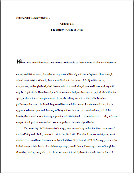
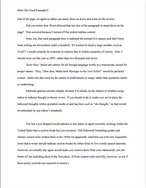
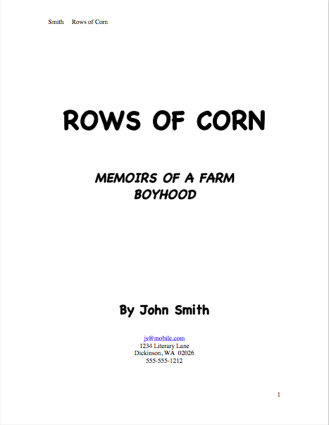
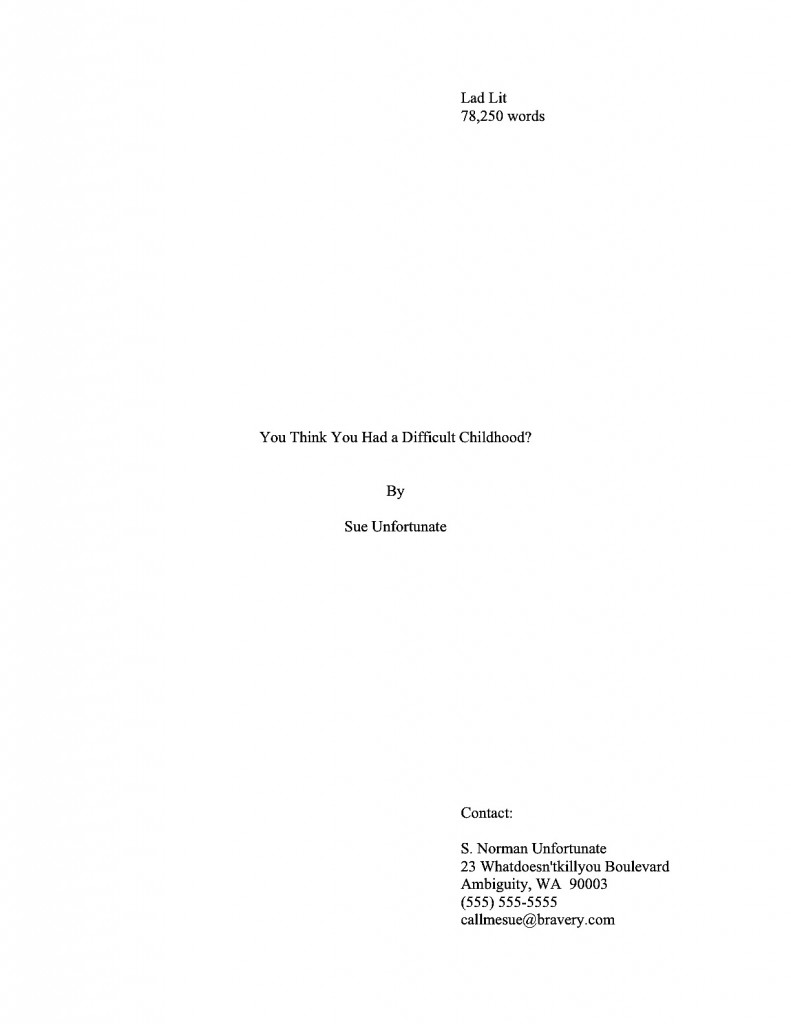
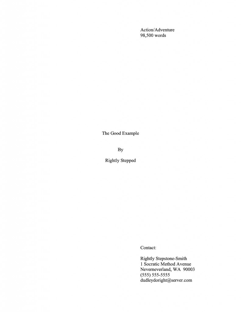
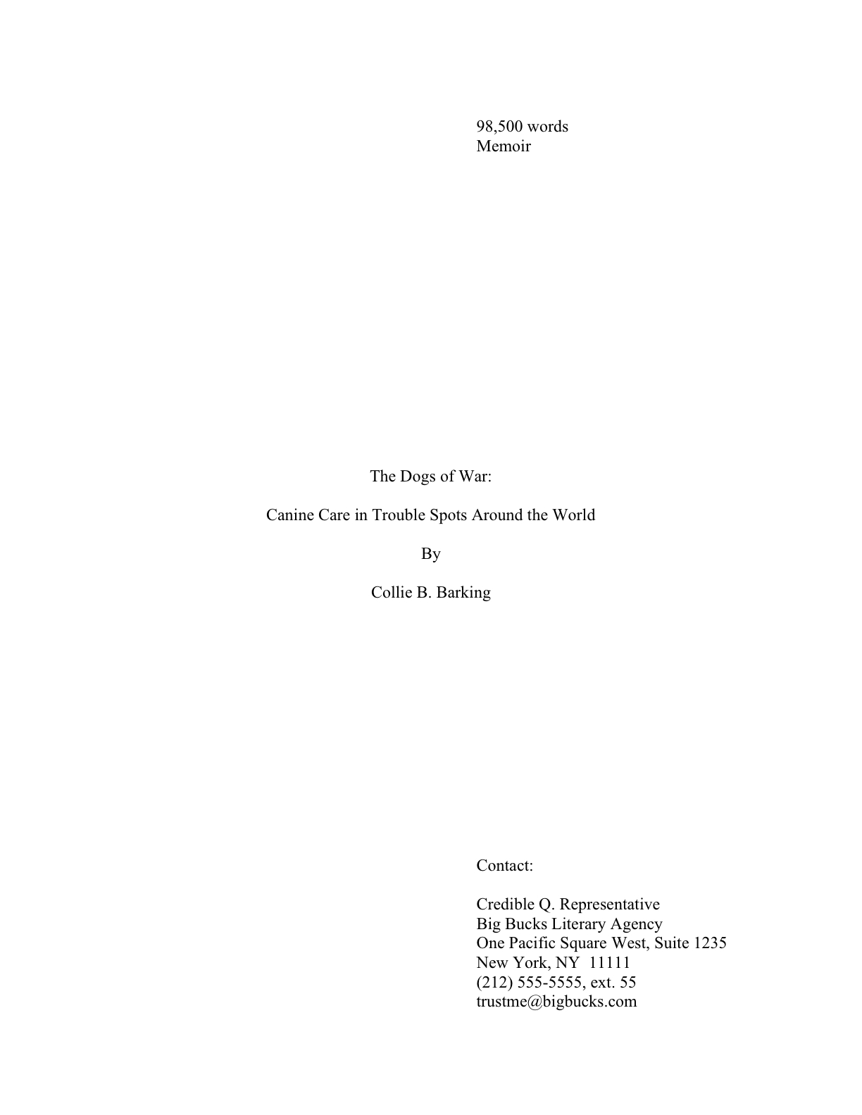
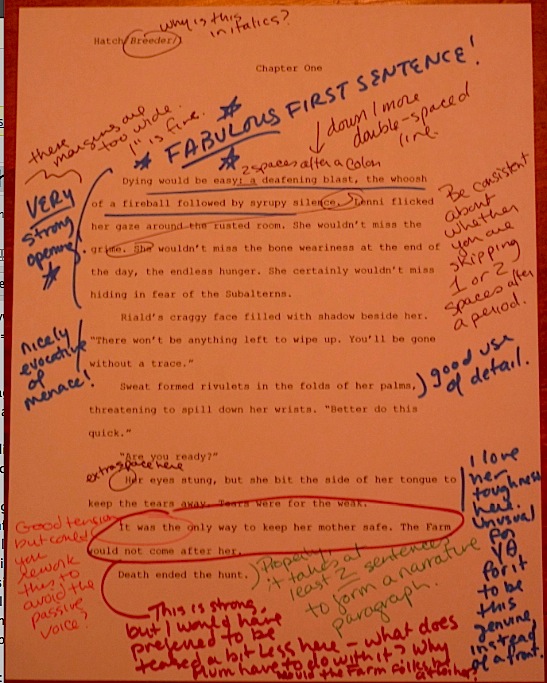
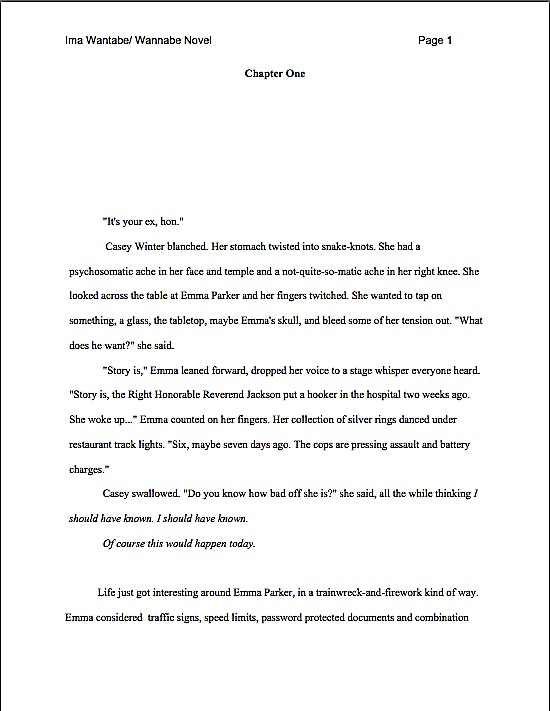
Formatpalooza, part XIV: proclaim joy to the world, or at least broadcast consistent punctuation to it

angel on top of tree

Before I launch today, I have a genuinely delightful announcement: please join me in a big round of applause for Julie Wu, who has just sold her first novel to Algonquin! Congratulations, Julie, and I’m really looking forward to its publication!

I know: in this market. After an amazingly swift round of submissions. I’m excited about this book.

Although I always get a kick out of trumpeting the glad tidings that a good writer has at last been recognized for her talent, I have a more personal reason to be gleeful over this one: Julie was one of my freshman roommates at Harvard — which tells you a little something about how seriously the Housing Office took the rooming application essays in those thrilling days of yesteryear. Our dorm contained so many aspiring writers that the click-click-click of fingertips on keys was actually more deafening during the early weeks of the semester than when term papers were due.

Perhaps I do not need to underscore the moral, but when has that ever stopped me? It can be done, people. Keep on plugging away.

On a not entirely unrelated note: sincere congratulations, campers, for making so far in this extended series on standard format for manuscripts — book manuscripts, that is; once again, let me remind you that short stories, magazine articles, theses, dissertations, and other types of writing are subject to other restrictions. We’ve been tackling the big stuff all year, and I’m proud of all of you for having the gumption, not to mention the faith in your writing, to work through it with me.

Over the next few days (with perhaps a brief hiatus on a silent night I could mention), I shall be tying up the last few loose ends of standard format, including a reader-requested intensive discussion of the ins and outs of dialogue formatting and punctuation. As if that weren’t enough reason to tune in as soon as the turkey-induced stupor begins to subside a little, I have it on pretty good authority that a certain Furtive Non-Denominational Gift-Giver will be dropping by on Boxing Day with the announcement of a contest that may be very interesting to those of you who write either literary fiction or memoir.

Or even both. Perhaps while I’m sitting on the FNDGG’s lap, we can discuss adding a third contest category for that pervasive kind of writing that walks the sometimes very thin line between the two.

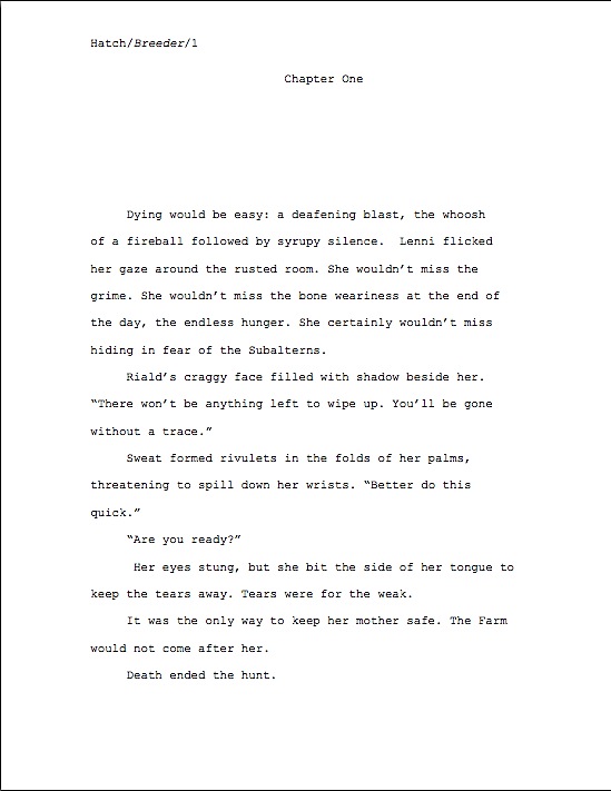
Today, I would like to talk about two hallmarks of the professionally-presented manuscript, proper punctuation and consistency. Before any of you yawn prodigiously and turn one eye to watching yet another sitcom version of A CHRISTMAS CAROL, please hear me out on this one, because these are two areas where the vast majority of submissions fall down on the job.

Perhaps because — feel free to pull out your hymnals and sing along, campers — the aforementioned vast majority of submissions are sent off without their writers taking the time to read the manuscript IN ITS ENTIRETY, IN HARD COPY, and OUT LOUD. And yes, Virginia, this is an excellent strategy, even if you happen to be planning to submit exclusively via e-mail.

Why is there honestly no substitute for that dramatic reading? It’s simply easier to catch typos, inadvertently skipped words, and punctuation gaffes in hard copy than on a computer screen — and as we discussed in last summer’s foray into the dreaded Frankenstein manuscript, some of the most common outcomes of repeated self-editing passes are style that varies markedly between one section of the manuscript and another, accidentally deleted words and punctuation, and yes, Virginia, uneven voice.

I’m not talking merely about manuscripts that require revision (although most submissions could use more liberal helpings of that, frankly), but also the fruits of repeated revision. Often, such errors are not the result of compositional carelessness, but of repeated revision. Zeroing in on the same page, paragraph, or even sentence over and over again without re-reading the entire section can easily result in a Frankenstein manuscript, one that reads in hard copy as though it were cobbled together from the corpses of several drafts, sometimes ones written in different voices.

Is it any wonder, then, that to a professional reader like our old pal Millicent the agency screener — happy holidays, Millie! — a manuscript whose author appears to know the rules of punctuation and grammar on page 5, but not on page 6, or whose authorial voice sounds substantially different on p. 1 and page 241, might seem ripe for rejection, on the assumption that the submitter needs to give it another round of polishing?

The same principle holds true for formatting, I’m afraid. Whether you choose to adhere to the rules of standard format we’ve been discussing over the last couple of weeks is ultimately, of course, up to you. But once you choose to follow a particular rule, you must obey it 100% of the time in your manuscript.

Let me repeat that, because it’s monumentally important: it’s not enough to adhere to a formatting rule most of the time; you must cleave to it in every single applicable instance in the text.Inconsistency — be it of voice or punctuation, spelling or format — simply isn’t going to look professional to people who read manuscripts for a living.

See now why it might behoove you to curl up in a comfy chair and start reading your manuscript out loud, Virginia? It’s the single best way to identify and root out Frankenstein tendencies.

I used to think that I didn’t actually need to state this requirement whenever I taught about standard format. After all, isn’t the part of the point of a rule that it should be followed on a regular basis, rather than merely periodically, as the whim strikes? However, I’ve seen enough manuscripts and contest entries (yes, I still judge from time to time; my, but you’re full of good questions today, Virginia) by good writers who sometimes use a single dash and sometimes a doubled one (if you’re not absolutely certain which is correct, I can only suggest that you reread this earlier ‘Palooza post), or whose Chapters 1-3, 6, and 17 have a (ugh) single space after periods and colons, whereas Chs. 4, 5, and 10-12 have two, and the rest feature both…

Well, you get the picture. Apparently, the need for consistency is not as self-evident as I — or Millicent — might like to believe. The overwhelming majority of aspiring writers simply do not reread their own work enough to have a clear sense of either its liabilities or its strengths.

Or so we must surmise from all of that inconsistent formatting. And spelling errors. And repeated words. And scenes where characters do or say things that they’ve done or said half a page before.

You know, the kind of stuff that any reader would catch if she sat down with the physical pages and read them closely. As in– wait for it — actually sitting down and reading a manuscript IN ITS ENTIRETY, IN HARD COPY, and OUT LOUD after every major revision pass.

Come closer, and I’ll let you in on a secret of good writing: it flows smoothly.

A sure narrative voice is a consistent one. That’s why writers brand-new to the writing game so often labor under the quite mistaken impression that their favorite books were their respective authors’ first drafts, and thus (one assumes) that their own first drafts should be marketable without further revision: because a the author of a well-crafted narrative works hard to create the illusion of spontaneous consistency.

Awfully hard. Seamlessness is no accident, you know.

So what do you think a professional reader like Millicent, her cousin Maury the editorial assistant, or their Aunt Mehitabel the veteran contest judge thinks when they encounter, say, one sentence that’s in the past tense, followed by three that are in the present? Or a character named George on page 8 and Jorge on page 127?

“Inconsistency,” they breathe in unison. “This manuscript needs more work.”

Or at least a good authorial read-through IN ITS ENTIRETY, IN HARD COPY, and OUT LOUD. If not after every revision, then at least prior to submitting it.

It’s also not a bad idea to have more than one set of eyes go through it, because all of us simply see a great many more grammatical errors and formatting oddities than we did, say, fifteen years ago. Remember back when everyone thought it was so funny that the vice president at the time (I didn’t call that one) corrected a child at a spelling bee who had spelled potato correctly, causing him to change it to potatoe?

At the time, the literate world rocked with laughter. Now, we routinely see supermarket signs advertising potatoe and tomatoe prices. And that’s a bad thing for literacy, because the more you see the error, the more likely is to make it yourself.

Why? Like Millicent and standard formatting, sheer repetition can make it start to look right to you.

Especially when you spot such errors in ostensibly credible sources. It used to be a rarity to see a spelling mistake in a newspaper or magazine article, because they were so closely edited; since the advent of on-screen editing, it’s now not uncommon to see a misspelling or grammatical error in a published book.

Had I mentioned that there’s just no substitute for reading a piece of writing IN ITS ENTIRETY, IN HARD COPY, and OUT LOUD? The eye is simply too likely to skip an error on-screen, partially because people read about 70% faster.

Then, too, AP standards — i.e., what governs what is considered correct in a newspaper or magazine — have, as we have discussed, recently adopted a number of practices that would not be kosher according to the dictates of standard format. The aforementioned single space after the period or colon, for instance, or capitalizing the first word after a colon.

All together now: sacre bleu!

While eliminating the extra space has been seen in published books for a while (but that doesn’t mean it’s necessarily proper in a manuscript, right?), post-period capitalization was practically unheard-of in published books until just a couple of years ago. Now, one sees it periodically (often, not entirely coincidentally, in books by journalists), along with some rather peculiar interpretations of the semicolon and the ellipsis.

And what happens, Virginia, when you see rules routinely bent in this manner? That’s right: confusion. Inevitably resulting, no matter what my agent friend says, in good writers raising questions like this:

I tried searching for this, but didn’t find an answer. Ellipses! Is the proper format:?.[space].[space].?or … with no spaces? Thanks as always.

This is a perfectly reasonable question now, of course, but it’s not one that was at all likely to come up even five years ago. Prior to that, pretty much any printed source would have adhered to the traditional rules governing ellipses, with the natural result that fewer writers were confused. Heck, they might even have learned the contextual rules governing ellipses in school.

What’s that, Virginia? You want to know what those rules are, since I’ve brought them up? Happy to oblige.

1. Ellipses are most commonly used mid-sentence, to mark a pause in speech. In this context, the periods in the ellipse should appear without spaces between them — and without spaces between them and the surrounding words, either. In other words, they should look like this:

“I’m appalled,” Ghislaine said. “More than appalled. I’m…horrified.”

2. Ellipses may also be used to alert the reader to skipped text in the middle of a quote. In these instances, whether an ellipse should have a space between its end and the end of the next word is entirely dependent upon whether the beginning of the next quoted part is a new sentence. Thus, if the original quotation was,

“I am in no way endorsing this policy or any other, because I feel it would be bad for the nation. I cannot be held responsible for its unhappy results.”

It would be proper to reproduce excerpts as:

The prime minister’s statement was unequivocal: “I am in no way endorsing this policy…because I feel it would be bad for the nation.”

Or as:

The prime minister’s statement was unequivocal: “I am in no way endorsing this policy… I cannot be held responsible for its unhappy results.”

3. Ellipses may also be used to show where the narration expects the reader to fill in the subsequent logic, as well as when speaker’s voice has trailed off into silence. As in:

Harry smiled, slipping one arm out of a sleeve that didn’t cover too much of his arm in the first place. A quick wiggle, and the rest of his shirt was off. Then he reached for his belt…

As much as some of you might want me to complete that paragraph, this is a family-friendly website. Besides, you’re perfectly capable of imagining the rest for yourself, are you not? In this case, the ellipse indicates my faith in your imaginative powers.

As would this, if I were writing dialogue — the most common use of this type of ellipsis:

“My, it’s hot in here.” Coyly, Harry shrugged his Flashdance-style sweater off one shoulder. “If only there were a way we could cool off…”

4. In reproducing a quote, an ellipsis can tell the reader that the quote continued, despite the fact that the writer chose not to show it in its entirety. This can come in handy, especially when writing about the kind of speaker who drones on and on:

“I deny the allegations,” the senator said. “I deny them absolutely, unequivocally, and in every other way. I deny that I cavorted in the House; I deny that I cavorted with a mouse. I deny that I cavorted in socks; I deny that I cavorted with a fox…”

Makes sense, doesn’t it? (And just between us, Virginia, wasn’t this a clever way of me to answer a reader’s question in a post that’s really about a larger issue?)

As nit-picky as all of these rules are, sometimes, good writers over-think them. So much so that they sometimes extrapolate extra rules of their own — but don’t necessarily apply them consistently throughout their manuscripts.

Yes, you read that correctly, Virginia. (She’s getting quite a workout today, is she not?) In my experience, most aspiring writers are very good about following the rules, once they know about them. In fact, really conscientious writers are quite a bit more likely to subject their manuscripts to extra restrictions than to ignore any of the established rules.

What kind of extra rules, you ask? Well, in our last sojourn on the standard format merry-go-round, two different readers asked how to format apostrophes and quotation marks. Ripped ruthlessly from their original context:

Could you in one of your really wonderful (and I really mean wonderful) posts on standard manuscript formatting devote a paragraph to quote marks and apostrophes? Times New Roman can have them both straight and curly, so which should I use? Or should I just make sure I’m consistent and leave it at that?

and

A related problem I have is in trying to place an apostrophe at the beginning of a word, particularly when writing dialogue and attempting to add a bit of the vernacular. To just type it, the apostrophe ends up being a “front-end” single quotation mark. I have to resort to some spacing and deleting shenanigans to get to appear correctly.

I freely admit it: I’m always a bit nonplused when I get questions like this, ones that assume a rule that just isn’t observed in professional manuscripts. As tempting as it might be to dust off my personal preferences on the subject and present them as a binding rule — which, as we’ve discussed throughout each of this autumn’s ‘Paloozas, is not an unheard-of thing for either a professional reader or a writing advice-giver to do — but the fact is, the expectations about both apostrophes and quotation marks in manuscripts have remained unchanged since the days when every submission was produced on a manual typewriter.

Which, in case you haven’t seen one lately, provided precisely one option for an apostrophe (‘) and exactly one for a quotation mark (“). On the same key, on most typewriters.

What does this mean for manuscript format? Good news, insofar as it translates into less work for writers: as long as the format is consistent and the punctuation is correct, Millicent’s not going to care one way or the other. Pick the one you prefer, and cling to it like an unusually tenacious leech.

I can completely understand why the two writers who brought it up — or any aspiring writer — would have wondered about this point: as readers, we do see various styles of apostrophe and quotation mark turning up in published books. Many readers also seem unaware that while U.S. publishers use doubled quotation marks (“), U.K. publishers use single quotation marks (‘), resulting in a whole lot of writers on both sides of the pond wondering vaguely if those other types of quotation mark mean something different — to mark text as ironic, perhaps?

Oh, you may laugh, but actually, it’s not all that great a logical leap. Given how counter-intuitive some of the rules of standard format are, it would not be at all astonishing if the publishing industry harbored some formatting preference that half of the writers in the world had heard nothing about.

But that’s not the case here; there is no special punctuation for irony. You have my full permission never to think about it again. Go sleep the undisturbed sleep of the just.

Before you go, though, one more piece of formatting advice: as you make your way through the bewildering forest of advice out there, toting your massive grain of salt, be aware of the fact that many seemingly authoritative sources out there disagree on certain points for the very simple reason that they’re talking about different things.

Pay close attention to context, because advice-givers often do not say explicitly, as I do, “Look, what I’m talking about here applies to book manuscripts and proposals, not other types of writing. So if you are trying to format a short story for submission to a magazine, please seek elsewhere.” Because such a high percentage of the aspiring writers’ market wants easy answers, preferably in the form of a single-page list of rules universally applicable to every writing venue, the temptation to produce a short, one-size-fits-all list of rules is considerable.

That doesn’t mean you should disregard such lists entirely, of course. Just keep in mind that any list that purports to cover every type is necessarily going to run afoul of some established standard somewhere — and that occasionally, rules pop up online and at conferences that would make Millicent’s eyes pop out of their sockets with astonishment.

Which is why, in case you’ve been curious, I have been going over even the simplest of the actual rules in such great detail, and with practical illustrations; I want all of you not only to adhere to the strictures of standard format, but to understand why each rule is to your advantage to embrace. That’s why I keep asking (and asking, and asking) if anybody has any questions. I just don’t think handing creative-minded people a brief list of mysterious orders is the best means of helping you become comfortable with the industry’s expectations.

So if anyone is looking for terse, bullet-pointed to-do lists for writers, I think any of my long-term readers can tell you that this blog is NOT the place to start. As the thousands of pages of archived posts here can attest, I am the queen of elaboration. Lots and lots of elaboration.

Speaking of elaboration and unnecessary doohickeys writers sometimes shoehorn into their book manuscripts and proposals, let’s talk about what should happen on the last page. Here, too, aspiring writers often give themselves extra trouble.

For a book manuscript, the proper way to end it is simply to end it. No bells, no whistles, no # # #, no -86-. Just stop writing.

Even the ever-popular THE END is not needed. In fact, I know plenty of Millicents (and their bosses, and editors, and contest judges) who routinely giggle when they see THE END typed on a last page, presumably — excuse my going out on an interpretive limb here — to indicate that a manuscript is not, in fact, going to continue.

“What is this writer thinking?” they ask one another, amused. “That I’m going to keep reading all of that blank space after the last paragraph, wondering where all of the ink went? That I’m incapable of understanding why there aren’t any more pages in the submission? Please!”

Remember what I was saying earlier in this series about professional critique being harsh? Don’t even get me started on professional ridicule.

Personally, I have sympathy for how confusing all of the various advice out there must be for those who have never seen a professional manuscript up close and personal. But honestly, some of the rules that commenters have asked about over the last three years must be from sources that predate World War II, or perhaps the Boer War. I’ve been editing book manuscripts for most of my adult life (and proofing galleys since early junior high school), and I have to say, I’ve literally never seen a single one that ended with “-86-”

So truth compels me to admit that I can sort of see where Millicent might find it amusing to see in a submission. Or might not find it amusing to see punctuation used inconsistently, or chapters begun without an indented paragraph (more on that one next time), or dashes that are sometimes doubled and sometimes not. Because while much of writing is a matter of style, and might thus vary throughout a manuscript, format, punctuation, and voice require consistency. Otherwise, how is Millicent to tell what is a fluke, what a typo, and what a daring experiment in the English language?

To people who read book manuscripts for a living in the US, the very notion of there not being a consensus about formatting, punctuation, spelling, grammar, and the other rule-based aspects of writing is downright odd: why, the evidence that there is a consensus is sitting right in front of them. The mailman brings stacks of it, every single day.

“Oh, come on — everyone doesn’t already know these rules?” agents and editors frequently ask me, incredulous. “This information is widely available, isn’t it?”

That’s a quote, people — but as someone who regularly works with folks on both sides of the submission aisle, I have come to believe that the wide availability of the information is actually part of the problem here. The rules governing book manuscripts haven’t changed all that much over the years, from an insider’s perspective, but from the point of view of someone new to the game, the fact that they have changed at all, ever — coupled with these rules not being applicable to every conceivable type of professional writing — can look an awful lot like inconsistency.

And we all know how Millie, Maury, and Mehitabel feel about that, don’t we?

If the flurry of rules starts to seem overwhelming, remind yourself that although submissions do indeed get rejected for very small reasons all the time, it’s virtually unheard-of for any manuscript to have only one problem. Like ants, manuscript red flags seldom travel alone.

So I would caution any aspiring writer against assuming that any single problem, formatting or otherwise, was the only reason a manuscript was getting rejected. Most of the time, it’s quite a few reasons working in tandem — which is why, unfortunately, it’s not all that uncommon for Millicent and her cohorts to come to believe that an obviously improperly-formatted manuscript is unlikely to be well-written. The notion that changing only one thing, even a major one, in the average manuscript would render it rejection-proof is not particularly easy for a professional reader to swallow.

There is no such thing as a rejection-proof manuscript, you know — although there is definitely such a thing as a manuscript that rejects itself. While it would indeed be dandy if there were a magical formula that could be applied to any manuscript to render it pleasing to every Millicent out there, that formula simply doesn’t exist; individual tastes and market trends vary too much. Not to mention the fact that the slow economy is making most agents and editors really, really cautious about picking up any manuscript at all right now.

This is vital to understand about standard format: it’s not a magic wand that can be waved over a submission to make every agent, editor, and contest judge on the face of the earth squeal with delight at the very sight of it. But it is a basic means of presenting your writing professionally, so your garden-variety Millicent will be able to weigh it on its non-technical merits.

All I can claim for standard format — and this isn’t insignificant — is that adhering to it will make it less likely that your submission will be rejected on a knee-jerk basis. However, I’m not going to lie to you: even a perfectly-formatted manuscript is going to garner its share of rejections, if it’s sent out enough.

Why? Because every agent out there, just like every editor, harbors quirky, individuated ideas about how the perfect book should be written.

Sorry. If I ran the universe…

Well, you know the rest. Try not to lose too much sleep through trying to second-guess what Millicent and her ilk want to see. Just do your best: writing well and presenting a clean manuscript honestly is how pretty much all of us landed our agents.

Keep plugging ahead — I’m counting upon you to provide me the joyous literary announcements of years to come. Keep up the good work!

Formatpalooza XIII: I’m gonna sit right down and write myself a letter…and then insert it properly into a manuscript

Mail slot2Mail slotMail slot3

Yes, the photos are unusually small today, but if it’s any consolation, it’s because this post is going to be an unusually long one, even by my hyper-communicative standards. So fasten your seatbelts and extinguish all smoking materials, everybody — it’s going to be a bumpy ride.

Oh, you thought I was going to post fluff pieces for Christmas week? Au contraire, mon frère: I’m hoping to wrap up Formatpalooza by the end of the year, so we have a lot of ground to cover. Besides, you asked for it.

You in the collective sense, of course: ever since I first started Author! Author! readers have been asking in the comments how to format letters, diary entries, newspaper articles, and other text-within-text opportunities within manuscripts. Today, I’m going to be answering that perpetual item on Literary Santa’s gift list.

Who do you thinks gives the good children books?

I begin today’s lesson with a parable. As someone who travels a lot (I teach all over the place, should anyone be interested in flying me someplace to hear me talk about, say, querying or pitching), I’ve become accustomed, if not precisely resigned, to the fact that pretty much every airport in the country has slightly different security regulations. Even within any given airport, enforcement is variable. What is required in, say, Los Angeles will sometimes get you scolded in Duluth — and sometimes even in Los Angeles, if a new manager happens to come on shift between the time you place your items on the conveyor belt and when they emerge on the other side.

Seriously, I’ve seen lipstick confiscated as a potential liquid in Seattle (yes, really), but been chided in Newark for cluttering my requisite 1-quart bag of carried-on liquids with Perky Passion. New Orleans seems to harbor an antipathy against pointy tweezers, a fear apparently reserved in Boston for the smallest gauge of knitting needles. In Chicago, I heard a lady screamed at because it hadn’t occurred to her to place her asthma inhaler in the plastic bag with her carried-on liquids; in Newark, the same poor woman was permitted to retain her inhaler, but was grilled mercilessly about the glass jar of seasoned salt that she was taking to her sister.

If there is any sort of national standard about whether shoes should be placed in a box or directly upon the conveyor belt, it must change at least twice weekly. And don’t even get me started on how a security guard reacted when I was reading Reza Aslan‘s fabulous new compilation of Middle Eastern writing, Tablet and Pen, in the Houston airport last month. Silly me, I thought, “Ma’am, what are you reading?” was an invitation to a literary discussion.

Like all of us, I try to be flexible, open-minded, and cooperative, reminding myself that the person chiding me for doing precisely what the official in the last airport told me to do four hours ago is merely enforcing the rules as she understands them, and that alerting her to the fact that she is apparently the only security officer in the continental U.S. that genuinely believes that socks, hats, and scarves, as well as shoes, need to be removed and run through the scanner is unlikely to improve the situation. Chances are, she’ll only get miffed, and I’ll still end up strolling through the metal detector barefooted except for the Perky Passion gracing my toes.

Coming home from a southern city that shall remain nameless earlier this year, however, I received an instruction that left me dumbfounded. After I scurried, shoeless, through the metal detector, the security officer made a grab at my skirt. “I have to pat it down,” she told me when I snatched it back. “New regulation.”

New, as in it had apparently been made up on the spot; this was a good six months before the new scan-or-pat rules were publicly announced. It also appeared to be rather sporadically enforced: even as she articulated it, beskirted women were passing unmolested through the three other security stations. As were men in baggy pants, priests in vestments, and bagpipers in kilts.

“I flew wearing this skirt two days ago,” I told her politely, “and nobody ran his hands over it. Is the regulation new as of today?”

She looked at me blankly. “I suppose,” she said after a moment’s thought, “I could have you turn around while I did it, to make it less embarrassing.”

A brief, enlightening chat with her very apologetic supervisor later, she still apparently didn’t understand just how she had misinterpreted the latest instructions. “But the skirt’s below her knee,” she kept saying, as if a strumpet in a miniskirt on that particular snowy 27° day would have been substantially less suspect than a lady dressed for the weather. “I have to pat her down, don’t I?”

As I reclaimed my hem from her grasp, I thought of you, my friends. Honestly, I did. There’s a moral here, one’s that’s highly applicable to any aspiring writer’s attempt to navigate all of the many conflicting pieces of formatting advice out there: while the rules themselves may be constant, interpretations do vary. In situations where the deciding party holds all the power, it’s best not to quibble over even the wackiest interpretations.

Or, to put it in the terms we use here at Author! Author!: if the agent of your dreams has just tweeted angrily that she hates seeing a second space after a period with a venom that less stalwart souls reserve for the sound of nails scratching a blackboard, being cut off in traffic, and nuclear war, it’s simply not worth your time or energy to pointing out that those spaces are in fact proper in typed documents in English. You’d be right, of course, but if she’s sure enough of her interpretation to devote 127 words to it, I can tell you now that you’re not going to win the fight.

Trust me, I’m not saying this because I am too lily-livered to take a stand on principle. Ask the security guard I gave a ten-minute lecture on the importance of a diversity of literary voices in a free society.

Give that agent PRECISELY what she says she wants — yes, even if finding out what she wants involves checking her agency’s website, guide listing, and her Twitter account. (I know, I know — that’s pretty time-consuming, but remember, it has probably never occurred to her that the good writers querying her are probably also trying to discover similar information for twenty or thirty other agents. She’s just trying to come up with something interesting to tweet.)

But don’t, whatever you do, assume that particular agent’s pet peeve is shared by everyone else in the industry, any more than one security guard’s antipathy to women carrying — gasp! — lipstick onto airplanes is a universal standard. As we’ve seen earlier in this series, not only are some of the newer standards far from standard; adhering to some of them might actually alienate more traditional agents and editors.

In fact, when trying to decide whether to follow any new guideline you’re hearing for the first time, it’s always prudent to consider the source. Someone new to the rules — who, for instance, is simply passing along a list he discovered somewhere — is far more likely to apply offbeat interpretations than someone who has had a great deal of practical experience with professional manuscripts. Advice heard first-hand from an agent or editor at a conference can (and often does) alter considerably by the time it becomes fourth- or fifth-hand news. All it takes to skew the message is one link in the chain to get a tiny detail wrong in the retelling, after all.

Or, as with my would-be groper, to misunderstand a key word or phrase in the original instructions. One person’s suspiciously abundant fabric below the waistband is another person’s lyrically flowing skirt.

Unfortunately, offbeat interpretations of the rules of standard format are not the exclusive province of fourth-hand advice-givers. Sometimes, newly-minted contest judges and even freshly-trained Millicents can give a tried-and-true rules a mighty original twist. In a contest that gives entrants critique or an agency that permits its screeners to scrawl individual observations in the margins of its form-letter rejections (as some do), even a small misunderstanding on the reader’s end has resulted in perplexing feedback for many an aspiring writer.

Even more unfortunately, the Mehitabels and Millicents producing this feedback seldom think to phrase their understanding of the relevant rule tactfully. To them, the rule’s the rule, just as calf-length skirts were security threats to my airport guard; why not just bark it as though it was true everywhere in the known universe?

The cumulative result of all of that barking of all of those interpretations of all of those rules: writers often end up feeling scolded, if not actually yelled at and shamed. Hands up, if this has ever happened to you.

My hand is raised, by the way. Back in my querying days, a West Coast Millicent once huffily informed me that he’d hated my premise when he’d first read my query three months before at his previous job in an East Coast agency — and he still hated it now. So much so that he took the time to write me a personalized rejection letter: a good two-thirds of a page of snarling admonition about doing my homework before querying. Evidently, I should have been following his professional movements closely enough to have taken wincing pains to avoid running my query under the same screener’s eye twice.

Shame on me for not having read his mind correctly. The next thing you know, I’ll be reading or wearing a skirt in an airport, scofflaw that I am.

Realistically, though, what good would it have done my submission to argue with him? It was indeed absurd of a faceless, anonymous Millicent to expect any aspiring writer to know anything about who is working behind the scenes at any agency, much less who is moving from one agency to another and when.

But do you know what would have been even more absurd and misguided? My automatically assuming that barker was right, simply because he was speaking from an apparent position of authority and with vehemence. Contrary to popular opinion, being right and sounding insistent have no necessary relationship to each other.

I’m bringing this up not because it is integral to understanding today’s foray into the complexities of formatting — it isn’t, especially — but to reiterate the importance of not simply adopting every formatting and writing tip you hear. Look those gift horses very closely in the mouth before you ride any of ‘em home.

Yes, even the ones grazing in my pasture. Many a soi-disant writing guru has ultimately proven to be factually wrong, and when that happens, it’s not the guru that gets hurt; it’s the aspiring writers who blithely follow his advice because it sounds authoritative. Ditto, unfortunately, when aspiring writers misinterpret agents’ pronouncements of their personal preferences as iron-clad rules of the industry.

Remember: when in doubt, the smart thing to do is ask follow-up questions; many an aspiring writer has run afoul of Millicent simply because he didn’t fully understand Rule #10 on an under-explained list of 27. Isn’t that a better use of your energies than fighting with an agent who cares enough about her personal hatred of italics to tweet about it every other month?

Another smart thing to do is to put in the necessary research time to track down a reasonable answer from a credible source. And yes, Virginia, that often means doing more than just Googling the question and averaging the answers on the first ten sites that pop up.

Since there actually isn’t all that much out there on today’s topic, I’m going to state it in nice, easily-searchable terms: today, we’re going to be talking about how to format a letter, diary entry, or long quote in a manuscript.

Or, to be more precise, the many different ways in which one could format them. The short answer to “How do I do that?” is, as it so often is in this game, it depends.

Upon what, you ask? Well, upon the length of the letter one wants to include, for one thing. Also, if we want to get technical about it (and the masses cry, We do! We do!), it depends upon whether the manuscript in question is an academic work or not — or is a nonfiction work of the type often produced by academics.

That last declaration left some of you scratching your heads, didn’t it? And like sensible writers, you formulate a follow-up question: “Why on earth would it make a difference whether a professor — or someone else who aspired to that level of expertise — wrote the darned thing? Standard format is standard format, isn’t it?”

Well, it is and it isn’t. Long-time readers, chant it with me now: what is proper in a book manuscript is not necessarily what’s proper in a short story manuscript; what’s expected in a book proposal is not precisely what’s expected in a novel submission; contests often have specific rules that run contrary to the prevailing rules of standard format. And as we have so often discussed, if an individual agent or editor publicly expresses a personal preference, anyone who submits to him should honor it. It’s the writer’s responsibility to check what’s appropriate for the submission at hand.

In other words, sometimes a skirt is just a skirt. Exceptions do exist.

As much as aspiring writers would love it if all written materials were subject to the same standards, assuming that any writing, anywhere, anytime should be formatted identically, or that any stack of papers called a manuscript will look the same, is simply wishful thinking. True, life would be a whole lot easier for writers everywhere if that particular wish came true, but in case you hadn’t yet noticed, the publishing world isn’t really set up with an eye to making things more convenient for those just breaking into the biz.

So how might a scholar handle this problem? A university press — or college professor reading a thesis, for that matter — would expect any quotation longer than 3 lines of text to be offset, devoid of quotation marks, and single-spaced, provided that the quote in question is not longer than a page; quotes less than three full lines long are simply placed within quotation marks. Offsetting, for the benefit of those intrepid readers who did not automatically skip the rest of this paragraph immediately after the words university press, is achieved by skipping a line, then indenting the quoted material five spaces (or half an inch, using Word’s standard tabs) on both the left and right margins. After the quote comes another blank line, then the text resumes normally.

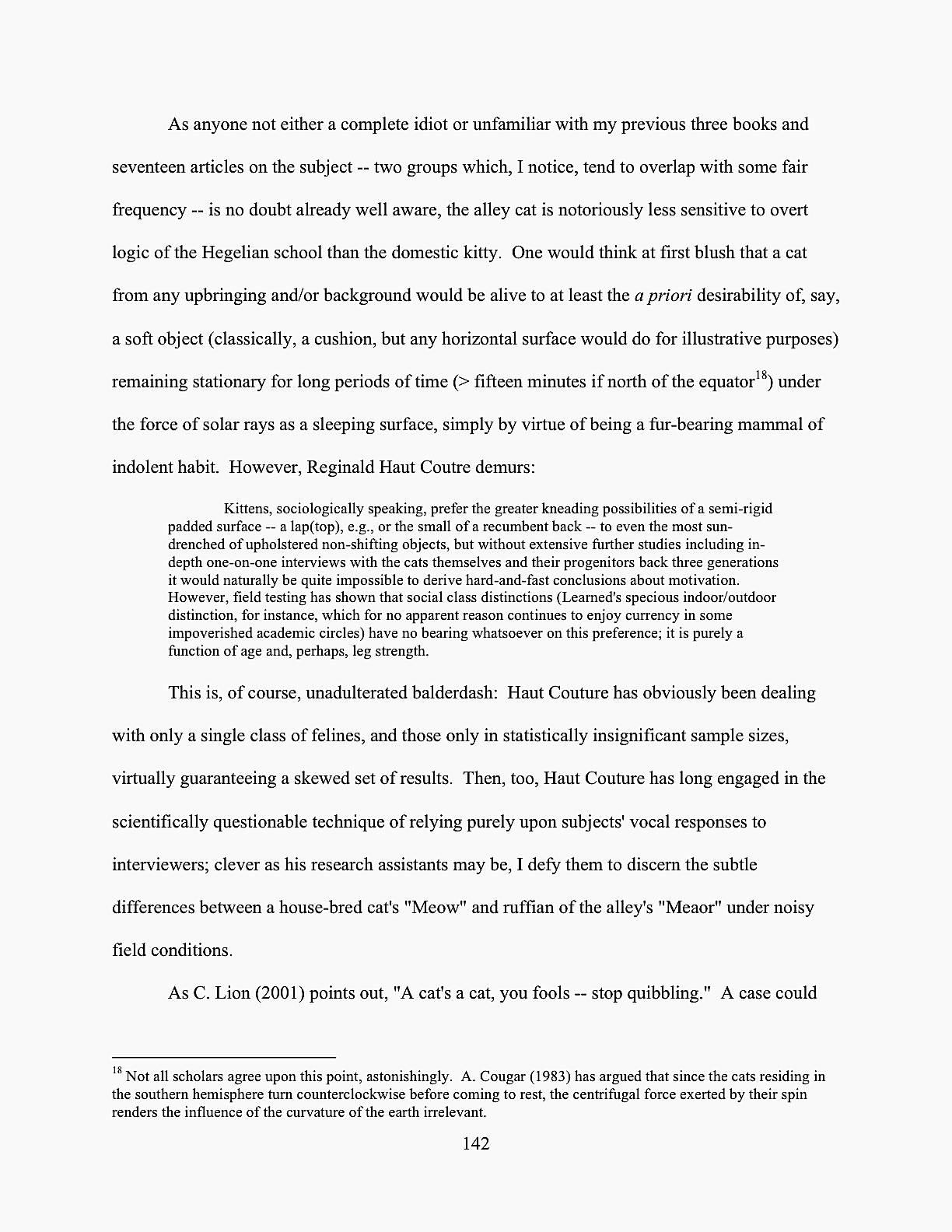
In practice, then, a page featuring quotations in an academic manuscript might look a little something like this:

academic example

Why do scholars mark quotes from other works so VERY well? That way, there can be absolutely no question about when a professor is borrowing material from somebody else’s published or unpublished work. (There tends to be a lot of unpublished work floating around the average university at any given time, after all.)

In a book proposal or nonfiction manuscript that isn’t a memoir, it’s perfectly permissible to present long quotes in this manner — although in non-academic nonfiction, the offset quote would be double-spaced. It’s clear, it’s direct, and most important of all, Millicents who work for NF-representing agents will get it. (Although most ultimately published memoirs begin life as book proposals, at least in the U.S., memoir manuscripts follow the formatting conventions of novels. Hey, I don’t make the rules; I just tell you about ‘em.)

“That’s all very well and good,” enough of you to get together and raise a barn are probably muttering, “but this doesn’t really address Dave’s question, does it? You’ve told us that a letter in a novel or memoir manuscript should not be treated like a quote one academic lifted from another and stuffed wholesale into her dissertation, but you don’t tell us how it should be handled. And how about showing us a practical example of that double-spaced offset quote you mentioned above?”

Don’t worry: a concrete example follows below. (Hey, I wasn’t kidding about the length of this post!) On the other front, patience, my friends, patience — because, again, it depends.

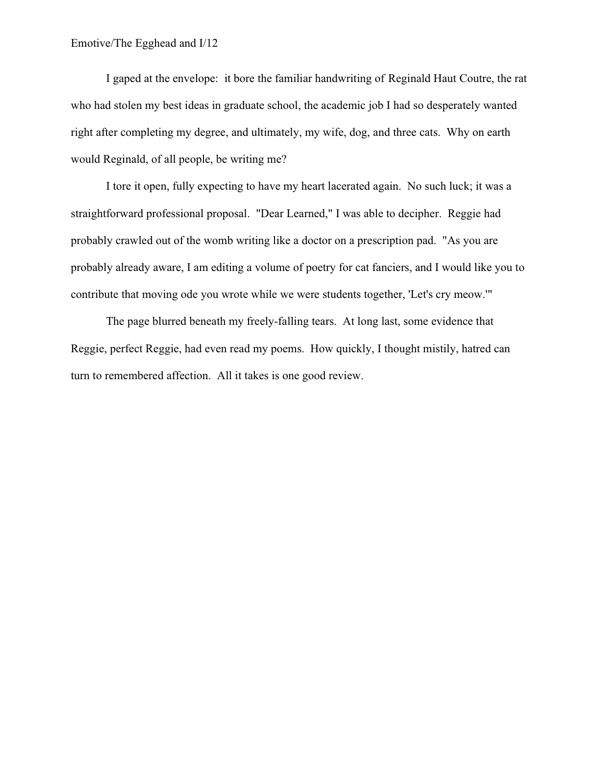
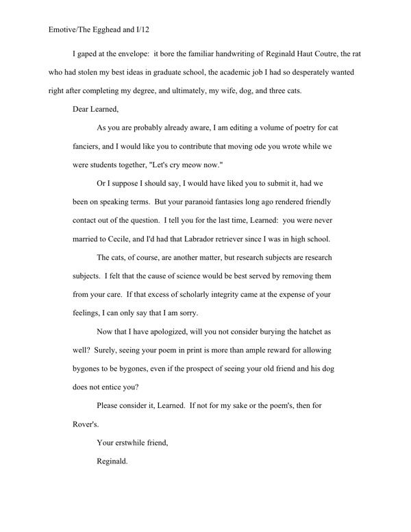
If the letter in question is short (or the excerpt being reproduced in the narrative is), there’s no need to treat it as anything but a regular old quote, like any other in the novel:

novel-letter-example1

Perfectly obvious what’s going on here, isn’t it? It doesn’t require special formatting for the reader to understand that this is an excerpt from a letter.

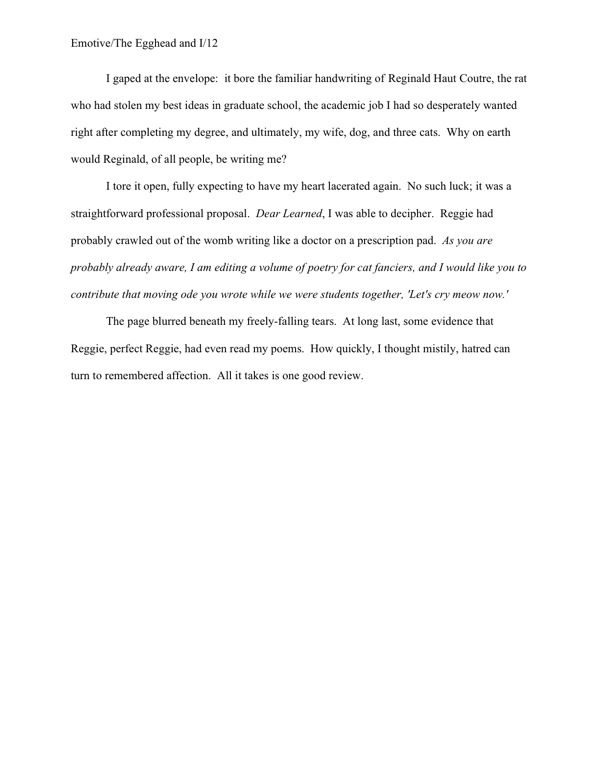
For short letters — say, under a page — some writers prefer to use italics (probably because, as Dave pointed out, they’ve seen them used that way in published books), but frankly, I wouldn’t recommend it in a novel or a memoir manuscript. It implies an ignorance of the fact that the editor, not the author, is always the one who makes decisions about how text will appear in a published version.

However, since some of you are undoubtedly not going to listen to me on this one, here is how to use italics properly in this context:

novel-letter-example2

I sense some of you shaking your heads. “But Anne,” epistle-lovers everywhere cry in protest, “that doesn’t LOOK like a letter. I like a letter to look like a letter on the page; that’s part of its charm. So how do I convey that without seeming as though I’m usurping editorial authority?”

I had a feeling I would be hearing from you literalists: there’s no shortage of writers who feel very strongly that every single syllable of every note passed between characters must be reproduced faithfully and its entirety in the text, as if the average reader had never seen a letter before and thus could not even begin to imagine what one might look like.

Frankly, it’s seldom actually necessary to a plot to include the parts of a letter that would be hard to squeeze within the strictures of standard format: the letterhead, if any; the date; the salutation; the signature. Within the context of a novel (or memoir), some or all of these are often self-evident: honestly, if the heroine is addressing her long-lost lover by, say, his given name and signs with her own, what additional insight could even the most imaginative reader derive from reproducing those salutations and signatures for each and every letter they right? Or even just one?

Even if she habitually opened with, “Dear Snotnose,” and signed off with, “Your affectionate bedbug,” that would only be character-revealing the first time she did it, right?

But you head-shakers are not convinced by that, are you? I sense that I’m not going to be able to blandish you into believing that the 15-page letter starting on pg. 82 might work better simply broken off into its own chapter entitled The Letter, am I? (A fabulous solution with very long letters, by the way.)

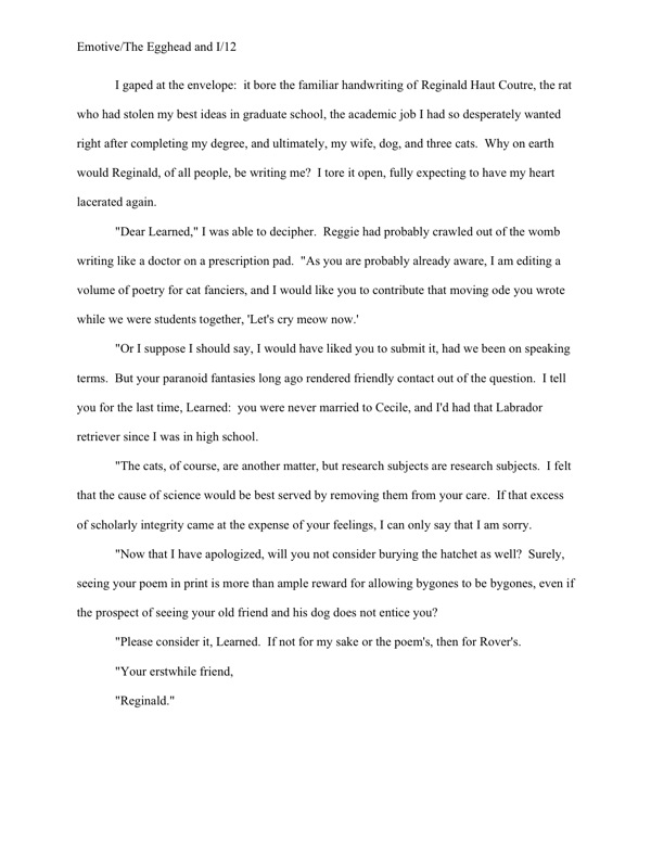
Rather than fight you, I’m simply going to show you the two acceptable ways of formatting a letter like a letter in a manuscript — which, not entirely coincidentally, will also work beautifully for letters that go on for pages and pages. First, unsurprisingly, it may be presented like dialogue, within quotes:

novel-letter-example-long

As with any other multi-paragraph quote, quotation marks do not appear at the end of a paragraph if the opening of the next paragraph is still part of the letter. They do, however, show up at the beginning of each paragraph within the letter, to alert the reader that this is not normal text.

The other option — and this will work with long quotes in nonfiction as well — is to offset the letter text, as one would with a long quote in an academic work. In a non-academic manuscript, however, the offset quote should be double-spaced, like the rest of the text:

novel-letter-example-long2

Although this format does work well for long quotes, I’m not a huge fan of it for letters in fiction or memoir. To my eye, it’s not as distinctive as the first option, and there’s always the off chance that a rapidly-skimming reader (like, say, Millicent) might not realize that the salutation is the opening of an offset section.

Don’t laugh; it happens, and not for reasons that necessarily reflect negatively upon the average Millicent’s intelligence. She’s got hundreds of pages to get through in any given day, and skimming eyes can miss details.

Or, to put it a bit more bluntly: don’t fall into the extremely common aspiring writer’s trap of believing that every reader will read — and more importantly, absorb — every single syllable on every page of your entire manuscript.

Sometimes, being obvious is a really, really good idea, especially in a situation where a part of the text is deliberately in a different voice than the rest of the narrative, as is almost always the case with a letter. Bear in mind that because manuscripts do not resemble published books, the goal here is not to reproduce the letter as you would like to see it in the book or as the protagonist saw it — it’s to make it absolutely clear when the text is an excerpt from a letter and when it is not.

Like academic publishers, Millicents don’t like to leave such things open for interpretation; it tends to make her bark-prone. Don’t make her guess where a letter — or any other long quote — begins or ends. The format should make it clear — but never, under any circumstances, use a different typeface to differentiate a letter from the rest of the text.

That last format would work beautifully for an article or diary entry. Again, though, if all the reader needs to know could be summed up in a few short sentences, why not quote the diary entry within the regular text, just as you would an excerpt from a letter?

“But Anne!” diary-lovers exclaim. “I like to see entire diary entries in novels or memoirs! Even if some of the material in the entry is off-topic or even a trifle dull, that just adds to the sense of realism!”

Okay, okay — I know an idée fixe when I hear one; I’m not even going to try to talk you out of that one. (Except to remind you: Millicent’s threshold of boredom is quite a bit lower than the average reader’s. So’s Mehitabel’s; edit accordingly.) Let’s take a gander at all four types of diary entry format on the manuscript page.

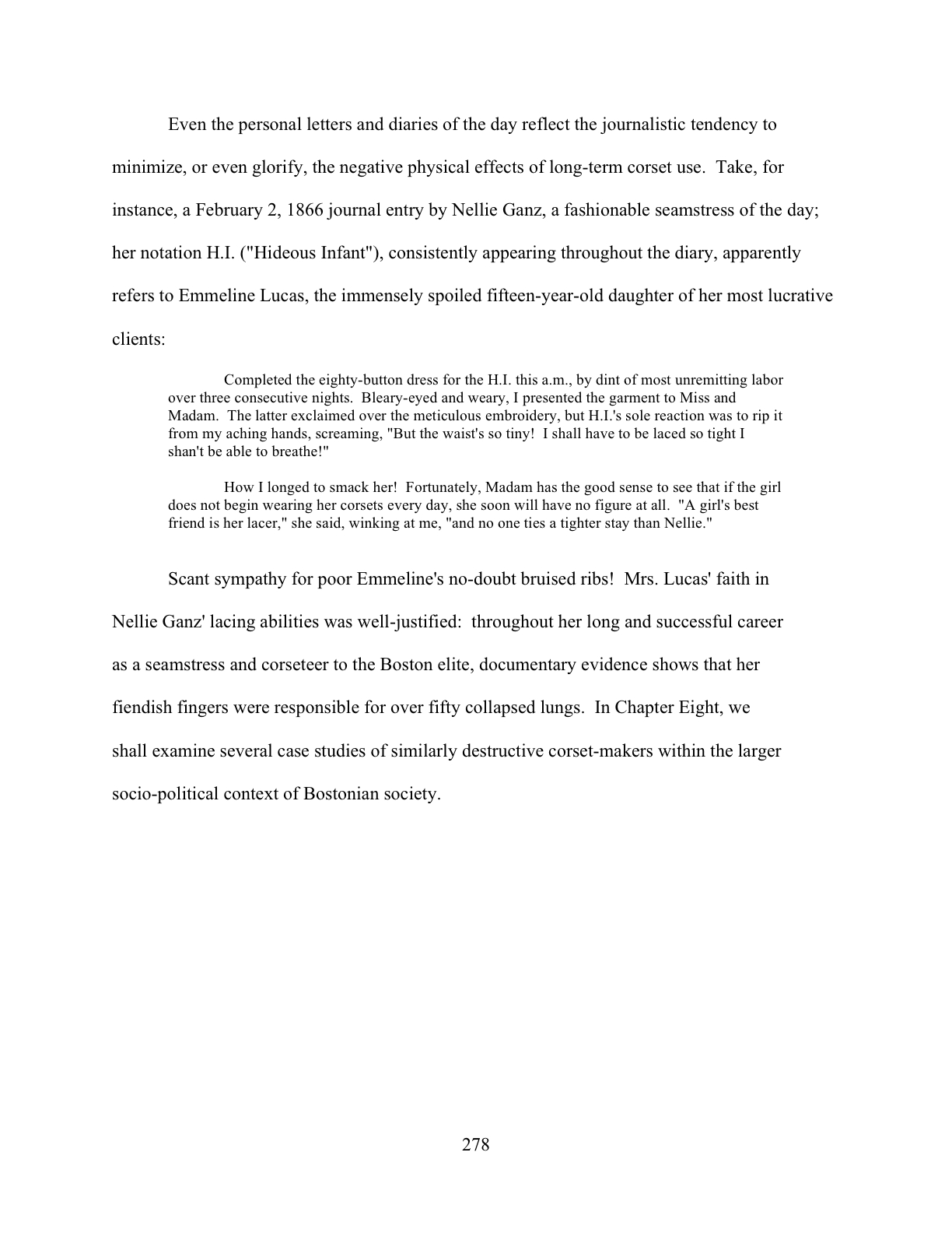
Yes, I did indeed say four — because, again, it depends on the type of manuscript in which the diary entry appears. In a scholarly work, it would look like this:

academic diary entry

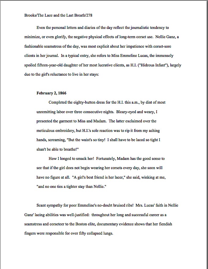
That’s not a tremendous surprise, right? In a nonfiction book on the subject not aimed at the academic market, however, Nellie’s diary would look like this on the page:

NF diary entry 1

No chance of Millicent’s not spotting the difference between the academic version and the standard format version, is there? To her eye, only the latter is formatted for professional consideration.

If the nonfiction writer preferred not to introduce the date of the entry in the paragraph preceding the diary entry, she could use a NF convention we discussed last week, the subheading. For many writers, there’s a distinct advantage to presenting a diary entry this way: a subheading, the entry would more closely resemble the way a reader might find it in a published book — although, again, that’s not really the goal here.

NF diary entry b

As you may see, this format takes up more room on the page — not always a minor consideration to a writer who is trying to edit for length. As with a letter, the more of the formal elements the writer chooses to include, the more space it will take. Which begs the question: is verisimilitude it worth taking up an extra few lines of text in a manuscript that’s already a bit on the long side? If so, a less literal rendering of frequent letters and diary entries can be a quick, easy way to reclaim a page or two of lines over the course of an entire manuscript.

For fiction or memoir, a similar format should be used for diary entries longer than a few lines but less than a couple of pages long — unless several diary entries appear back-to-back. (But of that, more below.)

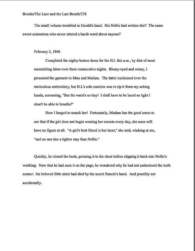
A novelist or memoirist faces a structural problem, though: it can be considerably harder in fiction to work the entry’s date into the preceding text (although many a fine writer has managed it with such sterling phrases as The minute volume trembled in Gerald’s hand. On May 24, 1910, his mother had written:), so the subheading is a popular choice for indicating the date.

As with other subheadings in fiction, the date should not be in boldface. Let’s take a peek at what the resultant short diary entry would look like on the page.

diary fiction 1

Still quite clear what is and is not diary entry, isn’t it? By offsetting the text, even a swiftly-skimming Millicent would find it easy to figure out where Nellie’s words end and Gerald’s thoughts begin.

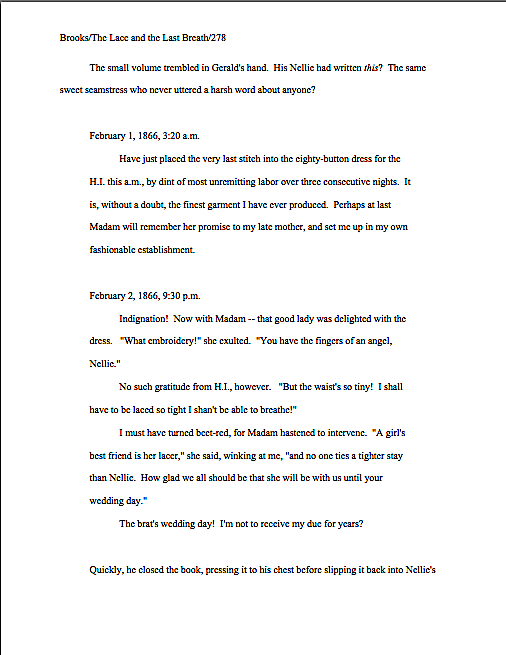
But how, you may well be wondering, would a writer present several short diary entries in a row? If the diary did not go on for more than a couple of pages, all that would be necessary would be to insert a section break between each.

In other words, by skipping a line between ‘em. Like so:

diary fiction 2

If a series of diary entries goes on for pages at a time, however, offsetting them makes less sense; the point of offsetting is, after all, to make a clear distinction between the special text and the regular text. After the third or fourth page of offsetting in a row, a skimming Millicent (or, more disastrous, an agent flipping forward in the manuscript) might leap to the incorrect conclusion that the margins just aren’t consistent in this manuscript.

May I suggest an elegant alternative, one that would side-step the possibility of this type of misinterpretation entirely? Consider devoting an entire chapter to them, titling that chapter something descriptive and unprovocative like Nellie’s Diary, and formatting all of the entries as regular text with subheadings.

Curious about what that might look like? You’re in luck; here are the first two pages of Chapter Eight:

diary chapter 1

diary chapter 2

Lovely and clear, isn’t it? It’s also, in case those of you who are trying to shorten your manuscripts happen to be interested, the most space-efficient means of presenting these diary entries on the page. What a difference a half an inch of margin on either side makes, eh?

If working through this often-misunderstood formatting issue doesn’t get me on Santa’s good list, what possibly would? Tomorrow’s foray into more formatting mysteries, perhaps. Keep up the good work!

Formatpalooza XII: it may be possible to see a world in a grain of sand and eternity in an hour, but that doesn’t mean a submitter should play tricks with the space-time continuum

green anemone

For the past few posts in this series, we’ve been comparing manuscripts in standard format with improperly-formatted ones — on their title pages, their first pages, and their mid-text pages — to see the rules in action, as well as how your submission’s chances could be hurt if you deviate from them. I hope you’ve been finding this more useful than a simple list of submission guidelines; in my experience, most rookie submitter mistakes arise not merely from simple ignorance of the strictures of standard format, but from the low-level panic that comes from having to guess whether one is performing the secret handshake correctly.

The better an aspiring writer understands the rules, the less guesswork is involved. It may not eliminate the stress of submission entirely, but it does at least remove one of the most common stressors from the mix.

Heck, you might even become relaxed enough about the process to feel a few glimmerings of sympathy for Millicent the agency screener. Each and every week, she has to read thousands upon thousands of pages just like the ones we’ve been considering.

Does the very idea of empathizing with her seem strange to those of you new to the querying and submission process? Admittedly, she is also the person who rejects the vast majority of queries and submissions sent to her agency — remember, at a US agency of any size, a manuscript typically has to make it past one or two Millicents before getting anywhere near an agent’s desk; that’s one reason average turn-around times have risen in recent years from weeks to months. (Another reason: a lot of agencies have had to lay off Millicents and administrative assistants, meaning that fewer eyes are scanning more pages.)

Yet given what a small percentage of these documents are properly formatted and spell-checked and original andbook category-appropriate, much less well-written, it’s hard to blame her eye for becoming a trifle jaded over time. As enviable as her job sounds (Reading for a living! Sign me up! many writers think), reading for errors is actually not very pleasurable, usually.

And make no mistake: it’s a screener’s job to read for technical errors, with an eye to weeding out the aforementioned vast majority of submissions. Unfortunately, as a group, aspiring writers make it easier than it should be to reject a promising voice. Technical mistakes are so common that the lack of them is sometimes the difference between a well-written manuscript that strikes Millicent as well-written enough to keep reading beyond the first page or two and one that makes her exclaim, “Oh, too bad — this writer isn’t ready yet. Next!”

Way back in the dim days of yesteryear, before you had been initiated into the mysteries of standard format, the fact that the writing was not the only factor considered in rejection decisions probably annoyed you just a trifle, didn’t it? Now that you’ve passed the Rubicon and are formatting your manuscripts like a pro, you can afford to smile compassionately at both Millicent and the literally millions of queriers and submitters who ply her with unprofessional-looking pieces of paper.

Or does that smirk off your face mean that I’m once again overestimating my readers’ saintly willingness to walk a mile in the moccasins that routinely kick aspiring writers’ dreams into the rejection pile?

Okay, let me speak to the more practical side of your collective psyche: even if you aren’t in the habit of empathizing with people who reject writers for a living, there’s a good self-interested reason you should care about her state of mind — or an agent, editor, or contest judge’s, for that matter. Simply put, Even with the best will in the world, grumpy, over-burdened, and/or rushed readers tend to be harder to please than cheerful, well-treated, well-rested ones.

And she does tend, alas, to fall in the former categories on more days than the latter. Millicent is the Tiny Tim of the literary world, you know; at least the Bob Cratchits a little higher up on the office totem pole uniformly get paid, but our Millie often gets a paycheck that’s more an honorarium than a living wage. Heck, some Millicents are not paid at all. Some do it for college credit — or just the experience.

Phenomena that one might reasonably expect to become increasingly common, by the way: the worse a bad economy gets, the better an unpaid intern is going to look to a cash-conscious agency. Or, heaven help us, a worried publishing house that’s been laying off editors. (And editorial assistants, increasing turn-around times at publishing houses, too.)

Fortunately, literary contests in the U.S. are almost exclusively judged by volunteer Mehitabels, at least prior to the finalist round, so writing competitions continue to be judged very much as they ever were. The Hitties of the world tend to be public-spirited authors, freelance editors, writing teachers, etc. who honestly are in it to help discover exciting new voices. If anything, however, that let’s-improve-the-literary-world orientation usually renders them less tolerant of technical errors in entries than Millicent is, not more.

Hard to imagine, isn’t it? Which is why — you ‘Palooza followers can hear this coming, can’t you? — a savvy submitter always reads her ENTIRE manuscript IN HARD COPY and OUT LOUD before sending it to anyone even vaguely affiliated with a literary contest or the publishing industry. It’s much, much easier to catch formatting issues, typos, and logic problems that way.

Even if Millie’s not an intern, she’s still unlikely to be paid very much, at least relative to the costs of living in the cities where the major publishers dwell. Her hours are typically long, and quite a lot of what she reads in the course of her day is, let’s face it, God-awful. Not to mention poorly formatted.

Oh, wait; I have mentioned it. Repeatedly.

“So why are you bringing it up yet again?” the masses shout indignantly.

On the outside chance that I’m being too subtle here: it’s vital to any aspiring writer’s happiness to be aware that while God-awful manuscripts and book proposals are, naturally, self-rejecting, every year, thousands upon thousands of otherwise well-written manuscripts get rejected on purely technical grounds.

Millicent’s job, in short, is not the glamorous, power-wielding potentate position that those who have not yet passed the Rubicon of signing with an agency often assume it to be. Nor, ideally, will she be occupying the position of first screener long: rejecting queries and manuscripts by the score on-the-job training for a fledgling agent, in much the same way as an editorial assistant’s screening manuscripts at a publishing houses is the stepping-stone to becoming an editor.

You didn’t think determining a manuscript’s literary merits after just a few lines of text was a skill that came naturally to those who lead their lives right and got As in English, did you? To be good an their jobs, agents and editors have to learn to spot professional writing in the wild — which means, in part (out comes the broken record again) having to recognize what a properly-formatted manuscript should and should not look like.

Actually, the aspiring writer’s learning curve is often not dissimilar to Millicent’s: no one tumbles out of the womb already familiar with the rules of manuscript formatting. (Okay, so I practically was, growing up around so many authors, but I’m a rare exception.) Like Millicent, most of us learn the ropes only through reading a great deal.

She has the advantage over us, though: she gets to read books in manuscript form, and most aspiring writers, especially at the beginning of their journeys to publication, read only books. So what writers tend to produce in their early submissions are essentially imitations of books.

The problem is, the format of the two is, as I believe that I have pointed out, oh, several hundred times throughout this ‘Palooza, quite different — and not, as some of you may have been muttering in the darkness of your solitary studios throughout this series, merely because esoteric rules render it more difficult for new writers to break into the biz.

Just a few of the many, many things an aspiring writer often does not know before submitting for the first time: manuscripts should be typed (don’t laugh; it’s not unheard-of for diagrams to be hand-drawn, hand-number, or for late-caught typos to be corrected in pen), double-spaced, and have 1-inch margins all the way around.

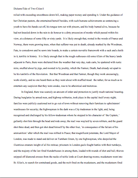
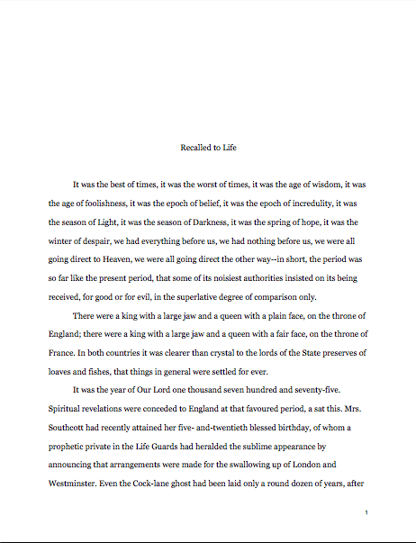
Let’s see why all of those things are necessary, from a professional point of view. Speaking of Tiny Tim, let’s call upon our old friend Charles Dickens again to see what a page of a manuscript should look like,

Nice and easy to read, isn’t it? (Assuming that you find it so, of course. If it’s too small to read easily on your browser, try holding down the COMMAND key and hitting + until the type is large enough to read comfortably.)

To give you some idea of just how difficult it would be to read, much less hand-edit, a manuscript that was not double-spaced or had smaller margins, take a gander at this little monstrosity:

I believe the proper term for this is reader-hostile. Even an unusually patient and literature-loving Millicent would reject a submission like this immediately, without reading so much as a word. As would, more often than not, Mehitabel.

Did I hear a few spit-takes during that last paragraph? “My goodness, Anne,” those of you who are wiping coffee, tea, or the beverage of your choice off your incredulous faces sputter, “why would any sane person consider presentation violations that serious an offense? It is, after all, precisely the same writing.”

Well, think about it: even with nice, empty page backs upon which to scrawl copy edits, trying to cram spelling or grammatical changes between those lines would be well-nigh impossible. Knowing that, Millicent would never dream of passing such a manuscript along to the agent who employs her; to do so would be to invite a stern and probably lengthy lecture on the vicissitudes of the life editorial — and that fact that, despite impressive innovations in technology, most line editing a single-spaced document in either hard or soft copy is well-nigh impossible.

Too hard on the eyes — and where on earth would the comments go on the hard copy?

Don’t tempt her to reject your submission unread — and don’t even consider, I beg of you, providing the same temptation to a contest judge. Given the sheer volume of submissions Millicent reads, she’s not all that likely to resist. The contest judge, on the other hand, will be specifically instructed not to resist at all.

Yes, really. Even if the sum total of the provocation consists of a manuscript that’s shrunk to, say, 95% of the usual size, Mehitabel is likely to knock it out of the running on sight.

Some of you are blushing, aren’t you? Perhaps some past contest entrants and submitters who wanted to squeeze in a particularly exciting scene before the end of those requested 50 pages?

No? Let me fill you in on a much-deplored practice, then: faced with a hard-and-fast page limit, some wily writers will shrink the font or the margins, to shoehorn a few more words onto each page. After all, the logic runs, who is going to notice a tenth of an inch sliced off a left or right margin, or notice that the typeface is a trifle smaller than usual?

Millicent will notice, that’s who, and practically instantly. As will any reasonably experienced contest judge; after hours on end of reading 12-point type within 1-inch margins, a reader develops a visceral sense of roughly how many characters fit on a properly-formatted page.

Don’t believe me? Go back and study today’s first example, the correctly formatted page. Then take a gander at this wee gem of tricky intent:

I shaved only one-tenth of an inch off each margin and shrunk the text by 5% — far, far less of a reduction than most fudgers attempt. Admit it: you can tell it’s different, can’t you, even without whipping out a ruler?

So could a professional reader. And let me tell you, neither the Millicents of this world nor the contest judges appreciate attempts to trick them into extraneous reading. Next!

The same principle applies, incidentally, to query letters: often, aspiring writers, despairing of fitting a coherent summary of their books within the standard single page, will shrink the margins or typeface on a query. Trust me, someone who reads queries all day, every day, will be able to tell.

The other commonly-fudged spacing technique involves skipping only one space after periods and colons, rather than the grammatically-requisite two spaces. Frequently, writers won’t even realize that this is fudging: as we’ve discussed, and recently, ever since published books began omitting these spaces in order to save paper, there are plenty of folks out there who insist that skipping the extra space in manuscripts is obsolete.

Including, as we have also discussed, some agents — and yes, Virginia, it is the submitter’s responsibility to check agency websites to make sure whether the particular agent to whom he is submitting happens to harbor that particular preference. If you encounter an agent who does, your path is clear — and feel free to shout this one out along with me, conscientious ‘Palooza-followers: if an agency’s guidelines ask for something specific in a submission, for heaven’s sake, give it to them. Just don’t generalize individual preferences to the entire industry.

If they don’t express a preference for single-spacing, stick to standard format, regardless of what you may have heard online about how nobody is using double-spacing after periods and colons anymore. It’s simply not true.

But that’s not what you’d think from the vehemence of the single-space faithful, is it? Frequently, the proponents will insist that manuscripts that include the space look hopelessly old-fashioned to agents and editors.

Well, guess what, cookie — standard manuscript format is old-fashioned, by definition; that fact doesn’t seem to stop most of the currently-published authors of the English-speaking world from using it. In fact, in all of my years writing and editing, I have never — not once — seen an already agented manuscript rejected or even criticized for including the two spaces that English prose requires after a period or colon.

I have, however, heard endless complaint from professional readers — myself included — about those second spaces being omitted. Care to guess why?

Reward yourself with a virtual partridge in a pear tree if you said that cutting those spaces throws off word count estimation; the industry estimates assume those doubled spaces. (If you don’t know how and why word count is tallied, please see the HOW TO ESTIMATE WORD COUNT — AND WHY category on the archive list at right.)

And give yourself five golden rings if you also suggested that omitting them renders a manuscript harder to hand-edit. We all know the lecture Millicent is likely to get if she forgets about that, right?

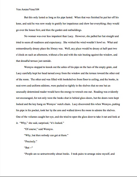
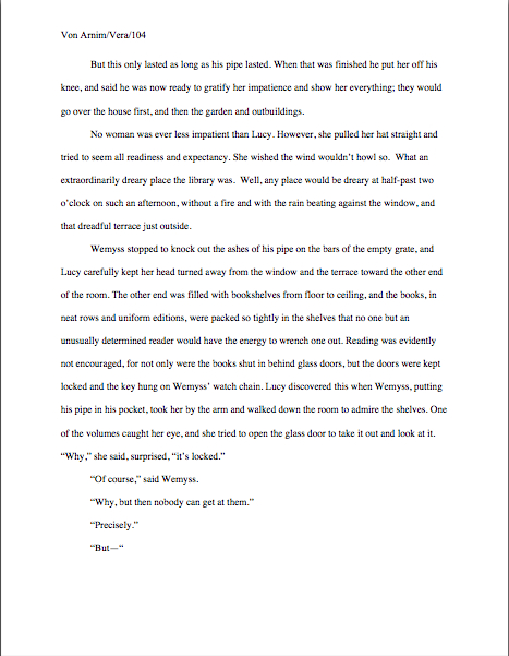
Again, a pro isn’t going to have to look very hard at a space-deprived page to catch on that there’s something fishy going on — and again, we’re going to take a gander at why. Since Dickens was so fond of half-page sentences, the examples I’ve been using above won’t illustrate this point very well, so (reaching blindly into the depths of the bookshelf next to my computer), let’s take a random page out of Elizabeth Von Arnim’s wonderful take on the Bluebeard myth, VERA:

Vera correctly

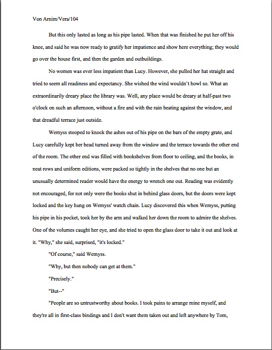
There are 310 words on this page; I wasn’t kidding the other day about how far off the standard word count estimations were. Now cast your eye over the same text improperly formatted:

Doesn’t look significantly different to the naked eye, does it? The word count is only slightly lower on this version of this page — 295 words — but enough to make quite a difference over the course of an entire manuscript.

Do I see some hands shooting up out there? “But Anne,” I hear some sharp-eyed readers exclaim, “wasn’t the word count lower because there was an entire line missing from the second version?”?

Well spotted, criers-out: the natural tendency of omitting the second spaces would be to include more words per page, not less. But not spacing properly between sentences was not the only deviation from standard format here; Millicent, I assure you, would have caught two others.

I tossed a curve ball in here, to make sure you were reading as closely as she was. Wild guesses? Anyone? Anyone?

The error that chopped the word count was a pretty innocent one, almost always done unconsciously: the writer did not turn off the widow/orphan control, found in Word under FORMAT/PARAGRAPH/LINE AND PAGE BREAKS. As we discussed only the other day, this insidious little function, the default unless one changes it, prevents single lines of multi-line paragraphs from getting stranded on either the bottom of one page of the top of the next.

As you may see, keeping this function operational results in an uneven number of lines per page. Which, over the course of an entire manuscript, is going to do some serious damage to the word count.

As would tinkering with the bottom margin to allow an extra line on the page. Here it is with only a minor change, a .9 inch bottom margin instead of 1 inch, a modification so minute that a non-professional reader would probably not notice that it was non-standard. To compress a bit more, let’s have only one space after each period.

Vera with extra line

A bit claustrophobic, is it not? If you don’t find it so, consider it as Millicent would: not as an individual page, isolated in space and time, but as one of the several thousand she has read that week. Lest we forget, most of the ones she will have been taking seriously will have looked like this:

Vera correctly

See it now? While Millicent is highly unlikely to have either the time or the inclination to whip out a ruler to check whether that bottom margin is really a full inch (although Mehitabel might), she will be able to tell that this page has more words on the page than the others she has seen that day. She might not be able to tell instantly precisely how this page has been modified, but she will be able to tell that something’s off.

“But Anne,” clever rule-manipulators all over North America shout, “I’ve been modifying my submissions this way for years, and nobody has ever called me out on it. Therefore, I do not believe it’s ever been a factor in my work being rejected — and it does allow me to stay under that all-important 400-page limit.”

Perhaps, rules-lawyers, but let me ask you a question: have you ever had such a manuscript accepted?

It’s an extremely common submitter’s misconception, especially amongst those brand-new to the game or who have only submitted pages as part of a query packet, rather than as requested materials, that if they were really doing something wrong, the rejecter would tell them so. In these days of form-letter rejections — and even no-reply rejections — this is simply an unrealistic expectation.

Especially for a formatting error. Since most submissions contain at least one — and remember, formatting problems, like spelling and grammar gaffes, tend to travel in packs — and since non-adherence to standard format is so universally regarded as symptomatic of a lack of professional knowledge, it would be prohibitively time-consuming for Millicent to scrawl try learning how to format a manuscript, then resubmit.

No, regardless of whether the ultimate rejection trigger was that extra line per page, the second misspelling in paragraph 2, or a premise that Millicent has seen seventeen times that week, the reasons given for sending back the submission will probably run like this: I’m sorry, but this manuscript does not fit our needs at this time. I just didn’t fall in love with this story, and I don’t feel that I can sell this in the current tough market. Best of luck placing it elsewhere.

The moral of this sad, sad story: it seldom pays to assume that you’re doing it right just because you haven’t been told you are doing it wrong. And it pays even less often to conclude from the generalities of a boilerplate rejection that there can’t have been any specific technical problem that caused Millicent, if not to reject it outright, then at least to take the submission less seriously.

Besides, there was another notorious agents’ pet peeve in an earlier example — although, frankly, it would have irritated a contest judge far more than Millicent. Here’s the page again; see if you can spot it this time. (Hint: it was not in the properly-formatted version.)

Take ten lords a-leaping out of petty cash if you ran your eyes thoughtfully over this example and became riveted to the next-to-last line of the page: an emdash (“But—“) instead of a doubled dash. Here again, we see that the standards that apply to printed books are not proper for manuscripts.

Which brings me to yet another moral for the day: just because a particular piece of formatting looks right to those of us who have been reading books since we were three doesn’t mean that it is correct in a manuscript.

Or book proposal. Or contest entry.

Remember, Millicent reads manuscripts all day; contest judges read entries for hours at a time. After a while, a formatting issue that might well not even catch a lay reader’s attention can begin to seem gargantuan.

Please don’t dismiss this as unimportant to your success as a writer. If writing is solid, it deserves to be free of distracting formatting choices. You want agents, editors, and contest judges to be muttering, “Wow, this is good,” over your manuscript, not “Oh, God, he doesn’t know the rules about dashes,” do you not?

Spare Tiny Tim the chagrin, please; both you and she will be the happier for it. Believe me, she could use a brilliantly-written, impeccably-formatted submission to brighten her possibly Dickensian day. Be compassionate toward her plight — and your submission’s, proposal’s, and/or contest entry’s. Pay close enough attention to the technical details that yours the submission that makes her say, “Oh, here is good writing, well presented.”

Do you feel your self-editorial eyes sharpening? Excellent. Next time, I’ll bring more practical examples as whetting stones. And if you can manage to wipe that completely distasteful metaphor from your mind until tomorrow, keep up the good work!

Formatpalooza, part XI: setting some boundaries, or, wait, Millicent — why have you stopped reading?

Carcassone outer wall

Have you been enjoying our in-depth guided tour of the manuscript from the top down? Not gone tumbling down any parapets, have we>

No, that’s not just some clumsy publishing-world metaphor. So far, we’ve talked about the piece of paper on top of the submission stack, the title page; we’ve talked about the next sheet of paper, the first page of text and how it differs from both the title page and the pages that come after it; we’ve extrapolated from that first page to standards for the first page of each chapter and any titled section breaks.

Now, it’s time to talk about all of those pages in the middle Perhaps, while we’re at it, we could engage in some more of those nifty compare-and-contrast exercises we engaged in so fruitfully last time.

Hard to contain your enthusiasm within reasonable boundaries, isn’t it?

Okay, so it’s not a particularly sexy topic, but it’s a really, really good idea for an aspiring writer to devote some serious time to comparing properly and improperly formatted manuscripts. Writing time is precious for all of us — and scarce for most of us — and school compare-and-contrast exercises left most graduates with but think of it as an investment in your writing career: once you’re learned to spot formatting problems easily, you’ll be a much, much more effective proofreader. Not to mention being able to format your manuscripts correctly from the get-go.

Oh, that doesn’t sound like much of a door prize to you? Just wait until you’re trying madly to pull a submission packet together overnight in response to a request for materials, or frantically constructing a contest entry four hours before it needs to be postmarked. Or, even more stressfully marvelous, responding to a last-minute revision request from the editor who had originally told you that manuscript had been accepted as complete.

Believe me, when any of those stressful-but-happy days come, you’ll be very grateful then for every nanosecond that you don’t have to squander on wondering if your margins are consistent.

Because they had better be: believe me, our old pal, Millicent the agency screener, is very quick to discern the difference between a professionally-formatted manuscript and, well, everything else. At the end of a long day’s reading, they definitely jump out at her, and with good reason: once a professional reader gets used to seeing the similarities that pretty much all professional manuscripts share, submissions formatted in other ways might as well have UNPROFESSIONAL stamped on them in bright red ink.

And while Millicent, bless her literature-loving soul. may strive valiantly not to allow that impression to color her reading of the submission itself, it’s just not a good idea to assume that it won’t. She’s only human, after all.

It’s an even worse idea to assume a charitable reading for a contest entry, by the way. If anything, contest judges tend to be even more sensitive to the beauty of standard format than Millicent, for the simple reason that they’ve usually been reading a whole lot longer. The agency gig may well be Millie’s first job out of college, but the judge handed your entry may well have just retired from a long and fruitful career teaching English composition.

I don’t want to frighten any of you out of entering literary contests, but her fingers positively ache for the red pen of correction.

This is not entirely accidental — most well-respected contests require some professional credentials from their judges, either as writers, editors, or teachers. Which means, in practice, that judges have often been writing in standard format themselves for years or bludgeoning other writers into compliance with its requirements.

Translation: non-standard formatting won’t look right to them, either. By now, you’re having a similar reaction, aren’t you?

Don’t think you’ve been developing professional eyes throughout this autumn of ‘Paloozas? Or don’t want to believe you could conceivably share any traits with Millicent? Let’s test the proposition by trying a little Aphra Behn on for size.

If you don’t know her work, you should, at least historically: as far as we know, she was the first woman paid for writing in English — which, as Virginia Woolf pointed out, means that every female writer who earns so much as a sou from it now should be laying wreaths on her grave in gratitude.

Our girl Aphra’s also hilarious — and if you think it’s easy for a joke written in 1688 to remain funny today, well, I look forward to reading your comedic stylings in the year 2332.

Don’t believe me? Slip your tootsies into Millicent’s moccasins and consider the following page from THE FAIR JILT. (As always, if you’re having trouble reading the small writing, enlarge the image by holding down the COMMAND key and pressing +.) I defy you not to be too distracted by the story to notice how the page is put together.

Seriously, try not to think at all about the fact that Millicent probably would not even start to read this version. Don’t worry your pretty little head over why.

the fair jilt wrong

You clever souls could tell instantly that there was something wrong here, couldn’t you, and not just because Miranda’s trying to seduce her priest? (For convent, read monastery.) Set aside Aphra’s practically Dickensian affection for semicolons for the moment — which would tend to turn off a modern Millicent pretty quickly — and let’s ponder why this page almost certainly would not get a fair reading in a present-day agency.

Before you commit yourself irrevocably, here’s what it should have looked like in standard format:

Aphra Behn right

Quick, tell me: what’s the reason our Millie would not bother to start reading the first page 10, but would read the second?

If you flung your hand into the air and shouted, “The 10-point type, Anne! It will strain her already overworked eyes,” pat yourself on the back 47 times. If you also added, “And the Ariel typeface probably didn’t help here, either,” make that 48.

Why is the first in particular almost always a deal-breaker? She’s used to seeing every manuscript heading out of the agency to publishing houses in 12-point Times New Roman, so that first example — feel free to chant it with me here, ‘Palooza followers — it just doesn’t look right.

And why should she waste her time with that tiny type? She absolutely could not forward it to her boss that way; agents are susceptible to eye strain, too.

But those unfortunate cosmetic choices are not the only problems with the first version, are they? Let’s turn our magnifying glasses to the top of the page: the incorrect version does not have a proper slug line. Seeing this lone page out of context, it’s quite obvious why a slug line is a dandy idea, isn’t it? Without it, how would it be even remotely possible to return this wandering page back into the manuscript from whence it came.

“Who wrote this?” Millicent cries in ire, glaring around her cubicle at the 47 manuscripts lying there. “This stray piece of paper could be from any of these!”

At least Ms. Behn thought to number the pages of Example #1 — but did you catch the problem with how she did it? The page number is in the bottom right-hand margin, rather than in the slug line, where it belongs. And it’s so far down in the footer that the number got caught off halfway during printing.

Did you catch any other problems that might register on Millicent’s umbrage meter? What about that right margin? Mighty straight, isn’t it? That look proper to you?

What’s going on here is called block-justification, another problem that can be laid squarely at the feet of those who insist that a manuscript and a published book should be identical. The text in many published books, and certainly in many magazines and newspapers, is spaced so that each line begins at exactly the same distance from the left-hand edge of the page and ends (unless it’s the last line of a paragraph) at exactly the same distance from the right-hand edge of the page.

Why would this species of neatness bug the heck out of professional readers? A very practical reason indeed: it renders skimming quite a bit more difficult.

Why? Well, block formatting provides fewer landmarks, as it were, to the glancing eye, As you may see for yourself, Practically every line of narrative text resembles every other. To those of us used to the ragged right margins and even letter spacing of standard format, it’s actually kind of hard to read.

So there’s quite a bit in Example #1 that’s distracting from the actual writing, isn’t there? Doesn’t help sell the text, does it?

Okay, all of these rhetorical questions in a row are beginning to make me dizzy, so let’s move on to Example #2, the one Millicent and a contest judge would like. To save your weary fingertips a modicum of scrolling (hey, I do what I can), here it is again:

Aphra Behn right

Now, let’s take a gander at the same page in — ugh — business format; if you don’t know why it’s ugh-worthy, you might want to revisit my earlier post on the immense value of indentation.

Startlingly different, isn’t it, considering that I made a grand total of two formatting changes?

You did catch both of them on your skim through, right? All I did was I eliminate the indentations at the beginning of each paragraph and skipped a line between paragraphs to produce the norm for business correspondence, as well as for most of the text currently posted on the Internet. (Including this blog, unfortunately. As a professional writer and reader of manuscripts, it drives me nuts that my blogging program won’t allow me to indent paragraphs like a literate human being.)

Again, why is Millicent unlikely even to start reading that last rendition of page 10? Because — wait for it — it just doesn’t look right.

In fact, in both submissions and contest entries, business format is often grounds all by itself for knocking a manuscript out of finalist consideration. Finding yourself asking why again? Well, technically, indented paragraphs are grammatically requisite, so to a judge, non-indented paragraphs may well seem as great a violation of everything we hold dear as frequent misspellings or use of the wrong form of there, their, and they’re.

(Since not all of you laughed, allow me to beg you nervously: please tell me that some English teacher took the time to teach you the rules governing there, their, and they’re. We all see them used incorrectly so often nowadays that I shall not rest easy until I am positive that each and every one of you is aware that there refers to a place, their means belonging to them, and they’re is a contraction for they are. While I’m at it, I’d also like to point out that that it’s is a contraction for it is, whereas its means belonging to it. Thank you for humoring me; time to get back to the post already in progress.)

Fortunately for judges and Millicents who care deeply about the health of the language, errors seldom come singly in entries and submissions. Like spelling errors, formatting mistakes are apparently social: they like to travel in packs, roving all over a manuscript like Visigoths sacking Rome.

As a result of this convenient submission phenomenon, a manuscript that contains errors within the first few lines (or on the first page) is easy for a professional reader to dismiss; statistically speaking, it’s a pretty good bet that if Millicent kept reading the pages following a technically flawed opening, she would find more causes for umbrage.

Given how many submissions she has to screen between now and lunch, do you think she is going to (a) press on in the hope that the first error was a fluke, or (b) leap to the (perhaps unwarranted) assumption that there is more of the same to come and reject it right away?

I leave that one to your fine critical faculties to answer. Let’s just say that her umbrage-taking threshold tends to be on the low side, especially immediately after she has taken a sip from that too-hot latte that always seems to be by her side when we are watching her in action. (Let it cool next time, okay, Millie?)

Why am I bringing this up in the middle of a discussion of the perils of business format? Well, for starters, an ever-increasing number of agents are not only accepting e-mailed queries (a genuine rarity until quite recently), including some who ask queriers to include the opening pages, a synopsis, and/or other writing samples with their queries. Since few agents open attachments from writers with whom they’ve had no previous contact, many request that those opening pages be included in the body of the e-mail, pasted just below the letter.

Sense a potential problem barreling in our general direction? That’s right: most e-mail programs are not set up for easy tabbing; consequently, business format is the norm for e-mail communications. But that doesn’t mean that the Millicent assigned to screen those queries won’t turn up her nose at non-indented paragraphs in those pages.

Again, why? Are you sitting down, dislikers of indentation?

I hate to be the one to break this to you, but there are Millicents out there — and agents, editors, contest judges, and literate people everywhere — who will leap directly from noting a lack of indentation and unwarranted spaces between paragraphs to our old friend, option (b): if the submitter is not aware of how to format a paragraph of English prose properly, she reasons, aren’t there inevitably more snafus to come?

Now, not every Millicent — or agent, judge, etc. — will have this knee-jerk reaction, of course. But do you really want to take the chance that she’s not going to seize the opportunity to save herself a little time?

The specter of illiteracy is not the only reason using business format is likely to cost you, either. To a professional reader, the differences between the last two examples would be more than visually jarring — they’d be downright confusing. In standard format, the only reason for a skipped line between paragraphs would be a section break, so Millicent would be expecting the second paragraph to be about something new.

Okay, so a misconception like that might distract her attention for only few consecutive seconds, but let’s not kid ourselves: your garden-variety Millicent is spending less than a minute on most of the submissions she rejects — it’s actually not all that uncommon for her not to make into the second or third paragraph before reaching for the SASE and a copy of that annoying form rejection letter.

Take a moment for the implications to sink fully into your overtaxed brainpan. Don’t worry; I’ll wait.

While those of you new to the speed with which rejection typically occurs are already in shock, let me add for the sake of anyone who doesn’t already know: those who regard business format as a symptom of creeping illiteracy — hey, I just report the news; I don’t dictate it — are every bit as likely to frown upon it just as much in a query letter or synopsis as in a manuscript submission.

Time loss is not the only reason she might take umbrage at momentary confusion. Let me let you in on a little secret: professional readers, especially those who inhabit agencies and publishing houses, tend not to be overly fond of having their mental image of the story they are reading at the moment jarred.

How do I know this? Well, for one thing, they commonly refer to it as being tricked. As in, “I hate being tricked by a first paragraph that is about someone other than the protagonist.”

There’s a practical basis to this dislike, but it’s kind of complicated. I wrote a couple of fairly extensive posts on the subject a while back (here’s a link to the first, and here’s a link to the second, in case you’re interested), but I’ll run over the thumbnail version now.

Is everybody comfortably seated? My thumbnails are a tad long. (Just try to get THAT image out of your head anytime soon.)

To get through all of the submissions she’s assigned to screen each week, Millicent has to read quite quickly, right? If she doesn’t, she’ll get buried in paper, as basically, she’s got to make it through WAR AND PEACE several times over before she toddles wearily homeward on Friday afternoon.

That’s a whole lot of material to remember, by anyone’s standards — and remembering actually is important here. If she decides to allow a manuscript to make it to the next level of consideration, she is going to need to be able to tell her boss what the book is about: who the protagonist is, what the conflict is, why that conflict is important enough to the protagonist for the reader to be drawn into it, and so forth.

In essence, she’s going to need to be able to pitch it to the higher-ups at the agency, just as the agent is going to have to do in order to sell the book to an editor, and an editor is going to have to do in order to convince his higher-ups that the publishing house should acquire the book.

And, often, as first-round contest judges will need to do on an evaluation form in order to pass an entry onto the next round.

Okay, brace yourself, because explaining what comes next involves delving into one of the great cosmic mysteries that has long perplexed aspiring writers the world over. It’s not for the faint of heart.

Remember earlier in thus series, when I mentioned that agents and editors don’t read like other people? Well, one of the primary differences is that from line one of page one, they’re already imagining how they’re going to pitch this book. So if paragraph 2 or 3 (or page 2 or 3) suddenly informs them that their mental patter has been about the wrong character, they feel as if they’ve been backing the wrong horse.

And while there may have been any number of perfectly reasonable narrative reasons for the text to concentrate upon an alternate character for the opening, unless the writing and the story have already really wowed Millicent, her resentment about being tricked actively misled mistaken about the identity of the protagonist is often sufficient to make her reach for that SASE and form letter.

Feel free to go scream into the nearest pillow over that last piece of convoluted logic; you don’t want to keep that kind of existential cri de coeur pent up inside. I’ll wait until it’s out of your system.

Feel better? Good.

Before you go rushing off to see if your opening paragraphs might possibly be laying you open to a charge of trickery — because, for instance, you might have taken the bold authorial step of noticing that there is more than one human being in the world, and written about an interpersonal relationship accordingly — let’s return to the formatting issue that prompted my little segue into the psychology of resentment. Can we extrapolate any practical lesson about business format from it?

You bet your boots we can: it’s not a good idea to give the impression of a section break where there isn’t one. And when producing pages for people who read all day, you might want to stick to the rules governing written English and indent your paragraphs.

Starting to feel more at home with standard format? Excellent; my evil plan plot for world domination teaching strategy is working. Keep up the good work!

Formatpalooza, part X: look, darling! The majestic manuscript slug, running free in its natural habitat!

flooded ditch

No, Virginia, that squiggly brown thing near the bottom edge of the photo is not in fact a slug, literary or otherwise: I think it’s merely a well-camouflaged stick. Because I love you people — and because so many of you have told me that you tune into Author! Author! first thing in the morning, perhaps so you may peruse it while sipping your favorite caffeinated morning beverage — I would not present you with a close-up of a slug, stealthily or otherwise.

Hey, Millicent the agency screener’s not the only one susceptible to performing a spit-take with a too-hot latte.

Have we been talking so intensely about the first couple of pages of your manuscript — the title page, the first page of text — that standard format has invaded your dreams yet? I wouldn’t be entirely surprised if it had: this series on what professional manuscripts look like has been both example-ridden and extraordinarily nit-picky, even by my standards of detail-orientation. So you probably won’t be altogether astonished to learn that before we move on from the first page of the text (and of each chapter) to considering an ordinary page, I want to devote today to pagination.

And slug-lovers everywhere rise up to dance in the rain-slick streets!

Seriously, don’t groan; it’s an important issue. Not numbering your manuscript, book proposal, or contest entry’s pages an almost universal instant rejection offense; trust me, Millicent is going to notice how and if you do it. In fact, as cosmetic issues go, how and where an aspiring writer chooses to place the page number on the page can tell our Millie a tremendous amount about him.

Specifically, whether he has done his homework about submission, because there is only one place on a manuscript page that it is permissible to place a page number: in the slug line.

Is everybody quite sure where that is on the page? Just to be on the safe side, let’s take another gander at an example from last time.

memoir w ch title

See the slug frolicking in the upper left-hand margin? How happy it looks in its natural habitat.

The top margin is the page number’s natural habitat as well — which seems to come as a surprise to many aspiring writers. Let’s go ahead and forge a new axiom about it: the page number belongs within the slug line, rather than anywhere else on the page.

This is as proper on page 139 of a book manuscript as on page one. While we’re noticing such things, I would also like to call your attention to the fact that in each of these examples, the page’s only reference to the author’s name or the title of the book appears in the slug line.

That, too, would work equally well on p. 139 as on page 1. Sensing a pattern here?

I sincerely hope so, because the slug line confuses a lot of aspiring writers; until you have seen piles and piles of professional manuscripts, it looks kind of funny. So much so that to some would-be submitters, heads swimming from having been told over and over again that a manuscript should have a 1-inch margin on all sides, find it counterintuitive to add a line of text, even such a short one, within that margin.

But I assure you, it’s traditionally done that way. And why? Intrepid ‘Palooza followers everywhere, chant it with me now: because like every other aspect of standard format for manuscripts, placing the slug line there just looks right to professional readers.

Yes, that logic is a trifle tautological, now that you mention it. If you have a problem with that, I would suggest taking it up with the powers that rule the universe. As I believe I may have pointed out once or twice earlier in this autumn of ‘Paloozas, I do not count myself amongst those powers.

If I did, Microsoft Word would be set up to create documents in standard format automatically, Word for Mac and Word for Windows would be set up so those using one could easily give formatting advice to those using the other, air pollution would be merely a thing of distant memory, and ice cream cones would be free on Fridays. Oh, and the little girl across the street who believes slugs are her totem animal would come to liberate her little friends from my garden on a daily basis, rather than on a monthly one.

As none of these things seems to be true, let’s get back to business: how does one create that pesky slug line, anyway?

Back in the days when typewriters roamed the earth, it was perfectly easy to add a slug line to every page: all a writer had to do was insert it a half-inch down from the top of the page, left-justified, floating within the 1-inch-deep top margin. For word-processed documents, it’s a trifle more complicated.

The slug line still belongs in the same place, .5 inches from the top of the paper, suspended in the middle of the requisite 1-inch top margin. But instead of laboriously typing it on each page individually as writers did in the bad old days, one simply inserts it in the header. In most versions of Word (I can’t speak for all of them), the header may be found under the VIEW menu.

Before the Luddites out there trot out their usual grumble about the bother of tracking down the bells and whistles in Word, think about this: placing the slug line in the header also enables the writer to take advantage of one of the true boons of the advent of word processing, pages that number themselves.

As opposed to having to do it manually, laboriously retyping the slug line in its entirety on each and every page of the manuscript.

Oh, you may laugh, but several times each year, I receive a manuscripts constructed by a writer who was not aware that Word would do this for her. Instead of utilizing the header function, the poor writer will have elected to include the necessary information on the first line of text on the page.

Not only does this unfortunate misconception involve an absolutely monumental and ultimately unnecessary effort, but the result doesn’t pass the all-important does it look right? test. Take a peek for yourself:

See how pulling the slug line down into the text messes with the spacing of the page? Here, an entire line of text is sacrificed to it — and let me tell you, that line is not going to go quietly.

How so, you ask? Well, think about it: what’s inevitably going to happen if the author decides to insert a new sentence or two on a page formatted this way? That’s right: the writer is going to have to go back and move each and every one of those slug lines to match the NEW pagination.

I’d show you a practical example of this, but it’s just too tragic to contemplate. Trust me, it would be a heck of a lot of work, and writers who do it are likely to end up beating their heads against their studio walls.

Take a moment to peruse that last example again. See any other problems with the slug line? How about the fact that it includes the word page? Shouldn’t be there; just the numbers will suffice.

Did I just hear some huffs of indignation out there? “But Anne,” the formatting-ambitious cry, “I think it looks kind of classy to include page before the page number? It’s kinda stylish. If it’s just a matter of personal style, who could possibly be hurt by including it, if I like the way it looks?”

Well, you, for starters. And why? (Chanters, ready your lungs.) Because it just would not look right to someone who reads manuscripts, book proposals, or contest entries on a regular basis.

No kidding — I’ve seen screeners get quite indignant about this one. “Does this writer think I’m stupid?” Millicent is prone to huff. (Don’t bother to answer that question; it’s rhetorical.) “Does she think I don’t know that the numeral that appears on every page refers to the number of pages? Does she think I’m going to go nuts and suddenly decide that it is a statistic, or part of the title? Or maybe a wayward date that’s wandered off to the wrong part of the page?”

Don’t bait her; the lady has a hard life, even when she doesn’t accidentally burn her lip on a too-hot latte. Make her happy: do it the approved way.

Okay, did you spot any other problems? What about the fact that the first character is in a different typeface from the rest of the text? Or the equally disturbing fact that the first paragraph of the chapter is not indented?

Again, the writer may consider this nifty, but I can assure you, Millicent won’t. Fortunately for her blood pressure, the odd typeface for the first letter, in imitation of the illuminated texts hand-written by monks in the Middle Ages, doesn’t turn up all that often in manuscripts other than fantasy and YA, for one simple reason: books in that category are more likely to feature this it’s-a-new-chapter signal than others. But once again, what an editor may decide, rightly or wrongly, is appropriate for a published book has no bearing upon what Millicent expects to see in a manuscript.

Save the manuscript illumination for someone who will appreciate it. Hop in your time machine and track down a medieval monk to admire your handiwork, if you like, but in this timeframe, keep the entire manuscript in the same typeface and size.

The non-indented first paragraph of a chapter is fairly common in mystery submissions, I have noticed, and starting to become more prevalent in other kinds of fiction as well of late. (For an interesting discussion about why, please see the comments on this post and this one.) In fact, I’ve been told by many mystery writers — and rather tersely, too — that eschewing indentation in this context is an homage to the great early writers in the genre, an echo of their style, so who is yours truly to try to talk them out of that gesture of respect?

Well, since you asked, I’m someone familiar with what Millicent expects to see on a page — as well as someone who is aware that almost without exception, in Edgar Allan Poe’s time all the way down to our own, the editor has determined the formatting that appeared on any given printed page, not the author. To professional eyes, especially professionally peevish ones like Millicent’s, a manuscript that implicitly appropriates this sort of decision as authorial might as well be the first step to the writer’s marching into Random House, yanking off a well-worn riding glove, and striking the editor-in-chief with it.

It’s just not a good idea for someone brand-new to the biz to do.

Yes, you read that correctly: non-standard formatting choices are occasionally interpreted as a challenge to editorial authority. And while we could speculate for the next week about the level of insecurity that would prompt regarding a minor formatting choice as a harbinger of incipient insurrection, is the manuscript of your first book really the right place to engender that discussion amongst Millicent and her cronies?

Exactly. Save the formatting suggestions for a long, intimate discussion over coffee with your editor after she acquires the book. You’ll probably lose any disagreement on the subject, but at least you will have made your preferences known. Until that happy, caffeine-enhanced day, just accept that the industry prefers to see every paragraph in a manuscript indented the regulation half-inch.

It just looks right that way.

While we’re at it, how about the bolded chapter number and title in that last example? Nothing in a manuscript should be in boldface. Nothing, I tell you. Uh-uh. Not ever. (Except for that nonfiction exception we talked about last time. And I have seen authors get away with bolding the title on the tile page, but frankly, I wouldn’t chance it in a first book submission.)

Nor should anything be underlined — not even names of books, magazines, or song titles. Instead, they should be italicized, as should words in foreign tongues that are not proper nouns.

Yes, Virginia, back in the day when typewriters roamed the earth, underlining was the norm, for the simple reason that most typewriters did not have italic keys. So if you consult an older list of formatting restrictions or one intended solely for short story formatting — both of which seem to be circulating at an unprecedented rate on the web of late, pretty much always billed as universally-applicable rules for any type of writing, anywhere, anyhow, a phenomenon which simply does not exist — you might conceivably be told that publications, song titles, and/or foreign words (sacre bleu!) should be underlined. But trust me on this one: any agent is going to tell you to get rid of the underlining, pronto.

And why? All together now: because it just doesn’t look right that way.

All right, campers, do you feel ready to fly solo into a critique of a first page? Here are two pages of text, studded with standard format violations for your ferreting-out pleasure:

How did you do? Are those problems just leaping off the page at you now? If not, ask yourself: does that first page contain information that ought to be on the title page instead? Are the margins even? Are the paragraphs formatted correctly? And so forth.

In fact, it’s a terrific idea for any aspiring writer to get into the habit of asking those types of questions immediately after clapping eyes upon any manuscript, his own or anybody else’s. Why? Because that’s Millicent’s first instinct. However literature-loving a she may be, she sees so many incorrectly-formatted submissions that a properly-formatted one automatically looks at first glance like more professional writing to her.

As, with practice, it will to you. I promise. To get that ball rolling, as well as to reward you for so much hard work — or to provide you with some helpful comparison, depending upon how you did on that last little test — here are a couple of correctly-formatted pages, to soothe your tired eyes:

good example page 1

good example page 2

Whenever you start finding yourself chafing at the rules of standard format, come back and take a side-by-side gander at these last sets of examples, to regain perspective on what standard format is and why it’s important in a submission, proposal, or contest entry. I assure you, after a professional reader like Millicent has been screening manuscripts all day, every day for even a couple of months, every time she sees the bad example, mentally, she’s picturing the good example right next to it.

Small wonder, then, that — wait for it — manuscripts that look right get taken more seriously than those that don’t. Regardless of how you may feel about Millicent’s literary tastes, isn’t a serious read from her what you want for your book? Or your book proposal? Or your contest entry?

Did you notice that I snuck us from the first page of the text into the second in my last example? Next time, we’ll continue delving into the mysteries of the mid-manuscript page. On Friday, I’ll be offering a little reward for all of your virtue.

Hey, if treading the path of virtue is rewarded nowhere else on earth, it is here at Author! Author! Keep up the good work!

Formatpalooza, part IX: areas of authorial discretion, or, there are rules, and there are rules

full moon in the gutter

At the risk of seeming trite, I would like to point out that it has been raining a great deal in Seattle of late. Not the normal constant misty drizzle that characterizes our dark Pacific Northwest winters, but sheets. Buckets. The proverbial cats and dogs, with an antelope or two thrown in by whatever celestial water-monger has seen fit to try to drown us.

I’m not saying we’re worried. I’m saying my neighbors came over this evening to ask how long a cubit was, so they could read the blueprints for their ark.

But enough idly wondering where on earth they found a pair of yeti for their menagerie. Time to get back to the matter at hand: manuscript formatting.

Over the last couple of posts, we have been gladdening our hearts (okay, gladdening my detail-loving editorial heart) with discussion of something that Millicent the agency screener just loves to see, a properly-formatted first page of a manuscript, as well as phenomena she sees more often, but likes less, various species of improperly formatted page 1. The Millicent-pleasing version looked, if you will recall, a little something like this — and, as always, if you’re having trouble seeing the details, try enlarging the image by holding down the COMMAND key and pressing + repeatedly.

good example revised

Now that’s a lovely page 1: unprovocative, professional-looking, and flaunting lots of nice, clean white space at the top. “Ah,” Millicent murmurs, settling back into her chair, “now I can concentrate on the writing and the story.”

Contrast that, please, with the much more cluttered short story format all too many book and book proposal submitters mistakenly believe is universally applicable to any writing on paper:

Pretty distracting to the eye, is it not? Admittedly, not all embracers of this format will choose to clutter the space up further with an epigraph — which, as we discussed last time, it not generally the best idea at the submission stage, no matter what you want the published version of your book to look like — but one does not need to be the Amazing Kreskin to predict that their submission packets all share another unprofessional characteristic: no title page.

How do I know that? Well, think about it: since all of that eye-displacing verbiage — title, book category, word count, contact information — would in a properly-constructed submission packet appear on the title page, why would a submitter repeat all of it at the top of page 1?

Both page 1 and the opening of each subsequent chapter should include all of the spaciousness of that first example, not launching into the text until 14 single lines from the top of the page. (Or, to put it another way, 6 double-spaced lines under the chapter title. And for those of you who do not know how to insert a hard page break into a Word document, it’s located under the INSERT menu. Select BREAK, then PAGE BREAK.)

Did that bit about the subsequent chapters catch any of you by surprise? To prevent that kind of confusion in future, let’s go ahead and hatch a new axiom: each new chapter should begin on a fresh page, but the first page of every chapter should be formatted exactly like page 1.

Yes, Virginia: exactly, at least in terms of formatting. Since the book’s title should appear on the title page, why would the opening of the book and the opening of Chapter 6 be different?

So you may see that in action (and to prove that I practice what I preach), here’s what could be the first page of Chapter Six my memoir:

Memoir wo title

I said could, because actually, I’m not a big fan of chapters named Chapter Six, even if they happen to be the sixth chapter in the manuscript. It’s sort of like dubbing a suburban street lined with elm trees Elm Street: there’s nothing inherently wrong with a straightforward, descriptive title, but you must admit, it’s not startlingly original.

It’s not precisely going to come as a shock to many readers when Chapter Six appears immediately after Chapter Five, after all. At least not readers whose counting skills have moved past their first hand.

Speaking of hands, I see many of them waving in the air, apparently trying to attract my attention. “Okay, Anne,” those of you fond of naming things inquire, “how should a chapter title appear on the page, if I also want to number it? Or do I need to choose between numbering and titling?”

Not at all — go ahead and include both, if that makes you happy. In fact, it’s actually a little easier for agents and editors if you do number titled chapters; it’s simpler for a feedback-giver to say, “Please tone down the snarkiness in Chapter 6 of your memoir, Ermintrude,” than “You know the snarky tone in the chapter called something like How I Had My Way with Ocelots, or, Twenty-seven Ways to Skin a Cat? Give it a rest, Ermintrude.”

The formatting is very simple: just add the chapter title on the second double-spaced line of text, centered under the chapter number designation. (Freeing up mental space to speculate: what was Ermintrude doing with all of those ocelots?)

This format should sound at least a trifle familiar: we’ve already seen it in action in today’s first example. But in furtherance of my ongoing mission to place so many examples of correctly-formatted manuscript pages in front of your weary eyes that you’ll start automatically recoiling from pages in published books, muttering, “Well, that wouldn’t work in a manuscript submission, let’s take a gander at another one:

memoir w ch title

Actually, I had an ulterior motive in showing you that last example: in comparing it to the example just before it, do you notice anything about the amount of space between the chapter number and the beginning of the text?

If you immediately shot your hand into the air, exclaiming, “By gum, Anne, the area between the two appears identical! You’ve simply placed the chapter title within it, you clever lady,” award yourself an extra helping of hot fudge on your sundae. (If devoting a couple of weeks to discussing standard format doesn’t entitle an aspiring writer to dessert, nothing does.)

Regardless of whether a chapter’s opening page contains a chapter designation, a title, or both, the text should begin the same distance from the top of the page. The same logic would apply to any other information you might see fit to include at the beginning of a chapter — alerting the reader to a break between Part I and Part II of a book, for instance.

Since so many aspiring writers ask me about part breaks — hey, I’m not known as the Format Queen for nothing; I would much, much rather that my readers ask me than misformat their submissions — let’s take a look at the phenomenon in action. If Chapter 6 were the beginning of Part II of my memoir (it isn’t, but we aim to please here at Author! Author!), I would have formatted it thus:

memoir w part break

Starting to get the hang of this? Okay, let’s talk about inserting another common piece of introductory information in that heading: identifying a narrator-du-chapter in a multiple point-of-view novel.

If the switch comes at the beginning of a chapter, it couldn’t be easier: it’s simply another reader-signal that belongs above the pre-text white space, right? To see this principle in action, let’s pretend our ongoing example is fiction (which it isn’t; my middle school honestly was pelted with migratory spiders) and place the narrator’s name in the traditional spot:

new chapter with name

That’s the way one would handle the matter in a multiple POV manuscript like, say, Barbara Kingsolver’s THE POISONWOOD BIBLE, where the narrator changes with the chapter. If there were also a chapter title (perhaps not advisable in this case, as there’s already significant information at the top of that page for the reader to absorb), it would go between the chapter heading and the narrator identifier.

The important thing here is to be consistent — and that’s not always easy. Most seasoned authors probably wouldn’t appreciate my revealing a working secret, but pretty much everyone worries that someday her will forget to hit return one of the necessary times, so that Chapter 5 will begin — gasp! — twelve lines from the top, while Chapter 1-4 and 6 on will begin fourteen lines down.

Gives you the willies even to contemplate how Millicent might react to that level of formatting inconsistency, doesn’t it? Double-check each and every chapter opening before you submit; trust me, you’ll be happier in the long run.

Oh, my — that was an unpopular suggestion, wasn’t it? Fully a third of you have your hands waving impatiently in the air. “That would be absurdly time-consuming, Anne,” the irate third huff. “Oh, I understand that the chapter number or title needs to appear at the top of the first page and each subsequent chapter; I’m perfectly happy to leave six double-spaced blank lines between it and the first line of text, so the first paragraph starts seven lines down. But surely there’s an easier way to do this — a template or something? Perhaps Word has some sort of default setting I can employ so I need never worry about the issue again as long as I live?”

Standard format templates do exist, now that you mention it, but frankly, Word is already equipped with two perfectly dandy features for reproducing formatting exactly in more than one place in a document: COPY and PASTE.

In other words, create your own template. It’s very simple to do: just copy from “Chapter One” down through the first line of text, then paste it on the first page of Chapter 2, 3, etc. Once the format is in place, it’s a snap to fill in the information appropriate to the new chapter.

Oh, dear — now another group of you have raised your hands. Yes? “But Anne,” exclaim those of you who favor switching narrator (or place, or time) more often than once per chapter, “we are, as we believe the tag line identifying us as speakers just mentioned, advocates of those nifty mid-chapter signposts that we see all the time in published books, boldfaced notifications that the time, place, or speaker has just changed. How would I format that in a manuscript?”

You’re talking about incorporating subheadings into a novel, right? Or at least what would be a subheading in a nonfiction manuscript: a section break followed by a new title.

I’m fully prepared to answer this question, of course, if only to show all of you nonfiction writers out there what your subheadings should look like. Before I do, however, I’d like to ask novelists interested in adopting this strategy a quick question: are you absolutely positive that you want to do that?

That’s not an entirely flippant question, you know. There are plenty of Millicents out there who have been trained by old-fashioned agents — and even more editorial assistants who work for old-fashioned editors. And that’s important to know, because even in an age when mid-chapter subheadings aren’t all that uncommon in published books, there are still plenty of professional readers whose knee-jerk response to seeing ‘em is invariably, “What is this, a magazine article? In my day, fiction writers used language to indicate a change in time or place, rather than simply slapping down a subheading announcing it; if they wanted to indicate a change of point of view, they would either start a new chapter, find a graceful way to introduce the shift into the text, or have the narrative voice change so markedly that the shift would be immistakable! O tempore! O mores!

I just mention.

To this ilk of pros, the practice of titling a section, or even a chapter, with clear indicators of time, place, or speaker will always seem to be indicative of a show, don’t tell problem. And you have to admit, they sort of have a point: novelists have been indicating changes of time and space by statements such as The next day, back at the ranch… ever since the first writer put pen to paper, right?

As a result, fiction readers expect to see such orienting details emerge within the course of the narrative, rather than on top of it. Most of the time, this information isn’t all that hard to work into a narrative — and if a novelist is looking to please a tradition-hugging agent or editor, that’s probably a better strategy to embrace, at least at the submission stage. As with any other authorial preference for how a published book should look, you can always try to negotiate an editorial change of heart after a publisher acquires your novel.

At least if you don’t happen to write in a book category that routinely uses such subheadings. If recent releases in your book category are crammed with the things, don’t worry your pretty little head about editorial reaction to ‘em. An editor — or agent, Millicent, or contest judge — who routinely handles books in that category may be trusted to realize that you’re simply embracing the norms of your genre.

Millicents tend to approve of that. It shows that the submitter has taken the time to become conversant with what’s being published these days in the category within which he has chosen to write.

Which is to say: these days, plenty of very good fiction writers prefer to alert the reader to vital shifts with titles and subheadings. And nonfiction writers have been using them for decades; in fact, they’re more or less required in a book proposal. (More insight on those follows later in this series, I promise.) I just didn’t want any of you to be shocked if the agent of your dreams sniffs in the early days after signing you, “Mind taking out these subheadings? Seven of the ten editors to whom I’m planning to submit this hate them, and I’d rather be spared yet another lecture on the pernicious influence of newspapers and magazine formatting upon modern literature, okay?”

All that being said — and now that I’ve completely unnerved those of you who are considering submitting manuscripts with subheadings — you do need to know how to do it properly.

It’s quite straightforward, actually: a subheading is just a section break followed by a left-justified title. The text follows on the next double-spaced line.

Want to see that in action? Okay. Just to annoy traditionalists who draw a sharp distinction between fiction and nonfiction writing, let’s take a peek at a nonfiction page by a well-respected novelist:

Wharton subheading example

That caused some bloodshot eyes to pop wide open, didn’t it? “But Anne!” the detail-oriented exclaim, “that subheading is in BOLDFACE! Didn’t the rules of standard format specifically tell me never, under any circumstances, to boldface anything in my manuscript?”

Well caught, sharp-eyed ones: boldfacing the subheading does indeed violate that particular stricture of standard format. However, since nonfiction manuscripts and proposals have been routinely boldfacing subheadings (and only subheadings) for over a decade now — those crotchety old-fashioned editors are partially right about the creeping influence of article practices into the book world, you know — I thought that you should know about it.

It’s definitely not required, though; Millicent is unlikely to scowl at a nonfiction submission that doesn’t bold its subheadings. Like font choice, you make your decision, you take your chances.

In a fiction submission, though, I definitely wouldn’t advise it; traditionalists lurk in much, much higher concentrations on the fiction side of the industry, after all. Here’s the same page, formatted as fiction — and since we’re already talking about exceptions to the rules, let’s make this example a trifle more instructive by including a date and time in the subheading:

Wharton example2

Unsure why I used numerals in the subheading, rather than writing out all of the numbers under a hundred, as standard format usually requires? Full dates, like specific times and currency, are rendered in numeric form in manuscripts. Thus, I paid $14.17 for a train ticket at 12:45 a.m. on November 3, 1842, officer is correct; I paid fourteen dollars and seventeen cents for a train ticket at twelve forty-five a.m. on November three, eighteen hundred and forty-two is not. (It would, however, be perfectly permissible to include quarter to one in the afternoon on November third.)

Everybody clear on all of that that? Now would be a dandy time to start waving your hand at the Format Queen, if not.

Next time, we shall be continuing our in-depth look at chapter openings. In the meantime, keep up the good work!

Formatpalooza, part VIII: but I see it done constantly in published books!

Seattle mossgin and tonic
oxidized polebeach rock2

As those of you who have been perusing the sage advice underneath the pictures here at Author! Author! for some time may have noticed, I’m a big fan of artists’ looking at ordinary, everyday things and showing us the beauty inherent in them. The coy models in the shots above could not have been more prosaic if they had tried: clockwise from top left, that’s perfectly ordinary moss on a perfectly ordinary concrete wall, photographed during a perfectly ordinary Seattle rainstorm, a genuinely mundane gin-and-tonic (commonplace Bombay Sapphire, instead of my preferred Hendrick’s), a salt-of-the-earth beach rock nice enough to hold still and pose for me, and a regular old municipal light pole attacked by regular old municipal rust.

And while I was clicking away to capture that first shot, a perfectly run-of-the-mill artist-meets-dubious-public moment: while crunching my body sideways in order to get that first shot, a Central Casting mother told her standard-issue wee daughter to veer away from the you-meet-‘em-every-day crazy lady. Yet another case of a misunderstood artist — and another a child being warned that if she tries to look at something from an unusual perspective, people are bound to think she’s strange.

And that, my friends, is how budding artists are discouraged from potentially glorious careers: being told that normalcy requires seeing things just like everybody else does.

Perhaps not astonishingly, writers tend to find beauty in found words. An overhead scrap of conversation, perhaps, or a favorite phrase in a book. And often — far too often, from Millicent the agency screener’s perspective — aspiring writers celebrate these words lifted from other places by quoting them at the beginning of their manuscripts.

That’s right, campers: today, I’m going to be talking about proper formatting for that extremely popular opening-of-text decoration, the epigraph. You know, those nifty little quotes from other sources that we writers adore enough to want to reproduce in our own books.

And who can blame us? It’s not as though the publishing industry doesn’t encourage us to think of them this way: in a published book, the epigraph, if any, is almost always presented in a place of honor, either at the top of each chapter or by itself on the page before the text proper starts.

Take, for example, the placement of the well-known epigraph to Alice Walker’s THE COLOR PURPLE, an excerpt from Stevie Wonder’s DO LIKE YOU. Even in my cheap, well-worn paperback edition, it scores a page all to itself, right between the copyright information on the flip side of the title page and the opening of Chapter One.

The color purple's epigraph

Okay, so that picture didn’t really do the words justice; not all of my photos can be winners, you know. Let’s try a tighter shot:

epigraph2

Not only is it allocated space; it’s allocated white space, to set it off from the other text. That is quite an honor, in an age when acknowledgments pages are routinely omitted, along with the second spaces after periods and colons, in order to save paper.

Especially since nobody but writers like epigraphs much — but I’m getting ahead of myself, amn’t I?

We writers-who-read think they’re great, don’t we? Particularly if those pithy little quotes come from obscure sources; they feel so literary. Or deep-in-the-national-psyche, know-your-Everyman populist, if they’re culled from songs. By evoking the echo of another writer’s words, be it an author’s or a songwriter’s, we use them to set the tone for the story to come.

I don’t think conceptual aptness is all there is to the appeal, though. There is something powerfully ritualistic about typing the words of a favorite author at the beginning of our manuscripts; it’s a way that we can not only show that we are literate folk — as opposed to the (ugh!) other kind — but that by writing a book, we are joining some pretty exalted company.

Feeling that way about the little dears, I truly hate to mention this, but here goes: it’s a waste of ink to include them in a manuscript intended for submission to an agency. 99.9998% of the time, they will not be read at all.

Stop glaring at me; it’s not my fault. I don’t stand over Millicent with a bullhorn, admonishing her to treat every syllable of every submission with respect. (Although admittedly, that’s an interesting idea.)

The sad fact is, most Millicents are specifically trained not to read epigraphs in manuscripts; it’s widely considered a waste of time. I’ve literally never met a professional reader who doesn’t simply skip epigraphs in a first read — or (brace yourselves, italics-lovers) any other italicized paragraph or two at the very beginning of a manuscript, even if it was actually part of the text.

Oh, dear — I told you to brace yourselves. “Why on earth,” italics-lovers the world over gasp in aghast unison, “would any literature-loving human do such a thing? Published books open all the time with italicized bits!”

A fair question, but actually, there’s a pretty fair answer. Most Millicents just assume, often not entirely without justification, that if opening is in italics, it doesn’t really have much to do with the story at hand, which (they conclude, not always wrongly) begins with the first line of plain text.

In other words, our Millie treats any slanted text at the beginning of a manuscript as if it were an epigraph. It’s kind of hard to blame her, really: she’s there to read your writing, not somebody else’s.

Of course, there’s another, less ego-flattering reason that Millicents tend to skip ‘em: at the submission stage of the game, no one cares who a writer’s favorite authors are. A writer’s reading habits, while undoubtedly influential in developing her personal voice, are properly the subject of post-publication interviews, not manuscript pre-screening considerations.

After all, it’s not as though Millicent can walk into her boss’ office and say, “Look, I think you should read this submission, rather than that one, because the first’s writer has really terrific literary taste — it opens with a quote from William Godwin’s CALEB WILLIAMS, OR THINGS AS THEY ARE,” can she?

For those of you who didn’t howl with laughter at that little history-of-publishing joke, novelist William Godwin was political theorist and novelist Mary Wollstonecraft’s editor around the time of the French Revolution. They also produced another literary marvel together: Mary Wollstonecraft Shelley, the author of Frankenstein, was their daughter. Isn’t it fun being hyper-literate?

Still not rolling in the aisles, are you? That’s how Millicent feels when confronted with a genuinely esoteric quote at the top of a manuscript.

Whichever reason to skip the darned thing most appeals to the Millicent who happens to have your submission lingering on her desk (right next to that too-hot latte she’s always sipping, no doubt), it’s a safe bet that she’s not going to be reading your carefully-chosen epigraph. She feels pretty good about this choice, too.

Why? Well, the official justification for this practice — yes, there is one to which Millicents will admit in public — is not only reasonable, but even noble-sounding. See if it sounds at all familiar: even the busiest person at an agency or publishing house picks up a submission in order to read its author’s writing, not somebody else’s.

Kind of hard to fault them for feeling that way, isn’t it? Given our druthers, I suspect it would be hard to find an aspiring writer who wouldn’t prefer that the pros notice the individual brilliance of her respective styles than marvel over her esoteric reading habits.

Some of you are still clutching your quote books to your heaving chests, aren’t you? Okay, sentiment aside, let’s look at what including an epigraph in a book achieves on a practical level, as well as its strategic liabilities.

Let’s assume for a moment that you have selected the perfect quotation to open your story. Even better than that, it’s gleaned from an author that readers in your chosen book category already know and respect. By picking that quote, you’re announcing from page 1 — or before page 1, if you allocate it its own page in your manuscript — you’re telling Millicent that not only are you well-read in your book category, but you’re ready and able to take your place amongst its best authors.

Sounds plausible from a writerly perspective, doesn’t it? That’s one hard-working little quote.

But what happens when Millicent first claps eyes on your startlingly apt epigraph? Instead of impressing her with your erudition, the epigraph will to prompt her to start skimming before she gets to the first line of your text — and you will have made her wonder if you realized that manuscript format and book format are not the same.

So you tell me: was including it a good idea? Or the worst marketing notion since New Coke?

If that all that hasn’t convinced you, try this on for size: while individual readers are free to transcribe extracts to their hearts’ contents, the issue of reproducing words published elsewhere is significantly more problematic for a publishing house. While imitation may be the sincerest form of flattery, reproduction of published text without the author’s permission is known in the biz by another, less flattering name: copyright infringement.

What does that mean in practice? Well, if the epigraph is from a book that is not in the public domain, the publisher will need to obtain explicit permission to use any quote longer than fifty words. Ditto for any quote from a song that isn’t in the public domain, even if it is just a line or two.

So effectively, most epigraphs in manuscripts might as well be signposts shouting to an editor: “Here is extra work for you, buddy, if you buy this book! You’re welcome!”

I’m sensing some disgruntlement out there, amn’t I? “But Anne,” I hear some epigraph-huggers cry,
“the material I’m quoting at the opening of the book is absolutely vital! The book simply isn’t comprehensible without it!”

Before I respond, let me ask a follow-up question: do you mean that it is crucial to the reader’s understanding the story, or that you have your heart set on that particular quote’s opening this book when it’s published?

If it’s the latter, including the epigraph in your manuscript is absolutely the wrong way to go about making that dream come true. Like any other book formatting issue, whether to include an epigraph — or acknowledgements, or a dedication — is up to the editor, not the author.

And besides — chant it with me now, ‘Palooza faithful — a manuscript should not look like a published book.

Consequently, the right time to place your desired epigraph under professional eyes is after the publisher has acquired the book, not before. You may well be able to argue successfully for including that magically appropriate quote, if you broach the subject at the right time. Politely.

Just to set my trouble-borrowing mind at ease: you do know better than to include either acknowledgements or a dedication in your manuscripts at submission time, right? It’s for precisely the same reason: whether they’ll end up in the published book is the editor’s call. (I wouldn’t advise getting your hopes up, though: in these paper-conserving days, the answer is usually no on both counts, at least for a first book.)

Quite a few of you were beaming virtuously throughout those last three paragraphs, though, weren’t you? “I know better than to second-guess an editor,” stalwart souls everywhere announce proudly. “I honestly meant what I said: my opening quote is 100% essential to any reader, including Millicent and her cohorts, understanding my work.”

Okay, if you insist, I’ll run through the right and wrong ways to slip an epigraph into a manuscript — but bear in mind that I can’t promise that even the snazziest presentation will cajole Millicent into doing anything but skipping that quote you love so much.

For starters, do not, under any circumstances, include a quote on the title page as an epigraph. Which is, alas, what submitters are most likely to do. Let’s take a gander at what their title pages tend to look like:

Does that leave you wondering whether Millicent will notice the quote at all, much less find it obnoxious? She will, because this is was what she was expecting to see:

Actually, that was sort of a red herring — that page wasn’t precisely what she expected. Did you catch the vital piece of information Eeyore left off his title page?

If you said that he neglected to include the book category on the second example, award yourself a pile of thistles. (Hey, that’s what he would have given you.) His title page should have looked like this:

Eeyore good title

And yes, I am going to keep showing you properly-formatted title pages until you start seeing them in your sleep; why do you ask? Take a moment to compare the third example with the first: the quote in the first example is going to stand out to Millicent like the nail in a certain critter’s tail, isn’t it?

Other submitters choose to eschew the title page route in order to place an epigraph on the first page of text. The result is immensely cluttered, by anyone’s standards — especially if the submitter has made the very common mistake I mentioned in my discussion of title pages last time, omitting the title page altogether and cramming all of its information onto page 1:

Where did all of our lovely white space go? Into quoting Ambrose Bierce, partially.

Not that I’m against anyone doing that, ever. Except — wait for it — on the top of a manuscript submission.

The third popular but ill-advised way to include an introductory epigraph is to place it on a page all by itself in the manuscript, between the title page and the first page of text. In other words, as it might appear in a published book:

What’s wrong with this, other than the fact that Poe died before our boy D.H. wrote Sons and Lovers? At the risk of repeating myself, a manuscript is not supposed to look just like a published book; it has its own proper format.

At best, Millicent is likely to huffily turn past this page unread. At worst, she’s going to think, “Oh, no, not another writer who doesn’t know how to format a manuscript properly. I’ll bet that when I turn to page one, it’s going to be rife with terrible errors.”

Does either outcome sound especially desirable to you? I thought not.

So what should an epigraph-insistent submitter do? Leave it out of the submission, of course — weren’t you listening before?

But if it is absolutely artistically necessary to include it, Mssr. Poe actually wasn’t all that far off: all he really did wrong here was include a slug line. The best way to include an introductory epigraph is on an unnumbered page PRIOR to page 1. On that unnumbered page, it should begin 12 lines down and be centered. But I’m not going to show you an example of that.

Why? Because I really, truly would advise against including an epigraph at all at the submission stage.

Just in case I hadn’t made that clear. And had I mentioned that manuscripts specifically should not resemble published books?

That doesn’t mean you should abandon your cherished epigraph altogether, however. Squirrel all of those marvelous quotes away until after you’ve sold the book — then wow your editor with your erudition and taste.

“My,” the editor will say, “this writer has spent a whole lot of time scribbling down other authors’ words. He must read quite a bit.”

Or, if you can’t wait that long, land an agent first and wow her with your erudition and taste. But don’t be surprised if she strongly advises you to keep those quotation marks to yourself for the time being. After all, she will want the editor of her dreams to be reading your writing, not anyone else’s, right?

Wait — where have I heard that before?

If you are submitting directly to a small press, do be aware that most publishing houses now place the responsibility for obtaining the necessary rights squarely upon the author. If you include epigraphs, editors at these houses will simply assume that you have already obtained permission to use them. Ditto with self-publishing presses.

This expectation covers, incidentally, quotes from song lyrics, regardless of length.

Yes, really. If you want to use a lyric from a song that is not yet in the public domain, it is generally the author’s responsibility to get permission to use it — and while for other writing, a quote of less than 50 consecutive words is considered fair use, ANY excerpt from an owned song usually requires specific permission, at least in North America. Contact the American Society of Composers, Authors, and Publishers (ASCAP) for assistance in making such requests. (For a very funny first-hand view of just what a nightmare this process can be, please see FAAB Joel Derfner’s guest post on the subject.)

Have I talked you out of including an epigraph yet — particularly an excerpt from a copyrighted song, like Alice Walker’s? How about holding off for the creative reason: Millicent sees the same quotes over and over again?

Oh, you were positive that nobody else was a William Godwin fan?

I know that it hurts to cut your favorite quote from your manuscript, but take comfort in the fact that at the submission stage, no cut is permanent. Just because you do not include your beloved quote in your submission does not mean that it cannot be in the published book.

Contrary to what 99% of aspiring writers believe, at the submission stage, even the most polished manuscript is a draft, not a finished work. In actuality, nothing in a manuscript is exempt from alteration until the book is actually printed — and folks in the industry make editing requests accordingly.

That’s going to help all of you sleep better tonight, isn’t it? Actually, it should: just as tight copyright restrictions prevent your favorite authors from having long chunks of their texts excerpted without their permission — or, sacre bleu! entire paragraphs from CALEB WILLIAMS being passed off as somebody else’s work — so will it protect your writing from predatory borrowers.

Just a bit of proverbial food for thought. Keep noticing the beauty in the everyday, everybody, and as always, keep up the good work!

Formatpalooza, part VII: it’s all a matter of perspective, or, let’s move the piano over here. Wait — how would it look over there? And other tales of title page formatting

sagrada familia ceiling3

Ever since I launched on this last ‘Palooza of autumn, I’ve been hearing some discontented murmuring amongst aesthetes out there in the ether. “But Anne,” visually-oriented aspiring writers murmur under their breath, so as not to attract the wrath of their nemesis, Millicent the agency screener, “I feel that the rules of standard format for book manuscripts and proposals — not to be confused with the formatting norms for short stories, magazine articles, screenplays, or any other kind of writing intended for professional submission — are stepping all over my right to creative expression. If I believe my writing looks best in a special font like Abadi MT Condensed Extra Bold, why shouldn’t I run with it? It’s how I want my words to look in the published book, so why shouldn’t I present my manuscript that way?”

Do you want the short answers or the long ones, murmuring aesthetes? The short are actually the same for both questions: because Millicent will take your writing more seriously if you format it as she expects to see it.

And why might that be, devoted ‘Palooza followers? Pull out your hymnals and sing along: a manuscript should not resemble a published book in many important respects. Therefore, formatting a submission to reflect one’s publication preferences on matters like font (which is the publishing house’s decision, anyway, not the author’s) will not appear to be a creative choice, but a reflection of a misunderstanding of how publishing works — and an indication that the writer has not taken the time to learn the rules of submission.

A trifle broad-ranging a conclusion to draw from something as simple as font choice or a title page graced with a photograph? Perhaps, but to someone who deals with manuscripts and/or book proposals all day, every day, it’s not all that far-fetched.

Let me try to put all of this into perspective for you. Quick, tell me: did I take the photograph above while looking down into an abyss, sideways into an alcove, or up at an impossibly high ceiling?

Hard to tell which way is up, isn’t it? (But here’s a hint: the purple stuff is flying dust.) Without some orienting landmarks, it’s difficult even to know for sure what you’re looking at, or from what direction.

That’s more or less the same problem the average aspiring writer faces when looking at her own first manuscript or book proposal with an eye to figuring out whether it is formatted correctly. (Oh, you thought that analogy wasn’t going to pay off right away? Au contraire, mon fr?re.)

Let’s face it, very, very few as-yet-to-be-published writers have ever seen a professional manuscript up close and personal; still fewer have had the opportunity to glance through a professional book proposal. Oh, there’s plenty of advice out there on how it should be done, of course, but as many of you have no doubt noted with chagrin, sources differ.

So how on earth is someone new to the game supposed to figure out which end of the manuscript is up, figuratively speaking? The trick lies in remembering that the principles governing manuscript formatting are practical and historical, not purely aesthetic.

Thus, while two-inch margins and a cursive typeface may strike a writer as the perfect expressive extension of the spirit of his novel, to someone who reads manuscripts for a living, they’re just puzzling. And, frankly, distracting from the writing.

Where you stand, in other words, depends on where you sit. From where Millicent is sitting, deviation from standard format demonstrates a lack of knowledge about how the industry works, not creativity. She has good reason to feel that way: because professional manuscripts and book proposals are formatted in a particular way, she knows that her boss, the agent of your dreams, would have a hard time convincing an editor at a major publishing house to read even the first page of an unprofessional formatted manuscript.

Which brings be back to where we left off last time, right? For the past couple of posts, we’ve been engaging in compare-and-contrast exercises, showing common examples of title pages and fine-tuning your binoculars so you might see how our old friend Millie — or her boss, or an editor, or a contest judge — might view them. As I sincerely hope those of you who read yesterday’s post can attest, it was pretty obvious that the professionally-formatted title page won the beauty contest hands-down — and took top honors in the practicality category, too.

Yes, Virginia, a choice as small as a typeface can make an astonishingly great difference to how professional your work looks to the pros. That comes as something of a surprise to most aspiring writers — who, not entirely surprisingly, tend to regard that particular decision as a purely aesthetic one. “Why,” they ask, and not unreasonably, “should it matter? Good writing’s good writing, isn’t it?”

Well, yes and no. Yes, good writing is a thing of beauty and a joy forever. No, insofar as good writing tends to have less impact on the average Millicent when it’s presented in an unusual typeface.

Yes, really. To see why, let’s once again start at the top of the submission packet, taking a gander at the same title page in three different typefaces. Here it is in 12-point Times New Roman, one of the two preferred typefaces:

Austen title good

That’s what anyone sitting in Millicent’s seat would expect to see. Now let’s look at exactly the same information, assuming that Aunt Jane had favored 12-point Helvetica so strongly that she just couldn’t resist submitting in it:

Austen title helvetica

The letters are quite a bit bigger, don’t they? Not enough so to appear to be, say, 14-point font, but large enough to make Millicent wonder whether the word count is accurate. (Estimated word count does, after all, vary by typeface: Times New Roman is estimated at 250 words/page, Courier at 200. More on that below.)

And do you really want her speculating about your credibility before the first page of your manuscript? Now that we have seated ourselves firmly in Millicent’s office chair, we can see that Aunt Jane’s choice of Helvetica, while not a deal-breaker, does not necessarily present her manuscript to its best advantage.

Does the increased volume of disgruntled ethereal muttering mean some of you want to see a typeface that might be a deal-breaker? Happy to oblige.

Austen title brushscript

Can’t really blame Millicent for not wanting to turn the page on that one, can we? Despite containing all of the information that a title page should include, in the right places and in the right order, it’s unprofessional-looking. Not to mention hard to read.

Got Millicent’s perspective firmly imbedded in your mind? Excellent. If you want to switch back to the writer’s point of view, all you have to do is remember that the manuscript that follows even this last title page is SENSE AND SENSIBILITY.

The moral: even the best writing may be placed at a competitive disadvantage by unprofessional presentation. Standard format is the good writer’s friend, not her enemy.

Shall I assume that all of that clanking is a thousand writers’ hackles being raised? “But Anne,” outraged voices thunder, “aren’t you making Millicent out to be pretty shallow? Whenever I’ve heard agents and editors asked at conferences or on their websites about whether cosmetic issues can get a manuscript rejected, they often disclaim the notion with scorn. I’ve even heard a few of them say that they don’t care about issues like typeface, spaces after periods and colons, or where the chapter title lies — and that strikes me as significant, as I’ve never, ever heard one say it was okay to let a query letter run longer than a single page. Isn’t it the writing that matters in a submission, ultimately?”

Again, yes and no, hackle-raisers. Yes, the writing matters — but it’s not all that matters.

Naturally, the writing matters most in a submission, with freshness, audience-appropriateness, marketability, and fit with the agent or editor reading it jostling for second place. Equally naturally, and something that I often point out here, individual agents, editors, and even contest judges harbor individual preferences as well and have been known to express them at conferences. Or on their blogs, Twitter feeds, and over drinks at that bar that’s never more than 100 yards from any literary conference in North America.

One person’s pet peeve, however, may not be another’s. Since few aspiring writers have access to the industry-specific information required to find out the preferences of every agent to whom they are submitting, adhering to standard format minimizes the probability of running afoul of unknown annoyance-triggers.

Adopting the norms of standard format and clinging to them like an unusually tenacious leech will also help you preserve your sanity throughout the often-protracted submission process. — because, honestly, trying to apply every single one of the expressed opinions floating around out there to your manuscript will drive you 100% nuts. The pet peeves one hears about are too often mutually contradictory, for one thing.

Chant it with me now, ‘Palooza followers: if an agent to whom you are submitting asks for something different, for heaven’s sake, give it to her. If, as is almost always the case, you just don’t know, keep the presentation unprovocative and professional so that your writing may shine.

In other words, adhere to the strictures of standard format, rather than assuming, as so many aspiring writers do to their cost, that the writing is the only thing that matters.

Remember, where you stand depends on where you sit. It’s a matter of perspective. And from both Millicent and the aspiring writer’s perspective, taking the time to present writing professionally is honestly worth it.

Admittedly, one does hear of cases where a kind, literature-loving agent has looked past bizarre formatting in order to see a potential client’s, well, potential, one also hears of isolated cases where a manuscript rife with spelling and grammatical errors gets picked up, or one that has relatively little chance of selling well in the current market. The age of miracles has not entirely passed, apparently.

But — and this is a BIG but — these cases get talked about because they are exceptions, and rare ones at that. 9,999 times out of 10,000, any of these problems will result in, if not instantaneous rejection, then rejection upon Millicent’s lighting upon the next problem in the manuscript.

Those pesky hackles are clacking again, aren’t they? “Okay,” the hackled concede, “I can understand how Millicent would be tempted to skip reading a submission like #3 above, where she’s likely to strain her eyes. I can seen see why she might leap to some negative conclusions about #2, since, as you have mentioned before, she knows that it’s going to be more time-consuming, and thus more costly, to take on a client who needs to be trained how to present her work professionally. But if presentation is so darned important, why don’t aspiring writers hear about it more often at conferences, in articles about submission, or even just in discussions amongst ourselves?”

Excellent question, h-raisers. I can’t say for sure, but I suspect that’s not just because a sane, sensible individual with a reputation to protect is unlikely to stand up in front of 500 eager potential submitters and say, “Look, if you’re planning to submit a grimy photocopy of your book, or insist upon presenting it in 10-point type, or not indenting your paragraphs, just don’t bother to query me.”

Having actually seen a well-meaning agent tell an indignant crowd that he really only took seriously query letters from writers he met at conferences (yes, really; there were many, many witnesses), I can tell you precisely what would happen if some honest soul did take this astounding step: instantly, 500 pens would scrawl on 500 programs, DO NOT QUERY THIS ONE; HE’S MEAN.

Which would rather defeat the agent’s purpose in coming to the conference to recruit new clients, wouldn’t it?

As someone who frequently teaches writing and formatting classes, I can think of another reason that a speaker might want to be careful about such pronouncements: an agent or editor doesn’t have to speak at many conferences (or blog for very long) before recognizing that anything she says about submissions is likely to be repeated with the ?clat of a proverb, to borrow a phrase from Aunt Jane, for years to come amongst the writing community.

Seriously, it’s true. I’ve heard offhand comments made from the dais, or even jokes, being debated for hours in conference hallways, particularly if those comments happen to relate to the cosmetic aspects of querying and submission. 5-4 Supreme Court decisions are routinely discussed with less vim and vitriol. Some of Miss Snark’s pronouncements have been more commented upon than St. Paul’s second letter to the Corinthians.

Okay, so that last is a slight exaggeration. My point is, the very notion of from-the-horse’s-mouth rightness carries such a luster that such speakers are constantly in extreme danger of having everything they say quoted back to them as an inflexible rule.

Which is why, I must admit, I occasionally experience qualms about presenting the rules of standard format as inflexible rules. On the pro-regulation side, we are talking, after all, about an industry that both values creativity and considers submitting a book proposal in anything but a black folder dangerously radical. (Yes, really.) On the con side, literally nothing else I talk about here consistently raises as much writerly ire.

The very topic of presentation seems to be emotionally trying for a lot of writers — disproportionately so, from where Millicent is sitting. Tell an aspiring writer that his dialogue is turgid, or his pacing drags, or that he’s left a necessary section out of his book proposal, and most of the time, he’ll be at least curious about why you think so. (If a bit defensive.) Yet suggest to the same writer that he might be better off reformatting his manuscript to include such niceties as paragraph indentation or moving his page number to the slug line, and a good quarter of the time, he’ll look at you as though you’d just kicked his grandmother. Thrice.

Go figure, eh?

Presentation issues definitely do matter — which is, again, not to say that the quality of the writing doesn’t. But — and again, this is a BIG but — as we’ve discussed, rejection decisions are more often than not made on page 1 of a manuscript. Sometimes even within the course of the first paragraph. If a manuscript is hard to read due to a funky typeface or odd spacing or just plain poor print quality, Millicent may just pass on reading it at all.

While these phenomena are, in fact, quite widely recognized as true, the person who announced them this baldly from the dais at a literary conference would be covered head to foot with flung tomatoes in twenty seconds flat. Metaphorically, at least.

Which is why I’m going to keep saying it until I’m blue in the face and you die of boredom: from the perspective of someone who reads manuscripts for a living, professional formatting is simply the least distracting way a book can possibly be presented. Adhering to the industry’s cosmetic expectations renders it more likely that an agent or editor will concentrate upon the beauty of the writing, not less.

Think about it: they can’t fall in love with your good writing until they read it, can they? So don’t you want to do everything within your power to convince them that your manuscript is the one that deserves more than a cursory glance?

Of course you do; if you didn’t, you would have given up on ‘Paloozaing a paragraph into the fall’s first series, right? Instead of thinking of the rigors of standard format as a series of unimportant (or even silly) superficial choices, try regarding them as translating your calling card, a means of catching Millicent’s tired eye and informing her that this is a manuscript that should be taken seriously.

Have I got you sufficiently fired up about superficial manuscript prettiness yet? Grand; let’s get back to the incredibly nit-picky issue of typeface.

As I mentioned earlier in this series, I would highly recommend using either Times, Times New Roman, or Courier typefaces, both on the title page and in the manuscript as well. These are the standards of the industry, and thus the least likely to raise Millicent’s ever-knitted eyebrows. But like some of the other strictures of standard format, there’s a pretty good reason for this one: from where she is sitting, word count estimation is always predicated upon one of these typefaces.

Why is the question of estimating relevant on a title page? Again, we must look to Millicent’s perspective: word counts in book manuscripts are generally estimated, not the actual count; for short stories and articles, use the actual count.

Was that giant gust of wind that just knocked my desk over your collective gasp of astonishment? I’m not entirely surprised; a lot of aspiring writers are confused on this point. “But Anne,” they protest, and who can blame them? “My Word program will simply tell me how many words there are in the document. Since it’s so easy to be entirely accurate, why shouldn’t I be as specific as possible? Or, to put it another way, why would an agent or editor ask for the word count, then expect me to guess?”

Would you fling something at me if I said once again that this is a matter of perspective? From Millicent’s seat, the answer is pretty obvious: industry practices dictate how manuscripts are handled, not the whims of the fine folks at Microsoft.

That makes perfect sense, does it not? The Microsofties I know are sterling human beings to a man, but they’re hardly experts on the publishing industry’s requirements. And really, why should they be?

Contrary to popular opinion amongst aspiring writers, just because Word is set up to allow certain things — giving you an exact word count, for instance, or access to 200 typefaces — doesn’t mean that the publishing industry wants writers to do things that way. (And if you doubt that, consider the doubled dash vs. the automatic emdash Word favors.) Word processing programs came into use long, long after standard format for manuscripts, after all; why should agents, editors, and Millicents allow computer programmers to dictate what strikes them as professional?

Perspective, people: which makes more sense, assuming that the word count on your title page will be read by Millicent, or Bill Gates?

I cannot, naturally, speak to Mssr. Gates’ point of view on the subject, but here is why Millicent would care on the estimation front. The Times family is estimated at 250 words/page; Courier at 200. So a 400-page manuscript in Times New Roman is estimated to be roughly 100,000 words if it’s in Times — something Millicent should be able to tell as soon as she claps eyes on the submission’s title page, right? — and 80,000 if it’s in Courier.

Finding the logic behind that is at all confusing? Book manuscripts are typically discussed in estimated word count, not actual; since word length vary, and because manuscripts shrink around 2/3rds in the transition to published book, the number of pages is actually a better measure of how much it will cost to print and bound the thing. So if your title page says that your baby is 86,250 words and it’s in Times New Roman, a pro will just assume that it’s 345 pages (345 x 250= 86,250) rather than flipping to the bottom of the stack of papers to check. If it’s in Courier, she would conclude that it is 431 pages — and that your math skills are not particularly good.

Now, in actual fact, a 400-page manuscript in TNR is usually closer to 115,000 words than 100,000; as any writer who has compared the estimated word count for her book with the total her word processing program so kindly provides, they tend to differ wildly. But word count, like beauty, is in the eye of the beholder: a novelist whose title page reported, accurately, that her 400-page novel was 115,000 words might well see it rejected out of hand on the grounds that it was too long.

Why? Well, math may not have been Millicent’s best subject, either (as one might expect, the inmates of agencies tend overwhelmingly English majors), but she can do third-grade multiplication in her head: 115,000 words at 250 words/page would equal a 460-page manuscript. That’s quite a bit longer than editors tend to expect first novels in most genres to be these days; at around 450 pages, binding costs rise significantly.

In other words, next!

Boy, those hackles are getting a workout today, aren’t they? “But Anne, why is Millicent estimating at all? If she wants to know how long it is, why doesn’t she just flip to the last page and check the page number, for heaven’s sake?”

I could give you a long song and dance about how much her wrists hurt from opening all those query envelopes all day, or how her secret midnight e-mail orgies have rendered pinching a torture, but in practice, the answer is far less personal than practical: because the word count is right there on the title page.

Tell me, oh submitters: why on earth should she doubt its accuracy? Unless, say, the title page were in a non-standard typeface like Helvetica, she’s going to assume that an aspiring writer familiar enough with standard format to include the word count on the title page would also know how to estimate it accurately.

I know, I know: from a writerly perspective, that’s kind of a wacky assumption. But her chair boasts a different view than ours.

Besides, how exactly could she manage to turn to page 400 of a manuscript, when her boss requested that the writer send only the first 50, without resorting to some pretty impressive maneuvering through time and space?

I’m aware that I’m running quite long today, but in the interest of clarity, let’s invest another few minutes in turning to the first page of the submission, to see how much of a difference font and typeface make at first glance. Here’s a correctly-formatted page 1 in Times New Roman. Just for giggles, I’m going to use that notorious editor’s nightmare, the opening paragraphs of A TALE OF TWO CITIES:

2 cities page 1 proper

Pretty spiffy, eh? And definitely not how this opening would appear in a published book, right?

Now let’s take a peek at the same page, also correctly formatted, in Courier. Note how many fewer words per page it allows:

2 cities proper Courier

Got both of those firmly imbedded in your brainpan? Good. Now format your first pages that way for the rest of your natural life.

Well, my work here is obviously done. I’m off to do a spot of Christmas shopping.

Just kidding — you want to see why it’s a good idea, don’t you? Okay, take a gander at the same first page, not in standard manuscript format. See how many differences you can spot:

Fascinating how just a few small formatting changes can alter the presentation, isn’t it? It’s exactly the same writing, but it just doesn’t look as professional. To Millicent, who reads hundreds of pages per day, the differences between the last three examples could not be clearer.

And yet, if we’re going to be honest about it, there were really very few deviations from standard format in the last example. For those of you playing at home, the typeface is Georgia; the chapter title is in the wrong place, and there isn’t a slug line. Also, the page is numbered in the wrong place — the default setting, incidentally, in many word processing programs.

In all probability, none of these infractions against the rules of standard format are serious enough to cause Millicent to toss a submission aside as soon as she notices them. But when poor formatting is combined with literary experimentation — like, say, that paragraph-long opening sentence ol’ Charles managed to cough up — which do you think she is going to conclude, that Dickens is a writer who took the time to polish his craft, or that he just doesn’t know what he’s doing?

Don’t tempt a professional reader to draw the wrong conclusion about your devotion to your craft. Remember, where a manuscript stands depends upon where the reader sits.

Before any hackles start rocketing skyward again, I hasten to add: where the submitting writer sits often makes a difference to Millicent’s perception, too. Her reception of that last example is very likely to be different before Dickens became a household name or after, although once he was established.

Unless you happen to be famous, I wouldn’t advise taking the risk. And if you do happen to be famous, could I interest you in writing a back jacket blurb?

In fairness to Millicent, though, it’s highly unlikely that it would even occur to our Charles to deviate this markedly from standard format, if he already had experience working with an agent or editor. The longer you remain in the business, the more those little things will strike you as just, well, matters of right and wrong. As, fortunately or not, they do Millicent and her ilk.

Come to think of it, that sense of fitness may well be the reason that discussions of formatting tend to become so vitriol-stained: we all like to be right, and after all, propriety is in the eye of the beholder. After all, each of us is most familiar with the view from her own chair.

Pulling back from one’s own perspective can be most helpful. There’s a reason that it’s called the bigger picture, people.

In that spirit, let’s take a longer view of the photo above, to situate ourselves:

sagrada familia ceiling

Easier to tell up from down now, isn’t it? Taking a broader perspective, you can see that the green light on the left is coming from a stained-glass window; on the left, there’s a decorative support beam. From the myopic tight shot, it was far less obvious that this was a cathedral.

Making sure your writing is framed properly can have a similar effect. More show-and-tell follows next time, of course. Keep up the good work!

Formatpalooza, part VI: me and you and a boy? girl? dog? named Snafu

Johnny_Cash_-_A_Boy_Named_SueJohnny_Cash_-_A_Boy_Named_SueJohnny_Cash_-_A_Boy_Named_Sue

Still hanging in there, ‘Palooza followers? Excellent. Last time, I showed how the first page of text does not, from a professional perspective, make an adequate substitute for a title page. Instead of being a replica of a hoped-for book cover, as many submitters produce, or a shouted-out declaration of the book’s title and who wrote it, the properly-formatted title page is a quiet, practical piece of paper, containing a specific set of marketing information.

That is not always the purpose a title page serves in a submission, alas — if, indeed, the submitter is professional enough to include a title page at all. As I pointed out yesterday, some aspiring writers attempt to consolidate the proper functions of the title page and page 1 of the text onto a single piece of paper, as would be appropriate for a short story submission. To someone who reads book manuscripts for a living — like our good friend Millicent the agency screener, first line of literary defense — this is simply going to look, well, wrong. It’s so presumed to be part of a properly-formatted manuscript that her agency’s submission guidelines might not bother to mention title pages at all.

Which may be why, in practice, submitting without a title page is far more common than including one, especially for electronic submissions. This presentation choice is particularly common for contest entries, perhaps because contest rules do not always say, “Hey, buddy, include a title page, why doncha?” — and they virtually never say, “Hey, buddy, don’t bother with a title page, because we don’t need it.” Instead, they usually just ask entrants to include certain information with their entries: the category the writer is entering, perhaps, with contact information on a separate sheet of paper.

And already, I see a forest of hands in the air. “But Anne,” murmur those of you who currently have submissions floating around out there without your contact information attached, “I’d like to go back to that part about the expectation that a manuscript should include a title page being so widespread that a pro putting together submission guidelines might not even think to bring it up. Assuming that pretty much everyone else whose submission will land on Millicent’s desk on the same day as mine was in the dark about this as I was until yesterday (thanks to your fine-yet-sleep-disturbing post), should I even worry about not having included a title page? I mean, if Millie were going to reject manuscripts on this basis alone, she’d be a non-stop rejection machine.”

Of course, she isn’t a non-stop rejection machine. She’s a virtually non-stop rejection machine; she approves some submissions.

But let’s delve into the crux of your question, worried submitters: you’re quite right that this omission is too common to be an instant-rejection offense at most agencies, despite the fact that including it renders it far, far easier for the agent of your dreams to contact you after he has fallen in love with your writing.

However, as we discussed yesterday, any deviation from standard format on page 1 — or, in the case of the title page, before page 1 — will make a manuscript look less professional to someone who reads submissions day in, day out. It lowers expectations about what is to follow.

To gain a better a sense of why, let’s take another look at R.Q. Snafu and Faux Pas’ submissions from last time:

While such a top page does indeed include the requisite information Millicent or her boss would need to contact the author (although Faux Pas’ does it better, by including more means of contact), cramming it onto the first page of text doesn’t really achieve anything but saving a piece of paper. It doesn’t even shorten the manuscript or contest entry, technically speaking: the title page is never included in a page count; that’s why pagination begins on the first page of text.

So what should a proper title page for a book manuscript or proposal look like? Glad you asked:

Got all three of those images indelibly burned into your cranium? Good. Now weigh the probability that someone who reads as many manuscripts per day as Millicent — or her boss, or the editor to whom her boss likes to sell books — would not notice a fairly substantial difference in the presentation. Assess the likelihood of that perception’s coloring any subsequent reading of the manuscript in question.

The answer’s kind of obvious once you know the difference, isn’t it?

No? Okay, take a gander at another type of title page Millicent sees with great frequency — one that contains all of the right information, but is so unprofessionally formatted that the care with which the writer followed the content rules gets entirely lost:

title picture

Where should I even begin with this one? It’s pretty, undoubtedly, but would anyone care to start listing any of the five things wrong with it?

If you immediately zeroed in on the picture, give yourself a gold star for the day; there is literally no chance that any image a writer chooses to place on a manuscript or proposal’s title page will end up on the published book’s cover — the usual rationale for including them at this stage, by the way. So decorating your submission’s title page with photos or drawings will just seem bizarre to Millicent. (And that goes double for Mehitabel, the veteran literary contest judge. She is likely to emit a well-bred little scream when she opens the envelope.)

Award yourself two gold stars if you said Ms. White should nix the red lettering — or any lettering that isn’t black, for that matter — or that her contact information should not have been centered. Pin a great big blue ribbon on yourself, too, if you also pointed out that Ms. White used two different typefaces here, a classic standard format no-no. Not to mention the fact — although I do seem to be mentioning it, don’t I? — that the type size varies.

I feel an axiom coming on: like everything else in the manuscript, the title page should be entirely in 12-point type. It should also be in the same font as the rest of the manuscript.

With the usual caveat: unless an agent specifically requests otherwise, of course. Or contest’s rules; double-check for title page restrictions, which are quite common.

You may place the title in boldface if you like, but that’s it on the funkiness scale. No matter how cool your title page looks with 24-point type or the picture you would like to see on the book jacket, resist the urge, because Millicent will be able to tell from across the room if you didn’t.

Don’t believe that size matters? See for yourself:

Quite a difference, isn’t it? Apart from Mssr. Smith’s tragic font choice and his not having countermanded Word’s annoying propensity to reproduce e-mail addresses in blue ink, did you notice any potentially-distracting problems with this title page?

If you said that it included both a slug line (the author’s name and title in the upper right margin of the page) and a page number in the bottom right corner, snag yourself yet another gold star from petty cash. Add whipped cream and walnut clusters if you mentally added the reason that those additions are incorrect: because the title page is not the first page of text, and thus should not be formatted as if it were.

While I’m on a boldface kick, nor should title pages be numbered. This means, incidentally, that the title page should not be counted as one of the 50 pages in those 50 pages the agent of your dreams asked you to submit. Nor would it count toward the total number of pages for a contest entry.

That loud whoop you just heard was contest-entering writers everywhere realizing that they could squeeze another page of text into their entries.

While you’ve got those title pages firmly imprinted upon your brainpan — let me briefly address incisive reader Lucy’s observation on today’s first example. Specifically, here’s what she had to say when I originally introduced it:

You mention initials being a gender-less faux-pas… what if you have a weird name which is gender confusing? Say a boy named Sue? Should he put Mr. Sue Unfortunate on his title page? Or just Sue Unfortunate?

Lucy’s responding, of course, to the fine print on R.Q.’s first page. Here it is again, to save you some scrolling:

I was having a little fun in that last paragraph with the still surprisingly common writerly belief that the agents and editors will automatically take a submission by a woman more seriously if the author submits it under her initials, rather than under her given first name. J.K. Rowling aside, this just isn’t true, at least in fiction circles.

In fact, in North America, women buy the overwhelming majority of novels — and not just women’s fiction, either. A good 90% of literary fiction readers (and agents, and editors) have two X chromosomes — and some of them have been known to prefer reading books by Susans rather than Roberts.

So unless you have always hated your parents for christening you Susan, you won’t really gain anything professionally by using initials in your nom de plume instead. Go ahead and state your name boldly.

unfortunate2

Even better, why not publish under a name you actually like instead? That’ll show your Susan-loving parents.

I just ruffled a few feathers out there, didn’t I? “But Anne,” I hear many an initialed purist exclaim, “I don’t want to be judged as a female writer; I want to be judged as a writer. What’s wrong with removing gender markers altogether from my title page — or my query letter, for that matter?”

Well, there’s nothing wrong with it per se, Susan, except that people are probably going to leap to a conclusion about your sex regardless. These days, Millicent’s first response upon seeing initials on a title page — especially if neither the By part and the contact information contain a first name, is usually, “Oh, this is a female writer who doesn’t want to be identified as one,” rather than “Gee, I wonder who this mystery person without a first name is. I’m just going to leap right into this manuscript with no gender-based expectations at all.”

Why might young Millie have this reaction — and her older boss be even more likely to respond this way? Because female writers — and with a few notable exceptions, almost exclusively female writers — have been submitting this way for a couple of hundred years now. It’s not all that hard a code to crack.

Historically, the hide-my-sex-for-success strategy has been used far, far less by male authors — except, of course, that hugely prolific and apparently immortal author, Anonymous, and the reputedly male writers of such ostensibly female-penned first-person classics of estrogen-fueled wantonness (avert your eyes, children) as THE HAPPY HOOKER, COFFEE, TEA, OR ME? and MEMOIRS OF A GEISHA. Even during periods when the most popular and respected novelists have been women (and there have been quite a few in the history of English and American prose, contrary to what your high school English textbook probably implied), when someone named Stanley Smith wrote a novel, the title page has generally said so.

Because, you see, even back in the 19th century, many readers would have assumed S. Smith the novelist was a nice lady named Susan. It’s probably where your parents got the idea to christen you that. (Or those readers would have assumed that you were an Oxford don writing fiction on the side, but that avocation has historically resulted in fewer book readers naming their children Susan.)

That being said, the choice to identify yourself with initials or not is entirely up to you — or, more accurately, to you and your agent, you and your editor, and you and your future publisher’s marketing department. Some sets of initials look cool in print, just as some names look better than others on book jackets.

Or so claimed my father, the intrepid fellow who demanded that the maternity ward nurse convey him to a typewriter to see how my name looked in print before committing to filling out my birth certificate. You know, to see how if it would look good on a book jacket. So for those of you who have wondered: however improbable it sounds, Anne Mini is in fact my given name; it just happens to look great in print, thanks to a little paternal forethought.

All of that, of course, is preliminary to answering Lucy’s trenchant question, which is: how on earth does a writer with a gender-ambiguous name delicately convey whether s/he would prefer to be addressed as Ms. or Mr.? Actually, s/he doesn’t, at least on the title page, or indeed in the query letter; that’s a matter for subsequent conversation with the agent. At worst, the agent will call and ask for Ms. Unfortunate; you can live with that, can’t you, Susan?

Besides, unless a writer’s gender (or sex, for that matter) is crucial to the story being told, why should it come up before then?

See earlier commentary about being judged by one’s writing, not one’s sex. But if a writer is genuinely worried about it, s/he could always embrace Sue’s strategy above, and use a more gender-definite middle name in the contact information.

Keep your chins up, Susans everywhere — you may have little control over what literary critics will say about your work, but you do have control over what name they call you. That’s worth something, isn’t it?

More concrete examples of properly and improperly formatted manuscripts follow next time, of course. Keep up the good work!

Formatpalooza, part V: the first thing Millicent the agency screener spots in a submission — and no, it’s not writing talent

Percival Grail Dove psychadelic

How well have your delicate writerly sensibilities been absorbing from the last few posts’ worth of inoculation with professional formatting know-how? Yes, Virginia, it has been a whole lot of information to take in all at once, now that you mention it. It may have left a bit of a sore place, but much better a one-time quick sting than engendering years of rejection without knowing why, I always say. Once you’ve gotten exposed to the correct way to format a book manuscript, chances are that you’ll be immune to formatting problems in the future.

Why, yes, I have run that metaphor right into the ground. How kind of you to notice.

There’s a reason I’m hammering on it so hard, however: one of the great fringe benefits of inoculation is that, as unpleasant as it may have been at the sticking-point, so to speak, the stuck usually doesn’t have to think all that much about smallpox or whooping cough for quite a long time afterward.

So too with standard format for book manuscripts — once a writer gets used to how a professional submission is supposed to look, everything else is going to look wacky. As I have been threatening imploring you to believe promising you repeatedly every few minutes while running through the standard format strictures, once you get used to how a professional manuscript is put together, any other formatting is going to feel downright uncomfortable.

And to prove it to you, I’m going to spend the rest of this series let you see precisely how different standard format and non-standard format appears to the pros. In the spirit of that old chestnut, SHOW, DON’T TELL, I shall be sliding in front of your astonished eyes pages that follow the rules right next to ones that don’t, for side-by-side comparison purposes.

That way, you’ll learn to tell which is which on those numerous future occasions when I don’t happen to be standing next to you, whispering in your ear. (I find that writers on a deadline tend to work better with minimal nearby murmurings.)

But before I launch into it, the usual caveats: what I’m about to show you relates to books, book proposals, and other occupants of query or submission packets only, folks. At the risk of repeating myself (and repeating myself and repeating myself), standard format for manuscripts is just that, a set of guidelines for how book submissions should be formatted, not short stories, screenplays, poetry, magazine and newspaper articles, or anything else.

If you’re looking for formatting tips for any of the latter, run, don’t walk, to consult with those knowledgeable souls who deal with that kind of writing on a day-to-day basis. By the same token, it would be a trifle silly to look to those who deal exclusively with other types of formatting for guidance on constructing a book manuscript, wouldn’t it?

Yes, Virginia, I have mentioned this before, and recently. I shall no doubt mention it again: I’m constantly meeting aspiring writers who believe, mistakenly, that writing is writing, and thus all of it should be formatted identically.

That’s just not the case. Out comes the broken record:

broken-record5 Please recognize that not everything that falls under the general rubric writing should be formatted identically. Book manuscripts should be formatted one way, short stories (to use the most commonly-encountered other set of rules) another.

So if your favorite source — other than yours truly, of course — tells you to do something diametrically opposed to what I’m showing you here, may I suggest double-checking that the other source is indeed talking about book manuscripts and not, say, submissions to a magazine that accepts short stories?

I hate to burst anyone’s bubble, but contrary to popular belief, submission standards differ by type of publication. Yet surprisingly often, those giving practical to aspiring writers will conflate the format for, say, short stories, one with that for book manuscripts, resulting in a first page that will look incorrect to either. (Although, generally speaking, such guidelines tend to stick closer to the short story format than to the book.)

A word to the wise: if you have encountered conflicting bit of advice on the Internet — and if you’ve done even the most minimal search on the subject, I’m sure you have — consider the source. If that source does not make a distinction between book and short story format, or doesn’t seem to be aware that all professional manuscripts are not the same, be wary.

Everyone clear on that? Good, because I wouldn’t want any of you to be submitting articles to magazines using the format we’ve been discussing with such vim.

Caveat #2: as is always an excellent idea before you even consider submitting to any given agent, editor, or contest, check the individual agency’s, small publisher’s, or contest submission guidelines before you send anything. I’ve been presenting standard format here, but if the agent of your dreams (or the agent with whom you are currently signed, if they don’t happen to be the same person) has expressed a strong preference for his clients formatting in a manner opposed to what you see here, for heaven’s sake, run with that.

But only for submission to that particular agent, not to every single one currently dancing a jig on the earth’s crust. Contrary to what a good 95% of the generic submission advice out there maintains (or implies by omission), individual preferences do vary. Long-time members of the Author! Author! community, chant it with me now: not every piece of formatting advice writers hear at conferences or online refers to a hard-and-fast industry-wide expectation. Sometimes, an expressed preference is merely personal.

Admittedly, major deviations from standard format are genuinely uncommon — among manuscripts that agents are currently submitting to editors at major US publishing houses, at least — but let’s face it, you’re not going to get anywhere telling an established agent that no one else’s clients are using 18-point Copperplate Gothic Bold if he happens to have an unnatural affection for it. Part of working with an agent entails trusting that he knows more about marketing books than you do. If he doesn’t, you wouldn’t want to be working with him, right?

I must have misheard all of the query-weary submitters out there. The answer you meant to give is a resounding yes.

Before my last statement sends anyone out there into that time-honored writerly I’ve just signed with an agency but what if I chose the wrong one? panic, remember this: if you’ve done your homework before you signed, and thus are certain that he has a solid recent track record selling books in your category, you have every reason to have faith in your representative.

Or so I keep telling myself when I can’t sleep at night. Hey, handing one’s hopes and dreams to someone else to market is no emotional picnic.

On to the practical examples. Please study both the good and bad examples very, very carefully if you are planning to submit book-length work to a North American agent or editor anytime soon: writers often overlook non-standard formatting as a possible reason that an otherwise well-written manuscript might have been rejected.

Oh, not all by itself, generally speaking, unless the violation was truly egregious by industry standards, something along the lines of submitting unnumbered pages or not indenting paragraphs, for instance, the kind of faux pas that might actually cause Millicent to cast the entire submission aside, unread. But in a garden-variety well-written manuscript that combines non-standard format with even just a couple of the common agents’ pet peeves — a cliché on page 1, for instance, or several misspellings in the first paragraph — the result is generally fatal.

Certainly, other rejection reasons get a lot more airplay, particularly at writers’ conferences. If you want to take a long, hard look at some of the better-discussed reasons, I would urge you to gird your loins and plunge into the REJECTION ON PAGE ONE category at right. (Not for the faint of heart: in it, I go over a list of instant-response rejection reasons given by a group of agents going over a stack of actual submissions at a conference, one by painful one.)

Yet surprisingly little conference time seems to be devoted to deviations from standard format for manuscripts. Why shouldn’t conference speakers take thirty seconds of their speaking gigs to pointing out, for instance, that the ways in which a professional manuscript does not resemble a published book — ways that are unfortunately quite obvious to an agent, editor, contest judge, etc., from practically the moment their eyes light upon a submission?

Why is it so very apparent, you ask? Because much of the time, submitting writers will work overtime to make it apparent.

Seriously, many aspiring writers clearly go out of their way to format their submissions to resemble published books, in the mistaken belief that this will make their work seem more professional. As we’ve already discussed in this series, the opposite is generally true — and often, it’s apparent in a professional reader’s first glance at the first page of a submission.

If the implications of that last assertion made you dizzy — if, for instance, you found yourself picturing our old pal Millicent pulling a submitted manuscript out of its envelope, casting a critical eye over the first page, hooting, and stuffing the whole thing into the handy SASE along with a photocopied rejection letter — try placing your head between your knees and breathing slowly.

Go ahead. I’ll wait until you recover.

And then follow up with a hard truth that may get those of you new to the game hyperventilating again: the VAST majority of submissions are rejected not only on page 1, but within the first few lines of page 1. Heck, a harried Millicent will derive a negative impression of a manuscript even prior to page 1.

Keep taking those nice, deep breaths. That dizziness will pass shortly.

Ah, some of you have found your wind again, have you? “Oh, come on, Anne,” I hear some hard-boiled submission veterans scoff, “she makes up her mind that this isn’t a submission to take seriously before to page 1? How is that even possible?”

Well, the most common don’t-take-this-one-seriously trigger is the absence of any title page whatsoever. Many submitters, for reasons best known to themselves, omit the title page altogether from their submissions — often, I suspect, because they are unaware that a professional book-length manuscript always has a title page.

Why? Long-time readers (or even those who have been paying attention over the last couple of posts, pull out your hymnals and sing along with me now: a properly-formatted title page tells an agent precisely how to contact the brilliant author who wrote it — and tells an editor precisely how to contact the agent who represents her.

Was that gargantuan gasp a signal that those of you who have title page-free submissions circulating at the moment are just a teeny bit worried? If so, relax: forgetting to include a title page almost certainly won’t prevent Millicent from reading your submission at all.

She tends to read even the most bizarrely-formatted submissions for at least a line or two (although often no more than that). But that initial impression of an author’s lack of professionalism — or, to call it by a kinder name, of having a lot to learn about how the publishing industry works — does often translate into a rather jaundiced reading eye for what comes next.

Why? Well, let’s take a peek through her reading glasses, shall we? The first thing Millicent sees when she opens the average requested materials package is something like this:

If you’re having trouble reading the fine print, try double-clicking on the image.

Have it in sharp focus now? Good. Our Millie might also encounter a first page like this:

Or, heaven help us, like this:

Taken a good gander? Excellent. Now tell me: why might Millicent take one look at these and conclude that the respective submitters of these three first pages could use a good class on manuscript formatting — and thus would be time-consuming clients for her boss to sign?

I see all of you ‘Palooza followers out there with your hands in the air, jumping up and down, eager to tell everyone what’s wrong with this as a first page of text — and you’re absolutely right, of course. We’re going to be talking about precisely those points in the days to come.

For now, however, I want you to concentrate upon how this example has failed as both a title page and a first page of text: by not including the information that Millicent would expect to see on either.

What makes me so sure she would find this discovery disappointing, at best? Because what she (or her boss agent, or an editor, or a contest judge) would have expected to see on top of that pile of paper was this:

good title

This is a standard manuscript title page for the same book — rather different, isn’t it? Visibly different, in fact, from several paces away, even if Millicent isn’t wearing her reading glasses.

Again, submitting the earlier examples rather than that last would not necessarily be instantly and automatically fatal to a manuscript’s chances, of course. Most of the time, Millicent will go ahead and plunge into that first paragraph of text anyway.

However, human nature and her blistering reading schedule being what they are, she may not. And not necessarily just because she’s impatient with your formatting; she genuinely has only a minute or so to decide whether to read beyond page 1. For those of you new to this screener’s always-rushed days, she has a stack of manuscripts up to her chin to screen — and that’s at the end of a long day of screening queries; screening manuscript submissions is in addition to that.

Given the stack of submissions threatening to topple over onto her poor, aching head, if she has already decided that a submission is flawed, just how charitable an eye do you think she is likely to cast upon that typo in line 13? To use her favorite word: next!

To be fair to Millicent, while it may well be uncharitable of her to leap to the conclusion that Faux Pas’ or Ridiculous’ manuscripts are likely to be unpolished because they did not include a proper title page, agencies do have a vested interest in signing writers who present themselves professionally. For one thing, they’re cheaper to represent, in practical terms: the agent doesn’t have to spend as much time working with them, getting their manuscripts ready to submit to editors.

Let’s face it, no agent in his right mind would send out a manuscript that didn’t include a standard title page. It serves a number of important — nay, vital — marketing functions.

To understand why, let’s take another peek at the professional version. So you don’t have to keep scrolling up and down the page, here it is again:

good title

Did you take a nice, long look? Good. While we’re at it, let’s also take a gander at a proper title page for a book with a subtitle):

Those formats firmly in your mind? Excellent. Now for a pop quiz: how precisely do Rightly and Collie’s first sheets of paper promote their respective books than Faux Pas or Ridiculous’ first pages?

Well, right off the bat, a good title page tells a prospective agent or editor what kind of book it is, as well as its approximate length. (If you do not know how to estimate the number of words in a manuscript, or why you should use an estimate rather than relying upon your word processor’s count, please see the WORD COUNT category at right.) Both of these are pieces of information that will tell Millicent instantly whether the submission in her hand would meet the requirements of the editors to whom her agency tends to sell.

Oh, yes, that’s important in a submission, whether to an agency or a publishing house. Really, really important.

Why? Well, think about it: if Millicent’s boss had decided not to represent Action/Adventure anymore, or if editors at the major houses had started saying that they were only interested in seeing Action/Adventure books longer than 90,000 words, Rightly Stepped would be out of luck.

But then, being a savvy submitter, ol’ Rightly would also want his work to be represented by an agent who just adores very long Action/Adventure novels — and regularly goes to lunch with scads and scads of editors who feel precisely the same way, right?

As I may have mentioned seven or eight hundred times before (in this post, it feels like), the standard title page also tells Millicent precisely how to contact the author to offer representation — and that’s a very, very good thing for everyone concerned. If I’ve said it once, I’ve said it a thousand times: it is always in a writer’s best interest to make it easy for an agent to help him.

I might be wrong, of course, but I suspect that not forcing Millicent to forage through the mountain of paper on her desk to find a misplaced cover letter with your phone number on it might be a good start toward being easily to assist. Like bothering to number your pages, identifying yourself clearly on your title page and providing contact information up front is a small way that you can make her life — and her boss’ — just a little less hectic.

By contrast, Faux Pas’ first page doesn’t really do anything but announce the title of the book and leap right into the story. That’s one underachieving piece of paper, isn’t it?

Starting to get a feel for how a title page is supposed to look — and how it isn’t? Don’t fret all night, if not: more concrete examples follow next time. Keep up the good work!
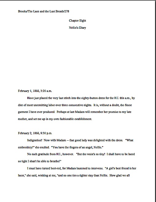
Formatpalooza, part IV: drawing some much-needed lines in the sand

lines in the sand

Before we begin today, a heads-up about a long-time member of the Author! Author! community’s exciting new project: tonight at 7 and 10 EST is the premiere of memoirist, blogger, and all-around fab guyJoel Derfner‘s new reality show, Girls Who Like Boys Who Like Boys on the Sundance Channel. Best of luck, Joel, and may the film editors be kind to you!

Those of you who have been hanging out here for a while may know Joel better under his commenting/blogging moniker, Faustus, M.D.. Or for his informative and funny guest blogs on getting permission to use song lyrics in one’s books (oh, yes, Virginia, explicit permission is required, unless the song is in the public domain) and how much input an author does and doesn’t get on his book covers. Or perhaps the name rings a bell because I have regularly been heard to say over the last couple of years that his memoir, SWISH: My Quest to Become the Gayest Person Ever and What Happened Instead, represents some of the best memoir writing of the last decade.

Who can say? Memory is a funny thing.

Speaking of which, you might want to bookmark this post, campers: since I’m going to be wrapping up my theoretical discussion of standard format today, I’m going to list all of the rules we have discussed so far.

That’s right: the whole shebang, listed in a single post. Can’t you feel the excitement in the air? Let’s get cracking.

(1) All manuscripts should be printed or typed in black ink and double-spaced, with one-inch margins around all edges of the page, on 20-lb or better white paper.

(2) All manuscripts should be printed on ONE side of the page and unbound in any way.

(3) The text should be left-justified, NOT block-justified. By definition, manuscripts should NOT resemble published books in this respect.

(4) The preferred typefaces are 12-point Times, Times New Roman, Courier, or Courier New — unless you’re writing screenplays, in which case you may only use Courier. For book manuscripts, pick one (and ONLY one) and use it consistently throughout your entire submission packet.

(5) The ENTIRE manuscript should be in the same font and size — no switching typefaces for any reason. Industry standard is 12-point.

(6) Do NOT use boldface anywhere in the manuscript BUT on the title page — and not even there, necessarily.

(7) EVERY page in the manuscript should be numbered EXCEPT the title page.

(8) Each page of the manuscript (other than the title page) should have a standard slug line in the header. The page number should appear in the slug line, not anywhere else on the page.

(9) The first page of each chapter should begin a third of the way down the page, with the chapter title appearing on the FIRST line of the page, NOT on the line immediately above where the text begins.

(10) Contact information for the author belongs on the title page, NOT on page 1.

(11) Every submission should include a title page, even partial manuscripts.

(12) The beginning of EVERY paragraph of text should be indented .5 inch. No exceptions, ever.

(13) Don’t skip an extra line between paragraphs, except to indicate a section break.

(14) NOTHING in a manuscript should be underlined. Titles of songs and publications, as well as words in foreign languages and those you wish to emphasize, should be italicized.

All of those make sense, I hope, at least provisionally? Excellent. Moving on…

(15) All numbers under 100 should be written out in full: twenty-five, not 25. But numbers over 100 should be written as numbers: 1,243, not one thousand, two hundred and forty-three.

Violations of this one routinely make people who read manuscripts for a living twitch uncontrollably. Yet an unfortunately high percentage of otherwise industry-savvy aspiring writers are apparently unaware of this particular rule — or apply it incorrectly.

The instinct to correct it in a submission is universal in professional readers. From that impulse to rejection is often a fairly short journey, because once the notion gee, this writer hasn’t taken the time to learn the ropes has occurred to a professional reader, it’s hard to unthink. After that, anything from a major cliché to a minor typo would just seem like corroboration of this uncharitable — and in some cases unfair — conclusion.

Translation: NOT presenting your numbers correctly will not help you win friends and influence people at agencies and publishing houses. Don’t say I didn’t warn you.

Like pointing out foreign-language words with special formatting, this formatting rule was originally for the benefit of the manual typesetters. When numbers are entered as numbers, a single slip of a finger can result in an error, whereas when numbers are written out, the error has to be in the inputer’s mind.

There are only three exceptions to this rule: dates, currency, and, of course, page numbers. Thus, a properly-formatted manuscript dealing with events on November 11 would look like this on the page:

Abbott/The Great Voyage/82

The sandwich cost $3.76.

On November 11, 1492, fifty-three scholars divided into eighteen parties in preparation for sailing to Antarctica. It took 157 rowboats ten trips apiece to load all of their books, papers, and personal effects onboard.

And not like this:

Abbott/The Great Voyage/Eighty-two

The sandwich cost three dollars and seventy-six cents, cash American.

On November eleventh, fourteen hundred and ninety-two, fifty-three scholars divided into eighteen parties in preparation for sailing to Antarctica. It took a hundred and fifty-seven rowboats ten trips apiece to load all of their books, papers, and personal effects onboard.

Do I see some hands waving in the air? “But Anne,” inveterate readers of newspapers protest, “I’m accustomed to seeing numbers like 11, 53, 18, and 10 written as numerals in print. Does that mean that when I read, say, a magazine article with numbers under 100 depicted this way, that some industrious editor manually changed all of those numbers after the manuscript was submitted?”

No, it doesn’t — although I must say, the mental picture of that poor, unfortunate soul assigned to spot and make such a nit-picky change is an intriguing one. What you have here is yet another difference between book manuscript format and, well, every other kind of formatting out there: in journalism, they write out only numbers under 10.

Unfortunately, many a writing teacher out there believes that the over-10 rule should be applied to all forms of writing, anywhere, anytime. Yes, this is true for newspaper articles, where space is at a premium, but in a book manuscript, it is WRONG, WRONG, WRONG.

Did I mention it was wrong? And that my aged eyes have actually seen contest entries knocked out of finalist consideration over this particular issue? More than once? And within the last year?

AP style differs from standard format in several important respects, not the least being that in standard format (as in other formal presentations in the English language), the first letter of the first word after a colon should not be capitalized, since technically, it’s not the beginning of a new sentence. I don’t know who introduced the convention of post-colon capitalization, but believe me, I’m not the only one who read the submissions of aspiring book writers for a living that’s mentally consigned that language subversive to a pit of hell that would make even Dante avert his eyes in horror.

That’s the way we nit-pickers roll. We like our formatting and grammatical boundaries firm.

Heck, amongst professional readers, my feelings on the subject are downright non-confrontational. I’ve been in more than one contest judging conference where tables were actually banged and modern societies deplored. Trust me, you don’t want your entry to be the one that engenders this reaction.

So let’s all chant it together, shall we? The formatting and grammatical choices you see in newspapers will not necessarily work in manuscripts or literary contest entries.

Everyone clear on that? Good, because — are you sitting down, lovers of newspapers? — embracing journalistic conventions like the post-colon capital and writing out only numbers under ten will just look like mistakes to Millicent and her ilk on the submission page.

And no, there is no court of appeal for such decisions; proper format, like beauty, is very much in the eye of the beholder. So if you were planning to cry out, “But that’s the way USA TODAY does it!” save your breath.

Unfortunately, although my aforementioned heart aches for those of you who intended to protest, “But how on earth is an aspiring writer to know that the standards are different?” this is a cry that is going to fall on deaf ears as well. Which annoys me, frankly.

The sad fact is, submitters rejected for purely technical reasons are almost never aware of it. With few exceptions, the rejecters will not even take the time to scrawl, “Take a formatting class!” or “Next time, spell-check!” on the returned manuscript. If a writer is truly talented, they figure, she’ll mend her ways and try again.

And that, in case any of you lovely people had been wondering, is why I revisit the topic of standard format so darned often. How can the talented mend their ways if they don’t know how — or even if — their ways are broken?

(16) Dashes should be doubled — rather than using an emdash — with a space at either end. Hyphens are single and are not given extra spaces at either end, as in self-congratulatory.

Yes, yes, I know: you’ve probably heard that this rule is obsolete, too, gone the way of underlining. The usual argument for its demise: books no longer preserve these spaces, for reasons of printing economy, so many writing teachers tell their students just to go ahead and eliminate them. An AP-trained teacher will tell you to use the longer emdash, as will the Chicago Manual of Style.

In this, however, they are wrong, at least as far as manuscripts are concerned. (You’re starting to get used to that, right?)

Standard format is invariable upon this point: a doubled dash with a space on either end is correct; anything else is not.

And yes, it is indeed a common enough pet peeve that the pros will complain to one another about how often submitters get it wrong. They also bemoan how often they see manuscripts where this rule is applied inconsistently: two-thirds of the dashes doubled, perhaps, sometimes with a space at either end and sometimes not, with the odd emdash and single dash dotting the text as well.

It may seem like a minor, easily-fixable phenomenon from the writer’s side of the submission envelope, but believe me, inconsistency drives people trained to spot minor errors nuts.

Your word-processing program probably changes a double dash to an emdash automatically, but CHANGE IT BACK. If only as a time-saver: any agent would make you do this before agreeing to submit your manuscript to an editor, so you might as well get into this salutary habit as soon as possible.

(17) Adhere to the standard rules of punctuation and grammar, not what it being done on the moment in newspapers, magazines, books, or on the Internet — including the rule calling for TWO spaces after every period and colon.

In other words, do as Strunk & White say, not what others do. Assume that Millicent graduated with honors from the best undergraduate English department in the country (or at least the fifteenth-best), taught by the grumpiest, meanest, least tolerant stickler for grammar that ever snarled at a student unfortunate enough to have made a typo, and you’ll be fine.

Or, if that mental image isn’t frightening enough, try envisioning the many, many professional writers who delighted in leaping upon the slightest hint of grammatical impropriety even in spoken English throughout my formative years. I know that works for me.

The primary deviation I’ve been seeing in recent years is leaving only one space, rather than the standard two, after a period. The rationale runs thus: printed books usually do this now, to save paper; the fewer the spaces on a page, the more words can be crammed onto it. Since we’ve all seen it done in recently-released books, some argue — and vehemently — it would be ludicrous to format a manuscript any other way.

Indeed, you may have seen that one touted as the proper way to format a manuscript. A number of writing-advice websites, I notice, and even some writing teachers have been telling people that this is the wave of the future — and that adhering to the two-space norm makes a manuscript look obsolete. Some even tout this as a universal instant-rejection offense.

At the risk of sounding like the harsh grammar-mongers of my youth, poppycock. Agents, very good ones, routinely submit manuscripts with doubled spaces to editors, also very good ones, all the time. Successfully. But truth compels me to point out that there are also many agents, also good ones, who have embraced the single-space convention, and quite adamantly. Although some agents and editors do now request eliminating the second space at the submission stage, the doubled space is still the norm — except amongst the minority who feel very strongly that it is not.

Clear as pea soup, right?

So which convention should you embrace? The answer, as it so often is, involves doing your homework about the specific agent or publisher you are planning to approach. As always, it’s ultimately up to you; it’s really a question of choosing whom to please — or producing two different manuscripts for submission.

Once you get in the habit of doing that research, I suspect those of you who have heard horror stories about how everybody now positively hates the second space convention will be astonished to see how few agencies even mention it in their submission guidelines. If they don’t, it’s usually safe to assume that they adhere to the older convention — or at the very least, don’t care. If, however, you happen to be submitting to one of those people who specifically asks for single spaces, in which case, you’d be silly not to bow to their expressed preferences. (Sensing a pattern here?)

Fortunately, for aspiring writers everywhere, those agents who do harbor a strong preference for the single space tend not to keep mum about it. If they actually do tell their Millicents to regard a second space as a sign of creeping obsolescence, chances are very, very good that they’ll mention that fact on their websites.

Again, double-check before you submit. If the agent of your dreams has not specified, double-space.

Why should that be the default option, since proponents of eliminating the second space tend to be so very vocal? Those who cling to the older tradition tend to be, if anything, a shade more vehement.

Why, you ask? Editing experience, usually. Preserving that extra space after each sentence in a manuscript makes for greater ease of reading, and thus editing. As anyone who has ever edited a long piece of writing can tell you, the white space on the page is where the comments — grammatical changes, pointing out flow problems, asking, “Does the brother really need to die here?” — go.

Less white space, less room to comment. It honestly is that simple.

Oh, and it drives the grammar-hounds nuts to hear that time-honored standards are being jettisoned in the name of progress. “What sane human being,” they ask through gritted teeth, “seriously believes that replacing tonight with tonite, or all right with alright constitutes progress? Dropping the necessary letters and spaces doesn’t even save significant page space!”

Those are some pretty vitriol-stained lines in the sand, aren’t they?

Let’s just say that until everyone in the industry makes the transition editing in soft copy — which is, as I have pointed out many times in this forum, both harder and less efficient than scanning a printed page — the two-space rule is highly unlikely to change universally. Just ask a new agent immediately after the first time he’s submitted to an old-school senior editor: if he lets his clients deviate from the norms, he’s likely to be lectured for fifteen minutes on the great beauty of the English language and the imperative to protect its graceful strictures from the invading Goths, Visigoths, and journalists.

I sense that some of you are starting to wring your hands and rend your garments in frustration. “I just can’t win here! Most want it one way, a few another. I’m so confused about what’s required that I keep switching back and forth between two spaces and one while I’m typing.”

I hate to be the one to break it to you, but inconsistent formatting is likely to annoy both sides of the aisle. Whichever choice you embrace, be consistent about it throughout your manuscript; don’t kid yourself that an experienced professional reader isn’t going to notice if you sometimes use one format, sometimes the other.

He will. So will a veteran contest judge. Pick a convention and stick with it.

But don’t fret over it too much. This honestly isn’t as burning a debate amongst agents and editors as many aspiring writers seem to think. But as always: check before you submit. If the agent’s website, contest listing, and/or Twitter page doesn’t mention individual preferences, assume s/he’s going to be submitting to old-school editors and retain the second space.

And be open to the possibility — brace yourselves; you’re not going to like this — that you may need to submit your manuscript formatted one way for a single agent on your list, and another for the other nineteen.

Hey, I warned you that you weren’t going to like it.

(18) Turn off the widow/orphan control; it gives pages an uneven number of lines.

The widow/orphan control, for those of you new to the term. is the setting on a word processing program that controls how many lines appear on any given page. The default setting prevents the first line of a new paragraph from being left alone on a page if the rest of the paragraph is on the next (a line so left behind is called an orphan) or the last line of a paragraph begun on a previous page from appearing at the top of the next page all by itself (and that’s called a widow).

Thus, if the widow/orphan control is left on, lines will be stolen from one page and added to the ones before and after. Result: some of your pages will have more lines of text on them than others. Why might that be problematic? Well, unless your pages are standardized, you can’t justify estimating your word count (at # of pages x 250 in Times New Roman). Since word counts for book-length projects are expected to be estimated (you’ll need to use the actual count for short stories or articles), and actual count can be as much as 20% higher than estimated, it’s certainly in the best interest of anyone who tends to run a little long to estimate.

And even if your manuscript isn’t over 400 pages (100,000 words, estimated), the usual dividing line for Millicent to cry, “Oh, too bad; it’s too long for a first novel in this book category. Next!” she’s going to dislike seeing an extra inch of white space on the bottom of some of your pages. Not necessarily enough to shout, “Next!” anyway, but do you really want something that superficial to be your submission’s last straw?

Here’s how to turn it off in Word: under the FORMAT menu, select PARAGRAPH…, then LINE AND PAGE BREAKS. Un-check the Widow/Orphan control box, and you’re home free!

There you have it: the rules. Practice them until they are imbedded into your very bones, my friends: literally every page of text you submit to an agent, editor, or literary contest for the rest of your professional life (yes, including the synopsis) should be in standard format.

Confused? Now would be a delightful time to ask some questions. Tomorrow, it’s on to concrete examples. Keep up the good work!

Formatpalooza, part III: the necessities, or, how you would feel if you got locked in Millicent’s mailbag

restrooms & cemeteries

Ah, life’s quotidian necessities. If you look closely in the background, you’ll see that there’s also a liquor store. The wee tourist trap where I took this is a town of practical people, evidently.

I’ve got practicality on my mind today, campers — as should you, really. Whether you are being surprised and stunned by the rigors of standard format for the first time or working your way though this series as a veteran, it is very much to your practical advantage to learn these rules, then apply them consistently throughout your manuscript. While it is undoubtedly time-consuming, investing a few days in formatting your manuscript properly will in the long term save you a whole heck of a lot of time.

Was that massive sound wave that just washed over my studio two-thirds of you suddenly crying, “Huh?”

It’s true, honest. While the applying these rules to a manuscript already in progress may seem like a pain, practice makes habit. After a while, the impulse to conform to the rules of standard format becomes second nature for working writers. Trust me, it’s a learned instinct that can save a writer oodles of time and misery come deadline time.

How, you ask? Well, to a writer for whom proper formatting has become automatic, there is no last-minute scramble to change the text. It came into the world correct — which, in turn, saves a writer revision time. Sometimes, those conserved minutes and hours can save the writer’s proverbial backside as well.

Scoff not: even a psychic with a very, very poor track record for predictions could tell you that if you are lucky enough to land an agent and get published, there will be times in your writing career when you don’t have the time to proofread as closely as you would like, much less check every page to make absolutely certain it looks right. Sometimes, the half an hour it would take to reformat a inconsistent manuscript can make the difference between making and missing a contest deadline.

Or between delighting or disappointing the agent or editor of your dreams currently drumming her fingers on her desk, waiting for you to deliver those minor requested revisions to Chapter 7. You know, that lighthearted little revision changing the protagonist’s sister Wendy to her brother Ted; s/he is no longer a corporate lawyer, but a longshoreman, and Uncle George dies not of a heart attack, but of 12,000 pounds of under-ripe bananas falling on him from a great height when he goes to the docks to tell Ted that Great-Aunt Mandy is now Great-Uncle Armand. (If only Ted had kept a better eye on that load-bearing winch!)

Or, for nonfiction writers, delivering the finished book you proposed by the date specified in your publishing contract. Trust me, at any of these junctures, the last thing you’ll want to have to worry about are consistent margins.

Perversely, this is a kind of stress that makes writers happy — perhaps not in the moment we are experiencing it, but on a career-long basis. The more successful you are as a writer — any kind of writer — the more often you will be in a hurry, predictably. No one has more last-minute deadlines than a writer with a book contract.

Just ask any author whose agent is breathing down her neck after a deadline has passed. Especially if the writer didn’t know about the deadline until it had already come and gone. (Oh, how I wish I were kidding about that.) And don’t even get me started on the phenomenon of one’s agent calling the day after Thanksgiving to announce, “I told the editor that you could have the last third of the book completely reworked by Christmas — that’s not going to be a problem, is it?”

Think you’re going to want to be worrying about your formatting then? Believe me, you’re going to be kissing yourself in retrospect for learning how to handle the rote matters right the first time, so you can concentrate on the hard stuff. (What would many tons of bananas dropped from that height look like, anyway?)

That’s the good news about how easily standard format sinks into one’s very bones; in practical terms, it honestly is easier than what many aspiring writers are already doing to their pages. The rise of the Internet has led to a proliferation of time-consuming rumors about secret handshake-type requirements for submissions. I’m constantly encountering writers who tinker endlessly with the settings on their Word programs because they heard somewhere (in the finest tradition of rumor, they are often unsure precisely where) that the default setting for double-spacing is not the precise size agents really want, or hand-constructing quotation marks out of pixels so they will look like the ones in a favorite published book, or painstakingly typing the slug line onto the top of each and every page of a word-processed document, rather than typing the darned thing into the header once and being done with it.

All of these are real examples of writerly obsession, by the way. I wasn’t kidding about these rules saving you time in the long run.

The less-good news about standard format is that once someone — like, say, the average agent, editor, or Millicent — has spent enough time staring at professionally-formatted manuscripts, anything else starts to look, well, unprofessional.

The implications of this mindset are vast. First, as I mentioned yesterday, if an agent or editor requested pages, it would behoove you to send them in standard format, unless s/he specifically tells you otherwise. Ditto with contest entries: it’s just what those who read manuscripts professionally expect to see. It’s so much assumed that s/he probably won’t even mention it, because most agents and editors believe that these rules are already part of every serious book-writer’s MO.

So much so, in fact, that agents who’ve read my blog sometimes ask me why I go over these rules so often. Doesn’t everyone already know them? Isn’t this information already widely available? Aren’t there, you know, books on how to put a manuscript together?

I’ll leave those of you reading this post to answer those for yourselves. Suffice it to say that our old pal Millicent the agency screener believes the answers to be: because I like it, yes, yes, and yes.

Second, this mindset means that seemingly little choices like font and whether to use a doubled dash or an emdash — of which more below — can make a rather hefty difference to how Millicent perceives a manuscript. (Yes, I know: I point this out with some frequency. However, as it still seems to come as a great surprise to the vast majority aspiring writers; I can only assume that my voice hasn’t been carrying very far the last 852 times I’ve said it.)

I hate to be the one to break it to you, but professional-level critique is HARSH; it’s like having your unmade-up face examined under a very, very bright light by someone who isn’t afraid to hurt your feelings by pointing out flaws. In the industry, this level of scrutiny is not considered even remotely mean.

Actually, if your work generates tell-it-like-it-is feedback from a pro, you should be a bit flattered — it’s how they habitually treat professional authors. Yet the aforementioned vast majority of submitting writers seem to assume, at least implicitly, that agents and their staffs will be hugely sympathetic readers of their submissions, willing to overlook technical problems because of the quality of the writing or the strength of the story.

I’m not going to lie to you, though — every once in a very, very long while, the odd exception that justifies this belief does in fact occur. If the writing is absolutely beautiful, or the story is drool-worthy, but the formatting is all akimbo and the spelling is lousy, there’s an outside chance that someone at an agency might be in a saintly enough mood to overlook the problems and take a chance on the writer.

You could also have a Horatio Alger moment where you find a billionaire’s wallet, return it to him still stuffed with thousand-dollar bills, and he adopts you as his new-found son or daughter. Anything is possible, of course.

But it’s probably prudent to assume, when your writing’s at stake, that yours is not going to be the one in 10,000,000 exception.

Virtually all of the time, an agent, editor, contest judge, or screener’s first reaction to an improperly-formatted manuscript is the same as to one that is dull but technically perfect: speedy rejection. From a writerly point of view, this is indeed trying. Yet as I believe I may have mentioned once or twice before, I do not run the universe, and thus do not make the rules.

Sorry. No matter how much I would like to absolve you from some of them, it is outside my power. Take it up with the fairy godmother who neglected to endow me with that gift at birth, okay?

Until you have successfully made your case with her, I’m going to stick to using the skills that she did grant me, a childhood surrounded by professional writers and editors who made me learn to do it the right way the first time. My fifth-grade history paper was in standard format; I can still hear my mother blithely dismissing my poor, befuddled teacher’s protests that none of the other kids in the class were typing their papers with, “Well, honestly, if Annie doesn’t get into the habit of including slug lines now, where will she be in twenty years?”

Where, indeed? The strictures of standard format are hardly something that she would have wanted me to pick up on the street, after all.

So let’s start inculcating some lifetime habits, shall we? To recap Formatpalooza thus far:

(1) All manuscripts should be printed or typed in black ink and double-spaced, with one-inch margins around all edges of the page, on 20-lb or better white paper.

(2) All manuscripts should be printed on ONE side of the page and unbound in any way.

(3) The text should be left-justified, NOT block-justified. By definition, manuscripts should NOT resemble published books in this respect.

(4) The preferred typefaces are 12-point Times, Times New Roman, Courier, or Courier New — unless you’re writing screenplays, in which case you may only use Courier. For book manuscripts, pick one (and ONLY one) and use it consistently throughout your entire submission packet.

(5) The ENTIRE manuscript should be in the same font and size. Industry standard is 12-point.

(6) Do NOT use boldface anywhere in the manuscript BUT on the title page — and not even there, necessarily.

(7) EVERY page in the manuscript should be numbered EXCEPT the title page.

(8) Each page of the manuscript (other than the title page) should have a standard slug line in the header. The page number should appear in the slug line, not anywhere else on the page.

(9) The first page of each chapter should begin a third of the way down the page, with the chapter title appearing on the FIRST line of the page, NOT on the line immediately above where the text begins.

(10) Contact information for the author belongs on the title page, NOT on page 1.

(11) Every submission should include a title page, even partial manuscripts.

Everyone clear on all that? If not, this would be a dandy time to pipe up with questions. While you’re formulating ‘em, let’s move on.

(12) The beginning of EVERY paragraph of text should be indented .5 inch. No exceptions, ever.

Right off the bat, here is a way to save some of you conscientious rule-followers some time. Most word-processing programs (Including Word, if left to its own devices) automatically indent .5 inch (12.7 mm, if my junior high school conversion formula is still correct), but as you’ve probably noticed in practice, that’s more than five spaces.

Such is the way of the world. If you set your tabs to .5 inch, you’ll be set.

Why bring up the number of spaces relevant here? Well, the usual way this rule is expressed is indent every paragraph 5 spaces, a quaint hangover from the days of typewriter. As you may have heard somewhere, however, MS Word, the standard word processing program of the publishing industry, automatically sets its default first tab at .5 inch. Yet unless you happen to be using an unusually large typeface like Courier, you’ve probably noticed that hitting the space bar five times will not take you to .5 inches away from the left margin; in Times New Roman, it’s more like 8 spaces.

Does this mean all of us should be whipping out our measuring tapes, painstakingly hand-crafting a specialized tab that’s the exact equivalent of five actual characters, down to the last micron? Of course not — but would you be surprised to hear how many aspiring writers do?

Their confusion is understandable: this is genuinely one of those things that actually has changed in theory, if not visibly on the page, since the advent of wide-spread computer use. To set the nervous at ease, let’s talk about why is standard indentation at .5 inch now, rather than at five characters.

History, my dears, history: back in the days when return bars roamed the earth instead of ENTER keys, there were only two typefaces commonly found on typewriters, Pica and Elite. They yielded different sizes of type (Pica roughly the equivalent of Courier, Elite more or less the size of Times New Roman), but as long as writers set a tab five spaces in, and just kept hitting the tab key, manuscripts were at least consistent.

After the advent of the home computer, however, word-processed manuscripts became the norm. The array of possible typefaces exploded. Rather than simply accepting that every font would have slightly different indentations, the publishing industry (and the manufacturers of Word) simply came to expect that writers everywhere would keep hitting the tab key, rather than hand-spacing five times at the beginning of each paragraph. The result: the amount of space from the left margin became standardized, so that every manuscript, regardless of font, would be indented the same amount.

So why pick .5 inch as the standard indentation? Well, Elite was roughly the size of Times New Roman, 12 characters per inch. Pica was about the size of Courier, 10 characters per inch. The automatic tab at .5 inch, therefore, is pretty much exactly five spaces from the left margin in Pica.

All of which is a long-winded way of saying that in this instance, at least, Word’s default settings are the writer’s friend. Keep on hitting that tab key.

Which brings me back to the no exceptions part: nothing you send to anyone in the industry should EVER be in block-style business format. To people in the publishing industry, it simply looks illiterate.

That clattering sound you just heard was the more nervous type of aspiring writer reaching frantically for his mouse, to open up all of his writing files and change them instantly. And frankly, he should: despite the fact that everyone from CEOs to the proverbial little old lady from Pasadena has been known to use block format from time to time (blogs are set up to use nothing else, right?), technically, non-indented paragraphs are not proper for English prose.

Period. That being the case, what do you think Millicent’s first reaction to a non-indented page 1 is likely to be?

Yes, what all of you newly well-lit souls are thinking right now is quite true: those submissions may well have been rejected at first glance by a Millicent in a bad mood. Heck, there are agencies where a manuscript that designates paragraphs by skipping a line between paragraphs rather than by indenting simply would not be read.

Yes, even if the writers submitted those manuscripts via e-mail. (See why I’m always harping on how submitting in hard copy, or at the very worst as a Word attachment, is inherently better for a submitter?) And that’s a kinder response than Mehitabel the veteran contest judge would have had: she would have looked at a block-formatted first page and sighed, “Well, that’s one that can’t make the finals.”

Why the knee-jerk response? Well, although literacy has become decreasingly valued in the world at large, the people who have devoted themselves to bringing good writing to publications still tend to take it awfully darned seriously. To publishing types, any document with no indentations, skipping a line between paragraphs, and the whole shebang left-justified carries the stigma of (ugh) business correspondence — and that’s definitely not good.

Why, you ask? Well, do you really want the person you’re trying to impress with your literary genius to wonder about your literacy?

I thought not. And which do you think is going to strike format-minded industry professionals as more literate, a query letter in business format or one in correspondence format (indented paragraphs, date and signature halfway across the page, no skipped line between paragraphs)?

Uh-huh. And don’t you wish that someone had told you that before you sent out your first query letter?

Trust me on this one: indent your paragraphs in any document that’s ever going to pass under the nose of anyone even remotely affiliated with the publishing industry.

Including the first paragraph of every chapter, incidentally. Yes, Virginia, published books — particularly mysteries, I notice — often begin chapters and sections without indentation. But again, that lack of indentation was the editor’s choice, not the author’s, and copying it in a submission, no matter to whom it is intended as an homage, might get your work knocked out of consideration.

Speaking of problems adhering to business format might cause…

(13) Don’t skip an extra line between paragraphs, except to indicate a section break.

I’m serious about that being the only exception: skip an extra line to indicate a section break in the text, and for no other reason.

Really, this guideline is just common sense — so it’s a continual surprise to professional readers how often we see manuscripts that are single-spaced with a line skipped between paragraphs. (Again, much like blog format, seen here in all of its glory. The blogging program makes me do it, Millicent, I swear.)

Why surprising? Well, since the entire manuscript should be double-spaced with indented paragraphs, there is no need to skip a line to indicate a paragraph break. (Which is, in case you were not aware of it, what a skipped line between paragraph means in a single-spaced or non-indented document.) In a double-spaced document, a skipped line means a section break, period.

Also — and this is far from insignificant, from a professional reader’s point of view — it’s practically impossible to edit a single-spaced document, either in hard copy or on screen. The eye skips between lines too easily, and in hard copy, there’s nowhere to scrawl comments like Mr. Dickens, was it the best of times or was it the worst of times? It could hardly have been both!

So why do aspiring writers so often blithely send off manuscripts with skipped lines, single-spaced or otherwise? My guess would be for one of two reasons: either they think business format is proper English formatting (which it isn’t) or they’re used to seeing skipped lines in print. Magazine articles, mostly.

But — feel free to shout it along with me now; you know the words — a professional book manuscript or proposal is not, nor should it be, formatted like any published piece of writing. Manuscripts should not resemble books.

A few hands have been waving urgently in the air since I started this section. “But Anne!” those of you who have seen conflicting advice point out, “I’ve always heard that there are specific markers for section breaks! Shouldn’t I, you know, use them?”

I wouldn’t advise including these throwbacks to the age of typewriters — the * * * section break is no longer necessary in a submission to an agency or publishing house, nor is the #. So unless you’re entering a contest that specifically calls for them, or the agency to which you’re planning to submit mentions a preference for them in its submission requirements, it’s safe to assume that professional readers won’t expect to see them in a book manuscript or proposal.

Why were these symbols ever used at all? To alert the typesetter that the missing line of text was intentional.

That being said, although most Millicents will roll their eyes upon seeing one of these old-fashioned symbols, they tend not to take too much umbrage at it, because the # is in fact proper for short story format. A writer can usually get away with including them. However, since every agent I know makes old-fashioned writers take these markers out of book manuscripts prior to submission, it’s going to save you time in the long run to get into the habit of trusting the reader to understand what a skipped line means.

(To be fair, I know a grand total of one agent who allows his clients to use short-story formatting in book manuscripts. But only if they write literary fiction and have a long resume of short story publications. He is more than capable of conveying this preference to his clients, however.)

One caveat to contest-entrants: do check contest rules carefully, because some competitions still require * or #. You’d be amazed at how seldom many long-running literary contests update their rules.

(14) Nothing in a manuscript should be underlined, ever. Titles of songs and publications, as well as words in foreign languages and those you wish to emphasize, should be italicized.

Professional readers are perpetually amazed at how often otherwise perfectly-formatted manuscripts get this rule backwards — seriously, it’s a common topic of conversation at the bar that’s never more than 100 yards from any writers’ conference in North America. (You already knew that the conference center’s bar is the single best place to meet most of the agents, editors, and authors presenting at the average writers’ conference, didn’t you?) According to this informal and often not entirely sober polling data, an aspiring writer would have to be consulting a very, very outdated list of formatting restrictions to believe that underlining is ever acceptable.

Again, since your future agent is going to make you change all of that underlining to italics anyway, you might as well get out of the habit of underlining now. Like, say, before submitting your manuscript — because if Millicent happens to be having a bad day (again, what’s the probability?) when she happens upon underlining in a submission, she is very, very likely to roll her eyes and think, “Oh, God, not another one.”

Fair warning: if you consult an old style manual (or a website that is relying upon an old style manual), you may be urged to underline the words and phrases mentioned above. And just so you know, anyone who follows AP style will tell you to underline these. As will anyone who learned how to format a manuscript before the home computer became common, for the exceedingly simple reason that the average typewriter doesn’t feature italic keys as well as regular type; underlining used to be the only option.

DO NOT LISTEN TO THESE TEMPTERS: AP style is for journalism, not book publishing. They are different fields, and have different standards. And although I remain fond of typewriters — growing up in a house filled with writers, the sound used to lull me to sleep as a child — the fact is, the publishing industry now assumes that all manuscripts are produced on computers. In Word, even.

So DO NOT BE TEMPTED. In a submission for the book industry, NOTHING should be underlined. Ever.

Are all those capital letters conveying my ABSOLUTE SINCERITY about the importance of your NEVER doing this? I hope so: violations of this particular rule are rejection-triggers more often than not.

Italics are one of the few concessions manuscript format has made to the computer age — again, for practical reasons: underlining uses more ink than italics in the book production process. Thus, italics are cheaper in than underlining.

But that little history lesson didn’t really set your mind at ease about italics, did it? Calm down: the rules governing their use are not at all complicated.

(a) The logic behind italicizing foreign words is very straightforward: you don’t want the agent of your dreams to think you’ve made a typo, do you?

(b) The logic behind using italics for emphasis, as we’ve all seen a million times in print, is even more straightforward: writers used to use underlining for this. So did hand-writers.

(c) Some authors like to use italics to indicate thought, but there is no hard-and-fast rule on this. Before you make the choice, do be aware that many agents and editors actively dislike this practice. Their logic, as I understand it: a good writer should be able to make it clear that a character is thinking something, or indicate inflection, without resorting to funny type.

I have to confess, as a reader, I’m with them on that last one, but that’s just my personal preference. There are, however, many other agents and editors who think it is perfectly fine — but you are unlikely to learn which is which until after you have sent in your manuscript, alas.

Which means — again, alas — there is no fail-safe for this choice. Sorry. You submit your work, you take your chances.

I have a few more rules to cover, but this seems like a dandy place to break for the day. Don’t worry if you’re having trouble picturing what all of this might look like on the page: next week, I’m going to be showing you so many images of actual manuscript pages that you’re going to feel as if you’d gotten locked inside Millicent’s mailbag.

Hey, our intent is practical here. Keep up the good work!
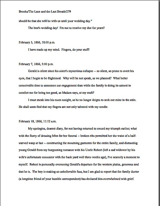
Formatpalooza, part II: not all truths are self-evident

gumballs

Hard to believe anyone would actually need to be told that those are gumballs, isn’t it? They are the epitome of the breed: large, spherical, colorful, and — dare I say it? — potentially jawbreaking. Yet clearly, at some point in the probably not-too-distant past, some passing myopic soul must have asked the proprietor, “So are those gumballs?”

I suspect that s/he just got tired of answering the same question 4200 times per week. Those of us who work with manuscripts for a living can sympathize.

Just to breathe the word editor (or my preferred title, book doctor) anywhere near the pronoun I and the verb am is to invite an avalanche of questions about manuscripts: how to get them published, how to get them under the eyes of an agent, how to keep them from getting rejected, and, surprisingly often, what they should look like.

Frankly, there seems to be a lot of confusion out there on that last subject — and that puzzles the pros, because standard format for manuscripts actually hasn’t changed all that much over the last 50 years. Oh, underlining is out and italics are in to designate words in foreign languages (currently, one should never underline anything in a book manuscript; I’ll be getting to that), and how one does indentation has altered a bit with the adoption of Microsoft Word as the industry standard for electronic submission (Word measures its tabs in fractions of an inch, not character spaces), but overall, the professionally-formatted manuscripts of today quite closely resemble the professionally-formatted manuscripts of, say, 1958.

That’s not to say, of course — or is it really that self-evident? — that all writing should be, or ever was, formatted in this manner. Short story format is different from standard format for books and book proposals, and has been for quite some time. So are essay format, academic format, journalistic format, and even how a published book will look on a page.

Which is, I suspect, the source of most of the confusion amongst aspiring writers of books. A tremendous amount of the formatting advice out there doesn’t seem to make the distinction between submitting writing to an agent or editor at a publishing house and submitting it to a magazine that prints short stories — or, indeed, presenting it in any context. That small omission leads many, many aspiring writers down the proverbial primrose path, because the fact is, the rules are different for different types of writing.

Do all of those eyebrows currently slapping into hairlines mean that this comes as a surprise to some of you? Were you under the impression that all writing should be formatted identically for submission anywhere, anytime?

If so, you are most emphatically not alone, especially since the rise of Google. Now, it’s far from uncommon for aspiring writers to plug manuscript page, submission format, or some similarly descriptive term into a search engine and come up with 25,000 pages, 65% of which will claim (or at least imply by omission) that they are stating the presentation rules for all professional writing.

Except they’re not. How do I know? Because it’s empirically impossible.

“But Anne,” some of you ask, cradling your sore brows, “why should that be the case? There are plenty of authors who write both short stories and novels, or essays and nonfiction books. Wouldn’t it just make sense that everybody would use the same format for writing?”

That would make sense, if (a) the overall system had been set up by writers, not publishers, (b) there had ever been an overall system governing all kinds of writing, and/or (c) the various species of writing were not published by completely distinct sets of people, each of whom have established norms for their own particular branches. Obviously — or is it so obvious? — the people outside an industry do not have the right to set submission standards for the people within it.

Or, to put it another way: just as all writing is not identical, neither is all publishing.

That very notion is making some of you squirm, isn’t it? I’m not entirely surprised: every time I have broached the subject formally, those who have heard rumors elsewhere that something has changed leap upon my well-intentioned little gazelles of advice with the ferocity of hungry lions, demanding that I either recant my not at all heretical beliefs or, as I mentioned last time, to compel literally every other writing advice-giver in North America to agree to abide by precisely the same rules.

To dispel any illusions up front: neither of those things is going to happen during Formatpalooza. In my professional experience, the formatting I’m discussing here is indeed important, and not just in theory. I have sold books adhering to these rules; my editing clients have sold books using them; agents, editors, and contest judges regularly complain about writers who don’t adhere to them — or even know such rules exist. So I feel entirely comfortable in saying early and often that manuscripts presented in standard format look professional to people who handle manuscripts for a living.

Does that mean every professional reader, everywhere, every time, will want to see your work formatted this way? No, of course not: as I also say early and often, should you happen to be submitting to an agent, editor, or contest that specifically asks you to do something other than I advise here, obviously, you should give him, her, or it what he or his stated guidelines request.

That’s just common sense, right? Not to mention basic courtesy. Yet judging by the plethora of questions I’m constantly getting on the subject, it’s not self-evident.

To make this last point pellucidly clear for those of you who have not been hanging around Author! Author! throughout our long autumn of ‘Paloozas: I would actively encourage you not only to check the standard agency guides for expressions of alternate preferences, but also to run an Internet search on any individual agent to whom you were planning to submit, to double-check that s/he hasn’t stated in some public forum that, for instance, s/he prefers only a single space after a period or a colon or can’t stand the sight of Times New Roman instead of Courier. Admittedly, it requires a bit more effort on the submitter’s part, but hey, it’s worth it.

Why? Chant it with me now, ‘Palooza devotees: if an agent or editor has been kind enough to take the time to tell aspiring writers precisely what s/he wants to see, be it in a query letter, storyline, or manuscript submission, a savvy writer should pay attention.

Again, that’s just being both smart and polite, isn’t it? If an agency has been considerate enough of its future clients to post submission guidelines, it’s only courteous to acknowledge their efforts.

I spot some timid hands raised out there. “But Anne,” point out some confused by conflicting advice — and who could blame them, given the multiplicity of it? “I’ve been doing my homework, and the overwhelming majority of the guide listings and agency websites I’ve found don’t talk about manuscript format at all. Does that mean that these fine folks just don’t care about how I present my writing?”

The short answer is no. The long answer is that standard format is just that: standard. So much so that to many folks who read and sell manuscripts for a living, it’s patently self-evident that they expect to see submissions in standard format.

So here is the mid-length answer: in the absence of specific alternate directions, the best course is always to adhere to the rules of standard format.

That’s why I revisit this topic regularly. To repeat the disclaimer I’ve run every single time I’ve run a series on formatting: these are the rules that I use myself, the ones that my lengthy experience tells me work. There are, however, other rules out there, presented by some very credible sources. If you find other guidelines that make sense to you, use them with my good wishes.

Seriously: as far as I’m concerned, what you do with your manuscript up to you. I’m only trying to be helpful here. Personally, I would strenuously advise against implementing any piece of formatting advice that deviates from the strictures of standard format unless you are positive that the specific agent or contest to whom you are planning to submit it wants to see your work that way — all too often, individual agents’ preferences fly around the rumor mill billed as the new universal expectation — but hey, I’m a realist: I’m aware that many, if not most, aspiring writers find it magnificently annoying to learn that they might have to produce more than one version of their manuscripts to submit to agents (or, even more common, writing contests) with different guidelines. They want to format their work once and be done with it, and who can blame them?

While I’m strenuously advising things, I would also urge you never to implement a rule you do not understand. That’s why I provide such extensive explanations for each of my suggested guidelines — so my readers may consider the various recommendations out there and form their own opinions.

You’re smart people; I know you’re up to the challenge.

I’m also confident that my readers are savvy enough to understand that paying attention to how a manuscript looks does not imply that how it is written doesn’t make a difference. Of course, writing talent, style, and originality count. Yet in order to notice any of those, a reader has to approach the page with a willingness to be wowed.

That willingness can wilt rapidly in the face of incorrect formatting — which isn’t, in response to what half of you just thought, necessarily the result of mere market-mindedness on the part of the reader. After you’ve read a few thousand manuscripts, deviations from standard format leap out at you. As will spelling and grammatical errors, phrase repetition, clichés, telling rather than showing, and all of the writing problems we’ve all heard so much.

They’re distractions from your good writing. My goal here is to help you minimize the distractions that would catch Millicent the agency screener’s eye first.

I hear those of you who have spent years slaving over your craft groaning out — believe me, I sympathize. For those of you who have not already started composing your first drafts in standard format (which will save you a lot of time in the long run, incidentally), many of the tiny-but-pervasive changes I am about to suggest that you make to your manuscript are going to be irksome to implement. Reformatting a manuscript is time-consuming and tedious, and I would be the first to admit that at first, some of these rules can seem arbitrary.

At least on their faces. Quite a few of these restrictions remain beloved even in the age of electronic submissions because they render a manuscript a heck of a lot easier to edit — and to read, in either hard or soft copy. As I will demonstrate with abundant examples later in this series, a lot of these rules exist for completely practical purposes — designed, for instance, to maximize white space in which the editor may scrawl trenchant comments like, “Wait, wasn’t the protagonist’s brother named James in the last chapter? Why is he Aloysius here?”

Perhaps this is self-evident from what I have already said, but here’s one last, quick caveat before I launch back into the list: the standard format restrictions I’m listing here are not intended to be applied to short stories, poetry, journalistic articles, academic articles, or indeed any other form of writing. The guidelines in this series are for BOOK manuscripts and proposals, and thus should not be applied to other kinds of writing. Similarly, the standards applicable to magazine articles, short stories, dissertations, etc. should not be applied to book proposals or manuscripts.

For the guidelines for these, you may — and should — seek elsewhere. (See my earlier rejection of universality.)

Everyone clear on that and ready to dive back into the matter at hand? Excellent; help yourself to a gumball. Let’s recap the rules we covered last time:

(1) All manuscripts should be printed or typed in black ink and double-spaced, with one-inch margins around all edges of the page, on 20-lb or better white paper.

(2) All manuscripts should be printed on ONE side of the page and unbound in any way.

(3) The text should be left-justified, NOT block-justified. By definition, manuscripts should NOT resemble published books in this respect.

(4) The preferred typefaces are 12-point Times, Times New Roman, Courier, or Courier New — unless you’re writing screenplays, in which case you may only use Courier. For book manuscripts, pick one (and ONLY one) and use it consistently throughout your entire submission packet.

Is everyone happy with those? PLEASE pipe up with questions, if not. In the meantime, let’s move on.

(5) The ENTIRE manuscript should be in the same font and size. Industry standard is 12-point.

No exceptions, please. No matter how cool your desired typeface looks, or how great the title page looks with 14-point type.

Yes, even on the title page, where almost everyone gets a little wacky the first time out. No pictures or symbols here, either, please. Just the facts. (If you don’t know how to format a title page professionally — and yes, Virginia, there is a professional format for it — please see the TITLE PAGE category on the list at right.)

I hate to be the one to break it to you, but there’s a term for title pages with 24-point fonts, fancy typefaces, and illustrations.

It’s high school book report. Need I say more?

(6) Do not use boldface anywhere in the manuscript BUT on the title page — and not even there, it’s not mandatory.

This seems like an odd one, right? Actually, the no-bolding rule is a throwback to the old typewriter days, where only very fancy machines indeed could darken selected type. So historically, using bold in-text is considered a bit tacky for the same reason that wearing white shoes before Memorial Day is in certain circles: it’s a subtle display of wealth.

You didn’t think all of those white shoes the Victorians wore cleaned themselves, did you? Shiny white shoes equaled scads of busily-polishing servants.

You may place your title in boldface on the title page, if you like, but that’s it. Nothing else in the manuscript should be bolded. (Unless it’s a section heading in a nonfiction proposal or manuscript — but don’t worry about that for now; I’ll be showing you how to format both a book proposal and a section break later on in this series, I promise.)

(7) Every page in the manuscript should be numbered — except the title page.

I’m quite serious about this: even if you take no other advice from Formatpalooza, please remember to number your pages.

This may seem like a little thing, but you’d be surprised how often violating this rule results in instantaneous rejection. Few non-felonious offenses irk the professional manuscript reader (including yours truly, if I’m honest about it) more than an unnumbered submission or contest entry. It ranks right up there on their rudeness scale with assault, arson, and beginning a query letter with, Dear Agent.

Why? Gravity, my friends, gravity. What goes up tends to come down — and if the object in question happens to be an unbound stack of paper…

Did that seem like an abstract metaphor? Not at all. Picture, if you will, two manuscript-bearing interns walking toward each other in an agency hallway. Between them, a banana peel. What is going to happen when the first slips, and the second tumbles on top of him, screaming?

You may giggle, but anyone who has ever worked with submissions has first-hand experience of this (okay, perhaps not the part about the banana peel, as well as what comes next: after the blizzard of flying papers dies down, and the two combatants rehash that old Reese’s Peanut Butter Cup commercial’s dialogue (“You got romance novel in my literary fiction!” “You got literary fiction in my romance novel!”), what needs to happen?

Yup. Some luckless soul has to put all of those pages back in the proper order. Put yourself in Millicent’s moccasins for a moment: just how much more irksome is that task going to be if the pages are not numbered?

Number your pages. Trust me, it is far, far, FAR easier for Millicent to toss the entire thing into the reject pile than to spend the hours required to guess which bite-sized piece of storyline belongs before which in an unnumbered manuscript.

FYI, the first page of the text proper is page 1 of the text, not the title page, and should be numbered as such. If your opus has an introduction or preface, the first page of that is page 1, not the first page of chapter 1.

Why, you ask? Long-time readers, pull out your hymnals and sing along: BECAUSE A MANUSCRIPT SHOULD NOT LOOK IDENTICAL TO A PUBLISHED BOOK.

The title page is not the only one commonly mislabeled as page one, by the way: epigraphs — those quotations from other authors’ books so dear to the hearts of writers everywhere — should not appear on their own page in a manuscript, as they sometimes do in published books. If you feel you must include one (considering that 99.9999% of the time, Millicent will just skip over it), include it between the chapter title and text on page 1.

If that last paragraph left your head in a whirl, don’t worry — I’ll show you how to format epigraphs properly later in this series. (Yes, including some discussion of that cryptic comment about Millicent. All in the fullness of time, my friends.)

(8) Each page of the manuscript (other than the title page) should have a standard slug line in the header. The page number should appear in the slug line, not anywhere else on the page.

Including the slug line means that every page of the manuscript has the author’s name on it — a great idea, should you, say, want an agent or editor to be able to contact you after s/he’s fallen in love with it. The slug line should appear in the upper left-hand margin (although no one will sue you if you put it in the upper right-hand margin, left is the time-honored location) of every page of the text except the title page (which should have nothing in the header or footer at all).

A trifle confused by all that terminology? I’m not entirely surprised. Most writing handbooks and courses tend to be a trifle vague about this particular requirement, so allow me to define the relevant terms: a well-constructed slug line includes the author’s last name, book title, and page number, to deal with that intern-collision problem I mentioned earlier. (The slug line allows the aforementioned luckless individual to tell the romance novel from the literary fiction.) And the header, for those of you who have not yet surrendered to Microsoft Word’s lexicon, is the 1-inch margin at the top of each page.

Traditionally, the slug line appears all in capital letters, but it’s not strictly necessary; if the agent of your dreams has a preference on the matter, trust me, you’ll be the first to hear about it after she signs you. Personally, I find the all-caps format visually distracting, so the third page of my memoir has a slug line that looks like this:

Mini/A Family Darkly/3

Since the only place a page number should appear on a page of text is in the slug line, if you are in the habit of placing numbers wacky places like the middle of the footer, do be aware that it does not look strictly professional to, well, professionals. Double-check that your word processing program is not automatically adding extraneous page markers.

Do not, I beg of you, yield like so many aspiring writers to the insidious temptation add little stylistic bells and whistles to the slug line, to tart it up. Page numbers should not have dashes on either side of them, be in italics or bold, or be preceded by the word page.

If that admonition strikes you as a disappointing barrier to your self-expression, remember, professional readers do not regard formatting choices as conveyers of personal style. The point here is not to make your slug line stand out for its innovative style, but your writing. In order for that to be possible, your manuscript’s pages to look exactly like every other professional writer’s.

And yes, Virginia, I am going to keep making that point over and over until you are murmuring it in your sleep. Why do you ask?

If you have a subtitle, don’t include it in the slug line — and if you have a very long title, feel free to abbreviate, to keep the slug line from running all the way across the top of the page. The goal here is to identify the manuscript at a glance, not to reproduce the entire book jacket.

Why not? Well, technically, a slug line should be 30 spaces or less, but there’s no need to stress about that in the computer age. (A slug, you see, is the old-fashioned printer’s term for a pre-set chunk of, you guessed it, 30 spaces of type. Aren’t you glad you asked?)

Keep it brief. For instance. my agent is currently circulating a novel of mine entitled THE BUDDHA IN THE HOT TUB — 26 characters, counting spaces. Since my last name is quite short, I could get away with putting it all in the slug line, to look like this:

Mini/The Buddha in the Hot Tub/1

If, however, my last name were something more complicated, such as Montenegro-Copperfield — 22 characters all by itself, including dash — I might well feel compelled to abbreviate. Just for the sake of variety, let’s see it in all caps:

MONTENEGRO-COPPERFIELD/BUDDHA/1

Incidentally, should anyone out there come up with a bright idea for a category heading on the archive list for this issue other than SLUG LINE — a category that already exists, but is unlikely to be found by anyone not already familiar with the term — I’d be delighted to hear suggestions. I’ve called it a slug line ever since I first clapped eyes on a professional manuscript (an event that took place so long ago my response to the sight was not, “What’s that at the top of the page, Daddy?” but “Goo!”), so I’m probably not going to be coming up with a good alternative anytime soon. Thanks.

(9) The first page of each chapter should begin a third of the way down the page, with the chapter title appearing on the first line of the page, not on the line immediately above where the text begins.

That’s fourteen single-spaced lines, incidentally. Don’t panic if you’re having trouble visualizing this — I’ll be giving concrete examples of what the first page of a chapter should look like later in this series.

The chapter title (or merely “Chapter One”) may appear on the first line of the first page — not on the last line before the text, as so many writers mistakenly do. The chapter title or number should be centered, and it should neither be in boldface nor underlined.

Why shouldn’t the title appear immediately above the text, as one so often sees — and, frankly, as some other writing sites advise? Because that’s where the title of a short story lives, not a book’s.

Self-evident now that you’ve heard it, isn’t it?

Because confusing the two formats is so common, very frequently, agents, editors and contest judges are presented with improperly-formatted first pages that include the title of the book, by Author’s Name, and/or the writer’s contact information in the space above the text. This is classic rookie mistake.

To professional eyes, a manuscript that includes any of this information on the first page of the manuscript (other than in the slug line, of course) seems like it just ended up in the wrong office. Clearly, the writer wanted not the agency to which she sent it, but the magazine down the street.

So where does all of that necessary contact information go, you ask? Read on.

(10) Contact information for the author belongs on the title page, not on page 1.

This is one of the most obvious visual differences between a short story submission (say, to a literary journal) and a novel submission. To submit a manuscript — or contest entry, for that matter — with this information on page 1 is roughly the equivalent of taking a great big red marker and scrawling, “I don’t know much about the business of publishing,” across it.

Just don’t do it.

“But wait,” I hear some of you out there murmuring, “I need a title page? Since when?”

Funny you should mention that, because…

(11) Every submission for a book-length work should include a title page, even partial manuscripts.

This one seems to come as a surprise to a lot of aspiring writers. You should always include a title page with ANY submission of ANY length, including contest entries and the chapters you send after the agent has fallen in love with your first 50 pages.

Why, you ask? Because it is genuinely unheard-of for a professional manuscript not to have a title page: literally every manuscript that any agent in North America sends to any editor in hard copy will include one, for the exceedingly simple reason that it’s the page that includes the agent’s contact information.

Yet, astonishingly, a good 95% of writers submitting to agencies seem to be unaware that including it is industry standard. To them, the cover letter, address on the SASE, or the e-mail to which the requested materials were attached are identification enough. But in practice, it’s actually none of those things will necessarily still be attached to your pages at the point when the agent of your dreams says, “By jingo, I’ve read enough. This is a writer I must sign, and pronto!”

Oh, you think that the SASE won’t go flying when those interns collide in the hallway? Or that e-mails never get deleted accidentally?

On the bright side, the widespread ignorance that a title page is expected means that if you are industry-savvy enough to include a professionally-formatted title page with your work, your submission automatically looks like a top percentile ranker to professional eyes from the moment it’s pulled out of the envelope. It’s never too early to make a good first impression, right?

If you do not know how to format a proper title page — and yes, Virginia, there is a special format for it, too — please see the TITLE PAGE category at right. Or wait a few days until I cover it later in this series.

Again, it’s entirely up to you. No pressure here. Have a gumball while you wait.

Before anyone who currently has a submission languishing at an agency begins to panic: you’re almost certainly not going to get rejected solely for forgetting to include a title page. Omitting a title page is too common a gaffe to be an automatic deal-breaker for most Millicents. Ditto with improperly-formatted ones. And yes, one does occasionally run into an agent at a conference or one blogging online who says she doesn’t care one way or the other about whether a submission has a title page resting on top at all.

Bully for them for being so open-minded, but as I point out roughly 127,348 times per year in this forum, how can you be sure that the person deciding whether to pass your submission upstairs or reject it isn’t a stickler for professionalism?

I sense some shoulders sagging at the very notion of all the work it’s going to be to alter your pages before you send them out. Please believe me when I tell you that, as tedious as it is to change these things in your manuscript now, by the time you’re on your third or fourth book, it will be second nature to you.

Why, I’ll bet that the next time you sit down to begin a new writing project, you will automatically format it correctly. Think of all of the time that will save you down the line.

Hey, in this business, you learn to take joy in the small victories.

More guidelines follow in the next couple of posts — yes, those of you whose hearts just sank audibly, standard format does indeed have that many rules — and then we shall move on swiftly to concrete examples of what all of this formatting looks like in practice. Why go over this in such detail? Because, again, I’m not asking you to embrace these guidelines just because I say so.

You should never do that, no matter how credible the source urging you to implement a rule that is new to you. I want you to have enough information on the subject to be able to understand why following them might be a good idea.

I’m funny that way. Keep up the good work!

Formatpalooza has landed!

lunar landing

That’s right, campers: we’re rounding out this autumn of ‘Paloozas with arguably the most important one of all, a step-by-step guide to standard format, the way that book manuscripts should look on a page-by-page basis. Because yes, Virginia, there are professional standards, and once per year, I like to tell my readers about ‘em.

What? No public rejoicing? “Manuscript formatting?” I hear many an aspiring writer grumbling. “What on earth does that have to do with landing an agent and/or getting my book published?”

Plenty, actually; submitting a professionally-formatted manuscript gives an aspiring writer a competitive advantage in submission. And this time around, because some of you asked so nicely, I’m going to be devoting a few posts specifically to the ins and outs of formatting — and punctuating — dialogue.

Why concentrate on dialogue this time around? Well, remember my mentioning that a hefty percentage of the aspiring writers of North America tend to gird their loins, ratchet up their nerves, and send out queries and requested materials in early January of each year, in fulfillment of New Year’s resolutions to get cracking on getting published? These same resolutions lead freelance editors’ desks, or at any rate their e-mail inboxes, to groan under the weight of clients eager to seek their counsel, both at the close of the old year and the opening of the new. It’s also the time of year when we can get a preview of what Millicent the agency screener is likely to see for the next twelve to fifteen months.

I can already tell you the coming year’s trend: first- and tight third-person narratives in which other characters speak and the narrator thinks within the same paragraph. Last year, it was not double-spacing manuscripts; the year before, it was not indenting paragraphs.

And once again, Millicents all over New York will be shaking their heads, muttering, “What on earth made anyone think this was proper? Did I miss a bestseller that broke this particular rule?”

Yet virtually every time I mention to my fellow professional readers that many, if not most, aspiring writers are not fully aware of how a manuscript should be formatted — or, indeed, that such a thing as standard format exists, they tend to chortle with disbelief. “Oh, come on, Anne,” they scoff. “Anyone serious about getting published would have done his homework about that. Besides, the formatting isn’t really the problem for most of those writers. Most of the manuscripts you’re talking about would have gotten rejected by agencies, anyway; the ones who don’t double-space tend not to spell-check, either.”

And that, incidentally, is what a mixed-use dialogue paragraph in a first-person narrative looks like. In a novel, it tends to run like this:

Kyra laughed. “Over my dead body.” I thought about that for a moment. Not such a terrible idea.

“That could be arranged,” I said, much to her evident annoyance.

“No, but seriously, Ermintrude, I can’t let you take that book out from my library.” I raised my eyebrows at her. “What part of non-circulating collection don’t you understand?”

As opposed to the classic — and much clearer, logistically speaking — tradition of limiting each speaker/actor to distinct and separate paragraphs, so the formatting itself makes it plain who is speaking when:

Kyra laughed. “Over my dead body.”

Not such a terrible idea. “That could be arranged.”

The minuscule muscles at the side of her right eye twitched with annoyance. “No, but seriously, Ermintrude, I can’t let you take that book out from my library. What part of non-circulating collection don’t you understand?”

Easier for a skimming eye to follow what’s going on, isn’t it? Now, there’s no question of who is speaking — or acting — when; every twitch is easily attributable to the proper twitcher. We’re going to be talking about this dynamic, as well as other tips for dialogue formatting and clarity, later in this series.

But I digress from my composite discussion with other professional manuscript-readers. “But what about the ones who do spell-check?” I ask my cynical colleagues, “and proof-read, and take the time to get feedback on their work before sending it out? Improper formatting can as easily be the result of simple ignorance as of authorial laziness. I’m constantly meeting good writers new to the biz who haven’t the vaguest idea about what a professional manuscript looks like, for the exceedingly simple reason that they’ve never seen one.”

More scoffing around the table in the bar that’s never more than 100 yards from any writers’ conference in North America. One of the freelance editors might even trot out that old agents’ truism: “If a writer’s serious about getting published, he’ll take the time to learn what the formatting norms are. There are books that explain how to do it.”

“Not to mention your blog, Anne,” another quips, invariably. “How often are you revisiting the rules of standard format these days? Once a year? Twice?”

Actually, it used to be three, back in the dark days before I learned to keep reminding all of you, campers, to check the archive category list conveniently located on lower right-hand side of this page the early and often. (Speaking of formatting, how do folks like the new, improved, ostensibly easier-to-use format on the archive listings? Over the years, many of you had asked for the categories to be organized with headings.)

I feel that my colleagues are engaging in a bit of buck-passing. “I’m not denying that it’s possible to learn how to do it right; I’m just pointing out that most of the time, the writers whose manuscripts get rejected unread because of formatting problems have no idea that they’re not getting rejected on the writing itself.” Half the table looks skeptical. “Okay, fine — let’s do a little survey. Hands up: how many of you would read a single-spaced manuscript, if a potential client sent it to you? Or even one-and-a-half spacing? What about non-indented paragraphs?”

Crickets.

And that, my friends, should tell you a lot about just how seriously people who read manuscripts for a living take the norms of standard format. Even amongst the open-minded, there is a deep, pervasive prejudice against manuscripts that don’t look right cosmetically. Millicent the agency screener, Maury the editorial assistant, Mehitabel the contest judge: all of these readers who must approve a manuscript before it can impress an agent, get picked up by a publisher, or make the finals of a contest are so conditioned to expect professional formatting that when they see a submission that deviates from the rules in any significant respect, they tend to assume, as did the hypothetical tableful of editors above, that the writer is falling down on the job in other respects.

What does that mean in practical terms? Usually, that incorrectly-formatted manuscripts and contest entries are rejected on sight — and, in many cases, unread.

Why? Well, think about it: it’s one of the easiest ways conceivable to narrow the submission pool — which is job #1 for Millicent, Maury, and Mehitabel, right? Do the math: if the average agent receives 800-1500 queries per week and agrees to read even five percent of the manuscripts (high for most agents, by the way), that’s 40-60 manuscripts per week, and thus somewhere in the neighborhood of 2,000-3,000 per year.

Since even a very successful agent could take on, at most, 4-5 new clients per year, Millicent had better narrow down that applicant pool, pronto, hadn’t she? So had Maury. So had Mehitabel, since no matter how good a crop of contest entries is, there are generally only a fixed, small number of finalist slots. They’ve got to rule manuscripts out.

Isn’t it fortunate for them, then, that the vast majority of submitters present their writing unprofessionally?

Did some of you just do a double-take? Yes, Virginia, most submissions are incorrectly formatted. They either resemble published books (which is not correct for a manuscript submission), are submitted in short story format (ditto), or look like whatever the submitter happens to think looks nice on the page (extrapolate the answer from the previous two).

All of which makes Millicent, Maury, and Mehitabel shout, “Hallelujah,” especially of late, when both query and submission rates have been skyrocketing. Writing a book has always been plan B for a lot of people — with the economy in its current state, many folks seem to be pulling partially-finished manuscripts out of desk drawers these days. (Okay, off their hard disks, but it amounts to the same thing.) The timing’s a tad unfortunate, since this is also a period where publishing houses have been laying off editors and other staff.

Translation: you know how fierce the competition to get picked up by an agent already was before the economy went south? It’s become even tougher.

While those of you who already suffering from query or submission fatigue are still reeling from the implications of that last statement, let me slip a few hard facts under the noses of those who have yet to submit for the first time:

(1) There is a an expected standard format to which US-based agents and editors expect book-length submissions and book proposals to adhere, regardless of whether those manuscripts are produced by seasoned pros with many book sales under their belts or those brand-new to the biz, and thus

(2) while deviating from standard format in a small way (or, more commonly, in a multiplicity of small ways) will not necessarily result in knee-jerk rejection, it does tend to prompt those who read manuscripts for a living to take the manuscript less seriously, on the assumption that an aspiring writer who has not taken the time to learn about standard format probably has not honed her craft much yet, either. Given the pervasiveness of this attitude,

(3) using fancy typefaces, including cover artwork, printing manuscript pages on colored paper, and/or any other deviations from standard format in one’s submission is most emphatically not regarded as interesting expressions of the author’s individual point of view, but rather as evidence that the author doesn’t know about (1). On the bright side,

(4) manuscripts submitted in standard format tend to be treated with substantially more respect by agency screeners, editorial assistants, contest judges, and pretty much everyone who happens to read unpublished prose for a living. Despite this fact,

(5) one does occasionally hear agents and editors ask for deviations from standard format; in these cases, an aspiring writer should definitely give them precisely what they ask to see. However,

(6) it’s never advisable to generalize from what one individual says s/he wants into a brand-new trend sweeping the industry. Nor is it a good idea to ape the formatting choices one sees in a published book, because

(7) book manuscripts do not resemble published books in many important respects, for many excellent, practical reasons that I shall be explaining at length throughout this ‘Palooza. That being the case, professional tend to draw unfavorable conclusions about submissions that do aspire to book formatting, much as they do when aspiring writers are not aware that

(8) standard format for book-length manuscripts is not business format and just using what you learned about short stories won’t do, either. Nor is it necessarily identical to what your word processor’s grammar checker will ask you to do, or even the AP style one sees in newspapers and magazines. None of these will look correct to an agent or editor who deals with book manuscripts, because the norms there are very specific.

This may seem nit-picky and irrelevant to the quality of the writing in question, but think about it: if a host asks you to a formal dinner, it’s only polite to wear formal attire; a guest who shows up in flip-flops and a Hawaiian shirt is going to stand out like the proverbial sore thumb. (If it’s not clear to you why that might be problematic, review point 2.) Similarly,

(9) when placed side-by-side with professional manuscripts, as a successful submission inevitably will be, a wackily put-together manuscript will stand out as unprofessional, a phenomenon that all too often leads to

(10) most manuscript submissions getting rejected on page 1. Not always because they deviates from standard format — although, had I not yet made this point sufficiently, the vast majority of submissions do — but because an unprofessionally-formatted manuscript already has one strike against it, and who needs that? Ultimately,

(11) it’s just not worth your while to try to fudge your way out of these standards, since the price of a submission’s annoying a professional reader can be so high. And no matter how many times my readers, students, and editing clients ask me if agents, editors, and contest judges are REALLY serious about them, I’m not going to give you permission to ignore any single one of the standard format strictures. No way. Stop asking, already.

Why might knowing all this — and, more importantly, acting upon this knowledge — translate into higher acceptance rates? Well, the aspiring writer who acts upon this information conscientiously is probably producing submissions within the top 2% of what crosses Millicent’s desk on any given day.

Yes, really, Virginia; stop looking at me with those doubtful, pleading eyes. If any of the information on the list above came as a surprise to you in any way, it’s incredibly important that you should join me on a tiptoe through the intricacies of standard format.

In case I’ve been too subtle so far about why: agency screeners, agents, editors, and contest judges tend to regard submissions formatted in any other way as either unpolished (if they’re feeling generous) or unprofessional (if they’re not).

I implore those of you who have been through this material with me before: please don’t just skip these posts on standard format. I see manuscripts all the time by experienced albeit unpublished writers that contain serious standard format violations; heck, these problems occasionally turn up in the work of published writers, if the complaints their agents and editors make in those bars that are never more than a hundred yards from any writers’ conference in North America are to be believed.

All of us could use a review from time to time — say, the once per year I bring the matter up here. Because, you see, I am far from the only professional reader who takes umbrage, when manuscripts deviate from certain time-honored restrictions. Believe me, Millicent started twitching at the very sight of them before she’d had her job three weeks.

Yes, even if the formatting in question would be perfectly legitimate in other writing environments. (See points 2, 3, 5, 6, and 8 above, for instance.) And yes, yes, oh, yes, even if the deviation is precisely what some agent, editor, writing guru, or darned fool writing expert like me has suddenly announced to the world is the new norm.

Millicent didn’t get that memo.

Why would she, unless she happens to work for the agent-who-blogs or editor-who-is-trying-to-be-helpful who promulgated the new advice? Indeed, why would anyone who works with manuscripts for a living go out looking to see what folks outside the industry — or, at minimum, outside her agency — are demanding of writers these days, when the basics of standard format have actually changed very little for decades?

Oh, should I have numbered that one?

Actually, it would be very much against her self-interest to go trolling for such information, because — chant it with me now, veterans of my previous forays into standard format’s underlying logic — it’s so much easier just to assume that submissions that don’t adhere to standard format are inherently unprofessional, and thus (by implication) less likely to contain writing destined to take the publishing world by storm.

To put it bluntly, not relying upon this convenient assumption would slow her per-submission rejection time. As I hope anyone who has been ‘Palooza-ing this autumn is already aware, the fine folks who read submissions (and queries) in order to decide who gets a break and who doesn’t are in a hurry.

Remember the stats above; these people have a heck of a lot of reading to do. In the face of that many pieces of paper to plow through, even the reading of eagerly-solicited submissions tends to be awfully rushed: the goal becomes to weed out as many as possible as quickly as possible, rather than seeking out gems. Once a professional reader like Millicent has been at it for a while, s/he will usually develop a knack for coming to a conclusion about a piece of writing within the first paragraph or two.

Sometimes even within the first line or two. (For a fairly frightening run-down of the common first-page rejection reasons, you might want to check out the HOW NOT TO WRITE A FIRST PAGE category on the list at right.)

Unfortunately for writers unaware of the rules, a non-standard manuscript is child’s play to spot from the moment a professional reader lays eyes upon it. That can be an extremely serious problem for a submission, because — wait for it — being identified as not professionally formatted renders it FAR more likely to be rejected.

Why? Shout it with me now: agencies and publishing houses get so many submissions that a screener’s primary goal is to weed out the one she is reading at the moment.

The faster she can do that, the better, to move through that mountain of paper on her desk. So a first page that cries out the moment Millicent claps eyes upon it, “This writer is brand-new to the game and will require quite a bit of your boss’ time to coach into being able to produce a manuscript that an agent would be comfortable submitting to an editor!” is an outright gift to her: she can feel completely comfortable rejecting it at the very first typo, cliché, or word choice she doesn’t happen to like.

Heck, she might not even wait to spot any of the above. She might just say, “Oh, look — single-spacing. Next!”

What does this trigger-happiness mean for aspiring writers who scoff at standard format, or just don’t know about it? Right now, Harry Houdini himself would have extreme difficulty sneaking a non-standard manuscript past an agency screener, even though he undoubtedly has the world’s best platform to write a book on extricating oneself from tight situations. (And if that last quip didn’t make you groan, if not chuckle, it’s time to brush up on your industry-speak.)

This dark, dark cloud is not without its proverbial silver lining, however. By logical extension, the more professional your manuscript looks, the more likely it is to be read with interest by a screener in a hurry.

See now why aspiring writers cognizant of points (1) – (11) might enjoy a considerable competitive advantage at submission time? So to help give you that edge, I’m going to start running though the rules of standard format — and no, Virginia, none of them are negotiable. Stop asking, I tell you.

(1) All manuscripts should be printed or typed in black ink and double-spaced, with one-inch margins around all edges of the page, on 20-lb or better white paper.

No exceptions, unless an agent or editor (or a contest’s rules) specifically asks you to do otherwise. And I’m dead serious about using only white paper: ecru paper, no off-white, no Dr. Seuss-type stripes.

Yes, buff or parchment can look very nice, now that you happen to mention it, Virginia, but there’s a strategic reason to use bright white paper. Very sharp black-white contrast is strongly preferred by virtually every professional reader out there, probably as a legacy of having read so many dim photocopies over the course of their lifetimes.

The only colored paper that should ever go anywhere near a manuscript is the single sheet that separates one copy of a submission or book proposal from the next, so it is easy for an agent to see where to break the stack. (But you don’t need to know about that until your agent asks you to send 15 copies of your book for submitting to editors. Put it out of your mind for now.)

Nice, clear, dark print is optimal here, so do spring for a new printer cartridge. You’d be amazed (at least, I hope you would) at how poor the printing quality is on some submissions; I’ve seem pages that looked as though the writer dunked them in a swiftly-flowing river several times before popping them in the mail.

Which is sad, because submissions with poor print quality are — you’re ahead of me on this one, aren’t you? — almost never read.

Speaking of never, never, ever, eversubmit a dim photocopy; print out an original every time. Oh, you may chuckle at the notion of sending out a grainy photocopy, but believe me, any contest judge has seen many, many entries submitted that way.

Mehitabel likes them, actually: for every one that pops up, her reading time is shortened. Any guesses why?

(2) All manuscripts should be printed on ONE side of the page and unbound in any way (again, unless you are specifically asked to do otherwise)

Yes, this IS criminally wasteful of paper, especially when you consider the literally millions of pages of submissions that go flying into the agencies and publishing houses every month. I assure you, if I ran the universe, paper conservation would be the norm, and recycling mandatory.

Also, writers would all be granted an extra month a year in which to write, excellent and inexpensive child care while writing, a cedar-lined cabin on the shores of Lake Michigan in which to do it, and a pineapple upside-down cake on Kurt Vonnegut’s birthday. Perhaps some hard candies on Truman Capote’s birthday as well, in affluent years, and dancing on Mme. de Staël’s.

But since the unhappy reality is that I do not run the universe, we shall all have to live with the status quo. Which is to say: the publishing industry is one vast paper-wasting enterprise. Sorry.

Unbound means precisely what it says: no binding of any kind. You’d be surprised at how often writers violate the thou-shalt-not-bind rule, including paper clips, rubber bands, or even binders with their submissions. Since agents always circulate manuscripts without any sort of binding, these doohickeys just scream, “I’m unfamiliar with the industry.”

SASE, open wide: here comes a returned manuscript.

The only exception to this rule is a nonfiction book proposal — not the manuscript, mind you, just the proposal. Proposals are typically presented unbound in a black folder, the kind with horizontal pockets. (For tips, please see the aptly-titled HOW TO FORMAT A BOOK PROPOSAL category at right.)

Which doesn’t mean that you aren’t perfectly welcome to print double-sided or bind copies for your own purposes; just don’t show your work to the pros that way. As Author! Author!’s very first commenter Dave tends to chime in — and helpfully — whenever I bring this up, if you wish to make double-sided, 3-hole-punched, be-bindered drafts for circulating to your first readers for ease of toting around, that’s a dandy idea.

But never submit in that manner to a professional reader unless s/he has asked you to do so. Trust me on this one.

(3) The text should be left-justified, not block-justified, as published books, e-mails, business letters, and online writing tend to be.

Many fledgling writers find (3) nearly impossible to accept, as it is one of the most visually obvious ways in which a professional manuscript differs from a printed book. They believe, wrongly, that anything that makes their submission look more like what’s on the shelves at Barnes & Noble is inherently professional.

In practice, quite the opposite is true. Yes, books feature text that runs in straight vertical lines along both side margins, and yes, your word processing program can replicate that practically effortlessly, if you ask it nicely to do so. Bully for it.

But don’t take advantage of that pleasing capacity, I beg you: the straight margin should be the left one; the right should be ragged, as if you had produced the manuscript on a typewriter.

Translation: the left margin should be straight; the right margin should not. In practice, that means that the left margin will be exactly 1 inch, while the right margin will be no less than an inch on any given line of text. Similarly, while the top margin should be exactly 1 inch, the bottom margin will typically be slightly more, because the spacing between lines of text needs to be constant. (You actually don’t need to fret over measuring any of this out, if you are using MS Word: just set the margins all around to 1″ and the spacing to double, and you will end up with a standard 23-line manuscript page.)

Fear not if you’re having trouble picturing this: I shall be showing you abundant concrete examples later in this series. For now, you’re just going to have to trust me when I tell you that block-justifying your submission is going to appeal to your garden-variety Millicent about as much as a pie in the face.

(4) The preferred typefaces are 12-point Times, Times New Roman, Courier, or Courier New; pick one and use it consistently throughout your entire submission packet.

Yes, Virginia, even if you have a strong preference for the lettering in your book when it is published. Why? Shout it with me now: MANUSCRIPTS AND PUBLISHED BOOKS AREN’T SUPPOSED TO LOOK THE SAME.

So use one of these typefaces for submission purposes — unless, of course, an agency’s submission guidelines specifically ask for something different. There are a few agents out there who have their own font preferences (usually Courier, and usually because they also represent screenplays), so do check their websites and/or listings in the standard agency guides. As ever, the golden rule of dealing with an agent you want to represent you is give them precisely what they ask to see, not what you would like them to see.

Personally, I would never dream of allowing an editing client of mine to submit a manuscript in anything but Times New Roman, nor would I ever submit any of my work in anything else. It is the standard typeface of the publishing industry, just as Courier is the norm of screenwriting.

A tad silly, you say? Perhaps, but it’s one of the bizarre facts of publishing life that manuscripts in these fonts tend to be taken far more seriously, and with good reason: these are the typefaces upon which the most commonly-used word count estimations are based. (Psst: if you don’t know why you should be estimating the length of your manuscript rather than using actual word count, please see the WORD COUNT category at right.)

I hear you grumbling, lovers of interesting typefaces. Yes, most published books are in typefaces other than Times or Courier — but typeface decisions for published books are made by the publishing house, not the author. Submission time is not the appropriate period for making your preferences known.

If you’re very nice down the line, after a publishing house has acquired your book, they may listen to your suggestions. They may giggle a little, true, but they might listen. Ditto with the cover and the title, which are — brace yourselves — almost never under the author’s control.

Why? Because these are matters of packaging and marketing, not content.

All of which begs the question, of course: why do word processing programs tempt us so many typefaces from which to choose, if we’re not supposed to use them?

Answer: because the people who make word processing programs are not the same people who decide what books get published in North America. Which is why, in case you’re wondering, what Microsoft Word means by word count and what the average agent or editor does are not typically the same thing.

Fair warning: if you are a writer who likes to have different voices presented in different typefaces, or who chooses boldface for emphasis, a submission is not a forum where you can express those preferences freely. Yes, one sees this in a published book occasionally, but I assure you, the choice to indulge in these formatting differences was the editor’s, not the author’s.

Sorry. See my earlier disclaimer about proprietorship of the universe.

I’m sensing a bit of dissention out there, but I can’t say I’m surprised. Almost invariably, around the time that I bring up Rule #4, someone posts a comment informing me huffily that website X advises something different, that this agent said at a conference she doesn’t care what typeface you use, that a certain manual said that standards have changed from the traditional guidelines I set out here, or some other observation presumably intended to make me rend my garments and cry, “Finally, I see the error of my ways! I guess I’ll disregard the fact that I’ve never seen the change you mention actually in use in a professional manuscript and declare it to be the new norm!”

To save you the trouble and sound like a broken record at the same time: it’s not gonna happen.

I have no doubt that all of these comments are indeed pointing out legitimate differences in advice, but it is not my purpose here to police the net for standardization of advice. If you like guidelines you find elsewhere better, by all means follow them.

All I claim for these rules — and it is not an insubstantial claim — is that nothing I advise here will ever strike a U.S.-based agent or editor as unprofessional. Even if any give agent, editor, or contest judge should happen to harbor personal preferences for other formatting choices, anyone who has been in the biz for a while will recognize pages in standard format as the industry norm.

In other words, adhering to these rules will mean that your writing is going to be judged on your writing, not your formatting. And that, my friends, is nothing at which to sneeze.

More of the rules of standard format follow next time, of course, as well as acres more explanation. In the meantime, keep up the good work!

Synopsispalooza, Part IV: getting down to the nitty-gritty, or, is this the part where I get to stomp on Tokyo?

300px-godzilla_1954_extras-1

Fair warning, campers: I’m in a foul mood today. I’ve answered the phone for eight telemarketers so far this evening, seven of whom refused to believe that I have not been secretly operating the A+ Mini-Mart out of my home. My physical therapists’ office forgot that I had an appointment today, so I got dressed up in my silly gym clothes for nothing. A client’s deadline just got moved up by a couple of months, meaning that his manuscript was due, oh, yesterday.

All of that I could take with equanimity. What really got my proverbial goat were the two — count ‘em, two — aspiring writers who chose today to appear out of the blue and demand that I drop everything to pay attention to them, despite the fact that neither knows me well enough to be asking for a favor, let alone demanding it, and did so in the rudest manner imaginable. Not only that, but each was so self-absorbed that s/he actually became angry with me for setting limits on how much of my time I would allow them to co-opt.

I was really very nice about it, honest. But both evidently chose to believe that because they had faith in their talent, I owed them my professional attention. One even sent me a document, presumably for me to edit out of the goodness of my heart.

Because, obviously, I could not possibly have anything else to do. I could get back to stomping on Tokyo later.

I wish I could say that this kind of thing does not happen to those of us who are kind enough to give the occasional free advice to the aspiring, but truth compels me to say otherwise. In fact, this attitude is so pervasive that quite a few pros simply avoid giving any advice to up-and-comers at all.

Which is why, in case any of you recent conference-goers had been wondering, it can be very hard to ask some of the speakers a pertinent question or track down an attending agent for a hallway pitch. They’ve probably been the victims of aspiring writers who mistook momentary interest, the willingness to answer a complex question, or even just plain old politeness for a commitment to a lifetime of non-stop assistance. One doesn’t have to encounter too many such boundary-leapers to start erecting some pretty hefty walls in self-defense.

Oh, I understand the impulse to push it from the aspiring writer’s perspective: since can be so hard to catch a pro’s eye that when you meet someone in the know who is actually nice to you, it can feel like the beginning of a friendship. And it may be — down the line. But from the pro’s point of view, all that friendly interaction was, or could possibly be construed as being, is just that, a friendly interaction with a stranger.

So imagine the pro’s surprise when she arrives back in her office to find five e-mails from that stranger, each more desperate and demanding than the last.

Wildly different understandings of the same interaction are especially prevalent at conferences that schedule pitching appointments for attendees. Most first-time pitchers walk into their sessions so terrified that if the agent or editor smiles even a little and listens sympathetically, they just melt. Here, at last, is a personal connection in an industry that can seem appallingly impersonal from the outside. So when the agent or editor concludes the meeting with a fairly standard request for pages, these pitchers sometimes conclude that the pro only made the request to be nice; s/he couldn’t possibly have meant it.

That’s the less common reaction. The significantly more common is to act as though the agent or editor has already committed to taking on the book. If not actually serving as best man or maid of honor at the writer’s wedding.

Yes, really — I see it at conferences all the time. The writer rushes home, instantly prints up his manuscript, and overnights it to his new friend. Or she rushes home, opens her e-mail account, and instantly sends the requested pages as an attachment to her new friend. Even if they received requests from other agents or editors, they won’t send ‘em out — that might offend the new friend, who clearly by now has a deep stake in signing the writer.

Then both writers fill Hefty bags with Doritos and plop themselves down between their telephones and their computers, waiting for the positive response that will doubtless come any minute now. And they wait.

Many of them are still waiting, in this era where some agencies have policies where no response equals assumed rejection. Others are stunned to receive form-letter rejections that contain no mention of their positive personal interaction at the conference at all. Some are unwise enough to follow up upon either of these reactions with a hurt or angry e-mail to that faithless new friend.

Who will, I guarantee you, be mystified to receive it. “Why is this writer taking my rejection so personally,” they murmur to their screeners, “not to mention so unprofessionally? We talked for five minutes at a conference; it’s not as though I made a commitment to help him. It’s my job to talk to writers at conferences, after all.”

“Hey, look,” Millicent says, pointing at her boss’ e-mail inbox, “your new protégé has just sent you yet another e-mail. Ooh, there’s a third. And a fourth!”

The agent buries her head in her hands. “Cancel my e-mail account. I’m moving to Peru to become a llama herder.”

What we have here, my friends, is a failure to communicate. Agents, editors, conference speakers, and writing gurus are nice to aspiring writers, when they are, because they are nice people, not because any of us (not the sane ones among us, anyway) are likely to pick a single aspirant at random and decide to devote all of our resources to helping him. Any of us who interact with aspiring writers on a regular basis meet hundreds, if not thousands, of people just burning for a break, yet not one of us possesses the magical ability to stare deeply into the eyes of a writer we’ve just met, assess the talent coiled like a spring in that psyche, and determine whether she, alone of those thousands, is worth breaking a few rules to help get into print. Nor are most of us living lives of such leisure that we have unlimited time or resources to devote to helping total strangers.

Yes, yes, I know: this blog is devoted to helping total strangers along the road to publication, and I do in fact post almost every day. Don’t quibble; I’m on a roll here.

Yet that level of instant, unlimited devotion is precisely what many aspiring writers simply assume is the natural next step after a pleasant initial interaction with a publishing professional. While most, thank goodness, have the intrinsic good sense or Mom-inculcated good manners not to start demanding favors instantly or barrage that nice pro with e-mails asking for advice or a leg up, the few who do are so shameless that, alas, they give all aspiring writers a bad name.

The moral: sometimes, a pleasant conversation at a conference is just a pleasant conversation at a conference. Don’t assume that polite interest in your writing equals a commitment to help you promote it. And never, ever, EVER risk alienating the rare pro who is willing to give a little free advice by presuming that the proper response to an act of kindness is to treat it as an invitation to ask for still more favors.

Any buildings still standing, or have I smashed them all with my giant lizard feet?

Okay, I feel better now. Time to get back to doing today’s single professional favor for masses and masses of writers I have never met. After that, I’m off the charitable clock.

For the last couple of posts, I’ve been showing you examples of good and not-so-good 1-page synopses, so we could talk about (okay, so I could conduct a monologue about) the overarching strategies that rendered them more or less effective. Since the response so far has been no more traumatized than one might expect from writers faced with the prospect of constructing a 1-page synopsis for a 400-page novel of a complexity that would make Tolstoy weep, I’m going to assume that we’re all pretty comfortable with the basic goals and strategy of a 1-page synopsis intended for tucking into a query envelope or to copy and paste at the bottom of an e-mailed query.

Before I move on to the ins and outs of writing the longer synopsis, I feel I should respond to some of the whimpers of confusion I’ve been sensing coming from some of my more structurally-minded readers. “Hey, Anne,” some of you have been thinking quite loudly, “I appreciate that you’ve been showing us visual examples of properly-formatted synopses — a sort of SYNOPSES ILLUSTRATED, if you will — but I’m still not positive that I’m doing it right. If I clutch my rabbit’s foot and wish hard enough, is there any chance that you might go over the various rather odd-looking formatting choices you’ve used in them before, say, I need to send out the 1-page synopsis currently wavering on my computer screen? Please? Pretty please? With sugar on top?”

Who am I to resist the charms of a well-stroked rabbit’s foot — especially when the request accompanying it is expressed so politely? Let’s take another gander at the good 1-page synopsis for PRIDE AND PREJUDICE:

For veterans of my extended forays into the joys and terrors of standard format for manuscripts, none of the formatting here is too surprising, right? Printed out, this 1-page synopsis strongly resembles a properly-constructed manuscript page — and with good reason.

For the most part, standard format for a synopsis is the same as for a page of manuscript: double-spaced, 1-inch margins all around, indented paragraphs (ALWAYS), doubled dashes, numbers under 100 written out in full, slug line, 12-point Times, Times New Roman, or Courier, the works. (If you’re unfamiliar with the rules of standard format, you will find them conveniently summarized under the HOW TO FORMAT A MANUSCRIPT category on the list at right. Or you could wait until later in the autumn, when I shall be launching into Formatpalooza.)

What it should NOT look like, but all too many query packet synopses do, is this:

P&P synopsis no indent

Why might our Millicent instantly take umbrage at this alternate formatting? Chant it with me, long-time readers of this blog: the only time business formatting (i.e., non-indented paragraphs) is acceptable is in business letters (but not query letters or personal correspondence) or e-mails. Because folks in the industry are aware of that, there is a well-established publishing tradition of regarding block formatting as the structural choice of the illiterate.

So the disturbingly common practice of submitting a block-formatted synopsis (“Well, it’s not a manuscript page, so why should it be formatted like one?”) or query letter (“It’s a business letter, isn’t it? I’m trying to break into the book-writing business.”) is — how shall put this delicately? — a really bad idea. Remember, everything in a query or submission packet is a writing sample. Format the constituent parts so they will convince Millicent of your deep and abiding commitment to excellence in the written word.

As in manuscript, the author’s contact information does not appear on the first page of the synopsis. Unlike the first page of a manuscript, however, the title of the book should appear on the first page of a synopsis, along with the information that it IS a synopsis.

Hey, Millicent has a lot of pieces of paper littering her desk. Do you really want yours to go astray — or be mistaken for a page of your manuscript?

Worried about what might happen to all of that formatting if you e-mail your 1-page synopsis? Relax: if it’s a requested synopsis, you’ll be sending it as a Word attachment, anyway.

If the synopsis will be accompanying an e-mailed query, you’re still going to want to write it initially in Word. As with manuscript pages, if you format your synopsis like this in Word, copy it, and paste it into the body of an e-mail (as many agencies’ querying guidelines now request), much of the formatting will remain intact: indented and double-spaced. Easy as the proverbial pie. Of course, the slug line — the author’s last name/title/page # that should appear in the header of every page of your writing you intend to submit to professional readers — won’t appear in the e-mailed version, nor will the margins, but you can live with that, can’t you?

More to the point, Millicent can — much, much better, usually, than with a block-formatted synopsis. The fewer provocations you can give for her to start stomping on nearby buildings, the better.

I see some of the sharper-eyed among you jumping up and down, hands raised. “Anne! Anne!” the eagle-eyed shout. “That’s not a standard slug line in your first example! It says Synopsis where the page number should be! Why’d you do it that way? Huh? Huh?”

Well caught, eager pointer-outers. I omitted the page number for the exceedingly simple reason that this is a one-page synopsis; the slug line’s there primarily so Millicent can figure out whose synopsis it is should it happen to get physically separated from the query or submission it accompanied. (Yes, it happens. As I MAY already have mentioned, Millie and her cronies deal with masses and masses of white paper.)

If this were a multi-page synopsis, the slug line would include the page number, but regardless of length, it’s a good idea to include the info that it is a synopsis here. That way, should any of the pages mistakenly find their way into a nearby manuscript (again, it happens), it would be easy for Millicent to spot it and wrangle it back to the right place.

Sometimes, it seems as though those pages have a life of their own. Especially when the air conditioning breaks down and someone in the office has the bright idea of yanking the rotating fan out of the closet. Or Godzilla decides to take a stroll down a nearby avenue, shaking everything up.

Oh, you may laugh, but think about it: like a manuscript, a query or submission synopsis should not be bound in any way, not even by a paper clip. So if a synopsis page does not feature either the writer’s name or the title of the work (and the subsequent pages of most query synopsis often fail to include either), how could Millicent possibly reunite it with its fellows if it goes a-wandering?

Heck, even if it’s all together, how is she supposed to know that a document simply entitled Synopsis and devoid of slug lines is describes a manuscript by Ignatz W. Crumble entitled WHAT I KNOW ABOUT EVERYTHING AND YOU SHOULD, TOO?

Don’t make Millicent guess; she may have had a hard day. Unidentified pages tend to end up in the recycling — or, if the Millicent happens to work in one of the many, many agencies that does not recycle paper (you’d be amazed), in the trash.

A second (or third, or fifth; extrapolate) page should also look very similar to any other page of standard-formatted manuscript, with one vital exception: the slug line for a synopsis should, as I mentioned above, SAY that the page it decorates is from a synopsis, not a manuscript, in addition to displaying the author’s last name, the title of the book, and the page number. (If you don’t know why a slug line is essential to include in any professional manuscript or why anyone would name something on a pretty page of text after a slimy creature, please see the SLUG LINE category on the archive list conveniently located at the lower right-hand side of this page.)

One caveat: if you are planning to submit a synopsis to a contest, double-check the rules: many literary contests simply disqualify any entry that includes the entrant’s name anywhere but on the entry form. (This is a sign of honesty in a contest, incidentally; it’s substantially harder to rig the outcome if the judges don’t know which entrant wrote which entry.) If you’re entering a name-banning contest, you should still include a slug line, but omit the first part: TITLE/SYNOPSIS/PAGE #.

Okay, some of you have had your hands in the air since you read the example above. “But Anne,” the tired-armed point out, “aren’t you ignoring the giant lizard in the room — or, in this case, on the page? You seem to have given some of the character names in all capital letters, followed by their ages in parentheses. Why?”

I’m glad you asked. It’s not absolutely necessary, technically speaking, but most professional fiction and memoir synopses capitalize the entire name of each major character the first time it appears. Not every time, mind you; just the first.

Why only the first? To alert a skimming agent or editor to the fact that — wait for it — a new character has just walked into the story.

Because Millicent might, you know, miss ’em otherwise. She reads pretty fast, you know.

It is also considered pretty darned nifty (and word-count thrifty) to include the character’s age in parentheses immediately after the first time the name appears, resulting in synopsis text that looks something like this:


ST. THERESA OF AVILA (26) has a problem. Ever since she started dating multi-millionaire GEORGE ARMSTRONG CUSTER (82), all of her friends have unaccountably decided that she is mercenary and hates Native Americans. Apart from JEANNE D’ARC (30), her wacky landlady-cum-bowling-partner, who uses every opportunity to pump Theresa for man-landing tips, none of the residents of Theresa’s swanky Upper East Side co-op are even speaking to her — at least until they start desperately vying for invitations to her exclusive wedding extravaganza, a lavish event to be held onstage at the Oscars, with THE REVEREND DOCTOR OWEN WILSON (44 if he’s a day) officiating. How will Theresa find a maid of honor — and if she does, what will her jealous old boyfriend GOD (∞) do in response?


Should any of you out there think you’re up to rounding out the plot above into some measure of coherence and submitting it, please, be my guest. Really. I’d love to read it.

For the rest of you, please note what I have done here: in preparing a synopsis for a comedy, I have produced — sacre bleu! — a humorous treatment of the material. Brevity need not be the death of wit.

And if I were creating a synopsis for a steamy romance novel with the same premise (although I tremble to think what a sex romp with that particular cast of characters would entail), you can bet your last wooden nickel that I would take some writerly steps to make my reader’s mouth go dry and his breath become short while perusing it.

Would I do this because I’m wacky? No, because — sing it out now, long-time readers — in a query or submission packet, the synopsis is a writing sample.

Oh, had I mentioned that fourteen or fifteen times already in this series? Well, it cannot be said too often, in my opinion. The sensible writer aims to use the synopsis to demonstrate not only that it is a good (or at least marketable) story, an attention-grabbing yarn peopled with fascinating, well-rounded characters, but that the s/he is a terrific storyteller.

I heard that monumental collective gasp of dread. Don’t worry — in the days to come, I shall be talking about ways in which you can tweak your synopsis in order to convey that lovely impression.

For the nonce, let’s take a quick field trip back to yesterday’s examples of a not-so-hot 1-page synopsis. Now that you know what Millicent is expecting to see, do you notice any formatting problems here?

If you immediately leapt to your feet, screaming, “It doesn’t have a slug line! It doesn’t have a slug line!” award yourself a gold star for the day. Make that two if you also bellowed that it doesn’t say anywhere on the page that it is a synopsis.

Take a medal out of petty cash if you noticed that the pages are not numbered: a major no-no in any submission, ever, and one of the more common mistakes. And yes, you should number it (although technically, it’s optional for a one-page synopsis — and no, you should not number it consecutively with the manuscript, unless a contest rules SPECIFICALLY tell you to do so. Just as the first page of Chapter 1 is always page 1, regardless of what may come before it in a submission packet, the first page of a synopsis is always page 1.

Top yourself with a halo if you also discovered that Aunt Jane made the rookie mistake of adding her name to the synopsis anywhere but in the slug line. For book-length works, the first page of text — regardless of whether it is in the manuscript, the synopsis, or any other requested materials — is not a title page.

Don’t treat it as if it were one; it looks unprofessional to the pros. Save your contact information for your query or cover letter and your title page.

Everyone happy with his or her score on that quiz? Excellent. Let’s tackle yesterday’s other negative example:

Where do we even begin? Millicent would almost certainly not even read this one — in fact, she might burst into laughter from several paces away. Any guesses why?

Well, for starters, it starts too far down on the page, falling into the same title-page error as the previous example. It’s the over-the-top typeface, though, and the fact that the page uses more than one of them, that would set Millicent giggling and showing it to her coworkers.

Oh, and it doesn’t contain a slug line or numbering, either. But I doubt Millicent would even notice that in mid-guffaw. Or while she is crying, “Next!”

It makes one other error for a fiction synopsis, a subtler one — and this one may surprise you: it mentions the title of the book in the text of the synopsis.

Why is this a problem? Well, for the same reason that it’s considered unprofessional to begin the descriptive paragraph in a query letter with something like LETTERS FROM HOME is the story of…: it’s considered stylistically weak, a sign that the synopsis is talking about the book instead of getting the reader involved in the story. Or, to put it another way, and a bit more bluntly: a fiction synopsis is supposed to tell the story of the book; one that pulls the reader out of the story by talking about it at a distance tends not to do that well.

And anyway, the title is already both at the top of the page (and SHOULD be in the slug line). Why, Millicent wonders impatiently, cradling her too-hot latte until it cools — she’s learning, she’s learning — would the writer WANT to waste the space and her time by repeating the information?

“Wait just a minute, Anne,” I hear some of my former questioners call from the rear of the auditorium. “You’re talking about the cosmetic aspects of the query synopsis as though it were going to be judged as pitilessly as the manuscript I’m hoping Millicent will ask me to submit. Surely, that’s not the case? The synopsis is just a technical requirement, right?”

Um, no. As I said, it’s considered a WRITING SAMPLE. So yes, the writing in it does tend to be judged — and dismissed — just as readily as problematic text anywhere else in the query packet.

Sorry to be the one to break that to you. But isn’t it better that you hear it from me than to be left to surmise it from a form-letter rejection? Or, as is more often the case, NOT surmise it from a form-letter rejection and keep submitting problematic synopses?

What? I couldn’t hear your replies over the deafening roar of aspiring writers all over the English-speaking world leaping to their feet, shouting, “Wait — my query or submission might have gotten rejected because of its formatting, rather than its writing or content?”

Um, yes — did that seriously come as a surprise to anyone? Oh, dear: I guess it really is time for a Formatpalooza.

While my former questioners are frantically re-examining their query packets and rethinking their former condemnations of Millicents, is anyone harboring any lingering questions about submission formatting? This would be a great time to ask, because next time, we’ll be leaving technicalities behind and delving into the wonderful world of storytelling on the fly.

After I trample that one last cottage on the edge of time. If I’m on a rampage, I might as well be thorough. Keep up the good work!
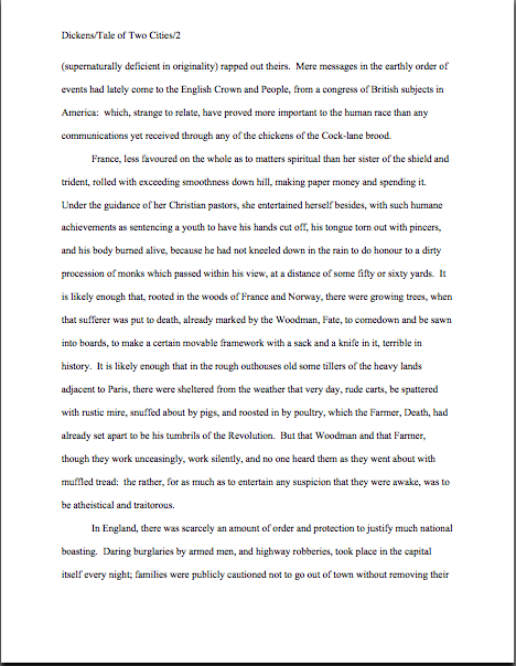
First pages that grab: Author! Author! Great First Page Made Even Better second-place winners in YA: Suzi McGowen’s A Troll Wife’s Tale and Sherry Soule’s Dark Angel (a.k.a. Beautifully Broken)

Suzi McGowen author photoSherry Soule author photo

No, I haven’t taken a look at the daunting task that is Synopsispalooza and abandoned it in terror — I shall be posting again in that excellent endeavor this evening. This morning, however, I would like to press forward with the next of the winning entries in the Author! Author! Great First Page Made Even Better Contest, the takers of second-place honors in Category II: YA, Suzi McGowen and Sherry Soule.

That’s Suzi on the left, Sherry on the right. Today, they are going to take us into the very trendy worlds of YA urban fantasy and YA paranormal.

Take a good gander at those well-constructed author photos — one of the reasons I asked the A!A!GFPMEB winners to provide them was to start all of you thinking about your author photos well before Authorbiopalooza in October. (It’s a Paloozapalooza this autumn at Author! Author!) Why think begin to ponder it well in advance? Well, two reasons. First, for most writers, coming up with a photo they like takes a few tries. Or a few hundred. Second, when the request for an author photo (or author bio, for that matter), it tends to be rather last-minute.

As in, “Oh, I’m going to start sending out your manuscript to editors tomorrow, Author McWriterly. Can you e-mail me a bio with a photo tonight?”

Trust me, you’ll be a much, much happier camper if you already have that photo — and that bio — in hand. (That’s true of synopses, too, actually, so be sure to tune back in tonight for more guidance on that front.)

Back to the business at hand. One of the problems faced by aspiring writers trying to break into a book category that happens to be hot at the moment — and remember, all publishing trends are temporary; what’s hot today may not be next year — is that, inevitably, there will be greater competition for the admittedly greater number of publishing slots. It’s an industry truism, as predictable as the flowers in spring: 1-2 years after a breakout bestseller appears, agencies will be flooded with queries and submissions with eerily similar premises.

And if there’s a series like TWILIGHT or HARRY POTTER that hits the big time? So many submissions for books like them will appear that entire subgenres may be formed.

In a way, this phenomenon is good for aspiring writers, especially for those who happened to be working on, say, YA paranormal romances when the first TWILIGHT book came out. The nice thing about the ever-changing book market is that it actually does tend to reward writers who keep weeding their own particular patch of it year in, year out: eventually, their chosen category may well become trendy.

That’s important to bear in mind, because there are always plenty of people, including agents and editors at conferences, eager to declare a particular book category dead — or impossible to sell, which in the publishing world amounts to the same thing. Just ask anyone who was trying to land an agent for historical fiction six months before COLD MOUNTAIN was a surprise bestseller.

That’s why they’re called surprise bestsellers: even the pros don’t necessarily see ‘em coming. Then they spend the next two years actively soliciting similar manuscripts, the following two tolerating similar manuscripts, and the next four wondering why in heaven’s name aspiring writers keep sending them similar manuscripts. Don’t they know the market has moved on to the next trend?

Of course, the cycle is longer with a breakout series; one has only to read the daily acquisitions listings on Publishers’ Marketplace or Publishers’ Weekly to see that books similar to TWILIGHT are still being picked up in droves. So naturally, thousands upon thousands of writers continue to describe their YA paranormals in TWILIGHTish terms, their YA fantasies in Potterish language, etc.

That strategy makes quite a bit of sense at the front end of a trend, or even at its height. The longer a wave continues, however, the harder it is to make a case that a manuscript by a writer who has never published before in that book category — like, say, the million or so adult fiction writers who have stampeded into the YA market over the past few years — is adding something new and original to the current offerings. And all too often, queriers abet that difficulty by emphasizing how their work is akin to the iconic bestseller in the category, rather than how it is different.

Which brings me back to today’s winning entries. As those of you who entered the contest may recall, one of the required elements was an identification of the entry’s book category and a brief explanation of what this manuscript would bring to that category’s already-existing target market. As so often happens with the descriptive paragraph of the query letter, most entrants mistook this requirement for either a request for a boasting back-jacket-style puff piece (This book will revolutionize Westerns!) or, you guessed it, an invitation to compare one’s own work with bestsellers.

Both of these approaches tend to sell original writing radically short. No matter how many times agents march into writers’ conferences and declaim, “I’m looking for books like Bestseller X,” the publishing industry has never been very taken with carbon copies. What these agents actually mean is, “Since editors are eager to replicate the success of Bestseller X, I am looking for new writers whose manuscripts will appeal to the same target demographic, those folks who have already demonstrated that they are willing — nay, excited about — buying similar books. So I want to see a manuscript with a fresh voice that nevertheless shares certain selling points with Bestseller X.”

Given that motivation, such an agent is unlikely to tell her agency screener (our old pal Millicent, natch) just to request pages from every querier whose descriptive paragraph says this book is just like Bestseller X, right? If a book category happens to be trendy, 70% of what crosses Millicent’s desk will be able to make that claim; by definition, surprise bestsellers change the expected selling points for new manuscripts in their book categories.

So what’s a better strategy for catching her eye? Assuming that any agency that represents that book category is already aware of Bestseller X’s selling points. Instead of telling her that your book shares them, why not show her how it is different, yet will appeal to the same target audience?

I can feel some of you who write in currently hip categories fighting that last paragraph. “But Anne, you said throughout Querypalooza that a querier has only a few lines to grab Millicent’s attention. So how can labeling my book as one with similar bestseller potential possibly undersell it?”

Glad you asked, conclusion-resisters. A lot of aspiring writers believe that a generic comparison to an established author’s work — which most this is the next Bestseller X! claims boil down to being, right? — is inherently more effective at promoting a manuscript than a specific demonstration of the book’s original elements.

As it happens, today’s winning entries disprove that assumption quite nicely. Here is Suzi’s brief description for A TROLL WIFE’S TALE:

You’ve heard of urban fantasy? That dark and gritty world of modern day cities, where elves and witches roam? My novel is the Young Adult version. Call it a suburban fantasy, where a female troll sets out to right wrongs, save the world, oh, and become a tooth fairy.

And here is Sherry’s for Dark Angel. (Please note: between the time that Sherry entered the contest and when we informed the winners — admittedly, a long time; my apologies — she changed the book’s title to BEAUTIFULLY BROKEN. A good call, I think — BEAUTIFULLY BROKEN is a perfectly marvelous title — but obviously, the judges had to work with the original entry. I hope this does not cause any confusion in future web searches, after the book comes out.)

DARK ANGEL is a twist on the young adult, boy meets girl, supernatural love story. This time the boy is the “normal” one and the girl is the supernatural and attractive teenager.

Both of these descriptions make the books in question sound rather generic, don’t they? The first doesn’t bring up an original element until the last few words. Not the best structure, strategically, as Millicent is likely to find the first three sentences a trifle perplexing: there is already a well-established YA urban fantasy category, so why not just state the book category up front and move swiftly on to what’s fresh, original, and exciting about this book?

Especially since there is so very much that is fresh, original, and exciting about this book. Take a gander at Suzi’s one-page description:

Troll Wife could use a job, so when she finds the poster on the telephone pole that says, “Any fae may apply,” she does. She’s as surprised as anyone when she’s accepted for training as a tooth fairy.

She’s also surprised by the impressive number of injuries she racks upon the job. A broken bone and a concussion? Eh, maybe she should have expected that. After all, learning to fly isn’t as easy as it sounds. But the gunshot wound? That was because she was fighting a monster that she ran into while collecting teeth.

The monster, called Oubliette, was a soldier in the war between the humans and the fae, hundreds of years ago. Now Oubliette wants to start the war all over again. This time, it wants to kill all the humans, not just most of them. The other tooth fairies should be her allies in this war against Oubliette, but Troll Wife doubts that any fae that smells like cotton candy can help save the world.

Troll Wife only has days to learn how to fight the Oubliette, protect the human children from it, and make sure that she collects her quota of teeth. While she’s at it, she needs to find out what dark secret the tooth fairies are hiding, and rescue herself from their tangled web.

Sounds like a genuine hoot, eh? But did you gain a sense of that delightful whimsy in the brief description?

DARK ANGEL’s brief description falls into an even more common querying trap: it presents the story as merely a gender-flipped twist on a bestseller. It also assumes — wrongly, based upon the longer description and the first page — that the similarity to that bestseller’s premise is the most interesting thing about this manuscript.

That made the judges rather sad, since on the page, it’s the least interesting thing about this story. Furthermore, the stories do not seem very similar. Take a peek at her longer description:

A sixteen-year-old impetuous outcast has seen ‘shadows’ for as long as she can remember and they always turn up when something bad is about to happen.

When those dark companions follow, Serenity Broussard to church with her family it begins no differently than any other day, except that she gets her first glimpse of the hot new guy in town. It’s a small town so it doesn’t take long for the gossip to spread about Trent Donavon, especially when he moves into his family’s rumored-to-be haunted mansion.

Trent and Serenity began to date and the seemingly perfect state of their relationship is thrown into chaos after she takes a job as an intern, helping restore his family’s estate. It doesn’t take Serenity long to realize that something is terribly wrong. The mansion is full of ghosts and secrets.

The house awakens latent psychic powers in Serenity, who finds herself being stalked by a ghost who tries to communicate with her in terrifying ways. The shadows lurking around Serenity—ever present and insubstantial are something else. Lacking in the description is one common denominator unifying the different types of shadows entering our world—darkness—malevolence.

Shadows had another thing in common—an attraction to Serenity.

When Serenity finds Trent’s mother’s diary, it sends her on a quest to uncover the mystery surrounding the woman’s untimely death. Except things aren’t as black and white as Serenity thinks. Because not all ghosts want help crossing over, some want vengeance.

Admittedly, a few of the narrative choices here are genuinely distracting from the storyline being presented (are the dark companions in paragraph 2 the same as the shadows in paragraph 1, for instance, and if so, are they individual characters? Why is shadows in quotation marks — and why, for an American audience, in single quotation marks? Why risk Millicent’s wrath with two technically incorrect single-sentence paragraphs, when it would be so easy to form the concepts there into narrative paragraphs with at least two sentences? Why aren’t there spaces at the ends of the dashes, since any synopsis should be in standard manuscript format?), but those would all be quite easily fixed. What I want you to notice here is that the brief description and the longer description could be for entirely different books.

That wouldn’t be too surprising to Millicent — aspiring writers undersell their manuscripts’ originality this way all the time. Sad, but true. Yet if we’re honest with ourselves, can we really blame Millicent for not being able to look at the first description of either of these books and extrapolate the second description?

That outcome would be a particular shame in the case of TROLL WIFE, because its premise is so darned charming and full of potential. (All of the judges preferred the title shortened, by the way, Suzi, although several of the judges — yours truly included — wondered if young girl readers would be a bit disturbed that the protagonist’s name and her social role are apparently identical.) That charm is apparent on page 1:

Suzi McGowen p1

Now, this page could use some revision — I suspect, for instance, that a hard-copy read-through would have caught that the narrative tells the reader twice that the protagonist is a tooth fairy, once at the end of paragraph one and again at the beginning of paragraph 2 — but is that why Millicent might start reading this with a jaundiced eye? Chant it with me now, campers: because professional readers stare at manuscripts all day, any deviation from standard format will leap off the page at them, distracting them from the writing.

There’s a reason I keep showing you so many before-and-after page 1s, after all. Take a peek at the same page after 2 minutes of cosmetic revision, and see if it doesn’t come across as more professional. For extra credit, compare it to the original revision and tell me what I changed.

Suzi revised

How did you do? I made five changes here: (1) moved the slug line to left margin (not mandatory, but the norm), (2) changed the chapter title from all caps to title case (thus the name: title case), (3) changed the spacing from an odd specific set to double-spaced, (4) changed the font from Courier to Times New Roman (again, not mandatory, but the norm for novel manuscripts), and (5) changed 14 in line 2 to fourteen. Of these five, only #5 — not writing out numbers under 100 in full — might have prompted Millicent to stop reading.

Yes, it really is that serious an offense against standard format — unfortunate, since so many aspiring writers mistakenly believe that the AP style restriction of writing out only numbers under ten applies to manuscripts. It does not: AP is for newspapers and magazines, and not all literary magazines adhere to it.

Having worked with Suzi and Sherry’s entries in soft copy (the better to show you before-and-after formatting, my dears), I suspect that both were relying on some sort of macro for the PC for their formatting — it was impossible, for instance, to alter the paragraph heading without deleting the title and the space above the text entirely and starting again from scratch. I realize that macros that purport to format a manuscript for a writer may be comforting, but actually, the restrictions of standard format are so simple that anyone reasonably familiar with Word should be able to set them up in five minutes flat. (If you don’t know what the requirements of standard manuscript format are, or indeed that there is a specific professional format for manuscripts, it would behoove you to take a peek at the HOW TO FORMAT A MANUSCRIPT category on the archive list located on the bottom right-hand side of this page.)

I hear some impatient huffing out there, do I not? “But Anne,” macro-huggers across the globe wail, “that sounds like a lot of extra work! I want my computer to do it all for me.”

Well, it is a touch of extra work — although not nearly as onerous as writers tend to speak of it as being — but let me put it this way: if a macro is wrong, its feelings are not going to get hurt when the submission gets rejected. The writer’s will. So who really should be in charge of making sure that the formatting is in apple-pie order?

True, one or two minor formatting gaffes are probably not going to be enough to trigger an automatic rejection. But then, it’s exceedingly rare that a first page gets rejected for only one reason. Presentation problems, like wolves, tend to run in packs.

So is it really all that astonishing that an experienced Millicent might open a submission packet, glance at a misformatted page 1, and assume that more presentation, proofreading, or even writing problems await her? Or that her patience for subsequent problems might be lower than for a perfectly-formatted page 1? Or, more to the point at submission time, that the first typo, grammatical error, or missing word in the text might combine in her mind with formatting problems to equal rejection?

See why I harp on formatting so much? To sharpen your eye for presentation, let’s see how the macro treated Sherry’s page 1:

The problems affect the sharp-eyed reader almost subliminally, don’t they? However, there’s one formatting error here that would draw Millicent’s eye as quickly as if the lines containing it were printed in red ink.

Oh, you didn’t catch it? Here is the same page, properly formatted.

Did you catch it that time? If you are already jumping up and down, shouting, “I saw it the first time, Anne! The text uses an emdash instead of the standard format-requisite spacedashdashspace!” give yourself a gold star for the day. (Hey, I told you there was going to be extra credit for the eagle-eyed.) Because manuscripts do not resemble published books in many important respects, the emdash — the Autoformat fix for dashes in Word that transforms them into straight lines connecting the surrounding words with no intervening spaces — is not correct in a manuscript. As you may see in the revised version above, the first word should be followed by a space, then two dashes, another space, then the second word. No exceptions.

Yes, I know that Autoformat will change what I just suggested into an emdash. Change it back, or risk the wrath of Millicent.

Okay, what else did I change? Interestingly, not what Suzi’s use of apparently the same macro might have lead us to expect: (1) moved slug line from the right to the left, (2) removed extra spaces in slug line (why have so many aspiring writers started adding spaces before and after the /s within the last year? It’s not correct, and it was not nearly so common before. It’s not as though standard format has changed in this respect.) (3) Moved the chapter title to the top line of the page, and, while I was at it, (4) changed the single space after the period to two, since that’s still the standard for manuscripts.

Long-time readers, chant it with me now: if the agent requesting your pages prefers the published book-style single-space convention, her agency’s submission guidelines should tell you so. If that’s what she wants, for heaven’s sake, give it to her, because for the agents who feel strongly enough about this to make public statements about it, it often is a rejection-worthy offense. Not only because they dislike the normal spacing, but because violating an individual agency’s stated submission standards just screams, “This writer not only cannot follow directions — he may not even have taken the time to check whether this agency had its own preferences!”

Why might that in itself render Millicent more likely to reject a submission? Because this is a detail-oriented business, writers who neglect the small stuff tend to be substantially more time-consuming for agencies to take on as clients.

“But Anne,” some of you new to the Author! Author! community — specifically, those of you who have not yet worked your way through one of my famous standard format series yet, I’m guessing — protest vehemently, “this is ridiculous. Surely, it’s the writing and the book concept that determine whether a manuscript gets accepted or rejected, not the petty little details. The agent or editor can always fix the small stuff before publication, after all. Even if a bunch of tiny, insignificant gaffes appear on page 1, I can’t believe that Millicent would just stop reading my submission.”

Oh, dear. I wasn’t going to do this, but if it saves even one good writer from undeserved rejection on formatting grounds, it’s worth it. Since Sherry revised her manuscript after the contest winners were announced, she was kind enough to send along the new version — indeed, the entire first chapter — for the judges to peruse. Obviously, it would not have been fair to the other entrants to judge the revised version, or even to provide extensive commentary upon it, but because it contained a couple of formatting problems that the original entry did not, I cannot in good conscience not flag them. One of them is, in fact, a presentation problem that might actually lead to Millicent’s not reading the submission featuring it at all.

So yes, you caught me: I have in fact structured this discussion to lead us to this point, necessitating showing you the revised version. Please, everybody, take these next examples in the spirit they are intended. (Seriously, I don’t want to see any snarky snickering about this in the comments; a tremendous number of aspiring writers make these particular mistakes, and we should all be grateful to Sherry for bringing them to our attention.)

So calmly, respectfully, wiggle your tootsies into Millicent’s moccasins and pretend you have just opened a submission packet to find this first page:

Beautifully Broken title

And this second one:

Beautifully Broken page 1

When you were expecting to find this:

Sherry's title

And this:

Sherry #2

Still don’t believe that formatting makes a difference to how Millicent perceives a manuscript? From the aspiring writer’s perspective, it might not seem to make much of a difference whether the title page is professionally formatted, or if it is in a wacky typeface, or if the first page of text is numbered 2 instead of one. But to her — and to agents, editors, and well-informed contest judges — there’s more than just words on a page at stake.

This is about respecting tradition. The publishing world values its traditions, and even if it did not on general principle, as those of you who have followed my past series on standard format are aware, manuscripts look a particular way for a variety of practical reasons. Every industry has the right to establish and maintain its own standards; most of the assertions that this or that has changed in manuscript format come from the outside.

Also, favoring professionally-formatted submissions a matter of practicality: an aspiring writer who takes the time to learn how to present his writing professionally is usually also one who has found out how publishing does and does not work. Thus, he is more likely than the average aspiring writer (who does not do his homework, as a general rule) to have realistic expectations about what an agent can and cannot do for him, the kind of turn-around times to expect on submissions to publishing houses, the necessity for not pouting when the editor asks for revisions, the imperative to promote one’s own book after it comes out, rather than passively waiting for the publishing house (or one’s friends who happen to be bloggers) to do it for him, and so forth. He’s just an easier client to promote.

What are we to conclude from all of this? Well, first, that I should plan to add a Formatpalooza to this autumn’s festivities; it actually was quite surprising to me how few of this contest’s entries arrived properly formatted. I don’t want any of my readers to get rejected on technical grounds, if a few weeks of my effort every year can help prevent it.

Second, have you noticed that since I’ve had to spend so much time going over the presentation and formatting problems, I haven’t had the luxury of talking about the writing much? That’s a pretty accurate representation of how distracting these issues are for professional readers: if the presentation and formatting are off, it’s awfully hard for good writing even to get noticed.

And that’s a real shame here, because there were some writing choices that we could have discussed productively. The prevalence of the incorrect single-sentence paragraph that we’ve already discussed in this series, for instance — in English prose, a narrative paragraph properly consists of at least two sentences; established authors like Joan Didion began breaking the rule not because they were unaware of it, but because to the hyper-literate, it is genuinely shocking to see a non-dialogue single-sentence paragraph. Thus the emphasis that this narrative choice places on the offset sentence: it shouldn’t be that way without a very good reason.

Unfortunately, in common usage, as well as in both of these pages, single-line paragraphs are used not for emphasis, but for rhythm. To a professional reader, this is not a very sophisticated way to establish beats. Save the single-sentence paragraphs for only that occasion when what is being said in them is going to come as a genuine surprise to the reader.

I would also have liked to talk about the and then convention, a notorious Millicent’s pet peeve. In a written narrative that does not involve time travel, events are assumed to be presented in the order that they happened chronologically. Thus, professional writing typically avoids the and then so dear to aspiring writers’ hearts, because it is logically redundant. The pros reserve it for only those occasions when the then part seems to come out of nowhere.

Hey, where have I heard that logic before?

Then, too, there’s the trailing off with an ellipsis… trope. Quite a few Millicents, especially the classically-trained ones, will have a knee-jerk negative to a narrative sentence or paragraph that ends in that manner. It’s fine in dialogue, where those three dots are expressing an audible phenomenon (the speaker’s voice trailing off or the effect of being interrupted in mid-thought), but the practice of borrowing that dialogue convention to make a narrative voice seem more conversational is, again, considered a not very sophisticated writing trick.

Because, really: aren’t there thousands of ways a narrative paragraph could generate suspense without resorting to punctuation?

Oh, how I wish I had time and space to talk about all this. In lieu of that, I’ll have to content myself with just posting the marked-up versions. (And mailing them to their authors, of course, but I do that routinely, so those brave enough to submit their work for critique here do not have to squint.) Here’s Suzi’s:

Suzi edit 2

And here’s Sherry’s:

Sherry edit 2

Moral: there’s no such thing as a detail too small to escape a professional reader’s notice — and no such thing as a first page that could not use one last going-over before being submitted. Join me at 7 pm PST for the resumption of Synopsispalooza, everyone, and keep up the good work!

First pages that grab: Author! Author! Great First Page Made Even Better first-place winner in YA, Natalie Hatch’s Breeder

N.Hatch

I’ve got a relatively short one for you tonight, campers: YA Natalie Hatch’s BREEDER, first-prize winner in Category II: YA. I’m fond of this entry, perhaps because Natalie had me by the end of the first page of her brief description: the tale of a runaway girl who takes up with a crew of space pirates.

What’s not to like, really?

Should the length of this post be seen as in itself a commentary upon Natalie’s first page? Well, yes and no. No, because I’m hurrying through our ongoing praise/critique fiesta on the winning entries in the Author! Author! Great First Page Made Even Better Contest — the reason I am posting twice today, to make sure that we get through them all before Synopsispalooza begins on Saturday. And yes, because today’s winning page does not offer all that many gaffes to point out.

That’s a good thing, of course, and perhaps not an altogether surprising one. Since entries closed for this contest, Natalie tells me, BREEDER won the YA category in an Australian children’s and YA writers’ competition. So were I to devote this post entirely to praise and skimp on the critique, I doubt anyone would blame me.

But that’s not really my style, is it? I’m here to milk these marvelous first pages for all of the discussion value I can.

A little praise to start out, however: Natalie’s book definitely has a great premise, an interesting protagonist in an interesting situation, facing a genuinely difficult conflict. In YA, that last is not a foregone conclusion: as our old pal, Millicent the agency screener would be only too glad to tell you, many, if not most, YA submissions feature relatively low-stakes conflicts.

Oh, what’s going on may feel like the end of the world to the protagonists of these novels, but the actual consequences of their actions, even in a worst-case scenario, are often as low as oh, no, my parents might find out. Not that there haven’t been interesting YA plots with this as the most horrifying imaginable outcome, but still, you can understand why a Millicent who screens YA queries and submissions all day, every day might conceivably long for something a bit more dramatic.

The book description for BREEDER will definitely make her sit bolt-upright in her chair. The stakes could hardly be higher for the protagonist:

The Farm needs Breeders, young girls drafted into two years of human egg production for the benefit of rich, but infertile, inner worlds. Lenni Nichols would rather die than receive the riches that await her at the completion of compulsory service. Unfortunately, faking her own death, disguising herself as a male and getting off world is harder than it looks. When Lenni signs on as an engineer to a scavenger vessel, she hopes most of her worries are over. Besides, all she has to do is hide from The Farm’s bounty hunters until the two years are complete and she will be free. Instead, she is plunged head-first into the treacherous life of space pirates. Faced with betrayal, love and loss, Lenni must overcome her own weaknesses in order to survive. She allows vengeance to taint her life and is almost consumed by it, straddling the fine line separating vigilante and villain.

Admit it — you’re already imagining the treacherous life of space pirates, aren’t you?

So am I, and yet, as a longtime reader of adult SF and fantasy, this plot does remind me a little of Octavia Butler’s superlative trilogy, XENOGENESIS, where human women are forced to become breeders for an alien-human hybrid race. Some resisters do in fact planet-hop, flee for their lives against incredible odds, etc., but biology turns out to be destiny in some very unexpected ways.

Given the subject matter here — delightfully original for a YA novel, as the judges kept pointing out to one another — the comparison may be unavoidable. However, I, for one, am not any the less eager to read Natalie’s work for reminding me of Octavia Butler’s.

Again, what’s not to like?

As the pros say, though, it all depends upon the writing. As it happens, that writing is quite good:

Natalie Hatch p1

I ask you, however: had you not already read the book description, would you have thought of that grabber of a first page as YA? Or would you have focused instead on the subject matter and categorized it as science fiction?

Give that matter a bit of thought, please. Before I give my opinion on the subject — and the judges’ — I want to slip a word in edgewise about my favorite editorial obsession, manuscript format.

Oh, didn’t you catch the formatting problems in the page shot above? Why don’t you go back and take a closer, Millicent-style look? I’ll wait. (If you’re having trouble seeing specifics, try holding down the COMMAND key and hitting + in order to enlarge the image.)

Need a hint? Okay: there are five formatting problems here, one major and four minor. Need a better hint? We saw a very similar major problem in one of the first prize-winning entries in the Adult Fiction category.

If you have been jumping up and down for the last two paragraphs, shouting, “I know! I know! The left and right margins are too wide!” give yourself a gold star. (I’ve been saying that enough throughout this series that I feel as though I should start including downloadable gold stars in my posts.) They are indeed too wide, by U.S. submission standards: 1″ on all four sides is the norm.

Natalie’s page has 1.25″ margins on the left and right, 1″ margins above. While, as I mentioned yesterday, super-wide margins actually are very nice from an editorial perspective — so much more room for scrawling commentary! Be still, my beating heart! — they are not what Millicent has been trained to expect. Also, they throw off the word count estimate terribly.

Perhaps even more serious from a submission perspective (and definitely more serious if Natalie should decide to query an agency that permits the inclusion of the opening page in her query packet), widening the margins also decreases the amount of text she can include on page 1. And why might that be problematic, campers?

If you cried out, “Because the majority of submissions are rejected on page 1, Anne,” well, you probably already have a closet full of gold stars by now. But well reasoned, anyway.

To show those of you strapped for space just how much more room, here is Natalie’s first page, reformatted. To buy her even more room to wow Millicent, I switched the typeface from Courier New to Times New Roman.

Natalie reformatted

Did you catch the four minor problems, now that I’ve fixed them? All of them would have been easier to catch in hard copy than on a computer screen (if you were already murmuring, “Read every page I’m planning to submit to an agency IN HARD COPY, IN ITS ENTIRETY, and OUT LOUD,” good), but the changes are apparent, if you look for them. In the order they appeared in the original:

1. The title of the book was italicized in the slug line.

2. Not enough space between the chapter heading and the first line of text.

3. The text is not consistent about whether it is going to use 2 spaces after a period or just 1.

4. Line -5 began with a space, not a letter.

Of these, #3 is far and away the most common in submissions. Before the rise of the Internet, and thus before public squabbles about whether it was time to jettison the second space after a period (it is never correct to use only a single space after a colon), it was quite rare to see inconsistent inter-sentence spacing: everybody just hit the space bar twice, and that was that. Now, however, since some agents call for one space and some for two, aspiring writers seem to have become confused, sometimes doing it one way, sometimes another.

This solution is unacceptable to neither party. Whether you decide to embrace the double-space convention (correct, but annoying to the small-but-vocal single-space minority) or the single space (pleasing to enthusiasts, but annoying to everyone else), you must apply it consistently throughout your manuscript.

Yes, even if you do the prudent thing and format your manuscript as single-spaced for agents who request it that way, and double-spaced for everyone else. As with all formatting, doing it sporadically will only make your manuscript look confused.

Now that we have those nit-picky-yet-vital formatting issues out of the way, we can return to the question of voice. Clearly, this voice works for this story, but it is YA? If so, what makes it YA, as opposed to the same story aimed at adult readers?

Frankly, I think it depends upon whether this page 1 lands in a YA-representing agency, one that does exclusively adult fiction, or both. Setting the issue of voice-appropriateness aside for the moment, look how Millicent responds to this opening:

Natalie edit

Personally, as an editor, I might have asked a few more follow-up questions than Millicent: how can silence be syrupy, for instance, a word usually associated with saccharine expressions of emotion? If it’s meant literally here (and, from the context, I suspect it is), how could enough of our heroine be left after an explosion to deserve the descriptor syrupy? What are the ages of these two characters? What is their relationship? Why does her suicide benefit her mother?

But as a reader, I would definitely been have been willing to turn the page in order to find the answers. Turn the page being the operative phrase here, right?

Most submissions are, after all, rejected on page 1. Which is precisely why the question of age-level appropriateness is so crucial in this case: if a YA-seeking Millicent sees this as adult-aimed — or, even more dangerous, adult-themed — writing, she may well reject it, regardless of how it is labeled.

I see some knitted brows out there. “But Anne,” some readers pipe up, “I don’t understand why you’re making such a big deal about this. A single narrative voice might well appeal to both teens and adult readers. What’s the big deal?”

The big deal, if you were not sufficiently frightened by the prospect of Millicent rejecting this page on voice-appropriateness grounds, is that this is going to be a tough premise to sell to YA booksellers, school librarians, and other adults responsible for determining what books are available to young readers. Traditionally, reproductive issues have not been all that popular with these adults as subject matter for teens; selling girls’ reproductive capacity might then reasonably be regarded as even trickier to convince an angry parent should be in a high school library.

I’m bringing this up because the voice on this page could very easily be tweaked in order to gear this story to adults. Had the reader been given some reason to believe one or both of the characters in the first scene were teens, that might not be possible, but in the absence of any reference to age, as it stands, there’s nothing about the voice, vocabulary, or even the protagonist that just screams YA voice.

Frankly, the judges engaged in some debate about whether this would have worked better as adult fiction. I was not the only judge to bring up Octavia Butler; the main (only, really) female character in William Gibson’s NEUROMANCER was also mentioned, but that seemed like a bit of a stretch. Most of us felt that this plot and this first page could make it in the tough adult SF market, although when the book description was added to the mix (particularly the part in the contest entry that said the target market was age 15 and up), the consensus was that this first page could also work as YA.

But there was a problem with that formulation: while readers aged 15-21 are technically part of the YA market, in practice, even older YA tends to be aimed at 13-year-olds. And there’s a good reason for that, especially for SF or fantasy — readers above that age are often already fairly deeply into adult fiction.

So what precisely is the difference between writing for Natalie’s intended target audience and for adults?

The usual answer — and one I do not like very much, on general principle — is that if the protagonist is an older teenager (say, around the age of the target market for this book), and female, the book must be YA, because (the logic runs) only a teenage girl would care about a teenage girl protagonist. (Cough, cough.) If, on the other hand, the protagonist is an older teenager and male, whether the book is YA or not depends entirely upon the situation and the writing.

Why? Hold onto your hats, ladies: because both male and female readers are more used to identifying with male protagonists.

Had I mentioned that I dislike this argument? It pops up all the time in literary fiction circles; the same story that with a male protagonist would be marketed as LF might well be steered toward the YA market if it’s about a girl. Rather than hash out that grand debate, though, let’s get back to Natalie’s first page.

Ultimately, the judges decided to take the writer’s word about the target audience — and happily, there is nothing on this page (barring the subject matter itself, which will be an insuperable barrier for some parents) that would rule it out as a YA voice. For a writer harboring sophisticated expectations of her readership, that was a savvy choice.

Given the subject matter, though — reproduction-for-sale has not historically been parents of teenagers’ rush-out-and-buy-it topic for their progeny — I would advise erring on the side of divulging too much about these characters on page 1, rather than too little. Even an oblique reference to age, perhaps accompanied by some expression of feeling toward the protagonist’s mother, might well land this opening firmly in the YA camp.

Although for YA, the nagging question will remain, unavoidably: did the mother sell our heroine into reproductive indentured servitude? Followed closely by: since subaltern is generally just a descriptive term for someone at a lower level in an organization, why is the word capitalized here?

For the answers to these and other burning questions, of course, we must turn to the rest of the book. Which, naturally, was impossible for the contest’s judges — and for the rest of us, until we may purchase it in a bookstore. By then, presumably, the book category issue will have been resolved by the person with the ultimate say: the acquiring editor at a publishing house.

Congratulations on a fine job, Natalie; congratulations on both contest wins. As always, keep up the good work!

Querypalooza, part II: state your business!

ozgatemanozgatemanozgateman

Are some of you still feeling a bit shell-shocked after this morning’s Querypalooza post? I wouldn’t be at all surprised if you were: in it, I set out a very basic structure for a query letter. In deference to everyone’s possibly strained nerves, I’m going to take it a bit more gently in this post, assuaging the fears of the nervous, adding nuances to the prototype, and generally spreading joy and enlightenment abroad.

And then I’m going to plunge you back into shock again. Don’t say I didn’t warn you. It’s for your own good, I promise.

Querying, I think we can all agree, is a necessary evil: no one likes it. It generates a whole lot of inconvenience for writer and agency alike, and to engage in it is to put one’s ego on the line in a very fundamental way.

Rejection hurts, and you can’t be rejected if you never send out your work, right? So you can either try to lie low, keeping your dreams to yourself, or you can attempt to approach those high-and-mighty gatekeepers of the industry, asking to be let inside the Emerald City.

Sounds a lot like high school social dynamics, doesn’t it?

Just as many people stay away from their high school reunions because they fear exposing themselves to the judgment of people whom past experience has led them to believe to be, well, kinda shallow and hurtful, many, many writers avoid querying, or give up after just a handful of queries, because they fear to be rejected by folks they have heard are — wait for it — kinda shallow and prone to be hurtful.

There are a variety of ways to deal with such fears. One could, for instance, not query at all, and resign oneself to that great novel or brilliant nonfiction book’s never being published. Alternatively, one could query just a couple of times, then give up.

Or — and if you haven’t guessed by now, this would be my preferred option — you could recognize that while some of the people at the reunion may in fact turn out to be kind of unpleasant, you really only need to find the one delightful person who finds you truly fascinating to make the entire enterprise worthwhile.

You’ll be pleased to hear, though, that unlike a hapless ex-school kid gearing up to attend a reunion, there are certain things an aspiring writer can do before querying to increase the probability of a positive reception. Certain elements mark a query letter as coming from someone who has taken the time to learn how the publishing industry works.

Agents like writers who bother to do that, you know, and with good reason. Such new clients are much less time-consuming than those whose ideas of how books are sold bear only scant relation to reality. Aspiring writers harboring unrealistic expectations tend not only to express resentment when their work encounters stumbling-blocks — they often end up feeling disappointed when things are going well.

I just mention.

The query letter structure I proposed last time — which is, I must reiterate, NOT the only one possible by any means, or even the only one that works; it’s just what has worked best in my experience — also frees the writer from the well-nigh impossible task of trying to cram everything good about a book into a single page. Which is, I have noticed over the years, precisely what most aspiring writers try to do.

No wonder they get intimidated and frustrated long before they query the 50 or 100 agents (yes, you read that correctly) it often takes these days for a good book to find the right fit. To put this in perspective, a truly talented writer might well end up querying the equivalent of my entire high school graduating class before being signed.

Believe it or not, masses of rejected queries are not necessarily a reflection on the manuscript in question. Rejection is often a function of heavy competition, agent specialization, and aspiring writers not being aware of what information a query letter is supposed to contain.

Apart from doing the necessary homework to get a query that DOES contain the right information onto the desk of an agent who does habitually represent that type of book, the only way that I know to speed up that process is to make the query letter itself businesslike, but personable.

Don’t tense up — I’m not talking about spilling your soul onto a single sheet of paper. I’m talking about making your query letter unique.

And not in the all-too-common misdefinition of the word as a synonym for special. I mean unique in its proper sense of one of a kind.

A tall order, you say? Well, keep in mind that the SOLE purpose of the query is to engender enough excitement in an agent (or, more commonly, in Millicent the agency screener: it is rare for agents at the larger agencies to screen query letters themselves; thus Millicent’s being the one to get the paper cuts) that she will ask to see a representative chunk of the book itself, not to reproduce what you would like to see on the book’s back jacket or to complain about having to work through an agent at all.

If either of the last two options made you chuckle in disbelief, good. Believe it or not, I’ve seen both turn up many, many times in unsuccessful query letters. Boasting and petulance both abound, and both tend to discourage positive response.

Now, I know that my readers are too savvy to do either of those things deliberately, but isn’t it worth sitting down with your query letter and asking yourself: could an exhausted Millicent — in a bad mood, with a cold, having just broken up with her boyfriend AND burned her lip on that over-hot latte yet again — possibly construe that letter as either?

Yes, querying is a chore, and an intimidating one at that; yes, ultimately it will be the agent’s job, not yours, to market your work to publishers, and an agent or editor probably would have a far better idea of how to spin your book than you would.

Agents and their screeners are in fact aware of all of these things. You don’t need to tell them.

Your query letter needs to market your book impeccably anyway, in a tone that makes you sound like an author who LOVES his work and is eager to give agent and editor alike huge amounts of his time to promote it. Not a walk in the park, definitely, but certainly doable by a smart, talented writer who approaches it in the right spirit.

Sound like anyone you know?

So start thinking, please, about how to make your query the one that waltzes into the reunion with a positive attitude, not the one who storms in with a chip on its little shoulder. Or, heaven forefend, the one that doesn’t stick its nose through the door at all.

The gates of the Emerald City are not going to open unless you knock, people. The only manuscript that has absolutely no chance of getting published is the one that is never queried or pitched.

Yet even as I typed that, I could sense some ardor-deflation out there. “”My God,” the little voice in the back of my head which I choose to attribute to my readership is saying, “how is all of that possible within the context of a single-page missive? How can I cram all I need to say to grab their attention in that little space, much less seem unique while doing it?”

Um, are you sitting down? You don’t actually have the entire page to catch their attention; to be on the safe side, figure you have only about five lines to convince them to keep reading.

Yes, you read that correctly. While you already have the heart medication and/or asthma inhaler at the ready, it seems like a good time to add: most query letters are not even read to their ends by Millicent and her ilk.

Are you rending your garments and shouting, “Why, oh Lord, why?” Because the vast majority of query letters disqualify themselves from serious consideration before the end of the opening paragraph.

Hey, I told you to sit down first.

At the risk of repeating myself, this is largely attributable to aspiring writers’ not being aware of what information a query letter should and should not contain. Unfortunately, Americans are so heavily exposed to hard-sell techniques that many aspiring writers make the mistake of using their query letters to batter the agent with predictions of future greatness so over-inflated (and, from the agent’s point of view, so apparently groundless, coming from a previously unpublished writer) that they may be dismissed out of hand.

Like what, you ask? Here are some popular favorites:

This is the next (fill in name of bestseller here)!

You’ll be sorry if you let this one pass by!

Everyone in the country will want to read this book!

Women everywhere will want to buy this book!

It’s a natural for Oprah!

This book is like nothing else on the market!

I hate to burst anyone’s bubble (yet I do seem to be doing it quite a bit lately, don’t I?), but to professional eyes, these are all absurd statements to discover in a query letter. Yes, even if the book in question IS the next DA VINCI CODE.

Why? Because these aren’t descriptions of the book; they’re back-jacket blurbs, marketing copy, equally applicable to (and equally likely to be true about) any manuscript that crosses their desks.

After one has heard the same claim 1500 times, it starts to lose a little vim. “Why do these queriers keep telling me that their books are unique?” Millicent grumbles, reaching for her fourth latte of the afternoon. “Why aren’t they SHOWING me?”

Ah, there’s the rub: assertions like these simply are not as effective at establishing a writer’s ability or a story’s appeal as demonstrating both practically, through well-written sentences and a summary containing lively and unusual details. Even in the extremely rare instances that these statements aren’t just empty boasts based upon wishful thinking, consider: whose literary opinion would you be more likely to believe in Millicent’s shoes, the author’s vague claim of excellence about his own book or another reader’s recommendation?

To put it another way, if someone you’d never met before came up to you on the street and said, “Hey, I bake the world’s best mincemeat pies, the kind that can change your life in a single bite,” would you believe him? Would you trustingly place that total stranger’s good-looking (or not) slice of God-knows-what into your mouth?

Or would you want some assurances that, say, this hard-selling yahoo knows something about cooking, had produced the pie in a vermin-free kitchen, and/or hadn’t constructed the mincemeat out of ground-up domestic pets?

Oh, you may laugh, thinking that this isn’t really an apt parallel, but why would agents and editors’ desire to hear about a new writer’s past publication history — or educational background, or even platform — if NOT to try to figure out if that pie is made of reasonable materials and in a manner up to professional standards of production?

That’s why, in case you’ve been wondering, a good query letter includes what I like to call ECQLC, Eye-Catching Query Letter Candy, platform information and/or selling points that will make Millicent sit up and say either, “Wow, this writer has interesting credentials,” “Wow, this writer is uniquely qualified to tell this story,” and/or “Wow, this book has greater market appeal/a larger target audience/is significantly more important to human existence than I would have guessed.”

The crucial exclamation to elicit, obviously, is “Wow!” Not merely because Millicent honestly does enjoy discovering exciting new writing projects (yes, even though it’s her job to reject 98% of the ones that cross her desk), but because a query letter that mentions either the writer’s credentials or the book’s selling points is genuinely rare.

I sense some disgruntled muttering out there, do I not? “Here we go again, Anne,” some mutterers, well, mutter. “I can’t STAND it when the pros start rattling on about platform. Isn’t that just code for we’re not interested in taking a chance on previously unpublished authors?”

Actually, it isn’t. Agents and their Millicents don’t ask to see platform information in queries in order to seem exclusionary toward previously unpublished writers (okay, not merely to seem exclusionary). They want it to be there because specific references to specific past literary achievements are signals to a quick-scanning screener that this is a query letter to take seriously.

As will an opening paragraph that states clearly and concisely why the writer decided to query this agent, as opposed to any other; a well-crafted single-paragraph elevator speech for the book; some indication of the target market, and a polite, respectful tone.

The same basic elements, in short, as an effective verbal pitch.

Did some light bulbs just flicker on over some heads out there? That’s right, campers — the difference between a vague boast and solid information about your book and why THIS agent is the best fit for it is actually a show, don’t tell problem, at base. Part of your goal in the query letter is to demonstrate through your professional presentation of your project that this is a great book by an exciting new author, not just to say it.

So you might want to eschew such statements as, “My friends say this is the greatest novel since THE GRAPES OF WRATH. It’s also a natural for Oprah.” You can make better arguments for your manuscript’s relevance.

“But Anne,” I hear some of you protest, “my book really is a natural for Oprah! I’m going on her show next week!”

Well, congratulations — go ahead and open your query letter with the date of your appearance on the show, and the best of luck to you. For the overwhelming majority of you who have not already negotiated with her production staff, I would recommend against mentioning your book’s Oprah potential at all, either in the query letter or, if you write nonfiction, in the book proposal.

Why? Because, conservatively speaking, at least 40% of book proposals Millicent sees mention the possibility of appearing on Oprah. As will most marketing plans, a hefty percentage of verbal pitches, and a higher percentage of query letters than I even like to say.

What’s the result of all of that repetition? Usually, Millicent will simply stop reading if a query letter opens with an empty boast like that, because to her, including such statements is like a writer’s scrawling on the query in great big red letters, “I have absolutely no idea how the publishing industry works.” Which, while an interesting tactic, is unlikely to get an agent or her screener to invest an additional ten seconds in reading on to your next paragraph.

That’s right, I said ten seconds: as much as writers like to picture agents and their screeners agonizing over their missives, trying to decide if such a book is marketable or not, the average query remains under a decision-maker’s eyes for less than 30 seconds.

That doesn’t seem like a lot of time to make up one’s mind, does it? Actually, it is ample for a query letter rife with typos and unsubstantiated claims about how great the book is to turn a professional reader off.

Try not to blame Millicent for this. I can’t stress enough that agency screeners do not reject quickly merely to be mean. It’s their job, and to a certain extent, developing pet peeves and shortcuts is a necessary psychological defense for someone handling hundreds of people’s hopes and dreams in any given day’s work.

Even the best-intentioned Millicent might conceivably, after as short a time as a few weeks of screening queries, might start relying pretty heavily upon her first impressions. Consider, for instance, the English major’s assumption that business format is in fact not proper formatting for either query letters or manuscripts. Think about it from a screener’s point of view: it’s true, for one thing, and let’s face it, improper formatting is the single quickest flaw to spot in either a query or manuscript.

So why wouldn’t Millicent free up an extra few seconds in her day by rejecting paper query letters devoid of indentation on sight? Especially when empirical experience has shown her that aspiring writers who don’t use grammatically-necessary indentation in their query letters often eschew it in their manuscripts as well?

I’m hearing more huffing. “But Anne,” some of you demand indignantly, and who could blame you? “What does indentation have to do with the actual writing in a manuscript? Or a query, for that matter?”

Potentially plenty, from Millicent’s point of view: remember, the competition for both client spots at agencies and publication contracts is fierce enough that any established agent fill her typically scant new client quota hundreds of times over with technically perfect submissions: formatted correctly, spell- and grammar-checked to within an inch of their lives, AND original. So there’s just not a lot of incentive for her to give a query with formatting, spelling, or grammatical problems the benefit of the doubt.

Some of you still don’t believe me about the dangers of using business formatting, do you? Okay, let’s take a gander at what Millicent expects to see, a letter formatted observing standard English rules of paragraph-formation:

mars query indented

Now let’s take a look at exactly the same letter in business format:

biz style mars query

Interesting how different it is, isn’t it, considering that the words are identical? And isn’t it astonishing how many paces away a reader can be for the difference to be obvious?

One lone exception to the intent-your-paragraphs rule: in an e-mailed query, of course, the business format would be acceptable, but on paper, it’s not the best strategic choice. Ditto with requested materials, even if you are sending them via e-mail. (Unless her agency specifies otherwise, Millicent will expect you to send any requested pages as Word attachments, not as inserts in the body of an e-mail; thus, all pages should include indented text. FYI, agencies that tell queriers to include sample pages or chapters with their queries are not technically requesting material: they simply like for Millie to have more information at her fingertips before she makes a decision. For an in-depth discussion of the differences between query packets and submission packets, please see the HOW TO PUT TOGETHER A QUERY PACKET and HOW TO PUT TOGETHER A SUBMISSION PACKET on the archive list at right.)

Indented paragraphs are, to put it bluntly, the industry standard. Unfortunately, a lot of aspiring writers seem not to be aware that business format tends to be regarded as less-than-literate, regardless of whether it appears in a query letter, a marketing plan, or — heaven forfend! — a submitted manuscript. (If you don’t know why I felt the need to invoke various deities to prevent you from using business format your manuscripts, please run, don’t walk to the HOW TO FORMAT A MANUSCRIPT category at right.)

In fact, I am perpetually meeting writers at conferences and in classes who insist, sometimes angrily, that a query letter is a business letter, and thus should be formatted as such. They tell me that standards have changed, that e-mail has eliminated the need for observing traditional paragraph standards, that it’s the writing that counts, not the formatting.

I understand the logic, of course, but it simply doesn’t apply here: not all businesses work in the same way. As anyone who works in an agency or publishing house would no doubt be delighted to tell you, there are many, many ways in which publishing doesn’t work like any other kind of business. One does not, for instance, require an agent in order to become a success at selling shoes or to become a well-respected doctor.

If you’re looking for evidence of the biz’ exceptionalism, all you have to do is walk into a bookstore with a good literary fiction section. Find a book by a great up-and-coming author that’s sold only 500 copies since it came out last year, and ask yourself, “Would another kind of business have taken a chance like this, or would it concentrate on producing only what sells well? Would it continue to produce products like this year after year, decade after decade, out of a sense of devotion to the betterment of the human race?”

Okay, so some businesses would, but it’s certainly not the norm.

Yet almost invariably, when I try to tell them that publishing is an old-fashioned industry fond of its traditions, and that agents and their screeners tend to be people with great affection for the English language and its rules, I receive the same huffy reply from writers who dislike indenting: some version of, “Well, I heard/read/was told that a query/marketing plan had to be businesslike. Therefore, it must be in business format. QED, tradition-hugger.”

I’m always glad when they bring this up — because I strongly suspect that this particular notion is at the root of the surprisingly pervasive rumor that agents actually prefer business format. I can easily envision agents stating point-blank at conferences that they want to receive businesslike query letters.

But businesslike and business format are not the same thing. Businesslike means professional, market-savvy, not overly-familiar — in short, the kind of query letter we talked about last time.

Business format, on the other hand, doesn’t dictate any kind of content at all; it’s purely about how the page is put together. There’s absolutely nothing about this style, after all, that precludes opening a query with the threat, “You’ll regret it for the rest of your natural life if you let this book pass you by!”

All of these negative examples are lifted from actual query letters, by the way. My spies are everywhere.

All that being said, there’s another reason that I would strenuously advise against using business format in your query letters. A comparative glance at the two letters above will demonstrate why.

Take another look, then put yourself in Millicent’s shoes for a moment and ask yourself: based upon this particular writing sample, would you assume that Aspiring Q. Author was familiar with standard format? Would you expect Aspiring’s paragraphs to be indented, or for him/her (I have no idea which, I now realize) NOT to skip lines between paragraphs?

Okay, would your answer to those questions change if you had a hundred query letters to read before you could get out of the office for the day, and you’d just burned your lip on a too-hot latte? (Millicent never seems to learn, does she?)

No? Well, what if it also contained a typo within the first line or two, had odd margins, or began with, “This is the best book you’ll read this year!” or some similar piece of boasting? Wouldn’t you be at least a LITTLE tempted to draw some negative conclusions from the format?

Even if you wouldn’t, Millicent would — and perhaps even should. Why? Because although most aspiring writers seem not to be aware of it, every sentence a writer submits to an agency is a writing sample.

Even if the writer doesn’t treat it as such, a screener will. After all, when that stranger comes up to sell you a meat pie, you’re going to be looking for whatever clues you can to figure out if he’s on the up-and-up.

I can feel some of you getting depressed over this, but actually, I find it empowering that the high rejection rate is not arbitrary. Quick rejections are not about being mean or hating writers — they’re about plowing through the mountains of submissions that arrive constantly. The average agency receives 800-1200 queries per week (that’s not counting the post-Labor Day backlog or New Year’s Resolution Rush, folks), so agents and screeners have a very strong incentive to weed out as many of them as possible as rapidly as possible.

That’s why, in case you were wondering, that agents will happily tell you that any query that begins “Dear Agent” (rather than addressing a specific agent by name) automatically goes into the rejection pile. So does any query that addresses the agent by the wrong gender in the salutation. (If you’re unsure about a Chris or an Alex, call the agency and ask; no need to identify yourself as anything but a potential querier.)

So does any query that is pitching a book in a category the agent is not looking to represent. Yes, even if the very latest agents’ guide AND the agency’s website says otherwise. This is no time to play rules lawyer; these people know what their own connections are.

And you know what? These automatic rejections will, in all probability, generate exactly the same form rejection letter as queries that were carefully considered, but ultimately passed upon.

So how precisely is an aspiring writer to learn what does and doesn’t work in a query? By finding out what Millicent has been trained to spot — and learning what appeals to her.

A great place to start: go to writers’ conferences and ask questions of agents about what kind of queries they like to see. Attend book readings and ask authors about how they landed their agents. Take writers who have successfully landed agents out to lunch and ask them how they did it.

But do not, whatever you do, just assume that what works in other kinds of marketing will necessarily fly in approaching an agent. After all, almost universally, agency guidelines specifically ask aspiring writers not to use the hard-sell techniques used in other types of business: writers seeking representation are expected not to telephone to pitch, send unrequested materials, or engage in extracurricular lobbying like sending cookies along with a query letter.

Instead, be businesslike, as befits a career writer: approach them in a manner that indicates that you are aware of the traditions of their industry. Tune in late tonight for some more tips on how. And, of course, keep up the good work!

Improving those opening pages, part II: preparing your manuscript for its first target reader

public market sign

Last time, I posted an honest-to-goodness reader’s honest-to-goodness page one and began to examine it as any professional reader — an agent, say, or editor, or contest judge — might. As those of you who joined me in that endeavor no doubt recall with a shudder, what a pro would consider a fairly cursory examination of presentation issues would strike most aspiring writers as a no-holds-barred critique.

Why would I do such a thing to a perfectly nice manuscript, other than to drum up enthusiasm for the Author! Author!/WHISPER Great First Page Made Even Better Contest (entry deadline next Monday, in case anybody’s forgotten)? For starters, to encourage all of you self-editors out there to start to look at your work not like a writer, or even like your ideal reader, but like an agency screener.

You know, the person who culls the hundreds of queries and dozens of submissions the average agent receives in any given week down to the happy few that the agent actually has time to read. Here at Author! Author!, that dreaded first line of defense and most critical first reader is known as Millicent.

Learning to read through Millicent’s eyes is an exceedingly useful skill for an aspiring writer to develop; in fact, for a writer intent upon landing an agent in North America, it’s a necessary skill. No matter how delightfully apt a manuscript may be for its intended ultimate readership — you know, the fine folks who are going to buy your book in a brick-and-mortar bookstore, take it home, and cherish it for the rest of their reading lives — if a submission can’t please the Millicent screening for the agent of your dreams, you’re bound to be out of luck.

With that dire warning ringing in our collective ears, let’s take another gander at yesterday’s example, shall we?

page 1 example wrong

Last time, I mentioned in passing that the italicized part would raise most Millicents’ eyebrows, if not red flags over the manuscript. While indicating thought by either using italics or saying she thought is acceptable in many book categories (but not all; taking the time to learn the conventions of your chosen book type will serve you well at submission time), it’s never considered right to use both simultaneously.

In other words, while Millicent would never consider this correct:

Casey swallowed. “Do you know how bad off she is?” she said, all the while thinking I should have known. I should have known.

Of course this would happen today.

depending upon the book category, she would be perfectly happy with either:

Casey swallowed. “Do you know how bad off she is?” she said, all the while thinking: I should have known. I should have known. Of course this would happen today.

or:

Casey swallowed. “Do you know how bad off she is?” I should have known. I should have known. Of course this would happen today.

The trick is to pick one method of indicating thought and stick to it consistently throughout the manuscript — ideally, the method utilized in the current bestsellers in your chosen book category. If a conscientious flip through recent releases of your type of book does not reveal a category convention, don’t stress out about it; just use the method that appeals most to you.

Bearing in mind, of course, that there are quite a few professional readers out there — yes, including a hefty minority of Millicents — who simply don’t like italicized thought on general principle. “Humph!” they say, wrinkling their noses over type dancing across the page. “Is this honestly necessary? Shouldn’t a good writer be able to make it clear that a character is thinking something, or indicate inflection, without resorting to funny type?”

I have to admit, as a reader, I’m seldom inclined to argue with them on this point, particularly if the manuscript in question also uses italics (correctly) for emphasis (“I’m talking to you, Reginald!”), to indicate foreign words (“You left off the requisite accent grave, Marie.”), or includes a lot of song or book titles (“I know — let’s play Rubber Band Man while reading My Life as a Contortionist by I.M. Bendy!”). Used rarely, there’s nothing wrong with italics, but in a manuscript with a lot of italicized words, the skimming eye can easily become confused, even to the point of skipping lines.

There’s another reason an aspiring writer might want to be sparing in his use of italics, especially on page one. It’s very, very popular to use italics on an opening page to highlight a brief opening scene or image.

Everybody knows what I’m talking about, right? In theory, the italics are intended to alert the reader to the fact that the paragraphs in the funny type aren’t in the time, place, and/or mindset of the ACTUAL opening scene that follows immediately thereafter. On the manuscript page, it usually looks a little something like this:

Ima's italics

One often sees this done in published books, right? Unfortunately — feel free to chant along with me now, long-time Author! Author! readers — manuscripts are not supposed to look like published books; they differ in many significant respects. Still more unfortunately, many, if not most, aspiring writers are not aware of those differences when they submit.

The usual result? Well, we saw a bit of it yesterday, didn’t we? Instead of treating the deviation from expected formatting as an intriguing authorial choice, Millicent usually just regards it as (a) a mistake, (b) an indicator of the submitter’s lack of familiarity with the publication process, (c) carte blanche to take the submission less seriously, or (d) all of the above.

So when Millie spots an italicized opening paragraph or two, she tends not to exclaim, “Oh, here is a suggestion to the editor about what the formatting of the published book should look like,” as italics-loving submitters hope. Instead, she says, “Oh, here’s another one who doesn’t know that italicization choices are the province of a book’s editor, not the author.”

In other words, she tends to regard block italicization in much the same way as she would any other deviation from standard format — if she doesn’t happen to work for an agent who has a pet peeve against this type of opening. As many, many agents do, I’m afraid.

How would that affect how Millicent would read such an opening? 99% of the time, like so:

italicized opening

In response to that vast collective gasp: yes. The vast majority of Millicents will simply skip over italicized opening text, treating the first normal line after it as the opening sentence of the manuscript.

My, the group’s gasping a lot today. “Why on earth,” italics-lovers the world over croak in aghast unison, “would any literature-loving human do such a thing? Published books open all the time with italicized bits!”

A fair question — but actually, there’s a pretty fair answer. Most Millicents just assume, often not entirely without justification, that if it’s in italics, it doesn’t really have much to do with the story at hand, which, they conclude (and not always wrongly), begins with the first line of plain text. In their experience, that’s where the action usually begins.

In other words, they’re apt to skip the italicized bits to save themselves some time.

Which is, as some of you may have noticed, the justification for many, many of the instant rejection norms that plague the nightmares of submitters. Millicent’s workday moves along at quite a clip, after all.

To distract you from any well-justified artistic seething you might be tempted to do over that last observation, take another look at that italicized section. Can you spot any other problems our pal Millie might have with it?

page 1 example wrong

Any luck? Actually, to Millicent’s eye, the problem is pervasive throughout the entire page. Here it is again, with the words that would jump out at her highlighted.

Ima's first with reps

Easier to see the word and phrase repetition now, isn’t it? (Although the slug line seems to have vanished mysteriously in the transition, I notice.) Trust me, Millicent would swoop down on each and every one of ‘em like a bird of prey.

Why is she so much more likely than the average reader to notice word and phrase repetition and be bugged by it? Like most professional readers, Millicent’s eye for redundancy has been sharpened not only by years and years of reading manuscripts, but also by training: textual repetition is one of the first things fledgling editors are taught to spot.

Why might a savvy submitter want to avoid tripping her delicate redundancy sensors on page one? Because of an underlying assumption necessary to justify quick rejections: almost universally, professional readers will assume that the writing on page 1 is a representative sample of the writing throughout the entire book.

Which it usually isn’t, in practice. Most first-time writers improve as they work their way from Chapter One to The End, so it’s not all that unusual for the sentence style and word choice to be quite different in Chapter 2 than in Chapter 18. It’s also quite common for writers to revise sporadically, resulting in a highly polished Chapter 6 followed by a virtually first-draft Chapter 7. And don’t even get me started on the number of submissions in which the first ten pages are impeccable (possibly because their writers had heard someone like me point out that unless the opening pages are buffed to a high shine, Millicent is unlikely to read past them), while the rest of the text remains largely unrevised.

Be that as it may, Millicent has a LOT of submissions to get through in any given day — and it’s her job to narrow the field of applicants for the post of agency client, isn’t it? So while she may decide to keep reading past the bottom of page 1 to see if the writing becomes less repetitious, or more exciting, or more genre-appropriate, or more anything else she knows that her boss is looking for in a new client’s work, structurally, there isn’t a great deal of incentive for her to invest the extra minute or two.

In case I’m being too subtle here: it’s in your best interest to revise the opening pages so that they reflect your most polished writing style. If page 1 doesn’t wow Millicent, page 2 may not get a chance to impress her.

Fortunately, redundancy can usually be removed at little or no cost to the meaning of a paragraph, and without even much effort. Take a peek at our example after roughly 43 seconds of revision:

example no reps

Do I spot a few eagerly-raised hands out there in the ether? “But Anne,” a few sharp-eyed souls point out, “that’s not the same text as before — it’s a few lines longer.”

Well spotted, sharp-eyed ones. More space on page 1 to show off your good writing is a dandy fringe benefit that often results from minimizing repetition. Don’t say I never gave you a present.

I have quite a bit more to say about this first page as a submission, believe it or not, but let’s save it for next time. Then, if we’re very brave indeed, we may take the plunge into page 2!

Clearly, we like to live dangerously here at Author! Author! Keep up the good work!
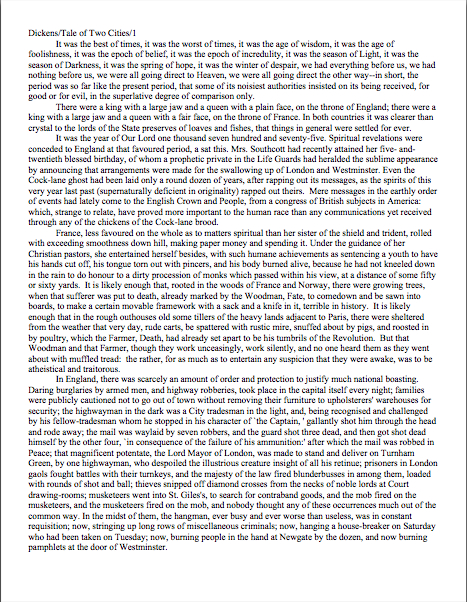
Hey! Do I spy some faint signs of life?
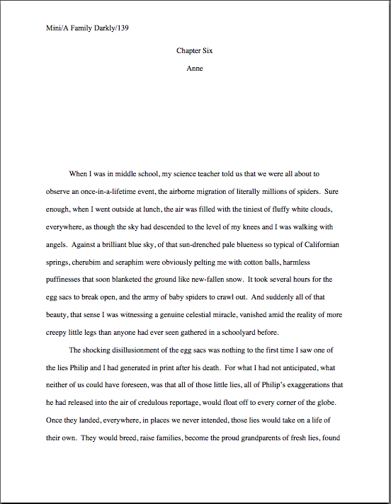
Ste Cecile at Albi

No, that’s not a photo of me convalescing after my recent back injury — I seldom can be spotted sporting a turban. It’s a statue of Ste. Cecile, snapped from the middle of a mob of waist-high French schoolchildren at Albi. As a working writer, I harbor great fondness for Ste. Cecile: even after Roman jailors third attempt to chop her head off (thus the slashes on the statue’s neck), she kept right on talking. She has my vote for patron saint of queriers and submitters, therefore.

Speaking of submissions, I had a bright idea whilst I’ve been lolling about moaning in recent weeks. We had been just wrapping up a nice, meaty series on multiple-protagonist novels with discussion of how to write a synopsis for the tricky things. Just before my back decided to start playing tricks on me, I had promised you an in-depth look at how to write a standard-length synopsis for a super-complicated novel.

A most worthy endeavor, obviously, but equally obviously, one that is going to require some pretty hefty examples. Now, in my ordinary day-to-day life, tossing off a mock synopsis is quick work for me — as I mentioned earlier in the series, it’s a professional skill that becomes honed only with long practice. Trying to repeat the trick whilst on painkillers, however, is another matter altogether.
So rather than hold off on posting further until I have the oomph to pull off that high dive again, I’ve decided to put it on the proverbial back burner for the nonce and dedicate myself to a new series. Something a trifle more conducive to the kind of shorter posts one can write comfortably in bed, as well as one that’s been pressing on my mind lately.

I’m going to be spending the next few days, in short, presenting you with an actual reader’s actual first pages of text, helping you (and the reader kind enough to provide them) see how Millicent the agency screener is likely to respond to various aspects of them. I’ve been meaning to do this for a while now, but never has it seemed like a more valuable endeavor: while I’ve been bedridden, I’ve been re-reading John Steinbeck’s entire literary output, and I wish someone had sat him down for a stern talk about his opening pages. Your garden-variety Millicent of today would not make it past the first page of most of his books.

And it’s not because of the writing. Honestly, TEN PAGES on soil conditions in Salinas before the story starts in EAST OF EDEN, John?

Why use a real, live, feeling aspiring writer’s opening pages for this exercise, you ask, when I generally make up examples from scratch? Well, several reasons, not the least of which I touched upon above: coming up with examples in time-consuming, and in my current condition, much harder than usual. Also — and this is significant for an exercise like this — I’ve been a professional writer and editor for an awfully long time now, and my parents before me; the errors I might make, even for illustrative purposes, might not be the same as those new to the game’s.

Third, I’m hoping by having abruptly selected a reader from amongst those of you who have commented over the last few months, startling that sterling soul by requesting pages out of the blue, and lavishing this level of attention and blog space upon one writer’s efforts, not only to encourage more of you to comment from time to time, but also to enter the Author! Author!/WHISPER Great First Page Made Even Better Contest.

The deadline of which, incidentally, is a scant week away, in case anyone is wondering. I just mention, because the prize here is a very practical one, quite worth winning: Fab YA author Phoebe Kitanidis and I will critique the first pages of the lucky winners’ manuscripts in this very forum in June.

I know what you’re thinking, but this is not one of those annoyingly time-consuming literary contests that require entrants to twist their manuscripts into all sorts of gymnastic poses for submission. All the rules ask you to do here is something most of you have already been doing: present the actual first page of your manuscripts, in precisely the format you would send to an agent who requested pages.

Think of it as a pre-Millicent test drive.

Professional feedback comes in all shapes and sizes, ranging from pointing out ultra-basic presentation problems (“Um, is there a reason that you’re using 8-point Copperplate Gothic Bold when folks in publishing expect to see 12-point Times New Roman?”) to clarity issues (“Pardon my saying so, but is it really essential to the story not to describe the fellow standing behind your unsuspecting protagonist with an axe?”) to marketing considerations such as hooking the reader’s interest early (“TEN PAGES on soil conditions in Salinas before the story actually starts, John?”) Today, I am going to ease us into manuscript critique in its most simple form: the purely cosmetic.

That’s right, campers: it’s time for another round of Millicent’s Knee-Jerk Reaction Theatre. Ready, set — let’s look for superficial turn-offs!

Before anybody out there dismisses this level of critique as beneath the notice of a serious writer, allow me to point out that the since vast majority of submitted manuscripts get rejected on page 1, it’s poor strategy to ignore the superficialities, as all too many submitters do. Writers may prefer to think that their manuscripts should — and will — be judged purely on the quality of the writing, but since all professional manuscripts look the same way, it’s simply a hard fact of submission that an improperly-presented manuscript is generally dismissed faster than a properly-presented one, even if the writing is identical.

To put it less harshly, a savvy submitter recognizes that an agent or editor can only fall in love with the writing if s/he reads it — and reads it with an open mind. A misformatted manuscript, however, walks into the game with a strike against it.

That’s an important realization, because even aspiring writers familiar with the basics of standard format (and if you do not count yourself among them, I would strenuously urge you to consult the HOW TO FORMAT A MANUSCRIPT category on the archive list at right without delay) frequently submit manuscripts that would strike Millicent as, well, a tad unprofessional. The most common problems are subtle ones.

So subtle, in fact, that someone who did not read manuscripts for a living might not catch them at all. That’s the case even though we’re days away from even considering the kinds of red flags a writer would usually catch only by reading her submission IN ITS ENTIRETY, IN HARD COPY, and OUT LOUD.

How subtle are the formatting issues that might leap out at Millicent from page 1, shouting, “Strike one; no runners on base!” you ask? Well, see for yourself — in the example below, there are no fewer than ten of them, although some Millicents would spot only nine. Take a gander — and if you have trouble reading it at this size, try double-clicking on the image and opening it into its own window or saving it to your hard disk:

page 1 example wrong

How many of them did you catch? To sharpen your eye a little, here is the same page with all of the purely formatting problems corrected. (For your comparing-and-contrasting pleasure, I’ve touched nothing else.)

first page better

Seeing more of them now? If some of these differences jumped out at you, considering that Millicent stares at manuscript pages all day, every day, how many of them do you think she would spot within the first couple of seconds?

Just to make sure that we’re all on the same page with her, so to speak, let’s go over the purely cosmetic problems here. In the order they appear on the page:

1. The slug line is in different typeface than the text. (The slug line is in Arial, the body in Times New Roman.)

2. Incorrectly formatted slug line includes author’s first name, instead of just the last.

3. Incorrectly formatted slug line does not include the page number.
4. Incorrectly formatted slug line has a space between the forward slash and the title. The spacing in a slug line should be continuous: Name/Title/#

5. The page number is in wrong place on the page; it belongs in the slug line.

6. Pagination includes the word page. Although many aspiring writers think this looks nifty, a professionally-formatted manuscript would never include the word.

7. There’s an extra space before first word of paragraph 2. (Yes, most Millicents would catch that in either a hard or soft copy submission.)

8. There’s only a single space between each period and beginning of the next sentence. Admittedly, some agents would not consider this improper formatting; check each agency’s submission guidelines. If they do not mention preferring the single space, use two.

9. The narrative uses both the verb thinking and italics to indicate thought, a notorious screeners’ pet peeve.

10. In final line of the page, there are two spaces between considered and traffic. To a professional reader, this is a dead giveaway that the submitter did not proofread in hard copy.

Quite a lot of eyebrow-raisers for such an innocent-looking page of text, isn’t it? That’s how closely agency screeners read — and we haven’t even begun to talk about the writing itself, you will notice. Take heart, though: unless Millicent is having a spectacularly bad day, none of these problems by itself, or even all of them together, is likely to result in an on-the-spot cry of “Next!”

Why not? Well, believe it or not, the first version might be one of the more professional-looking first pages Millicent sees today. Most of the elements of standard format are in fact done correctly here, and it’s relatively free of misspellings and grammatical problems. (Although while we’re being nit-picky, there should be a comma after documents in the last line, and technically, it takes at least two sentences to make a proper narrative paragraph.)

So an optimistic aspiring writer often can — and does — get away with submitting a first page like the former. Most professional readers, including agents, contest judges, and Millicents, are willing to overlook a small cosmetic error or two, just as they tend to discount the occasional typo, provided that it is not repeated in the manuscript. (The first misspelling of a word might legitimately be a slip of a finger; the second indicates that the writer just doesn’t know how to spell the word in question, right?)
It doesn’t take too many tiny problems, however, to render a pro much less sympathetic than she might otherwise have been to a larger problem like an awkward sentence or the appearance of a cliché. And that’s on a good day — do you really want to take the chance that Millicent won’t just have burned her lip on a too-hot latte just before turning to your first page?

I see a forest of hands waving in my general direction. “But Anne,” some of you point out, and rightly, “I’m finding this rather depressing. Taken individually, the deviations from standard format we’re talking about are all quite small; I just don’t want to believe that good writing could ever fall prey to what, frankly, looks at first glance like a pretty respectable formatting job. I’m not discounting Millicent’s ability to reject the submission that happens to be in front of her when she scalds herself, but surely nobody concerned really wants aspiring writers to believe that their work could be rejected based on anything but the writing.”

It depends upon whom you ask, actually: I’ve met plenty of screeners — as well as agents, editors, and contest judges, come to think of it — who regard writers that, as they tend to put it, “haven’t taken the time to learn the business,” just aren’t as ready to be published as those who have. Part of working with an agent involves learning how to follow certain rules. It’s not as though any agent worth his salt would submit the first version above to an editor at a publishing house, after all; that would just be self-defeating.

Besides, these days, most good agents see so many cosmetically perfect submissions that they don’t lose too much sleep over rejecting those that are not. Or over Millicent’s having been more critical in the hour after she scalded her lip than on a normal day. They just figure that if a writer has real talent, s/he’ll go away, get better at presentation, and get picked up somewhere else.

That’s why, in case you’d been wondering, there’s no appeal for Millicent’s decisions: it’s not as though most agencies will run submissions past a second screener if the first did not like it, after all. Good writers are expected to be tenacious — and to take the time to learn how the publishing industry expects manuscripts to be presented.

So instead of regarding presentation as a secondary issue, try to think of paying attention to the cosmetic details as being polite to the person conducting the interview for a job you really, really want. Even if you have good reason to believe that some of the other interviewees are getting away with taking a few liberties, it honestly is in your best interest to be polite enough to show her your writing in the manner that Millicent is accustomed to seeing the best work in your chosen book category presented.

All that being said, did you spot the non-superficial reason this page might engender a knee-jerk rejection, even after just a superficial first glance? (Hint: it’s a marketing issue.)

Any guesses? No? Then let me ask you this deceptively simple question: based on this first page alone, in what book category does this manuscript belong?

It’s not readily apparent, is it? Depending upon the intended category, that could or could not be a problem. If this manuscript were, say, women’s fiction, this first page might not raise Millicent’s overactive eyebrows — but were it a mystery, the lack of species markings might well make her wonder when the mystery’s going to start. Ditto if this were Action/Adventure, Western, any stripe of romance…

Well, you get the picture. Millicent likes to be able to tell if a submission falls into a category that her boss represents — and she likes to be able to tell by the bottom of page 1.

Seem strange that she would want to make up her mind on the subject so quickly? Her reason is very practical, I assure you: since every book category has its own particular style — language choices, conventions, stock characters, etc. — and no agent represents every book category, it can save Millie’s boss a heck of a lot of time in the long run if she weeds out manuscripts that don’t fit comfortably into the category. While many writers legitimately find this professional desire to place their work in a box a trifle maddening, it must be admitted that it’s usually far, far easier for an agent to sell a book if he knows which shelf it might occupy at Barnes & Noble. If any.

Why not wait until, say, page 50 before making that determination? Do you have any idea how many submissions Millicent has to get through this week? It’s her job to narrow the field as quickly as possible. With that in mind, which Millicent do you think is most likely to reject the example above: one whose boss represents mainstream fiction, or one who represents primarily science fiction?

Or, to put it another way, would you or would you not be surprised to learn that the page above is the opening to a fantasy novel?

A word to the wise: if a reader who knows nothing about your book cannot tell by the bottom of page 1 what type of manuscript it is, it’s very much in your interest to revise with an eye toward making the category more obvious.

Don’t those of you who write exciting stories that begin in the everyday, mundane world, then leap into fast-paced action, wish you had heard that salient little piece of advice before you submitted for the first time? Yet I’m not sure how you would have known it — while it’s something that any agented writer could probably have told you, it’s one of those things that it’s just assumed every serious writer already knows.

Case in point: I flatter myself that I write about submission pretty exhaustively here at Author! Author! yet for the life of me, I can’t recall my ever having brought it up before. Strange, but true.

So please join me in a deep and heartfelt shout of gratitude to the reader who was kind enough to let me use this first page. Because frankly, had I not seen the title page, and thus known that this manuscript was intended to be fantasy before I read the first page, I doubt it would have occurred to me mention this extremely common rejection reason.

Already, my tricky strategy for the week is bearing fruit. Tune in next time to see if the trend continues. Keep up the good work!