For the last few days, I’ve been pursuing the dual goals of trying to show you just how obvious it is to a professional reader when a submission ISN’T in standard manuscript format (as opposed to being set up to ape the format of published books) and to drum up a little holiday sympathy for Millicent, everybody’s favorite agency screener.
Wipe that smirk off your face, please. Even if you aren’t in the habit of empathizing with people who reject writers for a living, there’s a good self-interested reason you should care about her state of mind: even with the best will in the world, grumpy, over-burdened, and/or rushed readers tend to be harder to please than cheerful, well-treated, well-rested ones.
Millicent is the Tiny Tim of the literary world, you know; at least the Bob Cratchits a little higher up on the office totem pole uniformly get paid, but our Millie sometimes doesn’t, or gets a paycheck that’s more an honorarium than a living wage. A phenomenon that one might expect to become increasingly common in the months to come: the worse a bad economy gets, the better an unpaid intern is going to look to a cash-conscious agency.
Even if she’s not an intern, she’s still unlikely to be paid very much, at least relative to the costs of living in the cities where the major publishers dwell. Her hours are typically long, and quite a lot of what she reads in the course of her day is, let’s face it, God-awful.
Not to mention poorly formatted. But I digress.
Millicent’s job, in short, is not the glamorous, power-wielding potentate position that those who have not yet passed the Rubicon of signing with an agency often assume it to be. Nor, ideally, will she be occupying the position of first screener long: rejecting queries and manuscripts by the score on-the-job training for a fledgling agent, in much the same way as an editorial assistant’s screening manuscripts at a publishing houses is the stepping-stone to becoming an editor.
You didn’t think determining a manuscript’s literary merits after just a few lines of text was a skill that came naturally to those who lead their lives right and got As in English, did you?
The aspiring writer’s learning curve is often not dissimilar to Millicent’s, actually: no one tumbles out of the womb already familiar with the rules of manuscript formatting. (Okay, so I practically was, growing up around so many authors, but I’m a rare exception.) Like Millicent, most of us learn the ropes only through reading a great deal.
She has the advantage over us, though: she gets to read books in manuscript form, and most aspiring writers, especially at the beginning of their journeys to publication, read books. The format is, as I believe that I have pointed out, oh, several hundred times before in this very forum, quite different.
So what writers tend to produce in their early submissions are essentially imitations of books. The problem is, there are many reasons that a manuscript in book format would be hard for an agent or editor to handle — and not merely because the individual pages would appear unprofessional to Millicent.
For starters, published books are printed on both sides of the page, manuscripts on one. Why the difference, in these days of declining tree populations and editors huffily informing writers at conferences that paper is expensive?
Simple: it’s easier to edit that way. Which is why, even in these days of widely available word processors, scads of professional editing is still done by hand.
Why? Well, it’s a mite hard to give trenchant feedback while traveling in a crowded subway car if you have to maneuver a laptop, and many agencies remain far too virus-fearful to allow their employees solicit attachments from writers who aren’t already clients. (Those who do generally have a policy that forbids the opening of unsolicited attachments.) Even in agencies that have caved in to new technology sufficiently to send their member agents on long airplane flights to writers’ conferences armed with a Kindle with 17 manuscripts on it, hand-written marginalia is still the norm, even if it means scanning hand-proofed pages and e-mailing them back to the author.
Ultimately, most editors edit in hard copy because they prefer it. The human eye is, of course, to blame for this: reading comprehension drops by about 70% when the material is presented on a computer screen; the eye tends to skim.
Which is why — you can hear this coming, can’t you? — a wise writer always reads her ENTIRE manuscript IN HARD COPY before submitting it to anyone even vaguely affiliated with the publishing industry. It’s much, much easier to catch typos and logic problems that way.
While you’ve got your hymnals out, long-time readers, let’s continue with the liturgy: manuscripts should also be typed (don’t laugh; it’s not unheard-of for diagrams to be hand-drawn in submissions, or for late-caught typos to be corrected in pen), double-spaced, and have 1-inch margins all the way around.
Time to see why, from an editing point of view.
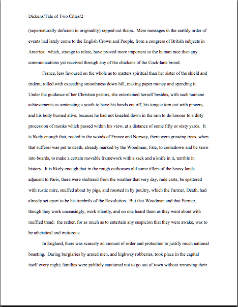
Thought I’d gone too far afield to get back to the topic at hand, didn’t you? Not a chance. Let’s call upon our old friend Dickens again to see what a page of a manuscript should look like:
Nice and easy to read, isn’t it? (If it’s too small to read easily on your browser, try double-clicking on the image.)
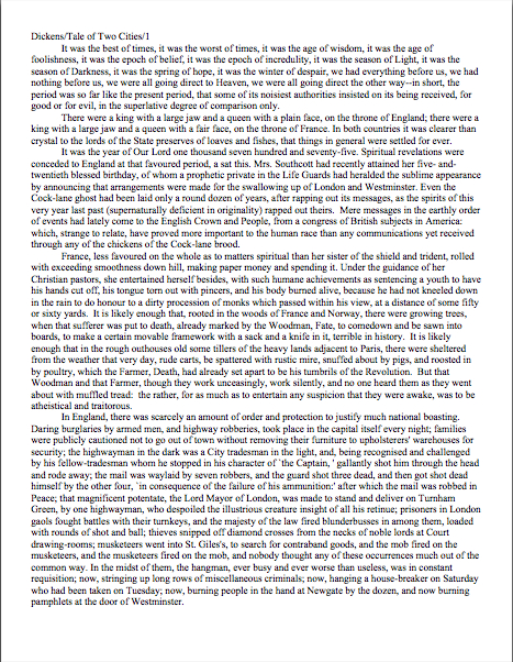
To give you some idea of just how difficult — or even impossible — it would be to hand-edit a manuscript that was NOT double-spaced or had smaller margins, take a gander at this little monstrosity:
I believe the proper term for this is reader-hostile. Even an unusually patient and literature-loving Millicent would reject a submission like this immediately, without reading so much as a word.
Were there a few eggnog spit-takes out there during that last sentence? “My goodness, Anne,” those of you who are wiping the grog off your incredulous faces sputter, “why is it THAT serious an offense?”
Well, think about it: even with nice, empty page backs upon which to scrawl copy edits, trying to cram spelling or grammatical changes between those lines would be well-nigh impossible. Knowing that, Millicent would never dream of passing such a manuscript along to the agent who employs her; to do so would be to invite a stern and probably lengthy lecture on the vicissitudes of the editorial life.
She wasn’t born yesterday, you know. She’s SMART.
Don’t tempt her just to reject it unread — and don’t, I beg you, provide the same temptation to a contest judge. Given the sheer volume of submissions the average Millicent reads, she’s not all that likely to resist.
Even if the sum total of the provocation consists of a manuscript that’s shrunk to, say, 95% of the usual size.
You know what I’m talking about, don’t you, past contest entrants and submitters who wanted to squeeze in a particularly exciting scene before the end of those requested 50 pages?
No? Let me fill you in on a much-deplored practice, then: faced with a hard-and-fast page limit for submission, some wily writers will shrink the font or the margins, to shoehorn a few more words onto each page. After all, who is going to notice a tenth of an inch sliced off a left or right margin, or notice that the typeface is a trifle smaller than usual?
Millicent will notice, that’s who, and practically instantly. As will any reasonably experienced contest judge; after hours on end of reading 12-point type within 1-inch margins, a reader develops a visceral sense of when something is off.
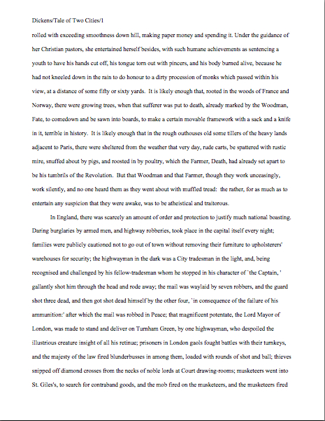
Don’t believe me? Go back and study today’s first example, the correctly formatted average page. Then take a look at this:
I shaved only one-tenth of an inch off each margin and shrunk the text by 5% — far less than most fudgers attempt, incidentally. Yet admit it: you can tell it’s different, can’t you, even without whipping out a ruler?
So could a professional reader. And let me tell you, neither the Millicents of this world nor the contest judges tend to appreciate attempts to trick them into extraneous reading. Next!
The same principle applies, incidentally, to query letters: often, aspiring writers, despairing of fitting a coherent summary of their books within the standard single page, will shrink the margins or typeface.
Trust me, someone who reads queries all day, every day, will be able to tell. (And if you would like to see precisely why, please check out the posts under the QUERY LETTERS ILLUSTRATED category on the list at right.)
The other commonly-fudged spacing technique involves skipping only one space after periods and colons, rather than the grammatically-requisite two spaces. Frequently, writers won’t even realize that this IS fudging: as readers have pointed out in the comments whenever I have talked about this in the past, ever since published books began omitting these spaces in order to save paper, I’ve seen a theory propounded all over the Internet (and sometimes even in writing classes, where the teachers should know better) insisting that skipping the extra space is obsolete. Frequently, the proponents will insist that manuscripts that include the space look old-fashioned to agents and editors.
And I’m not going to lie to you here: to the agents who prefer this format, it is going to look old-fashioned. Sorry.
But guess what: standard manuscript format IS old-fashioned, by definition; that fact doesn’t seem to stop most of the currently-published authors of the English-speaking world from using it. In fact, in all of my years writing and editing, I have never — not once — seen a manuscript rejected or even criticized for including the two spaces that English prose requires after a period or colon.
I have, however, heard endless complaint from professional readers — myself included — about those second spaces being omitted. Care to guess why?
Reward yourself with a virtual candy cane if you said that cutting those spaces throws off word count estimation; the industry estimates assume those doubled spaces. And give yourself twelve reindeer if you also suggested that omitting them renders a manuscript harder to hand-edit.
We all know the lecture Millicent is likely to get if she forgets about that, right?
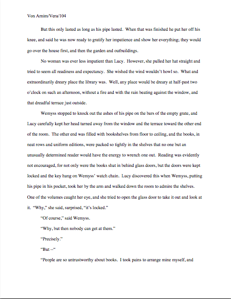
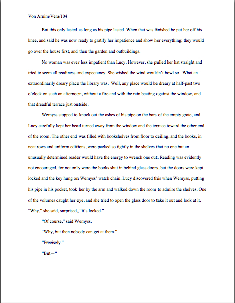
Again, a pro isn’t going to have to look very hard at a space-deprived page to catch on that there’s something fishy going on. Since Dickens was so fond of half-page sentences, the examples I’ve been using above won’t illustrate this point very well, so (reaching blindly into the depths of the bookshelf next to my computer), let’s take a random page out of Elizabeth Von Arnim’s VERA:
There are 310 words on this page; I wasn’t kidding the other day about how far off the standard word count estimations were, obviously. Now cast your eye over the same text improperly formatted:
Doesn’t look much different to the naked eye, does it? The word count is only slightly lower on this version of this page — 295 words — but enough to make quite a difference over the course of an entire manuscript.
So I see some hands shooting up out there? “But Anne,” I hear some sharp-eyed readers exclaim, “wasn’t the word count lower because there was an entire line missing from the second version?”
Well spotted, criers-out: the natural tendency of omitting the second spaces would be to include MORE words per page, not less. But not spacing properly between sentences was not the only deviation from standard format here; Millicent, I assure you, would have caught two others.
I tossed a curve ball in here, to make sure you were reading as closely as she was. Wild guesses? Anyone? Anyone?
The error that chopped the word count was a pretty innocent one, almost always done unconsciously: the writer did not turn off the widow/orphan control, found in Word under FORMAT/PARAGRAPH/LINE AND PAGE BREAKS. This insidious little function, the default unless one changes it, prevents single lines of multi-line paragraphs from getting stranded on either the bottom of one page of the top of the next.
As you may see, keeping this function operational results in an uneven number of lines per page. Which, over the course of an entire manuscript, is going to do some serious damage to the word count.
The other problem — and frankly, the one that would have irritated a contest judge far more than Millicent — was on the last line of the page: using an emdash (“But—”) instead of a doubled dash. Here again, we see that the standards that apply to printed books are not proper for manuscripts.
Which brings me back to today’s moral: just because a particular piece of formatting looks right to those of us who have been reading books since we were three doesn’t mean that it is correct in a MANUSCRIPT.
Millicent reads manuscripts all day; contest judges read entries for hours at a time. After a while, a formatting issue that might well not even catch a lay reader’s attention can begin to seem gargantuan.
As I have perhaps pointed out once or twice throughout this series, if the writing is good, it deserves to be free of distracting formatting choices. You want agents, editors, and contest judges to be muttering, “Wow, this is good,” over your manuscript, not “Oh, God, he doesn’t know the rules about dashes,” don’t you?
Spare Millicent the chagrin, please; both you and she will be the happier for it. Believe me, she could use a brilliantly-written, impeccably-formatted submission to brighten her Dickensian day.
More show-and-tell follows next time. Keep up the good work!

Right now each chapter of my novel is in a separate file, formatted not for submission to agents but for convenient upload to the writers workshop I participate in online. My final workshop will be one where the whole novel is reviewed at once, and I’ve decided to make that in the customary format you’ve been discussing, the same as I will submit to agents when they express interest in my queries.
The chapter line will appear at the top of each page – so I leave five doublespaced blank lines so the first paragraph starts six lines down? Is there something I can do in Microsoft Word so it will stay that way, and I won’t have to edit every chapter whenever I make an early chapter a few lines longer or shorter?
Do you have any advice specifically for microsoft word users about setting up sluglines? Are there any special challenges MS word users tend to encounter setting up a manuscript in manuscript format?
Great questions, David. I’m going to be talking about chapter openings on Monday or Tuesday, so I will address them then.
May I ask you to clarify something, however, so I may tailor my response better? When you say Is there something I can do in Microsoft Word so it will stay that way, and I won’t have to edit every chapter whenever I make an early chapter a few lines longer or shorter?, do you mean that you are not inserting a page break at the end of each chapter? If you’re not, a hard page break between chapters should eliminate the problem you describe. But if you are already beginning each new chapter on a fresh page, I don’t think I’m understanding the problem correctly.
Right now I have one chapter per file – and upload one chapter at a time to a writers workshop.
When I assemble the manuscript, you seem to be saying there is something called a page break, which will make the rest of a page stay blank. Yes, that resolves one of my problems, thanks.
And thank you for making me aware that I haven’t yet mentioned that new chapters should start on new pages! I shall rectify that toute suite.