We have only few rules of standard format left to cover in this series, and before you start dancing in the streets accordingly, I want to make sure that I’ve covered the basics clearly enough so that you can all spot correct and incorrect format in the wild, outside of this laboratory environment. Before I institute a pop quiz, I want to go over how to format the opening to a new chapter, whether or not it’s also the first page of your manuscript.
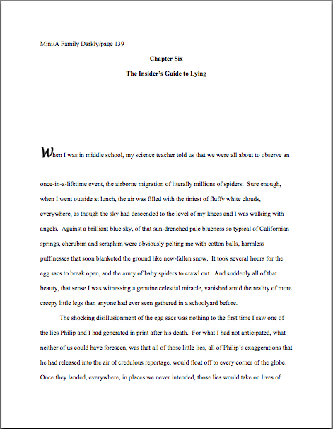
To get the discussion ball rolling, let’s take a gander at a properly-formatted chapter opening. Here is the first page of Chapter Six of my memoir:
Every chapter of a manuscript should begin like this: on a fresh page, 12 single lines (or 6 double-spaced) from the top. (For those of you who do not know how to insert a hard page break into a Word document, it’s located under the INSERT menu. Select BREAK, then PAGE BREAK.)
Notice how both the chapter number and the chapter title appear, centered, within these parameters. If there were no chapter title in this instance, the first page of Chapter 6 would look like this:
And since sharp-eyed reader Allison asked so very nicely, here’s what it would look like if Chapter 6 were the beginning of Part II of the book (it isn’t, but we aim to please here at Author! Author!):
Thinking that there must be an easier way to format the first page of a chapter than to memorize the way it should look and reproduce it from scratch each time? You’re not alone, if so; even seasoned authors worry that someday they will forget to hit return one of the necessary times, so that Chapter 5 will begin ten lines from the top, while Chapter 1-4 and 6 on will begin twelve lines down.
Why, curious reader David asked just the other day about how to get that formatting to stick, so to speak: “The chapter line will appear at the top of each page – so I leave five doublespaced blank lines so the first paragraph starts six lines down? Is there something I can do in Microsoft Word so it will stay that way?”
Standard format templates do exist, of course, but frankly, Word is already equipped with two perfectly dandy features for reproducing formatting exactly in more than one place in a document: COPY and PASTE.
Or, to put it another way, the easiest way I know to make sure each chapter opening is identical is to create your own template. Copy from “Chapter One” down through the first line of text, then paste it on the first page of chapter 2, 3, etc. Once the format is in place, it’s a snap to fill in the information appropriate to the new chapter.
Does that make sense to everyone? Excellent. Let’s take another gander at our first example:
This time, I would like you to notice that in each of these examples, the only reference to the author’s name or the title should appear in the slug line, located in the upper left-hand margin. This is as proper on page 139 of a book manuscript as on page one. While you’re going around noticing things, notice that the page number belongs within the slug line, rather than anywhere else on the page.
The slug line confuses a lot of aspiring writers; until you have seen piles and piles of professional manuscripts, it looks kind of funny, doesn’t it? And when you’ve been told over and over again that a manuscript should have a 1-inch margin on all sides, it can seem counterintuitive to add a line of text, even such a short one, IN that margin.
But I assure you, it’s always been done that way. And why? Followers of this series, chant it with me now: BECAUSE IT LOOKS RIGHT.
Yes, that logic IS tautological, now that you mention it. If you have a problem with that, I would suggest taking it up with the powers that rule the universe. As I believe the fact that my memoir has been in the hands of a reputable publisher for years and has yet to be release makes abundantly clear, I apparently do not rule the universe.
If I did, Microsoft Word would be set up to create documents in standard format automatically, Word for Mac and Word for Windows would be set up so those using one could easily give formatting advice to those using the other, and ice cream cones would be free on Fridays.
As none of these things seems to be true, let’s get back to business: how does one create that pesky slug line, anyway?
Back in the days when typewriters roamed the earth, it was perfectly easy to add a slug line to every page: all a writer had to do was insert it a half-inch down from the top of the page, left-justified, floating within the 1-inch-deep top margin. For word-processed documents, it’s a trifle more complicated.
The slug line still belongs in the same place, .5 inches from the top of the paper, but instead of laboriously typing it on each page individually as writers did in the bad old days, one simply inserts it in the header. In most versions of Word (I can’t speak for all of them), the header may be found under the VIEW menu.
Before the Luddites out there trot out their usual grumble about tracking down the bells and whistles in Word, think about this: placing the slug line in the header (located in Word under the VIEW menu) also enables the writer to take advantage of one of the true boons of the advent of word processing, pages that number themselves. Every so often, I will receive a manuscript where the author has, with obviously monumental effort, typed a slug line onto the first line of TEXT of each page, so it looks like this:
See how pulling the slug line down into the text messes with the spacing of the page? An entire line of text is sacrificed to it — and let me tell you, that line is not going to go quietly.
Why not? Well, what’s going to happen if new writing is inserted on a page formatted this way? That’s right: the author is going to have to go back and move each and every one of those slug lines to match the NEW pagination.
I’d show you a picture of this, but it’s just too ugly to contemplate. Trust me, it would be a heck of a lot of work.
Hey, I promised you a pop quiz, didn’t I? See any other problems with this last example?
How about the fact that the slug line includes the word PAGE? Shouldn’t be there; just the numbers will suffice.
Did I just hear some huffs of indignation out there? “But Anne,” I hear the formatting-ambitious cry, “it’s kind of stylish to include PAGE before the page number, isn’t it? It’s just a matter of personal style — who could be hurt by including it, if I like the way it looks?”
Well, you, for starters. And why? (Chanters, ready your lungs.) BECAUSE IT JUST WOULD NOT LOOK RIGHT TO A PROFESSIONAL READER.
I’m quite serious about this; I’ve seen screeners get quite indignant about this one. “Does this writer think I’m STUPID?” Millicent is prone to huff. (Don’t answer that question; it’s rhetorical.) “Does she think I DON’T know that the numeral that appears on every page refers to the number of pages? Does she think I’m going to go nuts and suddenly decide that it is a statistic, or part of the title?”
Don’t bait her; the lady has a hard life. Do it the standard way.
Okay, did you spot any other problems? What about the fact that the first paragraph of the chapter is not indented, and the first character is in a different typeface?
The odd typeface for the first letter, in imitation of the illuminated texts hand-written by monks in the Middle Ages, doesn’t turn up all that often in manuscripts other than fantasy and YA, for one simple reason: books in that category are more likely to feature this it’s-a-new-chapter signal than others. But once again, what an editor may decide, rightly or wrongly, is appropriate for a published book has no bearing upon what Millicent expects to see in a manuscript.
Save the manuscript illumination s for someone who will appreciate it. Hop in your time machine and track down a medieval monk to admire your handiwork, if you like, but in this timeframe, keep the entire manuscript in the same typeface and size.
The non-indented first paragraph of a chapter is fairly common in mystery submissions, I have noticed. I’ve been told by many mystery writers that this is an homage to the great early writers in the genre, an echo of their style.
But you know what? Almost without exception, in Edgar Allan Poe’s time all the way down to our own, the EDITOR has determined the formatting that appeared on any given printed page, not the author. To professional eyes, especially peevish ones like Millicent’s, a manuscript that implicitly appropriates this sort of decision as authorial might as well be the first step to the writer’s marching into Random House, yanking off a well-worn riding glove, and striking the editor-in-chief with it.
Yes, you read that correctly: it’s sometimes seen as a challenge to editorial authority. And while we could speculate for the next week about the level of insecurity that would prompt regarding a minor formatting choice as a harbinger of incipient insurrection, is the manuscript of your first book REALLY the right place to engender that discussion?
Exactly.
If you want to make Millicent and her bosses happy — or, at any rate, to keep them reading calmly — indent every paragraph of the text should the expected five spaces. It just looks right that way.
While we’re at it, how about the bolded chapter number and title? Nothing in a manuscript should be in boldface. Nothing, I tell you. Uh-uh. Not ever.
Well, you could get away with the title itself on the tile page, but frankly, I wouldn’t chance it.
Nor should anything be underlined — not even names of books or song titles. Instead, they should be italicized, as should words in foreign tongues that are not proper nouns.
I heard that gigantic intake of breath out there from those of you who remember constructing manuscripts on typewriters: yes, Virginia, back in the day, underlining WAS the norm, for the simple reason that most typewriters did not have italic keys.
If you consult an older list of formatting restrictions, you might conceivably be told that publications, song titles, and/or foreign words (sacre bleu!) should be underlined. But trust me on this one: any agent would tell you to get rid of the underlining, pronto.
And why? All together now: because IT JUST DOESN’T LOOK RIGHT THAT WAY.
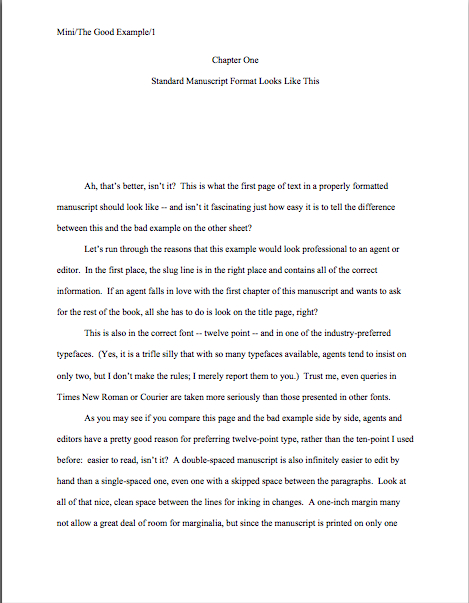
All right, campers, do you feel ready to fly solo? Here are two pages of text, studded with standard format violations for your ferreting-out pleasure. (I wrote these pages, too, in case anyone is worried about copyright violation or is thinking about suing me over it. Hey, stranger things have happened.)
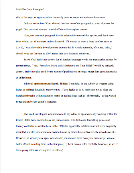
How did you do? Are those problems just leaping off the page at you now? To reward you for so much hard work, here are a couple of correctly-formatted pages, to soothe your tired eyes:
Whenever you start finding yourself chafing at the rules of standard format, come back and take a side-by-side gander at these last sets of examples — because, I assure you, after a professional reader like Millicent has been at it even a fairly short time, every time she sees the bad example, mentally, she’s picturing the good example right next to it.
And you know what? Manuscripts that look right get taken more seriously than those that don’t. And regardless of how you may feel about Millicent’s literary tastes, isn’t a serious read from her what you want for your book?
We’re in the home stretch of going over the formatting rules, everyone. Keep up the good work!


