Still hanging in there, gang? For the last couple of weeks, I’ve been showing you how to format a manuscript professionally, and I’m beginning to fear that in my eagerness and vim, I may have scared some of you a little. Or a whole lot.
My vehemence is kindly-motivated, I assure you: contrary to popular opinion amongst aspiring writers, how a submission is presented can indeed make a very great difference in how it’s received. Yes, yes, I hear you, those of you who have been running around to writers’ conferences in recent years: you can hardly throw a piece of bread at an agent or editor’s forum without hitting a pro saying, “It all depends upon the writing.”
They tend to spout this aphorism for a very good reason — it is in fact true. But as we discussed earlier in this series, that doesn’t mean that the quality of the writing is the only criterion agents, editors, contest judges, or any of the rest of us who read manuscripts for a living use when deciding whether to read beyond the first page of a submission. Professional presentation plays a role, as does marketability, a story’s probability of appealing to its target audience (not exactly the same thing), what happens to be the surprise bestseller of the moment — and yes, that whole slew of intangibles that make up personal taste.
There is, in short, no such thing as a foolproof formula for producing the perfect manuscript for submission. Sorry to be the one to break that to you.
As I’ve been arguing throughout this series on formatting, however, agents, editors, contest judges, screeners, and other professional readers develop an almost visceral sense of when a manuscript is properly formatted. So rather than screening submissions with a list of don’t by their sides, they more or less automatically discount pages that are cosmetically incorrect.
This is most emphatically not the same thing, though, as rejecting such pages on the spot because, say, an aspiring writer underlined a foreign-language word on page 1 instead of italicizing it. (I know, I know: sacre bleu!) Much as a reader with impeccable grammar will not necessarily throw down a book that misuses semicolons, most professional readers will not instantly reject an improperly-formatted submission without SOME further provocation.
But believe me, the writer in both cases is going to have to work a whole lot harder to impress the reader as literate.
Unfortunately, the prevailing standards for printed books — which, as we have seen, differ in many significant respects from manuscripts — often lead innocent writers astray. Case in point: including a table of contents in a manuscript submission.
That seems as if it would be a helpful page to tuck in there, doesn’t it? One can make an argument for it, certainly: in fiction, including it would enable an agent to go back and re-read the submission easily; in nonfiction, it would permit an editor to skip ahead to a chapter of particular interest. And heck, if the manuscript fell upon the floor in the kind of you got chocolate in my peanut butter!/you got peanut butter in my chocolate! we witnessed with horror earlier in this series, a well-organized table of contents might render it a trifle easier to reassemble, right?
Wrong. Including a table of contents in a manuscript submission is a notorious rookie mistake, the kind of stunt that makes Millicent the agency screener huff with displeasure.
Why is it such a serious strategic error? Well, in a published book, a table of contents, like an index, is a courtesy to browsers trying to get a feel for the contents and buyers who do not necessarily want to read the entire book. In order to serve this function well, however, the pages listed would have to match up with the beginnings of the relevant sections, right?
This is difficult in a manuscript for several reasons. First, Millicent doesn’t expect a table of contents to be there, particularly in a novel submission; it just won’t look right to her. Second, since a published book is typically about 2/3rds the length of its original manuscript (documents shrink in the transition to the printed page), the pages listed on a manuscript table of contents would ultimately be inaccurate, anyway.
Third — and perhaps most pertinent at the submission stage — including a table of contents implies that the author does not expect the reader to read the manuscript in its entirety, merely to flip to the pages that interest him most. From the publishing industry’s point of view, that’s a pretty jaw-dropping assumption — why, they wonder, would an agent or editor be interested in acquiring a book if he doesn’t like it well enough to read it in its entirety?
So really, a table of contents in a manuscript is just a wasted page. Do not include it in a manuscript submission, any more than you would include an index or those boxes around text that magazines are so fond of printing. To professional eyes, it looks unprofessional, especially in fiction.
It’s also an inconvenience — and yes, Virginia, to someone who has to skim as quickly as Millicent to get through the day’s reading, having to turn over an extra page actually is an inconvenience.
Don’t believe me? Okay, think about our time-strapped friend’s expectations when opening a submission envelope: when she turns over the title page, she is looking forward to finding the first page of text there waiting for her, all ready to be judged in a flash. If instead she finds a table of contents, something she would only find helpful if she were to read the entire manuscript, she may well be a trifle miffed. Given that she tends to reject most submissions somewhere between paragraph 1 and page 5, the information that Chapter 8 begins on page 112 will most likely strike her as at best gratuitous — and at worst presumptuous.
“What gives?” she’ll say, taking an extra sip of her too-hot latte as she impatiently gets the table of contents out of her way. “Doesn’t this writer know the difference between a manuscript and a book?”
‘Nuff said, I think.
Or maybe not — do I hear some aspiring nonfiction writers clamoring for my attention? “But Anne,” these excellent souls point out, “a book proposal is supposed to include a table of contents for the planned book, isn’t it? I read it in an article on how to write a book proposal.”
Ah, I’m glad that you brought this up, nonfictionists, because this is a very common misconception amongst first-time proposers. They fall into the classic mistake of assuming that because a term means something in one context, it must necessarily mean exactly the same thing in another context.
In this case, it most definitely does not.
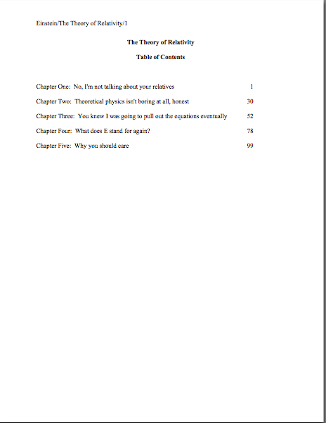
When hyper-literal proposers hear the term table of contents, they assume, wrongly, that an agent or editor is simply asking to see what the writer thinks the table of contents in the published book will look like, presumably as an exercise in guessing how many pages each of the proposed chapters will contain. As a result, first-time proposals tend to include a section that looks a little something like this:
Leaving aside for the moment the fact that Millicent simply would not expect to see this page in a book proposal, do you see any problems with this as a marketing document intended to convince an editor to pay the writer to write the proposed book?
Actually, I’m sure that some of your hands shot into the air even before I showed this example, in your eagerness to take issue with the notion that a submission should resemble a published book in the first place — and thus that the kind of table of contents one might expect to see in a nonfiction book would clearly be out of place in a submission.
Well caught, eager wavers. Spot any other problems?
If you said that the example above doesn’t include information that could possibly be either accurate or useful to an editor, give yourself a gold star for the day. Obviously, it would be impossible for a proposer to state with certainty where the chapter breaks would fall in the proposed book when published; all the information s/he could reasonably offer in this sort of table of contents, then, would be educated guesses about how long each chapter might be. Or perhaps a list of where those breaks fall in the draft manuscript.
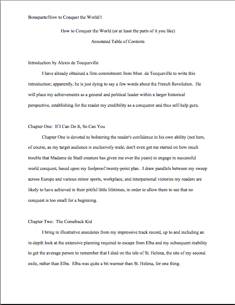
But that’s not the information nonfiction agents and editors want to see in the book proposal; they’re perfectly aware that since the book in question has not yet been written (or needn’t be), any length estimates must be just that, estimates, not fact. The information they do want to see in the annotated table of contents section of a book proposal is a brief description of the CONTENTS of each chapter.
The word annotated should have been a clue, I guess.
Typically, each proposed chapter is summarized in one or two paragraphs. Actually, typically is a bit of an exaggeration; what’s actually typical in a first time proposer’s book proposal is either the information-light version we saw in today’s first example or an entire page devoted to each chapter.
Neither is what is expected, however. The typical form I am talking about here is what professional nonfiction authors use.
And like so many other differences between professional formatting and, well, everything else they see in submissions, it’s really, really obvious at first glance to someone who has seen a book proposal before whether the submitter du jour has followed the rules. Compare what the first page of a correctly put-together annotated table of contents looks like with the truncated version above:
See the difference? I assure you, Millicent will. From ten paces away.
Hey, while we’re on the subject, why don’t we take a quick gander at all of the constituent parts of a book proposal, so all of you nonfiction writers out there may be sure that Millicent will like the look of yours? To make the overview even more useful, let’s run through the sections in the order they would appear in the proposal.
First, let’s take a peek at the title page. See if you notice anything distinctive about it:

If you immediately cried, “Why, unlike a title page for a novel, the proposal’s title page does not include a word count,” give yourself another gold star for the day. (You’re racking them up today, aren’t you?) The length of a nonfiction book is a contractual matter, typically; since what a proposal is offering is not the finished book, but a book concept and an author to write it to the specifications desired by the publisher, it does not make sense for the writer to guesstimate the length up front.
Award yourself yet another if you also mentioned that the contact information listed here is Scaredy’s agent’s, not Scaredy’s. Naturally, if Scaredy does not yet have an agent, naturally, he would list his own contact info in the bottom-right corner. Any guesses why his address would be replaced by his agent’s down the line?
The reason’s pretty straightforward: no agent in his right mind would allow his clients to circulate their proposals (or manuscripts, for that matter) without his contact info on them. After all, if an editor falls in love with the proposal, it’s the agent she’s supposed to be contacting, not the writer.
What follows next in a book proposal is the overview, a brief description of what the book is about and why the writer proposing it is the best person on earth to write it. (Never, ever forget that this is both a marketing document and a job application, people — you’re trying to get the publisher to hire you to write this book, right?)
Most first-time proposers just include the bare bones here, leaping right into the description, but I like to open with a little sample of the type of writing the editor may expect to see in the completed book. To this end, I always advise starting a proposal with a vividly-told illustrative anecdote.
The first page of the proposal, then, would look like this:
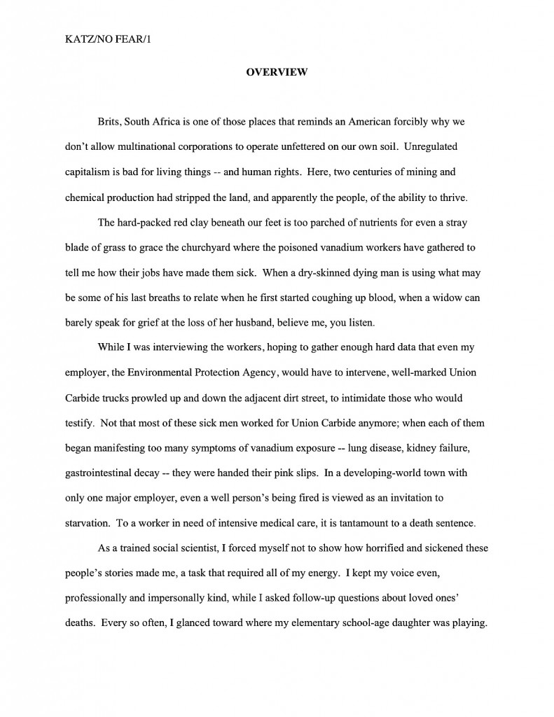
As you may see, like everything else in the book proposal, the overview should be in standard format: double-spaced, indented paragraphs, 12-point Times, Times New Roman, or Courier. Unlike the opening of a chapter, however, each new section is simply titled, a line skipped, and the text begun. Since this is a nonfiction document, whether to place OVERVIEW in boldface is up to you; my agency happens to like it, as well as the all-caps titling.
Notice, please, that because this is a memoir, the anecdote, like the rest of the proposal, is written in the first person singular. Many memoirists mistakenly believe that writing about their books in the third person is more professional, but that’s simply not the case.
Back to formatting. Just as a simple section break is sufficient to separate scenes in a novel or memoir, all that’s required in a proposal to differentiate the opening anecdote from the description of the proposed book is a skipped line:
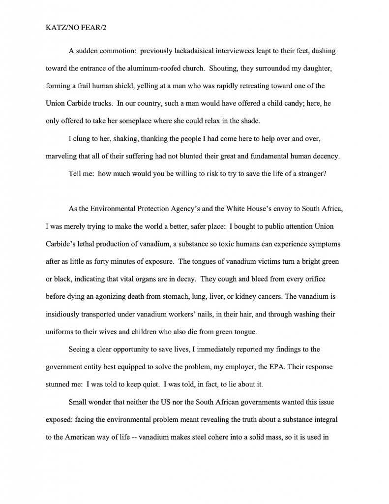
Since the overview typically covers a broad range of topics, I like to break it down into several smaller sections, to make it easier for an agent or editor to find the answers to the pertinent questions any good book proposal must answer. Every proposal is slightly different, of course, but typically, apart from the opening anecdote and the book’s description, I advise including subsections on why the proposed book will appeal to readers (this is a great place to bring up any demographic information you may have collected on your readership), why the book is needed now (as opposed to any other time in publishing history; this provides an excellent opportunity to bring up any relevant trends), and how to convince the target readership that this is the book for them (not a specific marketing plan, mind you — that comes later in the proposal — but a brief explanation of who the target reader is and why that reader might pick it up).
Nit-picky? Sure. But that’s the nature of a book proposal.
How does one mark each of these subsections? You already know how to do this one, actually: as is permissible in a nonfiction manuscript, to differentiate between topics within sections — to alert the reader to the start of the subsection on why you’re the best person currently gracing the crust of the earth to tell this particular story, for instance, or to usher onstage your explanation of precisely why the literate world needs this story right now — you may insert a subheading. Since we discussed this just the other day, I’m going to reuse the example.
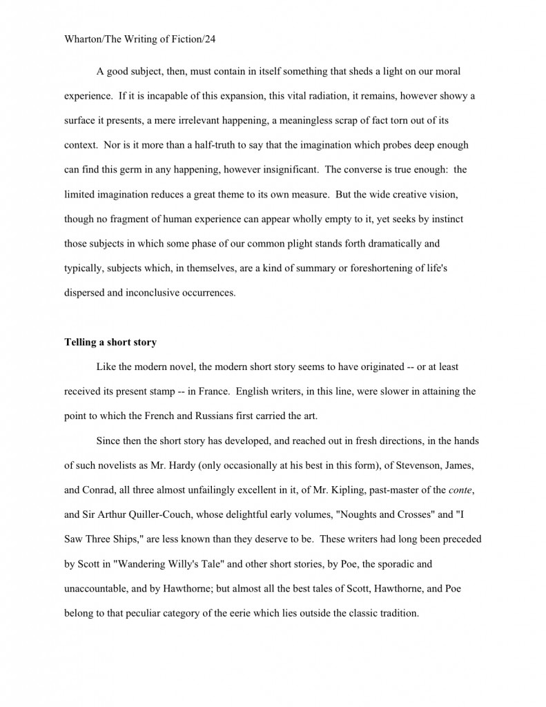
When moving between major sections of a book proposal, however, convention dictates inserting a page break between sections. Why? Because unlike a novel manuscript, proposals are often broken apart, with one section going to a publisher’s marketing department and another going to legal.
It’s also customary to begin a new major section with a centered title. For example, when moving from the overview to the competitive market analysis (i.e., the section of the proposal where the writer lists similar books currently on the market, then explains why his proposed book is different and better), the latter section would begin like this:
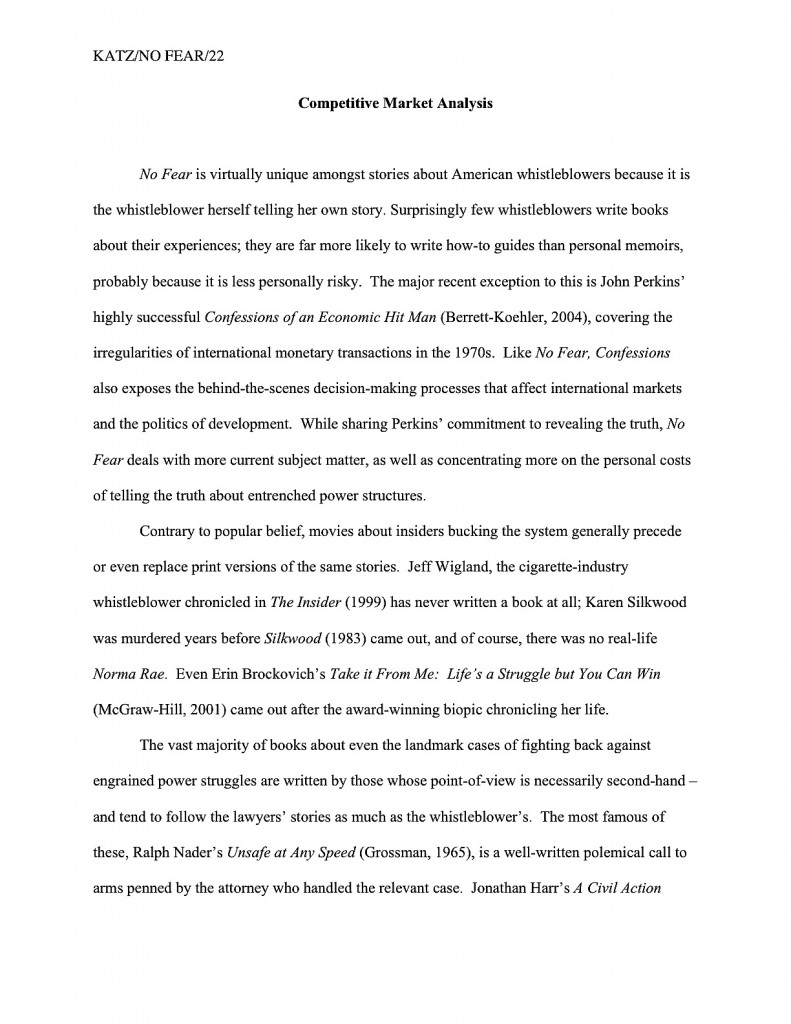
I’ve written at some length about how to construct a competitive market analysis — contrary to popular opinion, it’s not just a list of similar books currently on the market — so I shan’t go into the ins and out of creating this narrative here. (But if you’d like to hear more, please check out the posts collected under the aptly-named HOW TO WRITE A BOOK PROPOSAL category on the archive list at right.)
There are a couple of formatting curiosities I would like to point out, however. First, this section is written in a narrative style, not as a list. Second, it does not include all of the bibliographic information for the book. Just the author and title — in italics, as is appropriate for a book title in standard format — with the publisher and year of publication following in parentheses, will generally suffice. (Although if the agent of your dreams asks for something more, like the ISBN, for heaven’s sake, give it to her!)
Is that all there is to a book proposal, you ask hopefully? Heavens, no: there are several more vital sections. As usual, I have a great deal to say about each, so I am going to sign off for today and pick it up next time.
Keep coming up with those great book concepts, everyone, and keep up the good work!
