

No, I haven’t taken a look at the daunting task that is Synopsispalooza and abandoned it in terror — I shall be posting again in that excellent endeavor this evening. This morning, however, I would like to press forward with the next of the winning entries in the Author! Author! Great First Page Made Even Better Contest, the takers of second-place honors in Category II: YA, Suzi McGowen and Sherry Soule.
That’s Suzi on the left, Sherry on the right. Today, they are going to take us into the very trendy worlds of YA urban fantasy and YA paranormal.
Take a good gander at those well-constructed author photos — one of the reasons I asked the A!A!GFPMEB winners to provide them was to start all of you thinking about your author photos well before Authorbiopalooza in October. (It’s a Paloozapalooza this autumn at Author! Author!) Why think begin to ponder it well in advance? Well, two reasons. First, for most writers, coming up with a photo they like takes a few tries. Or a few hundred. Second, when the request for an author photo (or author bio, for that matter), it tends to be rather last-minute.
As in, “Oh, I’m going to start sending out your manuscript to editors tomorrow, Author McWriterly. Can you e-mail me a bio with a photo tonight?”
Trust me, you’ll be a much, much happier camper if you already have that photo — and that bio — in hand. (That’s true of synopses, too, actually, so be sure to tune back in tonight for more guidance on that front.)
Back to the business at hand. One of the problems faced by aspiring writers trying to break into a book category that happens to be hot at the moment — and remember, all publishing trends are temporary; what’s hot today may not be next year — is that, inevitably, there will be greater competition for the admittedly greater number of publishing slots. It’s an industry truism, as predictable as the flowers in spring: 1-2 years after a breakout bestseller appears, agencies will be flooded with queries and submissions with eerily similar premises.
And if there’s a series like TWILIGHT or HARRY POTTER that hits the big time? So many submissions for books like them will appear that entire subgenres may be formed.
In a way, this phenomenon is good for aspiring writers, especially for those who happened to be working on, say, YA paranormal romances when the first TWILIGHT book came out. The nice thing about the ever-changing book market is that it actually does tend to reward writers who keep weeding their own particular patch of it year in, year out: eventually, their chosen category may well become trendy.
That’s important to bear in mind, because there are always plenty of people, including agents and editors at conferences, eager to declare a particular book category dead — or impossible to sell, which in the publishing world amounts to the same thing. Just ask anyone who was trying to land an agent for historical fiction six months before COLD MOUNTAIN was a surprise bestseller.
That’s why they’re called surprise bestsellers: even the pros don’t necessarily see ‘em coming. Then they spend the next two years actively soliciting similar manuscripts, the following two tolerating similar manuscripts, and the next four wondering why in heaven’s name aspiring writers keep sending them similar manuscripts. Don’t they know the market has moved on to the next trend?
Of course, the cycle is longer with a breakout series; one has only to read the daily acquisitions listings on Publishers’ Marketplace or Publishers’ Weekly to see that books similar to TWILIGHT are still being picked up in droves. So naturally, thousands upon thousands of writers continue to describe their YA paranormals in TWILIGHTish terms, their YA fantasies in Potterish language, etc.
That strategy makes quite a bit of sense at the front end of a trend, or even at its height. The longer a wave continues, however, the harder it is to make a case that a manuscript by a writer who has never published before in that book category — like, say, the million or so adult fiction writers who have stampeded into the YA market over the past few years — is adding something new and original to the current offerings. And all too often, queriers abet that difficulty by emphasizing how their work is akin to the iconic bestseller in the category, rather than how it is different.
Which brings me back to today’s winning entries. As those of you who entered the contest may recall, one of the required elements was an identification of the entry’s book category and a brief explanation of what this manuscript would bring to that category’s already-existing target market. As so often happens with the descriptive paragraph of the query letter, most entrants mistook this requirement for either a request for a boasting back-jacket-style puff piece (This book will revolutionize Westerns!) or, you guessed it, an invitation to compare one’s own work with bestsellers.
Both of these approaches tend to sell original writing radically short. No matter how many times agents march into writers’ conferences and declaim, “I’m looking for books like Bestseller X,” the publishing industry has never been very taken with carbon copies. What these agents actually mean is, “Since editors are eager to replicate the success of Bestseller X, I am looking for new writers whose manuscripts will appeal to the same target demographic, those folks who have already demonstrated that they are willing — nay, excited about — buying similar books. So I want to see a manuscript with a fresh voice that nevertheless shares certain selling points with Bestseller X.”
Given that motivation, such an agent is unlikely to tell her agency screener (our old pal Millicent, natch) just to request pages from every querier whose descriptive paragraph says this book is just like Bestseller X, right? If a book category happens to be trendy, 70% of what crosses Millicent’s desk will be able to make that claim; by definition, surprise bestsellers change the expected selling points for new manuscripts in their book categories.
So what’s a better strategy for catching her eye? Assuming that any agency that represents that book category is already aware of Bestseller X’s selling points. Instead of telling her that your book shares them, why not show her how it is different, yet will appeal to the same target audience?
I can feel some of you who write in currently hip categories fighting that last paragraph. “But Anne, you said throughout Querypalooza that a querier has only a few lines to grab Millicent’s attention. So how can labeling my book as one with similar bestseller potential possibly undersell it?”
Glad you asked, conclusion-resisters. A lot of aspiring writers believe that a generic comparison to an established author’s work — which most this is the next Bestseller X! claims boil down to being, right? — is inherently more effective at promoting a manuscript than a specific demonstration of the book’s original elements.
As it happens, today’s winning entries disprove that assumption quite nicely. Here is Suzi’s brief description for A TROLL WIFE’S TALE:
You’ve heard of urban fantasy? That dark and gritty world of modern day cities, where elves and witches roam? My novel is the Young Adult version. Call it a suburban fantasy, where a female troll sets out to right wrongs, save the world, oh, and become a tooth fairy.
And here is Sherry’s for Dark Angel. (Please note: between the time that Sherry entered the contest and when we informed the winners — admittedly, a long time; my apologies — she changed the book’s title to BEAUTIFULLY BROKEN. A good call, I think — BEAUTIFULLY BROKEN is a perfectly marvelous title — but obviously, the judges had to work with the original entry. I hope this does not cause any confusion in future web searches, after the book comes out.)
DARK ANGEL is a twist on the young adult, boy meets girl, supernatural love story. This time the boy is the “normal” one and the girl is the supernatural and attractive teenager.
Both of these descriptions make the books in question sound rather generic, don’t they? The first doesn’t bring up an original element until the last few words. Not the best structure, strategically, as Millicent is likely to find the first three sentences a trifle perplexing: there is already a well-established YA urban fantasy category, so why not just state the book category up front and move swiftly on to what’s fresh, original, and exciting about this book?
Especially since there is so very much that is fresh, original, and exciting about this book. Take a gander at Suzi’s one-page description:
Troll Wife could use a job, so when she finds the poster on the telephone pole that says, “Any fae may apply,” she does. She’s as surprised as anyone when she’s accepted for training as a tooth fairy.
She’s also surprised by the impressive number of injuries she racks upon the job. A broken bone and a concussion? Eh, maybe she should have expected that. After all, learning to fly isn’t as easy as it sounds. But the gunshot wound? That was because she was fighting a monster that she ran into while collecting teeth.
The monster, called Oubliette, was a soldier in the war between the humans and the fae, hundreds of years ago. Now Oubliette wants to start the war all over again. This time, it wants to kill all the humans, not just most of them. The other tooth fairies should be her allies in this war against Oubliette, but Troll Wife doubts that any fae that smells like cotton candy can help save the world.
Troll Wife only has days to learn how to fight the Oubliette, protect the human children from it, and make sure that she collects her quota of teeth. While she’s at it, she needs to find out what dark secret the tooth fairies are hiding, and rescue herself from their tangled web.
Sounds like a genuine hoot, eh? But did you gain a sense of that delightful whimsy in the brief description?
DARK ANGEL’s brief description falls into an even more common querying trap: it presents the story as merely a gender-flipped twist on a bestseller. It also assumes — wrongly, based upon the longer description and the first page — that the similarity to that bestseller’s premise is the most interesting thing about this manuscript.
That made the judges rather sad, since on the page, it’s the least interesting thing about this story. Furthermore, the stories do not seem very similar. Take a peek at her longer description:
A sixteen-year-old impetuous outcast has seen ‘shadows’ for as long as she can remember and they always turn up when something bad is about to happen.
When those dark companions follow, Serenity Broussard to church with her family it begins no differently than any other day, except that she gets her first glimpse of the hot new guy in town. It’s a small town so it doesn’t take long for the gossip to spread about Trent Donavon, especially when he moves into his family’s rumored-to-be haunted mansion.
Trent and Serenity began to date and the seemingly perfect state of their relationship is thrown into chaos after she takes a job as an intern, helping restore his family’s estate. It doesn’t take Serenity long to realize that something is terribly wrong. The mansion is full of ghosts and secrets.
The house awakens latent psychic powers in Serenity, who finds herself being stalked by a ghost who tries to communicate with her in terrifying ways. The shadows lurking around Serenity—ever present and insubstantial are something else. Lacking in the description is one common denominator unifying the different types of shadows entering our world—darkness—malevolence.
Shadows had another thing in common—an attraction to Serenity.
When Serenity finds Trent’s mother’s diary, it sends her on a quest to uncover the mystery surrounding the woman’s untimely death. Except things aren’t as black and white as Serenity thinks. Because not all ghosts want help crossing over, some want vengeance.
Admittedly, a few of the narrative choices here are genuinely distracting from the storyline being presented (are the dark companions in paragraph 2 the same as the shadows in paragraph 1, for instance, and if so, are they individual characters? Why is shadows in quotation marks — and why, for an American audience, in single quotation marks? Why risk Millicent’s wrath with two technically incorrect single-sentence paragraphs, when it would be so easy to form the concepts there into narrative paragraphs with at least two sentences? Why aren’t there spaces at the ends of the dashes, since any synopsis should be in standard manuscript format?), but those would all be quite easily fixed. What I want you to notice here is that the brief description and the longer description could be for entirely different books.
That wouldn’t be too surprising to Millicent — aspiring writers undersell their manuscripts’ originality this way all the time. Sad, but true. Yet if we’re honest with ourselves, can we really blame Millicent for not being able to look at the first description of either of these books and extrapolate the second description?
That outcome would be a particular shame in the case of TROLL WIFE, because its premise is so darned charming and full of potential. (All of the judges preferred the title shortened, by the way, Suzi, although several of the judges — yours truly included — wondered if young girl readers would be a bit disturbed that the protagonist’s name and her social role are apparently identical.) That charm is apparent on page 1:
Now, this page could use some revision — I suspect, for instance, that a hard-copy read-through would have caught that the narrative tells the reader twice that the protagonist is a tooth fairy, once at the end of paragraph one and again at the beginning of paragraph 2 — but is that why Millicent might start reading this with a jaundiced eye? Chant it with me now, campers: because professional readers stare at manuscripts all day, any deviation from standard format will leap off the page at them, distracting them from the writing.
There’s a reason I keep showing you so many before-and-after page 1s, after all. Take a peek at the same page after 2 minutes of cosmetic revision, and see if it doesn’t come across as more professional. For extra credit, compare it to the original revision and tell me what I changed.
How did you do? I made five changes here: (1) moved the slug line to left margin (not mandatory, but the norm), (2) changed the chapter title from all caps to title case (thus the name: title case), (3) changed the spacing from an odd specific set to double-spaced, (4) changed the font from Courier to Times New Roman (again, not mandatory, but the norm for novel manuscripts), and (5) changed 14 in line 2 to fourteen. Of these five, only #5 — not writing out numbers under 100 in full — might have prompted Millicent to stop reading.
Yes, it really is that serious an offense against standard format — unfortunate, since so many aspiring writers mistakenly believe that the AP style restriction of writing out only numbers under ten applies to manuscripts. It does not: AP is for newspapers and magazines, and not all literary magazines adhere to it.
Having worked with Suzi and Sherry’s entries in soft copy (the better to show you before-and-after formatting, my dears), I suspect that both were relying on some sort of macro for the PC for their formatting — it was impossible, for instance, to alter the paragraph heading without deleting the title and the space above the text entirely and starting again from scratch. I realize that macros that purport to format a manuscript for a writer may be comforting, but actually, the restrictions of standard format are so simple that anyone reasonably familiar with Word should be able to set them up in five minutes flat. (If you don’t know what the requirements of standard manuscript format are, or indeed that there is a specific professional format for manuscripts, it would behoove you to take a peek at the HOW TO FORMAT A MANUSCRIPT category on the archive list located on the bottom right-hand side of this page.)
I hear some impatient huffing out there, do I not? “But Anne,” macro-huggers across the globe wail, “that sounds like a lot of extra work! I want my computer to do it all for me.”
Well, it is a touch of extra work — although not nearly as onerous as writers tend to speak of it as being — but let me put it this way: if a macro is wrong, its feelings are not going to get hurt when the submission gets rejected. The writer’s will. So who really should be in charge of making sure that the formatting is in apple-pie order?
True, one or two minor formatting gaffes are probably not going to be enough to trigger an automatic rejection. But then, it’s exceedingly rare that a first page gets rejected for only one reason. Presentation problems, like wolves, tend to run in packs.
So is it really all that astonishing that an experienced Millicent might open a submission packet, glance at a misformatted page 1, and assume that more presentation, proofreading, or even writing problems await her? Or that her patience for subsequent problems might be lower than for a perfectly-formatted page 1? Or, more to the point at submission time, that the first typo, grammatical error, or missing word in the text might combine in her mind with formatting problems to equal rejection?
See why I harp on formatting so much? To sharpen your eye for presentation, let’s see how the macro treated Sherry’s page 1:
The problems affect the sharp-eyed reader almost subliminally, don’t they? However, there’s one formatting error here that would draw Millicent’s eye as quickly as if the lines containing it were printed in red ink.
Oh, you didn’t catch it? Here is the same page, properly formatted.
Did you catch it that time? If you are already jumping up and down, shouting, “I saw it the first time, Anne! The text uses an emdash instead of the standard format-requisite spacedashdashspace!” give yourself a gold star for the day. (Hey, I told you there was going to be extra credit for the eagle-eyed.) Because manuscripts do not resemble published books in many important respects, the emdash — the Autoformat fix for dashes in Word that transforms them into straight lines connecting the surrounding words with no intervening spaces — is not correct in a manuscript. As you may see in the revised version above, the first word should be followed by a space, then two dashes, another space, then the second word. No exceptions.
Yes, I know that Autoformat will change what I just suggested into an emdash. Change it back, or risk the wrath of Millicent.
Okay, what else did I change? Interestingly, not what Suzi’s use of apparently the same macro might have lead us to expect: (1) moved slug line from the right to the left, (2) removed extra spaces in slug line (why have so many aspiring writers started adding spaces before and after the /s within the last year? It’s not correct, and it was not nearly so common before. It’s not as though standard format has changed in this respect.) (3) Moved the chapter title to the top line of the page, and, while I was at it, (4) changed the single space after the period to two, since that’s still the standard for manuscripts.
Long-time readers, chant it with me now: if the agent requesting your pages prefers the published book-style single-space convention, her agency’s submission guidelines should tell you so. If that’s what she wants, for heaven’s sake, give it to her, because for the agents who feel strongly enough about this to make public statements about it, it often is a rejection-worthy offense. Not only because they dislike the normal spacing, but because violating an individual agency’s stated submission standards just screams, “This writer not only cannot follow directions — he may not even have taken the time to check whether this agency had its own preferences!”
Why might that in itself render Millicent more likely to reject a submission? Because this is a detail-oriented business, writers who neglect the small stuff tend to be substantially more time-consuming for agencies to take on as clients.
“But Anne,” some of you new to the Author! Author! community — specifically, those of you who have not yet worked your way through one of my famous standard format series yet, I’m guessing — protest vehemently, “this is ridiculous. Surely, it’s the writing and the book concept that determine whether a manuscript gets accepted or rejected, not the petty little details. The agent or editor can always fix the small stuff before publication, after all. Even if a bunch of tiny, insignificant gaffes appear on page 1, I can’t believe that Millicent would just stop reading my submission.”
Oh, dear. I wasn’t going to do this, but if it saves even one good writer from undeserved rejection on formatting grounds, it’s worth it. Since Sherry revised her manuscript after the contest winners were announced, she was kind enough to send along the new version — indeed, the entire first chapter — for the judges to peruse. Obviously, it would not have been fair to the other entrants to judge the revised version, or even to provide extensive commentary upon it, but because it contained a couple of formatting problems that the original entry did not, I cannot in good conscience not flag them. One of them is, in fact, a presentation problem that might actually lead to Millicent’s not reading the submission featuring it at all.
So yes, you caught me: I have in fact structured this discussion to lead us to this point, necessitating showing you the revised version. Please, everybody, take these next examples in the spirit they are intended. (Seriously, I don’t want to see any snarky snickering about this in the comments; a tremendous number of aspiring writers make these particular mistakes, and we should all be grateful to Sherry for bringing them to our attention.)
So calmly, respectfully, wiggle your tootsies into Millicent’s moccasins and pretend you have just opened a submission packet to find this first page:
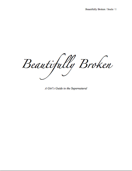
And this second one:
When you were expecting to find this:
And this:
Still don’t believe that formatting makes a difference to how Millicent perceives a manuscript? From the aspiring writer’s perspective, it might not seem to make much of a difference whether the title page is professionally formatted, or if it is in a wacky typeface, or if the first page of text is numbered 2 instead of one. But to her — and to agents, editors, and well-informed contest judges — there’s more than just words on a page at stake.
This is about respecting tradition. The publishing world values its traditions, and even if it did not on general principle, as those of you who have followed my past series on standard format are aware, manuscripts look a particular way for a variety of practical reasons. Every industry has the right to establish and maintain its own standards; most of the assertions that this or that has changed in manuscript format come from the outside.
Also, favoring professionally-formatted submissions a matter of practicality: an aspiring writer who takes the time to learn how to present his writing professionally is usually also one who has found out how publishing does and does not work. Thus, he is more likely than the average aspiring writer (who does not do his homework, as a general rule) to have realistic expectations about what an agent can and cannot do for him, the kind of turn-around times to expect on submissions to publishing houses, the necessity for not pouting when the editor asks for revisions, the imperative to promote one’s own book after it comes out, rather than passively waiting for the publishing house (or one’s friends who happen to be bloggers) to do it for him, and so forth. He’s just an easier client to promote.
What are we to conclude from all of this? Well, first, that I should plan to add a Formatpalooza to this autumn’s festivities; it actually was quite surprising to me how few of this contest’s entries arrived properly formatted. I don’t want any of my readers to get rejected on technical grounds, if a few weeks of my effort every year can help prevent it.
Second, have you noticed that since I’ve had to spend so much time going over the presentation and formatting problems, I haven’t had the luxury of talking about the writing much? That’s a pretty accurate representation of how distracting these issues are for professional readers: if the presentation and formatting are off, it’s awfully hard for good writing even to get noticed.
And that’s a real shame here, because there were some writing choices that we could have discussed productively. The prevalence of the incorrect single-sentence paragraph that we’ve already discussed in this series, for instance — in English prose, a narrative paragraph properly consists of at least two sentences; established authors like Joan Didion began breaking the rule not because they were unaware of it, but because to the hyper-literate, it is genuinely shocking to see a non-dialogue single-sentence paragraph. Thus the emphasis that this narrative choice places on the offset sentence: it shouldn’t be that way without a very good reason.
Unfortunately, in common usage, as well as in both of these pages, single-line paragraphs are used not for emphasis, but for rhythm. To a professional reader, this is not a very sophisticated way to establish beats. Save the single-sentence paragraphs for only that occasion when what is being said in them is going to come as a genuine surprise to the reader.
I would also have liked to talk about the and then convention, a notorious Millicent’s pet peeve. In a written narrative that does not involve time travel, events are assumed to be presented in the order that they happened chronologically. Thus, professional writing typically avoids the and then so dear to aspiring writers’ hearts, because it is logically redundant. The pros reserve it for only those occasions when the then part seems to come out of nowhere.
Hey, where have I heard that logic before?
Then, too, there’s the trailing off with an ellipsis… trope. Quite a few Millicents, especially the classically-trained ones, will have a knee-jerk negative to a narrative sentence or paragraph that ends in that manner. It’s fine in dialogue, where those three dots are expressing an audible phenomenon (the speaker’s voice trailing off or the effect of being interrupted in mid-thought), but the practice of borrowing that dialogue convention to make a narrative voice seem more conversational is, again, considered a not very sophisticated writing trick.
Because, really: aren’t there thousands of ways a narrative paragraph could generate suspense without resorting to punctuation?
Oh, how I wish I had time and space to talk about all this. In lieu of that, I’ll have to content myself with just posting the marked-up versions. (And mailing them to their authors, of course, but I do that routinely, so those brave enough to submit their work for critique here do not have to squint.) Here’s Suzi’s:
And here’s Sherry’s:
Moral: there’s no such thing as a detail too small to escape a professional reader’s notice — and no such thing as a first page that could not use one last going-over before being submitted. Join me at 7 pm PST for the resumption of Synopsispalooza, everyone, and keep up the good work!
Thank you, Anne! I appreciate your feedback. I learn more from the corrections, but I have to admit that I love hearing the praise, too.
Again, thank you for all the time and effort you have put into this. (Not just this contest, but your whole blog.)
You’re entirely welcome, Suzi. I’m genuinely looking forward to being able to walk into a bookstore and buy your book for a certain young reader of my acquaintance — she is going to LOVE this story.
I’m surprised to hear that, “Ah, crap,” is inappropriate for a teen audience. It seems pretty tame.
Appropriateness is as much a matter of logical necessity as of audience, Deb. In this example, the word was simply gratuitous — it replaced a genuine expression of emotion without adding much to the scene. Given how many parents would be inclined to place the book back on the shelf because the word appeared on the first page, it’s just not worth it.
But yes, 13-year-olds are used to hearing much worse profanity, even on TV. This is, in fact, one of the standard euphemisms used for TV. Yet the question of age-appropriateness is not simply a matter of reflecting the terminology that kids might already be encountering — it’s about presenting them with prose that’s both entertaining and good writing. Again, parents are every bit as likely to be the ones buying the books as the young readers.
So while peppering a manuscript with light profanity may seem perfectly legitimate, even realistic, it might actually be harmful to the book’s marketability. Rather than tossing words like this in decoratively, I would rather see YA writers reserve the profanity for the points in the text when it really matters.
But I’m getting carried away. Obviously, you didn’t say anything in your comment about peppering a manuscript with anything! I just get tired of seeing aspiring YA writers have their characters — and, frequently, their narrators as well — speak the way teens do in movies and on cable TV, then are shocked when their pages get rejected. YA books are not just mirrors up to nature: they should also provide young readers with clever lines that they long to work into socially-awkward situations.
Congratulations, Deb and Suzi!
I’ll admit to having to go back and edit for single sentence paragraphs, Anne. They can get real easy to toss off, especially when the pace is quick. I think you’ve mentioned the pervasive usage in AP news articles and the like. It also reminds me of poetry, where the placement of shortened lines or single sentences is used for effect of meaning. Not that it makes it excusable to pepper a manuscript with them, of course. This is an error I don’t like much fixing. Probably comes from the discrepancy of what I’d like to see appear on the page as a writer and reader, and what is actually acceptable.
Yes, I’ve talked about the AP usage — I’ve had some very interesting conversations with journalists who were actively trained to create single-sentence paragraphs. But then, newspaper and magazine accounts are set up visually to promote quick reading; books typically are not. Although I wouldn’t be surprised to see that changing as more people read on backlit screens. The eye’s tendency to skim definitely affects how I set up paragraphs on this very blog.
In manuscripts, though, I think most aspiring writers over-use single-sentence paragraphs because (a) they don’t know that they’re technically incorrect, (b) they don’t realize how often they are using them, and/or (c) they are writing only a paragraph or two at a time. Unless a writer steps back and looks at how an entire page looks, it can be very hard to catch structural repetition.
Heh, this has all been helpful to me. I just rewrote my first page and it is MILES better than what I entered in the contest. Too bad I can’t have a do-over! 😛 Thank you for sharing the Millicent point of view on the entries, Anne.
Congrats to all the winners. All your books sound like things I’d like to read. I hope we all get published and then we can read each others’. 🙂
I’m glad it’s been helpful, Elizabeth! That was my intention in awarding the prizes this way.
Well, shucks. I wish I’d read this post three years ago. To think that I believed my computer grammar program and dutifully changed to “and then.” What’s wrong with the folks who format the software?
Oh, I have had this conversations with people who work at Microsoft many, many times, Priscilla — the Word spell- and grammar-checker regularly suggests incorrect grammar. Too for to, for instance, or the wrong form of there, their, and they’re. The off-the-record answer I usually get is that the checkers are intended for proofreading purposes only — they are not really designed to be giving advice per se.
But naturally, people believe that what the spell- and grammar-checker tells them to do is authoritative! Incorrect advice makes people doubt the rules they do know, and never learn the rules they don’t. It drives editors nuts.
Thank you for the feedback, Anne. I rewrote my first page (first chapter, actually) AND reformatted my MS.
It was an honor to win second place in your contest.
I’m thrilled to hear it, Sherry! Do keep us posted on your progress — I have a feeling that we’re all going to be hearing quite a bit more of your unique voice.