So you’ve pitched successfully — now what? Part IV: covering your bases

I had intended to launch into the promised topic of cover letters for submissions over the weekend, campers, but I was inundated by quiet cries of distress. “But there’s so much to absorb!” post-pitch submitters have been moaning softly. “I had no idea that pulling my already-written manuscript together to submit to that nice agent/editor that requested it would be so complicated. How about giving us the weekend to catch up?”

Fair enough; I know that the strictures of standard format for book manuscripts is pretty hard to wrap one’s head around the first time one hears about it. That’s something those of us that read for a living are all to apt to forget, I’m afraid: until one has seen a few hundred professionally-formatted manuscripts up close and personal, there’s quite a lot about the process of putting one together that’s counterintuitive. If not downright insulting to a writer’s sense that if the writing is good enough, the presentation shouldn’t count.

If those of you planning to submit your work anytime soon have taken anything from this series, however, I sincerely hope it’s that to people in publishing, how a manuscript looks on the page is an indicator of a writer’s having done the necessary homework in order to work well with an agent or editor — and thus of that writer’s seriousness about becoming a professional author.

Speaking of counterintuitive, the vast majority of first-time submitters believe quite the opposite: that agents and editors will read a new writer’s manuscript with a kind eye, looking to like. Or so the pros surmise from the fact that so many submissions, even very good ones, contain non-standard formatting, misspelled words, grammatical mistakes, and other matters that would be hard for anyone that handled manuscripts for a living to overlook.

The result, I’m afraid, is all to often a failure to communicate. And that’s likely to be fatal, in a business devoted to communication.

I’m going to be talking later in the week about how to improve communication throughout the submission process. For today, however, we shall be concentrating upon a communication opportunity that submitters in general and post-pitch submitters in particular tend to skip entirely: the cover letter in the submission packet.

And already, the atmosphere is thick with huffs of derision. “Oh, please, Anne,” those of you on the cusp of submission murmur. “That agent to whom I pitched/queried asked to see my manuscript (or a portion thereof) knows it’s coming — thus the term requested materials. By definition, he knows who I am and what I write. So why on earth should I waste my time and his by writing a cover letter to explain something that requires no explanation ?”

Oh, I can think of plenty of reasons. Just off the top of my head: even if you send those page right after receiving the request, the agent or editor in question will not necessarily have you at the front of his mind; agents and editors at writers’ conferences frequently hear so many pitches that they begin to blur in retrospect; agents and editors often don’t open their own mail, and Millicent, their screener, has no reason to recognize your name; aspiring writers send unrequested submissions all the time, resulting in instant rejection.

Not including it is, in short, strategically unwise.

And at the risk of sounding like your mother, just slapping a manuscript into a box without any message of greeting is, let’s face it, rather rude. In an industry that actually does value manners to a charming, if old-fashioned, extent, I would strenuously advise anyone within the sound of my voice to avoid coming across as that.

Not sure why it might be considered rude? Well, think about it: even if you were expecting company, would you be comfortable opening your front door to someone that consistently refused to identify himself?

Unfortunately, a staggeringly high percentage of otherwise well-mannered submitters don’t think about that, apparently — and evidently do not give much thought to how much harder a submission sent sans cover letter would be to accept.

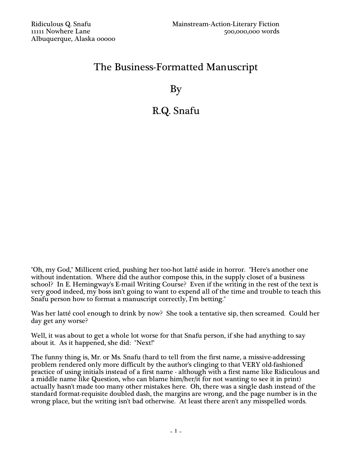
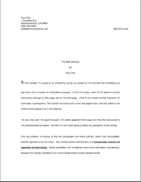
Frankly, the contents of the submission packet very often render it downright difficult for the agent to say yes if he likes the pages within. How so? Well, what’s the first thing he sees upon opening that box — or, more commonly, what his screener sees? Usually, something like this:

Or, should the submitter be somewhat better-versed in submission etiquette, something like this:

Not a lot to like there, eh? Just look at the poor paper quality: you can see page 1 vaguely outlined right through the title page.

Nor is that all. Not only does the sender evidently believe that the agent or editor that requested this asks to see so few manuscripts that hers would be instantly memorable — extremely unlikely — but she’s left Millicent to guess whether this is a requested or unsolicited submission.

Why is that not very wise? Unsolicited submissions almost always get rejected unread.

Still, the second example is better than the first. The sender of the first submission above has make herself almost impossible to sign as a client, at least without the recipient’s doing a good deal of record-searching that would not have been necessary if this writer had been more polite.

Not seeing why? Okay, let’s step into Millicent’s moccasins and take a closer look at the top page of the first submission box. You cut open what is probably your twentieth submission of the day to find this:

Did you study it carefully? If not with the scrutiny you wish the agent of your dreams would apply to your page 1, at least with respectful attention? (If you had too much trouble focusing on the details to do so, try holding down the COMMAND key and pressing + to enlarge the image.)

I hope you read it closely, because I have a couple of very serious questions to ask you, faux Millicent: who wrote this manuscript? And if your boss happens to like it, how will you get in touch with the writer in order to offer a representation contract?

The cover letter’s starting to seem like a better idea, isn’t it? If not, allow me to ask those of you still resisting the concept another serious question: if you were Millicent and had opened two submission boxes, one like our first example and one that contained a cover letter, which writer would you think would be less work for your boss to represent?

Shall I take the universal shudder that just went through my readership as an indication of understanding? “Okay, Anne,” those of you that sniffed at me a week ago when I urged you to include a title page with your submission, “I get it now: not placing my contact information at the top of my submission packet is a bad idea. But that’s not a problem if I include that title page you’ve been yammering about, is it? Since a good title page includes the writer’s contact information, why would the second submission example raise Millicent’s hackles at all?”

Good point, former title page-resisters. The short answer is that the overwhelming majority of title pages submitted do not include this information. They are merely decorative. Commonly, there’s a trade-off between what the writer perceives as beauty and Millicent is at all likely to consider either professional or informative. Like, for instance, this:

Colorful, yes; imaginative, certainly. But once again, it begs the question: how the heck would the requester of this manuscript get in touch with Cat in order to offer to represent her?

Trust me, the last response you want your submission to generate is a heart-felt, “Oh, it’s too bad we have no idea who sent us this or how to contact him or her; all we have is the author’s last name in the slug line. This saddens me, because I really liked this manuscript!”

As you say, though, a professionally-formatted title page would in fact provide any agent, editor, or Millicent with all the information necessary to contact the writer. The title page in our example, however, contains a red flag that might well convince any of the three just to ship the manuscript below it back unread. Take a closer look.

If you flung your hand into the air, leapt to your feet, and shouted, “Hey, that manuscript is well over the word count limit for its genre!” you get a gold star for the day. As we discussed last time, most agencies do have a target upper page limit in mind for first novels in a particular genre. That’s why, in case any of you had been wondering, agency submission guidelines often ask that a query letter should include a word count: so they can reject the over-long and the too-short without having to request the manuscript.

There’s another potential rejection reason here, however. Any guesses?

If you immediately screamed, “The book category listed does not exist,” help yourself to a second gold star out of petty cash. Aspiring writers do this all the time: believing that book category is primarily descriptive, rather than a quick reference to established marketing designations, they cram together mutually exclusive categories to form a hybrid.

Since that effort alone could have gotten this submission rejected, what should Cat have called this instead? Based on that first page, science fiction. And in her shoes, I would have either cut the manuscript in half and presented it as a series, or just left the word count off the title page.

Hey, agents do it all the time when submitting to editors; it honestly is extraordinarily difficult to sell a first-novel by a non-celebrity that’s much over 100,000 words. But you didn’t hear that from me.

Even if our friend Cat made both of these fundamental changes to her title page — after, perhaps, having checked to ascertain that using an estimated word count (250 words/page in Times New Roman x # of pages = a valid estimation) would not be less likely to engender instant rejection than the actual word count she seems to have used here — she would still be better off topping her submission with a nice, polite cover letter than merely relying upon the title page.

I hear some of you groaning. “Oh, come on. Haven’t I written enough for these people? The agent/editor has asked for my manuscript or a portion thereof; she’s also asked for a synopsis. And heaven knows I spent enough time writing my pitch and/or submission. Isn’t enough in fact enough?”

I sympathize with the submission fatigue, weary ones, but I think you’re overestimating the task at hand. In the first place, there’s no need for a long-winded missive — a simple thank-you to the agent for having asked to see the materials enclosed will do.

It’s hardly onerous. Seriously, for either a post-pitch or post-query submission, it could be as simple as the note penned by a colleague of Cat’s that’s done his homework, our old pal Literate McAuthorly.

Seriously, that’s all there is to it. Like any other thank-you letter, the courtesy lies more in the fact that the sender took the time to write it, rather than in what it actually says.

Still not convinced it’s worth your time to write? Okay, let’s move on to the second place: the submitter is the one who benefits from including a cover letter containing all of his contact information — all the more so because so few writers remember to tuck one into their packets, especially if they received the request for materials after a pitch. Suffice it to say that it’s in your best interest to assume that the person who heard your pitch or read your query won’t be the first person to screen your submission, for the exceedingly simple reason that it is, in practice, often a different human being.

Conveniently enough (and we’re up to the third place now, if you’re keeping track), the cover letter provides an excellent means of reminding the agent or editor that she did indeed request the pages enclosed. That minimizes the possibility that Millicent might slit open your submission packet and assume, wrongly, that it was just another unsolicited manuscript.

And we all know what happens to those, right? “Next!”

If the submission is the result of a conference pitch and Cat really wanted to be fancy about it — and believe me, you do — she could go ahead and say where you pitched the book to the agent. After a nice, long chat with her friend Literate, she might well come up with something like this:

See how easy it is for anyone who might open that box to contact Cat now? And see how little effort it took for her to establish herself from the get-go as a courteous, charming writer with whom it might be a pleasure to work?

It’s also apparent, I hope, just how close to effortless it would be to copy and paste this delightful little missive into an e-mail accompanying an electronic submission. The date and the agent’s address would be omitted, of course, but otherwise, it could go as is, with no further embellishment.

Do not, however, make the exceedingly common mistake of not including ALL of your contact information in an e-mailed submission. Writers do this all the time, assuming, with some justification, that all the agent would have to do is hit REPLY in order to get back to them. But electronic submissions sometimes get forwarded around agencies. Hitting REPLY, then, might well send a response to Millicent.

Besides, do you really want to limit the number of ways your future agent can contact you in order to offer you representation? Wouldn’t you be equally pleased with a positive phone call or letter as an e-mail?

Yes? You, with your hand in the air? “I can see that both Cat’s and Literate’s versions are polite, but I can’t help but notice that the formatting is different. And as someone who panics if I’m faced with more than one viable option, that distresses me!”

I’m afraid I can’t relieve your distress much, option-haters. Either format would be just fine: placing the sender’s contact information at the top or bottom of the page is equally permissible. Just don’t go over the top and do both.

What, your hand is still raised? Ask away, intrepid one. “But Anne, Cat’s met this agent face-to-face, right? Doesn’t that mean that she can call the agent by her unpronounceable first name?”

Well, she could, but it would be pushing the etiquette envelope a little. Unless a conference conversation extended beyond a pitch meeting to some social interaction, I would advise against becoming too familiar too soon. In an exchange with an agent or editor, it’s always safe to allow the pro to set the level of address intimacy.

What does that mean, in practice? Err on the side of formality in the cover letter; if the agent or editor addresses you as Dear Emile in a response, feel free to use first names from there on out.

Provided, of course, your name actually is Emile. If your name is Suzette, you might want to drop the agent a courteous, formal note, enclosing the missive to Emile and suggesting, gently, that your submission might have been confused with his.

Lordy, your hand is still up? “I’m still feeling a mite insecure, Anne. I would feel better if you gave me a list of what absolutely must be in my cover letter.”

A reasonable enough request. In fact, I’ll do even better: I’ll include some of the optional stuff, too. A cover letter with a submission should include:

(a) The writer’s full name

(b) All of the writer’s contact information
Not just some of it: your street address, telephone number, e-mail address should all be there, to render yourself as easy to contact as humanly possible.

(c) The title of the book, just in case the letter and the manuscript end up on different desks. (Yes, it happens. Don’t ask; just prepare for the contingency.)

(d) What is actually enclosed
Mention the number of pages enclosed, if the agent or editor asked for a partial. If the request included other materials — like, say, a synopsis or an author bio — go ahead and bring ‘em up in the cover letter.

Fringe benefit: if you are sending out more than one submission at a time (and you should, if you pitched successfully to more than one pro at a conference, unless one of them asked you for an exclusive), noting the contents of each packet in the cover letter will give you a record of what you sent to whom and when.

(e) The information that the manuscript enclosed was requested

(f) If you met the agent at a conference, mention that in the first paragraph of the letter, to help place your submission in context.
As crushing as it may be for the writerly ego to contemplate, an agent who spent days on end listening to hundreds of pitches probably is not going to remember each one. No need to re-pitch, of course, but a gentle reminder never hurts.

While you’re at it, it’s not a bad idea to write the name of the conference on the outside of the envelope, along with REQUESTED MATERIALS. Heck, it’s a very good idea to write the conference’s name on the outside of a query to an agent one has heard speak at a conference, too, or to include the conference’s name in the subject line of a query e-mail. The point here is to render it pellucidly clear to the agent why you’re contacting her.

Do not, please, make the surprisingly common mistake of erring on the other side of caution, assuming that the requester didn’t really mean the request. You’d be astonished at how many successful pitchers send, instead of the pages the agent or editor asked to see, a query asking if the requester still wants to see the pages that — wait for it — the agent or editor asked to see.

Why would they double-check? Usually, because they don’t fully understand that a verbal pitch is a substitute for a query, not an additional hurdle. Sending a post-pitch query is totally unnecessary, a waste of everyone’s time, and sometimes even annoying enough that the request gets withdrawn. Just comply with the original request, okay?

(g) If another agent is already reading all or part of the manuscript you’re sending — or has asked to see it — mention this in your cover letter.
No need to say who it is or how long s/he has had it; just tell the recipient that s/he’s not the only one considering representing this book. It’s only polite. Unless the agency has a policy forbidding simultaneous submissions, withholding this information will only generate resentment down the line if more than one agent wants to represent your book.

Yes, even if that agent to whom you submitted nine months ago has yet to respond. Actually, it’s in your strategic interest to contact that non-responder to let her know that another agent now has your manuscript.

One caveat: if you have heard with your very own personal ears the agent or editor say — at, for instance, the conference at which you pitched to him — that he doesn’t care whether anyone else is looking at a submission, go ahead and omit this information. Ditto if the requester has made this statement on his blog or the agency’s website.

You were intending to check these sources before you submitted, right, to make sure that the requester does not harbor any individual preferences? As always, if an agent or editor has been forthcoming enough to make a submission preference plain, honor it. It’s the polite thing to do.

It’s considerably less polite, though, to impose the non-standard preferences of another agent, editor, or some Yahoo given to spouting writing guidance online upon someone that has not expressed a desire to receive anything but a manuscript in standard format. This, too, is a small infraction of etiquette that well-meaning aspiring writers commit inadvertently all the time: since they’ve heard ONE agent say this or that — or, even more commonly, saw someone mention online that he heard that someone else heard an agent say this or that — they presume that this is the new rule, applicable to every other agent currently drawing breath.

Instead of trying to pretend that all agents share identical preferences — which a simple half-hour’s scroll through a random selection of agency websites would tell you was not true — a writer will always be better off treating those in a position to bring her book to publication as individuals. As, I suspect, you would like to be treated yourself: few aspiring writers, in my experience, relish feeling that Millicent will think of their work as generic.

Of course, you want your writing to stand out from the crowd. Another way to make your submission memorable: be the one submitter in fifty that includes a nice, polite, professional cover letter with your manuscript.

Your mother was right, you know: people really will like you better if you treat them with courtesy. Keep up the good work!

So you’ve pitched successfully — now what? Part III: let’s take it from the topper

I have to admit, campers, that after my last post’s almost purely visual foray into the specifics of professional formatting for book manuscripts and proposals, a single-post summary for which many just-the-facts-ma’am-oriented writers have been clamoring for quite some time, I quite wilted. Not so much from exhaustion (although that was an immense amount of practical how-to to cram into such a short space) as from the sense that, having at long last accomplished something that will please the folks that want to believe that no human enterprise cannot be successfully explained to everyone’s satisfaction in a single post — the searchers, in other words, rather than the habitual blog readers — I may return in good conscience to what I believe this blog does best, demonstrating thoughtfully how to avoid the many complex pitfalls that await the talented writer on the notoriously curvy road to publication.

Why, yes, that it a rather long sentence, now that you mention it. The late Henry James would be so proud.

Given how detail-oriented he was — his characters can scarcely feel an emotion without the reader’s being treated to it from fourteen different levels of analysis — I’m sure he would also be proud that I am once again reverting to lengthy explanation mode about something as seemingly simple as a professionally-formatted title page. Since it’s the first thing an agent, editor, or our old pal and nemesis, Millicent the agency screener, will see in your manuscript, it’s important to get it right. As the clich?goes — and you’re keeping an eye out for those while you’re reading those pages the pro requested you send IN THEIR ENTIRETY, IN HARD COPY, and preferably OUT LOUD, right? Almost everyone that reads for a living twitches at the sight of a clich?– you get only one chance to make a first impression.

Yet, surprisingly often, aspiring writers overlook odd formatting as a possible reason that an otherwise well-written manuscript might have been rejected. Oh, not all by itself, generally speaking, unless the violation was truly egregious by industry standards, something along the lines of submitting unnumbered pages or not indenting paragraphs, for instance, the kind of faux pas that might actually cause Millicent to cast the entire submission aside unread.

Like, say, the kind of major formatting snafu that a quick glance at that handy reference guide in my last post would lead a savvy submitter to avoid.

Yet surprisingly little conference time seems to be devoted to deviations from standard format for manuscripts. Why shouldn’t conference speakers take thirty seconds of their speaking gigs to pointing out, for instance, that the ways in which a professional manuscript does not resemble a published book — ways that are unfortunately quite obvious to an agent, editor, contest judge, etc., from practically the moment their bloodshot eyes light upon a submission?

Why is it so very apparent, you ask? Because much of the time, submitting writers will work overtime to make it apparent.

Seriously, many aspiring writers clearly go out of their way to format their submissions to resemble published books, in the mistaken belief that this will make their work seem more professional. As we’ve already discussed in this series, this effort generally causes Millicent readers to regard a submission as less professional — and often, it’s apparent in her first glance at the first page of a submission.

Yes, really, the vast majority of submissions are rejected not only on page 1, but within the first few lines of page 1. Heck, a harried Millicent may even derive a negative impression of a manuscript even prior to page 1.

Keep taking nice, deep breaths. That dizziness will pass shortly.

Ah, some of you have found your breaths again, haven’t you? “Oh, come on, Anne,” I hear some hard-boiled submission veterans scoff, “she makes up her mind that this isn’t a submission to take seriously before to page 1? How is that even possible?”

Well, the most common trigger is the absence of any title page whatsoever. Many submitters, for reasons best known to themselves, omit the title page altogether — often, I suspect, because they are unaware that a professional manuscript always features a title page.

Why? Long-time readers (or even those that simply paid attention to my last post), pull out your hymnals and sing along with me now: a properly-formatted title page tells an agent precisely how to contact the brilliant author who wrote it — and tells an editor precisely how to contact the agent who represents her.

Was that gargantuan gasp a signal that those of you who have title page-free submissions circulating at the moment are just the teensiest bit worried? If so, relax: forgetting to include a title page almost certainly won’t prevent Millicent from reading your submission at all. She generally reads even the most bizarrely-formatted submissions for at least a line or two (although frequently no more than that). But that initial impression of an author’s lack of professionalism — or, to call it by a kinder name, of a writer’s having a lot to learn about how the publishing industry does and doesn’t work — often translates into a rather jaundiced reading of what comes next.

Are you once again barking, “Ye gods, why?” Well, let’s take a peek through her reading glasses, The first thing Millicent’s work-wearied peepers fall upon when she opens the average requested materials packet is something like this:

As always, I apologize for the fuzziness with which my blogging program reproduces page shots. If you’re having trouble making out the details with Henry James-level specificity, try holding down the COMMAND key and pressing + to enlarge the image.

Have it in focus now? Good. Our Millie might also encounter a first page like this:

Or, heaven help us, like this:

Why might Millicent take one look at these and conclude that the respective submitters of these three first pages could use a good class on manuscript formatting — and thus would be time-consuming clients for her boss to sign? Because, dear friends, both of these examples have failed as both title pages and first page of text.

How? By not including the information that a pro would expect to see on either.

What makes me so sure she would find this discovery disappointing, at best? Because what she — or her boss, the agent to whom you successfully pitched — would have expected to see on top of that pile of paper was this:

good title

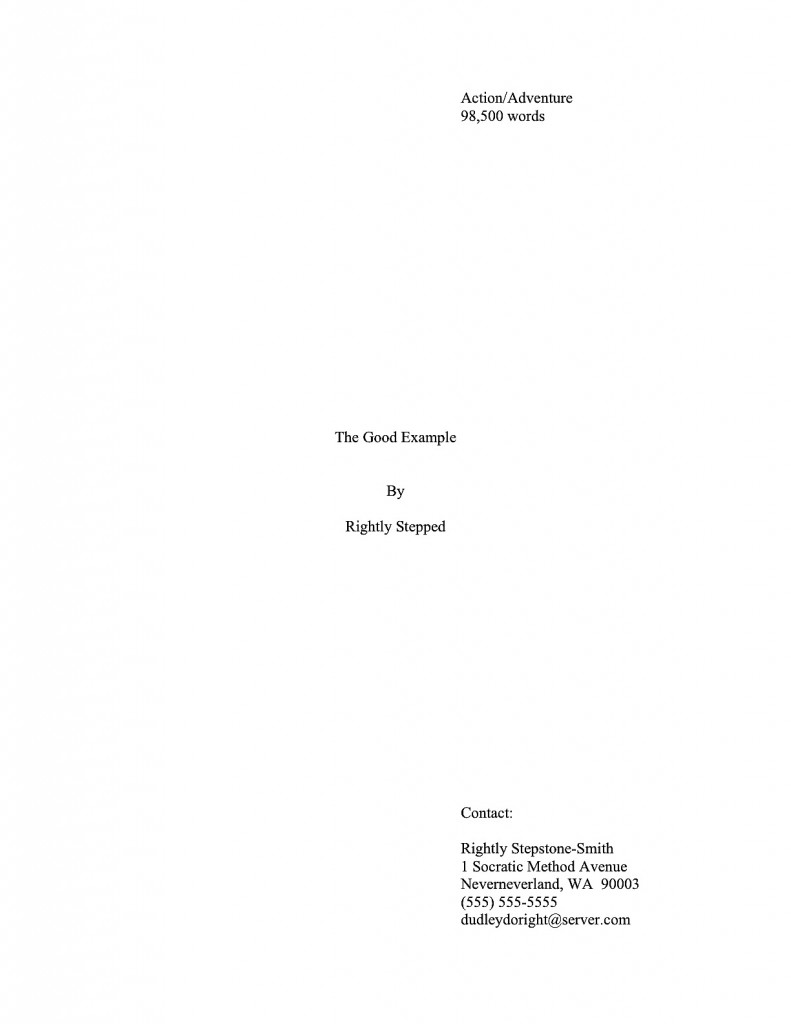
This is a standard professional title page for the same book — strikingly different, is it not? Visibly different, in fact, from several paces away, even if Millicent isn’t wearing her reading glasses.

Again, though, submitting the earlier examples rather than that last would not necessarily be instantly and automatically fatal to a manuscript’s chances. However, human nature and agency denizens’ punishing reading schedule being what they are, if Millie has already decided that a submission is flawed, just how charitable an eye do you think she is likely to cast upon that typo in line 13?

To use every screener’s favorite word: next!

To be fair to Millicent, while it may well be uncharitable of her to leap to the conclusion that Faux Pas’ or Ridiculous’ manuscripts are likely to be unpolished because they did not include a proper title page, agencies do have a vested interest in signing writers who present themselves professionally. For one thing, they’re cheaper to represent, in practical terms: the agent doesn’t have to spend as much time working with them, getting their manuscripts ready to submit to editors.

Among other things, then, including a properly-formatted title page tells him right off the bat that — wait for it — he won’t have to teach the writer how to produce a title page. That’s important, as no agent in his right mind would send out a manuscript that didn’t include a standard title page. It serves a number of important — nay, vital — marketing functions.

To understand why, let’s take another look at the professional version. So you don’t have to keep scrolling up and down the page, here it is again:

good title

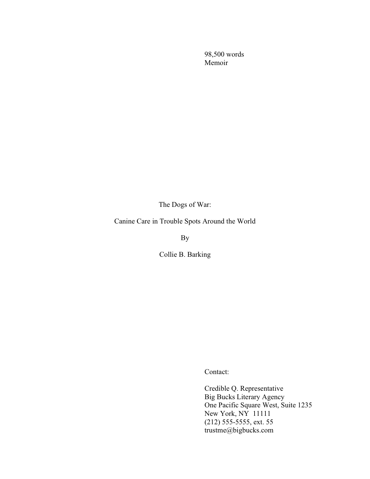
Did you take a nice, long look? Good. While we’re at it, let’s also take a gander at a proper title page for a book with a subtitle:

Pop quiz: how precisely do Rightly and Collie’s first sheets of paper promote their respective books than Faux Pas or Ridiculous’ first pages?

Well, right off the bat, a good title page tells a prospective agent or editor what kind of book it is, as well as its approximate length. Both of these are pieces of information that will tell Millicent instantly whether the submission in her hand would meet the requirements of the editors to whom her agency tends to sell.

How so? Well, think about it: if Millicent’s boss had decided not to represent Action/Adventure anymore, or if editors at the major houses had started saying that they were only interested in seeing Action/Adventure books longer than 90,000 words, Rightly Stepped would be out of luck.

But then, being a savvy submitter, ol’ Rightly would also want his work to be represented by an agent who just adores very long Action/Adventure novels — and regularly goes to lunch with scads and scads of editors who feel precisely the same way, right?

I sense some raised hands out there. “Um, Anne? I notice you mentioned approximate length. Since my word processing program will tell me precisely how many words are in my manuscript, why should I pretend I’m guessing?”

Your logic would be quite sound, estimate-eschewers, if we were talking about a magazine article or a short story. There, you should use actual word count.

For a book manuscript, however, the convention is to estimate word count. Since manuscripts shrink around 2/3rds in the transition to published book, the number of pages is actually a better measure of how much it will cost to print and bind the thing. A page in standard format in 12-point Times New Roman is assumed to run about 250 words, a page in Courier 200. So the conversion formulae run like this:

# of pages in Times New Roman x 250 words/page = estimated word count

# of pages in Courier x 200 = word count

Fair warning: the result will bear virtually no resemblance to your actual word count; it will usually be far lower. But that’s okay, because when Millie spots a title page indicating that the manuscript it covers is 100,000 words, she’ll instantly think, “Oh, that’s 400 pages.” In other words, well under the 125,000-word threshold at which printing and binding the book abruptly becomes quite a bit more expensive.

So if you are one of the many, many literal-minded writers that believe being absolutely factual will win Brownie points with Millicent — and I constantly meet writers that insist that because Word will provide an exact word count, providing anything else on the title page is tantamount to lying — I invite you to consider this: given that she has experience making this conversion, what do you think her first reaction will be to encountering a title page that proclaims up front that it’s a cool 112,452 words?

That’s right: “Oh, that’s too long for our agency.” Which is a pity, really, as it’s not beyond the bounds of belief that a 400-page manuscript’s actual word count would be 112,452.

Did that just make those of you that grew up on the classic 19th-century novels do a double-take? “Whoa, there!” length-lovers everywhere cry. “I’ve heard all over the place that the maximum word count most agents will consider is between 100,000 and 125,000 words, depending upon the book category, far shorter than many of the great works of literature. This is the first time I’ve ever heard that the actual cost of producing the physical books played a role in coming up with those figures. I just thought that in recent years, agents and editors had just made a collective decision — due, perhaps, to the hugely increased volume of submissions since the advent of the personal computer — not to read as much.”

That’s an interesting theory, length-lovers, and one that might make abundant sense if requested manuscripts were invariably read from beginning to end before being accepted or rejected. As we have discussed, however, the average submission gets rejected on page 1.

The disinclination for the long has much more to do with fact that paper is far more expensive than it was a hundred years ago — and at 500 pages, the binding costs take a remarkable leap. Now, we’ve all seen books that long for sale, but in recent years, they’re usually by already-established authors — i.e., ones with a track record of selling books to readers that might be willing to cough up a slightly higher amount of money for a new book by a favorite author.

But if a manuscript by a first-time author begins to bump up against that limit, publishers know from experience that the extra cost will be a harder sell to readers. Which means, in turn, that a manuscript much over 400 pages will be more difficult for an agent to sell to an editor. And that’s why, in case any of you had been wondering, aspiring writers so often hear the pros say at conferences that they’re not looking for anything over 100,000 words.

“Wait just a nit-picking minute!” those of you clutching lengthy manuscripts cry. “A couple of paragraphs ago, we were talking about 125,000 words (500 pages in Times New Roman x 250 words/page) as the reject-on-sight limit. So where does the 100,000-word (400 pages in Times New Roman x 250 words/page) barrier come from?”

Theories vary on this one, actually. A rather pervasive explanation claims that a prudent agent will want to leave room for revision; a second, almost as common, holds that since writers new to the craft usually have minimal experience in editing their own work, accepting a longer manuscript effectively means signing on to edit extraneous text, redundancy, and the like.

A third theory — and I don’t think you’re going to like it much — is that aspiring writers’ reportage of word count is too often off by quite a bit. Possibly because they’ve heard that old saw about how any submission over 100,000 words is toast. You must admit, that kind of rumor does provide a certain amount of incentive for inaccuracy.

In my experience, though, most first-time submitters are simply unaware of the estimation rules — or that they should estimate. Even with the best intentions, it’s not hard to see how Millicent might have derived this impression: it’s not all that uncommon for submitters to take an actual word count, round it to the nearest big number, and hope for the best.

How might that work in practice? Let’s say for the sake of argument that Bunny McNewatit’s novel was actually 85,487 words the last time she checked, but she’s tinkered with it a bit since. Now, she’s just given a successful pitch, and she’s too eager to get those requested first 50 pages out the door to redo the word count. But it doesn’t matter, she figures: she’s planning on working on the rest of the book while the agent of her dreams is reading the opening.

So, completely innocently, she adds a bit of a cushion to the estimate on the title page: there, she reports that her baby is 86,250 words. Since professional readers expect the font on the title page to be the same as the font in the text, and the title page is in Times New Roman, Millicent just assumes that the manuscript that follow is 345 pages (345 x 250 = 86,250), rather than flipping to the bottom of the stack of papers to check.

That’s fine — but if the title page is in Courier, Bunny’s in a spot of trouble. Doing the mental math, Millie would conclude that the book is 431 pages — and that Bunny’s math skills are not particularly good. In fact, because 86,250 does not divide evenly by 200, she’s going to wonder how our friend Bun came up with that word count. She may even — brace yourself — speculate that Bunny has not yet finished writing the book.

Now, in actual fact, a 400-page manuscript in TNR is usually closer to 115,000 words than 100,000; as any writer who has compared the estimated word count for her book with the total her word processing program so kindly provides, they tend to differ wildly. But word count, like beauty, is in the eye of the beholder: a novelist whose title page reported, accurately, that her 400-page novel was 115,000 words might well see it rejected out of hand on the grounds that it was too long.

Why? Well, math may not have been Millicent’s best subject, either (as one might expect, the inmates of agencies tend overwhelmingly to have been English majors), but she can do third-grade multiplication in her head: 115,000 words at 250 words/page would equal a 460-page manuscript. Next!

Boy, those hackles are getting a workout today, aren’t they? “But Anne, why is Millicent estimating at all? If she wants to know how long it is, why doesn’t she just flip to the last page and check the last page number, for heaven’s sake?”?

I could give you a long song and dance about how much her wrists hurt from opening all those query envelopes all day, or how her secret midnight e-mail orgies have rendered pinching a torture, but in practice, the answer is far less personal than practical: because the word count is right there on the title page.

Tell me, oh submitters: why on earth should she doubt its accuracy? Unless, say, the title page were in a non-standard typeface like Helvetica, she’s going to assume that an aspiring writer familiar enough with standard format to include the word count on the title page would also know how to estimate it accurately.

I know, I know: from a writerly perspective, that’s kind of a wacky assumption. But her chair boasts a different view than ours.

Besides, how exactly could she manage to turn to page 400 of a manuscript, when her boss requested that the writer send only the first 50, without resorting to some pretty impressive maneuvering through time and space?

Swiftly averting our eyes from the depressing fact that a number on the title page (or in a query) could potentially harm the manuscript that much, let’s consider how the other information on the page can boost that same manuscript’s chances of getting picked up. How about the undeniable fact that a standard title page also tells Millicent precisely how to contact the author to offer representation?

If I’ve said it once, I’ve said it a thousand times: it’s always in an aspiring writer’s interest to make it easy for the fine folks that work at the agency of her dreams to help her. I might be wrong, of course, but I suspect that not forcing Millicent to forage through the mountain of paper on her desk to find a misplaced cover letter with your phone number on it might be a good start toward being easily helpable.

Which is yet another way in which Faux Pas’ first page falls short, professionally speaking. It doesn’t really do anything but announce the title of the book and leap right into the story. That’s one underachieving piece of paper.

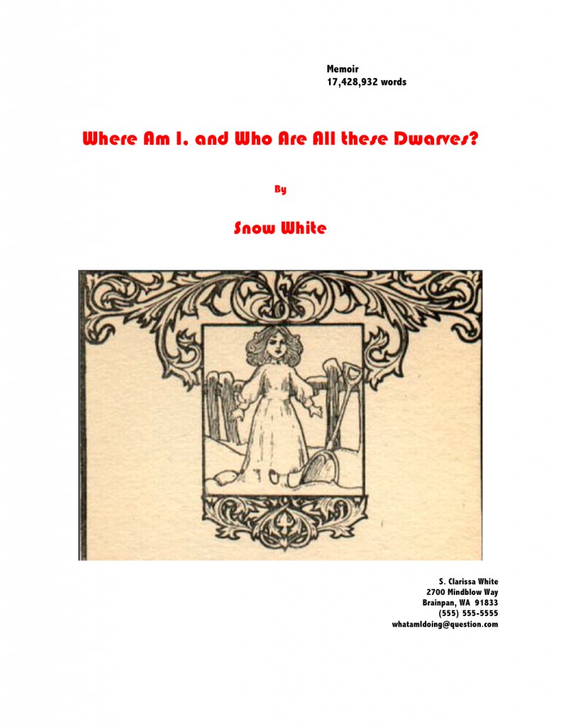
But that’s not the only way a title page can fall down on the job. Let’s take a gander at another type of title page Millicent often sees — one that contains the right information, but is so unprofessionally formatted that the care with which the writer followed the content rules gets entirely lost:

title picture

Where should I even begin with this one? It’s pretty, undoubtedly, but would anyone care to start listing any of the five things wrong with it?

If you immediately zeroed in on the picture, give yourself a gold star for the day; since there is literally no chance that any image a writer chooses to place on a manuscript or proposal’s title page will end up on the published book’s cover (the usual rationale for including them at this stage), decorating your submission’s title page with photos or drawings will just seem bizarre to Millicent. And that goes double for Mehitabel, the veteran literary contest judge.

Award yourself two gold stars if you said Ms. White should nix the red lettering — or any lettering that isn’t black, for that matter — or that her contact information should not have been centered. Pin a great big blue ribbon on yourself, too, if you also pointed out that Ms. White used two different typefaces here, a classic standard format no-no. Not to mention the fact — although I do seem to be mentioning it, don’t I? — that the type size varies.

I feel a rule coming on: like everything else in the manuscript, the title page should be entirely in 12-point type. It should also be in the same font as the rest of the manuscript. With the usual caveat: unless an agent specifically requests otherwise, of course.

Otherwise, you may place the title in boldface if you like, but that’s it on the funkiness scale. No matter how cool your title page looks with 24-point type or the picture you would like to see on the book jacket, resist the urge, because Millicent will be able to tell from across the room if you didn’t.

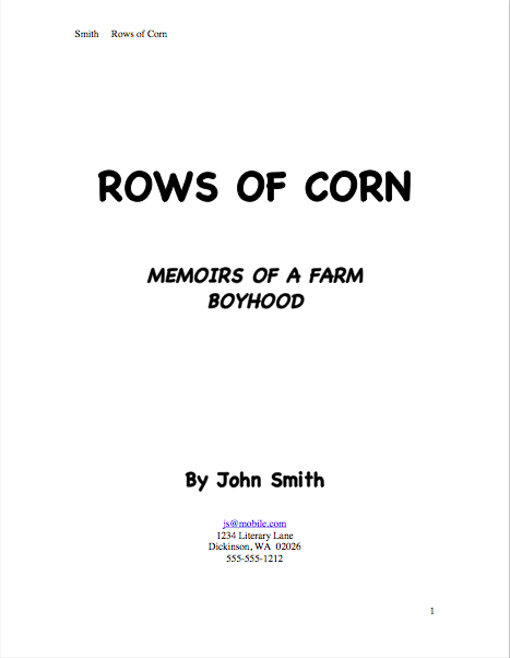
Don’t believe me that size matters? See for yourself:

Quite a difference, isn’t it? Apart from Mssr. Smith’s tragic font choice and his not having countermanded Word’s annoying propensity to reproduce e-mail addresses in blue ink, did you notice any potentially eye-distracting problems with this title page?

If you said that it included both a slug line (the author’s name and title in the upper right margin of the page) and a page number in the bottom right corner, snag yourself yet another gold star from petty cash. Add whipped cream and walnut clusters if you mentally added the reason that those additions are incorrect: because the title page is not the first page of text, and thus should not be formatted as if it were. Nor should title pages be numbered.

This means, incidentally, that the title page should not be counted as one of the 50 pages in those 50 pages the agent of your dreams asked you to submit, either. Nor would it count toward the total number of pages for a contest entry.

That loud whoop you just heard was contest-entering writers everywhere realizing that they could squeeze another page of text into their entries. Perhaps seconded by the many, many pitchers asked to send the standard first 50 pages that just realized my insistence upon professional presentation was not going to cost them a page of text.

I’m hearing some discontented murmuring amongst aesthetes out there in the ether. “But Anne,” visually-oriented aspiring writers murmur under their breath, so as not to attract the wrath of Millicent, “I feel that the rules of standard format for books and book proposals– not to be confused with the formatting norms for short stories, magazine articles, screenplays, or any other kind of writing intended for professional submission — are stepping all over my right to creative expression. If I believe my writing looks best in a special font like Abadi MT Condensed Extra Bold, why shouldn’t I run with it? It’s how I want my words to look in the published book, so why shouldn’t I present my manuscript that way?”

Because, murmuring aesthetes, Millicent will take your writing more seriously if you format it as she expects to see it. While two-inch margins and a cursive typeface may strike a writer as the perfect expressive extension of the spirit of his novel, to someone who reads manuscripts for a living, they’re just puzzling. And, frankly, distracting from the writing.

So yes, Virginia, a choice as small as a typeface honestly can make an astonishingly great difference to how professional your work looks to the pros, even on the title page. That comes as something of a surprise to most aspiring writers — who, it should astonish no one to learn, tend to regard that particular decision as a purely aesthetic one. “Why,” they ask, and not unreasonably, “should it matter? Good writing’s good writing, isn’t it?”

Well, yes and no. Yes, good writing is a thing of beauty and a joy forever. No, insofar as good writing tends to have less impact on the average Millicent when it’s presented in an unusual font.

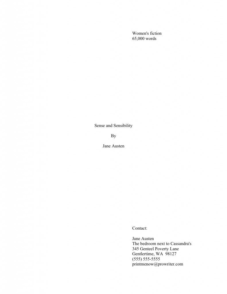
Yes, really. To see why, let’s take a peek at the same title page in three different typefaces. Here it is in 12-point Times New Roman:

Austen title good

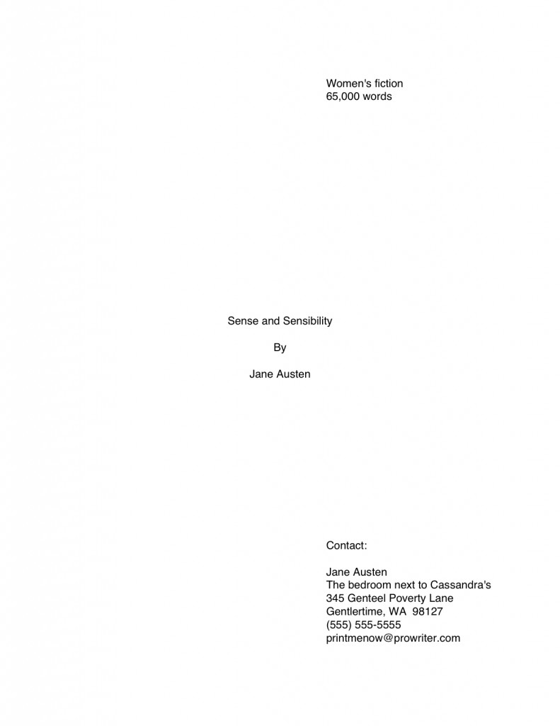
That’s what anyone sitting in Millicent’s seat would expect to see. Now let’s look at exactly the same information, assuming that Aunt Jane had favored 12-point Helvetica so strongly that she just couldn’t resist submitting in it:

Austen title helvetica

The letters are quite a bit bigger, aren’t they? Not enough so to appear to be, say, 14-point font, but large enough to make Millicent wonder whether the word count is accurate. (Lest we forget, word count does vary by typeface: Times New Roman is estimated at 250 words/page, Courier at 200.) And do you really want her speculating about your credibility before she reaches the first page of your manuscript?

Now that we have seated ourselves firmly in Millicent’s office chair, we can see that Aunt Jane’s choice of Helvetica, while not a deal-breaker, does not necessarily present her manuscript to its best advantage. But does the increased volume of disgruntled ethereal muttering mean some of you want to see a typeface that might be a deal-breaker? Happy to oblige.

Austen title brushscript

Can’t really blame Millicent for not wanting to turn the page on that one, can we? Despite containing all of the information that a title page should include, in the right places and in the right order, it’s unprofessional-looking. Not to mention hard to read.

Got Millicent’s perspective firmly imbedded in your mind? Excellent. If you want to switch back to the writer’s point of view, all you have to do is remember that the manuscript that follows even this last title page is SENSE AND SENSIBILITY.

The moral: even the best writing may be placed at a competitive disadvantage by unprofessional presentation. Yes, it’s a pain to implement at first, but in the long run, standard format is the good writer’s friend, not her enemy.

Adopting the norms of standard format and clinging to them like an unusually tenacious leech carries a fringe benefit, too: it will also help you preserve your sanity throughout the often-protracted submission process. Honestly, trying to apply every single one of the expressed (and not always well-informed) opinions floating around out there to your manuscript will drive you 100% nuts. The anecdotal agents’ pet peeves one hears bouncing around the Internet are too often mutually contradictory, for one thing.

But, naturally, if an agent to whom you are submitting asks for something different, for heaven’s sake, give it to her. If, as is almost always the case, you just don’t know, keep the presentation unprovocative and professional so that your writing may shine.

In other words, adhere to the strictures of standard format, rather than assuming, as so many aspiring writers do to their cost, that the writing is the only thing that matters.

Is that deafening clank the sound of a thousand writers’ hackles being raised? I can’t say I’m surprised; the very topic of presentation seems to be emotionally trying for a lot of writers — disproportionately so, from where Millicent is sitting. Tell an aspiring writer that his dialogue is turgid, or his pacing drags, or that he’s left a necessary section out of his book proposal, and most of the time, he’ll be at least curious about why you think so. (If a bit defensive.)

Yet suggest to the same writer that he might be better off reformatting his manuscript to include such niceties as paragraph indentation or moving his page number to the slug line, and a good quarter of the time, he’ll look at you as though you’d just kicked his grandmother. Thrice.

So pardon me if I duck behind a handy large piece of furniture while I reiterate: from the perspective of someone who reads manuscripts for a living, standard format is simply the least distracting way a book can possibly be presented.

Which is, of course, the primary reason to rely upon either Times, Times New Roman, or Courier typefaces, both on the title page and in the manuscript. These are the standards of the industry, and thus the least likely to raise Millicent’s ever-knitted eyebrows.

And that’s going to be true regardless of the quality of the writing. First impressions count.

To see how much of a difference font and typeface can make at first glance, here’s a correctly-formatted page 1 in Times New Roman. Just for giggles, I’m going to use that notorious editor’s nightmare, the opening paragraphs of A TALE OF TWO CITIES:

2 cities page 1 proper

Pretty spiffy, eh? And definitely not how this opening would appear in a published book, right?

Now let’s take a peek at the same page, also correctly formatted, in Courier. Note how many fewer words per page it allows:

2 cities proper Courier

Got both of those firmly imbedded in your brainpan? Good. Now format your first pages that way for the rest of your natural life. My work here is obviously done.

Just kidding — you want to see why it’s a good idea, don’t you? Okay, take a gander at the same first page, not in standard manuscript format. See how many differences you can spot:

Fascinating how just a few small formatting changes can alter the presentation, isn’t it? It’s exactly the same writing, but it just doesn’t look as professional. To Millicent, who reads hundreds of pages per day, the differences between the last three examples could not be clearer.

And yet, if we’re going to be honest about it, there were really very few deviations from standard format in the last example. For those of you playing at home, the typeface is Georgia; the chapter title is in the wrong place, and there isn’t a slug line. Also, the page is numbered in the wrong place — the default setting, incidentally, in many word processing programs.

In all probability, none of these infractions against the rules of standard format are serious enough to cause Millicent to toss a submission aside as soon as she notices them. But when poor formatting is combined with literary experimentation — like, say, that paragraph-long opening sentence ol’ Charles managed to cough up — which do you think she is going to conclude, that Dickens is a writer who took the time to polish his craft, or that he just doesn’t know what he’s doing?

Don’t tempt a professional reader to draw the wrong conclusion about your devotion to your craft. Remember, where a manuscript stands depends upon where the reader sits.

Before any hackles start rocketing skyward again, I hasten to add: where the submitting writer sits often makes a difference to Millicent’s perception, too. Her reception of that last example is very likely to be different before Dickens became a household name or after, although once he was established.

Unless you happen to be famous, I wouldn’t advise taking the risk. And if you do happen to be famous, could I interest you in writing a back jacket blurb?

In fairness to Millicent, though, it’s highly unlikely that it would even occur to our Charles to deviate this markedly from standard format, if he already had experience working with an agent or editor. The longer you remain in the business, the more those little things will strike you as just, well, matters of right and wrong. As, fortunately or not, they do Millicent and her ilk.

Come to think of it, that sense of fitness may well be the reason that discussions of formatting tend to become so vitriol-stained: we all like to be right, and after all, propriety is in the eye of the beholder. After all, each of us is most familiar with the view from her own chair.

Which is why, I suspect, so many aspiring writers become enraged at the very notion that something — anything — but the style of the writing could possibly play a role in a professional assessment of a manuscript’s potential. As Millicent is only too painfully aware, there’s more to working well with an agent or editor than writing like a muse-inspired bard.

There’s being willing and able to take direction, for instance, because working authors often do need to make revisions on very short notice. There’s being willing and able to take criticism without flying into a passion — because, believe me, the pros don’t pull their punches; when everyone’s trying to meet a deadline, it’s a waste of valuable time. And there’s being willing and able to adhere to the standards of the industry one is lobbying so hard to join.

Make it easy to help you do that. And make it apparent that you will be easy to help from the very top of your manuscript.

I can sense some of you recent pitchers getting antsy about sending out those requested materials, so that’s it on the formatting front for the nonce. Next time, I shall be talking about how to construct a professional-sounding cover letter to accompany your submission — and over the weekend, we shall be discussing how to pack up your work and send it off with style.

Keep up the good work!
So you’ve pitched successfully — now what? Part II: what does a professionally-formatted book manuscript look like, anyway?

Hint: not like this

I’m going to try something a little different today, campers. This post is for all of you strong, silent types: instead of explaining at my usual great length how to put together a manuscript for submission to the agent of your dreams, I’m going to show you.

What brought on this change in tactic? Well, last time, I gave those of you that had just pitched your work successfully to an agent — which, contrary to astoundingly pervasive opinion amongst conference-goers, means that the agent asked to see all or part of your manuscript or book proposal, not offered on the spot to represent you — a brief overview of what that agent would expect to see in a submission. I did that not only to aid writers in a whirl about how to get their work out the door, but also to provide advance knowledge to those of you planning upon pitching at a writers’ conference in the months to come and those of you planning to send out queries. In fact, I shall be devoting the rest of the week to this worthy endeavor.

Why devote so much energy to talking about something as seemingly simply straightforward as packing up a manuscript and sending it to someone that has asked to see it? Because knowing what’s expected can both streamline the submission process and render the preparation stage substantially less stressful. Because there’s more to it than meets the eye. And, frankly, because most submitters do some part of it wrong.

How? Oh, in a broad array of ways. Some manuscripts are formatted as if they were published books. Others are mostly correct, but do not apply the rules consistently or present the text in a wacky font. Still others cherry-pick which rules to follow, or combine the rules for short stories and those for book-length works into an unholy mish-mash of styles.

And those are just the manuscripts put together by writers that are aware that some standards for professional presentation exist. Agents see plenty of submissions from those that evidently believe that everything from margin width to typeface is purely an expression of individual style.

Back in the decadent days when being asked to submit a manuscript meant, if not an offer of representation, then at least an explanation of why the agent was passing on the project, rejected writers were often firmly but kindly told to learn the ropes before submitting again. And today, many agencies have been considerate enough to post some indication of their formatting requirements on their websites. But more often than not, submitters whose manuscripts deviated from expectations never find out that unprofessional presentation played any role at all in their rejection.

So how are they to learn how to improve their writing’s chances of pleasing the pros?

This evening, I’m going to be concentrating on the cosmetic expectations for a manuscript. But before my long-term readers roll their eyes — yes, yes, I know, I do talk about standard format quite a bit — let me hasten to add that in this post, I am going to present manuscript pages in a different manner than I ever have before.

You see, I’ve been talking about standard format for manuscripts for almost seven years now at Author! Author!, long enough to notice some trends. First trend: this is one of the few writer-oriented online sources for in-depth explanations of how and why professional manuscripts are formatted in a very specific manner — and are formatted differently than short stories, magazine articles, or published books. As the sharper-eyed among you may have gleaned from the fact that I devote several weeks of every year to discussing standard format and providing visual examples (the latest rendition begins here), I take that responsibility very seriously.

Which is why the second trend troubles me a little: whenever a sponsor a writing contest — and I am offering two this summer, one aimed at adult writers writing for the adult market and a second for writers under voting age and adult YA writers — a good two-thirds of the entries are improperly formatted. Not just in one or two minor respects, either. I’m talking about infractions serious enough that, even if they would not necessarily prompt our old pal, Millicent the agency screener, to reject those pages on the spot, they would at least encourage her to take the writing less seriously.

Why might someone that reads submissions for a living respond that drastically? Chant it with me now, long-time readers: because all professional book-length manuscripts handled by US-based agencies and publishing houses look essentially the same, writing presented in any other manner distracts Millicent. So if you want your work to claim her full attention, it’s very much to your advantage to present it as the pros do.

I could encourage you to embrace this excellent strategy in a number of ways. I could, for instance, keep inventing reasons to shoehorn the link to the rules for standard format for book manuscripts. I could also make adhering to the strictures of standard format a requirement for entering a writing contest, and then construct a post in which I list the rules one by one, showing how incorporating each would change how a manuscript aimed at an adult audience appeared on the page. I could even, I suppose, take a theoretical entry to a young writers’ contest, apply the rules to it, and post the results.

All of that would be helpful, I suspect, to the many, many aspiring writers who have never seen a professionally-formatted manuscript in person. Yet I must confess, I worry about writers that learn more easily from visual examples than extensive explanation. Not to mention those that are in just too much of a hurry to read through post after post of careful demonstration of the rules in practice.

Today, then, I am going to present standard format for book manuscripts in the quickest, visually clearest way that I can: I’m going to draw you a map.

Or, to be a trifle more precise about it, this post will provide a guide to the professional manuscript page that will allow those new to it to navigate around it with ease. Let’s start by taking a peek at the first three pages an agent would expect to see in a manuscript, as the agent would expect to see it: the title page, page 1, and page 2.


Pretty innocuous presentation, isn’t it? (If you’re experiencing difficulty seeing the details, try holding down the COMMAND key and pressing + repeatedly to enlarge the images.) As we may see, book manuscripts differ from published books in many important respects. Some respects that might not be obvious above:

Book manuscripts should be typed or printed in black ink on 20-lb or heavier white paper.

I encourage my clients to use bright white 24-lb paper; it doesn’t wilt.

Manuscripts are printed or typed on one side of the page and are unbound in any way.

The preferred typefaces for manuscripts are 12-point Times New Roman or Courier.

No matter how cool your desired typeface looks, or how great the title page looks with 14-point type, keep the entire manuscript in the same font and typeface.

Due to the limitations of blog format, you’re just going to have to take my word for it that all of these things were true of the manuscript pages I am about to show you. I printed them out and labeled their constituent parts, so we could talk about them more easily. Then I slapped the result onto the nearest table, and snapped some glamour shots. The lighting could have been better, but here they are, in all their glory.

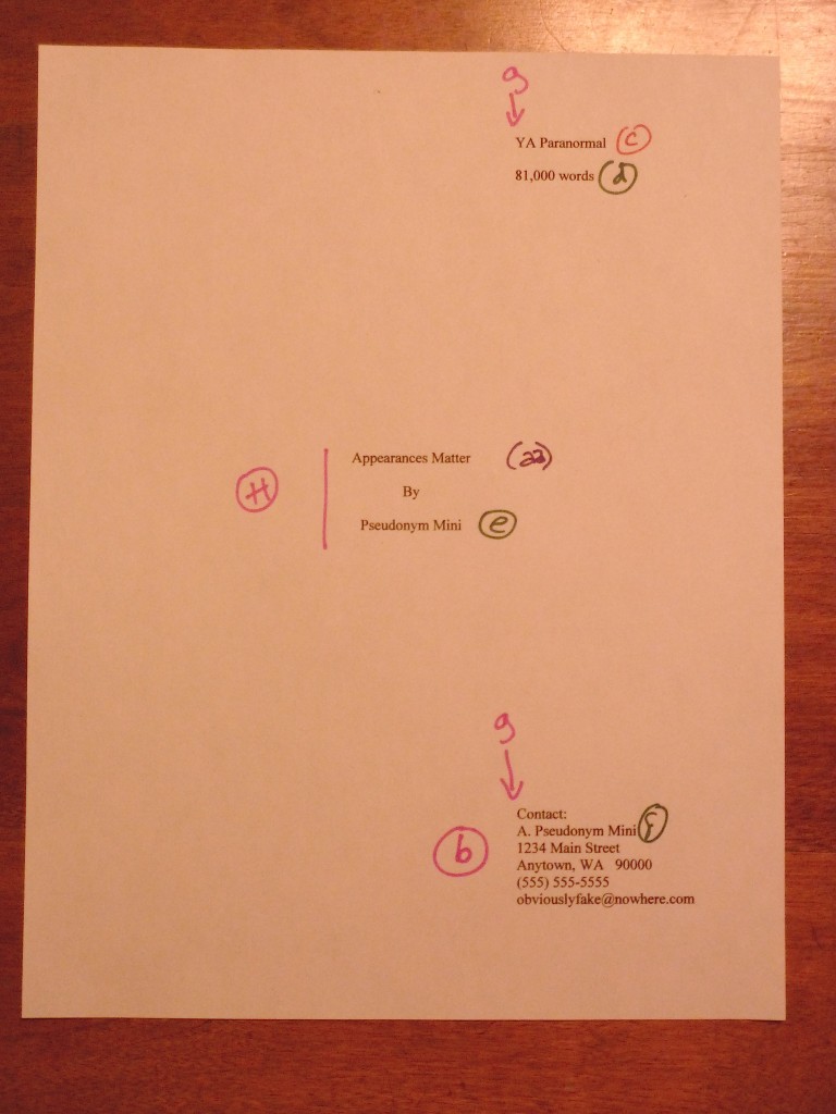
I’ll go into the reasoning behind including a title page in a submission (it’s a good idea, even if you’ve been asked to send only the first few pages) in tomorrow’s post, so for now, let’s just note what information it contains and where it appears on the page. A professionally-formatted title page presents:

A professionally-formatted title page should include all of the following: the manuscript’s book category (c), word count (d), author’s intended publication name (e), author’s real name (f), and author’s contact information (b).

Don’t worry; I shall be defining all of these terms in my next post.

The title and author’s pen name should be centered on the page. (h)

The book category, word count, and contact information should all be lined up vertically on the page. (g)

The easiest way to pull this off is to set a tab at 4″ or 4.5″.

Do not use boldface anywhere in the manuscript but on the title page — and even there, it’s optional.

As you may see here, I have elected not to use it. If I did, the only place where it would be appropriate is at (aa), the title.

Contact information for the author belongs on the title page, not page 1. (b)

Which is, of course, a nicety that would escape the notice of a submitter that believed that short story format (in which the word count and contact information are presented on page 1) and book manuscript format were identical. By including a title page, you relieve yourself of the necessity to cram all of that information onto the first page of a chapter. As you may see, the result is visually much less cluttered.

Every page in the manuscript should be numbered except the title page. The first page of text is page 1. (5)

In other words, do not include the title page in a page count.

Everyone finding everything with relative ease so far? Excellent. In order to zoom in on (5), let’s take a closer look at the first page of Chapter 1.

Got that firmly in your mind? Now let’s connect the dots.

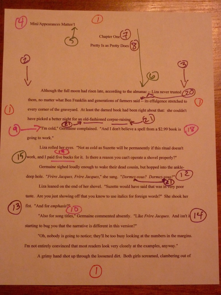
All manuscripts are double-spaced, with 1-inch margins on all four edges. (1)

Do not even consider trying to fudge either the line spacing or the margin width. Trust me, any Millicent that’s been at it a while will instantly spot any shrinkage or expansion in either. The same holds true of using any font size other than 12 point, by the way.

The text should be left-justified, not block-justified.

This one often confuses writers, because text in newspapers, magazines, and some published books is block-justified: the text is spaced so that every line in the same length. The result is a left margin and a right margin that visually form straight lines running down the page.

But that’s not proper in a book manuscript. As we see here, the left margin should be straight (2), while the right is uneven (3).

Every page of text should feature a standard slug line in the header (4), preferably left-justified.

That’s the bit in the top margin of each page containing the Author’s Last Name/Title/#. As you can see here, the slug line should be in the header — in other words, in the middle of the one-inch top margin — not on the first line of text.

The slug line should appear in the same plain 12-point type as the rest of the manuscript, by the way. No need to shrink it to 10 point or smaller; Millicent’s too used to seeing it to find it visually distracting.

The page number (5) should appear in the slug line and nowhere else on the page.

Another one that often confuses writers new to the biz: word processing programs are not, after all, set up with this format in mind. Remember, though, that the fine people at Microsoft do not work in the publishing industry, and every industry has the right to establish its own standards.

Every page in the manuscript should be numbered. The first page of text is page 1.

Do not scuttle your chances submitting an unpaginated manuscript; 99% of the time, it will be rejected unread. Yes, even if you are submitting it via e-mail. People who read for a living consider unnumbered pages rude.

The first page of a chapter should begin a third of the way down the page (6), with the chapter number (7) and/or title (8) centered at the top.

If the chapter does not have a title, just skip line (8).

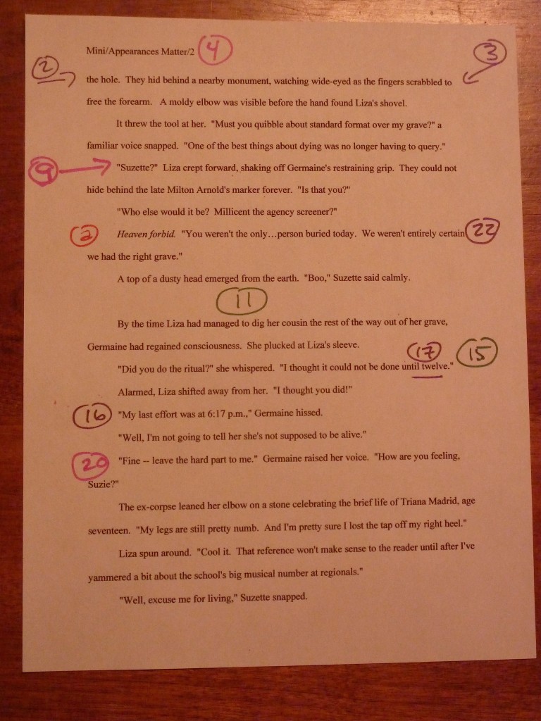
Is everyone comfortable with what we have covered so far? If not, please ask. While I’m waiting for trenchant questions, I’m going to repost page 2, so we may contemplate its majesty.

Awesomely bland, is it not? Let’s check out the rest of the rules.

The beginning of each paragraph should be indented .5 inch. (9)

Yes, including the first paragraph of each chapter, no matter what you have seen in a published book. The decision not to indent the first paragraph of the chapter rests with the publisher, not the writer; if you have strong preferences on the subject, take it up with the editor after you have sold the book.

It may seem counterintuitive, but the manuscript is not the right place to express those preferences. No formatting choice in the manuscript will necessarily end up in the published book.

That includes, by the way, an authorial preference for business format. If you happen to prefer non-indented paragraphs that force a skipped line between paragraphs, too bad. Which leads us to…

Don’t skip an extra line between paragraphs (10), except to indicate a section break. (11)

As we see here, section breaks are formed by skipping one double-spaced line. Do not indicate a section break by # # # or any other marker UNLESS you are writing a short story, article, or entering a contest that requires the inclusion of a specific symbol. (Check the rules.)

Words in foreign languages should be italicized (12), as should emphasized words (13) and titles of copyrighted works like songs (14). Nothing in the text should be underlined.

This one’s pretty self-explanatory, I think, except for the always-burning question of whether to italicize thought (as I’ve done here at a) or not. There is no hard-and-fast rule on this one: some agents like it, some consider it a narrative cop-out. Because its acceptability varies wildly between book categories, your best bet is to check five or ten recent releases similar to yours to see if italicized thought appears there.

If you ultimately decide to embrace the italicized thought convention, you must be 100% consistent in applying it throughout the text. What you should never do, however, is make the common mistake of both saying that a character is thinking something and italicizing it. To an agent or editor, this

I’m so frightened! Irma thought.

is redundant. Pick one means of indicating thought and stick to it.

All numbers under 100 should be written out in full: twenty-five, not 25. (15)

This one is not quite as straightforward as it sounds. As we can see in the text, dates, times, and currency is sometimes expressed as numbers. When a time is specific (16), it is written in number form, but a general time (17) is written out in full. September 4, 1832 is fine, but without the year, the fourth of September is correct. By the same token, a specific amount of money (18) is in numeral form, but a round number (19) is conveyed in words.

Dashes should be doubled (20), with spaces at either end, but hyphens are single, with no spaces. (21)

Why? So a typesetter can tell them apart. (Okay, so that made more sense when manuscripts were produced on typewriters. Humor Millie on this one.)

#22 is not precisely a formatting matter, but manuscript submissions so often misuse them that I wanted to flag it here. In American English (and thus when submitting to a US-based agency), ellipses contain only three periods UNLESS they come at the end of a quote that ends in a period. When an ellipsis indicates a pause in speech, as it does here at (22), there should not be a space between it and the words around it.

And that’s it! Unless an agency’s submission guidelines specify some other formatting preferences, you will not go wrong with these.

I shall now tiptoe quietly away, so you may study them in peace. Tune in tomorrow for more discussion of title pages, and, as always, keep up the good work!
P.S.: there’s a good discussion in the Comments section about formatting quotes and citations in manuscripts and book proposals.

Reimagining a classic impeccably: a conversation with I, IAGO author Nicole Galland

Okay, okay, so I didn’t manage to get our planned whew-I-survived-PNWA treat up yesterday, as I had hoped, as a quick breather between talking about how to handle conference pitching with aplomb and today’s plunge into how to handle a request for manuscript pages — which will still be happening later today, you will be delighted to hear. I have an excellent excuse, however: the other day, a truck burst into flames outside the salon where I was having my hair cut.

The first those of us inside the salon heard of it was the giant pop when the windshield exploded. Not the best time to have one’s head in a sink, as it turns out. Both my stylist and I jumped so much that I have a gigantic bump on the back of my noggin. It’s rendered it just a trifle difficult to focus on a computer screen.

And that, in case any of you had been wondering, is why fiction has to be so much more plausible than nonfiction — and why simply slapping real-life events on the novel page so often doesn’t ring quite true. Quite a lot of what happens in this zany world of ours would seem completely absurd if it popped up in a novel.

Case in point: would you believe it if Our Heroine not only rushed to her blog the instant she could see straight after that out-of-nowhere explosion, but posted twice in one day? Surely, that pushes the bounds of credulity; the fact that it is actually going to happen would be irrelevant.

Is my vision still a bit blurry, or are some of you sighing and shifting impatiently in your chairs? “Yes, yes, Anne,” those of you eager to get requested materials out the door mutter, “I’m sorry for your whacked head, but we’ve been talking about practical matters for the last week. I’ve appreciated that, as I have a manuscript request burning a hole in my metaphorical pocket from my recent successful conference pitch and/or a query that hit the right note. I’m begrudgingly honoring your advice to read my submission IN ITS ENTIRETY, IN HARD COPY, and perhaps even OUT LOUD before I send it off to the agent of my dreams. But honestly, a cozy chat about plausibility in fiction? Or a discussion of craft with a respected historical fiction author, as the title of this post implies you’re about to have? How can I do that and remain monomaniacally focused upon popping my manuscript into the mail as soon as I have satisfied your insane demands?”

All part of my evil plan, impatient shifters (but please, don’t say popping to me right now; it makes my head throb). As it happens, evil plans, plausibility in fiction, craft, and the all-important issue of how to keep the faith throughout what can be a long, attenuated submission process — even if you hit SEND immediately after today’s late-night post on how to present your work professionally, it’s not at all uncommon for submitters not to hear back for months — are all part of this afternoon’s treat.

So is the question of how to render over-the-top realities plausible on the page. Or wasn’t plausibility something for which you had been scanning while you were re-reading the pages you intend to submit IN THEIR ENTIRETY, IN HARD COPY, and, if you want to make me happy, OUT LOUD?

Okay, that’s why you might want to pay close attention to the content of this discussion, impatient shifters. Now, allow me to introduce my discussant, a highly-respected historical novelist deeply gifted at bringing even the most over-the-top events of years past into vivid, plangent, and utterly plausible life on the page: Nicole Galland.

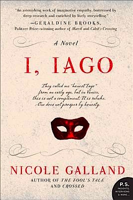
Nicole Galland’s terrific new retelling of OTHELLO, I, Iago came out a few months back, and although you of all people know I am not prone to gushing, I think it’s one of the best historical novels of recent years. I also think it’s both a terrific read and a great example for those of you toiling away in the currently popular vineyard of reconceiving classic tales. From the publisher’s blurb:

From earliest childhood, the precocious boy called Iago had inconvenient tendencies toward honesty—a “failing” that made him an embarrassment to his family and an outcast in the corrupted culture of glittering, Renaissance Venice. Embracing military life as an antidote to the frippery of Venetian society, he won the glowing love of the beautiful Emilia, and the regard of Venice’s revered General Othello. After years of abuse and rejection, Iago was poised to win everything he ever fought for…

…until a cascade of unexpected betrayals propel him on a catastrophic quest for righteous vengeance, contorting his moral compass until he has betrayed his closest friends and family and sealed his own fate as one of the most notorious villains of all time.

Pretty exciting, eh? Actually, for once, a blurb has undersold the dramatic action — and the genuinely astonishing twists of the plot.

Yes, even if one happens to know Othello awfully darned well. I do, as it happens: I’ve acted in it. Heck, I’ve played more than one role in it. And more than one turn of events made me not only gasp out loud, but put that pen with which a prudent author interviewer always takes marginal notes right through the page.

Think about that. Usually, I don’t jump for anything less than a nearby explosion.

Seriously, one of the occupational hazards of being an editor is the deadening of one’s capacity for surprise. Editors are notorious for rolling their eyes over mild foreshadowing on page 14 and murmuring, “Oh, great, now I know how the book ends.” If you are the type of person that likes to receive a story arc in sequential chunks, I would strenuously advise against accompanying an editor to a movie.

That suggestion is brought to you, incidentally, by the unlucky soul that happened to be occupying the adjacent loge seat when I saw The Sixth Sense. The first time the mother appeared onscreen and did not ask how her child’s therapy session had gone, everyone within three rows heard my annoyed huff, if not my whispered, “Oh, so the mother can’t see the therapist; he must be a ghost. I’m bored now.”

As you might imagine for a reader with that kind of attitude problem, it’s rare that a plot catches me by surprise. So how is it possible that reading a story whose ending I know as well as Othello’s kept me up all night reading because I wanted to know how it was going to turn out?

Which is, of course, the central problem in retelling any well-known classic. It’s always a writing challenge to draw readers into a story, particularly one that takes place long ago, but it’s an especially high dive with Shakespeare — and not merely because of the intimidation value of tackling one of the theatrical world’s greatest tragedies. Even readers that routinely turn pale at the very thought of their high school English class’ discussion of Hamlet may reasonably be expected to be familiar with the outlines of the plot: General Othello and the lovely Desdemona are in love, Iago convinces Othello to become madly jealous, and the stage quickly becomes littered with corpses.

To make the dive even higher, the literary world has in recent years applauded — and even expected — new takes on culturally well-known tales not only to render them fresh and accessible for current readers, but to do so from the point of view of the villain. In reimagining Othello, that presents quite a difficulty: Iago does some pretty loathsome things to the people around him, rendering him hard to like — and, unusually for chatty Shakespeare, the play’s audience is actually not treated to much explanation of his motives.

How did Nicole conquer these twin challenge? By means of a writing choice that I think will delight and instruct those of us devoted to writing fiction: by delving so thoroughly into Iago’s past and personality development that as he takes each step toward infamy, the reader is cajoled into saying, “Oh, okay — I can go along with that.”

The result is hugely engaging. I, IAGO not only seduced me into liking the villain — something I would not have thought possible — but left me feeling by the tumultuous last quarter of the book that by having empathized with his increasingly warped sense of right and wrong, I had become enmeshed in his fate. Yet even though I could see it coming, even though I had picked up the book knowing that it had to come, the trip there kept catching me off guard, because I was experiencing it moment-to-moment with the protagonist-villain.

And that, my friends, is not something that happens all that often to those of us that murmur at the first mention of a character’s hard childhood, “Oh, so he’s the serial killer.”

An unexpected fringe benefit that friends of the Bard will love: this story is so steeped in the Shakespearean ethos that small hints of his other works seem to have been built into the very plaster of the ballrooms and steel of the swords. Here is an image plucked from a sonnet; there is descriptor reminiscent of Juliet. And could that possibly be a reference to Pericles, Prince of Tyre?

It is, in a word, fun — not word I generally associate with tragedy. If I have a critique (other than having lost sleep to this story), it’s that I would have liked to see both Desdemona’s very genuine wit and Othello’s descent into overwhelming paroxysms of jealousy in a bit more detail. Why was this great mind so easily overthrown?

But that’s a minor quibble. As an established fan of Nicole’s writing — and, in the interest of full disclosure, as someone who first met her during an audition for Measure for Measure at Harvard, back in the Reagan era — naturally, I expected to be charmed by the writing. I have to say, though, I think this is far and away her best book to date, and certainly one I have been frantically handing to every aspiring historical novelist I meet as a prime example of how it’s done.

So, equally naturally, when she made a flying visit to Seattle recently, I dragged her into my back yard, turned a camera on her, and implored her to share her writing secrets. Unfortunately, before we began, I took off the hat I had been wearing on that hat day first, so you’ll have to excuse my hair.

Seriously, its state requires excuse, so much so that had this not been such a meaty interview with such an old friend, I might have held off on posting it until I could find a gifted retoucher of videotape. But I promised you a treat, so I shall cast vanity to the winds.

How I suffer for your art, eh? Concentrate instead, please, on this year’s bumper crop of lilacs — and a great conversation about craft with one of the best. Enjoy!