I have to admit, campers, that after my last post’s almost purely visual foray into the specifics of professional formatting for book manuscripts and proposals, a single-post summary for which many just-the-facts-ma’am-oriented writers have been clamoring for quite some time, I quite wilted. Not so much from exhaustion (although that was an immense amount of practical how-to to cram into such a short space) as from the sense that, having at long last accomplished something that will please the folks that want to believe that no human enterprise cannot be successfully explained to everyone’s satisfaction in a single post — the searchers, in other words, rather than the habitual blog readers — I may return in good conscience to what I believe this blog does best, demonstrating thoughtfully how to avoid the many complex pitfalls that await the talented writer on the notoriously curvy road to publication.
Why, yes, that it a rather long sentence, now that you mention it. The late Henry James would be so proud.
Given how detail-oriented he was — his characters can scarcely feel an emotion without the reader’s being treated to it from fourteen different levels of analysis — I’m sure he would also be proud that I am once again reverting to lengthy explanation mode about something as seemingly simple as a professionally-formatted title page. Since it’s the first thing an agent, editor, or our old pal and nemesis, Millicent the agency screener, will see in your manuscript, it’s important to get it right. As the clich?goes — and you’re keeping an eye out for those while you’re reading those pages the pro requested you send IN THEIR ENTIRETY, IN HARD COPY, and preferably OUT LOUD, right? Almost everyone that reads for a living twitches at the sight of a clich?– you get only one chance to make a first impression.
Yet, surprisingly often, aspiring writers overlook odd formatting as a possible reason that an otherwise well-written manuscript might have been rejected. Oh, not all by itself, generally speaking, unless the violation was truly egregious by industry standards, something along the lines of submitting unnumbered pages or not indenting paragraphs, for instance, the kind of faux pas that might actually cause Millicent to cast the entire submission aside unread.
Like, say, the kind of major formatting snafu that a quick glance at that handy reference guide in my last post would lead a savvy submitter to avoid.
Yet surprisingly little conference time seems to be devoted to deviations from standard format for manuscripts. Why shouldn’t conference speakers take thirty seconds of their speaking gigs to pointing out, for instance, that the ways in which a professional manuscript does not resemble a published book — ways that are unfortunately quite obvious to an agent, editor, contest judge, etc., from practically the moment their bloodshot eyes light upon a submission?
Why is it so very apparent, you ask? Because much of the time, submitting writers will work overtime to make it apparent.
Seriously, many aspiring writers clearly go out of their way to format their submissions to resemble published books, in the mistaken belief that this will make their work seem more professional. As we’ve already discussed in this series, this effort generally causes Millicent readers to regard a submission as less professional — and often, it’s apparent in her first glance at the first page of a submission.
Yes, really, the vast majority of submissions are rejected not only on page 1, but within the first few lines of page 1. Heck, a harried Millicent may even derive a negative impression of a manuscript even prior to page 1.
Keep taking nice, deep breaths. That dizziness will pass shortly.
Ah, some of you have found your breaths again, haven’t you? “Oh, come on, Anne,” I hear some hard-boiled submission veterans scoff, “she makes up her mind that this isn’t a submission to take seriously before to page 1? How is that even possible?”
Well, the most common trigger is the absence of any title page whatsoever. Many submitters, for reasons best known to themselves, omit the title page altogether — often, I suspect, because they are unaware that a professional manuscript always features a title page.
Why? Long-time readers (or even those that simply paid attention to my last post), pull out your hymnals and sing along with me now: a properly-formatted title page tells an agent precisely how to contact the brilliant author who wrote it — and tells an editor precisely how to contact the agent who represents her.
Was that gargantuan gasp a signal that those of you who have title page-free submissions circulating at the moment are just the teensiest bit worried? If so, relax: forgetting to include a title page almost certainly won’t prevent Millicent from reading your submission at all. She generally reads even the most bizarrely-formatted submissions for at least a line or two (although frequently no more than that). But that initial impression of an author’s lack of professionalism — or, to call it by a kinder name, of a writer’s having a lot to learn about how the publishing industry does and doesn’t work — often translates into a rather jaundiced reading of what comes next.
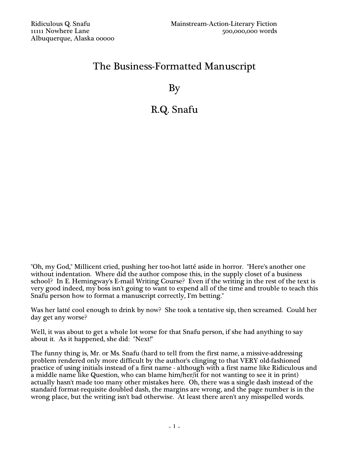
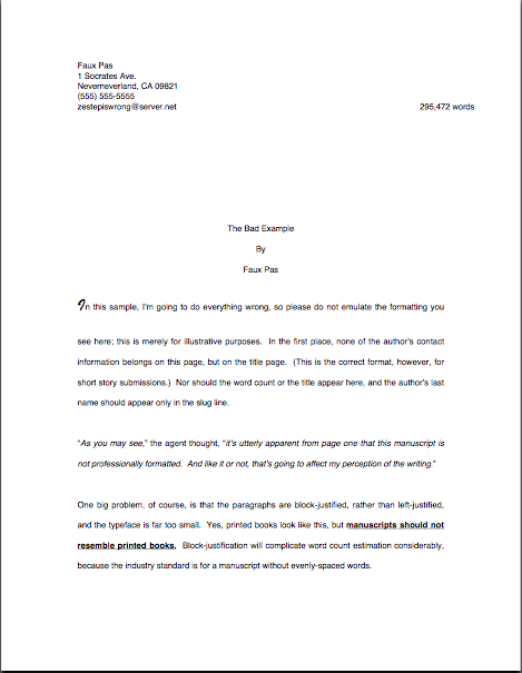
Are you once again barking, “Ye gods, why?” Well, let’s take a peek through her reading glasses, The first thing Millicent’s work-wearied peepers fall upon when she opens the average requested materials packet is something like this:
As always, I apologize for the fuzziness with which my blogging program reproduces page shots. If you’re having trouble making out the details with Henry James-level specificity, try holding down the COMMAND key and pressing + to enlarge the image.
Have it in focus now? Good. Our Millie might also encounter a first page like this:
Or, heaven help us, like this:
Why might Millicent take one look at these and conclude that the respective submitters of these three first pages could use a good class on manuscript formatting — and thus would be time-consuming clients for her boss to sign? Because, dear friends, both of these examples have failed as both title pages and first page of text.
How? By not including the information that a pro would expect to see on either.
What makes me so sure she would find this discovery disappointing, at best? Because what she — or her boss, the agent to whom you successfully pitched — would have expected to see on top of that pile of paper was this:
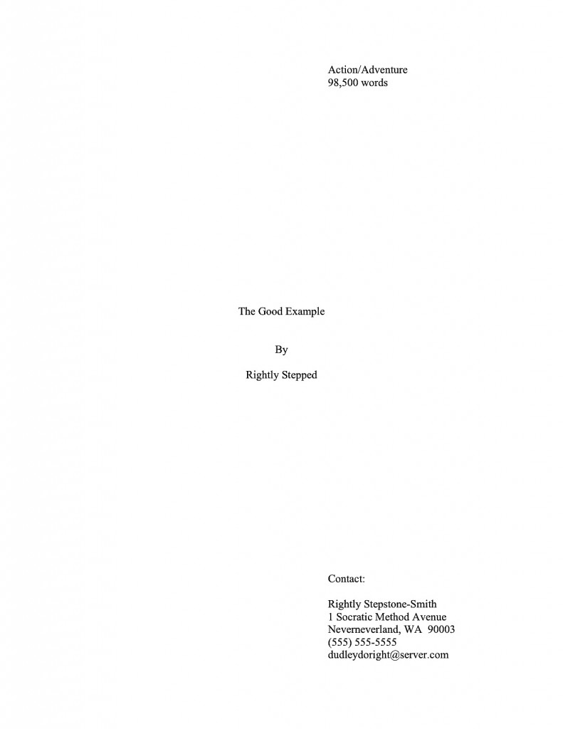
This is a standard professional title page for the same book — strikingly different, is it not? Visibly different, in fact, from several paces away, even if Millicent isn’t wearing her reading glasses.
Again, though, submitting the earlier examples rather than that last would not necessarily be instantly and automatically fatal to a manuscript’s chances. However, human nature and agency denizens’ punishing reading schedule being what they are, if Millie has already decided that a submission is flawed, just how charitable an eye do you think she is likely to cast upon that typo in line 13?
To use every screener’s favorite word: next!
To be fair to Millicent, while it may well be uncharitable of her to leap to the conclusion that Faux Pas’ or Ridiculous’ manuscripts are likely to be unpolished because they did not include a proper title page, agencies do have a vested interest in signing writers who present themselves professionally. For one thing, they’re cheaper to represent, in practical terms: the agent doesn’t have to spend as much time working with them, getting their manuscripts ready to submit to editors.
Among other things, then, including a properly-formatted title page tells him right off the bat that — wait for it — he won’t have to teach the writer how to produce a title page. That’s important, as no agent in his right mind would send out a manuscript that didn’t include a standard title page. It serves a number of important — nay, vital — marketing functions.
To understand why, let’s take another look at the professional version. So you don’t have to keep scrolling up and down the page, here it is again:

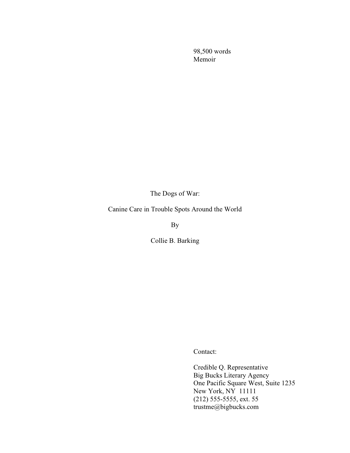
Did you take a nice, long look? Good. While we’re at it, let’s also take a gander at a proper title page for a book with a subtitle:
Pop quiz: how precisely do Rightly and Collie’s first sheets of paper promote their respective books than Faux Pas or Ridiculous’ first pages?
Well, right off the bat, a good title page tells a prospective agent or editor what kind of book it is, as well as its approximate length. Both of these are pieces of information that will tell Millicent instantly whether the submission in her hand would meet the requirements of the editors to whom her agency tends to sell.
How so? Well, think about it: if Millicent’s boss had decided not to represent Action/Adventure anymore, or if editors at the major houses had started saying that they were only interested in seeing Action/Adventure books longer than 90,000 words, Rightly Stepped would be out of luck.
But then, being a savvy submitter, ol’ Rightly would also want his work to be represented by an agent who just adores very long Action/Adventure novels — and regularly goes to lunch with scads and scads of editors who feel precisely the same way, right?
I sense some raised hands out there. “Um, Anne? I notice you mentioned approximate length. Since my word processing program will tell me precisely how many words are in my manuscript, why should I pretend I’m guessing?”
Your logic would be quite sound, estimate-eschewers, if we were talking about a magazine article or a short story. There, you should use actual word count.
For a book manuscript, however, the convention is to estimate word count. Since manuscripts shrink around 2/3rds in the transition to published book, the number of pages is actually a better measure of how much it will cost to print and bind the thing. A page in standard format in 12-point Times New Roman is assumed to run about 250 words, a page in Courier 200. So the conversion formulae run like this:
# of pages in Times New Roman x 250 words/page = estimated word count
# of pages in Courier x 200 = word count
Fair warning: the result will bear virtually no resemblance to your actual word count; it will usually be far lower. But that’s okay, because when Millie spots a title page indicating that the manuscript it covers is 100,000 words, she’ll instantly think, “Oh, that’s 400 pages.” In other words, well under the 125,000-word threshold at which printing and binding the book abruptly becomes quite a bit more expensive.
So if you are one of the many, many literal-minded writers that believe being absolutely factual will win Brownie points with Millicent — and I constantly meet writers that insist that because Word will provide an exact word count, providing anything else on the title page is tantamount to lying — I invite you to consider this: given that she has experience making this conversion, what do you think her first reaction will be to encountering a title page that proclaims up front that it’s a cool 112,452 words?
That’s right: “Oh, that’s too long for our agency.” Which is a pity, really, as it’s not beyond the bounds of belief that a 400-page manuscript’s actual word count would be 112,452.
Did that just make those of you that grew up on the classic 19th-century novels do a double-take? “Whoa, there!” length-lovers everywhere cry. “I’ve heard all over the place that the maximum word count most agents will consider is between 100,000 and 125,000 words, depending upon the book category, far shorter than many of the great works of literature. This is the first time I’ve ever heard that the actual cost of producing the physical books played a role in coming up with those figures. I just thought that in recent years, agents and editors had just made a collective decision — due, perhaps, to the hugely increased volume of submissions since the advent of the personal computer — not to read as much.”
That’s an interesting theory, length-lovers, and one that might make abundant sense if requested manuscripts were invariably read from beginning to end before being accepted or rejected. As we have discussed, however, the average submission gets rejected on page 1.
The disinclination for the long has much more to do with fact that paper is far more expensive than it was a hundred years ago — and at 500 pages, the binding costs take a remarkable leap. Now, we’ve all seen books that long for sale, but in recent years, they’re usually by already-established authors — i.e., ones with a track record of selling books to readers that might be willing to cough up a slightly higher amount of money for a new book by a favorite author.
But if a manuscript by a first-time author begins to bump up against that limit, publishers know from experience that the extra cost will be a harder sell to readers. Which means, in turn, that a manuscript much over 400 pages will be more difficult for an agent to sell to an editor. And that’s why, in case any of you had been wondering, aspiring writers so often hear the pros say at conferences that they’re not looking for anything over 100,000 words.
“Wait just a nit-picking minute!” those of you clutching lengthy manuscripts cry. “A couple of paragraphs ago, we were talking about 125,000 words (500 pages in Times New Roman x 250 words/page) as the reject-on-sight limit. So where does the 100,000-word (400 pages in Times New Roman x 250 words/page) barrier come from?”
Theories vary on this one, actually. A rather pervasive explanation claims that a prudent agent will want to leave room for revision; a second, almost as common, holds that since writers new to the craft usually have minimal experience in editing their own work, accepting a longer manuscript effectively means signing on to edit extraneous text, redundancy, and the like.
A third theory — and I don’t think you’re going to like it much — is that aspiring writers’ reportage of word count is too often off by quite a bit. Possibly because they’ve heard that old saw about how any submission over 100,000 words is toast. You must admit, that kind of rumor does provide a certain amount of incentive for inaccuracy.
In my experience, though, most first-time submitters are simply unaware of the estimation rules — or that they should estimate. Even with the best intentions, it’s not hard to see how Millicent might have derived this impression: it’s not all that uncommon for submitters to take an actual word count, round it to the nearest big number, and hope for the best.
How might that work in practice? Let’s say for the sake of argument that Bunny McNewatit’s novel was actually 85,487 words the last time she checked, but she’s tinkered with it a bit since. Now, she’s just given a successful pitch, and she’s too eager to get those requested first 50 pages out the door to redo the word count. But it doesn’t matter, she figures: she’s planning on working on the rest of the book while the agent of her dreams is reading the opening.
So, completely innocently, she adds a bit of a cushion to the estimate on the title page: there, she reports that her baby is 86,250 words. Since professional readers expect the font on the title page to be the same as the font in the text, and the title page is in Times New Roman, Millicent just assumes that the manuscript that follow is 345 pages (345 x 250 = 86,250), rather than flipping to the bottom of the stack of papers to check.
That’s fine — but if the title page is in Courier, Bunny’s in a spot of trouble. Doing the mental math, Millie would conclude that the book is 431 pages — and that Bunny’s math skills are not particularly good. In fact, because 86,250 does not divide evenly by 200, she’s going to wonder how our friend Bun came up with that word count. She may even — brace yourself — speculate that Bunny has not yet finished writing the book.
Now, in actual fact, a 400-page manuscript in TNR is usually closer to 115,000 words than 100,000; as any writer who has compared the estimated word count for her book with the total her word processing program so kindly provides, they tend to differ wildly. But word count, like beauty, is in the eye of the beholder: a novelist whose title page reported, accurately, that her 400-page novel was 115,000 words might well see it rejected out of hand on the grounds that it was too long.
Why? Well, math may not have been Millicent’s best subject, either (as one might expect, the inmates of agencies tend overwhelmingly to have been English majors), but she can do third-grade multiplication in her head: 115,000 words at 250 words/page would equal a 460-page manuscript. Next!
Boy, those hackles are getting a workout today, aren’t they? “But Anne, why is Millicent estimating at all? If she wants to know how long it is, why doesn’t she just flip to the last page and check the last page number, for heaven’s sake?”?
I could give you a long song and dance about how much her wrists hurt from opening all those query envelopes all day, or how her secret midnight e-mail orgies have rendered pinching a torture, but in practice, the answer is far less personal than practical: because the word count is right there on the title page.
Tell me, oh submitters: why on earth should she doubt its accuracy? Unless, say, the title page were in a non-standard typeface like Helvetica, she’s going to assume that an aspiring writer familiar enough with standard format to include the word count on the title page would also know how to estimate it accurately.
I know, I know: from a writerly perspective, that’s kind of a wacky assumption. But her chair boasts a different view than ours.
Besides, how exactly could she manage to turn to page 400 of a manuscript, when her boss requested that the writer send only the first 50, without resorting to some pretty impressive maneuvering through time and space?
Swiftly averting our eyes from the depressing fact that a number on the title page (or in a query) could potentially harm the manuscript that much, let’s consider how the other information on the page can boost that same manuscript’s chances of getting picked up. How about the undeniable fact that a standard title page also tells Millicent precisely how to contact the author to offer representation?
If I’ve said it once, I’ve said it a thousand times: it’s always in an aspiring writer’s interest to make it easy for the fine folks that work at the agency of her dreams to help her. I might be wrong, of course, but I suspect that not forcing Millicent to forage through the mountain of paper on her desk to find a misplaced cover letter with your phone number on it might be a good start toward being easily helpable.
Which is yet another way in which Faux Pas’ first page falls short, professionally speaking. It doesn’t really do anything but announce the title of the book and leap right into the story. That’s one underachieving piece of paper.
But that’s not the only way a title page can fall down on the job. Let’s take a gander at another type of title page Millicent often sees — one that contains the right information, but is so unprofessionally formatted that the care with which the writer followed the content rules gets entirely lost:
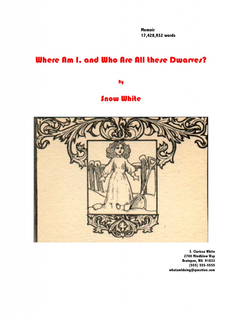
Where should I even begin with this one? It’s pretty, undoubtedly, but would anyone care to start listing any of the five things wrong with it?
If you immediately zeroed in on the picture, give yourself a gold star for the day; since there is literally no chance that any image a writer chooses to place on a manuscript or proposal’s title page will end up on the published book’s cover (the usual rationale for including them at this stage), decorating your submission’s title page with photos or drawings will just seem bizarre to Millicent. And that goes double for Mehitabel, the veteran literary contest judge.
Award yourself two gold stars if you said Ms. White should nix the red lettering — or any lettering that isn’t black, for that matter — or that her contact information should not have been centered. Pin a great big blue ribbon on yourself, too, if you also pointed out that Ms. White used two different typefaces here, a classic standard format no-no. Not to mention the fact — although I do seem to be mentioning it, don’t I? — that the type size varies.
I feel a rule coming on: like everything else in the manuscript, the title page should be entirely in 12-point type. It should also be in the same font as the rest of the manuscript. With the usual caveat: unless an agent specifically requests otherwise, of course.
Otherwise, you may place the title in boldface if you like, but that’s it on the funkiness scale. No matter how cool your title page looks with 24-point type or the picture you would like to see on the book jacket, resist the urge, because Millicent will be able to tell from across the room if you didn’t.
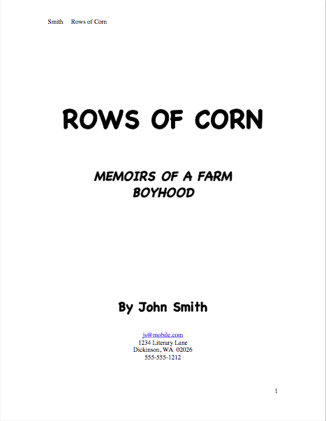
Don’t believe me that size matters? See for yourself:
Quite a difference, isn’t it? Apart from Mssr. Smith’s tragic font choice and his not having countermanded Word’s annoying propensity to reproduce e-mail addresses in blue ink, did you notice any potentially eye-distracting problems with this title page?
If you said that it included both a slug line (the author’s name and title in the upper right margin of the page) and a page number in the bottom right corner, snag yourself yet another gold star from petty cash. Add whipped cream and walnut clusters if you mentally added the reason that those additions are incorrect: because the title page is not the first page of text, and thus should not be formatted as if it were. Nor should title pages be numbered.
This means, incidentally, that the title page should not be counted as one of the 50 pages in those 50 pages the agent of your dreams asked you to submit, either. Nor would it count toward the total number of pages for a contest entry.
That loud whoop you just heard was contest-entering writers everywhere realizing that they could squeeze another page of text into their entries. Perhaps seconded by the many, many pitchers asked to send the standard first 50 pages that just realized my insistence upon professional presentation was not going to cost them a page of text.
I’m hearing some discontented murmuring amongst aesthetes out there in the ether. “But Anne,” visually-oriented aspiring writers murmur under their breath, so as not to attract the wrath of Millicent, “I feel that the rules of standard format for books and book proposals– not to be confused with the formatting norms for short stories, magazine articles, screenplays, or any other kind of writing intended for professional submission — are stepping all over my right to creative expression. If I believe my writing looks best in a special font like Abadi MT Condensed Extra Bold, why shouldn’t I run with it? It’s how I want my words to look in the published book, so why shouldn’t I present my manuscript that way?”
Because, murmuring aesthetes, Millicent will take your writing more seriously if you format it as she expects to see it. While two-inch margins and a cursive typeface may strike a writer as the perfect expressive extension of the spirit of his novel, to someone who reads manuscripts for a living, they’re just puzzling. And, frankly, distracting from the writing.
So yes, Virginia, a choice as small as a typeface honestly can make an astonishingly great difference to how professional your work looks to the pros, even on the title page. That comes as something of a surprise to most aspiring writers — who, it should astonish no one to learn, tend to regard that particular decision as a purely aesthetic one. “Why,” they ask, and not unreasonably, “should it matter? Good writing’s good writing, isn’t it?”
Well, yes and no. Yes, good writing is a thing of beauty and a joy forever. No, insofar as good writing tends to have less impact on the average Millicent when it’s presented in an unusual font.
Yes, really. To see why, let’s take a peek at the same title page in three different typefaces. Here it is in 12-point Times New Roman:
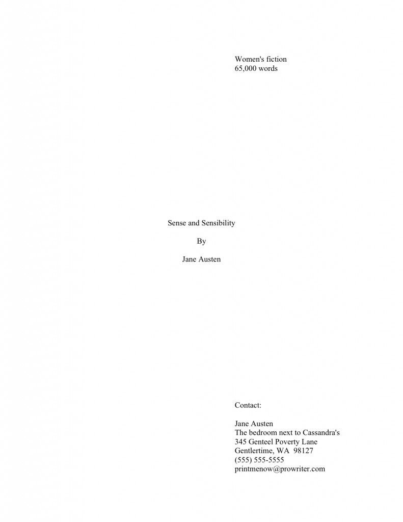
That’s what anyone sitting in Millicent’s seat would expect to see. Now let’s look at exactly the same information, assuming that Aunt Jane had favored 12-point Helvetica so strongly that she just couldn’t resist submitting in it:
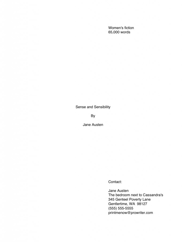
The letters are quite a bit bigger, aren’t they? Not enough so to appear to be, say, 14-point font, but large enough to make Millicent wonder whether the word count is accurate. (Lest we forget, word count does vary by typeface: Times New Roman is estimated at 250 words/page, Courier at 200.) And do you really want her speculating about your credibility before she reaches the first page of your manuscript?
Now that we have seated ourselves firmly in Millicent’s office chair, we can see that Aunt Jane’s choice of Helvetica, while not a deal-breaker, does not necessarily present her manuscript to its best advantage. But does the increased volume of disgruntled ethereal muttering mean some of you want to see a typeface that might be a deal-breaker? Happy to oblige.
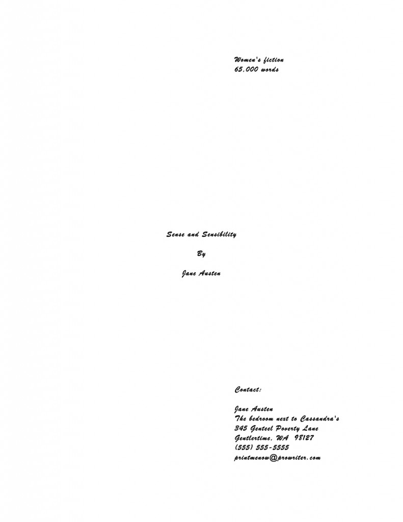
Can’t really blame Millicent for not wanting to turn the page on that one, can we? Despite containing all of the information that a title page should include, in the right places and in the right order, it’s unprofessional-looking. Not to mention hard to read.
Got Millicent’s perspective firmly imbedded in your mind? Excellent. If you want to switch back to the writer’s point of view, all you have to do is remember that the manuscript that follows even this last title page is SENSE AND SENSIBILITY.
The moral: even the best writing may be placed at a competitive disadvantage by unprofessional presentation. Yes, it’s a pain to implement at first, but in the long run, standard format is the good writer’s friend, not her enemy.
Adopting the norms of standard format and clinging to them like an unusually tenacious leech carries a fringe benefit, too: it will also help you preserve your sanity throughout the often-protracted submission process. Honestly, trying to apply every single one of the expressed (and not always well-informed) opinions floating around out there to your manuscript will drive you 100% nuts. The anecdotal agents’ pet peeves one hears bouncing around the Internet are too often mutually contradictory, for one thing.
But, naturally, if an agent to whom you are submitting asks for something different, for heaven’s sake, give it to her. If, as is almost always the case, you just don’t know, keep the presentation unprovocative and professional so that your writing may shine.
In other words, adhere to the strictures of standard format, rather than assuming, as so many aspiring writers do to their cost, that the writing is the only thing that matters.
Is that deafening clank the sound of a thousand writers’ hackles being raised? I can’t say I’m surprised; the very topic of presentation seems to be emotionally trying for a lot of writers — disproportionately so, from where Millicent is sitting. Tell an aspiring writer that his dialogue is turgid, or his pacing drags, or that he’s left a necessary section out of his book proposal, and most of the time, he’ll be at least curious about why you think so. (If a bit defensive.)
Yet suggest to the same writer that he might be better off reformatting his manuscript to include such niceties as paragraph indentation or moving his page number to the slug line, and a good quarter of the time, he’ll look at you as though you’d just kicked his grandmother. Thrice.
So pardon me if I duck behind a handy large piece of furniture while I reiterate: from the perspective of someone who reads manuscripts for a living, standard format is simply the least distracting way a book can possibly be presented.
Which is, of course, the primary reason to rely upon either Times, Times New Roman, or Courier typefaces, both on the title page and in the manuscript. These are the standards of the industry, and thus the least likely to raise Millicent’s ever-knitted eyebrows.
And that’s going to be true regardless of the quality of the writing. First impressions count.
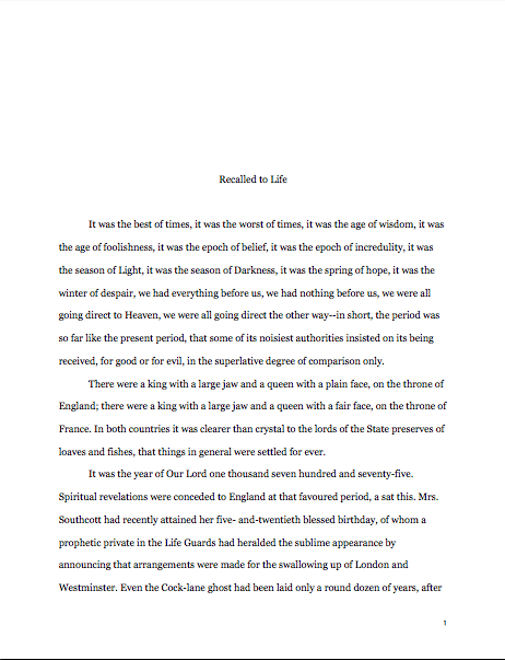
To see how much of a difference font and typeface can make at first glance, here’s a correctly-formatted page 1 in Times New Roman. Just for giggles, I’m going to use that notorious editor’s nightmare, the opening paragraphs of A TALE OF TWO CITIES:
Pretty spiffy, eh? And definitely not how this opening would appear in a published book, right?
Now let’s take a peek at the same page, also correctly formatted, in Courier. Note how many fewer words per page it allows:
Got both of those firmly imbedded in your brainpan? Good. Now format your first pages that way for the rest of your natural life. My work here is obviously done.
Just kidding — you want to see why it’s a good idea, don’t you? Okay, take a gander at the same first page, not in standard manuscript format. See how many differences you can spot:
Fascinating how just a few small formatting changes can alter the presentation, isn’t it? It’s exactly the same writing, but it just doesn’t look as professional. To Millicent, who reads hundreds of pages per day, the differences between the last three examples could not be clearer.
And yet, if we’re going to be honest about it, there were really very few deviations from standard format in the last example. For those of you playing at home, the typeface is Georgia; the chapter title is in the wrong place, and there isn’t a slug line. Also, the page is numbered in the wrong place — the default setting, incidentally, in many word processing programs.
In all probability, none of these infractions against the rules of standard format are serious enough to cause Millicent to toss a submission aside as soon as she notices them. But when poor formatting is combined with literary experimentation — like, say, that paragraph-long opening sentence ol’ Charles managed to cough up — which do you think she is going to conclude, that Dickens is a writer who took the time to polish his craft, or that he just doesn’t know what he’s doing?
Don’t tempt a professional reader to draw the wrong conclusion about your devotion to your craft. Remember, where a manuscript stands depends upon where the reader sits.
Before any hackles start rocketing skyward again, I hasten to add: where the submitting writer sits often makes a difference to Millicent’s perception, too. Her reception of that last example is very likely to be different before Dickens became a household name or after, although once he was established.
Unless you happen to be famous, I wouldn’t advise taking the risk. And if you do happen to be famous, could I interest you in writing a back jacket blurb?
In fairness to Millicent, though, it’s highly unlikely that it would even occur to our Charles to deviate this markedly from standard format, if he already had experience working with an agent or editor. The longer you remain in the business, the more those little things will strike you as just, well, matters of right and wrong. As, fortunately or not, they do Millicent and her ilk.
Come to think of it, that sense of fitness may well be the reason that discussions of formatting tend to become so vitriol-stained: we all like to be right, and after all, propriety is in the eye of the beholder. After all, each of us is most familiar with the view from her own chair.
Which is why, I suspect, so many aspiring writers become enraged at the very notion that something — anything — but the style of the writing could possibly play a role in a professional assessment of a manuscript’s potential. As Millicent is only too painfully aware, there’s more to working well with an agent or editor than writing like a muse-inspired bard.
There’s being willing and able to take direction, for instance, because working authors often do need to make revisions on very short notice. There’s being willing and able to take criticism without flying into a passion — because, believe me, the pros don’t pull their punches; when everyone’s trying to meet a deadline, it’s a waste of valuable time. And there’s being willing and able to adhere to the standards of the industry one is lobbying so hard to join.
Make it easy to help you do that. And make it apparent that you will be easy to help from the very top of your manuscript.
I can sense some of you recent pitchers getting antsy about sending out those requested materials, so that’s it on the formatting front for the nonce. Next time, I shall be talking about how to construct a professional-sounding cover letter to accompany your submission — and over the weekend, we shall be discussing how to pack up your work and send it off with style.
Keep up the good work!

I truly wanted to write down a quick remark to thank you for these pleasant secrets you are showing at this website. My time-consuming internet lookup has at the end been rewarded with really good know-how to go over with my contacts. I’d express that we readers actually are undoubtedly blessed to dwell in a fantastic community with many outstanding individuals with insightful concepts. I feel rather grateful to have used the web site and look forward to tons of more cool times reading here. Thank you once more for all the details.