The end of the road for this emotionally-trying series on formatting is within sight, I promise — one doesn’t like to tempt the easily-affronted gods by predicting TOO far into the future, but I believe I can state with assurance that I SHALL finish up tomorrow, or at any rate in the course of my next post (see earlier comment about god-tempting). Since we are so very close to the finish line, I’m going to take a bit of a risk and revisit what seems to be a perennial controversy amongst aspiring writers: whether to place a chapter title (or just “Chapter One”) on the first line of a page or on the line just above where the text starts.
Don’t laugh, those of you who are new to this particular debate: this one has generated a body count over the years.
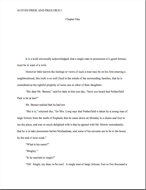
To place the possibilities before you in all of their lush magnificence, should the first page of a chapter look like this:
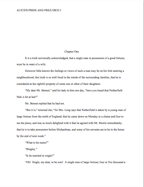
Or like this?
Now, I could just tell you what to do here, because, to be blunt about it, the first version is in standard format; the second is not. No way, no how.
So why might a professional reader prefer the first? Chant it with me now, children: BECAUSE IT LOOKS RIGHT TO THEM.
Oh, how tempting it is to leave it at that…but truth does compel me to tell you (and if not truth, those pesky mercurial gods I was talking about earlier), agents and contest judges see far, far more examples of version #2 than #1. Many, many times more. So much so that — brace yourselves, because I haven’t said this very often throughout this series — at this point, you could get away with either.
I know — it sort of creeps me out to hear myself saying such a thing, too.
That being said, I would be reluctant to buy into the astonishingly pervasive theory that if masses and masses of people do something, it automatically becomes correct. As anyone who screens manuscripts for a living could tell you, a much higher percentage of them are incorrectly formatted than presented properly. And really, as everyone’s mother was wont to say (at least on the West Coast), if everyone else jumped off the Golden Gate Bridge, would you, too?
I was delighted to discover when I moved to the East Coast for college that the moms out there were prone to asking the same question with reference to the Empire State Building. There must be something about that particular period of architecture (the GGB was built in 1933-37, the ESB in 1930-31) that promotes suicidal ideas.
Speaking of body counts.
The weird thing about this particular formatting oddity is how often it appears in otherwise perfectly presented manuscripts. That fact sets Millicent the agency screener’s little head in a spin. As, I must admit, it does mine, as well as the brainpan of virtually every other professional reader I know.
Why is it so very puzzling to us, you ask? Because at least in my case — and I don’t THINK I’m revealing a trade secret here — I have literally never seen an agent submit a manuscript to a publishing house with format #2. Heck, I have literally never even heard of an agent, editor, or anyone else in the publishing industry’s ASKING for a chapter heading to be moved from the top of the page to just above the text.
And that strikes me as odd, because as I’ve heard some pretty strange requests from agents and editors in my time, believe me; I’m not easily shocked anymore. But to hear a pro insist upon placing the chapter heading where you have to skip down a third of a page to read it…well, that would have me reaching for my smelling salts.
Do they even make those anymore? And if everyone else jumped off the Golden Gate Bridge clutching them, would I?
Clearly, however, somebody out there is preaching the place-it-just-above-the-text gospel, because agents, editors, and contest judges are simply inundated with examples of this formatting anomaly. We see bushels of ‘em. Hordes of aspiring writers are apparently absolutely convinced that the sky will fall in if that chapter heading is located anywhere but immediately above the text.
In fact, many aspiring writers are SO convinced of the rightness of the drooping title heading that it’s not all that uncommon for an editor to find that after she has left a couple of subtle hints like this that the writer should change the formatting…
…the subsequent drafts remain unchanged. The writer will have simply ignored the advice.
(Off the record: editors HATE it when their advice is ignored. So do agents. Contest judges probably wouldn’t be all that fond of it, either, but blind submissions mean that in order to get dunned for brushing off a judge’s feedback, a writer would have to submit the same chapter two years running to the same contest, have the entry land in the same judge’s pile — in itself rather rare — AND the judge would have to remember having given that feedback. Oh, and for the entrant to hear about it, the contest would have to be one of the few that gives editorial feedback.)
The up v. down debate may seem like a rather silly controversy — after all, in the cosmic scheme of things, why should it matter if the white space is above or below the title? — but sheer repetition and writerly tenacity in clinging to version #2 have turned it from a difference of opinion into a vitriol-stained professional reader pet peeve. (See earlier comment about how we tend to react to our advice being ignored; it isn’t pretty.)
Which, unfortunately, tends to mean that in discussions of the issue at conferences degenerate into writing-teacher-says-X, editor-at-Random-House-says-Y: lots of passion demonstrated, but very little rationale produced, beyond each side’s insisting that the other’s way just looks wrong.
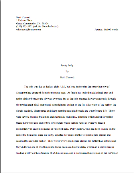
However, there is a pretty good reason that moving the chapter heading information to just above the text looks wrong to someone who edits book manuscripts for a living: it’s a formatting tidbit borrowed from short stories, whose first pages look quite, quite different. Lookee:
As you may see for yourself, for a short story like this one, there’s a mighty fine reason to list the title just above the text: a heck of a lot of information has to come first on the page, because short stories, unlike book manuscripts, are not submitted with a title page.
But that would not be proper in a book-length manuscript, would it? Let’s see what Noël’s editor might have said upon viewing this as as the first page of a book:
Ouch. (That last bit would have been funnier if the entire page were readable, by the way, but my camera batteries were running low. Sorry about that.) But as Millicent and that angry mob of pitchfork-wielding ignored editors would be only too happy to tell you, short stories don’t HAVE chapters, so who on earth are they to be telling those of us in the book world how to format our manuscripts?
Stick with version #1.
Which is not to say, of course, that this particular small deviation will automatically and invariably result in instantaneous rejection. It won’t, even in the latté-stained hands of the most format-sensitive Millicent. (See, she spilled coffee on her hands after she took a sip while it was still too hot — and if you didn’t get that joke, you probably haven’t been reading this blog for very long.) If a submission is beautifully written AND technically correct in every other respect, she might only shake her head over the location of the chapter heading, making a mental note to tell you to change it between when her boss, the agent, signs the writer and when they will be submitting the manuscript to editors at publishing houses.
But if you don’t mind my saying so, that’s a mighty hefty set of ifs.
While I’ve got the camera all warmed up, this would probably be a good time to illustrate another ubiquitous agent and editor pet peeve, the bound manuscript – and this one IS generally an automatic-rejection offense.
Manuscripts, and I don’t care who hears me say it, should not be bound in any way. There’s an exceedingly simple reason for this: binding renders it impossible (or at least a major pain in the fingertips) to pull out a chapter, stuff it in one’s bag, and read it on the subway.
Hey, paper is heavy. Would YOU want to lug home ten manuscripts every night on the off chance you’ll read them?
As with other ploys to make a manuscript appear identical to a published book, binding the loose pages of a manuscript for submission will NOT win you friends in the publishing world. Not only does this not look right (I spared you the chanting this time), but it seems so wrong that Millicent will be positively flabbergasted to see a submitter to do it.
She might, for instance, forget that her latte is still too hot to drink, take a sip, and scald her tongue. It’s been known to happen.
Seriously, the unbound manuscript is one of those rules so engrained in the professional reader’s mind that it seldom even occurs to authors, agents, or editors to mention it as a no-no at writers’ conferences. Heck, I’m not sure that I’ve mentioned it once within the last six months — and by anyone’s standards, I’m unusually communicative about how manuscripts should be presented.
So I’m going to repeat myself, because you’re not going to hear this very often: by definition, manuscripts should NEVER be bound in any way. Not staples, not spiral binding, not perfect binding. If you take nothing else away from this series, binding-lovers, I implore you to remember this.
Why? Well, in practice, I’m sorry to report, a bound manuscript will seldom survive long enough in the screening process for the chapter-separation dilemma to arise, because — and it pains me to be the one to break this to those of you who’ve been submitting bound manuscripts, but if I don’t tell you, who will? — those pretty covers tend never to be opened at all.
Did you just exclaim, “Ye gods, WHY?” again? I can’t say as I blame you, but try for a moment to envision what a bound manuscript might look like from Millicent’s perspective.
To ramp up your stress levels to the proper level to understand her, envision a desk simply smothered with an immense pile of submissions to screen before going home for the day. Envision further that it’s already 6:30 PM, and eyeballs already dry as dust from a long, hard day of rejecting query letters.
Just lost your sympathy, didn’t she? Try, try again to place yourself in her proverbial moccasins.
Picturing the pile of envelopes clearly again? Okay, now slit open an envelope that reads REQUESTED MATERIALS on the outside. (You DO know that you should ALWAYS scrawl that in two-inch letters in the lower left-hand corner of a submission envelope, don’t you, so your requested materials don’t get buried in the slush pile?)
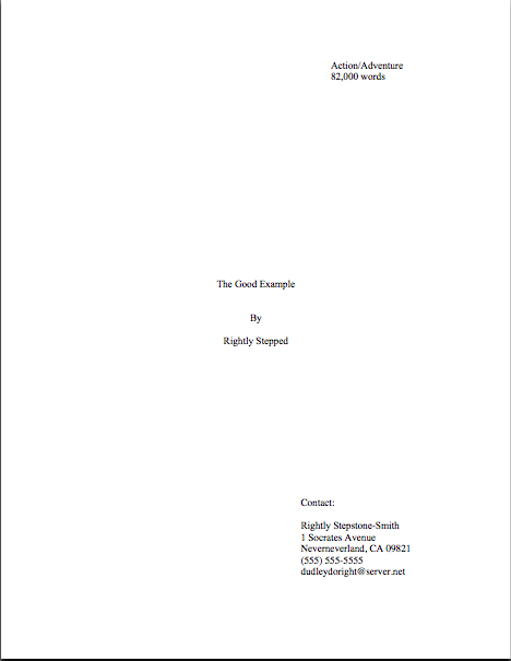
If you’re Millicent — and right now, you are, singed tongue and all — you fully expect to see something like this lurking between the cover letter and the SASE tucked underneath:
But in the case of the bound manuscript, you would instead encounter something like this:
Kind of hard to miss the difference, isn’t it? And unfortunately, nine times out of ten, the next sound a bystander would hear would be all of that nice, expensive binding grating against the inside of the SASE, just before Millicent tucks a photocopied form rejection letter on top of it.
Honestly, it’s not that she is too lazy to flip open the cover; she just doesn’t see why she should. Her logic may not be fair or open-minded, from a writerly perspective, but it’s a fairly common argument throughout the industry: if this submitter does not know this very basic rule of manuscripts, how likely is she to know the rules of standard format?
And if she does not know either, how likely is she to be producing polished prose?
I know, I know — this logic often does not hold water when it comes down to an individual case; despite my best efforts over the last few years, there are plenty of good writers out there who happen to be clueless about the rules of standard format.
But even if they all jumped off the Golden Gate Bridge, you shouldn’t.
Here’s why: from Millicent’s perspective, the fact that good writers aren’t necessarily born aware of the norms of the industry matters less than we writers would like — because, as unpleasant as it is for aspiring writers to realize, her agency is going to see enough technically perfect submissions this week to afford to be able to leap to unwarranted conclusions about this one.
Don’t waste your money on binding.
Seem arbitrary? From a professional reader’s point of view, it isn’t — the enforcement of standard formatting isn’t actually any more complicated than the simple axiom that any game has rules, and you will play better if you take the time to learn them.
Think about it: if you saw a batter smack a baseball, then dash for third base instead of first on his way around the diamond, would you expect his home run to count? Would an archer who hit the bulls-eye in her neighbor’s target instead of her own win the grand prize? If you refused to pay the rent on Park Place because you didn’t like the color on the board, would you win the Monopoly game?
I can go on like this for days, you know. Please say that you are getting the parallels, so I may move on.
Submitting art to the marketplace has rules, too, and while your fourth-grade P.E. teacher probably did not impart them to you (as, if I ran the universe, s/he would have), you’re still going to be a whole lot better at playing the game if you embrace those rules, rather than fight them.
You’ll also, in the long run, enjoy playing the game more. I know that it may not seem that way the first time one is struggling to change an already-written manuscript into standard format, but trust me, it will be much more fun when you finish your next manuscript and realize that there’s nothing that needs to be changed.
Let all of those other folks jump off the Golden Gate Bridge without you, I say. Remember, you’re playing this game by choice: you could, after all, make your own rules and publish your book yourself. If you want to play with the big kids, you’re going to need to abide by their rules.
I’ll wrap up this topic next time, I promise, and after we’re done, I’ve got a tremendous treat in store for you. Hang in there, and keep up the good work!


