
We begin today with a pop quiz, inspired by sharp-eyed reader Jinnayah’s comment on yesterday’s post. Quick, tell me: did I take the photo above while looking down into an abyss, sideways into an alcove, or up at an impossibly high ceiling?
Hard to tell which way is up, isn’t it? (But here’s a hint: the purple stuff is flying dust.) Without some orienting landmarks, it’s difficult even to know for sure what you’re looking at, or from what direction.
That’s more or less the same problem the average aspiring writer faces when looking at her own first manuscript or book proposal with an eye to figuring out whether it is formatted correctly, right? Let’s face it, very, very few as-yet-to-be-published writers have ever seen a professional manuscript up close and personal; still fewer have had the opportunity to glance through a professional book proposal. Oh, there’s plenty of advice out there on how it should be done, of course, but as many of you have no doubt noted with chagrin, sources differ.
So how on earth is someone new to the game supposed to figure out which end of the manuscript is up, figuratively speaking?
The trick lies in remembering that the principles governing manuscript formatting are practical and historical, not aesthetic. Thus, while two-inch margins and a cursive typeface may strike a writer as the perfect expressive extension of the spirit of his novel, to someone who reads manuscripts for a living, they’re just puzzling. And distracting.
Where you stand, in other words, depends on where you sit. From where Millicent is sitting, deviation from standard format demonstrates a lack of knowledge about how the industry works, not creativity. She has good reason to feel that way: because professional manuscripts and book proposals are formatted in a particular way, she knows that her boss, the agent of your dreams, would have a hard time convincing an editor at a major publishing house to read even the first page of an unprofessional formatted manuscript.
Which brings be back to where we left off last time, right? For the past couple of posts, we’ve been engaging in compare-and-contrast exercises, showing common examples of title pages and fine-tuning your binoculars so you might see how our old friend Millie — or her boss, or an editor, or a contest judge — might view them. As I sincerely hope those of you who read the post can attest, it was pretty obvious that the professionally-formatted title page won the beauty contest hands-down. Or, if the bulk of you aren’t yet willing to attest to that, may I at least hope that everyone is now aware that as far as presentation goes, where you stand depends upon where you sit?
Case in point: a choice as small as a typeface can make an astonishingly great difference to how professional your work looks to the pros. That comes as something of a surprise to most aspiring writers — who, not entirely surprisingly, tend to regard that particular decision as a purely aesthetic one. “Why,” they ask, and not unreasonably, “should it even matter to Millicent? Good writing’s good writing, isn’t it?”
Well, yes and no. Yes, good writing is a thing of beauty and a joy forever. No, insofar as good writing tends to have less impact on the average Millicent when it’s presented in an unusual typeface.
Yes, really. To see why, let’s once again start at the top of the submission packet, taking a gander at the same title page in three different typefaces. Here it is in 12-point Times New Roman, one of the two preferred typefaces:
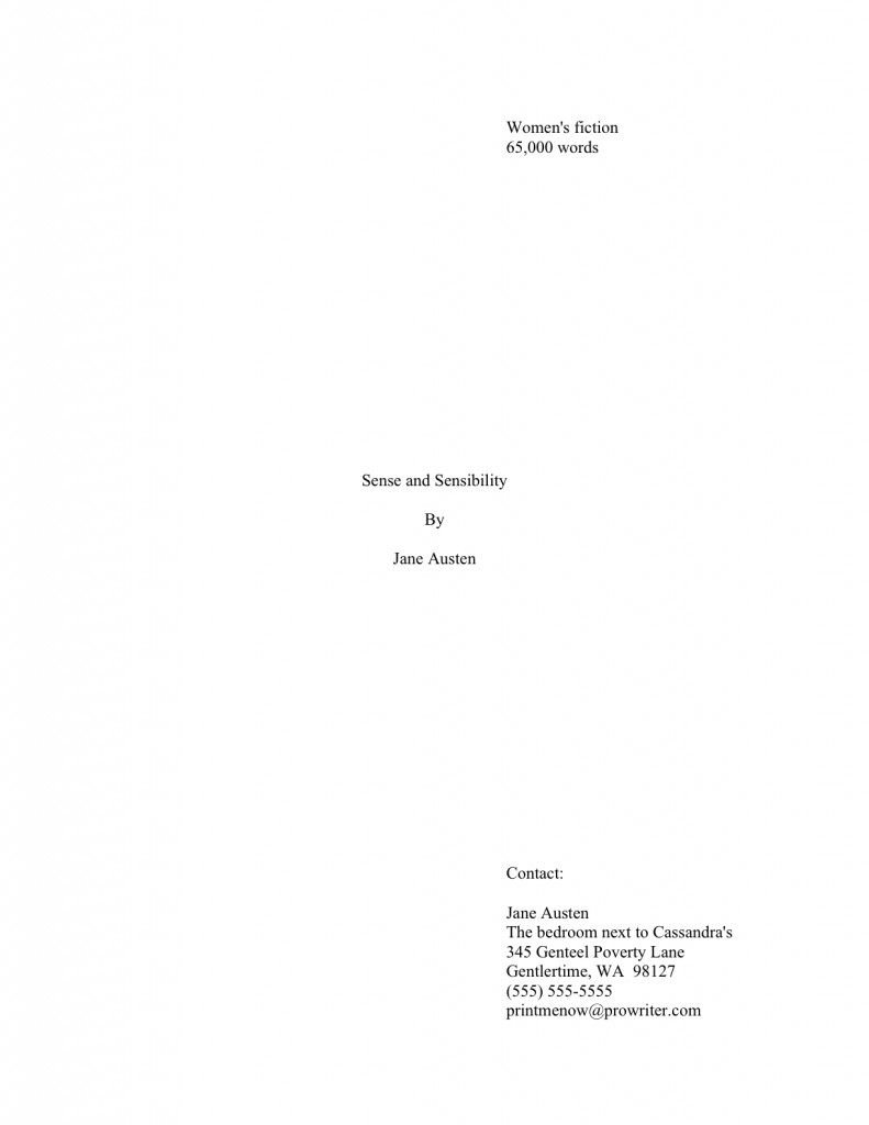
That’s what anyone sitting in Millicent’s seat would expect to see. Now let’s look at exactly the same information, assuming that Aunt Jane favored 12-point Helvetica:
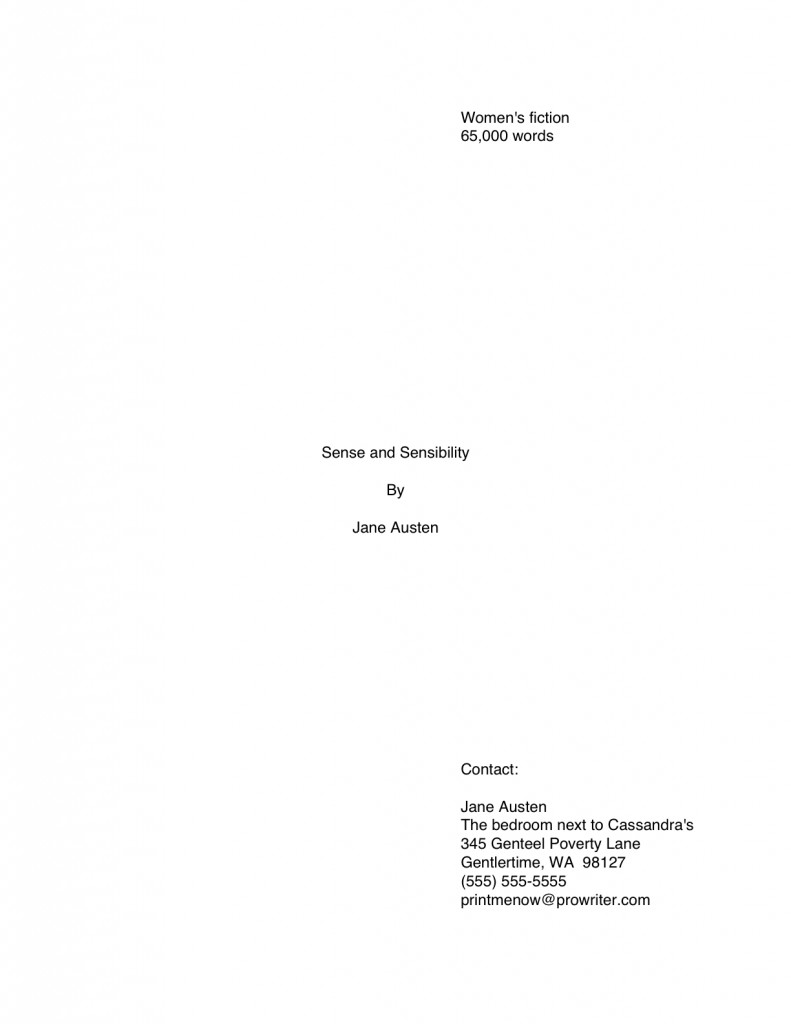
The letters appear quite a bit bigger, don’t they? Not enough so to appear to be, say, 14-point font, but large enough to make Millicent wonder whether the word count is accurate. (Estimated word count does, after all, vary by typeface: Times New Roman is estimated at 250 words/page, Courier at 200. More on that below.) And do you really want her speculating about your credibility before the first page of your manuscript?
So if we seat ourselves in Millicent’s office chair, we can see that Aunt Jane’s choice of Helvetica, while not a deal-breaker, does not necessarily present her manuscript to its best advantage. And now you want to see a typeface that might be a deal-breaker, don’t you? Happy to oblige.
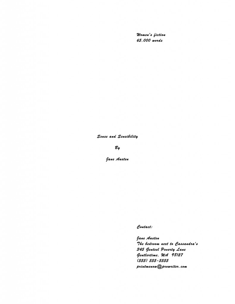
Can’t really blame Millicent for not wanting to turn the page on that one, can we? Despite containing all of the information that a title page should include, in the right places and in the right order, it’s unprofessional-looking. Not to mention hard to read.
Got Millicent’s perspective firmly imbedded in your mind? Excellent. If you want to switch back to the writer’s point of view, all you have to do is remember that the manuscript that follows even this last title page is SENSE AND SENSIBILITY.
The moral: even the best writing may be placed at a competitive disadvantage by unprofessional presentation.
I assume that all of that clanking is a thousand writers’ hackles being raised. “But Anne,” outraged voices thunder “aren’t you assuming that Millicent’s pretty shallow? Whenever I’ve heard agents and editors asked at conferences or on their websites about whether cosmetic issues can get a manuscript rejected, they often disclaim the notion with scorn. I’ve even heard a few of them say that they don’t care about issues like typeface, spaces after periods and colons, or where the chapter title lies — and that strikes me as significant, as I’ve never, ever heard one say it was okay to let a query letter run longer than a single page. Isn’t it the writing that matters in a submission, ultimately?”
Again, yes and no, hackle-raisers. Yes, the writing matters — but it’s not all that matters.
Naturally, the writing matters most in a submission, with freshness, audience-appropriateness, marketability, and fit with the agent or editor reading it jostling for second place. Equally naturally, and something that I often point out here, individual agents, editors, and even contest judges harbor individual preferences as well and have been known to express them at conferences. Or on their blogs, Twitter feeds, and over drinks at that bar that’s never more than 100 yards from any literary conference in North America.
One person’s pet peeve, however, may not be another’s, and since few aspiring writers of my acquaintance either take the trouble or have the information required to find out the preferences of every agent to whom they are submitting, adhering to standard format minimizes the probability of running afoul of unknown annoyance-triggers. Because, honestly, trying to apply every single one of the expressed opinions floating around out there to your manuscript will drive you 100% nuts. The pet peeves are too often mutually contradictory, for one thing.
Which is to say: if an agent to whom you are submitting asks for something different, for heaven’s sake, give it to her; if, as is almost always the case, you just don’t know, keep the presentation unprovocative and professional so that your writing may shine.
In other words, adhere to the strictures of standard format, rather than assuming, as so many aspiring writers do to their cost, that the writing is the only thing that matters.
Remember, where you stand depends on where you sit. And from both Millicent and the aspiring writer’s perspective, taking the time to present writing professionally is honestly worth it.
Yes, admittedly, one does hear of cases where a kind, literature-loving agent has looked past bizarre formatting in order to see a potential client’s, well, potential, one also hears of isolated cases where a manuscript rife with spelling and grammatical errors gets picked up, or one that has relatively little chance of selling well in the current market. The age of miracles has not entirely passed, apparently.
But — and this is a BIG but — these cases get talked about because they are exceptions, and rare ones at that. 9,999 times out of 10,000, any of these problems will result in, if not instantaneous rejection, then rejection upon Millicent’s lighting upon the next problem in the manuscript.
Those hackles are clacking again, aren’t they? “Okay,” the hackled admit, “I can understand how Millicent would be tempted to skip reading a submission like #3 above, where she’s likely to strain her eyes. I can seen see why she might leap to some negative conclusions about #2, since, as you have mentioned before, she knows that it’s going to be more time-consuming, and thus more costly, to take on a client who needs to be trained how to present her work professionally. But if presentation is so darned important, why don’t aspiring writers hear about it more often at conferences, in articles about submission, or even just in discussions amongst ourselves?”
Excellent question, h-raisers. I can’t say for sure, but I suspect that’s not just because a sane, sensible individual with a reputation to protect is unlikely to stand up in front of 500 eager potential submitters and say, “Look, if you’re planning to submit a grimy photocopy of your book, or insist upon presenting it in 10-point type, or not indenting your paragraphs, just don’t bother to query me.”
Having actually seen a well-meaning agent tell an indignant crowd that he really only took seriously query letters from writers he met at conferences (yes, really; there were many, many witnesses), I can tell you precisely what would happen if some honest soul did take this astounding step: instantly, 500 pens would scrawl on 500 programs, DO NOT QUERY THIS ONE; HE’S MEAN.
Which would rather defeat the agent’s purpose in coming to the conference to recruit new clients, wouldn’t it?
As someone who frequently teaches writing and formatting classes, I can think of another reason that a speaker might want to be careful about such pronouncements: an agent or editor doesn’t have to speak at many conferences (or blog for very long) before recognizing that anything she says about submissions is likely to be repeated with the éclat of a proverb for years to come amongst the writing community.
Seriously, it’s true. I’ve heard offhand comments made from the dais, or even jokes, being debated for hours in conference hallways, particularly if those comments happen to relate to the cosmetic aspects of querying and submission. 5-4 Supreme Court decisions are routinely discussed with less vim and vitriol. Some of Miss Snark’s pronouncements have been more commented upon than St. Paul’s second letter to the Corinthians.
Okay, so that last is a slight exaggeration. My point is, the very notion of from-the-horse’s-mouth rightness carries such a luster that such speakers are constantly in extreme danger of having everything they say quoted back to them as an inflexible rule.
Which is why, I must admit, I occasionally experience qualms about presenting the rules of standard format as inflexible rules. On the pro-regulation side, we are talking, after all, about an industry that both values creativity and considers submitting a book proposal in anything but a black folder dangerously radical. (Yes, really.) On the con side, literally nothing else I talk about here consistently raises as much writerly ire.
The very topic of presentation seems to be emotionally trying for a lot of writers — disproportionately so, from where Millicent is sitting. Tell an aspiring writer that his dialogue is turgid, or his pacing drags, or that he’s left a necessary section out of his book proposal, and most of the time, he’ll be at least curious about why you think so. (If a bit defensive.) Yet suggest to the same writer that he might be better off reformatting his manuscript to include such niceties as paragraph indentation or moving his page number to the slug line, and a good quarter of the time, he’ll look at you as though you’d just kicked his grandmother. Thrice.
Go figure, eh?
Presentation issues definitely do matter — which is, again, not to say that the quality of the writing doesn’t. But — and again, this is a BIG but — as we’ve discussed, rejection decisions are often made on page 1 of a manuscript. Sometimes even within the course of the first paragraph. And if the manuscript is hard to read, due to a funky typeface or odd spacing or just plain poor print quality, it may not be read at all.
While these phenomena are, in fact, quite widely recognized as true, the person who announced them this baldly from the dais at a literary conference would be covered head to foot with flung tomatoes in twenty seconds flat. Metaphorically, at least.
Which is why I’m going to keep saying it until I’m blue in the face and you die of boredom: from the perspective of someone who reads manuscripts for a living, professional formatting is simply the least distracting way a book can possibly be presented. Perversely, adhering to the industry’s cosmetic expectations renders it MORE likely that an agent or editor will concentrate upon the beauty of the writing, not less.
Think about it: they can’t fall in love with your good writing until they read it, can they? So don’t you want to do everything within your power to convince them that your manuscript is the one that deserves more than a cursory glance?
Of course you do; if you didn’t, you would have given up on this series a paragraph into it, right? Instead of thinking of the rigors of standard format as a series of unimportant (or even silly) superficial choices, try regarding them as translating your calling card, a means of catching Millicent’s tired eye and informing her that this is a manuscript that should be taken seriously.
Have I got you sufficiently fired up about superficial manuscript prettiness yet? Grand; let’s get back to the incredibly nit-picky issue of typeface.
As I mentioned earlier in this series, I would highly recommend using either Times, Times New Roman, or Courier typefaces, both on the title page and in the manuscript as well. These are the standards of the industry, and thus the least likely to raise Millicent’s ever-knitted eyebrows. But like some of the other strictures of standard format, there’s a pretty good reason for this one: from where she is sitting, word count estimation is always predicated upon one of these typefaces.
Why is the question of estimating relevant on a title page? Again, we must look to Millicent’s perspective: word counts in book manuscripts are generally estimated, not the actual count; for short stories and articles, use the actual count.
Was that giant gust of wind that just knocked my desk over your collective gasp of astonishment? I’m not entirely surprised; a lot of aspiring writers are confused on this point. “But Anne,” they protest, and who can blame them? “My Word program will simply tell me how many words there are in the document. Since it’s so easy to be entirely accurate, why shouldn’t I be as specific as possible? Or, to put it another way, why would an agent or editor ask for the word count, then expect me to guess?”
Would you throw something at me if I said once again that this is a matter of perspective? From Millicent’s seat, the answer is pretty obvious: industry practices dictate how manuscripts are handled, not the whims of the fine folks at Microsoft. I mean, the Microsofties I know are sterling human beings to a man, but hardly experts on the publishing industry’s requirements. And really, why should they be?
Contrary to popular opinion amongst aspiring writers, just because Word is set up to allow certain things — giving you an exact word count, for instance, or access to 200 typefaces — doesn’t mean that the publishing industry wants writers to do things that way. (And if you doubt that, consider the doubled dash vs. the automatic emdash Word favors.) Word processing programs came into use long, long after standard format for manuscripts, after all; why should agents, editors, and Millicents allow computer programmers to dictate what strikes them as professional?
Perspective, people: which makes more sense, assuming that the word count on your title page will be read by Millicent, or Bill Gates?
I cannot, naturally, speak to Mssr. Gates’ point of view on the subject, but here is why Millicent would care on the estimation front. The Times family is estimated at 250 words/page; Courier at 200. So a 400-page manuscript in Times New Roman is estimated to be roughly 100,000 words if it’s in Times — something Millicent should be able to tell as soon as she claps eyes on the submission’s title page, right? — and 80,000 if it’s in Courier. (If the logic behind that is at all confusing, please see the WORD COUNT category on the archive list at right for further explanation.)
Now, in actual fact, a 400-page manuscript in TNR is probably closer to 115,000 words; as any writer who has compared the estimated word count for her book with the total her word processing program so kindly provides, they tend to differ wildly. But word count, like beauty, is in the eye of the beholder: a novelist whose title page reported, accurately, that her 400-page novel was 115,000 words might well see it rejected out of hand on the grounds that it was too long.
Why? Well, math may not have been Millicent’s best subject (as one might expect, the inmates of agencies tend overwhelmingly English majors), but she can do third-grade multiplication in her head: 115,000 words at 250 words/page would equal a 460-page manuscript. That’s quite a bit longer than editors tend to expect first novels in most genres to be these days; at around 450 pages, binding costs rise significantly.
In other words, next!
Boy, those hackles are getting a workout today, aren’t they? “But Anne, why is Millicent estimating at all? If she wants to know how long it is, why doesn’t she just flip to the last page and check the page number, for heaven’s sake?”
I could give you a long song and dance about how much her wrists hurt from opening all those query envelopes all day, or how her secret midnight e-mail orgies have rendered pinching a torture, but in practice, the answer is far less personal than practical: because the word count is right there on the title page.
Tell me, oh submitters: why on earth should she doubt its accuracy? Unless, say, the title page were in a non-standard typeface like Helvetica, she’s going to assume that an aspiring writer familiar enough with standard format to include the word count on the title page would also know how to estimate it accurately.
I know, I know: from a writerly perspective, that’s kind of a wacky assumption. But her chair boasts a different view than ours.
Besides, how exactly could she manage to turn to page 400 of a manuscript, when her boss requested that the writer send only the first 50, without resorting to some pretty impressive maneuvering through time and space?
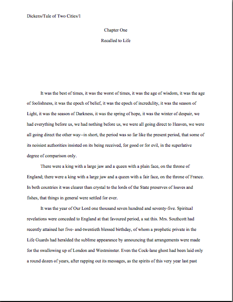
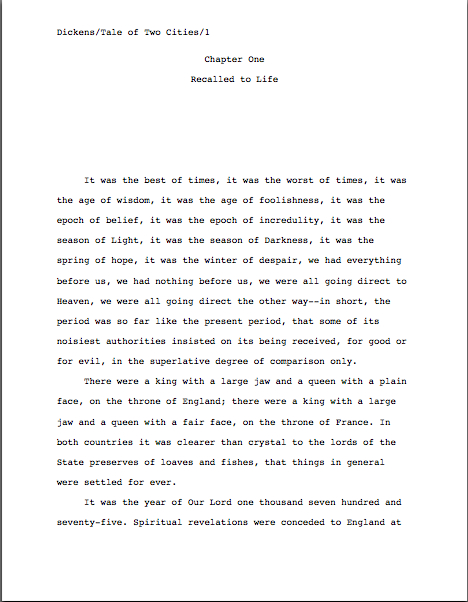
I’m aware that I’m running quite long today, but in the interest of clarity, let’s invest another few minutes in turning to the first page of the submission, to see how much of a difference font and typeface make at first glance. Here’s a correctly-formatted page 1 in Times New Roman. Just for giggles, I’m going to use that notorious editor’s nightmare, the opening paragraphs of A TALE OF TWO CITIES:
Pretty spiffy, eh? And definitely not how this opening would appear in a published book, right?
Now let’s take a peek at the same page, also correctly formatted, in Courier. Note how many fewer words per page it allows:
Got both of those firmly imbedded in your brainpan? Good. Now format your first pages that way for the rest of your natural life.
Well, my work here is obviously done.
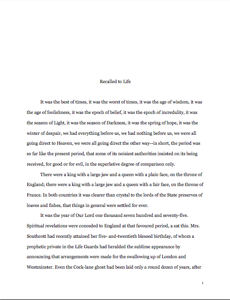
Just kidding — you want to see why it’s a good idea, don’t you? Okay, take a gander at the SAME first page, not in standard manuscript format. See how many differences you can spot:
Fascinating how just a few small formatting changes can alter the presentation, isn’t it? It’s exactly the same WRITING — but it just doesn’t look as professional. To Millicent, who reads hundreds of pages per day, the differences between the last three examples could not be clearer.
And yet, if we’re going to be honest about it, there were really very few deviations from standard format in the last example. For those of you playing at home, the typeface is Georgia; the chapter title is in the wrong place, and there isn’t a slug line. Also, the page is numbered in the wrong place — the default setting, incidentally, in many word processing programs.
Again, in all probability, none of these infractions against the rules of standard format are serious enough to cause Millicent to toss a submission aside as soon as she notices them. But when poor formatting is combined with literary experimentation — like, say, that paragraph-long first sentence ol’ Charles managed to cough up — which do you think she is going to conclude, that Dickens is a writer who took the time to polish his craft, or that he just doesn’t know what he’s doing?
Don’t tempt her to draw the wrong conclusion. Remember, where a manuscript stands depends upon where the reader sits.
Before any hackles start heading skyward again, I hasten to add: where the submitting writer sits often makes a difference to Millicent’s perception, too. Millicent’s reception of that last example is very likely to be different before Dickens became a household name or after, although once he was established. Unless you happen to be famous, I wouldn’t advise taking the risk.
And if you do happen to be famous, could I interest you in writing a back jacket blurb?
In fairness to Millicent, though, it’s highly unlikely that it would even occur to our Charles to deviate this markedly from standard format, if he already had experience working with an agent or editor. The longer you remain in the business, the more those little things will strike you as just, well, matters of right and wrong. As, fortunately or not, they do Millicent and her ilk.
Come to think of it, that sense of fitness may well be the reason that discussions of formatting tend to become so vitriol-stained: we all like to be right, and after all, propriety is in the eye of the beholder. After all, each of us is most familiar with the view from her own chair.
Pulling back from one’s own perspective can be most helpful. There’s a reason that it’s called the bigger picture, people. In that spirit, let’s take a longer view of the photo above, to situate ourselves:

Easier to tell up from down, isn’t it? With a broader perspective, you can see that the green light on the left is coming from a stained-glass window; on the left, there’s a decorative support beam. From a myopic tight shot, we can now tell that this is a picture of a ceiling — as it happens, in the cathedral whose photo graced my last post. (Hey, Jinnayah said she liked the building.)
More show-and-tell follows next time, of course. Keep up the good work!
Hi Anne-
Barcelona is one of the few places I’ve been. Hubby and I went to all the Gaudi buildings we could fit in- La Sagrada Familia and the Casa Batllo were our favorites.
Thanks for the formatting info, too. I’m doublechecking everything I read ‘out there’ against what you say.
You’re welcome, Kelly! And good for you for double-checking — it makes me a trifle nervous when writers use only one source, even if it’s me.
One of the things that struck me most about the architectural tours we took of Barcelona was how difficult it was to get the guides to talk about anyone but Gaudi. There’s so much marvelous architecture there, but when we asked, “Oh, who designed that one?” we kept being told that it wasn’t important! At one point, we received that answer about a building we were pretty sure had been designed by Mies van der Rohe, though, so perhaps our atrocious accents while asking the question was skewing the responses.