
For the past few posts in this series, we’ve been comparing manuscripts in standard format with improperly-formatted ones — on their title pages, their first pages, and their mid-text pages — to see the rules in action, as well as how your submission’s chances could be hurt if you deviate from them. I hope you’ve been finding this more useful than a simple list of submission guidelines; in my experience, most rookie submitter mistakes arise not merely from simple ignorance of the strictures of standard format, but from the low-level panic that comes from having to guess whether one is performing the secret handshake correctly.
The better an aspiring writer understands the rules, the less guesswork is involved. It may not eliminate the stress of submission entirely, but it does at least remove one of the most common stressors from the mix.
Heck, you might even become relaxed enough about the process to feel a few glimmerings of sympathy for Millicent the agency screener. Each and every week, she has to read thousands upon thousands of pages just like the ones we’ve been considering.
Does the very idea of empathizing with her seem strange to those of you new to the querying and submission process? Admittedly, she is also the person who rejects the vast majority of queries and submissions sent to her agency — remember, at a US agency of any size, a manuscript typically has to make it past one or two Millicents before getting anywhere near an agent’s desk; that’s one reason average turn-around times have risen in recent years from weeks to months. (Another reason: a lot of agencies have had to lay off Millicents and administrative assistants, meaning that fewer eyes are scanning more pages.)
Yet given what a small percentage of these documents are properly formatted and spell-checked and original andbook category-appropriate, much less well-written, it’s hard to blame her eye for becoming a trifle jaded over time. As enviable as her job sounds (Reading for a living! Sign me up! many writers think), reading for errors is actually not very pleasurable, usually.
And make no mistake: it’s a screener’s job to read for technical errors, with an eye to weeding out the aforementioned vast majority of submissions. Unfortunately, as a group, aspiring writers make it easier than it should be to reject a promising voice. Technical mistakes are so common that the lack of them is sometimes the difference between a well-written manuscript that strikes Millicent as well-written enough to keep reading beyond the first page or two and one that makes her exclaim, “Oh, too bad — this writer isn’t ready yet. Next!”
Way back in the dim days of yesteryear, before you had been initiated into the mysteries of standard format, the fact that the writing was not the only factor considered in rejection decisions probably annoyed you just a trifle, didn’t it? Now that you’ve passed the Rubicon and are formatting your manuscripts like a pro, you can afford to smile compassionately at both Millicent and the literally millions of queriers and submitters who ply her with unprofessional-looking pieces of paper.
Or does that smirk off your face mean that I’m once again overestimating my readers’ saintly willingness to walk a mile in the moccasins that routinely kick aspiring writers’ dreams into the rejection pile?
Okay, let me speak to the more practical side of your collective psyche: even if you aren’t in the habit of empathizing with people who reject writers for a living, there’s a good self-interested reason you should care about her state of mind — or an agent, editor, or contest judge’s, for that matter. Simply put, Even with the best will in the world, grumpy, over-burdened, and/or rushed readers tend to be harder to please than cheerful, well-treated, well-rested ones.
And she does tend, alas, to fall in the former categories on more days than the latter. Millicent is the Tiny Tim of the literary world, you know; at least the Bob Cratchits a little higher up on the office totem pole uniformly get paid, but our Millie often gets a paycheck that’s more an honorarium than a living wage. Heck, some Millicents are not paid at all. Some do it for college credit — or just the experience.
Phenomena that one might reasonably expect to become increasingly common, by the way: the worse a bad economy gets, the better an unpaid intern is going to look to a cash-conscious agency. Or, heaven help us, a worried publishing house that’s been laying off editors. (And editorial assistants, increasing turn-around times at publishing houses, too.)
Fortunately, literary contests in the U.S. are almost exclusively judged by volunteer Mehitabels, at least prior to the finalist round, so writing competitions continue to be judged very much as they ever were. The Hitties of the world tend to be public-spirited authors, freelance editors, writing teachers, etc. who honestly are in it to help discover exciting new voices. If anything, however, that let’s-improve-the-literary-world orientation usually renders them less tolerant of technical errors in entries than Millicent is, not more.
Hard to imagine, isn’t it? Which is why — you ‘Palooza followers can hear this coming, can’t you? — a savvy submitter always reads her ENTIRE manuscript IN HARD COPY and OUT LOUD before sending it to anyone even vaguely affiliated with a literary contest or the publishing industry. It’s much, much easier to catch formatting issues, typos, and logic problems that way.
Even if Millie’s not an intern, she’s still unlikely to be paid very much, at least relative to the costs of living in the cities where the major publishers dwell. Her hours are typically long, and quite a lot of what she reads in the course of her day is, let’s face it, God-awful. Not to mention poorly formatted.
Oh, wait; I have mentioned it. Repeatedly.
“So why are you bringing it up yet again?” the masses shout indignantly.
On the outside chance that I’m being too subtle here: it’s vital to any aspiring writer’s happiness to be aware that while God-awful manuscripts and book proposals are, naturally, self-rejecting, every year, thousands upon thousands of otherwise well-written manuscripts get rejected on purely technical grounds.
Millicent’s job, in short, is not the glamorous, power-wielding potentate position that those who have not yet passed the Rubicon of signing with an agency often assume it to be. Nor, ideally, will she be occupying the position of first screener long: rejecting queries and manuscripts by the score on-the-job training for a fledgling agent, in much the same way as an editorial assistant’s screening manuscripts at a publishing houses is the stepping-stone to becoming an editor.
You didn’t think determining a manuscript’s literary merits after just a few lines of text was a skill that came naturally to those who lead their lives right and got As in English, did you? To be good an their jobs, agents and editors have to learn to spot professional writing in the wild — which means, in part (out comes the broken record again) having to recognize what a properly-formatted manuscript should and should not look like.
Actually, the aspiring writer’s learning curve is often not dissimilar to Millicent’s: no one tumbles out of the womb already familiar with the rules of manuscript formatting. (Okay, so I practically was, growing up around so many authors, but I’m a rare exception.) Like Millicent, most of us learn the ropes only through reading a great deal.
She has the advantage over us, though: she gets to read books in manuscript form, and most aspiring writers, especially at the beginning of their journeys to publication, read only books. So what writers tend to produce in their early submissions are essentially imitations of books.
The problem is, the format of the two is, as I believe that I have pointed out, oh, several hundred times throughout this ‘Palooza, quite different — and not, as some of you may have been muttering in the darkness of your solitary studios throughout this series, merely because esoteric rules render it more difficult for new writers to break into the biz.
Just a few of the many, many things an aspiring writer often does not know before submitting for the first time: manuscripts should be typed (don’t laugh; it’s not unheard-of for diagrams to be hand-drawn, hand-number, or for late-caught typos to be corrected in pen), double-spaced, and have 1-inch margins all the way around.
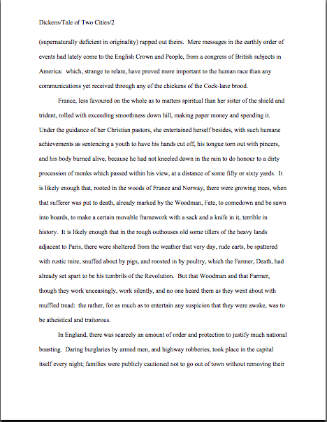
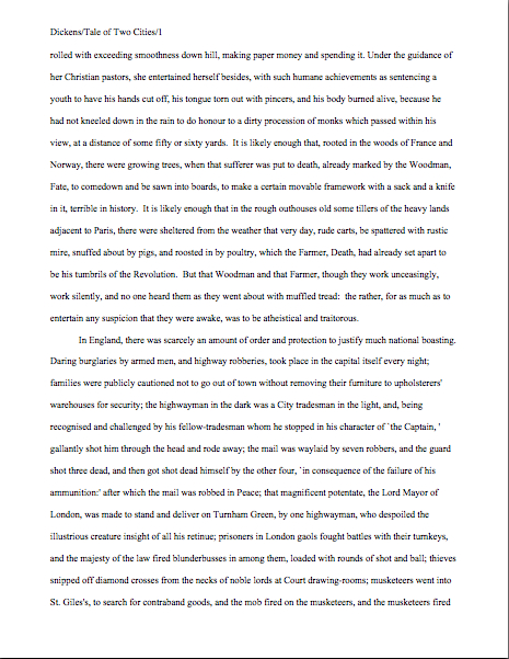
Let’s see why all of those things are necessary, from a professional point of view. Speaking of Tiny Tim, let’s call upon our old friend Charles Dickens again to see what a page of a manuscript should look like,
Nice and easy to read, isn’t it? (Assuming that you find it so, of course. If it’s too small to read easily on your browser, try holding down the COMMAND key and hitting + until the type is large enough to read comfortably.)
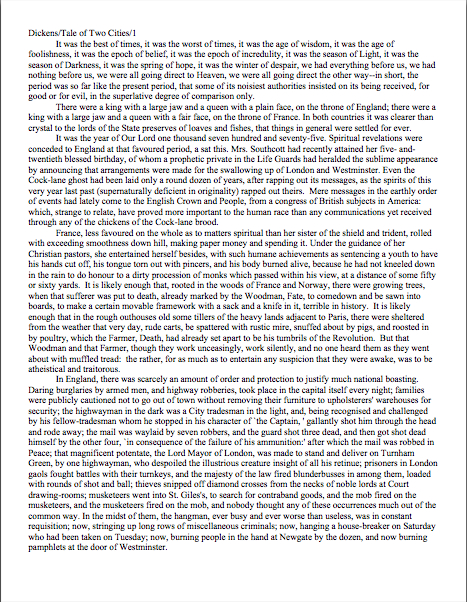
To give you some idea of just how difficult it would be to read, much less hand-edit, a manuscript that was not double-spaced or had smaller margins, take a gander at this little monstrosity:
I believe the proper term for this is reader-hostile. Even an unusually patient and literature-loving Millicent would reject a submission like this immediately, without reading so much as a word. As would, more often than not, Mehitabel.
Did I hear a few spit-takes during that last paragraph? “My goodness, Anne,” those of you who are wiping coffee, tea, or the beverage of your choice off your incredulous faces sputter, “why would any sane person consider presentation violations that serious an offense? It is, after all, precisely the same writing.”
Well, think about it: even with nice, empty page backs upon which to scrawl copy edits, trying to cram spelling or grammatical changes between those lines would be well-nigh impossible. Knowing that, Millicent would never dream of passing such a manuscript along to the agent who employs her; to do so would be to invite a stern and probably lengthy lecture on the vicissitudes of the life editorial — and that fact that, despite impressive innovations in technology, most line editing a single-spaced document in either hard or soft copy is well-nigh impossible.
Too hard on the eyes — and where on earth would the comments go on the hard copy?
Don’t tempt her to reject your submission unread — and don’t even consider, I beg of you, providing the same temptation to a contest judge. Given the sheer volume of submissions Millicent reads, she’s not all that likely to resist. The contest judge, on the other hand, will be specifically instructed not to resist at all.
Yes, really. Even if the sum total of the provocation consists of a manuscript that’s shrunk to, say, 95% of the usual size, Mehitabel is likely to knock it out of the running on sight.
Some of you are blushing, aren’t you? Perhaps some past contest entrants and submitters who wanted to squeeze in a particularly exciting scene before the end of those requested 50 pages?
No? Let me fill you in on a much-deplored practice, then: faced with a hard-and-fast page limit, some wily writers will shrink the font or the margins, to shoehorn a few more words onto each page. After all, the logic runs, who is going to notice a tenth of an inch sliced off a left or right margin, or notice that the typeface is a trifle smaller than usual?
Millicent will notice, that’s who, and practically instantly. As will any reasonably experienced contest judge; after hours on end of reading 12-point type within 1-inch margins, a reader develops a visceral sense of roughly how many characters fit on a properly-formatted page.
Don’t believe me? Go back and study today’s first example, the correctly formatted page. Then take a gander at this wee gem of tricky intent:
I shaved only one-tenth of an inch off each margin and shrunk the text by 5% — far, far less of a reduction than most fudgers attempt. Admit it: you can tell it’s different, can’t you, even without whipping out a ruler?
So could a professional reader. And let me tell you, neither the Millicents of this world nor the contest judges appreciate attempts to trick them into extraneous reading. Next!
The same principle applies, incidentally, to query letters: often, aspiring writers, despairing of fitting a coherent summary of their books within the standard single page, will shrink the margins or typeface on a query. Trust me, someone who reads queries all day, every day, will be able to tell.
The other commonly-fudged spacing technique involves skipping only one space after periods and colons, rather than the grammatically-requisite two spaces. Frequently, writers won’t even realize that this is fudging: as we’ve discussed, and recently, ever since published books began omitting these spaces in order to save paper, there are plenty of folks out there who insist that skipping the extra space in manuscripts is obsolete.
Including, as we have also discussed, some agents — and yes, Virginia, it is the submitter’s responsibility to check agency websites to make sure whether the particular agent to whom he is submitting happens to harbor that particular preference. If you encounter an agent who does, your path is clear — and feel free to shout this one out along with me, conscientious ‘Palooza-followers: if an agency’s guidelines ask for something specific in a submission, for heaven’s sake, give it to them. Just don’t generalize individual preferences to the entire industry.
If they don’t express a preference for single-spacing, stick to standard format, regardless of what you may have heard online about how nobody is using double-spacing after periods and colons anymore. It’s simply not true.
But that’s not what you’d think from the vehemence of the single-space faithful, is it? Frequently, the proponents will insist that manuscripts that include the space look hopelessly old-fashioned to agents and editors.
Well, guess what, cookie — standard manuscript format is old-fashioned, by definition; that fact doesn’t seem to stop most of the currently-published authors of the English-speaking world from using it. In fact, in all of my years writing and editing, I have never — not once — seen an already agented manuscript rejected or even criticized for including the two spaces that English prose requires after a period or colon.
I have, however, heard endless complaint from professional readers — myself included — about those second spaces being omitted. Care to guess why?
Reward yourself with a virtual partridge in a pear tree if you said that cutting those spaces throws off word count estimation; the industry estimates assume those doubled spaces. (If you don’t know how and why word count is tallied, please see the HOW TO ESTIMATE WORD COUNT — AND WHY category on the archive list at right.)
And give yourself five golden rings if you also suggested that omitting them renders a manuscript harder to hand-edit. We all know the lecture Millicent is likely to get if she forgets about that, right?
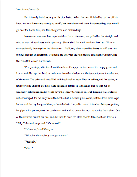
Again, a pro isn’t going to have to look very hard at a space-deprived page to catch on that there’s something fishy going on — and again, we’re going to take a gander at why. Since Dickens was so fond of half-page sentences, the examples I’ve been using above won’t illustrate this point very well, so (reaching blindly into the depths of the bookshelf next to my computer), let’s take a random page out of Elizabeth Von Arnim’s wonderful take on the Bluebeard myth, VERA:
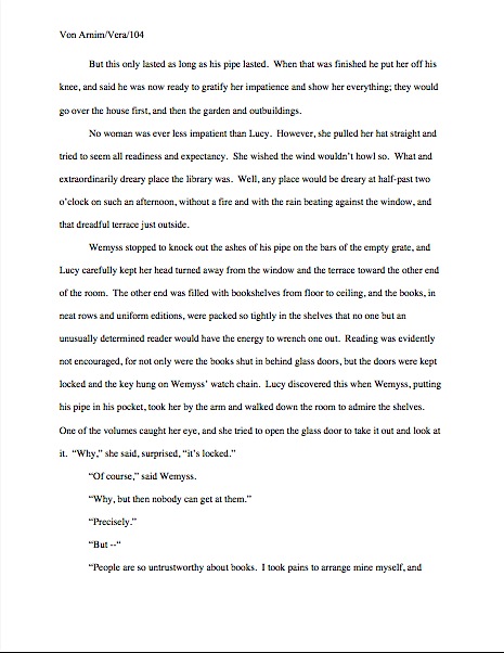
There are 310 words on this page; I wasn’t kidding the other day about how far off the standard word count estimations were. Now cast your eye over the same text improperly formatted:
Doesn’t look significantly different to the naked eye, does it? The word count is only slightly lower on this version of this page — 295 words — but enough to make quite a difference over the course of an entire manuscript.
Do I see some hands shooting up out there? “But Anne,” I hear some sharp-eyed readers exclaim, “wasn’t the word count lower because there was an entire line missing from the second version?”?
Well spotted, criers-out: the natural tendency of omitting the second spaces would be to include more words per page, not less. But not spacing properly between sentences was not the only deviation from standard format here; Millicent, I assure you, would have caught two others.
I tossed a curve ball in here, to make sure you were reading as closely as she was. Wild guesses? Anyone? Anyone?
The error that chopped the word count was a pretty innocent one, almost always done unconsciously: the writer did not turn off the widow/orphan control, found in Word under FORMAT/PARAGRAPH/LINE AND PAGE BREAKS. As we discussed only the other day, this insidious little function, the default unless one changes it, prevents single lines of multi-line paragraphs from getting stranded on either the bottom of one page of the top of the next.
As you may see, keeping this function operational results in an uneven number of lines per page. Which, over the course of an entire manuscript, is going to do some serious damage to the word count.
As would tinkering with the bottom margin to allow an extra line on the page. Here it is with only a minor change, a .9 inch bottom margin instead of 1 inch, a modification so minute that a non-professional reader would probably not notice that it was non-standard. To compress a bit more, let’s have only one space after each period.
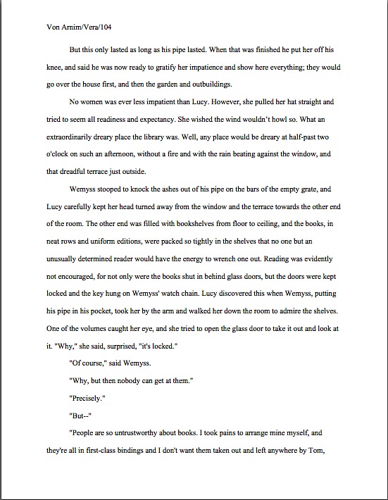
A bit claustrophobic, is it not? If you don’t find it so, consider it as Millicent would: not as an individual page, isolated in space and time, but as one of the several thousand she has read that week. Lest we forget, most of the ones she will have been taking seriously will have looked like this:

See it now? While Millicent is highly unlikely to have either the time or the inclination to whip out a ruler to check whether that bottom margin is really a full inch (although Mehitabel might), she will be able to tell that this page has more words on the page than the others she has seen that day. She might not be able to tell instantly precisely how this page has been modified, but she will be able to tell that something’s off.
“But Anne,” clever rule-manipulators all over North America shout, “I’ve been modifying my submissions this way for years, and nobody has ever called me out on it. Therefore, I do not believe it’s ever been a factor in my work being rejected — and it does allow me to stay under that all-important 400-page limit.”
Perhaps, rules-lawyers, but let me ask you a question: have you ever had such a manuscript accepted?
It’s an extremely common submitter’s misconception, especially amongst those brand-new to the game or who have only submitted pages as part of a query packet, rather than as requested materials, that if they were really doing something wrong, the rejecter would tell them so. In these days of form-letter rejections — and even no-reply rejections — this is simply an unrealistic expectation.
Especially for a formatting error. Since most submissions contain at least one — and remember, formatting problems, like spelling and grammar gaffes, tend to travel in packs — and since non-adherence to standard format is so universally regarded as symptomatic of a lack of professional knowledge, it would be prohibitively time-consuming for Millicent to scrawl try learning how to format a manuscript, then resubmit.
No, regardless of whether the ultimate rejection trigger was that extra line per page, the second misspelling in paragraph 2, or a premise that Millicent has seen seventeen times that week, the reasons given for sending back the submission will probably run like this: I’m sorry, but this manuscript does not fit our needs at this time. I just didn’t fall in love with this story, and I don’t feel that I can sell this in the current tough market. Best of luck placing it elsewhere.
The moral of this sad, sad story: it seldom pays to assume that you’re doing it right just because you haven’t been told you are doing it wrong. And it pays even less often to conclude from the generalities of a boilerplate rejection that there can’t have been any specific technical problem that caused Millicent, if not to reject it outright, then at least to take the submission less seriously.
Besides, there was another notorious agents’ pet peeve in an earlier example — although, frankly, it would have irritated a contest judge far more than Millicent. Here’s the page again; see if you can spot it this time. (Hint: it was not in the properly-formatted version.)
Take ten lords a-leaping out of petty cash if you ran your eyes thoughtfully over this example and became riveted to the next-to-last line of the page: an emdash (“But—“) instead of a doubled dash. Here again, we see that the standards that apply to printed books are not proper for manuscripts.
Which brings me to yet another moral for the day: just because a particular piece of formatting looks right to those of us who have been reading books since we were three doesn’t mean that it is correct in a manuscript.
Or book proposal. Or contest entry.
Remember, Millicent reads manuscripts all day; contest judges read entries for hours at a time. After a while, a formatting issue that might well not even catch a lay reader’s attention can begin to seem gargantuan.
Please don’t dismiss this as unimportant to your success as a writer. If writing is solid, it deserves to be free of distracting formatting choices. You want agents, editors, and contest judges to be muttering, “Wow, this is good,” over your manuscript, not “Oh, God, he doesn’t know the rules about dashes,” do you not?
Spare Tiny Tim the chagrin, please; both you and she will be the happier for it. Believe me, she could use a brilliantly-written, impeccably-formatted submission to brighten her possibly Dickensian day. Be compassionate toward her plight — and your submission’s, proposal’s, and/or contest entry’s. Pay close enough attention to the technical details that yours the submission that makes her say, “Oh, here is good writing, well presented.”
Do you feel your self-editorial eyes sharpening? Excellent. Next time, I’ll bring more practical examples as whetting stones. And if you can manage to wipe that completely distasteful metaphor from your mind until tomorrow, keep up the good work!
“…reading for errors is actually not very pleasurable, usually. “
Or finding them where you didn’t expect them. I recently began reading a book I won at a convention by a fantasy author I met there. The book (in fact, his series) was published by a small specialty press, not self-published.
It is RIDDLED with errors–repetitive wording, using the wrong word entirely, spelling here and there, info dumps, etc., all the things time spent with editing books and websites have taught me not to do. The mistakes are so prevalent they detract from the story, which I suspect might actually be good if it were cleaned up.
The problem is I anticipate seeing this person at the next convention. What in the world do I say if he asks me how I liked it, when I’m struggling to read and keep the red pencil in my head at bay? I don’t want to say anything bad, because he’s a nice guy and a fellow author, and HE is published where I am not.
I remember thinking if this is what Millicent has to look at on a daily basis, I really do want to buy her a latte and a cinnamon bun out of sympathy.
PS – I could just hang with the horror writers and avoid him! Or find the positive, I guess. *sigh*
Oh, that’s a tough one, Elizabeth. Usually, authors don’t ask that particular question point-blank — they assume that if you liked the book, you will offer than information spontaneously — so you probably will be able to limit any comments to what you actually did like about the book. It’s a rare author who will go on to ask what you didn’t like about it.
If you get cornered, my go-to response (because this happens ALL the time, unfortunately) is to praise the writing — and ask, “Did you have problems getting the corrections on your galleys incorporated into the book? I’ve heard that’s been a problem at (fill in publisher here)?”
If he did try to make changes — and he probably did — this is a great gambit, because it will encourage him to complain about it. (Trust me, if an author has made the same correction on proofs three times without the revision making it into the final copy, he’s going to be DYING to talk about it.) If he looks at you blankly, you can always pass it off with some murmured comment about how the rumors on the writers’ conference circuit are not always particularly accurate.
Thanks, Anne, I will keep that response handy just in case.
Re: the Word format issue–
But Word is the standard now, not typewriters. Who submits typewritten pages any more? Wouldn’t agents, Millicent, etc. be used to the way it formats things? Obviously you would turn off widow/orphan control, etc. but it’s still not going to look exactly like a typewritten page.
It’s a tricky issue, Elizabeth. Yes, everyone is used to Word — except for those areas (emdashes vs. doubled dashes, for instance — where they are not. Go figure.
Anne,
“Give them what they want” seems to be the driving force of your series on formatting. If you expect to be taken seriously as a writer, you have to format a manuscript the way *they* want it, not the way *we* want it. I get that. I do. And I appreciate your taking to time to explain it to us. On this point there can be no argument. As in the theater, the audience is always right.
What interests me, however, is the way in which Microsoft Word has warped the original manuscript guidelines. But they haven’t changed in forty years! I hear you grumble. Not so. Take my Smith Corona Classic 12 manual typewriter, manufactured sometime in the late 60s/early 70s. With one inch top and bottom margins, I get 27 double-spaced lines of text per page. Not 23.
So I did a little more digging. I found this nugget on
{Anne here: sorry, Jens, but there was an extensive quotation from another blog here, presented without a link back to the original source. It was significantly longer than a fair use excerpt. Since I can have no idea whether its author gave permission for it to be reproduced here, I have removed it, out of concern for his copyright.}
Does this change what agents and editors expect to see? No. Is it bizarre and inexplicable? Yes. Is it a pain in the neck? Absolutely.
Jens
First, a brief explanation so the foregoing makes any sense at all to people who have read the post to which it is attached: unfortunately, the quote Jens used in the comment above was longer than the 50 consecutive words fair use allows, so I had to remove it. I am genuinely sorry about that, as it will render this discussion significantly more difficult for third parties to follow.
In case anyone would like to try, Jens is referring to a long, meandering discussion in the comments on a previous post. The previous post, like this one, didn’t really have anything to do with the history of typefaces, but because he originally asked a question about the number of lines per page in standard format, I wrote roughly seven pages of answer on that point in those previous comments. Those who have concerns on this subject might find them useful.
But probably not necessary: I also added a section in this post that addressed his original two questions directly and with a visual example. I did this because I believed him to be asking a practical question, rather than initiating a theoretical discussion. Not until this last comment was there any indication that this was primarily an exercise in historical speculation, rather than an exchange about actual submission standards, so I think my confusion on this point was understandable.
I mention all of this so that no one will be confused by either the last comment or what I am about to say.
Jens, if you want to obsess about this, it’s your prerogative — generally speaking, I approve of technical obsessions — but as I said perhaps too gently earlier in this exchange, I do not believe my blog is the appropriate forum for it. As I mentioned then, tossing around other, unrelated standards might confuse someone who comes here for practical guidance.
Or, to put it another way, this blog is not about abstract discussion; it’s intended to be of bread-and-butter assistance to writers. I understand that you are interested in this topic, but that does not mean everyone else will be, or (I must say it) it is reasonable to expect me to devote hours of my time to responding to an issue that I have no reason to believe most of my readers will find illuminating to the topic at hand, or even interesting as an abstract discussion. Even had your original couple of comments been more directly related to what you now say is your central concern, an off-topic discussion doesn’t really add to other readers’ enjoyment or use of the site.
I am sorry about having to remove the excerpt from the other blog, but it is not my responsibility to track down the original source (especially when that source is not identified, as Internet etiquette demands, with a link to it) and obtain the author’s explicit permission to use a quotation beyond fair use. Even if this were not a potentially unfair use of another writer’s material, I have already asked you in months past not to expect me to comment on what bloggers say on other sites. If you’d like clarification on why, please consult the rules I have established for commenting here.
I’m here to help serious writers — which I do believe you to be, Jens. I’m sure you mean well. But the next time you want to do anything but ask a legitimate question about the topic at hand, please do not phrase it as a question, or at least not as a question relating to the topic of the day. The potential for confusing others is just too great.
Whoa!
Anne… I clearly have failed to communicate my question to you. It is a practical question relevant to all submitters. May I beg your patience one last time to explain what I mean?
The rule: One Inch Margins all around.
The conscientious submitter could reasonably (as both Dave and I have done) conclude that this means one inch margins on paper. The only way to achieve this is to trick MS Word into giving it to you. You do this by setting a .9 bottom margin in Word.
This point was not addressed in your post 12 (which I did, in fact, read in its entirety).
Equally, the deleted quote above regarding the definition of double spacing is also relevant. (It pointed out that double spacing in MS Word is quite a bit bigger than traditional double spacing on a typewriter). Suppose a writer decided to submit a typographically correct double spaced manuscript that included 27 lines per page? It would be technically correct, but would stil be rejected because “it looked wrong”.
The divergence between standard manuscript format and and how MS Word interprets that manuscript format are two different things. As a result, there is potential for the conscientious submitter to unwittingly make mistakes that would result in rejection.
We on the same page now?
Jens
I suppose I never would have bothered about it, had I understood from the beginning that twenty-three lines and a wider than one inch bottom margin were expected. In adding a twenty-fourth line, I was trying to maximize what I thought was allowed to me.
Dave
Actually, it had just never occurred to me to say the number of lines per page — but now that we’re talking about it, I’m kind of surprised that it’s never come up before. I’ve gone back and added a bit of verbiage to both Formatpalooza I and X with an eye to clearing up any confusion; that way, the compare-and-contrast in Formatpalooza XII will come across as elucidation, rather than a fresh point.