Hint: not like this
I’m going to try something a little different today, campers. This post is for all of you strong, silent types: instead of explaining at my usual great length how to put together a manuscript for submission to the agent of your dreams, I’m going to show you.
What brought on this change in tactic? Well, last time, I gave those of you that had just pitched your work successfully to an agent — which, contrary to astoundingly pervasive opinion amongst conference-goers, means that the agent asked to see all or part of your manuscript or book proposal, not offered on the spot to represent you — a brief overview of what that agent would expect to see in a submission. I did that not only to aid writers in a whirl about how to get their work out the door, but also to provide advance knowledge to those of you planning upon pitching at a writers’ conference in the months to come and those of you planning to send out queries. In fact, I shall be devoting the rest of the week to this worthy endeavor.
Why devote so much energy to talking about something as seemingly simply straightforward as packing up a manuscript and sending it to someone that has asked to see it? Because knowing what’s expected can both streamline the submission process and render the preparation stage substantially less stressful. Because there’s more to it than meets the eye. And, frankly, because most submitters do some part of it wrong.
How? Oh, in a broad array of ways. Some manuscripts are formatted as if they were published books. Others are mostly correct, but do not apply the rules consistently or present the text in a wacky font. Still others cherry-pick which rules to follow, or combine the rules for short stories and those for book-length works into an unholy mish-mash of styles.
And those are just the manuscripts put together by writers that are aware that some standards for professional presentation exist. Agents see plenty of submissions from those that evidently believe that everything from margin width to typeface is purely an expression of individual style.
Back in the decadent days when being asked to submit a manuscript meant, if not an offer of representation, then at least an explanation of why the agent was passing on the project, rejected writers were often firmly but kindly told to learn the ropes before submitting again. And today, many agencies have been considerate enough to post some indication of their formatting requirements on their websites. But more often than not, submitters whose manuscripts deviated from expectations never find out that unprofessional presentation played any role at all in their rejection.
So how are they to learn how to improve their writing’s chances of pleasing the pros?
This evening, I’m going to be concentrating on the cosmetic expectations for a manuscript. But before my long-term readers roll their eyes — yes, yes, I know, I do talk about standard format quite a bit — let me hasten to add that in this post, I am going to present manuscript pages in a different manner than I ever have before.
You see, I’ve been talking about standard format for manuscripts for almost seven years now at Author! Author!, long enough to notice some trends. First trend: this is one of the few writer-oriented online sources for in-depth explanations of how and why professional manuscripts are formatted in a very specific manner — and are formatted differently than short stories, magazine articles, or published books. As the sharper-eyed among you may have gleaned from the fact that I devote several weeks of every year to discussing standard format and providing visual examples (the latest rendition begins here), I take that responsibility very seriously.
Which is why the second trend troubles me a little: whenever a sponsor a writing contest — and I am offering two this summer, one aimed at adult writers writing for the adult market and a second for writers under voting age and adult YA writers — a good two-thirds of the entries are improperly formatted. Not just in one or two minor respects, either. I’m talking about infractions serious enough that, even if they would not necessarily prompt our old pal, Millicent the agency screener, to reject those pages on the spot, they would at least encourage her to take the writing less seriously.
Why might someone that reads submissions for a living respond that drastically? Chant it with me now, long-time readers: because all professional book-length manuscripts handled by US-based agencies and publishing houses look essentially the same, writing presented in any other manner distracts Millicent. So if you want your work to claim her full attention, it’s very much to your advantage to present it as the pros do.
I could encourage you to embrace this excellent strategy in a number of ways. I could, for instance, keep inventing reasons to shoehorn the link to the rules for standard format for book manuscripts. I could also make adhering to the strictures of standard format a requirement for entering a writing contest, and then construct a post in which I list the rules one by one, showing how incorporating each would change how a manuscript aimed at an adult audience appeared on the page. I could even, I suppose, take a theoretical entry to a young writers’ contest, apply the rules to it, and post the results.
All of that would be helpful, I suspect, to the many, many aspiring writers who have never seen a professionally-formatted manuscript in person. Yet I must confess, I worry about writers that learn more easily from visual examples than extensive explanation. Not to mention those that are in just too much of a hurry to read through post after post of careful demonstration of the rules in practice.
Today, then, I am going to present standard format for book manuscripts in the quickest, visually clearest way that I can: I’m going to draw you a map.
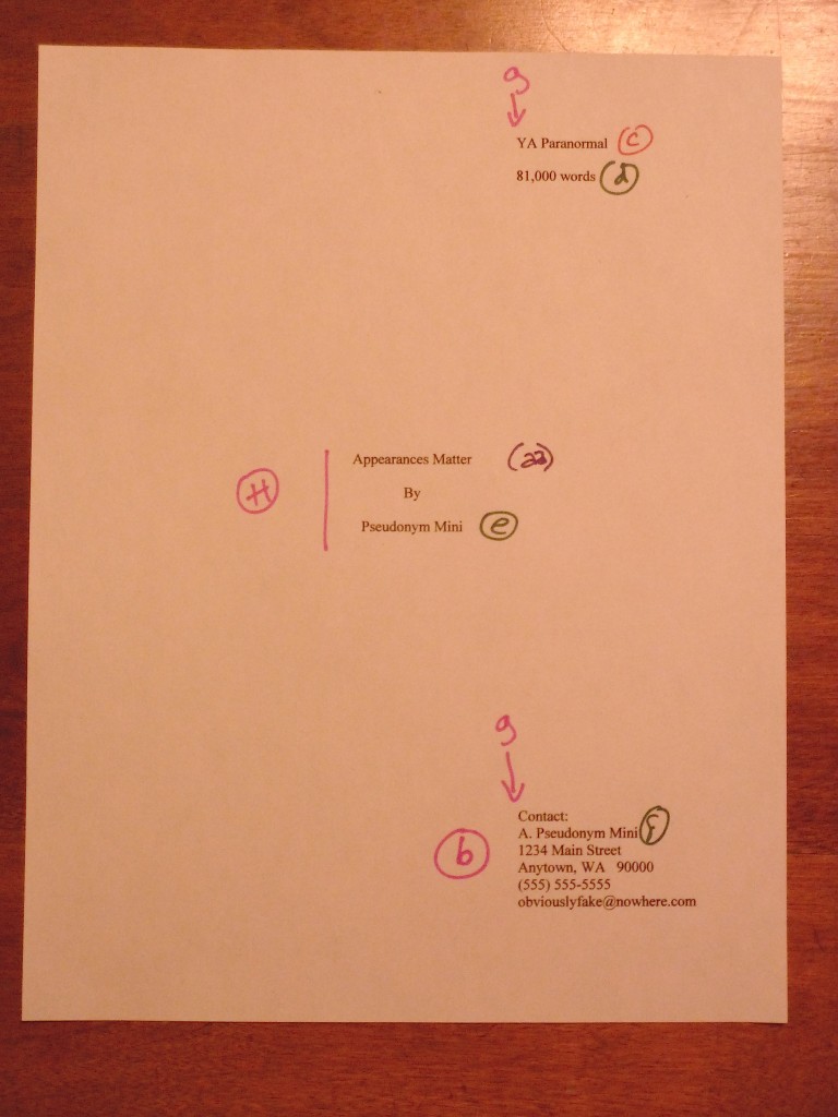
Or, to be a trifle more precise about it, this post will provide a guide to the professional manuscript page that will allow those new to it to navigate around it with ease. Let’s start by taking a peek at the first three pages an agent would expect to see in a manuscript, as the agent would expect to see it: the title page, page 1, and page 2.
Pretty innocuous presentation, isn’t it? (If you’re experiencing difficulty seeing the details, try holding down the COMMAND key and pressing + repeatedly to enlarge the images.) As we may see, book manuscripts differ from published books in many important respects. Some respects that might not be obvious above:
Book manuscripts should be typed or printed in black ink on 20-lb or heavier white paper.
I encourage my clients to use bright white 24-lb paper; it doesn’t wilt.
Manuscripts are printed or typed on one side of the page and are unbound in any way.
The preferred typefaces for manuscripts are 12-point Times New Roman or Courier.
No matter how cool your desired typeface looks, or how great the title page looks with 14-point type, keep the entire manuscript in the same font and typeface.
Due to the limitations of blog format, you’re just going to have to take my word for it that all of these things were true of the manuscript pages I am about to show you. I printed them out and labeled their constituent parts, so we could talk about them more easily. Then I slapped the result onto the nearest table, and snapped some glamour shots. The lighting could have been better, but here they are, in all their glory.
I’ll go into the reasoning behind including a title page in a submission (it’s a good idea, even if you’ve been asked to send only the first few pages) in tomorrow’s post, so for now, let’s just note what information it contains and where it appears on the page. A professionally-formatted title page presents:
A professionally-formatted title page should include all of the following: the manuscript’s book category (c), word count (d), author’s intended publication name (e), author’s real name (f), and author’s contact information (b).
Don’t worry; I shall be defining all of these terms in my next post.
The title and author’s pen name should be centered on the page. (h)
The book category, word count, and contact information should all be lined up vertically on the page. (g)
The easiest way to pull this off is to set a tab at 4″ or 4.5″.
Do not use boldface anywhere in the manuscript but on the title page — and even there, it’s optional.
As you may see here, I have elected not to use it. If I did, the only place where it would be appropriate is at (aa), the title.
Contact information for the author belongs on the title page, not page 1. (b)
Which is, of course, a nicety that would escape the notice of a submitter that believed that short story format (in which the word count and contact information are presented on page 1) and book manuscript format were identical. By including a title page, you relieve yourself of the necessity to cram all of that information onto the first page of a chapter. As you may see, the result is visually much less cluttered.
Every page in the manuscript should be numbered except the title page. The first page of text is page 1. (5)
In other words, do not include the title page in a page count.
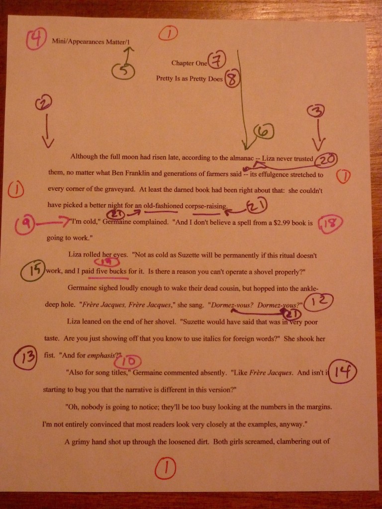
Everyone finding everything with relative ease so far? Excellent. In order to zoom in on (5), let’s take a closer look at the first page of Chapter 1.
Got that firmly in your mind? Now let’s connect the dots.
All manuscripts are double-spaced, with 1-inch margins on all four edges. (1)
Do not even consider trying to fudge either the line spacing or the margin width. Trust me, any Millicent that’s been at it a while will instantly spot any shrinkage or expansion in either. The same holds true of using any font size other than 12 point, by the way.
The text should be left-justified, not block-justified.
This one often confuses writers, because text in newspapers, magazines, and some published books is block-justified: the text is spaced so that every line in the same length. The result is a left margin and a right margin that visually form straight lines running down the page.
But that’s not proper in a book manuscript. As we see here, the left margin should be straight (2), while the right is uneven (3).
Every page of text should feature a standard slug line in the header (4), preferably left-justified.
That’s the bit in the top margin of each page containing the Author’s Last Name/Title/#. As you can see here, the slug line should be in the header — in other words, in the middle of the one-inch top margin — not on the first line of text.
The slug line should appear in the same plain 12-point type as the rest of the manuscript, by the way. No need to shrink it to 10 point or smaller; Millicent’s too used to seeing it to find it visually distracting.
The page number (5) should appear in the slug line and nowhere else on the page.
Another one that often confuses writers new to the biz: word processing programs are not, after all, set up with this format in mind. Remember, though, that the fine people at Microsoft do not work in the publishing industry, and every industry has the right to establish its own standards.
Every page in the manuscript should be numbered. The first page of text is page 1.
Do not scuttle your chances submitting an unpaginated manuscript; 99% of the time, it will be rejected unread. Yes, even if you are submitting it via e-mail. People who read for a living consider unnumbered pages rude.
The first page of a chapter should begin a third of the way down the page (6), with the chapter number (7) and/or title (8) centered at the top.
If the chapter does not have a title, just skip line (8).
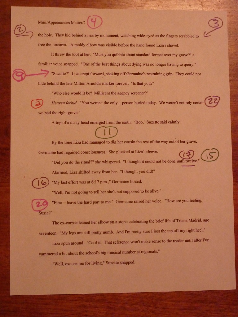
Is everyone comfortable with what we have covered so far? If not, please ask. While I’m waiting for trenchant questions, I’m going to repost page 2, so we may contemplate its majesty.
Awesomely bland, is it not? Let’s check out the rest of the rules.
The beginning of each paragraph should be indented .5 inch. (9)
Yes, including the first paragraph of each chapter, no matter what you have seen in a published book. The decision not to indent the first paragraph of the chapter rests with the publisher, not the writer; if you have strong preferences on the subject, take it up with the editor after you have sold the book.
It may seem counterintuitive, but the manuscript is not the right place to express those preferences. No formatting choice in the manuscript will necessarily end up in the published book.
That includes, by the way, an authorial preference for business format. If you happen to prefer non-indented paragraphs that force a skipped line between paragraphs, too bad. Which leads us to…
Don’t skip an extra line between paragraphs (10), except to indicate a section break. (11)
As we see here, section breaks are formed by skipping one double-spaced line. Do not indicate a section break by # # # or any other marker UNLESS you are writing a short story, article, or entering a contest that requires the inclusion of a specific symbol. (Check the rules.)
Words in foreign languages should be italicized (12), as should emphasized words (13) and titles of copyrighted works like songs (14). Nothing in the text should be underlined.
This one’s pretty self-explanatory, I think, except for the always-burning question of whether to italicize thought (as I’ve done here at a) or not. There is no hard-and-fast rule on this one: some agents like it, some consider it a narrative cop-out. Because its acceptability varies wildly between book categories, your best bet is to check five or ten recent releases similar to yours to see if italicized thought appears there.
If you ultimately decide to embrace the italicized thought convention, you must be 100% consistent in applying it throughout the text. What you should never do, however, is make the common mistake of both saying that a character is thinking something and italicizing it. To an agent or editor, this
I’m so frightened! Irma thought.
is redundant. Pick one means of indicating thought and stick to it.
All numbers under 100 should be written out in full: twenty-five, not 25. (15)
This one is not quite as straightforward as it sounds. As we can see in the text, dates, times, and currency is sometimes expressed as numbers. When a time is specific (16), it is written in number form, but a general time (17) is written out in full. September 4, 1832 is fine, but without the year, the fourth of September is correct. By the same token, a specific amount of money (18) is in numeral form, but a round number (19) is conveyed in words.
Dashes should be doubled (20), with spaces at either end, but hyphens are single, with no spaces. (21)
Why? So a typesetter can tell them apart. (Okay, so that made more sense when manuscripts were produced on typewriters. Humor Millie on this one.)
#22 is not precisely a formatting matter, but manuscript submissions so often misuse them that I wanted to flag it here. In American English (and thus when submitting to a US-based agency), ellipses contain only three periods UNLESS they come at the end of a quote that ends in a period. When an ellipsis indicates a pause in speech, as it does here at (22), there should not be a space between it and the words around it.
And that’s it! Unless an agency’s submission guidelines specify some other formatting preferences, you will not go wrong with these.
I shall now tiptoe quietly away, so you may study them in peace. Tune in tomorrow for more discussion of title pages, and, as always, keep up the good work!
P.S.: there’s a good discussion in the Comments section about formatting quotes and citations in manuscripts and book proposals.
If I am submitting via email and text is copy pasted into the email, how do you suggest coping with your preferred formatting for title page and chapter heading placements?
Also, if it is electronic submission only, in the form of .doc files, the title page and formatting for the chapters is still relevant?
I have no problem for printed submissions but just how much variation is acceptable for electronic? Do agents/publishers print up the submissions or read these digitally? Given the number of submissions would it not be too expensive for them to be printing 50 pages?
I formatted my electronic submissions with title of the book in the header and name, contact and page numbers in the footer. You’re going to tell me I messed up again, aren’t you?
If the agent asks for text to be pasted into an e-mail (much more common for queries than submissions, by the way), it’s usually because she wants to get a quick sense of voice; they seldom read more than a few pages this way. So don’t worry about any part of the formatting except making sure it is all double-spaced. Virtually every other formatting detail will disappear, and people that work in agencies are aware of that.
If the agent requests a .doc file in Word, however, formatting is very relevant, for all of the reason I discussed above. It doesn’t matter whether she asked for it to be sent via e-mail or not: this is where the writer shows he can present his work professionally.
So yes, it does sound as though you messed up a little. Will it be enough to ensure rejection? Probably not by itself; Millicent will in all likelihood simply read the submission with lower expectations, and thus be more likely to reject it. However, one does occasionally hear folks in agencies say incredulously, “You won’t believe it — I’ve just read an amazing book from someone that evidently doesn’t know anything about publishing!”
Which is, I’m afraid, how improper formatting looks to the pros. It doesn’t matter how it was submitted: a professionally-formatted page is a professionally-formatted page.
That being said, most published authors experienced a pretty sharp learning curve when they first began submitting. A great deal of what happens in the querying and submission process is counterintuitive, after all. The trick lies in learning from one’s mistakes and moving on.
Your question about whether they print up electronic submission is a good one, but the answer is that it varies. Quite a few agents screen on Kindles now. Even at agencies that do print them up, though, it’s customary for a screener to take a look at the first few pages of the manuscript first — as you may already know, the overwhelming majority of submissions are rejected on page 1. It wouldn’t really make sense to print up any that haven’t made it past Millicent’s initial scrutiny.
I love the way you wrote this article. This is wonderful. I do hope you intend to write more of these types of articles. Thank you for this interesting content!
As the number of entries on formatting is crowding quadruple digits, I hope I chose a fitting one in which to ask these questions. A few niggling points on format remain murky to me, even after your heroically extensive blogging on the subject.
I’m writing non-academic non-fiction. My book proposal is in process as I type, and I’m not sure how to handle these issues:
1) In quoting poetry, what’s standard on quotes within the body of a paragraph (as opposed to an offset section)? At the moment I’m running lines together in sentences, separating between each line with a slash that has a space on each side — if I don’t use the spaces, Word treats them as one long word that gets knocked off the end of the manuscript line. So: “There were no penalties that might instill / Dark fears, no menaces inscribed upon / Bronze tablets.” Is this correct?
2) I have both footnotes (for comments on the main text) and endnotes (for citations). Can I use 11-point standard font for the notes?
3) And of course, is there a standard for format of citations in the endnotes? I’m doing something like title, author (first, last), page numbers if applicable. Do I need publishing info in the citations, too? Can I use “ibid” for subsequent citations? Can I abbreviate a lengthy title after writing it out in full for the first use, and maybe even leave the author’s name off? (Instead of The Archetypes and the Collective Unconscious, C.G. Jung, p. –, just use Archetypes, p. –)
I actually have tons of other questions about this whole process, but that’ll suffice for now. Thanks!
This is a fine place to post this, Arcana, although I suspect that future readers might be more likely to find it under the FORMATTING QUOTATIONS FROM OTHER SOURCES under the NONFICTION heading. (Although, admittedly, I might not have gone to check that if you had not blamed my having written a great deal on the subject — broken up into many, many clearly-defined subcategories — for your simply asking these questions on the most recent formatting post because it was more convenient for you. If you’re going to justify that choice unnecessarily, I can think of more courteous ways to do it.) I might also post it under ACADEMIC WRITING, as most of the issues you cite are more common in academic nonfiction than in mainstream nonfiction.
It sounds as though you may be basing your expectations of what is and is not appropriate, rather than books published recently in your chosen book category. That in itself may prove problematic, as people in publishing have a keen eye for nonfiction proposers who have not done extensive market research. There’s no such thing as a generic nonfiction book, after all; like fiction, each type is aimed at a specific sub-market.
I bring this up not only because it’s highly unusual for a writer who isn’t either an academic or journalist to use either footnotes or endnotes in a book proposal, but because even in a published book, many readers find them intimidating or even annoying. I would strenuously advise running, not walking, to a well-stocked bookstore, pulling out 25 or 30 books similar to yours, and checking to see if any of them contain notes.
Assuming that they will for your particular subsection of the literary market, let’s move on to your questions.
1) The standard for any within-paragraph quotes is three lines of text; if it runs to four or more, it’s offset. For poetry, though, you tend to get a bit more leeway: it’s not unusual to see four or five short lines quoted in this manner.
However, the way you have presented it here is not correct — the spaces around the slashes are improper, no matter what Word does. (Contrary to astonishingly common belief amongst aspiring writers, there is absolutely no connection between Word’s standards and standard format.) It should read: “There were no penalties that might instill/Dark fears, no menaces inscribed upon/Bronze tablets.†If that causes Word to cut the line oddly, then it’s your responsibility to pick a logical place within the quote to hit the RETURN key.
2) Actually, 10-point is usually the default for footnotes, but you will want your endnotes to be in 12-point type. However, the differentiation you’re making here between comments and citation is not a recognized distinction, so most professional readers would find it confusing. There is no technical reason not to use the same notation style for both types of note.
3) It’s difficult to answer this question, because usually, manuscripts that contain such citations are written by academics, so they simply use the standard for academic articles: (Author’s last name, year of publication: page number) in the text, then a bibliography in the back. If you are not including a bibliography, you do need to cite the publishing data for the first citation. Thereafter, you may use Author’s last name, Abbreviated title, page #.
I’m confused by the question about ibid, however — why wouldn’t you be able to use it? Or are you concerned that you’re not using it correctly? I’m going to assume it’s the latter, because this is one that does often turn up wrong. Ibid is appropriate only if the source cited is the same as the one in the previous note. Thus:
12. Jung, Archetypes of the Collective Unconscious, 137.
13. Ibid, 152.
If, however, the reference is the same as the one immediately preceding it, then the proper notation is op. cit.. That means, basically, that you’ve cited it before.
12. Jung, Archetypes of the Collective Unconscious, 137.
13. Durkheim, Suicide, 382.
14. Jung, op. cit., 152.
All that being said, it’s highly unusual for a book proposal to contain either footnotes or endnotes, except in the sample chapter — and it’s unusual for a book to use both. Typically, authors choose one or the other.
Footnotes would be the better choice in a proposal. Even in the sample chapter, I would advise against using endnotes, for three reasons. First, virtually nobody in publishing will be willing to flip back and forth while reading the sample; it’s safe to assume that 99% of agents and editors simply would not read them at the proposal stage. Second, proposals are generally read very quickly, so an expectation that the reader would take the time to seek out an endnote may elicit some impatience. Third, it’s not unusual for agents to screen proposals on a Kindle or similar device. Both footnotes and endnotes would be visually distracting to anyone reading it in this manner.
For that last reason and one other, in your shoes, even if I planned to have notes in the book, I would sharply limit their use in the proposal. You’d be surprised at how many mainstream nonfiction agents harbor a prejudice against them: a book proposal is not, after all, a master’s thesis. Since the proposal has a section aimed at establishing the writer’s expertise, it’s seldom necessary to bolster that expertise in by citing other experts — something that often comes as a surprise to first-time nonfiction writers, who assume that heavy citations will make them seem more erudite.
Even in cases where the citations are for actual quotes (as appears to be the case here), the point of a proposal is to show that the proposer can write, not that other people can; quoting others, then, tends not to help the proposal’s case. In fact, if the quotes are lengthy and from works not in the public domain, using them may actually harm the proposal’s chances, since rights would have to be obtained for any quote longer than 50 c consecutive words.
Of course, every proposal is different; if you’re writing a book on Jung, obviously, you’re going to need to cite some Jung. I would strongly urge you, though, to give some serious thought to whether the notes are actually necessary at the proposal stage. After all, no one in publishing seriously believes that the format of the sample chapter will dictate the format of the eventual published book.
Anne, thanks so much for the reply. Yes, the FORMATTING QUOTES FROM OTHER SOURCES would have been a little more appropriate. The mention of an abundance of advice really wasn’t a dig; I’d much rather be the beneficiary of a little more rather than too little.
Thanks, I do know that there isn’t a generic non-fiction genre; I just didn’t find it relevant to mention the genre for these questions. I appreciate the recommendation to leave out the endnotes; it never occurred to me, honestly, and I’d be happy not to startle any readers of my proposal. I enjoy (limited) citations so that readers, not publishers, can follow up on more startling facts or assertions that an argument might hinge on. But that can come later in the process, obviously, if I’m lucky enough to get that far.
You’re welcome, Arcana — and actually, after having thought about the category issues a bit more, I added a few categories that might have helped you find the information faster. It’s a fine line, balancing between being specific enough in a category title to guide a reader in a quandary to the right post and adding so many categories that other readers just won’t begin to scroll through them. Best of luck with it!
Boy, do I know that feeling, NWH. Especially when I reeembmr my earlier novels and realize they probably were drivel! But after we’ve been writing for a while, we keep getting better as we polish our skills and hone our ideas.And I still reeembmr the very first time a couple of friends read a novel of mine and we got together to chat about it over dinner one evening. It was thrilling to know that they liked it but it was even more thrilling to hear my characters’ names on their lips. The characters had finally come alive, outside my own head, and felt so real that I could almost touch them.The friends didn’t just say they liked it, though. They also asked questions. Why did he do this at that point? That seemed a little odd. Or Did we already know about this/that, or does that need some explanation? This was very helpful, and made the novel much better once I had dealt with those things.I sometimes think the way people give their feedback is half the deal. Asked in the form of questions, over dinner, my friends’ feedback was very easy to take. But I also had someone sit me down after a later novel, simply listing all the things he thought were wrong with it. I was so discouraged that I didn’t pick it up again for six years.So the people giving the feedback do have to be careful how they do it too.
That’s so true, Aranzado, particularly the last part: first readers, particularly those who know only one writer, can sometimes scare a writer with feedback. But it’s also true that the overwhelming majority of aspiring writers don’t set parameters for feedback; they simply ask their kith and kin what they thought of the book. That’s far too broad a question to reliably yield useful feedback.
I know I’m 6 years late, but this is absolutely remarkable. I’m currently working on my first book, nonfiction, and need all the help I can get. I plan to write fiction sooner or later. I’ll be looking through all your posts over time. Thank you for taking the time to explain the manuscript process with both visuals and text.
And I’m unfortunately late in replying to your kind comment. Ginger! Thank you so much, and I hope that your writing projects have been going well!