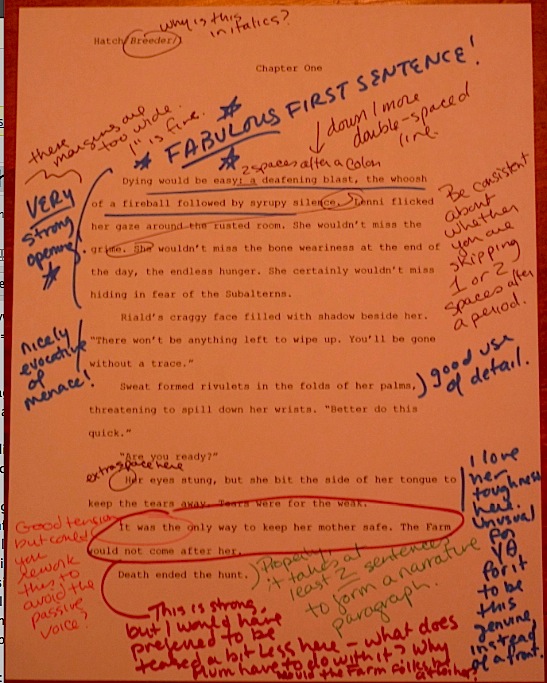
I’ve got a relatively short one for you tonight, campers: YA Natalie Hatch’s BREEDER, first-prize winner in Category II: YA. I’m fond of this entry, perhaps because Natalie had me by the end of the first page of her brief description: the tale of a runaway girl who takes up with a crew of space pirates.
What’s not to like, really?
Should the length of this post be seen as in itself a commentary upon Natalie’s first page? Well, yes and no. No, because I’m hurrying through our ongoing praise/critique fiesta on the winning entries in the Author! Author! Great First Page Made Even Better Contest — the reason I am posting twice today, to make sure that we get through them all before Synopsispalooza begins on Saturday. And yes, because today’s winning page does not offer all that many gaffes to point out.
That’s a good thing, of course, and perhaps not an altogether surprising one. Since entries closed for this contest, Natalie tells me, BREEDER won the YA category in an Australian children’s and YA writers’ competition. So were I to devote this post entirely to praise and skimp on the critique, I doubt anyone would blame me.
But that’s not really my style, is it? I’m here to milk these marvelous first pages for all of the discussion value I can.
A little praise to start out, however: Natalie’s book definitely has a great premise, an interesting protagonist in an interesting situation, facing a genuinely difficult conflict. In YA, that last is not a foregone conclusion: as our old pal, Millicent the agency screener would be only too glad to tell you, many, if not most, YA submissions feature relatively low-stakes conflicts.
Oh, what’s going on may feel like the end of the world to the protagonists of these novels, but the actual consequences of their actions, even in a worst-case scenario, are often as low as oh, no, my parents might find out. Not that there haven’t been interesting YA plots with this as the most horrifying imaginable outcome, but still, you can understand why a Millicent who screens YA queries and submissions all day, every day might conceivably long for something a bit more dramatic.
The book description for BREEDER will definitely make her sit bolt-upright in her chair. The stakes could hardly be higher for the protagonist:
The Farm needs Breeders, young girls drafted into two years of human egg production for the benefit of rich, but infertile, inner worlds. Lenni Nichols would rather die than receive the riches that await her at the completion of compulsory service. Unfortunately, faking her own death, disguising herself as a male and getting off world is harder than it looks. When Lenni signs on as an engineer to a scavenger vessel, she hopes most of her worries are over. Besides, all she has to do is hide from The Farm’s bounty hunters until the two years are complete and she will be free. Instead, she is plunged head-first into the treacherous life of space pirates. Faced with betrayal, love and loss, Lenni must overcome her own weaknesses in order to survive. She allows vengeance to taint her life and is almost consumed by it, straddling the fine line separating vigilante and villain.
Admit it — you’re already imagining the treacherous life of space pirates, aren’t you?
So am I, and yet, as a longtime reader of adult SF and fantasy, this plot does remind me a little of Octavia Butler’s superlative trilogy, XENOGENESIS, where human women are forced to become breeders for an alien-human hybrid race. Some resisters do in fact planet-hop, flee for their lives against incredible odds, etc., but biology turns out to be destiny in some very unexpected ways.
Given the subject matter here — delightfully original for a YA novel, as the judges kept pointing out to one another — the comparison may be unavoidable. However, I, for one, am not any the less eager to read Natalie’s work for reminding me of Octavia Butler’s.
Again, what’s not to like?
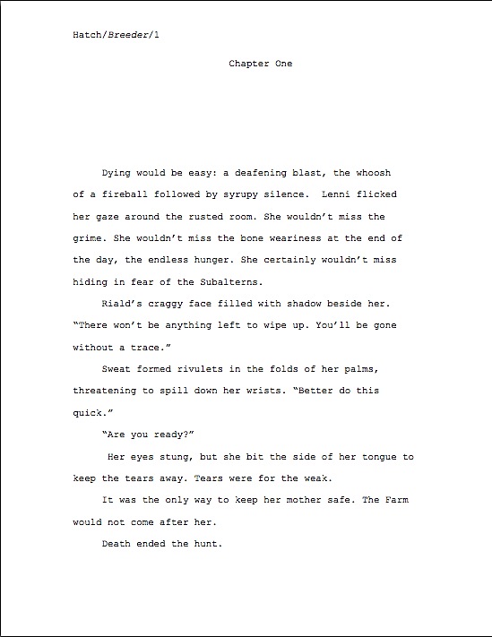
As the pros say, though, it all depends upon the writing. As it happens, that writing is quite good:

I ask you, however: had you not already read the book description, would you have thought of that grabber of a first page as YA? Or would you have focused instead on the subject matter and categorized it as science fiction?
Give that matter a bit of thought, please. Before I give my opinion on the subject — and the judges’ — I want to slip a word in edgewise about my favorite editorial obsession, manuscript format.
Oh, didn’t you catch the formatting problems in the page shot above? Why don’t you go back and take a closer, Millicent-style look? I’ll wait. (If you’re having trouble seeing specifics, try holding down the COMMAND key and hitting + in order to enlarge the image.)
Need a hint? Okay: there are five formatting problems here, one major and four minor. Need a better hint? We saw a very similar major problem in one of the first prize-winning entries in the Adult Fiction category.
If you have been jumping up and down for the last two paragraphs, shouting, “I know! I know! The left and right margins are too wide!” give yourself a gold star. (I’ve been saying that enough throughout this series that I feel as though I should start including downloadable gold stars in my posts.) They are indeed too wide, by U.S. submission standards: 1″ on all four sides is the norm.
Natalie’s page has 1.25″ margins on the left and right, 1″ margins above. While, as I mentioned yesterday, super-wide margins actually are very nice from an editorial perspective — so much more room for scrawling commentary! Be still, my beating heart! — they are not what Millicent has been trained to expect. Also, they throw off the word count estimate terribly.
Perhaps even more serious from a submission perspective (and definitely more serious if Natalie should decide to query an agency that permits the inclusion of the opening page in her query packet), widening the margins also decreases the amount of text she can include on page 1. And why might that be problematic, campers?
If you cried out, “Because the majority of submissions are rejected on page 1, Anne,” well, you probably already have a closet full of gold stars by now. But well reasoned, anyway.
To show those of you strapped for space just how much more room, here is Natalie’s first page, reformatted. To buy her even more room to wow Millicent, I switched the typeface from Courier New to Times New Roman.

Did you catch the four minor problems, now that I’ve fixed them? All of them would have been easier to catch in hard copy than on a computer screen (if you were already murmuring, “Read every page I’m planning to submit to an agency IN HARD COPY, IN ITS ENTIRETY, and OUT LOUD,” good), but the changes are apparent, if you look for them. In the order they appeared in the original:
1. The title of the book was italicized in the slug line.
2. Not enough space between the chapter heading and the first line of text.
3. The text is not consistent about whether it is going to use 2 spaces after a period or just 1.
4. Line -5 began with a space, not a letter.
Of these, #3 is far and away the most common in submissions. Before the rise of the Internet, and thus before public squabbles about whether it was time to jettison the second space after a period (it is never correct to use only a single space after a colon), it was quite rare to see inconsistent inter-sentence spacing: everybody just hit the space bar twice, and that was that. Now, however, since some agents call for one space and some for two, aspiring writers seem to have become confused, sometimes doing it one way, sometimes another.
This solution is unacceptable to neither party. Whether you decide to embrace the double-space convention (correct, but annoying to the small-but-vocal single-space minority) or the single space (pleasing to enthusiasts, but annoying to everyone else), you must apply it consistently throughout your manuscript.
Yes, even if you do the prudent thing and format your manuscript as single-spaced for agents who request it that way, and double-spaced for everyone else. As with all formatting, doing it sporadically will only make your manuscript look confused.
Now that we have those nit-picky-yet-vital formatting issues out of the way, we can return to the question of voice. Clearly, this voice works for this story, but it is YA? If so, what makes it YA, as opposed to the same story aimed at adult readers?
Frankly, I think it depends upon whether this page 1 lands in a YA-representing agency, one that does exclusively adult fiction, or both. Setting the issue of voice-appropriateness aside for the moment, look how Millicent responds to this opening:

Personally, as an editor, I might have asked a few more follow-up questions than Millicent: how can silence be syrupy, for instance, a word usually associated with saccharine expressions of emotion? If it’s meant literally here (and, from the context, I suspect it is), how could enough of our heroine be left after an explosion to deserve the descriptor syrupy? What are the ages of these two characters? What is their relationship? Why does her suicide benefit her mother?
But as a reader, I would definitely been have been willing to turn the page in order to find the answers. Turn the page being the operative phrase here, right?
Most submissions are, after all, rejected on page 1. Which is precisely why the question of age-level appropriateness is so crucial in this case: if a YA-seeking Millicent sees this as adult-aimed — or, even more dangerous, adult-themed — writing, she may well reject it, regardless of how it is labeled.
I see some knitted brows out there. “But Anne,” some readers pipe up, “I don’t understand why you’re making such a big deal about this. A single narrative voice might well appeal to both teens and adult readers. What’s the big deal?”
The big deal, if you were not sufficiently frightened by the prospect of Millicent rejecting this page on voice-appropriateness grounds, is that this is going to be a tough premise to sell to YA booksellers, school librarians, and other adults responsible for determining what books are available to young readers. Traditionally, reproductive issues have not been all that popular with these adults as subject matter for teens; selling girls’ reproductive capacity might then reasonably be regarded as even trickier to convince an angry parent should be in a high school library.
I’m bringing this up because the voice on this page could very easily be tweaked in order to gear this story to adults. Had the reader been given some reason to believe one or both of the characters in the first scene were teens, that might not be possible, but in the absence of any reference to age, as it stands, there’s nothing about the voice, vocabulary, or even the protagonist that just screams YA voice.
Frankly, the judges engaged in some debate about whether this would have worked better as adult fiction. I was not the only judge to bring up Octavia Butler; the main (only, really) female character in William Gibson’s NEUROMANCER was also mentioned, but that seemed like a bit of a stretch. Most of us felt that this plot and this first page could make it in the tough adult SF market, although when the book description was added to the mix (particularly the part in the contest entry that said the target market was age 15 and up), the consensus was that this first page could also work as YA.
But there was a problem with that formulation: while readers aged 15-21 are technically part of the YA market, in practice, even older YA tends to be aimed at 13-year-olds. And there’s a good reason for that, especially for SF or fantasy — readers above that age are often already fairly deeply into adult fiction.
So what precisely is the difference between writing for Natalie’s intended target audience and for adults?
The usual answer — and one I do not like very much, on general principle — is that if the protagonist is an older teenager (say, around the age of the target market for this book), and female, the book must be YA, because (the logic runs) only a teenage girl would care about a teenage girl protagonist. (Cough, cough.) If, on the other hand, the protagonist is an older teenager and male, whether the book is YA or not depends entirely upon the situation and the writing.
Why? Hold onto your hats, ladies: because both male and female readers are more used to identifying with male protagonists.
Had I mentioned that I dislike this argument? It pops up all the time in literary fiction circles; the same story that with a male protagonist would be marketed as LF might well be steered toward the YA market if it’s about a girl. Rather than hash out that grand debate, though, let’s get back to Natalie’s first page.
Ultimately, the judges decided to take the writer’s word about the target audience — and happily, there is nothing on this page (barring the subject matter itself, which will be an insuperable barrier for some parents) that would rule it out as a YA voice. For a writer harboring sophisticated expectations of her readership, that was a savvy choice.
Given the subject matter, though — reproduction-for-sale has not historically been parents of teenagers’ rush-out-and-buy-it topic for their progeny — I would advise erring on the side of divulging too much about these characters on page 1, rather than too little. Even an oblique reference to age, perhaps accompanied by some expression of feeling toward the protagonist’s mother, might well land this opening firmly in the YA camp.
Although for YA, the nagging question will remain, unavoidably: did the mother sell our heroine into reproductive indentured servitude? Followed closely by: since subaltern is generally just a descriptive term for someone at a lower level in an organization, why is the word capitalized here?
For the answers to these and other burning questions, of course, we must turn to the rest of the book. Which, naturally, was impossible for the contest’s judges — and for the rest of us, until we may purchase it in a bookstore. By then, presumably, the book category issue will have been resolved by the person with the ultimate say: the acquiring editor at a publishing house.
Congratulations on a fine job, Natalie; congratulations on both contest wins. As always, keep up the good work!
I don’t really care what genre it is given. I want to read it. Great job, Natalie.
Anne, thanks for the comments about the genre issues. It helped!
I want to read more now!
I’m going to play devil’s advocate on behalf of those contestants who have opted to use margins wider than one inch. If they have been following other standard format guidelines, I believe many of them say, “margins of at least one inch,” which I would interpret to mean that wider margins are acceptable. I’ve also seen submission guidelines specifying inch and a quarter or even inch and a half margins. However, I’ll stick with the inch margins unless I should be submitting to one of these agencies/ independent publishers.
On another note, I too would like to read this and the other stories that this contest has teased us with.
Dave
That’s true, Dave, although in my experience, the at least advocates are not actually trying to elicit margins wider than an inch — they’re trying to make it plain that they will not read a submission with anything less than that. A rather passive-aggressive way to make the point, admittedly, but it usually works.
Thanks so much Anne and judges for helping me improve my story. I now print out everything and read it out loud (cheesy grin). Your blog is such a wonderful resource, I’m slowly making my way through.
Thanks Dave, Christie and Deb for the kind words.
Such powerful descriptions, Natalie!
Thanks, Anne. I appreciate all the advice I can get. And thanks to the judges.
Sorry about the slow posting on some of these comments, folks — my spam filter seems to have decided that anyone with a photograph is inherently suspicious. Working on correcting that misconception…
Thanks for spotlighting Natalie’s first page.
Since Natalie knows I’m a huge grrl space pirate fan, she kindly let me glom her manuscript. Wicked fun story full of action, cosmic adventure, and memorable characters.
I’m looking forward to the day I can buy it for my daughter. *Looks at agents and publishers while impatiently tapping foot*
Ooh, I’m jealous, Heather. Keep right on glowering in the pros’ direction!
Funny thing. Although I liked the first page, the opening words, “Dying would be easy,” struck me as so trite and overused that my immediate response was, “Next!”
Otherwise, Anne, I’m right there with all of your comments. I did overlook the italics in the slug line because I wasn’t looking at hard copy.
I do have a question about something that’s probably irrelevant. The original uses “smart quotes” while your version doesn’t. Is there any preference about that?
No, there is absolutely no preference about the quotation marks, Doug. I don’t normally write about this issue — which has come up several times in the past, by the way — this is the kind of word processing-invented conundrum that aspiring writers squander their time worrying about instead of devoting their energies to improving their writing. Just because it’s possible to do something in Word doesn’t mean it is relevant to standard format.
Based on your last two comments, however, I think you may have misunderstood my point in discussing the winning entries at such great length. The point of this series was not to invite universal criticism of the texts themselves: even had the judges not already critiqued these first pages pretty thoroughly already, if I had been seeking negative examples, I would not be posting the best entries, right? My hope for this series was to engender productive discussion about the concepts these pages illustrated, as well as to demonstrate technique in different kinds of writing.
As I mentioned in response to your last — and, indeed, throughout this series — what works in one book category will not work in another. You clearly are not a YA fan: duly noted. While naturally it’s interesting to share one’s opinion about writing in categories one does not habitually read, it is possible to do so in a polite and constructive way.
As a general rule, specific, substantive objections tend to be more useful to writers than blanket thou-shalt-never rules. As a professional feedback-giver, I know from experience that I don’t like this or I would not have written it this way do not help aspiring writers improve their writing.
So while I would prefer that we talked about the content of the post, rather than whether the judges’ collective opinion of these pages was correct, if we could keep feedback constructive and upbeat, I think the discussion would be better. Thanks!
YA or no, I’d turn to your page two zippy quick, Natalie. And what a clever title. I can imagine this appealing to scads of readers.
I’m amazed at how each of these entries create such varied prose, and I’m drawn in nearly every time.