

Before I launch into today’s installment in our ongoing series on manuscript formatting, I’m delighted to announce some good news about a long-time member of the Author! Author! community: the ever-fabulous Joel Derfner, author of the genuinely hilarious and moving memoir SWISH: My Quest to Become the Gayest Person Ever and What Happened Instead has a new musical opening off-Broadway tonight! Here’s the skinny:
Signs of Life is about a girl coming of age in Theresienstadt, the Czech town the Nazis set up as a propaganda ghetto to show the rest of the world how well Hitler was treating the Jews. Theresienstadt was filled with artists, musicians, and intellectuals; there were nightly concerts, there were swing bands, there were operas, there were enough instrumentalists to fill two symphony orchestras. So a piece of musical theater seemed like a natural fit.”
Sounds fascinating, Joel, and congratulations! Tickets are available at Ovationtix; an unusually reliable little bird told me that throughout the month of February, if you use the promotion code HOUSE, you can get two tickets for the price of one.
I just mention. Back to business.
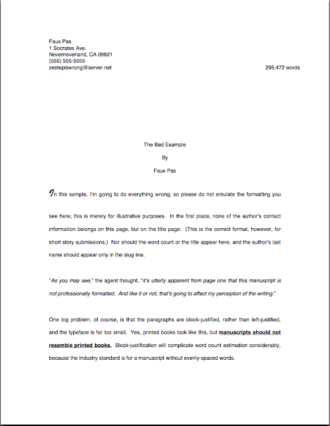
Last time, I showed how the first page of text does not, from a professional perspective, make an adequate substitute for a title page. Instead of being a replica of a hoped-for book cover, as many submitters produce, or a shouted-out declaration of the book’s title and who wrote it, the properly-formatted title page is a quiet, practical piece of paper, containing a specific set of marketing information.
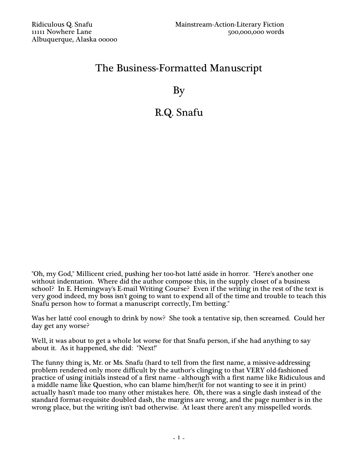
That is not always the purpose a title page serves in a submission, alas — if, indeed, the submitter is professional enough to include a title page at all. As I pointed out last time, some writers attempt to consolidate the proper functions of the title page and first page of text into a single sheet of paper. This formatting choice is particularly common for contest entries, for some reason. To get a sense of why this might be problematic, let’s take another look at R.Q. Snafu and Faux Pas’ submissions from yesterday:
While such a top page does indeed include the requisite information Millicent or her boss would need to contact the author (although Faux Pas’ does it better, by including more means of contact), cramming it onto the first page of text doesn’t really achieve anything but saving a piece of paper. It doesn’t even shorten the manuscript or contest entry, technically speaking: the title page is never included in a page count; that’s why pagination begins on the first page of text.
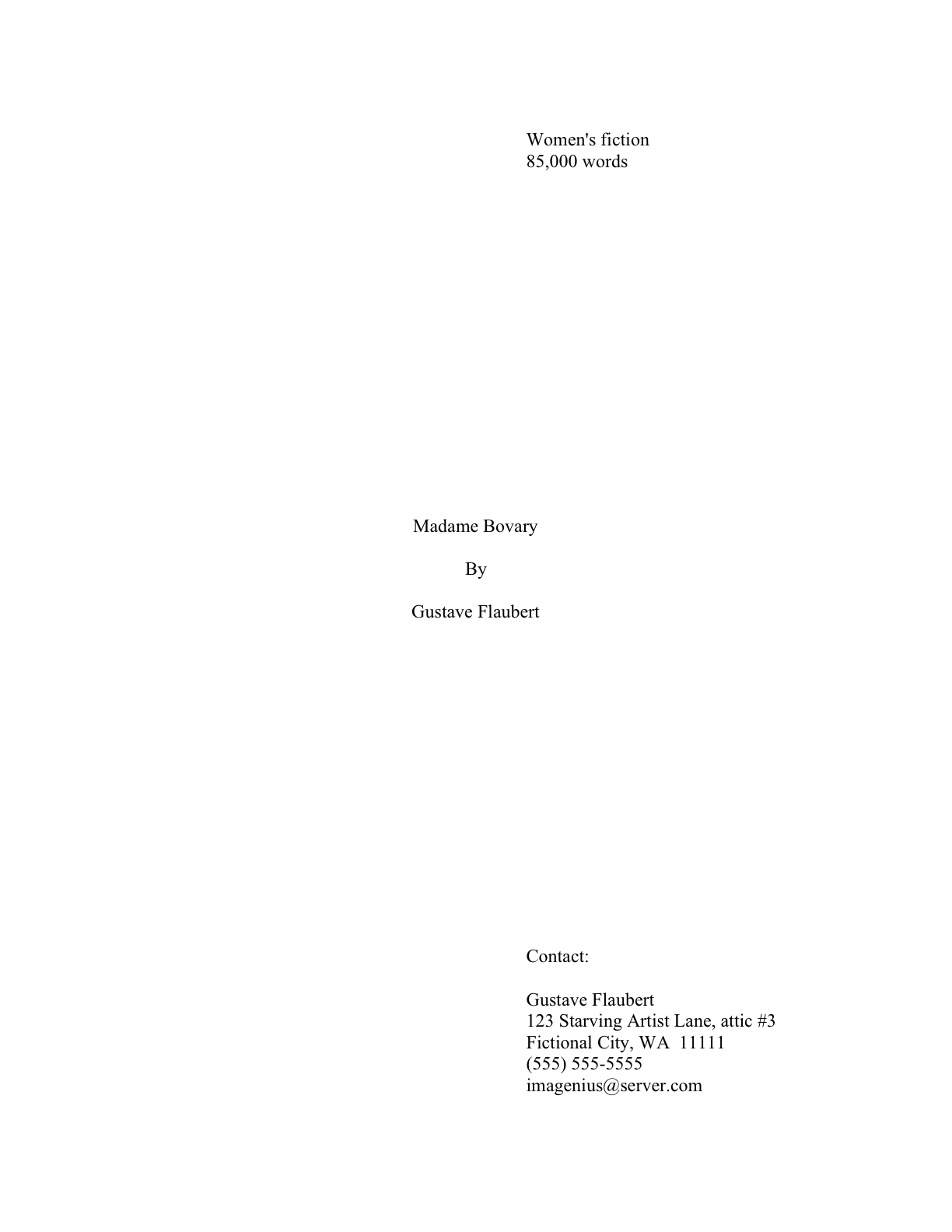
So what should a proper title page for a book manuscript or proposal look like? Glad you asked:
Got all three of those images indelibly burned into your cranium? Good. Now weigh the probability that someone who reads as many manuscripts per day as Millicent the agency screener — or her boss, or the editor to whom her boss likes to sell books — would NOT notice a fairly substantial difference in the presentation. Assess the likelihood of that perception’s coloring any subsequent reading of the manuscript in question.
The answer’s kind of obvious once you know the difference, isn’t it? Isn’t it?
No? Okay, take a gander at another type of title page Millicent often sees — one that contains the right information, but is so unprofessionally formatted that the care with which the writer followed the content rules gets entirely lost:
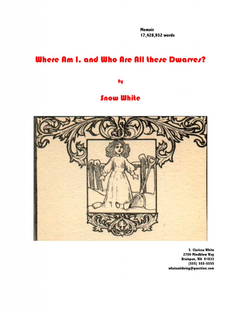
Where should I even begin with this one? It’s pretty, undoubtedly, but would anyone care to start listing any of the five things wrong with it?
If you immediately zeroed in on the picture, give yourself a gold star for the day; since there is literally no chance that any image a writer chooses to place on a manuscript or proposal’s title page will end up on the published book’s cover (the usual rationale for including them at this stage), decorating your submission’s title page with photos or drawings will just seem bizarre to Millicent. (And that goes double for Mehitabel, the veteran literary contest judge.)
Award yourself two gold stars if you said Ms. White should nix the red lettering — or any lettering that isn’t black, for that matter — or that her contact information should not have been centered. Pin a great big blue ribbon on yourself, too, if you also pointed out that Ms. White used two different typefaces here, a classic standard format no-no. Not to mention the fact — although I do seem to be mentioning it, don’t I? — that the type size varies.
I feel a rule coming on: like everything else in the manuscript, the title page should be entirely in 12-point type. It should also be in the same font as the rest of the manuscript.
With the usual caveat: unless an agent specifically requests otherwise, of course. Or contest’s rules; double-check for title page restrictions, which are quite common.
Otherwise, you may place the title in boldface if you like, but that’s it on the funkiness scale. No matter how cool your title page looks with 24-point type or the picture you would like to see on the book jacket, resist the urge, because Millicent will be able to tell from across the room if you didn’t.
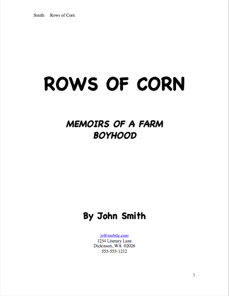
Don’t believe me that size matters? See for yourself:
Quite a difference, isn’t it? Apart from Mssr. Smith’s tragic font choice and his not having countermanded Word’s annoying propensity to reproduce e-mail addresses in blue ink, did you notice any potentially-distracting problems with this title page?
If you said that it included both a slug line (the author’s name and title in the upper right margin of the page) and a page number in the bottom right corner, snag yourself yet another gold star from petty cash. Add whipped cream and walnut clusters if you mentally added the reason that those additions are incorrect: because the title page is not the first page of text, and thus should not be formatted as if it were.
Nor should title pages be numbered. This means, incidentally, that the title page should not be counted as one of the 50 pages in those 50 pages the agent of your dreams asked you to submit, either. Nor would it count toward the total number of pages for a contest entry.
That loud whoop you just heard was contest-entering writers everywhere realizing that they could squeeze another page of text into their entries.
Before I sign off for today — and while you’ve got title pages on the brain — let me briefly address incisive reader Lucy’s observation on today’s first example. Specifically, here’s what she had to say when I originally introduced it yesterday:
You mention initials being a gender-less faux-pas… what if you have a weird name which is gender confusing? Say a boy named Sue? Should he put Mr. Sue Unfortunate on his title page? Or just Sue Unfortunate?
Lucy’s responding, of course, to the fine print on R.Q.’s first page. Here it is again, to save you some scrolling:
I was having a little fun in that last paragraph with the still surprisingly common writerly belief that the agents and editors will automatically take a submission by a woman more seriously if the author submits it under her initials, rather than under her given first name. J.K. Rowling aside, this just isn’t true, at least in fiction circles.
In fact, in North America, women buy the overwhelming majority of novels — and not just women’s fiction, either. Literary fiction readers (and agents, and editors) tend to have two X chromosomes — and some of them have been known to prefer reading books by Susans rather than Roberts.
Again, I just mention.
So unless you have always hated your parents for christening you Susan, you won’t really gain anything professionally by using initials in your nom de plume instead. Go ahead and state your name boldly:
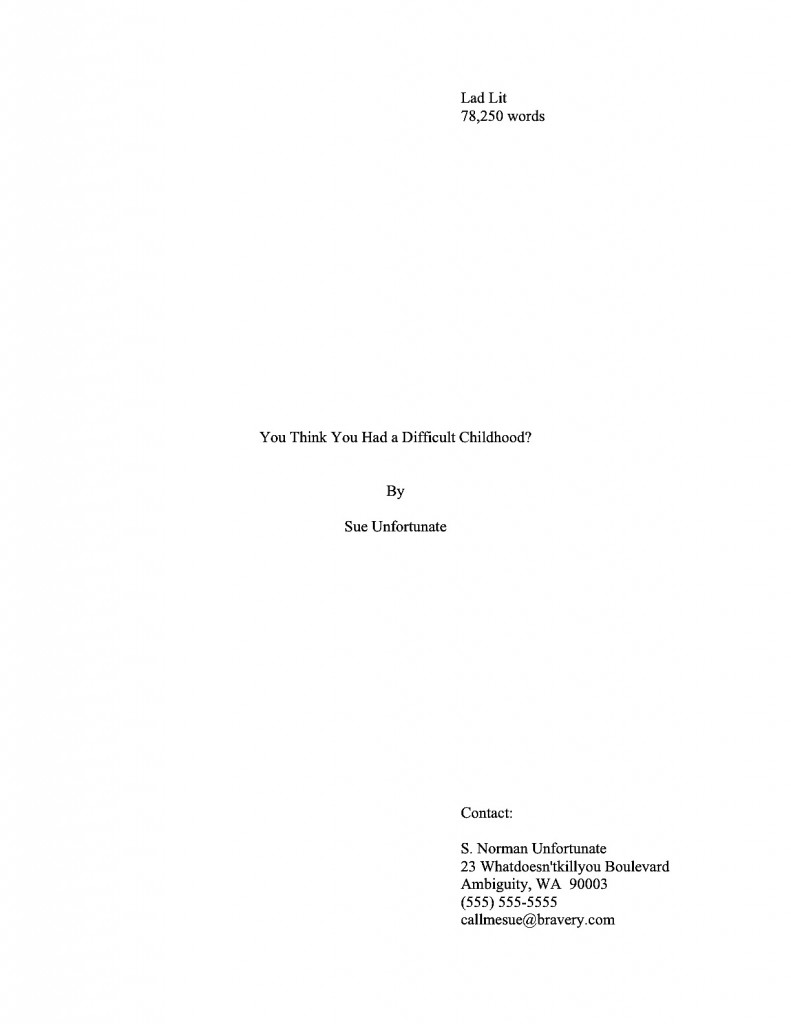
Even better, why not publish under a name you actually like instead? That’ll show your Susan-loving parents.
I just ruffled a few feathers out there, didn’t I? “But Anne,” I hear an initialed purist exclaim, “I don’t want to be judged as a female writer; I want to be judged as a writer. What’s wrong with removing gender markers altogether from my title page — or my query letter, for that matter?”
Well, there’s nothing wrong with it per se, Susan, except that these days, it almost invariably results in Millicent’s seeing such initials and murmuring, “Oh, this is a female writer who doesn’t want to be identified as one,” rather than “Gee, I wonder who this mystery person without a first name is. I’m just going to leap right into this manuscript with no gender-based expectations at all.”
Why will Millie have this reaction, you ask? Because female writers — and with a few notable exceptions, almost exclusively female writers — have been submitting this way for a couple of hundred years now. It’s not all that hard a code to crack.
Historically, the hide-my-sex-for-success strategy has been used far, far less by male authors — except, of course, that hugely prolific and apparently immortal author, Anonymous, and the reputedly male writers of such ostensibly female-penned classics of wantonness (avert your eyes, children) as THE HAPPY HOOKER and COFFEE, TEA, OR ME?. Even during periods when the most popular and respected novelists have been women (and there have been quite a few in the history of English prose, contrary to what your high school English textbook probably implied), when someone named Stanley Smith wrote a novel, the title page has generally said so.
Because, you see, even back then, readers would have assumed S. Smith the novelist was a nice lady named Susan. It’s probably where your parents got the idea to christen you that.
All that being said, the choice to initial or not is entirely up to you — or, more accurately, to you and your agent. Some sets of initials look cool in print, just as some names look better than others on book jackets.
Or so claimed my father, the intrepid fellow who demanded that the maternity ward nurse convey him to a typewriter to see how my name looked in print before committing to filling out my birth certificate. You know, to see how if it would look good on a book jacket. So for those of you who have wondered: however improbable it sounds, Anne Mini IS in fact my given name; it just happens to look great in print, thanks to a little paternal forethought.
All of that, of course, is preliminary to answering Lucy’s trenchant question, which is: how on earth does a writer with a gender-ambiguous name delicately convey whether s/he would prefer to be addressed as Ms. or Mr.? Actually, s/he doesn’t, at least on the title page, or indeed in the query letter; that’s a matter for subsequent conversation with the agent. At worst, the agent will call and ask for Ms. Unfortunate; you can live with that, can’t you, Susan?
Besides, unless a writer’s gender is crucial to the story being told, why should it come up before then?
See earlier commentary about being judged by one’s writing, not one’s gender. But if a writer is genuinely worried about it, s/he could always embrace Sue’s strategy above, and use a more gender-definite middle name in the contact information.
And keep your chins up, Susans everywhere — you may have little control over what literary critics will say about your work, but you do have control over what name they call you. That’s worth something, isn’t it?
Keep up the good work!
Haha! Thank you, Anne!
PS I give you fair warning that I am stealing the title “Where am I…” by Snow White. I’ll thank you in the credits!
You’re welcome to it, Lucy! I just love seeing my name in acknowledgments.
In my somewhat limited contest entry experience, I’ve discovered at least one that does not want a title page. I’d sent my entry via e-mail and was asked to re-submit in RTF vs. DOC, and to NOT include the title page.
I suppose it is like a lot of the “standards,” in that everyone or every organization has his/its own.
Dave
That’s so interesting, Dave — that probably means that you were using a more recent version of Word than the contest was. And since I know you to be a most conscientious reader of contest rules, shame on that contest for not making its standards clear up front!
The rules did state RTF so that was my error. They did not say anything about not including a title page, and having been informed that one should ALWAYS include a title page, I did so. Indeed, the rules should have specifically mentioned that one was not to be included.
Dave