Okay, I’ll cop to it: I get carried away sometimes by good questions from readers. Clearly, those of you who have been hanging out here at Author! Author! for a good, long while have gotten used to that, for not a single one of you raised your paws into the air to point out, “Excuse me, Anne, but is was there some clever explanatory strategy behind your doubtless well-justified decision to devoting a post to how to handle subtitles on title and manuscript pages before we revisited the logic behind including a title page in a submission at all?”
I appreciate your delicacy, but honestly, I had completely forgotten that I had not yet covered title pages in our most recent foray into standard format for book manuscripts. I’m going to be devoting the next couple of days to rectifying that oversight.
I hear the ether resounding with moans of frustration at how much there is to learn about presenting your work as our old pal and nemesis, Millicent the agency screener, expects writing ready to hit the big time to appear on the page, but honestly, I don’t make the rules; I only explain them for the benefit of those new to the game. Try to think of it as inoculation with professional formatting know-how. It may have left a bit of a sore place, but much better a one-time sting than engendering years of rejection without knowing why, I always say. Once you’ve gotten exposed to the correct way to format a book manuscript, chances are that you’ll be immune to formatting problems in the future.
Why, yes, I have run that metaphor right into the ground. How kind of you to notice.
I have an excellent reason for hammering on it so hard, however: one of the great fringe benefits of inoculation is that, as unpleasant as it may have been at the sticking-point, so to speak, the stuck usually doesn’t have to think all that much about smallpox or whooping cough for quite a long time afterward.
So too with standard format for book manuscripts — once a writer gets used to how a professional submission is supposed to look, everything else is going to look wacky. Seriously, it’s true. As I have been threatening imploring you to believe promising you repeatedly every few minutes while running through the standard format strictures, once you get used to how a professional manuscript is put together, any other formatting is going to feel downright…odd.
Which is, in case you were wondering, why any Millicent worth her salt can distinguish between a professionally-formatted manuscript and one that shouts from the rooftops that the writer has not yet invested the time to familiarize himself with how the publishing industry works. She can spot a deviation from standard format from seven feet away.
Why? Feel free to chant it with me now, those of you who have been following this series — because every single manuscript her boss, the agent of your dreams, sends out to editors at publishing houses looks the same. By an elegant extension of logic, she could reasonably conclude that taking on a new writer clearly unaware of the demands of standard format would require more work for the agency than one who has been savvy enough to learn the ropes . Or, as agents like to put it, a writer serious enough about getting published that she’s bothered to do her homework.
It really does behoove an ambitious aspiring writer, then, to learn to look at a manuscript as a literature-loving but time-strapped Millie with 52 submissions to screen between now and lunchtime would. To that end, I shall be sliding in front of your astonished eyes pages that follow the rules right next to ones that don’t, for side-by-side comparison purposes.
That way, you’ll learn to tell which is which on those numerous future occasions when I don’t happen to be standing next to you, whispering in your ear. (In my editorial experience, writers on a deadline tend to work better with minimal disembodied murmurings. You’re funny that way.)
But before I launch into it, let’s hear it for the usual caveats: what I’m about to show you relates to books, book proposals, and other occupants of query or submission packets only, folks. At the risk of repeating myself (and repeating myself and repeating myself), standard format for manuscripts is just that, a set of guidelines for how book submissions should be formatted, not short stories, screenplays, poetry, magazine and newspaper articles, or anything else. If you’re looking for formatting tips for any of the latter, run, don’t walk, to consult with those knowledgeable souls who deal with that kind of writing on a day-to-day basis.
Yes, Virginia, I have mentioned this before, and recently. I shall no doubt mention it again: I’m constantly meeting aspiring writers who believe, mistakenly, that writing is writing, and thus all of it should be formatted identically.
That’s just not the case — and no, arguing with me about it will not change that fact. Out comes the broken record:
 Please recognize that not everything that falls under the general rubric writing should be formatted identically. Book manuscripts should be formatted one way, short stories (to use the most commonly-encountered other set of rules) another.
So if your favorite source — other than yours truly, of course — tells you to do something diametrically opposed to what I’m showing you here, may I suggest double-checking that the other source is indeed talking about book manuscripts and not, say, submissions to a magazine that accepts short stories?
I hate to burst anyone’s bubble, but contrary to popular belief, submission standards differ by type of publication. Yet surprisingly often, those giving practical to aspiring writers will conflate the format for, say, short stories, one with that for book manuscripts, resulting in a first page that will look incorrect to either. (Although, generally speaking, such guidelines tend to stick closer to the short story format than to the book.)
A word to the wise: if you have encountered conflicting bit of advice on the Internet — and if you’ve done even the most minimal search on the subject, I’m sure you have — consider the source. If that source does not make a distinction between book and short story format, or doesn’t seem to be aware that all professional manuscripts are not the same, be wary.
Everyone clear on that? Good, because I wouldn’t want any of you to be submitting articles to magazines using the format we’ve been discussing with such vim.
Caveat #2: as is always an excellent idea before you even consider submitting to any given agent, editor, or contest, check the individual agency’s, small publisher’s, or contest submission guidelines before you send anything. I’ve been presenting standard format here, but if the agent of your dreams (or the agent with whom you are currently signed, if they don’t happen to be the same person) has expressed a strong preference for his clients formatting in a manner opposed to what you see here, for heaven’s sake, run with that.
But only for submission to that particular agent, not to every single one currently dancing a jig on the earth’s crust. Contrary to what a good 95% of the generic submission advice out there maintains (or implies by omission), individual preferences do vary. Long-time members of the Author! Author! community, pull out your hymnals and sing along with me now: not every piece of formatting advice writers hear at conferences or online refers to a hard-and-fast industry-wide expectation. Sometimes, an expressed preference is merely personal.
Admittedly, major deviations from standard format are genuinely uncommon — among manuscripts that agents are currently submitting to editors at major US publishing houses, at least — but let’s face it, you’re not going to get anywhere telling an established agent that no one else’s clients are using 18-point Copperplate Gothic Bold if he happens to have an unnatural affection for it. Part of working with an agent entails trusting that he knows more about marketing books than you do. If he doesn’t, you wouldn’t want to be working with him, right?
I must have misheard all of the query-weary submitters out there. The answer you meant to give is a resounding by gum, yes!
Before my last statement sends anyone out there spinning into that far-more-common-than-anyone-wants-to-admit I want to sign with an agency, but what if I chose the wrong one? panic, remember this: if you’ve done your homework before you signed, and thus are certain that he has a solid recent track record selling books in your category, you have every reason to have faith in your representative.
Or so I keep telling myself when I can’t sleep at night. Hey, handing one’s hopes and dreams to someone else to market is no emotional picnic.
On to the practical examples. Please study both the good and bad examples very, very carefully if you are planning to submit book-length work to a North American agent or editor anytime soon. Why? Well, not to put too fine a point on it, but writers often overlook non-standard formatting as a possible reason that an otherwise well-written manuscript might have been rejected.
Oh, not all by itself, generally speaking, unless the violation was truly egregious by industry standards, something along the lines of submitting unnumbered pages or not indenting paragraphs, for instance, the kind of faux pas that might actually cause Millicent to cast the entire submission aside, unread. But in a garden-variety well-written manuscript that combines non-standard format with even just a couple of the common agents’ pet peeves — a clich? on page 1, for instance, or several misspellings in the first paragraph — the result is generally fatal.
Certainly, other rejection reasons get a lot more airplay, particularly at writers’ conferences. If you want to take a long, hard look at some of the better-discussed reasons, I would urge you to gird your loins and plunge into the REJECTION ON PAGE ONE category at right. (Not for the faint of heart: in it, I go over a list of instant-response rejection reasons given by a group of agents going over a stack of actual submissions at a conference, one by painful one.)
Yet surprisingly little conference time seems to be devoted to deviations from standard format for manuscripts. Why shouldn’t conference speakers take thirty seconds of their speaking gigs to pointing out, for instance, that the ways in which a professional manuscript does not resemble a published book — ways that are unfortunately quite obvious to an agent, editor, contest judge, etc., from practically the moment their eyes light upon a submission?
Why is it so very apparent, you ask? Because much of the time, submitting writers will work overtime to make it apparent.
I kid you not: Many aspiring writers clearly go out of their way to format their submissions to resemble published books, in the mistaken belief that this will make their work seem more professional. As we’ve already discussed in this series, the opposite is generally true — and often, it’s discernible in a professional reader’s first glance at the first page of a submission.
If the implications of that last assertion made you dizzy — if, for instance, you found yourself picturing Millicent pulling a submitted manuscript out of its envelope, casting a critical eye over the first page, hooting, and stuffing the whole thing into the handy SASE along with a photocopied rejection letter — try placing your head between your knees and breathing slowly.
Go ahead. I’ll wait until you recover.
And then follow up with a hard truth that may get those of you new to the game hyperventilating again: the vast majority of submissions are rejected not only on page 1, but within the first few lines on page 1. Heck, a harried Millicent will derive a negative impression of a manuscript even prior to page 1.
Keep taking those nice, deep breaths. That dizziness will pass shortly.
Ah, some of you have found your wind again, have you? “Oh, come on, Anne,” I hear some hard-boiled submission veterans scoff, “she makes up her mind that this isn’t a submission to take seriously before to page 1? How is that even possible?”
Well, the most common don’t-take-this-one-seriously trigger is the absence of any title page whatsoever. Many submitters, for reasons best known to themselves, omit the title page altogether from their submissions — often, I suspect, because they are unaware that a professional book-length manuscript always has a title page.
Why? Practicality, mostly. A properly-formatted title page tells an agent precisely how to contact the brilliant author who wrote it — and tells an editor precisely how to contact the agent who represents her.
Was that gargantuan gasp out there in the ether a signal that those of you who have title page-free submissions circulating at the moment are just a teeny bit worried? If so, relax: forgetting to include a title page almost certainly won’t prevent Millicent from reading your submission at all.
She tends to read even the most bizarrely-formatted submissions for at least a line or two (although often no more than that). But that initial impression of an author’s lack of professionalism — or, to call it by a kinder name, of having a lot to learn about how the publishing industry works — does often translate into a rather jaundiced reading eye for what comes next.
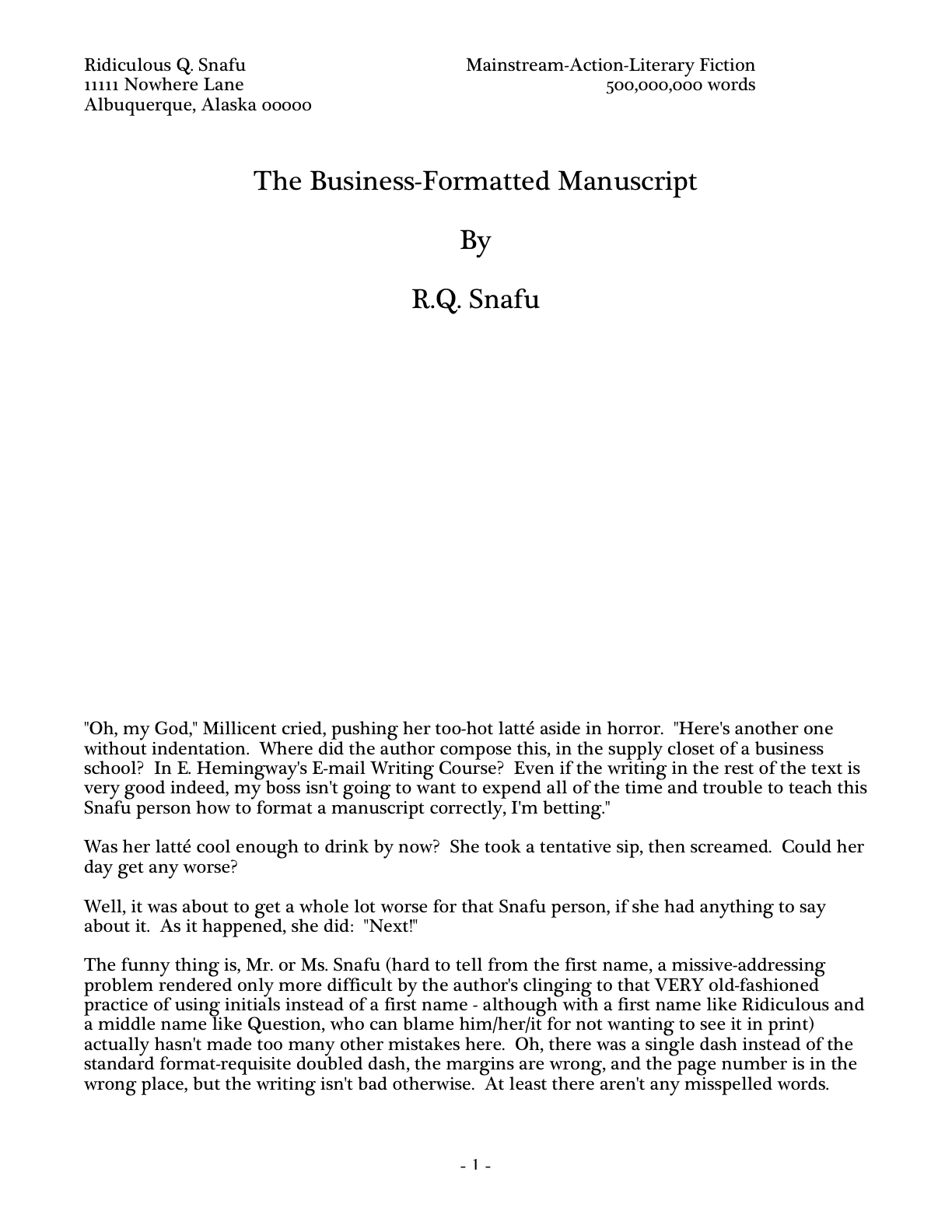
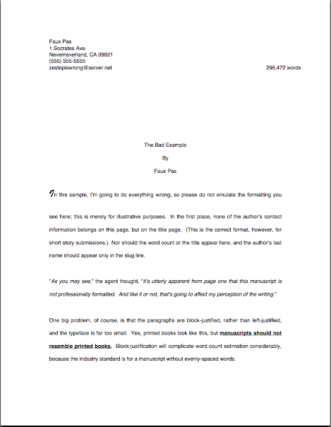
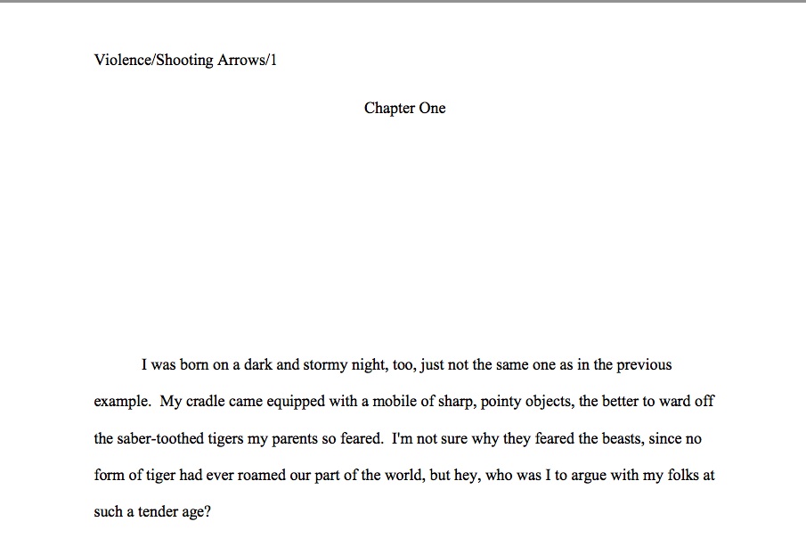
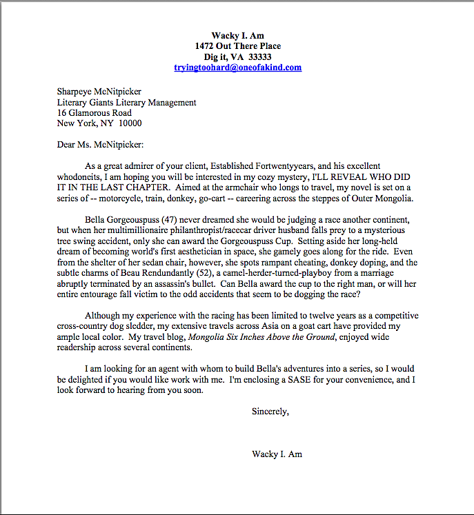
Why? Well, let’s take a peek through her reading glasses, shall we? The first thing Millicent sees when she opens the average requested materials package is something like this:
If you’re having trouble reading the fine print, try holding down the COMMAND key and pressing + to enlarge the image.
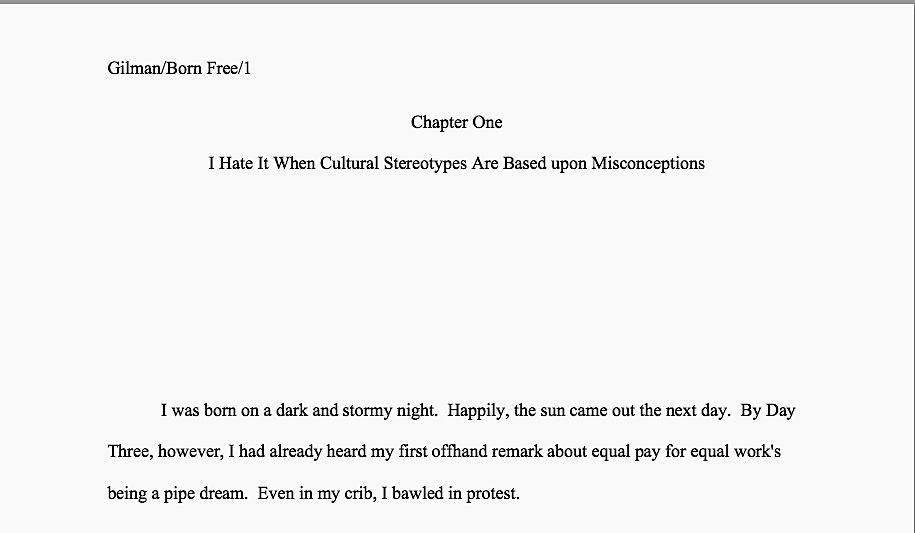
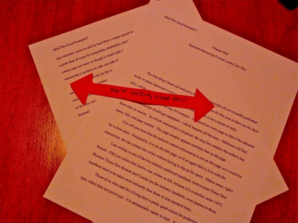
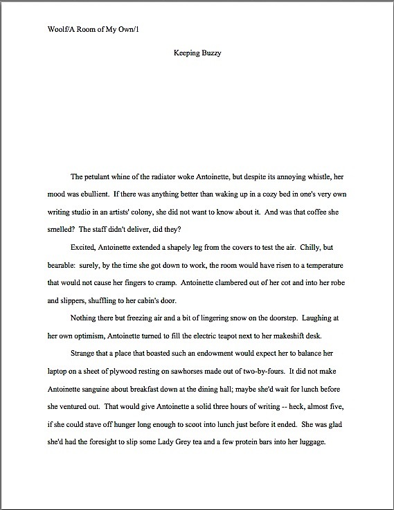
Have it in sharper focus now? Good. Our Millie might also encounter a first page like this:
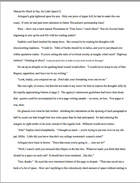
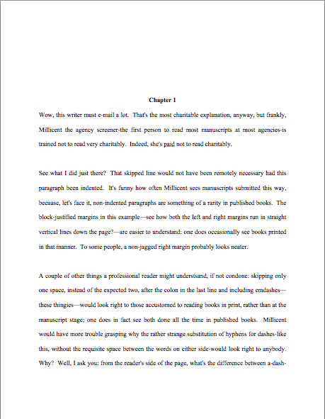
Or, heaven help us, like this:
Taken a good gander? Excellent. Now tell me: why might Millicent take one look at these and conclude that the respective submitters of these three first pages could use a good class on manuscript formatting — and thus would be time-consuming clients for her boss to sign?
I see some eager beavers out there with your hands in the air, jumping up and down, eager to tell everyone what’s wrong with each of these as a first page of text — and you’re absolutely right, of course. These examples have failed as both a title page and a first page of text by not including the information that Millicent would expect to see on either.
What makes me so sure she would find this discovery disappointing, at best? Because what she (or her boss agent, or an editor, or a contest judge) would have expected to see on top of that pile of paper was this:
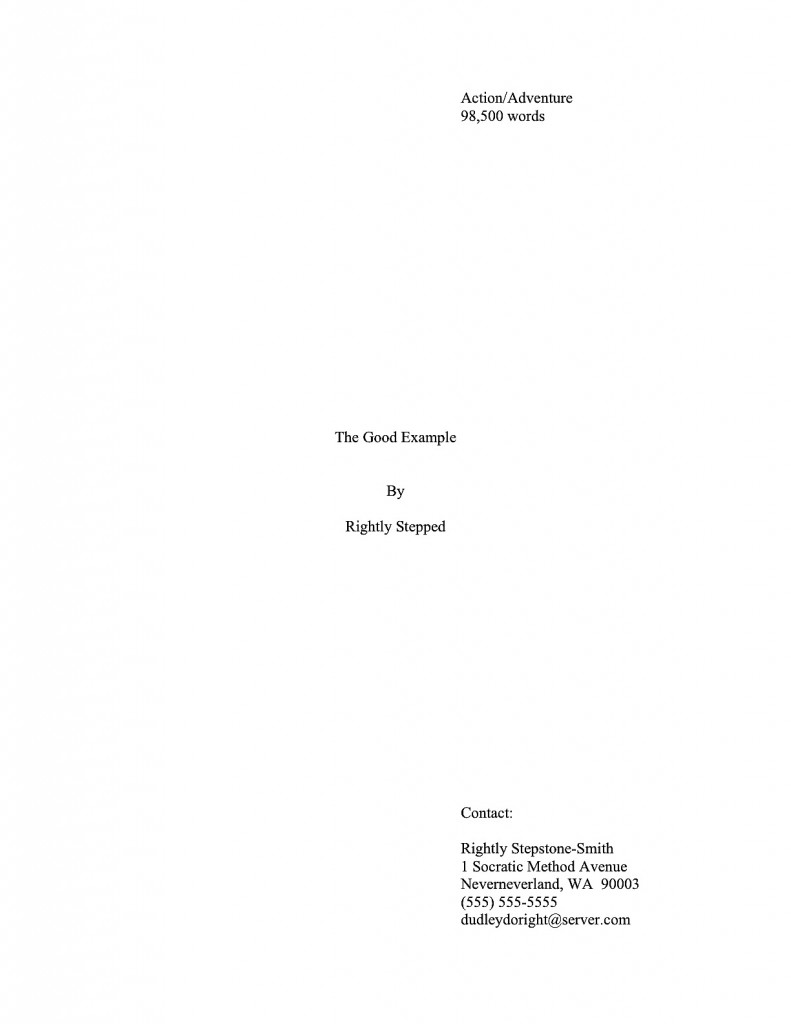
Rather different, isn’t it? Visibly different, in fact, from several paces away, even if Millicent isn’t wearing her reading glasses.
Again, submitting the earlier examples rather than that last would not necessarily be instantly and automatically fatal to a manuscript’s chances, of course. Most of the time, Millicent will go ahead and plunge into that first paragraph of text anyway.
However, human nature and her blistering reading schedule being what they are, she may not. And not necessarily just because she’s impatient with your formatting; she genuinely has only a minute or so to decide whether to read beyond page 1. For those of you new to this screener’s always-rushed days, she has a stack of manuscripts up to her chin to screen — and that’s at the end of a long day of screening queries; screening manuscript submissions is in addition to that.
Given the stack of submissions threatening to topple over onto her poor, aching head, if she has already decided that a submission is flawed, just how charitable an eye do you think she is likely to cast upon that typo in line 13? To use her favorite word: next!
To be fair to Millicent, while it may well be uncharitable of her to leap to the conclusion that Faux Pas’or Ridiculous’ manuscripts are likely to be unpolished because they did not include a proper title page, agencies do have a vested interest in signing writers who present themselves professionally. For one thing, they’re cheaper to represent, in practical terms: the agent doesn’t have to spend as much time working with them, getting their manuscripts ready to submit to editors.
At the risk of seeming blunt, no agent in his right mind would send out a manuscript that didn’t include a standard title page. It serves a number of important — nay, vital — marketing functions. To understand why, let’s take another peek at the professional version. So you don’t have to keep scrolling up and down the page, here it is again:

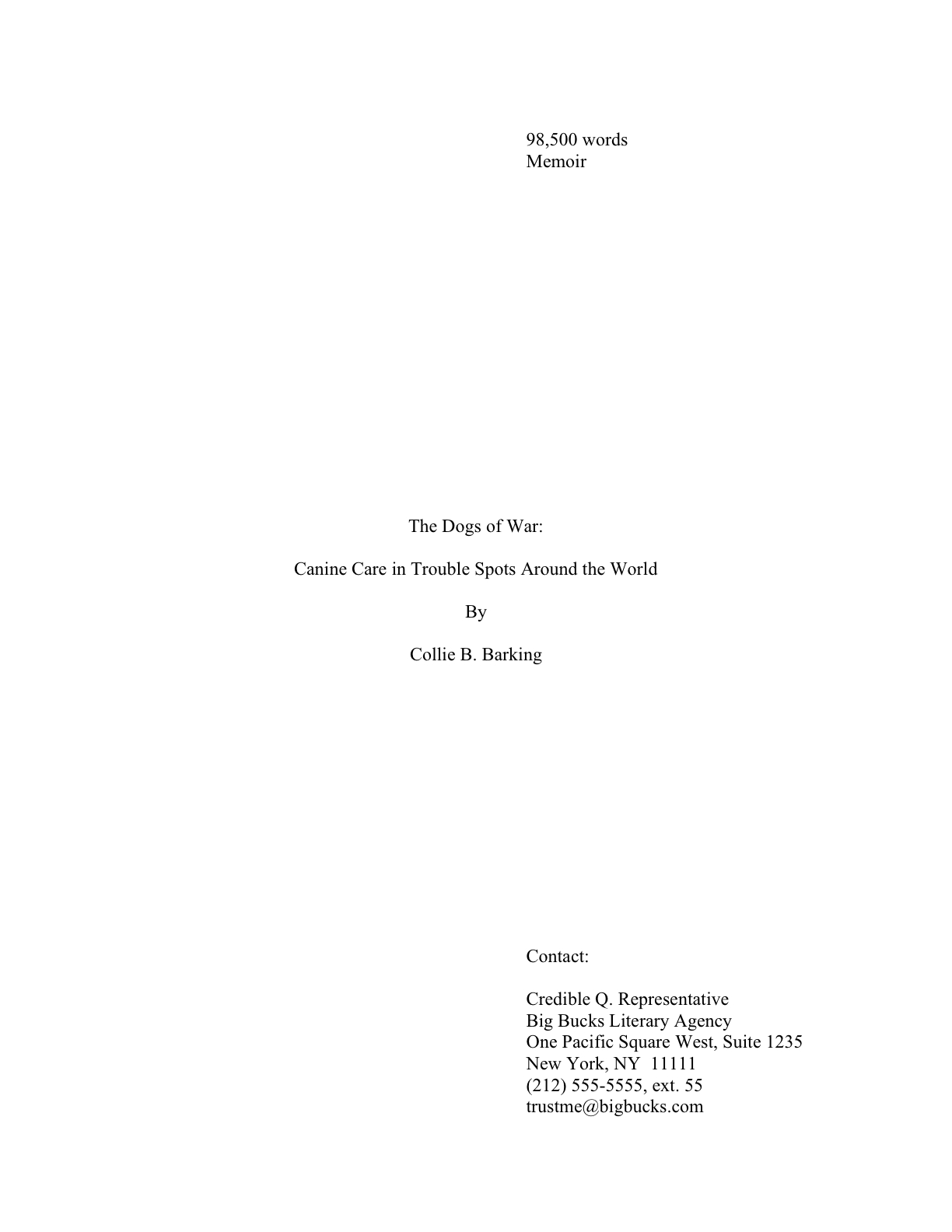
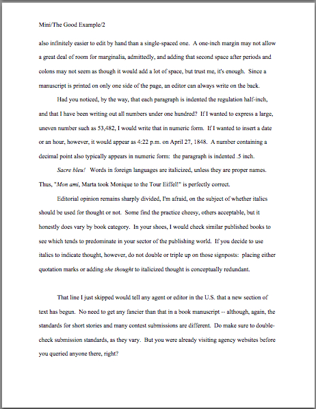
Did you take a nice, long look? Good. While we’re at it, let’s refresh our memories of our last post’s discussion of subtitle-wrangling by taking a gander at a second proper title page:
Now for a pop quiz: how precisely do Rightly and Collie’s first sheets of paper promote their respective books than Faux Pas or Ridiculous’ first pages?
Well, right off the bat, a good title page tells a prospective agent or editor what kind of book it is, as well as its approximate length. (If you do not know how to estimate the number of words in a manuscript, or why you should use an estimate rather than relying upon your word processor’s count, please see the WORD COUNT category at right.) Both of these are pieces of information that will tell Millicent instantly whether the submission in her hand would meet the requirements of the editors to whom her agency tends to sell.
Oh, yes, that’s important in a submission, whether to an agency or a publishing house. Really, really important.
Why? Well, think about it: if Millicent’s boss had decided not to represent Action/Adventure anymore, or if editors at the major houses had started saying that they were only interested in seeing Action/Adventure books longer than 90,000 words, Rightly Stepped would be out of luck.
But then, being a savvy submitter, ol’ Rightly would also want his work to be represented by an agent who just adores very long Action/Adventure novels — and regularly goes to lunch with scads and scads of editors who feel precisely the same way, right?
As I may have mentioned seven or eight hundred times before (in this post, it feels like), the standard title page also tells Millicent precisely how to contact the author to offer representation — and that’s a very, very good thing for everyone concerned. If I’ve said it once, I’ve said it a thousand times: it is always in a writer’s best interest to make it easy for an agent to help him.
I might be wrong, of course, but I suspect that not forcing Millicent to forage through the mountain of paper on her desk to find a misplaced cover letter with your phone number on it might be a good start toward being a snap to assist. Like bothering to number your pages, identifying yourself clearly on your title page and providing contact information up front is a small way that you can make her life — and her boss’ — just a little less hectic.
By contrast, Faux Pas’ first page doesn’t really do anything but announce the title of the book and leap right into the story. That’s one underachieving piece of paper, isn’t it?
Starting to seem less astonishing that Millicent might pick up each of these manuscripts with rather different expectations about what she’ll find within? It’s not only surprising; it’s inevitable, given how often misformatted submissions also are evidently not spell-checked, proofread for grammar, or — and this does amaze most professional readers — not written in a voice or vocabulary appropriate for the story’s target audience.
Before you go ahead and resent that, bear in mind that the fact that any screener would also have seen many incorrectly formatted manuscripts that do not share these faults is why a well-intentioned Millie would seldom reject a manuscript purely for that reason. The very fact that any well-established agency receives so many non-standard manuscripts means, in practice, that a professionally-formatted manuscript will generally enjoy a competitive advantage.
Think of it this way: Millicent likes to reward writers who do their homework. So why not have your manuscript shout that you have beginning on its top page?
Keep up the good work!


