Once more, with feeling! (And color, apparently.)

Has everyone had time to absorb this week’s earlier post on what a professionally-formatted book manuscript looks like? I realize that for those of you brand-new to presenting your writing to agents, editors, and contest judges, that single-post overview might have run a bit quickly. In the interests of clarity, I’m going to be devoting the next few posts to going over each rule in some detail, for the explanation-oriented.

And yes, you’re quite correct: I’m doing this a bit late this year. In the past, I have devoted the first weeks of each new year to regaling the members of the Author! Author! community with an in-depth look at how professionally-formatted book manuscripts and proposals are put together. Why make this an annual event, you ask? Why, because I’m fond of writers — and I’m constantly meeting good writers new to the biz who haven’t the vaguest idea about what a professional manuscript looks like, for the exceedingly simple reason that they’ve never seen one.

Or, in many cases, ever thought about presentation at all. The vast majority of submitters seem to believe either that how writing looks on a page lies purely within the author’s discretion or that manuscripts and published books should be formatted identically, and these beliefs make their writing look less professional to people who read book manuscripts for a living.

Which, if you think about it, isn’t all that astonishing: hands up, those of you who got into the writing habit because you were just dying to learn all about margins or page spacing. When the Muses sneak up upon us, sprinkle us with inspiration, and send us scurrying toward our writing desks, the consideration of what typefaces an agent might prefer tends not to be uppermost in our thoughts, does it?

You’d never know that, though, from hearing folks who read manuscripts for a living talk about how often they see whimsically-presented writing. “Half of ‘em don’t even bother to spell- or grammar-check,” Millicent the agency screener, Maury the editorial assistant, and Mehitabel the contest judge have all been heard to moan, “let alone proofread. And then they don’t indent their paragraphs, or assume that I’m going to be willing to strain my eyes over 10-point type? Or one that’s single-spaced? There’s no way my boss the agent/the editor for whom I work/the celebrity judge in the finalist round is going to be willing to put up with any of that.”

As professional readers like to say, if a writer’s serious about getting published, she’ll take the time to learn what the formatting norms are. So pervasive is this saying that even amongst the open-minded, there is a deep, pervasive prejudice against manuscripts that don’t look right cosmetically. Millicent, Maury, and Mehitabel are so conditioned to expect professional formatting that when they see a submission that deviates from the rules in any significant respect, they tend to assume, as did the hypothetical tableful of editors above, that the writer is falling down on the job in other respects.

What does that mean in practical terms? Often, that incorrectly-formatted manuscripts and contest entries get rejected on sight — and, in many cases, unread. Why, you ask, aghast? Actually, there’s a pretty good reason: writers unfamiliar with how publishing works tend to be both more time-consuming to work with and more energy-consuming to represent than those who have done their homework. Most agencies, after all, do not sponsor a crash course in professional presentation for new clients (although that’s a darned good idea). Since that’s the case, the simplest way for our old pal, Millicent the agency screener, to tell if a new writer has learned much about the industry s/he aspires to enter is a quick glance at page 1.

Oh, you thought some agencies allowed aspiring writer to include the first few pages of text with their queries just so Millicent could get a sense of their writing style? At minimum, presentation problems will render it more difficult for a good writer to get the aforementioned agents, editors, and contest judges take his work seriously.

Why? Well, think about it: it’s one of the easiest ways conceivable to narrow the submission pool — which is job #1 for Millicent, Maury, and Mehitabel, right? Do the math: if the average agent receives 800-1500 queries per week and agrees to read even five percent of the manuscripts (high for most agents, by the way), that’s 40-60 manuscripts per week, and thus somewhere in the neighborhood of 2,000-3,000 per year.

Since even a very successful agent could take on, at most, 4-5 new clients per year, Millicent had better narrow down that applicant pool, pronto, hadn’t she? So had Maury. So had Mehitabel, since no matter how good a crop of contest entries is, there are generally only a fixed, small number of finalist slots. They’ve got to rule manuscripts out.

Isn’t it fortunate for them, then, that the overwhelming majority of submitters present their writing unprofessionally? They either resemble published books (which is not correct for a manuscript submission), are submitted in short story format (ditto), or look like whatever the submitter happens to think looks nice on the page (extrapolate the answer from the previous two).

All of which makes Millicent, Maury, and Mehitabel shout, “Hallelujah,” especially over the last few years, when both query and submission rates have been skyrocketing. Writing a book has always been plan B for a lot of people — with the economy in its current state, many folks seem to be pulling partially-finished manuscripts out of desk drawers these days. (Okay, off their hard disks, but it amounts to the same thing.) The timing’s a tad unfortunate, since this is also a period where publishing houses have been laying off editors and other staff in droves.

Translation: you know how fierce the competition to get picked up by an agent already was before the economy went south? It’s become even tougher. So I would encourage those of you who are right now muttering angrily that if the world were organized correctly, only the quality of the writing would matter in a submission or contest entry to ask yourselves: even if you’re right, does it really make sense not to give Millicent, Maury, and Mehitabel what they expect to see?

Or, to put it another way: if your goal is to impress these people with your writing, why distract them from it with non-standard formatting?

Then, too, because so many aspiring writers go a bit random with their pages, submitting a properly-formatted manuscript tends to give an aspiring writer a competitive advantage — and that’s equally true, incidentally, whether that writer sends off her baby in hard copy or attaches it to an e-mail. When agencies, publishing houses, and even literary contests request full or partial manuscripts to be sent via e-mail, what they’re almost always expecting is a Word document (in .doc format, by the way, not .docx); unless they specifically say otherwise, few professional readers would be willing to peruse more than a few pages imbedded in an e-mail.

I sense some of you scratching your heads. “Whoa there, Anne!” shout those of you whose minds have been reeling at the very thought of how much time it might take you to reformat your entire book when you already have a request from an agent in hand — as opposed to, say, just hitting SEND as soon as you finish reading this post. “Before I resign myself to sacrificing some of my very scant writing and querying time to rearranging my words on the page, I want to hear more about that competitive advantage you mentioned. What is it exactly that my fellow submitters and/or writing contest entrants might not know, and how precisely may I take full advantage of the fact that you are evidently determined to force this knowledge upon me?”

Excellent questions both, head-scratchers, and ones that richly deserve extensive answers. Here are the hard facts, some of which I hope will sound familiar by now.

(a) There is a an expected standard format to which US-based agents and editors expect book-length submissions and book proposals to adhere, regardless of whether those manuscripts are produced by seasoned pros with many book sales under their belts or those brand-new to the biz, and thus

(b) while deviating from standard format in a small way (or, more commonly, in a multiplicity of small ways) will not necessarily result in knee-jerk rejection, it does tend to prompt those who read manuscripts for a living to take the manuscript less seriously, on the assumption that an aspiring writer who has not taken the time to learn about standard format probably has not honed her craft much yet, either. Given the pervasiveness of this attitude,

(c) using fancy typefaces, including cover artwork, printing manuscript pages on colored paper, and/or any other deviations from standard format in one’s submission is most emphatically not regarded as interesting expressions of the author’s individual point of view, but rather as evidence that the author doesn’t know about (a). On the bright side,

(d) manuscripts submitted in standard format tend to be treated with substantially more respect by agency screeners, editorial assistants, contest judges, and pretty much everyone who happens to read unpublished prose for a living. Despite this fact,

(e) one does occasionally hear agents and editors ask for deviations from standard format; in these cases, an aspiring writer should definitely give them precisely what they ask to see. However,

(f) it’s never advisable to generalize from what one individual says s/he wants into a brand-new trend sweeping the industry. Nor is it a good idea to ape the formatting choices one sees in a published book, because

(g) book manuscripts do not resemble published books in many important respects, for many excellent, practical reasons that I shall be explaining at length throughout this series. That being the case, professional tend to draw unfavorable conclusions about submissions that do aspire to book formatting, much as they do when aspiring writers are not aware that

(h) standard format for book-length manuscripts is not business format — and just using what you learned about short stories won’t do, either. Nor is it necessarily identical to what your word processor’s grammar checker will ask you to do, or even the AP style one sees in newspapers and magazines. None of these will look correct to an agent or editor who deals with book manuscripts; the norms there are very specific.

This may seem nit-picky and irrelevant to the quality of the writing in question, but think about it: if a host asks you to a formal dinner, it’s only polite to wear formal attire; a guest who shows up in flip-flops and a Hawaiian shirt is going to stand out like the proverbial sore thumb. (If it’s not clear to you why that might be problematic, review point b.) Similarly,

(i) when placed side-by-side with professional manuscripts, as a successful submission inevitably will be, an oddly or inconsistently put-together manuscript will stand out as unprofessional, a phenomenon that all too often leads to

(j) most manuscript submissions getting rejected on page 1. Not always because they deviates from standard format — although, had I not yet made this point sufficiently, the vast majority of submissions do — but because an unprofessionally-formatted manuscript already has one strike against it, and who needs that? Ultimately,

(k) it’s just not worth your while to try to fudge your way out of these standards, since the price of a submission’s annoying a professional reader can be so high. And no matter how many times my readers, students, and editing clients ask me if agents, editors, and contest judges are REALLY serious about them, I’m not going to give you permission to ignore any single one of the standard format strictures.

No way. Stop asking, already. I have your best interests at heart, honestly: the aspiring writer who acts upon this information conscientiously is probably producing submissions within the top 2% of what crosses Millicent’s desk on any given day.

Yes, really. I wasn’t kidding last time about how confused aspiring writers can become by the welter of advice swirling about online — or when I mentioned this time that many writers looking to break into the biz simply don’t think about presentation at all.

Why should they? The writing is all that counts, right?

And a forest of hands has spouted out there in the ether. Yes? “But Anne, I heard from a friend who heard from someone in a writers’ chat room that someone heard at a conference that {fill in preferred deviation from standard format here} is THE new thing. Rumor has it that any manuscript that doesn’t adhere to {see previous bracket-filler} will automatically get rejected as old-fashioned. So there.”

One hears this argument quite a lot on line. Which is surprising, really, because almost no matter what rumored change gets fitted into those brackets, I can tell you now that Millicent didn’t get the memo about it

Why would she, unless she happens to work for the agent-who-blogs or editor-who-is-trying-to-be-helpful that promulgated the new advice? Indeed, why would anyone who works with manuscripts for a living go out looking to see what folks outside the industry — or, at minimum, outside her agency — are demanding of writers these days, when the basics of standard format have actually changed very little for decades?

Oh, should I have numbered that one?

Actually, it would be very much against her self-interest to go trolling for such information, because — chant it with me now, veterans of my annual forays into standard format’s underlying logic — it’s so much easier just to assume that submissions that don’t adhere to standard format are inherently unprofessional, and thus (by implication) less likely to contain writing destined to take the publishing world by storm.

To put it bluntly, not relying upon this convenient assumption would slow her per-submission rejection time. That’s well worth considering, as the fine folks who read submissions (and queries) in order to decide who gets a break and who doesn’t are in typically a great big hurry.

These people have a heck of a lot of reading to do on any given day, after all. In the face of that many pieces of paper to plow through, even the reading of eagerly-solicited submissions tends to be awfully rushed: the goal becomes to weed out as many as possible as quickly as possible, rather than seeking out gems. Once a professional reader like Millicent has been at it for a while, s/he will usually develop a knack for coming to a conclusion about a piece of writing within the first paragraph or two.

Sometimes even within the first line or two. (For a fairly frightening run-down of the common first-page rejection reasons, you might want to check out the HOW NOT TO WRITE A FIRST PAGE category on the archive list conveniently located on the lower right-hand side of this page.)

Unfortunately for writers unaware of the rules, a non-standard manuscript is child’s play to spot from the moment a professional reader claps eyes upon it. That can be an extremely serious problem for a submission, because — wait for it — agencies and publishing houses get so many submissions that a screener’s primary goal is to weed out the one she is reading at the moment.

The faster she can do that, the better, to move through that mountain of paper on her desk. So a first page that cries out, “This writer is brand-new to the game and will require quite a bit of your boss’ time to coach into being able to produce a manuscript that an agent would be comfortable submitting to an editor!” is an outright gift to her: she can feel completely comfortable rejecting it at the very first typo, clich?, or word choice she doesn’t happen to like.

Heck, she might not even wait to spot any of the above. She might just say, “Oh, look — non-indented paragraphs. Next!”

Right now, Harry Houdini himself would have extreme difficulty sneaking a non-standard manuscript past an agency screener. Yes, even though he undoubtedly has the world’s best platform to write a book on extricating oneself from tight situations. (And if that last quip didn’t make you groan, if not chuckle, it’s time to brush up on your industry-speak.)

So here, after that long preamble, are the rules of standard format — and no, Virginia, none of them are negotiable. (Really. Stop asking.) If you would like to see what these look like in action, you’ll find abundant visual examples here.

(1) All manuscripts should be printed or typed in black ink and double-spaced, with one-inch margins around all edges of the page, on 20-lb or better white paper.

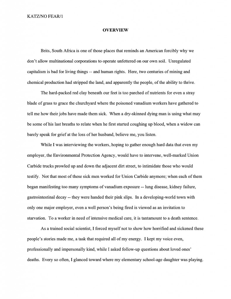
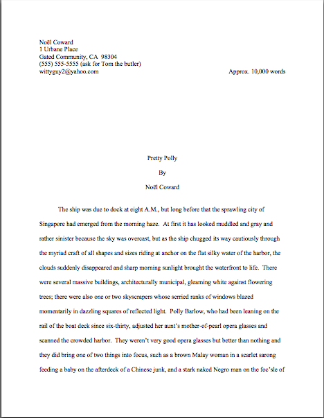
No exceptions, unless an agent or editor (or a contest’s rules) specifically asks you to do otherwise. And I’m dead serious about using only white paper: ecru paper, no off-white, no Dr. Seuss-type stripes. The example at the top of this post was intended to frighten you.

Yes, buff or parchment can look very nice, now that you happen to mention it, Virginia, but there’s a strategic reason to use bright white paper. Very sharp black-white contrast is strongly preferred by virtually every professional reader out there, probably as a legacy of having read so many dim photocopies over the course of their lifetimes.

The only colored paper that should ever go anywhere near a manuscript is the single sheet that separates one copy of a submission or book proposal from the next, so it is easy for an agent to see where to break the stack. (But you don’t need to know about that until your agent asks you to send 15 copies of your book for submitting to editors. Put it out of your mind for now.)

Nice, clear, dark print is optimal here, so do spring for a new printer cartridge, if you can. You’d be amazed (at least, I hope you would) at how poor the printing quality is on some submissions; I’ve seem pages that looked as though the writer dunked them in a swiftly-flowing river several times before popping them in the mail.

Which is sad, because submissions with poor print quality are — you’re ahead of me on this one, aren’t you? — almost never read. Millie’s already suffering from eye strain.

Speaking of never, never, ever, ever submit a dim photocopy; print out an original every time. Oh, you may chuckle at the notion of sending out a grainy copy, but believe me, any contest judge has seen many, many entries submitted that way.

Mehitabel likes them, actually: for every one that pops up, her reading time is shortened. Any guesses why?

(2) All manuscripts should be printed on ONE side of the page and unbound in any way. For submission to US-based agencies, publishing houses, and contests, the pages in question should be US-standard 8.5″ x 11″ paper.

Yes, this is criminally wasteful of paper, especially when you consider the literally millions of pages of submissions that go flying into the agencies and publishing houses every month. I assure you, if I ran the universe, paper conservation would be the norm, and recycling mandatory.

Last time I checked, though, I was not yet running the universe. If I were, pandas would be plentiful and come in giant, fairly large, and pocket sizes. Ice cream sundaes would have the same nutritional value as platters full of broccoli, and crowds of public-spirited citizens would rush up and kiss purchasers of first-time authors’ books on each cheek.

Also, writers would all be granted an extra month a year in which to write, excellent and inexpensive child care while writing, a cedar-lined cabin on the shores of Lake Michigan in which to do it, and a pineapple upside-down cake on Ray Bradbury’s birthday. Perhaps some hard candies on Truman Capote’s birthday as well, in affluent years, and dancing on Mme. de Sta?l’s.

But since the unhappy reality is that I do not run the universe, we shall all have to live with the status quo.

Unbound means precisely what it says: no binding of any kind. You’d be surprised at how often writers violate the thou-shalt-not-bind rule, including paper clips, rubber bands, or even binders with their submissions. Since agents always circulate manuscripts without any sort of binding, these doohickeys just scream, “I’m unfamiliar with the industry.”

SASE, open wide: here comes a returned manuscript.

The only exception to this rule is a nonfiction book proposal — not the manuscript, mind you, just the proposal. Proposals are typically presented unbound in a black folder, the kind with horizontal pockets. (For tips, please see the aptly-titled HOW TO FORMAT A BOOK PROPOSAL category at right.)

Which doesn’t mean that you aren’t perfectly welcome to print double-sided or bind copies for your own purposes; just don’t show your work to the pros that way. As Author! Author!’s very first commenter Dave tends to chime in — and helpfully — whenever I bring this up, if you wish to make double-sided, 3-hole-punched, be-bindered drafts for circulating to your first readers for ease of toting around, that’s a dandy idea.

But never submit in that manner to a professional reader unless s/he has asked you to do so. Trust me on this one.

(3) The text should be left-justified, not block-justified, as published books, e-mails, business letters, and online writing tend to be.

Many fledgling writers find (3) nearly impossible to accept, as it is one of the most visually obvious ways in which a professional manuscript differs from a printed book. They believe, wrongly, that anything that makes their submission look more like what’s on the shelves at their local library is inherently professional.

In practice, quite the opposite is true. Yes, books feature text that runs in straight vertical lines along both side margins, and yes, your word processing program can replicate that practically effortlessly, if you ask it nicely to do so. Bully for it.

But don’t take advantage of that pleasing capacity, I beg you: the straight margin should be the left one; the right should be ragged, as if you had produced the manuscript on a typewriter.

Translation: the left margin should be straight; the right margin should not. In practice, that means that the left margin will be exactly 1 inch, while the right margin will be no less than an inch on any given line of text. Similarly, while the top margin should be exactly 1 inch, the bottom margin will typically be slightly more, because the spacing between lines of text needs to be constant.

You actually don’t need to fret over measuring any of this out, if you are using MS Word: just set the margins all around to 1″ and the spacing to double, and you will end up with a standard 23-line manuscript page. Don’t worry if the bottom margin is not precisely 1″; remember, the fine folks at Microsoft are not employees of the publishing industry.

(4) The preferred typefaces are 12-point Times, Times New Roman, Courier, or Courier New — unless you’re writing screenplays, in which case you may only use Courier. For book manuscripts, pick one (and ONLY one) and use it consistently throughout your entire submission packet.

Yes, Virginia, even if you have a strong preference for the lettering in your book when it is published. Why? Shout it with me now: MANUSCRIPTS AND PUBLISHED BOOKS AREN’T SUPPOSED TO LOOK THE SAME.

Select one of the fonts above for submission purposes — unless, of course, an agency’s submission guidelines specifically ask for something different. There are a few agents out there who have their own font preferences (usually Courier, and usually because they also represent screenplays), so do check their websites and/or listings in the standard agency guides. As ever, the golden rule of dealing with an agent you want to represent you is give them precisely what they ask to see, not what you would like them to see.

Personally, I would never dream of allowing an editing client of mine to submit a manuscript in anything but Times New Roman, nor would I ever submit any of my work in anything else. It is the standard typeface of the publishing industry, just as Courier is the norm of screenwriting.

A tad silly, you say? Perhaps, but it’s one of the bizarre facts of publishing life that manuscripts in these fonts tend to be taken far more seriously, and with good reason: these are the typefaces upon which the most commonly-used word count estimations are based. (Psst: if you don’t know why you should be estimating the length of your manuscript rather than using actual word count, please see the WORD COUNT category at right.)

I hear you grumbling, lovers of interesting typefaces. Yes, most published books are in typefaces other than Times or Courier — but typeface decisions for published books are made by the publishing house, not the author. Submission time is not the appropriate period for making your preferences known.

For that excellent reason, the chances of Millicent, her boss, or the editor to whom the agent of your dreams will eventually sell your manuscript taking one look at your offbeat typeface choice and exclaiming, “Well, normally, I would find this completely distracting from the writing, but obviously, this gifted writer is using the only chance s/he’ll ever have to discuss the published version with us to make his/her preferences clear. I guess we’d better honor them!” are so close to zero that you’d have to fly in Zeno via a time machine to measure any difference.

Relax, in other words. If you’ll have a chance to talk about what your book will look like in print after a publisher acquires it. Chances are, the people who actually make these decisions will ignore you — typically, only self-publishing authors who get to select their books’ typefaces — but you’re perfectly welcome to air your preferences at the appropriate juncture. They may giggle a little, true, but they might listen. Ditto with the cover and the title, which are — brace yourselves — almost never under the author’s control.

Why? Because these are matters of packaging and marketing, not content.

All of which begs the question, of course: why do word processing programs tempt us so many typefaces from which to choose, if we’re not supposed to use them? Because the people who make word processing programs are not the same people who decide what books get published in North America. Which is why, in case you’re wondering, what Microsoft Word means by word count and what the average agent or editor does are not typically the same thing.

Fair warning: if you are a writer who likes to have different voices presented in different typefaces, or who chooses boldface for emphasis, a submission is not a forum where you can express those preferences freely. Yes, one sees this in a published book occasionally, but I assure you, the choice to indulge in these formatting differences was the editor’s, not the author’s.

Sorry. See my earlier disclaimer about proprietorship of the universe.

I’m sensing a bit of dissention out there, but I can’t say I’m surprised. Almost invariably, around the time that I bring up Rule #4, someone posts a comment informing me huffily that website X advises something different, that this agent said at a conference she doesn’t care what typeface you use, that a certain manual said that standards have changed from the traditional guidelines I set out here, or some other observation presumably intended to make me rend my garments and cry, “Finally, I see the error of my ways! I guess I’ll disregard the fact that I’ve never seen the change you mention actually in use in a professional manuscript and declare it to be the new norm!”

To save you the trouble: it’s not gonna happen. Arrange for me to get my way about the pandas, and we’ll talk.

More of the rules of standard format follow next time, of course, as well as acres more explanation. Until we meet again, keep up the good work!

Formatpalooza has landed!

lunar landing

That’s right, campers: we’re rounding out this autumn of ‘Paloozas with arguably the most important one of all, a step-by-step guide to standard format, the way that book manuscripts should look on a page-by-page basis. Because yes, Virginia, there are professional standards, and once per year, I like to tell my readers about ‘em.

What? No public rejoicing? “Manuscript formatting?” I hear many an aspiring writer grumbling. “What on earth does that have to do with landing an agent and/or getting my book published?”

Plenty, actually; submitting a professionally-formatted manuscript gives an aspiring writer a competitive advantage in submission. And this time around, because some of you asked so nicely, I’m going to be devoting a few posts specifically to the ins and outs of formatting — and punctuating — dialogue.

Why concentrate on dialogue this time around? Well, remember my mentioning that a hefty percentage of the aspiring writers of North America tend to gird their loins, ratchet up their nerves, and send out queries and requested materials in early January of each year, in fulfillment of New Year’s resolutions to get cracking on getting published? These same resolutions lead freelance editors’ desks, or at any rate their e-mail inboxes, to groan under the weight of clients eager to seek their counsel, both at the close of the old year and the opening of the new. It’s also the time of year when we can get a preview of what Millicent the agency screener is likely to see for the next twelve to fifteen months.

I can already tell you the coming year’s trend: first- and tight third-person narratives in which other characters speak and the narrator thinks within the same paragraph. Last year, it was not double-spacing manuscripts; the year before, it was not indenting paragraphs.

And once again, Millicents all over New York will be shaking their heads, muttering, “What on earth made anyone think this was proper? Did I miss a bestseller that broke this particular rule?”

Yet virtually every time I mention to my fellow professional readers that many, if not most, aspiring writers are not fully aware of how a manuscript should be formatted — or, indeed, that such a thing as standard format exists, they tend to chortle with disbelief. “Oh, come on, Anne,” they scoff. “Anyone serious about getting published would have done his homework about that. Besides, the formatting isn’t really the problem for most of those writers. Most of the manuscripts you’re talking about would have gotten rejected by agencies, anyway; the ones who don’t double-space tend not to spell-check, either.”

And that, incidentally, is what a mixed-use dialogue paragraph in a first-person narrative looks like. In a novel, it tends to run like this:

Kyra laughed. “Over my dead body.” I thought about that for a moment. Not such a terrible idea.

“That could be arranged,” I said, much to her evident annoyance.

“No, but seriously, Ermintrude, I can’t let you take that book out from my library.” I raised my eyebrows at her. “What part of non-circulating collection don’t you understand?”

As opposed to the classic — and much clearer, logistically speaking — tradition of limiting each speaker/actor to distinct and separate paragraphs, so the formatting itself makes it plain who is speaking when:

Kyra laughed. “Over my dead body.”

Not such a terrible idea. “That could be arranged.”

The minuscule muscles at the side of her right eye twitched with annoyance. “No, but seriously, Ermintrude, I can’t let you take that book out from my library. What part of non-circulating collection don’t you understand?”

Easier for a skimming eye to follow what’s going on, isn’t it? Now, there’s no question of who is speaking — or acting — when; every twitch is easily attributable to the proper twitcher. We’re going to be talking about this dynamic, as well as other tips for dialogue formatting and clarity, later in this series.

But I digress from my composite discussion with other professional manuscript-readers. “But what about the ones who do spell-check?” I ask my cynical colleagues, “and proof-read, and take the time to get feedback on their work before sending it out? Improper formatting can as easily be the result of simple ignorance as of authorial laziness. I’m constantly meeting good writers new to the biz who haven’t the vaguest idea about what a professional manuscript looks like, for the exceedingly simple reason that they’ve never seen one.”

More scoffing around the table in the bar that’s never more than 100 yards from any writers’ conference in North America. One of the freelance editors might even trot out that old agents’ truism: “If a writer’s serious about getting published, he’ll take the time to learn what the formatting norms are. There are books that explain how to do it.”

“Not to mention your blog, Anne,” another quips, invariably. “How often are you revisiting the rules of standard format these days? Once a year? Twice?”

Actually, it used to be three, back in the dark days before I learned to keep reminding all of you, campers, to check the archive category list conveniently located on lower right-hand side of this page the early and often. (Speaking of formatting, how do folks like the new, improved, ostensibly easier-to-use format on the archive listings? Over the years, many of you had asked for the categories to be organized with headings.)

I feel that my colleagues are engaging in a bit of buck-passing. “I’m not denying that it’s possible to learn how to do it right; I’m just pointing out that most of the time, the writers whose manuscripts get rejected unread because of formatting problems have no idea that they’re not getting rejected on the writing itself.” Half the table looks skeptical. “Okay, fine — let’s do a little survey. Hands up: how many of you would read a single-spaced manuscript, if a potential client sent it to you? Or even one-and-a-half spacing? What about non-indented paragraphs?”

Crickets.

And that, my friends, should tell you a lot about just how seriously people who read manuscripts for a living take the norms of standard format. Even amongst the open-minded, there is a deep, pervasive prejudice against manuscripts that don’t look right cosmetically. Millicent the agency screener, Maury the editorial assistant, Mehitabel the contest judge: all of these readers who must approve a manuscript before it can impress an agent, get picked up by a publisher, or make the finals of a contest are so conditioned to expect professional formatting that when they see a submission that deviates from the rules in any significant respect, they tend to assume, as did the hypothetical tableful of editors above, that the writer is falling down on the job in other respects.

What does that mean in practical terms? Usually, that incorrectly-formatted manuscripts and contest entries are rejected on sight — and, in many cases, unread.

Why? Well, think about it: it’s one of the easiest ways conceivable to narrow the submission pool — which is job #1 for Millicent, Maury, and Mehitabel, right? Do the math: if the average agent receives 800-1500 queries per week and agrees to read even five percent of the manuscripts (high for most agents, by the way), that’s 40-60 manuscripts per week, and thus somewhere in the neighborhood of 2,000-3,000 per year.

Since even a very successful agent could take on, at most, 4-5 new clients per year, Millicent had better narrow down that applicant pool, pronto, hadn’t she? So had Maury. So had Mehitabel, since no matter how good a crop of contest entries is, there are generally only a fixed, small number of finalist slots. They’ve got to rule manuscripts out.

Isn’t it fortunate for them, then, that the vast majority of submitters present their writing unprofessionally?

Did some of you just do a double-take? Yes, Virginia, most submissions are incorrectly formatted. They either resemble published books (which is not correct for a manuscript submission), are submitted in short story format (ditto), or look like whatever the submitter happens to think looks nice on the page (extrapolate the answer from the previous two).

All of which makes Millicent, Maury, and Mehitabel shout, “Hallelujah,” especially of late, when both query and submission rates have been skyrocketing. Writing a book has always been plan B for a lot of people — with the economy in its current state, many folks seem to be pulling partially-finished manuscripts out of desk drawers these days. (Okay, off their hard disks, but it amounts to the same thing.) The timing’s a tad unfortunate, since this is also a period where publishing houses have been laying off editors and other staff.

Translation: you know how fierce the competition to get picked up by an agent already was before the economy went south? It’s become even tougher.

While those of you who already suffering from query or submission fatigue are still reeling from the implications of that last statement, let me slip a few hard facts under the noses of those who have yet to submit for the first time:

(1) There is a an expected standard format to which US-based agents and editors expect book-length submissions and book proposals to adhere, regardless of whether those manuscripts are produced by seasoned pros with many book sales under their belts or those brand-new to the biz, and thus

(2) while deviating from standard format in a small way (or, more commonly, in a multiplicity of small ways) will not necessarily result in knee-jerk rejection, it does tend to prompt those who read manuscripts for a living to take the manuscript less seriously, on the assumption that an aspiring writer who has not taken the time to learn about standard format probably has not honed her craft much yet, either. Given the pervasiveness of this attitude,

(3) using fancy typefaces, including cover artwork, printing manuscript pages on colored paper, and/or any other deviations from standard format in one’s submission is most emphatically not regarded as interesting expressions of the author’s individual point of view, but rather as evidence that the author doesn’t know about (1). On the bright side,

(4) manuscripts submitted in standard format tend to be treated with substantially more respect by agency screeners, editorial assistants, contest judges, and pretty much everyone who happens to read unpublished prose for a living. Despite this fact,

(5) one does occasionally hear agents and editors ask for deviations from standard format; in these cases, an aspiring writer should definitely give them precisely what they ask to see. However,

(6) it’s never advisable to generalize from what one individual says s/he wants into a brand-new trend sweeping the industry. Nor is it a good idea to ape the formatting choices one sees in a published book, because

(7) book manuscripts do not resemble published books in many important respects, for many excellent, practical reasons that I shall be explaining at length throughout this ‘Palooza. That being the case, professional tend to draw unfavorable conclusions about submissions that do aspire to book formatting, much as they do when aspiring writers are not aware that

(8) standard format for book-length manuscripts is not business format and just using what you learned about short stories won’t do, either. Nor is it necessarily identical to what your word processor’s grammar checker will ask you to do, or even the AP style one sees in newspapers and magazines. None of these will look correct to an agent or editor who deals with book manuscripts, because the norms there are very specific.

This may seem nit-picky and irrelevant to the quality of the writing in question, but think about it: if a host asks you to a formal dinner, it’s only polite to wear formal attire; a guest who shows up in flip-flops and a Hawaiian shirt is going to stand out like the proverbial sore thumb. (If it’s not clear to you why that might be problematic, review point 2.) Similarly,

(9) when placed side-by-side with professional manuscripts, as a successful submission inevitably will be, a wackily put-together manuscript will stand out as unprofessional, a phenomenon that all too often leads to

(10) most manuscript submissions getting rejected on page 1. Not always because they deviates from standard format — although, had I not yet made this point sufficiently, the vast majority of submissions do — but because an unprofessionally-formatted manuscript already has one strike against it, and who needs that? Ultimately,

(11) it’s just not worth your while to try to fudge your way out of these standards, since the price of a submission’s annoying a professional reader can be so high. And no matter how many times my readers, students, and editing clients ask me if agents, editors, and contest judges are REALLY serious about them, I’m not going to give you permission to ignore any single one of the standard format strictures. No way. Stop asking, already.

Why might knowing all this — and, more importantly, acting upon this knowledge — translate into higher acceptance rates? Well, the aspiring writer who acts upon this information conscientiously is probably producing submissions within the top 2% of what crosses Millicent’s desk on any given day.

Yes, really, Virginia; stop looking at me with those doubtful, pleading eyes. If any of the information on the list above came as a surprise to you in any way, it’s incredibly important that you should join me on a tiptoe through the intricacies of standard format.

In case I’ve been too subtle so far about why: agency screeners, agents, editors, and contest judges tend to regard submissions formatted in any other way as either unpolished (if they’re feeling generous) or unprofessional (if they’re not).

I implore those of you who have been through this material with me before: please don’t just skip these posts on standard format. I see manuscripts all the time by experienced albeit unpublished writers that contain serious standard format violations; heck, these problems occasionally turn up in the work of published writers, if the complaints their agents and editors make in those bars that are never more than a hundred yards from any writers’ conference in North America are to be believed.

All of us could use a review from time to time — say, the once per year I bring the matter up here. Because, you see, I am far from the only professional reader who takes umbrage, when manuscripts deviate from certain time-honored restrictions. Believe me, Millicent started twitching at the very sight of them before she’d had her job three weeks.

Yes, even if the formatting in question would be perfectly legitimate in other writing environments. (See points 2, 3, 5, 6, and 8 above, for instance.) And yes, yes, oh, yes, even if the deviation is precisely what some agent, editor, writing guru, or darned fool writing expert like me has suddenly announced to the world is the new norm.

Millicent didn’t get that memo.

Why would she, unless she happens to work for the agent-who-blogs or editor-who-is-trying-to-be-helpful who promulgated the new advice? Indeed, why would anyone who works with manuscripts for a living go out looking to see what folks outside the industry — or, at minimum, outside her agency — are demanding of writers these days, when the basics of standard format have actually changed very little for decades?

Oh, should I have numbered that one?

Actually, it would be very much against her self-interest to go trolling for such information, because — chant it with me now, veterans of my previous forays into standard format’s underlying logic — it’s so much easier just to assume that submissions that don’t adhere to standard format are inherently unprofessional, and thus (by implication) less likely to contain writing destined to take the publishing world by storm.

To put it bluntly, not relying upon this convenient assumption would slow her per-submission rejection time. As I hope anyone who has been ‘Palooza-ing this autumn is already aware, the fine folks who read submissions (and queries) in order to decide who gets a break and who doesn’t are in a hurry.

Remember the stats above; these people have a heck of a lot of reading to do. In the face of that many pieces of paper to plow through, even the reading of eagerly-solicited submissions tends to be awfully rushed: the goal becomes to weed out as many as possible as quickly as possible, rather than seeking out gems. Once a professional reader like Millicent has been at it for a while, s/he will usually develop a knack for coming to a conclusion about a piece of writing within the first paragraph or two.

Sometimes even within the first line or two. (For a fairly frightening run-down of the common first-page rejection reasons, you might want to check out the HOW NOT TO WRITE A FIRST PAGE category on the list at right.)

Unfortunately for writers unaware of the rules, a non-standard manuscript is child’s play to spot from the moment a professional reader lays eyes upon it. That can be an extremely serious problem for a submission, because — wait for it — being identified as not professionally formatted renders it FAR more likely to be rejected.

Why? Shout it with me now: agencies and publishing houses get so many submissions that a screener’s primary goal is to weed out the one she is reading at the moment.

The faster she can do that, the better, to move through that mountain of paper on her desk. So a first page that cries out the moment Millicent claps eyes upon it, “This writer is brand-new to the game and will require quite a bit of your boss’ time to coach into being able to produce a manuscript that an agent would be comfortable submitting to an editor!” is an outright gift to her: she can feel completely comfortable rejecting it at the very first typo, cliché, or word choice she doesn’t happen to like.

Heck, she might not even wait to spot any of the above. She might just say, “Oh, look — single-spacing. Next!”

What does this trigger-happiness mean for aspiring writers who scoff at standard format, or just don’t know about it? Right now, Harry Houdini himself would have extreme difficulty sneaking a non-standard manuscript past an agency screener, even though he undoubtedly has the world’s best platform to write a book on extricating oneself from tight situations. (And if that last quip didn’t make you groan, if not chuckle, it’s time to brush up on your industry-speak.)

This dark, dark cloud is not without its proverbial silver lining, however. By logical extension, the more professional your manuscript looks, the more likely it is to be read with interest by a screener in a hurry.

See now why aspiring writers cognizant of points (1) – (11) might enjoy a considerable competitive advantage at submission time? So to help give you that edge, I’m going to start running though the rules of standard format — and no, Virginia, none of them are negotiable. Stop asking, I tell you.

(1) All manuscripts should be printed or typed in black ink and double-spaced, with one-inch margins around all edges of the page, on 20-lb or better white paper.

No exceptions, unless an agent or editor (or a contest’s rules) specifically asks you to do otherwise. And I’m dead serious about using only white paper: ecru paper, no off-white, no Dr. Seuss-type stripes.

Yes, buff or parchment can look very nice, now that you happen to mention it, Virginia, but there’s a strategic reason to use bright white paper. Very sharp black-white contrast is strongly preferred by virtually every professional reader out there, probably as a legacy of having read so many dim photocopies over the course of their lifetimes.

The only colored paper that should ever go anywhere near a manuscript is the single sheet that separates one copy of a submission or book proposal from the next, so it is easy for an agent to see where to break the stack. (But you don’t need to know about that until your agent asks you to send 15 copies of your book for submitting to editors. Put it out of your mind for now.)

Nice, clear, dark print is optimal here, so do spring for a new printer cartridge. You’d be amazed (at least, I hope you would) at how poor the printing quality is on some submissions; I’ve seem pages that looked as though the writer dunked them in a swiftly-flowing river several times before popping them in the mail.

Which is sad, because submissions with poor print quality are — you’re ahead of me on this one, aren’t you? — almost never read.

Speaking of never, never, ever, eversubmit a dim photocopy; print out an original every time. Oh, you may chuckle at the notion of sending out a grainy photocopy, but believe me, any contest judge has seen many, many entries submitted that way.

Mehitabel likes them, actually: for every one that pops up, her reading time is shortened. Any guesses why?

(2) All manuscripts should be printed on ONE side of the page and unbound in any way (again, unless you are specifically asked to do otherwise)

Yes, this IS criminally wasteful of paper, especially when you consider the literally millions of pages of submissions that go flying into the agencies and publishing houses every month. I assure you, if I ran the universe, paper conservation would be the norm, and recycling mandatory.

Also, writers would all be granted an extra month a year in which to write, excellent and inexpensive child care while writing, a cedar-lined cabin on the shores of Lake Michigan in which to do it, and a pineapple upside-down cake on Kurt Vonnegut’s birthday. Perhaps some hard candies on Truman Capote’s birthday as well, in affluent years, and dancing on Mme. de Staël’s.

But since the unhappy reality is that I do not run the universe, we shall all have to live with the status quo. Which is to say: the publishing industry is one vast paper-wasting enterprise. Sorry.

Unbound means precisely what it says: no binding of any kind. You’d be surprised at how often writers violate the thou-shalt-not-bind rule, including paper clips, rubber bands, or even binders with their submissions. Since agents always circulate manuscripts without any sort of binding, these doohickeys just scream, “I’m unfamiliar with the industry.”

SASE, open wide: here comes a returned manuscript.

The only exception to this rule is a nonfiction book proposal — not the manuscript, mind you, just the proposal. Proposals are typically presented unbound in a black folder, the kind with horizontal pockets. (For tips, please see the aptly-titled HOW TO FORMAT A BOOK PROPOSAL category at right.)

Which doesn’t mean that you aren’t perfectly welcome to print double-sided or bind copies for your own purposes; just don’t show your work to the pros that way. As Author! Author!’s very first commenter Dave tends to chime in — and helpfully — whenever I bring this up, if you wish to make double-sided, 3-hole-punched, be-bindered drafts for circulating to your first readers for ease of toting around, that’s a dandy idea.

But never submit in that manner to a professional reader unless s/he has asked you to do so. Trust me on this one.

(3) The text should be left-justified, not block-justified, as published books, e-mails, business letters, and online writing tend to be.

Many fledgling writers find (3) nearly impossible to accept, as it is one of the most visually obvious ways in which a professional manuscript differs from a printed book. They believe, wrongly, that anything that makes their submission look more like what’s on the shelves at Barnes & Noble is inherently professional.

In practice, quite the opposite is true. Yes, books feature text that runs in straight vertical lines along both side margins, and yes, your word processing program can replicate that practically effortlessly, if you ask it nicely to do so. Bully for it.

But don’t take advantage of that pleasing capacity, I beg you: the straight margin should be the left one; the right should be ragged, as if you had produced the manuscript on a typewriter.

Translation: the left margin should be straight; the right margin should not. In practice, that means that the left margin will be exactly 1 inch, while the right margin will be no less than an inch on any given line of text. Similarly, while the top margin should be exactly 1 inch, the bottom margin will typically be slightly more, because the spacing between lines of text needs to be constant. (You actually don’t need to fret over measuring any of this out, if you are using MS Word: just set the margins all around to 1″ and the spacing to double, and you will end up with a standard 23-line manuscript page.)

Fear not if you’re having trouble picturing this: I shall be showing you abundant concrete examples later in this series. For now, you’re just going to have to trust me when I tell you that block-justifying your submission is going to appeal to your garden-variety Millicent about as much as a pie in the face.

(4) The preferred typefaces are 12-point Times, Times New Roman, Courier, or Courier New; pick one and use it consistently throughout your entire submission packet.

Yes, Virginia, even if you have a strong preference for the lettering in your book when it is published. Why? Shout it with me now: MANUSCRIPTS AND PUBLISHED BOOKS AREN’T SUPPOSED TO LOOK THE SAME.

So use one of these typefaces for submission purposes — unless, of course, an agency’s submission guidelines specifically ask for something different. There are a few agents out there who have their own font preferences (usually Courier, and usually because they also represent screenplays), so do check their websites and/or listings in the standard agency guides. As ever, the golden rule of dealing with an agent you want to represent you is give them precisely what they ask to see, not what you would like them to see.

Personally, I would never dream of allowing an editing client of mine to submit a manuscript in anything but Times New Roman, nor would I ever submit any of my work in anything else. It is the standard typeface of the publishing industry, just as Courier is the norm of screenwriting.

A tad silly, you say? Perhaps, but it’s one of the bizarre facts of publishing life that manuscripts in these fonts tend to be taken far more seriously, and with good reason: these are the typefaces upon which the most commonly-used word count estimations are based. (Psst: if you don’t know why you should be estimating the length of your manuscript rather than using actual word count, please see the WORD COUNT category at right.)

I hear you grumbling, lovers of interesting typefaces. Yes, most published books are in typefaces other than Times or Courier — but typeface decisions for published books are made by the publishing house, not the author. Submission time is not the appropriate period for making your preferences known.

If you’re very nice down the line, after a publishing house has acquired your book, they may listen to your suggestions. They may giggle a little, true, but they might listen. Ditto with the cover and the title, which are — brace yourselves — almost never under the author’s control.

Why? Because these are matters of packaging and marketing, not content.

All of which begs the question, of course: why do word processing programs tempt us so many typefaces from which to choose, if we’re not supposed to use them?

Answer: because the people who make word processing programs are not the same people who decide what books get published in North America. Which is why, in case you’re wondering, what Microsoft Word means by word count and what the average agent or editor does are not typically the same thing.

Fair warning: if you are a writer who likes to have different voices presented in different typefaces, or who chooses boldface for emphasis, a submission is not a forum where you can express those preferences freely. Yes, one sees this in a published book occasionally, but I assure you, the choice to indulge in these formatting differences was the editor’s, not the author’s.

Sorry. See my earlier disclaimer about proprietorship of the universe.

I’m sensing a bit of dissention out there, but I can’t say I’m surprised. Almost invariably, around the time that I bring up Rule #4, someone posts a comment informing me huffily that website X advises something different, that this agent said at a conference she doesn’t care what typeface you use, that a certain manual said that standards have changed from the traditional guidelines I set out here, or some other observation presumably intended to make me rend my garments and cry, “Finally, I see the error of my ways! I guess I’ll disregard the fact that I’ve never seen the change you mention actually in use in a professional manuscript and declare it to be the new norm!”

To save you the trouble and sound like a broken record at the same time: it’s not gonna happen.

I have no doubt that all of these comments are indeed pointing out legitimate differences in advice, but it is not my purpose here to police the net for standardization of advice. If you like guidelines you find elsewhere better, by all means follow them.

All I claim for these rules — and it is not an insubstantial claim — is that nothing I advise here will ever strike a U.S.-based agent or editor as unprofessional. Even if any give agent, editor, or contest judge should happen to harbor personal preferences for other formatting choices, anyone who has been in the biz for a while will recognize pages in standard format as the industry norm.

In other words, adhering to these rules will mean that your writing is going to be judged on your writing, not your formatting. And that, my friends, is nothing at which to sneeze.

More of the rules of standard format follow next time, of course, as well as acres more explanation. In the meantime, keep up the good work!
The mysteriously mysterious strictures of standard format, part XVIII: wrapping up the proposal neatly and tying it with a big red bow (not literally, of course; as you may see, it would not only look a tad silly, but would be difficult to mail without crushing the bow)

gift-wrapped proposal

As that rather cumbersome title implies, I’m going to be finishing up my whirlwind overview of book proposal formatting today. This exciting development (hey, everything’s relative) is, of course, merely a plateau in our continuing climb toward mastery of standard format for book manuscripts. Over the days to come, I shall be wrapping that up, too, via my favorite means: answering readers’ burning questions.

So if you’ve been holding back any, waiting for someone else to ask, now would be a dandy time to leap into the fray. The comments on today’s post would be a dandy place to bring up any lingering concerns.

While I’m trolling for commentary, would anybody be interested in my following this series with a short overview of what a query letter and synopsis should look like? Please weigh in, if so — or if not, for that matter. Personally, I kind of like the idea of having all of the formatting posts back-to-back in the archives, but as I’ve dealt with query letters fairly recently, I fear to bore the masses.

Which is a rather interesting statement for someone who’s just spent weeks on end meticulously detailing small formatting distinctions to make, come to think of it. Apparently, my faith in my own writing’s inherent fascination is boundless.

As is today’s intended subject matter, as it happens. I’m determined to polish off the proposal today, so this is bound to be a long one, folks.

Before we launch into this last installment, let’s recap, shall we? (Yes, yes, I know, I’ve covered all this before, but you’d be surprised at how many writers in a hurry will read only the most recent post in a series like this.) Here, once again, are the constituent parts of the book proposal, in the order they should appear:

1. The title page

2. The overview, a comprehensive document that leaves Maury with no doubt whatsoever about how to answer the following questions:

(a) What is the proposed book will be about, and why are you the single best being with an operational circulatory system and fingers to write about it?

(b) What is the central question or problem of the book? Why the topic is important, and to whom?

(c) Why is this book needed now, as opposed to any other time in literary history?

(d) Who is the target audience for this book?

(e) Why will this book appeal to the target audience as no book currently on the market does?

(f) How will your platform enable you to reach this target audience better than anyone else who might even think about writing this book?

(g) How strong a writer are you, and is this voice appropriate to the proposed book’s subject matter and target audience?

3. The competitive market analysis

4. The annotated table of contents

Everyone relatively happy about all of those? Again, please pop a question into the comments, if not. Moving on:

5. The sample chapter(s)
Generally speaking, professional proposals use Chapter 1 as the sample, rather than one from farther into the storyline or argument, for the exceedingly simple reason that it’s usually easier for the reader to follow that way. However, that’s not strictly necessary: in a cookbook proposal, for instance, Chapter 7′s Thanksgiving feast may well wow Millicent more than Chapter 1′s general introduction to baking techniques.

Use your best judgment — but as always, be open to your future agent’s informing you that you judged wrong and that you must write another sample chapter before she submits it to editors at publishing houses. (Yes, it happens. Quite a lot, in fact.)

When making the decision about which chapter to include here, bear in mind that this section is where you’re going to provide the most direct evidence of the voice and writing style of the proposed book. Neither of which, in a good proposal, will come as a surprise to Millicent, because the entire proposal should be written in the voice of the book.

Yes, even the dry marketing parts. Hey, you’re a writer — it’s your job to make even unquestionably dull stuff interesting to read.

A whole lot more work than simply throwing the necessary materials together and hoping that the sample chapter alone is enough to convince Millicent that your voice is right for this project? Undoubtedly. But a better marketing strategy than the far more common approach of composing the rest of the proposal in the faintly exasperated tone of the jumper through unnecessary hoops? Absolutely.

On the brighter side, for a well-prepared writer, the labor involved in incorporating the sample chapter into the proposal is comparatively light. Hold your applause, but in a proposal, the sample chapter is formatted precisely like a chapter in a manuscript.

Okay, you can clap now. You know you want to.

That’s right — provided that as much of the book as you’ve written so far is already in standard format, you can simply copy and paste it into your book proposal at the proper juncture. This means, of course, that the first page of the sample chapter will have more white space at the top than any other page of the proposal. (And if you found that last statement mystifying, may I suggest that you review my earlier post on chapter openings and how they should look on the page?)

I hear some of you muttering and shuffling your feet. You want to see the difference between the first page of the sample chapter and any old page of the proposal, don’t you? Good plan.

Here, for your comparing and contrasting pleasure, is a properly-formatted first page of a proposal. (You do remember, right, that the title page is neither numbered nor included in the page count?)

overview1

That looks familiar by now, right? Because the sample chapter is a major section of the proposal, let’s review how a major section change would be designated in a proposal:

competitive market analysis3

Now take a peek at a minor topic change — which, again, should be old hat by now. (Where on earth did that perverse little expression originate, I wonder?)

subheading in proposal

As I would devoutly hope would be abundantly clear to you by this late point in a series on standard formatting, none of the above remotely resembles the first page of a manuscript. The first page of a manuscript should, of course, look like this:

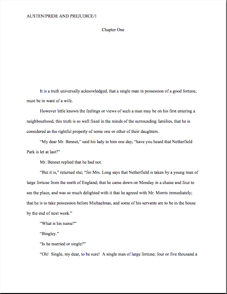
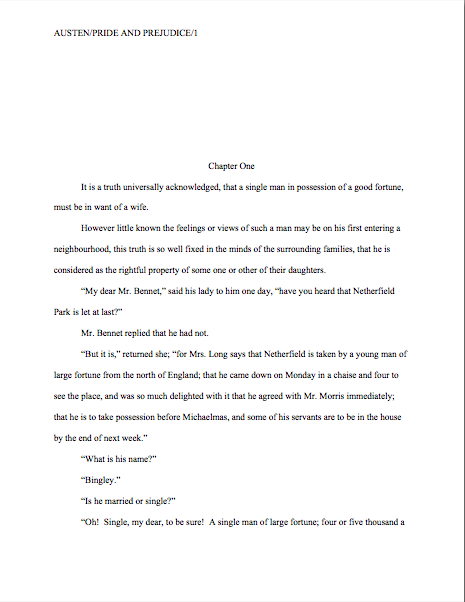
first page of text

Quite a difference, is it not? Millicent could tell which was a page from a proposal and which had fluttered free of a manuscript from ten paces away.

Now take a gander at the first page of the sample chapter in a proposal:

sample chapter opening

Those last two are remarkably similar, aren’t they? Pop quiz: see any formatting differences between this and the same chapter opening in the manuscript?

If you immediately leapt to your feet, exclaiming, “By Jove, Anne, the slug line clearly demonstrates that rather than starting pagination over again at page 1, the sample chapter’s first page shows where it falls within the book proposal,” congratulations: you have the eye of an editor. As you so astutely pointed out, the page numbers don’t start over at the beginning of the sample chapter; the entire proposal is numbered consecutively. For extra credit, would anyone care to guess why?

If you shouted, “To make it easier for Millicent to put the always unbound pages of the proposal back in order after she collides with someone in the hallway!” you’re really on a roll today. Help yourself to a gold star out of petty cash.

Otherwise, though, the sample chapter and the same chapter in manuscript form should be formatted identically. Realizing that, need I even add that part of what the writer is demonstrating in this section of the proposal is a familiarity with the standards of this industry?

Not to mention the tone and vocabulary norms of your chosen book category. I probably should mention it, though, because many a well-argued and even well-written book proposal has gotten rejected because the prose in the sample chapter just didn’t sound like, well, a book in that category.

As always, if you’re not familiar with what’s currently being published in your chosen book category, why not? And how on earth did you manage to write a convincing competitive market analysis without being up on all the recent releases, anyway?

I’m most emphatically not kidding about this: from an agent or editor’s point of view, a book proposer’s being conversant with the norms, trends, and current market for the type of book she’s proposing is not an optional extra — it’s a basic requirement. It comes standard with the professional nonfiction writer package.

Don’t tell me you can’t afford to buy everything that comes out in your category, either; that’s what libraries and bookstores with comfortable reading chairs are for.

One final word about the sample chapter before I move on to the remaining bits of the proposal: make absolutely sure that the sample chapter delivers on the promise of that chapter’s summary in the annotated table of contents. If there’s any doubt whatsoever in your mind about whether it fulfills that promise — or if it does not represent your best writing — either pick another chapter to use as your sample or start revising.

Cursory sample chapters are the bane of any proposal-reading Millicent or Maury’s existence, and for good reason: if their attention has been sufficiently grabbed by the overview and maintained throughout the middle part of the proposal, it’s a genuine disappointment to discover a sample chapter that just lies there. If they’ve read that far, trust me, they want — and expect — to be wowed.

They also expect that the sample chapter will demonstrate how you intend to flesh out the brief chapter summaries in the annotated table of contents, and rightly so. If the two parts of the proposal appear to be out of sync, M & M are going to wonder if your writing skills are up to the task of producing a consistent final manuscript.

Don’t tempt them to speculate on that score. Call me cynical, but I’ve seldom seen that type of speculation end well for the proposer. It’s not a screener’s job to give proposers the benefit of the doubt, after all.

Speaking of doing one’s job, it’s about time that I talked about the remaining elements of the proposal, isn’t it? Don’t worry; there aren’t many.

6. The author bio
Since writing a stellar author bio is an art form of its own, I’m not even going to attempt to describe here how to write one. For an in-depth discussion of the subject, please consult the aptly-named HOW TO WRITE AN AUTHOR BIO category on the archive list at right.

Seriously, go consult it. Again, this is a place where many first-time proposers skimp, thinking (erroneously, alas) that since they’ve already talked about their platforms earlier in the proposal, all that’s really necessary in the author bio is the kind of bare-bones, just-the-facts-ma’am author bios they’re accustomed to seeing inside the dust jackets of hardcover books. Do not, I implore you, be fooled by those brief paragraphs going by the same moniker as what’s required in a book proposal.

The purpose of an author bio in a book proposal is to provide a handy single-page summary of the writer’s platform for writing this particular book. That means, in practice, that a savvy writer may choose to use different author bio text — or even author photos — in proposals for different books.

Not sure why? Okay, tell me: if you were vacillating between acquiring two books on dog breeding, which bio would appeal to you more, one that simply lists the writer’s previous publications and credentials under a smiling head shot — or one that listed eight dog-related credentials under a snapshot of the writer with his arm around a happy Dalmatian?

No contest, is there?

Do not, for the sake of your own happiness, leave constructing your bio to the end of the proposal-writing process. It’s hard; budget time for it. Why? Well, really apt author bios are hard to write — and most of us go through quite a few photos before we find one of ourselves that we like.

Don’t believe me? Okay, care to guess how many shots my quite gifted photographer friend Marjon Floris took before she caught the one in my bio?

Somewhere in the neighborhood of 800. With two cameras. (Thank goodness for digital technology, eh?) Admittedly, my whole family is pretty camera-shy — my brother’s wedding photographer actually burst into tears during the reception, so frustrated was he at the difficulty of catching candids of any of us wily Minis — but still, a good author photo often takes a lot of trial and error.

Speaking of the camera-shy, am I seeing some of you waggling your fingertips in my peripheral vision? “But Anne,” the photography-averse murmur, making faces at the camera, “I don’t want to include a picture of myself in my bio; believe me, my book’s appeal would in no way be enhanced by a photo of me clutching a Dalmatian, or indeed, any creature whatsoever, warm- or cold-blooded. Can’t I, you know, skip it?”

You’re not going to believe this, but the answer is yes.

At least in a book proposal; it’s more or less de rigueur these days in a bio accompanying a manuscript submission. (Hey, both Millicent and Maury will want to be able to tell their bosses if the new writer they’ve just discovered is photogenic — like it or not, it does sometimes make a difference in marketing these days.)

Without an author photo, a proposal bio is simply another double-spaced single page of text with a title at the top. Here, for instance, is the super-serious bio I used a few years ago in the proposal for the political book I’ve been using as an example all day:

author bio

7. Relevant clippings, if any
This is another platform-proving exercise: if you have written articles, or even other books, it’s customary to include beautifully sharp photocopies of a few of them at the end of your book proposal. Similarly, if you happen to be famous enough for articles to have been written about you and your subject matter, feel free to include ‘em here — provided, in this second case, that they relate to your platform for this particular book.

Since our primary concern in this series is formatting (although I suspect that salient fact may have slipped all of our minds while I’ve been chatting at length about the content of a good book proposal; hey, I’m chatty), I’m going to leave to another time in-depth discussion of how to generate clippings. For now, I’ll content myself with urging you to make sure that the copies are pristine, with nice, clear, readable type.

Oh, and one other thing: do yourself a favor and scan each of the clippings, or have a computer-savvy someone do it for you. Not only will this enable you to submit your proposal to agents and small publishers who prefer online submissions (still relatively rare for nonfiction, but growing in popularity by the day), but it will also save you quite a bit of time down the line, once you’re working with an agent.

Why? Well, it has become quite common for agents to submit book proposals electronically to editors. Unscanned clippings can’t go into a virtual proposal, right?

Pant, pant, pant. Don’t stop running now — we’re practically at the end.

8. The proposal folder
I’ve written about this fairly extensively in the HOW TO WRITE A BOOK PROPOSAL series (conveniently gathered under the category of the same name on the archive list at right), so I’m not going to delve too deeply into the particulars. Except to say: in the United States, book proposals are presented in plain black folders.

Period. Don’t even consider trying to get fancy — and whatever you do, do not bind your proposal in any way. Let those pages flap around loose, just as they do in a manuscript.

Well, not quite the same: tuck the pages (neatly please) into the folder, items 1-4 on the left-hand side (i.e., everything prior to the sample chapter), items 5-7 (the sample chapter and beyond on the right).

Don’t label the folder on the front, either; keep it plain. What Millicent, Maury, and everybody else in the industry expects to see coming out of a submission envelope is this:

book proposal folder1

I know: boring. That’s the way they like it.

The folders in question, by the way, are the ones with horizontal pockets inside, not the ones with brads in the middle. The latter are for high school book reports, the former for book proposals, and ne’er the twain shall meet. So if the folder in your hand does not look like this when you open it:

book proposal photo 2

scuttle on back to the office supply story and pick up one that does. Seriously, proposals in the wrong kind of folder will just look unprofessional to the pros.

And that — whew! — is a lightning-swift (for me) discussion of how to format a book proposal. Congratulations on absorbing so much practical information so rapidly, campers, and keep up the good work!

The mysteriously mysterious strictures of standard format, part XIV: contested real estate, or, the battling schools of thought on chapter headings

Dempsey fight drawing

“In all matters of opinion,” Mark Twain tells us, “our adversaries are insane.”

Nowhere in modern life is this axiom more apt than in the vicious battleground that is airline seating. In recent years, most airlines have opted to make the space between rows of passengers smaller; in order to cram more seats per plane, many have also quietly made the window seats and even the seatbelts on window seats slightly smaller as well. (Try comparing sometime.)

The result for anyone who, like your humble correspondent, enjoys glancing out a window from time to time, is a seat tray rammed directly into one’s solar plexus if one happens to be trying to, say, use a laptop in flight. And that’s if the window-lover in the row ahead of me decides not to recline his seat.

On the particular flight upon which I am typing this, the last condition did not, alas, apply. A honeymoon couple — he awash in some pepper-based cologne, she beamingly bouncing her ring upon every row she passed, so all might see it glimmer in the light — evidently mistook their seats for two single beds. Not only were their activities in them not, as my grandmother would have said, appropriate for every audience, but they seemed disappointed — nay, convinced — that their seats would not recline into a completely flat position, presumably so they could (ahem) elevate their performance art piece to the next level.

After the first time the lady in question caused my laptop to emit a loud crack of protest, I politely explained through the crack in the seats (now about five inches from my face) that the nearness of the rows rendered their desired level of reclining impossible. Even if I had not needed to be working on my computer throughout the flight — an absolute necessity, I assured them, due to the standard formatting educational needs of all of you fine people waiting impatiently for me to land — the only way I could possibly accommodate the angle they desired would involve my balancing my paperback on the bride’s forehead as it hovered a few inches above my lap.

Apart from the book part, the honeymoon couple thought that would be just fine. How nice of me to suggest it.

The hard-argued subsequent compromise involved my turning sideways, twisting one of my legs underneath me while resting, if it could be called that, my back against the window-side armrest. If I gingerly balanced my laptop on the tray table of the seat to my left, I could barely manage to type. My left hip and elbow swiftly fell asleep, and the position required my staring fixedly at the profile of the guy in 23C (whose wife, you will be astonished to hear, apparently doesn’t understand him), but that was a small price to pay for the approximately 19 degree incline my gymnastics permitted the honeymooners.

At least for the first twenty minutes or so. After that, they kept trying to recline their seats farther. Apparently, I was being unreasonable to expect enough personal space to keep my laptop open the 90 degrees recommended by the manufacturer for optimal screen visibility. I can now tell you from personal experience that while it’s still possible to read the screen down to roughly 49 degrees, the lower the lid, the less accurate the typing.

Also, the lower the lid, the more one is tempted to draw conclusions about the fundamental difference between content producers and content consumers. To the recliners, the notion that I would so need to express myself on any subject that it could not wait until after we had landed was, I gathered, completely incomprehensible.

Oh, wasn’t I done yet? They’d like to lean back and enjoy themselves properly.

As much as I would like to blame the honeymooners’ frankly not-very-neighborly attitude upon either a poor set of upbringings (raised by airline-phobic wolves, perhaps?) or some bizarre wedding-induced solipsism that made them sincerely believe that no other human happiness was important compared to theirs, I suspect something very simple was happening here: all three of us were basing our expectations of personal space not upon the current lay-out of the airplane, but our sense memories of what air travel had been in the past.

My body remembers fondly being able to operate a laptop in comfort on an airplane, and not all that long ago. And I can only assume that somewhere deep in the honeymooners’ musculature, their forms remembered equally well being able to flop backward with impunity, without violating anyone else’s space bubble.

Or they were appallingly brought up. Either way, nobody was happy with the outcome.

A similar failure to communicate often characterizes the initial interactions between an aspiring writer and those he hopes will help his work get into print: agents, editors, contest judges, freelance editors, and of course, our old pal, Millicent the agency screener. From the new writer’s point of view, many of the hoops through which he’s expected to jump seem arbitrary, if not actively hostile to his progress; from the other side of the divide, it’s practically incomprehensible that any serious writer would not be aware of prevailing standards.

Each side, in short, typically expects something different from the other than what the other believes he is expected to provide. If the communication gap is severe enough, each may even begin to suspect the other of violating expectations on purpose, just to be annoying.

But that’s very seldom the case, on either end. The expectations are simply different, as often as not because each side has in mind some mythical period when perfect communication was the norm, rather than the exception. Millicent sighs for the days when the truly gifted tumbled out of the womb with a complete understanding of both standard format and changing market conditions; the aspiring writer longs for the era when every submission was read in its entirety, every time, and editors took the time to work with promising new authors.

Both sides are perfectly at liberty to sigh nostalgically, of course. But the fact is, none of these conditions ever prevailed on a large scale.

Oh, well-advertised submission standards used to render looking professional a trifle easier, admittedly; back when the slush pile still existed at major publishers, a new author could occasionally leap-frog over a few levels of testing. And undoubtedly, editors formerly had more time to work with writers. Things change. But contrary to what many an aspiring writer would like to think, there’s never been a point in publishing history when mainstream publishers were purely non-profit enterprises, devotes solely to bringing new voices to the admiring masses, nor have the bulk of submissions ever been completely professional and market-oriented.

Those seats never reclined as fully as you remember them doing, either. And those tray tables have never been particularly spacious.

All of which, I devoutly hope, will place you in the right frame of mind for confronting what seems to be a perennial controversy amongst aspiring writers: whether to place a chapter title (or just “Chapter One”) on the first line of a page or twelve lines below that, on the line just above where the text proper starts.

Don’t laugh, those of you who are new to this particular debate: this one has generated quite a body count over the years. Former comrades in arms, veterans of the writing trenches, have ceased speaking altogether over this issue; even judges within the same literary contest have been known to differ sharply on the subject.

Which is a trifle puzzling to those of us who deal with professional manuscripts for a living, frankly, because there actually isn’t a debate on our end. Nor do the Millicents gather over steaming lattes to debate the niceties of labeling a chapter. One way looks right to us for a book manuscript, period: the first page of a chapter should be formatted

What does that mean in practice? The chapter title belongs at the top of the page (centered) if the manuscript is a book; as with the first page of a manuscript, the title appears at the top, with the text beginning twelve lines below. In a short story or article, by contrast, the title belongs ten lines from the top of the page, on the double-spaced line above the text.

So yes, the spacing honestly does matter to the pros. As always, it’s to an aspiring writer’s advantage to use the format appropriate to the type of writing because it will look right to the Millicent screening it.

The answer really is as simple as that. Why, then, the rampant confusion? And why, given that the difference is a relatively small one not necessarily reflective of the quality of the writing involved, might a professional reader like Millicent or Mehitabel the contest judge particularly care if a talented aspiring writer chose the wrong version?

As is my wont, I shall let you see for yourselves. To place the two vitriol-stained possibilities before you in all of their lush magnificence, the question here is should the first page of a book chapter look like this:

Or like this:

Quite a visceral difference, no? The first version is in standard format for a book manuscript; the second is for a short story or article.

Oh, how tempting it is to leave it at that…but truth does compel me to tell you that Millicents, the agents who employ them, and contest judges see far, far more examples of version #2 than #1 in book submissions. Many, many times more. So much so that — prepare to rejoice, because I haven’t said this very often throughout this series — although an agent would almost certainly make you move a low chapter title aloft, at this point in publishing history, you could probably get away with either in a book submission.

I know — it sort of creeps me out to hear myself saying such a thing, too.

I hasten to add, though, that I would be reluctant to buy into the astonishingly pervasive theory that if masses and masses of people do something, it automatically becomes correct. No matter how many times all of us see apostrophe + s used to make a noun plural, it’s just not proper — unless, of course, we’re talking about the Oakland A’s, where the erroneous apostrophe is actually part of the proper name.

Ditto with manuscript submissions: as anyone who screens manuscripts for a living could tell you, a much higher percentage of them are incorrectly formatted than presented properly. But that doesn’t make improper formatting right, does it? Nor does it render it reasonable to expect that Millicent will be pleased to see a chapter title lolling about just above the text.

As everyone’s mother was wont to say (at least on the West Coast), if everybody else jumped off the Golden Gate Bridge, would you, too?

I was delighted to discover when I moved to the East Coast for college that the moms out there were prone to asking the same question with reference to the Empire State Building. There must be something about that particular period of architecture (the GGB was built in 1933-37, the ESB in 1930-31) that promotes suicidal ideas.

Speaking of body counts.

The weird thing about this particular formatting oddity — I’m back to talking about chapter titles now, not suicide attempts, in case you found that last segue a mite confusing — is how often the incorrect version appears in otherwise perfectly presented manuscripts. That fact sets Millicent’s little head in a spin. As, I must admit, it does mine, as well as the brainpan of virtually every other professional reader I know.

Why is it so very puzzling to us, you ask? Because at least in my case — and I don’t THINK I’m revealing a trade secret here — although I have literally never seen an agent submit a manuscript to a publishing house with format #2, I’m constantly meeting aspiring writers who have been told by writing teachers and even contest judges that #2 is the only acceptable version. And that’s just weird to me, as I have literally never even heard of an agent, editor, or anyone else in the publishing industry’s asking for a chapter heading to be moved from the top of the page to just above the text. Although as I said, I do know agents who routinely ask for the shift in the other direction.

And believe me, I’ve heard some pretty strange requests from agents and editors in my time; I’m not easily shocked anymore. But to hear a professional reader insist upon placing the chapter heading where you have to skip down a third of a page to read it…well, that would have me reaching for my smelling salts.

(Do they even make smelling salts anymore? And if everyone else jumped off the Golden Gate Bridge clutching them, would I?)

Clearly, somebody out there is preaching the place-it-just-above-the-text gospel, because agents, editors, and contest judges are simply inundated with examples of this formatting anomaly. We see bushels of ‘em. Hordes of aspiring writers are apparently absolutely convinced that the sky will fall in if that chapter heading is located anywhere but immediately above the text. Sometimes, when those die-hard advocates become contest judges, they even dock correctly-formatted first pages for having the title in the right place.

In fact, many aspiring writers are so convinced of the rightness of the drooping title heading that it’s not all that uncommon for an editor to find that after she has left a couple of subtle hints like this that the writer should change the formatting…

…the subsequent drafts remain unchanged. The writer will have simply ignored the advice.

(A word to the wise: editors universally HATE it when their advice is ignored. So do agents. Contest judges probably wouldn’t be all that fond of it, either, but blind submissions mean that in order to get dunned for brushing off a judge’s feedback, a writer would have to submit the same chapter two years running to the same contest, have the entry land in the same judge’s pile — in itself rather rare — and the judge would have to remember having given that feedback. Oh, and for the entrant to hear about it, the contest would have to be one of the few that gives editorial feedback.)

The up v. down debate may seem like a rather silly controversy — after all, in the cosmic scheme of things, why should it matter if the white space is above or below the title? — but sheer repetition and writerly tenacity in clinging to version #2 have turned it from a difference of opinion into a vitriol-stained professional reader pet peeve.

See earlier comment about how we tend to react to our advice being ignored; it’s seldom pretty.

Which, unfortunately, tends to mean that in discussions of the issue at conferences degenerate into writing-teacher-says-X, editor-at-Random-House-says-Y: lots of passion demonstrated, but very little rationale produced, beyond each side’s insisting that the other’s way just looks wrong.

However, there is a pretty good reason that moving the chapter heading information to just above the text looks wrong to someone who edits book manuscripts for a living: short stories’ first pages are supposedto look quite, quite different from those belonging to book manuscripts or proposals. Take a gander:

As you may see, for a short story like this one, there’s a mighty fine reason to list the title just above the text: a heck of a lot of information has to come first on the page, because short stories, unlike book manuscripts, are not submitted with a title page.

But that would not be proper in a book-length manuscript, would it? Let’s see what Noël’s editor might have said upon viewing this as the first page of a book:

Ouch. (That last bit would have been funnier if the entire page were readable, by the way, but my camera batteries were running low. Sorry about that.) Yet you must admit that at some level, the editor’s ire would have been justified: as Millicent and that angry mob of pitchfork-wielding ignored editors would be only too happy to tell you, short stories don’t HAVE chapters, so who on earth are they to be telling those of us in the book world how to format our manuscripts?

So I say it again: for a book manuscript, stick with version #1.

Which is not to say, of course, that this particular small deviation will automatically and invariably result in instantaneous rejection. It won’t, even in the latté-stained hands of the most format-sensitive Millicent. (See, she spilled coffee on her hands after she took a sip while it was still too hot — and if you didn’t get that joke, you probably haven’t been reading this blog for very long.) If a submission is beautifully written and technically correct in every other respect, she might only shake her head over the location of the chapter heading, making a mental note to tell you to change it between when her boss, the agent, signs the writer and when they will be submitting the manuscript to editors at publishing houses.

But if you don’t mind my saying so, that’s a mighty hefty set of ifs.

While I’ve got the camera all warmed up (and miles to go before I’m ready to let the honeymooners recline into my lap), this would probably be a good time to illustrate another ubiquitous agent and editor pet peeve, the bound manuscript — and you’re going to want to pay close attention to this one, as it is almost universally an automatic-rejection offense.

Manuscript submissions, and I don’t care who hears me say it, should not be bound in any way. Ditto with book proposals.

There’s an exceedingly simple reason for this: binding renders it impossible (or at least a major pain in the fingertips) to pull out a chapter, stuff it in one’s bag, and read it on the subway. Hey, paper is heavy. Would you want to lug home ten manuscripts every night on the off chance you’ll read them?

As with other ploys to make a manuscript appear identical to a published book, binding the loose pages of a manuscript for submission will not win you friends in the publishing world. Not only does this not look right (I spared you the chanting this time), but it seems so wrong that Millicent will be positively flabbergasted to see a submitter to do it.

She might, for instance, forget that her latte is still too hot to drink, take a sip, and scald her tongue. It’s been known to happen.

Seriously, the unbound manuscript is one of those rules so engrained in the professional reader’s mind that it seldom even occurs to authors, agents, or editors to mention it as a no-no at writers’ conferences. Heck, I’m not sure that I’ve mentioned it once within the first two years I was writing this blog — and by anyone’s standards, I’m unusually communicative about how manuscripts should be presented.

Talk about it all day, I will.

So I’m going to repeat myself, because you’re not going to hear this very often: by definition, book manuscripts should NEVER be bound in any way. Not staples, not spiral binding, not perfect binding. If you take nothing else away from this series, binding-lovers, I implore you to remember this.

Why am I making you swear to follow my advice this time around? Well, in practice, I’m sorry to report, a bound manuscript will seldom survive long enough in the screening process for the chapter-separation dilemma to arise, because — and it pains me to be the one to break this to those of you who’ve been submitting bound manuscripts, but if I don’t tell you, who will? — those pretty covers tend never to be opened at all.

Did you just exclaim, “Ye gods, WHY?” again? I can’t say as I blame you, but try for a moment to envision what a bound manuscript might look like from Millicent’s perspective.

To ramp up your stress levels to the proper level to understand her, envision a desk simply smothered with an immense pile of submissions to screen before going home for the day. Envision further that it’s already 6:30 PM, and eyeballs already dry as dust from a long, hard day of rejecting query letters.

Just lost your sympathy, didn’t she? Try, try again to place yourself in her proverbial moccasins.

Picturing that immense pile of envelopes clearly again? Okay, now slit open an envelope that reads REQUESTED MATERIALS on the outside. (You do know that you should ALWAYS scrawl that in two-inch letters in the lower left-hand corner of a submission envelope, don’t you, so your requested materials don’t get buried in the slush pile?)

If you’re Millicent — and right now, you are, singed tongue and all — you fully expect to see something like this lurking between the cover letter and the SASE tucked underneath:

But in the case of the bound manuscript, you would instead encounter something like this:

Kind of hard to miss the difference, isn’t it? Unfortunately, 999 times out of 1000, the next sound a bystander would hear would be all of that nice, expensive binding grating against the inside of the SASE, just before Millicent tucks a photocopied form rejection letter on top of it.

Honestly, it’s not that she is too lazy to flip open the cover; she just doesn’t see why she should.

Her logic may not seen particularly open-minded, from a writerly perspective, but it’s a fairly common argument throughout the industry: if this submitter does not know this very basic rule of manuscripts, how likely is he to know the rules of standard format? And if he does not know either, how likely is he to be producing polished prose? If he hasn’t taken the time to polish his prose, is this manuscript really finished?

And if it isn’t finished, why should I (you’re still Millicent, remember?) bother to invest my time in reading it before it is?

I know, I know — this logic may well not hold water when it comes down to an individual case. Despite my best efforts over the last few years, there are plenty of good writers out there who happen to be clueless about the rules of standard format.

But even if they all jump off the Golden Gate Bridge, you shouldn’t.

Here’s why: this is yet another expectation-differential problem. From Millicent’s perspective, the fact that good writers aren’t necessarily born aware of the norms of the industry matters less than we writers would like — because, as unpleasant as it is for aspiring writers to realize, her agency is going to see enough technically perfect submissions this week to afford to be able to leap to unwarranted conclusions about this one.

The moral: don’t waste your money on binding.

Seem arbitrary? From a professional reader’s point of view, it isn’t — the enforcement of standard formatting isn’t actually any more complicated than the simple axiom that any game has rules, and you will play better if you take the time to learn them.

Think about it: if you saw a batter smack a baseball, then dash for third base instead of first on his way around the diamond, would you expect his home run to count? Would an archer who hit the bulls-eye in her neighbor’s target instead of her own win the grand prize? If you refused to pay the rent on Park Place because you didn’t like the color on the board, would you win the Monopoly game?

I can go on like this for days, you know. Please, I beg you, say that you are getting the parallels, so I may move on. The flight attendant’s about to tell me to shut off my computer in preparation for landing.

Submitting art to the marketplace has rules, too, and while your fourth-grade P.E. teacher probably did not impart them to you (as, if I ran the universe, s/he would have), you’re still going to be a whole lot better at playing the game if you embrace those rules, rather than fight them.

You’ll also, in the long run, enjoy playing the game more. It may not seem that way the first time one is struggling to change an already-written manuscript into standard format, but trust me, it will be much more fun when you finish your next manuscript and realize that there’s nothing that needs to be changed.

Let all of those other folks jump off the Golden Gate Bridge without you, I say. Remember, you’re playing this game by choice: you could, after all, make your own rules and publish your book yourself. If you want to play with the big kids, you’re going to need to abide by their rules.

At least at the submission stage.

Until you know the expectations of the lovely folks seated in the row behind you, don’t assume you can recline all the way back into their laps. Everyone on the plane is trying to get to the same place, after all. By following the rules, you can make it a more enjoyable trip for all concerned.

Okay, okay, flight attendant; I’ll stop milking that metaphor and shut down my laptop. Just promise me that you’ll make the honeymooners straighten up their seats for the trip to the ground.

Keep up the good work!

Let’s continue with the basics: how do professional writers format manuscripts, anyway?

Buster Keaton reading

Some of you are already yawning, aren’t you? “Manuscript formatting?” I hear many an aspiring writer grumbling. “What on earth does that have to do with landing an agent and/or getting my book published?”

Plenty, actually; submitting the way professional authors do gives an aspiring writer a competitive advantage in submission. Before I go into why, bear with me for a moment while I share a little editorial anecdote.

Remember how I was telling you that a hefty percentage of the aspiring writers of North America tend to gird their loins, ratchet up their nerves, and send out queries and requested materials in early January of each year, in fulfillment of New Year’s resolutions to get cracking on getting published? These same resolutions lead freelance editors’ desks, or at any rate their e-mail inboxes, to groan under the weight of clients eager to seek their counsel. It’s also the time of year when we can get a preview of what Millicent the agency screener is likely to see for the next eleven months.

I can already tell you this year’s trend, alas: not double-spacing manuscripts. Last year, it was not indenting paragraphs.

A few of my fellow editors laughed at me when I brought it up at lunch last month, deploring that so many aspiring writers had apparently not done their homework on how manuscripts should be formatted. “Oh, come on, Anne,” they scoffed. “The formatting isn’t really the problem for most of those writers. Most of the manuscripts you’re talking about would have gotten rejected by agencies, anyway; the ones who don’t double-space tend not to spell-check, either.”

I sensed a bit of buck-passing. “But what about the ones who do spell-check — and proof-read, and take the time to get feedback on their work before sending it out? Improper formatting can as easily be the result of simple ignorance as of authorial laziness. I’m constantly meeting good writers new to the biz who haven’t the vaguest idea about what a professional manuscript looks like, for the exceedingly simple reason that they’ve never seen one.”

More scoffing. One of the editors even trotted out that old agents’ truism: “If a writer’s serious about getting published, he’ll take the time to learn what the formatting norms are. There are books that explain how to do it.”

“Not to mention your blog, Anne,” another quipped. “How often are you revisiting the rules of standard format these days? Once a year? Twice?”

Actually, it used to be three, but that was before I learned to keep reminding readers to check the archive lists. Still, I wasn’t about to let my friends off that easy. “I’m not denying that it’s possible to learn how to do it right; I’m just pointing out that most of the time, the writers whose manuscripts get rejected unread because of formatting problems have no idea that they’re not getting rejected on the writing itself.” Half the table looked skeptical. “Okay, fine — let’s do a little survey. Hands up: how many of you would read a single-spaced manuscript, if a potential client sent it to you? Or even one-and-a-half spacing? What about non-indented paragraphs?”

Crickets.

And that, my friends, should tell you a lot about just how seriously people who read manuscripts for a living take formatting. Even amongst the open-minded, there is a deep, pervasive prejudice against manuscripts that don’t look right cosmetically. Millicent the agency screener, Maury the editorial assistant, Mehitabel the contest judge: all of these readers whose approval a manuscript must get in order to land an agent, get picked up by a publisher, or make the finals of a contest are so conditioned to expect professional formatting that when they see one that deviates from the rules in any significant respect, they tend to assume, as did the editors above, that the writer is falling down on the job in other respects.

What does that mean in practical terms? Usually, that incorrectly-formatted manuscripts and contest entries are rejected unread.

Why? Well, it’s one of the easiest ways conceivable to narrow the submission pool — which is, if you think about it, job #1 for Millicent, Maury, and Mehitabel. Do the math: if the average agent receives 800-1200 queries per week and agrees to read even five percent of the manuscripts (high for most agents, by the way), that’s 40-60 manuscripts per week, and thus somewhere in the neighborhood of 2,000-3,000 per year. Since even a very successful agent could take on, at most, 4-5 new clients per year, Millicent had better narrow down that applicant pool, pronto, hadn’t she?

So had Maury. So had Mehitabel. Isn’t it fortunate, then, that the vast majority of submitters help these first readers out by presenting their writing unprofessionally?

Yes — really: the majority of submissions are not professionally formatted. They either resemble published books (which is not correct for a manuscript submission), short stories (ditto), or just whatever the submitter happens to think looks nice on the page (extrapolate the answer from the previous two).

All of which makes Millicent, Maury, and Mehitabel shout, “Hallelujah,” especially of late, when both query and submission rates have been skyrocketing. A lot of closet writers for whom writing a book has always been plan B — and with the economy in its current state, many folks seem to be pulling partially-finished manuscripts out of desk drawers these days. (Well, okay, off their hard disks, but it amounts to the same thing.) Because of the aforementioned books coming out of drawers, agencies and small publishing houses are seeing more queries than usual right now. The timing’s a tad unfortunate, since this is also a period where publishing houses have been laying off editors and other staff.

Translation: you know how fierce the competition to get picked up by an agent already was before the economy went south? It’s become even tougher.

While those of you who have been at it awhile are still reeling from the implications of that last statement, let me slip a few hard facts under the noses of those who have yet to submit for the first time:

(1) There exists a standard format for manuscripts to which US-based agents and editors expect submissions to adhere, regardless of whether those manuscripts are produced by seasoned pros with many book sales under their belts or those brand-new to the biz, and thus

(2) using fancy typefaces, including cover artwork, printing manuscript pages on colored paper, and/or any other deviations from standard format in one’s submission will NOT be regarded as interesting expressions of the author’s individual point of view, but rather as evidence that the author doesn’t know about (1). As a result,

(3) manuscripts submitted in standard format tend to be treated with SUBSTANTIALLY more respect by agency screeners, editorial assistants, contest judges, and pretty much everyone who happens to read unpublished prose for a living. Despite this fact,

(4) one does occasionally hear agents and editors ask for deviations from standard format; one should definitely give them precisely what they ask to see. However, it’s never advisable to generalize what one individual says s/he wants into a brand-new trend sweeping the industry. Nor is it a good idea to ape the formatting choices one sees in a published book, because

(5) book manuscripts do not resemble published books in many important respects, and for many excellent, practical reasons. That being the case, those who screen manuscripts for a living tend to draw unfavorable conclusions about submissions that do aspire to book formatting, much as they do when aspiring writers are not aware that

(6) standard format for book-length manuscripts is NOT business format, either, and just using what you learned about short stories won’t do, either. Nor is it necessarily identical to what your word processor’s grammar checker will ask you to do, or even the AP style one sees in newspapers and magazines. None of these will look correct to an agent or editor who deals with book manuscripts, because the norms there are very specific. This may seem nit-picky and irrelevant to the quality of the writing in question, but think about it:

(7) if a host asks you to a formal dinner, it’s only polite to wear formal attire; a guest who shows up in flip-flops and a Hawaiian shirt is going to stand out like the proverbial sore thumb. (If it’s not clear to you why, review point 2.) Similarly, when placed side-by-side with professional manuscripts, as a successful submission inevitably will, a wackily put-together manuscript will stand out as unprofessional, a phenomenon that all too often leads to

(8) most manuscript submissions get rejected on page 1. Not always because it deviates from standard format — although the vast majority of submissions do — but because an unprofessionally-formatted manuscript already has one strike against it, and who needs that? Ultimately,

(9) it’s just not worth your while to try to fudge your way out of these standards, since the price of a submission’s annoying a professional reader can be so high. And as I mentioned above, no matter how many times my readers, students, and editing clients ask me if agents, editors, and contest judges are REALLY serious about them, I’m not going to give you permission to ignore any single one of the standard format strictures. No way. Stop asking, already.

Why might knowing all this — and, more importantly, acting upon this knowledge — translate into higher acceptance rates, typically? Well, the aspiring writer who acts upon this information conscientiously is probably producing submissions within the top 2% of what crosses Millicent the agency screener’s desk on any given day.

Yes, really. So if any of the information on the list above came as a surprise to you in any way, it’s incredibly important that you should join me on a tiptoe through the intricacies of standard format.

I implore those of you who have been through this material with me before: don’t just skip these posts on standard format. I see manuscripts all the time by experienced albeit unpublished writers that contain standard format violations; heck, they occasionally turn up in the work of published writers, if the complaints their agents and editors make in those bars that are never more than a hundred yards from any writers’ conference in North America are to be believed.

Seriously, all of us could use a review from time to time — say, the twice per year I bring the matter up here. Because, you see, I am far from the only professional reader who takes umbrage, when manuscripts deviate from certain time-honored restrictions. Trust me, Millicent started twitching at the very sight of them before she’d had her job three weeks.

Yes, even if the formatting in question would be perfectly legitimate in other writing environments. (See points 2, 3, 5, and 6 above, for instance.) And yes, yes, oh, yes, even if the deviation is precisely what some agent, editor, writing guru, or darned fool writing expert like me has suddenly announced to the world is the new norm.

Millicent didn’t get that memo.

Think about it: why would she, unless she happens to work for the agent-who-blogs or editor-who-is-trying-to-be-helpful who promulgated the new advice? Indeed, why would anyone who works with manuscripts for a living go out looking to see what folks outside the industry — or, at minimum, outside her agency’s office — are demanding of writers these days, when the basics of standard format have actually changed very little for decades?

Actually, it would be very much against her self-interest to go trolling for such information, because –chant it with e now — it’s so much easier just to regard submissions that don’t adhere to standard format as inherently unprofessional, and thus (by implication) less likely to contain writing destined to take the publishing world by storm.

To put it bluntly, it would slow her per-submission rejection time.

I hope no one out there fainted, because this is a vital fact for any submitting writer to understand: the folks who read submissions (and queries) in order to decide who gets a break and who doesn’t are in a HURRY. Remember the stats above; these people have a heck of a lot of reading to do.

As we saw in our series on how manuscripts get published, in the face of that many pieces of paper to plow through, even the reading of submissions tends to be awfully rushed: the goal becomes to weed out as many as possible as quickly as possible, rather than seeking out gems. Once a professional reader like Millicent has been at it for a while, s/he will usually develop a knack for coming to a conclusion about a piece of writing within the first paragraph or two.

Sometimes even within the first line or two. (For a fairly frightening run-down of the common first-page rejection reasons, you might want to check out the HOW NOT TO WRITE A FIRST PAGE category on the list at right.)

What does this trigger-happiness mean for aspiring writers who scoff at standard format, or just don’t know about it? Well, it’s not good: agency screeners, agents, editors, and contest judges tend to regard submissions formatted in any other way as either unpolished (if they’re feeling generous) or unprofessional (if they’re not).

And unfortunately for writers unaware of the rules, a non-standard manuscript is child’s play to spot from the moment a professional reader lays eyes upon it. That can be an extremely serious problem for a submission, because — wait for it — being identified as not professionally formatted renders it FAR more likely to be rejected.

Why? Shout it with me now: agencies and publishing houses get so many submissions that a screener’s primary goal is to weed out the one she is reading at the moment.

The faster she can do that, the better, to move through that mountain of paper on her desk. So a first page that cries out the moment Millicent lays eyes on it, “This writer is brand-new to the game and will require quite a bit of your boss’ time to coach into being able to produce a manuscript that an agent would be comfortable submitting to an editor!” is a downright gift to her: she can feel completely comfortable rejecting it at the very first typo, cliché, or word choice she doesn’t happen to like.

Heck, she might not even wait to spot any of the above. She might just say, “Oh, look — single-spacing. Next!”

This dark, dark cloud is not without its proverbial silver lining, however. By logical extension, the more professional your manuscript looks, the more likely it is to be read with interest by a screener in a hurry.

See now why aspiring writers cognizant of points (1) – (9) enjoy a considerable competitive advantage at submission time?

I don’t know about you, but I’m all for anything that helps a good writer’s work get taken more seriously, especially in the current super-tight submission environment, which is more rejection-happy than I’ve ever seen it — and I’ve been listening to writers, agents, and editors complain about the state of the literary market since I was in my cradle. (Literally. Long story.)

Right now, Harry Houdini himself would have extreme difficulty sneaking a non-standard manuscript past an agency screener, even though he undoubtedly has the world’s best platform to write a book on extricating oneself from tight situations. (And if that last quip didn’t make you groan, if not chuckle, it’s time to brush up on your industry-speak.)

So to help give you that competitive edge, I’m going to start running though the rules of standard format — and no, Virginia, none of them are negotiable.

(1) All manuscripts should be printed or typed in black ink and double-spaced, with one-inch margins around all edges of the page, on 20-lb or better white paper.

No exceptions, unless someone in the industry (or a contest’s rules) SPECIFICALLY asks you to do otherwise. And I’m dead serious about using ONLY white paper: ecru paper, no off-white, no Dr. Seuss-type stripes.

Yes, yes, buff or parchment can look very nice, but there’s a strategic reason to use bright white paper: very sharp black-white contrast is strongly preferred by virtually every professional reader out there, probably as a legacy of having read so many dim photocopies over the course of their lifetimes.

The ONLY colored paper that should ever go anywhere near a manuscript is the single sheet that separates one copy of a submission or book proposal from the next, so it is easy for an agent to see where to break the stack. (But you don’t need to know about that until your agent asks you to send 15 copies of your book for submitting to editors. Put it out of your mind for now.)

Nice, clear, dark print is optimal here, so do spring for a new printer cartridge. You’d be amazed (at least, I hope you would) at how poor the printing quality is on some submissions; it’s as though the author dunked in a swiftly-flowing river several times before popping it in the mail.

Which is sad, because submissions with poor print quality are — you’re ahead of me on this one, aren’t you? — almost never read.

Speaking of never, never, ever, eversubmit a dim photocopy; print out an original, every time, You’d be amazed (at least, I hope you would) at how poor the printing quality is on some submissions; it’s as though the author dunked in a swiftly-flowing river several times before popping it in the mail.

Oh, you may chuckle at the notion of sending out a grainy photocopy, but believe me, any contest judge has seen many, many entries submitted that way. Mehitabel likes them, actually: for every one that pops up, her reading time is shortened. Any guesses why?

(2) All manuscripts should be printed on ONE side of the page and unbound in any way (again, unless you are specifically asked to do otherwise)

Yes, this IS criminally wasteful of paper, especially when you consider the literally millions of pages of submissions that go flying into the agencies and publishing houses every month. Most agencies do not even recycle; as I mentioned in my last series, the vast majority of agencies did not even consider accepting e-mailed queries at all until the anthrax-in-envelopes scare.

I assure you, if I ran the universe, paper conservation would be the norm, and recycling mandatory. Also, writers would all be granted an extra month a year in which to write, excellent and inexpensive child care while writing, a cedar-lined cabin on the shores of Lake Michigan in which to do it, and a pineapple upside-down cake on Kurt Vonnegut’s birthday. Perhaps some hard candies on Agatha Christie’s birthday as well, in affluent years, and dancing on Mme. de Staël’s.

But since the unhappy reality is that I do NOT run the universe (see disclaimer above), we shall all have to live with the status quo.

Which is to say: the publishing industry is one vast paper-wasting enterprise. Sorry.

Unbound means precisely what it says: no binding of any kind. You’d be surprised at how often writers violate the thou-shalt-not-bind rule, including paper clips, rubber bands, or even binders with their submissions. Since agents always circulate manuscripts without any sort of binding, these doohickeys just scream, “I’m unfamiliar with the industry.”

SASE, open wide: here comes a returned manuscript.

The ONLY exception to this rule is a nonfiction book proposal — not the manuscript, just the proposal — which is typically presented UNBOUND in a black folder, the kind with horizontal pockets. (For tips on how a book proposal should be presented, please see the aptly-titled BOOK PROPOSALS category on the list at right.)

Which doesn’t mean that you aren’t perfectly welcome to print double-sided or bind copies for your own purposes; just don’t show your work to the pros that way. As Author! Author!’s very first commenter Dave tends to chime in when I bring this up — and helpfully — if you wish to make double-sided, 3-hole-punched, be-bindered drafts for circulating to your first readers for ease of toting around, be my guest.

But NEVER submit in that manner to a professional reader unless s/he has asked you to do so. Trust me on this one.

(3) The text should be left-justified, NOT block-justified, as published books, e-mails, business letters, and online writing tend to be.

Translation: the left margin should be straight; the right margin should not.

Many fledgling writers find (3) nearly impossible to accept, because it is one of the most visually obvious ways in which a professional manuscript differs from a printed book. They believe, wrongly, that anything that makes their submission look more like what’s on the shelves at Barnes & Noble is inherently professional. In practice, quite the opposite is true.

Yes, books feature text that runs in straight vertical lines along both side margins, and yes, your word processing program can replicate that practically effortlessly, if you ask it nicely to do so. Bully for it.

But don’t take advantage of that pleasing capacity, I beg you: the straight margin should be the left one; the right should be ragged, as if you had produced the manuscript on a typewriter.

Fear not if you’re having trouble picturing this: I shall be showing you concrete examples later in this series. For now, you’re just going to have to trust me when I tell you that block-justifying your submission is going to appeal to your garden-variety Millicent about as much as a slap in the face.

Speaking of things I’m going to demonstrate in the days to come, NEVER format a query or cover letter to someone in the industry in business format: indent those paragraphs. (And yes, now that you bring it up, I do intend to show you why. Hold your proverbial horses, already.)

(4) The preferred typefaces are 12-point Times, Times New Roman, Courier, or Courier New; pick one and use it consistently throughout your entire submission packet.

Even if you have a strong preference for the lettering in your book when it is published, use one of these typefaces for submission purposes. Personally, I would never dream of allowing a client of mine to submit a manuscript in anything but Times New Roman, nor would I ever submit any of my work in anything else. It is the standard typeface of the publishing industry, just as Courier is the norm of screenwriting.

A tad silly, you say? Perhaps, but it’s one of the bizarre facts of publishing life that manuscripts in these fonts tend to be taken far more seriously, and with good reason: these are the typefaces upon which the most commonly-used word count estimations are based. (Psst: if you don’t know why you should be estimating the length of your manuscript rather than using actual word count, please see the WORD COUNT category at right.)

To forestall the usual question someone brings up at this point: yes, most published books ARE in typefaces other than Times or Courier, but typeface decisions for published books are made by the publishing house, not the author. Submission time is not the appropriate period for making your preferences known.

Why? Shout it with me now, understanders of point (5) at the top of this post — MANUSCRIPTS AND PUBLISHED BOOKS AREN’T SUPPOSED TO LOOK THE SAME.

If you’re very nice down the line, after a publishing house has acquired your book, they may listen to your suggestions. They may giggle a little, true, but they might listen. Ditto with the cover and the title, which are — brace yourselves — almost never under the author’s control.

Why? Because these are considered matters of packaging and marketing, not content.

All of which begs the question, of course: why do word processing programs tempt us so many typefaces from which to choose, if we’re not supposed to use them?

Answer: because the people who make word processing programs are not the same people who decide what books get published in North America. Which is why, in case you’re wondering, what Microsoft Word means by word count and what the average agent or editor does are not typically the same thing.

Again, so there.

There are a few agents out there who have their own font preferences (usually Courier, and usually because they also represent screenplays) so do check their websites and/or listings in the standard agency guides. As ever, the golden rule of dealing with an agent you want to represent you is GIVE ‘EM PRECISELY WHAT THEY ASK TO SEE, not what you would like them to see.

Fair warning: if you are a writer who likes to have different voices presented in different typefaces, or who chooses boldface for emphasis, a submission is not a forum where you can express those preferences freely. Yes, one sees this in a published book occasionally, but I assure you, the choice to indulge in these formatting differences was the editor’s, not the author’s.

Sorry. (See my earlier disclaimer about proprietorship of the universe.)

I’m still sensing some skepticism out there on the font issue, but that may be a hangover from reader reactions to previous series on standard format. Almost invariably, around the time that I bring up Rule #4, someone posts a comment informing me huffily that website X advises something different, that this agent said at a conference she doesn’t care what typeface you use, that a certain manual said that standards have changed from the traditional guidelines I set out here, or some other observation presumably intended to make me rend my garments and cry, “Finally, I see the error of my ways! I guess I’ll disregard the fact that I’ve never seen the change you mention actually in use in a professional manuscript and declare it to be the new norm!”

To save you the trouble and sound like a broken record at the same time: it’s not gonna happen.

I have no doubt that all of these comments are indeed pointing out legitimate differences in advice, but it is not my purpose here to police the net for standardization of advice. If you like guidelines you find elsewhere better, by all means follow them.

All I claim for these rules — and it is not an insubstantial claim — is that nothing I advise here will EVER strike an agent or editor as unprofessional; even if any give agent, editor, or contest judge should happen to harbor personal preferences for other formatting choices, anyone who has been in the biz for a while will recognize pages in standard format as the industry norm.

Why is that important? Adhering to these rules will mean that your writing is going to be judged on your writing, not your formatting. And that, my friends, is nothing at which to sneeze.

Speaking of which: my apologies for being a trifle slow to get to this topic, campers — that flu I had last week has developed into bronchitis, and I try not to post when I’m feverish. Tends to make me a trifle testy. So if I’m a trifle slow in answering questions left in the comments over the next week or so, I’m sure you’ll understand. Rest assured, I’ll get to them just as soon as I stop coughing.

More rules follow next time, of course, as well as buckets more explanation. In the meantime, keep up the good work!
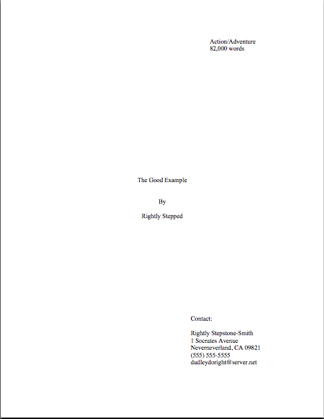
The getting-a-book-published basics, part VI: responding sensibly to that much-anticipated request for pages

seagull in Spain

No, I’m not devoting today’s post to the resting habits of seagulls. I just thought that after all of the horrifying imagery we’ve all been seeing over the last 24 hours, a nice, soothing image wouldn’t be amiss today. (But if you’re itching to help out: both the Red Cross and Doctors without Borders can put donations to work helping earthquake victims right away.)

For those of you joining us mid-series, I’ve been spending the last few posts on an overview of how books currently get published in the United States. Not the astonishing pervasive fantasy that all a good writer has to do to get published is to write a book, but the actual logistics of what happens. The view from the trenches, as it were. So far, we’ve gone over how US-based publishing has changed over time; how fiction and nonfiction are marketed differently; why a writer needs an agent; the various methods of seeking representation, along with their pros and cons, and last time, what kinds of reactions an aspiring writer may reasonably expect following an attempt to approach an agent.

Is everyone fairly clear on all of those? If not, please feel free to post questions in via the comments functions — or, better yet, to seek out more detailed answers amongst the many and varied categories on the archive list on the lower right-hand side of this page.

Yes, yes, I know: I have been harping on the archives quite a bit over the last few posts, but I assure you, I have my reasons. The current series is intended to give those new to trying to get their work published — and anyone else who feels like reading it — a general view of how the process works, as opposed to my usually favored approach, the let’s-concentrate-on-this-one-small-aspect-for-a-week method of analysis. Both have their benefits, of course, but if you are looking for elucidation on any of the individual points I’m discussing here, chances are that you will find far more discussion than you ever dreamed in the archived posts.

So if delving into the archive list starts to feel like trying to catalogue the contents of Pandora’s box, well, don’t say that I didn’t warn you. Back we go to the general overview.

What a writer should do if an agent requests materials: paper or ether?
If a query or pitch is successful, an agent will typically ask the writer to send either the entire manuscript (rare), a specified number of pages from the beginning of the book (substantially more common), or, for nonfiction, the book proposal. Most of the time, this means that the agent is expecting to receive it as hard copy, sent by regular mail, so if the requesting agent does not specify, start printing.

Yes, even if you queried electronically; reading submissions in soft copy is still far from universal. If an agent prefers e-mailed submissions, he will tell you so when he requests the pages; that information is often included on the agency’s website’s submissions requirements list as well.

If an agent does prefer electronic submissions (and tells you so), send the requested pages as an attachment to an e-mail. Under no circumstances should you ever send a computer disk or CD-R with your book on it — it will be returned without being opened.

If you are planning to submit electronically, please be aware that unless a US-based agent specifically states otherwise, the attachment he has in mind is a document in MS Word. If you work on a Mac, make sure to send it as a Windows-friendly document and as .doc file; many agencies do not run recent enough versions of Word to read .docx files.

Why Word, as opposed to any of the many software programs out there professing to create professional-looking book pages? Word is what the major publishing houses use, that’s why. If the agent of your dreams is going to submit electronically to an editor, that’s how the editor would expect to receive it.

Occasionally, an agent will ask for attachments as rtf (rich text format), a version without the formatting bells and whistles that render documents hard to translate across word processing systems; if you don’t habitually work in Word, but send your document in rtf, a Word user should be able to open it. Some agents accept submissions in PDF format — especially those who choose to read submissions on a Kindle, rather than on a computer screen, as is becoming increasingly common — but it’s seldom preferred, as it’s hard to edit.

Because the human eye reads much more quickly on a backlit screen than on a printed page, it’s usually to the writer’s advantage to submit in hard copy, rather than electronically. It’s also more work for an agent to reject a paper copy, as opposed to the single action of hitting the DELETE key required to remove an e-submission from his life forever; that’s also true of mailed vs. e-mailed queries, incidentally. (For more on the pros and cons of paper vs. electronic submissions, please see the E-MAILED SUBMISSIONS and E-MAILING QUERIES categories on the list at right.)

However an agent has asked you to submit, though, do as he asks. In fact, if there is one inviolable rule to bear in mind while preparing a submission packet, it is surely send the agent precisely what he has asked you to send.

What a writer should do if an agent requests materials: demonstrating you can follow directions
Being hyper-literal often doesn’t serve an aspiring very well along the frequently perilous road to publication, but this is one time where it’s positively a boon. All too often, aspiring writers get so excited over an agent’s request that they forget the quality of the writing is not necessarily the only factor an agent weighs in deciding whether to represent a client. She’s also going to being paying attention to whether the submitter is good at doing what he’s asked to do.

So I reiterate: submit precisely what the agent asks you to send — and only what she asks you to submit.

What might that mean in practice, you ask? Well, if the agent asked to see the first 50 pages, send the first 50 pages — not the first 49, if a chapter happens to end there, or 55 if there’s a really exciting scene after page 50. If page 50 ends mid-sentence, so be it.

Getting the picture?

Why is it so very important to follow submission instructions exactly? The ability to follow directions to the letter tends to be a quality that agents LOVE to see in potential clients, since it implies the writers in question possess two skills absolutely essential to working well with an editor — no, make that three: an ability to listen or read well, a capacity for setting goals and meeting them, and a professional attitude.

So getting the contents of the submission packet right is monumentally important. So if you receive the request in the course of a pitch meeting, take the time to write down a list of what the agent is asking you to send. Read it back to him to make sure you caught everything. (Trust me, if you’re face-to-face with an agent who has just said yes to you, you won’t be thinking with your usual clarity.)

If the agent makes the request in writing, read the missive through several times, then sit down and make a list of what he’s asked you to send. Wait at least 24 hours before re-reading the communication to double-check that every requested item made it onto the list. THEN assemble your submission packet, checking off each element as you place it into the envelope or box.

Clever reader Tad came up with a brilliant extra level of security: after you have assembled the submission packet, hand it, your list, and a copy of the letter from the agent to someone you trust — a parent, a significant other, a best friend, or any other friendly, detail-oriented person you’re relatively certain isn’t harboring a secret desire to see you miserable — and ask that person to check that (a) the letter and the list correspond exactly and (b) you’ve included every necessary element in the packet.

Yes, it’s THAT vital to get it right.

Throughout the last few paragraphs, I’ve been sensing some confusion out there. “But Anne,” a few timid souls pipe up, “am I missing something here? How difficult could it possibly be to print up the number of pages the agent requests, place them in an envelope, and pop it in the mail? Are you saying that he might ask to see something other than the manuscript?”

Often, yes. There are also a couple of elements that any US-based agent will expect to see, whether or not he asks you to include them.

What might an agent ask you to submit — and what should you always send whether she asks for it or not
Since there is no industry-wide standardization of what precisely belongs in a submission packet, any given agent may ask for a different array — and you already know to send precisely what each asks you to send, right? However, the most commonly-requested elements are:

The requested pages in standard manuscript format, unbound.
The most popular lengths to ask for are the first chapter, the first three chapters, the first 50 pages, the first 100 pages, and the entire manuscript. If you’re unfamiliar with the way a professional manuscript should look (hint: not like a published book, nor is it identical to a short story submission), please see the HOW TO FORMAT A BOOK MANUSCRIPT and STANDARD FORMAT ILLUSTRATED categories at right.

A few cautionary notes, just in case any of you are too eager to get that packet out the door to check the formatting posts: manuscripts absolutely must be double-spaced, in 12-point type (preferably Times, Times New Roman, or Courier), printed on only one side of the page with one-inch margins, and feature indented paragraphs. (No, business format is not proper here — for a full explanation why, please see the BUSINESS FORMAT VS INDENTED PARAGRAPHS category at right.)

A synopsis.
For fiction, this is a description of the major twists and turns of the plot, told as vividly as possible. Remember what I said last time about every syllable you submit to an agent being a writing sample? Holds true for the synopsis, too. (For tips on how to pull this off in what is often an intimidatingly small number of pages, please see the HOW TO WRITE A REALLY GOOD SYNOPSIS category at right.)

For nonfiction, it’s a summary of the central question the book will address, why the question is important to answer, and a brief indication of what evidence you will use to bolster your arguments. (For an in-depth look at how to pull one of these together, please see HOW TO WRITE A NONFICTION SYNOPSIS category at right.)

An author bio.
This is an extended version of the 1-paragraph description of your life, with emphasis upon your writing credentials, your education, and any experience that would lead an observer to regard you as an expert on the subject matter of your book. For a crash course on how to write one, please see the HOW TO WRITE AN AUTHOR BIO category. (Hey, I wasn’t kidding about there being a whole lot of elucidation on this site. If an agent asks you for something, chances are that I’ve written a two-week series on how to produce it.)

The book proposal.
As I mentioned earlier in this series, book proposals are marketing packets used to sell nonfiction. For an explanation of what should go into it and how to put it together, please see the HOW TO WRITE A BOOK PROPOSAL category. (This is starting to read like the back of a greatest hits album, isn’t it?

A marketing plan.
This request was unheard-of for novels until just a couple of years ago, but recently, the marketing plan has been enjoying a vogue. For fiction, it’s the same document as the similar section in the book proposal (and thus a description of how to write one may be found under the HOW TO WRITE A BOOK PROPOSAL category): a description the target audience for the book and how to reach them.

Bear in mind that what anyone who asks to see a marketing plan has in mind is what the AUTHOR will be doing to promote the book, not the publishing house’s efforts, so just saying, “I will make myself available to go on a book tour,” probably isn’t going to impress anybody. Think creatively: who is your target reader, and where do folks like that congregate?

Those are what an agent will probably ask to see. For tips on how to present these professionally, how to box them up, in what order they should be stacked, etc., please to see the HOW TO PUT TOGETHER A SUBMISSION PACKET category at right.

While I’m at it, here is a list of what she will almost certainly not mention in her request, but your submission will appear substantially more professional if you include:

A cover letter thanking the agent for asking to see the requested materials and repeating the writer’s contact information.
I’m always astonished at how many aspiring writers just throw a manuscript into an envelope without even attempting any polite preliminaries. It’s rude — and, given how many queries an agency processes in any given week, it’s not a grand idea to assume that the person who opens your submission envelope (almost certainly the screener, Millicent, whom we met yesterday, not the agent herself), will instantly recall who you are. (For guidelines on how to construct this important missive, please see, you guessed it, the COVER LETTERS FOR SUBMISSIONS category at right.)

A title page for your manuscript.
Again, most submitters omit this, but an already-established writer would never dream of submitting a manuscript anywhere without a title page, since a professional title page includes information absolutely vital to marketing the book: the book category, the word count, the title (of course), the author’s contact information. (For an explanation of all of these elements, how to put them together on a page, and illustrations of what a professionally-formatted title page looks like, please see the TITLE PAGES category on the list at right.)

A stamped, self-addressed envelope (SASE).
As with queries, not including a SASE with a submission is generally considered an instant-rejection offense. While it’s classy to include a letter-sized SASE in case the agent wants to respond in writing, the SASE in a submission is an envelope or box labeled with your address and enough postage (stamps, not metered) to mail it back to you. (If that sounds complicated, don’t fret: you’ll find a complete explanation of how to handle the many permutations of SASE use under the SASE GUIDELINES category at right.)

Why do you need to include a SASE for your manuscript’s return? Well, unless the agent decides to sign you to a representation contract, she’s not going to hang onto your manuscript — and since not all agencies have recycling programs (yes, I know; it’s discouraging), those rejected pages are just going to land in the trash.

Confused? It wouldn’t be altogether surprising if you were: the logistics of submission are much more complex than the vast majority of aspiring writers realize. For a much fuller explanation of how to juggle all of these elements into a professional-looking submission package, check out the HOW TO PUT TOGETHER A SUBMISSION PACKET category at right.

Packaging the submission so it ends up in the right place
Since agencies receive many, many submissions, both requested and not, with every single mail delivery, it’s an excellent idea to write REQUESTED MATERIALS in great, big letters on the top of the envelope or box containing your submission packet. This will help ensure that your package ends up in the right pile on the right desk. As unsolicited manuscripts are almost universally rejected unread, the last thing in the world you want is for your requested materials to be mistaken for them, right?

For the same reason, if an agent has asked you to submit pages via e-mail, it’s prudent to include the words REQUESTED MATERIALS in the subject line of the e-mail. It’s very, very easy to delete an e-mail accidentally, after all. Better safe than sorry, I always say.

Oh, and before I forget, let me reiterate that grand old piece of traditional writerly advice from the first post in this series: never, ever send an agent — or anybody else, for that matter — your only copy of anything. To that, let me add Anne’s Axiom of Submission: never spend the money to ship anything to an agent overnight unless they specifically ask you to do so.

Contrary to popular opinion amongst aspiring writers, overnight shipping will not get your packet read any quicker than sending it by regular mail, so it’s just a waste of money. Within the US, the significantly less expensive Priority Mail will get it there within 2-3 business days, which is quite fast enough.

Assuming that at least some of you are still with me, I shall now move on to the single most-asked question amongst submitters everywhere:

Okay, now I’ve sent my submission packet. How soon will I hear back?
Well, let me put it this way: I wouldn’t advise holding your breath. Even if you are asked to submit a partial and an agent decides that she’d like to see the rest of the book, you’re probably not going to hear about it right away.

And right away in this context means within the next six weeks. You’ll save yourself a lot of heartache if you understand this: no matter how enthusiastically an agent solicited a manuscript, trust me, she will neither have cleared her schedule in anticipation of receiving your materials nor will drop everything to read it the instant it arrives.

Yes, really. Unless she knows that there are other agents competing to represent you (should you find yourself in that enviable position anytime soon, congratulations, and please see the WHAT IF MORE THAN ONE AGENT ASKS TO SEE MY MANUSCRIPT? category at right), she — or, more likely, her assistant — will place it in a pile along with all of the other submissions awaiting review.

As with query letters, the length of time an agency takes to make a decision on a manuscript varies wildly, but most of the time — are you sitting down? — it’s measured in months, not days or even weeks. Most agencies list their average turn-around times on their websites or in their agency guide listings, to alert aspiring writers to what can be an extended wait, but those estimates tend to be quite optimistic.

Why does it take so long, you wail? Well, as I said, quite a few manuscripts will have arrived before yours. If waiting in a queue seems unfair now, think about it again after an agent has had a manuscript for a month: how would you feel if one that arrived today were read before yours?

Another reason that turn-around times tend to be slow is — again, you might want to brace yourself — the agent who requested the materials is not usually the only, or even the first, person to read a submission.

Remember our pal Millicent from yesterday? Guess what her job entails after she finishes screening all of those query letters? That’s right: she’s usually the one deciding whether a submission makes the first cut; at some agencies, two Millicents have to agree that a manuscript is of publishable quality AND a good fit for the agency before the agent sees it.

I told you to brace yourself. Unfortunately, as long-time readers of this blog are already glumly aware, Millicents are trained to find reasons to reject manuscripts first and foremost, rather than reasons to accept them.

And no, in answer to what half of you just thought, she doesn’t do it just to be mean or because she hates literature. Since her job is to thin the number of submissions her boss will have to read (often in the agent’s spare time, rather than at work, incidentally: yet another reason that turn-around times tend to be slow), a good Millicent may reject as many as 90% of submissions before they get anywhere near the agent. (For a truly frightening look at some of the most common criteria she uses to thin the herd, you might want to check out the FIRST PAGES AGENTS DISLIKE or AGENCY SCREENERS’ PET PEEVES OF THE NOTORIOUS VARIETY categories at right. I warn you, however, these posts are not for the faint of heart.)

Even more unfortunately, submitters are seldom given concrete reasons for rejection any more. (For a thoroughly depressing explanation why, please see the FORM-LETTER REJECTIONS category at right.) This means, in practice, that an aspiring writer may not gain any useable revision information from the submission process at all.

I know; it’s awful. If I ran the universe, or even just the publishing industry, it would not be this way. Queriers and submitters alike would receive kindly-worded explanations of why Millicent decided to reject them. Public libraries would also be open 24 hours per day, staffed by magnificently well-read and well-paid staff more than willing to stock good self-published and print-on-demand books (as most US libraries currently will not, as a matter of policy), and hand out ice cream to every child departing with a checked-out book, in order to instill in wee ones the idea that the library is the best place ever.

Under my benevolent régime, schoolteachers would also be paid exceptionally well, every citizen could afford to buy a few books by promising new authors every week, and municipal fountains would flow freely with chocolate milk for all to enjoy. Truman Capote, Dorothy Parker, and Madame de Staël’s birthdays would be international holidays. And earthquakes would be permanently banned.

In case you may not have noticed, none of these delightful things is yet true, so I think it’s safe to assume that I don’t yet run the universe. Sorry about that.

Despite deviating sharply from what I personally would like to see happen at agencies, the submission process is far from impossible to navigate: remember, every year, hundreds of first-time authors impress agents enough to land representation contracts. But there is a reason that acquiring an agent is so often described in fishing terms: she landed a great agent, his agent is a great catch.

Sometimes they’re biting; sometimes they aren’t. Being aware of that going into the process can help a writer keep pushing forward.

Which is precisely what you need to keep doing while an agency is pondering your manuscript: keep your chin up, keep querying and submitting to other agents — and keep writing on your next book.

That’s the sane and sensible way for a savvy writer to make her way through this often intimidating and mysterious process — don’t put all of your proverbial eggs into a single basket, especially not one being toted by someone as professionally touchy as Millicent.

That way lies despair. Trust me on this one.

But it’s been weeks. Can’t I, you know, speed up the process a little?
In a word, no. In more words: whatever you do during what can be an extended wait to hear back about your manuscript, DO NOT pick up the phone and call the agent to demand what on earth could possibly be taking so long.

It will not get your submission read faster, and since it’s considered quite rude in the industry for a writer to try to rush a decision (interesting, considering that writers often have only a week or two to decide whether to accept an agency or publishing offer), it’s unlikely to make you any friends at the agency.

If it’s been more than twice the length of time the agent told you to expect (or twice the average time listed on the agency’s website or guide listing), you may send a POLITE e-mail or letter, asking for confirmation that the agency has received your submission packet and offering to send another — they do occasionally go astray — but that’s it. (For a fuller analysis of this situation and other slow turn-arounds, please see the WHY HAVEN’T I HEARD BACK YET? category at right.)

Wow, that ended on a down note, didn’t it? Aren’t you glad that included that nice, cheery picture up top, to perk us all up?

Next time, I shall delve into an inherently happier topic: what happens after an agent decides to represent a book. Keep pressing forward, everybody, and as always, keep up the good work!

Wrapping up on wrapping up: what precisely should go in that box?

brain in shipping box

Are you excited to have reached the end of this extended megaseries on everything and anything that should go in a query or submission packet — other than the manuscript, that is? Did that collective “Nyeah” I just heard mean that you’re thrilled to have all of this knowledge under your belt, in preparation for that supercharged, tense day when you’re asked to bundle your pages together and send ‘em off, or that the long-term readers amongst you are just pleased to have this info in consecutive posts, for easy future reference? Or is it merely that you will be awfully glad when I stop yammering on about these less-than-thrilling practicalities and wend my way back to craft?

However it may be, last time, I launched into an extensive discussion of the kind of boxes a writer should (sturdy, clean, size-appropriate) and should not use (grease-stained, mangled, clearly last used to ship books from Amazon) to send a manuscript to an agent, editor, or contest. Today, I’m going to round off our discussion of submission packets with some examination of what a writer might conceivably want to stuff into that box.

Let’s pretend for a moment that you have just been asked to submit materials to the agent of your dreams. To be absolutely clear, I’m talking about REQUESTED materials here, not just sending pages to an agency that asks queriers to include the first chapter, a few pages, or a synopsis with a query — all of these would, in the industry’s eyes, be unsolicited pages crammed into a query packet.

I know, I know: it’s a bit counter-intuitive that a blanket statement on a website, in an agency guide, or from a conference dais that a particular agent would like to receive these materials from all queriers doesn’t constitute solicitation, but it doesn’t. The logic runs thus: guidelines that recommend submitting extra material with a query are generic, aimed at any aspiring writer who might conceivably be considering sending a query.

By contrast, a solicited submission, a.k.a. requested materials, is one that an agent is WAITING to see because she has asked a particular writer to send it following a successful pitch or query. Because the agent expressed positive interest in seeing those pages, the lucky requestee is fully justified in scrawling REQUESTED MATERIALS in letters two inches high in the lower right-hand corner of the envelope or shipping box, just to the left of the address, to assure that the submission lands on the right desk instead of the slush pile made up of, you guessed it, unsolicited manuscripts.

Everyone clear on the difference between solicited and unsolicited materials? Because if you don’t by this point in this megaseries, I can only fling my hands into the air and tearfully inquire of any deities who might happen to be listening just where I went wrong in bringing you up.

Just as generic requests vary in what agents ask queriers to send, so do requests for solicited material. Out comes my favorite broken record again: while every agency and small publishing house seems to have a slightly different idea of what constitutes a standard submission packet (word to the wise: read those requests CAREFULLY), here are the most commonly-requested constituent parts, in the order in which they are generally expected to appear in the packet:

1. Cover letter
You HAVE been sending cover letters with your submissions, right? As I mentioned a few days ago, just sending a manuscript all by itself is considered a bit rude, as well as strategically unwise.

“Oh, please, Anne,” I hear the submission-weary complain. “Rude? What do you call making a successful querier or pitcher write ANOTHER letter to an agent who has already agreed to read my work?”

I sympathize with the submission fatigue, oh weary ones, but don’t get your hackles up. In the first place, there’s no need for a long-winded missive — a simple thank-you to the agent for having asked to see the materials enclosed will do. It’s hardly onerous.

In the second place, the submitter is the one who benefits from including a cover letter — all the more so because so few submitters remember to tuck one into their packets. An astonishingly high percentage of submissions arrive without a cover letter, and often without a title page as well, begging the question: what makes these submitting writers so positive that the requesting agent will still remember their queries or pitches well enough to render page one of chapter one instantly recognizable?

I’m not going to depress you by telling you just how unlikely this is to be the case.

Suffice it to say that it’s in your best interest to assume that the person who heard your pitch or read your query won’t be the first person to screen your submission, for the very simple reason that it is, in fact, often a different person. Thus, it doesn’t really make sense to presume that everyone who sets eyes on your manuscript will already be familiar with who you are and what you write.

And it’s not problematic purely because a Millicent new to your project might get offended by not being addressed politely from the moment she opens the manuscript box. Does anyone out there want to take a guess at the PRACTICAL reason omitting both a cover letter and a title page might render a submitter less likely to get picked up?

If you instantly cried, “Because it renders the agency’s contacting the submitter substantially more difficult!” give yourself a gold star for the day. Like a query letter and a title page, a good cover letter should include all of the sender’s contact information — because the last response you want your submission to generate is a heart-felt, “Oh, it’s too bad we have no idea who sent us this or how to contact him or her; all we have is the author’s last name in the slug line. This saddens me, because I really liked this manuscript!”

Okay, so that little piece of dialogue is pretty lousy, now that you mention it. But you get my point, right?

“Okay, Anne,” the former head-scratchers concede, “I get why I should include a cover letter. What does it need to say?”

Glad you asked. Under most circumstances, all it needs to say is the following. (If you’re having trouble reading this, try either double-clicking on the image or saving it to your hard disk as a PDF.)

Seriously, that’s all there is to it. Like any other thank-you letter, the courtesy lies more in the fact that the sender took the time to write it, rather than in what it actually says.

A couple of caveats:

(a) If you met the agent at a conference, mention that in the first paragraph of the letter, to help place your submission in context. As crushing as it may be for the writerly ego to contemplate, an agent who spent days on end listening to hundreds of pitches probably is not going to remember each one. No need to re-pitch, but a gentle reminder never hurts.

While you’re at it, it’s not a bad idea to write the name of the conference on the outside of the envelope, along with REQUESTED MATERIALS. Heck, it’s a very good idea to write the conference’s name on the outside of a query to an agent one has heard speak at a conference, too, or to include the conference’s name in the subject line of a query e-mail. The point here is to render it pellucidly clear to the agent why you’re contacting her.

(b) If another agent is already reading all or part of the manuscript you’re sending — or has asked to see it — be sure to mention this in your cover letter. No need to say who it is or how long s/he has had it; just tell the recipient that s/he’s not the only one considering representing this book. Unless the agency has a policy forbidding simultaneous submissions, withholding this information will only generate resentment down the line if more than one agent wants to represent your book.

Yes, even if that agent to whom you submitted 9 months ago has just never responded. Actually, it’s in your strategic interest to contact that non-responder to let her know that another agent is interested.

(c) Make sure ALL of your contact information is on the letter, either in the header (letterhead-style, as I have shown above) or under your signature. Again, you want to make sure that the agent of your dreams can call you up and rave about how much she loved your submission, right?

(d) Make absolutely certain that the letter includes the title of your book, just in case the letter and the manuscript end up on different desks. (Yes, it happens. Don’t ask; just be prepared for this horrifying contingency.)

Everyone comfortable with the cover letter? For more tips on how to construct one with aplomb, please see COVER LETTERS FOR SUBMISSIONS (where do I come up with these obscure category titles?) on the list at right.

2. Title page
ALWAYS include this, if ANY manuscript pages have been requested — yes, even if you have already sent the first 50 pages, and are now sending the rest of the book. (If you have never formatted a professional manuscript before, please see the TITLE PAGE category at right.)

Why? Long-time readers, chant it with me now: because the submission looks more professional that way.

Also, like the cover letter, the title page renders it easy for an agent to track you down. Believe me, if the agent of your dreams falls in love with your manuscript, you’re going to want to hear about it right away.

3. The requested pages in standard format, unbound in any way.

The operative word here is requested. If an agent or editor asked you for a partial, send PRECISELY the requested number of pages. Don’t fudge here — even if your novel features a tremendous cliffhanger on p. 51, if the agent of your dreams asked for the first 50 pages, send only the first 50 pages, period.

Actually, in this instance, you should send only the first 50 pages even if they do not end in a period. Even if the designated last page ends mid-sentence, stop there.

As to sending pages in standard manuscript format, please, don’t get me started again the desirability of sending professionally-formatted submissions. For a month after I run a series on standard format , the rules keep running through my head like a nagging tune.

If you’re brand-new to reading this blog and thus successfully avoided my recent series on the subject, or have somehow avoided my repeated and vehement posts on standard format for manuscripts over the last three years, please see the MANUSCRIPT FORMATTING 101 and STANDARD FORMAT ILLUSTRATED categories on the list at right.

For the benefit of those of you who are going to blow off that last piece of advice because you’re in a hurry — oh, I know that you’re out there; I can hear your shallow, panicked breathing — allow me to add something you might not have picked up from those posts on formatting: a manuscript intended for submission should not be bound in any way.

Oh, and do use at least 20-lb, bright white paper. Cheaper paper can begin to wilt after the first screener has rifled through it. Yes, it does increase the already quite substantial cost of submission, but this is one situation where being penny-wise can cost you serious presentation points.

4. Synopsis, if one was requested, clearly labeled AS a synopsis.
With fiction, when an outline is requested, they usually mean a synopsis, not the annotated table of contents appropriate for nonfiction. For nonfiction, an outline means an annotated table of contents.

Most of the time, though, what an agent will ask to see for either is a synopsis.

As I mentioned earlier in this post, I haven’t done a synopsis how-to in a while, so I shall be revisiting it beginning this coming weekend. For those of you in a greater hurry, please check out the HOW TO WRITE A SYNOPSIS category at right. (Again, how do I come up with these category titles?)

5. Author bio, if one was requested.
Which you already have in your hot little hand, right? Aren’t you pleased with yourself?

For those of you joining us late in this series, an author bio is a one-page (double-spaced) or half-page (single-spaced) plus photo account of the submitting writer’s professional credentials. Typically, when an agent submits a manuscript or book proposal to editors, the author bio is tucked immediately at the end of the manuscript or sample chapter.

6. A SASE big enough to fit the entire manuscript.
This should be automatic by now, but to recap for those of you who will read this weeks or months from now in the archives: that’s a self-addressed, stamped envelope, for those of you new to the game. Always use stamps, not metered postage, for the SASE.

I’m really running through that stack of old records today, but to reiterate: send a SASE large enough for the return of your materials EVERY time, regardless of whether the agency (or publishing house) to whom you are submitting has actually asked for a SASE. If the requested pages fit in a Manila or Priority Mail envelope, it’s perfectly acceptable to fold a second one in half, stamp and address it, and tuck it in the submission package.

How does one handle this when using a box as a SASE? Well, since it would be impracticable to fold up another Priority Mail box inside, if you have been asked to send so many pages that you need to pack ‘em in a box, paper-clip a return mailing label and stamps to your cover letter, along with a polite request that the agent would affix both to the shipping box in the event of rejection.

To be on the safe side, explain HOW you want them to reuse the box: peel the back off the mailing label, stick it over the old label, affix new postage, and seal. You didn’t hear it from me, of course, but sometimes, they evidently have trouble figuring it out.

You can also nab one of those tough little everything-you-can-cram-in-here-is-one-price Priority Mail envelopes, self-address it, add postage, and stick it into the box. If you don’t care if your manuscript comes back to you a little bent, this is a wonderfully cash-conscious way to go. Those envelopes are surprisingly tough, in my experience — what are they made out of, kryptonite? — and while the pages don’t look too pretty after a cross-country trip in them, they do tend to arrive safely.

In case you couldn’t tell, I’m not a big fan of writers over-investing in impressive return postage. It’s bad enough that we writers are expected to underwrite the costs of agencies rejecting our work. (Which is, effectively, what the SASE accomplishes, right?) If you’re getting the manuscript back, it’s because they’ve rejected it. Who cares if the pages show up on your doorstep bent?

“But Anne,” I hear the ecology-minded writers out there murmur, “surely it would be easier, cheaper, and environmentally friendlier to ask the agent or editor to recycle the submission pages if s/he rejects it?”

Yes, it would be all three, but I would strenuously advise against making this request of any agency or publishing house that doesn’t state directly on its website or in its agency guide listing that it will recycle rejected manuscripts. Most won’t, but many, many agencies will instruct their Millicents to reject any submission that arrives without a SASE.

Do you really want to chance it?

7. Optional extras.
If you want to send a second, business-size envelope SASE as well, to make it easy for them to request the rest of the manuscript, place it at the bottom of the packet (and mention it in your cover letter.)

Since the vast majority of agencies are congenitally allergic to submitters calling, e-mailing, or even writing to find out if a manuscript actually arrived — check the agency’s website or guide listing to be sure — it’s also a fair-to-middling idea to include a self-addressed, stamped postcard for the agency to mail to you to acknowledge receipt of the manuscript. To generate a chuckle in a hard-worked Millicent, I always liked to send a SASP that looked like this — although with a stamp attached, of course:

Don’t worry about this causing trouble; it doesn’t, and you will have proof that they received it. This is important, because manuscripts do go astray from time to time.

8. Pack it all in a durable container that will keep your submission from getting damaged en route.

Why, this suggestion seems strangely familiar, somehow…oh, yes, we spent all of yesterday’s post talking about it.

And that, my friends, is the low-down on the submission packet. Don’t forget that EVERYTHING you send to an agency is a writing sample: impeccable grammar, punctuation, and printing please. No smudges or bent corners, either.

In other words, make it all pretty and hope for the best. And, of course, keep up the good work!
How to write a really good synopsis, part IV: the nitty and the gritty

wind power

For the last couple of posts, I’ve been showing you examples of good and not-so-good 1-page synopses, so we could talk about (okay, so I could conduct a monologue about) the overarching strategies that rendered them more or less effective. Since I haven’t exactly been overwhelmed with howls of protest on the subject — really? The prospect of constructing a 1-page synopsis for a 400-page novel of a complexity that would make Tolstoy weep annoys nobody? — I’m going to assume that we’re all pretty comfortable with the basic goals and strategy of a 1-page synopsis intended for tucking into a query envelope or to copy and paste at the bottom of an e-mailed query.

Before I move on to the ins and outs of writing the longer synopsis, I feel I should respond to some of the whimpers of confusion I’ve been sensing coming from some of my more structurally-minded readers. “Hey, Anne,” some of you have been thinking quite loudly, “I appreciate that you’ve been showing us visual examples of properly-formatted synopses — a sort of SYNOPSES ILLUSTRATED, if you will — but I’m still not positive that I’m doing it right. If I clutch my rabbit’s foot and wish hard enough, is there any chance that you might go over the various rather odd-looking formatting choices you’ve used in them before, say, I need to send out the 1-page synopsis currently wavering on my computer screen?”

Who am I to resist the charms of a well-stroked rabbit’s foot? Let’s take another gander at the good 1-page synopsis for PRIDE AND PREJUDICE:

For veterans of my extended forays into the joys and terrors of standard format for manuscripts, none of the formatting here is too surprising, right? Printed out, it strongly resembles a properly-constructed manuscript page — and with good reason.

For the most part, standard format for a synopsis is the same as for a page of manuscript: double-spaced, 1-inch margins all around, indented paragraphs (ALWAYS), Times, Times New Roman, or Courier, the works. (If you’re unfamiliar with the rules of standard format, you will find them conveniently summarized in the HOW TO FORMAT A MANUSCRIPT and STANDARD FORMAT ILLUSTRATED categories on the list at right.) As with the first page of a manuscript, the author’s contact information does not appear on the first page of the synopsis. Unlike the first page of a manuscript, however, the title of the book should appear on the first page of a synopsis, along with the information that it IS a synopsis.

And, as with manuscript pages, if you format your synopsis like this in Word, copy it, and paste it into the body of an e-mail (as many agencies’ querying guidelines now request), much of the formatting will remain intact: indented and double-spaced. Easy as the proverbial pie. Of course, the slug line — the author’s last name/title/page # that should appear in the header of every page of your writing you intend to submit to professional readers — won’t appear in the e-mailed version, nor will the margins.

I see some of the sharper-eyed among you jumping up and down, hands raised. “Anne! Anne!” the eagle-eyed shout. “That’s not a standard slug line in your example! It says Synopsis where the page number should be! Why’d you do it that way? Huh? Huh?”

Well caught, eager pointer-outers. I omitted the page number for the exceedingly simple reason that this is a one-page synopsis; the slug line’s there primarily so Millicent can figure out whose synopsis it is should it happen to get physically separated from the query or submission it accompanied. (Yes, it happens. Millie and her cronies deal with masses and masses of white paper.)

If this were a multi-page synopsis, the slug line should include the page number, but regardless of length, it’s a good idea to include the info that it is a synopsis here. That way, should any of the pages mistakenly find their way into a nearby manuscript (again, it happens), it would be easy for Millicent to spot it and wrangle it back to the right place.

Sometimes, it seems as though those pages have a life of their own. Especially when the air conditioning breaks down and someone in the office has the bright idea of yanking the rotating fan out of the closet.

Oh, you may laugh, but think about it: like a manuscript, a query or submission synopsis should not be bound in any way, not even by a paper clip. If a synopsis page does not feature either the writer’s name or the title of the work (and the subsequent pages of most query synopsis often fail to include either), how could Millicent possibly reunite it with its fellows if it goes a-wandering?

Heck, even if it’s all together, how is she supposed to know that a document simply entitled Synopsis and devoid of slug lines is describes a manuscript by Ignatz W. Crumble entitled WHAT I KNOW ABOUT EVERYTHING AND YOU SHOULD, TOO?

Don’t make her guess. Unidentified pages tend to end up in the recycling — or, if the Millicent happens to work in one of the many, many agencies that does not recycle paper (you’d be amazed), in the trash.

A second (or third, or fifth; extrapolate) page should also look very similar to any other page of standard-formatted manuscript, with one vital exception: the slug line for a synopsis should, as I mentioned above, SAY that the page it decorates is from a synopsis, not a manuscript, in addition to displaying the author’s last name, the title of the book, and the page number. (If you don’t know why a slug line is essential to include in any professional manuscript or why anyone would name something on a pretty page of text after a slimy creature, please see the SLUG LINE category on the archive list conveniently located at the lower right-hand side of this page.)

One caveat: if you are planning to submit a synopsis to a contest, double-check the rules: many literary contests simply disqualify any entry that includes the entrant’s name anywhere but on the entry form. (This is a sign of honesty in a contest, incidentally; it’s substantially harder to rig the outcome if the judges don’t know which entrant wrote which entry.) If you’re entering a name-banning contest, you should still include a slug line, but omit the first part: TITLE/SYNOPSIS/PAGE #.

Okay, some of you have had your hands in the air since you read the example above. “But Anne,” the tired-armed point out, “aren’t you ignoring the elephant in the room — or, in this case, on the page? You seem to have given some of the character names in all capital letters. Why?”

I’m glad you asked. It’s not absolutely necessary, technically speaking, but most professional fiction and memoir synopses capitalize the entire name of each major character the first time it appears. Not every time, mind you; just the first.

Why only the first? To alert a skimming agent or editor to the fact that — wait for it — a new character has just walked into the story.

Because Millicent might, you know, miss ‘em otherwise. She reads pretty fast, you know.

It is also considered pretty darned nifty (and word-count thrifty) to include the character’s age in parentheses immediately after the first time the name appears, resulting in synopsis text that looks something like this:

ST. THERESA OF AVILA (26) has a problem. Ever since she started dating multi-millionaire GEORGE ARMSTRONG CUSTER (82), all of her friends have unaccountably decided that she is mercenary and hates Native Americans. Apart from JEANNE D’ARC (30), her wacky landlady-cum-bowling-partner, who uses every opportunity to pump Theresa for man-landing tips, none of the residents of Theresa’s swanky Upper East Side co-op are even speaking to her — at least until they start desperately vying for invitations to her exclusive wedding extravaganza, a lavish event to be held onstage at the Oscars, with THE REVEREND DOCTOR OWEN WILSON (44 if he’s a day) officiating. How will Theresa find a maid of honor — and if she does, what will her jealous old boyfriend GOD (?) do?

Should any of you out there think you’re up to rounding out the plot above into some measure of coherence and submitting it, please, be my guest. Really. I’d love to read it.

For the rest of you, please note what I have done here: in preparing a synopsis for a comedy, I have produced — wait for it! — a humorous treatment of the material. And if I were creating a synopsis for a steamy romance novel with the same premise (although I tremble to think what a sex romp with that particular cast of characters would entail), you can bet your last wooden nickel that I would take some writerly steps to make my reader’s mouth go dry and his breath become short while perusing it.

Would I do this because I’m wacky? No, because — chant it with me now, long-time readers — in a query or submission packet, the synopsis is a writing sample.

Oh, had I mentioned that fourteen or fifteen times already in this series? Well, it cannot be said too often, in my opinion. The sensible writer’s primary goal in producing it is to demonstrate not only that it is a good (or at least marketable) story, an attention-grabbing yarn peopled with fascinating, well-rounded characters, but that the writer is a terrific storyteller.

I heard that monumental collective gasp of dread. Don’t worry — in the days to come, I shall be talking about ways in which you can tweak your synopsis in order to convey that lovely impression.

For the nonce, let’s take a quick field trip back to yesterday’s examples of a not-so-hot 1-page synopsis. Now that you know what Millicent is expecting to see, do you notice any formatting problems here?

If you immediately leapt to your feet, screaming, “It doesn’t have a slug line! It doesn’t have a slug line!” award yourself a gold star for the day. Make that two if you bellowed that it doesn’t say anywhere on the page that it is a synopsis.

Take a medal out of petty cash if you noticed that the pages are not numbered: a major no-no in any submission, ever, and one of the more common mistakes. And yes, you should number it, even for a one-page synopsis — and no, you should not number it consecutively with the manuscript, unless a contest rules SPECIFICALLY tell you to do so. The first page of a synopsis is always page 1.

Top yourself with a halo if you also discovered that Aunt Jane made the rookie mistake of adding her name to the synopsis anywhere but in the slug line. For book-length works, the first page of text — regardless of whether it is in the manuscript, the synopsis, or any other requested materials — is not a title page.

Don’t treat it as if it were one; it looks unprofessional to the pros.

Everyone happy with his or her score on that quiz? Excellent. Let’s tackle the other negative example:

Where do we even begin? Millicent the screener would almost certainly not even read this one — in fact, she might burst into laughter from several paces away. Any guesses why?

Well, for starters, it starts too far down on the page, for one thing, falling into the same title-page error as the previous example. It’s the over-the-top typeface, though, and the fact that the page uses more than one of them, that would set Millicent giggling and showing it to her coworkers.

Oh, and it doesn’t contain a slug line or numbering, either. But I doubt Millicent would even notice that in mid-guffaw.

It makes one other error for a fiction synopsis, a subtler one — and this one may surprise you: it mentions the title of the book IN the text of the synopsis.

Why is this a problem? Well, it’s considered stylistically weak, a sign that the synopsis is talking ABOUT the book instead of getting the reader involved in the story. Or, to put it another way, and a bit more bluntly: a fiction synopsis is supposed to tell the story of the book; one that pulls the reader out of the story by talking about it at a distance tends not to do that well.

And anyway, the title is already both at the top of the page (and SHOULD be in the slug line): why, Millicent wonders impatiently, cradling her too-hot latte until it cools — she’s learning, she’s learning — would the writer WANT to waste the space and her time by repeating the information?

“Wait just a minute, Anne,” I hear some of my former questioners call from the rear of the auditorium. “You’re talking about the cosmetic aspects of the query synopsis as though it were going to be judged as pitilessly as the manuscript I’m hoping Millicent will ask me to submit. Surely, that’s not the case? The synopsis is just a technical requirement, right?”

Um, no. As I said, it’s considered a WRITING SAMPLE. So yes, it does tend to be judged — and dismissed — just as readily as problematic text anywhere else in the query packet.

Sorry to be the one to break that to you. But isn’t it better that you hear it from me than to be left to surmise it from a form-letter rejection? Or, as is more often the case, NOT surmise it from a form-letter rejection and keep submitting problematic synopses?

What? I couldn’t hear your replies over the deafening roar of aspiring writers all over the English-speaking world leaping to their feet, shouting, “Wait — my query or submission might have gotten rejected because of its formatting, rather than its writing or content?”

While they’re frantically re-examining their query packets and rethinking their former condemnations of Millicents, is anyone harboring any lingering questions about submission formatting? This would be a great time to ask, because next time, we’ll be leaving technicalities behind and delving into the wonderful world of storytelling on the fly.

Keep up the good work!

How to format a book manuscript properly, part XI: if everyone else jumped off the Golden Gate Bridge…or a brick cathedral…

gargoyle-at-albi

Perhaps I am cathedral-ignorant, but I hadn’t previously been aware that anyone had ever saw fit to build cathedrals out of red brick; even the gargoyle seems a bit dubious about it, doesn’t it? Speaking as someone who grew up in earthquake country, where bricks tend to become either projectiles or integral components of piles of rubble when one least expects it, my first instinct when I see a brick structure this large is to cover the back of my neck with my clasped hands and crawl under the nearest desk, as I was taught in elementary school earthquake drills.

This particular structure is indeed large: in fact, according to the copious signage at this particular cathedral at Albi, it’s the largest brick church in the world. Which actually isn’t all that surprising when you consider that the rest of the town looks like this:

pont-vieux-at-albi

Oh, you thought I had been traipsing around Cathar country and you weren’t going to be seeing some pictures of very old architecture? Don’t you remember how many sea-and-sand photos graced the blog after my retreat last fall to the Oregon coast? You might want to brace yourself for a few months of flying buttresses, stained glass, and Gothic shadows, my friends.

Speaking of hedging one’s bets (which is, as I understand it, largely the point of a flying buttress), one doesn’t like to tempt the easily-affronted gods by predicting TOO far into the future, but I believe I can state with assurance that I SHALL polish off this series on standard format early next week, or at any rate quite soon (see earlier comment about god-tempting).

Since we are so very close to the finish line (and since we have a protective gargoyle watching over this post), I’m going to take a bit of a risk and revisit what seems to be a perennial controversy amongst aspiring writers: whether to place a chapter title (or just “Chapter One”) on the first line of a page or on the line just above where the text starts.

Don’t laugh, those of you who are new to this particular debate: this one has generated quite a body count over the years. Former comrades in arms, veterans of the writing trenches, have ceased speaking altogether over this particular debate; even judges within the same literary contest have been known to differ sharply on the subject.

Which is a trifle puzzling to those of us who deal with professional manuscripts for a living, because there actually isn’t a debate on our end. The answer here is really as simple as the title belongs in one place if the manuscript is a book, and another if it’s a short story or article.

Why, then, the rampant confusion? I shall let you see for yourselves. To place the possibilities before you in all of their lush magnificence, should the first page of a book chapter look like this:

Or like this?

Now, I could just tell you what to do here, because, to be blunt about it, the first version is in standard format; the second is not. Which renders it a perfect case study to test whether you’ve been paying attention throughout this series: given that the difference is a relatively small one that’s not particularly reflective of the quality of the writing involved, why might a professional reader like Millicent the agency screener prefer the first?

Chant it with me now, dutiful followers of this series: BECAUSE IT LOOKS RIGHT TO THEM.

Oh, how tempting it is to leave it at that…but truth does compel me to tell you (and if not truth, those pesky mercurial gods I was talking about earlier), Millicents, the agents who employ them, and contest judges see far, far more examples of version #2 than #1. Many, many times more. So much so that — brace yourselves, because I haven’t said this very often throughout this series — at this point in publishing history, you could get away with either.

I know — it sort of creeps me out to hear myself saying such a thing, too.

That being said, I would be reluctant to buy into the astonishingly pervasive theory that if masses and masses of people do something, it automatically becomes correct. As anyone who screens manuscripts for a living could tell you, a much higher percentage of them are incorrectly formatted than presented properly.

And really, as everyone’s mother was wont to say (at least on the West Coast, the land of earthquakes), if everyone else jumped off the Golden Gate Bridge, would you, too?

I was delighted to discover when I moved to the East Coast for college that the moms out there were prone to asking the same question with reference to the Empire State Building. There must be something about that particular period of architecture (the GGB was built in 1933-37, the ESB in 1930-31) that promotes suicidal ideas.

Speaking of body counts.

The weird thing about this particular formatting oddity is how often the incorrect version appears in otherwise perfectly presented manuscripts. That fact sets Millicent’s little head in a spin. As, I must admit, it does mine, as well as the brainpan of virtually every other professional reader I know.

Why is it so very puzzling to us, you ask? Because at least in my case — and I don’t THINK I’m revealing a trade secret here — I have literally never seen an agent submit a manuscript to a publishing house with format #2. Heck, I have literally never even heard of an agent, editor, or anyone else in the publishing industry’s ASKING for a chapter heading to be moved from the top of the page to just above the text.

And that strikes me as odd, because as I’ve heard some pretty strange requests from agents and editors in my time, believe me; I’m not easily shocked anymore. But to hear a pro insist upon placing the chapter heading where you have to skip down a third of a page to read it…well, that would have me reaching for my smelling salts.

(Do they even make smelling salts anymore? And if everyone else jumped off the Golden Gate Bridge clutching them, would I?)

Clearly, somebody out there is preaching the place-it-just-above-the-text gospel, because agents, editors, and contest judges are simply inundated with examples of this formatting anomaly. We see bushels of ‘em. Hordes of aspiring writers are apparently absolutely convinced that the sky will fall in if that chapter heading is located anywhere but immediately above the text. And sometimes, when those die-hard advocates become contest judges, they even dock correctly-formatted first pages for having the title in the right place.

In fact, many aspiring writers are SO convinced of the rightness of the drooping title heading that it’s not all that uncommon for an editor to find that after she has left a couple of subtle hints like this that the writer should change the formatting…

…the subsequent drafts remain unchanged. The writer will have simply ignored the advice.

(Off the record: editors HATE it when their advice is ignored. So do agents. Contest judges probably wouldn’t be all that fond of it, either, but blind submissions mean that in order to get dunned for brushing off a judge’s feedback, a writer would have to submit the same chapter two years running to the same contest, have the entry land in the same judge’s pile — in itself rather rare — AND the judge would have to remember having given that feedback. Oh, and for the entrant to hear about it, the contest would have to be one of the few that gives editorial feedback.)

The up v. down debate may seem like a rather silly controversy — after all, in the cosmic scheme of things, why should it matter if the white space is above or below the title? — but sheer repetition and writerly tenacity in clinging to version #2 have turned it from a difference of opinion into a vitriol-stained professional reader pet peeve. (See earlier comment about how we tend to react to our advice being ignored; it isn’t pretty.)

Which, unfortunately, tends to mean that in discussions of the issue at conferences degenerate into writing-teacher-says-X, editor-at-Random-House-says-Y: lots of passion demonstrated, but very little rationale produced, beyond each side’s insisting that the other’s way just looks wrong.

However, there is a pretty good reason that moving the chapter heading information to just above the text looks wrong to someone who edits book manuscripts for a living: it’s a formatting tidbit borrowed from short stories, whose first pages are supposedto look quite, quite different from those belonging to book manuscripts or proposals. Take a gander:

As you may see for yourself, for a short story like this one, there’s a mighty fine reason to list the title just above the text: a heck of a lot of information has to come first on the page, because short stories, unlike book manuscripts, are not submitted with a title page.

But that would not be proper in a book-length manuscript, would it? Let’s see what Noël’s editor might have said upon viewing this as the first page of a book:

Ouch. (That last bit would have been funnier if the entire page were readable, by the way, but my camera batteries were running low. Sorry about that.) But as Millicent and that angry mob of pitchfork-wielding ignored editors would be only too happy to tell you, short stories don’t HAVE chapters, so who on earth are they to be telling those of us in the book world how to format our manuscripts?

Stick with version #1.

Which is not to say, of course, that this particular small deviation will automatically and invariably result in instantaneous rejection. It won’t, even in the latté-stained hands of the most format-sensitive Millicent. (See, she spilled coffee on her hands after she took a sip while it was still too hot — and if you didn’t get that joke, you probably haven’t been reading this blog for very long.) If a submission is beautifully written AND technically correct in every other respect, she might only shake her head over the location of the chapter heading, making a mental note to tell you to change it between when her boss, the agent, signs the writer and when they will be submitting the manuscript to editors at publishing houses.

But if you don’t mind my saying so, that’s a mighty hefty set of ifs.

While I’ve got the camera all warmed up, this would probably be a good time to illustrate another ubiquitous agent and editor pet peeve, the bound manuscript — and you’re going to want to pay close attention here, as this one IS almost universally an automatic-rejection offense.

Manuscripts, and I don’t care who hears me say it, should not be bound in any way. There’s an exceedingly simple reason for this: binding renders it impossible (or at least a major pain in the fingertips) to pull out a chapter, stuff it in one’s bag, and read it on the subway.

Hey, paper is heavy. Would YOU want to lug home ten manuscripts every night on the off chance you’ll read them?

As with other ploys to make a manuscript appear identical to a published book, binding the loose pages of a manuscript for submission will NOT win you friends in the publishing world. Not only does this not look right (I spared you the chanting this time), but it seems so wrong that Millicent will be positively flabbergasted to see a submitter to do it.

She might, for instance, forget that her latte is still too hot to drink, take a sip, and scald her tongue. It’s been known to happen.

Seriously, the unbound manuscript is one of those rules so engrained in the professional reader’s mind that it seldom even occurs to authors, agents, or editors to mention it as a no-no at writers’ conferences. Heck, I’m not sure that I’ve mentioned it once within the first two years I was writing this blog — and by anyone’s standards, I’m unusually communicative about how manuscripts should be presented.

Talk about it all day, I will.

So I’m going to repeat myself, because you’re not going to hear this very often: by definition, book manuscripts should NEVER be bound in any way. Not staples, not spiral binding, not perfect binding. If you take nothing else away from this series, binding-lovers, I implore you to remember this.

Why? Well, in practice, I’m sorry to report, a bound manuscript will seldom survive long enough in the screening process for the chapter-separation dilemma to arise, because — and it pains me to be the one to break this to those of you who’ve been submitting bound manuscripts, but if I don’t tell you, who will? — those pretty covers tend never to be opened at all.

Did you just exclaim, “Ye gods, WHY?” again? I can’t say as I blame you, but try for a moment to envision what a bound manuscript might look like from Millicent’s perspective.

To ramp up your stress levels to the proper level to understand her, envision a desk simply smothered with an immense pile of submissions to screen before going home for the day. Envision further that it’s already 6:30 PM, and eyeballs already dry as dust from a long, hard day of rejecting query letters.

Just lost your sympathy, didn’t she? Try, try again to place yourself in her proverbial moccasins.

Picturing the pile of envelopes clearly again? Okay, now slit open an envelope that reads REQUESTED MATERIALS on the outside. (You DO know that you should ALWAYS scrawl that in two-inch letters in the lower left-hand corner of a submission envelope, don’t you, so your requested materials don’t get buried in the slush pile?)

If you’re Millicent — and right now, you are, singed tongue and all — you fully expect to see something like this lurking between the cover letter and the SASE tucked underneath:

But in the case of the bound manuscript, you would instead encounter something like this:

Kind of hard to miss the difference, isn’t it? Unfortunately, 999 times out of 1000, the next sound a bystander would hear would be all of that nice, expensive binding grating against the inside of the SASE, just before Millicent tucks a photocopied form rejection letter on top of it.

Honestly, it’s not that she is too lazy to flip open the cover; she just doesn’t see why she should. Her logic may not seen particularly open-minded, from a writerly perspective, but it’s a fairly common argument throughout the industry: if this submitter does not know this very basic rule of manuscripts, how likely is he to know the rules of standard format?

And if he does not know either, how likely is he to be producing polished prose? If he hasn’t taken the time to polish his prose, is this manuscript really finished? And if it isn’t finished, why should I (you’re still Millicent, remember?) bother to invest my time in reading it before it is?

I know, I know — this logic often does not hold water when it comes down to an individual case; despite my best efforts over the last few years, there are plenty of good writers out there who happen to be clueless about the rules of standard format.

But even if they all jumped off the Golden Gate Bridge, you shouldn’t.

Here’s why: from Millicent’s perspective, the fact that good writers aren’t necessarily born aware of the norms of the industry matters less than we writers would like — because, as unpleasant as it is for aspiring writers to realize, her agency is going to see enough technically perfect submissions this week to afford to be able to leap to unwarranted conclusions about this one.

The moral: don’t waste your money on binding.

Seem arbitrary? From a professional reader’s point of view, it isn’t — the enforcement of standard formatting isn’t actually any more complicated than the simple axiom that any game has rules, and you will play better if you take the time to learn them.

Think about it: if you saw a batter smack a baseball, then dash for third base instead of first on his way around the diamond, would you expect his home run to count? Would an archer who hit the bulls-eye in her neighbor’s target instead of her own win the grand prize? If you refused to pay the rent on Park Place because you didn’t like the color on the board, would you win the Monopoly game?

I can go on like this for days, you know. Please say that you are getting the parallels, so I may move on.

Submitting art to the marketplace has rules, too, and while your fourth-grade P.E. teacher probably did not impart them to you (as, if I ran the universe, s/he would have), you’re still going to be a whole lot better at playing the game if you embrace those rules, rather than fight them.

You’ll also, in the long run, enjoy playing the game more. I know that it may not seem that way the first time one is struggling to change an already-written manuscript into standard format, but trust me, it will be much more fun when you finish your next manuscript and realize that there’s nothing that needs to be changed.

Let all of those other folks jump off the Golden Gate Bridge without you, I say. Remember, you’re playing this game by choice: you could, after all, make your own rules and publish your book yourself. If you want to play with the big kids, you’re going to need to abide by their rules.

And if you’re not absolutely positive that you have been abiding by them, why not submit an entry to the First Periodic Author! Author! Awards for Expressive Excellence, deadline May 18? Since only entries in standard format will be considered for awards, I have it on pretty good authority that entrants whose formatting is problematic will be informed of the fact by the judges.

Yes, really.

I’ll wrap up this series on Monday, I promise –although there’s another terrific reader question that I want to make sure to address before I do — but first, I’ve got a tremendous treat in store for you in Friday’s post, a guest blog by a memoirist I think you’re going to enjoy being able to say in future years that you read him way back when. Fair warning, however: his subject matter is most emphatically not for the faint of heart.

No, I’m not going to give you any more hints. You’ll just have to tune in tomorrow and see for yourself.

Keep up the good work!

Now that the contest has gotten you thinking about it, let’s revisit how to format a book manuscript properly

star-magnolia

See the nice, pretty star magnolia flowers? Aren’t they soothing to behold? Don’t they help lower the blood pressure of those of you who have been reading this blog for a while, the ones who tensed up at the very notion of going through the rigors of standard format for manuscripts again?

Yes, it’s stressful, enough so that each time I go over it (on average, 2-3 times per year), I ask myself at least thrice why I’m putting myself — and the rest of you — through it. Delving into the nitty-gritty of the logic behind those pesky rules is no fun by anyone’s standards. And every time I have broached the subject formally, those who have heard rumors elsewhere that something has changed leap upon my well-intentioned little gazelles of advice with the ferocity of hungry lions, demanding that I either recant my not at all heretical beliefs or forcibly compel literally every other writing advice-giver in North America to agree to abide by precisely the same rules.

To dispel any illusions up front: neither of those things is going to happen.

Why? Well, in my professional experience, these are the rules: I have sold books adhering to them; my editing clients have sold books using them. So I feel entirely comfortable assuring you that although naturally, some agents out there will harbor their own personal preferences, manuscripts formatted in the manner I am about to describe over the course of this series will look professional to those who handle manuscripts for a living.

So there.

Before I launch into the sundry excellent reasons that an aspiring writer might conceivably want his manuscripts to resemble those produced by, say, every published author currently on the US bestseller lists, allow me to share a small reasons that I have chosen to revisit these strictures now. First, we’ve just finished a series on HOW DO MANUSCRIPTS GET PUBLISHED, ANYWAY? (conveniently grouped together, for those of you who may have missed it, under that title under the archive list at right), a set of posts intended to introduce those absolutely new to trying to get their writing published to the often-counterintuitive world of querying and submission. I think it’s a safe bet to assume that it will come as a surprise to at least some of those neophytes that there IS a standard format for book manuscripts.

Call me zany, but I’d like them to find out what the rules are before they sink too much time and effort into submitting their work, because it’s just a fact that a manuscript that looks professional tends to be taken more seriously at agencies, publishing houses, and even in contests than one that doesn’t, even if the writing is equally good.

The second reason is practical: as I mentioned in the rules for the First Periodic Author! Author! Awards for Expressive Excellenceonly entries in standard format will be considered for awards. Since I’ve committed myself to being draconian on this point, it seemed only fair to run over what standard format means.

(And may I point out that if any of you who have been through several iterations of this standard format series find yourself still unsure if you’re doing it right, entering the contest might be an excellent means of finding out for sure?)

My third reason, and I’m not ashamed to admit it, is that I’m getting ready to go on a spring writing retreat. Why is that relevant, you ask? Well, let me ask you this: which would it take you longer to write 7-12 pages in standard format from scratch, or to punch up an earlier draft of the same length.

I thought so; me, too. I’ll drop in enough new material to keep it interesting for those of you who have been over these concepts before, I promise. However, if I’m a trifle slow in answering questions left in the comments throughout the series to come, I’m sure you’ll understand.

So much for the reasons that relate directly to me or to you. On to the reason that should carry the most weight with everyone concerned: submitting the way professional authors do gives an aspiring writer a competitive advantage in submission.

Why? Because the majority of submissions are not professionally formatted. They either resemble published books (which is not correct for a manuscript submission), short stories (ditto), or just whatever the submitter happens to think looks nice on the page (extrapolate the answer from the previous two).

And that worries me, frankly. I’ve been hearing recently from a lot of closet writers for whom writing a book has always been plan B — and with the economy in its current state, many folks seem to be pulling partially-finished manuscripts out of desk drawers these days. (Well, okay, off their hard disks, but it amounts to the same thing.) It would be a dandy idea for these returning writers to start formatting their manuscripts correctly, so they do not need to revise them again for format down the line.

Which leads me to the third reason that embracing standard format is an exceptionally good strategy right now: because of the aforementioned books coming out of drawers, agencies and small publishing houses are seeing more queries than usual right now. The timing’s a tad unfortunate, since this is also a period where publishing houses have been laying off editors and other staff.

Translation: you know how fierce the competition to get picked up by an agent already was? Well, prepare yourself for it to become even tougher.

While those of you who have been at it awhile are reeling from the implications of that last statement, let me slip a few hard facts under the noses of those who have yet to submit:

(1) There exists a standard format for manuscripts to which US-based agents and editors expect submissions to adhere, regardless of whether those manuscripts are produced by seasoned pros with many book sales under their belts or those brand-new to the biz, and thus

(2) using fancy typefaces, including cover artwork, printing manuscript pages on colored paper, and/or any other deviations from standard format in one’s submission will NOT be regarded as interesting expressions of the author’s individual point of view, but rather as evidence that the author doesn’t know about (1). As a result,

(3) manuscripts submitted in standard format tend to be treated with SUBSTANTIALLY more respect by agency screeners, editorial assistants, contest judges, and pretty much everyone who happens to read unpublished prose for a living. Despite this fact,

(4) one does occasionally hear agents and editors ask for deviations from standard format; one should definitely give them precisely what they ask to see. However, it’s never advisable to generalize what one individual says s/he wants into a brand-new trend sweeping the industry. Nor is it a good idea to ape the formatting choices one sees in a published book, because

(5) professionally-formatted manuscripts do not resemble published books in many important respects, and for many excellent, practical reasons. That being the case, those who screen manuscripts for a living tend to draw unfavorable conclusions about submissions that do aspire to book formatting, much as they do when aspiring writers are not aware that

(6) standard format for book-length manuscripts is NOT business format, either, and just using what you learned about short stories won’t do, either. Nor is it necessarily identical to what your word processor’s grammar checker will ask you to do, or even the AP style one sees in newspapers and magazines. None of these will look correct to an agent or editor who deals with book manuscripts, because the norms there are very specific. This may seem nit-picky and irrelevant to the quality of the writing in question, but think about it:

(7) if a host asks you to a formal dinner, it’s only polite to wear formal attire; a guest who shows up in flip-flops and a Hawaiian shirt is going to stand out like the proverbial sore thumb. (If it’s not clear to you why, review point 2.) Similarly, when placed side-by-side with professional manuscripts, as a successful submission inevitably will, a wackily put-together manuscript will stand out as unprofessional, a phenomenon that all too often leads to

(8) the average manuscript submission getting rejected on page 1. Not always because it deviates from standard format — although the vast majority of submissions do — but because an unprofessionally-formatted manuscript already has one strike against it, and who needs that? Ultimately,

(9) it’s just not worth your while to try to fudge your way out of these standards, since the price of a submission’s annoying a professional reader can be so high. And as I mentioned above, no matter how many times my readers, students, and editing clients ask me if agents, editors, and contest judges are REALLY serious about them, I’m not going to give you permission to ignore any single one of the standard format strictures. No way. Stop asking, already.

Why might knowing all this — and, more importantly, acting upon this knowledge — translate into higher acceptance rates, typically? Well, the aspiring writer who acts upon this information conscientiously is probably producing submissions within the top 5% of what crosses Millicent the agency screener’s desk on any given day.

Yes, really. So if any of the information on the list above came as a surprise to you in any way, it’s incredibly important that you should join me on a tiptoe through the intricacies of standard format.

One final word of preamble, then I shall launch into the meat of the matter (see? I already have retreat on the brain): I implore those of you who have been through this material with me before: don’t just skip these posts on standard format. I see manuscripts all the time by experienced writers that contain standard format violations; heck, they occasionally turn up in the work of published writers, if the complaints their agents and editors make in those bars that are never more than a hundred yards from any writers’ conference in North America are to be believed.

Seriously, all of us could use a review from time to time. Because, you see, I am far from the only professional reader who takes umbrage, when manuscripts deviate from certain time-honored restrictions. Millicent started twitching at the very sight of them before she’d had her job three weeks.

Yes, even if the formatting in question would be perfectly legitimate in other writing environments. (See points 2, 3, 5, and 6, for instance.) And yes, yes, oh, yes, even if the deviation is precisely what some agent, editor, writing guru, or darned fool writing expert like me has suddenly announced to the world is the new norm.

Trust me, Millicent didn’t get that memo.

Think about it: why would she, unless she happens to work for the agent-who-blogs or editor-who-is-trying-to-be-helpful who promulgated the new advice? Indeed, why would anyone who works with manuscripts for a living go out looking to see what folks outside the industry — or, at minimum, outside her agency’s office — are demanding of writers these days, when the basics of standard format have actually changed very little for decades?

Actually, it would be very much against her self-interest to go trolling for such information, because — brace yourselves, those of you going through this logic for the first time — it’s so much easier just to regard submissions that don’t adhere to standard format as inherently unprofessional, and thus (by implication) less likely to contain writing destined to take the publishing world by storm.

To put it bluntly, it would slow her per-submission rejection time.

I hope no one out there fainted, because this is a vital fact for any submitting writer to understand: the folks who read submissions (and queries) in order to decide who gets a break and who doesn’t are in a HURRY. Reportedly, the average agency receives 800-1200 queries per week; that’s a whole lot of reading.

And those are the statistics from when the economy was good, before all of those lapsed writers started dusting off the half-finished manuscripts in their bottom desk drawers and saying, “Hey, this is my Plan B.”

As we saw in our series on how manuscripts get published, in the face of that many pieces of paper to plow through, even the reading of submissions tends to be awfully rushed: the goal becomes to weed out as many as possible as quickly as possible, rather than seeking out gems. Once a professional reader like Millicent has been at it for a while, s/he will usually develop a knack for coming to a conclusion about a piece of writing within the first paragraph or two.

Sometimes even within the first line or two. (For a fairly frightening run-down of the common first-page rejection reasons, you might want to check out the REJECTION ON PAGE 1 category on the list at right.)

What does this trigger-happiness mean for aspiring writers who scoff at standard format, or just don’t know about it? Well, it’s not good: agency screeners, agents, editors, and contest judges tend to regard submissions formatted in any other way as either unpolished (if they’re feeling generous) or unprofessional (if they’re not).

And unfortunately for writers unaware of the rules, a non-standard manuscript is child’s play to spot from the moment a professional reader lays eyes upon it. That can be an extremely serious problem for a submission, because being identified as not professionally formatted renders it FAR more likely to be rejected.

Why? Shout it with me now: agencies and publishing houses get so many submissions that a screener’s PRIMARY goal is to weed out the one she is reading at the moment.

The faster she can do that, the better, to move through that mountain of paper on her desk. So a first page that cries out the moment Millicent lays eyes on it, “This writer is brand-new to the game and will require quite a bit of your boss’ time to coach into being able to produce a manuscript that an agent would be comfortable submitting to an editor!” is a downright gift to her: she can feel completely comfortable rejecting it at the very first typo, cliché, or word choice she doesn’t happen to like..

Heck, she might not even wait to spot any of the above.

That’s not all bad news, however. By logical extension, the more professional your manuscript looks, the more likely it is to be read with interest by a screener in a hurry.

See now why aspiring writers cognizant of points (1) – (9) enjoy a considerable competitive advantage at submission time?

I don’t know about you, but I’m all for anything that helps a good writer’s work get taken more seriously, especially in the current super-tight submission environment, which is more rejection-happy than I’ve ever seen it — and I’ve been listening to writers, agents, and editors complain about the state of the literary market since I was in my cradle. Literally.

Right now, Harry Houdini himself would have extreme difficulty sneaking a non-standard manuscript past an agency screener, even though he undoubtedly has the world’s best platform to write a book on extricating oneself from tight situations. (And if that last quip didn’t make you groan, if not chuckle, it’s time to brush up on your industry-speak.)

So to help give you that competitive edge, here are the rules of standard format — and no, NONE of them are negotiable.

(1) All manuscripts should be printed or typed in black ink and double-spaced, with one-inch margins around all edges of the page, on 20-lb or better white paper.

No exceptions, unless someone in the industry (or a contest’s rules) SPECIFICALLY asks you to do otherwise. And I’m dead serious about using ONLY white paper: ecru paper, no off-white, no Dr. Seuss-type stripes.

Yes, yes, buff or parchment can look very nice, but there’s a strategic reason to use bright white paper: very sharp black-white contrast is strongly preferred by virtually every professional reader out there, probably as a legacy of having read so many dim photocopies over the course of their lifetimes.

The ONLY colored paper that should ever go anywhere near a manuscript is the single sheet that separates one copy of a submission or book proposal from the next, so it is easy for an agent to see where to break the stack. (But you don’t need to know about that until your agent asks you to send 15 copies of your book for submitting to editors. Put it out of your mind for now.)

Nice, clear, dark print is optimal here, so do spring for a new printer cartridge. You’d be amazed (at least, I hope you would) at how poor the printing quality is on some submissions; it’s as though the author dunked in a swiftly-flowing river several times before popping it in the mail. Which is sad, because submissions with poor print quality are almost never read.

Speaking of never, never, ever, eversubmit a dim photocopy; print out an original, every time, You’d be amazed (at least, I hope you would) at how poor the printing quality is on some submissions; it’s as though the author dunked in a swiftly-flowing river several times before popping it in the mail. Oh, you may chuckle at the notion of sending out a grainy photocopy, but believe me, any contest judge has seen many, many entries submitted that way.

(2) All manuscripts should be printed on ONE side of the page and unbound in any way (again, unless you are specifically asked to do otherwise)

Yes, this IS criminally wasteful of paper, especially when you consider the literally millions of pages of submissions that go flying into the agencies and publishing houses every month. Most agencies do not even recycle; as I mentioned last week, the vast majority of agencies did not even consider accepting e-mailed queries at all until the anthrax-in-envelopes scare.

I assure you, if I ran the universe, paper conservation would be the norm, and recycling mandatory. Also, writers would all be granted an extra month a year in which to write, excellent and inexpensive child care while writing, a cedar-lined cabin on the shores of Lake Michigan in which to do it, and a pineapple upside-down cake on Kurt Vonnegut’s birthday. Perhaps some hard candies on Agatha Christie’s birthday as well, in affluent years, and dancing on Mme. de Staël’s.

But since the unhappy reality is that I do NOT run the universe (see disclaimer above), we shall all have to live with the status quo.

Which is to say: the publishing industry is one vast paper-wasting enterprise. Sorry.

Unbound means precisely what it says: no binding of any kind. You’d be surprised at how often writers violate the thou-shalt-not-bind rule, including paper clips, rubber bands, or even binders with their submissions. Since agents always circulate manuscripts without any sort of binding, these doohickies just scream, “I’m unfamiliar with the industry.”

SASE, open wide: here comes a returned manuscript.

The ONLY exception to this rule is a nonfiction book proposal — not the manuscript, just the proposal — which is typically presented UNBOUND in a black folder, the kind with horizontal pockets. (For tips on how a book proposal should be presented, please see the aptly-titled BOOK PROPOSALS category on the list at right.)

Which doesn’t mean that you aren’t perfectly welcome to print double-sided or bind copies for your own purposes; just don’t show your work to the pros that way. As Author! Author!’s very first commenter Dave usually chimes in when I bring this up, if you wish to make double-sided, 3-hole-punched, be-bindered drafts for circulating to your first readers for ease of toting around, be my guest. But NEVER submit in that manner to a professional reader unless s/he has asked you to do so.

(3) The text should be left-justified, NOT block-justified, as published books, e-mails, business letters, and online writing tend to be.

Many fledgling writers find (3) nearly impossible to accept, because it is one of the most visually obvious ways in which a professional manuscript differs from a printed book. They believe, wrongly, that anything that makes their submission look more like what’s on the shelves at Barnes & Noble is inherently professional.

In practice, quite the opposite is true.

Yes, books feature text that runs in straight vertical lines along both side margins, and yes, your word processing program can replicate that practically effortlessly, if you ask it nicely to do so. Bully for it.

But don’t take advantage of that pleasing capacity, I beg you: the straight margin should be the left one; the right should be ragged, as if you had produced the manuscript on a typewriter.

Fear not if you’re having trouble picturing this: I shall be showing you concrete examples later in this series.) For now, you’re just going to have to trust me when I tell you that block-justifying your submission is going to appeal to your garden-variety Millicent about as much as a slap in the face.

Speaking of things I’m going to demonstrate in the days to come, NEVER format a query or cover letter to someone in the industry in business format: indent those paragraphs. (And yes, now that you bring it up, I do intend to show you why. Hold your proverbial horses, already.)

(4) The preferred typefaces are 12-point Times, Times New Roman, Courier, or Courier New; pick one and use it consistently throughout your entire submission packet. Even if you have a strong preference for the lettering in your book when it is published, use one of these typefaces for submission purposes.

Personally, I would never dream of allowing a client of mine to submit a manuscript in anything but Times New Roman, nor would I ever submit any of my work in anything else. It is the standard typeface of the publishing industry, just as Courier is the norm of screenwriting.

A tad silly, you say? Perhaps, but it’s one of the bizarre facts of publishing life that manuscripts in these fonts tend to be taken far more seriously, and with good reason: these are the typefaces upon which the most commonly-used word count estimations are based. (Psst: if you don’t know why you should be estimating the length of your manuscript rather than using actual word count, please see the WORD COUNT category at right.)

To forestall the usual question someone brings up at this point: yes, most published books ARE in typefaces other than Times or Courier, but typeface decisions for published books are made by the publishing house, not the author. Submission time is not the appropriate period for making your preferences known.

Why? Chant it with me now, understanders of point (5) at the top of this post — MANUSCRIPTS AND PUBLISHED BOOKS AREN’T SUPPOSED TO LOOK THE SAME.

If you’re very nice down the line, after a publishing house has acquired your book, they may listen to your suggestions. They might giggle a little, but they might listen. Ditto with the cover and the title, which are — brace yourselves — almost never under the author’s control.

Why? Because these are considered matters of packaging and marketing, not content.

All of which begs the question, of course: why do word processing programs tempt us so many typefaces from which to choose, if we’re not supposed to use them?

Answer: because the people who make word processing programs are not the same people who decide what books get published in North America. Which is why, in case you’re wondering, what Microsoft Word means by word count and what the average agent or editor does are not typically the same thing.

Again, so there.

There are a few agents out there who have their own font preferences (usually Courier, and usually because they also represent screenplays) so do check their websites and/or listings in the standard agency guides. As ever, the golden rule of dealing with an agent you want to represent you is GIVE ‘EM PRECISELY WHAT THEY ASK TO SEE, not what you would like them to see.

Fair warning: if you are a writer who likes to have different voices presented in different typefaces, or who chooses boldface for emphasis, a submission is not a forum where you can express those preferences freely. Yes, one sees this in a published book occasionally, but I assure you, the choice to indulge in these formatting differences was the editor’s, not the author’s.

Sorry. (See my earlier disclaimer about proprietorship of the universe.)

I’m still sensing some skepticism out there on the font issue, but that may be a hangover from reader reactions to previous series on standard format. Almost invariably, around the time that I bring up Rule #4, someone posts a comment informing me huffily that website X advises something different, that this agent said at a conference she doesn’t care what typeface you use, that a certain manual said that standards have changed from the traditional guidelines I set out here, or some other observation presumably intended to make me rend my garments and cry, “Finally, I see the error of my ways! I guess I’ll disregard the fact that I’ve never seen the change you mention actually in use in a professional manuscript and declare it to be the new norm!”

To save you the trouble and sound like a broken record at the same time: it’s not gonna happen.

I have no doubt that all of these comments are indeed pointing out legitimate differences in advice, but it is not my purpose here to police the net for standardization of advice. If you like guidelines you find elsewhere better, by all means follow them.

All I claim for these rules — and it is not an insubstantial claim — is that nothing I advise here will EVER strike an agent or editor as unprofessional. Adhering to them will mean that your writing is going to be judged on your writing, not your formatting.

And that, my friends, is nothing at which to sneeze.

More rules follow next time, of course. In the meantime, keep up the good work!

Some thoughts on character names, part V, in which I ramble amiably from subtopic to subtopic — speaking of which, I’ve got some good news about a member of the Author! Author! community

A Carrion Death cover UKauthor signing A Carrion Death

As those of you who have been hanging around this blog for a while already know, I always like announcing the triumphs of our own — in a business as tough as ours, getting into the habit of celebrating other authors’ successes means getting to enjoy many, many more good days in any given year — but I’m especially pleased to gloat over the success of a good book by good writers in the current publishing hard times.

We could all use some good news right about now, eh?

So I am absolutely delighted to open today with not only a single piece of good news about a member of our little community, but a whole raft of it: FAAB (Friend of Author! Author! Blog) Stan Trollip dropped me a line to say that his first novel with co-author Michael Sears, a little gem entitled A CARRION DEATH, has been recognized by the Los Angeles Times as one of the top 10 crime novels of 2008.

As if that and a boatload of glowing reviews weren’t enough, has just been named one of 4 finalists in genre fiction by the 2008 Minnesota Book Awards.

In addition to the juried awards, the good folks at the Minnesota Book Awards have also nominated A CARRION DEATH for a Readers’ Award, given to the book that garners the most votes online. So should any of you feel inclined to pitch in and help a debut author by voting, the deadline is April 10.

Congratulations, Stan and Michael!

Or, more properly, congratulations are due to Michael Stanley, their collective nom de plume. For those of you who missed Stan’s informative guest post on the delicate art of collaboration last spring, here’s the blurb:


Smashed skull, snapped ribs, and a cloying smell of carrion. Leave the body for the hyenas to devour—no body, no case. But when Kalahari game rangers stumble on a human corpse mid-meal, it turns out the murder wasn’t perfect after all. Enough evidence is left to suggest foul play. Detective David “Kubu” Bengu of the Botswana Criminal Investigation Department is assigned to the case. From the sun-baked riverbeds of the Kalahari to the highest offices of an international conglomerate, he follows a blood-soaked trail in search of answers. Beneath a mountain of lies and superstitions, he uncovers a chain of crimes leading to the most powerful figures in the country—influential enemies who will kill anyone in their way.


Incidentally, should any of you be planning to write query letters in the foreseeable future, THAT’s what a terrific summary paragraph looks like. Crammed to the gills with vivid, attention-grabbing details, isn’t it? Makes you want to read the book, doesn’t it?

Those of you who succumbed to the temptation of doings so will no doubt be pleased to hear that Michael Stanley’s second book, THE SECOND DEATH OF GOODLUCK TINUBU, will be released on June 2 in North America. (I’m told that it will be released in the rest of the world in April as A DEADLY TRADE.) For US-based pre-order buffs, Amazon is already offering it for sale.

carrion-death-uk-small.jpgcarrion-death-us-small.jpgcarrion-death-uk-small.jpgcarrion-death-us-small.jpgcarrion-death-uk-small.jpg

Back to our ongoing series on the successful selection and wielding of character names. In Part III (Part I was Askhari Hodari’s expert turn as a guest poster, in case any of you were confused by my rather spotty enumeration, and Part IV was the interesting group discussion this weekend, in which I encourage everyone to continue to participate), I waxed long on the Cast of Thousands phenomenon: manuscripts that name every character, no matter how minor, down to the dogs and the goat tethered in the back yard in Chapter 3.

Manuscripts afflicted with COT can get overwhelming, not to say confusing, pretty fast. Professional readers like our old pal Millicent, the agency screener, tend to become impatient when characters pile up — as, indeed, do other readers.

“How,” the hapless peruser of a COT-riddled book wonders, “am I supposed to keep all of these characters straight? Who is Alexei? Have I seen him before?”

I sense that there were some hands still raised after my last discussion of the phenomenon. (Never mind how I know that. Blogging imbues one with super-sharp sensory perceptions.) “Wait just a minute,” I heard some of you murmuring in the ether. “An ordinary reader may not have options if s/he forgets who is who, but our old pal Millicent the agency screener does. If she finds she’s forgotten who a character is, she has a perfectly easy way to find out — her boss asked that I send a synopsis along with my submission. All she has to do is flip to the back of the packet. Or are you saying that if I have a lot of characters in my opening scenes, I should place my synopsis FIRST in the packet?”

To take the last question first, no — at least, not unless an agency specifies in its submission guidelines that it prefers that order. Why? Long-time readers, chant it with me now: a submitter should always send a requesting agent PRECISELY what s/he asked to see.

No more, no less. Yes, even if she asked for the first 50 pages and your chapter ends a paragraph into page 51. No fudging. And trust a frequent literary contest judge when she tells you that rule applies to stated length restrictions in contest rules, too.

Part of what you are demonstrating by your submission or entry is that you can follow directions, after all. Agents and editors tend to have affection for writers who pay attention to the details of requests; it’s so rare. Writers who start printing out pages after reading only the first line of a request for materials seem to be the norm, unfortunately, not the exception.

That giant tsunami-like rush of air you just heard was every agent, editor, and denizen of a publisher’s marketing department sighing in unison. They honestly do have a reason to be cranky on this point.

But enough of their pain — I’m sensing more conceptually-based disturbances of the ether out there, especially from those of you just on the cusp of stuffing synopses into submission envelopes. “But Anne,” the more literal-minded ether-rockers cry en masse, “I just read a blog by an anonymous agent/heard an agent say at a conference/happened to be eavesdropping in that bar that’s never more than 100 yards from the dais at any writers’ conference, and this guy said he didn’t care about exact page count; he just wanted the first three chapters. So aren’t you, you know, wrong about the importance of sticking to 50 pages?”

Actually, literal rockers, you’ve provided evidence in support of my point, not against it. Remember, no matter how much aspiring writers would like for there to be an absolutely uniform set of expectations for submissions — and a well-publicized one, at that — individual differences do exist. So once again, long-time readers, please take out your hymnals and sing along: if your submission-requester says he wants to see something specific in your submission packet, for heaven’s sake, give it to him. Ditto with contest rules.

General submission guidelines only kick in when the requester doesn’t ask for something different — which is to say, the vast majority of the time. (As always, if you’re unfamiliar with how professional manuscripts differ from printed books or other commonly-scene formats, I implore you to check out the STANDARD FORMAT BASICS and/or STANDARD FORMAT ILLUSTRATED categories on the list at right. Actually, I would strongly recommend any reader new to this blog to take a gander at those categories first.) But if the agent you overheard wants four chapters, you should send four chapters; if he asks you to give your pitch in mime while juggling seventeen oranges, you should consider doing that, too, because he’s the one who is going to be deciding whether he wants to represent you or not.

That being the case, is your first professional contact with him truly the best time to say (at least implicitly), “Look, I know what you asked to see, and that request was based upon your far greater knowledge of both how the publishing industry works and how you like to read, but I’m just going to assume that I’m right and you’re wrong. Got a problem with that?”

I can tell you now: he will.

That being said, don’t revere such requests so highly that you fall into the extremely common trap of generalizing any such quirky individual preferences into industry-wide expectations. Just because one agent, small publisher, and/or contest has a wacky preference doesn’t mean that any other agent, small publisher, and/or contest will share it.

Or, to express it in mathematical terms, agent’s preference ? every agents’ preference.

Aspiring writers often forget that, especially when confronted with the latest panicky iterations of “Oh, my God, I heard an agent speak last week, and submission standards have completely changed!” that trouble the literary world in the wake of every conference season.

Whenever you encounter any hyper-specific submission guidelines that deviate sharply from the rules of standard manuscript format that an agency might post on its website or an agent might specify at a conference — like, say, specifying that submissions may only be in Helvetica or that they should be bound, both usually no-nos — should be treated as applicable to THAT REQUESTER ALONE, rather than to every authors’ representative currently walking the earth.

Everyone clear on that? Good.

Back to the original question, and thence to my argument already in progress. To recap for those of you who have forgotten what the question was during the course of my rather extended digression: why wouldn’t a professional reader who got a large character list mixed up simply fish out the synopsis for reference? And if helping a busy Millicent keep the characters straight is a legitimate purpose for a synopsis, shouldn’t it come first in the packet?

In a word, no. If you put the synopsis at the front of your packet, Millicent is just going to toss it aside and go straight to the first page of your manuscript. If dear Millie reads all the way through your submission and likes what she sees, THEN she will read the synopsis.

Maybe.

You’re hoping that I’m kidding, aren’t you? Bizarre but true, typically, not every employee at an agency will take the time to read the synopsis they asked a writer to send prior to sitting down with those first few pages to see whether s/he can write.

Seriously — ask at the next writers’ conference you attend.

There’s a certain logic to this, at least for fiction. After all, if a book made it to the submission stage; presumably, the novel’s premise was deemed acceptable by the query screener or the agent to whom the writer pitched it; the only reason to read the synopsis at the submission stage, then, would be to find out what happens AFTER the last submission page.

And anyway, if Alexei’s appearance in Ch. 2 was brief enough, chances are that he won’t have made an appearance in the synopsis, anyway.

While I’m apparently free-associating about any and all topics related to character names, and since this contest entry season, this seems like a dandy time to talk about character name choice that could get a writer into a whole lot of trouble. Yes, Virginia, I’m talking about that pesky but oh-so-common literary contest rule that forbids entrants from mentioning their own names anywhere in a submission.

Kind of inconvenient for memoirists and other writers of the real, isn’t it? In practice, it means that entrants in memoir and personal essay categories, not to mention those many fiction writers who like to blur the line between fiction and nonfiction by making themselves characters in their own narratives, have to select new monikers for themselves.

Stop laughing, oh writers of thinly-veiled autobiographies passing as fiction. For a writer who has embraced the unique difficulties of thinking of herself as a character in a book, renaming oneself can be a genuine problem.

Which is not to say that the no-name rule itself is objectionable. However annoying rechristening may be to contest-entering writers of the real, it exists for a very good reason: for a contest to be worth its salt, it must be able to claim that its judging procedures are not biased; the first step to assuring lack of personal bias is to institute blind judging, where no judge knows the name of any given author. Admittedly, some competitions are only apparently unbiased, but for the most part, contest organizers take authorial anonymity very seriously indeed.

So no, finding a clever way to get around the rules is not going to endear you to them. Not at all.

Which is why I am about to turn very hard-line: if you are submitting a memoir entry, FOLLOW THE RULE ABOUT NOT HAVING YOUR OWN NAME APPEAR ANYWHERE IN THE MANUSCRIPT. And do bear in mind that this rule applies to not only your entire name, but EITHER your first or your last appearing alone.

Actually, every contest entrant everywhere should follow all the rules in the contests they enter, but this is the single most common way for memoir entries to get themselves disqualified — and the reason that for a memoir entry, you should NEVER just print up the opening chapter of your book and send it in.

You could, of course, sidestep the issue entirely by not entering a piece of writing in which dear self is a character — which is, again, a trifle difficult for memoirists and other habitual writers of the real. The second-best way that I’ve found is to christen oneself anew with the name that you wish your parents had had the wit and wisdom to give you in the first place.

Come on — none of us had the name we wanted in junior high school. Pick the one that would have made your life lovely and do a search-and-replace.

Obviously, you’re going to want to make a duplicate document of the chapter or essay you’re planning on entering in the contest before you perform this bit of minor surgery — as I said, it’s never a good idea just to print up the requisite number of pages from your already-existing manuscript and send off to a contest. (Your slug line in your submitting-to-agents version will have your name in it, for one thing.) Perhaps less obviously, you’re going to need to perform the search-and-replace function for both the first and last name, as well as any nicknames you might have incorporated into the manuscript.

Even when you’ve gone to all the trouble of using a pseudonym. Even then, it is a good idea to add a note on the title page, saying that since the contest forbids the author to mention his own name, you will be using “Bobby” (not your real name) throughout.

Why, you ask? Because it’s practically impossible NOT refer to yourself by name in the story of your own life. Since judges are aware of that, and become accordingly eagle-eyed.

And don’t think being coy about it will help you evade their scrutiny, either. Make yourself comfortable; I’m going to tell you a little story.

I went to college with Danny, a very clever, very ambitious writer who eagerly contributed pieces to the on-campus humor magazine. (As those who happened to be hanging around Harvard at the time would no doubt be quick to point out, I use the term humor loosely in this instance: the magazine was seldom actually funny to those who were not in the writers’ clique, but bear with me here.) Danny had every reason to try to get his articles published: the magazine had long ago spawned an extremely profitable off-campus humor magazine, so a successful Lampoon piece could be a stepping-stone to a career as a comedy writer.

Despite or perhaps because of these articles’ worth as resume-candy, it was the practice of the magazine to publish all of its pieces without bylines, to encourage collaboration amongst members of the writing club. But as I said, Danny was ambitious: he, like many of the other writers in the club, was anxious to graduate with clippings he could use to promote his work later on. So Danny did something exceptionally crafty: he inserted his own name into every ostensibly anonymous piece he wrote, much as Jerry Lee Lewis used to refer to himself in his own lyrics, so radio listeners would know who sang the song.

His favorite way of doing this was to insert an imaginary conversation with himself into the text, so an alter ego could address him by name, as in, “Danny boy, you’re really in trouble now!” Occasionally, he would vary it by having an authority figure yell at his narrator: “Wilson, you’re out of line!” (Because Danny is now a fairly prominent magazine writer, I should say straight away: to protect his identity, Wilson is not Danny’s actual last name.)

Now, as my parenthetical aside just told you indirectly, Danny’s little stratagem actually did help him generate the clippings he coveted, but he was relying upon his club’s editorial indulgence to let him get away with breaking the rules. In a contest, this practice would have gotten him disqualified immediately.

I bring this up not because there are legions of Machiavellian-minded rule-breakers out there, but because I have seen so many contest entries that have apparently done inadvertently what Danny did on purpose. Within the first-person narrative common to memoirs, narrators tend to talk to themselves all the time, à la Hamlet: “Danny, you get ahold of yourself, now.” And that single reference, to a judge who was looking to pounce upon contest rule violations, could get a memoir entry disqualified.

Yes, Virginia (if that’s your real name), even though it would be highly unlikely, without the judge’s having the list of memoir entrants by his side for first-name cross-referencing purposes, for the judge to guess the author’s identity. Simply the implication that the author might have referred to himself can appear to be a rule violation.

So a word to the wise: innocent naming mistakes can knock your entry out of competition. So it would behoove to prepare your entry, like your queries, under the assumption that the judge who is going to read it is the nastiest, most curmudgeonly nit-picker since, well, me.

“But Anne,” I hear you cry, pale at the prospect of encountering yours truly as a contest judge, “if this mistake is usually made inadvertently, how can I hope to avoid it?”

Well asked, oh fearful trembler. Experience sharpens the editing eye. Rest yourself upon the judge’s reading couch for a moment, and take a look at where these slips most commonly occur.

Let’s say the memoir’s author is named Biddy MacAlister-Thames, not a name anyone’s eye is likely to encounter on a page without noticing. Even if Biddy has had the foresight to rename herself Libby McPherson-Seine and do a search-and-replace accordingly, she should double-check her entry especially carefully in the following places:

(1) When another character directly addresses the narrator: “Biddy, have you seen the our pet tiger, Max?”

(2) When another character is talking about the narrator behind her back: “Ward, I’m worried about the Beaver. He’s paying too much attention to that Biddy next door.”

(3) When another character refers to the narrator by an abbreviation that a search-and-replace might not catch: “I’m talking to you, Bid,” is substantially less likely to get changed automatically than, “I’m talking to you, Biddy.”

(4) And, in the VAST MAJORITY of childhood memoirs, when the narrator gets in trouble, some adult shouts some version of: “Elizabeth Deirdre MacAlister-Thames, you come in this house this instant!”

Remember, in order to violate the rule, even if a character OTHER than the author appears with the author’s last name, it can cost you. So keep our Biddy should keep her eye out for these kinds of situations, too:

(5) When a third party addresses a family member: “Mrs. MacAlister-Thames, your daughter is under arrest.”

(6) When the narrator refers to her family collectively, or to a possession as theirs: The Easter Bunny had been unusually generous to the MacAlister-Thames family that year.

And, as I mentioned above, self-references to EITHER your first or last name, not just to both together, count as rule violations. So Biddy would be wise to do a search-and-replace for BOTH your first AND last names in your entry before you print it up.

Yes, it’s a tedious thing to have to do, Biddy (or whatever you’re calling yourself now), and yes, you have my sympathies for having to do it. But frankly, I would rather see you annoyed and on the finalist list than not proofread and disqualified.

I’m funny that way.

Now that I’ve cleaned up some of the name-related loose ends, I’m going to launch into another big topic next time: that special scourge of humanity that is too-frequent name repetition. Keep up the good work!
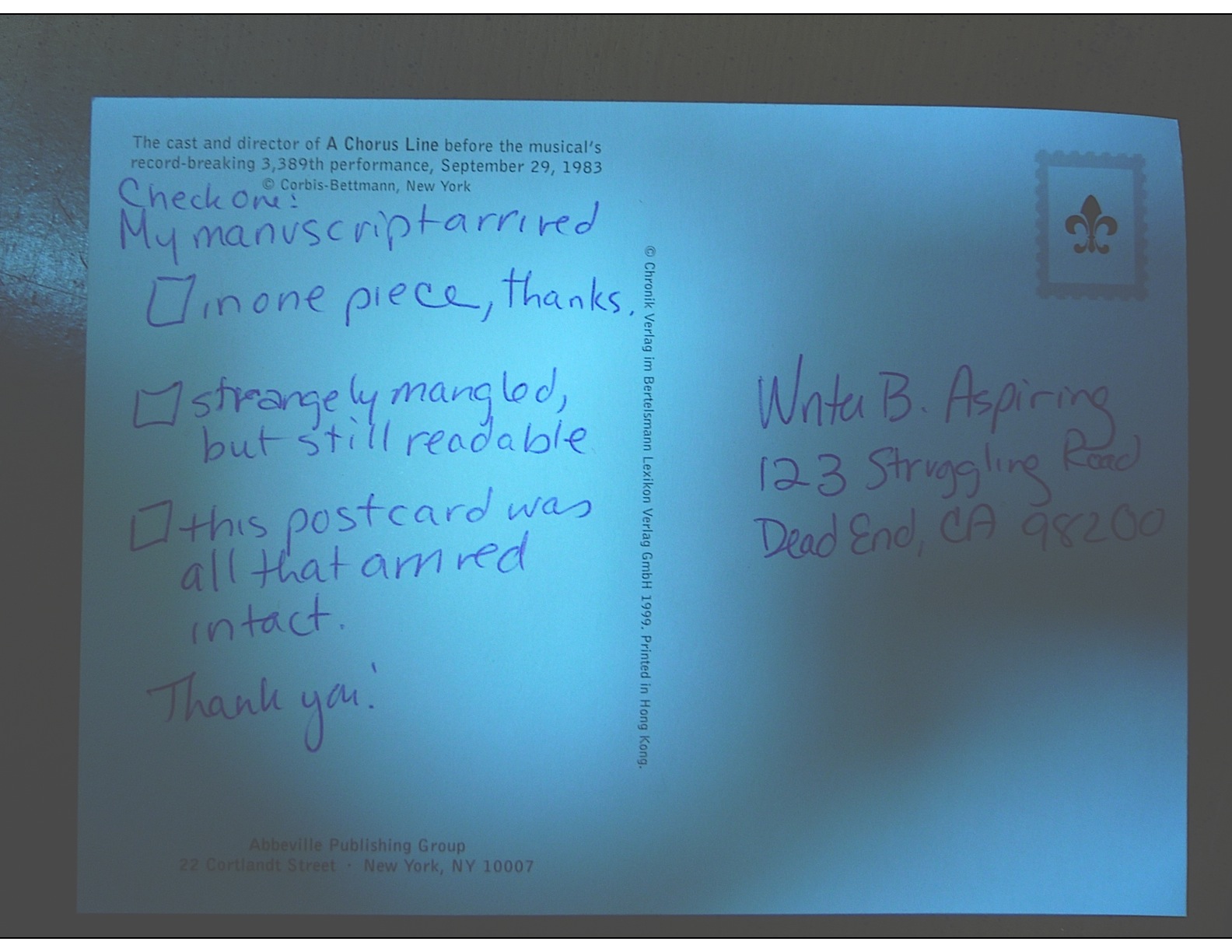
Wrapping it all up, part II: what precisely should go in that box?

Last time, at a reader’s request, I launched into an extensive discussion of the kind of boxes a writer should (sturdy, clean, size-appropriate) and should not use (grease-stained, mangled, clearly last used to ship books from Amazon) to send a manuscript to an agent, editor, or contest. It seems appropriate to follow that up with some examination of what a writer might conceivably want to stuff into that box.

Let’s pretend for a moment that you have just been asked to submit materials to the agent of your dreams. To be absolutely clear, I’m talking about REQUESTED materials here, not just sending pages to an agency that asks queriers to include the first chapter, a few pages, or a synopsis with a query — all of these would, in the industry’s eyes, be unsolicited pages.

I know, I know: it’s a bit counter-intuitive that a blanket statement on a website, in an agency guide, or from a conference dais that a particular agent would like to receive these materials from all queriers doesn’t constitute solicitation, but it doesn’t. The logic runs thus: guidelines that recommend submitting extra material with a query are generic, aimed at any aspiring writer who might conceivably be considering sending a query.

By contrast, a solicited submission, a.k.a. requested materials, is one that an agent is WAITING to see because she has asked a particular writer to send it following a successful pitch or query. Because the agent expressed positive interest in seeing those pages, the lucky requestee is fully justified in scrawling REQUESTED MATERIALS in letters two inches high in the lower right-hand corner of the envelope or shipping box, just to the left of the address, to assure that the submission lands on the right desk instead of the slush pile made up of, you guessed it, unsolicited manuscripts.

Everyone clear on the difference between solicited and unsolicited materials? Dandy.

Just as generic requests vary in what agents ask queriers to send, so do requests for solicited material. While every agency and small publishing house seems to have a slightly different idea of what constitutes a standard submission packet (word to the wise: read those requests CAREFULLY), here are the most commonly-requested constituent parts, in the order in which they are generally expected to appear in the packet:

1. Cover letter
You HAVE been sending cover letters with your submissions, right? Just sending a manuscript all by itself is considered a bit rude, as well as strategically unwise.

“Oh, please, Anne,” I hear the submission-weary complain. “Rude? What do you call making a querier write ANOTHER letter to an agent who has already agreed to read my work?”

I sympathize with the submission fatigue, oh weary ones, but don’t get your hackles up. In the first place, there’s no need for a long-winded missive — a simple thank-you to the agent for having asked to see the materials enclosed will do. It’s hardly onerous.

In the second place, the submitter is the one who benefits from including a cover letter — all the more so because so few submitters remember to tuck one into their packets. An astonishingly high percentage of submissions arrive without a cover letter, and often without a title page as well, begging the question: what makes these submitting writers so positive that the requesting agent will still remember their queries or pitches well enough to render page one of chapter one instantly recognizable?

I’m not going to depress you by telling you just how unlikely this is to be the case.

Suffice it to say that it’s in your best interest to assume that the person who heard your pitch or read your query won’t be the first person to screen your submission, for the very simple reason that it is, in fact, often a different person. Thus, it doesn’t really make sense to presume that everyone who sets eyes on your manuscript will already be familiar with who you are and what you write.

And it’s not problematic purely because a Millicent new to your project might get offended by not being addressed politely from the moment she opens the manuscript box. Does anyone out there want to take a guess at the PRACTICAL reason omitting both a cover letter and a title page might render a submitter less likely to get picked up?

If you instantly cried, “Because it renders the agency’s contacting the submitter substantially more difficult!” give yourself a gold star for the day. Like a query letter and a title page, a good cover letter should include all of the sender’s contact information — because the last response you want your submission to generate is a heart-felt, “Oh, it’s too bad we have no idea who sent us this or how to contact him or her; all we have is the author’s last name in the slug line. This saddens me, because I really liked this manuscript!”

Yes, that little piece of dialogue is pretty lousy, now that you mention it. But you get my point, right?

“Okay, Anne,” the former head-scratchers concede, “I get why I should include a cover letter. What does it need to say?”

Glad you asked. Under most circumstances, all it needs to say is this:

Seriously, that’s all there is to it. Like any other thank-you letter, the courtesy lies more in the fact that the sender took the time to write it, rather than in what it actually says.

A couple of caveats:

(a) If you met the agent at a conference, mention that in the first paragraph of the letter, to help place your submission in context. As crushing as it may be for the writerly ego to contemplate, an agent who spent days on end listening to hundreds of pitches probably is not going to remember each one. No need to re-pitch, but a gentle reminder never hurts.

While you’re at it, it’s not a bad idea to write the name of the conference on the outside of the envelope, along with REQUESTED MATERIALS. Heck, it’s a very good idea to write the conference’s name on the outside of a query to an agent one has heard speak at a conference, too, or to include the conference’s name in the subject line of a query e-mail. The point here is to render it pellucidly clear to the agent why you’re contacting her.

(b) If another agent is already reading all or part of the manuscript you’re sending — or has asked to see it — mention this in your cover letter. No need to say who it is or how long s/he has had it; just tell the recipient that s/he’s not the only one considering representing this book. Unless the agency has a policy forbidding simultaneous submissions, withholding this information will only generate resentment down the line if more than one agent wants to represent your book.

Yes, even if that agent to whom you submitted 9 months ago has just never responded. Actually, it’s in your strategic interest to contact that non-responder to let her know that another agent is interested.

(c) Make sure ALL of your contact information is on the letter, either in the header (letterhead-style, as I have shown above) or under your signature. Again, you want to make sure that the agent of your dreams can call you up and rave about how much she loved your submission, right?

(d) Make absolutely certain that the letter includes the title of your book, just in case the letter and the manuscript end up on different desks. (Yes, it happens. Don’t ask; just prepare for the contingency.)

Everyone comfortable with the cover letter? For more tips on how to construct one with aplomb, please see COVER LETTERS FOR SUBMISSIONS (where do I come up with these obscure category titles?) on the list at right.

2. Title page
ALWAYS include this, if ANY manuscript pages have been requested — yes, even if you have already sent the first 50 pages, and are now sending the rest of the book. (If you have never formatted a professional manuscript before, please see the YOUR TITLE PAGE category at right.)

Why? Long-time readers, chant it with me now: because the submission looks more professional that way.

Also, like the cover letter, the title page renders it easy for an agent to track you down. Believe me, if the agent of your dreams falls in love with your manuscript, you’re going to want to hear about it right away.

3. The requested pages in standard format, unbound in any way.

The operative word here is requested. If an agent or editor asked you for a partial, send PRECISELY the requested number of pages. Don’t fudge here — even if your novel features a tremendous cliffhanger on p. 51, if the agent of your dreams asked for the first 50 pages, send only the first 50 pages, period.

Actually, in this instance, you should send only the first 50 pages even if they do not end in a period. Even if the designated last page ends mid-sentence, stop there.

As to sending pages in standard manuscript format, please, don’t get me started again the desirability of sending professionally-formatted submissions. For a month after I run a series on standard format , the rules keep running through my head like a nagging tune.

If you’re brand-new to reading this blog and thus successfully avoided my recent series on the subject, or have somehow avoided my repeated and vehement posts on standard format for manuscripts over the last three years, please see the MANUSCRIPT FORMATTING 101 and STANDARD FORMAT ILLUSTRATED categories on the list at right.

For the benefit of those of you who are going to blow off that last piece of advice because you’re in a hurry — oh, I know that you’re out there — allow me to add something you would have learned from those posts on formatting: a manuscript intended for submission should not be bound in any way.

Oh, and do use at least 20-lb, bright white paper. Cheaper paper can begin to wilt after the first screener has rifled through it. Yes, it does increase the already quite substantial cost of submission, but this is one situation where being penny-wise can cost you serious presentation points.

4. Synopsis, if one was requested, clearly labeled AS a synopsis.
With fiction, when an outline is requested, they usually mean a synopsis, not the annotated table of contents appropriate for nonfiction. For nonfiction, an outline means an annotated table of contents.

Most of the time, though, what an agent will ask to see for either is a synopsis.

As I mentioned earlier in this post, I haven’t done a synopsis how-to in a while, so I shall be revisiting it beginning this coming weekend. For those of you in a greater hurry, please check out the HOW TO WRITE A SYNOPSIS category at right. (How do I come up with these category titles?)

5. Author bio, if one was requested.
An author bio is a one-page (double-spaced) or half-page (single-spaced) plus photo account of the submitting writer’s professional credentials. Typically, when an agent submits a manuscript or book proposal to editors, the author bio is tucked immediately at the end of the manuscript or sample chapter.

6. A SASE big enough to fit the entire manuscript.
This should be automatic by now, but to recap for those of you who will read this weeks or months from now in the archives: that’s a self-addressed, stamped envelope, for those of you new to the game.

Always use stamps, not metered postage, for the SASE. Why? Because since 9/11, someone who wants to mail a pre-metered package that weighs over two pounds via USPS has to tote it to a post office. Due to the paper-consumptive rigors of standard format, one rarely, if ever, meets a full-length manuscript that weighs less than two pounds.

When you send requested materials via mail (as opposed to submitting as an e-mail attachment), include in your submission packet an envelope or box addressed to yourself, along with sufficient postage for the safe return of EVERYTHING you have submitted, not just a #10 envelope so the agency may contact you to ask for more pages. If you feel like being really, really considerate, it’s nifty to include a #10 SASE, so the agent may contact you to ask for more pages, but in the age of e-mail and relatively inexpensive long-distance calling, that request is unlikely to come via regular mail.

Send a SASE large enough for the return of your materials EVERY time, regardless of whether the agency (or publishing house) to whom you are submitting has actually asked for a SASE. If the requested pages fit in a Manila or Priority Mail envelope, it’s perfectly acceptable to fold a second one in half, stamp and address it, and tuck it in the submission package.

How does one handle this when using a box as a SASE? Well, since it would be impracticable to fold up another Priority Mail box inside, if you have been asked to send so many pages that you need to pack ‘em in a box, paper-clip a return mailing label and stamps to your cover letter, along with a polite request that the agent would affix both to the shipping box in the event of rejection.

To be on the safe side, explain HOW you want them to reuse the box: peel the back off the mailing label, stick it over the old label, affix new postage, and seal. You didn’t hear it from me, of course, but sometimes, they evidently have trouble figuring it out.

You can also nab one of those tough little everything-you-can-cram-in-here-is-one-price Priority Mail envelopes, self-address it, add postage, and stick it into the box. If you don’t care if your manuscript comes back to you a little bent, this is a wonderfully cash-conscious way to go. Those envelopes are surprisingly tough, in my experience — what are they made out of, kryptonite? — and while the pages don’t look too pretty after a cross-country trip in them, they do tend to arrive safely.

In case you couldn’t tell, I’m not a big fan of writers over-investing in impressive return postage. It’s bad enough that we writers are expected to underwrite the costs of agencies rejecting our work. (Which is, effectively, what the SASE accomplishes, right?) If you’re getting the manuscript back, it’s because they’ve rejected it. Who cares if the pages show up on your doorstep bent?

“But Anne,” I hear the ecology-minded writers out there murmur, “surely it would be easier, cheaper, and environmentally friendlier to ask the agent or editor to recycle the submission pages if s/he rejects it?”

Yes, it would be all three, but I would strenuously advise against making this request of any agency or publishing house that doesn’t state directly on its website or in its agency guide listing that it will recycle rejected manuscripts. Most won’t, but many, many agencies will instruct their Millicents to reject any submission that arrives without a SASE.

Do you really want to chance it?

7. Optional extras.
If you want to send a second, business-size envelope SASE as well, to make it easy for them to request the rest of the manuscript, place it at the bottom of the packet (and mention it in your cover letter.)

It’s also a good idea to include a self-addressed, stamped postcard for the agency to mail to you to acknowledge receipt of the manuscript. To generate a chuckle in a hard-worked Millicent, I always liked to send a SASP that looked like this — although with a stamp attached, of course:

Don’t worry about this causing trouble; it doesn’t, and you will have proof that they received it. This is important, because manuscripts do go astray from time to time.

8. Pack it all in a durable container that will keep your submission from getting damaged en route.

Why, this suggestion seems strangely familiar, somehow…oh, yes, we spent all of yesterday’s post talking about it.

And that, my friends, is the low-down on the submission packet. Don’t forget that EVERYTHING you send to an agency is a writing sample: impeccable grammar, punctuation, and printing please. No smudges or bent corners, either.

Make it all pretty and hope for the best. And, of course, keep up the good work!

Manuscript formatting 101, part X: if everyone else jumped off the Golden Gate Bridge…

The end of the road for this emotionally-trying series on formatting is within sight, I promise — one doesn’t like to tempt the easily-affronted gods by predicting TOO far into the future, but I believe I can state with assurance that I SHALL finish up tomorrow, or at any rate in the course of my next post (see earlier comment about god-tempting). Since we are so very close to the finish line, I’m going to take a bit of a risk and revisit what seems to be a perennial controversy amongst aspiring writers: whether to place a chapter title (or just “Chapter One”) on the first line of a page or on the line just above where the text starts.

Don’t laugh, those of you who are new to this particular debate: this one has generated a body count over the years.

To place the possibilities before you in all of their lush magnificence, should the first page of a chapter look like this:

Or like this?

Now, I could just tell you what to do here, because, to be blunt about it, the first version is in standard format; the second is not. No way, no how.

So why might a professional reader prefer the first? Chant it with me now, children: BECAUSE IT LOOKS RIGHT TO THEM.

Oh, how tempting it is to leave it at that…but truth does compel me to tell you (and if not truth, those pesky mercurial gods I was talking about earlier), agents and contest judges see far, far more examples of version #2 than #1. Many, many times more. So much so that — brace yourselves, because I haven’t said this very often throughout this series — at this point, you could get away with either.

I know — it sort of creeps me out to hear myself saying such a thing, too.

That being said, I would be reluctant to buy into the astonishingly pervasive theory that if masses and masses of people do something, it automatically becomes correct. As anyone who screens manuscripts for a living could tell you, a much higher percentage of them are incorrectly formatted than presented properly. And really, as everyone’s mother was wont to say (at least on the West Coast), if everyone else jumped off the Golden Gate Bridge, would you, too?

I was delighted to discover when I moved to the East Coast for college that the moms out there were prone to asking the same question with reference to the Empire State Building. There must be something about that particular period of architecture (the GGB was built in 1933-37, the ESB in 1930-31) that promotes suicidal ideas.

Speaking of body counts.

The weird thing about this particular formatting oddity is how often it appears in otherwise perfectly presented manuscripts. That fact sets Millicent the agency screener’s little head in a spin. As, I must admit, it does mine, as well as the brainpan of virtually every other professional reader I know.

Why is it so very puzzling to us, you ask? Because at least in my case — and I don’t THINK I’m revealing a trade secret here — I have literally never seen an agent submit a manuscript to a publishing house with format #2. Heck, I have literally never even heard of an agent, editor, or anyone else in the publishing industry’s ASKING for a chapter heading to be moved from the top of the page to just above the text.

And that strikes me as odd, because as I’ve heard some pretty strange requests from agents and editors in my time, believe me; I’m not easily shocked anymore. But to hear a pro insist upon placing the chapter heading where you have to skip down a third of a page to read it…well, that would have me reaching for my smelling salts.

Do they even make those anymore? And if everyone else jumped off the Golden Gate Bridge clutching them, would I?

Clearly, however, somebody out there is preaching the place-it-just-above-the-text gospel, because agents, editors, and contest judges are simply inundated with examples of this formatting anomaly. We see bushels of ‘em. Hordes of aspiring writers are apparently absolutely convinced that the sky will fall in if that chapter heading is located anywhere but immediately above the text.

In fact, many aspiring writers are SO convinced of the rightness of the drooping title heading that it’s not all that uncommon for an editor to find that after she has left a couple of subtle hints like this that the writer should change the formatting…

…the subsequent drafts remain unchanged. The writer will have simply ignored the advice.

(Off the record: editors HATE it when their advice is ignored. So do agents. Contest judges probably wouldn’t be all that fond of it, either, but blind submissions mean that in order to get dunned for brushing off a judge’s feedback, a writer would have to submit the same chapter two years running to the same contest, have the entry land in the same judge’s pile — in itself rather rare — AND the judge would have to remember having given that feedback. Oh, and for the entrant to hear about it, the contest would have to be one of the few that gives editorial feedback.)

The up v. down debate may seem like a rather silly controversy — after all, in the cosmic scheme of things, why should it matter if the white space is above or below the title? — but sheer repetition and writerly tenacity in clinging to version #2 have turned it from a difference of opinion into a vitriol-stained professional reader pet peeve. (See earlier comment about how we tend to react to our advice being ignored; it isn’t pretty.)

Which, unfortunately, tends to mean that in discussions of the issue at conferences degenerate into writing-teacher-says-X, editor-at-Random-House-says-Y: lots of passion demonstrated, but very little rationale produced, beyond each side’s insisting that the other’s way just looks wrong.

However, there is a pretty good reason that moving the chapter heading information to just above the text looks wrong to someone who edits book manuscripts for a living: it’s a formatting tidbit borrowed from short stories, whose first pages look quite, quite different. Lookee:

As you may see for yourself, for a short story like this one, there’s a mighty fine reason to list the title just above the text: a heck of a lot of information has to come first on the page, because short stories, unlike book manuscripts, are not submitted with a title page.

But that would not be proper in a book-length manuscript, would it? Let’s see what Noël’s editor might have said upon viewing this as as the first page of a book:

Ouch. (That last bit would have been funnier if the entire page were readable, by the way, but my camera batteries were running low. Sorry about that.) But as Millicent and that angry mob of pitchfork-wielding ignored editors would be only too happy to tell you, short stories don’t HAVE chapters, so who on earth are they to be telling those of us in the book world how to format our manuscripts?

Stick with version #1.

Which is not to say, of course, that this particular small deviation will automatically and invariably result in instantaneous rejection. It won’t, even in the latté-stained hands of the most format-sensitive Millicent. (See, she spilled coffee on her hands after she took a sip while it was still too hot — and if you didn’t get that joke, you probably haven’t been reading this blog for very long.) If a submission is beautifully written AND technically correct in every other respect, she might only shake her head over the location of the chapter heading, making a mental note to tell you to change it between when her boss, the agent, signs the writer and when they will be submitting the manuscript to editors at publishing houses.

But if you don’t mind my saying so, that’s a mighty hefty set of ifs.

While I’ve got the camera all warmed up, this would probably be a good time to illustrate another ubiquitous agent and editor pet peeve, the bound manuscript – and this one IS generally an automatic-rejection offense.

Manuscripts, and I don’t care who hears me say it, should not be bound in any way. There’s an exceedingly simple reason for this: binding renders it impossible (or at least a major pain in the fingertips) to pull out a chapter, stuff it in one’s bag, and read it on the subway.

Hey, paper is heavy. Would YOU want to lug home ten manuscripts every night on the off chance you’ll read them?

As with other ploys to make a manuscript appear identical to a published book, binding the loose pages of a manuscript for submission will NOT win you friends in the publishing world. Not only does this not look right (I spared you the chanting this time), but it seems so wrong that Millicent will be positively flabbergasted to see a submitter to do it.

She might, for instance, forget that her latte is still too hot to drink, take a sip, and scald her tongue. It’s been known to happen.

Seriously, the unbound manuscript is one of those rules so engrained in the professional reader’s mind that it seldom even occurs to authors, agents, or editors to mention it as a no-no at writers’ conferences. Heck, I’m not sure that I’ve mentioned it once within the last six months — and by anyone’s standards, I’m unusually communicative about how manuscripts should be presented.

So I’m going to repeat myself, because you’re not going to hear this very often: by definition, manuscripts should NEVER be bound in any way. Not staples, not spiral binding, not perfect binding. If you take nothing else away from this series, binding-lovers, I implore you to remember this.

Why? Well, in practice, I’m sorry to report, a bound manuscript will seldom survive long enough in the screening process for the chapter-separation dilemma to arise, because — and it pains me to be the one to break this to those of you who’ve been submitting bound manuscripts, but if I don’t tell you, who will? — those pretty covers tend never to be opened at all.

Did you just exclaim, “Ye gods, WHY?” again? I can’t say as I blame you, but try for a moment to envision what a bound manuscript might look like from Millicent’s perspective.

To ramp up your stress levels to the proper level to understand her, envision a desk simply smothered with an immense pile of submissions to screen before going home for the day. Envision further that it’s already 6:30 PM, and eyeballs already dry as dust from a long, hard day of rejecting query letters.

Just lost your sympathy, didn’t she? Try, try again to place yourself in her proverbial moccasins.

Picturing the pile of envelopes clearly again? Okay, now slit open an envelope that reads REQUESTED MATERIALS on the outside. (You DO know that you should ALWAYS scrawl that in two-inch letters in the lower left-hand corner of a submission envelope, don’t you, so your requested materials don’t get buried in the slush pile?)

If you’re Millicent — and right now, you are, singed tongue and all — you fully expect to see something like this lurking between the cover letter and the SASE tucked underneath:

But in the case of the bound manuscript, you would instead encounter something like this:

Kind of hard to miss the difference, isn’t it? And unfortunately, nine times out of ten, the next sound a bystander would hear would be all of that nice, expensive binding grating against the inside of the SASE, just before Millicent tucks a photocopied form rejection letter on top of it.

Honestly, it’s not that she is too lazy to flip open the cover; she just doesn’t see why she should. Her logic may not be fair or open-minded, from a writerly perspective, but it’s a fairly common argument throughout the industry: if this submitter does not know this very basic rule of manuscripts, how likely is she to know the rules of standard format?

And if she does not know either, how likely is she to be producing polished prose?

I know, I know — this logic often does not hold water when it comes down to an individual case; despite my best efforts over the last few years, there are plenty of good writers out there who happen to be clueless about the rules of standard format.

But even if they all jumped off the Golden Gate Bridge, you shouldn’t.

Here’s why: from Millicent’s perspective, the fact that good writers aren’t necessarily born aware of the norms of the industry matters less than we writers would like — because, as unpleasant as it is for aspiring writers to realize, her agency is going to see enough technically perfect submissions this week to afford to be able to leap to unwarranted conclusions about this one.

Don’t waste your money on binding.

Seem arbitrary? From a professional reader’s point of view, it isn’t — the enforcement of standard formatting isn’t actually any more complicated than the simple axiom that any game has rules, and you will play better if you take the time to learn them.

Think about it: if you saw a batter smack a baseball, then dash for third base instead of first on his way around the diamond, would you expect his home run to count? Would an archer who hit the bulls-eye in her neighbor’s target instead of her own win the grand prize? If you refused to pay the rent on Park Place because you didn’t like the color on the board, would you win the Monopoly game?

I can go on like this for days, you know. Please say that you are getting the parallels, so I may move on.

Submitting art to the marketplace has rules, too, and while your fourth-grade P.E. teacher probably did not impart them to you (as, if I ran the universe, s/he would have), you’re still going to be a whole lot better at playing the game if you embrace those rules, rather than fight them.

You’ll also, in the long run, enjoy playing the game more. I know that it may not seem that way the first time one is struggling to change an already-written manuscript into standard format, but trust me, it will be much more fun when you finish your next manuscript and realize that there’s nothing that needs to be changed.

Let all of those other folks jump off the Golden Gate Bridge without you, I say. Remember, you’re playing this game by choice: you could, after all, make your own rules and publish your book yourself. If you want to play with the big kids, you’re going to need to abide by their rules.

I’ll wrap up this topic next time, I promise, and after we’re done, I’ve got a tremendous treat in store for you. Hang in there, and keep up the good work!
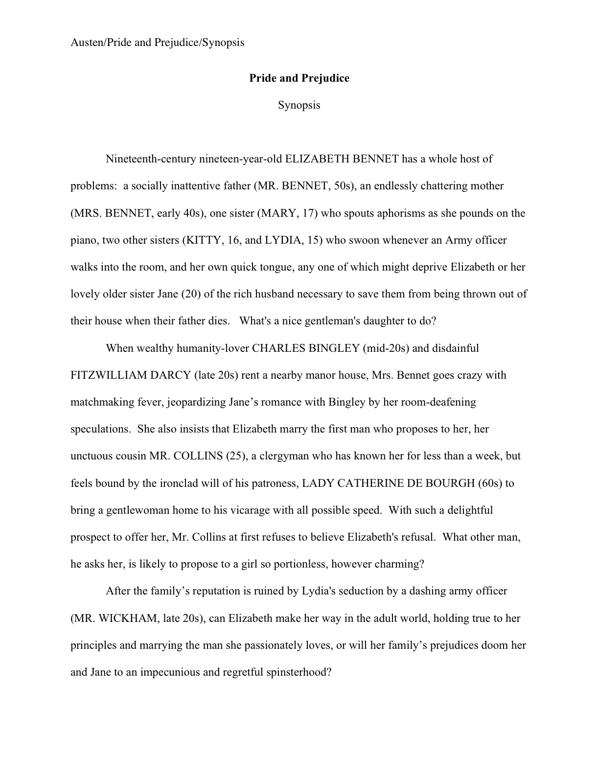
The single best thing you can do to help your submission’s chances, or, the monster always returns

Those of you who gasped as soon as you saw the title, “Oh, heavens above, can it really be time to go over standard format for manuscripts AGAIN?” give yourselves a gold star for the day. Heck, go ahead and give yourself two or even three, because an aspiring writer who knows, accepts, and embraces the following unpleasant truths enjoys a considerable competitive advantage in submission:

(a) that there exists a standard format for manuscripts to which US-based agents and editors expect submissions to adhere, regardless of whether those manuscripts are produced by seasoned pros with many book sales under their belts or those brand-new to the biz, and thus

(b) using fancy typefaces, including cover artwork, printing manuscript pages on colored paper, and/or any other deviations from standard format in one’s submission will NOT be regarded as interesting expressions of the author’s individual point of view, but rather as evidence that the author doesn’t know about (a). As a result,

(c) manuscripts submitted in standard format tend to be treated with SUBSTANTIALLY more respect by agency screeners, editorial assistants, contest judges, and pretty much everyone who happens to read unpublished prose for a living. Despite this fact,

(d) one does occasionally hear agents and editors ask for deviations from standard format; one should definitely give them precisely what they ask to see. However, it’s never advisable to generalize what one individual says s/he wants into a brand-new trend sweeping the industry. Nor is it a good idea to ape the formatting choices one sees in a published book, because

(e) professionally-formatted manuscripts do not resemble published books in many important respects, and for many excellent, practical reasons. That being the case, those who screen manuscripts for a living tend to draw unfavorable conclusions about submissions that do aspire to book formatting, much as they do when aspiring writers are not aware that

(f) standard format for book-length manuscripts is NOT business format, either, and just using what you learned about short stories won’t do, either. Nor is it necessarily identical to what your word processor’s grammar checker will ask you to do, or even the AP style one sees in newspapers and magazines. None of these will look correct to an agent or editor who deals with book manuscripts, because the norms there are very specific. This may seem nit-picky and irrelevant to the quality of the writing in question, but think about it:

(g) if a host asks you to a formal dinner, it’s only polite to wear formal attire; a guest who shows up in flip-flops and a Hawaiian shirt is going to stand out like the proverbial sore thumb. (See point b.) Similarly, when placed side-by-side with professional manuscripts, as a successful submission inevitably will, a wackily put-together manuscript will stand out as unprofessional, a phenomenon that all too often leads to

(h) the average manuscript submission gets rejected on page 1. Not always because it deviates from standard format — although the vast majority of submissions do — but because an unprofessionally-formatted manuscript already has one strike against it, and who needs that? Ultimately,

(i) it’s just not worth your while to try to fudge your way out of these standards, since the price of a submission’s annoying a professional reader can be so hight. And as I mentioned in yesterday’s post, no matter how many times my readers, students, and editing clients ask me if agents, editors, and contest judges are REALLY serious about them, I’m not going to give you permission to ignore any single one of the standard format strictures. No way. Stop asking, already.

Why does knowing all this — and, more importantly, acting upon this knowledge — translate into higher acceptance rates, typically? Well, the aspiring writer who acts upon this information conscientiously is probably producing submissions within the top 5% of what crosses Millicent the agency screener’s desk on any given day.

Yes, really. So if any of the information on the list above came as a surprise to you in any way, it’s incredibly important that you should join me on a walk through the intricacies of standard format.

It’s the rest of you, the ones who have been hanging around Author! Author! long enough to have survived my previous jaunts through the rigors of standard format, who have the right to inquire why I am running through it again right now. “Hey, wait a minute,” these sterling souls protest. “Weren’t you writing about all this at the beginning of August? And haven’t you been promising months of discussion of craft for quite some time now?

“And is the photograph above a representation of snooty people scowling at me, or is that just a bunch of wet sand onto which I am projecting my paranoid fantasies?”

Legitimate questions, all. But listen: Thanksgiving (that’s next Thursday, for those of you reading this outside the United States) traditionally marks the beginning of the annual publishing world slow-down. With so many different religions and cultures cramming so many different holidays into the next month and a half, it’s genuinely hard to get an entire editorial committee into a room long enough to consider acquiring a book. Desks are piled high with the unread manuscripts from the previous year.

Besides, everyone has shopping to do.

The result: turn-around times for submissions and queries typically slow to a crawl between Thanksgiving and the New Year. And as I BELIEVE I have mentioned once or twice (or eighty or ninety) times before, half the writers of the English-speaking world seem to make a New Year’s resolution to get that raft of queries in the mail or get that long tinkered-with manuscript out the door to the agent who requested it last summer, turn-around times don’t really start to speed up again until after the Martin Luther King, Jr., long weekend.

That’s the third weekend of January, for those of you reading outside the US. We like to hold inaugurations around then.

Since my readers tend to be pretty industry-savvy — go ahead and pat yourselves on the back — then, I’m assuming that many of you are frantically running around now, trying to get those submissions ship-shape to beat the proverbial Christmas rush.

And lo! in the west, there appeared a serious discussion of standard format. What timing, eh?

I may be wrong about this, but you must admit that it would explain the downright avalanche of formatting questions posted as comments in the archives lately, not to mention those turning up in my e-mail. (Which I discourage, as a general rule: answering questions one by one is incredibly time-consuming, whereas answers to questions posted here may be read, enjoyed, and commented-upon by many, a much more efficient use of my volunteer question-answering time.)

And, frankly, the weekend before Thanksgiving just didn’t seem like the best time to start a brand-new topic from scratch — and not only because I’m expecting 28 people to crowd around my dinner table on Thursday. Since most of my audience (at least those who comment regularly) seem to be US-based themselves, and those of us in the States are going to be spending the next week juggling the demands of relatives, over-large birds, competing sporting events, and, often, post-election political discussions with those with whom one does not necessarily see eye-to-eye, I may not have everyone’s full attention right now, anyway.

Hey, agents and editors aren’t the only ones who are busy during the holidays. As I write this, my SO is in the kitchen, creating his famous gluten-free stuffing to take to the first of the pre-Thanksgiving Thanksgiving dinners of our holiday season, scheduled for TOMORROW.

And let’s not even mention the three books of my own — one already sold, one not yet sold but in my agent’s hands, and one that I’m trying to finish ASAP in response to at least alleged editorial interest — that seem to be requiring virtually daily attention from me at the moment. Each and every one of these projects would shout hallelujah in unison if I didn’t start a brand-new topic from scratch right now.

Oh, and you don’t serve leftovers occasionally when you’re working on a deadline?

One final word of preamble, then I shall launch into the meat of the matter (see? I already have turkey on the brain): I implore those of you who have been through this material with me before: don’t just skip these posts on standard format. I see manuscripts all the time by experienced writers that contain standard format violations. Until a writer has worked closely with an editor or agent long enough for these rules to become second nature, it’s just too easy to let an exception or two slip by.

Seriously, all of us could use a review from time to time. Because, you see, I am far from the only professional reader who takes umbrage, when manuscripts deviate from certain time-honored restrictions. Millicent started twitching at the very sight of them before she’d had her job three weeks.

Yes, even if the formatting in question would be perfectly legitimate in other writing environments. (See points b, c, e, and f, for instance.) And yes, yes, oh, yes, even if the deviation is precisely what some agent, editor, writing guru, or darned fool writing expert like me has suddenly announced to the world is the new norm.

Trust me, Millicent didn’t get that memo.

Think about it: why would she, unless she happens to work for the agent-who-blogs or editor-who-is-trying-to-be-helpful who promulgated the new advice? Indeed, why would anyone who works with manuscripts for a living go out looking to see what folks outside the industry — or, at minimum, outside her agency’s office — are demanding of writers these days, when the basics of standard format have actually changed very little for decades?

Actually, it would be very much against her self-interest to go trolling for such information, because — brace yourselves, those of you going through this logic for the first time — it’s so much easier just to regard submissions that don’t adhere to standard format as inherently unprofessional, and thus (by implication) less likely to contain writing destined to take the publishing world by storm.

To put it bluntly, it would slow her per-submission rejection time.

I hope no one out there fainted, because this is a vital fact for any submitting writer to understand: the folks who read submissions (and queries) in order to decide who gets a break and who doesn’t are in a HURRY. Reportedly, the average agency receives 800-1200 queries per week; that’s a whole lot of reading.

And those are the statistics from when the economy was good, before all of those hobbyist writers started dusting off the half-finished manuscripts in their bottom desk drawers and saying, “Hey, this is my Plan B.”

In the face of that many pieces of paper to plow through, even the reading of submissions tends to be awfully rushed: the goal becomes to weed out as many as possible as quickly as possible, rather than seeking out gems. Once a professional reader like Millicent has been at it for a while, s/he will usually develop a knack for coming to a conclusion about a piece of writing within the first paragraph or two.

Sometimes even within the first line or two.

What does this mean for aspiring writers who scoff at standard format, or just don’t know about it? Well, it’s not good: agency screeners, agents, editors, and contest judges tend to regard submissions formatted in any other way as either unpolished (if they’re feeling generous) or unprofessional (if they’re not).

And unfortunately for writers unaware of the rules, a non-standard manuscript is child’s play to spot from the moment a professional reader lays eyes upon it. That’s can be an extremely serious problem for a submission, because being identified as not professionally formatted renders it FAR more likely to be rejected than any writing-related problem.

Why? Shout it with me now: agencies and publishing houses get so many submissions that a screener’s PRIMARY goal is to weed out the one she is reading at the moment. The faster she can do that, the better, to move through that mountain of paper on her desk. So a first page that cries out the moment Millicent lays eyes on it, “This writer is brand-new to the game and will require quite a bit of your boss’ time to coach into being able to produce a manuscript that an agent would be comfortable submitting to an editor!” is a downright gift to her: she can feel completely comfortable rejecting it at the very first typo, cliché, or word choice she doesn’t happen to like..

Heck, she might not even wait to spot any of the above.

That’s not all bad news, however. By logical extension, the more professional your manuscript looks, the more likely it is to be read with interest by a screener in a hurry.

See now why aspiring writers cognizant of points (a) -(i) enjoy a considerable competitive advantage at submission time?

I don’t know about you, but I’m all for anything that helps a good writer’s work get taken more seriously, especially in the current super-tight submission environment, which is more rejection happy than I’ve ever seen it — and I’ve been listening to writers, agents, and editors complain about the state of the literary market since I was in my cradle. Right now, Harry Houdini himself would have extreme difficulty sneaking a non-standard manuscript past an agency screener, even though he undoubtedly has the world’s best platform to write a book on extricating oneself from tight situations.

If that last quip didn’t make you groan, if not chuckle, it’s time to brush up on your agent-speak.

So to help give you that competitive edge, here are the rules of standard format — and no, NONE of them are negotiable.

(1) All manuscripts should be printed or typed in black ink and double-spaced, with one-inch margins around all edges of the page, on 20-lb or better white paper.

No exceptions, unless someone in the industry (or a contest’s rules) SPECIFICALLY asks you to do otherwise. And I’m dead serious about using ONLY white paper: ecru paper, no off-white, no Dr. Seuss-type stripes.

Yes, yes, buff or parchment can look very nice, but there’s a strategic reason to use bright white paper: very sharp black-white contrast is strongly preferred by virtually every professional reader out there, probably as a legacy of having read so many dim photocopies over the course of their lifetimes.

The ONLY colored paper that should ever go anywhere near a manuscript is the single sheet that separates one copy of a submission or book proposal from the next, so it is easy for an agent to see where to break the stack. (But you don’t need to know about that until your agent asks you to send 15 copies of your book for submitting to editors. Put it out of your mind for now.)

And do spring for a new printer cartridge, and skip the trip to the copy center. Submissions with poor print quality are almost never read. You’d be amazed (at least, I hope you would) at how poor the printing quality is on some submissions; it’s as though the author dunked in a swiftly-flowing river several times before popping it in the mail.

Speaking of never, never, ever submit a dim photocopy; print out an original, every time, and make sure the ink is nice and dark on every page. Oh, you may chuckle at the notion of sending out a grainy photocopy, but believe me, any contest judge has seen many, many entries submitted that way.

(2) All manuscripts should be printed on ONE side of the page and unbound in any way (again, unless you are specifically asked to do otherwise).

Yes, this IS criminally wasteful of paper, especially when you consider the literally millions of pages of submissions that go flying into the agencies and publishing houses every month. Most agencies do not even recycle; the vast majority of agencies did not even consider accepting e-mailed queries at all until the anthrax-in-envelopes scare.

I swear I’m not making that up.

I assure you, if I ran the universe, paper conservation would be the norm, and recycling mandatory. Also, writers would all be granted an extra month a year in which to write, excellent and inexpensive child care while writing, a cedar-lined cabin on the shores of Lake Michigan in which to do it, and a pineapple upside-down cake on Kurt Vonnegut’s birthday. Perhaps some hard candies on Agatha Christie’s birthday as well, in affluent years, and dancing on Mme. de Staël’s.

But since the unhappy reality is that I do NOT run the universe (see disclaimer above), we shall all have to live with the status quo.

Which is to say: the publishing industry is one vast paper-wasting enterprise. Sorry.

Unbound means precisely what it says: no binding of any kind. You’d be surprised at how often writers violate the thou-shalt-not-bind rule, including paper clips, rubber bands, or even binders with their submissions. Since agents always circulate manuscripts without any sort of binding, these doohickies just scream, “I’m unfamiliar with the industry.”

SASE, here we come.

The ONLY exception to this rule is a nonfiction book proposal — not the manuscript, just the proposal — which is typically presented UNBOUND in a black folder, the kind with horizontal pockets. (For tips on how a book proposal should be presented, please see the aptly-titled BOOK PROPOSALS category on the list at right.)

To forestall the comment beloved reader Dave usually posts when I bring this up, if you wish to make double-sided, 3-hole-punched, be-bindered drafts for circulating to your first readers for ease of toting around, be my guest. But NEVER submit in that manner to a professional reader unless s/he has asked you to do so.

(3) The text should be left-justified, NOT block-justified, as published books, e-mails, business letters, and online writing tend to be.

Yes, books feature text that runs in straight vertical lines along both side margins, and yes, your word processing program can replicate that practically effortlessly, if you ask it nicely to do so.

But don’t: the straight margin should be the left one; the right should be ragged, as if you had produced the manuscript on a typewriter.

Many writers find this one nearly impossible to accept, because it is one of the most visually obvious ways in which a professional manuscript differs from a printed book. They believe, wrongly, that anything that makes their submission look more like what’s on the shelves at Barnes & Noble is inherently professional.

Quite the opposite is true. In a few days, I’m going to show you a practical demonstration of why, but for now, you’re just going to have to trust me when I tell you that block-justifying your submission is going to appeal to your garden-variety Millicent about as much as a punch the jaw.

Speaking of things I’m going to demonstrate in the days to come, NEVER format a query or cover letter to someone in the industry in business format: indent those paragraphs.

(4) The preferred typefaces are 12-point Times, Times New Roman, Courier, or Courier New; pick one and use it consistently throughout your entire submission packet. Even if you have a strong preference for the lettering in your book when it is published, use one of these typefaces for submission purposes.

Personally, I would never dream of allowing a client of mine to submit a manuscript in anything but Times New Roman, nor would I ever submit any of my work in anything else. It is the standard typeface of the industry.

It’s one of the bizarre facts of publishing life that manuscripts in these fonts tend to be taken far more seriously, and with good reason: these are the typefaces upon which the most commonly-used word count estimations are based. (Psst: if you don’t know why you should be estimating the length of your manuscript rather than using actual word count, please see the WORD COUNT category at right.)

There are advocates of Courier, too, so you may use it, but I implore you, do not get any wackier than that. If you write screenplays, you may ONLY use Courier. Most screenplay agents will not read even the first page of a script in another typeface — which means that most contest judges will follow suit.

There are a few agents out there who have their own font preferences, so do check their websites and/or listings in the standard agency guides. As ever, the golden rule of dealing with an agent you want to represent you is GIVE ‘EM PRECISELY WHAT THEY ASK TO SEE, not what you would like them to see.

If you are a writer who likes to have different voices presented in different typefaces, or who chooses boldface for emphasis, a submission is not a forum where you can express those preferences freely. Yes, one sees this in a published book occasionally, but I assure you, the choice to indulge in these formatting differences was the editor’s, not the author’s.

Sorry. (See my earlier disclaimer about proprietorship of the universe.)

To forestall the usual question someone brings up at this point: yes, most published books ARE in typefaces other than Times or Courier, but typeface decisions for published books are made by the publishing house, not the author. Submission time is not the appropriate period for making your preferences known.

Why? Chant it with me now, understanders of point (e) at the top of this post — MANUSCRIPTS AND PUBLISHED BOOKS AREN’T SUPPOSED TO LOOK THE SAME.

If you’re very nice down the line, after a publishing house has acquired your book, they may listen to your suggestions. They might giggle a little, but they might listen. Ditto with the cover and the title, which are — brace yourselves — almost never under the author’s control.

Why? Because these are considered matters of packaging and marketing, not content.

All of which begs the question, of course: why do word processing programs tempt us so many typefaces from which to choose, if we’re not supposed to use them?

Answer: because the people who make word processing programs are not the same people who decide what books get published in North America. Which is why, in case you’re wondering, what Microsoft Word means by word count and what the average agent or editor does are not typically the same thing.

So there.

I’m still sensing some skepticism out there on the font issue, but that may be a hangover from reader reactions to previous series on standard format. Almost invariably, around the time that I bring up Rule #4, someone posts a comment informing me huffily that website X advises something different, that this agent said at a conference she doesn’t care what typeface you use, that a certain manual said that standards have changed from the traditional guidelines I set out here, or some other observation presumably intended to make me rend my garments and cry, “Finally, I see the error of my ways! I guess I’ll disregard the fact that I’ve never seen the change you mention actually in use in a professional manuscript and declare it to be the new norm!”

To save you the trouble: it’s not gonna happen.

I have no doubt that all of these comments are indeed pointing out legitimate differences in advice, but it is not my purpose here to police the net for standardization of advice. If you like guidelines you find elsewhere better, by all means follow them.

All I claim for these rules — and it is not an insubstantial claim — is that nothing I advise here will EVER strike an agent or editor as unprofessional. Adhering to them will mean that your writing is going to be judged on your writing, not your formatting.

And that, my friends, is nothing at which to sneeze.

More rules follow next time, of course. In the meantime, keep up the good work!
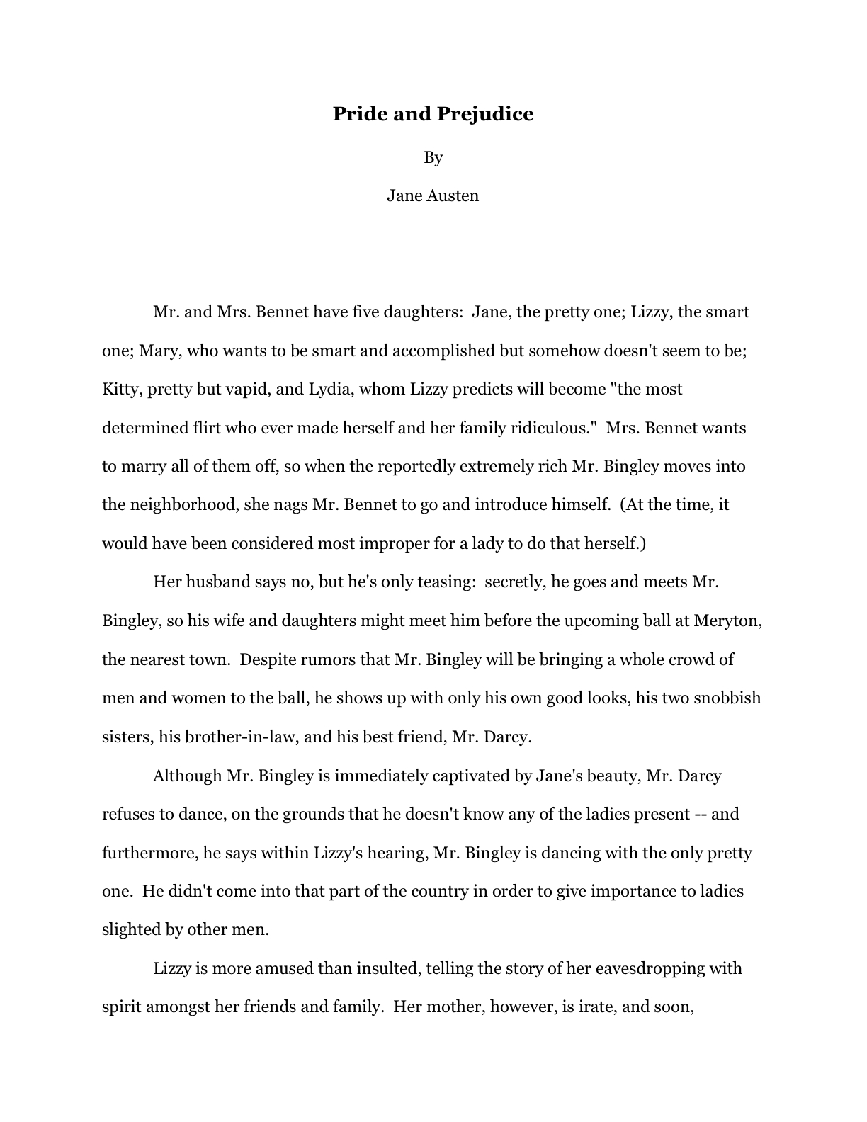
Synopsis-writing 101, part IV: the technicalities, or, what, you think I’m MADE of mushrooms?

Okay, so the joke in the title would have been funnier if I had in fact been posting on consecutive days, as I had originally planned. But as the illustrious comic Stephen Wright is fond of pointing out — you can’t have everything; where would you put it?

For the last couple of posts, I’ve been showing you examples of good and not-so-good 1-page synopses, so we could talk about (read: so I could conduct a monologue about) the overarching strategies that rendered them more or less effective. Since I haven’t exactly been overwhelmed with howls of protest on the subject — really? The prospect of constructing a 1-page synopsis for a 400-page novel of a complexity that would make Tolstoy weep annoys nobody? — I’m going to assume that we’re all pretty comfortable with the strategic part.

Before I move on to the ins and outs of writing the longer synopsis, I feel I should respond to some of the whimpers of confusion from the more structurally-minded of my readers. “But Anne,” I have heard some of you pointing out, “you’ve shown us a couple of visual examples of properly-formatted synopses — a sort of SYNOPSES ILLUSTRATED, if you will. Any chance that you might go over the various rather odd-looking formatting choices you’ve used in them before, say, we need to send out our own?”

Oh, certainly. Let’s take another example at the good 1-page synopsis for PRIDE AND PREJUDICE:

For veterans of any of my extended forays into the joys and terrors of standard format for manuscripts, nothing here should be too surprising. By and large, standard format for a synopsis is the same as for a page of manuscript: double-spaced, 1-inch margins all around, indented paragraphs, Times, Times New Roman, or Courier, the works. (If you’re unfamiliar with the rules of standard format, you will find them conveniently summarized in the HOW TO FORMAT A MANUSCRIPT and STANDARD FORMAT ILLUSTRATED categories on the list at right.

Please notice that, as with the first page of a manuscript, the author’s contact information does not appear on the first page of the synopsis. Unlike the first page of a manuscript, however, the title of the book should appear on the first page of a synopsis, along with the information that it IS a synopsis.

Why the latter? Because the synopsis and the manuscript it accompanies — to say nothing of the synopsis and query that often arrive in the same envelope — often become separated during the reading and evaluation process. It never pays to assume, then, that the reader of one will automatically know things about the other.

The title, for instance.

A second (or third, or fifth; extrapolate) page should also look very similar to any other page of standard-formatted manuscript, with one vital exception: the slug line for a synopsis should, as I mentioned in the previous sentence, SAY that the page it decorates is from a synopsis, not a manuscript, in addition to displaying the author’s last name, the title of the book, and the page number. (If you don’t know what a slug line is, why anyone would use it, or, indeed, why anyone would name something on a pretty page of text after a slimy creature, please see the SLUG LINE category on the list at right.)

Why include a slug line here? Because pages do occasionally go astray, and because synopses, like manuscripts, should never be bound in any way — unless a contest’s rules specifically state otherwise, of course.

Do I hear some nervous shifting in chairs out there? “But Anne,” I hear some of you cry out, “aren’t you ignoring the elephant in the room — or, in this case, on the page? You seem to have given some of the character names in all capital letters. Why?”

I’m glad you asked. It’s not absolutely necessary, technically speaking, but most professional fiction synopses CAPITALIZE THE ENTIRE NAME of each major character the first time it appears. Not every time, mind you; just the first.

Why only the first? To alert a skimming agent or editor to the fact that — wait for it — a new character has just walked into the story.

Because Millicent might, you know, miss ’em otherwise.

It is also considered pretty darned nifty (and word-count thrifty) to include the character’s age in parentheses immediately after the first time the name appears, resulting in synopses that look something like this:

ST. THERESA OF AVILA (26) has a problem. Ever since she started dating multi-millionaire GEORGE ARMSTRONG CUSTER (82), all of her friends have unaccountably decided that she is mercenary and hates Native Americans. Apart from JEANNE D’ARC (30), her wacky landlady-cum-bowling-partner, who uses every opportunity to pump Theresa for man-landing tips, none of the residents of Theresa’s swanky Upper East Side co-op are even speaking to her — at least until they start desperately vying for invitations to her exclusive wedding extravaganza, a lavish event to be held onstage at the Oscars, with THE REVEREND DOCTOR OWEN WILSON (44 if he’s a day, I would guess; Author! Author! hopes he feels better soon) officiating. How will Theresa find a maid of honor — and if she does, what will her jealous old boyfriend GOD (∞) do?

Should any of you out there think you’re up to rounding out the plot above into some measure of coherence and submitting it, please, be my guest. Really. I’d love to read it.

For the rest of you, please note what I have done here: in preparing a synopsis for a comedy, I have produced a — wait for it! — humorous treatment of the material.

And if I were creating a synopsis for a steamy romance novel with the same premise (although I tremble to think what a sex romp with that particular cast of characters would entail), you can bet your last wooden nickel [that] I would take some writerly steps to make my reader’s mouth go dry and his breath become short while perusing it.

Would I do this because I’m wacky? No, because — those of you who have been following this series, chant it with me now — the synopsis, like the first 50 pages, is a writing sample.

Oh, had I mentioned that before? Well, it cannot be said too often, in my opinion. The sensible writer’s primary goal in producing it is to demonstrate not only that it is a good (or at least marketable) story, an attention-grabbing yarn peopled with fascinating characters, but that the writer is a terrific storyteller.

Don’t worry — in the days to come, I shall be talking about ways in which you can tweak your synopsis in order to convey that lovely impression.

For the nonce, let’s take a quick field trip back to yesterday’s examples of a not-so-hot 1-page synopsis. Do you notice any formatting problems here?

If you immediately leapt to your feet, screaming, “It doesn’t have a slug line! It doesn’t have a slug line!” give yourself a gold star for the day. Further points if you bellowed that it doesn’t say anywhere on the page that it is a synopsis.

Extra credit if you noticed that the pages are not numbered — a major no-no in any submission, ever, yet one of the more common ones. And yes, you should number it, even for a one-page synopsis — and no, you should not number it consecutively with the manuscript, unless a contest rule’s SPECIFICALLY tell you to do so. The first page of a synopsis is always page 1.

Top yourself with a halo if you also discovered that Aunt Jane made the rookie mistake of adding her name to the synopsis anywhere but in the slug line. For book-length works, the first page of text — regardless of whether it is in the manuscript, the synopsis, or any other requested materials — is not a title page.

Don’t treat it as if it were one; it looks unprofessional to the pros.

Everyone happy with his or her score on that quiz? Let’s take on the other negative example:

Where do we even begin? Millicent the screener would almost certainly not even read this one — in fact, she might burst into laughter from several paces away.

Let’s go over why. It stars too far down on the page, for one thing, falling into the same title-page error as the previous example. It’s the over-the-top typeface, though, and the fact that the page uses more than one of them, that would set Millicent giggling and showing it to her coworkers.

Oh, and it doesn’t contain a slug line or numbering. But I doubt Millicent would even notice that over her guffaws.

It makes one other error for a fiction synopsis, a subtler one — any guesses what?

This one may surprise some of you: it mentions the title of the book IN the text of the synopsis. Why is this a problem? Well, it’s considered stylistically weak, a sign that the synopsis is talking ABOUT the book instead of getting the reader involved in the story. Or, to put it another way, and a bit more bluntly: a fiction synopsis is supposed to tell the story of the book; one that pulls the reader out of the story by talking about it at a distance tends not to do that well.

And anyway, the title is already both at the top of the page (and SHOULD be in the slug line): why, Millicent wonders impatiently, cradling her too-hot latte until it cools — she’s learning, she’s learning — would the writer WANT to waste the space and her time by repeating the information?

“Wait just a minute, Anne,” I hear some of my former questioners call from the rear of the auditorium. “You’re talking about the cosmetic aspects of the synopsis as though it were going to be judged as pitilessly as the manuscript I submit. Surely, that’s not the case? The synopsis is just a technical requirement, right?”

Um, no — as I said, it’s considered a WRITING SAMPLE. So yes, it does tend to be judged — and dismissed — just as readily as problematic text anywhere else in the submission packet.

Sorry to be the one to break that to you. But isn’t it better that you hear it from me than surmise it from a form-letter rejection? Or, as is more often the case, NOT surmise if from a form-letter rejection and keep submitting problematic synopses?

Something worth mulling over, I think.

Next time, we’ll leave technicalities behind and delve into the wonderful world of storytelling on the fly. Keep up the good work!
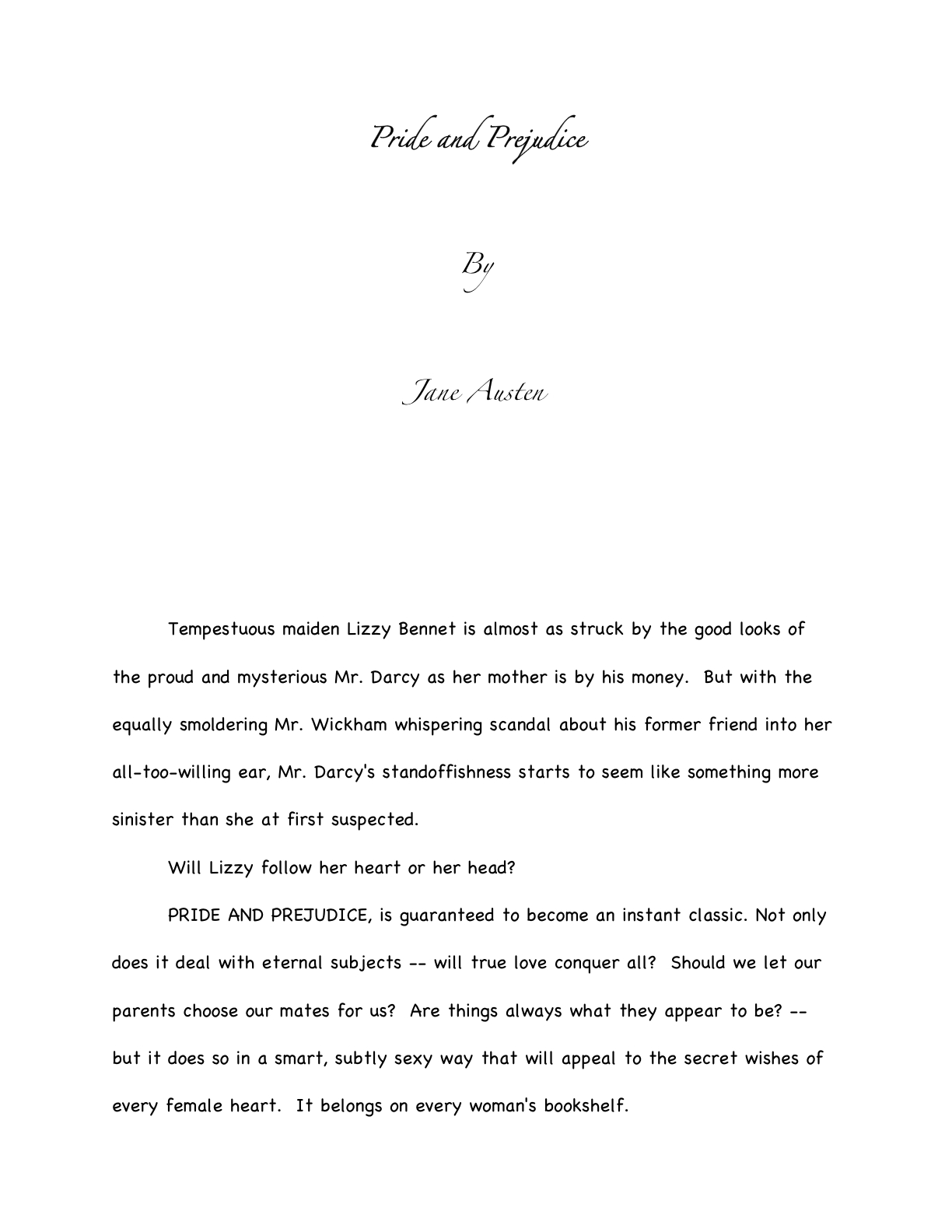
While I’m at it, let’s go ahead and talk about how to put together a submission packet

After I signed off yesterday, I began to experience a qualm or two: yes, I had gone over how to use a SASE (that pesky self-addressed, stamped envelope queriers and submitters are expected to tuck into their queries and submissions), but had I really said enough about what should and should not go into a submission packet? Had I, in fact, explained it all clearly enough that a reader wrapped up in the dizzying excitement of receiving her first request to submit pages could skim it (when trying to get a manuscript out the door, who has time for deep reading?), comprehend it, and slap together a bang-up submission packet on the spot, without digging into the archives?

And the ghostly voices in the ether I choose to attribute to my readers moaned, “No…”

In short, I think it’s worth delaying my promised series on synopsis-writing a day or so in order to round out our discussion of all things mailed, don’t you?

I’m choosing to take all of the silence out there as a yes. Let’s pretend for a moment that like my fantasy reader above, you have just been asked to submit materials to the agent of your dreams.

To be absolutely clear, I’m not talking about sending pages to an agency that asks queriers to include the first chapter, a few pages, or a synopsis with a query — all of these would, in the industry’s eyes, be unsolicited pages. I know; it’s a bit counter-intuitive that a blanket statement that the agent would like to see these materials from all queriers doesn’t constitute solicitation, but it doesn’t.

A solicited submission is one that an agent is WAITING to see, usually following a successful pitch or query.

Let’s further assume that your manuscript (or whatever portion of it an agent or editor has requested that you send to be perused by Millicent, the Platonic agency screener) is already in tip-top formatting shape, all typos and logic problems removed, and thus what the industry calls clean — and if you’re not absolutely positive that your pages meet ALL of those conditions, stop right here and make a plan for tidying up your pages.

Trust me, this is a situation where spelling counts. As does grammar.

But once your work is in apple-pie order, as Louisa May Alcott used to say, what next? What should your submission packet include, and in what order?

In part, this is a trick question, because — long-time readers, chant it with me now — the packet should include precisely what the agent asked you to include, no more, no less. In the words of the immortal Fats Waller, find out what they like and how they like it, and let ‘em have it just that way.

Okay, so he wasn’t talking about literature when he sang that. Roll with me here.

Agents are usually quite specific about what they want in a submission. If you doubt this, check out an agency’s website or one of the standard agency guides, then attend a conference where agents are scheduled to speak. Raise your hand and ask whether it’s okay to send, say, the 55 pages it would take to round out a chapter when an agent has asked to see the first 50. You will be astonished at how people who say their preferences in clients are as vague as writers who produce “good writing in any genre” will suddenly transform into rule-hugging lovers of draconian efficiency.

To save you the trouble of asking, let me tell you what they will say: never, ever, EVER send what you THINK they want to see instead of what they have asked to see. Of course, you may offer in your cover letter to send more, but that is all.

Which means, in practice, that if you’ve been asked for the first 50, and the chapter ends in a blow-your-socks-off cliffhanger on p. 51, you should still only send the first 50. Of course, if you wanted to be Machiavellian about it, you could always perform a little strategic snipping prior to that, so said cliffhanger topples just on the bottom of p. 50. No one would fault you for that.

However — and this should sound familiar on the secret handshake front — any agent is going to assume that a writer of your caliber is already aware that certain requests imply certain inclusions. Here they are, in the order in which they are generally expected to appear in the packet:

1. Cover letter
An astonishingly high percentage of submissions arrive without a cover letter, and often without a title page as well, begging the question: what makes these writers so positive that the requesting agent will still remember their queries or pitches well enough to render page one of chapter one instantly recognizable?

I hate to burst anyone’s bubble, but it’s not going to be — in fact, in many agencies, the person who heard the pitch or read the query won’t even be the first person to screen the submission. So it doesn’t really make sense to assume that everyone who sets eyes on your manuscript will already be familiar with your work.

Besides, including a cover letter is polite. No need for a long-winded missive — a simple thank-you to the agent for having asked to see the materials enclosed will do.

If you met the agent at a conference, mention that in the first paragraph of the letter, to help place your submission in context. (As crushing as it may be to the writerly ego to contemplate, an agent who spent days on end listening to hundreds of pitches probably is not going to remember each one. No need to re-pitch, but a gentle reminder never hurts.

If another agent is already reading all or part of the manuscript you’re sending — or has asked to see it — mention this in your cover letter. No need to say who it is or how long s/he has had it; just tell the recipient that s/he’s not the only one considering representing this book. Unless the agency has a policy forbidding simultaneous submissions, withholding this information will only generate resentment down the line if more than one agent wants to represent your book.

Yes, even if that agent to whom you submitted 9 months ago has just never responded. Actually, it’s in your strategic interest to contact that non-responder to let her know that another agent is interested.

Most importantly, make sure ALL of your contact information is on the letter, either in the header (letterhead-style) or under your signature, and do be absolutely certain that the letter includes the title of your book, just in case the letter and the manuscript end up on different desks.

Yes, it does happen. You want them to be able to get ahold of you to tell you how much they love your writing, don’t you?

2. Title page
ALWAYS include this, if ANY manuscript pages have been requested – yes, even if you have already sent the first 50 pages, and are now sending the rest of the book. (If you have never formatted a professional manuscript before, please see the YOUR TITLE PAGE category at right.)

Why? Long-time readers, chant it with me now: because the submission looks more professional that way.

Also, like the cover letter, the title page renders it easy for an agent to track you down. Believe me, if the agent of your dreams falls in love with your manuscript, you’re going to want to hear about it right away.

3. The requested pages in standard format.
Oh, please, don’t get me started again on the necessity of sending ONLY the pages the agents asked to see…or about the desirability of sending professionally-formatted manuscript pages. This time of year, when I have a lot of clients calling me up all excited because they’ve pitched successfully at a conference, the rules keep running through my head like a nagging tune.

If you’re new to reading this blog, or have somehow avoided my repeated and vehement posts on standard format for manuscripts, please see the HOW TO FORMAT A MANUSCRIPT and STANDARD FORMAT ILLUSTRATED categories on the list at right.

For the benefit of those of you who are going to blow off that last piece of advice because you’re in a hurry — oh, I know that you’re out there — allow me to add something you would have learned from those posts on formatting: a manuscript intended for submission should not be bound in any way.

Oh, and do use at least 20-lb, bright white paper. Cheaper paper can begin to wilt after the first screener has rifled through it. Yes, it does increase the already quite substantial cost of submission, but this is one situation where being penny-wise can cost you serious presentation points.

4. Synopsis, if one was requested, clearly labeled AS a synopsis.
With fiction, when an outline is requested, they usually mean a synopsis, not an annotated table of contents. For nonfiction, an outline means an annotated table of contents.

Most of the time, though, what an agent will ask to see for either is a synopsis.

As I mentioned earlier in this post, I haven’t done a synopsis how-to in a while, so I shall be revisiting it beginning this coming weekend. For those of you in a greater hurry, please check out the HOW TO WRITE A SYNOPSIS category at right. (How do I come up with these category titles?)

5. Author bio, if one was requested.
An author bio is a one-page (double-spaced) or half-page (single-spaced) plus photo account of the submitting writer’s professional credentials. Typically, when an agent submits a manuscript or book proposal to editors, the author Since these are far from easy to write, I always recommend that aspiring writers construct them well in advance, so they have a great one on hand to tuck into the submission packet.

I suspect that I’m going to yield to those nagging voices in the ether and revisit how to write an author bio soon — but dag nab it, I really want to get back to craft. For those of you who need to toss one together while this internal debate rages, you can find a step-by-step guide to writing one under the AUTHOR BIO category on the list at right.

6. A SASE big enough to fit the entire manuscript.
This should be automatic by now, but to recap for those of you who will read this weeks or months from now in the archives: that’s a self-addressed, stamped envelope, for those of you new to the game. Always use stamps, not metered postage, for the SASE.

Why? Because since 9/11, someone who wants to mail a pre-metered package that weighs over two pounds via USPS has to tote it to a post office. Due to the paper-consumptive rigors of standard format, one rarely, if ever, meets a full-length manuscript that weighs less than two pounds.

If you’ve been asked to submit an entire manuscript, rather than a partial, it is, as I mentioned yesterday, completely acceptable to ask the agency to reuse the original shipping box as the SASE. Include a return mailing label, already made out to you, the proper stamps for postage (metered strips will not work here), and add a paragraph to your cover letter explaining that you want them to reuse the box. To be on the safe side, explain HOW you want them to reuse the box: peel the back off the mailing label, stick it over the old label, affix new postage, and seal.

You didn’t hear it from me, of course, but sometimes, they evidently have trouble figuring it out.

7. Optional extras.
If you want to send a second, business-size envelope SASE as well, to make it easy for them to request the rest of the manuscript, place it at the bottom of the packet (and mention it in your cover letter.)

It’s also a good idea to include a self-addressed, stamped postcard for the agency to mail to you to acknowledge receipt of the manuscript. Don’t worry about this causing trouble; it doesn’t, and you will have proof that they received it. This is important, because manuscripts do go astray from time to time.

8. Pack it all in a durable container that will keep your submission from getting damaged en route.
I hear all the time from writers stressing out about what kind of box to use, and not without good reason. In the old days — say, 30+ years ago — the author was expected to provide a box, and a rather nice one, then wrap it in plain brown paper for shipping. These old boxes are beautiful, if you can still find one: dignified black cardboard, held together by shining brass brads.

However, now, if you can get the requested materials there in one piece box-free (say, if it is an excerpt short enough to fit into a Manila folder or Priority Mail cardboard envelope), go ahead. Do bear in mind, though, that you want to have your pages arrive looking fresh and unbent, so make sure that your manuscript fits comfortably in its holder in such a way that the pages are unlikely to wrinkle.

Remember my comment above about its being penny-wise and pound-foolish to use cheap paper for submissions? This is part of the reason why.

Or, to put it another way: if your submission is the next one opened immediately after Millicent has burned her lip on that latté that she never seems to remember to let cool, do you think you’ll be better off if the pages are slightly mangled, or if they are smooth?

Yeah. Appearances count.

For an entire manuscript, find an inexpensive box. You’re going to want a box with the right footprint to ship a manuscript without too much internal shifting. Going a little big and adding peanuts or bubble wrap is usually your best bet. (Avoid the temptation to use newspaper; newsprint stains.)

Most office supply stores carry perfectly serviceable white boxes, but if you live in the greater Seattle area, funky plastic junk store Archie McPhee’s, of all places, routinely carries fabulous red and blue boxes exactly the right size for a 450-page manuscript WITH adorable little black plastic handles for about a buck each. AND you can get a bobble-head Edgar Allan Poe doll that bears an uncomfortably close resemblance to Robert Goulet — and if that’s not one-stop shopping, I should like to know what is.

Your local post office will probably stock manuscript-sized boxes as well. Do be warned, though, that the USPS’ 8 1/2” x 11” boxes only LOOK as though they will fit a manuscript comfortably without bunching the pages. the actual footprint of the bottom of the box is the size of a piece of paper, so there is no wiggle room to, say, insert a stack of paper without wrinkling it.

Trust me, that’s NOT something you want to find out after you’ve already printed out your submission.

Yes, yes, I know: the USPS is purportedly the best postal service in the world, a boon to humanity, and one of the least expensive to boot. Their gallant carriers have been known to push forward through the proverbial sleet, hail, dark of night, and mean dogs. But when faced with an only apparently manuscript-ready box on a last-minute deadline, the thought must occur to even the most flag-proud: do the postal services of other countries confound their citizens in this way? What do they expect us to put in an 8 1/2” x 11” box OTHER than a manuscript?

Okay, that’s out of my system now. But whatever difficulties you may have finding an appropriately-sized box, DO NOT, under any circumstances, reuse a box clearly marked for some other purpose, such as holding dishwashing soap.

Yes, it’s been known to happen.

The most economical box source for US-based writers are those free Priority Mail boxes that the post office provides, the ones that are about 2 inches deep. They’ll actually hold two 400-page manuscripts side-by-side quite comfortably, so add padding to keep the unbound manuscripts from bouncing around too much. I want it to look good when it gets there, after all.

Since it would be impracticable to fold up another Priority Mail box inside, I advise enclosing the label and postage, as I described above, or just nabbing one of those tough little everything-you-can-cram-in-here-is-one-price Priority Mail envelopes, self-addressing it, adding postage, and sticking it into the box.

If you don’t care if your manuscript comes back to you a little bent, this is a wonderfully cash-conscious way to go. Those envelopes are surprisingly tough, in my experience — what are they made out of, kryptonite? — and while the pages don’t look too pretty after a cross-country trip in them, they do tend to arrive safely.

In case you couldn’t tell, I’m not a big fan of writers over-investing in impressive return postage. It’s bad enough that we writers are expected to underwrite the costs of agencies rejecting our work (which is, effectively, what the SASE accomplishes, right?). If you’re getting the manuscript back, it’s because they’ve rejected it. Who cares if the pages show up on your doorstep bent?

Unless, of course, you intend to iron those pages and submit them somewhere else.

And that, my friends, is the low-down on the submission packet. Don’t forget that EVERYTHING you send to an agency is a writing sample: impeccable grammar, punctuation, and printing please. No smudges or bent corners, either. Make it all pretty.

Questions? Comments? Anyone up for a nice, long walk where we talk about something else entirely?

Keep up the good work!

What does standard format look like, anyway? Part VIII: taking your fate into your own hands, or, you go, princess!

Hello, campers —

Well, I am feeling a bit better after my weekend off, due in part to taking a break to go see Seattle Opera’s surprisingly powerful production of AIDA. I may have an odd sense of humor, but few things cheer me up like observing a character bellowing her deepest secrets at the top of her (well-developed) lungs for minutes at a time, only to have her antagonist, who is standing all of three feet away, observe to the audience, “Aha! Her reaction has betrayed her!” as if all the the soprano had done was frown fleetingly.

Why was I surprised by the production, you ask? From an editor’s point of view, the story of Aida is kind of a nightmare — predictable, repetitious, and quite, quite downbeat. The protagonist is almost completely passive (unless you count the aforementioned secret-bellowing); her love interest is quite possibly the least ethically flexible human being ever to have trod the planet, and the moment that the latter changes his mind even a little, Aida’s father pops out from behind a 30-foot statue of Anubis or somebody and tells Dumbo that he’s just betrayed his country.

ANY editor would have told Verdi to have the father use the information to set up the ambush of the Pharaoh’s army FIRST and gloat about it later. That’s just a basic application of the old Show, don’t tellrule.

This production violated this precept even more than most by moving the big trial scene in Act II offstage entirely, so the audience only hears it. Actually, this turned out to be quite a clever way of staging it, since all the audience had to watch throughout was the reaction of Stephanie Blythe, the perfectly marvelous mezzo playing Aida’s rival, Amneris, instead of the usual 50+ supernumeraries wearing King Tut headdresses. In fact, switching the perspective here and in a number of small ways throughout might have made an audience member new to the storyline wonder why the opera was called AIDA, not AMNERIS.

I’m bringing this up not only because I enjoyed the production, of course: this isn’t a bad strategy for perking up a story centered around a passive protagonist.

A I’ve mentioned before, readers tend to lose interest in passive protagonists’ dilemmas rather quickly, and with good reason: characters who sit around and think about their problems, or let events happen all around them without at least trying to change the status quo, become predictable after the third or fourth scene. A character who surprises the reader by taking the occasional risk is inherently suspense-generating — what, the reader wonders, will that feisty protagonist do next?

Now, to be fair, Aida has some pretty great excuses for being passive: she’s Amneris’ slave; she’s in love with Amneris’ fiancé, who also happens to be the commander of the army fighting with her own father’s troops; pretty much everyone she loves has been or is about to be slaughtered, and Amneris is a savvy enough expression-watcher that she’s understood those shouted asides about how deeply Aida and the general are in love. About all she can manage to do is determine the method of her own death — which is, you guessed it, slow and passive.

Hey, it’s an opera: you expected it NOT to be tragic?

Emphasizing Amneris’ perspective was a great choice — not only is she far, far more active in the story than Aida (whose best aria is about not the storyline per se, but how much she misses her homeland), but she experiences genuine moral dilemmas, a broad range of easily shouted-about emotions, AND has both the courage and the resources to act upon her decisions. While Aida stands around and suffers tunefully, Amneris gets to do cool things like have her boyfriend dragged off by guards, offer him his life in exchange for renouncing his love, and curse the priests who bury him alive.

As we editors like to say, she experiences a growth curve throughout the narrative. Since Aida is primarily an observer of her own tragedy, her mindset doesn’t change a whole lot.

Not that I blame her. I wouldn’t like to be walled up in a tomb, either.

Which is not to say that a narrative always benefits by concentrating on the more powerful players — anyone with a decently-stocked fiction collection could point out many novels that prove quite the opposite.

However, concentrating on a character who fights against fate, growing and changing in the process, rather than one who merely suffers the slings and arrows of outrageous fortune, usually produces a more sympathetic protagonist. Counter-intuitive, isn’t it, that the pure victim might excite less empathy than her feistier foe?

None of which, I notice, has a great deal to do with the post I am re-running today. Except this: presentation choices do affect the emotional impact of art. Even, as in today’s examples, when those choices are purely cosmetic.

Enjoy!

I was all set to clamber onto my moral high horse again and dispense more of yesterday’s philosophy, honest — but then sharp-eyed long-time reader Janet caught, as is her wont, the missing puzzle piece in my illustrated romp through standard format. So I’m sliding elevated ethical questions onto the back burner for the nonce and diving right back into practicalities.

As Janet so rightly pointed out, I had completely skipped over one of the more common first-page-of-chapter controversies (and yes, in my world, there are indeed many from which to choose), whether to place the title and/or chapter designation at the top of the page, or just above the text.

To place the options before you, should the first page of a chapter look like this:

Or like this?

Now, I had been under the impression that I had waxed long and eloquent about the side I took in this burning debate, and that quite recently, but apparently, my eloquence has been confined to posts more than a year old, exchanges in the comments (which are not, alas, searchable, but still very worth reading), and my own fevered brain.

So let me clear up my position on the matter: the first version is in standard format; the second is not. No way, no how. And why might a professional reader prefer the first?

Chant it with me now: BECAUSE IT LOOKS RIGHT TO THEM.

Yet, if anything, agents and contest judges see more examples of version #2 than #1. Many, many more.

Admittedly, anyone who screens manuscripts is likely to notice that a much higher percentage of them are incorrectly formatted than presented properly, this particular formatting oddity often appears in otherwise perfectly presented manuscripts.

And that fact sets Millicent the agency screener’s little head in a spin. As, I must admit, it does mine and virtually every other professional reader’s. Because at least in my case — and I don’t THINK I’m revealing a trade secret here — I have literally never seen an agent submit a manuscript to a publishing house with format #2. And I have literally never even heard of an agent, editor, or anyone else in the publishing industry’s ASKING for a chapter heading to be moved from the top of the page to just above the text.

Oh, I’ve heard some pretty strange requests from agents and editors in my time, believe me; I’m not easily shocked anymore. But to hear a pro insist upon placing the chapter heading where you have to skip down a third of a page to read it…well, that would have me reaching for my smelling salts. (Do they even make those anymore?)

But clearly, somebody out there is preaching otherwise, because agents, editors, and contest judges are simply inundated with examples of this formatting anomaly. We see bushels of ‘em. Hordes of aspiring writers are apparently absolutely convinced that the sky will fall in if that chapter heading is located anywhere but immediately above the text.

In fact, it’s not all that uncommon for an editor to find that after she has left a couple of subtle hints that the writer should change the formatting…

…the subsequent drafts remain unchanged. The writer will have simply ignored the advice.

(Off the record: editors HATE it when their advice is ignored. So do agents. Contest judges probably wouldn’t be all that fond of it, either, but blind submissions mean that a writer must submit the same chapter two years running to the same contest, have the entry land in the same judge’s pile — in itself rather rare — AND the judge would have to remember having given that feedback.)

This may seem like a rather silly controversy — after all, why should it matter if the white space is above or below the title? — but sheer repetition and writerly tenacity in clinging to version #2 have turned it from a difference of opinion into a vitriol-stained professional reader pet peeve. (See earlier comment about how we tend to react to our advice being ignored; it isn’t pretty.)

Which, unfortunately, tends to mean that in discussions of the issue at conferences degenerate into writing-teacher-says-X, editor-at-Random-House-says-Y: lots of passion demonstrated, but very little rationale beyond each side’s insisting that the other’s way just looks wrong.

However, there is a pretty good reason that moving the chapter heading information to just above the text looks wrong to someone who edits book manuscripts for a living: it’s a formatting tidbit borrowed from short stories, whose first pages look quite different:

There, as you may see for yourself, is a mighty fine reason to list the title just above the text: a heck of a lot of information has to come first. But that would not be proper in a book-length manuscript, would it?

Let’s see what Noël’s editor has to say, viewing his submission as the first page of a book:

Ouch. (That last bit would have been funnier if the entire page were readable, by the way, but my camera batteries were running low.) But as Millicent and that angry mob of pitchfork-wielding ignored editors would be only too happy to tell you, short stories don’t HAVE chapters, so who on earth are they to be telling those of us in the book world how to format our manuscripts?

Stick with version #1.

Which is not to say, of course, that this particular small deviation will automatically and invariably result in instantaneous rejection. Chances are it won’t, even in the latté-stained hands of the most format-sensitive Millicent. (See, she spilled coffee on her hands after she took a sip while it was still too hot — and if you didn’t get that joke, you probably haven’t been reading this blog for very long.) If a submission is beautifully written AND technically correct in every other respect, she might only shake her head over the location of the chapter heading, making a mental note to tell you to change it between when her boss, the agent, signs the writer and when they will be submitting the manuscript to editors at publishing houses.

But if you don’t mind my saying so, that’s a mighty hefty set of ifs.

While I’ve got the camera all warmed up, this would probably be a good time to show another ubiquitous agent and editor pet peeve, the bound manuscript – and this one IS generally an automatic-rejection offense. As with other ploys to make a manuscript appear identical to a published book, binding the loose pages of a manuscript for submission will NOT win you friends in the publishing world.

Why? Not only does this not look right (I spared you the chanting this time), but it seems so wrong that Millicent will be positively flabbergasted to see a submitter to do it.

Seriously, this is one of those things that is so engrained in the professional reader’s mind that it seldom even occurs to authors, agents, or editors to mention it as a no-no at writers’ conferences. Heck, I’m not sure that I’ve mentioned it once within the last six months — and by anyone’s standards, I’m unusually communicative about how manuscripts should be presented.

So pay attention, because you’re not going to hear this very often: by definition, manuscripts should NEVER be bound in any way.

Not staples, not spiral binding, not perfect binding. There’s an exceedingly simple reason for this: binding renders it impossible (or at least a major pain in the fingertips) to pull out a chapter, stuff it in one’s bag, and read it on the subway.

Hey, paper is heavy. Would YOU want to lug home ten manuscripts every night on the off chance you’ll read them?

In practice, I’m sorry to report, a bound manuscript will seldom survive long enough in the screening process for the chapter-separation dilemma to arise, because — and it pains me to be the one to break this to those of you who’ve been submitting bound manuscripts, but if I don’t tell you, who will? — those pretty covers tend never to be opened.

Remember that immense pile of submissions Millicent has to screen before going home for the day — and it’s already 6:30? Well, when she slits open an envelope that reads REQUESTED MATERIALS on the outside, she fully expects to see something like this lurking between the cover letter and the SASE tucked underneath:

But in the case of the bound manuscript, she instead sees something like this:

Kind of hard to miss the difference, isn’t it? And unfortunately, nine times out of ten, the next sound a bystander would hear would be all of that nice, expensive binding grating against the inside of the SASE.

Honestly, it’s not that she is too lazy to flip open the cover; she just doesn’t see why she should. Her logic may not be fair or open-minded, but it’s a fairly common argument throughout the industry: if this submitter does not know this very basic rule of manuscripts, how likely is she to know the rules of standard format?

And if she does not know either, how likely is she to be producing polished prose?

Yes, this logic often does not hold water when it comes down to an individual case. But from her perspective, that matters less than we writers would like — because, as unpleasant as it is for aspiring writers to realize, her agency is going to see enough technically perfect submissions this week to afford to be able to leap to unwarranted conclusions about this one.

Don’t waste your money on binding.

Now that I have depressed you all into a stupor, let me add a final note about learning to conform to these seemingly arbitrary preconditions for getting your book read: any game has rules.

If you saw a batter smack a baseball, then dash for third base instead of first on his way around the diamond, would you expect his home run to count? Would an archer who hit the bulls-eye in her neighbor’s target instead of her own win the grand prize? If you refused to pay the rent on Park Place because you didn’t like the color on the board, would you win the Monopoly game?

I can go on like this for days, you know.

My point is, submitting art to the marketplace has rules, too, and while your fourth-grade P.E. teacher probably did not impart them to you (as, if I ran the universe, s/he would have), you’re still going to be a whole lot better at playing the game if you embrace those rules, rather than fight them.

You’ll also, in the long run, enjoy playing the game more.

And remember, you’re playing this game by choice: you could, after all, make your own rules and publish your book yourself. Weigh the possibilities, and keep up the good work!