Formatpalooza, part XX: wrapping up the book proposal in style

Before I launch into today’s festivities, I am pleased to announce a reprieve for those of you who wanted to enter the Author! Author! Rings True contest, but have not yet found the time: the deadline has been extended to Monday, January 10th, at noon in your time zone. So if any of you literary fiction writers, memoirists, or folks who are just unsure about your book category would like some of my patented no-holds-barred feedback on the first page of your manuscript and synopsis, now is your chance!

Back to business. As today’s title implies, I’m going to be finishing up my whirlwind overview of book proposal formatting this evening. This exciting development (hey, everything’s relative) is, of course, merely a plateau in our continuing climb toward mastery of standard format for book manuscripts. In my next post, I shall be wrapping that up, too, via my favorite means: answering readers’ burning questions.

So if you’ve been holding back any, waiting for someone else to ask, now would be a dandy time to leap into the fray. The comments on today’s post, for instance, would be a dandy place to bring up any lingering concerns.

Before we launch into this last installment, let’s recap, shall we? (Yes, yes, I know, I’ve covered all this before, but you’d be surprised at how many writers in a hurry will read only the most recent post in a series like this.) Here, once again, are the constituent parts of the book proposal, in the order they should appear:

1. The title page

2. The overview, a comprehensive document that leaves both Millicent the agency screener and Maury the editorial assistant with no doubt whatsoever about how to answer the following questions:

(a) What is the proposed book will be about, and why are you the single best being with an operational circulatory system and fingers to write about it?

(b) What is the central question or problem of the book? Why the topic is important, and to whom?

(c) Why is this book needed now, as opposed to any other time in literary history?

(d) Who is the target audience for this book?

(e) Why will this book appeal to the target audience as no book currently on the market does?

(f) How will your platform enable you to reach this target audience better than anyone else who might even think about writing this book?

(g) How strong a writer are you, and is this voice appropriate to the proposed book’s subject matter and target audience?

3. The competitive market analysis

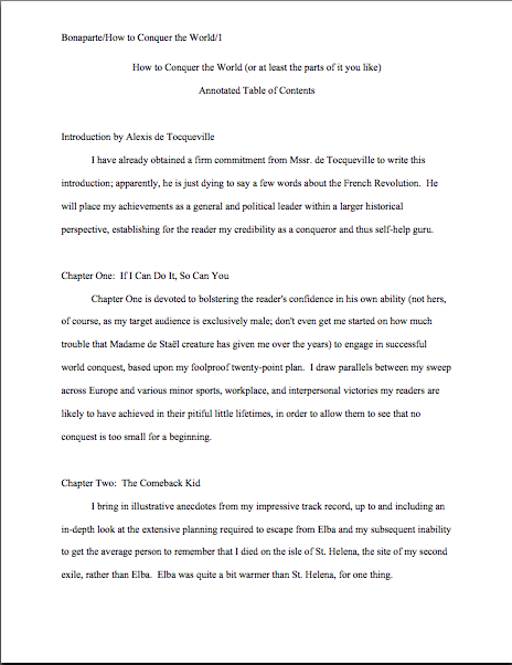
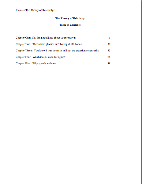
4. The annotated table of contents

Everyone relatively happy about all of those? Again, please pop a question into the comments, if not. As, indeed, incisive reader Laura did the last time I discussed the intricacies of book proposals:

Quick question about the table of contents. The book I am proposing is written in first and second person Should the Annotated Table of Contents be written in the same style or should it be a third person explanation of the chapters?

Great question, Laura: the annotated table of contents should be written in the third person, regardless of the voice of the proposed book. That is not true of the rest of the book proposal: the opening pages of book description (and, of course, the sample chapter) should be in the intended voice of the book. So while most nonfiction proposals are written entirely in the third person singular, all memoir proposals should be in the first person.

Everyone clear on that? Excellent. Moving on:

5. The sample chapter(s)
Usually, book proposals contain only one sample chapter — written impeccably and polished to within an inch of its life, naturally — but if the chapter you have in mind is less than 15 pages long, consider including more than one. As long as you keep the total sample under 30 pages or so, you should be fine.

Generally speaking, professional proposals use Chapter 1 as the sample chapter, rather than one from farther into the storyline or argument, for the exceedingly simple reason that it’s usually easier for the reader to follow that way. However, that’s not strictly necessary: in a cookbook proposal, for instance, Chapter 7’s Thanksgiving feast may well wow Millicent more than Chapter 1’s general introduction to baking techniques.

Use your best judgment — but as always, be open to your future agent’s informing you that you judged wrong and that you must write another sample chapter before she submits it to editors at publishing houses. (Yes, it happens. Quite a lot, in fact.)

Whichever chapter you select, make absolutely certain that the chapter and the description in the annotated table of contents match. You’d be astonished — at least, I hope you would — how often the chapter does not resemble the description: it’s as though the writer wrote the chapter and the annotated table of contents at completely different times, and then didn’t bother to cross-check.

Which is, of course, precisely what happens, most of the time. That’s a serious proposal faux pas: how can a proposer expect Millicent or Maury to believe that those descriptions in the annotated table of contents are accurate representations of what will turn up in the eventual book if the one and only chapter presented as evidence does not adhere pretty closely to its description?

When making the decision about which chapter to include, bear in mind, too, that the sample chapter is where you’re going to provide the most direct evidence of the voice and writing style of the proposed book. Neither of which, in a good proposal, will come as a surprise to Millicent, because the entire proposal should be written in the narrative voice of the book.

Yes, even the dry marketing parts. Hey, you’re a writer — it’s your job to make even unquestionably dull stuff interesting to read. It all needs to be your best writing.

Which brings me back to that bit about the sample chapter’s needing to be written impeccably and polished to within an inch of its life. It never fails to astonish Millicent and Maury how often a good writer with a compelling book concept simply throws away the opportunity the sample chapter provides of demonstrating that s/he is a serious writer willing to take the time to present his or her work professionally. A sample chapter containing formatting errors, grammatical problems, or typos is simply not going to be impressive enough to catch an agent or editor’s eye.

Not positively, anyway. Why not? Because, lest we forget, a book proposal is a job application: in it, the writer is trying to convince an agent or editor that this is a compelling argument or story that a specific group of readers will want to buy, but that this writer and no other is the perfect person to hire to write it.

That’s true, incidentally, no matter how unusual your book concept is or how impressive your platform is to write it. Remember, being able to write well, clearly, and in adherence to standard format is the minimum requirement for a successful submission, not a set of fringe benefits.

What’s that you say, campers? This all sounds like a heck of a lot more work than simply throwing the necessary materials together and hoping that the sample chapter alone is enough to convince Millicent that your voice is right for this project? Undoubtedly. But a better marketing strategy than the far more common approach of composing the rest of the proposal in the faintly exasperated tone of the jumper through unnecessary hoops? Absolutely.

On the brighter side, for a well-prepared writer, the labor involved in incorporating the sample chapter into the proposal is comparatively light. How so? Well, hold your applause, but in a proposal, the sample chapter is formatted precisely like a chapter in a manuscript.

Okay, you can clap now. You know you want to.

That’s right — provided that as much of the book as you’ve written so far is already in standard format, you can simply copy and paste it into your book proposal at the proper juncture. This means, of course, that the first page of the sample chapter will have more white space at the top than any other page of the proposal. (And if you found that last statement mystifying, may I suggest that you review my earlier post on chapter openings and how they should look on the page?)

I hear some of you muttering and shuffling your feet. You want to see the difference between the first page of the sample chapter and any old page of the proposal, don’t you? Good plan.

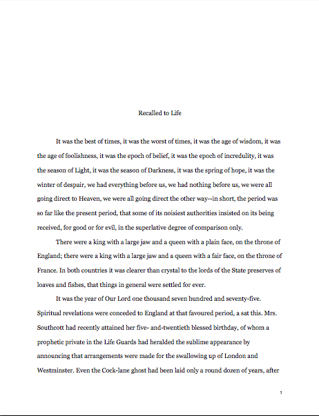
Here, for your comparing and contrasting pleasure, is a properly-formatted first page of a proposal. (You do remember, right, that the title page is neither numbered nor included in the page count?) As always, if you are having trouble reading specifics, try holding down the COMMAND key and pressing + to enlarge the image.
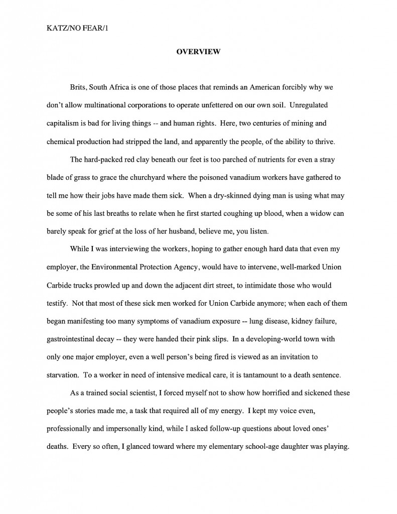
overview1

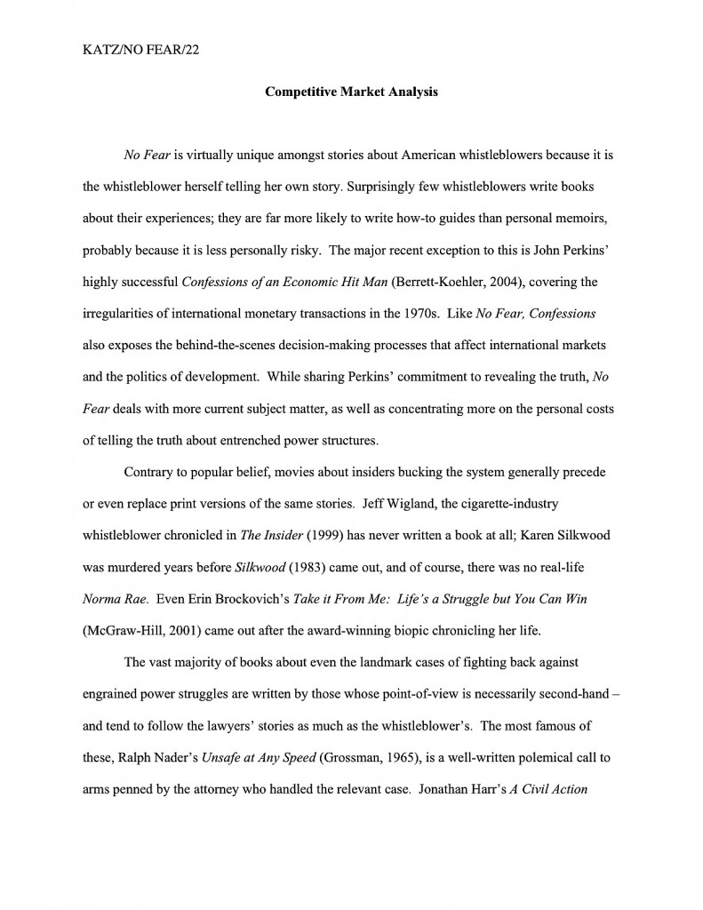
That should look familiar by now, right? Because the sample chapter is a major section of the proposal, let’s review how a major section change would be designated in a proposal:

competitive market analysis3

Now take a peek at a minor topic change — which, too, should be old hat by now. (Where on earth did that perverse little expression originate, I wonder?)

subheading in proposal

As I would devoutly hope would be abundantly clear to you by this late point in a series on standard formatting, none of the above remotely resembles the first page of a manuscript. The first page of a manuscript should, of course, look like this:

first page of text

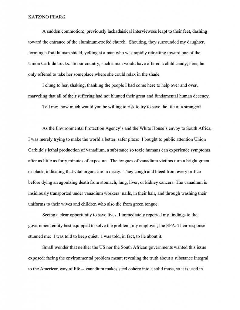
Quite a difference, is it not? Millicent could tell which was a page from a proposal and which had fluttered free of a manuscript from ten paces away. Now take a gander at the first page of the sample chapter in a proposal:

sample chapter opening

Those last two are remarkably similar, aren’t they? Pop quiz: see any formatting differences between this and the same chapter opening in the manuscript?

If you immediately leapt to your feet, exclaiming, “By Jove, Anne, the slug line clearly demonstrates that rather than starting pagination over again at page 1, the sample chapter’s first page shows where it falls within the book proposal,” congratulations: you have the eye of an editor. As you so astutely pointed out, the page numbers don’t start over at the beginning of the sample chapter; the entire proposal is numbered consecutively. For extra credit, would anyone care to guess why?

If you shouted, “To make it easier for Millicent to put the always unbound pages of the proposal back in order after she collides with someone in the hallway!” you’re really on a roll today. Help yourself to a gold star out of petty cash.

Otherwise, though, the sample chapter and the same chapter in manuscript form should be formatted identically. Realizing that, need I even add that part of what the writer is demonstrating in the sample chapter is a familiarity with the standards of this industry?

Not to mention the tone and vocabulary norms of the chosen book category. I probably should mention that, come to think of it, because many a well-argued and even well-written book proposal has gotten rejected because the prose in the sample chapter just didn’t sound like, well, a book in that category.

As always, if you’re not familiar with what’s currently being published in your chosen book category, why not? And how on earth did you manage to write a convincing competitive market analysis without being up on all the recent releases, anyway?

I’m most emphatically not kidding about this: from an agent or editor’s point of view, a book proposer’s being conversant with the norms, trends, and current market for the type of book she’s proposing is not an optional extra — it’s a basic requirement. It comes standard with the professional nonfiction writer package.

Don’t tell me you can’t afford to buy everything that comes out in your category, either: that’s what libraries and bookstores with comfortable reading chairs are for, after all. (Although a case could be made that the single best thing a first-time writer in any book category could do to help convince the pros that category has a solid fan base is to rush out consistently and buy new releases in that category. Particularly those by first-time authors.)

A couple of final words about the sample chapter before I move on to the remaining bits of the proposal: make absolutely sure that the sample chapter delivers on the promise of that chapter’s summary in the annotated table of contents. If there’s any doubt whatsoever in your mind about whether it fulfills that promise — or if it does not represent your best writing — either pick another chapter to use as your sample or start revising.

What does bearing out the promise of that description mean, in practice? If the chapter description contained an explicit question — or even an implicit one — the sample chapter had better answer it. If the description hinted at an exciting scene, the chapter had better deliver it. If the description made an argument, the chapter had better present evidence in support of it.

And it had better do so without repeating entire sentences or — sacre bleu! — paragraphs from the description. Or, indeed, from any other part of the proposal. Trust me, Millicent and Maury both have sufficient memory for phraseology to catch if you have used the same three consecutive words twice within the same book proposal, much less reused an entire paragraph from the annotated table of contents in the chapter. Or vice versa.

Seriously, proposers do this all the time — as do synopsis-writers, incidentally. When trying to break into a business that runs on uniquely-worded expressions of thought, it’s just not a very good strategy.

Do try, too, to pick sample material that makes your subject matter sound fascinating. That may seem as though it goes without saying, but cursory sample chapters are the bane of any proposal-reading Millicent or Maury’s existence, and for good reason: if their attention has been sufficiently grabbed by the overview and maintained throughout the middle part of the proposal, it’s a genuine disappointment to discover a sample chapter that just lies there. If they’ve read that far, trust me, they want — and expect — to be wowed.

At the risk of hauling out that broken record player again, they also expect that the sample chapter will demonstrate how you intend to flesh out the brief chapter summaries in the annotated table of contents, and rightly so. If the two parts of the proposal appear to be out of sync, M & M are going to wonder if your writing skills are up to the task of producing a consistent final manuscript.

Don’t tempt them to speculate on that score. Call me cynical, but I’ve seldom seen that type of speculation end well for the proposer. It’s not a screener’s job to give proposers the benefit of the doubt, after all.

Speaking of doing one’s job, it’s about time that I talked about the remaining elements of the proposal, isn’t it? Don’t worry; there aren’t many.

6. The author bio
Since writing a stellar author bio is an art form of its own, and one that we have discussed recently, I’m not even going to attempt to describe here how to write one. For an in-depth discussion of the subject, please consult the aptly-named HOW TO WRITE AN AUTHOR BIO category on the archive list at right.

Again, this is a place where many first-time proposers skimp, thinking (erroneously, alas) that since they’ve already talked about their platforms earlier in the proposal, all that’s really necessary in the author bio is the kind of bare-bones, just-the-facts-ma’am author bios they’re accustomed to seeing inside the dust jackets of hardcover books. Do not, I implore you, be fooled by those brief paragraphs going by the same moniker as what’s required in a book proposal.

The purpose of an author bio in a book proposal is to provide a handy single-page summary of the writer’s platform for writing this particular book. That means, in practice, that a savvy writer may choose to use different author bio text — or even author photos — in proposals for different books.

Not sure why? Okay, tell me: if you were vacillating between acquiring two books on dog breeding, which bio would appeal to you more, one that simply lists the writer’s previous publications and credentials under a smiling head shot — or one that listed eight dog-related credentials under a snapshot of the writer with his arm around a happy Dalmatian?

No contest, is there?

Do not, for the sake of your own writerly happiness, leave constructing your bio to the end of the proposal-writing process. It’s hard; budget time for it. Why? Well, really apt author bios are hard to write — and most of us go through quite a few photos before we find one of ourselves that we like.

Don’t believe me? Okay, care to guess how many shots my quite gifted photographer friend Marjon Floris took before she caught the one in my bio?

Somewhere in the neighborhood of 800. With two cameras. (Thank goodness for digital technology, eh?) Admittedly, my whole family is pretty camera-shy — my brother’s wedding photographer actually burst into tears during the reception, so frustrated was he at the difficulty of catching candids of any of us wily Minis — but still, a good author photo often takes a lot of trial and error.

Speaking of the camera-shy, am I seeing some of you waggling your fingertips in my peripheral vision? “But Anne,” the photography-averse murmur, making faces at the camera, “I don’t want to include a picture of myself in my bio; believe me, my book’s appeal would in no way be enhanced by a photo of me clutching a Dalmatian, or indeed, any creature whatsoever, warm- or cold-blooded. Can’t I, you know, skip it?”

You’re not going to believe this, but the answer is yes.

At least in a book proposal; it’s more or less de rigueur these days in a bio accompanying a manuscript submission. Hey, both Millicent and Maury will want to be able to tell their bosses if the new writer they’ve just discovered is photogenic — like it or not, it does sometimes make a difference in marketing these days.

Without an author photo, a proposal bio is simply another double-spaced single page of text with a title at the top. Here, for instance, is the super-serious bio I used a few years ago in the proposal for the political book I’ve been using as an example all day:

author bio

7. Relevant clippings, if any
This is another platform-proving exercise: if you have written articles, or even other books, it’s customary to include beautifully sharp photocopies of a few of them at the end of your book proposal. Similarly, if you happen to be famous enough for articles to have been written about you and your subject matter, feel free to include ‘em here — provided, in this second case, that they relate to your platform for this particular book.

Since our primary concern in this series is formatting (although I suspect that salient fact may have slipped all of our minds while I’ve been chatting at length about the content of a good book proposal; hey, I’m chatty), I’m going to leave to another time in-depth discussion of how to generate clippings. For now, I’ll content myself with urging you to make sure that the copies are pristine, with nice, clear, readable type.

Oh, and one other thing: do yourself a favor and scan each of the clippings, or have a computer-savvy someone do it for you. Not only will this enable you to submit your proposal to agents and small publishers who prefer online submissions (still relatively rare for nonfiction, but growing in popularity by the day), but it will also save you quite a bit of time down the line, once you’re working with an agent.

Why? Well, it has become quite common for agents to submit book proposals electronically to editors. Unscanned clippings can’t go into a virtual proposal, right?

Pant, pant, pant. Don’t stop running now — we’re practically at the end.

8. The proposal folder
I’ve written about this fairly extensively in the HOW TO WRITE A BOOK PROPOSAL series (conveniently gathered under the category of the same name on the archive list at right), so I’m not going to delve too deeply into the particulars. Except to say: in the United States, book proposals are presented in plain black folders.

Period. Don’t even consider trying to get fancy — and whatever you do, do not bind your proposal in any way. Let those pages flap around loose, just as they do in a manuscript.

Well, not quite the same: tuck the pages (neatly please) into the folder, items 1-4 on the left-hand side (i.e., everything prior to the sample chapter), items 5-7 (the sample chapter and beyond on the right).

Don’t label the folder on the front, either; keep it plain. What Millicent, Maury, and everybody else in the industry expects to see coming out of a submission envelope is this:

book proposal folder1

I know: boring. That’s the way they like it.

The folders in question, by the way, are the ones with horizontal pockets inside, not the ones with brads in the middle. The latter are for high school book reports, the former for book proposals, and ne’er the twain shall meet. So if the folder in your hand does not look like this when you open it:

book proposal photo 2

scuttle on back to the office supply story and pick up one that does. Seriously, proposals in the wrong kind of folder will just look unprofessional to the pros.

And that — whew! — is a lightning-swift (for me) discussion of how to format a book proposal. Congratulations on absorbing so much practical information so rapidly, campers, and for being professional enough to take the time to learn the ropes before you submit.

Next time, it’s back to the rigors of standard format for manuscripts — and to answering more readers’ trenchant questions. (But to save all of you question-askers some effort: I am already aware that there are a lot of sources out there making a lot of claims about how manuscripts should be formatted; you don’t need to keep telling me. There is absolutely nothing I can do about the plethora of odd advice out there on the web. I know that those of you who long for consensus are frustrated that every single source you consult doesn’t say precisely the same thing, but as I have said early and often throughout this series, my goal here is to give you enough of the logic behind what I advise for you to be able to judge for yourselves. For some tips on how to tell the good advice from the bad, and the informed from the just guessing, you might want to check out the HOW CAN I CHOOSE BETWEEN COMPETING ADVICE category on the archive list at right.)

Keep up the good work!

Formatpalooza, part XIX: constructing a proposal an agent or editor would like to accept

Sorry about the uncharacteristically long silence, campers. Although you may have concluded that I had withdrawn, discreetly, in order to allow those of you who write literary fiction, memoir, and work that just doesn’t fit neatly into a pre-established category some extra time to prepare your entries in the Author! Author! Rings True Writing Competition — the deadline is Saturday at midnight in your time zone! — I was, alas, flat on my back.

Or rather resting at an incline, sniffling my way through one of the most annoying flus ever to work its way through the hapless citizenry of this part of the country. Normally, I can work through the haze of such contretemps, but this one was a lulu. I shall post through the weekend, though, to make up for the lost time.

Why the hurry? I know that some of you are eager to polish off — and polish up — your nonfiction book proposals.

Toward that laudable end, we have been bending our collective gaze — steely, to be sure — away from the green pastures of manuscript formatting to turn our attention to the wind-swept plains of book proposals and their proper formatting. As we have seen in our brief sojourn amid the majestic buffalo and skipping lambs, while the text of a book proposal is formatted largely in the same matter as a manuscript’s, the various headings and subheadings are often different.

Allow me to take a brief pause in the midst of all of that stirring imagery to sneeze violently.

Before we resume, did you notice how I dropped that running metaphor when it became apparent that it wasn’t working? That’s a good editing tip for any kind of writing: if it doesn’t fly, don’t force it. An even better one: while proofing you work, make sure you read all the way to the end of every sentence; it’s the only way to catch metaphors abandoned mid-stream.

Why, yes, Virginia, I do see orphaned metaphors wandering about ostensibly well-revised manuscripts. All the time. It’s one of the species markings of the Frankenstein manuscript.

As we saw last time, a professional book proposal contains a wide range of marketing materials, all written in the proposer’s best possible prose, cleverly fitted together in a manner to convince an agent or editor that the proposed book an interesting idea that will appeal to a very specific (and, ideally, well-established) target audience. Not only that, but that the proposer is the best (and, ideally, the only) conceivable person currently drawing breath to write this particular book.

Or, to put it in the language of the industry, it’s a marketable concept presented by a writer with a great platform.

Pardon me while I wrap myself up warmly — the thousand hands that just shot into the air created quite a draft. “Excuse me, Anne?” many would-be proposers inquire nervously. “You didn’t really mean that bit about the proposal written in the proposer’s best possible prose, did you? After all, the proposal is just a formality, a series of hoops through which I have to jump before a publisher buys my book, right? All that really matters is a great book concept.”

Actually, no — although I can certainly see why you might think so. Unlike novels, nonfiction books (yes, even most memoirs) are sold not because someone falls in love with the manuscript, but because a prospective author has made a convincing case in a proposal that a book that does not yet exist will be marketable to a specific audience and that s/he is the right person to write it.

Since the book concept and the argument for it are the primary sales pitch, most first-time proposers conclude that the writing in a proposal is of secondary importance. They’re absolutely wrong.

Why? Because every syllable of a book proposal is a writing sample — the only writing sample, in fact, upon which an agent or editor will base his or her conclusions about whether to pick up the book.

Picture, if you will (and you will, right?), Maury the editorial assistant, diligently scanning the day’s submissions from agents for the next promising nonfiction project. He has reason to be careful: he needs to be very, very selective about what he passes on to his boss, the editor of your dreams. (Let’s call her Ermintrude, just for giggles.) If he simply sends Ermintrude every proposal that sounds as if it might make a good book, he’s not really doing his job, is he? It’s not as though she can offer a publication contract to every interesting-sounding project, after all; at most, even an extremely busy editor might be able to take on somewhere between one and ten a year.

Yes, you read that correctly. Believe me, if Ermintrude had her druthers, she would be publishing at least 30 times that many, but her druthers are, alas, constrained by economic realities and marketing trends.

Please think about that, if were planning to toss together your book proposals over the next long weekend, or stuff them into the mailbox without running the text by another literate human being not already familiar with your book’s concept — or, sacre bleu! if you have already sent off a New Year’s resolution-fueled submission packet. Even though it has historically been quite a bit easier to land an agent and sell a first nonfiction book than a debut novel, the competition is still extremely fierce.

So when you see an agency’s submission guidelines seemingly casually asking nonfiction writers to query with proposal, this is not a requirement to approach lightly. The Millicents who screen those proposals for agents are expecting not a thrown-together, paint-by-numbers, bare-minimum document; they are expecting to see a polished, professional presentation of a terrific book concept written in beautiful, clear prose.

Why set the bar that high? Let’s wend our way back to Maury’s cubicle to find out.

It’s Maury’s job to prevent Ermintrude’s desk from becoming so over-stacked with proposals that she can’t find her phone. That means, in practice, that he’s going to weed out any proposal that doesn’t sound interesting right off the bat. He’s also going to reject those that don’t have a clearly-defined concept — which, in a screener’s world, means one that’s both grabbed his attention instantly and is comprehensible within the first few pages of the proposal — as well as those that either don’t define their target market well or do not strike him as likely to appeal to the readers already buying such books. Not to mention those that don’t seem to have a well laid-out marketing plan or chapters likely to deliver fully upon the premise of the proposal, or those proposed by writers who haven’t made a good case for their platforms to write the book.

That, frankly, is most of ‘em. I hate to be blunt about it, but because the book proposal is such a widely misunderstood marketing tool, Maury sees a whole lot of rambling proposals. And rambling, unprofessional proposals are most of what Millicent sees on a weekly basis.

In both cases, the response is the same: “Next!” Unfortunately, due to the sheer volume of submissions, it’s likely to be “Next!” for quite a few well-written ones, too.

Why, you cry in tones of anguish? Let’s be generous and assume that Maury’s had an unusually strong selection of proposals tumble onto his desk this week: out of 300, 10 are genuinely fascinating ideas for books aimed for a well-established audience.

He is facing a dilemma, right? Obviously, he can’t possibly pass them all along to his boss — remember, 10 is Ermintrude’s entire year’s allotment of books, even if she works nights, weekends, and funds the last two herself, and this is only the first week of the year. So how does he decide which one or two to send across the hall to her?

That’s right: the ones where the writing in the first few pages screams, “Excuse me, but had you noticed that there’s some talent here?”

Yes, I did indeed say the first few pages; as with a novel, if the opening doesn’t shine, a professional reader is unlikely to read on.

Don’t pout — this information is potentially empowering, because it can steer a nonfiction writer toward specific, helpful revisions. If a literate person like Maury can’t tell Ermintrude what the book is about and why you’re the best person on earth to write it by the time he is halfway through page 4, you might want to think about some serious revision. And if he doesn’t positively long to read the book by the middle of page 2, run, don’t walk, back to the drawing board to work on your prose and presentation.

Now that I’ve scared the living daylights out of you, let’s review the constituent parts of the book proposal — at least, the ones we have covered so far:

1. The title page

2. The overview, a comprehensive document that leaves Maury with no doubt whatsoever about how to answer the following questions:

(a) What is the proposed book will be about, and why are you the single best being currently possessing an operational circulatory system and fingers to write about it?

(b) What is the central question or problem of the book? Why the topic is important, and to whom?

(c) Why is this book needed now, as opposed to any other time in literary history?

(d) Who is the target audience for this book?

(e) Why will this book appeal to the target audience as no book currently on the market does?

(f) How will your platform enable you to reach this target audience better than anyone else who might even think about writing this book?

(g) How strong a writer are you, and is this voice appropriate to the proposed book’s subject matter and target audience?

Okay, okay, so I kind of slipped that last one up the back staircase, but it’s an important question to consider when evaluating whether your book proposal is strong enough to head out the door. Let’s face it: most book proposals are very, very dry. That makes some sense, given that for even the most enthusiastic book proposer, comparing books currently on the market and talking about methods for reaching a target audience are not inherently exciting topics.

As a result, many a book proposal reads like a book report: all of the necessary parts are there, but the writing is perfunctory and, well, dull. Quite apart from the very real risk of boring Maury and Millicent — who, after all, read quite a few proposals in any given day, if their bosses handle nonfiction — a just-the-facts-ma’am proposal runs another risk: conveying the impression that the book being proposed will be sketchily or uncompellingly written as well.

But this is a marketing document, right? Why not use those pages to give Millicent and Maury a strong foretaste of what the book will be like? Or, to phrase it as an axiom: it’s a great asset to a book proposal if it is written in the same voice (and with the same vocabulary) as the eventual book.

Especially if you can do it excitingly within the first few paragraphs of the proposal. As we discussed last time, a fantastic way to establish authorial voice and interest in the subject matter is to start the proposal with a vividly illustrative anecdote or other method of direct appeal to the reader’s reason and emotions.

Opening with personality-free marketing material tends not to grab Maury’s attention anywhere near as well. Unless you would rather try to thrill him with a hook focused upon last year’s sales statistics?

3. The competitive market analysis
This section, as I hope you will recall from last time, consists of a brief examination of similar books that have come out within the last five years, accompanied in each case by an explanation of how the book being proposed will serve the shared target audience’s needs in a different and/or better manner. Not intended to be an exhaustive list, the competitive market analysis uses the publishing successes of similar books in order to make a case that there is a demonstrable already-existing audience for this book.

Sound familiar? It should: here is where the proposer proves the contentions he made in the overview. Preferably, with hard data.

Which of the many, many contentions, you ask, and how does talking about one’s competition prove them? Well, for starters, who the target audience is for your book?

Answer: the readers who have already bought the books listed in the competitive market analysis. The implicit logic: if those books sold well, that means these people buy a lot of books — and might be eager to buy more.

Remember, this should not be a list, but a compare-and-contrast essay, presented in standard format. The essay format is actually to your advantage: while you’re comparing and contrasting, you can demonstrate how your book is different and better than what’s already on the market — and yes, Virginia, that can (and should) be done without running down the competition, as long as you’re specific.

Think about it: if you mention the best points of the other books and can still make the case that your proposed volume will either do what they do, only more effectively (do you have a stronger platform than another author, for instance, or is the other book outdated now?) and/or not in the same way (what does your take on the subject offer that those other books do not?), your book is going to end up looking better by contrast than if you merely say that everything else is terrible.

Trust me on this one. If you can’t say anything nice about a particular comparable book, consider instead contrasting yours to one that you can praise with a straight face.

Some of you have had your hands raised since last time, have you not? “But Anne,” proposers everywhere exclaim, rubbing circulation back into their exhausted arms, “one of the reasons I wanted to write my book in the first place is that there isn’t another recent book on the subject. So how do I come up with a list for the competitive market analysis? Make things up?”

Glad you asked, patient arm-raisers — there’s a pro’s trick for handling this. But first, indulge me by participating in a short exercise in understanding your book’s appeal.

(a) Equip yourself with some scratch paper (the back sides of earlier drafts of your proposal, perhaps?) and a comfortable pen.
I would suggest selecting a comfortable chair, too, because you’re not to budge until you come up with a list to take with you to a bookstore.

(b) Brainstorm five different ways to describe your proposed book.
And I’m not talking about descriptors like well-written, either — describe your book the way a clerk in a bookstore might to a potential reader. Is it a memoir about your childhood spent following your mother as she worked as a gold-panner in the Sierra Nevada mountains in the 1920s? Then your list might run like this: memoir of 10-year-old girl, treasure-hunting, mountain living, 1920s, and women in unusual occupations.

Starting to get the hang of this? Let’s try another one: the proposer of a self-help book aimed at mothers with children suffering from life-threatening illnesses, illustrated with abundant real-life case studies might generate a list like this: self-help for mothers, terminal illness, medical memoir, parenting books, dealing with the prospect of death, and mourning.

Got your list firmly in hand? Good. Now…

(c) Hie yourself and your list hence to the nearest well-stocked brick-and-mortar bookstore.
Seriously, what I’m about to suggest is considerably harder to pull off online.

Standing in the store, feeling silly for carrying that list around? Excellent. Ready, set…

(d) Don’t find a book like yours. Instead find a couple of books that match one — and only one — descriptor on your list.
Yes, really: while it would be terrific to discover a book similar enough to yours that you can perform a direct point-by-point comparison, it’s actually not necessary for your book proposal. Instead, go to the first descriptor on your list and find several books that could be described with the same term.

Proposing a memoir, for instance? Stand in front of the memoir section and keep pulling books off the shelves until you discover a few that are similar in some way to yours — not identical, but exhibiting some subject matter or approach overlap.

It can be a very, very small way. Is it a childhood memoir by someone who grew up in the same part of the country as you did? Start taking notes. Is another by a dog-lover, while two chapters of your proposed book cover your relationship with beloved Spot? Sounds close enough to me. If your memoir set in the mid-1960s, find a few good nonfiction titles that cover similar aspects of the period.

After you’ve ferreted out a few useful titles, move on to the next descriptor on your list. If your cookbook is for vegans, how about including as few of the well put-together vegetarian cookbooks out recently? Not too hard to see how your book would be different and better for vegan readers than those, right? If your memoir features a chapter on the day your big brother ran away to join the army, wouldn’t it make sense to grab a couple of military memoirs, to check which dealt with family issues?

And so forth. The goal here is not necessarily to find a dozen books exactly like yours; it’s also perfectly permissible to devote a paragraph or two each to several different book categories into which your unique book might conceivably fall. Chances are, you’re going to find more books than you actually need. When in doubt, go with the ones that sold better and/or were released by major U.S. publishers; while a book from a smaller press, or one that sold only a few hundred copies, might actually be a better fit, it will provide less evidence to Millicent and her boss that there are editors at major houses already eager to buy books like yours.

Once you have come up with a dozen or so titles, you are ready to begin writing your competitive market analysis.

(e) Instead of trying to draw overall comparisons between your proposed book and each of the titles on your list, focus instead on the single point of overlap — and show how your book will address that particular point in a better way or with a different take than the already-published book.
Try not to fall into the trap of hyper-literalism here. If your book is about being raised by bears, and you are contrasting it with a memoir about being raised by wolves, you’re not going to get a lot of mileage out of saying, WOLF CHILD completely ignores the problems of the bear-raised human, so my book, CUB SCOUT, will appeal to the wild-animal/family market more.

Well, of course a book about wolves would not address bears; it’s not reasonable to expect otherwise. By concentrating upon more positive points of comparison, it’s easier to make your book’s legitimate selling points clear: like the best-selling WOLF CHILD, CUB SCOUT is a first-person account of being raised by wild animals. Wolves, however, have a long history of taking in abandoned human children; I was the first child in the Cascade region ever to have spent significant time with the grizzly without ending up a corpse.

See the difference? Again, the point here is not to convey the impression that you consider every similar book out there your competition, and therefore its author an enemy to be discredited. By demonstrating that there is already a market for books that match your five descriptors — as there must be, according to industry logic, or those recently-released books would not be on the shelves* — the implication is that past readers of each of those types of book might arguably be interested in yours.

(* Don’t waste your energies questioning this quite debatable assumption; you’ve got a proposal to write.)

Everyone clear now on the purpose and proper formatting of the competitive market analysis? If not, now would be a fabulous time to shout out a question or two. While I’m waiting with my hand cupped around my ear, let’s move on to the next section.

4. The annotated table of contents
It’s not surprising that this section falls flat in so many proposals; many, if not most, proposers don’t seem to understand the purpose of the annotated table of contents. Many, many proposers labor under the misconception that what agents and editors expect to see in this section is simply a list of chapter titles, accompanied by guesstimated page numbers. Many, many other proposers assume that they should devote a page to each chapter.

Or even several. For my sins, I’ve seen proposal drafts with 20-page annotated tables of contents. Believe me, Maury was far from pleased.

Avoid that dreadful fate in yours; keep it brief, but substantial. One to two paragraphs on each envisioned chapter is about right — remembering, of course, that everything in a book proposal is a writing sample. At the risk of repeating myself, show, don’t tell.

How does one pull that off when covering so much territory in so short a space as a paragraph or two? The same way you came up with the descriptive paragraph of your query letter, ideally: instead of trying to summarize everything that happens in a chapter in general terms, pick a particularly interesting scene or argument and present it in vivid terms.

In other words: be specific, not general. If you can possibly manage it, try to include details that Maury is unlikely to see in another proposal.

Again, you’re going to want to write this as narrative, not a list, but this section of the proposal has some odd conventions, ones that tend to come as a surprise to most first-time proposers. To see them in action, let’s take a gander at out example from the other day. As always, if you’re having trouble reading the specifics, try holding down the COMMAND key and pressing + to enlarge the image.

Notice anything here that might offend the muses of standard format, were this a novel? How about the fact that the title of the book appears at the top of the page, as if Annotated Table of Contents were a subtitle? Or the phenomenon of adding a section break between each chapter’s description? Or that the descriptions were in the present tense, like a synopsis?

Actually, there’s a pretty good explanation for the first two of these conventions. (Sorry; you’re on your own for the last.) Remember how I mentioned earlier in this sub-series that unlike a manuscript, book proposals are often broken up into their constituent parts on the reading end, so folks working in different departments at publishing houses may take a gander at ‘em?

Titling the annotated table of contents renders it easier to get those pages back into the right proposal. Skipping a line between chapters makes it simpler for an editor to find the chapter she is seeking when she’s in an editorial committee meeting or arguing with your agent about what will be in the final book.

Oh, you weren’t aware that editors often ask writers to change the proposed chapters? Happens all the time, so gird your loins, nonfiction-proposers, and prepare to play ball.

If the very notion of being asked to remove your meticulously-researched chapter on steam engines (in order to replace it with a similar section on cotton gins, about which the acquiring editor did her undergraduate thesis at Columbia) or to reduce your seven intended chapters on your life prior to the age of 17 into as many paragraphs (so you may concentrate at greater length on your four subsequent years as a sword-swallower) causes your skin crawl in revulsion, do not despair. You actually do have a means of making sure your favorite chapters pass the editorial test: write about them brilliantly in the annotated table of contents.

Seriously, if ever there was a time to show, not tell, this is it. The more vividly-depicted specifics you can work into those chapter descriptions, the better. Think of it as an opportunity to let Maury and Millicent know what a great storyteller you are.

Why is that especially important in the annotated table of contents, you ask? The vast majority of first proposals just summarize what’s going to be in each chapter, instead of using each chapter to tell a compelling separate story. Because you’re selling your talents as a writer here, as well as the subject matter of the book, that’s a serious faux pas.

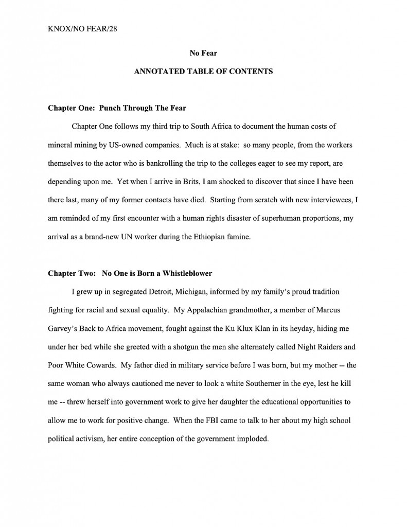
If you just muttered to yourself, “Hey, might this not be an amazingly good place to demonstrate just how my book is different and better than the ones I was discussing in the last section?” congratulations — you’re starting to think like a pro. Especially in a memoir or cookbook proposal, this is a great spot to work in mention of how your book is uniquely yours:

annotated table of contents2

If you eagerly shot your hand into the air as you glanced over that last example, eager to point out that this example was formatted slightly differently than the one before it, congratulations again — your eye is sharpening. The last version is in the version my agency prefers; the desire for bolding and all caps is not universal.

Just thought you might like to see both. And if I haven’t said it often enough yet: if the agent of your dreams wants you to format your proposal differently from what I advise here — in, for example, clearly laid-out guidelines on the agency’s website — for heaven’s sake, give him what he wants. In the book proposal as well as the manuscript, the average agent is looking for evidence that a potential client can follow directions.

Don’t see why that would be an essential quality in a book-proposing client? Okay, let me ask you: if you were an agent, would you rather represent the writer who says, “Lose my Chapter 13 and dumb down the book’s vocabulary to an 8th-grade reading level? Can do, Ermintrude!” or the one who flies into an uncontrollable fury and comes weeping to the agent, demanding to cancel the book contract?

Oh, come on — you didn’t really hesitate over that choice as long as you pretended, did you?

I’ll be wrapping up book proposal formatting next time — literally: I’ll be talking about the folders that encase them. Until we meet again in that happy, not-too-distant future, keep up the good work!

Formatpalooza, part XVIII: checking off all of those boxes, or, how to format a book proposal

How’s everybody doing out there? Are all of you nonfiction writers excited that I’ve been talking about writing specific to your book categories, or is everyone still too burned out from New Year’s festivities that you’re sitting there, glassy-eyed, silently willing the first Monday of 2011 to be over, already? Or — and I sincerely hope this is the case — are you paying attention to this post with one part of your brain, while another delightedly plots how to polish up your entries to the Author! Author! Rings True Writing Competition? There are both fiction and nonfiction categories this time around, folks, so I hope all of you memoirists who just dropped by for the formatting tips will at least consider entering.

Personally, I can’t wait to see what you’ll send in. As those of you who have been hanging out here at Author! Author! for a while may have sensed, I honestly do like to see what my readers are writing.

And, of course, to know how I can help you present your manuscripts and proposals more professionally. If you have a question about standard format, or something for which you would like to see more practical examples, by all means, let me know. That’s why the comment function is there, folks!

Seriously, it’s to everybody’s benefit if you ask; trust me, if you have been wondering, so have hundreds of other writers. The overwhelming majority of aspiring writers have never seen a professionally-formatted manuscript or book proposal, after all. I would much, much rather you asked me than took a wild guess in your submissions.

Readers’ questions also allow me to fine-tune the archive list at right — I want to make it as intuitive as possible for a panicked aspiring writer to use. (Speaking of which, since no one has commented yet on last November’s rather radical rearrangement of the archive list, am I to conclude that (a) most of you are finding it easier to use than its previous incarnation, (b) most of you are finding it harder to use, but are too polite to say so, (c) despite the monumental effort of rearranging it under subheadings, the result is precisely as user-friendly as the simple alphabetical list it replaced, or (d) nobody has noticed? It would be quite helpful for me to know.)

I’m particularly interested in finding out what pieces of information are comparatively difficult to find in my frankly pretty hefty archives. Why, only last February, eagle-eyed reader Kim was kind enough to point out a fairly extensive omission in my twice-yearly examinations of standard format for manuscripts: although I had been providing illustrations of same for several years now, I’d never shown the innards of a properly-formatted book proposal. In fact, as Kim explained,

Anne — Thank you for this glorious blog. It is a wealth of information. I am putting together a submissions package (requested materials, yea!), which includes a book proposal. After searching through your site, I still can’t find a specific format for the thing. For example, should the chapter summaries be outlined? double-spaced? Should I start a new page for each subheading? Also, my book has several very short chapters (80 in total). Should I group some of them together in the summaries, lest it run too long? Or is it better to give a one sentence description of each? Thanks again.

My first response to this thoughtful set of observations, I must admit, was to say, “No way!” After all, I had written a quite extensive series entitled HOW TO WRITE A BOOK PROPOSAL (beginning here) as recently as…wait, did that date stamp say August of 2005?

As in within a month of when I started this blog? More to the point, since before I sold my second nonfiction book to a publisher? (No, you haven’t missed any big announcements, long-time readers: that one isn’t out yet, either.)

Clearly, I had a bit of catching up to do. Equally clearly, I am deeply indebted to my intrepid readers for telling me when they cannot find answers to their burning questions in the hugely extensive Author! Author! archives.

The burning question du jour: how is a book proposal formatted differently than a book manuscript? Or is it?

In most ways, it isn’t; in some ways, however, it is. Rather than assume, as I apparently did for four and a half years, that merely saying that book proposals should be in standard manuscript format (with certain minimal exceptions), let’s see what that might look like in action.

In fact, since I’ve been going over the constituent parts in order, let’s go ahead recap from the beginning, talking a little about what purpose each portion of it serves. Here, ladies and gentlemen of the Author! Author! community, are the building blocks of a professional book proposal, illustrated for your pleasure. As you will see, much of it is identical in presentation to a manuscript.

1. The title page
Like any other submission to an agent or editor, a book proposal should have a title page. Why? To make it easier to contact you — or your agent — and buy the book, of course.

As we discussed in our last ‘Palooza post, once a writer has landed an agent, the agency’s contact information belongs on the title page, so the editor of one’s dreams may contact one’s agent easily to acquire the book. Prior to either the happy day of an offer on one’s book or the equally blissful day one signs with an agent, the writer’s contact information belongs on the title page.

2. The overview
First-time proposers often shirk on this part, assuming — wrongly — that all that’s required to propose a nonfiction book is to provide the kind of 1-, 3-, or 5-page synopsis one might tuck into a query packet. In practice, however, a successful overview serves a wide variety of purposes:

(a) It tells the agent or editor what the proposed book will be about, and why you are the single best person on earth to write about it. Pretty much everyone gets that first part, but presenting one’s platform credibly is often overlooked in an overview. (I hate to be the one to break it to you, but if an agent or editor makes it to the bottom of page 3 of your proposal without understanding why you are a credible narrator for this topic, your proposal is going to fall flat, no matter how inherently interesting your topic may be.

(b) It presents the central question or problem of the book, explaining why the topic is important and to whom , amplifying on the argument in (a), couching it in larger terms and trends. Or, to put it another way: why will the world be a better place if this book is published?

No, that’s not an egomaniac’s way to look at it. Why do your readers need to read this book? How will their lives or understanding of the world around them be strengthened or reshaped by it?

(c) It demonstrates why this book is needed now, as opposed to any other time in literary history. That one is self-explanatory, I hope.

(d) It answers the burning question: who is the target audience for this book, anyway? To reframe the question as Millicent’s boss will: how big is the intended market for this book, and how do we know that they’re ready to buy a book on this subject?

(e) It explains why this book will appeal to the target audience as no book currently on the market will. (In other words, how are potential readers’ needs not being served by what’s been published within the last five years — the usual definition of the current market — and why will your book serve those needs in a better, or at any rate different, manner?

(f) It shows how your platform will enable you to reach this target audience better than anyone else who might conceivably write this book. Essentially, this involves tying together all of the foregoing, adding your platform, and stirring.

(g) It makes abundantly clear the fact that you can write. Because, lest we forget, a book proposal is a job application at base: the writer’s primary goal is to get an agent or editor to believe that she is the right person to hire to write the book she’s proposing.

Yes, there should be separate sections of the book proposal that address all of these points in detail. The overview is just that: a quick summary of all of the important selling points for your book, presented in a manner intended to entice an agent or editor to read on to the specifics.

In the interest of establishing points (a), (b), and (g) right off the bat, I like to open a book proposal with an illustrative anecdote or direct personal appeal that thrusts the reader right smack into the middle of the central problem of the piece, reducing it to an individual human level. Basically, the point here is to answer the question why would a reader care about this subject? within the first few lines of the proposal, while showing off the writer’s best prose.

For a general nonfiction book — particularly one on a subject that Millicent might at first glance assume, perish the thought, to be a bit on the dry side — this is a great opportunity for the writer to give a very concrete impression of why a reader might care very deeply about the issue at hand. Often, the pros open such an anecdote with a rhetorical question.

overview NF page 1

The opening anecdote gambit works especially well for a memoir proposal, establishing both the voice and that the memoir’s central figure is an interesting person in an interesting situation. While it’s best to keep the anecdote brief — say, anywhere between a paragraph and a page and a half — it’s crucial to grab Millicent’s attention with vividly-drawn details and surprising turns of event. To revisit our example from last time:

overview1

overview2

As we saw in that last example, you can move from the anecdote or opening appeal without fanfare, simply by inserting a section break — in other words, by skipping a line. While many book proposals continue this practice throughout the overview, it’s visually more appealing to mark its more important sections with subheadings, like so:

subheading in proposal

Incorporating subheadings, while not strictly speaking necessary, renders it very, very easy for Millicent the agency screener to find the answers to the basic questions any book proposal must answer. If the text of the proposal can address those questions in a businesslike tone that’s also indicative of the intended voice of the proposed book, so much the better.

Please note, however, that I said businesslike, not in business format. Under no circumstances should a book proposal either be single-spaced or present non-indented paragraphs.

This one confuses a lot of first-time proposers, I’ve noticed. “But Anne!” they protest, and not entirely without justification. “A book proposal is a business document, isn’t it? Doesn’t that mean that it should be in business format?”

The short answer is my God — no! The not-so-short answer is: not if you want Millicent to read it. An aspiring writer who does not indent her paragraphs is presumed illiterate.

Long-time readers, chant it with me now: the publishing industry does not use business format, even in its business letters; always, always, ALWAYS indent your paragraphs.

3. The competitive market analysis
The competitive market analysis is probably the most widely misunderstood portion of the book proposal. What the pros expect to see here is a brief examination of similar books that have come out within the last five years, accompanied by an explanation of how the book being proposed will serve the shared target audience’s needs in a different and/or better manner. Not intended to be an exhaustive list, the competitive market analysis uses the publishing successes of similar books in order to make a case that there is a demonstrable already-existing audience for this book.

But that’s not how you’ve heard this section described, is it? Let me take a stab at what most of you have probably heard: it’s a list of 6-12 similar books.

Period. The sad, sad result usually looks like this:

competitive market analysis bad

Makes it pretty plain that the writer thinks all that’s required here is proof that there actually have been other books published on the subject in the past, doesn’t it? Unfortunately, to Millicent’s critical eye, such a list doesn’t merely seem like ignorance of the goal of the competitive market analysis — it comes across as proof positive of the authorial laziness of a writer who hasn’t bothered to learn much about either how books are proposed or the current market for the book he’s proposing.

To be fair, this is the section where first-time proposers are most likely to skimp on the effort. Never a good idea, but a particularly poor tactic here. After all of these years, the average Millicent is darned tired of proposers missing the point of this section: all too often, first-time proposers assume that it has no point, other than to create busywork.

As you may see above, the bare-bones competitive market analysis makes the writer seem as if he’s gone out of his way to demonstrate just how stupid he thinks this particular exercise is. That’s because he’s missed the point of the exercise.

The goal here is not merely to show that other books exist, but that the book being proposed shares salient traits with books that readers are already buying. And because the publishing industry’s conception of the current market is not identical to what is actually on bookstore shelves at the moment, the savvy proposer includes in his competitive market analysis only books that have been released by major houses within the last five years.

That last point made some of you choke on your tea, didn’t it? Don’t you wish someone had mentioned that little tidbit to you before the first time you proposed?

Even when proposers do take the time to research and present the appropriate titles, a handful of other mistakes tend to mark the rookie’s proposal for Millicent. Rather than show you each of them individually, here’s an example that includes several. Take out your magnifying glass and see how many you can catch.

competitive market analysis 2

How did you do?

Let’s take the more straightforward, cosmetic problems first, the ones that should immediately leap out at anyone familiar with standard format. There’s no slug line, for starters: if this page fell out of the proposal — as it might; remember, proposals are unbound — Millicent would have no idea to which of the 17 proposals currently on her desk it belonged. It does contain a page number, but an unprofessionally-presented one, lingering at the bottom of the page with, heaven help us, dashes on either side.

Then, too, one of the titles is underlined, rather than italicized, demonstrating formatting inconsistency, and not all of the numbers under 100 are written out in full. Not to mention the fact that it’s single-spaced!

All of this is just going to look tacky to Millie, right?

Okay, what else? Obviously, this version is still presented as a list, albeit one that includes some actual analysis of the works in question; it should be in narrative form. Also, it includes the ISBN numbers, which to many Millicent implies — outrageously! — a writerly expectation that she’s going to take the time to look up the sales records on all of these books.

I can tell you now: it’s not gonna happen. If a particular book was a runaway bestseller, the analysis should have mentioned that salient fact.

There’s one other, subtler problem with this example — did you catch it?

I wouldn’t be astonished if you hadn’t; many a pro falls into this particular trap. Let’s take a peek at this same set of information, presented as it should be, to see if the gaffe jumps out at you by contrast.

competitive market analysis3

Any guesses? How about the fact that the last example’s criticism is much, much gentler than the one immediately before it?

Much too frequently, those new to proposing books will assume, wrongly, that their job in the competitive market analysis is rip apart every previous book on the subject. They try to make the case that every other book currently available has no redeeming features, as a means of making their own book concepts look better by contrast.

Strategically, this is almost always a mistake. Anybody out there have any ideas why?

If it occurred to you that perhaps, just perhaps, the editors, or even the agents, who handled the books mentioned might conceivably end up reading this book proposal, give yourself three gold stars. It’s likely, isn’t it? After all, agents and editors both tend to specialize; do you honestly want the guy who edited the book you trashed to know that you thought it was terrible?

Let me answer that one for you: no, you do not. Nor do you want to insult that author’s agent. Trust me on this one.

No need to go overboard and imply that a book you hated was the best thing you’ve ever read, of course — the point here is to show how your book will be different and better, so you will need some basis for comparison. You might want to avoid phrases like terrible, awful, or an unforgivable waste of good paper, okay?

I had hoped to get a little farther in the proposal, but as I’m already running long, I’m going to sign off for the day. But since you’re all doing so well, here’s one final pop quiz before I go: what lingering problem remains in this last version, something that might give even an interested Millicent pause in approving this proposal?

If you immediately leapt to your feet, shouting, “I know! I know! Most of these books came out more than five years ago, and of those, The Gluten-Free Gourmet is the only one that might be well enough known to justify including otherwise,” give yourself seven gold stars for the day.

Heck, take the rest of the day off; I am. Keep up the good work!
Formatpalooza, part XVII: not all that glitters is…well, you know the rest

sequined hat

I had hoped to wrap up Formatpalooza by the end of the year, but frankly, I think it’s going to be a trifle on the tight side, unless I post a couple of times tomorrow. Even by my standards of vim, that might be overkill.

My vehemence is kindly-motivated, I assure you: contrary to popular opinion amongst aspiring writers, how a submission is presented can make a very great difference in how it’s received. Yes, yes, I hear you, those of you who have been running around to writers’ conferences in recent years: you can hardly throw a piece of bread at an agent or editor’s forum without hitting a pro saying, “It all depends upon the writing.”

They tend to spout this aphorism for a very good reason — it is in fact true. But as we discussed both earlier in this series and in earlier ‘Paloozas, that doesn’t mean that the quality of the writing is the only criterion agents, editors, contest judges, or any of the rest of us who read manuscripts for a living use when deciding whether to read beyond the first page of a submission. Professional presentation plays a role, as does marketability, a story’s probability of appealing to its target audience (not exactly the same thing), what happens to be the surprise bestseller of the moment — and yes, that whole slew of intangibles that make up personal taste.

There is, in short, no such thing as a foolproof formula for producing the perfect manuscript for submission. Sorry to be the one to break that to you.

As I’ve been arguing throughout this ‘Palooza, however, agents, editors, contest judges, screeners, and other professional readers develop an almost visceral sense of when a manuscript is properly formatted. So rather than screening submissions with a list of don’t by their sides, they more or less automatically discount pages that are cosmetically incorrect.

This is most emphatically not the same thing, though, as rejecting such pages on the spot because, say, an aspiring writer underlined a foreign-language word on page 1 instead of italicizing it. (I know, I know: sacre bleu!) Much as a reader with impeccable grammar will not necessarily throw down a book that misuses semicolons, most professional readers will not instantly reject an improperly-formatted submission without some further provocation.

But as we discussed last time, the writer in both cases is going to have to work a whole lot harder to impress the pro as literate. Unfortunately, the prevailing standards for printed books — which, as we have seen, differ in many significant respects from manuscripts — often lead innocent writers astray.

Leading them to, say, include a table of contents in a manuscript submission.

That seems as if it would be a helpful page to tuck in there, doesn’t it? One can make an argument for it, certainly: in fiction, including it would enable an agent to go back and re-read the submission easily; in nonfiction, it would permit an editor to skip ahead to a chapter of particular interest. And heck, if the manuscript fell upon the floor in the kind of you got chocolate in my peanut butter!/you got peanut butter in my chocolate! we witnessed with horror earlier in this series, a well-organized table of contents might render it a trifle easier to reassemble, right?

Wrong. Including a table of contents in a manuscript submission is a classic rookie mistake, the kind of stunt that makes Millicent the agency screener roll her eyes.

Why is it such a serious strategic error? Well, in a published book, a table of contents, like an index, is a courtesy to browsers trying to get a feel for the contents and buyers who do not necessarily want to read the entire book. In order to serve this function well, however, the pages listed would have to match up with the beginnings of the relevant sections, right?

This is difficult in a manuscript, for several reasons. First, Millicent doesn’t expect to see a table of contents, particularly in a novel submission; it just won’t look right to her. Second, since a published book is typically about 2/3rds the length of its original manuscript (documents shrink in the transition to the printed page), the pages listed on a manuscript table of contents would ultimately be inaccurate, anyway.

Third — and perhaps most relevant at the submission stage — including a table of contents implies that the writer does not expect the agent of her dreams to read the manuscript in its entirety, but merely to flip to the pages that interest him most. From the publishing industry’s point of view, that’s a pretty jaw-dropping assumption: why, they wonder, would an agent or editor be interested in acquiring a book if he doesn’t like it well enough to read it in full?

So really, including a table of contents in a manuscript is just wasting a page. It does not belong in a manuscript, any more than an index or those boxes around text that magazines are so fond of printing. To professional eyes, it looks unprofessional, especially in a novel submission.

It’s also an inconvenience — and yes, Virginia, to someone who has to skim as quickly as Millicent to get through the day’s reading, having to turn over an extra page is an actual inconvenience.

Don’t believe me? Okay, think about our time-strapped friend’s expectations when opening a submission envelope: when she turns over the title page, she is looking forward to finding the first page of text there waiting for her, all ready to be judged in a flash. If instead she finds a table of contents, something she would only find helpful if she were to read the entire manuscript, she may well be a trifle miffed. Given that she tends to reject most submissions somewhere between paragraph 1 and page 5, the information that Chapter 8 begins on page 112 will most likely strike her as at best gratuitous — and at worst presumptuous.

“What gives?” she’ll say, taking an extra sip of her too-hot latte as she impatiently gets the table of contents out of her way. “Doesn’t this writer know the difference between a manuscript and a book?”

‘Nuff said, I think.

Or maybe not — do I hear some aspiring nonfiction writers clamoring for my attention? “But Anne,” these excellent souls point out, “a book proposal is supposed to include a table of contents for the planned book, isn’t it? I read it in an article on how to write a book proposal.”

Ah, I’m glad that you brought this up, nonfictionists, because first-time proposers often conflate the table of contents one might find in a published book with the annotated table of contents required in a book proposal. They are in fact quite different things.

Again, mixing up terms is a classic rookie mistake. Over and over again, I see aspiring writers new to the game simply assuming that because a term means something in one context, it must necessarily mean exactly the same thing in another context.

As a general rule of thumb, that’s not always true. In this case, it most definitely is not.

When hyper-literal proposers hear the term table of contents, they assume, wrongly, that an agent or editor is simply asking to see what the writer thinks the table of contents in the published book will look like, presumably as an exercise in guessing how many pages each of the proposed chapters will contain. (It’s hard to imagine it serving any other purpose.)

As a result, first-time proposals tend to include a section that looks a little something like this:

Leaving aside for the moment the fact that Millicent simply would not expect to see this page in a book proposal at all , do you see any problems with this as a marketing document intended to convince an editor to pay the writer to write the proposed book?

Actually, I’m sure that some of your hands shot into the air even before I showed this example, in your eagerness to take issue with the notion that a submission should resemble a published book in the first place — and thus that the kind of table of contents one might expect to see in a nonfiction book would clearly be out of place in a submission.

Well caught, eager wavers. Spot any other problems?

If you said, “Well, for starters, the example above doesn’t include information that could possibly be either accurate or useful to an editor,” give yourself a gold star for the day. Obviously, it would be impossible for a proposer to state with certainty where the chapter breaks would fall in the proposed book when published; all the information s/he could reasonably offer in this sort of table of contents would be educated guesses about how long each chapter might be. Or perhaps a list of where those breaks fall in the draft manuscript.

But that’s not the information nonfiction agents and editors want to see in the book proposal; they’re perfectly aware that since the book in question has not yet been written (or needn’t be), any length estimates must be just that, estimates, not fact. The information they do want to see in the annotated table of contents section of a book proposal is a brief description of the CONTENTS of each chapter.

The word annotated should have been a clue, I guess.

Typically, each proposed chapter is summarized in one or two paragraphs. Well, typically is a bit of an exaggeration; what’s actually typical in a first time proposer’s book proposal is either the information-light version we saw in today’s first example or an entire page devoted to each chapter.

Neither is what is expected, however. The typical form I am talking about here is what professional nonfiction authors use.

And like so many other differences between professional formatting and, well, everything else they see in submissions, it’s really, really obvious at first glance to someone who has seen a book proposal before whether the submitter du jour has followed the rules. Compare what the first page of a correctly put-together annotated table of contents looks like with the truncated version above:

See the difference? Millicent will. From ten paces away.

Hey, while we’re on the subject, why don’t we take a quick gander at all of the constituent parts of a book proposal, so all of you nonfiction writers out there may be sure that Millicent will like the look of yours? To make the overview even more useful, let’s run through the sections in the order they would appear in the proposal.

First, let’s take a peek at the title page. See if you notice anything distinctive about it:

If you immediately cried, “Why, unlike a title page for a novel, the proposal’s title page does not include a word count,” give yourself another gold star. (You’re racking them up today, aren’t you?) The length of a nonfiction book is a contractual matter; since what a proposal is offering is not the finished book, but a book concept and an author to write it to the specifications desired by the publisher, it does not make sense for the writer to guesstimate the length up front.

Award yourself yet another if you also mentioned that the contact information listed here is Scaredy’s agent’s, not Scaredy’s. Naturally, if Napolèon does not yet have an agent, naturally, he would list his own contact info in the bottom-right corner.

Any guesses why his address would be replaced by his agent’s down the line?

The reason is pretty straightforward: no agent in his right mind would allow his clients to circulate their proposals (or manuscripts, for that matter) without his contact info on them. After all, if an editor falls in love with the proposal, it’s the agent she’s supposed to be contacting, not the writer.

What follows next in a book proposal is the overview, a brief description of what the book is about and why the writer proposing it is the best person on earth to write it. Never, ever forget that this is both a marketing document and a job application, proposers: you’re trying to get the publisher to hire you to write this book, right?)

Most first-time proposers just include the bare bones here, leaping right into the description, but I like to open with a little sample of the type of writing the editor may expect to see in the completed book. To this end, I always advise starting a proposal with a vividly-told illustrative anecdote.

The first page of the proposal, then, would look like this:

overview1

As you may see, like everything else in the book proposal, the overview should be in standard format: double-spaced, indented paragraphs, 12-point Times, Times New Roman, or Courier. Unlike the opening of a chapter, however, each new section is simply titled, a line skipped, and the text begun. Since this is a nonfiction document, whether to place OVERVIEW in boldface is up to you; my agency happens to like it, as well as the all-caps titling.

Notice, please, that because this is a proposal for a memoir, the anecdote is written in the first person singular. The rest of the proposal should be as well. Many memoirists mistakenly believe that writing about their books in the third person is more professional, but that’s simply not the case.

Back to formatting. Just as a simple section break is sufficient to separate scenes in a novel or memoir, all that’s required in a proposal to differentiate the opening anecdote from the description of the proposed book is a skipped line:

overview2

Since the overview typically covers a broad range of topics, I like to break it down into several smaller sections, to make it easier for an agent or editor to find the answers to the pertinent questions any good book proposal must answer. Every proposal is slightly different, of course, but typically, apart from the opening anecdote and the book’s description, I advise including subsections on why the proposed book will appeal to readers (this is a great place to bring up any demographic information you may have collected on your readership), why the book is needed now (as opposed to any other time in publishing history; this provides an excellent opportunity to bring up any relevant trends), and how to convince the target readership that this is the book for them (not a specific marketing plan, mind you — that comes later in the proposal — but a brief explanation of who the target reader is and why that reader might pick it up).

Nit-picky? Sure. But that’s the nature of a book proposal.

How does one mark each of these subsections? You already know how to do this one, actually: as is permissible in a nonfiction manuscript, to differentiate between topics within sections — to alert the reader to the start of the subsection on why you’re the best person currently gracing the crust of the earth to tell this particular story, for instance, or to usher onstage your explanation of precisely why the literate world needs this story right now — you may insert a subheading. To reuse the example from the last time we discussed subheadings:

Wharton subheading example

When moving between major sections of a book proposal, convention dictates inserting a page break between sections. Why? Because unlike a novel manuscript, proposals are often broken apart, with one section going to a publisher’s marketing department another going to legal, a third staying with the editor interested in acquiring it, and so forth.

It’s also customary to begin a new major section with a centered title. For example, when moving from the overview to the competitive market analysis (i.e., the section of the proposal where the writer lists similar books currently on the market, then explains why his proposed book is different and better), the latter section would begin like this:

comp market analysis

I’ve written at some length about how to construct a competitive market analysis — contrary to popular opinion, it’s not just a list of similar books currently on the market — so I shan’t go into the ins and out of creating this narrative here. But if you’d like to hear more, please check out the posts collected under the aptly-named HOW TO WRITE A BOOK PROPOSAL category on the archive list at right.

There are a couple of formatting curiosities I would like to point out, however. First, the competitive market analysis should be written in a narrative style, not as a list. Second, it does not include all of the bibliographic information for the book. Just the author and title — in italics, as is appropriate for a book title in standard format — with the publisher and year of publication following in parentheses, will generally suffice. (Although if the agent of your dreams asks for something more, like the ISBN, for heaven’s sake, give it to her.)

Is that all there is to a book proposal, you ask hopefully? Heavens, no: there are several more vital sections. As usual, I have a great deal to say about each, so I am going to sign off for today and pick it up next time. Keep up the good work!

Formatpalooza, part XV: contested territory in this season of concord, or, the surprisingly contentious issue of chapter title placement

peace y'all and angels

I begin today’s post in this season of concord with a commentary on disunity: “In all matters of opinion,” Mark Twain told us many, many years ago, “our adversaries are insane.”

Nowhere in modern life is this axiom more apt than in the vicious battleground that is airline seating. In recent years, most airlines have opted to make the space between rows of passengers smaller; in order to cram more seats per plane, many have also quietly made the window seats and even the seatbelts on window seats slightly smaller as well. (Try comparing sometime with the belt in the middle seat.)

The result for anyone who, like your humble correspondent, enjoys glancing out a window from time to time, is a seat tray rammed directly into one’s solar plexus if one happens to be trying to, say, use a laptop in flight. And that’s if the window-lover in the row ahead of me decides not to recline his seat.

On the last airline flight during which I tried to compose a blog in mid-air, the last condition did not, alas, apply. A honeymoon couple — he awash in some pepper-based cologne, she beamingly bouncing her ring upon every row she passed, so all might see it glimmer in the light — evidently mistook their seats for two single beds. Not only were their activities in them not, as my grandmother would have said, appropriate for every audience, but they seemed disappointed — nay, convinced — that their seats would not recline into a completely flat position, presumably so they could (ahem) elevate their performance art piece to the next level.

After the first time the lady in question caused my laptop to emit a loud crack of protest, I politely explained through the crack in the seats (now about five inches from my face) that the nearness of the rows rendered their desired level of reclining impossible. Even if I had not needed to be working on my computer throughout the flight — an absolute necessity, I assured them, due to the standard formatting educational needs of all of you fine people waiting who were at that very moment waiting impatiently for me to land — the only way I could possibly accommodate the angle they desired would involve my balancing my in-flight meal on the bride’s forehead as it hovered a few inches above my lap.

Apart from the meal part, the honeymoon couple thought that would be just fine. How nice of me to suggest it.

The hard-argued subsequent compromise involved my turning sideways, twisting one of my legs underneath me while resting, if it could be called that, my back against the window-side armrest. If I gingerly balanced my laptop on the tray table of the seat to my left, I could barely manage to type. My left hip and elbow swiftly fell asleep, and the position required my staring fixedly at the profile of the guy in 23C (whose wife, you will be astonished to hear, apparently doesn’t understand him), but that was a small price to pay for the approximately 19 degree incline my gymnastics permitted the honeymooners.

At least for the first twenty minutes or so. After that, they kept trying to recline their seats farther. Apparently, I was being unreasonable to expect enough personal space to keep my laptop open the 90 degrees recommended by the manufacturer for optimal screen visibility. I can now tell you from personal experience that while it’s still possible to read the screen down to roughly 49 degrees, the lower the lid, the less accurate the typing.

Also, the lower the lid, the more one is tempted to draw conclusions about the fundamental difference between content producers and content consumers. To the recliners, the notion that I would so need to express myself on any subject that it could not wait until after we had landed was, I gathered, completely incomprehensible.

Oh, wasn’t I done yet? They’d like to lean back and enjoy themselves properly.

As much as I would like to blame the honeymooners’ frankly not-very-neighborly attitude upon either a poor set of upbringings (raised by airline-phobic wolves, perhaps?) or some bizarre wedding-induced solipsism that made them sincerely believe that no other human happiness was important compared to theirs, I suspect something very simple was happening here: all three of us were basing our expectations of personal space not upon the current lay-out of the airplane, but our sense memories of what air travel had been in the past.

My body remembers fondly being able to operate a laptop in comfort on an airplane, and not all that long ago. And I can only assume that somewhere deep in the honeymooners’ musculature, their forms remembered equally well being able to flop backward with impunity, without violating anyone else’s space bubble.

Either that, or they were appallingly brought up. Either way, nobody was happy with the outcome.

A similar failure to communicate often characterizes the initial interactions between an aspiring writer and those he hopes will help his work get into print: agents, editors, contest judges, freelance editors, and of course, our old pal, Millicent the agency screener. From the new writer’s point of view, many of the hoops through which she’s expected to jump seem arbitrary, if not actively hostile to his progress. Yet from the other side of the divide, it’s practically incomprehensible that any serious writer would not be aware of prevailing standards.

Each side, in short, typically expects something different from the other than what the other believes he is expected to provide. If the communication gap is severe enough, each may even begin to suspect the other of violating expectations on purpose, just to be annoying.

But that’s very seldom the case, on either end. The expectations are simply different, as often as not because each side has in mind some mythical period when perfect communication was the norm, rather than the exception. Millicent sighs for the mythical days when the truly gifted tumbled out of the womb with a complete understanding of both standard format and changing market conditions; the aspiring writer longs for the fantastic era when every submission was read in its entirety, every time, and editors took the time to work with promising new authors on every promising sentence.

Both sides are perfectly at liberty to sigh nostalgically, of course. But the fact is, none of these conditions ever prevailed on a large scale.

Oh, well-advertised submission standards used to render looking professional a trifle easier, admittedly; back when the slush pile still existed at major publishers, a new author could occasionally leap-frog over a few levels of testing. And undoubtedly, editors formerly had more time to work with writers. Things change. But contrary to what many an aspiring writer would like to think, there’s never been a point in publishing history when mainstream publishers were purely non-profit enterprises, devoted solely to bringing new voices to the admiring masses, nor have the bulk of submissions ever been completely professional and market-oriented.

Those seats never reclined as fully as you remember them doing, either. Those tray tables have never been particularly spacious. And those minuscule bags of nuts and/or pretzels? Always chintzy.

All of which, I devoutly hope, will place you in the right frame of mind for confronting what seems to be a perennial controversy amongst aspiring writers: whether to place a chapter title (or just “Chapter One”) on the first line of a page or twelve lines below that, on the line just above where the text proper starts.

Don’t laugh, those of you who are new to this particular debate: this one has generated quite a body count over the years. Former comrades in arms, veterans of the writing trenches, have ceased speaking altogether over this issue; even judges within the same literary contest have been known to differ sharply on the subject.

Which is a trifle puzzling to those of us who deal with professional manuscripts for a living, frankly, because there actually isn’t a debate on our end. Nor do the Millicents gather over steaming lattes to debate the niceties of labeling a chapter. One way looks right to us for a book manuscript, period: the first page of a chapter should be formatted precisely the same way as the first page of a manuscript.

What does that mean in practice? Glad you asked.

The chapter title belongs at the top of the page (centered) if the manuscript is a book; as with the first page of a manuscript, the title appears at the top, with the text beginning twelve lines below. In a short story or article, by contrast, the title belongs twelve lines from the top of the page, on the double-spaced line above the text.

So yes, the spacing honestly does matter to the pros. As always, it’s to an aspiring writer’s advantage to use the format appropriate to the type of writing, if only because it will look right to the Millicent screening it.

The answer really is as simple as that. Why, then, the rampant confusion? And why, given that the difference is a relatively small one not necessarily reflective of the quality of the writing involved, might a professional reader like Millicent or Mehitabel the contest judge particularly care if a talented aspiring writer chose the wrong version?

As is my wont, I shall let you see for yourselves. To place the two vitriol-stained possibilities before you in all of their lush magnificence, the question here is should the first page of a book chapter look like this:

P&P opener right

Or like this:

P&P opener wrong

Quite a visceral difference, no? The first version is in standard format for a book manuscript; the second is for a short story or article. Although, as we have discussed earlier in this series, the first page of a short story, it would also include contact information for the author. Which means, in essence, that aspiring book writers who place the chapter heading immediately above the text are formatting it incorrectly for either a manuscript or a short story.

But let’s set that aside for the moment. The fact is, every week, Millicent sees huge numbers of submissions with chapter headings like the second example — and that makes her sigh. “Do they do this on purpose?” she mutters. “Just to annoy me?”

Seem like an overreaction? Not really: Millicents, the agents who employ them, and contest judges see far, far more examples of version #2 than #1 in book submissions. Many, many times more. So much so that — prepare to rejoice, because I haven’t said this very often throughout this series — although an agent would almost certainly make you move a low chapter title aloft, at this point in publishing history, you could probably get away with either chapter heading in a book submission.

If, of course, you didn’t care about making Millicent sigh.

I hasten to add, though, that I would be reluctant to buy into the astonishingly pervasive theory that if masses and masses of people do something, it automatically becomes correct. No matter how many times all of us see apostrophe + s used to make a noun plural, it’s just not proper — unless, of course, we’re talking about the Oakland A’s, where the erroneous apostrophe is actually part of the proper name.

Ditto with manuscript submissions: as anyone who screens manuscripts for a living would tell you (probably accompanied by a gigantic sigh), a much higher percentage of them are incorrectly formatted than presented properly. But that doesn’t make improper formatting right, does it? Nor does it render it reasonable to expect that Millicent will be pleased to see a chapter title lolling about just above the text.

As everyone’s mother was wont to say (at least on the West Coast), if everybody else jumped off the Golden Gate Bridge, would you, too?

I was delighted to discover when I moved to the East Coast for college that the moms out there were prone to asking the same question with reference to the Empire State Building. There must be something about that particular period of architecture (the GGB was built in 1933-37, the ESB in 1930-31) that promotes suicidal ideation.

Speaking of body counts. Back to the matter at hand.

The weird thing about this particular formatting oddity — I’m back to talking about chapter titles now, not suicide attempts, in case you found that last segue a mite confusing — is how often the incorrect version appears in otherwise perfectly presented manuscripts. That fact sets Millicent’s little head in a spin. As, I must admit, it does mine, as well as the brainpan of virtually every other professional reader I know.

Why is it so very puzzling to us, you ask? Because at least in my case — and I don’t think I’m revealing a trade secret here — although I have literally never seen an agent submit a manuscript to a publishing house with format #2, I’m constantly meeting aspiring writers who insist that writing teachers and even contest judges have told them that #2 is the only acceptable version. That’s just weird to me, as I have never even heard of an agent, editor, or anyone else in the publishing industry’s asking for a chapter heading to be moved from the top of the page to just above the text. Although as I said, I do know agents who routinely ask for the shift in the other direction; mine, to name but one.

And believe me, I’ve heard some pretty strange requests from agents and editors in my time; I’m not easily shocked anymore. At this point in publishing history, to hear a professional reader insist upon placing the chapter heading where you have to skip down a third of a page to read it would have me reaching for my smelling salts.

(Do they even make smelling salts anymore? And if everyone else jumped off the Golden Gate Bridge clutching them, would I?)

Clearly, somebody out there is preaching the place-it-just-above-the-text gospel, because agents, editors, and contest judges are simply inundated with examples of this formatting anomaly. We see bushels of ‘em. Hordes of aspiring writers are absolutely convinced that the sky will fall in if that chapter heading is located anywhere but immediately above the text. Sometimes, when those die-hard advocates become contest judges, they even dock correctly-formatted first pages for having the title in the right place.

In fact, many aspiring writers are so convinced of the rightness of the drooping title heading that it’s not all that uncommon for an editor to find that after she has left a couple of subtle hints like this that the writer should change the formatting…

…the subsequent drafts remain unchanged. The writer will have simply ignored the advice.

(A word to the wise: editors universally hate it when their advice is ignored. So do agents. Contest judges probably wouldn’t be all that fond of it, either, but blind submissions mean that in order to get dunned for brushing off a judge’s feedback, a writer would have to submit the same chapter two years running to the same contest, have the entry land in the same judge’s pile — in itself rather rare — and the judge would have to remember having given that feedback. Oh, and for the entrant to hear about it, the contest would have to be one of the few that gives editorial feedback.)

The up v. down debate may seem like a rather silly controversy — after all, in the cosmic scheme of things, why should it matter if the white space is above or below the title? — but sheer repetition and writerly tenacity in clinging to version #2 have turned it from a difference of opinion into a vitriol-stained professional reader pet peeve.

See earlier comment about how we tend to react to our advice being ignored; it’s seldom pretty.

Which, unfortunately, tends to mean that in discussions of the issue at conferences degenerate into writing-teacher-says-X, editor-at-Random-House-says-Y: lots of passion demonstrated, but very little rationale produced, beyond each side’s insisting that the other’s way just looks wrong.

However, there is a pretty good reason that moving the chapter heading information to just above the text looks wrong to someone who edits book manuscripts for a living: short stories’ first pages are supposedto look quite, quite different from those belonging to book manuscripts or proposals. Take a gander:

As you may see, for a short story like this one, there’s a mighty fine reason to list the title just above the text: a heck of a lot of information has to come first on the page, because short stories, unlike book manuscripts, are not submitted with a title page.

But that would not be proper in a book-length manuscript, would it? Let’s see what Noël’s editor might have said upon viewing this as the first page of a book:

Ouch. (That last bit would have been funnier if the entire page were readable, by the way, but my camera batteries were running low. Sorry about that.) Yet you must admit that at some level, the editor’s ire would have been justified: as Millicent and that angry mob of pitchfork-wielding ignored editors would be only too happy to tell you, short stories don’t HAVE chapters, so who on earth are they to be telling those of us in the book world how to format our manuscripts?

So I say it again: for a book manuscript, stick with version #1.

Which is not to say, of course, that this particular small deviation will automatically and invariably result in instantaneous rejection. It won’t, even in the latté-stained hands of the most format-sensitive Millicent. (See, she spilled coffee on her hands after she took a sip while it was still too hot — and if you didn’t get that joke, you probably haven’t been reading this blog for very long.) If a submission is beautifully written and technically correct in every other respect, she might only shake her head over the location of the chapter heading, making a mental note to tell you to change it between when her boss, the agent, signs the writer and when they will be submitting the manuscript to editors at publishing houses.

But if you don’t mind my saying so, that’s a mighty hefty set of ifs.

While I’m on the topic of common submitters’ misconceptions, this would probably be a good time to illustrate another ubiquitous agent and editor pet peeve, the bound manuscript — and you’re going to want to pay very close attention to this one, as it is almost universally an automatic-rejection offense.

Manuscript submissions, and I don’t care who hears me say it, should not be bound in any way. Ditto with book proposals. There’s an exceedingly simple reason for this: binding renders it impossible (or at least a major pain in the fingertips) to pull out a chapter, stuff it in one’s bag, and read it on the subway.

Hey, paper is heavy. Would you want to lug home ten manuscripts every night on the off chance you’ll read them? (And now that you’re pondering that one, are you still surprised at how many agents now routinely screen submissions on their Kindles?)

As with other ploys to make a manuscript appear identical to a published book, binding the loose pages of a manuscript for submission will not win you friends in the publishing world. Not only does this not look right (I spared you the chanting this time), but it seems so wrong that Millicent will be positively flabbergasted to see a submitter to do it.

She might, for instance, forget that her latte is still too hot to drink, take a sip, and scald her tongue. It’s been known to happen.

Seriously, the unbound manuscript is one of those rules so engrained in the professional reader’s mind that it seldom even occurs to authors, agents, or editors to mention it as a no-no at writers’ conferences. Heck, I’m not sure that I’ve mentioned it once within the first two years I was writing this blog — and by anyone’s standards, I’m unusually communicative about how manuscripts should be presented.

Talk about it all day, I will.

So I’m going to repeat myself, because you’re not going to hear this very often: by definition, book manuscripts should NEVER be bound in any way. Not staples, not spiral binding, not perfect binding. If you take nothing else away from this series, binding-lovers, I implore you to remember this.

Why am I making you swear to follow my advice this time around? Well, in practice, I’m sorry to report, a bound manuscript will seldom survive long enough in the screening process for the chapter-separation dilemma to arise, because — and it pains me to be the one to break this to those of you who’ve been submitting bound manuscripts, but if I don’t tell you, who will? — those pretty covers tend never to be opened at all.

Did you just exclaim, “Ye gods, WHY?” again? I can’t say as I blame you, but try for a moment to envision what a bound manuscript might look like from Millicent’s perspective.

To ramp up your stress levels to the proper level to understand her, envision a desk simply smothered with an immense pile of submissions to screen before going home for the day. Envision further that it’s already 6:30 PM, and eyeballs already dry as dust from a long, hard day of rejecting query letters.

Just lost your sympathy, didn’t she? Try, try again to place yourself in her desk chair.

Picturing that immense pile of envelopes clearly again? Okay, now slit open an envelope that reads REQUESTED MATERIALS on the outside. (You do know that you should always scrawl that in two-inch letters in the lower left-hand corner of a submission envelope, don’t you, so your requested materials don’t get buried in the slush pile?)

If you’re Millicent — and right now, you are, singed tongue and all — you fully expect to see something like this lurking between the cover letter and the SASE tucked underneath:

P&P title right

But in the case of the bound manuscript, you would instead encounter something like this:

Kind of hard to miss the difference, isn’t it? Unfortunately, 999 times out of 1000, the next sound a bystander would hear would be all of that nice, expensive binding grating against the inside of the SASE, just before Millicent tucks a photocopied form rejection letter on top of it.

Honestly, it’s not that she is too lazy to flip open the cover; she just doesn’t see why she should. Clearly, this submitter has not done his homework.

That last phrase should sound familiar to those of you who have been following this autumn’s run of ‘Paloozas: it’s a standard euphemism for this writer would be difficult to work with, because he hasn’t bothered to learn what professional expectations for manuscripts/query letters/synopses/author bios are. Sigh…

This logic may not seen particularly open-minded, from a writerly perspective, but it’s a fairly common argument throughout the industry: if this binding-happy submitter does not know this very basic rule of manuscripts, how likely is he to know the rules of standard format? And if he does not know either, how likely is he to be producing polished prose? If he hasn’t taken the time to polish his prose, is this manuscript really finished?

And if it isn’t finished, why should I (you’re still Millicent, remember?) bother to invest my time in reading it before it is? (Again: sigh.)

I know, I know — this might not be a fair assessment in any individual case. Despite my best efforts over the last few years, there are plenty of good writers out there who happen to be clueless about the rules of standard format.

But even if they all jump off the Golden Gate Bridge, you shouldn’t.

This is yet another expectation-differential problem. From Millicent’s perspective, the fact that good writers aren’t necessarily born aware of the norms of the industry matters less than we writers would like — because, as unpleasant as it is for aspiring writers to realize, her agency is going to see enough technically perfect submissions this week to afford to be able to leap to unwarranted conclusions about this one.

The moral: don’t waste your money on binding.

Seem arbitrary? From a professional reader’s point of view, it isn’t — the enforcement of standard formatting isn’t actually any more complicated than the simple axiom that any game has rules, and you will play better if you take the time to learn them.

Think about it: if you saw a batter smack a baseball, then dash for third base instead of first on his way around the diamond, would you expect his home run to count? Would an archer who hit the bulls-eye in her neighbor’s target instead of her own win the grand prize? If you refused to pay the rent on Park Place because you didn’t like the color on the board, would you win the Monopoly game?

I can go on like this for days, you know. Please, I beg you, say that you are getting the parallels, so I may move on.

Submitting art to the marketplace has rules, too, and while your fourth-grade teacher probably did not impart them to you (as, if I ran the universe, s/he would have), you’re still going to be a whole lot better at playing the game if you embrace those rules, rather than fight them.

You’ll also, in the long run, enjoy playing the game more. It may not seem that way the first time one is struggling to change an already-written manuscript into standard format, but trust me, it will be much more fun when you finish your next manuscript and realize that there’s nothing that needs to be changed.

Let all of those other folks jump off the Golden Gate Bridge without you, I say. Remember, you’re playing this game by choice: you could, after all, make your own rules and publish your book yourself. If you want to play with the big kids, you’re going to need to abide by their rules.

At least at the submission stage.

Until you know the expectations of the lovely folks seated in the row behind you, don’t assume you can recline all the way back into their laps. Everyone on the plane is trying to get to the same place, after all. By following the rules, you can make it a more enjoyable trip for all concerned.

Next time, I shall tackle a less-common but still virulent misconception. Keep up the good work!
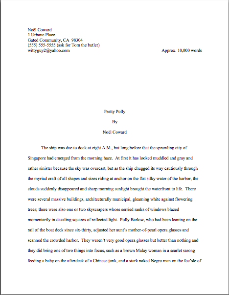
Formatpalooza, part IX: areas of authorial discretion, or, there are rules, and there are rules

full moon in the gutter

At the risk of seeming trite, I would like to point out that it has been raining a great deal in Seattle of late. Not the normal constant misty drizzle that characterizes our dark Pacific Northwest winters, but sheets. Buckets. The proverbial cats and dogs, with an antelope or two thrown in by whatever celestial water-monger has seen fit to try to drown us.

I’m not saying we’re worried. I’m saying my neighbors came over this evening to ask how long a cubit was, so they could read the blueprints for their ark.

But enough idly wondering where on earth they found a pair of yeti for their menagerie. Time to get back to the matter at hand: manuscript formatting.

Over the last couple of posts, we have been gladdening our hearts (okay, gladdening my detail-loving editorial heart) with discussion of something that Millicent the agency screener just loves to see, a properly-formatted first page of a manuscript, as well as phenomena she sees more often, but likes less, various species of improperly formatted page 1. The Millicent-pleasing version looked, if you will recall, a little something like this — and, as always, if you’re having trouble seeing the details, try enlarging the image by holding down the COMMAND key and pressing + repeatedly.

good example revised

Now that’s a lovely page 1: unprovocative, professional-looking, and flaunting lots of nice, clean white space at the top. “Ah,” Millicent murmurs, settling back into her chair, “now I can concentrate on the writing and the story.”

Contrast that, please, with the much more cluttered short story format all too many book and book proposal submitters mistakenly believe is universally applicable to any writing on paper:

Pretty distracting to the eye, is it not? Admittedly, not all embracers of this format will choose to clutter the space up further with an epigraph — which, as we discussed last time, it not generally the best idea at the submission stage, no matter what you want the published version of your book to look like — but one does not need to be the Amazing Kreskin to predict that their submission packets all share another unprofessional characteristic: no title page.

How do I know that? Well, think about it: since all of that eye-displacing verbiage — title, book category, word count, contact information — would in a properly-constructed submission packet appear on the title page, why would a submitter repeat all of it at the top of page 1?

Both page 1 and the opening of each subsequent chapter should include all of the spaciousness of that first example, not launching into the text until 14 single lines from the top of the page. (Or, to put it another way, 6 double-spaced lines under the chapter title. And for those of you who do not know how to insert a hard page break into a Word document, it’s located under the INSERT menu. Select BREAK, then PAGE BREAK.)

Did that bit about the subsequent chapters catch any of you by surprise? To prevent that kind of confusion in future, let’s go ahead and hatch a new axiom: each new chapter should begin on a fresh page, but the first page of every chapter should be formatted exactly like page 1.

Yes, Virginia: exactly, at least in terms of formatting. Since the book’s title should appear on the title page, why would the opening of the book and the opening of Chapter 6 be different?

So you may see that in action (and to prove that I practice what I preach), here’s what could be the first page of Chapter Six my memoir:

Memoir wo title

I said could, because actually, I’m not a big fan of chapters named Chapter Six, even if they happen to be the sixth chapter in the manuscript. It’s sort of like dubbing a suburban street lined with elm trees Elm Street: there’s nothing inherently wrong with a straightforward, descriptive title, but you must admit, it’s not startlingly original.

It’s not precisely going to come as a shock to many readers when Chapter Six appears immediately after Chapter Five, after all. At least not readers whose counting skills have moved past their first hand.

Speaking of hands, I see many of them waving in the air, apparently trying to attract my attention. “Okay, Anne,” those of you fond of naming things inquire, “how should a chapter title appear on the page, if I also want to number it? Or do I need to choose between numbering and titling?”

Not at all — go ahead and include both, if that makes you happy. In fact, it’s actually a little easier for agents and editors if you do number titled chapters; it’s simpler for a feedback-giver to say, “Please tone down the snarkiness in Chapter 6 of your memoir, Ermintrude,” than “You know the snarky tone in the chapter called something like How I Had My Way with Ocelots, or, Twenty-seven Ways to Skin a Cat? Give it a rest, Ermintrude.”

The formatting is very simple: just add the chapter title on the second double-spaced line of text, centered under the chapter number designation. (Freeing up mental space to speculate: what was Ermintrude doing with all of those ocelots?)

This format should sound at least a trifle familiar: we’ve already seen it in action in today’s first example. But in furtherance of my ongoing mission to place so many examples of correctly-formatted manuscript pages in front of your weary eyes that you’ll start automatically recoiling from pages in published books, muttering, “Well, that wouldn’t work in a manuscript submission, let’s take a gander at another one:

memoir w ch title

Actually, I had an ulterior motive in showing you that last example: in comparing it to the example just before it, do you notice anything about the amount of space between the chapter number and the beginning of the text?

If you immediately shot your hand into the air, exclaiming, “By gum, Anne, the area between the two appears identical! You’ve simply placed the chapter title within it, you clever lady,” award yourself an extra helping of hot fudge on your sundae. (If devoting a couple of weeks to discussing standard format doesn’t entitle an aspiring writer to dessert, nothing does.)

Regardless of whether a chapter’s opening page contains a chapter designation, a title, or both, the text should begin the same distance from the top of the page. The same logic would apply to any other information you might see fit to include at the beginning of a chapter — alerting the reader to a break between Part I and Part II of a book, for instance.

Since so many aspiring writers ask me about part breaks — hey, I’m not known as the Format Queen for nothing; I would much, much rather that my readers ask me than misformat their submissions — let’s take a look at the phenomenon in action. If Chapter 6 were the beginning of Part II of my memoir (it isn’t, but we aim to please here at Author! Author!), I would have formatted it thus:

memoir w part break

Starting to get the hang of this? Okay, let’s talk about inserting another common piece of introductory information in that heading: identifying a narrator-du-chapter in a multiple point-of-view novel.

If the switch comes at the beginning of a chapter, it couldn’t be easier: it’s simply another reader-signal that belongs above the pre-text white space, right? To see this principle in action, let’s pretend our ongoing example is fiction (which it isn’t; my middle school honestly was pelted with migratory spiders) and place the narrator’s name in the traditional spot:

new chapter with name

That’s the way one would handle the matter in a multiple POV manuscript like, say, Barbara Kingsolver’s THE POISONWOOD BIBLE, where the narrator changes with the chapter. If there were also a chapter title (perhaps not advisable in this case, as there’s already significant information at the top of that page for the reader to absorb), it would go between the chapter heading and the narrator identifier.

The important thing here is to be consistent — and that’s not always easy. Most seasoned authors probably wouldn’t appreciate my revealing a working secret, but pretty much everyone worries that someday her will forget to hit return one of the necessary times, so that Chapter 5 will begin — gasp! — twelve lines from the top, while Chapter 1-4 and 6 on will begin fourteen lines down.

Gives you the willies even to contemplate how Millicent might react to that level of formatting inconsistency, doesn’t it? Double-check each and every chapter opening before you submit; trust me, you’ll be happier in the long run.

Oh, my — that was an unpopular suggestion, wasn’t it? Fully a third of you have your hands waving impatiently in the air. “That would be absurdly time-consuming, Anne,” the irate third huff. “Oh, I understand that the chapter number or title needs to appear at the top of the first page and each subsequent chapter; I’m perfectly happy to leave six double-spaced blank lines between it and the first line of text, so the first paragraph starts seven lines down. But surely there’s an easier way to do this — a template or something? Perhaps Word has some sort of default setting I can employ so I need never worry about the issue again as long as I live?”

Standard format templates do exist, now that you mention it, but frankly, Word is already equipped with two perfectly dandy features for reproducing formatting exactly in more than one place in a document: COPY and PASTE.

In other words, create your own template. It’s very simple to do: just copy from “Chapter One” down through the first line of text, then paste it on the first page of Chapter 2, 3, etc. Once the format is in place, it’s a snap to fill in the information appropriate to the new chapter.

Oh, dear — now another group of you have raised your hands. Yes? “But Anne,” exclaim those of you who favor switching narrator (or place, or time) more often than once per chapter, “we are, as we believe the tag line identifying us as speakers just mentioned, advocates of those nifty mid-chapter signposts that we see all the time in published books, boldfaced notifications that the time, place, or speaker has just changed. How would I format that in a manuscript?”

You’re talking about incorporating subheadings into a novel, right? Or at least what would be a subheading in a nonfiction manuscript: a section break followed by a new title.

I’m fully prepared to answer this question, of course, if only to show all of you nonfiction writers out there what your subheadings should look like. Before I do, however, I’d like to ask novelists interested in adopting this strategy a quick question: are you absolutely positive that you want to do that?

That’s not an entirely flippant question, you know. There are plenty of Millicents out there who have been trained by old-fashioned agents — and even more editorial assistants who work for old-fashioned editors. And that’s important to know, because even in an age when mid-chapter subheadings aren’t all that uncommon in published books, there are still plenty of professional readers whose knee-jerk response to seeing ‘em is invariably, “What is this, a magazine article? In my day, fiction writers used language to indicate a change in time or place, rather than simply slapping down a subheading announcing it; if they wanted to indicate a change of point of view, they would either start a new chapter, find a graceful way to introduce the shift into the text, or have the narrative voice change so markedly that the shift would be immistakable! O tempore! O mores!

I just mention.

To this ilk of pros, the practice of titling a section, or even a chapter, with clear indicators of time, place, or speaker will always seem to be indicative of a show, don’t tell problem. And you have to admit, they sort of have a point: novelists have been indicating changes of time and space by statements such as The next day, back at the ranch… ever since the first writer put pen to paper, right?

As a result, fiction readers expect to see such orienting details emerge within the course of the narrative, rather than on top of it. Most of the time, this information isn’t all that hard to work into a narrative — and if a novelist is looking to please a tradition-hugging agent or editor, that’s probably a better strategy to embrace, at least at the submission stage. As with any other authorial preference for how a published book should look, you can always try to negotiate an editorial change of heart after a publisher acquires your novel.

At least if you don’t happen to write in a book category that routinely uses such subheadings. If recent releases in your book category are crammed with the things, don’t worry your pretty little head about editorial reaction to ‘em. An editor — or agent, Millicent, or contest judge — who routinely handles books in that category may be trusted to realize that you’re simply embracing the norms of your genre.

Millicents tend to approve of that. It shows that the submitter has taken the time to become conversant with what’s being published these days in the category within which he has chosen to write.

Which is to say: these days, plenty of very good fiction writers prefer to alert the reader to vital shifts with titles and subheadings. And nonfiction writers have been using them for decades; in fact, they’re more or less required in a book proposal. (More insight on those follows later in this series, I promise.) I just didn’t want any of you to be shocked if the agent of your dreams sniffs in the early days after signing you, “Mind taking out these subheadings? Seven of the ten editors to whom I’m planning to submit this hate them, and I’d rather be spared yet another lecture on the pernicious influence of newspapers and magazine formatting upon modern literature, okay?”

All that being said — and now that I’ve completely unnerved those of you who are considering submitting manuscripts with subheadings — you do need to know how to do it properly.

It’s quite straightforward, actually: a subheading is just a section break followed by a left-justified title. The text follows on the next double-spaced line.

Want to see that in action? Okay. Just to annoy traditionalists who draw a sharp distinction between fiction and nonfiction writing, let’s take a peek at a nonfiction page by a well-respected novelist:

Wharton subheading example

That caused some bloodshot eyes to pop wide open, didn’t it? “But Anne!” the detail-oriented exclaim, “that subheading is in BOLDFACE! Didn’t the rules of standard format specifically tell me never, under any circumstances, to boldface anything in my manuscript?”

Well caught, sharp-eyed ones: boldfacing the subheading does indeed violate that particular stricture of standard format. However, since nonfiction manuscripts and proposals have been routinely boldfacing subheadings (and only subheadings) for over a decade now — those crotchety old-fashioned editors are partially right about the creeping influence of article practices into the book world, you know — I thought that you should know about it.

It’s definitely not required, though; Millicent is unlikely to scowl at a nonfiction submission that doesn’t bold its subheadings. Like font choice, you make your decision, you take your chances.

In a fiction submission, though, I definitely wouldn’t advise it; traditionalists lurk in much, much higher concentrations on the fiction side of the industry, after all. Here’s the same page, formatted as fiction — and since we’re already talking about exceptions to the rules, let’s make this example a trifle more instructive by including a date and time in the subheading:

Wharton example2

Unsure why I used numerals in the subheading, rather than writing out all of the numbers under a hundred, as standard format usually requires? Full dates, like specific times and currency, are rendered in numeric form in manuscripts. Thus, I paid $14.17 for a train ticket at 12:45 a.m. on November 3, 1842, officer is correct; I paid fourteen dollars and seventeen cents for a train ticket at twelve forty-five a.m. on November three, eighteen hundred and forty-two is not. (It would, however, be perfectly permissible to include quarter to one in the afternoon on November third.)

Everybody clear on all of that that? Now would be a dandy time to start waving your hand at the Format Queen, if not.

Next time, we shall be continuing our in-depth look at chapter openings. In the meantime, keep up the good work!

Formatpalooza, part VII: it’s all a matter of perspective, or, let’s move the piano over here. Wait — how would it look over there? And other tales of title page formatting

sagrada familia ceiling3

Ever since I launched on this last ‘Palooza of autumn, I’ve been hearing some discontented murmuring amongst aesthetes out there in the ether. “But Anne,” visually-oriented aspiring writers murmur under their breath, so as not to attract the wrath of their nemesis, Millicent the agency screener, “I feel that the rules of standard format for book manuscripts and proposals — not to be confused with the formatting norms for short stories, magazine articles, screenplays, or any other kind of writing intended for professional submission — are stepping all over my right to creative expression. If I believe my writing looks best in a special font like Abadi MT Condensed Extra Bold, why shouldn’t I run with it? It’s how I want my words to look in the published book, so why shouldn’t I present my manuscript that way?”

Do you want the short answers or the long ones, murmuring aesthetes? The short are actually the same for both questions: because Millicent will take your writing more seriously if you format it as she expects to see it.

And why might that be, devoted ‘Palooza followers? Pull out your hymnals and sing along: a manuscript should not resemble a published book in many important respects. Therefore, formatting a submission to reflect one’s publication preferences on matters like font (which is the publishing house’s decision, anyway, not the author’s) will not appear to be a creative choice, but a reflection of a misunderstanding of how publishing works — and an indication that the writer has not taken the time to learn the rules of submission.

A trifle broad-ranging a conclusion to draw from something as simple as font choice or a title page graced with a photograph? Perhaps, but to someone who deals with manuscripts and/or book proposals all day, every day, it’s not all that far-fetched.

Let me try to put all of this into perspective for you. Quick, tell me: did I take the photograph above while looking down into an abyss, sideways into an alcove, or up at an impossibly high ceiling?

Hard to tell which way is up, isn’t it? (But here’s a hint: the purple stuff is flying dust.) Without some orienting landmarks, it’s difficult even to know for sure what you’re looking at, or from what direction.

That’s more or less the same problem the average aspiring writer faces when looking at her own first manuscript or book proposal with an eye to figuring out whether it is formatted correctly. (Oh, you thought that analogy wasn’t going to pay off right away? Au contraire, mon fr?re.)

Let’s face it, very, very few as-yet-to-be-published writers have ever seen a professional manuscript up close and personal; still fewer have had the opportunity to glance through a professional book proposal. Oh, there’s plenty of advice out there on how it should be done, of course, but as many of you have no doubt noted with chagrin, sources differ.

So how on earth is someone new to the game supposed to figure out which end of the manuscript is up, figuratively speaking? The trick lies in remembering that the principles governing manuscript formatting are practical and historical, not purely aesthetic.

Thus, while two-inch margins and a cursive typeface may strike a writer as the perfect expressive extension of the spirit of his novel, to someone who reads manuscripts for a living, they’re just puzzling. And, frankly, distracting from the writing.

Where you stand, in other words, depends on where you sit. From where Millicent is sitting, deviation from standard format demonstrates a lack of knowledge about how the industry works, not creativity. She has good reason to feel that way: because professional manuscripts and book proposals are formatted in a particular way, she knows that her boss, the agent of your dreams, would have a hard time convincing an editor at a major publishing house to read even the first page of an unprofessional formatted manuscript.

Which brings be back to where we left off last time, right? For the past couple of posts, we’ve been engaging in compare-and-contrast exercises, showing common examples of title pages and fine-tuning your binoculars so you might see how our old friend Millie — or her boss, or an editor, or a contest judge — might view them. As I sincerely hope those of you who read yesterday’s post can attest, it was pretty obvious that the professionally-formatted title page won the beauty contest hands-down — and took top honors in the practicality category, too.

Yes, Virginia, a choice as small as a typeface can make an astonishingly great difference to how professional your work looks to the pros. That comes as something of a surprise to most aspiring writers — who, not entirely surprisingly, tend to regard that particular decision as a purely aesthetic one. “Why,” they ask, and not unreasonably, “should it matter? Good writing’s good writing, isn’t it?”

Well, yes and no. Yes, good writing is a thing of beauty and a joy forever. No, insofar as good writing tends to have less impact on the average Millicent when it’s presented in an unusual typeface.

Yes, really. To see why, let’s once again start at the top of the submission packet, taking a gander at the same title page in three different typefaces. Here it is in 12-point Times New Roman, one of the two preferred typefaces:

Austen title good

That’s what anyone sitting in Millicent’s seat would expect to see. Now let’s look at exactly the same information, assuming that Aunt Jane had favored 12-point Helvetica so strongly that she just couldn’t resist submitting in it:

Austen title helvetica

The letters are quite a bit bigger, don’t they? Not enough so to appear to be, say, 14-point font, but large enough to make Millicent wonder whether the word count is accurate. (Estimated word count does, after all, vary by typeface: Times New Roman is estimated at 250 words/page, Courier at 200. More on that below.)

And do you really want her speculating about your credibility before the first page of your manuscript? Now that we have seated ourselves firmly in Millicent’s office chair, we can see that Aunt Jane’s choice of Helvetica, while not a deal-breaker, does not necessarily present her manuscript to its best advantage.

Does the increased volume of disgruntled ethereal muttering mean some of you want to see a typeface that might be a deal-breaker? Happy to oblige.

Austen title brushscript

Can’t really blame Millicent for not wanting to turn the page on that one, can we? Despite containing all of the information that a title page should include, in the right places and in the right order, it’s unprofessional-looking. Not to mention hard to read.

Got Millicent’s perspective firmly imbedded in your mind? Excellent. If you want to switch back to the writer’s point of view, all you have to do is remember that the manuscript that follows even this last title page is SENSE AND SENSIBILITY.

The moral: even the best writing may be placed at a competitive disadvantage by unprofessional presentation. Standard format is the good writer’s friend, not her enemy.

Shall I assume that all of that clanking is a thousand writers’ hackles being raised? “But Anne,” outraged voices thunder, “aren’t you making Millicent out to be pretty shallow? Whenever I’ve heard agents and editors asked at conferences or on their websites about whether cosmetic issues can get a manuscript rejected, they often disclaim the notion with scorn. I’ve even heard a few of them say that they don’t care about issues like typeface, spaces after periods and colons, or where the chapter title lies — and that strikes me as significant, as I’ve never, ever heard one say it was okay to let a query letter run longer than a single page. Isn’t it the writing that matters in a submission, ultimately?”

Again, yes and no, hackle-raisers. Yes, the writing matters — but it’s not all that matters.

Naturally, the writing matters most in a submission, with freshness, audience-appropriateness, marketability, and fit with the agent or editor reading it jostling for second place. Equally naturally, and something that I often point out here, individual agents, editors, and even contest judges harbor individual preferences as well and have been known to express them at conferences. Or on their blogs, Twitter feeds, and over drinks at that bar that’s never more than 100 yards from any literary conference in North America.

One person’s pet peeve, however, may not be another’s. Since few aspiring writers have access to the industry-specific information required to find out the preferences of every agent to whom they are submitting, adhering to standard format minimizes the probability of running afoul of unknown annoyance-triggers.

Adopting the norms of standard format and clinging to them like an unusually tenacious leech will also help you preserve your sanity throughout the often-protracted submission process. — because, honestly, trying to apply every single one of the expressed opinions floating around out there to your manuscript will drive you 100% nuts. The pet peeves one hears about are too often mutually contradictory, for one thing.

Chant it with me now, ‘Palooza followers: if an agent to whom you are submitting asks for something different, for heaven’s sake, give it to her. If, as is almost always the case, you just don’t know, keep the presentation unprovocative and professional so that your writing may shine.

In other words, adhere to the strictures of standard format, rather than assuming, as so many aspiring writers do to their cost, that the writing is the only thing that matters.

Remember, where you stand depends on where you sit. It’s a matter of perspective. And from both Millicent and the aspiring writer’s perspective, taking the time to present writing professionally is honestly worth it.

Admittedly, one does hear of cases where a kind, literature-loving agent has looked past bizarre formatting in order to see a potential client’s, well, potential, one also hears of isolated cases where a manuscript rife with spelling and grammatical errors gets picked up, or one that has relatively little chance of selling well in the current market. The age of miracles has not entirely passed, apparently.

But — and this is a BIG but — these cases get talked about because they are exceptions, and rare ones at that. 9,999 times out of 10,000, any of these problems will result in, if not instantaneous rejection, then rejection upon Millicent’s lighting upon the next problem in the manuscript.

Those pesky hackles are clacking again, aren’t they? “Okay,” the hackled concede, “I can understand how Millicent would be tempted to skip reading a submission like #3 above, where she’s likely to strain her eyes. I can seen see why she might leap to some negative conclusions about #2, since, as you have mentioned before, she knows that it’s going to be more time-consuming, and thus more costly, to take on a client who needs to be trained how to present her work professionally. But if presentation is so darned important, why don’t aspiring writers hear about it more often at conferences, in articles about submission, or even just in discussions amongst ourselves?”

Excellent question, h-raisers. I can’t say for sure, but I suspect that’s not just because a sane, sensible individual with a reputation to protect is unlikely to stand up in front of 500 eager potential submitters and say, “Look, if you’re planning to submit a grimy photocopy of your book, or insist upon presenting it in 10-point type, or not indenting your paragraphs, just don’t bother to query me.”

Having actually seen a well-meaning agent tell an indignant crowd that he really only took seriously query letters from writers he met at conferences (yes, really; there were many, many witnesses), I can tell you precisely what would happen if some honest soul did take this astounding step: instantly, 500 pens would scrawl on 500 programs, DO NOT QUERY THIS ONE; HE’S MEAN.

Which would rather defeat the agent’s purpose in coming to the conference to recruit new clients, wouldn’t it?

As someone who frequently teaches writing and formatting classes, I can think of another reason that a speaker might want to be careful about such pronouncements: an agent or editor doesn’t have to speak at many conferences (or blog for very long) before recognizing that anything she says about submissions is likely to be repeated with the ?clat of a proverb, to borrow a phrase from Aunt Jane, for years to come amongst the writing community.

Seriously, it’s true. I’ve heard offhand comments made from the dais, or even jokes, being debated for hours in conference hallways, particularly if those comments happen to relate to the cosmetic aspects of querying and submission. 5-4 Supreme Court decisions are routinely discussed with less vim and vitriol. Some of Miss Snark’s pronouncements have been more commented upon than St. Paul’s second letter to the Corinthians.

Okay, so that last is a slight exaggeration. My point is, the very notion of from-the-horse’s-mouth rightness carries such a luster that such speakers are constantly in extreme danger of having everything they say quoted back to them as an inflexible rule.

Which is why, I must admit, I occasionally experience qualms about presenting the rules of standard format as inflexible rules. On the pro-regulation side, we are talking, after all, about an industry that both values creativity and considers submitting a book proposal in anything but a black folder dangerously radical. (Yes, really.) On the con side, literally nothing else I talk about here consistently raises as much writerly ire.

The very topic of presentation seems to be emotionally trying for a lot of writers — disproportionately so, from where Millicent is sitting. Tell an aspiring writer that his dialogue is turgid, or his pacing drags, or that he’s left a necessary section out of his book proposal, and most of the time, he’ll be at least curious about why you think so. (If a bit defensive.) Yet suggest to the same writer that he might be better off reformatting his manuscript to include such niceties as paragraph indentation or moving his page number to the slug line, and a good quarter of the time, he’ll look at you as though you’d just kicked his grandmother. Thrice.

Go figure, eh?

Presentation issues definitely do matter — which is, again, not to say that the quality of the writing doesn’t. But — and again, this is a BIG but — as we’ve discussed, rejection decisions are more often than not made on page 1 of a manuscript. Sometimes even within the course of the first paragraph. If a manuscript is hard to read due to a funky typeface or odd spacing or just plain poor print quality, Millicent may just pass on reading it at all.

While these phenomena are, in fact, quite widely recognized as true, the person who announced them this baldly from the dais at a literary conference would be covered head to foot with flung tomatoes in twenty seconds flat. Metaphorically, at least.

Which is why I’m going to keep saying it until I’m blue in the face and you die of boredom: from the perspective of someone who reads manuscripts for a living, professional formatting is simply the least distracting way a book can possibly be presented. Adhering to the industry’s cosmetic expectations renders it more likely that an agent or editor will concentrate upon the beauty of the writing, not less.

Think about it: they can’t fall in love with your good writing until they read it, can they? So don’t you want to do everything within your power to convince them that your manuscript is the one that deserves more than a cursory glance?

Of course you do; if you didn’t, you would have given up on ‘Paloozaing a paragraph into the fall’s first series, right? Instead of thinking of the rigors of standard format as a series of unimportant (or even silly) superficial choices, try regarding them as translating your calling card, a means of catching Millicent’s tired eye and informing her that this is a manuscript that should be taken seriously.

Have I got you sufficiently fired up about superficial manuscript prettiness yet? Grand; let’s get back to the incredibly nit-picky issue of typeface.

As I mentioned earlier in this series, I would highly recommend using either Times, Times New Roman, or Courier typefaces, both on the title page and in the manuscript as well. These are the standards of the industry, and thus the least likely to raise Millicent’s ever-knitted eyebrows. But like some of the other strictures of standard format, there’s a pretty good reason for this one: from where she is sitting, word count estimation is always predicated upon one of these typefaces.

Why is the question of estimating relevant on a title page? Again, we must look to Millicent’s perspective: word counts in book manuscripts are generally estimated, not the actual count; for short stories and articles, use the actual count.

Was that giant gust of wind that just knocked my desk over your collective gasp of astonishment? I’m not entirely surprised; a lot of aspiring writers are confused on this point. “But Anne,” they protest, and who can blame them? “My Word program will simply tell me how many words there are in the document. Since it’s so easy to be entirely accurate, why shouldn’t I be as specific as possible? Or, to put it another way, why would an agent or editor ask for the word count, then expect me to guess?”

Would you fling something at me if I said once again that this is a matter of perspective? From Millicent’s seat, the answer is pretty obvious: industry practices dictate how manuscripts are handled, not the whims of the fine folks at Microsoft.

That makes perfect sense, does it not? The Microsofties I know are sterling human beings to a man, but they’re hardly experts on the publishing industry’s requirements. And really, why should they be?

Contrary to popular opinion amongst aspiring writers, just because Word is set up to allow certain things — giving you an exact word count, for instance, or access to 200 typefaces — doesn’t mean that the publishing industry wants writers to do things that way. (And if you doubt that, consider the doubled dash vs. the automatic emdash Word favors.) Word processing programs came into use long, long after standard format for manuscripts, after all; why should agents, editors, and Millicents allow computer programmers to dictate what strikes them as professional?

Perspective, people: which makes more sense, assuming that the word count on your title page will be read by Millicent, or Bill Gates?

I cannot, naturally, speak to Mssr. Gates’ point of view on the subject, but here is why Millicent would care on the estimation front. The Times family is estimated at 250 words/page; Courier at 200. So a 400-page manuscript in Times New Roman is estimated to be roughly 100,000 words if it’s in Times — something Millicent should be able to tell as soon as she claps eyes on the submission’s title page, right? — and 80,000 if it’s in Courier.

Finding the logic behind that is at all confusing? Book manuscripts are typically discussed in estimated word count, not actual; since word length vary, and because manuscripts shrink around 2/3rds in the transition to published book, the number of pages is actually a better measure of how much it will cost to print and bound the thing. So if your title page says that your baby is 86,250 words and it’s in Times New Roman, a pro will just assume that it’s 345 pages (345 x 250= 86,250) rather than flipping to the bottom of the stack of papers to check. If it’s in Courier, she would conclude that it is 431 pages — and that your math skills are not particularly good.

Now, in actual fact, a 400-page manuscript in TNR is usually closer to 115,000 words than 100,000; as any writer who has compared the estimated word count for her book with the total her word processing program so kindly provides, they tend to differ wildly. But word count, like beauty, is in the eye of the beholder: a novelist whose title page reported, accurately, that her 400-page novel was 115,000 words might well see it rejected out of hand on the grounds that it was too long.

Why? Well, math may not have been Millicent’s best subject, either (as one might expect, the inmates of agencies tend overwhelmingly English majors), but she can do third-grade multiplication in her head: 115,000 words at 250 words/page would equal a 460-page manuscript. That’s quite a bit longer than editors tend to expect first novels in most genres to be these days; at around 450 pages, binding costs rise significantly.

In other words, next!

Boy, those hackles are getting a workout today, aren’t they? “But Anne, why is Millicent estimating at all? If she wants to know how long it is, why doesn’t she just flip to the last page and check the page number, for heaven’s sake?”

I could give you a long song and dance about how much her wrists hurt from opening all those query envelopes all day, or how her secret midnight e-mail orgies have rendered pinching a torture, but in practice, the answer is far less personal than practical: because the word count is right there on the title page.

Tell me, oh submitters: why on earth should she doubt its accuracy? Unless, say, the title page were in a non-standard typeface like Helvetica, she’s going to assume that an aspiring writer familiar enough with standard format to include the word count on the title page would also know how to estimate it accurately.

I know, I know: from a writerly perspective, that’s kind of a wacky assumption. But her chair boasts a different view than ours.

Besides, how exactly could she manage to turn to page 400 of a manuscript, when her boss requested that the writer send only the first 50, without resorting to some pretty impressive maneuvering through time and space?

I’m aware that I’m running quite long today, but in the interest of clarity, let’s invest another few minutes in turning to the first page of the submission, to see how much of a difference font and typeface make at first glance. Here’s a correctly-formatted page 1 in Times New Roman. Just for giggles, I’m going to use that notorious editor’s nightmare, the opening paragraphs of A TALE OF TWO CITIES:

2 cities page 1 proper

Pretty spiffy, eh? And definitely not how this opening would appear in a published book, right?

Now let’s take a peek at the same page, also correctly formatted, in Courier. Note how many fewer words per page it allows:

2 cities proper Courier

Got both of those firmly imbedded in your brainpan? Good. Now format your first pages that way for the rest of your natural life.

Well, my work here is obviously done. I’m off to do a spot of Christmas shopping.

Just kidding — you want to see why it’s a good idea, don’t you? Okay, take a gander at the same first page, not in standard manuscript format. See how many differences you can spot:

Fascinating how just a few small formatting changes can alter the presentation, isn’t it? It’s exactly the same writing, but it just doesn’t look as professional. To Millicent, who reads hundreds of pages per day, the differences between the last three examples could not be clearer.

And yet, if we’re going to be honest about it, there were really very few deviations from standard format in the last example. For those of you playing at home, the typeface is Georgia; the chapter title is in the wrong place, and there isn’t a slug line. Also, the page is numbered in the wrong place — the default setting, incidentally, in many word processing programs.

In all probability, none of these infractions against the rules of standard format are serious enough to cause Millicent to toss a submission aside as soon as she notices them. But when poor formatting is combined with literary experimentation — like, say, that paragraph-long opening sentence ol’ Charles managed to cough up — which do you think she is going to conclude, that Dickens is a writer who took the time to polish his craft, or that he just doesn’t know what he’s doing?

Don’t tempt a professional reader to draw the wrong conclusion about your devotion to your craft. Remember, where a manuscript stands depends upon where the reader sits.

Before any hackles start rocketing skyward again, I hasten to add: where the submitting writer sits often makes a difference to Millicent’s perception, too. Her reception of that last example is very likely to be different before Dickens became a household name or after, although once he was established.

Unless you happen to be famous, I wouldn’t advise taking the risk. And if you do happen to be famous, could I interest you in writing a back jacket blurb?

In fairness to Millicent, though, it’s highly unlikely that it would even occur to our Charles to deviate this markedly from standard format, if he already had experience working with an agent or editor. The longer you remain in the business, the more those little things will strike you as just, well, matters of right and wrong. As, fortunately or not, they do Millicent and her ilk.

Come to think of it, that sense of fitness may well be the reason that discussions of formatting tend to become so vitriol-stained: we all like to be right, and after all, propriety is in the eye of the beholder. After all, each of us is most familiar with the view from her own chair.

Pulling back from one’s own perspective can be most helpful. There’s a reason that it’s called the bigger picture, people.

In that spirit, let’s take a longer view of the photo above, to situate ourselves:

sagrada familia ceiling

Easier to tell up from down now, isn’t it? Taking a broader perspective, you can see that the green light on the left is coming from a stained-glass window; on the left, there’s a decorative support beam. From the myopic tight shot, it was far less obvious that this was a cathedral.

Making sure your writing is framed properly can have a similar effect. More show-and-tell follows next time, of course. Keep up the good work!