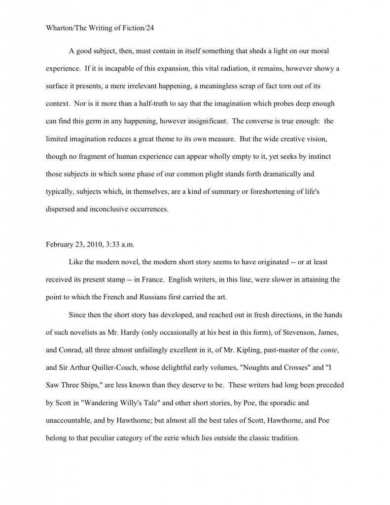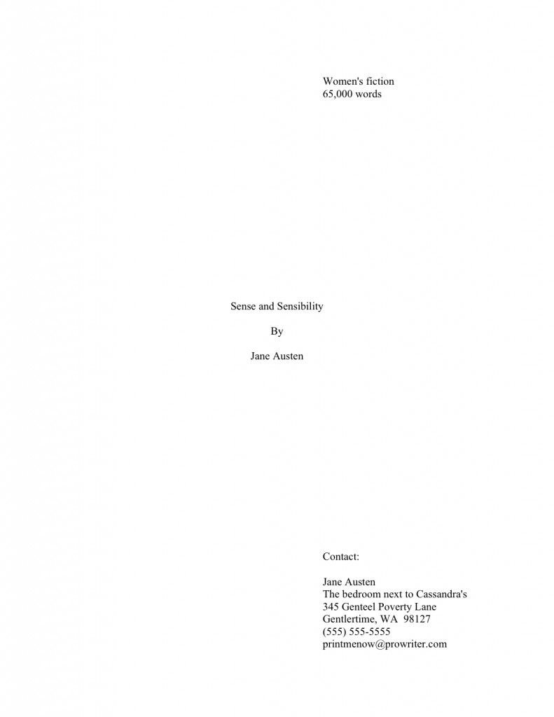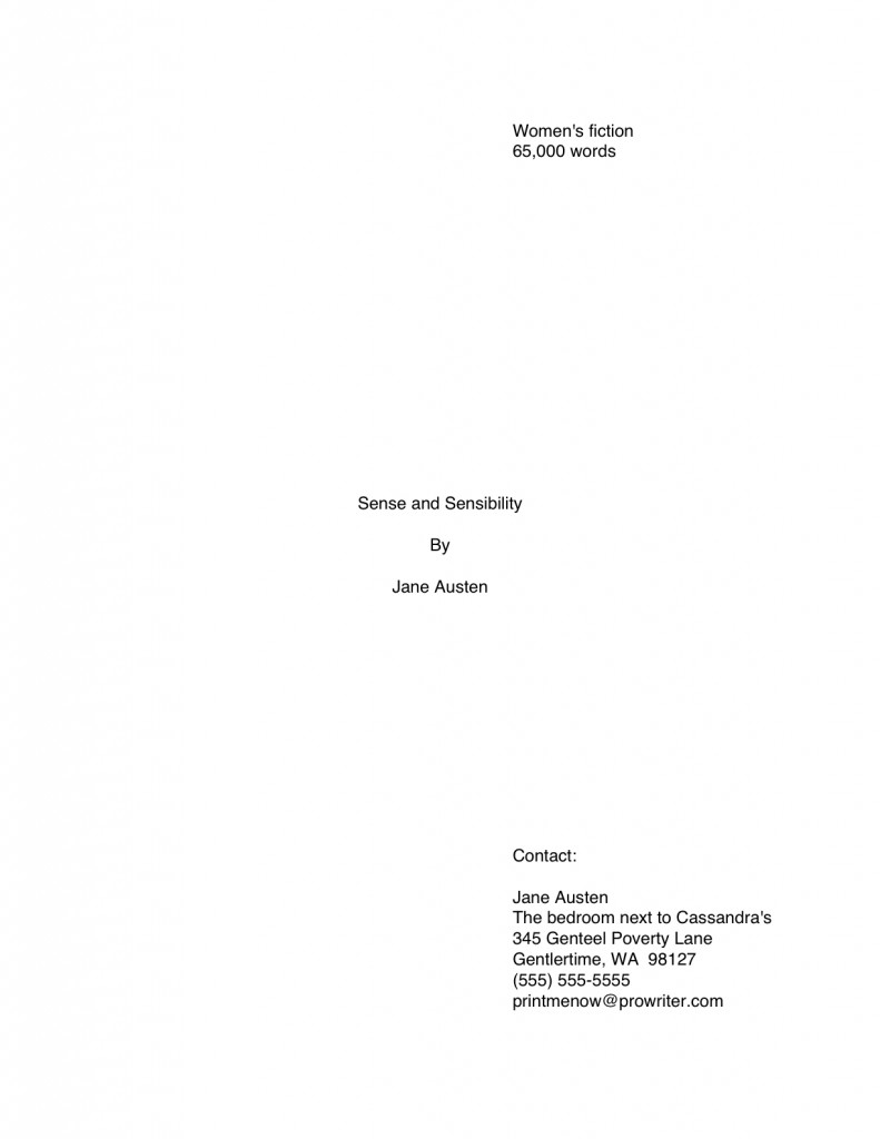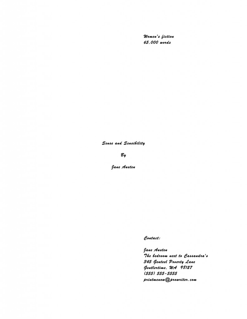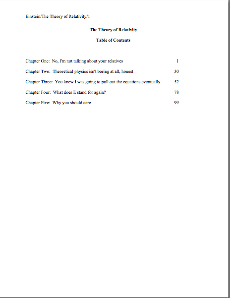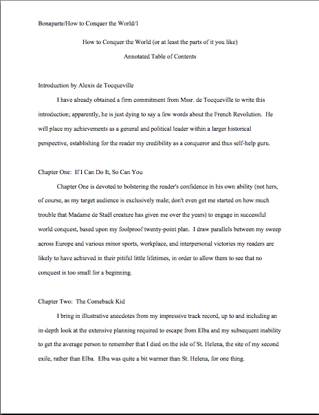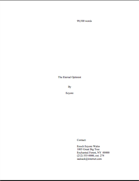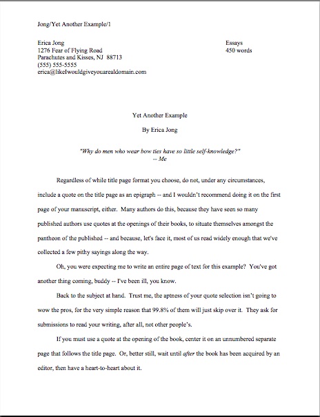
Have we been talking so intensely about the first couple of pages of your manuscript — the title page, the first page of text — that standard format has invaded your dreams yet? Yes, yes, I know: this series on what professional manuscripts look like has been both example-ridden and extraordinarily nit-picky, even by my standards of detail-orientation. So you probably won’t be altogether astonished to learn that before we move on from the first page of the text (and of each chapter) to considering an ordinary page, I want to devote today to pagination.
Don’t groan; it’s an important issue. Not numbering your manuscript, book proposal, or contest entry’s pages an almost universal instant rejection offense; trust me, Millicent the agency screener is going to notice how and if you do it. In fact, as cosmetic issues go, how and where an aspiring writer chooses to place the page number on the page can tell Millicent a tremendous amount about him.
Specifically, whether he has done his homework about submission, because there is only one place on a manuscript page that it is permissible to place a page number: in the slug line.
(Admit it — you’re relieved that I didn’t festoon the top of this post with a picture of a slug. Although I suppose a slug-minded person might misinterpret that shadow in the lower right of the photo a something crawling. Actually, there was a slug in the immediate environment when I took the pretty photo above, but it was on a leaf below the primary flower, completely hidden from sight. So I feel entirely justified in presenting this as the Official Flower of the Slug Line. It’s certified slug-approved!)
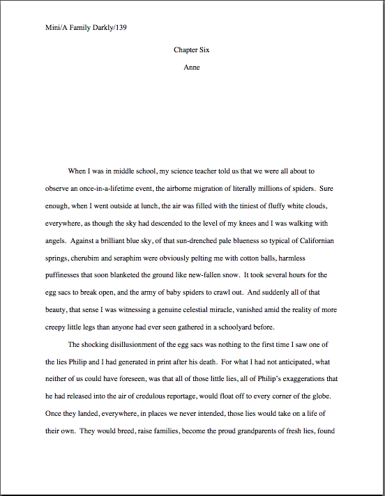
Speaking of relative location, is everybody quite sure where the slug line should be positioned on the page? Just to be on the safe side, let’s take another gander at an example from yesterday’s post:
See it in the upper left-hand margin? Notice, please, that the page number belongs within the slug line, rather than anywhere else on the page. This is as proper on page 139 of a book manuscript as on page one. While you’re going around noticing things, also notice that in each of these examples, the page’s only reference to the author’s name or the title of the book appears in the slug line.
The slug line confuses a lot of aspiring writers; until you have seen piles and piles of professional manuscripts, it looks kind of funny. And when you’ve been told over and over again that a manuscript should have a 1-inch margin on all sides, it can seem counterintuitive to add a line of text, even such a short one, within that margin.
But I assure you, it’s always been done that way. And why? Followers of this series, chant it with me now: because it looks right to professional readers.
Yes, that logic is a trifle tautological, now that you mention it. If you have a problem with that, I would suggest taking it up with the powers that rule the universe. As I believe the fact that my memoir has been in the hands of a reputable publisher for years and still has yet to be released (due to lawsuit threats concerning who owns my memories, believe it or not) makes abundantly clear, I apparently do not rule the universe. If I did, Microsoft Word would be set up to create documents in standard format automatically, Word for Mac and Word for Windows would be set up so those using one could easily give formatting advice to those using the other, air pollution would be merely a thing of distant memory, and ice cream cones would be free on Fridays.
As none of these things seems to be true, let’s get back to business: how does one create that pesky slug line, anyway?
Back in the days when typewriters roamed the earth, it was perfectly easy to add a slug line to every page: all a writer had to do was insert it a half-inch down from the top of the page, left-justified, floating within the 1-inch-deep top margin. For word-processed documents, it’s a trifle more complicated.
The slug line still belongs in the same place, .5 inches from the top of the paper, suspended in the middle of the requisite 1-inch top margin. But instead of laboriously typing it on each page individually as writers did in the bad old days, one simply inserts it in the header. In most versions of Word (I can’t speak for all of them), the header may be found under the VIEW menu.
Before the Luddites out there trot out their usual grumble about tracking down the bells and whistles in Word, think about this: placing the slug line in the header also enables the writer to take advantage of one of the true boons of the advent of word processing, pages that number themselves.
As opposed to having to do it manually, laboriously retyping the slug line in its entirely on each and every page of the manuscript. Oh, you may laugh, but every so often, I will receive a manuscript constructed by a writer who was not aware that Word would do this for her. Instead of utilizing the header function, the poor writer will have elected to include the necessary information on the first line of text on the page.
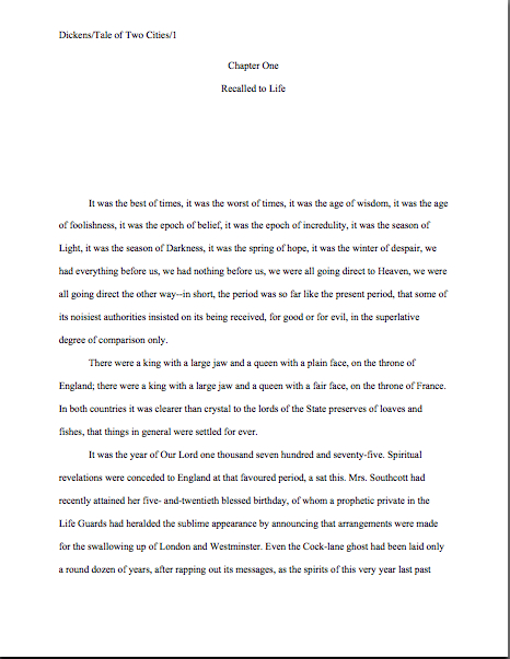
Not only does this unfortunate misconception involve an absolutely monumental and ultimately unnecessary effort, but the result doesn’t pass the all-important does it look right? test. Take a peek for yourself:
See how pulling the slug line down into the text messes with the spacing of the page? Here, an entire line of text is sacrificed to it — and let me tell you, that line is not going to go quietly.
How so, you ask? Well, think about it: what’s inevitably going to happen if new writing is inserted on a page formatted this way? That’s right: the writer is going to have to go back and move each and every one of those slug lines to match the NEW pagination.
I’d show you a practical example of this, but it’s just too sad to contemplate. Trust me, it would be a heck of a lot of work, and writers who do it are likely to end up beating their heads against their studio walls.
Take a moment to peruse that last example again. See any other problems with the slug line? How about the fact that it includes the word page? Shouldn’t be there; just the numbers will suffice.
Did I just hear some huffs of indignation out there? “But Anne,” I hear the formatting-ambitious cry, “I think it looks kind of nifty to include page before the page number? It’s kinda stylish. If it’s just a matter of personal style, who could possibly be hurt by including it, if I like the way it looks?”
Well, you, for starters. And why? (Chanters, ready your lungs.) Because it just would not look right to someone who reads manuscripts, book proposals, or contest entries on a regular basis.
No kidding — I’ve seen screeners get quite indignant about this one. “Does this writer think I’m stupid?” Millicent is prone to huff. (Don’t bother to answer that question; it’s rhetorical.) “Does she think I don’t know that the numeral that appears on every page refers to the number of pages? Does she think I’m going to go nuts and suddenly decide that it is a statistic, or part of the title? Or maybe a wayward date that’s wandered off to the wrong part of the page?”
Don’t bait her; the lady has a hard life. Do it the approved way.
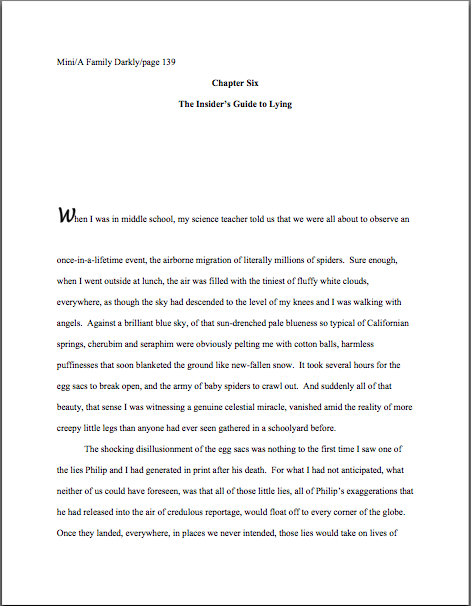
Okay, did you spot any other problems? What about the fact that the first character is in a different typeface from the rest of the text? Or the equally disturbing fact that the first paragraph of the chapter is not indented?
Again, the writer may consider this stylish, but I can assure you, Millicent won’t. Fortunately for her blood pressure, the odd typeface for the first letter, in imitation of the illuminated texts hand-written by monks in the Middle Ages, doesn’t turn up all that often in manuscripts other than fantasy and YA, for one simple reason: books in that category are more likely to feature this it’s-a-new-chapter signal than others. But once again, what an editor may decide, rightly or wrongly, is appropriate for a published book has no bearing upon what Millicent expects to see in a manuscript.
Save the manuscript illumination for someone who will appreciate it. Hop in your time machine and track down a medieval monk to admire your handiwork, if you like, but in this timeframe, keep the entire manuscript in the same typeface and size.
The non-indented first paragraph of a chapter is fairly common in mystery submissions, I have noticed, and starting to become more prevalent in other kinds of fiction as well of late. (For an interesting discussion about why, please see the comments on this post and this one.) In fact, I’ve been told by many mystery writers — and rather tersely, too — that eschewing indentation in this context is an homage to the great early writers in the genre, an echo of their style, so who is yours truly to try to talk them out of that gesture of respect?
Well, not to put too fine a point on it, I’m someone familiar with what Millicent expects to see on a page — as well as someone who is aware that almost without exception, in Edgar Allan Poe’s time all the way down to our own, the editor has determined the formatting that appeared on any given printed page, not the author. To professional eyes, especially peevish ones like Millicent’s, a manuscript that implicitly appropriates this sort of decision as authorial might as well be the first step to the writer’s marching into Random House, yanking off a well-worn riding glove, and striking the editor-in-chief with it. It’s just not a good idea for someone brand-new to the biz to do.
Yes, you read that correctly: it’s sometimes seen as a challenge to editorial authority. And while we could speculate for the next week about the level of insecurity that would prompt regarding a minor formatting choice as a harbinger of incipient insurrection, is the manuscript of your first book really the right place to engender that discussion amongst Millicent and her cronies?
Exactly. Save the formatting suggestions for a long, intimate discussion over coffee with your editor after she acquires the book. You’ll probably lose any disagreement on the subject, but at least you will have made your preferences known. Until that happy, caffeine-enhanced day, just accept that the industry prefers to see every paragraph in a manuscript indented the regulation five spaces.
It just looks right that way.
While we’re at it, how about the bolded chapter number and title in that last example? Nothing in a manuscript should be in boldface. Nothing, I tell you. Uh-uh. Not ever. (Except for that nonfiction exception we talked about yesterday. And I have seen authors get away with the title itself on the tile page, but frankly, I wouldn’t chance it on a first book.)
Nor should anything be underlined — not even names of books or song titles. Instead, they should be italicized, as should words in foreign tongues that are not proper nouns. Yes, Virginia, back in the day when typewriters roamed the earth, underlining was the norm, for the simple reason that most typewriters did not have italic keys. So if you consult an older list of formatting restrictions or one intended solely for short story formatting — both of which seem to be circulating at an unprecedented rate on the web of late, pretty much always billed as universally-applicable rules for any type of writing, anywhere, anyhow, a phenomenon which simply does not exist — you might conceivably be told that publications, song titles, and/or foreign words (sacre bleu!) should be underlined. But trust me on this one: any agent is going to tell you to get rid of the underlining, pronto.
And why? All together now: because it just doesn’t look right that way.
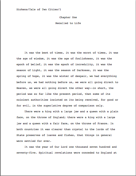
All right, campers, do you feel ready to fly solo into a critique of a first page? Here are two pages of text, studded with standard format violations for your ferreting-out pleasure:
How did you do? Are those problems just leaping off the page at you now? If not, ask yourself: does that first page contain information that ought to be on the title page instead? Are the margins even? Are the paragraphs formatted correctly? And so forth.
In fact, it’s a terrific idea for any aspiring writer to get into the habit of asking those types of questions immediately after clapping eyes upon any manuscript, his own or anybody else’s. Why? Because that’s Millicent’s first instinct. However literature-loving a she may be, she sees so many incorrectly-formatted submissions that a properly-formatted one automatically looks at first glance like more professional writing to her.
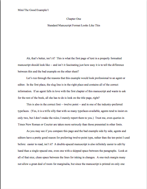
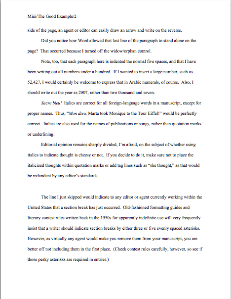
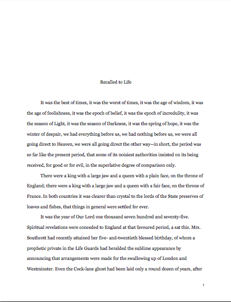
As, with practice, it will to you. I promise. To get that ball rolling, as well as to reward you for so much hard work — or to provide you with some helpful comparison, depending upon how you did on that last little test — here are a couple of correctly-formatted pages, to soothe your tired eyes:
Whenever you start finding yourself chafing at the rules of standard format, come back and take a side-by-side gander at these last sets of examples, to regain perspective on what standard format is and why it’s important in a submission, proposal, or contest entry. I assure you, after a professional reader like Millicent has been at it for even a couple of months, every time she sees the bad example, mentally, she’s picturing the good example right next to it.
Which is why, as we have discussed, manuscripts that look right get taken more seriously than those that don’t. And regardless of how you may feel about Millicent’s literary tastes, isn’t a serious read from her what you want for your book? Or your book proposal? Or your contest entry?
Did you notice that I snuck us from the first page of the text into the second in my last example? Next time, we’ll continue delving into the mysteries of the mid-manuscript page. Keep up the good work!

