The mysteriously mysterious strictures of standard format, part XIX: the end of the line this time, really. Unless anyone has any more questions?

Poet Wislawa Szymborska clutching her Nobel Prize for literature medal

Poet Wislawa Szymborska clutching her Nobel Prize for literature medal

Sincere congratulations, campers, for making it all the way through this extended series on standard format for manuscripts — book manuscripts, that is; once again, let me remind you that short stories, magazine articles, theses, dissertations, and other types of writing are subject to other restrictions — as well as January and February’s intensive examination of how a manuscript moves from a writer’s fingertips all the way to publication. We’ve been tackling the big stuff so far this year, and I’m proud of all of you for having the gumption, not to mention the faith in your writing, to work through it with me.

Next week, it’s back to craft, after a brief stopover in the hows and whys of partials. We’ve earned a respite from hard-and-fast rules, I think.

Besides, you won me a nickel. It’s not the Nobel Prize, but hey, I’m grateful.

Yes, an entire nickel: an agent of my acquaintance, a tireless advocate for my giving up this blog in order to rechannel the considerable time and energy I devote to it into my other writing, My readers’ consistent devotion to improving both their writing skills and ability to present them professionally, wagered that you would be so tired of formatting after my revisiting repeatedly it for four and a half years that the posts this time around would pass relatively uncommented-upon.

Actually, he didn’t suggest betting on it until after I stopped laughing at his contention. “What’s so funny?” he demanded. “It’s not as though your past posts on the subject aren’t well-marked. Why can’t readers just go there to find out what to do?”

Because I like the guy and I’m not in the habit of lecturing agents, I restrained myself from suggesting that he just didn’t understand how a blog works. “Some will, but many of my readers don’t have the time to comb the archives.” (See? I honestly am aware of that.) “And the writers brand-new to the game may not yet know that there is a standard format at all. By going over it two or three times a year, I’m doing my part to make sure that everyone’s writing can look its best for you. You should be grateful.”

He was not. “Did you spend your last three lifetimes blithely violating the rules of grammar and structure, condemning yourself to the Sisyphean task of explaining them over and over again this time around? You’re dreaming, my friend — your readership doesn’t need this. I’ll bet you twenty bucks that you get fewer comments this time than last.”

Well, great as my faith in my readers undoubtedly is, I seldom bet more than a nickel (although I did win a quarter off my mother during the last campaign season for predicting the vice presidential nominees correctly), so he had to settle for that. “You’ll see,” I told him. “Not only will readers comment more than usual, but they’ll come up with questions neither you nor I would have thought of addressing.”

He handed over the nickel after Part III. One of you asked a perfectly reasonable about indentation he’d never heard before.

So now I’m jangling a nickel happily in my pocket, and I have yet another convert to what I have long held is the truth about aspiring writers: contrary to practically universal opinion amongst professional readers, deviations from standard format are not usually the result of writers’ being too lazy to find out how to present a manuscript. Most of the aspiring writers I encounter are downright starved for accurate information on the subject; the underlying problem is that there isn’t enough authoritative information out there to combat all of the inaccurate rumors.

I’ve always been a big proponent of agency websites simply posting a page with the formatting rules, in fact, so I could devote our shared time here to craft. Which is why, in case any of you long-term readers have been speculating on the subject, I used to end extended series on standard format with a rather peevish little discussion about why, in the face of so much conflicting information about submission requirements floating around these days, professional advice-givers like me don’t either:

(a) check out every other source out there to make sure that we’re all saying precisely the same thing (which would be so time-consuming that none of us would have time to give any further advice),

(b) take it upon ourselves to force every single individual who is empowered to pass judgment upon a manuscript within the confines of North America to agree upon a single (and preferably single-page) set of rules to which everyone without exception would adhere (which would require a convention so large that the framers of the U.S. Constitution would turn pale at the very thought), or

(c) shut up entirely and let those new to the biz try to figure out some genuinely counter-intuitive rules all by themselves.

I can’t speak for everyone currently giving advice on the subject, of course, but in my own case, the answer is really pretty straightforward: the norms I’ve been explaining throughout this series are in fact the ones I have used successfully myself for many, many years. Since neither I, any of my editing clients, or (as far as I know) any reader of this blog who has followed this advice to the letter has ever been asked by an agent or editor to make a single purely formatting change to his/her manuscript (with the sole exception of the few agents who are now post clear instructions to submitters not to use the requisite two spaces after periods, but we’ve already talked about that, right?), I feel quite confident in continuing to give this particular set of advice.

But I will say something that one seldom hears advice-givers say: whether you choose to adhere to the rules of standard format I’ve set out here is ultimately up to you. But once you choose to follow a particular rule, you must obey it 100% of the time in your manuscript.

Let me repeat that, because it’s monumentally important: it’s not enough to adhere to a formatting rule most of the time; you must cleave to it in every single applicable instance in the text.

Why? You should know the words to the song by now: because inconsistency isn’t going to look professional to people who read manuscripts for a living.

I used to think that I didn’t actually need to state this requirement, as did the agent who lost the nickel to me. After all, isn’t the part of the point of a rule that it should be followed on a regular basis, rather than just periodically? However, I’ve seen enough manuscripts and contest entries (yes, I still judge from time to time) by good writers who sometimes use a single dash and sometimes a doubled one (if you’re not absolutely certain which is correct, I can only suggest that you reread this post from earlier in this series), or whose Chapters 1-3, 6, and 17 have a (ugh) single space after periods and colons, whereas Chs. 4, 5, and 10-12 have two, and the rest feature both…

Well, you get the picture. Apparently, the need for consistency is not as self-evident as I — or certainly my friend, the agent — had previously believed.

I would point the finger at a few culprits for this astonishingly pervasive problem. First — and I’m quite positive that those of you who have been hanging around Author! Author! for a while have felt this one coming practically since the top of this post — the vast majority of aspiring writers simply do not reread their own work enough.

I’m not talking about revision here (although most submissions could use more liberal helpings of that, frankly), but rather actually sitting down and reading a manuscript IN ITS ENTIRETY, IN HARD COPY, and OUT LOUD.

What tips me off that very few writers actually do this before submitting their pages to an agent or a contest? Well, for starters, inconsistent formatting. And spelling errors. And repeated words. And scenes where characters do or say things that they’ve done or said half a page before.

You know, the kind of stuff that any reader would catch if she sat down with the actual pages and read them closely.

Often, such errors are not the result of compositional carelessness, but of repeated revision –the second culprit I’m dragging before the court in irons today. Zeroing in on the same page, paragraph, or even sentence over and over again without re-reading the entire section can easily result in what I like to call a Frankenstein manuscript, one that reads in hard copy as though it were cobbled together from the corpses of several drafts, sometimes ones written in different voices.

Come closer, and I’ll let you in on a secret of good writing: it flows smoothly.

A sure narrative voice is a consistent one. That’s why writers brand-new to the writing game so often labor under the quite mistaken impression that their favorite books were their respective authors’ first drafts, and thus (one assumes) that their own first drafts should be marketable without further revision: because a the author of a well-crafted narrative works hard to create the illusion of spontaneous consistency.

Awfully hard. Seamlessness is no accident, you know.

So what do you think a professional reader like Millicent the agency screener, her cousin Maury the editorial assistant, or their aunt Mehitabel the veteran contest judge thinks when they encounter, say, one sentence that’s in the past tense, followed by three that are in the present? Or a character named George on page 8 and Jorge on page 127?

“Inconsistency,” they breathe in unison. “This manuscript needs more work.”

Or at least a good authorial read-through IN ITS ENTIRETY, IN HARD COPY, and OUT LOUD. If not after every major revision, then at least prior to submitting it.

There’s just no substitute for this. Sorry about that.

Third, all of us simply see a great many more grammatical errors and formatting oddities than we did, say, ten years ago. Remember back when everyone thought it was so funny that the vice president at the time (I didn’t call that one) corrected a child at a spelling bee who had spelled potato correctly, causing him to change it to potatoe?

At the time, the literate world rocked with laughter over it. Now, we routinely see supermarket signs advertising potatoe and tomatoe prices. And that’s a bad thing for literacy, because the more you see the error, the more likely is to make it yourself.

Why? Like Millicent and standard formatting, sheer repetition makes it start to look right to you.

Especially when you spot such errors in ostensibly credible sources. It used to be a rarity to see a spelling mistake in a newspaper or magazine article, because they were so closely edited; since the advent of on-screen editing, it’s now not uncommon to see a misspelling or grammatical error in a published book.

Had I mentioned that there’s just no substitute for reading a piece of writing IN ITS ENTIRETY, IN HARD COPY, and OUT LOUD? The eye is simply too likely to skip an error on-screen, partially because people read about 70% faster.

Then, too, AP standards — i.e., what governs what is considered correct in a newspaper or magazine — have, as we have discussed, recently adopted a number of practices that would not be kosher according to the dictates of standard format. The aforementioned single space after the period or colon, for instance, or capitalizing the first word after a colon.

All together now: sacre bleu!

While eliminating the extra space has been seen in published books for a while (but that doesn’t mean it’s necessarily proper in a manuscript, right?), post-period capitalization was practically unheard-of in published books until just a couple of years ago. Now, one sees it periodically (often, not entirely coincidentally, in books by journalists), along with some rather peculiar interpretations of the semicolon and the ellipsis.

And what happens, class, when you see rules routinely bent in this manner?

That’s right: confusion. Inevitably resulting, no matter what my agent friend says, in good writers raising questions like this:

I tried searching for this, but didn’t find an answer. Ellipses! Is the proper format:?.[space].[space].?or … with no spaces? Thanks as always.

This is a perfectly reasonable question now, of course, but it’s not one that was at all likely to come up even five years ago. Prior to that, pretty much any printed source would have adhered to the traditional rules governing ellipses, with the natural result that fewer writers were confused. Heck, they might even have learned the contextual rules governing ellipses in school.

Oh, you want to know what those rules are, since I’ve brought them up? An excellent thought.

1. Ellipses are most commonly used mid-sentence, to mark a pause in speech. In this context, the periods in the ellipse should appear without spaces between them — and without spaces between them and the surrounding words, either. In other words, they should look like this:

“I’m appalled,” Jennifer said. “More than appalled. I’m…horrified.”

2. Ellipses are also used to alert the reader to skipped text in the middle of a quote. In these instance, whether an ellipse should have a space between its end and the end of the next word is entirely dependent upon whether the beginning of the next quoted part is a new sentence. Thus, if the original quotation was,

“I am in no way endorsing this policy or any other, because I feel it would be bad for the nation. I cannot be held responsible for its unhappy results.”

It would be proper to reproduce excerpts as:

The prime minister’s statement was unequivocal: “I am in no way endorsing this policy…because I feel it would be bad for the nation.”

And as:

The prime minister’s statement was unequivocal: “I am in no way endorsing this policy… I cannot be held responsible for its unhappy results.”

3. Ellipses are also used to show where the narration expects the reader to fill in the subsequent logic, as well as when speaker’s voice has trailed off into silence. As in:

Jeremy smiled, slipping one arm out of a sleeve that didn’t cover too much of his arm in the first place. A quick wiggle, and the rest of his shirt was off. Then he reached for his belt…

As much as some of you might want me to complete that paragraph, this is a family-friendly website. Besides, you’re perfectly capable of imagining the rest for yourself, are you not? In this case, the ellipse indicates my faith in your imaginative powers. As would this, if I were writing dialogue:

“My, it’s hot in here.” Coyly, Jeremy shrugged his Flashdance-style sweater off one shoulder. “If only there were a way we could cool off…”

4. In reproducing a quote, an ellipse can tell the reader that the quote continued, despite the fact that the writer chose not to show it in its entirety. This can come in handy, especially when writing about the kind of speaker who drones on and on:

“I deny the allegations,” the senator said. “I deny them absolutely, unequivocally, and in every other way. I deny that I cavorted in the House; I deny that I cavorted with a mouse. I deny that I cavorted in socks; I deny that I cavorted with a fox…”

Makes sense, doesn’t it? (And just between us, wasn’t this a clever way of me to answer a reader’s question in a post that’s really about a larger issue?)

The fourth culprit — yes, I’m back on my justifying the confusion kick — may surprise you a little. As so often happens, I have excellent reader questions to thank for reminding me to bring it to your attention: as nit-picky as all of these rules are, sometimes, good writers over-think them. So much so that they sometimes extrapolate extra rules of their own.

Yes, you read that correctly. In my experience, most aspiring writers are very good about following the rules, once they know about them. In fact, really conscientious writers are quite a bit more likely to subject their manuscripts to extra restrictions than to ignore any of the established rules.

What kind of extra rules, you ask? Well, I can give you a great example from this time around the standard format merry-go-round. Two different readers — my agent friend still can’t get over the fact that even one brought it up — asked how to format apostrophes and quotation marks. Ripped ruthlessly from their original context:

Could you in one of your really wonderful (and I really mean wonderful) posts on standard manuscript formatting devote a paragraph to quote marks and apostrophes? Times New Roman can have them both straight and curly, so which should I use? Or should I just make sure I’m consistent and leave it at that?

and

A related problem I have is in trying to place an apostrophe at the beginning of a word, particularly when writing dialogue and attempting to add a bit of the vernacular. To just type it, the apostrophe ends up being a “front-end” single quotation mark. I have to resort to some spacing and deleting shenanigans to get to appear correctly.

I freely admit it: I’m always a bit nonplused when I get a question like this, one that assumes a rule that just isn’t observed in professional manuscripts. As tempting as it might be to dust off my personal preferences on the subject and present them as a binding rule — which, as we’ve discussed before, is not an unheard-of thing for either a professional reader or a writing advice-giver to do — but the fact is, the expectations about both apostrophes and quotation marks in manuscripts have remained unchanged since the days when every submission was produced on a manual typewriter.

Which, in case you haven’t seen one lately, provided precisely one option for an apostrophe (‘) and exactly one for a quotation mark (“). On the same key, on most typewriters.

What does this mean for manuscript format? Good news, insofar as it translates into less work for writers: as long as the format is consistent, Millicent’s not going to care one way or the other. Pick the one you prefer, and stick to it.

I can completely understand why the two writers who brought it up — or any aspiring writer — would have wondered about this point: as readers, we do see various styles of apostrophe and quotation mark turning up in published books. And given how counter-intuitive some of the rules of standard format are, it would not, let’s face it, be at all astonishing if the publishing industry harbored some formatting preference that half of the writers in the world had heard nothing about.

But that’s not the case here. You have my full permission never to think about it again. Go sleep the undisturbed sleep of the just.

Before you go, though, one more piece of formatting advice: as you make your way through the bewildering forest of advice out there, toting your massive grain of salt, be aware of the fact that many seemingly authoritative sources out there disagree on certain points for the very simple reason that they’re talking about different things, although they often do not say so explicitly. Bear in mind that because such a high percentage of the aspiring writers’ market wants easy answers, preferably in the form of a single-page list of rules universally applicable to every writing venue, the temptation to produce a short, one-size-fits-all list of rules is considerable.

That doesn’t mean you should disregard such lists entirely, of course. Just keep in mind that any list that purports to cover every type is necessarily going to run afoul of some established standard somewhere — and that occasionally, rules pop up online and at conferences that would make my agent friend’s eyes pop out of their sockets with astonishment.

Which is why, in case you’ve been curious, I have been going over even the simplest of the actual rules in such great detail, and with practical illustrations; I want all of you not only to adhere to the strictures of standard format, but to understand why each rule is to your advantage to embrace. That’s why I keep asking (and asking, and asking) if anybody has any questions. I just don’t think handing creative-minded people a brief list of mysterious orders is the best means of helping you become comfortable with the industry’s expectations.

So if anyone is looking for terse, bullet-pointed to-do lists for writers, I think any of my long-term readers can tell you that this blog is NOT the place to start. As the thousands of pages of archived posts here can attest, I am the queen of elaboration. Lots and lots of elaboration.

Speaking of elaboration, there’s a final formatting issue I should address before I draw this series to a close.

While we’re on the subject of unnecessary doohickeys writers are sometimes told to shoehorn into their book manuscripts and proposals, let’s talk about what should happen on the last page. Here, too, aspiring writers often give themselves extra trouble.

For a book manuscript, the proper way to end it is simply to end it. No bells, no whistles, no # # #, no -86-. Just stop writing.

Even the ever-popular THE END is not needed. In fact, I know plenty of Millicents (and their bosses, and editors, and contest judges) who routinely giggle at the use of THE END to indicate that a manuscript is not, in fact, going to continue. “What is this writer thinking?” they ask one another, amused. “That I’m going to keep reading all of that blank space after the last paragraph, wondering where all of the ink went? That I’m incapable of understanding why there aren’t any more pages in the submission? Please!”

Remember what I was saying earlier in this series about professional critique being harsh? Don’t even get me started on professional ridicule.

Personally, I have sympathy for how confusing all of the various advice out there must be for those who have never seen a professional manuscript up close and personal. But honestly, some of the rules that commenters have asked about over the last three years must be from sources that predate World War II, or perhaps the Boer War. I’ve been editing book manuscripts for most of my adult life (and proofing galleys since early junior high school), and I have to say, I’ve literally never seen a single one that ended with “-86-”

So truth compels me to admit that I can sort of see where Millicent might find it amusing to see in a submission.

But you can sort of see her point of view here, can’t you? To people who read book manuscripts for a living in the US, the very notion of there NOT being a consensus is downright odd: why, the evidence that there is a consensus is sitting right in front of them. The mailman brings stacks of it, every single day.

“Oh, come on — everyone doesn’t already know these rules?” my agent friend asked, incredulous. “This information is widely available, isn’t it?”

That’s a quote, people — but as someone who regularly works with folks on both sides of the submission aisle, I have come to believe that the wide availability of the information is actually part of the problem here. The rules governing book manuscripts haven’t changed all that much over the years, from an insider’s perspective, but from the point of view of someone new to the game, the fact that they have changed at all, ever — coupled with these rules not being applicable to every conceivable type of professional writing — can look an awful lot like inconsistency.

And we all know how Millie, Maury, and Mehitabel feel about that, don’t we?

If the flurry of rules starts to seem overwhelming, remind yourself that although submissions do indeed get rejected for very small reasons all the time, it’s virtually unheard-of for any manuscript to have only one problem. Like ants, manuscript red flags seldom travel alone.

So I would caution any aspiring writer against assuming that any single problem, formatting or otherwise, was the only reason a manuscript was getting rejected. Most of the time, it’s quite a few reasons working in tandem — which is why, unfortunately, it’s not all that uncommon for Millicent and her cohorts to come to believe that an obviously improperly-formatted manuscript is unlikely to be well-written. The notion that changing only one thing, even a major one, in the average manuscript would render it rejection-proof is not particularly easy for a professional reader to swallow.

There is no such thing as a rejection-proof manuscript, you know. While it would indeed be dandy if there were a magical formula that could be applied to any manuscript to render it pleasing to every Millicent out there, that formula simply doesn’t exist; individual tastes and market trends vary too much. Not to mention the fact that the slow economy is making most agents and editors really, really cautious about picking up any manuscript at all right now.

This is vital to understand about standard format: it’s not a magic wand that can be waved over a submission to make every agent, editor, and contest judge on the face of the earth squeal with delight at the very sight of it. But it is a basic means of presenting your writing professionally, so your garden-variety Millicent will be able to weigh it on its non-technical merits.

All I can claim for standard format — and this isn’t insignificant — is that adhering to it will make it less likely that your submission will be rejected on a knee-jerk basis. However, I’m not going to lie to you: even a perfectly-formatted manuscript is going to garner its share of rejections, if it’s sent out enough.

Why? Because every agent out there, just like every editor, harbors quirky, individuated ideas about how the perfect book should be written.

Sorry. If I ran the universe…

Well, you know the rest. Try not to lose too much sleep through trying to second-guess what Millicent and her ilk want to see. Just do your best: writing well and presenting a clean manuscript honestly is how pretty much all of us landed our agents.

Keep moving ahead — the Nobel committee is counting upon all of us to provide the laureates of tomorrow. Keep up the good work!
The mysteriously mysterious strictures of standard format, part XIV: contested real estate, or, the battling schools of thought on chapter headings

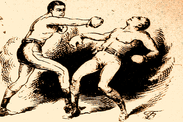
Dempsey fight drawing

“In all matters of opinion,” Mark Twain tells us, “our adversaries are insane.”

Nowhere in modern life is this axiom more apt than in the vicious battleground that is airline seating. In recent years, most airlines have opted to make the space between rows of passengers smaller; in order to cram more seats per plane, many have also quietly made the window seats and even the seatbelts on window seats slightly smaller as well. (Try comparing sometime.)

The result for anyone who, like your humble correspondent, enjoys glancing out a window from time to time, is a seat tray rammed directly into one’s solar plexus if one happens to be trying to, say, use a laptop in flight. And that’s if the window-lover in the row ahead of me decides not to recline his seat.

On the particular flight upon which I am typing this, the last condition did not, alas, apply. A honeymoon couple — he awash in some pepper-based cologne, she beamingly bouncing her ring upon every row she passed, so all might see it glimmer in the light — evidently mistook their seats for two single beds. Not only were their activities in them not, as my grandmother would have said, appropriate for every audience, but they seemed disappointed — nay, convinced — that their seats would not recline into a completely flat position, presumably so they could (ahem) elevate their performance art piece to the next level.

After the first time the lady in question caused my laptop to emit a loud crack of protest, I politely explained through the crack in the seats (now about five inches from my face) that the nearness of the rows rendered their desired level of reclining impossible. Even if I had not needed to be working on my computer throughout the flight — an absolute necessity, I assured them, due to the standard formatting educational needs of all of you fine people waiting impatiently for me to land — the only way I could possibly accommodate the angle they desired would involve my balancing my paperback on the bride’s forehead as it hovered a few inches above my lap.

Apart from the book part, the honeymoon couple thought that would be just fine. How nice of me to suggest it.

The hard-argued subsequent compromise involved my turning sideways, twisting one of my legs underneath me while resting, if it could be called that, my back against the window-side armrest. If I gingerly balanced my laptop on the tray table of the seat to my left, I could barely manage to type. My left hip and elbow swiftly fell asleep, and the position required my staring fixedly at the profile of the guy in 23C (whose wife, you will be astonished to hear, apparently doesn’t understand him), but that was a small price to pay for the approximately 19 degree incline my gymnastics permitted the honeymooners.

At least for the first twenty minutes or so. After that, they kept trying to recline their seats farther. Apparently, I was being unreasonable to expect enough personal space to keep my laptop open the 90 degrees recommended by the manufacturer for optimal screen visibility. I can now tell you from personal experience that while it’s still possible to read the screen down to roughly 49 degrees, the lower the lid, the less accurate the typing.

Also, the lower the lid, the more one is tempted to draw conclusions about the fundamental difference between content producers and content consumers. To the recliners, the notion that I would so need to express myself on any subject that it could not wait until after we had landed was, I gathered, completely incomprehensible.

Oh, wasn’t I done yet? They’d like to lean back and enjoy themselves properly.

As much as I would like to blame the honeymooners’ frankly not-very-neighborly attitude upon either a poor set of upbringings (raised by airline-phobic wolves, perhaps?) or some bizarre wedding-induced solipsism that made them sincerely believe that no other human happiness was important compared to theirs, I suspect something very simple was happening here: all three of us were basing our expectations of personal space not upon the current lay-out of the airplane, but our sense memories of what air travel had been in the past.

My body remembers fondly being able to operate a laptop in comfort on an airplane, and not all that long ago. And I can only assume that somewhere deep in the honeymooners’ musculature, their forms remembered equally well being able to flop backward with impunity, without violating anyone else’s space bubble.

Or they were appallingly brought up. Either way, nobody was happy with the outcome.

A similar failure to communicate often characterizes the initial interactions between an aspiring writer and those he hopes will help his work get into print: agents, editors, contest judges, freelance editors, and of course, our old pal, Millicent the agency screener. From the new writer’s point of view, many of the hoops through which he’s expected to jump seem arbitrary, if not actively hostile to his progress; from the other side of the divide, it’s practically incomprehensible that any serious writer would not be aware of prevailing standards.

Each side, in short, typically expects something different from the other than what the other believes he is expected to provide. If the communication gap is severe enough, each may even begin to suspect the other of violating expectations on purpose, just to be annoying.

But that’s very seldom the case, on either end. The expectations are simply different, as often as not because each side has in mind some mythical period when perfect communication was the norm, rather than the exception. Millicent sighs for the days when the truly gifted tumbled out of the womb with a complete understanding of both standard format and changing market conditions; the aspiring writer longs for the era when every submission was read in its entirety, every time, and editors took the time to work with promising new authors.

Both sides are perfectly at liberty to sigh nostalgically, of course. But the fact is, none of these conditions ever prevailed on a large scale.

Oh, well-advertised submission standards used to render looking professional a trifle easier, admittedly; back when the slush pile still existed at major publishers, a new author could occasionally leap-frog over a few levels of testing. And undoubtedly, editors formerly had more time to work with writers. Things change. But contrary to what many an aspiring writer would like to think, there’s never been a point in publishing history when mainstream publishers were purely non-profit enterprises, devotes solely to bringing new voices to the admiring masses, nor have the bulk of submissions ever been completely professional and market-oriented.

Those seats never reclined as fully as you remember them doing, either. And those tray tables have never been particularly spacious.

All of which, I devoutly hope, will place you in the right frame of mind for confronting what seems to be a perennial controversy amongst aspiring writers: whether to place a chapter title (or just “Chapter One”) on the first line of a page or twelve lines below that, on the line just above where the text proper starts.

Don’t laugh, those of you who are new to this particular debate: this one has generated quite a body count over the years. Former comrades in arms, veterans of the writing trenches, have ceased speaking altogether over this issue; even judges within the same literary contest have been known to differ sharply on the subject.

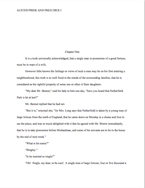
Which is a trifle puzzling to those of us who deal with professional manuscripts for a living, frankly, because there actually isn’t a debate on our end. Nor do the Millicents gather over steaming lattes to debate the niceties of labeling a chapter. One way looks right to us for a book manuscript, period: the first page of a chapter should be formatted

What does that mean in practice? The chapter title belongs at the top of the page (centered) if the manuscript is a book; as with the first page of a manuscript, the title appears at the top, with the text beginning twelve lines below. In a short story or article, by contrast, the title belongs ten lines from the top of the page, on the double-spaced line above the text.

So yes, the spacing honestly does matter to the pros. As always, it’s to an aspiring writer’s advantage to use the format appropriate to the type of writing because it will look right to the Millicent screening it.

The answer really is as simple as that. Why, then, the rampant confusion? And why, given that the difference is a relatively small one not necessarily reflective of the quality of the writing involved, might a professional reader like Millicent or Mehitabel the contest judge particularly care if a talented aspiring writer chose the wrong version?

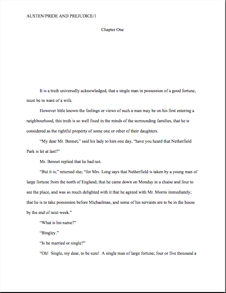
As is my wont, I shall let you see for yourselves. To place the two vitriol-stained possibilities before you in all of their lush magnificence, the question here is should the first page of a book chapter look like this:

Or like this:

Quite a visceral difference, no? The first version is in standard format for a book manuscript; the second is for a short story or article.

Oh, how tempting it is to leave it at that…but truth does compel me to tell you that Millicents, the agents who employ them, and contest judges see far, far more examples of version #2 than #1 in book submissions. Many, many times more. So much so that — prepare to rejoice, because I haven’t said this very often throughout this series — although an agent would almost certainly make you move a low chapter title aloft, at this point in publishing history, you could probably get away with either in a book submission.

I know — it sort of creeps me out to hear myself saying such a thing, too.

I hasten to add, though, that I would be reluctant to buy into the astonishingly pervasive theory that if masses and masses of people do something, it automatically becomes correct. No matter how many times all of us see apostrophe + s used to make a noun plural, it’s just not proper — unless, of course, we’re talking about the Oakland A’s, where the erroneous apostrophe is actually part of the proper name.

Ditto with manuscript submissions: as anyone who screens manuscripts for a living could tell you, a much higher percentage of them are incorrectly formatted than presented properly. But that doesn’t make improper formatting right, does it? Nor does it render it reasonable to expect that Millicent will be pleased to see a chapter title lolling about just above the text.

As everyone’s mother was wont to say (at least on the West Coast), if everybody else jumped off the Golden Gate Bridge, would you, too?

I was delighted to discover when I moved to the East Coast for college that the moms out there were prone to asking the same question with reference to the Empire State Building. There must be something about that particular period of architecture (the GGB was built in 1933-37, the ESB in 1930-31) that promotes suicidal ideas.

Speaking of body counts.

The weird thing about this particular formatting oddity — I’m back to talking about chapter titles now, not suicide attempts, in case you found that last segue a mite confusing — is how often the incorrect version appears in otherwise perfectly presented manuscripts. That fact sets Millicent’s little head in a spin. As, I must admit, it does mine, as well as the brainpan of virtually every other professional reader I know.

Why is it so very puzzling to us, you ask? Because at least in my case — and I don’t THINK I’m revealing a trade secret here — although I have literally never seen an agent submit a manuscript to a publishing house with format #2, I’m constantly meeting aspiring writers who have been told by writing teachers and even contest judges that #2 is the only acceptable version. And that’s just weird to me, as I have literally never even heard of an agent, editor, or anyone else in the publishing industry’s asking for a chapter heading to be moved from the top of the page to just above the text. Although as I said, I do know agents who routinely ask for the shift in the other direction.

And believe me, I’ve heard some pretty strange requests from agents and editors in my time; I’m not easily shocked anymore. But to hear a professional reader insist upon placing the chapter heading where you have to skip down a third of a page to read it…well, that would have me reaching for my smelling salts.

(Do they even make smelling salts anymore? And if everyone else jumped off the Golden Gate Bridge clutching them, would I?)

Clearly, somebody out there is preaching the place-it-just-above-the-text gospel, because agents, editors, and contest judges are simply inundated with examples of this formatting anomaly. We see bushels of ‘em. Hordes of aspiring writers are apparently absolutely convinced that the sky will fall in if that chapter heading is located anywhere but immediately above the text. Sometimes, when those die-hard advocates become contest judges, they even dock correctly-formatted first pages for having the title in the right place.

In fact, many aspiring writers are so convinced of the rightness of the drooping title heading that it’s not all that uncommon for an editor to find that after she has left a couple of subtle hints like this that the writer should change the formatting…

…the subsequent drafts remain unchanged. The writer will have simply ignored the advice.

(A word to the wise: editors universally HATE it when their advice is ignored. So do agents. Contest judges probably wouldn’t be all that fond of it, either, but blind submissions mean that in order to get dunned for brushing off a judge’s feedback, a writer would have to submit the same chapter two years running to the same contest, have the entry land in the same judge’s pile — in itself rather rare — and the judge would have to remember having given that feedback. Oh, and for the entrant to hear about it, the contest would have to be one of the few that gives editorial feedback.)

The up v. down debate may seem like a rather silly controversy — after all, in the cosmic scheme of things, why should it matter if the white space is above or below the title? — but sheer repetition and writerly tenacity in clinging to version #2 have turned it from a difference of opinion into a vitriol-stained professional reader pet peeve.

See earlier comment about how we tend to react to our advice being ignored; it’s seldom pretty.

Which, unfortunately, tends to mean that in discussions of the issue at conferences degenerate into writing-teacher-says-X, editor-at-Random-House-says-Y: lots of passion demonstrated, but very little rationale produced, beyond each side’s insisting that the other’s way just looks wrong.

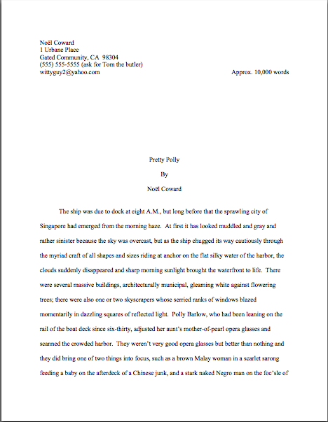
However, there is a pretty good reason that moving the chapter heading information to just above the text looks wrong to someone who edits book manuscripts for a living: short stories’ first pages are supposedto look quite, quite different from those belonging to book manuscripts or proposals. Take a gander:

As you may see, for a short story like this one, there’s a mighty fine reason to list the title just above the text: a heck of a lot of information has to come first on the page, because short stories, unlike book manuscripts, are not submitted with a title page.

But that would not be proper in a book-length manuscript, would it? Let’s see what Noël’s editor might have said upon viewing this as the first page of a book:

Ouch. (That last bit would have been funnier if the entire page were readable, by the way, but my camera batteries were running low. Sorry about that.) Yet you must admit that at some level, the editor’s ire would have been justified: as Millicent and that angry mob of pitchfork-wielding ignored editors would be only too happy to tell you, short stories don’t HAVE chapters, so who on earth are they to be telling those of us in the book world how to format our manuscripts?

So I say it again: for a book manuscript, stick with version #1.

Which is not to say, of course, that this particular small deviation will automatically and invariably result in instantaneous rejection. It won’t, even in the latté-stained hands of the most format-sensitive Millicent. (See, she spilled coffee on her hands after she took a sip while it was still too hot — and if you didn’t get that joke, you probably haven’t been reading this blog for very long.) If a submission is beautifully written and technically correct in every other respect, she might only shake her head over the location of the chapter heading, making a mental note to tell you to change it between when her boss, the agent, signs the writer and when they will be submitting the manuscript to editors at publishing houses.

But if you don’t mind my saying so, that’s a mighty hefty set of ifs.

While I’ve got the camera all warmed up (and miles to go before I’m ready to let the honeymooners recline into my lap), this would probably be a good time to illustrate another ubiquitous agent and editor pet peeve, the bound manuscript — and you’re going to want to pay close attention to this one, as it is almost universally an automatic-rejection offense.

Manuscript submissions, and I don’t care who hears me say it, should not be bound in any way. Ditto with book proposals.

There’s an exceedingly simple reason for this: binding renders it impossible (or at least a major pain in the fingertips) to pull out a chapter, stuff it in one’s bag, and read it on the subway. Hey, paper is heavy. Would you want to lug home ten manuscripts every night on the off chance you’ll read them?

As with other ploys to make a manuscript appear identical to a published book, binding the loose pages of a manuscript for submission will not win you friends in the publishing world. Not only does this not look right (I spared you the chanting this time), but it seems so wrong that Millicent will be positively flabbergasted to see a submitter to do it.

She might, for instance, forget that her latte is still too hot to drink, take a sip, and scald her tongue. It’s been known to happen.

Seriously, the unbound manuscript is one of those rules so engrained in the professional reader’s mind that it seldom even occurs to authors, agents, or editors to mention it as a no-no at writers’ conferences. Heck, I’m not sure that I’ve mentioned it once within the first two years I was writing this blog — and by anyone’s standards, I’m unusually communicative about how manuscripts should be presented.

Talk about it all day, I will.

So I’m going to repeat myself, because you’re not going to hear this very often: by definition, book manuscripts should NEVER be bound in any way. Not staples, not spiral binding, not perfect binding. If you take nothing else away from this series, binding-lovers, I implore you to remember this.

Why am I making you swear to follow my advice this time around? Well, in practice, I’m sorry to report, a bound manuscript will seldom survive long enough in the screening process for the chapter-separation dilemma to arise, because — and it pains me to be the one to break this to those of you who’ve been submitting bound manuscripts, but if I don’t tell you, who will? — those pretty covers tend never to be opened at all.

Did you just exclaim, “Ye gods, WHY?” again? I can’t say as I blame you, but try for a moment to envision what a bound manuscript might look like from Millicent’s perspective.

To ramp up your stress levels to the proper level to understand her, envision a desk simply smothered with an immense pile of submissions to screen before going home for the day. Envision further that it’s already 6:30 PM, and eyeballs already dry as dust from a long, hard day of rejecting query letters.

Just lost your sympathy, didn’t she? Try, try again to place yourself in her proverbial moccasins.

Picturing that immense pile of envelopes clearly again? Okay, now slit open an envelope that reads REQUESTED MATERIALS on the outside. (You do know that you should ALWAYS scrawl that in two-inch letters in the lower left-hand corner of a submission envelope, don’t you, so your requested materials don’t get buried in the slush pile?)

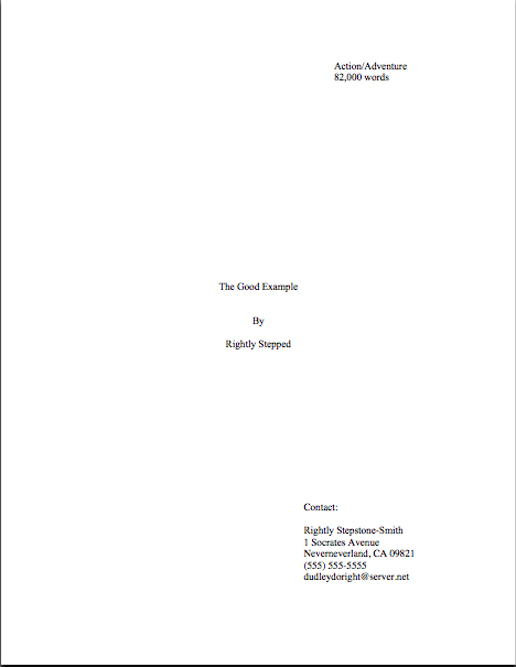
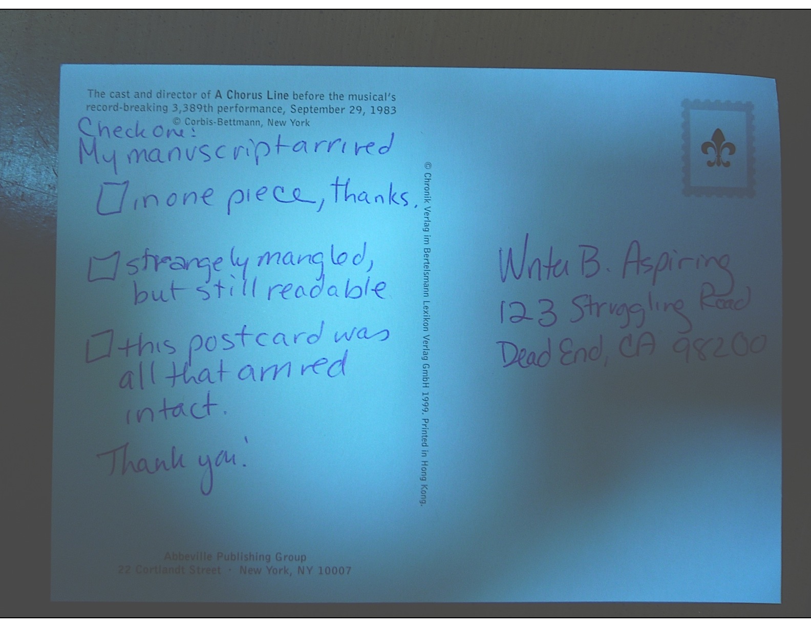
If you’re Millicent — and right now, you are, singed tongue and all — you fully expect to see something like this lurking between the cover letter and the SASE tucked underneath:

But in the case of the bound manuscript, you would instead encounter something like this:

Kind of hard to miss the difference, isn’t it? Unfortunately, 999 times out of 1000, the next sound a bystander would hear would be all of that nice, expensive binding grating against the inside of the SASE, just before Millicent tucks a photocopied form rejection letter on top of it.

Honestly, it’s not that she is too lazy to flip open the cover; she just doesn’t see why she should.

Her logic may not seen particularly open-minded, from a writerly perspective, but it’s a fairly common argument throughout the industry: if this submitter does not know this very basic rule of manuscripts, how likely is he to know the rules of standard format? And if he does not know either, how likely is he to be producing polished prose? If he hasn’t taken the time to polish his prose, is this manuscript really finished?

And if it isn’t finished, why should I (you’re still Millicent, remember?) bother to invest my time in reading it before it is?

I know, I know — this logic may well not hold water when it comes down to an individual case. Despite my best efforts over the last few years, there are plenty of good writers out there who happen to be clueless about the rules of standard format.

But even if they all jump off the Golden Gate Bridge, you shouldn’t.

Here’s why: this is yet another expectation-differential problem. From Millicent’s perspective, the fact that good writers aren’t necessarily born aware of the norms of the industry matters less than we writers would like — because, as unpleasant as it is for aspiring writers to realize, her agency is going to see enough technically perfect submissions this week to afford to be able to leap to unwarranted conclusions about this one.

The moral: don’t waste your money on binding.

Seem arbitrary? From a professional reader’s point of view, it isn’t — the enforcement of standard formatting isn’t actually any more complicated than the simple axiom that any game has rules, and you will play better if you take the time to learn them.

Think about it: if you saw a batter smack a baseball, then dash for third base instead of first on his way around the diamond, would you expect his home run to count? Would an archer who hit the bulls-eye in her neighbor’s target instead of her own win the grand prize? If you refused to pay the rent on Park Place because you didn’t like the color on the board, would you win the Monopoly game?

I can go on like this for days, you know. Please, I beg you, say that you are getting the parallels, so I may move on. The flight attendant’s about to tell me to shut off my computer in preparation for landing.

Submitting art to the marketplace has rules, too, and while your fourth-grade P.E. teacher probably did not impart them to you (as, if I ran the universe, s/he would have), you’re still going to be a whole lot better at playing the game if you embrace those rules, rather than fight them.

You’ll also, in the long run, enjoy playing the game more. It may not seem that way the first time one is struggling to change an already-written manuscript into standard format, but trust me, it will be much more fun when you finish your next manuscript and realize that there’s nothing that needs to be changed.

Let all of those other folks jump off the Golden Gate Bridge without you, I say. Remember, you’re playing this game by choice: you could, after all, make your own rules and publish your book yourself. If you want to play with the big kids, you’re going to need to abide by their rules.

At least at the submission stage.

Until you know the expectations of the lovely folks seated in the row behind you, don’t assume you can recline all the way back into their laps. Everyone on the plane is trying to get to the same place, after all. By following the rules, you can make it a more enjoyable trip for all concerned.

Okay, okay, flight attendant; I’ll stop milking that metaphor and shut down my laptop. Just promise me that you’ll make the honeymooners straighten up their seats for the trip to the ground.

Keep up the good work!

The mysteriously mysterious strictures of standard format, part XI: page 137 deserves your loving scrutiny, too, or, no time for napping yet, gargoyle!

napping gargoyle in Carcassonne

Have you been enjoying our in-depth guided tour of the manuscript from the top down? Literally: so far, we’ve talked about the piece of paper on top of the submission stack, the title page; we’ve talked about the next sheet of paper, the first page of text and how it differs from both the title page and the pages that come after it; we’ve extrapolated from that first page to standards for the first page of each chapter and any titled section breaks.

Now, it’s time to talk about all of those pages in the middle, don’t you think? Perhaps, while we’re at it, we could engage in some more of those nifty compare-and-contrast exercises we engaged in so fruitfully yesterday.

I know, I know: hard to contain your enthusiasm, isn’t it?

Okay, so it’s not a particularly sexy topic, but as I mentioned yesterday, it’s a really, really good idea for an aspiring writer to devote a spot of time in comparing properly and improperly formatted manuscripts. Yes, yes, writing time is precious for all of us — and scarce for most of us — and school compare-and-contrast exercises left most graduates with but think of it as an investment in your writing career: once you’re learned to spot formatting problems easily, you’ll be a much, much more effective proofreader. Not to mention being able to format your manuscripts correctly from the get-go.

Oh, that doesn’t sound like much of a door prize to you? Just wait until you’re trying madly to pull a submission packet together in response to a request for materials, or frantically constructing a contest entry four hours before it needs to be postmarked. Or, even more stressfully marvelous, responding to a last-minute revision request from your editor. Believe me, you’ll be very grateful then for every nanosecond that you don’t have to devote to wondering if your margins are consistent.

With an eye to building up those vital professional skills, I have been running through the strictures of standard manuscript format and some common deviations from it, to demonstrate just how clearly our old pal, Millicent the agency screener, discerns the differences between a professionally-formatted manuscript and, well, everything else. At the end of a long day’s reading, they definitely jump out at her, and with good reason: once a professional reader gets used to seeing the similarities that pretty much all professional manuscripts share, submissions formatted in other ways might as well have UNPROFESSIONAL stamped on them in bright red ink.

And while Millicent may strive valiantly not to allow that impression to color her reading of the submission itself, it’s just not a good idea to assume that it won’t. She’s only human, after all.

It’s an even worse idea to assume a charitable reading for a contest entry, by the way. If anything, contest judges tend to be even more sensitive to the beauty of standard format than Millicent, for the simple reason that they’ve usually been reading a whole lot longer. The agency gig may well be Millie’s first job out of college, but the judge handed your entry may well have just retired from a long and fruitful career teaching English composition.

Her fingers positively ache for the red pen of correction.

This is not entirely accidental — most well-respected contests require some professional credentials from their judges, either as writers, editors, or teachers. Which means, in practice, that judges have often been writing in standard format themselves for years or bludgeoning other writers into compliance with its requirements.

Translation: other kinds of formatting won’t look right to them, either. By now, you’re having a similar reaction, aren’t you?

Don’t think you’re developing professional eyes? Or don’t want to believe you could conceivably share any traits with Millicent? Let’s test the proposition by trying a little Aphra Behn on for size.

If you don’t know her work, you should, at least historically: as far as we know, she was the first woman paid for writing in English — which, as Virginia Woolf pointed out, means that every female writer who earns so much as a sou from it now should be laying wreaths on her grave in gratitude.

Our girl Aphra’s also hilarious — and if you think it’s easy for a joke written in 1688 to remain funny today, well, I look forward to reading your comedic stylings in the year 2332.

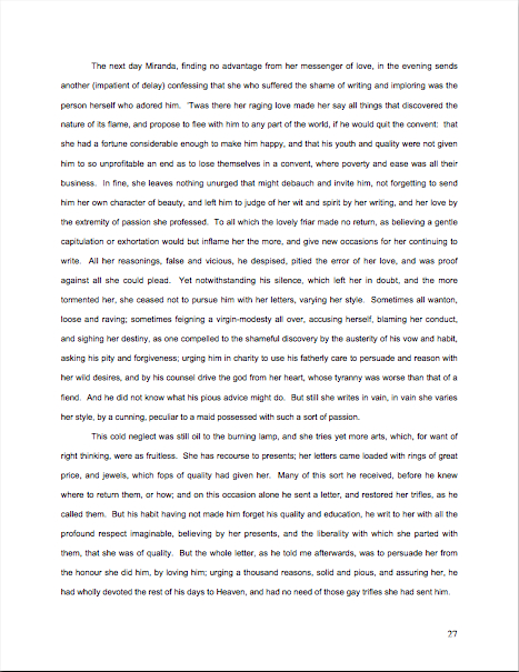
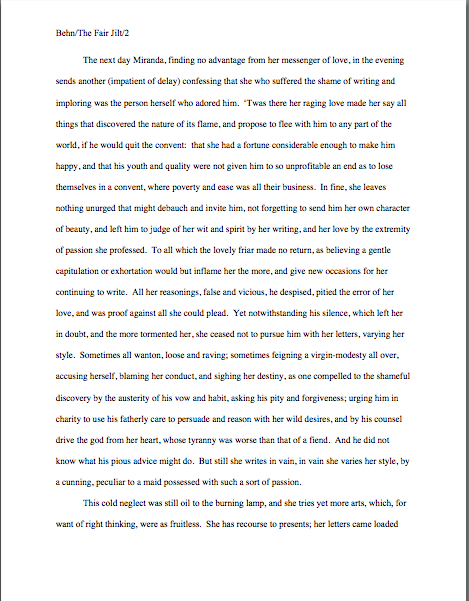
Don’t believe me? Here is a page from THE FAIR JILT. (If you’re having trouble reading the small writing, try double-clicking on the image, then enlarging the resulting window.) Try not to be too distracted by the story to notice how the page is put together.

You clever souls could tell instantly that there was something wrong here, couldn’t you, and not just because Miranda’s trying to seduce her priest? (For convent, read monastery.) Set aside Aphra’s practically Dickensian affection for semicolons for the moment — which would tend to turn off a modern Millicent pretty quickly — why might this page have a hard time as a submission.

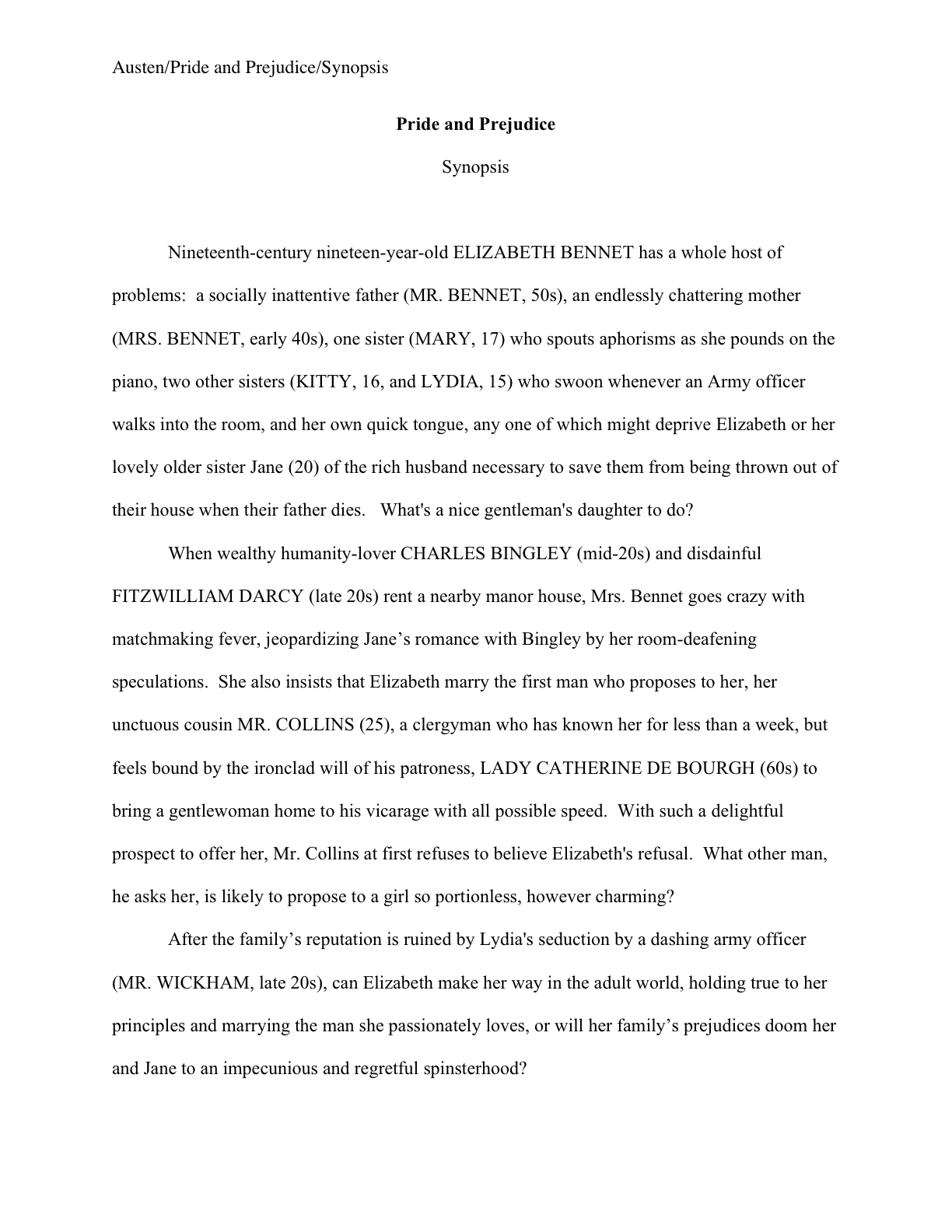
Before you commit to a final answer, here’s what it should have looked like in standard format:

Let’s take the problems in the first version from the top of the page: the incorrect version does not have a proper slug line. Seeing this lone page out of context, it’s quite obvious why a slug line is a dandy idea, isn’t it? Without it, how would it be even remotely possible to return this wandering page back into the manuscript from whence it came.

“Who wrote this?” Millicent cries in ire, glaring around her cubicle at the 47 manuscripts lying there. “This stray piece of paper could be from any of these!”

At least Ms. Behn thought to number the pages of Example #1 — but did you catch the problem with how she did it? The page number is in the bottom right-hand margin, rather than in the slug line, where it belongs.

Okay, that’s enough review from my last post. Did you catch any other problems that might register on Millicent’s umbrage meter??

What about the 10-point type, which will strain Millicent’s already overworked eyes? Or the Ariel typeface? There is nothing inherently wrong with either, but when she’s used to see practically every manuscript that heads out of the agency to publishing houses in 12-point Times New Roman, (chant it with me here) it just doesn’t look right.

Anything else? What about that right margin? Mighty straight, isn’t it? That look proper to you?

What’s going on here is called block-justification, another problem that can be laid squarely at the feet of those who insist that a manuscript and a published book should be identical. The text in many published books, and certainly in many magazines and newspapers, is spaced so that each line begins at exactly the same distance from the left-hand edge of the page and ends (unless it’s the last line of a paragraph) at exactly the same distance from the right-hand edge of the page.

Which, to let you in on why this type of neatness bugs the heck out of professional readers, renders skimming quite a bit more difficult.

Why? Well, as you may see for yourself, block formatting provides fewer landmarks, as it were; to the glancing eye, practically every line of narrative text resembles every other. To those of us used to the ragged right margins and even letter spacing of standard format, it’s actually kind of hard to read.

So there’s quite a bit in Example #1 that’s distracting from the actual writing, isn’t there? Doesn’t help sell the text, does it?

Okay, all of these rhetorical questions in a row are beginning to make me dizzy, so I’m going to wind down for the day. But before I do, let’s take one more look at Example #2, the one Millicent and a contest judge would like:

Now, let’s take a gander at the same page in — ugh — business format; if you don’t know why it’s ugh-worthy, you might want to revisit this series’ earlier post on the immense value of indentation.

Startlingly different, isn’t it, considering that I made a grand total of two formatting changes?

You did catch both of them on your skim through, right? All I did was I eliminate the indentations at the beginning of each paragraph and skipped a line between paragraphs to produce the norm for business correspondence, as well as for most of the text currently posted on the Internet.

Including this blog, unfortunately. As a professional writer and reader of manuscripts, it drives me nuts that my blogging program won’t allow me to indent paragraphs.

Why? Because — wait for it — it just doesn’t look right. So much so that in a contest entry, as in a submission, business format is often grounds all by itself for knocking a manuscript out of finalist consideration.

Finding yourself asking why again? Well, technically, indented paragraphs are grammatically requisite, so to a judge, non-indented paragraphs may well seem as great a violation of everything we hold dear as frequent misspellings or use of the wrong form of there, their, and they’re.

Fortunately for judges and Millicents who care deeply about the health of the language, errors seldom come singly in entries and submissions. Like spelling errors, formatting mistakes are apparently social: they like to travel in packs, roving all over a manuscript like Visigoths sacking Rome.

As a result of this convenient phenomenon, a manuscript that contains errors within the first few lines (or on the first page) is easy for a professional reader to dismiss; statistically speaking, it’s a pretty good bet that if Millicent kept reading after a technically flawed opening, she would find more causes for umbrage.

Given how many submissions she has to screen between now and lunch, do you think she is going to (a) press on in the hope that the first error was a fluke, or (b) leap to the (perhaps unwarranted) assumption that there is more of the same to come and reject it right away?

I leave that one to your fine critical faculties to answer. Let’s just say that her umbrage-taking threshold tends to be on the low side.

Why am I bringing this up in the middle of a discussion of the perils of business format, you ask? Well, for starters, an ever-increasing number of agents are not only accepting e-mailed queries (a genuine rarity until astonishingly recently), including some who ask queriers to include the opening pages, a synopsis, and/or other writing samples with their queries. Since few agents open attachments from writers with whom they’ve had no previous contact, many request that those opening pages be included in the body of the e-mail, pasted just below the letter.

See a potential problem there? That’s right: most e-mail programs are not set up for easy tabbing; consequently, business format is the norm for e-mail communications. But that doesn’t mean that the Millicent assigned to screen those queries won’t turn up her nose at non-indented paragraphs in those pages.

Again, why? Are you sitting down, dislikers of indentation?

I hate to be the one to break this to you, but there are Millicents out there (and agents, editors, and contest judges as well) who will leap directly from noticing a lack of indentation and unwarranted spaces between paragraphs to our friend, option (b): if the submitter is not aware of how to format a paragraph of English prose properly, she reasons, aren’t there inevitably more snafus to come?

Not every Millicent — or agent, judge, etc. — will have this knee-jerk reaction, of course. But do you really want to take the chance that she’s not going to seize the opportunity to save herself a little time?

The specter of illiteracy is not the only reason using business format is likely to cost you, either. To a professional reader, the differences between the last two examples would be more than visually jarring — they’d be downright confusing. In standard format, the only reason for a skipped line between paragraphs would be a section break, so Millicent would be expecting the second paragraph to be about something new.

Okay, so a misconception like that might distract her attention for only few consecutive seconds, but let’s not kid ourselves: your garden-variety Millicent is spending less than a minute on most of the submissions she rejects — it’s actually not all that uncommon for her not to make into the second or third paragraph before reaching for the SASE and a copy of that annoying form rejection letter.

Take a moment for the implications of that to sink in fully. Don’t worry; I’ll wait.

While those of you new to the speed with which rejection typically occurs are already in shock, let me add for the sake of anyone who doesn’t already know: those who regard business format as a symptom of creeping illiteracy — hey, I just report the news; I don’t dictate it — are every bit as likely to frown upon it just as much in a query letter or synopsis as in a manuscript submission.

Time loss is not the only reason she might take umbrage at momentary confusion. Let me let you in on a little secret: professional readers, especially those who inhabit agencies and publishing houses, tend not to be overly fond of having their mental image of the story they are reading at the moment jarred. How do I know this? Well, for one thing, they commonly refer to it as being tricked.

As in, “I hate being tricked by a first paragraph that is about someone other than the protagonist.”

There’s a practical basis to this dislike, of course, but it’s kind of complicated. I wrote a couple of fairly extensive posts on the subject a while back (here’s a link to the first, and here’s a link to the second, in case you’re interested), but I’ll run over the thumbnail version now.

Is everybody comfortably seated? My thumbnails are a tad long. (Just try to get THAT image out of your head anytime soon.)

To get through all of those manuscripts she’s assigned to screen each week, Millicent has to read quite quickly, right? If she doesn’t, she’ll get buried in paper, as basically, she’s got to make it through WAR AND PEACE several times over in a week.

That’s a whole lot of material to remember, by anyone’s standards — and remembering actually is important here. If she decides to allow a manuscript to make it to the next level of consideration, she is going to need to be able to tell her boss what the book is about: who the protagonist is, what the conflict is, why that conflict is important enough to the protagonist for the reader to be drawn into it, and so forth.

In essence, she’s going to need to be able to pitch it to the higher-ups at the agency, just as the agent is going to have to do in order to sell the book to an editor, and an editor is going to have to do in order to convince his higher-ups that the publishing house should acquire the book.

And, often, as first-round contest judges will need to do on an evaluation form in order to pass an entry onto the next round.

Okay, brace yourself, because explaining what comes next involves delving into one of the great cosmic mysteries that has long perplexed aspiring writers the world over. It’s not for the faint of heart.

Remember earlier in thus series, when I mentioned that agents and editors don’t read like other people? Well, one of the primary differences is that from line one of page one, they’re already imagining how they’re going to pitch this book. So if paragraph 2 or 3 (or page 2 or 3) suddenly informs them that their mental patter has been about the wrong character, they feel as if they’ve been backing the wrong horse.

And while there may have been any number of perfectly reasonable narrative reasons for the text to concentrate upon an alternate character for the opening, unless the writing and the story have already really wowed Millicent, her resentment about being tricked mistaken about the identity of the protagonist is often sufficient to make her reach for that SASE and form letter.

Feel free to go scream into the nearest pillow over that last piece of convoluted logic; you don’t want to keep that kind of existential cri de coeur pent up inside. I’ll wait until it’s out of your system.

Feel better? Good.

Before you go rushing off to see if your opening paragraphs might possibly be laying you open to a charge of trickery — because, for instance, you might have taken the bold authorial step of noticing that there is more than one human being in the world, and written about an interpersonal relationship accordingly — let’s return to the formatting issue that prompted my little segue into the psychology of resentment. Can we extrapolate any practical lesson about business format from it?

You bet your boots we can: it’s not a good idea to give the impression of a section break where there isn’t one. And when producing pages for people who read all day, you might want to stick to the rules governing written English and indent your paragraphs.

Starting to feel more at home with standard format? Excellent; my evil plan plot for world domination teaching strategy is working. More compare-and-contrast exercises follow in the days to come, so keep up the good work!

The mysteriously mysterious strictures of standard format, part X: a place where the slugs run free

flower in France

Have we been talking so intensely about the first couple of pages of your manuscript — the title page, the first page of text — that standard format has invaded your dreams yet? Yes, yes, I know: this series on what professional manuscripts look like has been both example-ridden and extraordinarily nit-picky, even by my standards of detail-orientation. So you probably won’t be altogether astonished to learn that before we move on from the first page of the text (and of each chapter) to considering an ordinary page, I want to devote today to pagination.

Don’t groan; it’s an important issue. Not numbering your manuscript, book proposal, or contest entry’s pages an almost universal instant rejection offense; trust me, Millicent the agency screener is going to notice how and if you do it. In fact, as cosmetic issues go, how and where an aspiring writer chooses to place the page number on the page can tell Millicent a tremendous amount about him.

Specifically, whether he has done his homework about submission, because there is only one place on a manuscript page that it is permissible to place a page number: in the slug line.

(Admit it — you’re relieved that I didn’t festoon the top of this post with a picture of a slug. Although I suppose a slug-minded person might misinterpret that shadow in the lower right of the photo a something crawling. Actually, there was a slug in the immediate environment when I took the pretty photo above, but it was on a leaf below the primary flower, completely hidden from sight. So I feel entirely justified in presenting this as the Official Flower of the Slug Line. It’s certified slug-approved!)

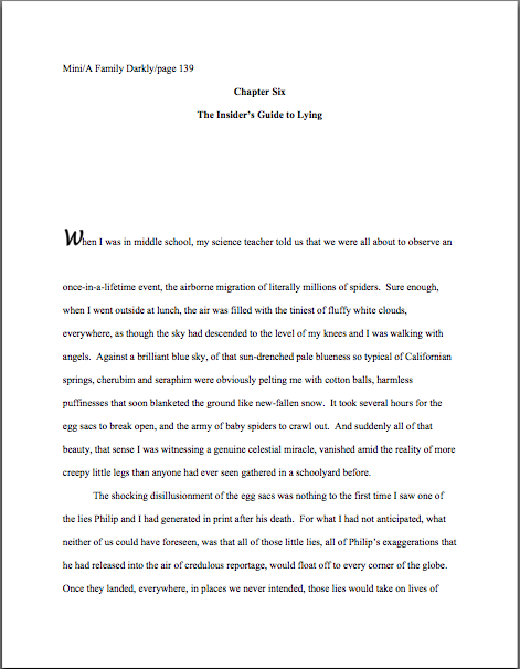
Speaking of relative location, is everybody quite sure where the slug line should be positioned on the page? Just to be on the safe side, let’s take another gander at an example from yesterday’s post:

See it in the upper left-hand margin? Notice, please, that the page number belongs within the slug line, rather than anywhere else on the page. This is as proper on page 139 of a book manuscript as on page one. While you’re going around noticing things, also notice that in each of these examples, the page’s only reference to the author’s name or the title of the book appears in the slug line.

The slug line confuses a lot of aspiring writers; until you have seen piles and piles of professional manuscripts, it looks kind of funny. And when you’ve been told over and over again that a manuscript should have a 1-inch margin on all sides, it can seem counterintuitive to add a line of text, even such a short one, within that margin.

But I assure you, it’s always been done that way. And why? Followers of this series, chant it with me now: because it looks right to professional readers.

Yes, that logic is a trifle tautological, now that you mention it. If you have a problem with that, I would suggest taking it up with the powers that rule the universe. As I believe the fact that my memoir has been in the hands of a reputable publisher for years and still has yet to be released (due to lawsuit threats concerning who owns my memories, believe it or not) makes abundantly clear, I apparently do not rule the universe. If I did, Microsoft Word would be set up to create documents in standard format automatically, Word for Mac and Word for Windows would be set up so those using one could easily give formatting advice to those using the other, air pollution would be merely a thing of distant memory, and ice cream cones would be free on Fridays.

As none of these things seems to be true, let’s get back to business: how does one create that pesky slug line, anyway?

Back in the days when typewriters roamed the earth, it was perfectly easy to add a slug line to every page: all a writer had to do was insert it a half-inch down from the top of the page, left-justified, floating within the 1-inch-deep top margin. For word-processed documents, it’s a trifle more complicated.

The slug line still belongs in the same place, .5 inches from the top of the paper, suspended in the middle of the requisite 1-inch top margin. But instead of laboriously typing it on each page individually as writers did in the bad old days, one simply inserts it in the header. In most versions of Word (I can’t speak for all of them), the header may be found under the VIEW menu.

Before the Luddites out there trot out their usual grumble about tracking down the bells and whistles in Word, think about this: placing the slug line in the header also enables the writer to take advantage of one of the true boons of the advent of word processing, pages that number themselves.

As opposed to having to do it manually, laboriously retyping the slug line in its entirely on each and every page of the manuscript. Oh, you may laugh, but every so often, I will receive a manuscript constructed by a writer who was not aware that Word would do this for her. Instead of utilizing the header function, the poor writer will have elected to include the necessary information on the first line of text on the page.

Not only does this unfortunate misconception involve an absolutely monumental and ultimately unnecessary effort, but the result doesn’t pass the all-important does it look right? test. Take a peek for yourself:

See how pulling the slug line down into the text messes with the spacing of the page? Here, an entire line of text is sacrificed to it — and let me tell you, that line is not going to go quietly.

How so, you ask? Well, think about it: what’s inevitably going to happen if new writing is inserted on a page formatted this way? That’s right: the writer is going to have to go back and move each and every one of those slug lines to match the NEW pagination.

I’d show you a practical example of this, but it’s just too sad to contemplate. Trust me, it would be a heck of a lot of work, and writers who do it are likely to end up beating their heads against their studio walls.

Take a moment to peruse that last example again. See any other problems with the slug line? How about the fact that it includes the word page? Shouldn’t be there; just the numbers will suffice.

Did I just hear some huffs of indignation out there? “But Anne,” I hear the formatting-ambitious cry, “I think it looks kind of nifty to include page before the page number? It’s kinda stylish. If it’s just a matter of personal style, who could possibly be hurt by including it, if I like the way it looks?”

Well, you, for starters. And why? (Chanters, ready your lungs.) Because it just would not look right to someone who reads manuscripts, book proposals, or contest entries on a regular basis.

No kidding — I’ve seen screeners get quite indignant about this one. “Does this writer think I’m stupid?” Millicent is prone to huff. (Don’t bother to answer that question; it’s rhetorical.) “Does she think I don’t know that the numeral that appears on every page refers to the number of pages? Does she think I’m going to go nuts and suddenly decide that it is a statistic, or part of the title? Or maybe a wayward date that’s wandered off to the wrong part of the page?”

Don’t bait her; the lady has a hard life. Do it the approved way.

Okay, did you spot any other problems? What about the fact that the first character is in a different typeface from the rest of the text? Or the equally disturbing fact that the first paragraph of the chapter is not indented?

Again, the writer may consider this stylish, but I can assure you, Millicent won’t. Fortunately for her blood pressure, the odd typeface for the first letter, in imitation of the illuminated texts hand-written by monks in the Middle Ages, doesn’t turn up all that often in manuscripts other than fantasy and YA, for one simple reason: books in that category are more likely to feature this it’s-a-new-chapter signal than others. But once again, what an editor may decide, rightly or wrongly, is appropriate for a published book has no bearing upon what Millicent expects to see in a manuscript.

Save the manuscript illumination for someone who will appreciate it. Hop in your time machine and track down a medieval monk to admire your handiwork, if you like, but in this timeframe, keep the entire manuscript in the same typeface and size.

The non-indented first paragraph of a chapter is fairly common in mystery submissions, I have noticed, and starting to become more prevalent in other kinds of fiction as well of late. (For an interesting discussion about why, please see the comments on this post and this one.) In fact, I’ve been told by many mystery writers — and rather tersely, too — that eschewing indentation in this context is an homage to the great early writers in the genre, an echo of their style, so who is yours truly to try to talk them out of that gesture of respect?

Well, not to put too fine a point on it, I’m someone familiar with what Millicent expects to see on a page — as well as someone who is aware that almost without exception, in Edgar Allan Poe’s time all the way down to our own, the editor has determined the formatting that appeared on any given printed page, not the author. To professional eyes, especially peevish ones like Millicent’s, a manuscript that implicitly appropriates this sort of decision as authorial might as well be the first step to the writer’s marching into Random House, yanking off a well-worn riding glove, and striking the editor-in-chief with it. It’s just not a good idea for someone brand-new to the biz to do.

Yes, you read that correctly: it’s sometimes seen as a challenge to editorial authority. And while we could speculate for the next week about the level of insecurity that would prompt regarding a minor formatting choice as a harbinger of incipient insurrection, is the manuscript of your first book really the right place to engender that discussion amongst Millicent and her cronies?

Exactly. Save the formatting suggestions for a long, intimate discussion over coffee with your editor after she acquires the book. You’ll probably lose any disagreement on the subject, but at least you will have made your preferences known. Until that happy, caffeine-enhanced day, just accept that the industry prefers to see every paragraph in a manuscript indented the regulation five spaces.

It just looks right that way.

While we’re at it, how about the bolded chapter number and title in that last example? Nothing in a manuscript should be in boldface. Nothing, I tell you. Uh-uh. Not ever. (Except for that nonfiction exception we talked about yesterday. And I have seen authors get away with the title itself on the tile page, but frankly, I wouldn’t chance it on a first book.)

Nor should anything be underlined — not even names of books or song titles. Instead, they should be italicized, as should words in foreign tongues that are not proper nouns. Yes, Virginia, back in the day when typewriters roamed the earth, underlining was the norm, for the simple reason that most typewriters did not have italic keys. So if you consult an older list of formatting restrictions or one intended solely for short story formatting — both of which seem to be circulating at an unprecedented rate on the web of late, pretty much always billed as universally-applicable rules for any type of writing, anywhere, anyhow, a phenomenon which simply does not exist — you might conceivably be told that publications, song titles, and/or foreign words (sacre bleu!) should be underlined. But trust me on this one: any agent is going to tell you to get rid of the underlining, pronto.

And why? All together now: because it just doesn’t look right that way.

All right, campers, do you feel ready to fly solo into a critique of a first page? Here are two pages of text, studded with standard format violations for your ferreting-out pleasure:

How did you do? Are those problems just leaping off the page at you now? If not, ask yourself: does that first page contain information that ought to be on the title page instead? Are the margins even? Are the paragraphs formatted correctly? And so forth.

In fact, it’s a terrific idea for any aspiring writer to get into the habit of asking those types of questions immediately after clapping eyes upon any manuscript, his own or anybody else’s. Why? Because that’s Millicent’s first instinct. However literature-loving a she may be, she sees so many incorrectly-formatted submissions that a properly-formatted one automatically looks at first glance like more professional writing to her.

As, with practice, it will to you. I promise. To get that ball rolling, as well as to reward you for so much hard work — or to provide you with some helpful comparison, depending upon how you did on that last little test — here are a couple of correctly-formatted pages, to soothe your tired eyes:

Whenever you start finding yourself chafing at the rules of standard format, come back and take a side-by-side gander at these last sets of examples, to regain perspective on what standard format is and why it’s important in a submission, proposal, or contest entry. I assure you, after a professional reader like Millicent has been at it for even a couple of months, every time she sees the bad example, mentally, she’s picturing the good example right next to it.

Which is why, as we have discussed, manuscripts that look right get taken more seriously than those that don’t. And regardless of how you may feel about Millicent’s literary tastes, isn’t a serious read from her what you want for your book? Or your book proposal? Or your contest entry?

Did you notice that I snuck us from the first page of the text into the second in my last example? Next time, we’ll continue delving into the mysteries of the mid-manuscript page. Keep up the good work!

The mysteriously mysterious strictures of standard format, part VII: where you stand depends on where you sit. Or read, as the case may be.

sagrada familia ceiling3

We begin today with a pop quiz, inspired by sharp-eyed reader Jinnayah’s comment on yesterday’s post. Quick, tell me: did I take the photo above while looking down into an abyss, sideways into an alcove, or up at an impossibly high ceiling?

Hard to tell which way is up, isn’t it? (But here’s a hint: the purple stuff is flying dust.) Without some orienting landmarks, it’s difficult even to know for sure what you’re looking at, or from what direction.

That’s more or less the same problem the average aspiring writer faces when looking at her own first manuscript or book proposal with an eye to figuring out whether it is formatted correctly, right? Let’s face it, very, very few as-yet-to-be-published writers have ever seen a professional manuscript up close and personal; still fewer have had the opportunity to glance through a professional book proposal. Oh, there’s plenty of advice out there on how it should be done, of course, but as many of you have no doubt noted with chagrin, sources differ.

So how on earth is someone new to the game supposed to figure out which end of the manuscript is up, figuratively speaking?

The trick lies in remembering that the principles governing manuscript formatting are practical and historical, not aesthetic. Thus, while two-inch margins and a cursive typeface may strike a writer as the perfect expressive extension of the spirit of his novel, to someone who reads manuscripts for a living, they’re just puzzling. And distracting.

Where you stand, in other words, depends on where you sit. From where Millicent is sitting, deviation from standard format demonstrates a lack of knowledge about how the industry works, not creativity. She has good reason to feel that way: because professional manuscripts and book proposals are formatted in a particular way, she knows that her boss, the agent of your dreams, would have a hard time convincing an editor at a major publishing house to read even the first page of an unprofessional formatted manuscript.

Which brings be back to where we left off last time, right? For the past couple of posts, we’ve been engaging in compare-and-contrast exercises, showing common examples of title pages and fine-tuning your binoculars so you might see how our old friend Millie — or her boss, or an editor, or a contest judge — might view them. As I sincerely hope those of you who read the post can attest, it was pretty obvious that the professionally-formatted title page won the beauty contest hands-down. Or, if the bulk of you aren’t yet willing to attest to that, may I at least hope that everyone is now aware that as far as presentation goes, where you stand depends upon where you sit?

Case in point: a choice as small as a typeface can make an astonishingly great difference to how professional your work looks to the pros. That comes as something of a surprise to most aspiring writers — who, not entirely surprisingly, tend to regard that particular decision as a purely aesthetic one. “Why,” they ask, and not unreasonably, “should it even matter to Millicent? Good writing’s good writing, isn’t it?”

Well, yes and no. Yes, good writing is a thing of beauty and a joy forever. No, insofar as good writing tends to have less impact on the average Millicent when it’s presented in an unusual typeface.

Yes, really. To see why, let’s once again start at the top of the submission packet, taking a gander at the same title page in three different typefaces. Here it is in 12-point Times New Roman, one of the two preferred typefaces:

Austen title good

That’s what anyone sitting in Millicent’s seat would expect to see. Now let’s look at exactly the same information, assuming that Aunt Jane favored 12-point Helvetica:

Austen title helvetica

The letters appear quite a bit bigger, don’t they? Not enough so to appear to be, say, 14-point font, but large enough to make Millicent wonder whether the word count is accurate. (Estimated word count does, after all, vary by typeface: Times New Roman is estimated at 250 words/page, Courier at 200. More on that below.) And do you really want her speculating about your credibility before the first page of your manuscript?

So if we seat ourselves in Millicent’s office chair, we can see that Aunt Jane’s choice of Helvetica, while not a deal-breaker, does not necessarily present her manuscript to its best advantage. And now you want to see a typeface that might be a deal-breaker, don’t you? Happy to oblige.

Austen title brushscript

Can’t really blame Millicent for not wanting to turn the page on that one, can we? Despite containing all of the information that a title page should include, in the right places and in the right order, it’s unprofessional-looking. Not to mention hard to read.

Got Millicent’s perspective firmly imbedded in your mind? Excellent. If you want to switch back to the writer’s point of view, all you have to do is remember that the manuscript that follows even this last title page is SENSE AND SENSIBILITY.

The moral: even the best writing may be placed at a competitive disadvantage by unprofessional presentation.

I assume that all of that clanking is a thousand writers’ hackles being raised. “But Anne,” outraged voices thunder “aren’t you assuming that Millicent’s pretty shallow? Whenever I’ve heard agents and editors asked at conferences or on their websites about whether cosmetic issues can get a manuscript rejected, they often disclaim the notion with scorn. I’ve even heard a few of them say that they don’t care about issues like typeface, spaces after periods and colons, or where the chapter title lies — and that strikes me as significant, as I’ve never, ever heard one say it was okay to let a query letter run longer than a single page. Isn’t it the writing that matters in a submission, ultimately?”

Again, yes and no, hackle-raisers. Yes, the writing matters — but it’s not all that matters.

Naturally, the writing matters most in a submission, with freshness, audience-appropriateness, marketability, and fit with the agent or editor reading it jostling for second place. Equally naturally, and something that I often point out here, individual agents, editors, and even contest judges harbor individual preferences as well and have been known to express them at conferences. Or on their blogs, Twitter feeds, and over drinks at that bar that’s never more than 100 yards from any literary conference in North America.

One person’s pet peeve, however, may not be another’s, and since few aspiring writers of my acquaintance either take the trouble or have the information required to find out the preferences of every agent to whom they are submitting, adhering to standard format minimizes the probability of running afoul of unknown annoyance-triggers. Because, honestly, trying to apply every single one of the expressed opinions floating around out there to your manuscript will drive you 100% nuts. The pet peeves are too often mutually contradictory, for one thing.

Which is to say: if an agent to whom you are submitting asks for something different, for heaven’s sake, give it to her; if, as is almost always the case, you just don’t know, keep the presentation unprovocative and professional so that your writing may shine.

In other words, adhere to the strictures of standard format, rather than assuming, as so many aspiring writers do to their cost, that the writing is the only thing that matters.

Remember, where you stand depends on where you sit. And from both Millicent and the aspiring writer’s perspective, taking the time to present writing professionally is honestly worth it.

Yes, admittedly, one does hear of cases where a kind, literature-loving agent has looked past bizarre formatting in order to see a potential client’s, well, potential, one also hears of isolated cases where a manuscript rife with spelling and grammatical errors gets picked up, or one that has relatively little chance of selling well in the current market. The age of miracles has not entirely passed, apparently.

But — and this is a BIG but — these cases get talked about because they are exceptions, and rare ones at that. 9,999 times out of 10,000, any of these problems will result in, if not instantaneous rejection, then rejection upon Millicent’s lighting upon the next problem in the manuscript.

Those hackles are clacking again, aren’t they? “Okay,” the hackled admit, “I can understand how Millicent would be tempted to skip reading a submission like #3 above, where she’s likely to strain her eyes. I can seen see why she might leap to some negative conclusions about #2, since, as you have mentioned before, she knows that it’s going to be more time-consuming, and thus more costly, to take on a client who needs to be trained how to present her work professionally. But if presentation is so darned important, why don’t aspiring writers hear about it more often at conferences, in articles about submission, or even just in discussions amongst ourselves?”

Excellent question, h-raisers. I can’t say for sure, but I suspect that’s not just because a sane, sensible individual with a reputation to protect is unlikely to stand up in front of 500 eager potential submitters and say, “Look, if you’re planning to submit a grimy photocopy of your book, or insist upon presenting it in 10-point type, or not indenting your paragraphs, just don’t bother to query me.”

Having actually seen a well-meaning agent tell an indignant crowd that he really only took seriously query letters from writers he met at conferences (yes, really; there were many, many witnesses), I can tell you precisely what would happen if some honest soul did take this astounding step: instantly, 500 pens would scrawl on 500 programs, DO NOT QUERY THIS ONE; HE’S MEAN.

Which would rather defeat the agent’s purpose in coming to the conference to recruit new clients, wouldn’t it?

As someone who frequently teaches writing and formatting classes, I can think of another reason that a speaker might want to be careful about such pronouncements: an agent or editor doesn’t have to speak at many conferences (or blog for very long) before recognizing that anything she says about submissions is likely to be repeated with the éclat of a proverb for years to come amongst the writing community.

Seriously, it’s true. I’ve heard offhand comments made from the dais, or even jokes, being debated for hours in conference hallways, particularly if those comments happen to relate to the cosmetic aspects of querying and submission. 5-4 Supreme Court decisions are routinely discussed with less vim and vitriol. Some of Miss Snark’s pronouncements have been more commented upon than St. Paul’s second letter to the Corinthians.

Okay, so that last is a slight exaggeration. My point is, the very notion of from-the-horse’s-mouth rightness carries such a luster that such speakers are constantly in extreme danger of having everything they say quoted back to them as an inflexible rule.

Which is why, I must admit, I occasionally experience qualms about presenting the rules of standard format as inflexible rules. On the pro-regulation side, we are talking, after all, about an industry that both values creativity and considers submitting a book proposal in anything but a black folder dangerously radical. (Yes, really.) On the con side, literally nothing else I talk about here consistently raises as much writerly ire.

The very topic of presentation seems to be emotionally trying for a lot of writers — disproportionately so, from where Millicent is sitting. Tell an aspiring writer that his dialogue is turgid, or his pacing drags, or that he’s left a necessary section out of his book proposal, and most of the time, he’ll be at least curious about why you think so. (If a bit defensive.) Yet suggest to the same writer that he might be better off reformatting his manuscript to include such niceties as paragraph indentation or moving his page number to the slug line, and a good quarter of the time, he’ll look at you as though you’d just kicked his grandmother. Thrice.

Go figure, eh?

Presentation issues definitely do matter — which is, again, not to say that the quality of the writing doesn’t. But — and again, this is a BIG but — as we’ve discussed, rejection decisions are often made on page 1 of a manuscript. Sometimes even within the course of the first paragraph. And if the manuscript is hard to read, due to a funky typeface or odd spacing or just plain poor print quality, it may not be read at all.

While these phenomena are, in fact, quite widely recognized as true, the person who announced them this baldly from the dais at a literary conference would be covered head to foot with flung tomatoes in twenty seconds flat. Metaphorically, at least.

Which is why I’m going to keep saying it until I’m blue in the face and you die of boredom: from the perspective of someone who reads manuscripts for a living, professional formatting is simply the least distracting way a book can possibly be presented. Perversely, adhering to the industry’s cosmetic expectations renders it MORE likely that an agent or editor will concentrate upon the beauty of the writing, not less.

Think about it: they can’t fall in love with your good writing until they read it, can they? So don’t you want to do everything within your power to convince them that your manuscript is the one that deserves more than a cursory glance?

Of course you do; if you didn’t, you would have given up on this series a paragraph into it, right? Instead of thinking of the rigors of standard format as a series of unimportant (or even silly) superficial choices, try regarding them as translating your calling card, a means of catching Millicent’s tired eye and informing her that this is a manuscript that should be taken seriously.

Have I got you sufficiently fired up about superficial manuscript prettiness yet? Grand; let’s get back to the incredibly nit-picky issue of typeface.

As I mentioned earlier in this series, I would highly recommend using either Times, Times New Roman, or Courier typefaces, both on the title page and in the manuscript as well. These are the standards of the industry, and thus the least likely to raise Millicent’s ever-knitted eyebrows. But like some of the other strictures of standard format, there’s a pretty good reason for this one: from where she is sitting, word count estimation is always predicated upon one of these typefaces.

Why is the question of estimating relevant on a title page? Again, we must look to Millicent’s perspective: word counts in book manuscripts are generally estimated, not the actual count; for short stories and articles, use the actual count.

Was that giant gust of wind that just knocked my desk over your collective gasp of astonishment? I’m not entirely surprised; a lot of aspiring writers are confused on this point. “But Anne,” they protest, and who can blame them? “My Word program will simply tell me how many words there are in the document. Since it’s so easy to be entirely accurate, why shouldn’t I be as specific as possible? Or, to put it another way, why would an agent or editor ask for the word count, then expect me to guess?”

Would you throw something at me if I said once again that this is a matter of perspective? From Millicent’s seat, the answer is pretty obvious: industry practices dictate how manuscripts are handled, not the whims of the fine folks at Microsoft. I mean, the Microsofties I know are sterling human beings to a man, but hardly experts on the publishing industry’s requirements. And really, why should they be?

Contrary to popular opinion amongst aspiring writers, just because Word is set up to allow certain things — giving you an exact word count, for instance, or access to 200 typefaces — doesn’t mean that the publishing industry wants writers to do things that way. (And if you doubt that, consider the doubled dash vs. the automatic emdash Word favors.) Word processing programs came into use long, long after standard format for manuscripts, after all; why should agents, editors, and Millicents allow computer programmers to dictate what strikes them as professional?

Perspective, people: which makes more sense, assuming that the word count on your title page will be read by Millicent, or Bill Gates?

I cannot, naturally, speak to Mssr. Gates’ point of view on the subject, but here is why Millicent would care on the estimation front. The Times family is estimated at 250 words/page; Courier at 200. So a 400-page manuscript in Times New Roman is estimated to be roughly 100,000 words if it’s in Times — something Millicent should be able to tell as soon as she claps eyes on the submission’s title page, right? — and 80,000 if it’s in Courier. (If the logic behind that is at all confusing, please see the WORD COUNT category on the archive list at right for further explanation.)

Now, in actual fact, a 400-page manuscript in TNR is probably closer to 115,000 words; as any writer who has compared the estimated word count for her book with the total her word processing program so kindly provides, they tend to differ wildly. But word count, like beauty, is in the eye of the beholder: a novelist whose title page reported, accurately, that her 400-page novel was 115,000 words might well see it rejected out of hand on the grounds that it was too long.

Why? Well, math may not have been Millicent’s best subject (as one might expect, the inmates of agencies tend overwhelmingly English majors), but she can do third-grade multiplication in her head: 115,000 words at 250 words/page would equal a 460-page manuscript. That’s quite a bit longer than editors tend to expect first novels in most genres to be these days; at around 450 pages, binding costs rise significantly.

In other words, next!

Boy, those hackles are getting a workout today, aren’t they? “But Anne, why is Millicent estimating at all? If she wants to know how long it is, why doesn’t she just flip to the last page and check the page number, for heaven’s sake?”

I could give you a long song and dance about how much her wrists hurt from opening all those query envelopes all day, or how her secret midnight e-mail orgies have rendered pinching a torture, but in practice, the answer is far less personal than practical: because the word count is right there on the title page.

Tell me, oh submitters: why on earth should she doubt its accuracy? Unless, say, the title page were in a non-standard typeface like Helvetica, she’s going to assume that an aspiring writer familiar enough with standard format to include the word count on the title page would also know how to estimate it accurately.

I know, I know: from a writerly perspective, that’s kind of a wacky assumption. But her chair boasts a different view than ours.

Besides, how exactly could she manage to turn to page 400 of a manuscript, when her boss requested that the writer send only the first 50, without resorting to some pretty impressive maneuvering through time and space?

I’m aware that I’m running quite long today, but in the interest of clarity, let’s invest another few minutes in turning to the first page of the submission, to see how much of a difference font and typeface make at first glance. Here’s a correctly-formatted page 1 in Times New Roman. Just for giggles, I’m going to use that notorious editor’s nightmare, the opening paragraphs of A TALE OF TWO CITIES:

Pretty spiffy, eh? And definitely not how this opening would appear in a published book, right?

Now let’s take a peek at the same page, also correctly formatted, in Courier. Note how many fewer words per page it allows:

Got both of those firmly imbedded in your brainpan? Good. Now format your first pages that way for the rest of your natural life.

Well, my work here is obviously done.

Just kidding — you want to see why it’s a good idea, don’t you? Okay, take a gander at the SAME first page, not in standard manuscript format. See how many differences you can spot:

Fascinating how just a few small formatting changes can alter the presentation, isn’t it? It’s exactly the same WRITING — but it just doesn’t look as professional. To Millicent, who reads hundreds of pages per day, the differences between the last three examples could not be clearer.

And yet, if we’re going to be honest about it, there were really very few deviations from standard format in the last example. For those of you playing at home, the typeface is Georgia; the chapter title is in the wrong place, and there isn’t a slug line. Also, the page is numbered in the wrong place — the default setting, incidentally, in many word processing programs.

Again, in all probability, none of these infractions against the rules of standard format are serious enough to cause Millicent to toss a submission aside as soon as she notices them. But when poor formatting is combined with literary experimentation — like, say, that paragraph-long first sentence ol’ Charles managed to cough up — which do you think she is going to conclude, that Dickens is a writer who took the time to polish his craft, or that he just doesn’t know what he’s doing?

Don’t tempt her to draw the wrong conclusion. Remember, where a manuscript stands depends upon where the reader sits.

Before any hackles start heading skyward again, I hasten to add: where the submitting writer sits often makes a difference to Millicent’s perception, too. Millicent’s reception of that last example is very likely to be different before Dickens became a household name or after, although once he was established. Unless you happen to be famous, I wouldn’t advise taking the risk.

And if you do happen to be famous, could I interest you in writing a back jacket blurb?

In fairness to Millicent, though, it’s highly unlikely that it would even occur to our Charles to deviate this markedly from standard format, if he already had experience working with an agent or editor. The longer you remain in the business, the more those little things will strike you as just, well, matters of right and wrong. As, fortunately or not, they do Millicent and her ilk.

Come to think of it, that sense of fitness may well be the reason that discussions of formatting tend to become so vitriol-stained: we all like to be right, and after all, propriety is in the eye of the beholder. After all, each of us is most familiar with the view from her own chair.

Pulling back from one’s own perspective can be most helpful. There’s a reason that it’s called the bigger picture, people. In that spirit, let’s take a longer view of the photo above, to situate ourselves:

sagrada familia ceiling

Easier to tell up from down, isn’t it? With a broader perspective, you can see that the green light on the left is coming from a stained-glass window; on the left, there’s a decorative support beam. From a myopic tight shot, we can now tell that this is a picture of a ceiling — as it happens, in the cathedral whose photo graced my last post. (Hey, Jinnayah said she liked the building.)

More show-and-tell follows next time, of course. Keep up the good work!
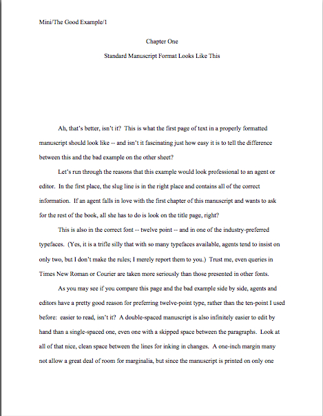
The mysteriously mysterious strictures of standard format, part IV: drawing some lines in the sand

seagull in the sand

I’m so sorry, everyone — my website experienced a wee meltdown late Thursday night. Some hidden toggle evidently got switched, and ever since, apparently, it has been impossible to post a comment on my last post. Rather unfriendly, wasn’t it, since I’d specifically asked all of you to comment with questions?

Rest assured, any reluctance to hear from you rested firmly on the technology side, not the human one. So please, feel free to comment away.

This would be an especially good time to bring up any long-smoldering concerns about formatting, actually, since I’m going to be devoting next week’s posts to showing you how standard format for manuscripts looks on the printed page. Some of my best examples were derived from readers’ questions; this time around, in fact, in response to a recent reader’s request, I’m going to be adding an entire post on how to format a book proposal.

So if there’s a principle we’ve discussed within the last few days that you’d like to see in action, please, don’t be shy.

Today, I’m going to be wrapping up my theoretical discussion of standard format. In the interest of having all of the rules listed in a single post, let’s recap what we’ve already covered.

(1) All manuscripts should be printed or typed in black ink and double-spaced, with one-inch margins around all edges of the page, on 20-lb or better white paper.

(2) All manuscripts should be printed on ONE side of the page and unbound in any way.

(3) The text should be left-justified, NOT block-justified. By definition, manuscripts should NOT resemble published books in this respect.

(4) The preferred typefaces are 12-point Times, Times New Roman, Courier, or Courier New — unless you’re writing screenplays, in which case you may only use Courier. For book manuscripts, pick one (and ONLY one) and use it consistently throughout your entire submission packet.

(5) The ENTIRE manuscript should be in the same font and size. Industry standard is 12-point.

(6) Do NOT use boldface anywhere in the manuscript BUT on the title page — and not even there, necessarily.

(7) EVERY page in the manuscript should be numbered EXCEPT the title page.

(8) Each page of the manuscript (other than the title page) should have a standard slug line in the header. The page number should appear in the slug line, not anywhere else on the page.

(9) The first page of each chapter should begin a third of the way down the page, with the chapter title appearing on the FIRST line of the page, NOT on the line immediately above where the text begins.

(10) Contact information for the author belongs on the title page, NOT on page 1.

(11) Every submission should include a title page, even partial manuscripts.

(12) The beginning of EVERY paragraph of text should be indented .5 inch. No exceptions, ever.

(13) Don’t skip an extra line between paragraphs, except to indicate a section break.

(14) NOTHING in a manuscript should be underlined. Titles of songs and publications, as well as words in foreign languages and those you wish to emphasize, should be italicized.

All of those make sense, I hope, at least provisionally? Excellent. Moving on…

(15) All numbers under 100 should be written out in full: twenty-five, not 25. But numbers over 100 should be written as numbers: 1,243, not one thousand, two hundred and forty-three.

I’m surprised how often otherwise industry-savvy aspiring writers are unaware of this particular rule, but the instinct to correct it in a submission is universal in professional readers. Translation: NOT doing it will not help you win friends and influence people at agencies and publishing houses.

Like pointing out foreign-language words with special formatting, this formatting rule was originally for the benefit of the manual typesetters. When numbers are entered as numbers, a single slip of a finger can result in an error, whereas when numbers are written out, the error has to be in the inputer’s mind.

There are only two exceptions to this rule: dates and, of course, page numbers. Thus, a properly-formatted manuscript dealing with events on November 11 would look like this on the page:

ABBOTT/THE GREAT VOYAGE/82

On November 11, 1492, fifty-three scholars divided into eighteen parties in preparation for sailing to Antarctica. It took 157 rowboats ten trips apiece to load all of their books, papers, and personal effects onboard.

And not like this:

ABBOTT/THE GREAT VOYAGE/Eighty-two

On November eleventh, fourteen hundred and ninety-two, fifty-three scholars divided into eighteen parties in preparation for sailing to Antarctica. It took a hundred and fifty-seven rowboats ten trips apiece to load all of their books, papers, and personal effects onboard.

Do I see some hands waving in the air? “But Anne,” inveterate readers of newspapers protest, “I’m accustomed to seeing numbers like 11, 53, 18, and 10 written as numerals in print. Does that mean that when I read, say, a magazine article with numbers under 100 depicted this way, that some industrious editor manually changed all of those numbers after the manuscript was submitted?”

No, it doesn’t — although I must say, the mental picture of that poor, unfortunate soul assigned to spot and make such a nit-picky change is an intriguing one. What you have here is yet another difference between book manuscript format and, well, every other kind of formatting out there: in journalism, they write out only numbers under 10.

Unfortunately, many a writing teacher out there believes that the over-10 rule should be applied to all forms of writing, anywhere, anytime. Yes, this is true for newspaper articles, where space is at a premium, but in a book manuscript, it is WRONG, WRONG, WRONG.

Did I mention it was wrong? And that my aged eyes have actually seen contest entries knocked out of finalist consideration over this particular issue? More than once? And within the year?

AP style differs from standard format in several important respects, not the least being that in standard format (as in other formal presentations in the English language), the first letter of the first word after a colon should NOT be capitalized, since technically, it’s not the beginning of a new sentence. I don’t know who introduced the convention of post-colon capitalization, but believe me, I’m not the only one who read the submissions of aspiring book writers for a living that’s mentally consigned that language subversive to a pit of hell that would make even Dante avert his eyes in horror.

That’s the way we nit-pickers roll. We like our formatting and grammatical boundaries firm.

Heck, amongst professional readers, my feelings on the subject are downright mild. I’ve been in more than one contest judging conference where tables were actually banged and modern societies deplored. Trust me, you don’t want your entry to be the one that engenders this reaction.

So let’s all chant it together, shall we? The formatting and grammatical choices you see in newspapers will not necessarily work in manuscripts or literary contest entries.

Everyone clear on that? Good, because — are you sitting down, lovers of newspapers? — embracing journalistic conventions like the post-colon capital and writing out only numbers under ten will just look like mistakes to Millicent and her ilk on the submission page.

And no, there is no court of appeal for such decisions; proper format, like beauty, is very much in the eye of the beholder. So if you were planning to cry out, “But that’s the way USA TODAY does it!” save your breath.

Unfortunately, although my aforementioned heart aches for those of you who intended to protest, “But how on earth is an aspiring writer to KNOW that the standards are different?” this is a cry that is going to fall on deaf ears as well. Which annoys me, frankly. The sad fact is, submitters rejected for purely technical reasons are almost never aware of it. With few exceptions, the rejecters will not even take the time to scrawl, “Take a formatting class!” or “Next time, spell-check!” on the returned manuscript. If a writer is truly talented, they figure, she’ll mend her ways and try again.

And that, in case any of you had been wondering, is why I revisit the topic of standard format so darned often. How can the talented mend their ways if they don’t know how — or even if — their ways are broken?

(16) Dashes should be doubled — rather than using an emdash — with a space at either end. Hyphens are single and are not given extra spaces at either end, as in self-congratulatory.

Yes, yes, I know: you’ve probably heard that this rule is obsolete, too, gone the way of underlining. The usual argument for its demise: books no longer preserve these spaces, for reasons of printing economy, so many writing teachers tell their students just to go ahead and eliminate them. An AP-trained teacher will tell you to use the longer emdash, as will the Chicago Manual of Style.

In this, however, they are wrong, at least as far as manuscripts are concerned. (You’re starting to get used to that, right?)

Standard format is invariable upon this point: a doubled dash with a space on either end is correct; anything else is not. And yes, it is indeed a common enough pet peeve that the pros will complain to one another about how often submitters get it wrong.

They also whine about how often they see manuscripts where this rule is applied inconsistently: two-thirds of the dashes doubled, perhaps, sometimes with a space at either end and sometimes not, with the odd emdash and single dash dotting the text as well. It may seem like a minor, easily-fixable phenomenon from the writer’s side of the submission envelope, but believe me, inconsistency drives people trained to spot minor errors nuts.

Your word-processing program probably changes a double dash to an emdash automatically, but CHANGE IT BACK. If only as a time-saver: any agent would make you do this before agreeing to submit your manuscript to an editor, so you might as well get into this salutary habit as soon as possible.

(17) Adhere to the standard rules of punctuation and grammar, not what it being done on the moment in newspapers, magazines, books, or on the Internet — including the rule calling for TWO spaces after every period and colon.

In other words, do as Strunk & White say, not what others do. Assume that Millicent graduated with honors from the best undergraduate English department in the country, taught by the grumpiest, meanest, least tolerant stickler for grammar that ever snarled at a student unfortunate enough to have made a typo, and you’ll be fine.

Imagining half the adults around me in my formative years who on the slightest hint of grammatical impropriety even in spoken English will work, too.

The primary deviation I’ve been seeing in recent years is leaving only one space, rather than the standard two, after a period. Yes, printed books often do this, to save paper (the fewer the spaces on a page, the more words can be crammed onto it, right?). A number of writing-advice websites, I notice, and even some writing teachers have been telling people that this is the wave of the future — and that adhering to the two-space norm makes a manuscript look obsolete.

At the risk of sounding like the harsh grammar-mongers of my youth, poppycock. Although some agents and editors do now request eliminating the second space at the submission stage, the doubled space is still the norm. Agents, very good ones, routinely submit manuscripts with doubled spaces to editors, also very good ones, all the time. Successfully.

So when in doubt, adhere to the rules of English. Unless, of course, you happen to be submitting to one of those people who specifically asks for single spaces, in which case, you’d be silly not to bow to their expressed preferences. (Sensing a pattern here?)

Fortunately, for aspiring writers everywhere, those agents who do harbor a strong preference for the single space tend not to keep mum about it. If they actually do tell their Millicents to regard a second space as a sign of creeping obsolescence, chances are very, very good that they’ll mention that fact on their websites.

Double-check before you submit. If the agent of your dreams has not specified, double-space.

Why should that be the default option, since proponents of eliminating the second space tend to be so very vocal? Those who cling to the older tradition are, if anything, more vehement.

Why, you ask? Editing experience, usually. Preserving that extra space after each sentence in a manuscript makes for greater ease of reading, and thus editing. As anyone who has ever edited a long piece of writing can tell you, the white space on the page is where the comments — grammatical changes, pointing out flow problems, asking, “Does the brother really need to die here?” — go.

Less white space, less room to comment. It really is that simple.

Oh, and it drives the grammar-hounds nuts to hear that time-honored standards are being jettisoned in the name of progress. “What sane human being,” they ask through gritted teeth, “seriously believes that replacing tonight with tonite, or all right with alright constitutes progress? Dropping the necessary letters and spaces doesn’t even save significant page space!”

Those are some pretty vitriol-stained lines in the sand, aren’t they?

Let’s just say that until everyone in the industry makes the transition editing in soft copy — which is, as I have pointed out many times in this forum, both harder and less efficient than scanning a printed page — the two-space rule is highly unlikely to change universally. Just ask a new agent immediately after the first time he’s submitted to an old-school senior editor: if he lets his clients deviate from the norms, he’s likely to be lectured for fifteen minutes on the rules of the English language.

I sense that some of you are starting to wring your hands and rend your garments in frustration. “I just can’t win here! Most want it one way, a few another. I’m so confused about what’s required that I keep switching back and forth between two spaces and one while I’m typing.”

I hate to be the one to break it to you, but inconsistent formatting is likely to annoy both sides of the aisle. Whichever choice you embrace, be consistent about it throughout your manuscript; don’t kid yourself that an experienced professional reader isn’t going to notice if you sometimes use one format, sometimes the other.

He will. So will a veteran contest judge. Pick a convention and stick with it.

But don’t fret over it too much. This honestly isn’t as burning a debate amongst agents and editors as many aspiring writers seem to think. Both ways have advocates, and frankly, there are plenty of agents out there who report that they just don’t care.

As always: check before you submit. If the agent’s website, contest listing, and/or Twitter page doesn’t mention individual preferences, assume s/he’s going to be submitting to old-school editors and retain the second space.

And be open to the possibility — brace yourselves; you’re not going to like this — that you may need to submit your manuscript formatted one way for a single agent on your list, and another for the other nineteen.

I told you that you weren’t going to like it.

(18) Turn off the widow/orphan control; it gives pages into an uneven number of lines.

That one’s pretty self-explanatory, isn’t it? Think of it as my Valentine’s Day present to you.

What, too practical? You would have preferred something made out of lace or chocolate?

There you have it: the rules. Practice them until they are imbedded into your very bones, my friends: literally every page of text you submit to an agent, editor, or literary contest (yes, including the query letter and synopsis) for the rest of your professional life should be in standard format.

Okay, so maybe that’s not the most romantic view of the future imaginable, but we’re all about practicality here at Author! Author! That, and drawing some much-needed lines in the sand.

Happy Valentine’s and Presidents’ Days, everybody. Keep up the good work!
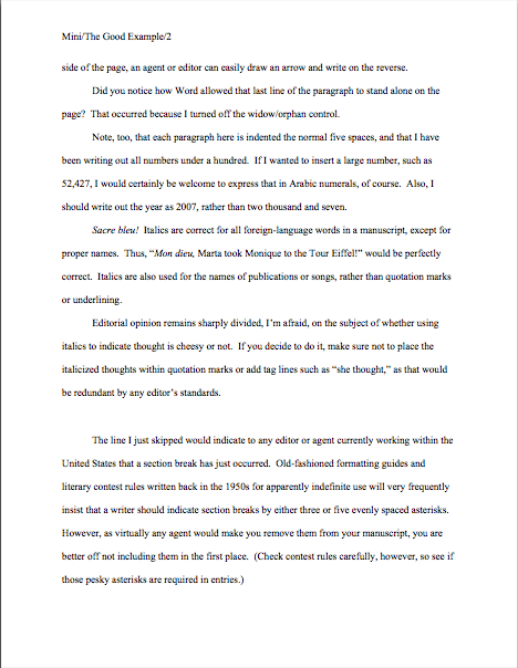
The mysteriously mysterious strictures of standard format, part III: pretty is as pretty does

yard with petals

Another pretty picture for you today, campers, to soothe the fractured soul and as a refresher for those you trapped in that magnificent East Coast blizzard. As Shelley wrote, if winter comes, can spring be far behind?

It’s also a reward for virtue, both for those brave enough to be learning the contours of standard format for the first time and those dedicated many who stick with it every time I revisit the topic. Believe me, feedback and questions from both categories of intrepid reader have made Author! Author! an infinitely better, more useful, and friendlier place for writers. You all deserve far more than a nice photo of my back yard, of course, but I am, as always, most grateful.

So here’s another gift, a little trifle that I was going to save for the end of this series: working your way first through this series, then through your manuscript, while undoubtedly time-consuming, will in the long term save you a whole heck of a lot of time.

Was that massive sound wave that just washed over my studio two-thirds of you suddenly crying, “Huh?”

It’s true, honest. While the applying these rules to a manuscript already in progress may seem like a pain, practice makes habit. After a while, the impulse to conform to the rules of standard format becomes second nature for working writers. Trust me, it’s a learned instinct that can save a writer oodles of time and misery come deadline time.

How, you ask? Well, to a writer for whom proper formatting has become automatic, there is no last-minute scramble to change the text. It came into the world correct — which, in turn, saves a writer revision time. Sometimes, those conserved minutes and hours can save the writer’s proverbial backside as well.

Scoff not: even a psychic with a very, very poor track record for predictions could tell you that there will be times in your writing career when you don’t have the time to proofread as closely as you would like, much less check every page to make absolutely certain it looks right. Sometimes, the half an hour it would take to reformat a inconsistent manuscript can make the difference between making and missing a contest deadline.

Or between delighting or disappointing the agent or editor of your dreams currently drumming her fingers on her desk, waiting for you to deliver those minor requested changes to Chapter 7. (You know, that lighthearted little revision changing the protagonist’s sister Wendy to her brother Ted; s/he is no longer a corporate lawyer, but a longshoreman, and Uncle George dies not of a heart attack, but of 12,000 pounds of under-ripe bananas falling on him from a great height when he goes to the docks to tell Ted that Great-Aunt Mandy is now Great-Uncle Armand. If only Ted had kept a better eye on that load-bearing winch!)

Or, for nonfiction writers, delivering the finished book you proposed by the date specified in your publishing contract. Trust me, at any of these junctures, the last thing you’ll want to have to worry about are consistent margins.

Perversely, this is a kind of stress that makes writers happy — perhaps not in the moment we are experiencing it, but on a career-long basis. The more successful you are as a writer — ANY kind of writer — the more often you will be in a hurry, predictably. No one has more last-minute deadlines than a writer with a book contract.

Just ask any author whose agent is breathing down her neck after a deadline has passed. Especially if the writer didn’t know about the deadline until it had already come and gone. (Oh, how I wish I were kidding about that.) And don’t even get me started on the phenomenon of one’s agent calling the day after Thanksgiving to announce, “I told the editor that you could have the last third of the book completely reworked by Christmas — that’s not going to be a problem, is it?”

Think you’re going to want to be worrying about your formatting then? Believe me, you’re going to be kissing yourself in retrospect for learning how to handle the rote matters right the first time, so you can concentrate on the hard stuff. (What would many tons of bananas dropped from that height look like, anyway?)

That’s the good news about how easily standard format sinks into one’s very bones. The down side, is that once people — like, say, the average agent, editor, or Millicent — have spent enough time staring at professionally-formatted manuscripts, anything else starts to look, well, unprofessional.

The implications of this mindset are vast. First, as I mentioned yesterday, if an agent or editor requested pages, it would behoove you to send them in standard format, unless s/he SPECIFICALLY tells you otherwise. Ditto with contest entries: it’s just what those who read manuscripts professionally expect to see. It’s so much assumed that s/he probably won’t even mention it, because most agents and editors believe that these rules are already part of every serious book-writer’s MO.

So much so, in fact, that agents who’ve read my blog sometimes ask me why I go over these rules so often. Doesn’t everyone already know them? Isn’t this information already widely available? Aren’t there, you know, books on how to put a manuscript together?

I’ll leave those of you reading this post to answer those for yourselves. Suffice it to say that our old pal Millicent the agency screener believes the answers to be: because I like it, yes, yes, and yes.

Second, this mindset means that seemingly little choices like font and whether to use a doubled dash or an emdash — of which more below — can make a rather hefty difference to how Millicent perceives a manuscript. (Yes, I know: I point this out with some frequency. However, as it still seems to come as a great surprise to the vast majority aspiring writers; I can only assume that my voice hasn’t been carrying very far the last 700 times I’ve said it.)

I hate to be the one to break it to you, but professional-level critique is HARSH; it’s like having your unmade-up face examined under a very, very bright light by someone who isn’t afraid to hurt your feelings by pointing out flaws. In the industry, this level of scrutiny is not considered even remotely mean.

Actually, if your work generates tell-it-like-it-is feedback from a pro, you should be a bit flattered — it’s how they habitually treat professional authors. Yet the aforementioned vast majority of submitting writers seem to assume, at least implicitly, that agents and their staffs will be hugely sympathetic readers of their submissions, willing to overlook technical problems because of the quality of the writing or the strength of the story.

I’m not going to lie to you, though — every once in a very, very long while, the odd exception that justifies this belief does in fact occur. If the writing is absolutely beautiful, or the story is drool-worthy, but the formatting is all akimbo and the spelling is lousy, there’s an outside chance that someone at an agency might be in a saintly enough mood to overlook the problems and take a chance on the writer.

You could also have a Horatio Alger moment where you find a billionaire’s wallet, return it to him still stuffed with thousand-dollar bills, and he adopts you as his new-found son or daughter. Anything is possible, of course.

But it’s probably prudent to assume, when your writing’s at stake, that yours is not going to be the one in 10,000,000 exception.

Virtually all of the time, an agent, editor, contest judge, or screener’s first reaction to an improperly-formatted manuscript is the same as to one that is dull but technically perfect: speedy rejection. From a writerly point of view, this is indeed trying. Yet as I believe I may have mentioned once or twice before, I do not run the universe, and thus do not make the rules.

Sorry. No matter how much I would like to absolve you from some of them, it is outside my power. Take it up with the fairy godmother who neglected to endow me with that gift at birth, okay?

Until you have successfully made your case with her, I’m going to stick to using the skills that she did grant me, a childhood surrounded by professional writers and editors who made me learn to do it the right way the first time. As in my fifth-grade history paper was in standard format; I can still hear my mother blithely dismissing my poor, befuddled teacher’s protests that none of the other kids in the class were typing their papers with, “Well, honestly, if Annie doesn’t get into the habit of including slug lines now, where will she be in twenty years?”

Where, indeed? The strictures of standard format are hardly something that she would have wanted me to pick up on the street, after all.

So let’s start inculcating some lifetime habits, shall we? To recap from earlier posts:

(1) All manuscripts should be printed or typed in black ink and double-spaced, with one-inch margins around all edges of the page, on 20-lb or better white paper.

(2) All manuscripts should be printed on ONE side of the page and unbound in any way.

(3) The text should be left-justified, NOT block-justified. By definition, manuscripts should NOT resemble published books in this respect.

(4) The preferred typefaces are 12-point Times, Times New Roman, Courier, or Courier New — unless you’re writing screenplays, in which case you may only use Courier. For book manuscripts, pick one (and ONLY one) and use it consistently throughout your entire submission packet.

(5) The ENTIRE manuscript should be in the same font and size. Industry standard is 12-point.

(6) Do NOT use boldface anywhere in the manuscript BUT on the title page — and not even there, necessarily.

(7) EVERY page in the manuscript should be numbered EXCEPT the title page.

(8) Each page of the manuscript (other than the title page) should have a standard slug line in the header. The page number should appear in the slug line, not anywhere else on the page.

(9) The first page of each chapter should begin a third of the way down the page, with the chapter title appearing on the FIRST line of the page, NOT on the line immediately above where the text begins.

(10) Contact information for the author belongs on the title page, NOT on page 1.

(11) Every submission should include a title page, even partial manuscripts.

Everyone clear on all that? If not, this would be a dandy time to pipe up with questions. While you’re formulating ‘em, let’s move on.

(12) The beginning of EVERY paragraph of text should be indented .5 inch. No exceptions, ever.
The usual way this rule is expressed — and, indeed, the way I expressed it as recently as the last time I went over standard format — is indent every paragraph 5 spaces. MS Word, however, the standard word processing program of the publishing industry, automatically sets its default first tab at .5 inch.. Yet unless you happen to be using an unusually large typeface like Courier, you’ve probably noticed that hitting the space bar five times will not take you to .5 inches away from the left margin; in Times New Roman, it’s more like 8 spaces.

This discrepancy leaves some aspiring writers perplexed, understandably. Clearly, a choice needed to be made here — so why is standard indentation at .5 inch now, rather than at five characters?

History, my dears, history: the five spaces rule is from the days of typewriters. Back in the days when return bars roamed the earth, there were only two typefaces commonly found on typewriters, Pica and Elite. They yielded different sizes of type (Pica roughly the equivalent of Courier, Elite more or less the size of Times New Roman), but as long as writers set a tab five spaces in, and just kept hitting the tab key, manuscripts were at least consistent.

After the advent of the home computer, however, computer-generated manuscripts have become the norm. The array of possible typefaces exploded. Rather than simply accepting that every font would have slightly different indentations, the publishing industry (and the manufacturers of Word) simply came to expect that writers everywhere would keep hitting the tab key, rather than hand-spacing five times at the beginning of each paragraph. The result: the amount of space from the left margin became standardized, so that every manuscript, regardless of font, would be indented the same amount.

So why pick .5 inch as the standard indentation? Well, Elite was roughly the size of Times New Roman, 12 characters per inch. Pica was about the size of Courier, 10 characters per inch. The automatic tab at .5 inch, therefore, is pretty much exactly five spaces from the left margin in Pica.

All of which is a long-winded way of saying that in this instance, at least, Word’s default settings are the writer’s friend. Keep on hitting that tab key.

Which brings me back to the no exceptions, ever, part: NOTHING you send to anyone in the industry should EVER be in block-style business format. And for a pretty good reason: despite the fact that everyone from CEOs to the proverbial little old lady from Pasadena has been known to use block format from time to time (blogs are set up to use nothing else, right?), technically, non-indented paragraphs are not proper for English prose.

Period. That being the case, what do you think Millicent’s first reaction to a non-indented page 1 is likely to be?

That loud clicking sound that some of you may have found distracting was the sound of light bulbs going on over the heads of all of those readers who have been submitting their manuscripts (and probably their queries as well) in block paragraphs. Yes, what all of you newly well-lit souls are thinking right now is quite true: those submissions may well have been rejected at first glance by a Millicent in a bad mood. (And when, really, is she not?)

Yes, even if the writer submitted those manuscripts via e-mail. (See why I’m always harping on how submitting in hard copy, or at the very worst as a Word attachment, is inherently better for a submitter?) And that’s a kinder response than Mehitabel the veteran contest judge would have had: she would have looked at a block-formatted first page and sighed, “Well, that’s one that can’t make the finals.”

Why the knee-jerk response? Well, although literacy has become decreasingly valued in the world at large, the people who have devoted themselves to bringing good writing to publications still tend to take it awfully darned seriously. To publishing types, any document with no indentations, skipping a line between paragraphs, and the whole shebang left-justified carries the stigma of (ugh) business correspondence — and that’s definitely not good.

Why, you ask? Well, do you really want the person you’re trying to impress with your literary genius to wonder about your literacy?

I thought not. And which do you think is going to strike format-minded industry professionals as more literate, a query letter in business format or one in correspondence format (indented paragraphs, date and signature halfway across the page, no skipped line between paragraphs)?

Uh-huh. And don’t you wish that someone had told you THAT before you sent out your first query letter?

Trust me on this one: indent your paragraphs in any document that’s ever going to pass under the nose of anyone even remotely affiliated with the publishing industry.

Including the first paragraph of every chapter, incidentally. Yes, published books — particularly mysteries, I notice — often begin chapters and sections without indentation. But again, that lack of indentation was the editor’s choice, not the author’s, and copying it in a submission, no matter to whom it is intended as an homage, might get your work knocked out of consideration.

(13) Don’t skip an extra line between paragraphs, except to indicate a section break.

I’m serious about that being the ONLY exception: skip an extra line to indicate a section break in the text, and for no other reason.

Really, this guideline is just common sense — so it’s a continual surprise to professional readers how often we see manuscripts that are single-spaced with a line skipped between paragraphs (much like blog format, seen here in all of its glory).

Why surprising? Well, since the entire manuscript should be double-spaced with indented paragraphs, there is no need to skip a line to indicate a paragraph break. (Which is, in case you were not aware of it, what a skipped line between paragraph means in a single-spaced or non-indented document.) In a double-spaced document, a skipped line means a section break, period.

Also — and this is far from insignificant, from a professional reader’s point of view — it’s practically impossible to edit a single-spaced document, either in hard copy or on screen. The eye skips between lines too easily, and in hard copy, there’s nowhere to scrawl comments like Mr. Dickens, was it the best of times or was it the worst of times? It could hardly have been both!

So why do aspiring writers so often blithely send off manuscripts with skipped lines, single-spaced or otherwise? My guess would be for one of two reasons: either they think business format is proper English formatting (which it isn’t) or they’re used to seeing skipped lines in print. Magazine articles, mostly.

But — feel free to shout it along with me now; you know the words — a professional book manuscript or proposal is not, nor should it be, formatted like any published piece of writing.

A few hands have been waving urgently in the air since I started this section. “But Anne!” those of you who have seen conflicting advice point out, “I’ve always heard that there are specific markers for section breaks! Shouldn’t I, you know, use them?”

I wouldn’t advise including these throwbacks to the age of typewriters — the * * * section break is no longer necessary in a submission to an agency or publishing house, nor is the #. So unless you’re entering a contest that specifically calls for them, or the agency to which you’re planning to submit mentions a preference for them in its submission requirements, it’s safe to assume that professional readers won’t expect to see them in a book manuscript or proposal.

Why were these symbols ever used at all? To alert the typesetter that the missing line of text was intentional.

That being said, although most Millicents will roll their eyes upon seeing one of these old-fashioned symbols, they tend not to take too much umbrage at it, because the # is in fact proper for short story format. A writer can usually get away with including them. However, since every agent I know makes old-fashioned writers take these markers out of book manuscripts prior to submission, it’s going to save you time in the long run to get into the habit of trusting the reader to understand what a skipped line means.

(Actually, I do know a grand total of one agent who allows his clients to use short-story formatting in book manuscripts. But only if they write literary fiction and have a long resume of short story publications. He is more than capable of conveying this preference to his clients, however.)

One caveat to contest-entrants: do check contest rules carefully, because some competitions still require * or #. You’d be amazed at how seldom many long-running literary contests update their rules.

(14) NOTHING in a manuscript should be underlined. Titles of songs and publications, as well as words in foreign languages and those you wish to emphasize, should be italicized.

Fair warning: if you consult an old style manual (or a website that is relying upon an old style manual), you may be urged to underline the words and phrases mentioned above. And just so you know, anyone who follows AP style will tell you to underline these. As will anyone who learned how to format a manuscript before the home computer became common, for the exceedingly simple reason that the average typewriter doesn’t feature italic keys as well as regular type; underlining used to be the only option.

DO NOT LISTEN TO THESE TEMPTERS: AP style is for journalism, not book publishing. They are different fields, and have different standards. And although I remain fond of typewriters — growing up in a house filled with writers, the sound used to lull me to sleep as a child — the fact is, the publishing industry now assumes that all manuscripts are produced on computers. In Word, even.

So DO NOT BE TEMPTED. In a submission for the book industry, NOTHING should be underlined. Ever.

Professional readers are AMAZED at how often otherwise perfectly-formatted manuscripts get this rule backwards — seriously, it’s a common topic of conversation at the bar that’s never more than 100 yards from any writers’ conference in North America. (You already knew that the conference center’s bar is the single best place to meet most of the agents, editors, and authors presenting at the average writers’ conference, didn’t you?) According to this informal and often not entirely sober polling data, an aspiring writer would have to be consulting a very, very outdated list of formatting restrictions to believe that underlining is ever acceptable.

Again, since your future agent is going to make you change all of that underlining to italics anyway, you might as well get out of the habit of underlining now. Like, say, before submitting your manuscript — because if Millicent happens to be having a bad day (again, what’s the probability?) when she happens upon underlining in a submission, she is very, very likely to roll her eyes and think, “Oh, God, not another one.”

Italics are one of the few concessions manuscript format has made to the computer age — again, for practical reasons: underlining uses more ink than italics in the book production process. Thus, italics are cheaper. So when should you use them and why?

(a) The logic behind italicizing foreign words is very straightforward: you don’t want the agent of your dreams to think you’ve made a typo, do you?

(b) The logic behind using italics for emphasis, as we’ve all seen a million times in print, is even more straightforward: writers used to use underlining for this. So did hand-writers.

(c) Some authors like to use italics to indicate thought, but there is no hard-and-fast rule on this. Before you make the choice, do be aware that many agents and editors actively dislike this practice. Their logic, as I understand it: a good writer should be able to make it clear that a character is thinking something, or indicate inflection, without resorting to funny type.

I have to confess, as a reader, I’m with them on that last one, but that’s just my personal preference. There are, however, many other agents and editors who think it is perfectly fine — but you are unlikely to learn which is which until after you have sent in your manuscript, alas.

Which means — again, alas — there is no fail-safe for this choice. Sorry. You submit your work, you take your chances.

I have a few more rules to cover, but this seems like a dandy place to break for the day. Don’t worry if you’re having trouble picturing what all of this might look like on the page: next week, I’m going to be showing you so many images of actual manuscript pages that you’re going to feel as if you’d gotten locked inside Millicent’s mailbag.

You want to be able to recognize a pretty manuscript when you see one, right? Keep up the good work!

What was that again? Or, I did not know it then, but a Gila monster was about to come of a clear blue sky and change my life forever

massive-kite

I passed through two different airports today, my friends — more travel on behalf of the Grumpy Relative, who continues to ail, alas — so I can state with authority that metal detectors in at least two states are cranked up farm far past normal levels of scrutiny. How do I know? Because in both airports, rows of busty women were being re-scanned while those with dinner plate-sized belt buckles were waltzing through security.

That’s right, folks: underwires are setting off metal detectors again. I tremble for democracy.

Back to business, now that I’m home again. For the past week or so, I have been talking about ways to self-edit your work in order to pick up the pace. In pursuit of that estimable goal, I went on a tear yesterday about redundancy, particularly word and phrase repetition. And you, bless your persistent souls, bore with me through it.

Today, I shall shift gears a little, to focus on another pet peeve that makes Millicent the agency screener poke her pen through the page where it appears because she just can’t help herself: concept repetition.

Again and again (and again in manuscripts, good narratives get sidetracked by a compulsion to explain what has just occurred, even if the original telling was quite clear, as though the author did not believe that the specifics of an incident, exchange, or character revelation could possibly have conveyed his intention for the scene. Like so:

Herman blanched. “You can’t possibly mean that, Susan. You wouldn’t go to the police.”

“Yeah?” Susan drew herself up to her full seven and a half feet. “Just watch me, Bozo.”

Herman was frightened — really frightened, even more than the time when his ex-wife had threatened to season his veal stew with liberal dashes of arsenic if he repeated that joke about the guy who walked into a bar with a duck on his head just one more time. What if Susan really meant it this time? What would he do? What would he tell the police? More seriously, would the police arrest him on Susan’s word alone? Strange, how the mere fact that she was glaring down at him left him even more frightened.


See the problem here — or rather, the problems? This excerpt utilizes yesterday’s faux pas, word repetition (Herman’s sure frightened a lot, isn’t he? And how many ways does the reader need to be informed that Susan is freakishly tall?). It also, from Millicent’s perspective, adds conceptual insult to literal redundancy by devoting a paragraph to explaining an emotional response that was already clear from blanched in line 1: Herman was scared.

From an editing perspective, that means almost half of the verbiage here could be cut without affecting the meaning of the passage at all. More than half, if the person doing the editing trusted the reader enough to assume that the mere mention of telling the police something implies the possibility of subsequent arrest:

Herman blanched. “You can’t possibly mean that, Susan. You wouldn’t go to the police.”

“Yeah?” Susan drew herself up to her full seven and a half feet. “Just watch me, Bozo.”

What if she really meant it this time? Would the police take her word over his?


Not as much fun as the original version, perhaps, but you must admit that it gets the job done, plot-wise. In a scant 47 words, rather than 126.

Out of context, that may not seem like a significant reclamation of page space, but to an aspiring writer whose magnum opus is 401 pages when his brand-new agent insists that she cannot possibly sell the book if it breaks the infamous 100,000 word barrier (i.e., 400 pages in Times New Roman in standard format), a several-line cut this easy to achieve is going to seem like manna from heaven.

Pop quiz: did you catch the other type of conceptual redundancy that sets professional readers’ teeth on edge in that last paragraph? No? Well, perhaps Millicent’s reaction will help you find it: “Oh, for Pete’s sake! Where ELSE does manna come from?”

Yes, professional readers’ hackles often are that easily raised; remember, these people are trained to read CLOSELY. And since it’s Millicent’s job to narrow down the potential client pool from amongst the many, many submissions her agency receives to a small handful, it’s not uncommon for even a single flash of annoyance to be enough to knock a submission out of the running.

While you’re hyperventilating over that last one, I might as well add: the same holds true of contest entries. If anything, contest judges tend to take umbrage a trifle more quickly than Millicent.

Why the hair-trigger rejection impulse? Long-time readers of this blog, pull out your hymnals and join in our perennial chorus: because any well-respected literary contest, like any well-established agency, will receive enough perfectly-formatted, well-written manuscripts free of typos, logic problems, and redundancy that those screening them can afford to read with an unforgiving eye. Seldom, if ever, are contest judges, agents, or editors looking for fixer-upper manuscripts; they want something already in excellent shape.

Depressing? Heck, yes — so why am I risking ruining your day by bringing it up? Because an aspiring writer who walks into contest entry prep or submission to an agency aware of these facts is far more likely to succeed than one who does not. If s/he acts upon that information in the revision process, at least.

Everyone with me so far? I’m going to assume that all of that hyperventilating out there indicates a yes.

Which renders this a dandy time to bring up a less common but still worth mentioning type of conceptual redundancy, summarizing what is about to happen BEFORE the scene occurs, often in the dramatic-sounding historical future tense: Little did I know that this was my last day of work or What was to come was still worse, and similar transitional sentiments.

Why is beginning a scene or story with this kind of sentence problematic in a submission? It’s jarring to the editorial eye, because it’s telling the story backwards: conclusion first, followed by how one gets there. It’s hard to build suspense if the reader already knows the outcome, after all. Do it too many times in a row, and the narrative risks yanking the reader out of the story altogether.

Memoirists are particularly fond of this sort of foreshadowing. As in this sterling example:

I had no way of knowing that the events of the next day would shatter my childish innocence forever. When I got up in the morning, the sun seemed to be shining upon me beneficently.

I ambled downstairs to the breakfast nook, as usual, blithely unaware of the horror that was going to befall me before I finished my bowl of cornflakes decorated with fresh strawberries hand-sliced by the kindly soul I knew at the time as Mom. Or was she?

I was soon to find out. “Sit down, Georgie,” she said, pouring milk over my breakfast. “I have something particularly shocking to tell you.”


Enough, already: by now, no reader on the face of God’s green earth is going to find what comes next surprising. The build-up has been too great.

And frankly, totally unnecessary, from an editorial perspective. Like most professional readers, I like to be surprised when childish innocence is shattered — don’t warn me in advance.

And is there really a reader out there who needs to be told that a character got up in the morning to have breakfast? Tell me if it’s the dead of night or 5 pm, but if it’s not, trust me to be able to put two and two together and not come up with the square root of 2,367.

How might a savvy self-editor streamline in this passage to avoid letting the proverbial cat out of the bag about the genuine surprise while not over-explaining the obvious? Hint: virtually any revelation is more startling, not less, if it comes out of a relatively clear blue sky:

When I got up, the sun was shining upon me beneficently. I ambled downstairs to the breakfast nook.

As usual, Mom was decorating my bowl of cornflakes with hand-sliced fresh strawberries. “Sit down, Georgie,” she said, pouring milk over my breakfast. “I have something particularly shocking to tell you. I’m not your mother; in fact, I’m not even human. I’m a Gila monster that attained the ability to speak English through the freak radioactivity accident that claimed the life of your real mother.”


Come on, admit it: you didn’t see that coming, did you?

See a pattern developing in the before versions vs. the after versions? At base, unnecessary narrative summary, before or after the fact, are indicative of writerly insecurity. How so? Well, to a professional reader’s eye, they demonstrate that the writer is having a hard time believing that his target reader can follow the prevailing logic.

In other words, the writer just doesn’t trust the reader’s intelligence, so he explains more than once what is going on, just to be sure. As in:

Shuddering, Hermione turned her back upon the human sacrifice. It offended her sensibilities as a civilized person. Where she came from, people seeking celestial intervention merely scolded God in private for not helping them more swiftly.


I may be leaping to unwarranted conclusions here, but I would assume that the number of potential readers whose sensibilities would NOT be offended by the sight of a human sacrifice is small enough that a contemporary writer might safely regard their critique as negligible. Personally, I am apt to assume that my readers are not given to sacrificing human, goat, or anything else that wiggles, so I would trim this passage accordingly:

Shuddering, Hermione turned her back upon the human sacrifice. Where she came from, people seeking celestial intervention merely scolded God in private for not helping them more swiftly.


Has the passage genuinely lost meaning through this edit? I think not — but it has lost a line of text. And on the day when your agent calls you up and tells you, “The editor says she’ll take the book if you can make it 5,000 words shorter!” you’ll be grateful for every single expendable line.

Sometimes, the author’s mistrust of the reader’s level of comprehension is so severe that she goes so far as to recap a particular set of facts’ importance as if the paragraph in question were in the synopsis, rather than in the text. For example:

“I canb he-ah you vewy wew,” Doris said, wiping her nose for the tenth time. She was prone to allergies that stuffed up her nose and rendered her vision blurry; moving here with her husband, Tad, her two adorable children, Newt (6) and Stephanie (8), and their pet ocelot Rex into a house in the middle of a field of mustard flowers, then, had probably been a poor idea.


While such a paragraph might work very well in a synopsis, serving as an agent or editor’s first introduction to Doris and her family, but in a manuscript, it reads awkwardly. (Don’t believe me? Try reading it out loud.) Since so much information is crammed into so few lines, it does not flow very well, so this passage would be a poor choice for the opening of a novel, or even the beginning lines of a chapter.

Yet if it appeared later in the text, wouldn’t the reader already know that Doris was married, had two children and an ocelot, and had moved recently? Wouldn’t this information be redundant, in fact? And if that weren’t reason enough to do some serious trimming here, as any comedian can tell you, nothing kills a good joke so quickly as too much explanation.

Such global statements pop up in mid-text more often than you might think in submissions, though. To be fair, there’s a reason you probably wouldn’t think it, if you read a fair amount: editors at publishing houses tend to leap upon this particular species of redundancy with all the vim of Rex pouncing upon a nice piece of red meat; as a result, one doesn’t see it much in published books.

All the more reason to excise similar passages from your submissions, I say. Look how much snappier poor Doris’ plight is with the background trimmed:

“I canb he-ah you vewy wew.” Doris wiped her nose for the tenth time, ruing the day she had bought a house in the middle of a field of mustard flowers. It doesn’t matter if the scenery is magnificent when your eyes are too blurry to discern either distant mountains or your own driveway.


Partially, I think, reiterative over-explanation turns up in manuscripts because our ears have been trained by movies and TV to expect a certain amount of conceptual redundancy. Almost any important clue in a screenplay will be repeated at least once, and often more, just in case some poor slob in the audience missed it the first time.

There is a long theatrical tradition of this stripe of redundancy, of course: in ancient Greek drama, a chorus provided frequent recaps of what had happened so far in the play. My college classics professor opined that this handy service, a sort of 5th century BC Cliff Notes, made it easier for spectators to nip out to have compact affairs with temple dancers and their neighbors’ wives; they could always catch up on the plot when they returned.

It’s amazing what one retains from long-ago lectures, isn’t it? You should have heard what he thought those figures cavorting on the sides of vases were doing.

But readers have an important advantages over the audience of a play — or at least they did before TiVo and rewind-able videotapes: books these days are cleverly designed so you may turn pages forward OR backward. Thus, if a reader has forgotten a major fact already mentioned in the text, she can flip back and look for it.

The moral: trusting in your reader’s intelligence — or at any rate her ability to figure out where to find information revealed earlier, even if she cannot recall it in detail — is an important step in becoming an effective self-editor. If your plot requires additional explanation here or there because you’ve moved too swiftly, believe me, an agent or editor will be happy point it out to you.

More tips on weeding out invidious pace-slowers and Millicent-annoyers follow in posts to come. Assume an intelligent and easily-miffed readership for your submissions, folks, and keep up the good work!
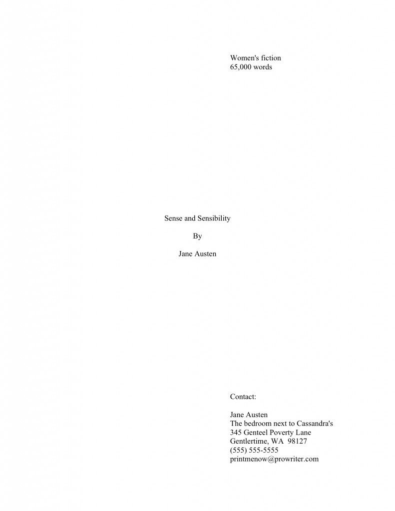
Trimming that overstuffed manuscript down to size

dorothy melting witch

Before I launch into today’s musings, here’s a heads-up for Washington writers: applications are due December 7 for the 2010 EDGE Program for Writers, sponsored by the Artist Trust. Designed to help working writers at all levels of their careers expand their professional acumen, the EDGE program provides six weeks of intensive professional development classes, including topics such as:

*professional presentation on paper, on the web and in live readings
*how to research and take advantage of funding resources and opportunities available to writers
*how to prepare a successful grant proposal and budget
*time management, goal setting and developing a brand as a writer
*how to identify key audiences and determine marketing directions for literary works
*financial management; legal issues such as copyright and intellectual
property, and working with and as independent contractors

Not to mention the ECQLC (Eye-Catching Query Letter Candy) value of winning a place in this prestigious program! For a full description and printable application, click here.

While I’m at it, a quick reminder about an ongoing contest right here on this site: there are just a few short aphorism-gathering days left in the the share your favorite inspirational writing-related quote contest. Specifically, entries will be accepted through midnight Pacific Standard Time on Sunday, December 6.

This is a fun and easy opportunity not only to share your favorite keeping-the-faith quote with the rest of the Author! Author! community, the one that keeps you going through those dark nights of the soul when the muses seem to have left the building permanently — and to win a free copy of LIFELINES: THE BLACK BOOK OF PROVERBS.

A description of the latter and substantially more encouragement to enter the contest appears here, of course, but here’s a recap of the rules:

1. Pick your all-time favorite proverb or quote about writing.

2. Figure out why you love it so much, and write a paragraph about why it inspires you. (Keep it under 100 words, please.)

3. E-mail the quote and your paragraph, along with the quote’s original source (if you know it) and your name to anneminicontest@gmail.com by midnight Pacific Standard time on Sunday, December 6th.

4. Wait in eager anticipation for me to announce the winner, when I’ll post the most stirring quotes.

There endeth the public service announcement portion of the day’s proceedings. Let’s get back to talking about revision — specifically, about how to tackle revising with an eye toward picking up the pace.

Why, some of you may be asking, might a savvy aspiring writer want to take some steps make an exciting plot — or an unexciting one, for that matter — go just a touch faster before subjecting the manuscript to the ever-critical eye of Millicent the agency screener, her cousin Maury the editorial assistant, and/or their Aunt Mehitabel, the veteran contest judge? One very, very simple reason: as Millicent, Maury, and Aunt Mehitabel are all quite aware, slow manuscripts make editors grind their teeth and agents shake their heads in sorrow.

I won’t even tell you what pacing that drags makes the celebrity judges brought in to pick the winners amongst the finalists at literary contests do; this is a family-friendly blog, after all. Suffice it to say that a story or argument that crawls along is not typically the best way to impress Millicent or any of her relatives enough to cause them to long to read the rest of the book.

Antipathy toward being bored by submissions is virtually universal amongst the professional readers of this world, yet astonishingly few writing books and seminars address the issue at all. Except, of course, to opine that for the purposes of submission, a faster read is, on the whole, better than a slower one.

That’s not a guideline; that’s an aphorism. (But not a very inspiring one. I wouldn’t recommend entering it in any contests.)

There are a couple of good reasons for this genteel avoidance of an unpleasant subject, I suspect. First, editing for length and pace is an unpleasant subject for contemplation where dear self is concerned, isn’t it? I don’t know about you, but most of the writers of my acquaintance (including, I’ll admit it, yours truly) get kind of annoyed when an agent or editor says, “I absolutely love your writing! How about giving us 15% less of it?”

Or, to take what used to be a stock agents’ pronouncement a decade ago, when we were all flatly told that a first novel should be no more than 100,000 words, regardless of what might actually work best for the text. (That’s 400 pages in Times New Roman, by standard estimation techniques; if you don’t know how to estimate word count, or why any sane person would want to do so when MS Word will simply tell you how many words are in a manuscript, please see the opaquely-named WORD COUNT category on the archive list at right. ) The truism on the subject has become a little more lax in the past couple of years, thank goodness: now, pronouncement-mongers tend to say anywhere between 80,000 (320 pages) to 120,000 (480) is usually fine.

Unless you happen to be submitting to someone who thinks it isn’t. To be on the safe side, I’d try to keep it as closer to 100,000 than 120,000, unless you happen to be writing in a book category where longer is routine; above 500 pages or so, printing costs leap dramatically.

As someone who attends quite a few writers’ conferences in any given year, I, for one, was pretty darned relieved when the wisdom du jour changed. During the arbitrary 100,000 period, I always hated that inevitable moment when someone stood up at the agents’ forum and asked how long was too long for a manuscript. The air of gloom that descended upon the room at the reply was palpable.

As much as I object to arbitrary standards – 125,000 words strikes me as less arbitrary, because binding costs do get higher at that point – I have to say, like most of us who edit for a living, I’m a fan of the tightly-paced manuscript. I practice what I preach, too: in the novel currently in my agent’s hands, I cut 20 pages entirely through eliminating individual lines.

So believe me, I feel your pain, self-editors. But like most people who read manuscripts by the score, that doesn’t mean that I don’t start muttering, “Get on with it, already!” when a plot begins to drag. Sorry.

The second reason I think the issue of manuscript-tightening doesn’t get much attention in conference classes, writing seminars, and publications aimed at writers is that just as it’s genuinely difficult to say with any precision how long a book one has never read should be, it’s also hard to give general advice about pacing that applies to every single manuscript that might conceivably fall off a gifted writer’s fingertips onto a keyboard.

Every writer has different ways of slowing down or speeding up text. Which is precisely why it’s so vitally important to examine your own manuscript to learn what yours are.

You can feel me about to ask you to do something, can’t you? Don’t worry — it won’t be too painful; I’m not going to ask you to kill your darlings, at least not today.

Why in heaven’s name not, as writing teachers all over North America have been shouting at their students to axe their favorite bits of prose since practically the moment the classic piece of advice fell out of Dorothy Parker’s well-rouged lips sometime during Prohibition? Well, in my experience, most talented writers — published and as-yet-to-be-published alike — actually have a pretty good sense about the little things that shine in their manuscripts.

You know what I’m talking about, right? Those telling little details that bring joy to the eyes of agents, editors, and contest judges everywhere when they appear nestled in a manuscript – particularly on the first page of the text, where they act like miniature neon signs reading, “Hello? This one can WRITE!” causing Millicent to sit up straight for perhaps the first time that screening day and cry, “By gum, maybe I should NOT toss this one into the rejection pile.”

As lovely as eliciting this reaction is, there is more to catching a professional reader’s attention than a charming and detailed first page, I’m afraid. Of course, it’s a necessary first step to that reader’s moving on eagerly to the second, and the third, and so forth. But an initial good impression is not enough, however much writing teachers emphasize the importance of including an opening hook: in order to wow an agent into asking to see the entire manuscript, or into reading the entirety of the one you’ve already sent, the impressive writing needs to continue consistently throughout.

Was that chill I just felt the cumulative effect of all of you first page-perfecters out there going pale? “I just spent eight months on my first five pages,” I hear these wan wraiths stammer. “If I brought the entire book to that level of polish, I would need to live to be 112. I doubt that I’ll still be up to a book tour by then.”

I hate to be the one to tell you this, oh pale ones, but most writers revising for submission stop the high-gloss treatment far too soon. Around page 50, on average, because we’ve all been told that’s the first chunk an agent will ask to see.

The result is a whole lot of manuscripts that raise tremendous expectations in screeners’ breasts — only to lapse into what is fairly obviously less worked-upon writing around page 52. It’s so common a phenomenon that professional readers have a pet name for it: sagging in the middle.

While it is true that having brilliant early pages is one of the best calling cards a book can have, consistency is a far more appreciated writerly skill than writing advice-givers tend to admit. (And before the quote-mongers who emblazon famous thoughts on calendars start shouting that consistency is the hobgoblin of little minds, let me remind you that the early part of the quote is almost always omitted: the original read, “A FOOLISH consistency is the hobgoblin of little minds.” Just in case anyone has proverbs on her mind or anything.)

Here are some facts to chill creative blood: while the vast majority of submissions are in fact rejected prior to page 5, with a hefty percentage dismissed by Millicent before the bottom of page 1, a book’s audition period can — and generally does — go on for most of the manuscript. An excellent agent of my acquaintance, for instance, tells me that he reads the first 185 pages of any manuscript he is considering actively looking for reasons to reject it. Beginning on page 186, he is looking for reasons to ACCEPT it, because he’s already invested so much time in it.

So, naturally, whenever I meet a writer who is planning on querying him, I say, “Psst! Make sure your pp. 150-200 are magnificent!”

Why might a professional reader toss aside a book after having loved it for, say, 190 pages? Usually, a lack of consistency in the writing: great writing early in the book raises expectations for the writing later in the book, necessarily. In the industry, a book that achieves this difficult feat is declared to have lived up to the promise of its first chapter.

Naturally, this is a little unfair, but after one has read approximately 7 million early chapters chock-full of telling little details, one has generally become resigned to seeing their frequency diminish later in the text – but not like it. It’s kind of a letdown, like when that the terrific conversationalist with whom you had three great dates blurts out on Date #4 a glowing paean to a politician whom you have considered for years at best a corrupt megalomaniac.

We’ve all been there, I’m sure.

I must admit it: as an editor, once I have seen evidence that a writer possesses the twin gifts of observation and the ability to handle detail deftly, I have been known to mutter angrily at the manuscript before me, “You’re a better writer than this! Give me your best work!”

So now that I have scared you to pieces about the importance of consistency, how can a revising writer tell if, say, the proportion of telling little details falls off throughout a manuscript enough to start enough to displease a professional reader’s eye?

Glad you asked. Try this experiment:

1. Print out three chapters of your manuscript, the first, one from the middle, and one toward the end of the book.
Don’t use the final chapter; most writers polish that one automatically, doubtless the effect of our high school English teachers making us read the final pages of THE GREAT GATSBY so often.

2. Make yourself comfy someplace where you will not be disturbed for a few hours, and start reading.
Easier said than done, of course, especially for those of you with young children gladdening your daily lives, but this isn’t relaxation: this is work. So don’t you dare feel guilty about taking the time.

3. While you are reading, highlight in nice, bright yellow every time the narrative gives information about a character in summary form.
I’m deadly serious about this. Mark everything from Angelique felt envious to Georgine was a shop welder of immense proportions to “Edward was a compassionate soul, drawn to injured children, limping dogs, and soup kitchens.”

4. Now use a different color of pen — red is nice — to underline any character-revealing information that the narrative conveys indirectly, through specific detail or speeches that demonstrate a characteristic or an environment that is reflective of a character’s internal mood.
Remember, you are not judging the quality of the sentences here — what you are looking for are passages that encourage the reader to draw his or her own conclusions about what the character is like. To revisit the trio from above, red-marked sentences might include:
Unable to contain herself, Angelique surreptitiously poked her rival with a pin

or Georgine’s broad shoulders barely fit through the doors to her metal shop

or even Edward was late for work again, having been sidetracked by a child’s scraped knee, a search for the same little girl’s lost cocker spaniel, and the absolute necessity to track down and fund the homeless person he had been forced to overlook yesterday because he’d already given away the last dollar in his pocket.

Beginning to see some patterns here? Good.

5. Now that you’ve identified these different species of sentences, double-check immediately before and after the indirect indicators in red for summary statements telling the reader precisely how these dandy little details should be interpreted.
Such summaries tend to lurk in their environs. When you find them, ask yourself, “Self, is this summary absolutely necessary here, or does the indirect statement cover what I wanted to say? Could it in fact be cut, and would the manuscript be both shorter and better for it?”

Applied consistently, this question can strip a lot of unnecessary verbiage from a manuscript relatively painlessly. It’s a good strategy to know, because it’s often difficult for a writer to notice redundancy on a page he has written himself — from a writerly perspective, saying something in two different ways often just looks like creative emphasis.

Or — and this is more common — we may not trust the reader to draw the correct conclusion from the more delicate indirect clues, and so rush to provide the logical extrapolation. But readers are pretty smart, especially those lovers of good writing who dote on telling little details.

Okay, I need to sign off for today, but please don’t throw those marked-up pages away: I have more plans for them — and their little dog, too.

Yes, going through your manuscript with a fine-toothed comb is a whole lot of work, but believe me, when your book is on the uphill side of page 185, and the agent of your dreams is trying to decide whether you have the consistency of style to pull off an entire book, you’ll be very, very glad you bought those marking pens.

Maybe you should ask the Furtive Non-Denominational Gift-Giver to sneak some more into your stocking later this month. Keep up the good work!
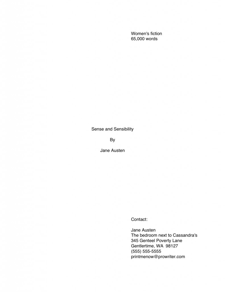
Wrapping up on wrapping up: what precisely should go in that box?

brain in shipping box

Are you excited to have reached the end of this extended megaseries on everything and anything that should go in a query or submission packet — other than the manuscript, that is? Did that collective “Nyeah” I just heard mean that you’re thrilled to have all of this knowledge under your belt, in preparation for that supercharged, tense day when you’re asked to bundle your pages together and send ‘em off, or that the long-term readers amongst you are just pleased to have this info in consecutive posts, for easy future reference? Or is it merely that you will be awfully glad when I stop yammering on about these less-than-thrilling practicalities and wend my way back to craft?

However it may be, last time, I launched into an extensive discussion of the kind of boxes a writer should (sturdy, clean, size-appropriate) and should not use (grease-stained, mangled, clearly last used to ship books from Amazon) to send a manuscript to an agent, editor, or contest. Today, I’m going to round off our discussion of submission packets with some examination of what a writer might conceivably want to stuff into that box.

Let’s pretend for a moment that you have just been asked to submit materials to the agent of your dreams. To be absolutely clear, I’m talking about REQUESTED materials here, not just sending pages to an agency that asks queriers to include the first chapter, a few pages, or a synopsis with a query — all of these would, in the industry’s eyes, be unsolicited pages crammed into a query packet.

I know, I know: it’s a bit counter-intuitive that a blanket statement on a website, in an agency guide, or from a conference dais that a particular agent would like to receive these materials from all queriers doesn’t constitute solicitation, but it doesn’t. The logic runs thus: guidelines that recommend submitting extra material with a query are generic, aimed at any aspiring writer who might conceivably be considering sending a query.

By contrast, a solicited submission, a.k.a. requested materials, is one that an agent is WAITING to see because she has asked a particular writer to send it following a successful pitch or query. Because the agent expressed positive interest in seeing those pages, the lucky requestee is fully justified in scrawling REQUESTED MATERIALS in letters two inches high in the lower right-hand corner of the envelope or shipping box, just to the left of the address, to assure that the submission lands on the right desk instead of the slush pile made up of, you guessed it, unsolicited manuscripts.

Everyone clear on the difference between solicited and unsolicited materials? Because if you don’t by this point in this megaseries, I can only fling my hands into the air and tearfully inquire of any deities who might happen to be listening just where I went wrong in bringing you up.

Just as generic requests vary in what agents ask queriers to send, so do requests for solicited material. Out comes my favorite broken record again: while every agency and small publishing house seems to have a slightly different idea of what constitutes a standard submission packet (word to the wise: read those requests CAREFULLY), here are the most commonly-requested constituent parts, in the order in which they are generally expected to appear in the packet:

1. Cover letter
You HAVE been sending cover letters with your submissions, right? As I mentioned a few days ago, just sending a manuscript all by itself is considered a bit rude, as well as strategically unwise.

“Oh, please, Anne,” I hear the submission-weary complain. “Rude? What do you call making a successful querier or pitcher write ANOTHER letter to an agent who has already agreed to read my work?”

I sympathize with the submission fatigue, oh weary ones, but don’t get your hackles up. In the first place, there’s no need for a long-winded missive — a simple thank-you to the agent for having asked to see the materials enclosed will do. It’s hardly onerous.

In the second place, the submitter is the one who benefits from including a cover letter — all the more so because so few submitters remember to tuck one into their packets. An astonishingly high percentage of submissions arrive without a cover letter, and often without a title page as well, begging the question: what makes these submitting writers so positive that the requesting agent will still remember their queries or pitches well enough to render page one of chapter one instantly recognizable?

I’m not going to depress you by telling you just how unlikely this is to be the case.

Suffice it to say that it’s in your best interest to assume that the person who heard your pitch or read your query won’t be the first person to screen your submission, for the very simple reason that it is, in fact, often a different person. Thus, it doesn’t really make sense to presume that everyone who sets eyes on your manuscript will already be familiar with who you are and what you write.

And it’s not problematic purely because a Millicent new to your project might get offended by not being addressed politely from the moment she opens the manuscript box. Does anyone out there want to take a guess at the PRACTICAL reason omitting both a cover letter and a title page might render a submitter less likely to get picked up?

If you instantly cried, “Because it renders the agency’s contacting the submitter substantially more difficult!” give yourself a gold star for the day. Like a query letter and a title page, a good cover letter should include all of the sender’s contact information — because the last response you want your submission to generate is a heart-felt, “Oh, it’s too bad we have no idea who sent us this or how to contact him or her; all we have is the author’s last name in the slug line. This saddens me, because I really liked this manuscript!”

Okay, so that little piece of dialogue is pretty lousy, now that you mention it. But you get my point, right?

“Okay, Anne,” the former head-scratchers concede, “I get why I should include a cover letter. What does it need to say?”

Glad you asked. Under most circumstances, all it needs to say is the following. (If you’re having trouble reading this, try either double-clicking on the image or saving it to your hard disk as a PDF.)

Seriously, that’s all there is to it. Like any other thank-you letter, the courtesy lies more in the fact that the sender took the time to write it, rather than in what it actually says.

A couple of caveats:

(a) If you met the agent at a conference, mention that in the first paragraph of the letter, to help place your submission in context. As crushing as it may be for the writerly ego to contemplate, an agent who spent days on end listening to hundreds of pitches probably is not going to remember each one. No need to re-pitch, but a gentle reminder never hurts.

While you’re at it, it’s not a bad idea to write the name of the conference on the outside of the envelope, along with REQUESTED MATERIALS. Heck, it’s a very good idea to write the conference’s name on the outside of a query to an agent one has heard speak at a conference, too, or to include the conference’s name in the subject line of a query e-mail. The point here is to render it pellucidly clear to the agent why you’re contacting her.

(b) If another agent is already reading all or part of the manuscript you’re sending — or has asked to see it — be sure to mention this in your cover letter. No need to say who it is or how long s/he has had it; just tell the recipient that s/he’s not the only one considering representing this book. Unless the agency has a policy forbidding simultaneous submissions, withholding this information will only generate resentment down the line if more than one agent wants to represent your book.

Yes, even if that agent to whom you submitted 9 months ago has just never responded. Actually, it’s in your strategic interest to contact that non-responder to let her know that another agent is interested.

(c) Make sure ALL of your contact information is on the letter, either in the header (letterhead-style, as I have shown above) or under your signature. Again, you want to make sure that the agent of your dreams can call you up and rave about how much she loved your submission, right?

(d) Make absolutely certain that the letter includes the title of your book, just in case the letter and the manuscript end up on different desks. (Yes, it happens. Don’t ask; just be prepared for this horrifying contingency.)

Everyone comfortable with the cover letter? For more tips on how to construct one with aplomb, please see COVER LETTERS FOR SUBMISSIONS (where do I come up with these obscure category titles?) on the list at right.

2. Title page
ALWAYS include this, if ANY manuscript pages have been requested — yes, even if you have already sent the first 50 pages, and are now sending the rest of the book. (If you have never formatted a professional manuscript before, please see the TITLE PAGE category at right.)

Why? Long-time readers, chant it with me now: because the submission looks more professional that way.

Also, like the cover letter, the title page renders it easy for an agent to track you down. Believe me, if the agent of your dreams falls in love with your manuscript, you’re going to want to hear about it right away.

3. The requested pages in standard format, unbound in any way.

The operative word here is requested. If an agent or editor asked you for a partial, send PRECISELY the requested number of pages. Don’t fudge here — even if your novel features a tremendous cliffhanger on p. 51, if the agent of your dreams asked for the first 50 pages, send only the first 50 pages, period.

Actually, in this instance, you should send only the first 50 pages even if they do not end in a period. Even if the designated last page ends mid-sentence, stop there.

As to sending pages in standard manuscript format, please, don’t get me started again the desirability of sending professionally-formatted submissions. For a month after I run a series on standard format , the rules keep running through my head like a nagging tune.

If you’re brand-new to reading this blog and thus successfully avoided my recent series on the subject, or have somehow avoided my repeated and vehement posts on standard format for manuscripts over the last three years, please see the MANUSCRIPT FORMATTING 101 and STANDARD FORMAT ILLUSTRATED categories on the list at right.

For the benefit of those of you who are going to blow off that last piece of advice because you’re in a hurry — oh, I know that you’re out there; I can hear your shallow, panicked breathing — allow me to add something you might not have picked up from those posts on formatting: a manuscript intended for submission should not be bound in any way.

Oh, and do use at least 20-lb, bright white paper. Cheaper paper can begin to wilt after the first screener has rifled through it. Yes, it does increase the already quite substantial cost of submission, but this is one situation where being penny-wise can cost you serious presentation points.

4. Synopsis, if one was requested, clearly labeled AS a synopsis.
With fiction, when an outline is requested, they usually mean a synopsis, not the annotated table of contents appropriate for nonfiction. For nonfiction, an outline means an annotated table of contents.

Most of the time, though, what an agent will ask to see for either is a synopsis.

As I mentioned earlier in this post, I haven’t done a synopsis how-to in a while, so I shall be revisiting it beginning this coming weekend. For those of you in a greater hurry, please check out the HOW TO WRITE A SYNOPSIS category at right. (Again, how do I come up with these category titles?)

5. Author bio, if one was requested.
Which you already have in your hot little hand, right? Aren’t you pleased with yourself?

For those of you joining us late in this series, an author bio is a one-page (double-spaced) or half-page (single-spaced) plus photo account of the submitting writer’s professional credentials. Typically, when an agent submits a manuscript or book proposal to editors, the author bio is tucked immediately at the end of the manuscript or sample chapter.

6. A SASE big enough to fit the entire manuscript.
This should be automatic by now, but to recap for those of you who will read this weeks or months from now in the archives: that’s a self-addressed, stamped envelope, for those of you new to the game. Always use stamps, not metered postage, for the SASE.

I’m really running through that stack of old records today, but to reiterate: send a SASE large enough for the return of your materials EVERY time, regardless of whether the agency (or publishing house) to whom you are submitting has actually asked for a SASE. If the requested pages fit in a Manila or Priority Mail envelope, it’s perfectly acceptable to fold a second one in half, stamp and address it, and tuck it in the submission package.

How does one handle this when using a box as a SASE? Well, since it would be impracticable to fold up another Priority Mail box inside, if you have been asked to send so many pages that you need to pack ‘em in a box, paper-clip a return mailing label and stamps to your cover letter, along with a polite request that the agent would affix both to the shipping box in the event of rejection.

To be on the safe side, explain HOW you want them to reuse the box: peel the back off the mailing label, stick it over the old label, affix new postage, and seal. You didn’t hear it from me, of course, but sometimes, they evidently have trouble figuring it out.

You can also nab one of those tough little everything-you-can-cram-in-here-is-one-price Priority Mail envelopes, self-address it, add postage, and stick it into the box. If you don’t care if your manuscript comes back to you a little bent, this is a wonderfully cash-conscious way to go. Those envelopes are surprisingly tough, in my experience — what are they made out of, kryptonite? — and while the pages don’t look too pretty after a cross-country trip in them, they do tend to arrive safely.

In case you couldn’t tell, I’m not a big fan of writers over-investing in impressive return postage. It’s bad enough that we writers are expected to underwrite the costs of agencies rejecting our work. (Which is, effectively, what the SASE accomplishes, right?) If you’re getting the manuscript back, it’s because they’ve rejected it. Who cares if the pages show up on your doorstep bent?

“But Anne,” I hear the ecology-minded writers out there murmur, “surely it would be easier, cheaper, and environmentally friendlier to ask the agent or editor to recycle the submission pages if s/he rejects it?”

Yes, it would be all three, but I would strenuously advise against making this request of any agency or publishing house that doesn’t state directly on its website or in its agency guide listing that it will recycle rejected manuscripts. Most won’t, but many, many agencies will instruct their Millicents to reject any submission that arrives without a SASE.

Do you really want to chance it?

7. Optional extras.
If you want to send a second, business-size envelope SASE as well, to make it easy for them to request the rest of the manuscript, place it at the bottom of the packet (and mention it in your cover letter.)

Since the vast majority of agencies are congenitally allergic to submitters calling, e-mailing, or even writing to find out if a manuscript actually arrived — check the agency’s website or guide listing to be sure — it’s also a fair-to-middling idea to include a self-addressed, stamped postcard for the agency to mail to you to acknowledge receipt of the manuscript. To generate a chuckle in a hard-worked Millicent, I always liked to send a SASP that looked like this — although with a stamp attached, of course:

Don’t worry about this causing trouble; it doesn’t, and you will have proof that they received it. This is important, because manuscripts do go astray from time to time.

8. Pack it all in a durable container that will keep your submission from getting damaged en route.

Why, this suggestion seems strangely familiar, somehow…oh, yes, we spent all of yesterday’s post talking about it.

And that, my friends, is the low-down on the submission packet. Don’t forget that EVERYTHING you send to an agency is a writing sample: impeccable grammar, punctuation, and printing please. No smudges or bent corners, either.

In other words, make it all pretty and hope for the best. And, of course, keep up the good work!
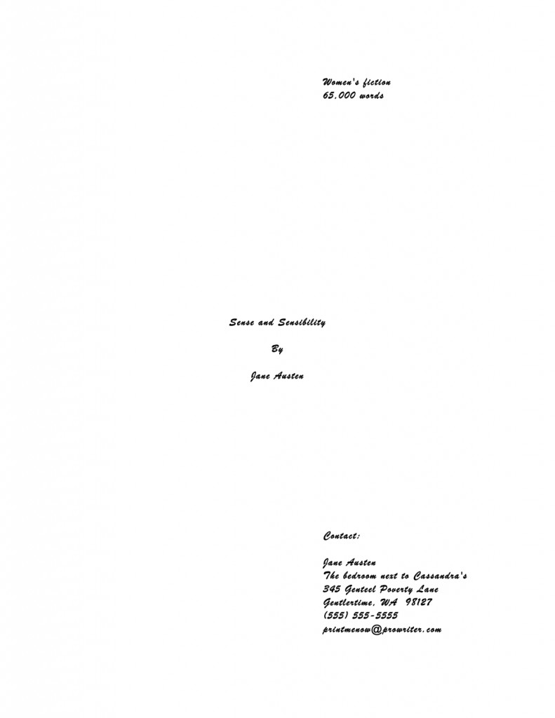
Wrapping it all up and tying it with a bow

tying a bow tie

My, I’ve been getting a lot of great questions in the comments lately! Mostly on long-ago posts, admittedly, but I hope it’s a sign that many of you are getting your work out there, sliding it under agents’, editors’, and contest judges’ noses. Yes, the news from the publishing world, like the news from other sectors of the economy, is rather grim, but that does not mean landing an agent or selling a book is impossible.

As I am undoubtedly not the first person in the writers’ cosmos to say, the only manuscript that has absolutely NO chance of getting published is the one that’s never sent out. Keep plugging away.

As those of you gifted at adding 2 and 2 together without getting 8 might already have figured out, I’ve been rounding out my meandering series on query/ submission packets and the things that go into them by sifting through my archives to find readers’ questions and answering them now. That way, all of the pack it up and ship it out posts are right on top of each other, rather than lying scattered about whenever some bright reader happened to bring it up.

Hey, I know that not everybody is fond of archive-diving. Those who are not should be grateful, then, that insightful long-time reader Jen wrote in to ask:

I can’t help but think that the rules sink into my brain a little deeper with each reading. Still, sending off all those pages with nothing to protect them but the slim embrace of a USPS envelope seems to leave them too exposed. Where does one purchase a manuscript box?

This is an excellent question, Jen: many, many aspiring writers worry that a simple Manila envelope, or even the heavier-duty Priority Mail envelope favored by the US Postal Service, will not preserve their precious pages in pristine condition. Especially, as is all too common, if those pages are crammed into an envelope or container too small to hold them comfortably, or that smashes the SASE into them so hard that it leaves an indelible imprint in the paper.

Do I sense some readers scratching their heads? “But Anne,” some of you ask, “once a submission is tucked into an envelope and mailed, it is completely out of the writer’s control. Aren’t the Millicents who inhabit agencies, as well as the Maurys who screen submissions at publishing houses and their Aunt Mehitabels who judge contest entries, fully aware that pages that arrive bent were probably mangled in transit, not by the writer who sent them?”

Well, yes and no, head-scratchers. Yes, pretty much everyone who has ever received a mauled letter is cognizant of the fact that envelopes do occasionally get caught in sorting machines. Also, mail gets tossed around a fair amount in transit — you think all of those packages in Santa’s sleigh have a smooth ride? — so yes, Virginia, even a beautifully put-together submission packet may arrive a tad crumpled.

Do most professional readers cut the submitter slack for this? Sometimes; if Millicent’s just burned her lip on that latté that she never seems to remember to let cool, it’s not going to take much for the next submission she opens to annoy her. And in the case of contest entries, I don’t know Aunt Mehitabel personally, but I have heard contest judges over the years complain vociferously to one another about the state in which entries have arrived on their reading desks.

All of which is to say: appearances count. You should make an effort to get your submission to its intended recipient in as neat a state as possible. It is, after all, showing up at an agency or publishing house for a job interview.

How does one go about insuring that it arrives looking good? The most straightforward way, as Jen suggests, is to ship it in a box designed for the purpose. Something, perhaps, along the lines of this:

Just kidding; we’re not looking for a medieval Bible box here. What most writers like to use looks a little something like this:

This, my friends, is the very model of a modern manuscript box: sturdy white or brown corrugated cardboard with a lid that is attached along one long side. Usually, a manuscript box designed for the purpose will hold from 250 to 750 pages of text comfortably, without sliding from side to side.

While manuscript boxes are indeed very nice for cradling your precious pages, they aren’t necessary for submission; the attached lid, while undoubtedly aesthetically pleasing, is not required, or even much appreciated at the agency end. Manuscripts are taken out of the boxes for perusal, anyway, so why fret about how the boxes that send them open? In practice, any clean, previously-unused box large enough to hold all of the requested materials (more on that subject in my next post) without crumpling them will work to send a submission.

Emphasis on previously unused. More on that below.

Some of you are resisting the notion of using just any old box, aren’t you, rather than one specially constructed for the purpose? I’m not entirely surprised. I hear all the time from writers stressing out about what kind of box to use — over and above clean, sturdy, and appropriately-sized, that is — and not without good reason. In the old days — say, 30+ years ago — the author was expected to provide a box, and a rather nice one, then wrap it in plain brown paper for shipping. These old boxes are beautiful, if you can still find one: dignified black cardboard, held together by shining brass brads.

Since I couldn’t even find a photograph of one of these gems online, I’m guessing that they’d be pretty hard to dig up to house your submission. At least not outside an unusually literary antique store. (“A first edition of Tropic of Capricorn, sonny? Try that shelf over there, next to the manuscript boxes and Edith Wharton’s secretary’s typewriter ribbons.”)

Happily, when sending a manuscript today, there’s no need to pack it in anything extravagant: no agent is going to look down upon your submission because it arrives in an inexpensive box. If you can get the requested materials there in one piece box-free — say, if it is an excerpt short enough to fit into a Manila folder or Priority Mail cardboard envelope without much wrinkling — go ahead. Do bear in mind, though, that you want to have your pages arrive looking fresh and unbent, so make sure that your manuscript fits comfortably in its holder in such a way that the pages are unlikely to wrinkle.

Out comes our old friend the broken record again: it’s penny-wise and pound-foolish to use cheap paper for submissions; a savvy submitter uses 20 lb or heavier paper. This is part of the reason why.

Look for a box with the right footprint to ship a manuscript without too much internal shifting. In general, it’s better to get a box that is a little too big than one that’s a little too small. To keep the manuscript from sliding around and getting crumpled, insert wads of bubble wrap or handfuls of peanuts around it, not wadded-up paper. Yes, the latter is more environmentally-friendly, but we’re talking about presentation here.

Avoid the temptation to use newspaper, too; newsprint tends to stain.

Most office supply stores carry perfectly serviceable white boxes — Office Depot, for instance, stocks a recycled cardboard variety — but if you live in the greater Seattle area, funky plastic junk store Archie McPhee’s, of all places, routinely carries fabulous red and blue boxes exactly the right size for a 450-page manuscript WITH adorable little black plastic handles for about a buck each. My agent gets a kick out of ‘em, reportedly, and while you’re picking one up, you can also snag a bobble-head Edgar Allan Poe doll that bears an uncomfortably close resemblance to Robert Goulet:

If that’s not one-stop shopping, I should like to know what is.

Your local post office may stock manuscript-sized boxes as well, as does USPS online. Post offices often conceal some surprisingly inexpensive options behind those capacious counters, so it is worth inquiring if you don’t see what you need on display.

Far and away the most economical box source for US-based writers are those free all-you-can-stuff-in-it Priority Mail boxes that the post office provides:

Quite the ravishing photo, isn’t it, considering that the model is an object made of cardboard? If you don’t happen to mind all of the postal service propaganda printed all over it, these 12″ x 12″ x 5 1/2″ boxes work beautifully, with a little padding, as will the 11 7/8″ x 13 5/8″ x 3 3/8″.

Say away from those wadded-up newspapers, I tell you. Can I interest you in some bubble wrap, inflatable packing material, or bio-degradable peanuts?

Why press the 12″ by 12″ boxes into service, you ask, when the USPS is considerate enough to offer a 8 1/2” x 11” all-you-can-cram-for-a-flat-rate box? Because those tempting little numbers only LOOK as though they will fit a manuscript comfortably without bunching the pages. The actual footprint of the bottom of the box is the size of a piece of paper, so there is no wiggle room to, say, insert a stack of paper without wrinkling it.

Trust me, that’s not something you want to find out after you’ve already printed out your submission.

Yes, yes, I know: the USPS is purportedly the best postal service in the world, a boon to humanity, and one of the least expensive to boot. Their gallant carriers have been known to push forward through the proverbial sleet, hail, dark of night, and mean dogs. But when faced with an only apparently manuscript-ready box on a last-minute deadline, the thought must occur to even the most flag-proud: do the postal services of other countries confound their citizens in this way?

Just what do they expect anyone to put in an 8 1/2” x 11” box OTHER than a stack of paper? A beach ball? A pony? A small automobile?

Whatever difficulties you may have finding an appropriately-sized box, DO NOT, under any circumstances, reuse a box clearly marked for some other purpose, such as holding dishwashing soap. As desirable as it might be for your pocketbook, your schedule, and the planet, never send your manuscript in a box that has already been used for another purpose.

You know what I mean, don’t you? We’ve all received (or sent) that box that began life as an mail-order shipping container, but is now covered with thick black marker, crossing out the original emporium’s name. My mother takes this process even farther, turning the lines intended to obfuscating that Amazon logo into little drawings of small creatures cavorting on a cardboard-and-ink landscape.

As dandy as this recycling is for birthday presents and the like, it’s considered a bit tacky in shipping a submission. Which is unfortunate, as the ones from Amazon tend to be a perfect footprint for manuscripts. Don’t yield to the temptation, though.

“But wait!” I hear the box-savvy cry, “those Amazon boxes are about 4 inches high, and my manuscript is about 3 inches high. It just cries out, ‘Stuff your manuscript into me and send me to an agent!’”

A word of advice: don’t take advice from cardboard boxes; they are not noted for their brilliance. Spring for something new.

Oh, and before I forget: If you’ve been asked to send more than one copy of a manuscript — not all that uncommon after you’ve been picked up by an agent — don’t even try to find a box that opens like a book: just use a standard shipping box. Insert a piece of colored paper between each copy, to render the copies easy to separate. Just make sure it’s not construction paper, or the color will rub off on your lovely manuscripts.

And you do know that EVERY time you send requested materials, either before or after signing an agency contract, you should write REQUESTED MATERIALS in great big letters in the lower left-hand corner of the submission envelope, don’t you? (If you have been asked to submit electronically, include the words REQUESTED MATERIALS in the subject line of the e-mail.) This will help your submission to land on the right desk, instead of in the slush pile or recycling bin.

Next time, I shall talk a little more about what goes INSIDE that manuscript box and in what order. In the meantime, keep up the good work!
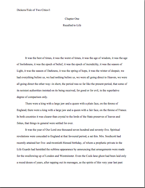
How to write a really good synopsis, part XIII: building your synopsis from solid wood, or, do you think it’s EASY to come up with a thematically-appropriate photo every day?

window corner

Did you enjoy your day off, everyone? I like to think of it as step one in declaring my birthday (and Truman Capote’s, and Euripedes’. as it happens) an international holiday. Rested and refreshed, let’s meander back to our ongoing list of questions designed to ferret out the most pervasive of synopsis problems. The hit parade so far:

(1) Does my synopsis present actual scenes from the book in glowing detail, or does it merely summarize the plot?

(2) If the reader had no information about my book other than the synopsis, would the story or argument make sense? Or is more specific information necessary to render the synopsis able to stand alone?

(3) Does the synopsis make the book sound compelling? Does it make me eager to read it?

(4) Does the synopsis tell the plot of the book AS a story, building suspense and then relieving it? Is it clear where the climax is and what is at stake for the protagonist? Or does it merely list all of the events in the book in the order they appear?

(5) Have I mentioned too many characters in the synopsis? Does each that I mention come across as individually memorable?

(6) In a novel synopsis, is it clear who the protagonist is?

(7) Does my protagonist/do my protagonists come across as an interesting, unusual person(s) involved in an interesting, unusual situation?

(8) In a memoir synopsis, is it clear who the protagonist is? (Other than I.) Does s/he come across as an interesting, unusual person involved in an interesting, unusual situation?

(9) In either a novel or a memoir synopsis, is it clear what the protagonist wants and what obstacles are standing in the way of her getting it? Is it apparent what is at stake for the protagonist if s/he attains this goal — and if s/he doesn’t?

(10) In a nonfiction synopsis that isn’t for a memoir, is it clear what the book is about? Does the subject matter come across as interesting, and does the synopsis convey why this topic might be important enough to the reader to make him/her long to read an entire book about it?

(11) Does my synopsis make the book sound just like other books currently on the market, or does it come across as original?

(12) If I’m marketing fiction, does my synopsis make the story I’m telling seem plausible?

(13) If my book is nonfiction, does it come across as both plausible and as though I’m a credible source?

Is everyone happy with all of those? More importantly, is everyone’s synopsis happy with all of those?

For the sake of getting on with it, I’m going to assume that the answer is a resounding, “By gum, Anne, YES!” But if you have any questions about what I’ve covered so far, please feel free to bring ‘em up in the comments. (And for those of you new to how blogs work: to leave a comment, go to the very bottom of the post, after the category listings, and click on the green word COMMENTS. That will take you to a form where you can leave, well, comments.)

Moving on — and all of these apply equally well to a synopsis intended to rest within a query packet, a submission packet, and a contest entry, by the way:

(14) Does the first couple of paragraphs of my synopsis contain an indelible image that the reader can take away?

Since part of the goal in a synopsis is to convince Millicent the agency screener that the manuscript is fresh, unique, and well-written, wowing her with the first paragraph is essential. So wiggle your way into Millicent’s moccasins and ask yourself: does the opening of the synopsis contain something both unique and memorable? A vivid sensual image, for instance? A surprising juxtaposition of words? A fresh emotional dilemma?

In short, something that she hasn’t already seen — preferably never, but at least not within the hour?

Don’t tell me, please, that there’s something terrific at the bottom of the page, or that if Millie will only have the patience to make it to the middle of page 3, she’ll be hooked. All of that may well be true, but remember, you can’t be sure that Millicent will make it to page 3, or even the bottom of the page.

Why, you exclaim in horror? Long-time readers of this blog, pull out your hymnals and sing along: screeners stop reading as soon as they’ve reached a conclusion about a submission.

Again, this isn’t a matter of laziness, meanness, or a hatred of literature — Millicent has to get through a lot of these in any given workday. So as with a contest entry, screeners tend to pass judgment upon synopses pretty fast. Also, in order to approve a query or submission for continuing on to the next step of the screening process, screeners often need to be able to describe the book in just a sentence or two. Giving Millicent (or a contest judge) a fantastic detail will make that part of her job significantly easier.

Trust me, you want to make her job easier.

Still want to believe that she’ll read on if the writing is good enough? Okay, let’s assume for a moment that she will. (Although 9 times out of 10, she won’t.) Let’s further assume that she likes what she sees when she does read on. Which would you rather be, the synopsizer whose pages prompt Millie to run into her boss’ office and cry, “Wow, I’ve just seen an image I’ve never seen before!” or the one whose synopsis requires two minutes of explanation about why it caught her interest?

Believe me, Millicent isn’t the only one who keeps glancing at her watch. Her boss’ timepiece is set even faster than hers.

What you DON’T want to do — oh, you may think you do, but it’s not in your best interest — is to make your job as a synopsizer easier by reusing text from the first chapter of the book. Especially, as synopsis-writers for contests so often do, by recycling the opening paragraph of the book.

Which leads me to…

(15) Does the opening of the synopsis read too like the opening of the book?

This may make some of you giggle — this list has been a real laugh riot, hasn’t it? — but you wouldn’t believe how often the first paragraph or two of manuscript are actually identical to the first paragraph or two of its synopsis.

Yes, even in contest entries, where the synopsis and chapter are almost always read within the same sitting. Strategically, that’s just not very bright, in a context where a writer is trying to prove within a scant allotment of pages that it’s worthwhile to read his entire book.

Millicent and her ilk tend to regard this as a symptom of authorial laziness, but I suspect that there is usually more to it than that: I think that aspiring writers, having slaved to create a memorable opening for their books, often regard those opening paragraphs as some of their best writing. If it really is so, they reason, why not feature it in a document where it’s likely to do them some good?

If you believe nothing else I tell you today, please believe this: it won’t do you any good. People in the publishing industry remember what they’ve read; make sure every sentence you submit within a packet is different.

(16) Is my synopsis in the present tense and the third person, regardless of the tense and voice of the book itself? For a memoir, is it in the first person and past tense?

This is one of those secret-handshake things that render a rookie’s submission so apparently different from an experienced writer’s, from Millicent’s perspective: a professional synopsis is ALWAYS in the present tense and third person, unless the book in question is a memoir.

Yes, even if the book being synopsized is written in the first person. Don’t bother to try to fight this one; it’s just a convention of the trade.

(17) If the synopsis is longer than one page, are its pages numbered?

Even after years of reading both synopses intended for submission and contest entries, I remain perennially shocked at how few of them identify either themselves or the author, due no doubt to a faith in the filing systems of literary agencies that borders on the childlike.

Why do I attribute this to faith? Well, like everything else in a manuscript or book proposal, the synopsis should not be bound in any way; like pretty much everything else on earth, paper responds to gravity.

Translation: things fall; pages get separated, and some luckless soul (generally, the person under Millicent the screener on the agency’s totem pole, if you can picture that) is charged with the task of reordering the tumbled pages.

Place yourself in that unhappy intern’s Doc Martens for a moment: given the choice between laboriously guessing which page follows which by perusing content, and pitching the whole thing (into what we devoutly hope is the recycling bin, but is probably merely the overloaded wastepaper basket) and moving on to the next task, which would YOU choose?

Okay, so maybe you’re ultra-virtuous. Allow me to rephrase: what if you were Millicent, had 20 other submissions to screen before lunch, and had just scalded your tender tongue on a too-hot latte?

Even if you cried, “Of course I would take the time!” in each instance, Pollyanna Karenina, don’t rely upon the kindness of strangers. Especially busy ones who have been trained to believe that unnumbered pages are unprofessional in a submission. Make it easy to put the pages back in the proper order.

(18) Does the first page of the synopsis SAY that it’s a synopsis? Does it also list the title of the book, or does it just begin abruptly? And does every page of the synopsis contain the slug line AUTHOR’S LAST NAME/TITLE/SYNOPSIS/#?

Standard format for a synopsis dictates that the title (either all in caps or bolded) is centered at the top of the first page of the synopsis, with “Synopsis” on the line below it. Then skip one double-spaced line, and begin the text of the synopsis.

Having trouble picturing that? Here’s a crib for the visually-minded:

Looking familiar, I hope? Everyone clear on why those paragraphs need to be indented?

And if it seems a bit silly to tell the nice people who asked you to send a synopsis that what they’ve got in their trembling hands is in fact a synopsis, remember that in a largish agency, the person who requests a submission is often not the person who subsequently reads it. Not the first person, anyway.

Even if it were, from the envelope-opener’s perspective, being expected to recall one request for further materials from — how long? Perhaps a month? — before is tantamount to being asked to guess how many fingers the author is holding up.

In Nebraska, when the guesser is standing in midtown Manhattan. Don’t make ‘em guess.

(19) Is the synopsis absolutely free of errors of any kind? Not just what your word processing software tells you is an error, but an actual error?

Naturally, like every other piece of paper you intend to send anywhere near an agency, you should both spell-check and read the ENTIRETY of your synopsis IN HARD COPY, ALOUD, before you send it anywhere.

Period. No excuses. I’m not listening.

Why double-up on the proofing? 95% of writers — and 99.98% of non-writers — fall into the trap of thinking that if a document passes muster with their computers’ spelling and grammar checkers, it must therefore be spelled correctly and grammatically sound. That is, alas, generally not true.

Word processing programs’ dictionaries are NOTORIOUSLY inaccurate — and often surprisingly outdated. I am fascinated by the fact that mine evidently does not contain any words that relate to the Internet or computer operations.

Don’t believe me? At this point in human history, should I really have had to introduce “blogger” into my spell-checker’s vocabulary?

And don’t even get a professional editor started on the chronic inadequacies of most word processing programs’ grammar checkers. Mine disapproves of gerunds and semicolons, apparently on general principle, strips necessary accent marks off French words, leaving them obscenely naked, and regularly advises me to use the wrong form of THERE. (If anybody working at Microsoft does not know the ABSOLUTELY IMMUTABLE rules governing when to use THERE, THEIR, AND THEY’RE, I beg you, drop me a comment, and I shall make everything clear.) Once, when I was not looking, it incorrectly changed a word in this very blog from “here” to “hear.”

Editors like to fantasize about the special circle of hell reserved for those amoral souls who teach our children that the differences between these don’t matter. I’ll spare you the details, but they include the constant din of fingernails on chalkboards, a cozy relationship with angry skunks, and the liberal application of boiling oil to tender parts.

Grammar checkers also typically butcher dialogue, especially if it contains necessary slang. Suffice it to say, most standard word processing spelling and grammar checkers would condemn the entirety of Mark Twain’s opus outright.

My point is, like a therapist who doesn’t listen well enough to give good advice, a poor grammar checker cannot be sufficiently disregarded. Even in the unlikely event that your grammar checker was put together by someone remotely familiar with the English language as she is spoke, you should NEVER rely solely upon what it tells you to do.

Read the manuscript for yourself.

And if you’re in doubt on a particular point, look it up. In a well-regarded dictionary, not on the Internet: contrary to popular opinion, most search engines will list both the proper spelling of a word and the most common misspellings. There is no gigantic cosmic English teacher monitoring proper spelling and grammar on the web.

So get up, walk across the room, and pick up a physical dictionary, for heaven’s sake. After so much time spent sitting in front of a monitor, the walk will do you good.

(20) Are all of the proper nouns spelled correctly?

This is a perennial agents’ pet peeve, and with good reason: believe it or not, misplaced cities, states, and even character names are rife in synopses.

Why? Because these are words that are generally omitted from standard spell-checkers — or are entered with a number of possible variations. So unless you have inserted all of the proper nouns in your work into your spell-checker’s memory, it will often overlook the difference between your elegant heroine, Sandy, and that trollop who wandered into your synopsis unbidden, Sandie.

Triple-check all character and place names. Seriously.

(21) Does the synopsis read as though I am genuinely excited about this book and eager to market it, or does it read as though I am deeply and justifiably angry that I had to write a synopsis at all?

Yes, I’ve talked about this one before, and recently, but this is a subtlety, a matter of tone rather than of content, so it bears repeating. It’s often not as visible to the author as it is to a third party.

So once more, with feeling: writerly resentment shows up BEAUTIFULLY against the backdrop of a synopsis, even ones that do not breathe an overt word about marketing. The VAST majority of synopses (particularly for novels) simply scream that their authors regarded the writing of them as tiresome busywork instituted by the industry to satisfy some sick, sadistic whim prevalent amongst agents, a hoop through which they enjoy seeing all of the doggies jump.

If you have even the vaguest suspicion that your synopsis — or, indeed, any of your marketing materials — may give off a even a whiff of that attitude, hand it to someone you trust for a second opinion.

Made it through all of the questions above? After you have tinkered with the synopsis until you are happy with all of your answers, set your synopsis aside. Stop fooling with it.

Seriously — there is such a thing as too much editing. Then, just before you send it out, read it again (IN HARD COPY and OUT LOUD, of course), and ask yourself a final question:

(22) Does my synopsis support the image of the book I want the requesting agent or editor to see? Would it be worth my while to modify it slightly in order to match more closely to what I told this sterling individual my book was about?

”Wait!” I hear some sharp readers out there cry. “Is Anne saying that it’s sometimes a good idea to tailor the synopsis to the particular agent or editor? Catch me — I’m about to faint with surprise!”

Well caught, oh ironic fainters. Yes, I am the queen of specialized submission packets. Down with genericism, I say!

It’s just common sense, really. If you heard an agent or editor expresses a strong personal preference for a particular theme or style in her speech at an agents’ and editors’ forum or during a pitch meeting, isn’t it just common sense to tweak your already-existing synopsis so it will appeal to those specific likes? If your dream agent let slip in your meeting that she was really intrigued by a particular aspect of your story, doesn’t it make sense to play that part up a little in the synopsis?

Doesn’t it? Huh?

A word of warning about pursuing this route: do NOT attempt it UNLESS you have already written a general synopsis with which you are pleased AND have saved it as a separate document. Save your modified synopsis as its own document, and think very carefully before you send it out to anyone BUT the agent or editor who expressed the opinions in question.

Why? Well, contrary to popular belief amongst aspiring writers and as I have been pointing out for several years now in this very forum, agents and editors are not a monolithic entity with a single collective opinion on what is good and what is bad writing. They are individuals, with individual tastes that vary wildly, sometimes even moment to moment — and certainly over the course of a career.

Think about it: was your favorite book when you were 13 also your favorite book when you were 30? Neither was any given agent’s.

And isn’t your literary opinion rather different on the day you learned that you were being promoted at work and the day that your cat died? Or even the moment after someone complimented your shirt (that color brings out your eyes, you know, and have you lost a little weight?), as opposed to the moment after you spilled half a cup of scalding coffee on it?

Again, what’s true for you is true for any given agent, editor, or screener: a LOT of factors can play into whether they like the pages sitting in front of them — or the pitch they are hearing — right now. As the old international relations truism goes, where you stand depends upon where you sit.

Bear this in mind when you are incorporating feedback into your synopsis — or, indeed, any of your work. Just because one agent (or an editor, or a contest feedback form, or every last member of your writers’ group, or the Wizard of Oz) has advised you to tweak your story this way or that, it doesn’t necessarily mean everyone in the industry will greet that tweak rapturously.

Use your judgment: it’s your book, after all. But by all means, if you can modify your synopsis for the SPECIFIC eyes of the individual who expressed the particular opinion in question, do it with my blessings.

Okay, that’s enough poking at your synopsis for now. Next time, by popular request, I am going to make a jump from a fairly high dive: I’m going to show you a 5-page, 3-page, and 1-page synopsis for the same book, to help give those of you new to the game a clearer idea of the scope of each. Yes, that’s right: I’m VOLUNTARILY sitting down and writing three separate synopses of the same story.

Never say I didn’t do anything for you, people. Keep up the good work!
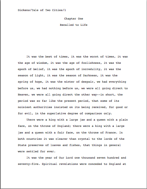
How to write a really good synopsis, part V: for those who feel hemmed by the length restriction

centurians in bondage

Ah, the beautiful early days of autumn! For a lot of people, this is a hectic time of year: the kids are heading back to school, Congress is back in session, the Supreme Court is hearing cases again, and Millicent the agency screener returns from her annual pre-Labor Day hiatus to train the unpaid intern who is going to be helping her in exchange for English department credit this fall. Everywhere you look, somebody’s being told to read something.

What a great time to be querying and pitching your work, eh?

The autumn brings out that thought in many an aspiring writer’s mind — so many, in fact, that I always run a series on the various elements of query packets this time of year. (No, it wasn’t your imagination, long-time readers: Author! Author! is partially cyclical. I always try to add something new each time I revisit an issue, though.) So far in this September’s hit parade, I’ve been going over writing a query, prepping a synopsis for tucking inside a query envelope, adding to the partial an agent has requested that you send, plopping into a contest entry, or having at the ready in anticipation for such a request at a pitch meeting. For the last few posts, I’ve been concentrating upon that bane of writers everywhere, the 1-page synopsis, which is essentially a written-down verbal pitch.

The summary part of a pitch, anyway. A 1-page synopsis should be a quick, pithy introduction to the premise, the protagonist, and the central conflict of the book.

Okay, so it may not be a piece o’ proverbial cake to pull all that off within a single page in standard format, but by this point in the series, I hope the prospect at least seems preferable to, say, confronting an angry cobra. More of a weeding-the-back-yard level of annoyance, really: a necessarily-but-tedious chore.

Seriously, successfully producing a 1-page synopsis is largely a matter of strategy, not creativity, and not even necessarily talent. As long as you don’t fall down the rabbit hole of one of the most common short synopsis-writing mistakes — trying to replicate each twist and turn of the plot/argument; generalizing so much that the book sounds generic; writing book jacket promotional copy rather than introducing the story — it’s simply a matter of telling Millicent what your book is ABOUT.

By contrast, the 5-page synopsis – which, until fairly recently, was far and away the most common requested length, as it still is for those already signed with agents and/or working with editors at publishing houses — should tell the STORY of your book (or state its argument) in as much vivid, eye-catching detail as you may reasonably cram into so few pages.

For what purpose, you ask? Why, to cause the agent, editor, or contest judge reading it exclaim spontaneously, “Wow — this sounds like one terrific book; this writer is a magnificent storyteller,” obviously.

Again, piece of cake to pull off in just a few pages, right?

Well, no, but don’t avert your eyes, please, if you are not yet at the querying stage — as with the author bio, I strongly recommend getting your synopsis ready WELL before you anticipate needing it. Especially if you are intending to query or pitch at a conference anytime soon. As I MAY have mentioned before, even if you do not intend to you will approach an agent whose website or agency guide listing asks for a query up front, you will be SUBSTANTIALLY happier if you walk into any marketing situation with your synopsis already polished, all ready to send out to the first agent or editor who asks for it, rather than running around in a fearful dither after the request, trying to pull your submission packet together.

Even if you think that both of the reasons I have just given are, to put it politely, intended to help lesser mortals not anywhere near as talented than your good self, whatever you do, try not to save writing your synopsis for the very last moments before you stuff a submission or entry into an envelope. That route virtually guarantees uncaught mistakes, even for the most gifted of writers and savviest of self-promoters.

If you take nothing else away from this series, please remember this: writing a synopsis well is hard, even for the most seasoned of pros; be sure to budget adequate time for it.

If the task feels overwhelming — which would certainly be understandable, faced with the daunting task of summarizing a 400-page book in just a few well-written pages — remind yourself that even though it may feel as though you effectively need to reproduce the entire book in condensed format, you actually don’t. Even a comparatively long synopsis shouldn’t depict every twist and turn of the plot.

What should you aim for instead? Glad you asked: just strive to give a solid feel of the mood of the book and a basic summary of the primary plot, rather than all of the subplots. Show where the major conflicts lie, introduce the main characters, interspersed with a few scenes described with a wealth of sensual detail, to make it more readable.

Sound vaguely familiar? It should; it’s an extension of our list of goals for the 1-page synopsis:

(1) introduce the major characters and premise,

(2) demonstrate the primary conflict(s),

(3) show what’s at stake for the protagonist, and

(4) ideally, give some indication of the tone and voice of the book.

(5) show the primary story arc through BRIEF descriptions of the most important scenes. (For NF that isn’t story-based, present the planks of the overarching argument in logical order, along with some indication of how you intend to prove each point), and

(6) show how the plot’s primary conflict is resolved or what the result of adopting the book’s argument would be.

I sense some squirming from the summary-resistant out there. “But Anne,” some of you protest, “am I missing something here? You’ve just told us not to try to summarize the entire book — yet what you’re suggesting here sounds a heck of a lot like sitting down and doing just that!”

Actually, I’m not. The distinction lies in the details: I’m advising you to winnow the story down to its most essential elements, rather than trying to list everything that happens.

If you’re having trouble separating the essential from the merely really, really important or decorative in your storyline, you may be staring too closely at it. Try to think of your story as a reader would — if a prospective reader asked you what your book was about and you had only a couple of minutes to answer, what would you say? (And no, I’m not talking about that ubiquitous writerly response that begins with a gigantic sigh and includes a fifteen-minute digression on what scenes in the novel are based on real life. Those of you who worked your way through this summer’s Pitching 101 series should know better than that, right?)

If you can’t get that account under 5 minutes, try giving the 20-minute version to a good listener who hasn’t read a syllable of your manuscript, then asking her to tell the plot of the book back to you: the elements she remembers to include are probably the most memorable. Or, if you don’t want to go out on a limb by recruiting others to help you, sit down all by your lonesome, picture your favorite English teacher standing over you, set the actual happenings of the novel aside for a moment, and write a brief summary of the book’s themes.

Oh, stop rolling your eyes; most authors are delighted to analyze their own books. Pretend that your book has just been assigned in a college English class — what would you expect the students to be able to say about it on the final?

No, the result will almost certainly not be a professional synopsis; this is an exercise intended to help you identify the essential of your storyline. A few quiz questions, to get you started:

(a) Who is the protagonist, and why is s/he interesting? (You’d be astonished at how few novel synopses give any clear indication of the latter.) To put it another way, what about this character in this situation is fresh?

(b) What does s/he want more than anything else? What or who is standing in the way of getting it?

(c) Why is getting it so important to her/him? What will happen if s/he doesn’t get it?

(d) How does the protagonist grow and change throughout pursuing this goal? What are the most important turning points in her/his development?

(e) How does the protagonist go about achieving this goal?

See? Piece of proverbial…hey, wait just a minute! Why, those questions sound a mite familiar, don’t they?

Again, they should: they’re the underlying issues of goals 1-3 and 5-6, above. If you answer them in roughly the same voice as the book, you will have met goal #4, as well — and, almost without noticing it, you will have the basic material for a dandy synopsis.

I told you: piece of cake.

Don’t, I implore you, make the extremely common mistake of leaving out point #6 — the one that specifies that you should include the story’s ending in the synopsis. Too many aspiring writers omit this in a misguided endeavor to goad Millicent the agency screener and her ilk into a frenzy of wonder about what is going to happen next.

“But I want to make them want to read the book!” such strategists invariably claim. “I don’t want to give away the ending. Leaving the synopsis on a cliffhanger will make them ask to see it right away.”

To professional eyes, this is a rookie mistake, at least in a synopsis longer than a page. In fact, it’s frowned-upon enough that some Millicents have been known to reject projects on this basis alone.

Half of you who currently have synopses out circulating with your queries just went pale, didn’t you?

Perhaps I should have broken it to you a bit more gently. Here goes: from a professional point of view, part of the goal of an extended synopsis is to demonstrate to someone who presumably hasn’t sat down and read your entire book that you can in fact plot out an entire novel plausibly. Agents and editors regard it as the writer’s job to demonstrate this in an extended synopsis, not theirs to guess how the plot might conceivably come to a halt.

I hate to be the one to break it to you (at least before I’ve helped you all to a slice of cake), but a talented sentence-writer’s possessing the skills, finesse, and tenacity to follow a story to its logical conclusions is not a foregone conclusion. In practice, the assumption tends to run in the opposite direction: if the synopsis leaves out the how the plot resolves, Millicent and her cousin Maury (the editorial assistant at a major publishing house) will tend to leap to one of four conclusions, none of which are good for a submitter. Either they surmise that:

a) the synopsis’ author isn’t aware of the purpose of an extended synopsis, having confused it with back jacket copy, and thus is a fish that should be thrown back into the sea until it grows up a little. In other words, next!

b) the synopsis’ author is a tireless self-promoter and/or inveterate tease, determined not to cough up the goods until there is actual money on the table. Since this is simply not how the publishing industry works, the fish analogy above may reasonably be applied here as well. Next!

c) the synopsis’ author is one of the many, many writers exceptionally talented at coming up with stupendous premises, but less adept at fleshing them out. S/he evidently hopes to conceal this weakness from Millicent and Maury until after they have already fallen in love with the beauty of her/his prose and plotting in the early part of the book, in an attempt to cajole their respective bosses into editing the heck out of the novel before it could possibly be ready to market.

The wily fiend! Next!

d) or, less charitably, the synopsis’ author hasn’t yet written the ending, and thus is wasting their respective boss’ time by submitting an incomplete novel. Again, next!

The moral: include some indication of how the plot resolves. Millicent, Maury, and their Aunt Mehitabel (the veteran contest judge) will thank you for it. They might even give you a piece of that delicious cake I keep mentioning.

Does that monumental gusty sigh I just heard out there in the ether mean that I have convinced you on that point? “All right, Anne,” synopsizers everywhere murmur with resignation, “I’ll give away the goods. But I have a lingering question about #4 on your list above, the one about writing the synopsis in roughly the same voice and in the same tone as the novel it summarizes. I get that a comic novel’s synopsis should contain a few chuckles; an ultra-serious one shouldn’t. A steamy romance’s synopsis should be at least a little bit sexy, a thriller’s a trifle scary, and so forth. But I keep getting so wrapped up in the necessity of swift summarization that my synopsis ends up sounding nothing like the book! How should I remedy this — by pretending I’m the protagonist and writing it from his point of view?”

Um, no. Nor should you even consider writing it in the first person, unless you happen to have written a memoir.

Nor is there any need to get obsessed with making sure the tone is identical to the book’s — in the same ballpark will do. You just want to show that you are familiar with the type of writing expected in the type of book you’ve written and can produce it consistently, even in a relatively dry document.

Piece of — oh, never mind.

There’s a practical reason for demonstrating this skill at the querying and submission stages: it’s a minor selling point for a new writer. Increasingly, authors are expected to promote their own books; it’s not at all uncommon these days for a publishing house to ask the author of a soon-to-be-released book to write a magazine or online article in the book’s voice, for promotional purposes, for instance. Or a blog, like yours truly. (Full disclosure; when I originally agreed to start acting as the Resident Writer for the Pacific Northwest Writers’ Association, my original blogging gig, I anticipated having a memoir out six months later. When the memoir got caught up in legal hassles, I just kept right on blogging.)

Yes, I know; you want to concentrate on your writing, not its promotion. The muses love you for that impulse. But would you rather that I lied to you about the realities of being a working author?

I thought not. Let’s move on.

What you should also not do — but, alas, all too many aspiring writers do — is attempt to replicate the voice of the book by lifting actual sentences from the novel itself, cramming them indiscriminately into the synopsis. I know that you want to show off your best writing, but trust me, you’re going to want to make up some new verbiage here.

Why, you ask? Hint: people who go into the manuscript-reading business tend to have pretty good memories.

That’s right: they recall what they’ve read. When I was teaching at a university, I was notorious for spotting verbiage lifted from papers I’d graded in previous terms; the fraternities that maintained A paper files actively told their members to avoid my classes.

Similarly, a really on-the-ball Millicent might recognize a sentence she read a year ago — and certainly one that she scanned ten minutes ago.

See the problem? No? What if I tell you that in a submission packet, the chapters containing the lifted verbiage and the synopsis are often read back-to-back?

Ditto with query packets. And good 30% of contest entries make this mistake, reproducing in the synopsis entire sentences or even entire paragraphs from the chapters included in the entry. Invariably, the practice ends up costing the entry originality points.

Do I see some raised hands from those of you who habitually recall what you’ve read? “But Anne,” some of you point out huffily, and who could blame you? “Didn’t you tell us just yesterday that it was a grave error to assume that Millicent (the agency screener), Maury (her cousin who works as an editorial assistant), and/or Mehitabel (their aunt, the contest judge) will necessarily read both our synopses and the rest of our submissions?”

Excellent point, sharp-eyed readers. While it’s never safe to assume that EVERYONE who reads your synopsis will also read your opening chapter, it’s also not a very good idea to assume that NO ONE will. Shooting for a happy medium — including enough overlap that someone who read only one of them could follow the plot without indulging in phrase redundancy — tends to work best here.

Should you be tempted to repeat yourself, I implore you to counter that impulse by asking this question with all possible speed: “Is there a vibrantly interesting detail that I could insert here instead?”

To over-writers (like, I must admit, myself), it may seem a trifle odd to suggest adding detail to a piece of writing as short as 5 pages, but actually, most synopses suffer from overgrowths of generalization and an insufficiency of specifics. So once you have a solid draft, read it over and ask yourself: is what I have here honestly a reader-friendly telling of my story or a convincing presentation of my argument (don’t worry, NF writers: I’ll deal with your concerns at length next time), or is it merely a presentation of the premise of the book and a cursory overview of its major themes?

For most synopses, it is the latter.

Do I hear some questions over and above the wailing and gnashing of teeth out there? “But Anne,” a couple of voices cry from the wilderness, “How can I tell the difference between a necessary summary statement and a generalization?”

Again, excellent question. The short answer: it’s hard. Here’s a useful trick:

(1) Print up a hard copy of the synopsis, find yourself a highlighting pen, and mark every summary statement about character, every time you have wrapped up a scene or plot twist description with a sentence along the lines of and in the process, Sheila learns an important lesson about herself.

(2) Go back through and take a careful look at these highlighted lines.

(3) Ask yourself for each: would a briefly-described scene SHOW the conclusion stated there better than just TELLING the reader about it? Is there a telling character detail or an interesting plot nuance that might supplement these general statements, making them more interesting to read?

I heard that gasp of recognition out there — yes, campers, the all-pervasive directive to SHOW, DON’T TELL should be applied to synopses as well. Generally speaking, the fewer generalities you can use in a 5-page synopsis, the better.

I’ll let those of you into brevity for brevity’s sake in on a little secret: given a choice, specifics are almost always more interesting to a reader than vague generalities. Think about it from an agency screener’s POV, someone who reads 800 synopses per week: wouldn’t general statements about lessons learned and hearts broken start to sound rather similar after awhile?

But a genuinely quirky detail in a particular synopsis — wouldn’t that stand out in your mind? And if that unique grabber appeared on page 1 of the synopsis, or even in the first couple of paragraphs, wouldn’t you pay more attention to the rest of the summary?

Uh-huh. So would Millicent.

It’s very easy to forget in the heat of pulling together a synopsis that agency screeners are readers, too, not just decision-makers. They like to be entertained, so the more entertaining you can make your synopsis, the more likely Millicent is to be wowed by it. So are Maury and Mehitabel.

Isn’t it fortunate that you’re a writer with the skills to pull that off?

If your synopsis has the opposite problem and runs long (like, I must admit, today’s post), you can also employ the method I described above, but with an editorial twist:

(1) Sit down and read your synopsis over with a highlighter gripped tightly in your warm little hand. On your first pass through, mark any sentence that does not deal with the primary plot or argument of the book.

(2) Go back through and read the UNMARKED sentences in sequence, ignoring the highlighted ones.

(3) Ask yourself honestly: does the shorter version give an accurate impression of the book?

(4) If so — take a deep breath here, please; some writers will find the rest of this one upsetting — do the marked sentences really need to be there at all?

If you’ve strenuously applied the steps above and your synopsis still runs too long, try this trick of the pros: minimize the amount of space you devote to the book’s premise and the actions that occur in Chapter 1.

Sounds wacky, I know, but the vast majority of synopses spend to long on it. Here’s a startling statistic: in the average novel synopsis, over a quarter of the text deals with premise and character introduction.

So why not be original and trim that part down to just a few sentences and moving on to the rest of the plot?

This is an especially good strategy if you’re constructing a synopsis to accompany requested pages, unrequested pages that an agency’s website or agency guide listing says to tuck into your query packet, or contest entry. Think about it: if you’re sending Chapter 1 or the first 50 pages, and if you place the chapter BEFORE the synopsis in your submission or query packet (its usual location), the reader will already be familiar with both the initial premise AND the basic characters AND what occurs at the beginning in the book before stumbling upon the synopsis.

So I ask you, since space is at a premium on the synopsis page, how is it in your interest to be repetitious?

Allow me show you how this might play out in practice. Let’s continue this series’ tradition of pretending that you are Jane Austen, pitching SENSE AND SENSIBILITY to an agent at a conference. (Which I suspect would be a pretty tough sell in the current market, actually.) Let’s further assume that you gave a solid, professional pitch, and the agent is charmed by the story. (Because, no doubt, you were very clever indeed, and did enough solid research before you signed up for your agent appointment to have a pretty fair certainty that this particular agent is habitually charmed by this sort of story.) The agent asks to see a synopsis and the first 50 pages.

See? Advance research really does pay off, Jane.

Naturally, you dance home in a terrible rush to get those pages in the mail. As luck would have it, you already have a partially-written synopsis on your computer. (Our Jane’s very into 21st-century technology.) In it, the first 50 pages’ worth of action look something like this:

Now, all of this does in fact occur in the first 50 pages of SENSE AND SENSIBILITY, at least in my well-worn little paperback addition. However, all of the plot shown above would be in the materials the agent requested, right? Do you really need to spend 2 of your allotted 5 pages on this small a section of the plot, even if it is the set-up for what happens later on?

Of course not. Being a wise Aunt Jane, you would streamline this portion of your submission synopsis so it looked a bit more like this:

And then go on with the rest of the story, of course.

See what space-saving wonders may be wrought by cutting down on the premise-establishing facts? The second synopsis is less than half the length of the first, yet still shows enough detail to show the agent how the submitted 50 pp. feeds into the rest of the book. Well done, Jane!

While all of you novelists are hard at work, trying to perform a similar miracle upon your synopses, next time, I shall be tackling the specialized problems of the nonfiction synopsis. Yes, that’s right: we’re going to have our cake and eat it, too.

Yum, yum. Keep up the good work!
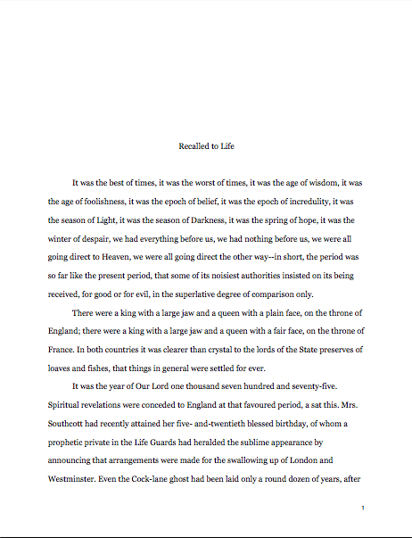
How to write a really good query letter, part IV: is the room getting bigger, or am I shrinking?

props-for-incredible-shrinking-man

Yes, yes, I know: I often take the weekends off from blogging, but I’m trying to get us through the Really Good Query Letter series by the end of Labor Day week. For the last few posts, I have been talking about how to present your book project so that it sounds like a professional pitch, rather than a carnival hawker introducing the Greatest (fill in the blank here) in the World. Peeks only 10 cents!

So far, I’ve been sticking to content, but for today, I’d like to focus on purely cosmetic issues.

No, I’m not advising you to apply rouge and lip gloss to your query letter (no, not even if it is introducing a book proposal on make-up tips; remember, flashy gimmicks don’t work). I’m talking about how your query looks, rather than what it says.

And I hear some of you grumbling already. “But Anne!” a few voices protest out there in the ether. “Books are made up of words arranged in sentences. I can understand why I need to make my manuscript appear professional (by adhering to the rules of standard format, conveniently gathered for my benefit under the HOW TO FORMAT A MANUSCRIPT category on the archive list at right), but a query letter rises or falls purely on its content, right? As long as I do not scrawl it in crayon on tissue paper, why should I worry about what it looks like?”

Why, indeed? Rather than tell you, I’m going to show you.

But to show you why a poorly presented query looks wrong, let’s take a gander at what a really good query letter looks like. Not so you can copy it verbatim — rote reproductions abound in rejection piles — but so you may see what the theory looks like in practice.

And please, those of you who only e-query: don’t assume that none of what I’m about to say about traditional paper queries is applicable to you. Even agents who accept only e-mailed queries were weaned on mailed ones; the paper version is still the industry standard, dictating what does and does not look professional to folks in the biz. So even if there is no paper whatsoever involved in your querying process, you’re still going to want to be aware of how query letters should appear on a page.

So you could see the principles we’ve been discussing in action, I’ve decided to pitch a book in the public domain whose story you might know: MADAME BOVARY. (And if you’re having trouble reading it at its current size, try clicking on the image a couple of times.)

That’s an awfully good query letter, isn’t it? After the last few days’ posts, I hope it’s clear to you why: it that presents the book well, in businesslike terms, without coming across as too pushy or arrogant. Even more pleasing to Millicent’s eye, Mssr. Flaubert makes the book sound genuinely interesting AND describes it in terms that imply a certain familiarity with how the publishing industry works.

Well done, Gustave! (The date on the letter is when the first installment of MADAME BOVARY was published, incidentally; I couldn’t resist.)

For the sake of comparison, let’s assume that Mssr. Flaubert had not done his homework; what might his query letter have looked like then?

Now, I respect my readers’ intelligence far too much to go through point by point, explaining what’s wrong with this second letter. Obviously, the contractions are far too casual for a professional missive.

No, but seriously, I would hope that you spotted the unsupported boasting, the bullying, disrespectful tone, and the fact that it doesn’t really describe the book. Also, to Millicent’s eye, the fact that it was addressed to DEAR AGENT and undated would indicate that ol’ Gustave is simply plastering the entire agent community with queries, regardless of individual agents’ representation preferences.

That alone would almost certainly lead her to reject MADAME BOVARY out of hand, without reading the body of the letter at all. And those ten pages the agency’s website or listing in a standard agents’ guide said to send? Returned unread.

As ever-eagle-eyed reader Dave pointed out last time, the Dear Agent letter has a first cousin that also tends to be an automatic rejection offense, a gaffe to which even very experienced queriers routinely fall prey. See if you can spot it:

bad-flaubert-query-letter-2

If you reared back in horror, exclaiming, “Oh, no! Our Gustave has sent the query to Agent Richardson, but left the salutation from what was probably his last query to Agent Tom Jones!” congratulations: you win a gold star with walnut clusters. Since the advent of the home computer, aspiring writers have been falling into this trap constantly.

The cure? Pull out your hymnals, long-time readers, and sing along: read EVERY SYLLABLE of each query letter IN HARD COPY and OUT LOUD.

Yes, even if you are e-querying or pasting a letter into a form on an agency’s website. Do not hit SEND until you have made absolutely sure that the salutation matches the recipient.

Setting aside all of these problems, there are two other major problems with both version of this letter that we have not yet discussed. First, how exactly is the agent to contact Gustave to request him to send the manuscript?

She can’t, of course, because Mssr. Flaubert has made the mistake of leaving out that information, as an astonishingly high percentage of queriers do.

Why? I suspect it’s because they assume that if they include a SASE (that’s Self-Addressed Stamped Envelope, for those of you new to the trade, and it should be included with every mailed query and submission UNLESS the agency’s website specifically says otherwise), the agent already has their contact information.

A similar logic tends to prevail with e-mailed queries: all the agent needs to do is hit REPLY, right?

Well, no, not necessarily; e-mailed queries get forwarded from agent to assistant and back again all the time, and SASEs have been known to go astray. I speak from personal experience here: I once received a kind rejection for someone else’s book stuffed into my SASE. I returned the manuscript with a polite note informing the agency of the mistake, along with the suggestion that perhaps they had lost MY submission. The nice agency assistant who answered that letter — very considerately, as it happens — grew up to be my current agent, now a senior agent at the same agency.

True story.

The moral: don’t depend on the SASE or return button alone. Include your contact information either in the body of the letter or in its header.

This is especially important if you happen to be querying a US-based agent from outside the US. English-speaking foreign writers often assume, wrongly, that US agents have a strong preference for working with the locals, that not being able to fly a few thousand miles for frequent face-to-face meetings would be a deal-breaker, or that an expatriate would be better off using her mom’s home address in Indiana so as to appear to be living in North America. As a result, they tend not to mention in their (almost invariably e-) queries that they and their manuscripts are not currently stateside.

However, the US is a mighty big country: NYC-based agents have been representing clients without meeting them in person since the early 20th century; distance is not a deal-breaker, typically. Some agencies might deduct the cost of international phone calls from the advance, just as they might choose to charge the writer for photocopying, but in the era of e-mail, that’s increasingly rare.

Go ahead and include your contact information, wherever you are. It might even be a selling point, if the agent happens to like to travel. (Oh, you don’t think the agent of your dreams would like to crash for a few days on your couch in London?)

But I digress. Back to the diagnosis already in progress.

Gustave’s second problem is a bit more subtle, not so much a major gaffe as a small signal to Millicent that the manuscript to which the letter refers MIGHT not be professionally polished. Any guesses?

If you said that it was in business format rather than correspondence format, congratulations: you’ve been paying attention. In this form, it would look less literate (unless it was an e-mailed submission, where indented paragraphs are harder to format).

Any other diagnoses? Okay, let me infect the good query with the same virus, to help make the problem a bit more visible to the naked eye:

See it now? The letter is written in Helvetica, not Times, Times New Roman, or Courier, the preferred typefaces for manuscripts.

Was that huge huff of indignation that just billowed toward space an indication that favoring one font over another in queries is, well, a tad unfair? To set your minds at ease, I’ve never seen font choice alone be a rejection trigger (although font size often is; stick to 12 point). Nor do most agencies openly express font preferences for queries (although a few do; check their websites and/or agency book listings).

However, I can tell you from very, very long experience working with aspiring writers that queries in the standard typefaces do seem to be treated with a touch more respect.

I know; odd. But worth noting, don’t you think?

While we’re on the subject of cosmetic problems, let’s take a look at another common yet purely structural way that good query letters send off an unprofessional vibe:

Not all that subtle, this: a query letter needs to be a SINGLE page. This restriction is taken so seriously that very, very few Millicents would be willing to turn to that second page at all, few enough that it’s just not worth adding.

Why are agencies so rigid about length when dealing with people who are, after all, writers? Long-time readers, chant it with me now: TIME. Can you imagine how lengthy the average query letter would be if agencies didn’t limit how long writers could ramble on about their books?

Stop smiling. It would be awful, at least for Millicent.

Fortunately, the one-page limit seems to be the most widely-known of querying rules, if one of the most often fudged in e-queries. (“What’s Millicent going to do?” the fudger mutters. “Print it out in order to catch me at my little ruse? She doesn’t have that kind of time.”) Which is rather unfair to screeners, since e-queries can, since they omit the date and address salutation at the top of the message, be several lines longer and still fit within the one-page ideal.

I’m just saying.

The one-page limit is so widely known, in fact, that aspiring writers frequently tempt Millicent’s wrath through conjuring tricks that force all of the information the writer wishes to provide onto a single page. Popular choices include minimizing the margins:

or shrinking the font size:

or, most effective at all, using the scale function under Page Setup in Word to shrink the entire document:

Let me burst this bubble before any of you even try to blow it up to its full extent: this sort of document-altering magic will not help an over-long query sneak past Millicent’s scrutiny, for the exceedingly simple reason that she will not be fooled by it. Not even for a nanosecond.

The only message such a query letter sends is this writer cannot follow directions.

An experienced contest judge would not be fooled, either, incidentally, should you be thinking of using any of these tricks to crush a too-lengthy chapter down to the maximum acceptable page length. Ditto for pages requested for submissions to agencies or publishing houses: if you shrink it, they will know.

Why am I so certain that Millie will catch strategic shrinkage? For precisely the same reason that deviations from standard format in manuscripts are so obvious to professional readers: the fact that they read correctly-formatted pages ALL THE TIME.

Don’t believe the tricks above wouldn’t be instantaneously spottable? Okay, glance at them, then take another gander at our first example of the day:

Viewed side-by-side, the differences are pretty obvious, aren’t they? Even in the extremely unlikely event that Millicent isn’t really sure that the query in front of her contains some trickery, all she has to do is move her fingertips a few inches to the right or the left of it, open the next query letter, and perform an enlightening little compare-and-contrast exercise.

Don’t tempt her to do it.

Avoiding formatting skullduggery is not the only thing I would like you to learn from today’s examples. What I would also like you to take away: with one egregious exception, these examples were all more or less the same query letter in terms of content, all pitching the same book. Yet only one of these is at all likely to engender a request to read the actual MANUSCRIPT.

In other words, even a great book will be rejected at the query letter if it is queried or pitched poorly. Yes, many agents would snap up Mssr. Flaubert in a heartbeat after reading his wonderful prose — but with a query letter like the second, or with some of the sneaky formatting tricks exhibited here, the probability of any agent’s asking to read it is close to zero.

The moral, should you care to know it: how a writer presents his work — in the query every bit as much as on the manuscript page — matters.

Let’s not forget an important corollary to this realization: even a book as genuinely gorgeous as MADAME BOVARY would not see the inside of a Borders today unless Flaubert kept sending out query letters, rather than curling up in a ball after the first rejection.

Deep down, pretty much every writer believes that if she were REALLY talented, her work would get picked up without her having to market it at all. It’s an incredibly common writerly fantasy: there’s a knock on your door, and when you open it, there’s the perfect agent standing there, contract in hand.

“I heard that your work is wonderful,” the agent says. “Here, sign this, so I may sell the manuscript I have not yet read to that editor who is waiting at the car parked at your curb.”

Or perhaps in your preferred version, you go to a conference and pitch your work for the first time. The agent of your dreams, naturally, falls over backwards in his chair; after sal volitale has been administered to revive him from his faint, he cries, “That’s it! The book I’ve been looking for my whole professional life!”

Or, still more common, you send your first query letter to an agent, and you receive a phone call two days later, asking to see the entire manuscript. Three days after you overnight it to New York, the agent calls to say that she stayed up all night reading it, and is dying to represent you. Could you fly to New York immediately, so she could introduce you to the people who are going to pay a million dollars for your rights?

I have nothing against a good fantasy (especially of the SF/Fantasy genre), but while you are trying to find an agent, please do not be swayed by daydreams. Don’t send out only one query at a time; it’s truly a waste of your efforts. Try to keep 7 or 8 out at any given time.

This advice often comes as a shock to writers. “What do you mean, 7 or 8 at a time? I’ve been rejected ten times, and I thought that meant I should lock myself away and revise the book completely before I sent it out again!”

In a word, no. Oh, feel free to lock yourself up and revise to your heart’s content, but if you have a completed manuscript in your desk drawer, you should try to keep a constant flow of query letters heading out your door. As they say in the biz, the only manuscript that can never be sold is the one that is never submitted. (For a great, inspiring cheerleading essay on how writers talk themselves out of believing this, check out Carolyn See’s Making a Literary Life.)

There are two reasons keeping a constant flow is a good idea, professionally speaking. First, it’s never a good idea to allow a query letter to molder on your desktop: after awhile, that form letter can start to seem very personally damning, and a single rejection from a single agent can start to feel like an entire industry’s indictment of your work.

I’ve said it before, and I’ll say it again: one of the most self-destructive of conference-circuit rumors is the notion that if a book is good, it will automatically be picked up by the first agent that sees it. Or the fifth, for that matter.

This is simply untrue. It is not uncommon for wonderful books to go through dozens of queries, and even many rounds of query-revision-query-revision before being picked up. As long-time readers of this blog are already aware, there are hundreds of reasons that agents and their screeners reject manuscripts, the most common being that they do not like to represent a particular kind of book.

So how precisely is such a rejection a reflection on the quality of the writing?

Keep on sending out those queries a hundred times, if necessary. Because until you can blandish the right agent into reading your book, you’re just not going to know for sure whether it is marketable or not.

More querying tips follow anon. Keep up the good work!

An inside look at a formal writing retreat, part III: did someone mention fellowships?

library-door-at-la-muse

For the last week or so, I’ve been talking about the pros, cons, ins, outs, and finances of grabbing one’s manuscript, computer, and what Chaucer described for posterity as a bag of needments and trundling off to a formal writing retreat. You know, the impressive kind that they advertise in the back of Poets & Writers magazine: artists’ colonies where you have to write (or paint, or sculpt, or photograph) your way in; for the rest of your professional life, agents, editors, and other literati take a gander at your bio or query letter and exclaim, “Oh, you were at Retreat X?”

Oh, and one generally gets time to work on one’s manuscript, too.

Because both the decision to take time off work and the application process can be intimidating, confusing, or even downright scary, I have devoted the last couple of days to chatting about practicalities with Kerry Eielson and John Fanning, owners, operators, and writers-in-residence at La Muse Artists’ Retreat in southwestern France. If you gaze carefully into the windows in the picture above, you’ll catch a glimpse of the magnificent view I enjoyed every time I cast my laptop from me last month and stared out the window, mulling over dialogue.

What — not enough detail in that image? Well, if you’re very nice, I’ll treat you to some clearer landscape photos throughout today’s post.

But wait, there’s more: as an additional treat, I’m also going to be continuing the extremely practical bent of yesterday’s post (an excellent behind-the-scenes glimpse into what a retreat application looks like from the other side of the submission desk) by sticking to the nitty-gritty. Specifically, to the financial nitty-gritty, to address the most pressing question on many would-be retreating writers’ minds:

How on earth do writers afford to stay at a retreat like this?

If a writer happens to be independently wealthy, obviously, the answer is simple: there are plenty of perfectly marvelous artists’ hideaways out there for thems as can pay for ‘em. Those of lesser means often save up for them, get a paper route, or blandish kith and kin into donating toward them as birthday presents, in much the same way as anyone else who wants something out of his price range.

However, the answer for most of us who do it on a semi-regular basis, as I mentioned on Monday, is to apply for fellowships, grants, and barter arrangements at the retreats whose facilities we covet.

Fair warning: very, very few formal retreats can afford to offer more than a small handful of fellowships; the vast majority of residents in even the top-flight retreats are paying their own way, at least in part. Not all artists’ colonies offer outright free stays — and remember when you’re budgeting, even those that do seldom offer assistance with travel to reach their often far-flung doorsteps — and those that do tend to see hundreds of applications for each available spot. Barter arrangements are sometimes possible, but rare.

The fact is, though, most retreats do offer a chance to win at least a break on the cost of residency, if not a free ride, to those willing to jump through a few extra hoops. Since you’re going to be submitting an application to a selective retreat, anyway, what are a few extra hoops? It never hurts to try.

Where might one start trying? Well, word of mouth is best; I’ve found some great grants, as well as some fabulous retreat spots, by the simple expedient of asking writers I admire where they go to get away from it all and who paid for it. You can also engage in a web search, but like anything else you shop for online, it’s prudent to double-check a granting foundation’s credibility before you put your John Hancock on a application fee check. Like literary contests, not all of the fellowship opportunities advertised are legit; like literary contests, sometimes the primary goal of a fellowship competition is apparently to collect all of those application fees, rather than to reward, say, compositional excellence. Many a retreat, like many a contest-running organization, depends heavily on funds raised from the fees of unsuccessful applicants.

Please tell me that none of that was news to you. Or that if it was, you haven’t been wildly sending off entries and application fees to every contest, fellowship, and grant program out there. Or that if you have, you will solemnly swear to set aside time to read through the CONTESTS THAT ARE WORTH YOUR TIME TO ENTER category on the archive list on the lower right-hand side of this page.

Hey, I’m only trying to save you some money. And chagrin.

As is the case with so very many other aspects of getting started as a writer, it pays to do your homework before you actually pay for anything. A good place to start looking for fellowships that actually are what they appear to be is Poets & Writers magazine, whose staff tend to keep a sharp eye out for those out to scam writers.

Yes, yes, I heard that massive collective sigh: tracking down a fellowship and applying for it can be quite a bit of work, yet another demand upon your precious writing time, along with querying, going to conferences to pitch, going to conferences not to pitch, submitting, entering contests, attending classes, keeping up with the new releases in your chosen book category, and, oh yeah, writing your manuscript. But listen: while all of these efforts can result in some pretty happy outcomes for a writer, from landing an agent to learning how to present your work professionally to making some pretty terrific fellow writers, applying for a retreat fellowship or writing grant is one of the very few standard writerly activities that can actually give you more time to write.

All right, that’s enough cautionary preamble for one day. Let’s take a gander at another nice, soothing picture of a lovely landscape in France — and get back to our ongoing conversation with some folks who are, in part, in the fellowship- and barter-granting business. And had I mentioned that La Muse is one of the relatively few fellowship-offering retreats out there that doesn’t charge an application fee?

Labastide Esparbaïrenque on a heavy traffic day

Labastide Esparbaïrenque on a heavy traffic day

Anne: I hear that you offer fellowships to stay at La Muse, which must be awfully difficult to pull off in the current global economy. Since you could fill the retreat entirely with writers and other artists paying their own way, why offer fellowships?

Kerry: We want people to be able to come for free. We want everyone to be able to come. We need people’s help to make that happen though because we are only two people so far with amazing barter attendees nearly every second month but we need more.

Anne: I’ll want to get back to barter residencies in a bit, since that’s so unusual, but let’s stick with the fellowships for the moment. How many fellowships are you offering these days?

John: We have four fellowships a year with separate application procedures, and seek partnerships to extend that to at least twelve fellowships.

Anne: Meaning that you sponsor visiting writers and artists from a number of different institutions.

John: Ideally, we would like to invite every attendee to La Muse as a fellow or on a residency attached to a university, publishing house, organization, or patron so that writers and artists don’t feel burdened by the financial weight of getting time off from work without pay or worrying about the costs of flights, etc.

Anne: I would love to see more retreats run on that basis, but so few of them are. I’ve met literally thousands of writers just in the last five years to whom such a retreat opportunity would have made a phenomenal difference.

John: Our vision has always been to provide a space for creative people who need to get away from life back home to get a project going or finished so inevitably we would like to make that transition much easier and less costly, as even the bare minimum costs we charge to offset our operating costs, can stop people from coming.

view-from-la-muse-window
Anne: So is that how you see La Muse operating ten years from now?

John: In ten years, although we would really love to see it happening a lot sooner, we foresee everyone that comes as being a fellow. We’ve already started this process with Foras Feasa in Ireland and the writing programs of universities such as Iowa and University of Wisconsin-Madison in the States, over and above the Wildcard residency every year.

Anne: And everyone’s eligible for the Wildcard residency. I know that you subsidize the Wildcard residency yourselves, out of the goodness of your collective heart. Do the universities pay to send their fellows?

John: The Iowa and Madison fellowships are not underwritten by the universities.

Anne: Wow. So more goodness-of-your-heart stuff.

John: We donate them to the graduates there because we believe in those courses. The University of Iowa brought a load of students here a few years ago under the guidance of Robin Hemley and David Hamilton. We were really impressed by the caliber and professionalism of Robin and David, but more importantly by the students and their potential. That’s why we offer them two fellowships a year.

Anne: Iowa has a great writing program. Was the high quality of the writing programs what prompted you to offer fellowships to students from the other two as well?

John: Madison is where Kerry went to university so she had first-hand experience of how good their creative writing department was, and I went to Maynooth University. which is a member of Foras Feasa. It all felt organic. However, we would love to have fellows from every country, but this takes time and energy and help.

Kerry: And in the future we will have it. We’re definitely going to need another really big house, too (there’s one we love right here in Labastide). Or two. And a support staff. And a recording studio for musicians, a piano, a movie room for screenings and cinema nights, an oven for ceramicists, a big room with a wooden floor for dancers, a full-time on-site yoga instructor, a coop-type organic vegetable garden for attendees, and a sizable gift from a lover-of-the-arts that will have made it all possible without any more debt, plus enough funding for every artist to come to La Muse on a full fellowship.

Anne: From your mouth to Whomever’s ear.

Kerry: I envision nirvana. And an office, so we don’t have to run all of this from our kitchen anymore and John’s small office upstairs.

windows-at-la-muse
Anne: But even now, not all of your fellowships are devoted to people affiliated with specific programs, right?

John: True to our non-affiliated roots, we also offer a Wildcard Residency to a visual artist and a writer every November.

Anne: I imagine that the Wildcard is the one that will interest most of my readers. How does one apply for a fellowship to La Muse?

Kerry: Whether for the University of Wisconsin Creative Writing Fellowship, the University of Iowa Creative Non-fiction Fellowship, or our own unaffiliated Wildcard Fellowship, the process is the same as for a regular retreat stay:

a CV
2 references (one personal and one professional)
a description of the project one hopes to work on at La Muse,
and a sample of work

Anne: That’s unusual, not to require extra paperwork for fellowship applicants.

Kerry: The deadlines are on our website. Foras Feasa in Ireland elects their Fellow every year, in March.

We have also barters almost every month of the year. We would love to have a barter attendee here every month of the year, but the operating costs of La Muse don’t allow for it yet.

view-near-church

Anne: Okay, let’s talk about the barters. If I may quote from your website:

We welcome writers and artists to apply to come to La Muse as barters on work exchange stays. Writers and artists receive a complimentary room in exchange for approximately 3 days of work per week, that is, two days of work and one hour a day of daily tasks.

The kind of work depends on the season and the number of other guests at the house, but would include anything from building stone walls and gardening to home improvement, grant research for the owners, or organizational/administrative assistance.

Barter rooms are not available during the summer. We review applications one to two months in advance. Application

Anne: Your barter arrangements are unusually generous, I’ve noticed. Usually, the work exchange results in a discount for the retreater, but this is the room for an entire three-week session.

Kerry: We try to have barters for most of the year. They apply more or less the same way as other attendees, though it’s a good idea to highlight in the application any specific skills that could help us, such as grant-writing knowledge, fundraising or marketing or PR, or house-painting or construction or gardening experience. All barter projects are for La Muse improvements only, i.e., they don’t do our laundry!

Anne: I get it: the barter attendees are helping you two build the La Muse of ten years hence both physically and financially. That’s a great idea. If any of you readers out there are financial wizards, I hope you’ll think about going on a bartered retreat to help move La Muse toward the dream of an entirely subsidized artists’ community!

Before I get too carried away with the idea, I should ask: do barterers get to stay the same length of time as paying retreatants? How is their work/retreat time differentiated so both they and you can get the most out of both?

Kerry: Once barters arrive, they work for three days a week in exchange for their room. They arrive on the last day of the outgoing retreat so that they can help us get the house ready. Either they work on one intensive project for the whole stay, or they essentially help us on whatever comes up. It depends on the time of the year they come and what we happen to be working on. We work with them on most projects.

John: Barters get a lot out of their stays here, too, because they are really aware of their creative time apart from their barter time. They always get a lot of their own work done because they are really aware of how precious their time here is.

It’s great, because they love to get out of the house to clear their creative desktops. That way, they start fresh after three days. We love having barters and from what they’ve wrote to us over the years they love the experience, too.

Anne: While we’re on the subject of unusual arrangements for a formal retreat, you mentioned last time that sometimes your writer and artist residents collaborate on projects; during my stay, a fellow resident and I happened to be writing books set in the 1980s — she nonfiction, I fiction — so we had amazing brainstorming sessions. Perhaps as a result, I kept thinking while I was in residence, if I ever was working on a collaborative project with another writer, I’d definitely drag him/her/it to La Muse for some intensive co-work.

Which leads me to ask about other types of groups. Do couples ever come together to La Muse, or groups of friends? A writing group, perhaps? Could you accommodate a writer with children and/or a significant other in tow?

Kerry: Yes, all of the above. Spouses who want to come and stay in the house with an artist have to apply with a project proposal etc; if they’re coming to be a tourist, we recommend renting a cottage. Families stay in cottages.

Anne: That makes sense. That way, the family can have its own space, distinct from the other residents.

Kerry: We’ve had creativity/yoga retreats, workshop retreats. It’s all possible. We envision and would welcome proposals for cooking/writing retreats, art/well-being retreats, etc.

Anne: And academics, too, right? A couple of my fellow attendees were graduate students, which I found interesting, as academic writers tend not to go on retreat as much as I think they should. Is La Muse a good place to, say, write up a dissertation? Or, to put it another way, what might be the benefits for an academic to live and work amongst artists for a while?

Kerry: A creative approach to structure and voice would be marvelous for dissertations, and that often comes from the conversations we and other attendees have with Ph.D. attendees. They see structure and approach in a whole new light when they see it from a more commercial or creative standpoint.

Anne: That definitely seemed to happen in my retreat group. I can tell you from experience that few dissertation-writers ever get asked on a college campus, “So, what story are you telling in your book?”

John: Yes, it makes them see beyond the footnotes and cross analysis to where the story of what it is they are writing about lies. Where is the story of my subject? A lot of academics that have been here have found that really refreshing and inspiring.

Anne: John, I hear that you’re planning to go on a writing retreat yourself. What are you looking for in a retreat experience?

John: I’m looking for La Muse!

Anne: On that note, I’m going to sign off for the day. Thanks, Kerry and John, for filling us in about fellowships and barters!

If some of you found today’s talk of finances a bit prosaic for your daydreaming-about-retreating-in-France pleasure, never fear: more mouth-watering details follow anon. In the meantime, keep up the good work!

How to format a book manuscript properly, part XII: not all truths are self-evident, or, why a sensible writer should hang onto that massive grain of salt

signing-the-constitution

I’ve been making a Herculean effort not to gloat too much here at Author! Author! about being on a writing retreat in France — or at least to hold off on it until we’ve made it through this series on standard format so I can settle into a nice, luxurious series on how to apply for and what to expect from formal artists’ retreats. But I shall burst if I don’t chortle about just two things today — no, make it three.

First, this is my writing space:
la-muse-writing-room
I’m ALONE in that, incidentally. You can’t see the other fireplace or the wood stove, but I assure you that they’re there.

Second, this is the view from one of the four six-foot-high French windows in my writing space:
window-view
Third, when I asked the very kind proprietors if I might have another lamp in my writing space, they promptly installed what appears from here to be a early 20th century chandelier:
other-end-of-la-muse-writing-space
I’d been thinking something more along the lines of a $20 lamp from IKEA, but hey, I’ll live with it. I could throw an intimate dinner party in the armoire.

I’m just saying: La Muse is a very, very nice place to write. And yes, there are fellowships available — but you’ll be hearing more about all of this in the weeks to come.

Okay, the chortling is out of my system now, more or less. Back to business.

The last few times I have come to the end of an extended series on manuscript formatting — book manuscripts, that is; please be aware that short stories, magazine articles, theses, dissertations, and other types of writing are subject to other restrictions — I’ve ended with a rather peevish little discussion about why, in the face of so much conflicting information about submission requirements floating around these days, professional advice-givers like me don’t either:

(a) check out every other source out there to make sure that we’re all saying precisely the same thing (which would be so time-consuming that none of us would have time to give any further advice),

(b) take it upon ourselves to force every single individual who is empowered to pass judgment upon a manuscript within the confines of North America to agree upon a single (and preferably single-page) set of rules to which everyone without exception would adhere (which would require a convention so large that the framers of the U.S. Constitution would turn pale at the very thought), or

(c) shut up entirely and let those new to the biz try to figure out some genuinely counter-intuitive rules all by themselves.

I can’t speak for everyone currently giving advice on the subject, of course, but in my own case, the answer is really pretty straightforward: the norms I’ve been explaining throughout this series are in fact the ones I have used successfully myself for many, many years. Since neither I, any of my editing clients, or (as far as I know) any reader of this blog who has followed this advice to the letter has ever been asked by an agent or editor to make a single purely formatting change to his/her manuscript, I feel quite confident in continuing to give this particular set of advice.

But I will say something that one seldom hears advice-givers say: whether you choose to adhere to the rules of standard format I’ve set out here is ultimately up to you. But once you choose to follow a particular rule, you must obey it 100% of the time in your manuscript.

Let me repeat that, because it’s monumentally important: it’s not enough to adhere to a formatting rule most of the time; you must cleave to it in every single applicable instance in the text.

Why? You should know the words to the song by now: because inconsistency isn’t going to look professional to people who read manuscripts for a living.

I used to think that I didn’t actually need to state this requirement — after all, isn’t the part of the point of a rule that it should be followed on a regular basis, rather than just periodically? However, within the last year, I’ve seen enough manuscripts and contest entries (yes, I still judge from time to time) by good writers who sometimes use a single dash and sometimes a doubled one (if you’re not absolutely certain which is correct, I can only suggest that you return to the first post of this series and read through it again), or whose Chapters 1-3, 6, and 17 have a (ugh) single space after periods and colons, whereas Chs. 4, 5, and 10-12 have two, and the rest feature both…

Well, you get the picture. Apparently, the need for consistency is not as self-evident as I had previously believed.

I would point the finger at a few culprits for this astonishingly pervasive manuscript problem. First — and I’m quite positive that those of you who have been hanging around Author! Author! for a while have felt this one coming practically since the top of this post — the vast majority of aspiring writers simply do not reread their own work enough. I’m not talking about revision here (although most submissions could use more liberal helpings of that, frankly), but rather actually sitting down and scanning a manuscript IN ITS ENTIRETY, IN HARD COPY, and OUT LOUD.

What tips me off that very few writers actually do this before submitting their pages to an agent or a contest? Well, for starters, inconsistent formatting. And spelling errors. And repeated words. And scenes where characters do or say things that they’ve done or said half a page before.

You know, the kind of stuff that any reader would catch if s/he sat down with the actual pages and read them closely.

Often, such errors are not the result of compositional carelessness, but of repeated revision –the second culprit I’m dragging before the court in irons today. Zeroing in on the same page, paragraph, or even sentence over and over again without re-reading the entire section can easily result in what I like to call a Frankenstein manuscript, one that reads in hard copy as though it were cobbled together from the corpses of several drafts, sometimes ones written in different voices.

Come closer, and I’ll let you in on a secret of good writing: it flows smoothly. A sure narrative voice is a consistent one. That’s why writers brand-new to the writing game so often labor under the quite mistaken impression that their favorite books were their respective authors’ first drafts, and thus (one assumes) that their own first drafts should be marketable without further revision: because a the author of a well-crafted narrative works hard to create the illusion of spontaneous consistency.

Awfully hard. Seamlessness is no accident, you know.

So what do you think a professional reader like Millicent the agency screener, her cousin Maury the editorial assistant, or their aunt Mehitabel the veteran contest judge thinks when they encounter, say, one sentence that’s in the past tense, followed by three that are in the present? Or a character named George on page 8 and Jorge on page 127?

“Inconsistency,” they breathe in unison. “This manuscript needs more work.”

Or at least a good authorial read-through IN ITS ENTIRETY, IN HARD COPY, and OUT LOUD.

I’m going to be talking at greater length about the Frankenstein manuscript phenomenon soon, you’ll no doubt be happy to hear. Since it’s such a natural follow-up to the standard format series, I may defer my discussion of writing retreats to attend to it first. I’ll have to give it some thought. (Don’t worry: either way, you’ll be seeing some nice pictures of France.)

The third culprit — and I have yet another excellent question from a reader to thank for reminding me to bring it to your attention — is the fact that sometimes presenting a manuscript professionally means breaking one of the standing rules.

Yes, you read that correctly. Among the many, many things that those new to submitting to agencies and publishing houses are magically expected to know is the one instance where using boldface is not only acceptable, but generally expected. No one will hurt you if you don’t use it, mind you, but your future agent may ask you to change your book proposal if you don’t.

I’m talking, in case you’re wondering, about section headings in book proposals. And sometimes in nonfiction manuscripts, but it really depends upon the agent or editor’s personal preference. Brace yourselves, because this logic is going to be a bit convoluted: boldface shouldn’t be used for emphasis, but it’s okay to use in a section heading in nonfiction; some agents actively prefer it, as did my memoir’s publisher.

But seriously, don’t use boldface anywhere else.

Confused? You’re not alone. Quoth curious reader Odin:

I’m having trouble finding a credible source which discusses how to format when there are location headings at the start of sections within a chapter. In a published book, they’d be left-justified with a blank line between it and the start of the text. After a section, there would be two or three blank lines, then the next left justified heading.

How do I do this in a manuscript? Left-justified chapter heading, then a # for the blank line, then start the section. At the end of the section, one # for the blank line, then the heading, etc? I don’t like the # between the heading and the text it heads because when the manuscript is double spaced, it tends to float all alone. I put the headings directly above the text and just used one blank line with a # between the end of one block and the next. It gets the idea across and I’m consistent with it throughout the manuscript, but I’d love to know how to do it right.

I freely admit it: I’m always a bit nonplused when I get a question like this, one that cites as law a rule that just isn’t used in professional manuscripts. But since I do hear from readers who have stumbled across advice like this quite often, I shall pass along a tip for assessing its helpfulness: if the sources you’ve been consulting are telling you to mark skipped lines with # or *, you probably haven’t been consulting sources conversant with the current book market. (The # is used for short stories and articles, not book manuscripts, and I’ve never seen a professional manuscript (as opposed to a contest entry) use * to mark a skipped line.)

It’s also — again, brace yourself, if you’ve been hobnobbing with old rule lists — not at all necessary in a current book manuscript to add any marker at all to indicate a skipped line in the text. Just hit the return key and call it good.

Before those of you who have fallen under the spell of short story and article rules start shouting, “But…but…” allow me to remind you that as we discussed earlier in this series, NOT EVERYTHING THAT FALLS UNDER THE RUBRIC OF WRITING SHOULD BE FORMATTED IDENTICALLY.

Have you happened to notice that amazingly few sources out there bother to tell aspiring writers that?

I suspect that it’s not entirely a coincidence, therefore, that so many aspiring writers assume that all writing should be formatted precisely the same way, regardless of where it will be submitted. That’s just not true — but without some fairly hefty cross-source research, how is someone new to the professional writing to know that?

Case in point: Odin’s dilemma. Pretty much any US-based agent would make her take the #s out of her manuscript, because short story formatting would imply to an editor that both the author and the agent are inexperienced in dealing with book manuscripts. In a submission process where tiny details often make an immense difference, that’s a chance that few agents are going to be willing to take.

So as you make your way through the bewildering forest of advice out there, toting your massive grain of salt, be aware of the fact that many seemingly authoritative sources out there disagree on certain points for the very simple reason that they’re talking about different things, although they often do not say so explicitly. Bear in mind that because such a high percentage of the aspiring writers’ market wants easy answers, preferably in the form of a single-page list of rules universally applicable to every writing venue, the temptation to produce a short, one-size-fits-all list of rules is considerable.

That doesn’t mean you should disregard such lists entirely, of course. Just keep in mind that any list that purports to cover every type is necessarily going to run afoul of some established standard somewhere.

Just to make it perfectly clear: if anyone is looking for terse, bullet-pointed to-do lists for writers, I think any of my long-term readers can tell you that this blog is NOT the place to start. As the thousands of pages of archived posts here can attest, I am the queen of elaboration.

Lots and lots of elaboration.

Which is why Odin’s question so delighted me, I must say: in compiling my own quite specific list, I had overlooked the section heading exception. Yet another opportunity to elaborate and clarify!

So I am pleased to present the two options for what a section heading in a nonfiction book (or proposal) should look like — first, utilizing boldface:

wharton-section-break-example11

Quite straightforward, isn’t it? This format also — and this is important in a book proposal, as they are often read very quickly — renders skimming easy.

That being said, there are anti-boldface hard-liners who might object to this; they’re rare, but they exist. So here is an alternate, bold-free version:

wharton-section-break-example2

Again: simple, elegant, non-confrontational. And — again, important — it would be clear what is happening where, even to a rapidly-skimming eye.

I must confess, however, that I don’t like it as much as the first. Why? Pull out your hymnals, everyone: because it just doesn’t look right.

While I’m on the subject of unnecessary doohickeys writers are sometimes told to shoehorn into their book manuscripts and proposals, let’s talk about what should happen on the last page. For a BOOK manuscript, the proper way to end it is simply to end it.

No bells, no whistles, no # # #, no -86-. Just stop writing.

Even the ever-popular THE END is not needed. In fact, I know plenty of Millicents (and their bosses, and editors, and contest judges) who routinely giggle at the use of THE END to indicate that a manuscript is not, in fact, going to continue. “What is this writer thinking?” they ask one another, amused. “That I’m going to keep reading all of that blank space after the last paragraph, wondering where all of the ink went? That I’m incapable of understanding why there aren’t any more pages in the submission? Please!”

Remember what I was saying earlier in this series about professional critique being harsh? Don’t even get me started on professional ridicule.

Personally, I have sympathy for how confusing all of the various advice out there must be for those who have never seen a professional manuscript up close and personal — that is, as I have said many times, why I revisit this decidedly unsexy topic so often. But honestly, some of the rules that commenters have asked about over the last three years must be from sources that predate World War II, or perhaps the Boer War. I’ve been editing book manuscripts for most of my adult life (and proofing galleys since early junior high school), and I have to say, I’ve literally never seen a single one that ended with “-86-”

So truth compels me to admit that I can sort of see where Millicent might find it amusing to see in a submission.

But you can sort of see her point of view here, can’t you? To people who read book manuscripts for a living in the US, the very notion of there NOT being a consensus is downright odd: why, the evidence that there is a consensus is sitting right in front of them. The mailman brings stacks of it, every single day.

“Oh, come on — everyone doesn’t already know these rules?” Millicent asks, incredulous. “This information is widely available, isn’t it?”

That’s a QUOTE, people — but as someone who regularly works with folks on both sides of the submission aisle, I have come to believe that the wide availability of the information is actually part of the problem here. The rules governing book manuscripts haven’t changed all that much over the years, from an insider’s perspective, but from the POV of someone new to the game, the fact that they have changed at all, ever — coupled with these rules not being applicable to every conceivable type of professional writing — can look an awful lot like inconsistency.

And we all know how Millie, Maury, and Mehitabel feel about that, don’t we?

Which is why, in case you have been wondering, I always spend so much time and space here explaining the logic behind each rule I advise using. I’m just not a fan of the do-it-because-I-say-so school of teaching, and besides, I want the right way to sink into your bones, so it may save you time for the rest of your writing career.

If the flurry of rules starts to seem overwhelming, remind yourself that although submissions do indeed get rejected for very small reasons all the time, it’s virtually unheard-of for any manuscript to have only ONE problem. They seldom travel alone.

So I would caution any aspiring writer against assuming that any single problem, formatting or otherwise, was the ONLY reason a manuscript was getting rejected. Most of the time, it’s quite a few reasons working in tandem — which is why, unfortunately, it’s not all that uncommon for Millicent and her cohorts to come to believe that an obviously improperly-formatted manuscript is unlikely to be well-written. The notion that changing only ONE thing, even a major one, in the average manuscript would render it rejection-proof is not particularly easy for a professional reader to swallow.

There is no such thing as a rejection-proof manuscript, you know. While it would indeed be dandy if there were a magical formula that could be applied to any manuscript to render it pleasing to every Millicent out there, that formula simply doesn’t exist; individual tastes and market trends vary too much.

This is vital to understand about standard format: it’s not a magic wand that can be waved over a submission to make every agent, editor, and contest judge on the face of the earth squeal with delight at the very sight of it.

But it is a basic means of presenting your writing professionally, so your garden-variety Millicent will be able to weigh it on its non-technical merits. All I can claim for standard format — and this isn’t insignificant — is that adhering to it will make it less likely that your submission will be rejected on a knee-jerk basis.

However, I’m not going to lie to you: even a perfectly-formatted manuscript is going to garner its share of rejections, if it’s sent out enough. Why? Because every agent out there, just like every editor, harbors quirky, individuated ideas about how the perfect book should be written.

Sorry. If I ran the universe…well, you know the rest.

Whatever set of rules you decide to embrace, though, make it YOUR decision — and stick to it. Don’t leap to make every change you hear rumored to be an agent’s pet peeve unless you are relatively certain in your heart of hearts that implementing it will make your manuscript a better book.

Yes, even if the suggestion in question came from yours truly. It’s your manuscript, not mine.

Keep up the good work!

Author! Author! How to format a book manuscript properly, part XII: not all truths are self-evident, or, why a sensible writer should hang onto that massive grain of salt

signing-the-constitution

I’ve been making a Herculean effort not to gloat too much here at Author! Author! about being on a writing retreat in France — or at least to hold off on it until we’ve made it through this series on standard format so I can settle into a nice, luxurious series on how to apply for and what to expect from formal artists’ retreats. But I shall burst if I don’t chortle about just two things today — no, make it three.

First, this is my writing space:
la-muse-writing-room
I’m ALONE in that, incidentally. You can’t see the other fireplace or the wood stove, but I assure you that they’re there.

Second, this is the view from one of the four six-foot-high French windows in my writing space:
window-view
Third, when I asked the very kind proprietors if I might have another lamp in my writing space, they promptly installed what appears from here to be a early 20th century chandelier:
other-end-of-la-muse-writing-space
I’d been thinking something more along the lines of a $20 lamp from IKEA, but hey, I’ll live with it. I could throw an intimate dinner party in the armoire.

I’m just saying: La Muse is a very, very nice place to write. And yes, there are fellowships available — but you’ll be hearing more about all of this in the weeks to come.

Okay, the chortling is out of my system now, more or less. Back to business.

The last few times I have come to the end of an extended series on manuscript formatting — book manuscripts, that is; please be aware that short stories, magazine articles, theses, dissertations, and other types of writing are subject to other restrictions — I’ve ended with a rather peevish little discussion about why, in the face of so much conflicting information about submission requirements floating around these days, professional advice-givers like me don’t either:

(a) check out every other source out there to make sure that we’re all saying precisely the same thing (which would be so time-consuming that none of us would have time to give any further advice),

(b) take it upon ourselves to force every single individual who is empowered to pass judgment upon a manuscript within the confines of North America to agree upon a single (and preferably single-page) set of rules to which everyone without exception would adhere (which would require a convention so large that the framers of the U.S. Constitution would turn pale at the very thought), or

(c) shut up entirely and let those new to the biz try to figure out some genuinely counter-intuitive rules all by themselves.

I can’t speak for everyone currently giving advice on the subject, of course, but in my own case, the answer is really pretty straightforward: the norms I’ve been explaining throughout this series are in fact the ones I have used successfully myself for many, many years. Since neither I, any of my editing clients, or (as far as I know) any reader of this blog who has followed this advice to the letter has ever been asked by an agent or editor to make a single purely formatting change to his/her manuscript, I feel quite confident in continuing to give this particular set of advice.

But I will say something that one seldom hears advice-givers say: whether you choose to adhere to the rules of standard format I’ve set out here is ultimately up to you. But once you choose to follow a particular rule, you must obey it 100% of the time in your manuscript.

Let me repeat that, because it’s monumentally important: it’s not enough to adhere to a formatting rule most of the time; you must cleave to it in every single applicable instance in the text.

Why? You should know the words to the song by now: because inconsistency isn’t going to look professional to people who read manuscripts for a living.

I used to think that I didn’t actually need to state this requirement — after all, isn’t the part of the point of a rule that it should be followed on a regular basis, rather than just periodically? However, within the last year, I’ve seen enough manuscripts and contest entries (yes, I still judge from time to time) by good writers who sometimes use a single dash and sometimes a doubled one (if you’re not absolutely certain which is correct, I can only suggest that you return to the first post of this series and read through it again), or whose Chapters 1-3, 6, and 17 have a (ugh) single space after periods and colons, whereas Chs. 4, 5, and 10-12 have two, and the rest feature both…

Well, you get the picture. Apparently, the need for consistency is not as self-evident as I had previously believed.

I would point the finger at a few culprits for this astonishingly pervasive manuscript problem. First — and I’m quite positive that those of you who have been hanging around Author! Author! for a while have felt this one coming practically since the top of this post — the vast majority of aspiring writers simply do not reread their own work enough. I’m not talking about revision here (although most submissions could use more liberal helpings of that, frankly), but rather actually sitting down and scanning a manuscript IN ITS ENTIRETY, IN HARD COPY, and OUT LOUD.

What tips me off that very few writers actually do this before submitting their pages to an agent or a contest? Well, for starters, inconsistent formatting. And spelling errors. And repeated words. And scenes where characters do or say things that they’ve done or said half a page before.

You know, the kind of stuff that any reader would catch if s/he sat down with the actual pages and read them closely.

Often, such errors are not the result of compositional carelessness, but of repeated revision –the second culprit I’m dragging before the court in irons today. Zeroing in on the same page, paragraph, or even sentence over and over again without re-reading the entire section can easily result in what I like to call a Frankenstein manuscript, one that reads in hard copy as though it were cobbled together from the corpses of several drafts, sometimes ones written in different voices.

Come closer, and I’ll let you in on a secret of good writing: it flows smoothly. A sure narrative voice is a consistent one. That’s why writers brand-new to the writing game so often labor under the quite mistaken impression that their favorite books were their respective authors’ first drafts, and thus (one assumes) that their own first drafts should be marketable without further revision: because a the author of a well-crafted narrative works hard to create the illusion of spontaneous consistency.

Awfully hard. Seamlessness is no accident, you know.

So what do you think a professional reader like Millicent the agency screener, her cousin Maury the editorial assistant, or their aunt Mehitabel the veteran contest judge thinks when they encounter, say, one sentence that’s in the past tense, followed by three that are in the present? Or a character named George on page 8 and Jorge on page 127?

“Inconsistency,” they breathe in unison. “This manuscript needs more work.”

Or at least a good authorial read-through IN ITS ENTIRETY, IN HARD COPY, and OUT LOUD.

I’m going to be talking at greater length about the Frankenstein manuscript phenomenon soon, you’ll no doubt be happy to hear. Since it’s such a natural follow-up to the standard format series, I may defer my discussion of writing retreats to attend to it first. I’ll have to give it some thought. (Don’t worry: either way, you’ll be seeing some nice pictures of France.)

The third culprit — and I have yet another excellent question from a reader to thank for reminding me to bring it to your attention — is the fact that sometimes presenting a manuscript professionally means breaking one of the standing rules.

Yes, you read that correctly. Among the many, many things that those new to submitting to agencies and publishing houses are magically expected to know is the one instance where using boldface is not only acceptable, but generally expected. No one will hurt you if you don’t use it, mind you, but your future agent may ask you to change your book proposal if you don’t.

I’m talking, in case you’re wondering, about section headings in book proposals. And sometimes in nonfiction manuscripts, but it really depends upon the agent or editor’s personal preference. Brace yourselves, because this logic is going to be a bit convoluted: boldface shouldn’t be used for emphasis, but it’s okay to use in a section heading in nonfiction; some agents actively prefer it, as did my memoir’s publisher.

But seriously, don’t use boldface anywhere else.

Confused? You’re not alone. Quoth curious reader Odin:

I’m having trouble finding a credible source which discusses how to format when there are location headings at the start of sections within a chapter. In a published book, they’d be left-justified with a blank line between it and the start of the text. After a section, there would be two or three blank lines, then the next left justified heading.

How do I do this in a manuscript? Left-justified chapter heading, then a # for the blank line, then start the section. At the end of the section, one # for the blank line, then the heading, etc? I don’t like the # between the heading and the text it heads because when the manuscript is double spaced, it tends to float all alone. I put the headings directly above the text and just used one blank line with a # between the end of one block and the next. It gets the idea across and I’m consistent with it throughout the manuscript, but I’d love to know how to do it right.

I freely admit it: I’m always a bit nonplused when I get a question like this, one that cites as law a rule that just isn’t used in professional manuscripts. But since I do hear from readers who have stumbled across advice like this quite often, I shall pass along a tip for assessing its helpfulness: if the sources you’ve been consulting are telling you to mark skipped lines with # or *, you probably haven’t been consulting sources conversant with the current book market. (The # is used for short stories and articles, not book manuscripts, and I’ve never seen a professional manuscript (as opposed to a contest entry) use * to mark a skipped line.)

It’s also — again, brace yourself, if you’ve been hobnobbing with old rule lists — not at all necessary in a current book manuscript to add any marker at all to indicate a skipped line in the text. Just hit the return key and call it good.

Before those of you who have fallen under the spell of short story and article rules start shouting, “But…but…” allow me to remind you that as we discussed earlier in this series, NOT EVERYTHING THAT FALLS UNDER THE RUBRIC OF WRITING SHOULD BE FORMATTED IDENTICALLY.

Have you happened to notice that amazingly few sources out there bother to tell aspiring writers that?

I suspect that it’s not entirely a coincidence, therefore, that so many aspiring writers assume that all writing should be formatted precisely the same way, regardless of where it will be submitted. That’s just not true — but without some fairly hefty cross-source research, how is someone new to the professional writing to know that?

Case in point: Odin’s dilemma. Pretty much any US-based agent would make her take the #s out of her manuscript, because short story formatting would imply to an editor that both the author and the agent are inexperienced in dealing with book manuscripts. In a submission process where tiny details often make an immense difference, that’s a chance that few agents are going to be willing to take.

So as you make your way through the bewildering forest of advice out there, toting your massive grain of salt, be aware of the fact that many seemingly authoritative sources out there disagree on certain points for the very simple reason that they’re talking about different things, although they often do not say so explicitly. Bear in mind that because such a high percentage of the aspiring writers’ market wants easy answers, preferably in the form of a single-page list of rules universally applicable to every writing venue, the temptation to produce a short, one-size-fits-all list of rules is considerable.

That doesn’t mean you should disregard such lists entirely, of course. Just keep in mind that any list that purports to cover every type is necessarily going to run afoul of some established standard somewhere.

Just to make it perfectly clear: if anyone is looking for terse, bullet-pointed to-do lists for writers, I think any of my long-term readers can tell you that this blog is NOT the place to start. As the thousands of pages of archived posts here can attest, I am the queen of elaboration.

Lots and lots of elaboration.

Which is why Odin’s question so delighted me, I must say: in compiling my own quite specific list, I had overlooked the section heading exception. Yet another opportunity to elaborate and clarify!

So I am pleased to present the two options for what a section heading in a nonfiction book (or proposal) should look like — first, utilizing boldface:

wharton-section-break-example11

Quite straightforward, isn’t it? This format also — and this is important in a book proposal, as they are often read very quickly — renders skimming easy.

That being said, there are anti-boldface hard-liners who might object to this; they’re rare, but they exist. So here is an alternate, bold-free version:

wharton-section-break-example2

Again: simple, elegant, non-confrontational. And — again, important — it would be clear what is happening where, even to a rapidly-skimming eye.

I must confess, however, that I don’t like it as much as the first. Why? Pull out your hymnals, everyone: because it just doesn’t look right.

While I’m on the subject of unnecessary doohickeys writers are sometimes told to shoehorn into their book manuscripts and proposals, let’s talk about what should happen on the last page. For a BOOK manuscript, the proper way to end it is simply to end it.

No bells, no whistles, no # # #, no -86-. Just stop writing.

Even the ever-popular THE END is not needed. In fact, I know plenty of Millicents (and their bosses, and editors, and contest judges) who routinely giggle at the use of THE END to indicate that a manuscript is not, in fact, going to continue. “What is this writer thinking?” they ask one another, amused. “That I’m going to keep reading all of that blank space after the last paragraph, wondering where all of the ink went? That I’m incapable of understanding why there aren’t any more pages in the submission? Please!”

Remember what I was saying earlier in this series about professional critique being harsh? Don’t even get me started on professional ridicule.

Personally, I have sympathy for how confusing all of the various advice out there must be for those who have never seen a professional manuscript up close and personal — that is, as I have said many times, why I revisit this decidedly unsexy topic so often. But honestly, some of the rules that commenters have asked about over the last three years must be from sources that predate World War II, or perhaps the Boer War. I’ve been editing book manuscripts for most of my adult life (and proofing galleys since early junior high school), and I have to say, I’ve literally never seen a single one that ended with “-86-”

So truth compels me to admit that I can sort of see where Millicent might find it amusing to see in a submission.

But you can sort of see her point of view here, can’t you? To people who read book manuscripts for a living in the US, the very notion of there NOT being a consensus is downright odd: why, the evidence that there is a consensus is sitting right in front of them. The mailman brings stacks of it, every single day.

“Oh, come on — everyone doesn’t already know these rules?” Millicent asks, incredulous. “This information is widely available, isn’t it?”

That’s a QUOTE, people — but as someone who regularly works with folks on both sides of the submission aisle, I have come to believe that the wide availability of the information is actually part of the problem here. The rules governing book manuscripts haven’t changed all that much over the years, from an insider’s perspective, but from the POV of someone new to the game, the fact that they have changed at all, ever — coupled with these rules not being applicable to every conceivable type of professional writing — can look an awful lot like inconsistency.

And we all know how Millie, Maury, and Mehitabel feel about that, don’t we?

Which is why, in case you have been wondering, I always spend so much time and space here explaining the logic behind each rule I advise using. I’m just not a fan of the do-it-because-I-say-so school of teaching, and besides, I want the right way to sink into your bones, so it may save you time for the rest of your writing career.

If the flurry of rules starts to seem overwhelming, remind yourself that although submissions do indeed get rejected for very small reasons all the time, it’s virtually unheard-of for any manuscript to have only ONE problem. They seldom travel alone.

So I would caution any aspiring writer against assuming that any single problem, formatting or otherwise, was the ONLY reason a manuscript was getting rejected. Most of the time, it’s quite a few reasons working in tandem — which is why, unfortunately, it’s not all that uncommon for Millicent and her cohorts to come to believe that an obviously improperly-formatted manuscript is unlikely to be well-written. The notion that changing only ONE thing, even a major one, in the average manuscript would render it rejection-proof is not particularly easy for a professional reader to swallow.

There is no such thing as a rejection-proof manuscript, you know. While it would indeed be dandy if there were a magical formula that could be applied to any manuscript to render it pleasing to every Millicent out there, that formula simply doesn’t exist; individual tastes and market trends vary too much.

This is vital to understand about standard format: it’s not a magic wand that can be waved over a submission to make every agent, editor, and contest judge on the face of the earth squeal with delight at the very sight of it.

But it is a basic means of presenting your writing professionally, so your garden-variety Millicent will be able to weigh it on its non-technical merits. All I can claim for standard format — and this isn’t insignificant — is that adhering to it will make it less likely that your submission will be rejected on a knee-jerk basis.

However, I’m not going to lie to you: even a perfectly-formatted manuscript is going to garner its share of rejections, if it’s sent out enough. Why? Because every agent out there, just like every editor, harbors quirky, individuated ideas about how the perfect book should be written.

Sorry. If I ran the universe…well, you know the rest.

Whatever set of rules you decide to embrace, though, make it YOUR decision — and stick to it. Don’t leap to make every change you hear rumored to be an agent’s pet peeve unless you are relatively certain in your heart of hearts that implementing it will make your manuscript a better book.

Yes, even if the suggestion in question came from yours truly. It’s your manuscript, not mine.

Keep up the good work!

How to format a book manuscript properly, part V: beauty is not the only thing that’s in the eye of the beholder

Last week, I began a rather complicated compare-and-contrast exercise, showing common examples of the first pages of submissions and fine-tuning your binoculars so you might see how our old friend Millicent the Agency Screener might view them. As I sincerely hope those of you who read the post can attest, it was pretty obvious that the professionally-formatted title page won the beauty contest hands-down.

Or, if the bulk of you aren’t willing to attest to that, may I at least hope that everyone is now at least aware that propriety, like beauty, lies in the eye of the beholder?

Yet after I posted it last week, I heard wee pixie voices bearding me. “But Anne,” I heard these winsome creatures pipe, “aren’t you assuming that Millicent’s pretty shallow? Whenever I’ve heard agents and editors asked at conferences or on their websites about whether cosmetic issues can get a manuscript rejected, they generally disclaim the notion with scorn. I’ve even heard some of them say that they don’t care about issues like typeface, spaces after periods and colons, or where the chapter title lies — and that strikes me as significant, as I’ve never, ever heard one say it was okay to let a query letter run longer than a single page. Isn’t it the writing that matters in a submission, ultimately?”

Well, yes and no, querying sprites. Yes, the writing matters — but it’s not all that matters.

Naturally, the writing matters MOST, with freshness, audience-appropriateness, marketability, and fit with the agent or editor reading it jostling for second place. Equally naturally, and something that I often point out here, individual agents, editors, and even contest judges harbor individual preferences as well and have been known to express them at conferences. Or on their blogs. Or even on an apparently very interesting Twitter conference that reader Mike wrote in to tell us about recently.

One person’s pet peeve, however, may not be another’s, and since few aspiring writers of my acquaintance either take the trouble or have the information required to find out the preferences of every agent to whom they are submitting, adhering to standard format minimizes the probability of running afoul of unknown annoyance-triggers.

Yes, yes, I know — I’ve been harping on that last bit during this series, but it honestly is important to bear in mind, because trying to apply every single one of the expressed opinions floating around out there to your manuscript will drive you 100% nuts. The pet peeves are too often mutually contradictory, for one thing.

Which is to say: if an agent to whom you are submitting asks for something different, for heaven’s sake, give it to her; if, as is usually the case, you just don’t know, keep the presentation unprovocative so that your writing may shine.

In other words, don’t assume, as so many aspiring writers do, that the writing is the only thing that matters.

Taking the time to present your work professionally is honestly worth it. Yes, admittedly, one does hear of cases where a kind, literature-loving agent has looked past bizarre formatting in order to see a potential client’s, well, potential, one also hears of isolated cases where a manuscript rife with spelling and grammatical errors gets picked up, or one that has relatively little chance of selling well in the current market.

The age of miracles has not entirely passed, apparently.

But — and this is a BIG but — these cases get talked about because they are exceptions, and rare ones at that. 9,999 times out of 10,000, any of these problems will result in, if not instantaneous rejection, then rejection upon Millicent’s lighting upon the next problem in the manuscript.

So why don’t aspiring writers hear that more often at conferences, in articles about submission, or even just amongst ourselves?

I can’t say for sure, but I suspect that’s not just because a sane, sensible individual with a reputation to protect is unlikely to stand up in front of 500 eager potential submitters and say, “Look, if you’re planning to submit a grimy photocopy of your book, or insist upon presenting it in 10-point type, or not indenting your paragraphs, just don’t bother to query me.”

Having actually seen a well-meaning agent tell an indignant crowd that he really only took seriously query letters from writers he met at conferences (yes, really; there were many, many witnesses), I can tell you precisely what would happen if some honest soul did take this astounding step: instantly, 500 pens would scrawl on 500 programs, DO NOT QUERY THIS ONE; SHE’S MEAN.

Which would rather defeat the agent’s purpose in coming to the conference to recruit new clients, wouldn’t it?

As someone who frequently teaches writing and formatting classes, I can think of another reason that a speaker might want to be careful about such pronouncements: an agent or editor doesn’t have to speak at many conferences (or blog for very long) before recognizing that anything they about submissions is likely to be repeated with the éclat of a proverb for years to come amongst the writing community.

Seriously, it’s true. I’ve heard offhand comments made from the dais, or even jokes, being debated for hours in conference hallways, particularly if those comments happen to relate to the cosmetic aspects of querying and submission. 5-4 Supreme Court decisions are discussed with less vim. Some of Miss Snark’s pronouncements have been more commented upon than St. Paul’s second letter to the Corinthians.

Okay, so that last is a slight exaggeration. My point is, the very notion of from-the-horse’s-mouth rightness carries such a luster that such speakers are constantly in extreme danger of having everything they say quoted back to them as an inflexible rule.

Which is why, I have to say, I occasionally experience qualms about presenting the rules of standard format as inflexible rules. On the pro-regulation side, we are talking, after all, about an industry that both values creativity and considers submitting a book proposal in anything but a black folder dangerously radical. On the con side, literally nothing else I talk about here consistently raises as much ire — so much so, in fact, that every time I revisit this topic, I find myself wondering by halfway through the series if I should ever return to it again.

It’s emotionally trying for me, too. Does that make those of you new to the process feel any better about slogging through it?

It seems to be emotionally trying for a lot of writers, disproportionately so. Tell an aspiring writer that his dialogue is turgid, or his pacing drags, or that he’s left a necessary section out of his book proposal, and most of the time, he’ll be at least curious about why you think so. (If a bit defensive.) Yet suggest to the same writer that he might be better off reformatting his manuscript to include such niceties as paragraph indentation or moving his page number to the slug line, and a good quarter of the time, he’ll look at you as though you’d just kicked his grandmother. Thrice.

Go figure, eh?

Presentation issues definitely do matter — which is, again, not to say that the quality of the writing doesn’t. But — and again, this is a BIG but — as we’ve discussed, rejection decisions are often made on page 1 of a manuscript. Sometimes even within the course of the first paragraph. If the manuscript is hard to read, due to a funky typeface or odd spacing or just plain poor print quality, it may not be read at all.

While these phenomena are, in fact, quite widely recognized as true, the person who announced them this baldly from the dais at a literary conference would be covered head to foot with flung tomatoes in twenty seconds flat. Metaphorically, at least.

Which is why I’m going to keep saying it until I’m blue in the face and you die of boredom: to the eye of someone who reads manuscripts for a living, professional formatting is simply the least distracting way a book can possibly be presented. Perversely, adhering to the industry’s cosmetic expectations renders it MORE likely that an agent or editor will concentrate upon the beauty of the writing, not less.

Think about it: they can’t fall in love with your good writing until they read it, can they? So don’t you want to do everything within your power to convince them that your manuscript is the one that deserves more than a cursory glance?

Of course you do; if you didn’t, you would have given up on this series a paragraph into it, right? Instead of thinking of the rigors of standard format as a series of unimportant (or even silly) superficial choices, try regarding them as translating your calling card, a means of catching Millicent’s tired eye and informing her that this is a manuscript that should be taken seriously.

Have I got you sufficiently fired up about superficial manuscript prettiness yet? Grand; let’s tackle more practicalities.

Last time, I showed how the first page of text does not, from a professional perspective, make an adequate substitute for a title page. Instead of being a replica of a hoped-for book cover, as many submitters produce, or a shouted-out declaration of the book’s title and who wrote it, the properly-formatted title page is a quiet, practical piece of paper, containing a specific set of marketing information.

It should look, in case you missed it, like this:

Like everything else in the manuscript, the title page should be entirely in 12-point type, unless an agent SPECIFICALLY requests otherwise. (Or contest’s rules; double-check for title page restrictions, which are quite common.) You may place the title in boldface if you like, but that’s it on the funkiness scale; a title page with photos, drawings, or bizarre fonts is just distracting.

I’m quite serious about this. No matter how cool your title page looks with 24-point type or the picture you would like to see on the book jacket, resist the urge, because Millicent will be able to tell from across the room if you didn’t.

Don’t believe me? See for yourself:

Quite a difference, isn’t it? Apart from the font choice, did you notice any other potentially-distracting dissimilarities between the first example and the second?

If you said that Mssr. Smith’s title page included both a slug line (the author’s name and title in the upper right margin of the page) and a page number in the bottom right corner, give yourself a gold star for the day. Add whipped cream and walnut clusters if you mentally added the reason that those additions are incorrect: because the title page is not the first page of text.

Technically, it should not be numbered. This means, incidentally, that the title page should not be counted as one of the 50 pages in those 50 pages the agent of your dreams asked you to submit, either. Nor would it count toward the total number of pages for a contest entry.

That loud whoop you just heard was contest-entering writers everywhere realizing that they could squeeze another page of text into their entries.

On both the title page and elsewhere, I would highly recommend using either Times, Times New Roman, or Courier typefaces, both here and in the manuscript as well, as these are the standards of the industry.

I know, I know: it’s more cosmetic tinkering. But like some of the other strictures of standard format, there’s a pretty good reason for this one: word count estimation is predicated upon these typefaces. The Times family is estimated at 250 words/page; Courier at 200. So a 400-page manuscript in Times New Roman is estimated to be roughly 100,000 words. (To make the math clear, 400 x 250 = 100,000; for further explanation, please see the WORD COUNT category on this list at right.)

Now, in actual fact, it’s probably closer to 115,000 words; as any writer who has compared the estimated word count for her book with the total her word processing program so kindly provides, they tend to differ wildly. But word count, like beauty, is in the eye of the beholder: a novelist whose title page reported, accurately, that her 400–age novel was 115,000 words might well see it rejected out of hand on the grounds that it was too long.

Why? Well, math may not have been Millicent’s best subject (as one might expect, the inmates of agencies tend overwhelmingly English majors), but she can do third-grade multiplication in her head: 115,000 words at 250 words/page would equal a 460-page manuscript. That’s quite a bit longer than editors tend to expect first novels in most genres to be.

In other words, next!

“But Anne,” I hear you cry, “why is Millicent estimating at all? If she wants to know how long it is, why doesn’t she just flip to the last page and check the page number, for heaven’s sake?”

Arguably, she might, but I wouldn’t bet upon it. I could give you a long song and dance about how much her wrists hurt from opening all those query envelopes all day, or how her secret midnight e-mail orgies have rendered pinching a torture, but in practice, the answer is far less personal: because the word count is right there on the title page.

Tell me, oh submitters: why on earth should she doubt its accuracy?

Also, how exactly could she manage to turn to page 400 of a manuscript, when her boss requested that the writer send only the first 50, without resorting to some pretty impressive maneuvering through time and space?

Let’s turn to the first page of the submission, to see how much of a difference font and typeface make at first glance. Here’s a correctly-formatted page 1 in Times New Roman. Just for giggles, I’m going to use that notorious editor’s nightmare, the opening paragraphs of A TALE OF TWO CITIES:

Pretty spiffy, eh? And definitely not how this opening would appear in a published book, right?

Just for giggles, let’s take a peek at the same page, also correctly formatted, in Courier. Note how many fewer words per page it allows:

Got both of those firmly imbedded in your brainpan? Good. Now format your first pages that way for the rest of your natural life.

Well, my work here is obviously done.

Okay, okay — you want to see why it’s a good idea, don’t you? Take a gander at the SAME first page, not in standard manuscript format. See how many differences you can spot:

Fascinating how just a few small formatting changes can alter the presentation, isn’t it? It’s exactly the same WRITING — but it just doesn’t look as professional. To Millicent, who reads hundreds of pages per day, the differences between the last three examples could not be clearer.

And yet, if we’re going to be honest about it, there were really very few deviations from standard format in the last example. For those of you playing at home, the typeface is Georgia; the chapter title is in the wrong place, and there isn’t a slug line. Also, the page is numbered in the wrong place — the default setting, incidentally, in many word processing programs.

Again, none of these infractions against the rules of standard format are serious enough to cause Millicent to toss a submission aside as soon as she notices them. But when poor formatting is combined with literary experimentation — like, say, that paragraph-long first sentence ol’ Charles managed to cough up — which do you think she is going to conclude, that Dickens is a writer who took the time to polish his craft, or that he just doesn’t know what he’s doing?

Don’t tempt her to draw the wrong conclusion. Remember, literary beauty, like every other kind, is in the eye of the beholder.

Of course, there is the occasional exception — if you answered that it all depends upon whether Millicent reading it before Dickens is a household name or after, give yourself yet another gold star for the day. Unless you happen to be famous, I wouldn’t advise taking the risk.

And if you do happen to be famous, could I interest you in writing a back jacket blurb?

At the risk of hatching an axiom, it’s worth a writer’s while pay attention to the little details. The longer you remain in the business, the more those little things will strike you as just, well, matters of right and wrong. As, fortunately or not, they do Millicent and her ilk.

Come to think of it, that sense of fitness may well be the reason that discussions of formatting tend to become so vitriol-stained: we all like to be right, and after all, propriety is in the eye of the beholder.

More show-and-tell follows next time, naturally. Keep up the good work!

How to format a book manuscript properly, part III: yes, the details matter. Really, really matter.

a-bunch-of-narcissus-buds

Fair warning, campers: today’s is going to be a long, long post, even by my standards. Yes, I could have chopped it in half, but for the sake of readers in the months to come who will be tracking down the rules-only part of this series on standard format for manuscripts in the archives, I wanted to cram the list of rules into as few posts as possible.

While the applying these rules to a manuscript already in progress may seem like a pain, remember, practice makes habitual. After a while, the impulse to conform to the rules of standard format becomes second nature. Trust me, it’s a learned instinct that can save a writer oodles of time and misery come deadline time.

How, you ask? Well, to a writer for whom proper formatting has become automatic, there is no last-minute scramble to change the text. It came into the world correct — which, in turn, saves a writer revision time.

And sometimes, those conserved minutes and hours can save the writer’s proverbial backside as well. Scoff not: even a psychic with a very, very poor track record for predictions could tell you that there will be times in your career when you don’t have the time to proofread as closely as you would like. At some point, that half an hour it would take to reformat will make the difference between making and missing your deadline.

Perversely, this is a kind of stress that will probably make you happy — perhaps not in the moment you are experiencing it, but in general. The more successful you are as a writer — ANY kind of writer — the more often you will be in a hurry, predictably. No one has more last-minute deadlines than a writer with a book contract…just ask any author whose agent is breathing down her neck after a deadline has passed. Or about which neither the editor nor agent remembered to tell her in the first place.

Oh, how I wish I were kidding about that. And don’t even get me started on the phenomenon of one’s agent calling the day after Thanksgiving to announce, “I told the editor that you could have the last third of the book completely reworked by Christmas — that’s not going to be a problem, is it?”

Think you’re going to want to be worrying about your formatting at that juncture? (And no, I wasn’t making up that last example, either; I had a lousy holiday season that year, as long-term readers of this blog may recall.) Believe me, you’re going to be kissing yourself in retrospect for learning how to handle the rote matters right the first time, so you can concentrate on the hard stuff.

That’s the good news about how easily standard format sinks into one’s very bones. The down side, is that once people — like, say, the average agent, editor, or Millicent — have spent enough time staring at professionally-formatted manuscripts, anything else starts to look, well, unprofessional.

The implications of this mindset are vast. First, it means that IF AN AGENT OR EDITOR REQUESTED YOU TO SEND PAGES, S/HE IS EXPECTING THEM TO BE IN STANDARD FORMAT, unless s/he SPECIFICALLY tells you otherwise.

Translation: it’s so much assumed that s/he probably won’t even mention it, because most agents and editors believe that these rules are already part of every serious book-writer’s MO.

So much so, in fact, that agents who’ve read my blog sometimes ask me why I go over these rules so often. Doesn’t everyone already know them? Isn’t this information already widely available? Aren’t there, you know, books on how to put a manuscript together?

I’ll leave those of you reading this post to answer those for yourselves. Suffice it to say that our old pal Millicent the agency screener believes the answers to be: because I like it, yes, yes, and yes.

Second, this mindset means that seemingly little choices like font and whether to use a doubled dash or an emdash — of which more below — can make a HUGE difference to how Millicent perceives a manuscript. (Yes, I know: I point this out with some frequency. However, as it still seems to come as a great surprise to the vast majority aspiring writers; I can only assume that my voice hasn’t been carrying very far when I’ve said it the last 700 times.)

I hate to be the one to break it to you, but professional-level critique is HARSH; it’s like having your unmade-up face examined under a very, very bright light by someone who isn’t afraid to hurt your feelings by pointing out flaws. In the industry, this level of scrutiny is not considered even remotely mean. Actually, if your work generates tell-it-like-it-is feedback from a pro, you should be a bit flattered — it’s how they habitually treat professional authors.

Yet the aforementioned vast majority of submitting writers seem to assume, at least implicitly, that agents and their staffs will be hugely sympathetic readers of their submissions, willing to overlook technical problems because of the quality of the writing or the strength of the story.

I’m not going to lie to you — every once in a very, very long while, the odd exception that justifies this belief does in fact occur. If the writing is absolutely beautiful, or the story is drool-worthy, but the formatting is all akimbo and the spelling is lousy, there’s an outside chance that someone at an agency might be in a saintly enough mood to overlook the problems and take a chance on the writer.

You could also have a Horatio Alger moment where you find a billionaire’s wallet, return it to him still stuffed with thousand-dollar bills, and he adopts you as his new-found son or daughter.

Anything is possible, of course. But it’s probably prudent to assume, when your writing’s at stake, that yours is not going to be the one in 10,000,000 exception.

Virtually all of the time, an agent, editor, contest judge, or screener’s first reaction to an improperly-formatted manuscript is the same as to one that is dull but technically perfect: speedy rejection.

Yes, from a writerly point of view, this is indeed trying. Yet as I believe I may have mentioned once or twice before, I do not run the universe, and thus do not make the rules.

Sorry. No matter how much I would like to absolve you from some of them, it is outside my power. Take it up with the fairy godmother who neglected to endow me with that gift at birth, okay?

Until you have successfully made your case with her, I’m going to stick to using the skills that she DID grant me, a childhood filled with professional writers who made me learn to do it the right way the first time. Let’s recap some of the habits they inculcated, shall we?

(1) All manuscripts should be printed or typed in black ink and double-spaced, with one-inch margins around all edges of the page, on 20-lb or better white paper.

(2) All manuscripts should be printed on ONE side of the page and unbound in any way.

(3) The text should be left-justified, NOT block-justified. By definition, manuscripts should NOT resemble published books in this respect.

(4) The preferred typefaces are 12-point Times, Times New Roman, Courier, or Courier New — unless you’re writing screenplays, in which case you may only use Courier. For book manuscripts, pick one (and ONLY one) and use it consistently throughout your entire submission packet.

(5) The ENTIRE manuscript should be in the same font and size. Industry standard is 12-point.

(6) Do NOT use boldface anywhere in the manuscript BUT on the title page — and not even there, necessarily.

(7) EVERY page in the manuscript should be numbered EXCEPT the title page.

(8) Each page of the manuscript (other than the title page) should have a standard slug line in the header. The page number should appear in the slug line, not anywhere else on the page.

(9) The first page of each chapter should begin a third of the way down the page, with the chapter title appearing on the FIRST line of the page, NOT on the line immediately above where the text begins.

(10) Contact information for the author belongs on the title page, NOT on page 1.

(11) Every submission should include a title page, even partial manuscripts.

Everyone clear on all that? Good. Let’s move on.

(12) The beginning of EVERY paragraph of text should be indented five spaces. No exceptions, EVER.

To put it another way: NOTHING you send to anyone in the industry should EVER be in block-style business format. And for a pretty good reason: despite the fact that everyone from CEOs to the proverbial little old lady from Pasadena has been known to use block format from time to time(and blogs are set up to use nothing else), technically, non-indented paragraphs are not proper for English prose.

Period. Don’t bother quibbling about it — and don’t skip lines between paragraphs, either. (The logic for that last bit follows in a moment, never fear.)

That loud clicking sound that some of you may have found distracting was the sound of light bulbs going on over the heads of all of those readers who have been submitting their manuscripts (and probably their queries as well) in block paragraphs. Yes, what all of you newly well-lit souls are thinking right now is quite true: those queries and submissions may well have been rejected at first glance by a Millicent in a bad mood. (And when, really, is she not?)

Yes, even if you submitted those manuscripts via e-mail. (See why I’m always harping on how submitting in hard copy, or at the very worst as a Word attachment, is inherently better for a submitter?)

Why the knee-jerk response? Well, although literacy has become decreasingly valued in the world at large, the people who have devoted themselves to bringing good writing to publications still tend to take it awfully darned seriously. To publishing types, any document with no indentations, skipping a line between paragraphs, and the whole shebang left-justified carries the stigma of (ugh) business correspondence — and that’s definitely not good.

Why, you ask? Well, do you really want the person you’re trying to impress with your literary genius to wonder about your literacy?

I thought not. And which do you think is going to strike format-minded industry professionals as more literate, a query letter in business format or one in correspondence format (indented paragraphs, date and signature halfway across the page, no skipped line between paragraphs)?

Uh-huh. And don’t you wish that someone had told you THAT before you sent out your first query letter?

Trust me on this one: indent your paragraphs in any document that’s ever going to pass under the nose of anyone even remotely affiliated with the publishing industry.

Including the first paragraph of every chapter, incidentally. Yes, published books — particularly mysteries, I notice — often begin chapters and sections without indentation. But again, that lack of indentation was the editor’s choice, not the author’s, and copying it in a submission, no matter to whom it is intended as an homage, might get your work knocked out of consideration.

(13) Don’t skip an extra line between paragraphs, except to indicate a section break.

I’m serious about that being the ONLY exception: skip an extra line to indicate a section break in the text, and for no other reason.

Really, this guideline is just common sense — so it’s a continual surprise to professional readers how often we see manuscripts that are single-spaced with a line skipped between paragraphs (much like blog format, seen here in all of its glory).

Why surprising? Well, since the entire manuscript should be double-spaced with indented paragraphs, there is no need to skip a line to indicate a paragraph break. (Which is, in case you were not aware of it, what a skipped line between paragraph means in a single-spaced or non-indented document.) In a double-spaced document, a skipped line means a section break, period.

Also — and this is far from insignificant, from a professional reader’s point of view — it’s COMPLETELY impossible to edit a single-spaced document, either in hard copy or on screen. The eye skips between lines too easily, and in hard copy, there’s nowhere to scrawl comments like Mr. Dickens, was it the best of times or was it the worst of times? It could hardly have been both!

So why do aspiring writers so often blithely send off manuscripts with skipped lines, single-spaced or otherwise? My guess would be for one of two reasons: either they think business format is proper English formatting (which it isn’t) or they’re used to seeing skipped lines in print. Magazine articles, mostly.

But — feel free to shout it along with me now; you know the words — A MANUSCRIPT SHOULD NOT RESEMBLE A PUBLISHED PIECE OF WRITING.

The * * * section break is obsolete, as is the #; no one will fault you for using either — although most Millicents will roll their eyes upon seeing one of these old-fashioned formats, the latter is in fact proper for short story format. However, every agent I know makes old-fashioned writers take them out of book manuscripts prior to submission — but still, these throwbacks to the age of typewriters are no longer necessary in a submission to an agency or publishing house.

Why were they ever used at all? To alert the typesetter that the missing line of text was intentional.

One caveat to contest-entrants: do check contest rules carefully, because some competitions still require * or #. You’d be amazed at how seldom long-running contests update their rules.

(14) NOTHING in a manuscript should be underlined. Titles of songs and publications, as well as words in foreign languages and those you wish to emphasize, should be italicized.

Fair warning: if you consult an old style manual (or a website that is relying upon an old style manual), you may be urged to underline the words and phrases mentioned above. And just so you know, anyone who follows AP style will tell you to underline these. As will anyone who learned how to format a manuscript before the home computer became common, for the exceedingly simple reason that the average typewriter doesn’t feature italic keys as well as regular type; underlining used to be the only option.

DO NOT LISTEN TO THESE TEMPTERS: AP style is for journalism, not book publishing. They are different fields, and have different standards. And although I remain fond of typewriters — growing up in a house filled with writers, the sound used to lull me to sleep as a child — the fact is, the publishing industry now assumes that all manuscripts are produced on computers. In Word, even.

So DO NOT BE TEMPTED. In a submission for the book industry, NOTHING should be underlined. Ever.

Professional readers are AMAZED at how often otherwise perfectly-formatted manuscripts get this backwards — seriously, many’s the time that a bunch of us has sat around and talked about it at the bar that’s never more than 100 yards from any writers’ conference in North America. According to this informal and often not entirely sober polling data, an aspiring writer would have to be consulting a very, very outdated list of formatting restrictions to believe that underlining is ever acceptable.

Or, to put it another way: since your future agent is going to make you change all of that underlining to italics anyway, you might as well get out of the habit of underlining now. Like, say, before submitting your manuscript — because if Millicent happens to be having a bad day (again, what’s the probability?) when she happens upon underlining in a submission, she is very, very likely to roll her eyes and think, “Oh, God, not another one.”

Italics are one of the few concessions manuscript format has made to the computer age — again, for practical reasons: underlining uses more ink than italics in the book production process. Thus, italics are cheaper. So when should you use them and why?

(a) The logic behind italicizing foreign words is very straightforward: you don’t want the agent of your dreams to think you’ve made a typo, do you?

(b) The logic behind using italics for emphasis, as we’ve all seen a million times in print, is even more straightforward: writers used to use underlining for this. So did hand-writers.

(c) Some authors like to use italics to indicate thought, but there is no hard-and-fast rule on this. Before you make the choice, do be aware that many agents and editors actively dislike this practice. Their logic, as I understand it: a good writer should be able to make it clear that a character is thinking something, or indicate inflection, without resorting to funny type.

I have to confess, as a reader, I’m with them on that last one, but that’s just my personal preference.

However, there are many other agents and editors who think it is perfectly fine — but you are unlikely to learn which is which until after you have sent in your manuscript, alas. You submit your work, you take your chances.

There is no fail-safe for this choice. Sorry.

(15) All numbers (except for dates) under 100 should be written out in full: twenty-five, not 25. But numbers over 100 should be written as numbers: 1,243, not one thousand, two hundred and forty-three.

I’m surprised how often otherwise industry-savvy writers are unaware of this one, but the instinct to correct it in a submission is universal in professional readers. Translation: NOT doing it will not help you win friends and influence people at agencies and publishing houses.

Like pointing out foreign-language words with special formatting, this formatting rule was originally for the benefit of the manual typesetters. When numbers are entered as numbers, a single slip of a finger can result in an error, whereas when numbers are written out, the error has to be in the inputer’s mind.

Again, be warned, those of you who have been taught by teachers who adhere to the AP style: they will tell you to write out only numbers under 10.

Yes, this is true for newspaper articles, where space is at a premium, but in a book manuscript, it is WRONG, WRONG, WRONG.

Did I mention it was wrong? And that my aged eyes have actually seen contest entries knocked out of finalist consideration over this particular issue? More than once? And within the year?

(16) Dashes should be doubled — rather than using an emdash — with a space at either end. Hyphens are single and are not given extra spaces at either end, as in self-congratulatory.

Yes, yes, I know: you’ve probably heard that this rule is obsolete, too, gone the way of underlining. The usual argument for its demise: books no longer preserve these spaces, for reasons of printing economy, so many writing teachers tell their students just to go ahead and eliminate them. An AP-trained teacher will tell you to use the longer emdash, as will the Chicago Manual of Style.

In this, however, they are wrong, at least as far as manuscripts are concerned. Standard format is invariable upon this point: a doubled dash with a space on either end is correct; anything else is not. And yes, it is indeed a common enough pet peeve that the pros will complain to one another about how often submitters do it.

They also whine about how often they see manuscripts where this rule is applied inconsistently: two-thirds of the dashes doubled, perhaps, sometimes with a space at either end and sometimes not, with the odd emdash and single dash dotting the text as well. It may seem like a minor, easily-fixable phenomenon from the writer’s side of the submission envelope, but believe me, inconsistency drives people trained to spot minor errors nuts.

Your word-processing program probably changes a double dash to an emdash automatically, but CHANGE IT BACK. Any agent would make you do this before agreeing to submit your manuscript to an editor, so you might as well get into this salutary habit as soon as possible.

(17) Adhere to the standard rules of punctuation and grammar, not what it being done on the moment in newspapers, magazines, books, or on the Internet — including the rule calling for TWO spaces after every period and colon.

In other words, do as Strunk & White say, not what others do. Assume that Millicent graduated with honors from the best undergraduate English department in the country, taught by the grumpiest, meanest, least tolerant stickler for grammar that ever snarled at a student unfortunate enough to have made a typo, and you’ll be fine.

Imagining half the adults around me in my formative years who on the slightest hint of grammatical impropriety even in spoken English will work, too.

The primary deviation from proper grammar I’ve been seeing in recent years is leaving only one space, rather than the standard two, after a period. Yes, printed books often do this, to save paper (the fewer the spaces on a page, the more words can be crammed onto it, right?). A number of writing-advice websites, I notice, and even some writing teachers have been telling people that this is the wave of the future — and that adhering to the two-space norm makes a manuscript look obsolete.

At the risk of sounding like the harsh grammar-mongers of my youth, poppycock.

There is a very, very practical reason to preserve that extra space after each sentence in a manuscript: ease of reading and thus editing. As anyone who has ever edited a long piece of writing can tell you, the white space on the page is where the comments — grammatical changes, pointing out flow problems, asking, “Does the brother really need to die here?” — go.

Less white space, less room to comment. It really is that simple.

Translation: until everyone in the industry makes the transition editing in soft copy — which is, as I have pointed out many times in this forum, both harder and less efficient than scanning a printed page — the two-space rule is highly unlikely to change.

However, as some of you are probably already gearing up to tell me in the comments, one does hear differing opinions on this subject; it’s not all that uncommon, for instance, for an agent relatively new to the game to announce at conferences that NOBODY still expects that single space. If you’re planning to submit to her, by all means, listen to her — but I would advise against assuming that she is speaking for everybody in the industry.

Why? Well, the agents and editors who still edit in hard copy feel pretty strongly about the two-space rule — which is, incidentally, still the norm for typing in the English language; I’ve literally never heard an editor at a conference insist that the norm is a single space, for instance, although that will probably change over time as the industry becomes more computer-savvy. So whenever I hear a young agent telling a roomful of eager aspiring writers that absolutely nobody in publishing wants to see the second space after the period anymore, I always think, “I wonder if he’ll still be giving that advice after the first time submits to an old-school senior editor who lectures him for fifteen minutes on the rules of the English language.”

Because the old-schoolers are, if anything, more vehement than the advocates for change, I would not allow any of my editing clients submit with a single space. Nor have any of them (or I) ever been asked to change their two spaces after periods and colons to a single space. I just mention.

All of which is to say: make your own choice and be consistent about it throughout your manuscript; don’t kid yourself that an experienced professional reader isn’t going to notice if you sometimes use one format, sometimes the other. (Later in this series, I will show you the same page of text both ways, so you may see why it’s pretty obvious which is being used.)

There you have it: the rules. Practice them until they are imbedded into your very bones, my friends: literally every page of text you submit to an agent, editor, or literary contest (yes, including the synopsis) for the rest of your professional life should be in standard format.

Oh, and it’s a good idea to make sure everything is spelled correctly, too, and to turn off the widow/orphan control; it makes pages into an uneven number of lines.

If you’re having a hard time absorbing all of these rules in one fell swoop, don’t despair: for the next couple of weeks, we’re going to be observing them in their natural habitat, the manuscript.

Tomorrow, though, I’m going to take a break in this rather breathless series to bring you a treat: another post in our episodic series on various aspects of censorship. Make sure to tune in; this one’s going to be especially fascinating for any of you who ever gave even passing thought to whether your work could possibly fit comfortably within a single book category.

In the meantime, keep pondering your entries for the First Periodic Author! Author! Awards for Expressive Excellence — and, as always, keep up the good work!

Now that the contest has gotten you thinking about it, let’s revisit how to format a book manuscript properly

star-magnolia

See the nice, pretty star magnolia flowers? Aren’t they soothing to behold? Don’t they help lower the blood pressure of those of you who have been reading this blog for a while, the ones who tensed up at the very notion of going through the rigors of standard format for manuscripts again?

Yes, it’s stressful, enough so that each time I go over it (on average, 2-3 times per year), I ask myself at least thrice why I’m putting myself — and the rest of you — through it. Delving into the nitty-gritty of the logic behind those pesky rules is no fun by anyone’s standards. And every time I have broached the subject formally, those who have heard rumors elsewhere that something has changed leap upon my well-intentioned little gazelles of advice with the ferocity of hungry lions, demanding that I either recant my not at all heretical beliefs or forcibly compel literally every other writing advice-giver in North America to agree to abide by precisely the same rules.

To dispel any illusions up front: neither of those things is going to happen.

Why? Well, in my professional experience, these are the rules: I have sold books adhering to them; my editing clients have sold books using them. So I feel entirely comfortable assuring you that although naturally, some agents out there will harbor their own personal preferences, manuscripts formatted in the manner I am about to describe over the course of this series will look professional to those who handle manuscripts for a living.

So there.

Before I launch into the sundry excellent reasons that an aspiring writer might conceivably want his manuscripts to resemble those produced by, say, every published author currently on the US bestseller lists, allow me to share a small reasons that I have chosen to revisit these strictures now. First, we’ve just finished a series on HOW DO MANUSCRIPTS GET PUBLISHED, ANYWAY? (conveniently grouped together, for those of you who may have missed it, under that title under the archive list at right), a set of posts intended to introduce those absolutely new to trying to get their writing published to the often-counterintuitive world of querying and submission. I think it’s a safe bet to assume that it will come as a surprise to at least some of those neophytes that there IS a standard format for book manuscripts.

Call me zany, but I’d like them to find out what the rules are before they sink too much time and effort into submitting their work, because it’s just a fact that a manuscript that looks professional tends to be taken more seriously at agencies, publishing houses, and even in contests than one that doesn’t, even if the writing is equally good.

The second reason is practical: as I mentioned in the rules for the First Periodic Author! Author! Awards for Expressive Excellenceonly entries in standard format will be considered for awards. Since I’ve committed myself to being draconian on this point, it seemed only fair to run over what standard format means.

(And may I point out that if any of you who have been through several iterations of this standard format series find yourself still unsure if you’re doing it right, entering the contest might be an excellent means of finding out for sure?)

My third reason, and I’m not ashamed to admit it, is that I’m getting ready to go on a spring writing retreat. Why is that relevant, you ask? Well, let me ask you this: which would it take you longer to write 7-12 pages in standard format from scratch, or to punch up an earlier draft of the same length.

I thought so; me, too. I’ll drop in enough new material to keep it interesting for those of you who have been over these concepts before, I promise. However, if I’m a trifle slow in answering questions left in the comments throughout the series to come, I’m sure you’ll understand.

So much for the reasons that relate directly to me or to you. On to the reason that should carry the most weight with everyone concerned: submitting the way professional authors do gives an aspiring writer a competitive advantage in submission.

Why? Because the majority of submissions are not professionally formatted. They either resemble published books (which is not correct for a manuscript submission), short stories (ditto), or just whatever the submitter happens to think looks nice on the page (extrapolate the answer from the previous two).

And that worries me, frankly. I’ve been hearing recently from a lot of closet writers for whom writing a book has always been plan B — and with the economy in its current state, many folks seem to be pulling partially-finished manuscripts out of desk drawers these days. (Well, okay, off their hard disks, but it amounts to the same thing.) It would be a dandy idea for these returning writers to start formatting their manuscripts correctly, so they do not need to revise them again for format down the line.

Which leads me to the third reason that embracing standard format is an exceptionally good strategy right now: because of the aforementioned books coming out of drawers, agencies and small publishing houses are seeing more queries than usual right now. The timing’s a tad unfortunate, since this is also a period where publishing houses have been laying off editors and other staff.

Translation: you know how fierce the competition to get picked up by an agent already was? Well, prepare yourself for it to become even tougher.

While those of you who have been at it awhile are reeling from the implications of that last statement, let me slip a few hard facts under the noses of those who have yet to submit:

(1) There exists a standard format for manuscripts to which US-based agents and editors expect submissions to adhere, regardless of whether those manuscripts are produced by seasoned pros with many book sales under their belts or those brand-new to the biz, and thus

(2) using fancy typefaces, including cover artwork, printing manuscript pages on colored paper, and/or any other deviations from standard format in one’s submission will NOT be regarded as interesting expressions of the author’s individual point of view, but rather as evidence that the author doesn’t know about (1). As a result,

(3) manuscripts submitted in standard format tend to be treated with SUBSTANTIALLY more respect by agency screeners, editorial assistants, contest judges, and pretty much everyone who happens to read unpublished prose for a living. Despite this fact,

(4) one does occasionally hear agents and editors ask for deviations from standard format; one should definitely give them precisely what they ask to see. However, it’s never advisable to generalize what one individual says s/he wants into a brand-new trend sweeping the industry. Nor is it a good idea to ape the formatting choices one sees in a published book, because

(5) professionally-formatted manuscripts do not resemble published books in many important respects, and for many excellent, practical reasons. That being the case, those who screen manuscripts for a living tend to draw unfavorable conclusions about submissions that do aspire to book formatting, much as they do when aspiring writers are not aware that

(6) standard format for book-length manuscripts is NOT business format, either, and just using what you learned about short stories won’t do, either. Nor is it necessarily identical to what your word processor’s grammar checker will ask you to do, or even the AP style one sees in newspapers and magazines. None of these will look correct to an agent or editor who deals with book manuscripts, because the norms there are very specific. This may seem nit-picky and irrelevant to the quality of the writing in question, but think about it:

(7) if a host asks you to a formal dinner, it’s only polite to wear formal attire; a guest who shows up in flip-flops and a Hawaiian shirt is going to stand out like the proverbial sore thumb. (If it’s not clear to you why, review point 2.) Similarly, when placed side-by-side with professional manuscripts, as a successful submission inevitably will, a wackily put-together manuscript will stand out as unprofessional, a phenomenon that all too often leads to

(8) the average manuscript submission getting rejected on page 1. Not always because it deviates from standard format — although the vast majority of submissions do — but because an unprofessionally-formatted manuscript already has one strike against it, and who needs that? Ultimately,

(9) it’s just not worth your while to try to fudge your way out of these standards, since the price of a submission’s annoying a professional reader can be so high. And as I mentioned above, no matter how many times my readers, students, and editing clients ask me if agents, editors, and contest judges are REALLY serious about them, I’m not going to give you permission to ignore any single one of the standard format strictures. No way. Stop asking, already.

Why might knowing all this — and, more importantly, acting upon this knowledge — translate into higher acceptance rates, typically? Well, the aspiring writer who acts upon this information conscientiously is probably producing submissions within the top 5% of what crosses Millicent the agency screener’s desk on any given day.

Yes, really. So if any of the information on the list above came as a surprise to you in any way, it’s incredibly important that you should join me on a tiptoe through the intricacies of standard format.

One final word of preamble, then I shall launch into the meat of the matter (see? I already have retreat on the brain): I implore those of you who have been through this material with me before: don’t just skip these posts on standard format. I see manuscripts all the time by experienced writers that contain standard format violations; heck, they occasionally turn up in the work of published writers, if the complaints their agents and editors make in those bars that are never more than a hundred yards from any writers’ conference in North America are to be believed.

Seriously, all of us could use a review from time to time. Because, you see, I am far from the only professional reader who takes umbrage, when manuscripts deviate from certain time-honored restrictions. Millicent started twitching at the very sight of them before she’d had her job three weeks.

Yes, even if the formatting in question would be perfectly legitimate in other writing environments. (See points 2, 3, 5, and 6, for instance.) And yes, yes, oh, yes, even if the deviation is precisely what some agent, editor, writing guru, or darned fool writing expert like me has suddenly announced to the world is the new norm.

Trust me, Millicent didn’t get that memo.

Think about it: why would she, unless she happens to work for the agent-who-blogs or editor-who-is-trying-to-be-helpful who promulgated the new advice? Indeed, why would anyone who works with manuscripts for a living go out looking to see what folks outside the industry — or, at minimum, outside her agency’s office — are demanding of writers these days, when the basics of standard format have actually changed very little for decades?

Actually, it would be very much against her self-interest to go trolling for such information, because — brace yourselves, those of you going through this logic for the first time — it’s so much easier just to regard submissions that don’t adhere to standard format as inherently unprofessional, and thus (by implication) less likely to contain writing destined to take the publishing world by storm.

To put it bluntly, it would slow her per-submission rejection time.

I hope no one out there fainted, because this is a vital fact for any submitting writer to understand: the folks who read submissions (and queries) in order to decide who gets a break and who doesn’t are in a HURRY. Reportedly, the average agency receives 800-1200 queries per week; that’s a whole lot of reading.

And those are the statistics from when the economy was good, before all of those lapsed writers started dusting off the half-finished manuscripts in their bottom desk drawers and saying, “Hey, this is my Plan B.”

As we saw in our series on how manuscripts get published, in the face of that many pieces of paper to plow through, even the reading of submissions tends to be awfully rushed: the goal becomes to weed out as many as possible as quickly as possible, rather than seeking out gems. Once a professional reader like Millicent has been at it for a while, s/he will usually develop a knack for coming to a conclusion about a piece of writing within the first paragraph or two.

Sometimes even within the first line or two. (For a fairly frightening run-down of the common first-page rejection reasons, you might want to check out the REJECTION ON PAGE 1 category on the list at right.)

What does this trigger-happiness mean for aspiring writers who scoff at standard format, or just don’t know about it? Well, it’s not good: agency screeners, agents, editors, and contest judges tend to regard submissions formatted in any other way as either unpolished (if they’re feeling generous) or unprofessional (if they’re not).

And unfortunately for writers unaware of the rules, a non-standard manuscript is child’s play to spot from the moment a professional reader lays eyes upon it. That can be an extremely serious problem for a submission, because being identified as not professionally formatted renders it FAR more likely to be rejected.

Why? Shout it with me now: agencies and publishing houses get so many submissions that a screener’s PRIMARY goal is to weed out the one she is reading at the moment.

The faster she can do that, the better, to move through that mountain of paper on her desk. So a first page that cries out the moment Millicent lays eyes on it, “This writer is brand-new to the game and will require quite a bit of your boss’ time to coach into being able to produce a manuscript that an agent would be comfortable submitting to an editor!” is a downright gift to her: she can feel completely comfortable rejecting it at the very first typo, cliché, or word choice she doesn’t happen to like..

Heck, she might not even wait to spot any of the above.

That’s not all bad news, however. By logical extension, the more professional your manuscript looks, the more likely it is to be read with interest by a screener in a hurry.

See now why aspiring writers cognizant of points (1) – (9) enjoy a considerable competitive advantage at submission time?

I don’t know about you, but I’m all for anything that helps a good writer’s work get taken more seriously, especially in the current super-tight submission environment, which is more rejection-happy than I’ve ever seen it — and I’ve been listening to writers, agents, and editors complain about the state of the literary market since I was in my cradle. Literally.

Right now, Harry Houdini himself would have extreme difficulty sneaking a non-standard manuscript past an agency screener, even though he undoubtedly has the world’s best platform to write a book on extricating oneself from tight situations. (And if that last quip didn’t make you groan, if not chuckle, it’s time to brush up on your industry-speak.)

So to help give you that competitive edge, here are the rules of standard format — and no, NONE of them are negotiable.

(1) All manuscripts should be printed or typed in black ink and double-spaced, with one-inch margins around all edges of the page, on 20-lb or better white paper.

No exceptions, unless someone in the industry (or a contest’s rules) SPECIFICALLY asks you to do otherwise. And I’m dead serious about using ONLY white paper: ecru paper, no off-white, no Dr. Seuss-type stripes.

Yes, yes, buff or parchment can look very nice, but there’s a strategic reason to use bright white paper: very sharp black-white contrast is strongly preferred by virtually every professional reader out there, probably as a legacy of having read so many dim photocopies over the course of their lifetimes.

The ONLY colored paper that should ever go anywhere near a manuscript is the single sheet that separates one copy of a submission or book proposal from the next, so it is easy for an agent to see where to break the stack. (But you don’t need to know about that until your agent asks you to send 15 copies of your book for submitting to editors. Put it out of your mind for now.)

Nice, clear, dark print is optimal here, so do spring for a new printer cartridge. You’d be amazed (at least, I hope you would) at how poor the printing quality is on some submissions; it’s as though the author dunked in a swiftly-flowing river several times before popping it in the mail. Which is sad, because submissions with poor print quality are almost never read.

Speaking of never, never, ever, eversubmit a dim photocopy; print out an original, every time, You’d be amazed (at least, I hope you would) at how poor the printing quality is on some submissions; it’s as though the author dunked in a swiftly-flowing river several times before popping it in the mail. Oh, you may chuckle at the notion of sending out a grainy photocopy, but believe me, any contest judge has seen many, many entries submitted that way.

(2) All manuscripts should be printed on ONE side of the page and unbound in any way (again, unless you are specifically asked to do otherwise)

Yes, this IS criminally wasteful of paper, especially when you consider the literally millions of pages of submissions that go flying into the agencies and publishing houses every month. Most agencies do not even recycle; as I mentioned last week, the vast majority of agencies did not even consider accepting e-mailed queries at all until the anthrax-in-envelopes scare.

I assure you, if I ran the universe, paper conservation would be the norm, and recycling mandatory. Also, writers would all be granted an extra month a year in which to write, excellent and inexpensive child care while writing, a cedar-lined cabin on the shores of Lake Michigan in which to do it, and a pineapple upside-down cake on Kurt Vonnegut’s birthday. Perhaps some hard candies on Agatha Christie’s birthday as well, in affluent years, and dancing on Mme. de Staël’s.

But since the unhappy reality is that I do NOT run the universe (see disclaimer above), we shall all have to live with the status quo.

Which is to say: the publishing industry is one vast paper-wasting enterprise. Sorry.

Unbound means precisely what it says: no binding of any kind. You’d be surprised at how often writers violate the thou-shalt-not-bind rule, including paper clips, rubber bands, or even binders with their submissions. Since agents always circulate manuscripts without any sort of binding, these doohickies just scream, “I’m unfamiliar with the industry.”

SASE, open wide: here comes a returned manuscript.

The ONLY exception to this rule is a nonfiction book proposal — not the manuscript, just the proposal — which is typically presented UNBOUND in a black folder, the kind with horizontal pockets. (For tips on how a book proposal should be presented, please see the aptly-titled BOOK PROPOSALS category on the list at right.)

Which doesn’t mean that you aren’t perfectly welcome to print double-sided or bind copies for your own purposes; just don’t show your work to the pros that way. As Author! Author!’s very first commenter Dave usually chimes in when I bring this up, if you wish to make double-sided, 3-hole-punched, be-bindered drafts for circulating to your first readers for ease of toting around, be my guest. But NEVER submit in that manner to a professional reader unless s/he has asked you to do so.

(3) The text should be left-justified, NOT block-justified, as published books, e-mails, business letters, and online writing tend to be.

Many fledgling writers find (3) nearly impossible to accept, because it is one of the most visually obvious ways in which a professional manuscript differs from a printed book. They believe, wrongly, that anything that makes their submission look more like what’s on the shelves at Barnes & Noble is inherently professional.

In practice, quite the opposite is true.

Yes, books feature text that runs in straight vertical lines along both side margins, and yes, your word processing program can replicate that practically effortlessly, if you ask it nicely to do so. Bully for it.

But don’t take advantage of that pleasing capacity, I beg you: the straight margin should be the left one; the right should be ragged, as if you had produced the manuscript on a typewriter.

Fear not if you’re having trouble picturing this: I shall be showing you concrete examples later in this series.) For now, you’re just going to have to trust me when I tell you that block-justifying your submission is going to appeal to your garden-variety Millicent about as much as a slap in the face.

Speaking of things I’m going to demonstrate in the days to come, NEVER format a query or cover letter to someone in the industry in business format: indent those paragraphs. (And yes, now that you bring it up, I do intend to show you why. Hold your proverbial horses, already.)

(4) The preferred typefaces are 12-point Times, Times New Roman, Courier, or Courier New; pick one and use it consistently throughout your entire submission packet. Even if you have a strong preference for the lettering in your book when it is published, use one of these typefaces for submission purposes.

Personally, I would never dream of allowing a client of mine to submit a manuscript in anything but Times New Roman, nor would I ever submit any of my work in anything else. It is the standard typeface of the publishing industry, just as Courier is the norm of screenwriting.

A tad silly, you say? Perhaps, but it’s one of the bizarre facts of publishing life that manuscripts in these fonts tend to be taken far more seriously, and with good reason: these are the typefaces upon which the most commonly-used word count estimations are based. (Psst: if you don’t know why you should be estimating the length of your manuscript rather than using actual word count, please see the WORD COUNT category at right.)

To forestall the usual question someone brings up at this point: yes, most published books ARE in typefaces other than Times or Courier, but typeface decisions for published books are made by the publishing house, not the author. Submission time is not the appropriate period for making your preferences known.

Why? Chant it with me now, understanders of point (5) at the top of this post — MANUSCRIPTS AND PUBLISHED BOOKS AREN’T SUPPOSED TO LOOK THE SAME.

If you’re very nice down the line, after a publishing house has acquired your book, they may listen to your suggestions. They might giggle a little, but they might listen. Ditto with the cover and the title, which are — brace yourselves — almost never under the author’s control.

Why? Because these are considered matters of packaging and marketing, not content.

All of which begs the question, of course: why do word processing programs tempt us so many typefaces from which to choose, if we’re not supposed to use them?

Answer: because the people who make word processing programs are not the same people who decide what books get published in North America. Which is why, in case you’re wondering, what Microsoft Word means by word count and what the average agent or editor does are not typically the same thing.

Again, so there.

There are a few agents out there who have their own font preferences (usually Courier, and usually because they also represent screenplays) so do check their websites and/or listings in the standard agency guides. As ever, the golden rule of dealing with an agent you want to represent you is GIVE ‘EM PRECISELY WHAT THEY ASK TO SEE, not what you would like them to see.

Fair warning: if you are a writer who likes to have different voices presented in different typefaces, or who chooses boldface for emphasis, a submission is not a forum where you can express those preferences freely. Yes, one sees this in a published book occasionally, but I assure you, the choice to indulge in these formatting differences was the editor’s, not the author’s.

Sorry. (See my earlier disclaimer about proprietorship of the universe.)

I’m still sensing some skepticism out there on the font issue, but that may be a hangover from reader reactions to previous series on standard format. Almost invariably, around the time that I bring up Rule #4, someone posts a comment informing me huffily that website X advises something different, that this agent said at a conference she doesn’t care what typeface you use, that a certain manual said that standards have changed from the traditional guidelines I set out here, or some other observation presumably intended to make me rend my garments and cry, “Finally, I see the error of my ways! I guess I’ll disregard the fact that I’ve never seen the change you mention actually in use in a professional manuscript and declare it to be the new norm!”

To save you the trouble and sound like a broken record at the same time: it’s not gonna happen.

I have no doubt that all of these comments are indeed pointing out legitimate differences in advice, but it is not my purpose here to police the net for standardization of advice. If you like guidelines you find elsewhere better, by all means follow them.

All I claim for these rules — and it is not an insubstantial claim — is that nothing I advise here will EVER strike an agent or editor as unprofessional. Adhering to them will mean that your writing is going to be judged on your writing, not your formatting.

And that, my friends, is nothing at which to sneeze.

More rules follow next time, of course. In the meantime, keep up the good work!