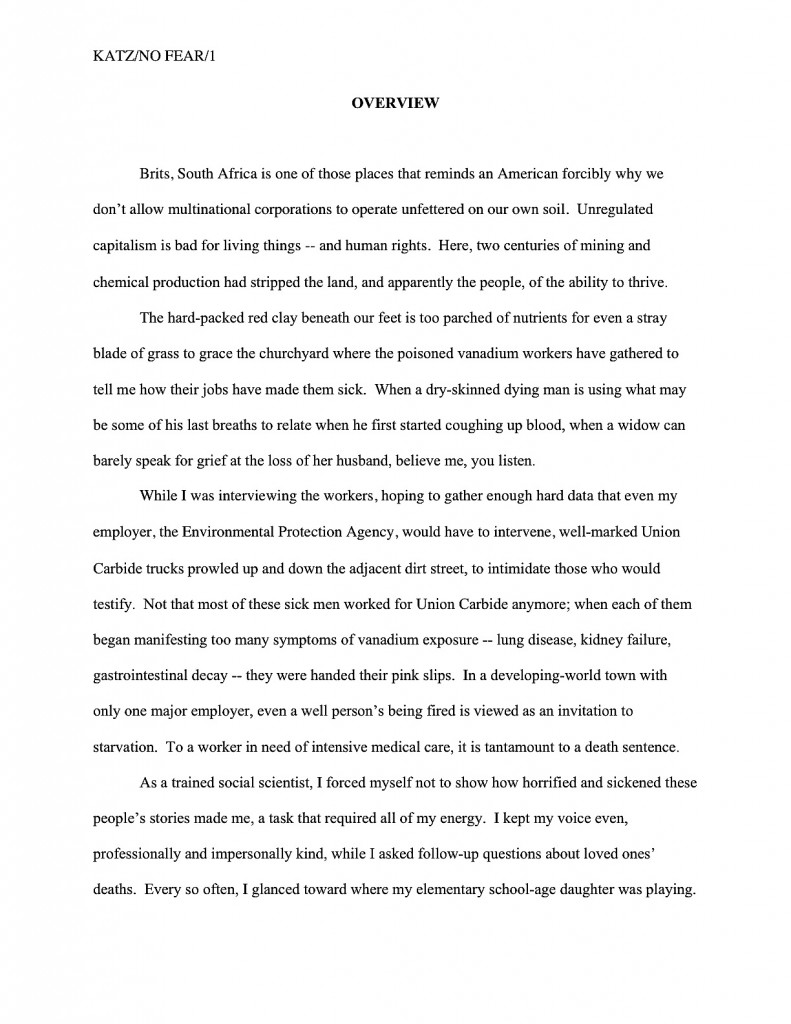
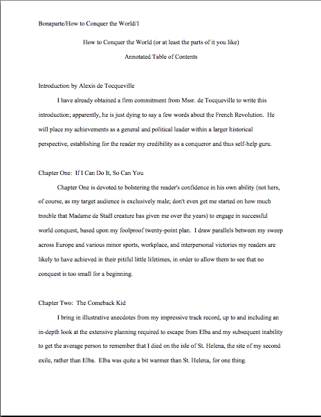
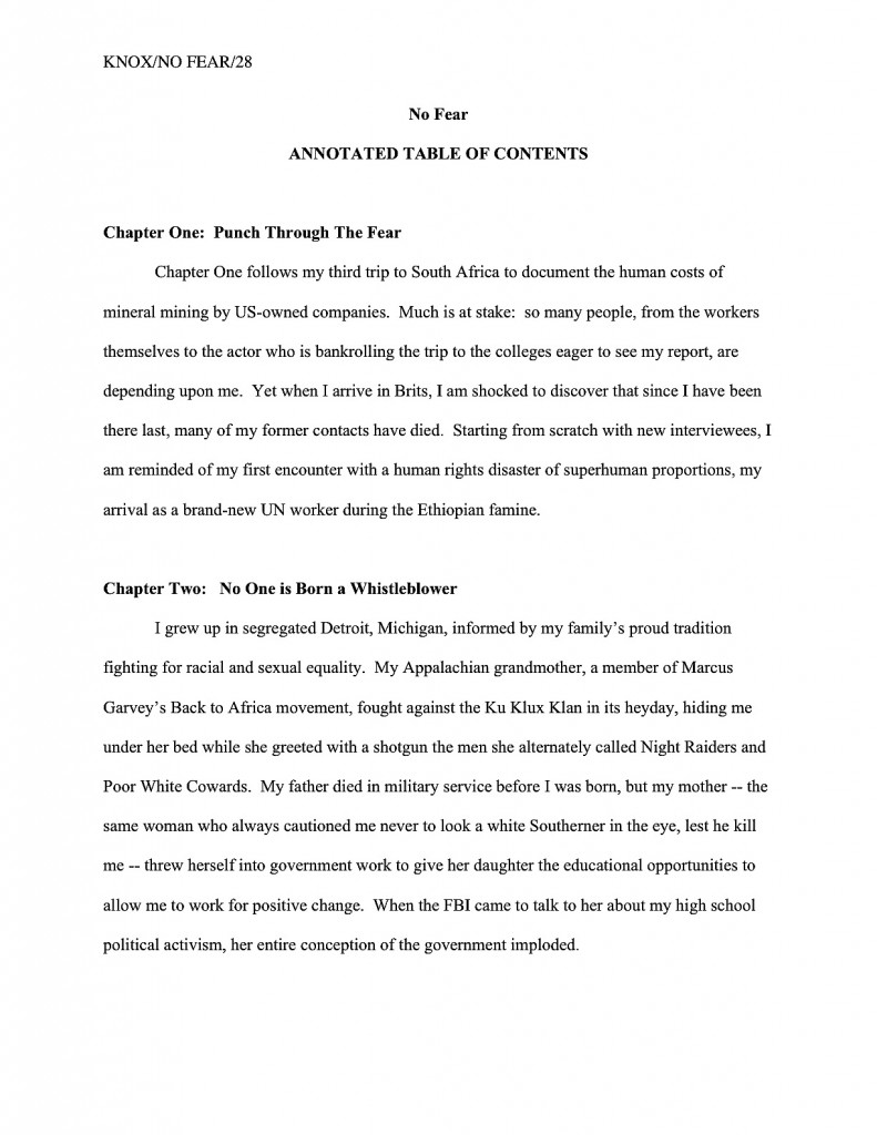
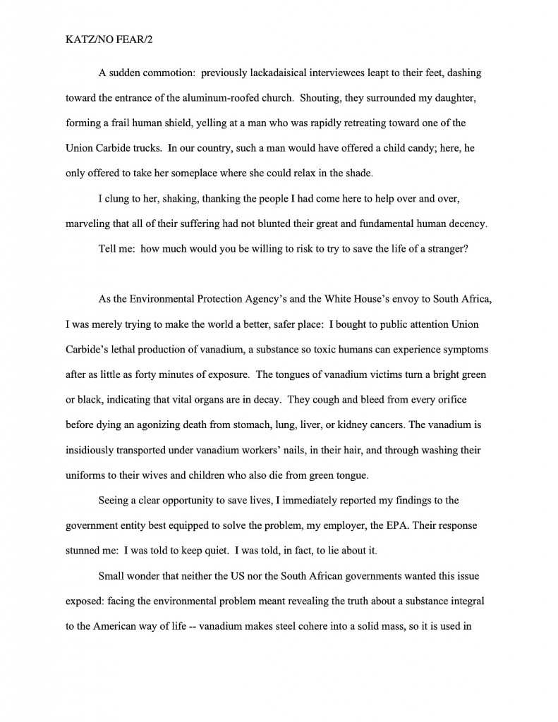
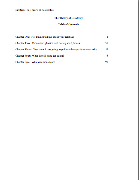
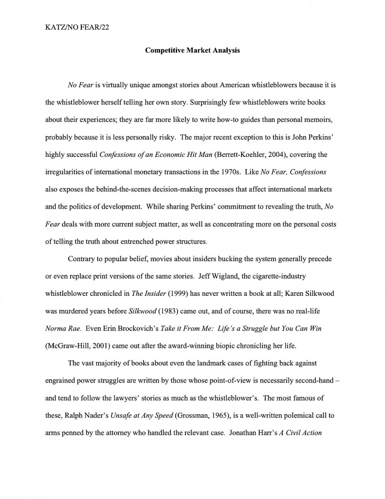
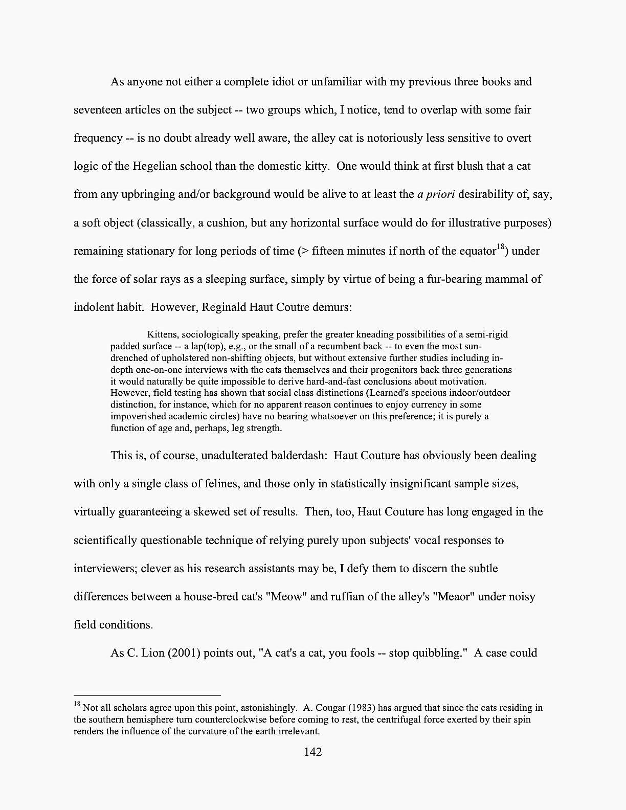
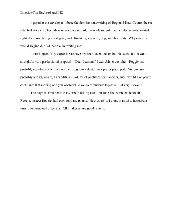
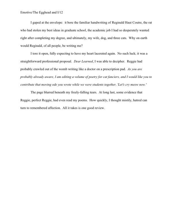
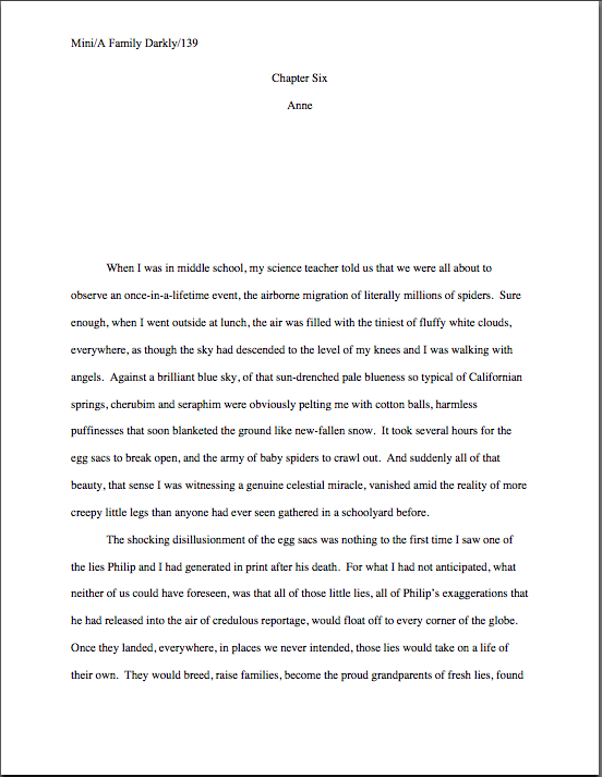
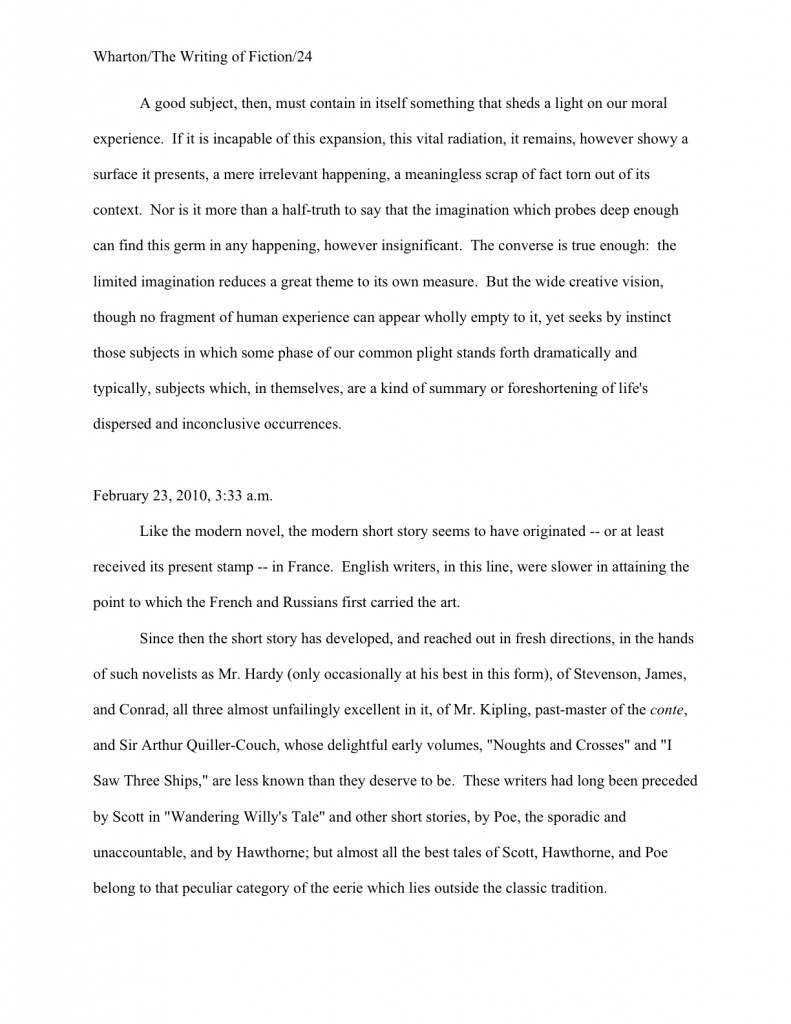
A trip to the Formatpalooza annex: the stylish section break — the inculcation of some good writing habits

“If only I hadn’t been so polite.” — S.T.C.

Long time no see, eh, campers? Honestly, I’m as surprised as you are: I keep arising each morning fully intending to post. The noon hour sees me already mentally composing practical examples. Hardly an afternoon goes by when I do not glance over at my computer nestled somewhere in the sub-basement of the muses’ palace of fine arts and think, “Okay, just a few minutiae to get through first, my pet, and we’ll be hard at work on that stirring entry on book promotion.” Or querying. Or Frankenstein manuscript-revising.

Then suddenly, it’s late evening, and the clever arguments and cunning demonstrations of applied craft I have been constructing in my head all day come tumbling to the ground. “Oh, that will take me hours to write up properly,” I murmur into my welcoming pillow. “Rather than write something hasty tonight, I’ll take it up tomorrow and zzzzzzz…”

At least, I think that’s what I’ve been murmuring. It’s kind of hard to remember the particulars in the morning.

“My God, Anne,” my learned mother says. “Who raised you? I certainly did not bring you up to go to sleep without jotting writing ideas on the notepad that’s never more than eight inches from your pillow.”

She has a point: she didn’t raise me to set at naught one of the cardinal rules of professional writing. One of the great tangible benefits of growing up in a family of writers and editors is knowing not to fall into the unfortunately common Oh, I’m sure I’ll remember the marvelous idea I have right now in the morning/when I get home/after I dash off this e-mail syndrome: I was trained from the cradle to have a writing implement and paper within tiny arms’ reach at all times, so I could jot down a few notes on that unforgettable idea just in case I forgot it.

Why sew extra pockets into a kid’s clothes for toting around wee notebooks and golf pencils? Because my hyper-literary parents wanted me to have a long and happy creative life, that’s why. As every professional writer in the world can attest to his or her sorrow, it’s never safe to assume that marvelous writing idea that the muses just dropped fully formed into your brainpan will not vanish into the ether within the next fifteen minutes.

Fortunately for the happiness of writers everywhere, few problems inherent to the life literary are as simple to solve as the lost great idea.

Step 1: write it down. Immediately.

Step 2: make sure you always have the means to carry out Step 1.

You needn’t buy a special notebook for the purpose — just get into the habit of carrying some paper and a writing implement in your pocket, purse, backpack, and/or pocket. Install same on your bedside table, in your car, in the pocket of that nasty uniform your inflexible and unimaginative boss makes you wear. (Honestly, does he think that patrons at his bar won’t at least suspect that the person mixing drinks is the bartender if she is not sporting a cheesy uniform?) From this moment forth, you should never be without it.

And I do mean never. If you are about to climb Mount Everest and do not have an extra few square inches for a pen, ask an experienced sherpa to help you repack. Clutch the lapels of the firefighter toting you off to safety until you are actually out of the building, but as soon as you are on non-smoking ground, grab the nearest envelope so you can scrawl a few notes on the back. Your deathbed should have pen and paper within easy reach.

And don’t tell me that you’ll get to it eventually — slip that notebook into your pocket now. Don’t make me bore you with that ghastly tale about Samuel Taylor Coleridge’s being interrupted by “a person on business from Porlock” while he was frantically trying to write Kubla Khan. While Coleridge apparently dined out on the story of how that untimely visitor made him forget the rest of the poem he’d already written in his mind, in my family, there was only one verdict about whose fault the loss was.

“He never should have answered the door,” my father would say.

“Not before jotting down a few notes,” my mother would agree.

Small comfort to Coleridge and every other writer who seen a good idea vanish in the face of the demands of quotidian life, naturally, but you’d be surprised at how little sympathy the lost great idea garners among professionals. “Well, why didn’t you write it down?” they will ask the writer, apparently oblivious to the fact she is valiantly choking back tears. “Didn’t you ever hear the story about Coleridge and Kubla Khan?”

Even if you have to grab a passing waiter’s pen from his apron to scrawl a few pertinent words on your hand or shirtsleeve, it honestly is in your best interest — and your next book’s — to get into the salutary habit of writing every fresh idea down right away. Which leads me to the lesser-known third portion of the cardinal rule:

Step 3: accept that performing (1) as often as you should will occasionally bring unfortunate social consequences.

You didn’t think that write down good ideas the instant they occur to you applied only to moments when you happened to be alone, did you? One never knows where inspiration will strike: amazing book ideas have been known to manifest in locales as inconvenient for note-taking as the shower, in the basket of a hot air balloon, on a Tilt-a-Whirl, and at dinners at the White House.

The muses can be most demanding mistresses. Heck, the premise of my last novel came to me while I was floating in an open-air hot tub nestled into the side of a mountain in the Oregon Cascades. I had to hop barefoot past a patch of poison oak to get to my ever-present pen and paper, and you don’t see me complaining.

Actually, once a writer becomes accustomed to noting every good idea for future use, she’s less likely to complain about it than those with whom she elects to spend her time. To that end, you also might want to train your kith and kin to hold their thoughts (and tongues) if — make that when — a brilliant idea strikes you.

Oh, you want, “Just hold off on carving that Thanksgiving turkey for a moment, Uncle Walter, while I write myself some notes,” to be the first your loved ones hear of your new-found good habit? Do you have any idea how many references to Kubla Khan it’s going to take to render that little surprise socially acceptable?

I sense half of you cringing at the very idea of stopping a conversation, dinner, or other things I will leave to your imagination if you are over the age of consent (you’ll understand when you’re older, Timmy) with a blithe, “Oh, excuse me, but Anne Mini says that if I intend to write for a living, I need to get this idea down at least in note form right away. Please feel free to continue without me.” I can understand where it might seem a trifle rude to the uninitiated.

But that’s precisely the point: it comes across as far more impolite to someone who doesn’t already know that serious writers do this. Frequently. It’s how the creative brain works: bursts of inspiration are part of our standard equipment. And the more seriously you take those inspirations, the more active your idea-generator will become.

It’s far, far better if you explain this to your kith and kin before the muses bop you over the head in the middle of that Broadway musical your partner has been dying to see for six months. Trust me on this one; it may seem counterintuitive, but it’s actually kinder that way. The sooner they get used to the idea that befriending a serious writer necessarily entails waiting in more or less supportive silence while you furiously scribble notes on the paper tablecloth in a crowded restaurant, the happier you — and they — will be once you are writing professionally.

Think of it as training for working with an agent or publishing house. Honestly — and I speak from experience here — “Hey, honey, the brand-new editor my publisher has just hired has asked me to come up with a new ending for my novel, pronto, so I’m not going to be able to pay the slightest attention for the next three weeks, okay?” will go over much better if Honey has already accustomed him- or herself to the reality that creativity is often rather inconsiderate about when it strikes.

So, as it happens, are deadlines. Just as there is no convenient time to sprain one’s ankle — again, I speak from experience — there is no really terrific time for a last-minute or rush revision request. Sorry about that.

I’m also sorry about this: no matter when it happens, it’s going to be hard on your loved ones, necessarily. But being the writer too nice to say to those loved ones now, “Look, I cherish our time together, but my writing is important enough that occasionally I will stop dead in the middle of an anecdote to make a note about a scene I want to write later,” is almost invariably equally reluctant to say in a nice, reasonable tone, “Remember how happy you were when I landed that agent? Well, this is the direct result: I need to spend this weekend making the revisions she’s requested,” or even, “Here, take twenty bucks from my rather paltry advance and go to a movie so I may honor the acquiring editor’s demand that I change my protagonist’s best friend’s name from Jolene to Joanne all 300 times it appears in my novel.”

Whenever you do it, it’s going to take some guts. I’m merely suggesting that if your kith and kin are already acclimated to your taking ten minutes out of lunch to scribble feverishly on the back of a menu, they’re less likely to find it unacceptable when you whip out a notebook in the third hour of Cousin Marvin’s testimonial dinner or in the course of the eighth inning of a particularly eventful baseball game. And at least they’ll have some inkling of why your work is important enough to you to cancel that long-planned trip to Disneyland because your editor abruptly got laid off and the new one just hates the chapter about the trip to Disneyland in your book.

Darn. It was going to be tax-deductible as a research expense, too.

Yes, yes, I know: writers tend to be conflict-avoiders. Try to think of getting them used to your ignoring them for two minutes in the middle of a movie as an inoculation — if they have already been exposed to the minor inconvenience, they won’t be made as sick at the onslaught of the major one. Don’t expect them to be thrilled about it, however; just expect them to cope. They’re never going to be thrilled if you spend most of your family reunion in the hotel room, fleshing out that fascinating conflict you’ve just dreamed up between your antagonist and the love interest’s second cousin, but at least it won’t seem out of character.

“Oh, that’s just Mavis,” your significant other/children/long-suffering parent will sigh. “We never know when the muses are going to kidnap her next.”

I would also recommend getting into the excellent habit of keeping a pad of paper by your computer while you are writing and revising, to jot down any inspirations that, while they might not be applicable to the page on your screen, might provide a piquant addition or necessary change to another part of the book. Taking the time to scrawl Did Arlo have a cocker spaniel prior to Chapter 4? on a scrap of paper now can save you the acute embarrassment of realizing that you’ve just sent the agent of your dreams a manuscript in which the dog’s breed is different in Chapters 2, 8, and 17 than it is in Chapter 1.

That’s particularly important if there happens to be more than one dog in the book, of course. “Wait,” Millicent the agency screener exclaims over page 47. “Is Marley the great Dane from page 2, or the Pekinese from Chapter 3? Or is it not a dog at all, but merely a reference to Ebenezer Scrooge’s late partner?”

Yes, readers who have been giggling for the past couple of paragraphs? “Oh, dear Anne,” the gigglers sigh. “You are such a Luddite. In the situation you just described, I would be working on my computer. Surely, that would obviate the need for rifling through the nearest wastepaper basket for a stray envelope. If I want to take notes, I’ll just open a new document and type them.”

I believe that you will, oh gigglers, but frankly, most writers caught up in the throes of one scene wouldn’t pause that long to type up an idea about another while it’s fresh in their minds. They would — sacre bleu! — just assume that they’d still remember that great notion by the time they had finished the current scene.

Think they will? Why take the chance? Jotting a quick note on a stray scrap of paper will take only a few seconds.

The other advantage of recording that idea on paper, rather than on one’s computer, Blackberry, or even in a recording device is that one can leave it sitting next to one’s computer, Blackberry, or recording device, all ready to remind one about that great notion. If you’re like me — and I suspect most writers are, at least in this respect — the very laws of inertia dictate that note written today will still be lying there a month hence, when you have time to get back to the scene you intended to write.

Oh, you tidy up your writing space every day? My good pile is almost as tall as the container holding the pens I used to write them.

If that same idea is memorialized electronically, by contrast, you have to remember to reopen that file or listen to that recording. Unless you are in the habit of regularly reviewing your computer files, that may not happen before you finish your current draft. You might not even stumble across it again — avert your eyes, children; this is going to be ugly — before you pop the completed draft in the mail to the agent of your dreams.

Isn’t taking a minute to write a note now preferable to bearding the heavens with your bootless cries of, “But I meant to go back and change the dog’s name from Marley to Charley prior to page 150!” later on?

The same principle applies, as I hope all of my regular readers are aware, to remembering technical questions that might arise during the writing or revision processes. Although a few intrepid souls might instantly close their Word programs and fly to this site (or a similar one, or ask a trusted writer friend) within a few seconds after running into an intractable problem, my impression is that most don’t.

And finally, I have managed to build a segue to the topic I had planned to discuss today! I wasn’t kidding about how easy it is to get sidetracked.

One of the many stacks currently threatening to topple over onto my mousing hand holds my To Blog Upon list. While the inspirations there range from the hyper-serious (one note reads blog about the desirability of an unpublished writer’s designating a literary executor in her will) to the practical (how long has it been since I discussed juggling offers from multiple agents?) to the completely frivolous (been overusing dog examples lately — switch to wombats?), many of the most intriguing ideas in this stack are print-outs (on the back sides of already-revised early drafts of my work, of course; reusing is as valuable as recycling) of questions readers have the comments.

(Note to self: all of those parentheses and italics are eye-distracting on the screen. Also, isn’t 93 words too long for a single sentence?)

I reserve a special stack — yes, my desk is precisely as cluttered as you are picturing it to be — for questions that are perfectly logical as follow-ups to formatting or craft issues, but wouldn’t necessarily occur to a professional reader as something that might be puzzling to those who have never seen a professional manuscript in person. When one stares at those pages for a living, one develops an almost visceral sense of what does and does not belong on the page. But how is someone new to the game to develop that sense?

Incisive and thoughtful reader Karin, for instance, raised a marvelous issue that I had overlooked in my Formatpalooza posts on section breaks. (Which were three: a post on the rules governing them, a post containing visual examples, and a post showing section breaks in a book proposal.) Even better, she was polite and charming as she brought it up.

I’ve been reading your blog for quite some time now and find your advice very clear and extremely thorough; thank you for the hours of work you put in trying to help us blind writers see the light of proper formatting and querying.

I have to admit, combing through pages of formatting advice, I may have missed the answer to my question, which, while small, addresses a concern I have on the fifth page of my manuscript, having to do with section breaks. Having turned off widow/orphan control and inserted a space between sections, I find that one section ends on the bottom of a page, which means the beginning of the next section starts after a blank line on the next page. Will professional eyes notice the blank line as a section break, or will it appear sloppy?

As you know, we all get very insecure wondering if these things spell doom for our publishing chances. If you have time, could you please put my fears to rest? Thank you very much!

As my To Blog Upon stack can attest, I get a lot of questions about section breaks. Partially, that seems to be due to the surprisingly pervasive practice among self-styled experts not to differentiate between what is proper to indicate a section break in a book manuscript or proposal (a skipped double-spaced line) and what is appropriate for a short story or article (#).

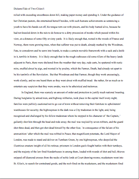
So before I address Karin’s specific concern, let’s see a properly-formatted section break in action in mid-page. A transition between two scenes in one of H.G. Wells’ social novels will do the trick nicely:

The image came out a trifle on the blurry side — my apologies about that — but the section break is quite clear, is it not? No bells, no whistles: just a skipped line between scenes.

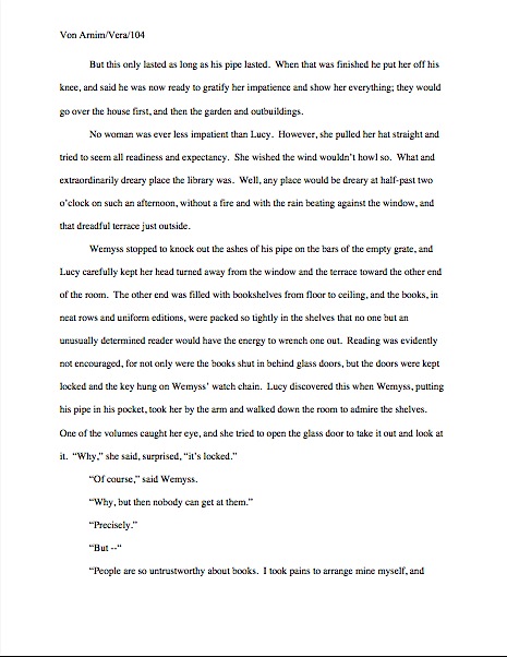
While you have that fuzzy image firmly in mind, let’s take a gander at another rule of standard format that often puzzles those new to the game. Had ol’ H.G. (or whoever is doing his word processing these days) not followed Karin’s example and turned off the widow/orphan control in Word, this page would have had a too-large bottom margin. Like so:

See the problem? This page has fewer lines on it than the previous example, because Word did not want to leave the first line of the final paragraph behind on page 158 when the rest of the paragraph was on page 159.

Millicent, however, like the rest of us who read manuscripts for a living, prefers each page to feature the same number of lines of text. Otherwise, it would be impossible to estimate word count, right?

Including a section break does not run afoul of that preference: in theory, there are the same number of lines per page; the empty space is holding the place of a line of text. Because our Millie knows that a skipped line of text means a section break, she understands that.

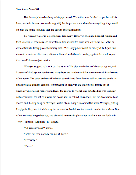
But what if the last line of a scene ended on the next-to-last line of the page? The result would be the same number of lines on page 158 as if the widow/orphan control had axed the last line. The next section would begin on the first line of page 159.

Clear enough what’s going on, is it not? Since the subsequent scene would follow on the top line of the next page, Millicent would know that what she has just seen is not a formatting gaffe, but a transition between two separate sections of text.

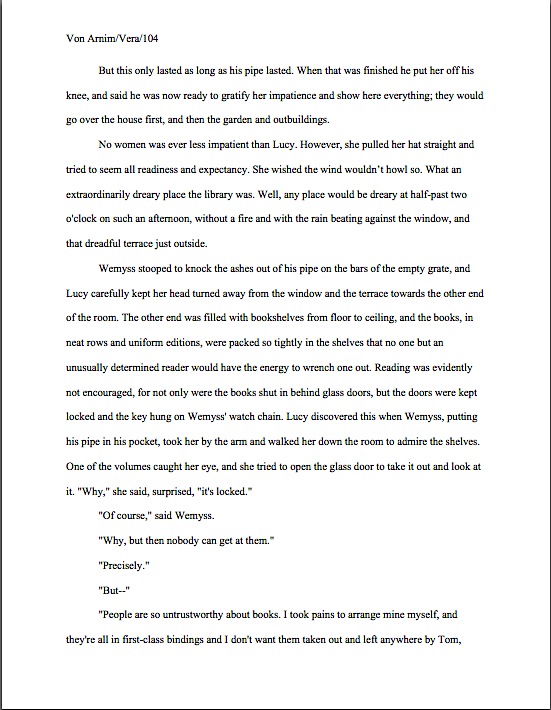
But what if, as Karin feared, the first scene had ended on the last line of page 158? Should we take her suggestion of pushing the section-differentiating skipped line to the top of page 159? Let’s see what that would look like in practice, shall we?

Looks a trifle silly, doesn’t it? To Millicent’s eyes, it would look like something else: a manuscript that the writer had not bothered to check in hard copy to see how it would print out. “And if the writer didn’t read his work in hard copy before sending it to my boss,” she reasons, “he probably didn’t bother to proofread it, either.”

Not an instant-rejection offense, certainly, but not the impression of how serious you are about your writing that you would prefer she harbor, is it? H.G. has two options here: tinker with the first scene so that it does not end on the last line of the page — or take the chance that Millie will understand that when the first line on the top of page 159 is about a different time, place, and person than the last line on page 158, she might be dealing with a change of scene.

I would opt for trusting her: she’s smart. And honestly, on the page, the situation isn’t all that confusing. Take a gander:

Sometimes, a writer just has to have faith in his readers’ intelligence. Millicents read a heck of a lot of manuscripts, after all: they understand the limitations of standard format.

And if they don’t, they can always write themselves a note as a reminder to find out. Keep up the good work!

Just what am I getting myself into? Part IV/Formatpalooza, part XXIV: the e-mailed query

Last time, if you will recall, we bent our substantial collective cranial capacity to the fascinating question of what happens to a query or submission after it arrives at an agency, with particular emphasis upon a subject endlessly hypnotic to agent-seeking writers everywhere, submission gaffes that might prompt our old pal, Millicent the agency screener, to snap into instant rejection-on-sight mode. Within that context, we dwelt long and hard upon the ways in which an electronic submission — i.e., pages that the agent has actually asked a writer to send via e-mail — might be received differently than a paper submission.

In case any of you missed that discussion, allow me to summarize it for you: it’s significantly faster to reject an electronic submission or query. Not to mention immensely easier to lose one or the other accidentally.

Why, you ask? Have you tried to lift a 400-page manuscript lately? The darned things are heavy.

Which is, of course, one of the reasons that more and more agencies are permitting — nay, even insisting upon — electronic submissions: it keeps them from being buried in paper, and their Millicents are less likely to rupture a spleen while processing Monday morning’s influx of queries and submissions. Oh, and a Kindle is quite a bit lighter to tote onto an airplane than fifteen full-length manuscripts.

But lest any of us kid ourselves, electronic submissions were practically unheard-of prior to the 2001 anthrax scare; prior to that, the overwhelming majority of US-based agencies did not even have websites. Immediately after those poisoned envelopes hit the news, however, quite a few agencies abruptly began accepting e-queries for the first time.
Even in an industry where working one’s way up has long been the norm, expecting Millicent to risk her life by opening envelopes was considered a bit de trop. (Hey, she may be paid very much — heck, at some agencies, she is an intern — but our Millie is a much-valued member of the agency team.)

They’ve been on the rise ever since; indeed, some agencies (but not most, by any stretch of the imagination) now accept only e-mailed queries. Others (but again, a minority) ask queriers to fill out an electronic form instead. Most of these forms allow writers to paste a query letter into the form, but some only allow queriers to type in a limited amount of information, with perhaps a space to paste in the first few pages of the manuscript.

Have these developments been good or bad for aspiring writers? Like so many aspects of both the changing publishing industry and technological advance, the answer is both.

There are, of course, distinct advantages to e-querying, although not as many as there were five years ago: it’s a significantly less expensive option for writers querying US-based agents from other countries, for instance. When computer-savvy agents first began accepting e-queries, they did tend to respond faster than their counterparts who worked purely in paper. Then, too, junior agents frequently screened their own e-mail for queries, rather than relying upon a Millicent. And even today, if an agency does indeed accept e-mailed queries, the querier may hear back a trifle more quickly and/or be slightly more likely to reach the agent herself by sending an e-mail.

Did the Internet-lovers out there just do a double-take? Yes, it’s true: even at this late date, there are many agents who will not read e-mailed queries. Ever. Period.

So before you even consider this option, check one of the standard agency guides to make sure it’s acceptable. (If you are unfamiliar with how to use an agency guide — the shorthand can be tricky — please see the HOW TO READ AN AGENCY LISTING category at right.) Or the agency’s website. If it has one.

Yes, seriously. Contrary to widespread writerly assumption, not every agency has a site posted on the web. This means that simply doing a web search under literary agency will not necessarily provide you with an exhaustive list of all of your representation possibilities. (For tips on how to come up with a list of agents to query, check out the HOW TO FIND AGENTS TO QUERY category on the list at right. How do I come up with these obscure category titles, anyway?)

But let’s assume for the moment that the agent of your dreams does indeed accept both paper and e-queries. Which is more to your advantage to send?

Well, it depends on the agency — and your timeline. You might well hear back about an e-query within a matter of hours, a most unlikely outcome for a paper query; then again, you might not. As I mentioned last time, turn-around times in agencies have gotten significantly longer over the last few years: what used to take just a couple of weeks now often takes a couple of months. Or more.

However, if an agency’s submission guidelines state point-blank that they do not respond to e-mailed queries unless they are interested, but that they do send out actual replies to mailed queries that include SASEs (a fairly common policy, amongst agencies that accept both), then it might be very much worth your while to query that agency via regular mail. Especially if you happen to be one of the vast majority of queriers who prefers to send out only one or two queries and wait until the agent(s) respond(s) before sending out any others: if that’s your strategy, you should be avoiding non-responders like the proverbial plague.

I frown upon the one-by-one strategy, by the way, and not just for electronic queries. Your time is just too valuable. Think about it: if you have six hot prospects on your querying list, and it takes two months on average to hear back on each, it will take you a year to query them all. But since practically no agencies insist upon exclusive queries anymore, why would you do that, when you could send out all six queries in the first week — and move on to another 6 if those do not garner the response you want?

Stop groaning. I would be as delighted as you if your first query happened to hit precisely the right Millicent working for precisely the right agent on precisely the right day — and not thirty seconds after she just burned her lip on that latte she always seems to be too impatient to allow to cool. However, even for beautifully-written first books by immensely talented aspiring writers, that’s exceedingly rare; finding the right fit for a book can be very time-consuming. It’s only prudent to plan to query widely.

Is that one-at-a-time strategy starting to seem less appealing yet? Or the prospect of hearing back sooner on any given query like a positive boon?

The relatively quicker response time on e-queries is not always an advantage, however. The human eye reads, on average, 70% faster on a backlit screen than on paper — not an insignificant increase, when Millicent is already skimming queries at top speed. She’s unlikely to have time for second thoughts: once her always-itchy trigger finger taps that DELETE key, that query is gone.

Which suggests a troubling philosophical question: isn’t the outcome identical whether she hits that key deliberately or by mistake — say, as an unconscious response to burning her lip on a too-hot latte? And now that so many agencies simply don’t respond to queriers (or even submitters) if the answer is no, how can the hapless writer of that deleted query letter ever know whether he never heard back due to Millicent’s determination that the book being offered would not interest her boss, her conviction that the book is inherently unmarketable in the current literary climate (not necessarily the same logic as the first), her reaction to a query that’s poorly put together — or her purely instinctive response to having spilled scalding coffee all over herself and her keyboard?

But most of you are not scared away by the possibility of having your baby rejected by caffeine, are you? “That’s right, Anne,” those of you excited about saving all of that paper (or just plain sick of licking stamps) shout. “I get most of my querying information online, and mirabile dictu, most of the agents who give advice online favor electronic submissions. So do a lot of agencies that pop up when I Google literary agency, remarkably enough. And it just seems a whole lot less time-consuming to copy and paste my query letter template — with suitable personalization for each agent, of course — into an e-mail than to print it up each time. So let’s have at it!”

Okay, electronic enthusiasts. Let’s talk about how to do this thing right.

E-mailing your query
As the shouters above indicated, e-mailing a query is pretty straightforward: it involves — wait for it — sending precisely the same query letter by e-mail that a writer would have sent via regular mail, minus the SASE. (You also don’t need to include the date or the recipient’s complete mailing address, as you would with a mailed letter. Just start with Dear Ms. Agentofmydreams, and proceed as with a regular letter.) In fact, if one composes the letter in Word, one can just copy it and paste it into the body of the e-mail.

There’s another big difference between an e-query and one that’s printed, a differential that should make business format-lovers everywhere rejoice: because most e-mail programs are hostile to indentation, it is considered quite acceptable not to indent the paragraphs in an e-query. Millicent might shake her head over the rapid decline in literacy amongst constructors of e-mail programs, but she will not blame you for it.

If you prefer to preserve the indentation (as I do, personally), go ahead and write a normal query letter in Word, then copy and paste it into the e-mail. If you find that one of the tabs disappears in transit — the last being the most prone to disappear in transit — you’ve not copied the final paragraph marker. Try this nifty trick: when you write the letter in Word, add an extra paragraph to the end of the letter. Copy and paste it into an e-mail; the actual text of the letter should arrive with the tabs all intact. Then hand-delete the extra verbiage.

Whatever you do, don’t send your letter as an attachment, or send a missive with a link to a generic query on your website. Most agencies have strict policies against opening unsolicited attachments (out of fear of downloading viruses), and I can tell you now that Millicent is not going to follow that link.

Why, you ask? Feel free to pull out your hymnals and sing along, campers: it’s Millie’s job to cull queries as quickly as humanly possible, to narrow down a roaring river to a manageable trickle. If she’s spending only about 30 seconds per query — probably even less on each e-query, because of that skimming-eye tendency — why on earth would she invest a couple of minutes in following a link to the website of someone too unfamiliar with how queries work to present her with a proper one?

My, we’re delving into a lot of deep philosophy today, aren’t we? Let’s lurch our way back to practicalities.

Composing the query first in a word processing program carries a couple of advantages. First, it’s easier to spell- and grammar-check. Second, it renders keeping good records of whom you have queried a little bit simpler: you can simply save each query as its own document, so you can keep track of what you have said to whom and when. (You do keep meticulous querying records, don’t you, so you will not approach the same agency twice with the same book project within a year? Repeat queries are considered quite rude in Millicent’s circles.)

Adhering to a two-step process also encourages a writer to re-read each query before sending it out in a way that simply resending the same e-mail over and over again (copy-and-paste works in most e-mail programs, too) does not. It will help you avoid some of the more common querying mix-ups: if you’re sending out a whole flotilla of queries at once, it’s pretty easy to hit SEND without realizing that your Dear Mr. Readerson missive just went to Ms. Picky. Or not to include the synopsis Ms. Picky’s agency’s submission guidelines request.

Another astonishingly common mistake in e-queries: not including any contact information. “But Anne,” computer-huggers everywhere cry, “isn’t that unnecessary? After all, Millicent could just hit REPLY if she wanted to ask me to send the manuscript, right?”

Not necessarily, no. Remember that nightmare scenario above, where her scalded hand accidentally hit DELETE? It’s also not all that uncommon for successful e-queries and e-submissions to be forwarded around an office, so the agent’s just pressing REPLY would merely send her opinion back to Millicent’s inbox, not yours.

And seriously: why wouldn’t you want to make it as easy as possible for these people to say yes to you?

Copying and pasting a query from Word can cause formatting problems, however — and not merely the tab disappearing act I mentioned above. If recent comments are any indication, many e-queriers have been horrified to discover after they have sent their e-mails (and having taken the prudent step of also e-mailing the letter to themselves, so they can see it as Millicent would), that there is an extra-large space between paragraphs.

“Hey, why is the formatting different?” they wonder indignantly. “When I pasted the letter into the e-mail, there was only a single line between paragraphs. Why the expansion? And will Millicent conclude that I am an idiot who doesn’t know how to format a letter properly?”

Since self-deprecating terms like idiot, moron, and complete dolt are a regular feature of comments by readers who have experienced this problem, I’m inclined to believe that it’s causing disproportionate chagrin. To set all of those worried (and not idiotic at all) minds at ease: no, Millicent won’t think the less of you if your e-query sports extra-wide spacing; it’s too common a problem. She’s knows that it’s the result of a rocky transition between Word and a lot of e-mail programs.

So don’t worry your smart little heads about it, okay? You’ve got bigger fish to fry.

Oh, dear — that didn’t convince all of you, did it? All right: let’s talk about how to eliminate this problem. First, you could write your query IN your e-mail program the first time around, then copy that to subsequent missives. You’d lose the advantages of composing in Word, but you wouldn’t have to worry about the formatting.

Or you could recognize that most e-mail programs and Word don’t have completely compatible word-processing bells and whistles. What constitutes a hard line break in Word (i.e., that skipped line between paragraphs) may well be a prompt for a two-line skip in your e-mail.

So how does one get around that? Don’t skip a line between paragraphs in the Word version. Just hit RETURN once at the end of each paragraph, as you would when typing in standard format. The sent e-mail will have only a single skipped line between paragraphs.

Seriously, it works. Send yourself a test query and see.

Querying via form on a website
Those forms are self-explanatory (part of their popularity, I suppose): many of them simply tell aspiring writers to paste their query letters into a form, along with a writing sample. I trust that you can figure them out on your own.

And if you can’t, I probably won’t be able to help: they’re too individualized for me to create general rules of thumb for dealing with ‘em. Sorry about that. Have you considered checking one of the standard agency guides to see if the agency with the troublesome form would accept a mailed query letter instead?

E-mailed query packets
Here again, the rule of thumb is precisely the same as for mailed queries: send precisely what the agency’s submission guidelines ask to see — no more, no less.

To tell you the truth, I’ve resisted writing much on this topic, for the exceedingly simple reason that I didn’t want anyone to confuse a query packet (i.e., the stack of things an agency’s website or listing in one of the standard agency guides might ask a querier to send along with the query letter) with a submission packet (the array of papers an agent has SPECIFICALLY asked a writer to send after a query or a pitch).

The former known in the industry as unsolicited materials, the latter as requested materials.

“But Anne,” some of you new to the process protest, and who could blame you? “I’m confused. If the agency’s website, guide listing, or page on that always-useful resource for writers seeking agents, Publishers’ Marketplace tells aspiring writers that they should send a synopsis or the first 50 pages with a query, in what sense is that not a request? Especially when half of those listings refer to their standards as submission requirements?”

I see your logic, oh rules lawyers, but you’re confusing passive guidelines with an active request. Anyone able to track down an agency’s website or listing might discover its submission guidelines, the prerequisites to which an aspiring writer must adhere in order to get a query under one of their agents’ spectacles at all. But as any agent or editor in the biz could tell you, agencies draw a very firm distinction between preliminary materials sent out of the blue (from their perspective) and pages that they actually asked a writer to submit, based upon a successful query or pitch.

How seriously do they take that distinction? Well, let me put it this way: I’ve seldom heard anyone who has worked within five blocks of an agency refer to any pages sent with a cold query (i.e., a query letter from a writer who has had no previous contact with the agency and hasn’t been referred by someone they know) as a submission.

Judging by the knitted brows out there, that little explanation didn’t leave you unconfused, did it? “Okay, Anne,” the brow-knitters say, arms folded and all ready for an argument, “I believe that they make a distinction, but I still think I’m right to think of those 50 pages the agent of my dreams’ website told me to send as both requested materials and a submission. If not, why would they call them submission guidelines, huh? Got a glib answer for that one?”

Actually, I have several. You’d better get comfortable.

In the first place, if your dream agent’s website stated that queriers should go ahead and send sample pages, it didn’t ask you personally to do so; it asked everyone who might submit to them. Given that such a public request effectively narrows down the potential pool of querier to every writer on earth who currently doesn’t have an agent, you can hardly blame those who work at the agency for not considering those guidelines in the same light as a specific request to a specific writer.

In the second place, submission guidelines is an industry term; publishing houses use it as well, but like word count or literary fiction, the definition in use at the moment is in the mind of the speaker. It’s not as precise as those coming into the conversation from the outside might like.

For all its imprecision, the term’s use in this context performs a pretty specific function: it catches the eye of writers so new to the industry that they are unaware that they shouldn’t just mail off a full manuscript to any agent who happens to catch their innocent imaginations. (You do know that such manuscripts are simply rejected unread, right?) Understood that way, an agency’s guidelines are in fact submission guidelines — they tell aspiring writers not to submit at all, but to query instead.

In the third place, I hate to be the one to bring this up, have you by any chance compared the guidelines on the agency’s website with those in one of the standard agency guides and/or the individual agent’s listing on the aforementioned Publishers’ Marketplace?

It’s a bit time-consuming to check multiple sources, but often worthwhile: not only do guide listings tend to have different emphases than website blurbs (thus enabling you to fine-tune your query list), but it’s also surprisingly common for the various sources to ask queriers to send different things.

Yes, really. It’s not at all unheard-off for the most recent Guide to Literary Agents to suggest querying with a synopsis, the agency’s website to ask for a query plus the first ten pages, and the individual agent’s Publisher’s Marketplace page to specify a query plus the first chapter and an author bio. Heck, it isn’t even all that unusual for one source to say that an agency welcomes paper queries, while another insists that it will only accept queries via e-mail and the website has a form to fill out and submit electronically.

No wonder writers are confused. I’m not bringing this up, however, to criticize agencies — heaven forbid! — but as part of my ongoing quest to convince agent-seeking writers that being hyper-literal and rules-lawyerish is not necessarily helpful at the querying stage.

Why, you ask? Well, remember how I had mentioned earlier in the summer that conference-goers sometimes confuse an individual agent’s personal preferences with an industry-wide norm? Sometimes, what guidelines end up in an agency guide are a function of the preferences of whoever happened to fill out the form — or of no one at the agency’s thinking to go back and update its Publishers’ Marketplace listing when the guidelines on the agency’s website have changed.

It doesn’t really matter why it happens, does it? If a particular agency has two or three sets of guidelines floating around out there, it follows as night the day that its resident Millicent must be seeing two or three different kinds of query packet on any given morning.

What were you saying about taking a guide listing or website’s guidelines as a request?

In the fourth place (yes, I’m still working on that pesky question), just because if an agency’s site/listing/representative at a writers’ conference expresses a generic interest in seeing extra materials — a synopsis, for instance, or a bio, or even pages — that doesn’t mean its Millicent will necessarily read them. If the query doesn’t spark her interest, she’s extremely unlikely to give the book project a second chance just because additional materials happen to be in front of her.

Before you get all huffy about that, brow-knitters, allow me to add hastily: this is largely a function of time not being infinitely elastic. It’s Millie’s job to weed out queries, right?

“But wait,” my brow-knitting friends ask hesitantly, “is it possible that I’m misunderstanding you here? From what you’re saying, it sounds as though my being able to send pages along with my query isn’t necessarily an advantage — all it really does is save Millicent the trouble of asking to see them.”

Well, if that’s the conclusion you want to draw from all this, I would be the last to stop you. I can only advise: do your homework before you send out that query. And send precisely what the agent expects to see.

How might one figure out just what that means, in the face of conflicting guidelines? Generally speaking, although the Publishers’ Marketplace and the Herman Guide listings tend to offer the most information (again, useful for figuring out which agent at the agency to approach), agencies’ websites usually offer the most up-to-date guidelines. I’d advise following them — but checking another source or two is always a good idea.

Especially if you’re not especially fond of copying and pasting your first few pages into the body of an e-mail or into a miniscule box on an online form. It can wreak havoc with formatting.

Ah, we’re back to formatting, after that long digression. Can we actually talk about how to put together an e-mailed query packet now?
If (and only if) the agency’s submission guidelines (wherever you found them) ask for additional materials, check very carefully to see if the guidelines tell you how to send them. Most of the time, they will ask that you include them in the body of the e-mail, not as an attachment.

Which is to say, unless the submission guidelines SPECIFICALLY ask you to do so, do not, under any circumstances, include attachments in an e-mailed query, for precisely the reason we discussed above: virtually every agency in North America has an iron-clad policy against opening unrequested attachments. They’re just too likely to contain viruses.

Hey, I’m not casting aspersions upon your no doubt squeaky-clean computer. I’m just reporting what the process looks like from the other side of the desk.

If the agency’s website SPECIFICALLY asked for attachments, send them in Word (the industry standard), but as we discussed yesterday, send them as .doc files; do not send them as .docx. Many, many agencies are running older versions of Word (on PCs, usually) and will not be able to open .docx files.

Like any file-transferring snafu between an agency and a writer, this is considered the writer’s fault. And no, Millicent won’t necessarily e-mail you back, asking you to send a different version. Nor will the agency call upon its crack computer support staff, for the simple reason that, as astonishing as this may seem to those of us living in the Pacific Northwest, NYC-based agencies seldom have an in-house computer expert. (Possibly because s/he would be so like to tell them to upgrade what version of Word they’re using.)

I’m telling you: a little foresight will go a long way toward getting her a document someone at the agency can actually open.

If you happen to be running a recent version of Word, your document may be saved as a .docx automatically, so use the SAVE AS… function to save your document as a Word 97-2004 document (.doc). Mac users, do be aware that your system may allow you to give your documents longer names than an older PC’s system might recognize as valid.

How do you include additional materials without attachments? Copy and paste them into the body of your e-mail, a few skipped lines after the end of your query.

Fair warning, though: as I mentioned above, formatting often gets lost in the transition. Particularly vulnerable, for some reason: double-spacing. Even if you have to change the spacing in the e-mail by hitting the RETURN key at the end of every line, make sure any manuscript pages you send are double-spaced.

If formatting disappears in transit, you’re probably not copying all of the formatting codes. The trick I mentioned above usually solves this problem: add an extra paragraph above and below the text you want to transfer, copy and paste the whole shebang into your e-mail, then hand-delete the extra words. Usually works like a charm.

And don’t worry your aforementioned smart little head about reproducing the exact format of your manuscript page; Millicent isn’t expecting text within the body of the e-mail to reproduce the printed page. She’s been around e-submissions long enough to know the havoc most e-mail programs can play with Word’s formatting. Just start with the first line of text on page 1 of your manuscript — the chapter title isn’t particularly necessary, but you may include it if you wish — and include as much of the text as requested.

Oh, scrape your jaws off the floor. The point of asking for those pages is not to see if you can produce a manuscript in standard format, after all — if an agent wanted to see that, the submission guidelines would ask for a Word attachment. (As some of them do: make sure to check every time.) What Millicent will be casting her bloodshot eyes across that writing sample for is to see if you can write.

You don’t mind that, do you?

No matter what other materials are specified in the guidelines, always start an e-mailed query packet with the query letter itself, then move on to any requested materials in the order they were listed in the guidelines. As I mentioned above (but it always bears repeating), unlike a paper query, an e-mailed query need not include date and full address of the recipient, but do open with a salutation: Dear Ms. Smith…

Why? Well, think about it from Ms. Smith’s perspective: wouldn’t a mass e-mail be the most efficient way of broadcasting 2,000 generic Dear Agent queries? Do you really want your e-query mistaken of one of those?

Most of you probably knew most of this, though, right? Let’s move on to a little-known trick o’ the trade — located in the part of the e-mailed query to which writers tend to give the least thought.

The subject line of an e-mailed query
The subject line is key to an e-query’s ending up in the right place, so you are going to want to make that space count. Or at any rate, prevent your e-mail from getting relegated to the spam file.

Most agents prefer writers to include the word QUERY in it, presumably so they don’t mix up your e-mail with that invitation to their high school reunion. If you just heard the agent speak at a conference, include the name of the conference in both the subject line and the first line of your query; many agencies will give priority to post-conference queries.

Conversely, if you already have an in with the agent, make sure to include that in the subject line, too. If you met the agent at a conference and she told you to send her a query (as opposed to sending materials; it happens), write REQUESTED QUERY and the name of the conference in the subject line; if you were lucky enough to garner a referral from an existing client, type QUERY — (Client’s name) REFERRAL.

Getting the picture? Good.

Like so much else in writer-agent relations, the practices were much more streamlined back in the days before the rise of the personal computer, much less the Internet. In fact, a case could be made, and a cogent one, for the popularity of the Internet’s being the cause of each agency’s specifying that it wants different materials in query packets: back when the standard agency guides and word of mouth were the primary ways that writers found out what standards were, pretty much everyone just asked for a query, or query + synopsis.

In fact, the industry truism of yore dictated that a writer should NEVER send manuscript pages or a proposal unless and agent had specifically asked him to do so. Frankly, I think that expectation was a bit easier on writers: there was far less stressful guesswork involved.

So are agencies asking for more materials up front just because they can — or because there now isn’t so much paper involved? Maybe, or maybe some of them just wanted to streamline the rejection process by arranging to have a writing sample on hand as soon as Millicent read the query letter: that way, she can rule out promising book concepts whose writing doesn’t deliver in one contact with the writer, rather than the former two.

Or perhaps — and I’m not saying this is true; I’m merely speculating — providing guidelines that are unlike those of other agencies may be a clever means of discovering just how good a prospective client is at following directions; if every agency asks for something slightly different, the Dear Agent queriers who treat every agent on earth as identical are going to stand out like the proverbial sore thumbs, right?

Just in case I’m right on that last one, follow the individual agency’s directions. To the letter. And if that means choosing from amongst several sets of guidelines, pick one and cling to it like a leech.

Trust me, both you and Millicent will feel better if you do. In an often confusing and alienating process, concrete direction can be very reassuring. Keep up the good work!

Formatpalooza, part XXIII: taking the guesswork out of the equation — or are we?

Once again, I had to laugh, campers: just as we were winding up this series on standard format for manuscripts — that’s book manuscripts and book proposals, mind you; if you are writing short stories, magazine articles, or for an academic journal, please seek out their specific requirements elsewhere — news sources all over North America suddenly began shouting that astronomers had determined that the astrological zodiac was off by about thirty degrees. That meant that instead of twelve signs, there were now thirteen, and most people were forcibly dragged into the sign before the one they had been used to reading in the newspaper.

I assume you heard all of the noise about it. The only problem: it wasn’t true.

Now, this outcome probably was not all that surprising to those whose first response to the breaking story was, “Gee, isn’t astronomers declaring that the basic principles of astrology have changed rather like orthodontists deciding that everything we have previously known about lipstick application is misguided?” but unfortunately, in the rumor-based news market, under-researched reporting is not particularly rare. Even more unfortunately, the time-honored and honorable newspaper practice of printing retractions is not especially common in television media — and virtually unheard-of in Internet declarations.

As those of you who have ever tried to look up information about submission format online are undoubtedly already aware, the result is a lingering mish-mash of the true, the partially true, and the blatantly false, mostly declared in identical tones of certainty, and all equally prone to generating a, “But I heard…” response. The underlying assumption is, and not entirely unreasonably, that each individual is now responsible for doing the necessary background research that reporters used routinely to provide.

Hands up, everybody whose last ten Google searches involved any research whatsoever beyond typing in a keyword or two, hitting RETURN, and scrolling through the top ten or twenty hits. Realistically, although most surfers know that not everything posted online is true, busy lives dictate that they act as though it were.

Case in point: the dizzying array of formatting, submission, and even grammatical advice floating around out there. I have nothing but sympathy for any poor aspiring writer whose first — or only — attempt to understand how new writing gets published in this fine country is gleaned from typing how to get published, literary agents, or even manuscript format into a search engine. Although I am fully aware that’s how some of you might have stumbled upon Author! Author!, the fact that I’m barraged on a daily basis by pleas from confused writers, begging me to reconcile what they read somewhere with what I’m suggesting, leads me to believe that while the Internet has in some ways made obtaining credible guidance for professional submission easier, in many respects, it’s harder than it was ten years ago.

And that is indeed unfortunate, because, let’s face it, it’s also significantly harder for a new writer to land an agent than ten years ago. Not only is the competition greater, but the economic downturn and resulting contraction of the publishing industry has meant that at most agencies, more aspiring writers are competing for far fewer client slots.

In a banner year, an agent might take on three or four new clients. In a lean year — or in what is expected to be a lean year — it might be even fewer.

Let’s pause a moment, to allow the implications of that last statement to sink in fully. Although the overwhelming majority of submitters to agencies simply assume that the average agent will simply pick up any good writing that arrives on her doorstep, that’s always been a logistical impossibility; there are far, far too many good writers out there. Even the more sophisticated submitters, the ones who have done their homework sufficiently to understand that there is no such thing as a generalist agent, often operate on the assumption that the only factors playing into whether the agent of their dreams decides to offer to represent them or not are the quality of the writing in the manuscripts and their respective fit into their authors’ chosen book categories.

In practice, that’s always been far from true. Ostensibly, it’s the agent’s job to be able to tell the difference between good writing in general, good writing in a selected book category, and good writing in a selected book category that could potentially interest an editor in the current book market. Any well-respected agent will receive literally thousands of queries and submission per year that fall into the first two groups — and hundreds that fall into the last.

And if that doesn’t strike you as potentially problematic for even the best new writers in your chosen book category, I can only suggest that you go back and re-read the last three paragraphs. You might have missed something.

As we discussed throughout the autumn of ‘Paloozas — don’t worry; we’ll be moving away from submission matters and back to craft next week — an agent has to consider many, many factors in deciding which dish out of the rich buffet of offerings to embrace as his next project. Quite a few of those factors are entirely outside the writer’s control: publishing trends, social movements, what’s being whispered around editorial water coolers these days, what any particular agent has just heard pitched recently at a literary conference. If your book category doesn’t happen to be hot right now, it is necessarily going to be harder to interest an agent in selling your book than if your category is rumored to be the next big thing.

Some factors, however, lie completely within the writer’s hands. Whether the manuscript is presented in standard format, for instance, and whether the formatting is consistent. The typeface and size the writer chooses. The percentage of backstory included on page 1. Whether the story opens with conflict or with ordinary interaction. Whether all the phrasing on page 1 is original, or whether it is peppered with catchphrases.

And so forth. Despite the consistent writers’ conference complaint, we writers honestly do make most of the decisions about our own manuscripts. That comes at a cost: agents, editors, and contest judges therefore have a right to assess our work not only on the writing, but also upon how well we adhere to the rules of standard format, grammar, punctuation, and the like.

Was that giant sucking sound that just rocked the universe the sharp collective intake of breath by aspiring writers everywhere who hadn’t realized before that any or all of those matters could be rejection triggers all by themselves? Or was it merely the audible dismay of those of you who did not proofread your last e-mailed submission IN ITS ENTIRETY, IN HARD COPY, and OUT LOUD before sending it off?

I mention e-mailed queries and submissions advisedly, because their steep rise in popularity has presented its own problem. Whereas in years passed, agents, editors, and contest judges were only able to judge submission only upon what appeared on the printed page, now, they can see not only the presentation polish of a submission, but also how the writer got it to look that way.

It is only reasonable, then, to expect Millicent the agency screener — who, after all, is employed specifically to reject the overwhelming majority of both queries and submissions before they get anywhere near the agent’s desk or computer screen — to take these matters seriously. While it has always been true that publishing types have associated incorrect grammar, punctuation, and even deviations from standard format with poor writing (an unfair correlation, perhaps, but a practically universal one), now that spell- and grammar-checkers are built into word processing programs and people like me yammer endlessly about proper manuscript format online, the tolerance for these gaffes has gone down, not up.

Anyone see the problem with that happening while we’re all constantly being exposed to the effects of the Internet’s unique combination of widespread disregard of the rules of grammar and punctuation, most e-mail and blogging programs’ outright hostility to proper indentation (oh, you thought I LIKED writing this in business format?), and the tendency of online advice-givers to contradict one another? Anyone?

Where these forces collide most harmfully for the aspiring writer is in the e-mailed or online submission. While a decade ago, an aspiring author who didn’t know to put the slug line in the header, but typed it at the top of each page of text, might have gotten past Millicent, in today’s online submission environment, his manuscript would be rejected by the top of page 2. Similarly, a writer could have gotten away with indenting each paragraph by hitting the space bar a certain number of times, as one would on a typewriter, whereas now, it’s immediately apparent to anyone looking at a soft copy submission that such a writer simply doesn’t know how to set tabs in Word.

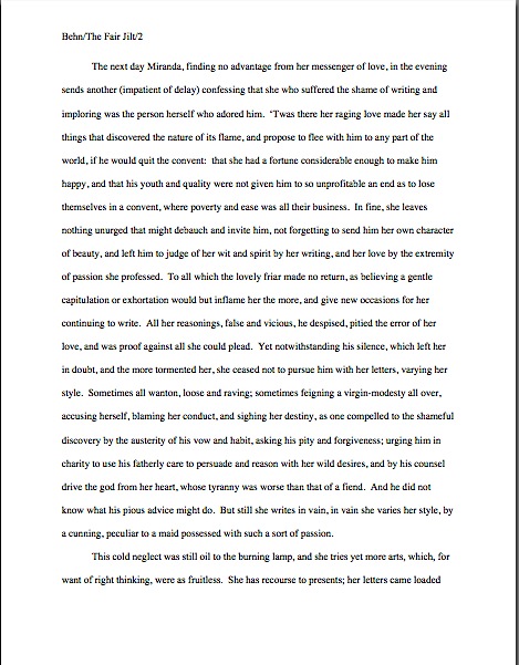
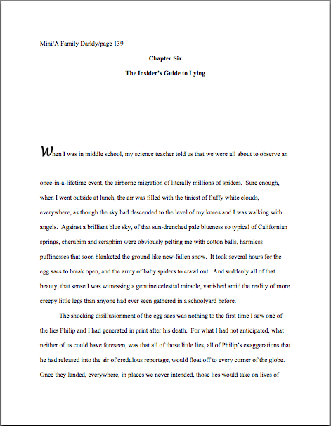
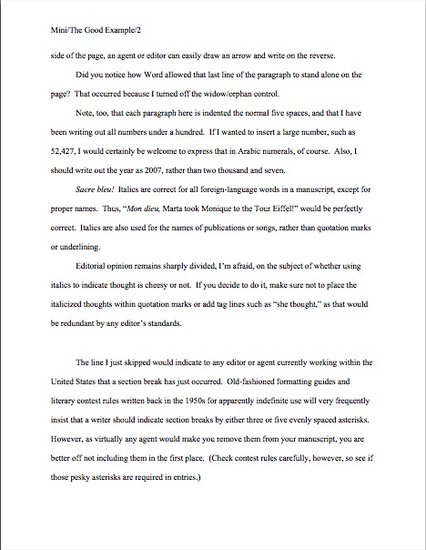
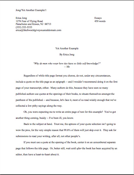
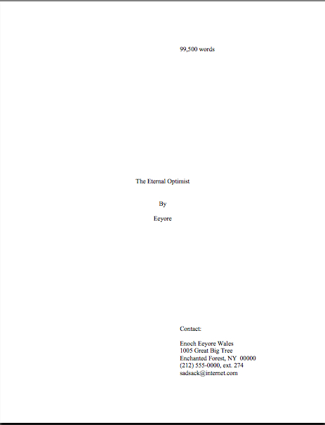
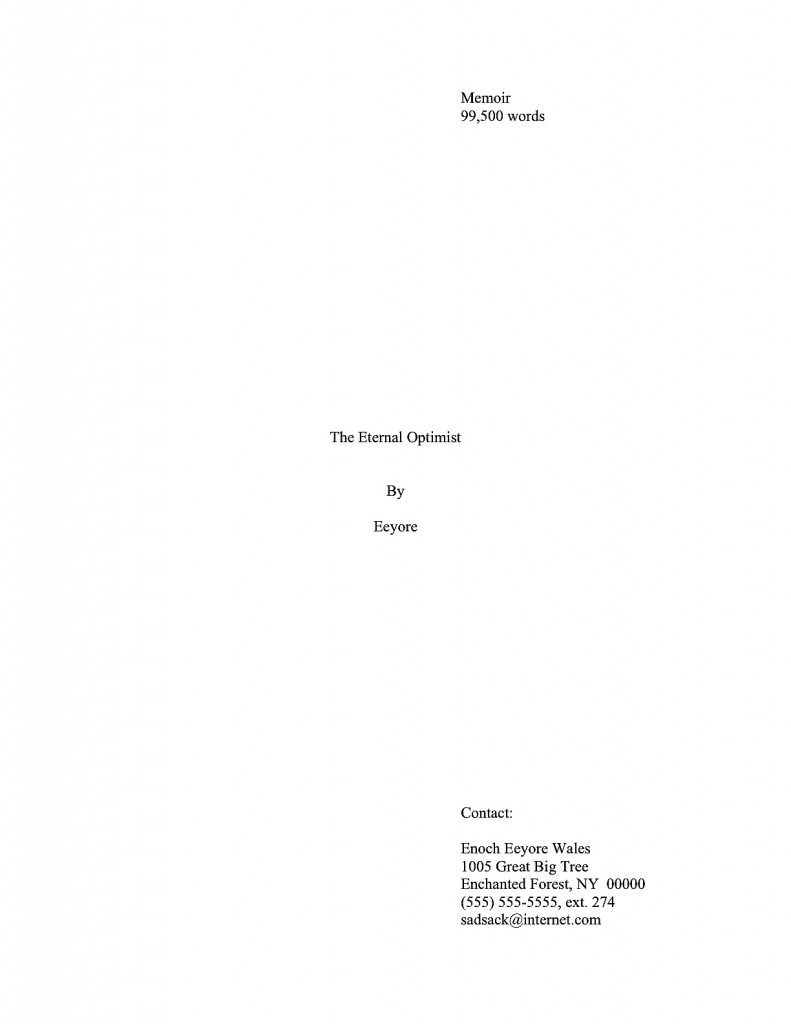
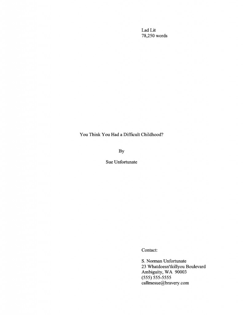
Already, I’m sensing hands shooting into the air out there, but hold your proverbial horses, please: not everyone may have gotten why precisely Millicent might conclude that a writer who made these mistakes might be a harder client for her boss to represent, and thus one to reject right off the bat. Consider, please, these two submission openings — and, as always, if you are having trouble seeing the particulars, try holding down the COMMAND key and hitting + to enlarge the image:

Quick, tell me: what are the three major formatting differences between these two page 1s?

Oh, you didn’t spot them? That’s not too terribly surprising — in a paper submission, Millicent probably would not have caught them, either. They look more or less identical, right?

Had either you or Millicent been able to open the relevant Word file, however — as our Millie would have had to do in order to consider an e-mailed submission — you would instantly have noticed several serious problems. First, the slug line (Mini/The Good Example/1) is not located in the header, but typed laboriously at the top of each page. That would mean, in practice, that after virtually any revision, the slug lines would shift either lower on the page or backward onto the previous page, rendering the pagination useless.

Second, and as a direct result, the chapter designation is on the third line of page 1, not line 1, where it should be. Third, both the chapter designation and the chapter title were hand-centered by the simple expedient of hitting the space bar repeatedly until the text was in the right place, as one would on a typewriter. Third, all of the indentation was done not by setting a tab, but by hitting the space bar 9 times at the beginning of each paragraph.

“But Anne,” many of you cry out in protest, “why would it matter? Isn’t all that counts for standard format how the page looks?”

Yes and no, dismayed protesters. Yes, for a hard-copy manuscript, looking right is sufficient. No, for a soft-copy manuscript, the words being in the right positions on the page is not enough to look professional.

Why not? Well, ease of subsequent revision, mostly. Just as the page numbers would have to be changed by hand in the second version, using the typewriter-style centering would mean that if the title changed, the writer would have to refigure how many spaces to insert, rather than using the Center function (found on the FORMATTING PALETTE under the VIEW menu in Word) to recenter it automatically. And even on a typewriter, not setting a tab (easily done using the RULER function under the VIEW menu) for something that needs to be done at the beginning of each and every paragraph in the manuscript is, well, a trifle strange.

If you found that last paragraph mystifying, may I make a simple suggestion that will make your life as a submitting writer far, far easier in the long run? Invest a few hours in taking a basic class on the functions of Word, because any agent or editor currently working in the United States will expect a new writer to be familiar with how it works.

Unfortunately, this is not information you’re likely to be able to find in a 2-minute Google search. You’re going to want to take an actual class, so you can ask as many questions as you need in order to get comfortable with all the bells and whistles.

Call your local computer store and ask; if you use a Mac, most Apple stores offer these tutorials for free. If you can’t find a class near you, try calling the local community college, asking to be directed to the Computer Science or English departments, and inquiring whether there is an advanced student who might like to make a few bucks by spending an hour or two showing you how to set up a document according to the rules of standard format.

I would repeat the same advice, with different emphasis, to any aspiring writer unsure of the rules of punctuation and/or grammar. In the long run, one of the best things an aspiring writer can do to improve his chances of getting professional recognition is to invest the time in a good, basic grammar course. Heck, I’m a big fan of every writer taking a refresher course every five or ten years.

I realize that this flies in the face of the web-based expectation of instant answers, and yes, I am always delighted to answer such questions here, especially as they relate to page formatting (the Formatpalooza post on punctuation in dialogue was in response to a reader’s question, for instance). But at least for as long as my agent keeps insisting that now is not the right time to bring out Author! Author! in book form (a now that has extended for a good five years, only six months less than I’ve been blogging), I can’t be standing next to you while you are composing, can I?

Trust me, both the writing and submission processes are significantly easier for an aspiring writer with a firm grasp of the rules of the language. If for no other reason than that those who are already conversant with how to use a semicolon correctly don’t have to waste hours upon hours wading through the widely divergent advice on the subject currently to be found online.

This is, after all, a business in which both spelling and grammar count. Very much. I would even go so far as to say that being good at both are a job requirement for a professional writer.

Like the strictures of standard format, however, grammar is not something that anyone is born knowing. The rules need to be learned, and applying them is a learned skill. Just as no aspiring baseball player would expect to hit a home run the first time she steps up to bat, neither should an aspiring writer cling to a misguided belief that if her writing is good enough, Millicent will overlook spelling, grammar, or punctuation problems.

She won’t. Period. Less so now than ever, because these days, it’s widely believed in publishing circles that there is more than adequate training in such matters readily available on the web.

Tell me, those of you who have gone looking for it, is that true? And if it is, how easy is it to tell a credible source from one that’s just winging it?

The same perception dominates the publishing world about standard format for manuscripts, by the way. The last time I announced I was going to run through the rules of standard format again, an agent of my acquaintance, a tireless advocate for my giving up this blog in order to rechannel the considerable time and energy I devote to it into my other writing, even bet me a nickel that no one would even comment, much less ask questions, throughout my next foray into the subject. Despite my readers’ consistent devotion to improving both their writing skills and ability to present them professionally, he wagered that you would be so tired of formatting after my revisiting repeatedly it for five years that the posts that time around would pass relatively uncommented-upon.

Actually, he didn’t suggest betting on it until after I stopped laughing at his contention. “What’s so funny?” he demanded. “It’s not as though your past posts on the subject aren’t well-marked, or as if there aren’t a million other sites on the web devoted to the subject. Why can’t readers just go there to find out what to do?”

Because I like the guy and I’m not in the habit of lecturing agents, I restrained myself from suggesting that he just didn’t understand how a blog works. “Some will, but many of my readers don’t have the time to comb the archives.” (See? I honestly am aware of that.) “And the writers brand-new to the game may not yet know that there is a standard format at all. By going over it two or three times a year, I’m doing my part to make sure that everyone’s writing can look its best for you. You should be grateful.”

He was, in a word, not. “Did you spend your last three lifetimes blithely violating the rules of grammar and structure, condemning yourself to the Sisyphean task of explaining them over and over again this time around? You’re dreaming, my friend — your readership doesn’t need this. I’ll bet you twenty bucks that you get fewer comments this time than last.”

Well, great as my faith in my readers undoubtedly is, I seldom bet more than a nickel (although I did win a quarter off my mother during the last campaign season for accurately predicting the outcome of the Nevada senate race), so he had to settle for that. “You’ll see,” I told him. “Not only will readers comment more than usual, but they’ll come up with questions neither you nor I would have thought of addressing.”

He handed over the nickel after Part III. One of you lovely people asked a perfectly reasonable about indentation he’d never heard before. Better yet, one that had never occurred to him before.

Now he is yet another convert to what I have long held is the truth about aspiring writers: contrary to practically universal opinion amongst professional readers, deviations from standard format are not usually the result of writers’ being too lazy to find out how to present a manuscript. Most of the aspiring writers I encounter are downright starved for accurate information on the subject; the underlying problem is that there isn’t enough authoritative information out there to combat all of the inaccurate rumors.

I’ve always been a big proponent of agency websites simply posting a page with the formatting rules, if only so I could devote our shared time here to craft. Some do, but most don’t; virtually all that do simply assume that any aspiring writer serious about getting published will already be familiar with standard format.

And that, in case those of you who have been hanging around Author! Author! for years have been wondering, is why I revisit the strictures of standard format at least twice per year. Call it my charitable contribution to the writing community.

If you feel it has been helpful and you are reading this before 10 p.m. on Sunday, January 16, 2011, may I suggest that a delightful means of expressing that would be to take a couple of minutes to nominate Author! Author! for a Bloggie Award? The more nominations, the more likely the blog is to make it to the finalist round, and thus be read by judges.

Again, I just mention. No pressure, of course. But I’d really like to see the stars line up right this year.

Next time, we shall plunge head-first back into the rigors of craft. Keep up the good work!

Formatpalooza, part XXII: dates, places, and the passage of time


Before we launch into today’s festivities, a couple of quick announcements. First, all of us here at Author! Author! are wafting good wishes toward science fiction author Orson Scott Card, who suffered a mild stroke last Saturday. Here’s to a speedy recovery, OSC!

Second, a heads-up for Seattle residents and those lucky enough to live in her relatively snow-free environs: Heidi Durrow, author of The Girl Who Fell from the Sky, will be giving a reading tonight at the Northwest African-American Museum (2300 S. Massachusetts St.), as well as signing her book at Costco (4401 4th Avenue S.) on Friday at 12:30 p.m. and reading at Third Place Books (17171 Bothell Way NE, Lake Forest Park) on Saturday at 6:30 p.m. I shall be at the Saturday night event, so please do come up and introduce yourself!

In other news, nominations for the Bloggies — which celebrate precisely what you think they do — are now open, and shall remain open through this coming Sunday, January 16th. So if anybody out there should happen to admire any particular blog, this would be a lovely time to express that sentiment through a nomination, if you catch my drift. Only the most-nominated blogs in any category (say, art/craft or topical) will proceed to the judging round, so if you have an opinion on the subject, now would be the time to weigh in about any blog you’d found particularly helpful within the last year.

I just mention. Back to the business at hand.

Earlier in this series, incisive reader Bruce (seconded by sharp-eyed reader Elizabeth) pointed out an issue that had somehow so far slipped between the cracks of Formatpalooza. Ahem:

The first page of my novel begins with a dateline. How would you treat it? As a typical dateline, as in a mag or newspaper? As a header?

or as something in-between?

At first, I must admit, I was a trifle nonplused by this question. Had we not discussed the issue of inserting articles, letters, and journal entries earlier in this series and did not that jolly little monologue include discussion of how to include a dateline?

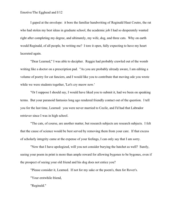
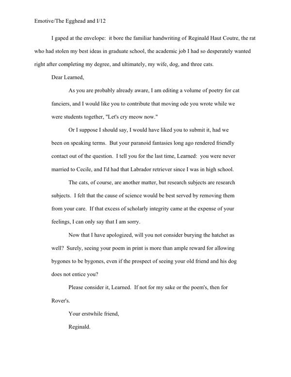
Well, it did and it didn’t, as I learned upon going back and doing a spot of re-reading. That earlier post did indeed show a couple of options for including a dateline for an article, letter, or diary entry imbedded within a non-academic manuscript. (For guidelines covering this kind of long quote in academic work, please see that previous post.) One could introduce the relevant date in the text just before the excerpted bit:

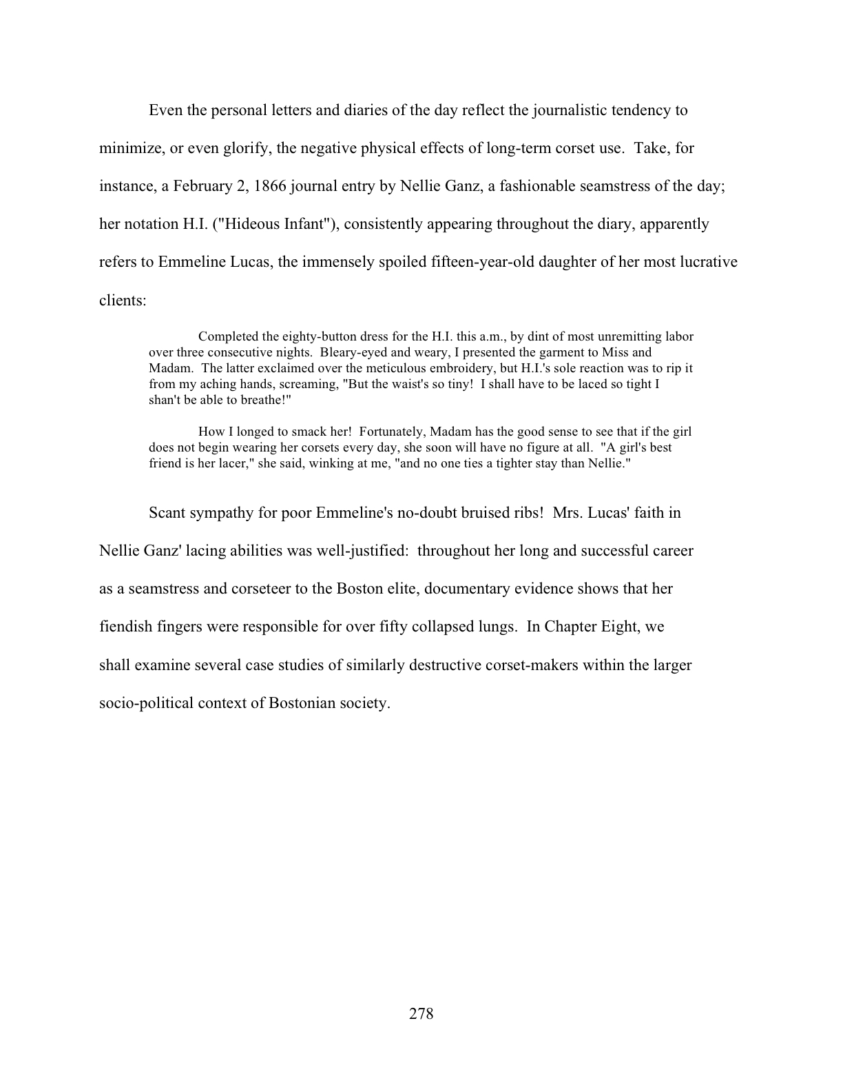
That would work in either a fiction or nonfiction manuscript. Nonfiction writers, however, also enjoy the option of using a boldfaced subheading. This format is especially popular for excerpting newspaper articles, as it would more closely resemble the way a reader might find it in a published book. Take a gander:

Doesn’t leave much doubt about when ol’ Nellie wrote that journal entry, does it? If this same entry were to appear in a novel manuscript, however, the boldfacing would not be appropriate.

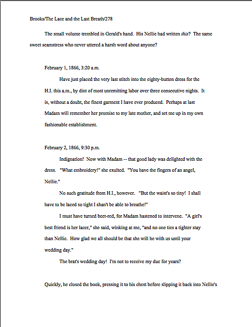
Why the dichotomy? Pull out your hymnals and sing along now: in a novel manuscript, nothing whatsoever should be in boldface or underlined. In a nonfiction manuscript, only subheadings may be in boldface.

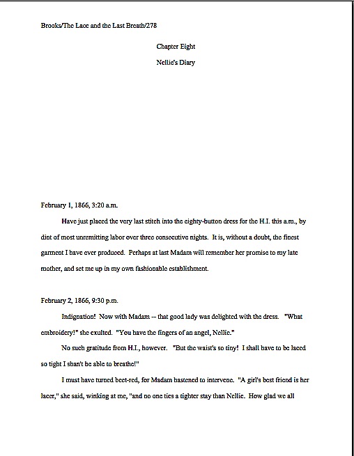
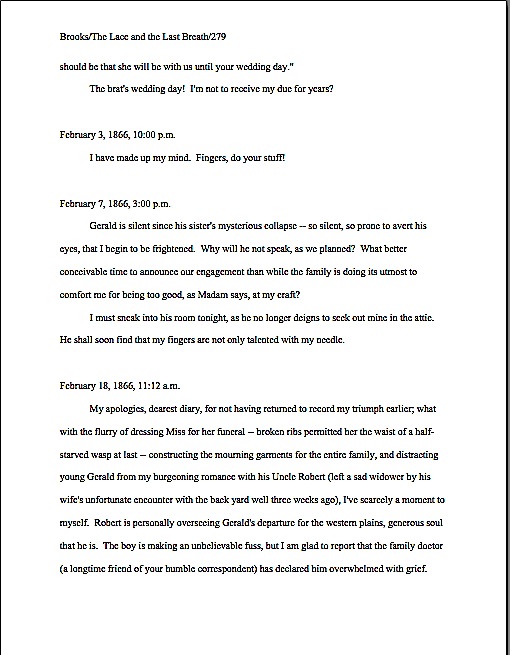
Thus, in a novel, Nellie’s diary entry would look like this on the page:

Everybody clear on that? I want to make certain, because as we saw in our last Formatpalooza post, in the welter of manuscript-formatting information out there, it’s very, very easy for an aspiring writer to conflate what would be appropriate for a dateline in one context — in this case, mid-chapter in a fiction or nonfiction manuscript — with what is called for in another.

Say, if the date, time, and/or place designation were opening a chapter, or even, as Bruce and Elizabeth would like to do, the book.

I have good reason to be cautious: if an unwary writer were simply to type dateline + manuscript format into Google, much of what would pop up in the first page would be either inapplicable or wrong. Actually, I just did it, and Result #6 was a link to Bruce’s question on this site. It also turned up a self-styled expert ordering an eager questioner to use underlining instead of italics, which is flatly incorrect for a book manuscript. Not entirely surprisingly, the expert didn’t bother to mention — and perhaps was unaware — that standard format for short stories, articles, and books is different, and thus it’s absurd to pretend that all writing, anywhere, anytime should be formatted identically for submission.

The moral here: before you accept ANY formatting advice, make sure it is specifically aimed at your type of writing. If a list of guidelines claims, either by positive assertion or omission, to be universally applicable for all manuscripts, run, don’t walk, in the opposite direction. And perhaps this goes without saying, but if you don’t know what precisely makes the person giving the advice an expert, ask follow-up questions, rather than believing — as an astonishingly high percentage of aspiring writers seeking advice online seem to do — that all online sources are equally credible.

It’s just not true, and trying to follow all of that wildly disparate advice simultaneously will only drive you nuts. Seriously, it’s a waste of your valuable time and energy. Find a credible source for your particular type of writing, cross-check what that source says with agency and publishing house submission guidelines before you even consider following the source’s advice, and don’t allow yourself to be distracted by every new suggestion you see online.

Especially if the source leaves you guessing whether the rule being touted is intended to apply to short story submissions (as, say, underlining to indicate italics would be) or book-length works (as in the imperative never to underline anything at all, under any circumstances). Just because the words manuscript, submission, and writing may be applied to both of these wildly different venues does not mean that the expectations are identical in each.

This is not a guessing game, after all. Actual standards do exist — they are merely industry-specific.

My point is — I honestly have had one lurking in the background throughout those last few paragraphs — one of the perennial problems faced by any aspiring writer trying to glean information online is the necessity for boiling complex concepts down to super-simple search terms. It’s led, unfortunately, to a tendency for definitional creepage.

You know what I’m talking about, right? It’s when a key word or phrase is ripped out of context often enough and used to mean other things in other venues that it comes to lose its specificity — and, eventually, its utility as a search term. Unfortunately, on the writing grapevine, definitional creepage is practically as common as complaints about how hard it is to land an agent in these trying times.

We saw a great example in our last post: a questioner used the term teaser to refer to a brief scene placed at the beginning of a novel, even though it would fall temporally later in the plot, in order to draw the reader into the book’s central conflict and open with action. It’s a comprehensible use of the word, but more specific uses, a teaser is everything from a promotional offer used in advertising to a rhetorical question used at the beginning of a newspaper or magazine article to tempt the reader into reading on to a theatrical curtain draped across the top of the proscenium arch to mask the flies and, along with the tormentors, provide a fabric frame for a stage.

And that’s not even counting the (avert your eyes, children) sexual definitions. The mind positively reels at the number of websites a curious writer might turn up by trying to find a little basic guidance on how to write one.

Think I’m digressing again? Au contraire, mon frère, because definitional creepage has almost certainly rendered it significantly more difficult for today’s brave questioners to find credible answers to this legitimate and serious formatting question.

Why? Well, primarily because not every date designation in writing is a dateline (or, in its more common usage, date line). In journalism, a dateline is the bit at the beginning of the article that tells the reader the date and place from which the news within the article was reported, usually presented in all capital letters: SEATTLE, JANUARY 12. Its purpose is not merely to indicate where the reporter was within the space-time continuum when she filed the story, but to enable readers to tell yesterday’s news from an article filed three weeks ago.

But that’s not its old definition, is it? Those of you addicted to looking things up will also be delighted to know that a date line is also how some earth scientists refer to the 180th meridian of longitude, better known to the rest of us as the International Date Line.

Now, clearly, Bruce wasn’t inquiring about the hypothetical dividing point where, by international agreement, a traveler moves from one day to the next. As a reasonable, sane human being, this definition did not even occur to me when I first read his question. Search engines, however, are not human beings, capable of considering the larger context, but must instead rely solely upon the search terms fed into them.

Yes, even extremely well-designed search engines. See the potential problem?

Why bring all of this up, rather than simply answering the original question? Two reasons. First, as an explanation and apology to all of the future web searchers who will undoubtedly end up on this page after having fed the term dateline or date line into their preferred search engines. Next time, you might want to add an extra term or to, to provide specific context.

Second, I’m REALLY glad that this term showed up in today’s question, because definitional creepage appears to be a factor in approximately 1 out of every 10 questions the Author! Author! comments. A lot of good writers out there seem to be frustrated by the results of insufficiently specific search terminology — and downright annoyed by the plethora of advice about ostensibly the same subject, when so many of the advice-givers are actually talking about different matters.

Didn’t think I could bring that diatribe full circle, did you? I’m a professional; don’t try this at home.

Let’s make things easy on the next aspiring writer looking for an answer to the question that Bruce and Elizabeth were kind and brave enough to bring forward for discussion by labeling the answer as clearly as humanly possible. Please, if you can think of other ways you might conceivably search for this information, mention it in the comments, so it can turn up in future web searches.

How to present a date and/or time at the beginning of a chapter or manuscript
As is often the case, the lucky writer has a couple of formatting options, both with concomitant advantages and disadvantages. One could, as we saw in our last post, simply use the date and/or time as the subtitle on page 1:

Or even as the title:

There is, however, a third and quite popular option: insert something that does in fact resemble a dateline in a newspaper article. Obviously, though, one would not want to format it exactly like a dateline — one should not, for instance, present it in all capital letters or substitute it for the necessary indentation at the beginning of the first paragraph of text.

And why wouldn’t we want to do either of those things, campers? Shout it out with me now: because a book manuscript should look like a book manuscript, not like any other kind of manuscript — or like any species of published writing. It is governed by its own rules.

Everybody got that, or should I attempt to wake up that deceased equine for another pummeling?

So how might a savvy writer of books format such a thing? By treating it like any other subheading in a manuscript, placing it where the first line of text would be if the date/time/place designation were not there.

In other words, the space format restrictions at the top of the chapter should not change at all. For fiction, it should look like this:

And for nonfiction, it should look like this:

Do I spot some raised hands waving at me from the ether? “But Anne,” a few thousand sharp-eyed readers point out, “that’s a less efficient use of page space! By adding the date as a subheading, we’ve lost a line of text!”

Quite true, date-lovers: there’s no such thing as a cost-free formatting alteration. While you gain in resemblance to an article’s dateline, you get fewer words per page. For those of you bumping up against that 400-page ceiling, the exchange might not be worth it. However, it’s up to you.

Thanks, Bruce and Elizabeth, for bringing this one up; I think the result has been a valuable addition to Formatpalooza. Thanks, too, to the many, many entrants to our recent Rings True competition whose first pages featured such date, time, and/or place designations; I honestly hadn’t realized that opening a book this way was enjoying a renaissance right now, at least amongst aspiring writers.

Keep those great questions rolling in, everybody. I’m planning to wrap up this series tomorrow, so we can launch back into nice, juicy craft questions over the weekend, but hey, I’m always delighted to clarify a formatting issue.

Keep up the good work!

Formatpalooza, part XXI: the past is prologue. But is that hook at the beginning of your manuscript?

It’s going to be a quick one this evening, I’m afraid, campers. Yes, yes, I know that I often say that, and then writing 14 pages because I discover that I have a lot to say on the topic at hand, but this time, I honestly am going to try to keep it short and sweet, in honor of my early day tomorrow.

Which may well be rescheduled, due to what looks to be about six inches of snow on the tree outside my studio window. Seattle does have a tendency to shut down on the first day of a snowstorm — and I tend to stay off the road running alongside my house when kids are sledding upon it. Call me zany.

What I am not calling zany is an interesting recent question from thoughtful reader Jen, zeroing in on a topic that even I can’t believe I’ve never addressed as a formatting issue before:

As you’re winding up Formatpalooza, I was wishing you would cover the question of how to format a teaser (as opposed to a prologue) at the beginning of a manuscript. Perhaps you have covered this in the past, but I can’t seem to find it. Thank you for your valuable help!

I’m delighted to help, Jen — but before I do, truth compels me to point out that the term teaser can refer to quite a few different things. Like so many writing terms, it can answer to one of several definitions with relation to novels, a couple of others with respect to nonfiction, a third set of things in journalism, and so forth. From the comparison to a prologue (as well as from some enlightening follow-up banter of the type that regularly goes on in the comments, thank goodness), the meaning in this case is a few pages — or even paragraphs — in the front of the manuscript that stand alone, rather than being related to the action on the first page of chapter 1.

In a published book, such an opening might appear like this, with Chapter One beginning on the next page:

Technically, an opening teaser like this is a prologue, whether or not it is labeled as such. In a published novel, it is virtually always treated like one: instead of being paginated with Roman numerals, as introductions in nonfiction books often are, an opening like this is almost invariably page 1 of a novel. The first page of Chapter One is simply numbered as the next page after the prologue.

The same logic prevails in a book manuscript intended for professional submission, whether it is fiction or nonfiction. (Academic texts work by different rules, though.) In standard format, the first page of text is page 1, always, regardless of how it would be numbered in a published book.

And why is that last caveat important to bear in mind, campers? Feel free to shout it along with me: professionally-formatted manuscripts differ in many respects from formatting in published books.

So how should the example above appear in a manuscript? It should be formatted precisely like a chapter opening — and like the first page of any manuscript. It should, in short, look like this:

But that doesn’t completely answer Jen’s question, does it? What should the first page of Chapter One look like, coming after such an opening? Glad you asked.

Is that a forest of hands that just sprouted out there, or is the snow doing something funny to my long-range vision? “But Anne,” some prologue-lovers shout, “isn’t that kind of opening likely to confuse Millicent the agency screener? I mean, isn’t she expecting the top of page 1 to be labeled Chapter One — and isn’t she likely to respond negatively if it isn’t? Shouldn’t I respond to my overpowering fear of her rejecting my manuscript on superficial grounds by labeling that opening as a prologue, so there is absolutely no chance of her being confused for so much as a nanosecond?”

Well, you certainly could do that, fearful tremblers, but it’s not strictly necessary. If you did, though, page 1 of your submission would look like this:

That makes abundant sense, right? Just as a chapter title would appear as a subtitle under the chapter designation, the prologue label would appear on the first line of the page, with the title of the prologue on the next double-spaced line. Everything else remains the same.

In a book category where such brief prologues are common openings, however, you don’t need to worry too much about Millicent’s not understanding what those first couple of pages are: trust me, she’ll recognize them. At least well enough not to be startled or confused when Chapter One opens in another time and place entirely — in this case, much earlier in poor Louis’ story.

Unless, of course, the writer chose to submit those pages like our next set of examples; see if you can spot the problem. Hint: if you jumped up from your desk chair, ran to the other side of the room, and squinted in the general direction of your computer screen, it would probably still be visible.

Did you catch the not-particularly-subtle problem here? Millicent might indeed find this opening confusing, because there’s nothing to indicate a time and place switch in the story. (Particularly unfortunate in this case, as the chapter is in a different voice than the prologue, and a rambling one at that.) Heck, there’s now nothing in the prologue section to indicate that it isn’t taking place in the present, rather than a couple of hundred years ago.

Chant it with me now, campers: when in doubt in a submission, opt for clarity, clarity, clarity.

Clarity, clarity, clarity is also why the prologue and/or introduction of a nonfiction manuscript (at least one not intended for an academic press) should follow the first page of text = page 1 rule. Yes, even if published books in your chosen book category always employ Roman numerals for prologues and introductions: trust me, if Millicent’s boss, the agent of your dreams, handles those sorts of books for a living, Millie will be able to figure out that the prologue that begins on page 1 of the manuscript will need to be repaginated by the editor.

Why am I so sure about that? Could it be because pagination decisions, like any other formatting calls in a published book, are the editor’s call, not the author’s?

Is everyone comfortable with all that? Please pipe up with questions, if not. And best of luck with the teasing, Jen!

Hmm, I could get used to writing posts this length. Or perhaps my will to communicate is just too strong. Keep up the good work!
Formatpalooza, part XX: wrapping up the book proposal in style

Before I launch into today’s festivities, I am pleased to announce a reprieve for those of you who wanted to enter the Author! Author! Rings True contest, but have not yet found the time: the deadline has been extended to Monday, January 10th, at noon in your time zone. So if any of you literary fiction writers, memoirists, or folks who are just unsure about your book category would like some of my patented no-holds-barred feedback on the first page of your manuscript and synopsis, now is your chance!

Back to business. As today’s title implies, I’m going to be finishing up my whirlwind overview of book proposal formatting this evening. This exciting development (hey, everything’s relative) is, of course, merely a plateau in our continuing climb toward mastery of standard format for book manuscripts. In my next post, I shall be wrapping that up, too, via my favorite means: answering readers’ burning questions.

So if you’ve been holding back any, waiting for someone else to ask, now would be a dandy time to leap into the fray. The comments on today’s post, for instance, would be a dandy place to bring up any lingering concerns.

Before we launch into this last installment, let’s recap, shall we? (Yes, yes, I know, I’ve covered all this before, but you’d be surprised at how many writers in a hurry will read only the most recent post in a series like this.) Here, once again, are the constituent parts of the book proposal, in the order they should appear:

1. The title page

2. The overview, a comprehensive document that leaves both Millicent the agency screener and Maury the editorial assistant with no doubt whatsoever about how to answer the following questions:

(a) What is the proposed book will be about, and why are you the single best being with an operational circulatory system and fingers to write about it?

(b) What is the central question or problem of the book? Why the topic is important, and to whom?

(c) Why is this book needed now, as opposed to any other time in literary history?

(d) Who is the target audience for this book?

(e) Why will this book appeal to the target audience as no book currently on the market does?

(f) How will your platform enable you to reach this target audience better than anyone else who might even think about writing this book?

(g) How strong a writer are you, and is this voice appropriate to the proposed book’s subject matter and target audience?

3. The competitive market analysis

4. The annotated table of contents

Everyone relatively happy about all of those? Again, please pop a question into the comments, if not. As, indeed, incisive reader Laura did the last time I discussed the intricacies of book proposals:

Quick question about the table of contents. The book I am proposing is written in first and second person Should the Annotated Table of Contents be written in the same style or should it be a third person explanation of the chapters?

Great question, Laura: the annotated table of contents should be written in the third person, regardless of the voice of the proposed book. That is not true of the rest of the book proposal: the opening pages of book description (and, of course, the sample chapter) should be in the intended voice of the book. So while most nonfiction proposals are written entirely in the third person singular, all memoir proposals should be in the first person.

Everyone clear on that? Excellent. Moving on:

5. The sample chapter(s)
Usually, book proposals contain only one sample chapter — written impeccably and polished to within an inch of its life, naturally — but if the chapter you have in mind is less than 15 pages long, consider including more than one. As long as you keep the total sample under 30 pages or so, you should be fine.

Generally speaking, professional proposals use Chapter 1 as the sample chapter, rather than one from farther into the storyline or argument, for the exceedingly simple reason that it’s usually easier for the reader to follow that way. However, that’s not strictly necessary: in a cookbook proposal, for instance, Chapter 7’s Thanksgiving feast may well wow Millicent more than Chapter 1’s general introduction to baking techniques.

Use your best judgment — but as always, be open to your future agent’s informing you that you judged wrong and that you must write another sample chapter before she submits it to editors at publishing houses. (Yes, it happens. Quite a lot, in fact.)

Whichever chapter you select, make absolutely certain that the chapter and the description in the annotated table of contents match. You’d be astonished — at least, I hope you would — how often the chapter does not resemble the description: it’s as though the writer wrote the chapter and the annotated table of contents at completely different times, and then didn’t bother to cross-check.

Which is, of course, precisely what happens, most of the time. That’s a serious proposal faux pas: how can a proposer expect Millicent or Maury to believe that those descriptions in the annotated table of contents are accurate representations of what will turn up in the eventual book if the one and only chapter presented as evidence does not adhere pretty closely to its description?

When making the decision about which chapter to include, bear in mind, too, that the sample chapter is where you’re going to provide the most direct evidence of the voice and writing style of the proposed book. Neither of which, in a good proposal, will come as a surprise to Millicent, because the entire proposal should be written in the narrative voice of the book.

Yes, even the dry marketing parts. Hey, you’re a writer — it’s your job to make even unquestionably dull stuff interesting to read. It all needs to be your best writing.

Which brings me back to that bit about the sample chapter’s needing to be written impeccably and polished to within an inch of its life. It never fails to astonish Millicent and Maury how often a good writer with a compelling book concept simply throws away the opportunity the sample chapter provides of demonstrating that s/he is a serious writer willing to take the time to present his or her work professionally. A sample chapter containing formatting errors, grammatical problems, or typos is simply not going to be impressive enough to catch an agent or editor’s eye.

Not positively, anyway. Why not? Because, lest we forget, a book proposal is a job application: in it, the writer is trying to convince an agent or editor that this is a compelling argument or story that a specific group of readers will want to buy, but that this writer and no other is the perfect person to hire to write it.

That’s true, incidentally, no matter how unusual your book concept is or how impressive your platform is to write it. Remember, being able to write well, clearly, and in adherence to standard format is the minimum requirement for a successful submission, not a set of fringe benefits.

What’s that you say, campers? This all sounds like a heck of a lot more work than simply throwing the necessary materials together and hoping that the sample chapter alone is enough to convince Millicent that your voice is right for this project? Undoubtedly. But a better marketing strategy than the far more common approach of composing the rest of the proposal in the faintly exasperated tone of the jumper through unnecessary hoops? Absolutely.

On the brighter side, for a well-prepared writer, the labor involved in incorporating the sample chapter into the proposal is comparatively light. How so? Well, hold your applause, but in a proposal, the sample chapter is formatted precisely like a chapter in a manuscript.

Okay, you can clap now. You know you want to.

That’s right — provided that as much of the book as you’ve written so far is already in standard format, you can simply copy and paste it into your book proposal at the proper juncture. This means, of course, that the first page of the sample chapter will have more white space at the top than any other page of the proposal. (And if you found that last statement mystifying, may I suggest that you review my earlier post on chapter openings and how they should look on the page?)

I hear some of you muttering and shuffling your feet. You want to see the difference between the first page of the sample chapter and any old page of the proposal, don’t you? Good plan.

Here, for your comparing and contrasting pleasure, is a properly-formatted first page of a proposal. (You do remember, right, that the title page is neither numbered nor included in the page count?) As always, if you are having trouble reading specifics, try holding down the COMMAND key and pressing + to enlarge the image.

overview1

That should look familiar by now, right? Because the sample chapter is a major section of the proposal, let’s review how a major section change would be designated in a proposal:

competitive market analysis3

Now take a peek at a minor topic change — which, too, should be old hat by now. (Where on earth did that perverse little expression originate, I wonder?)

subheading in proposal

As I would devoutly hope would be abundantly clear to you by this late point in a series on standard formatting, none of the above remotely resembles the first page of a manuscript. The first page of a manuscript should, of course, look like this:

first page of text

Quite a difference, is it not? Millicent could tell which was a page from a proposal and which had fluttered free of a manuscript from ten paces away. Now take a gander at the first page of the sample chapter in a proposal:

sample chapter opening

Those last two are remarkably similar, aren’t they? Pop quiz: see any formatting differences between this and the same chapter opening in the manuscript?

If you immediately leapt to your feet, exclaiming, “By Jove, Anne, the slug line clearly demonstrates that rather than starting pagination over again at page 1, the sample chapter’s first page shows where it falls within the book proposal,” congratulations: you have the eye of an editor. As you so astutely pointed out, the page numbers don’t start over at the beginning of the sample chapter; the entire proposal is numbered consecutively. For extra credit, would anyone care to guess why?

If you shouted, “To make it easier for Millicent to put the always unbound pages of the proposal back in order after she collides with someone in the hallway!” you’re really on a roll today. Help yourself to a gold star out of petty cash.

Otherwise, though, the sample chapter and the same chapter in manuscript form should be formatted identically. Realizing that, need I even add that part of what the writer is demonstrating in the sample chapter is a familiarity with the standards of this industry?

Not to mention the tone and vocabulary norms of the chosen book category. I probably should mention that, come to think of it, because many a well-argued and even well-written book proposal has gotten rejected because the prose in the sample chapter just didn’t sound like, well, a book in that category.

As always, if you’re not familiar with what’s currently being published in your chosen book category, why not? And how on earth did you manage to write a convincing competitive market analysis without being up on all the recent releases, anyway?

I’m most emphatically not kidding about this: from an agent or editor’s point of view, a book proposer’s being conversant with the norms, trends, and current market for the type of book she’s proposing is not an optional extra — it’s a basic requirement. It comes standard with the professional nonfiction writer package.

Don’t tell me you can’t afford to buy everything that comes out in your category, either: that’s what libraries and bookstores with comfortable reading chairs are for, after all. (Although a case could be made that the single best thing a first-time writer in any book category could do to help convince the pros that category has a solid fan base is to rush out consistently and buy new releases in that category. Particularly those by first-time authors.)

A couple of final words about the sample chapter before I move on to the remaining bits of the proposal: make absolutely sure that the sample chapter delivers on the promise of that chapter’s summary in the annotated table of contents. If there’s any doubt whatsoever in your mind about whether it fulfills that promise — or if it does not represent your best writing — either pick another chapter to use as your sample or start revising.

What does bearing out the promise of that description mean, in practice? If the chapter description contained an explicit question — or even an implicit one — the sample chapter had better answer it. If the description hinted at an exciting scene, the chapter had better deliver it. If the description made an argument, the chapter had better present evidence in support of it.

And it had better do so without repeating entire sentences or — sacre bleu! — paragraphs from the description. Or, indeed, from any other part of the proposal. Trust me, Millicent and Maury both have sufficient memory for phraseology to catch if you have used the same three consecutive words twice within the same book proposal, much less reused an entire paragraph from the annotated table of contents in the chapter. Or vice versa.

Seriously, proposers do this all the time — as do synopsis-writers, incidentally. When trying to break into a business that runs on uniquely-worded expressions of thought, it’s just not a very good strategy.

Do try, too, to pick sample material that makes your subject matter sound fascinating. That may seem as though it goes without saying, but cursory sample chapters are the bane of any proposal-reading Millicent or Maury’s existence, and for good reason: if their attention has been sufficiently grabbed by the overview and maintained throughout the middle part of the proposal, it’s a genuine disappointment to discover a sample chapter that just lies there. If they’ve read that far, trust me, they want — and expect — to be wowed.

At the risk of hauling out that broken record player again, they also expect that the sample chapter will demonstrate how you intend to flesh out the brief chapter summaries in the annotated table of contents, and rightly so. If the two parts of the proposal appear to be out of sync, M & M are going to wonder if your writing skills are up to the task of producing a consistent final manuscript.

Don’t tempt them to speculate on that score. Call me cynical, but I’ve seldom seen that type of speculation end well for the proposer. It’s not a screener’s job to give proposers the benefit of the doubt, after all.

Speaking of doing one’s job, it’s about time that I talked about the remaining elements of the proposal, isn’t it? Don’t worry; there aren’t many.

6. The author bio
Since writing a stellar author bio is an art form of its own, and one that we have discussed recently, I’m not even going to attempt to describe here how to write one. For an in-depth discussion of the subject, please consult the aptly-named HOW TO WRITE AN AUTHOR BIO category on the archive list at right.

Again, this is a place where many first-time proposers skimp, thinking (erroneously, alas) that since they’ve already talked about their platforms earlier in the proposal, all that’s really necessary in the author bio is the kind of bare-bones, just-the-facts-ma’am author bios they’re accustomed to seeing inside the dust jackets of hardcover books. Do not, I implore you, be fooled by those brief paragraphs going by the same moniker as what’s required in a book proposal.

The purpose of an author bio in a book proposal is to provide a handy single-page summary of the writer’s platform for writing this particular book. That means, in practice, that a savvy writer may choose to use different author bio text — or even author photos — in proposals for different books.

Not sure why? Okay, tell me: if you were vacillating between acquiring two books on dog breeding, which bio would appeal to you more, one that simply lists the writer’s previous publications and credentials under a smiling head shot — or one that listed eight dog-related credentials under a snapshot of the writer with his arm around a happy Dalmatian?

No contest, is there?

Do not, for the sake of your own writerly happiness, leave constructing your bio to the end of the proposal-writing process. It’s hard; budget time for it. Why? Well, really apt author bios are hard to write — and most of us go through quite a few photos before we find one of ourselves that we like.

Don’t believe me? Okay, care to guess how many shots my quite gifted photographer friend Marjon Floris took before she caught the one in my bio?

Somewhere in the neighborhood of 800. With two cameras. (Thank goodness for digital technology, eh?) Admittedly, my whole family is pretty camera-shy — my brother’s wedding photographer actually burst into tears during the reception, so frustrated was he at the difficulty of catching candids of any of us wily Minis — but still, a good author photo often takes a lot of trial and error.

Speaking of the camera-shy, am I seeing some of you waggling your fingertips in my peripheral vision? “But Anne,” the photography-averse murmur, making faces at the camera, “I don’t want to include a picture of myself in my bio; believe me, my book’s appeal would in no way be enhanced by a photo of me clutching a Dalmatian, or indeed, any creature whatsoever, warm- or cold-blooded. Can’t I, you know, skip it?”

You’re not going to believe this, but the answer is yes.

At least in a book proposal; it’s more or less de rigueur these days in a bio accompanying a manuscript submission. Hey, both Millicent and Maury will want to be able to tell their bosses if the new writer they’ve just discovered is photogenic — like it or not, it does sometimes make a difference in marketing these days.

Without an author photo, a proposal bio is simply another double-spaced single page of text with a title at the top. Here, for instance, is the super-serious bio I used a few years ago in the proposal for the political book I’ve been using as an example all day:

author bio

7. Relevant clippings, if any
This is another platform-proving exercise: if you have written articles, or even other books, it’s customary to include beautifully sharp photocopies of a few of them at the end of your book proposal. Similarly, if you happen to be famous enough for articles to have been written about you and your subject matter, feel free to include ‘em here — provided, in this second case, that they relate to your platform for this particular book.

Since our primary concern in this series is formatting (although I suspect that salient fact may have slipped all of our minds while I’ve been chatting at length about the content of a good book proposal; hey, I’m chatty), I’m going to leave to another time in-depth discussion of how to generate clippings. For now, I’ll content myself with urging you to make sure that the copies are pristine, with nice, clear, readable type.

Oh, and one other thing: do yourself a favor and scan each of the clippings, or have a computer-savvy someone do it for you. Not only will this enable you to submit your proposal to agents and small publishers who prefer online submissions (still relatively rare for nonfiction, but growing in popularity by the day), but it will also save you quite a bit of time down the line, once you’re working with an agent.

Why? Well, it has become quite common for agents to submit book proposals electronically to editors. Unscanned clippings can’t go into a virtual proposal, right?

Pant, pant, pant. Don’t stop running now — we’re practically at the end.

8. The proposal folder
I’ve written about this fairly extensively in the HOW TO WRITE A BOOK PROPOSAL series (conveniently gathered under the category of the same name on the archive list at right), so I’m not going to delve too deeply into the particulars. Except to say: in the United States, book proposals are presented in plain black folders.

Period. Don’t even consider trying to get fancy — and whatever you do, do not bind your proposal in any way. Let those pages flap around loose, just as they do in a manuscript.

Well, not quite the same: tuck the pages (neatly please) into the folder, items 1-4 on the left-hand side (i.e., everything prior to the sample chapter), items 5-7 (the sample chapter and beyond on the right).

Don’t label the folder on the front, either; keep it plain. What Millicent, Maury, and everybody else in the industry expects to see coming out of a submission envelope is this:

book proposal folder1

I know: boring. That’s the way they like it.

The folders in question, by the way, are the ones with horizontal pockets inside, not the ones with brads in the middle. The latter are for high school book reports, the former for book proposals, and ne’er the twain shall meet. So if the folder in your hand does not look like this when you open it:

book proposal photo 2

scuttle on back to the office supply story and pick up one that does. Seriously, proposals in the wrong kind of folder will just look unprofessional to the pros.

And that — whew! — is a lightning-swift (for me) discussion of how to format a book proposal. Congratulations on absorbing so much practical information so rapidly, campers, and for being professional enough to take the time to learn the ropes before you submit.

Next time, it’s back to the rigors of standard format for manuscripts — and to answering more readers’ trenchant questions. (But to save all of you question-askers some effort: I am already aware that there are a lot of sources out there making a lot of claims about how manuscripts should be formatted; you don’t need to keep telling me. There is absolutely nothing I can do about the plethora of odd advice out there on the web. I know that those of you who long for consensus are frustrated that every single source you consult doesn’t say precisely the same thing, but as I have said early and often throughout this series, my goal here is to give you enough of the logic behind what I advise for you to be able to judge for yourselves. For some tips on how to tell the good advice from the bad, and the informed from the just guessing, you might want to check out the HOW CAN I CHOOSE BETWEEN COMPETING ADVICE category on the archive list at right.)

Keep up the good work!
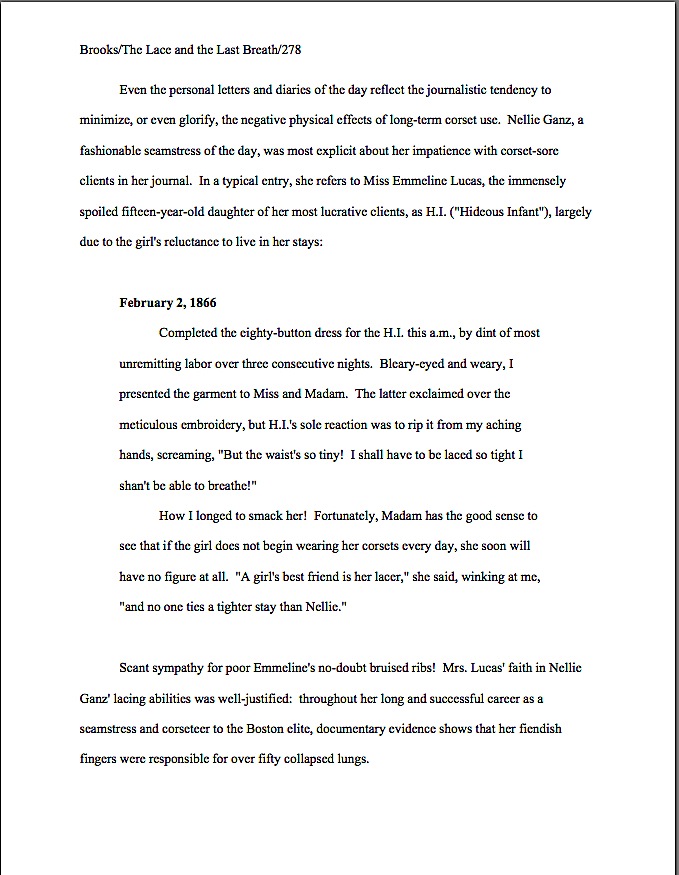
Formatpalooza, part XIX: constructing a proposal an agent or editor would like to accept

Sorry about the uncharacteristically long silence, campers. Although you may have concluded that I had withdrawn, discreetly, in order to allow those of you who write literary fiction, memoir, and work that just doesn’t fit neatly into a pre-established category some extra time to prepare your entries in the Author! Author! Rings True Writing Competition — the deadline is Saturday at midnight in your time zone! — I was, alas, flat on my back.

Or rather resting at an incline, sniffling my way through one of the most annoying flus ever to work its way through the hapless citizenry of this part of the country. Normally, I can work through the haze of such contretemps, but this one was a lulu. I shall post through the weekend, though, to make up for the lost time.

Why the hurry? I know that some of you are eager to polish off — and polish up — your nonfiction book proposals.

Toward that laudable end, we have been bending our collective gaze — steely, to be sure — away from the green pastures of manuscript formatting to turn our attention to the wind-swept plains of book proposals and their proper formatting. As we have seen in our brief sojourn amid the majestic buffalo and skipping lambs, while the text of a book proposal is formatted largely in the same matter as a manuscript’s, the various headings and subheadings are often different.

Allow me to take a brief pause in the midst of all of that stirring imagery to sneeze violently.

Before we resume, did you notice how I dropped that running metaphor when it became apparent that it wasn’t working? That’s a good editing tip for any kind of writing: if it doesn’t fly, don’t force it. An even better one: while proofing you work, make sure you read all the way to the end of every sentence; it’s the only way to catch metaphors abandoned mid-stream.

Why, yes, Virginia, I do see orphaned metaphors wandering about ostensibly well-revised manuscripts. All the time. It’s one of the species markings of the Frankenstein manuscript.

As we saw last time, a professional book proposal contains a wide range of marketing materials, all written in the proposer’s best possible prose, cleverly fitted together in a manner to convince an agent or editor that the proposed book an interesting idea that will appeal to a very specific (and, ideally, well-established) target audience. Not only that, but that the proposer is the best (and, ideally, the only) conceivable person currently drawing breath to write this particular book.

Or, to put it in the language of the industry, it’s a marketable concept presented by a writer with a great platform.

Pardon me while I wrap myself up warmly — the thousand hands that just shot into the air created quite a draft. “Excuse me, Anne?” many would-be proposers inquire nervously. “You didn’t really mean that bit about the proposal written in the proposer’s best possible prose, did you? After all, the proposal is just a formality, a series of hoops through which I have to jump before a publisher buys my book, right? All that really matters is a great book concept.”

Actually, no — although I can certainly see why you might think so. Unlike novels, nonfiction books (yes, even most memoirs) are sold not because someone falls in love with the manuscript, but because a prospective author has made a convincing case in a proposal that a book that does not yet exist will be marketable to a specific audience and that s/he is the right person to write it.

Since the book concept and the argument for it are the primary sales pitch, most first-time proposers conclude that the writing in a proposal is of secondary importance. They’re absolutely wrong.

Why? Because every syllable of a book proposal is a writing sample — the only writing sample, in fact, upon which an agent or editor will base his or her conclusions about whether to pick up the book.

Picture, if you will (and you will, right?), Maury the editorial assistant, diligently scanning the day’s submissions from agents for the next promising nonfiction project. He has reason to be careful: he needs to be very, very selective about what he passes on to his boss, the editor of your dreams. (Let’s call her Ermintrude, just for giggles.) If he simply sends Ermintrude every proposal that sounds as if it might make a good book, he’s not really doing his job, is he? It’s not as though she can offer a publication contract to every interesting-sounding project, after all; at most, even an extremely busy editor might be able to take on somewhere between one and ten a year.

Yes, you read that correctly. Believe me, if Ermintrude had her druthers, she would be publishing at least 30 times that many, but her druthers are, alas, constrained by economic realities and marketing trends.

Please think about that, if were planning to toss together your book proposals over the next long weekend, or stuff them into the mailbox without running the text by another literate human being not already familiar with your book’s concept — or, sacre bleu! if you have already sent off a New Year’s resolution-fueled submission packet. Even though it has historically been quite a bit easier to land an agent and sell a first nonfiction book than a debut novel, the competition is still extremely fierce.

So when you see an agency’s submission guidelines seemingly casually asking nonfiction writers to query with proposal, this is not a requirement to approach lightly. The Millicents who screen those proposals for agents are expecting not a thrown-together, paint-by-numbers, bare-minimum document; they are expecting to see a polished, professional presentation of a terrific book concept written in beautiful, clear prose.

Why set the bar that high? Let’s wend our way back to Maury’s cubicle to find out.

It’s Maury’s job to prevent Ermintrude’s desk from becoming so over-stacked with proposals that she can’t find her phone. That means, in practice, that he’s going to weed out any proposal that doesn’t sound interesting right off the bat. He’s also going to reject those that don’t have a clearly-defined concept — which, in a screener’s world, means one that’s both grabbed his attention instantly and is comprehensible within the first few pages of the proposal — as well as those that either don’t define their target market well or do not strike him as likely to appeal to the readers already buying such books. Not to mention those that don’t seem to have a well laid-out marketing plan or chapters likely to deliver fully upon the premise of the proposal, or those proposed by writers who haven’t made a good case for their platforms to write the book.

That, frankly, is most of ‘em. I hate to be blunt about it, but because the book proposal is such a widely misunderstood marketing tool, Maury sees a whole lot of rambling proposals. And rambling, unprofessional proposals are most of what Millicent sees on a weekly basis.

In both cases, the response is the same: “Next!” Unfortunately, due to the sheer volume of submissions, it’s likely to be “Next!” for quite a few well-written ones, too.

Why, you cry in tones of anguish? Let’s be generous and assume that Maury’s had an unusually strong selection of proposals tumble onto his desk this week: out of 300, 10 are genuinely fascinating ideas for books aimed for a well-established audience.

He is facing a dilemma, right? Obviously, he can’t possibly pass them all along to his boss — remember, 10 is Ermintrude’s entire year’s allotment of books, even if she works nights, weekends, and funds the last two herself, and this is only the first week of the year. So how does he decide which one or two to send across the hall to her?

That’s right: the ones where the writing in the first few pages screams, “Excuse me, but had you noticed that there’s some talent here?”

Yes, I did indeed say the first few pages; as with a novel, if the opening doesn’t shine, a professional reader is unlikely to read on.

Don’t pout — this information is potentially empowering, because it can steer a nonfiction writer toward specific, helpful revisions. If a literate person like Maury can’t tell Ermintrude what the book is about and why you’re the best person on earth to write it by the time he is halfway through page 4, you might want to think about some serious revision. And if he doesn’t positively long to read the book by the middle of page 2, run, don’t walk, back to the drawing board to work on your prose and presentation.

Now that I’ve scared the living daylights out of you, let’s review the constituent parts of the book proposal — at least, the ones we have covered so far:

1. The title page

2. The overview, a comprehensive document that leaves Maury with no doubt whatsoever about how to answer the following questions:

(a) What is the proposed book will be about, and why are you the single best being currently possessing an operational circulatory system and fingers to write about it?

(b) What is the central question or problem of the book? Why the topic is important, and to whom?

(c) Why is this book needed now, as opposed to any other time in literary history?

(d) Who is the target audience for this book?

(e) Why will this book appeal to the target audience as no book currently on the market does?

(f) How will your platform enable you to reach this target audience better than anyone else who might even think about writing this book?

(g) How strong a writer are you, and is this voice appropriate to the proposed book’s subject matter and target audience?

Okay, okay, so I kind of slipped that last one up the back staircase, but it’s an important question to consider when evaluating whether your book proposal is strong enough to head out the door. Let’s face it: most book proposals are very, very dry. That makes some sense, given that for even the most enthusiastic book proposer, comparing books currently on the market and talking about methods for reaching a target audience are not inherently exciting topics.

As a result, many a book proposal reads like a book report: all of the necessary parts are there, but the writing is perfunctory and, well, dull. Quite apart from the very real risk of boring Maury and Millicent — who, after all, read quite a few proposals in any given day, if their bosses handle nonfiction — a just-the-facts-ma’am proposal runs another risk: conveying the impression that the book being proposed will be sketchily or uncompellingly written as well.

But this is a marketing document, right? Why not use those pages to give Millicent and Maury a strong foretaste of what the book will be like? Or, to phrase it as an axiom: it’s a great asset to a book proposal if it is written in the same voice (and with the same vocabulary) as the eventual book.

Especially if you can do it excitingly within the first few paragraphs of the proposal. As we discussed last time, a fantastic way to establish authorial voice and interest in the subject matter is to start the proposal with a vividly illustrative anecdote or other method of direct appeal to the reader’s reason and emotions.

Opening with personality-free marketing material tends not to grab Maury’s attention anywhere near as well. Unless you would rather try to thrill him with a hook focused upon last year’s sales statistics?

3. The competitive market analysis
This section, as I hope you will recall from last time, consists of a brief examination of similar books that have come out within the last five years, accompanied in each case by an explanation of how the book being proposed will serve the shared target audience’s needs in a different and/or better manner. Not intended to be an exhaustive list, the competitive market analysis uses the publishing successes of similar books in order to make a case that there is a demonstrable already-existing audience for this book.

Sound familiar? It should: here is where the proposer proves the contentions he made in the overview. Preferably, with hard data.

Which of the many, many contentions, you ask, and how does talking about one’s competition prove them? Well, for starters, who the target audience is for your book?

Answer: the readers who have already bought the books listed in the competitive market analysis. The implicit logic: if those books sold well, that means these people buy a lot of books — and might be eager to buy more.

Remember, this should not be a list, but a compare-and-contrast essay, presented in standard format. The essay format is actually to your advantage: while you’re comparing and contrasting, you can demonstrate how your book is different and better than what’s already on the market — and yes, Virginia, that can (and should) be done without running down the competition, as long as you’re specific.

Think about it: if you mention the best points of the other books and can still make the case that your proposed volume will either do what they do, only more effectively (do you have a stronger platform than another author, for instance, or is the other book outdated now?) and/or not in the same way (what does your take on the subject offer that those other books do not?), your book is going to end up looking better by contrast than if you merely say that everything else is terrible.

Trust me on this one. If you can’t say anything nice about a particular comparable book, consider instead contrasting yours to one that you can praise with a straight face.

Some of you have had your hands raised since last time, have you not? “But Anne,” proposers everywhere exclaim, rubbing circulation back into their exhausted arms, “one of the reasons I wanted to write my book in the first place is that there isn’t another recent book on the subject. So how do I come up with a list for the competitive market analysis? Make things up?”

Glad you asked, patient arm-raisers — there’s a pro’s trick for handling this. But first, indulge me by participating in a short exercise in understanding your book’s appeal.

(a) Equip yourself with some scratch paper (the back sides of earlier drafts of your proposal, perhaps?) and a comfortable pen.
I would suggest selecting a comfortable chair, too, because you’re not to budge until you come up with a list to take with you to a bookstore.

(b) Brainstorm five different ways to describe your proposed book.
And I’m not talking about descriptors like well-written, either — describe your book the way a clerk in a bookstore might to a potential reader. Is it a memoir about your childhood spent following your mother as she worked as a gold-panner in the Sierra Nevada mountains in the 1920s? Then your list might run like this: memoir of 10-year-old girl, treasure-hunting, mountain living, 1920s, and women in unusual occupations.

Starting to get the hang of this? Let’s try another one: the proposer of a self-help book aimed at mothers with children suffering from life-threatening illnesses, illustrated with abundant real-life case studies might generate a list like this: self-help for mothers, terminal illness, medical memoir, parenting books, dealing with the prospect of death, and mourning.

Got your list firmly in hand? Good. Now…

(c) Hie yourself and your list hence to the nearest well-stocked brick-and-mortar bookstore.
Seriously, what I’m about to suggest is considerably harder to pull off online.

Standing in the store, feeling silly for carrying that list around? Excellent. Ready, set…

(d) Don’t find a book like yours. Instead find a couple of books that match one — and only one — descriptor on your list.
Yes, really: while it would be terrific to discover a book similar enough to yours that you can perform a direct point-by-point comparison, it’s actually not necessary for your book proposal. Instead, go to the first descriptor on your list and find several books that could be described with the same term.

Proposing a memoir, for instance? Stand in front of the memoir section and keep pulling books off the shelves until you discover a few that are similar in some way to yours — not identical, but exhibiting some subject matter or approach overlap.

It can be a very, very small way. Is it a childhood memoir by someone who grew up in the same part of the country as you did? Start taking notes. Is another by a dog-lover, while two chapters of your proposed book cover your relationship with beloved Spot? Sounds close enough to me. If your memoir set in the mid-1960s, find a few good nonfiction titles that cover similar aspects of the period.

After you’ve ferreted out a few useful titles, move on to the next descriptor on your list. If your cookbook is for vegans, how about including as few of the well put-together vegetarian cookbooks out recently? Not too hard to see how your book would be different and better for vegan readers than those, right? If your memoir features a chapter on the day your big brother ran away to join the army, wouldn’t it make sense to grab a couple of military memoirs, to check which dealt with family issues?

And so forth. The goal here is not necessarily to find a dozen books exactly like yours; it’s also perfectly permissible to devote a paragraph or two each to several different book categories into which your unique book might conceivably fall. Chances are, you’re going to find more books than you actually need. When in doubt, go with the ones that sold better and/or were released by major U.S. publishers; while a book from a smaller press, or one that sold only a few hundred copies, might actually be a better fit, it will provide less evidence to Millicent and her boss that there are editors at major houses already eager to buy books like yours.

Once you have come up with a dozen or so titles, you are ready to begin writing your competitive market analysis.

(e) Instead of trying to draw overall comparisons between your proposed book and each of the titles on your list, focus instead on the single point of overlap — and show how your book will address that particular point in a better way or with a different take than the already-published book.
Try not to fall into the trap of hyper-literalism here. If your book is about being raised by bears, and you are contrasting it with a memoir about being raised by wolves, you’re not going to get a lot of mileage out of saying, WOLF CHILD completely ignores the problems of the bear-raised human, so my book, CUB SCOUT, will appeal to the wild-animal/family market more.

Well, of course a book about wolves would not address bears; it’s not reasonable to expect otherwise. By concentrating upon more positive points of comparison, it’s easier to make your book’s legitimate selling points clear: like the best-selling WOLF CHILD, CUB SCOUT is a first-person account of being raised by wild animals. Wolves, however, have a long history of taking in abandoned human children; I was the first child in the Cascade region ever to have spent significant time with the grizzly without ending up a corpse.

See the difference? Again, the point here is not to convey the impression that you consider every similar book out there your competition, and therefore its author an enemy to be discredited. By demonstrating that there is already a market for books that match your five descriptors — as there must be, according to industry logic, or those recently-released books would not be on the shelves* — the implication is that past readers of each of those types of book might arguably be interested in yours.

(* Don’t waste your energies questioning this quite debatable assumption; you’ve got a proposal to write.)

Everyone clear now on the purpose and proper formatting of the competitive market analysis? If not, now would be a fabulous time to shout out a question or two. While I’m waiting with my hand cupped around my ear, let’s move on to the next section.

4. The annotated table of contents
It’s not surprising that this section falls flat in so many proposals; many, if not most, proposers don’t seem to understand the purpose of the annotated table of contents. Many, many proposers labor under the misconception that what agents and editors expect to see in this section is simply a list of chapter titles, accompanied by guesstimated page numbers. Many, many other proposers assume that they should devote a page to each chapter.

Or even several. For my sins, I’ve seen proposal drafts with 20-page annotated tables of contents. Believe me, Maury was far from pleased.

Avoid that dreadful fate in yours; keep it brief, but substantial. One to two paragraphs on each envisioned chapter is about right — remembering, of course, that everything in a book proposal is a writing sample. At the risk of repeating myself, show, don’t tell.

How does one pull that off when covering so much territory in so short a space as a paragraph or two? The same way you came up with the descriptive paragraph of your query letter, ideally: instead of trying to summarize everything that happens in a chapter in general terms, pick a particularly interesting scene or argument and present it in vivid terms.

In other words: be specific, not general. If you can possibly manage it, try to include details that Maury is unlikely to see in another proposal.

Again, you’re going to want to write this as narrative, not a list, but this section of the proposal has some odd conventions, ones that tend to come as a surprise to most first-time proposers. To see them in action, let’s take a gander at out example from the other day. As always, if you’re having trouble reading the specifics, try holding down the COMMAND key and pressing + to enlarge the image.

Notice anything here that might offend the muses of standard format, were this a novel? How about the fact that the title of the book appears at the top of the page, as if Annotated Table of Contents were a subtitle? Or the phenomenon of adding a section break between each chapter’s description? Or that the descriptions were in the present tense, like a synopsis?

Actually, there’s a pretty good explanation for the first two of these conventions. (Sorry; you’re on your own for the last.) Remember how I mentioned earlier in this sub-series that unlike a manuscript, book proposals are often broken up into their constituent parts on the reading end, so folks working in different departments at publishing houses may take a gander at ‘em?

Titling the annotated table of contents renders it easier to get those pages back into the right proposal. Skipping a line between chapters makes it simpler for an editor to find the chapter she is seeking when she’s in an editorial committee meeting or arguing with your agent about what will be in the final book.

Oh, you weren’t aware that editors often ask writers to change the proposed chapters? Happens all the time, so gird your loins, nonfiction-proposers, and prepare to play ball.

If the very notion of being asked to remove your meticulously-researched chapter on steam engines (in order to replace it with a similar section on cotton gins, about which the acquiring editor did her undergraduate thesis at Columbia) or to reduce your seven intended chapters on your life prior to the age of 17 into as many paragraphs (so you may concentrate at greater length on your four subsequent years as a sword-swallower) causes your skin crawl in revulsion, do not despair. You actually do have a means of making sure your favorite chapters pass the editorial test: write about them brilliantly in the annotated table of contents.

Seriously, if ever there was a time to show, not tell, this is it. The more vividly-depicted specifics you can work into those chapter descriptions, the better. Think of it as an opportunity to let Maury and Millicent know what a great storyteller you are.

Why is that especially important in the annotated table of contents, you ask? The vast majority of first proposals just summarize what’s going to be in each chapter, instead of using each chapter to tell a compelling separate story. Because you’re selling your talents as a writer here, as well as the subject matter of the book, that’s a serious faux pas.

If you just muttered to yourself, “Hey, might this not be an amazingly good place to demonstrate just how my book is different and better than the ones I was discussing in the last section?” congratulations — you’re starting to think like a pro. Especially in a memoir or cookbook proposal, this is a great spot to work in mention of how your book is uniquely yours:

annotated table of contents2

If you eagerly shot your hand into the air as you glanced over that last example, eager to point out that this example was formatted slightly differently than the one before it, congratulations again — your eye is sharpening. The last version is in the version my agency prefers; the desire for bolding and all caps is not universal.

Just thought you might like to see both. And if I haven’t said it often enough yet: if the agent of your dreams wants you to format your proposal differently from what I advise here — in, for example, clearly laid-out guidelines on the agency’s website — for heaven’s sake, give him what he wants. In the book proposal as well as the manuscript, the average agent is looking for evidence that a potential client can follow directions.

Don’t see why that would be an essential quality in a book-proposing client? Okay, let me ask you: if you were an agent, would you rather represent the writer who says, “Lose my Chapter 13 and dumb down the book’s vocabulary to an 8th-grade reading level? Can do, Ermintrude!” or the one who flies into an uncontrollable fury and comes weeping to the agent, demanding to cancel the book contract?

Oh, come on — you didn’t really hesitate over that choice as long as you pretended, did you?

I’ll be wrapping up book proposal formatting next time — literally: I’ll be talking about the folders that encase them. Until we meet again in that happy, not-too-distant future, keep up the good work!
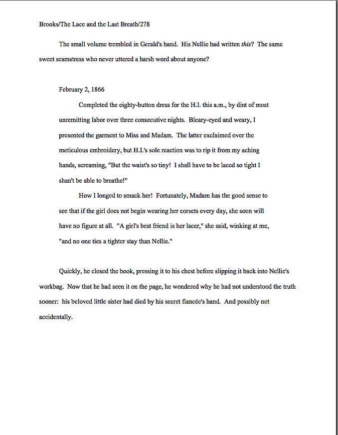
Formatpalooza, part XVIII: checking off all of those boxes, or, how to format a book proposal

How’s everybody doing out there? Are all of you nonfiction writers excited that I’ve been talking about writing specific to your book categories, or is everyone still too burned out from New Year’s festivities that you’re sitting there, glassy-eyed, silently willing the first Monday of 2011 to be over, already? Or — and I sincerely hope this is the case — are you paying attention to this post with one part of your brain, while another delightedly plots how to polish up your entries to the Author! Author! Rings True Writing Competition? There are both fiction and nonfiction categories this time around, folks, so I hope all of you memoirists who just dropped by for the formatting tips will at least consider entering.

Personally, I can’t wait to see what you’ll send in. As those of you who have been hanging out here at Author! Author! for a while may have sensed, I honestly do like to see what my readers are writing.

And, of course, to know how I can help you present your manuscripts and proposals more professionally. If you have a question about standard format, or something for which you would like to see more practical examples, by all means, let me know. That’s why the comment function is there, folks!

Seriously, it’s to everybody’s benefit if you ask; trust me, if you have been wondering, so have hundreds of other writers. The overwhelming majority of aspiring writers have never seen a professionally-formatted manuscript or book proposal, after all. I would much, much rather you asked me than took a wild guess in your submissions.

Readers’ questions also allow me to fine-tune the archive list at right — I want to make it as intuitive as possible for a panicked aspiring writer to use. (Speaking of which, since no one has commented yet on last November’s rather radical rearrangement of the archive list, am I to conclude that (a) most of you are finding it easier to use than its previous incarnation, (b) most of you are finding it harder to use, but are too polite to say so, (c) despite the monumental effort of rearranging it under subheadings, the result is precisely as user-friendly as the simple alphabetical list it replaced, or (d) nobody has noticed? It would be quite helpful for me to know.)

I’m particularly interested in finding out what pieces of information are comparatively difficult to find in my frankly pretty hefty archives. Why, only last February, eagle-eyed reader Kim was kind enough to point out a fairly extensive omission in my twice-yearly examinations of standard format for manuscripts: although I had been providing illustrations of same for several years now, I’d never shown the innards of a properly-formatted book proposal. In fact, as Kim explained,

Anne — Thank you for this glorious blog. It is a wealth of information. I am putting together a submissions package (requested materials, yea!), which includes a book proposal. After searching through your site, I still can’t find a specific format for the thing. For example, should the chapter summaries be outlined? double-spaced? Should I start a new page for each subheading? Also, my book has several very short chapters (80 in total). Should I group some of them together in the summaries, lest it run too long? Or is it better to give a one sentence description of each? Thanks again.

My first response to this thoughtful set of observations, I must admit, was to say, “No way!” After all, I had written a quite extensive series entitled HOW TO WRITE A BOOK PROPOSAL (beginning here) as recently as…wait, did that date stamp say August of 2005?

As in within a month of when I started this blog? More to the point, since before I sold my second nonfiction book to a publisher? (No, you haven’t missed any big announcements, long-time readers: that one isn’t out yet, either.)

Clearly, I had a bit of catching up to do. Equally clearly, I am deeply indebted to my intrepid readers for telling me when they cannot find answers to their burning questions in the hugely extensive Author! Author! archives.

The burning question du jour: how is a book proposal formatted differently than a book manuscript? Or is it?

In most ways, it isn’t; in some ways, however, it is. Rather than assume, as I apparently did for four and a half years, that merely saying that book proposals should be in standard manuscript format (with certain minimal exceptions), let’s see what that might look like in action.

In fact, since I’ve been going over the constituent parts in order, let’s go ahead recap from the beginning, talking a little about what purpose each portion of it serves. Here, ladies and gentlemen of the Author! Author! community, are the building blocks of a professional book proposal, illustrated for your pleasure. As you will see, much of it is identical in presentation to a manuscript.

1. The title page
Like any other submission to an agent or editor, a book proposal should have a title page. Why? To make it easier to contact you — or your agent — and buy the book, of course.

As we discussed in our last ‘Palooza post, once a writer has landed an agent, the agency’s contact information belongs on the title page, so the editor of one’s dreams may contact one’s agent easily to acquire the book. Prior to either the happy day of an offer on one’s book or the equally blissful day one signs with an agent, the writer’s contact information belongs on the title page.

2. The overview
First-time proposers often shirk on this part, assuming — wrongly — that all that’s required to propose a nonfiction book is to provide the kind of 1-, 3-, or 5-page synopsis one might tuck into a query packet. In practice, however, a successful overview serves a wide variety of purposes:

(a) It tells the agent or editor what the proposed book will be about, and why you are the single best person on earth to write about it. Pretty much everyone gets that first part, but presenting one’s platform credibly is often overlooked in an overview. (I hate to be the one to break it to you, but if an agent or editor makes it to the bottom of page 3 of your proposal without understanding why you are a credible narrator for this topic, your proposal is going to fall flat, no matter how inherently interesting your topic may be.

(b) It presents the central question or problem of the book, explaining why the topic is important and to whom , amplifying on the argument in (a), couching it in larger terms and trends. Or, to put it another way: why will the world be a better place if this book is published?

No, that’s not an egomaniac’s way to look at it. Why do your readers need to read this book? How will their lives or understanding of the world around them be strengthened or reshaped by it?

(c) It demonstrates why this book is needed now, as opposed to any other time in literary history. That one is self-explanatory, I hope.

(d) It answers the burning question: who is the target audience for this book, anyway? To reframe the question as Millicent’s boss will: how big is the intended market for this book, and how do we know that they’re ready to buy a book on this subject?

(e) It explains why this book will appeal to the target audience as no book currently on the market will. (In other words, how are potential readers’ needs not being served by what’s been published within the last five years — the usual definition of the current market — and why will your book serve those needs in a better, or at any rate different, manner?

(f) It shows how your platform will enable you to reach this target audience better than anyone else who might conceivably write this book. Essentially, this involves tying together all of the foregoing, adding your platform, and stirring.

(g) It makes abundantly clear the fact that you can write. Because, lest we forget, a book proposal is a job application at base: the writer’s primary goal is to get an agent or editor to believe that she is the right person to hire to write the book she’s proposing.

Yes, there should be separate sections of the book proposal that address all of these points in detail. The overview is just that: a quick summary of all of the important selling points for your book, presented in a manner intended to entice an agent or editor to read on to the specifics.

In the interest of establishing points (a), (b), and (g) right off the bat, I like to open a book proposal with an illustrative anecdote or direct personal appeal that thrusts the reader right smack into the middle of the central problem of the piece, reducing it to an individual human level. Basically, the point here is to answer the question why would a reader care about this subject? within the first few lines of the proposal, while showing off the writer’s best prose.

For a general nonfiction book — particularly one on a subject that Millicent might at first glance assume, perish the thought, to be a bit on the dry side — this is a great opportunity for the writer to give a very concrete impression of why a reader might care very deeply about the issue at hand. Often, the pros open such an anecdote with a rhetorical question.

overview NF page 1

The opening anecdote gambit works especially well for a memoir proposal, establishing both the voice and that the memoir’s central figure is an interesting person in an interesting situation. While it’s best to keep the anecdote brief — say, anywhere between a paragraph and a page and a half — it’s crucial to grab Millicent’s attention with vividly-drawn details and surprising turns of event. To revisit our example from last time:

overview1

overview2

As we saw in that last example, you can move from the anecdote or opening appeal without fanfare, simply by inserting a section break — in other words, by skipping a line. While many book proposals continue this practice throughout the overview, it’s visually more appealing to mark its more important sections with subheadings, like so:

subheading in proposal

Incorporating subheadings, while not strictly speaking necessary, renders it very, very easy for Millicent the agency screener to find the answers to the basic questions any book proposal must answer. If the text of the proposal can address those questions in a businesslike tone that’s also indicative of the intended voice of the proposed book, so much the better.

Please note, however, that I said businesslike, not in business format. Under no circumstances should a book proposal either be single-spaced or present non-indented paragraphs.

This one confuses a lot of first-time proposers, I’ve noticed. “But Anne!” they protest, and not entirely without justification. “A book proposal is a business document, isn’t it? Doesn’t that mean that it should be in business format?”

The short answer is my God — no! The not-so-short answer is: not if you want Millicent to read it. An aspiring writer who does not indent her paragraphs is presumed illiterate.

Long-time readers, chant it with me now: the publishing industry does not use business format, even in its business letters; always, always, ALWAYS indent your paragraphs.

3. The competitive market analysis
The competitive market analysis is probably the most widely misunderstood portion of the book proposal. What the pros expect to see here is a brief examination of similar books that have come out within the last five years, accompanied by an explanation of how the book being proposed will serve the shared target audience’s needs in a different and/or better manner. Not intended to be an exhaustive list, the competitive market analysis uses the publishing successes of similar books in order to make a case that there is a demonstrable already-existing audience for this book.

But that’s not how you’ve heard this section described, is it? Let me take a stab at what most of you have probably heard: it’s a list of 6-12 similar books.

Period. The sad, sad result usually looks like this:

competitive market analysis bad

Makes it pretty plain that the writer thinks all that’s required here is proof that there actually have been other books published on the subject in the past, doesn’t it? Unfortunately, to Millicent’s critical eye, such a list doesn’t merely seem like ignorance of the goal of the competitive market analysis — it comes across as proof positive of the authorial laziness of a writer who hasn’t bothered to learn much about either how books are proposed or the current market for the book he’s proposing.

To be fair, this is the section where first-time proposers are most likely to skimp on the effort. Never a good idea, but a particularly poor tactic here. After all of these years, the average Millicent is darned tired of proposers missing the point of this section: all too often, first-time proposers assume that it has no point, other than to create busywork.

As you may see above, the bare-bones competitive market analysis makes the writer seem as if he’s gone out of his way to demonstrate just how stupid he thinks this particular exercise is. That’s because he’s missed the point of the exercise.

The goal here is not merely to show that other books exist, but that the book being proposed shares salient traits with books that readers are already buying. And because the publishing industry’s conception of the current market is not identical to what is actually on bookstore shelves at the moment, the savvy proposer includes in his competitive market analysis only books that have been released by major houses within the last five years.

That last point made some of you choke on your tea, didn’t it? Don’t you wish someone had mentioned that little tidbit to you before the first time you proposed?

Even when proposers do take the time to research and present the appropriate titles, a handful of other mistakes tend to mark the rookie’s proposal for Millicent. Rather than show you each of them individually, here’s an example that includes several. Take out your magnifying glass and see how many you can catch.

competitive market analysis 2

How did you do?

Let’s take the more straightforward, cosmetic problems first, the ones that should immediately leap out at anyone familiar with standard format. There’s no slug line, for starters: if this page fell out of the proposal — as it might; remember, proposals are unbound — Millicent would have no idea to which of the 17 proposals currently on her desk it belonged. It does contain a page number, but an unprofessionally-presented one, lingering at the bottom of the page with, heaven help us, dashes on either side.

Then, too, one of the titles is underlined, rather than italicized, demonstrating formatting inconsistency, and not all of the numbers under 100 are written out in full. Not to mention the fact that it’s single-spaced!

All of this is just going to look tacky to Millie, right?

Okay, what else? Obviously, this version is still presented as a list, albeit one that includes some actual analysis of the works in question; it should be in narrative form. Also, it includes the ISBN numbers, which to many Millicent implies — outrageously! — a writerly expectation that she’s going to take the time to look up the sales records on all of these books.

I can tell you now: it’s not gonna happen. If a particular book was a runaway bestseller, the analysis should have mentioned that salient fact.

There’s one other, subtler problem with this example — did you catch it?

I wouldn’t be astonished if you hadn’t; many a pro falls into this particular trap. Let’s take a peek at this same set of information, presented as it should be, to see if the gaffe jumps out at you by contrast.

competitive market analysis3

Any guesses? How about the fact that the last example’s criticism is much, much gentler than the one immediately before it?

Much too frequently, those new to proposing books will assume, wrongly, that their job in the competitive market analysis is rip apart every previous book on the subject. They try to make the case that every other book currently available has no redeeming features, as a means of making their own book concepts look better by contrast.

Strategically, this is almost always a mistake. Anybody out there have any ideas why?

If it occurred to you that perhaps, just perhaps, the editors, or even the agents, who handled the books mentioned might conceivably end up reading this book proposal, give yourself three gold stars. It’s likely, isn’t it? After all, agents and editors both tend to specialize; do you honestly want the guy who edited the book you trashed to know that you thought it was terrible?

Let me answer that one for you: no, you do not. Nor do you want to insult that author’s agent. Trust me on this one.

No need to go overboard and imply that a book you hated was the best thing you’ve ever read, of course — the point here is to show how your book will be different and better, so you will need some basis for comparison. You might want to avoid phrases like terrible, awful, or an unforgivable waste of good paper, okay?

I had hoped to get a little farther in the proposal, but as I’m already running long, I’m going to sign off for the day. But since you’re all doing so well, here’s one final pop quiz before I go: what lingering problem remains in this last version, something that might give even an interested Millicent pause in approving this proposal?

If you immediately leapt to your feet, shouting, “I know! I know! Most of these books came out more than five years ago, and of those, The Gluten-Free Gourmet is the only one that might be well enough known to justify including otherwise,” give yourself seven gold stars for the day.

Heck, take the rest of the day off; I am. Keep up the good work!
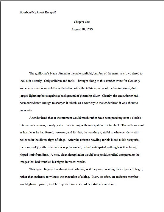
Formatpalooza, part XVII: not all that glitters is…well, you know the rest

sequined hat

I had hoped to wrap up Formatpalooza by the end of the year, but frankly, I think it’s going to be a trifle on the tight side, unless I post a couple of times tomorrow. Even by my standards of vim, that might be overkill.

My vehemence is kindly-motivated, I assure you: contrary to popular opinion amongst aspiring writers, how a submission is presented can make a very great difference in how it’s received. Yes, yes, I hear you, those of you who have been running around to writers’ conferences in recent years: you can hardly throw a piece of bread at an agent or editor’s forum without hitting a pro saying, “It all depends upon the writing.”

They tend to spout this aphorism for a very good reason — it is in fact true. But as we discussed both earlier in this series and in earlier ‘Paloozas, that doesn’t mean that the quality of the writing is the only criterion agents, editors, contest judges, or any of the rest of us who read manuscripts for a living use when deciding whether to read beyond the first page of a submission. Professional presentation plays a role, as does marketability, a story’s probability of appealing to its target audience (not exactly the same thing), what happens to be the surprise bestseller of the moment — and yes, that whole slew of intangibles that make up personal taste.

There is, in short, no such thing as a foolproof formula for producing the perfect manuscript for submission. Sorry to be the one to break that to you.

As I’ve been arguing throughout this ‘Palooza, however, agents, editors, contest judges, screeners, and other professional readers develop an almost visceral sense of when a manuscript is properly formatted. So rather than screening submissions with a list of don’t by their sides, they more or less automatically discount pages that are cosmetically incorrect.

This is most emphatically not the same thing, though, as rejecting such pages on the spot because, say, an aspiring writer underlined a foreign-language word on page 1 instead of italicizing it. (I know, I know: sacre bleu!) Much as a reader with impeccable grammar will not necessarily throw down a book that misuses semicolons, most professional readers will not instantly reject an improperly-formatted submission without some further provocation.

But as we discussed last time, the writer in both cases is going to have to work a whole lot harder to impress the pro as literate. Unfortunately, the prevailing standards for printed books — which, as we have seen, differ in many significant respects from manuscripts — often lead innocent writers astray.

Leading them to, say, include a table of contents in a manuscript submission.

That seems as if it would be a helpful page to tuck in there, doesn’t it? One can make an argument for it, certainly: in fiction, including it would enable an agent to go back and re-read the submission easily; in nonfiction, it would permit an editor to skip ahead to a chapter of particular interest. And heck, if the manuscript fell upon the floor in the kind of you got chocolate in my peanut butter!/you got peanut butter in my chocolate! we witnessed with horror earlier in this series, a well-organized table of contents might render it a trifle easier to reassemble, right?

Wrong. Including a table of contents in a manuscript submission is a classic rookie mistake, the kind of stunt that makes Millicent the agency screener roll her eyes.

Why is it such a serious strategic error? Well, in a published book, a table of contents, like an index, is a courtesy to browsers trying to get a feel for the contents and buyers who do not necessarily want to read the entire book. In order to serve this function well, however, the pages listed would have to match up with the beginnings of the relevant sections, right?

This is difficult in a manuscript, for several reasons. First, Millicent doesn’t expect to see a table of contents, particularly in a novel submission; it just won’t look right to her. Second, since a published book is typically about 2/3rds the length of its original manuscript (documents shrink in the transition to the printed page), the pages listed on a manuscript table of contents would ultimately be inaccurate, anyway.

Third — and perhaps most relevant at the submission stage — including a table of contents implies that the writer does not expect the agent of her dreams to read the manuscript in its entirety, but merely to flip to the pages that interest him most. From the publishing industry’s point of view, that’s a pretty jaw-dropping assumption: why, they wonder, would an agent or editor be interested in acquiring a book if he doesn’t like it well enough to read it in full?

So really, including a table of contents in a manuscript is just wasting a page. It does not belong in a manuscript, any more than an index or those boxes around text that magazines are so fond of printing. To professional eyes, it looks unprofessional, especially in a novel submission.

It’s also an inconvenience — and yes, Virginia, to someone who has to skim as quickly as Millicent to get through the day’s reading, having to turn over an extra page is an actual inconvenience.

Don’t believe me? Okay, think about our time-strapped friend’s expectations when opening a submission envelope: when she turns over the title page, she is looking forward to finding the first page of text there waiting for her, all ready to be judged in a flash. If instead she finds a table of contents, something she would only find helpful if she were to read the entire manuscript, she may well be a trifle miffed. Given that she tends to reject most submissions somewhere between paragraph 1 and page 5, the information that Chapter 8 begins on page 112 will most likely strike her as at best gratuitous — and at worst presumptuous.

“What gives?” she’ll say, taking an extra sip of her too-hot latte as she impatiently gets the table of contents out of her way. “Doesn’t this writer know the difference between a manuscript and a book?”

‘Nuff said, I think.

Or maybe not — do I hear some aspiring nonfiction writers clamoring for my attention? “But Anne,” these excellent souls point out, “a book proposal is supposed to include a table of contents for the planned book, isn’t it? I read it in an article on how to write a book proposal.”

Ah, I’m glad that you brought this up, nonfictionists, because first-time proposers often conflate the table of contents one might find in a published book with the annotated table of contents required in a book proposal. They are in fact quite different things.

Again, mixing up terms is a classic rookie mistake. Over and over again, I see aspiring writers new to the game simply assuming that because a term means something in one context, it must necessarily mean exactly the same thing in another context.

As a general rule of thumb, that’s not always true. In this case, it most definitely is not.

When hyper-literal proposers hear the term table of contents, they assume, wrongly, that an agent or editor is simply asking to see what the writer thinks the table of contents in the published book will look like, presumably as an exercise in guessing how many pages each of the proposed chapters will contain. (It’s hard to imagine it serving any other purpose.)

As a result, first-time proposals tend to include a section that looks a little something like this:

Leaving aside for the moment the fact that Millicent simply would not expect to see this page in a book proposal at all , do you see any problems with this as a marketing document intended to convince an editor to pay the writer to write the proposed book?

Actually, I’m sure that some of your hands shot into the air even before I showed this example, in your eagerness to take issue with the notion that a submission should resemble a published book in the first place — and thus that the kind of table of contents one might expect to see in a nonfiction book would clearly be out of place in a submission.

Well caught, eager wavers. Spot any other problems?

If you said, “Well, for starters, the example above doesn’t include information that could possibly be either accurate or useful to an editor,” give yourself a gold star for the day. Obviously, it would be impossible for a proposer to state with certainty where the chapter breaks would fall in the proposed book when published; all the information s/he could reasonably offer in this sort of table of contents would be educated guesses about how long each chapter might be. Or perhaps a list of where those breaks fall in the draft manuscript.

But that’s not the information nonfiction agents and editors want to see in the book proposal; they’re perfectly aware that since the book in question has not yet been written (or needn’t be), any length estimates must be just that, estimates, not fact. The information they do want to see in the annotated table of contents section of a book proposal is a brief description of the CONTENTS of each chapter.

The word annotated should have been a clue, I guess.

Typically, each proposed chapter is summarized in one or two paragraphs. Well, typically is a bit of an exaggeration; what’s actually typical in a first time proposer’s book proposal is either the information-light version we saw in today’s first example or an entire page devoted to each chapter.

Neither is what is expected, however. The typical form I am talking about here is what professional nonfiction authors use.

And like so many other differences between professional formatting and, well, everything else they see in submissions, it’s really, really obvious at first glance to someone who has seen a book proposal before whether the submitter du jour has followed the rules. Compare what the first page of a correctly put-together annotated table of contents looks like with the truncated version above:

See the difference? Millicent will. From ten paces away.

Hey, while we’re on the subject, why don’t we take a quick gander at all of the constituent parts of a book proposal, so all of you nonfiction writers out there may be sure that Millicent will like the look of yours? To make the overview even more useful, let’s run through the sections in the order they would appear in the proposal.

First, let’s take a peek at the title page. See if you notice anything distinctive about it:

If you immediately cried, “Why, unlike a title page for a novel, the proposal’s title page does not include a word count,” give yourself another gold star. (You’re racking them up today, aren’t you?) The length of a nonfiction book is a contractual matter; since what a proposal is offering is not the finished book, but a book concept and an author to write it to the specifications desired by the publisher, it does not make sense for the writer to guesstimate the length up front.

Award yourself yet another if you also mentioned that the contact information listed here is Scaredy’s agent’s, not Scaredy’s. Naturally, if Napolèon does not yet have an agent, naturally, he would list his own contact info in the bottom-right corner.

Any guesses why his address would be replaced by his agent’s down the line?

The reason is pretty straightforward: no agent in his right mind would allow his clients to circulate their proposals (or manuscripts, for that matter) without his contact info on them. After all, if an editor falls in love with the proposal, it’s the agent she’s supposed to be contacting, not the writer.

What follows next in a book proposal is the overview, a brief description of what the book is about and why the writer proposing it is the best person on earth to write it. Never, ever forget that this is both a marketing document and a job application, proposers: you’re trying to get the publisher to hire you to write this book, right?)

Most first-time proposers just include the bare bones here, leaping right into the description, but I like to open with a little sample of the type of writing the editor may expect to see in the completed book. To this end, I always advise starting a proposal with a vividly-told illustrative anecdote.

The first page of the proposal, then, would look like this:

overview1

As you may see, like everything else in the book proposal, the overview should be in standard format: double-spaced, indented paragraphs, 12-point Times, Times New Roman, or Courier. Unlike the opening of a chapter, however, each new section is simply titled, a line skipped, and the text begun. Since this is a nonfiction document, whether to place OVERVIEW in boldface is up to you; my agency happens to like it, as well as the all-caps titling.

Notice, please, that because this is a proposal for a memoir, the anecdote is written in the first person singular. The rest of the proposal should be as well. Many memoirists mistakenly believe that writing about their books in the third person is more professional, but that’s simply not the case.

Back to formatting. Just as a simple section break is sufficient to separate scenes in a novel or memoir, all that’s required in a proposal to differentiate the opening anecdote from the description of the proposed book is a skipped line:

overview2

Since the overview typically covers a broad range of topics, I like to break it down into several smaller sections, to make it easier for an agent or editor to find the answers to the pertinent questions any good book proposal must answer. Every proposal is slightly different, of course, but typically, apart from the opening anecdote and the book’s description, I advise including subsections on why the proposed book will appeal to readers (this is a great place to bring up any demographic information you may have collected on your readership), why the book is needed now (as opposed to any other time in publishing history; this provides an excellent opportunity to bring up any relevant trends), and how to convince the target readership that this is the book for them (not a specific marketing plan, mind you — that comes later in the proposal — but a brief explanation of who the target reader is and why that reader might pick it up).

Nit-picky? Sure. But that’s the nature of a book proposal.

How does one mark each of these subsections? You already know how to do this one, actually: as is permissible in a nonfiction manuscript, to differentiate between topics within sections — to alert the reader to the start of the subsection on why you’re the best person currently gracing the crust of the earth to tell this particular story, for instance, or to usher onstage your explanation of precisely why the literate world needs this story right now — you may insert a subheading. To reuse the example from the last time we discussed subheadings:

Wharton subheading example

When moving between major sections of a book proposal, convention dictates inserting a page break between sections. Why? Because unlike a novel manuscript, proposals are often broken apart, with one section going to a publisher’s marketing department another going to legal, a third staying with the editor interested in acquiring it, and so forth.

It’s also customary to begin a new major section with a centered title. For example, when moving from the overview to the competitive market analysis (i.e., the section of the proposal where the writer lists similar books currently on the market, then explains why his proposed book is different and better), the latter section would begin like this:

comp market analysis

I’ve written at some length about how to construct a competitive market analysis — contrary to popular opinion, it’s not just a list of similar books currently on the market — so I shan’t go into the ins and out of creating this narrative here. But if you’d like to hear more, please check out the posts collected under the aptly-named HOW TO WRITE A BOOK PROPOSAL category on the archive list at right.

There are a couple of formatting curiosities I would like to point out, however. First, the competitive market analysis should be written in a narrative style, not as a list. Second, it does not include all of the bibliographic information for the book. Just the author and title — in italics, as is appropriate for a book title in standard format — with the publisher and year of publication following in parentheses, will generally suffice. (Although if the agent of your dreams asks for something more, like the ISBN, for heaven’s sake, give it to her.)

Is that all there is to a book proposal, you ask hopefully? Heavens, no: there are several more vital sections. As usual, I have a great deal to say about each, so I am going to sign off for today and pick it up next time. Keep up the good work!
Formatpalooza XVI, in which we get downright chatty

partial pink roses

I ask you: how did it get to be Wednesday already? Clearly, some mad scientist has been sneaking into my life, boxing up hours at a time, and hauling them away to another dimension.

Or so I surmise, from the fact that I began this post yesterday morning, yet don’t seem to have posted it until this afternoon. Let’s get right down to business, before another fifteen-minute chunk just vanishes before my very eyes.

Manuscript submissions, like any other form of human communication, are subject to fashion. Nine months to a year after a surprise major bestseller hits the bookstores, for instance, agencies start seeing scads of queries for books with remarkably similar premises. About the same amount of time after a multiple-perspective novel hits it big, their inboxes are suddenly stuffed to bursting with multiple POV submissions. Even matters as small as semicolon use often, after a suitable lag for composition, enjoy the occasional renaissance.

It’s as predictable as the flowers in May — and just as likely to induce an allergic reaction in Millicent the agency screener, at least when the day’s submissions heavily à la mode. While a manuscript’s fitting neatly into an already well-established book can be a good thing, the fourth DA VINCI CODE knock-off of the morning can easily start to seem a little old.

Other trends, I must confess, catch professional readers by surprise. A few years back, about a tenth of the manuscript submissions appearing on agency doorsteps abruptly lost the second space after a period: one day, the second space was virtually universal; the next, it was as if a pair of giant hands had slapped the left and right margins of America, forcing all of those poor sentences into closer proximity with one another.

“What happened?” the pros demanded of one another, mystified. “Did I miss an industry-wide memo that the standards have just changed?”

In a manner of speaking, the people who ostensibly set those standards had. Miss Snark, a well-known agent-who-blogs of the time, had declared from behind her wall of anonymity that anyone who was anyone simply despised the second space after the period. Within a couple of weeks after she declared it verboten, agencies felt the effects, despite the fact that the standard within the industry had not actually changed.

Now, it wasn’t as though there hadn’t been banshees declaring the demise of the second period for a good decade before Miss Snark’s pronouncement: it had, in fact, been a fairly common writing-class admonition ever since some publishers started cutting it from published books in order to save paper. Surprisingly often, it was presented in precisely the same terms: the double-space convention is old-fashioned, and using it would instantly brand a writer as someone to ignore. That’s never actually been true — unless an agency or publishing house actually states a preference in its guidelines for only a single space after a period, using two is virtually unheard-of as a rejection-worthy offense all on its own — but it certainly sounds convincing, doesn’t it?

Since I already dealt with the one-space-two-space (red space, blue space?) debate in an earlier post, I shan’t go into its pros and cons again here. I merely bring it up to illustrate that although people outside of agencies and publishing houses periodically decide that this or that is the new normal for submissions, those decrees usually come as news to the fine folks on the receiving end of submissions.

You know, the individuals with actual power to change the rules in question. Imagine their surprise.

In a not entirely coincidental development, when one of these sea changes begins to take effect, Millicent’s response is just as likely to be annoyance as approval for those who have leapt on the bandwagon. In fact, the former is more likely. “Why are half the manuscripts I’ve seen today in blue ink?” she wonders. “Did someone at a writers’ conference make a joke that got misunderstood?”

Oh, it happens. And now, thanks to the Internet, such a misunderstanding can make it three times around the world before breakfast.

So when about a year ago, submissions suddenly began appearing in agencies with more than one speaker per paragraph in dialogue scenes, professional readers drew the obvious inference: either some soi-disant writing guru had declared the paragraph break between speakers so old-fashioned, or a recent bestseller had been composed by someone with a broken RETURN key, a broken right pinkie to hit it, or a deep-seated psychological aversion to clarity in dialogue.

“Why else,” Millicent has been heard to mutter, “would anyone deliberately chose a dialogue format that will confuse readers?”

You know what I’m talking about, right? Whereas traditional and — dare I say it? — old-fashioned dialogue is formatted like this:

Polly Purebred clutched a lace-napped handkerchief to her pale pink lips. “But I can’t pay the rent!”

“But you must pay the rent,” Dastardly Duke replied, twirling his mustache. “Or I shall tie you to that railroad track conveniently located just outside your front door.”

“But I can’t pay the rent!”

“But you must pay the rent, or I shall deal with you as I mentioned above.”

“But I can’t pay the rent!”

“What are you, a tape recorder? You gotta pay your rent, lady.”

A handsome stranger appeared in the doorway, slightly out of breath from having missed his cue. “I’ll pay the rent.”

Polly tapped on her watch meaningfully. “My hero.”

“Curses,” Duke remarked, yawning, “foiled again.”

On the manuscript page, that exchange (and possibly a little more) would be formatted as you see below. As always, if you’re having trouble reading the type, try holding down the COMMAND key and pressing + to enlarge the image.

dialogue format

That should look at least a trifle familiar to you: the indented paragraphs, one speaker per paragraph convention, and properly-placed quotation marks are all just what you would see in a published book, right? Obviously, though, because this page appears in a manuscript, these dialogue paragraphs are presented in standard format, just as narrative paragraphs would be.

Really, there’s only one unusual element here: did you catch the quote within the quote in paragraph 10? Because Handsome Stranger is reproducing verbiage from Dastardly’s rental ad, rustic charmer with view of railroad track appears within single quotation marks (‘), rather than doubled (“); doubled quotation marks appear around the entire speech.

Everybody’s clear on that, right? If not, now would be a delightful time to speak up.

Clear being the operative word here: while clarity is always required for professional writing, lack of clarity in dialogue is especially likely to be fatal to a submission. If the punctuation had not made it plain that Handsome was in fact quoting something, that paragraph would have made less sense. See for yourself:

“I do believe I will.” The stranger removed his fetching Mountie hat before stepping into the cabin. “I’ve been traveling all morning. The rental ad didn’t mention just how far out of town rustic charmer with view of railroad track actually was.”

Yes, Millicent might have been able to figure out from context (a) that Handsome was indeed quoting and (b) which words in the sentence were being quoted, but you have to admit, it’s not completely obvious at first glance. And one of the practices to which most overworked Millicents are allergic is reading a sentence in a submission twice, because they did not understand it completely the first time around.

The form that allergic reaction typically takes? You’ve probably already guessed: “Next!”

Seem harsh? Actually, it isn’t: conceptual clarity is the minimum expectation for professional writing, not a feature for which a submitter will receive extra credit. By definition, if a reader has to go back over a sentence a couple of times in order to figure out what’s going on in it, it’s not particularly clear.

Fortunately, even though there are three characters talking on the page above, it’s always perfectly clear who is speaking when, isn’t it? That’s because the real hero of this scene is the humble RETURN key: each speaker has his or her own paragraph.

Again, this should not come as too much of a surprise to readers familiar with how dialogue is typically presented in books. Recently, however, Millicent has found herself scratching her pretty head over exchanges like these:

“But I can’t pay the rent!” Polly Purebred clutched a lace-napped handkerchief to her pale pink lips, but her obvious distress had no effect on Dastardly Duke. He twirled his mustache. “But you must pay the rent, or I shall tie you to that railroad track conveniently located just outside your front door.

See the problem? A skimmer might well assume that everything within quotation marks was Polly’s speech, and thus become — sacre bleu! — confused.

Why might a swiftly-reading observer leap to that conclusion? For one very good reason: in English prose, the character who gives the first speech in a dialogue paragraph is assumed to be the speaker for every speech within that paragraph, unless there is specific indication otherwise. If there is no tag line (he said, she said), the speaker is presumed to be the first character named in the narrative part of that paragraph.

So technically, Polly is the only speaker here. Even though there are two actors within this paragraph, there’s literally nothing in it to indicate a change of speaker. How could there be, when this paragraph violates the one speaker per paragraph rule of dialogue?

Not seeing it? Okay, let’s break down what the actual text is telling us is going on:

Polly: But I can’t pay the rent!

Polly: But you must pay the rent, or I shall tie you to that railroad track conveniently located just outside your front door.

Doesn’t make much sense, right? And to a professional reader, neither does cramming two characters’ speeches into the same dialogue paragraph. Not only is it improper, but it leads to needless confusion.

Frankly, this kind of formatting is likely to send Millicent into a sneezing fit if it happens even once in a submission; if it occurs early enough in the text, it’s likely to trigger instant rejection. If she’s in an unusually tolerant mood that day, she might continue reading, but if she spots it again, she will sneeze herself into a whirl of philosophical confusion: why, such paragraphs leave her wondering, would a writer want not to follow the one speaker per paragraph rule of dialogue? Not only is it the norm for dialogue, but it fends off that bugbear of submissions everywhere, conceptual confusion.

If the practice appears to be habitual, she is forced to come to one of only two possible conclusions: either the writer was trying to save a line by not hitting the RETURN key (a sneaky practice which, over the course of an entire manuscript, might actually trim quite a few pages from an over-long dialogue-heavy submission), or he was simply unaware that — wait for it — the character who gives the first speech in a dialogue paragraph is assumed to be the speaker for every speech within that paragraph.

Neither conclusion is, I’m afraid, going to make her think particularly highly of the manuscript in question; either would be ample justification for rejection. Think about it: both a writer unfamiliar with the rules of dialogue nor one who believes that Millicent won’t notice or care if he bends them are likely to be rather time-consuming to represent; their learning curves will need to be pretty sharp in order to work successfully with an editor at a publishing house. Or, indeed, with an agent in preparing a submission to said editor.

But that’s not why misformatting dialogue is potentially fatal to a submission, at least not all by itself. Like not indenting one’s paragraphs, not adhering to the one speaker/one paragraph rule implies, among other things, that one does not read a great deal of English prose containing dialogue. And that’s an extremely dangerous impression to create with a submission, as the publishing industry has long favored writers it perceives as unusually literate.

It’s hard to blame them for that preference, considering that the people who harbor it tend to be the ones correcting any deviations from standard punctuation and grammar. Agents and editors know from experience that a writer who doesn’t pay attention to — or doesn’t know — how to format or punctuate dialogue is simply more time-consuming to guide down the curvy path to publication.

Indeed, many agents feel — and rightly — that it isn’t really their job to play the grammar police. One of the basic requirements of being a professional writer is knowing the rules governing English prose, after all.

You would think this tenet would send aspiring writers everywhere stampeding toward community colleges to enroll in basic composition classes, wouldn’t you? As Millicent’s inbox abundantly demonstrates these days, that’s one trend that doesn’t seem to be sweeping the nation.

Did a dragon just fly by, or are some of you hyperventilating? “But Anne,” the puzzled gasp, “isn’t it just a tad unreasonable to draw sweeping conclusions about someone’s literacy based upon just a couple of paragraphs of dialogue? I mean, take another look at that last example: it’s pretty obvious from context that Dastardly is saying the second speech, isn’t it? Would it kill Millicent to extrapolate? Or even just to read it twice, if she’s gotten confused?”

Not kill her, perhaps, but definitely irk her: remember, many screeners will not re-read, on general principle. Bear in mind, too, that Millicent is often reading very, very quickly — she has a lot of submissions to get through in a day, recall, and it’s her job to reject most of what she reads. If she finds a dialogue scene when she skims, she’s likely to reject the manuscript, even if someone reading at a normal pace might be able to follow the passage in question.

Fortunately, there’s a magic fix: hit the RETURN key between speakers. Look at how few keystrokes remove any potential for confusion from our last example.

“But I can’t pay the rent!” Polly Purebred clutched a lace-napped handkerchief to her pale pink lips.

Her obvious distress had no effect on Dastardly Duke. He twirled his mustache. “But you must pay the rent, or I shall tie you to that railroad track conveniently located just outside your front door.

Problem solved — and at no cost to the meaning of the original exchange. To reiterate Millicent’s earlier question, why wouldn’t a writer want to do it this way?

She also is left to wonder far more often than strikes her as reasonable why so many submissions of late have taken to violating the one speaker/actor per paragraph rule. All too often, she finds herself confronted with dialogue formatted like this:

“But I can’t pay the rent!” Polly reiterated.

“So you’ve said. Forty-seven times now.” She quailed before the rope he brandished. “Care to make it forty-eight, and take your chances with a locomotive?”

If we apply the principle that the first character named in a dialogue paragraph (in this case, she) is the presumed speaker, confusion once again reigns. Not sure why? When in doubt, break the exchange down into a play.

Polly: But I can’t pay the rent! So you’ve said. Forty-seven times now. “Care to make it forty-eight, and take your chances with a locomotive?”

Again, it doesn’t make much logical sense — and it’s not Millicent’s job to re-read it until it does. She’s likely to shout, “Next!” before she even notices that second paragraph presents effect (quailing) before it shows cause (brandishing).

Far, far easier simply to observe the rule that dictates in a dialogue paragraph, the speaker and the primary actor should be the same. If they are not, add a tag line to render who is speaking completely clear to the reader.

Let’s take a gander at both of those principles in practice, shall we? If we separate each speaker/actor by simply hitting the return key as needed, the confusion vanishes.

“But I can’t pay the rent!” Polly reiterated.

“So you’ve said. Forty-seven times now.”

She quailed silently before the rope he brandished.

“Care to make it forty-eight, and take your chances with a locomotive?”

This isn’t an especially stylish solution, is it? The cause-effect reversal is still there — and technically, it takes at least two sentences to make up a narrative paragraph. Let’s experiment with adding a tag line, so see if we can’t clear up matters:

“But I can’t pay the rent!” Polly reiterated.

“So you’ve said. Forty-seven times now,” he said wearily, brandishing the rope at her. She quailed before it. “Care to make it forty-eight, and take your chances with a locomotive?”

Perfectly clear who is doing what now, is it not? While adult fiction tends to minimize tag lines in two-person dialogue, where simple alternation of paragraphs will let the reader know who is speaking when, there is nothing wrong with this last example. Indeed, were this a three-person dialogue, the tag line would be actually necessary, since paragraph alternation works only with two speakers.

Not sure why? Let’s take another peek at that three-person exchange, this time with the speaker identification removed:

dialogue 3 speakers no IDs

Rather difficult to follow the players without a program, isn’t it? In multiple-speaker dialogue, frequent reminders of who is speaking when are downright necessary.

Remember: clarity, clarity, clarity.

In two-person dialogue that adheres to the one speaker/actor per paragraph rule, though, frequent reminders of who is speaking, especially in the form of tag lines, are seldom required, or even helpful. Obviously, the narrative must establish who the speakers are, but once they fall into an alternating rhythm of exchange, most readers will be able to follow who is speaking when — provided that the exchange does not go on for too long, of course, and the two speakers have distinct points of view.

There’s another reason to minimize tag lines in adult fiction. To a professional’s eye, too many he said/she cried reminders can come across as a bit storybookish, as if the narrative were going to be read aloud. A higher level of speaker identification is required in dialogue that’s heard, rather than read: since the hearer cannot see those nifty paragraph breaks that differentiate speakers on the page, she would have a hard time telling the players apart without the narrative’s actually stating who is speaking when.

As much as I would like to sign off and leave you to ponder these weighty issues, I cannot in good conscience leave the issue of dialogue behind without bringing up yet another of Millicent’s tag line-related pet peeves. See if you can diagnose it in the following example — or rather, them. Only one of the three tag lines below is correct.

“I told you so,” Polly pointed to the oncoming train. “That’s the five-ten.”

Dastardly fumbled with the ropes, “But it’s only 4:45! I have should have twenty-five minutes to tie you to the tracks!”

“You’d better hurry up, then,” she said, inspecting her manicure.

If you spotted the third paragraph as the correct one, award yourself a gold star and a pat on the back. “You’d better hurry up, then,” she said, inspecting her manicure.
is a properly-formatted tag line, properly punctuated.

So what’s the problem with the first two dialogue paragraphs?

If you immediately cried out, “By gum, Anne, neither pointed nor fumbled are verbs related to speech,” take yourself out to dinner. A verb in a tag line — and thus form a continuation of the sentence containing the quote, rather than a separate sentence — must at least imply the act of comprehensible noise coming out of a mouth: said, asked, whispered, shouted, exclaimed, asserted, etc.

Since neither pointed nor fumbled are speaking verbs, they cannot take the place of said in a tag line. Thus, the commas are incorrect: Polly pointed to the oncoming train and Dastardly fumbled with the ropes are not continuations of the dialogue sentences in their respective paragraphs, but separate sentences. They should have been punctuated accordingly.

“I told you so.” Polly pointed to the oncoming train. “That’s the five-ten.”

Dastardly fumbled with the ropes. “But it’s only 4:45! I have should have twenty-five minutes to tie you to the tracks!”

Admittedly, that last one is a matter of punctuation, rather than formatting, but as I believe I have mentioned approximately 1,500 times throughout the last few months of ‘Paloozas, writing problems tend to flock together. Especially these days, when the length restrictions of Twitter and Facebook status updates have accustomed so many of us to seeing writing without punctuation.

As any professional reader could tell you to her chagrin, the more one sees incorrect punctuation, spelling, grammar, and formatting, the greater the danger that it will start looking right to one on the page, even if one is aware of the rule dictating its wrongness. So in moving swiftly to reject incorrectly put-together dialogue, Millicent is not only out to protect the language — she’s practicing self-defense.

At the risk of sounding like an editor (funny how that happens from time to time), if you find that you’re starting to become fuzzy about what looks right and what wrong, consult an authoritative source; just assuming that what you see in print must be right is no longer necessarily a good rule of thumb. And if, to the everlasting shame of the educational system that nurtured you, no one ever taught you the rules in the first place, or if they have faded in your recollection, consider investing a couple of months in a basic composition class; most community colleges in the U.S. offer solid refreshers at a very reasonable price.

Seriously, it’s not a bad idea to go in for a grammar tune-up once or twice a decade. Millicent’s not the only one barraged with omitted punctuation, misspelled words, and overlooked grammar rules, after all.

Just something to ponder. Next time, I shall be moving back to pure formatting issues. In the meantime, keep up the good work!

Formatpalooza, part XV: contested territory in this season of concord, or, the surprisingly contentious issue of chapter title placement

peace y'all and angels

I begin today’s post in this season of concord with a commentary on disunity: “In all matters of opinion,” Mark Twain told us many, many years ago, “our adversaries are insane.”

Nowhere in modern life is this axiom more apt than in the vicious battleground that is airline seating. In recent years, most airlines have opted to make the space between rows of passengers smaller; in order to cram more seats per plane, many have also quietly made the window seats and even the seatbelts on window seats slightly smaller as well. (Try comparing sometime with the belt in the middle seat.)

The result for anyone who, like your humble correspondent, enjoys glancing out a window from time to time, is a seat tray rammed directly into one’s solar plexus if one happens to be trying to, say, use a laptop in flight. And that’s if the window-lover in the row ahead of me decides not to recline his seat.

On the last airline flight during which I tried to compose a blog in mid-air, the last condition did not, alas, apply. A honeymoon couple — he awash in some pepper-based cologne, she beamingly bouncing her ring upon every row she passed, so all might see it glimmer in the light — evidently mistook their seats for two single beds. Not only were their activities in them not, as my grandmother would have said, appropriate for every audience, but they seemed disappointed — nay, convinced — that their seats would not recline into a completely flat position, presumably so they could (ahem) elevate their performance art piece to the next level.

After the first time the lady in question caused my laptop to emit a loud crack of protest, I politely explained through the crack in the seats (now about five inches from my face) that the nearness of the rows rendered their desired level of reclining impossible. Even if I had not needed to be working on my computer throughout the flight — an absolute necessity, I assured them, due to the standard formatting educational needs of all of you fine people waiting who were at that very moment waiting impatiently for me to land — the only way I could possibly accommodate the angle they desired would involve my balancing my in-flight meal on the bride’s forehead as it hovered a few inches above my lap.

Apart from the meal part, the honeymoon couple thought that would be just fine. How nice of me to suggest it.

The hard-argued subsequent compromise involved my turning sideways, twisting one of my legs underneath me while resting, if it could be called that, my back against the window-side armrest. If I gingerly balanced my laptop on the tray table of the seat to my left, I could barely manage to type. My left hip and elbow swiftly fell asleep, and the position required my staring fixedly at the profile of the guy in 23C (whose wife, you will be astonished to hear, apparently doesn’t understand him), but that was a small price to pay for the approximately 19 degree incline my gymnastics permitted the honeymooners.

At least for the first twenty minutes or so. After that, they kept trying to recline their seats farther. Apparently, I was being unreasonable to expect enough personal space to keep my laptop open the 90 degrees recommended by the manufacturer for optimal screen visibility. I can now tell you from personal experience that while it’s still possible to read the screen down to roughly 49 degrees, the lower the lid, the less accurate the typing.

Also, the lower the lid, the more one is tempted to draw conclusions about the fundamental difference between content producers and content consumers. To the recliners, the notion that I would so need to express myself on any subject that it could not wait until after we had landed was, I gathered, completely incomprehensible.

Oh, wasn’t I done yet? They’d like to lean back and enjoy themselves properly.

As much as I would like to blame the honeymooners’ frankly not-very-neighborly attitude upon either a poor set of upbringings (raised by airline-phobic wolves, perhaps?) or some bizarre wedding-induced solipsism that made them sincerely believe that no other human happiness was important compared to theirs, I suspect something very simple was happening here: all three of us were basing our expectations of personal space not upon the current lay-out of the airplane, but our sense memories of what air travel had been in the past.

My body remembers fondly being able to operate a laptop in comfort on an airplane, and not all that long ago. And I can only assume that somewhere deep in the honeymooners’ musculature, their forms remembered equally well being able to flop backward with impunity, without violating anyone else’s space bubble.

Either that, or they were appallingly brought up. Either way, nobody was happy with the outcome.

A similar failure to communicate often characterizes the initial interactions between an aspiring writer and those he hopes will help his work get into print: agents, editors, contest judges, freelance editors, and of course, our old pal, Millicent the agency screener. From the new writer’s point of view, many of the hoops through which she’s expected to jump seem arbitrary, if not actively hostile to his progress. Yet from the other side of the divide, it’s practically incomprehensible that any serious writer would not be aware of prevailing standards.

Each side, in short, typically expects something different from the other than what the other believes he is expected to provide. If the communication gap is severe enough, each may even begin to suspect the other of violating expectations on purpose, just to be annoying.

But that’s very seldom the case, on either end. The expectations are simply different, as often as not because each side has in mind some mythical period when perfect communication was the norm, rather than the exception. Millicent sighs for the mythical days when the truly gifted tumbled out of the womb with a complete understanding of both standard format and changing market conditions; the aspiring writer longs for the fantastic era when every submission was read in its entirety, every time, and editors took the time to work with promising new authors on every promising sentence.

Both sides are perfectly at liberty to sigh nostalgically, of course. But the fact is, none of these conditions ever prevailed on a large scale.

Oh, well-advertised submission standards used to render looking professional a trifle easier, admittedly; back when the slush pile still existed at major publishers, a new author could occasionally leap-frog over a few levels of testing. And undoubtedly, editors formerly had more time to work with writers. Things change. But contrary to what many an aspiring writer would like to think, there’s never been a point in publishing history when mainstream publishers were purely non-profit enterprises, devoted solely to bringing new voices to the admiring masses, nor have the bulk of submissions ever been completely professional and market-oriented.

Those seats never reclined as fully as you remember them doing, either. Those tray tables have never been particularly spacious. And those minuscule bags of nuts and/or pretzels? Always chintzy.

All of which, I devoutly hope, will place you in the right frame of mind for confronting what seems to be a perennial controversy amongst aspiring writers: whether to place a chapter title (or just “Chapter One”) on the first line of a page or twelve lines below that, on the line just above where the text proper starts.

Don’t laugh, those of you who are new to this particular debate: this one has generated quite a body count over the years. Former comrades in arms, veterans of the writing trenches, have ceased speaking altogether over this issue; even judges within the same literary contest have been known to differ sharply on the subject.

Which is a trifle puzzling to those of us who deal with professional manuscripts for a living, frankly, because there actually isn’t a debate on our end. Nor do the Millicents gather over steaming lattes to debate the niceties of labeling a chapter. One way looks right to us for a book manuscript, period: the first page of a chapter should be formatted precisely the same way as the first page of a manuscript.

What does that mean in practice? Glad you asked.

The chapter title belongs at the top of the page (centered) if the manuscript is a book; as with the first page of a manuscript, the title appears at the top, with the text beginning twelve lines below. In a short story or article, by contrast, the title belongs twelve lines from the top of the page, on the double-spaced line above the text.

So yes, the spacing honestly does matter to the pros. As always, it’s to an aspiring writer’s advantage to use the format appropriate to the type of writing, if only because it will look right to the Millicent screening it.

The answer really is as simple as that. Why, then, the rampant confusion? And why, given that the difference is a relatively small one not necessarily reflective of the quality of the writing involved, might a professional reader like Millicent or Mehitabel the contest judge particularly care if a talented aspiring writer chose the wrong version?

As is my wont, I shall let you see for yourselves. To place the two vitriol-stained possibilities before you in all of their lush magnificence, the question here is should the first page of a book chapter look like this:

P&P opener right

Or like this:

P&P opener wrong

Quite a visceral difference, no? The first version is in standard format for a book manuscript; the second is for a short story or article. Although, as we have discussed earlier in this series, the first page of a short story, it would also include contact information for the author. Which means, in essence, that aspiring book writers who place the chapter heading immediately above the text are formatting it incorrectly for either a manuscript or a short story.

But let’s set that aside for the moment. The fact is, every week, Millicent sees huge numbers of submissions with chapter headings like the second example — and that makes her sigh. “Do they do this on purpose?” she mutters. “Just to annoy me?”

Seem like an overreaction? Not really: Millicents, the agents who employ them, and contest judges see far, far more examples of version #2 than #1 in book submissions. Many, many times more. So much so that — prepare to rejoice, because I haven’t said this very often throughout this series — although an agent would almost certainly make you move a low chapter title aloft, at this point in publishing history, you could probably get away with either chapter heading in a book submission.

If, of course, you didn’t care about making Millicent sigh.

I hasten to add, though, that I would be reluctant to buy into the astonishingly pervasive theory that if masses and masses of people do something, it automatically becomes correct. No matter how many times all of us see apostrophe + s used to make a noun plural, it’s just not proper — unless, of course, we’re talking about the Oakland A’s, where the erroneous apostrophe is actually part of the proper name.

Ditto with manuscript submissions: as anyone who screens manuscripts for a living would tell you (probably accompanied by a gigantic sigh), a much higher percentage of them are incorrectly formatted than presented properly. But that doesn’t make improper formatting right, does it? Nor does it render it reasonable to expect that Millicent will be pleased to see a chapter title lolling about just above the text.

As everyone’s mother was wont to say (at least on the West Coast), if everybody else jumped off the Golden Gate Bridge, would you, too?

I was delighted to discover when I moved to the East Coast for college that the moms out there were prone to asking the same question with reference to the Empire State Building. There must be something about that particular period of architecture (the GGB was built in 1933-37, the ESB in 1930-31) that promotes suicidal ideation.

Speaking of body counts. Back to the matter at hand.

The weird thing about this particular formatting oddity — I’m back to talking about chapter titles now, not suicide attempts, in case you found that last segue a mite confusing — is how often the incorrect version appears in otherwise perfectly presented manuscripts. That fact sets Millicent’s little head in a spin. As, I must admit, it does mine, as well as the brainpan of virtually every other professional reader I know.

Why is it so very puzzling to us, you ask? Because at least in my case — and I don’t think I’m revealing a trade secret here — although I have literally never seen an agent submit a manuscript to a publishing house with format #2, I’m constantly meeting aspiring writers who insist that writing teachers and even contest judges have told them that #2 is the only acceptable version. That’s just weird to me, as I have never even heard of an agent, editor, or anyone else in the publishing industry’s asking for a chapter heading to be moved from the top of the page to just above the text. Although as I said, I do know agents who routinely ask for the shift in the other direction; mine, to name but one.

And believe me, I’ve heard some pretty strange requests from agents and editors in my time; I’m not easily shocked anymore. At this point in publishing history, to hear a professional reader insist upon placing the chapter heading where you have to skip down a third of a page to read it would have me reaching for my smelling salts.

(Do they even make smelling salts anymore? And if everyone else jumped off the Golden Gate Bridge clutching them, would I?)

Clearly, somebody out there is preaching the place-it-just-above-the-text gospel, because agents, editors, and contest judges are simply inundated with examples of this formatting anomaly. We see bushels of ‘em. Hordes of aspiring writers are absolutely convinced that the sky will fall in if that chapter heading is located anywhere but immediately above the text. Sometimes, when those die-hard advocates become contest judges, they even dock correctly-formatted first pages for having the title in the right place.

In fact, many aspiring writers are so convinced of the rightness of the drooping title heading that it’s not all that uncommon for an editor to find that after she has left a couple of subtle hints like this that the writer should change the formatting…

…the subsequent drafts remain unchanged. The writer will have simply ignored the advice.

(A word to the wise: editors universally hate it when their advice is ignored. So do agents. Contest judges probably wouldn’t be all that fond of it, either, but blind submissions mean that in order to get dunned for brushing off a judge’s feedback, a writer would have to submit the same chapter two years running to the same contest, have the entry land in the same judge’s pile — in itself rather rare — and the judge would have to remember having given that feedback. Oh, and for the entrant to hear about it, the contest would have to be one of the few that gives editorial feedback.)

The up v. down debate may seem like a rather silly controversy — after all, in the cosmic scheme of things, why should it matter if the white space is above or below the title? — but sheer repetition and writerly tenacity in clinging to version #2 have turned it from a difference of opinion into a vitriol-stained professional reader pet peeve.

See earlier comment about how we tend to react to our advice being ignored; it’s seldom pretty.

Which, unfortunately, tends to mean that in discussions of the issue at conferences degenerate into writing-teacher-says-X, editor-at-Random-House-says-Y: lots of passion demonstrated, but very little rationale produced, beyond each side’s insisting that the other’s way just looks wrong.

However, there is a pretty good reason that moving the chapter heading information to just above the text looks wrong to someone who edits book manuscripts for a living: short stories’ first pages are supposedto look quite, quite different from those belonging to book manuscripts or proposals. Take a gander:

As you may see, for a short story like this one, there’s a mighty fine reason to list the title just above the text: a heck of a lot of information has to come first on the page, because short stories, unlike book manuscripts, are not submitted with a title page.

But that would not be proper in a book-length manuscript, would it? Let’s see what Noël’s editor might have said upon viewing this as the first page of a book:

Ouch. (That last bit would have been funnier if the entire page were readable, by the way, but my camera batteries were running low. Sorry about that.) Yet you must admit that at some level, the editor’s ire would have been justified: as Millicent and that angry mob of pitchfork-wielding ignored editors would be only too happy to tell you, short stories don’t HAVE chapters, so who on earth are they to be telling those of us in the book world how to format our manuscripts?

So I say it again: for a book manuscript, stick with version #1.

Which is not to say, of course, that this particular small deviation will automatically and invariably result in instantaneous rejection. It won’t, even in the latté-stained hands of the most format-sensitive Millicent. (See, she spilled coffee on her hands after she took a sip while it was still too hot — and if you didn’t get that joke, you probably haven’t been reading this blog for very long.) If a submission is beautifully written and technically correct in every other respect, she might only shake her head over the location of the chapter heading, making a mental note to tell you to change it between when her boss, the agent, signs the writer and when they will be submitting the manuscript to editors at publishing houses.

But if you don’t mind my saying so, that’s a mighty hefty set of ifs.

While I’m on the topic of common submitters’ misconceptions, this would probably be a good time to illustrate another ubiquitous agent and editor pet peeve, the bound manuscript — and you’re going to want to pay very close attention to this one, as it is almost universally an automatic-rejection offense.

Manuscript submissions, and I don’t care who hears me say it, should not be bound in any way. Ditto with book proposals. There’s an exceedingly simple reason for this: binding renders it impossible (or at least a major pain in the fingertips) to pull out a chapter, stuff it in one’s bag, and read it on the subway.

Hey, paper is heavy. Would you want to lug home ten manuscripts every night on the off chance you’ll read them? (And now that you’re pondering that one, are you still surprised at how many agents now routinely screen submissions on their Kindles?)

As with other ploys to make a manuscript appear identical to a published book, binding the loose pages of a manuscript for submission will not win you friends in the publishing world. Not only does this not look right (I spared you the chanting this time), but it seems so wrong that Millicent will be positively flabbergasted to see a submitter to do it.

She might, for instance, forget that her latte is still too hot to drink, take a sip, and scald her tongue. It’s been known to happen.

Seriously, the unbound manuscript is one of those rules so engrained in the professional reader’s mind that it seldom even occurs to authors, agents, or editors to mention it as a no-no at writers’ conferences. Heck, I’m not sure that I’ve mentioned it once within the first two years I was writing this blog — and by anyone’s standards, I’m unusually communicative about how manuscripts should be presented.

Talk about it all day, I will.

So I’m going to repeat myself, because you’re not going to hear this very often: by definition, book manuscripts should NEVER be bound in any way. Not staples, not spiral binding, not perfect binding. If you take nothing else away from this series, binding-lovers, I implore you to remember this.

Why am I making you swear to follow my advice this time around? Well, in practice, I’m sorry to report, a bound manuscript will seldom survive long enough in the screening process for the chapter-separation dilemma to arise, because — and it pains me to be the one to break this to those of you who’ve been submitting bound manuscripts, but if I don’t tell you, who will? — those pretty covers tend never to be opened at all.

Did you just exclaim, “Ye gods, WHY?” again? I can’t say as I blame you, but try for a moment to envision what a bound manuscript might look like from Millicent’s perspective.

To ramp up your stress levels to the proper level to understand her, envision a desk simply smothered with an immense pile of submissions to screen before going home for the day. Envision further that it’s already 6:30 PM, and eyeballs already dry as dust from a long, hard day of rejecting query letters.

Just lost your sympathy, didn’t she? Try, try again to place yourself in her desk chair.

Picturing that immense pile of envelopes clearly again? Okay, now slit open an envelope that reads REQUESTED MATERIALS on the outside. (You do know that you should always scrawl that in two-inch letters in the lower left-hand corner of a submission envelope, don’t you, so your requested materials don’t get buried in the slush pile?)

If you’re Millicent — and right now, you are, singed tongue and all — you fully expect to see something like this lurking between the cover letter and the SASE tucked underneath:

P&P title right

But in the case of the bound manuscript, you would instead encounter something like this:

Kind of hard to miss the difference, isn’t it? Unfortunately, 999 times out of 1000, the next sound a bystander would hear would be all of that nice, expensive binding grating against the inside of the SASE, just before Millicent tucks a photocopied form rejection letter on top of it.

Honestly, it’s not that she is too lazy to flip open the cover; she just doesn’t see why she should. Clearly, this submitter has not done his homework.

That last phrase should sound familiar to those of you who have been following this autumn’s run of ‘Paloozas: it’s a standard euphemism for this writer would be difficult to work with, because he hasn’t bothered to learn what professional expectations for manuscripts/query letters/synopses/author bios are. Sigh…

This logic may not seen particularly open-minded, from a writerly perspective, but it’s a fairly common argument throughout the industry: if this binding-happy submitter does not know this very basic rule of manuscripts, how likely is he to know the rules of standard format? And if he does not know either, how likely is he to be producing polished prose? If he hasn’t taken the time to polish his prose, is this manuscript really finished?

And if it isn’t finished, why should I (you’re still Millicent, remember?) bother to invest my time in reading it before it is? (Again: sigh.)

I know, I know — this might not be a fair assessment in any individual case. Despite my best efforts over the last few years, there are plenty of good writers out there who happen to be clueless about the rules of standard format.

But even if they all jump off the Golden Gate Bridge, you shouldn’t.

This is yet another expectation-differential problem. From Millicent’s perspective, the fact that good writers aren’t necessarily born aware of the norms of the industry matters less than we writers would like — because, as unpleasant as it is for aspiring writers to realize, her agency is going to see enough technically perfect submissions this week to afford to be able to leap to unwarranted conclusions about this one.

The moral: don’t waste your money on binding.

Seem arbitrary? From a professional reader’s point of view, it isn’t — the enforcement of standard formatting isn’t actually any more complicated than the simple axiom that any game has rules, and you will play better if you take the time to learn them.

Think about it: if you saw a batter smack a baseball, then dash for third base instead of first on his way around the diamond, would you expect his home run to count? Would an archer who hit the bulls-eye in her neighbor’s target instead of her own win the grand prize? If you refused to pay the rent on Park Place because you didn’t like the color on the board, would you win the Monopoly game?

I can go on like this for days, you know. Please, I beg you, say that you are getting the parallels, so I may move on.

Submitting art to the marketplace has rules, too, and while your fourth-grade teacher probably did not impart them to you (as, if I ran the universe, s/he would have), you’re still going to be a whole lot better at playing the game if you embrace those rules, rather than fight them.

You’ll also, in the long run, enjoy playing the game more. It may not seem that way the first time one is struggling to change an already-written manuscript into standard format, but trust me, it will be much more fun when you finish your next manuscript and realize that there’s nothing that needs to be changed.

Let all of those other folks jump off the Golden Gate Bridge without you, I say. Remember, you’re playing this game by choice: you could, after all, make your own rules and publish your book yourself. If you want to play with the big kids, you’re going to need to abide by their rules.

At least at the submission stage.

Until you know the expectations of the lovely folks seated in the row behind you, don’t assume you can recline all the way back into their laps. Everyone on the plane is trying to get to the same place, after all. By following the rules, you can make it a more enjoyable trip for all concerned.

Next time, I shall tackle a less-common but still virulent misconception. Keep up the good work!

Formatpalooza, part XIV: proclaim joy to the world, or at least broadcast consistent punctuation to it

angel on top of tree

Before I launch today, I have a genuinely delightful announcement: please join me in a big round of applause for Julie Wu, who has just sold her first novel to Algonquin! Congratulations, Julie, and I’m really looking forward to its publication!

I know: in this market. After an amazingly swift round of submissions. I’m excited about this book.

Although I always get a kick out of trumpeting the glad tidings that a good writer has at last been recognized for her talent, I have a more personal reason to be gleeful over this one: Julie was one of my freshman roommates at Harvard — which tells you a little something about how seriously the Housing Office took the rooming application essays in those thrilling days of yesteryear. Our dorm contained so many aspiring writers that the click-click-click of fingertips on keys was actually more deafening during the early weeks of the semester than when term papers were due.

Perhaps I do not need to underscore the moral, but when has that ever stopped me? It can be done, people. Keep on plugging away.

On a not entirely unrelated note: sincere congratulations, campers, for making so far in this extended series on standard format for manuscripts — book manuscripts, that is; once again, let me remind you that short stories, magazine articles, theses, dissertations, and other types of writing are subject to other restrictions. We’ve been tackling the big stuff all year, and I’m proud of all of you for having the gumption, not to mention the faith in your writing, to work through it with me.

Over the next few days (with perhaps a brief hiatus on a silent night I could mention), I shall be tying up the last few loose ends of standard format, including a reader-requested intensive discussion of the ins and outs of dialogue formatting and punctuation. As if that weren’t enough reason to tune in as soon as the turkey-induced stupor begins to subside a little, I have it on pretty good authority that a certain Furtive Non-Denominational Gift-Giver will be dropping by on Boxing Day with the announcement of a contest that may be very interesting to those of you who write either literary fiction or memoir.

Or even both. Perhaps while I’m sitting on the FNDGG’s lap, we can discuss adding a third contest category for that pervasive kind of writing that walks the sometimes very thin line between the two.

Today, I would like to talk about two hallmarks of the professionally-presented manuscript, proper punctuation and consistency. Before any of you yawn prodigiously and turn one eye to watching yet another sitcom version of A CHRISTMAS CAROL, please hear me out on this one, because these are two areas where the vast majority of submissions fall down on the job.

Perhaps because — feel free to pull out your hymnals and sing along, campers — the aforementioned vast majority of submissions are sent off without their writers taking the time to read the manuscript IN ITS ENTIRETY, IN HARD COPY, and OUT LOUD. And yes, Virginia, this is an excellent strategy, even if you happen to be planning to submit exclusively via e-mail.

Why is there honestly no substitute for that dramatic reading? It’s simply easier to catch typos, inadvertently skipped words, and punctuation gaffes in hard copy than on a computer screen — and as we discussed in last summer’s foray into the dreaded Frankenstein manuscript, some of the most common outcomes of repeated self-editing passes are style that varies markedly between one section of the manuscript and another, accidentally deleted words and punctuation, and yes, Virginia, uneven voice.

I’m not talking merely about manuscripts that require revision (although most submissions could use more liberal helpings of that, frankly), but also the fruits of repeated revision. Often, such errors are not the result of compositional carelessness, but of repeated revision. Zeroing in on the same page, paragraph, or even sentence over and over again without re-reading the entire section can easily result in a Frankenstein manuscript, one that reads in hard copy as though it were cobbled together from the corpses of several drafts, sometimes ones written in different voices.

Is it any wonder, then, that to a professional reader like our old pal Millicent the agency screener — happy holidays, Millie! — a manuscript whose author appears to know the rules of punctuation and grammar on page 5, but not on page 6, or whose authorial voice sounds substantially different on p. 1 and page 241, might seem ripe for rejection, on the assumption that the submitter needs to give it another round of polishing?

The same principle holds true for formatting, I’m afraid. Whether you choose to adhere to the rules of standard format we’ve been discussing over the last couple of weeks is ultimately, of course, up to you. But once you choose to follow a particular rule, you must obey it 100% of the time in your manuscript.

Let me repeat that, because it’s monumentally important: it’s not enough to adhere to a formatting rule most of the time; you must cleave to it in every single applicable instance in the text.Inconsistency — be it of voice or punctuation, spelling or format — simply isn’t going to look professional to people who read manuscripts for a living.

See now why it might behoove you to curl up in a comfy chair and start reading your manuscript out loud, Virginia? It’s the single best way to identify and root out Frankenstein tendencies.

I used to think that I didn’t actually need to state this requirement whenever I taught about standard format. After all, isn’t the part of the point of a rule that it should be followed on a regular basis, rather than merely periodically, as the whim strikes? However, I’ve seen enough manuscripts and contest entries (yes, I still judge from time to time; my, but you’re full of good questions today, Virginia) by good writers who sometimes use a single dash and sometimes a doubled one (if you’re not absolutely certain which is correct, I can only suggest that you reread this earlier ‘Palooza post), or whose Chapters 1-3, 6, and 17 have a (ugh) single space after periods and colons, whereas Chs. 4, 5, and 10-12 have two, and the rest feature both…

Well, you get the picture. Apparently, the need for consistency is not as self-evident as I — or Millicent — might like to believe. The overwhelming majority of aspiring writers simply do not reread their own work enough to have a clear sense of either its liabilities or its strengths.

Or so we must surmise from all of that inconsistent formatting. And spelling errors. And repeated words. And scenes where characters do or say things that they’ve done or said half a page before.

You know, the kind of stuff that any reader would catch if she sat down with the physical pages and read them closely. As in– wait for it — actually sitting down and reading a manuscript IN ITS ENTIRETY, IN HARD COPY, and OUT LOUD after every major revision pass.

Come closer, and I’ll let you in on a secret of good writing: it flows smoothly.

A sure narrative voice is a consistent one. That’s why writers brand-new to the writing game so often labor under the quite mistaken impression that their favorite books were their respective authors’ first drafts, and thus (one assumes) that their own first drafts should be marketable without further revision: because a the author of a well-crafted narrative works hard to create the illusion of spontaneous consistency.

Awfully hard. Seamlessness is no accident, you know.

So what do you think a professional reader like Millicent, her cousin Maury the editorial assistant, or their Aunt Mehitabel the veteran contest judge thinks when they encounter, say, one sentence that’s in the past tense, followed by three that are in the present? Or a character named George on page 8 and Jorge on page 127?

“Inconsistency,” they breathe in unison. “This manuscript needs more work.”

Or at least a good authorial read-through IN ITS ENTIRETY, IN HARD COPY, and OUT LOUD. If not after every revision, then at least prior to submitting it.

It’s also not a bad idea to have more than one set of eyes go through it, because all of us simply see a great many more grammatical errors and formatting oddities than we did, say, fifteen years ago. Remember back when everyone thought it was so funny that the vice president at the time (I didn’t call that one) corrected a child at a spelling bee who had spelled potato correctly, causing him to change it to potatoe?

At the time, the literate world rocked with laughter. Now, we routinely see supermarket signs advertising potatoe and tomatoe prices. And that’s a bad thing for literacy, because the more you see the error, the more likely is to make it yourself.

Why? Like Millicent and standard formatting, sheer repetition can make it start to look right to you.

Especially when you spot such errors in ostensibly credible sources. It used to be a rarity to see a spelling mistake in a newspaper or magazine article, because they were so closely edited; since the advent of on-screen editing, it’s now not uncommon to see a misspelling or grammatical error in a published book.

Had I mentioned that there’s just no substitute for reading a piece of writing IN ITS ENTIRETY, IN HARD COPY, and OUT LOUD? The eye is simply too likely to skip an error on-screen, partially because people read about 70% faster.

Then, too, AP standards — i.e., what governs what is considered correct in a newspaper or magazine — have, as we have discussed, recently adopted a number of practices that would not be kosher according to the dictates of standard format. The aforementioned single space after the period or colon, for instance, or capitalizing the first word after a colon.

All together now: sacre bleu!

While eliminating the extra space has been seen in published books for a while (but that doesn’t mean it’s necessarily proper in a manuscript, right?), post-period capitalization was practically unheard-of in published books until just a couple of years ago. Now, one sees it periodically (often, not entirely coincidentally, in books by journalists), along with some rather peculiar interpretations of the semicolon and the ellipsis.

And what happens, Virginia, when you see rules routinely bent in this manner? That’s right: confusion. Inevitably resulting, no matter what my agent friend says, in good writers raising questions like this:

I tried searching for this, but didn’t find an answer. Ellipses! Is the proper format:?.[space].[space].?or … with no spaces? Thanks as always.

This is a perfectly reasonable question now, of course, but it’s not one that was at all likely to come up even five years ago. Prior to that, pretty much any printed source would have adhered to the traditional rules governing ellipses, with the natural result that fewer writers were confused. Heck, they might even have learned the contextual rules governing ellipses in school.

What’s that, Virginia? You want to know what those rules are, since I’ve brought them up? Happy to oblige.

1. Ellipses are most commonly used mid-sentence, to mark a pause in speech. In this context, the periods in the ellipse should appear without spaces between them — and without spaces between them and the surrounding words, either. In other words, they should look like this:

“I’m appalled,” Ghislaine said. “More than appalled. I’m…horrified.”

2. Ellipses may also be used to alert the reader to skipped text in the middle of a quote. In these instances, whether an ellipse should have a space between its end and the end of the next word is entirely dependent upon whether the beginning of the next quoted part is a new sentence. Thus, if the original quotation was,

“I am in no way endorsing this policy or any other, because I feel it would be bad for the nation. I cannot be held responsible for its unhappy results.”

It would be proper to reproduce excerpts as:

The prime minister’s statement was unequivocal: “I am in no way endorsing this policy…because I feel it would be bad for the nation.”

Or as:

The prime minister’s statement was unequivocal: “I am in no way endorsing this policy… I cannot be held responsible for its unhappy results.”

3. Ellipses may also be used to show where the narration expects the reader to fill in the subsequent logic, as well as when speaker’s voice has trailed off into silence. As in:

Harry smiled, slipping one arm out of a sleeve that didn’t cover too much of his arm in the first place. A quick wiggle, and the rest of his shirt was off. Then he reached for his belt…

As much as some of you might want me to complete that paragraph, this is a family-friendly website. Besides, you’re perfectly capable of imagining the rest for yourself, are you not? In this case, the ellipse indicates my faith in your imaginative powers.

As would this, if I were writing dialogue — the most common use of this type of ellipsis:

“My, it’s hot in here.” Coyly, Harry shrugged his Flashdance-style sweater off one shoulder. “If only there were a way we could cool off…”

4. In reproducing a quote, an ellipsis can tell the reader that the quote continued, despite the fact that the writer chose not to show it in its entirety. This can come in handy, especially when writing about the kind of speaker who drones on and on:

“I deny the allegations,” the senator said. “I deny them absolutely, unequivocally, and in every other way. I deny that I cavorted in the House; I deny that I cavorted with a mouse. I deny that I cavorted in socks; I deny that I cavorted with a fox…”

Makes sense, doesn’t it? (And just between us, Virginia, wasn’t this a clever way of me to answer a reader’s question in a post that’s really about a larger issue?)

As nit-picky as all of these rules are, sometimes, good writers over-think them. So much so that they sometimes extrapolate extra rules of their own — but don’t necessarily apply them consistently throughout their manuscripts.

Yes, you read that correctly, Virginia. (She’s getting quite a workout today, is she not?) In my experience, most aspiring writers are very good about following the rules, once they know about them. In fact, really conscientious writers are quite a bit more likely to subject their manuscripts to extra restrictions than to ignore any of the established rules.

What kind of extra rules, you ask? Well, in our last sojourn on the standard format merry-go-round, two different readers asked how to format apostrophes and quotation marks. Ripped ruthlessly from their original context:

Could you in one of your really wonderful (and I really mean wonderful) posts on standard manuscript formatting devote a paragraph to quote marks and apostrophes? Times New Roman can have them both straight and curly, so which should I use? Or should I just make sure I’m consistent and leave it at that?

and

A related problem I have is in trying to place an apostrophe at the beginning of a word, particularly when writing dialogue and attempting to add a bit of the vernacular. To just type it, the apostrophe ends up being a “front-end” single quotation mark. I have to resort to some spacing and deleting shenanigans to get to appear correctly.

I freely admit it: I’m always a bit nonplused when I get questions like this, ones that assume a rule that just isn’t observed in professional manuscripts. As tempting as it might be to dust off my personal preferences on the subject and present them as a binding rule — which, as we’ve discussed throughout each of this autumn’s ‘Paloozas, is not an unheard-of thing for either a professional reader or a writing advice-giver to do — but the fact is, the expectations about both apostrophes and quotation marks in manuscripts have remained unchanged since the days when every submission was produced on a manual typewriter.

Which, in case you haven’t seen one lately, provided precisely one option for an apostrophe (‘) and exactly one for a quotation mark (“). On the same key, on most typewriters.

What does this mean for manuscript format? Good news, insofar as it translates into less work for writers: as long as the format is consistent and the punctuation is correct, Millicent’s not going to care one way or the other. Pick the one you prefer, and cling to it like an unusually tenacious leech.

I can completely understand why the two writers who brought it up — or any aspiring writer — would have wondered about this point: as readers, we do see various styles of apostrophe and quotation mark turning up in published books. Many readers also seem unaware that while U.S. publishers use doubled quotation marks (“), U.K. publishers use single quotation marks (‘), resulting in a whole lot of writers on both sides of the pond wondering vaguely if those other types of quotation mark mean something different — to mark text as ironic, perhaps?

Oh, you may laugh, but actually, it’s not all that great a logical leap. Given how counter-intuitive some of the rules of standard format are, it would not be at all astonishing if the publishing industry harbored some formatting preference that half of the writers in the world had heard nothing about.

But that’s not the case here; there is no special punctuation for irony. You have my full permission never to think about it again. Go sleep the undisturbed sleep of the just.

Before you go, though, one more piece of formatting advice: as you make your way through the bewildering forest of advice out there, toting your massive grain of salt, be aware of the fact that many seemingly authoritative sources out there disagree on certain points for the very simple reason that they’re talking about different things.

Pay close attention to context, because advice-givers often do not say explicitly, as I do, “Look, what I’m talking about here applies to book manuscripts and proposals, not other types of writing. So if you are trying to format a short story for submission to a magazine, please seek elsewhere.” Because such a high percentage of the aspiring writers’ market wants easy answers, preferably in the form of a single-page list of rules universally applicable to every writing venue, the temptation to produce a short, one-size-fits-all list of rules is considerable.

That doesn’t mean you should disregard such lists entirely, of course. Just keep in mind that any list that purports to cover every type is necessarily going to run afoul of some established standard somewhere — and that occasionally, rules pop up online and at conferences that would make Millicent’s eyes pop out of their sockets with astonishment.

Which is why, in case you’ve been curious, I have been going over even the simplest of the actual rules in such great detail, and with practical illustrations; I want all of you not only to adhere to the strictures of standard format, but to understand why each rule is to your advantage to embrace. That’s why I keep asking (and asking, and asking) if anybody has any questions. I just don’t think handing creative-minded people a brief list of mysterious orders is the best means of helping you become comfortable with the industry’s expectations.

So if anyone is looking for terse, bullet-pointed to-do lists for writers, I think any of my long-term readers can tell you that this blog is NOT the place to start. As the thousands of pages of archived posts here can attest, I am the queen of elaboration. Lots and lots of elaboration.

Speaking of elaboration and unnecessary doohickeys writers sometimes shoehorn into their book manuscripts and proposals, let’s talk about what should happen on the last page. Here, too, aspiring writers often give themselves extra trouble.

For a book manuscript, the proper way to end it is simply to end it. No bells, no whistles, no # # #, no -86-. Just stop writing.

Even the ever-popular THE END is not needed. In fact, I know plenty of Millicents (and their bosses, and editors, and contest judges) who routinely giggle when they see THE END typed on a last page, presumably — excuse my going out on an interpretive limb here — to indicate that a manuscript is not, in fact, going to continue.

“What is this writer thinking?” they ask one another, amused. “That I’m going to keep reading all of that blank space after the last paragraph, wondering where all of the ink went? That I’m incapable of understanding why there aren’t any more pages in the submission? Please!”

Remember what I was saying earlier in this series about professional critique being harsh? Don’t even get me started on professional ridicule.

Personally, I have sympathy for how confusing all of the various advice out there must be for those who have never seen a professional manuscript up close and personal. But honestly, some of the rules that commenters have asked about over the last three years must be from sources that predate World War II, or perhaps the Boer War. I’ve been editing book manuscripts for most of my adult life (and proofing galleys since early junior high school), and I have to say, I’ve literally never seen a single one that ended with “-86-”

So truth compels me to admit that I can sort of see where Millicent might find it amusing to see in a submission. Or might not find it amusing to see punctuation used inconsistently, or chapters begun without an indented paragraph (more on that one next time), or dashes that are sometimes doubled and sometimes not. Because while much of writing is a matter of style, and might thus vary throughout a manuscript, format, punctuation, and voice require consistency. Otherwise, how is Millicent to tell what is a fluke, what a typo, and what a daring experiment in the English language?

To people who read book manuscripts for a living in the US, the very notion of there not being a consensus about formatting, punctuation, spelling, grammar, and the other rule-based aspects of writing is downright odd: why, the evidence that there is a consensus is sitting right in front of them. The mailman brings stacks of it, every single day.

“Oh, come on — everyone doesn’t already know these rules?” agents and editors frequently ask me, incredulous. “This information is widely available, isn’t it?”

That’s a quote, people — but as someone who regularly works with folks on both sides of the submission aisle, I have come to believe that the wide availability of the information is actually part of the problem here. The rules governing book manuscripts haven’t changed all that much over the years, from an insider’s perspective, but from the point of view of someone new to the game, the fact that they have changed at all, ever — coupled with these rules not being applicable to every conceivable type of professional writing — can look an awful lot like inconsistency.

And we all know how Millie, Maury, and Mehitabel feel about that, don’t we?

If the flurry of rules starts to seem overwhelming, remind yourself that although submissions do indeed get rejected for very small reasons all the time, it’s virtually unheard-of for any manuscript to have only one problem. Like ants, manuscript red flags seldom travel alone.

So I would caution any aspiring writer against assuming that any single problem, formatting or otherwise, was the only reason a manuscript was getting rejected. Most of the time, it’s quite a few reasons working in tandem — which is why, unfortunately, it’s not all that uncommon for Millicent and her cohorts to come to believe that an obviously improperly-formatted manuscript is unlikely to be well-written. The notion that changing only one thing, even a major one, in the average manuscript would render it rejection-proof is not particularly easy for a professional reader to swallow.

There is no such thing as a rejection-proof manuscript, you know — although there is definitely such a thing as a manuscript that rejects itself. While it would indeed be dandy if there were a magical formula that could be applied to any manuscript to render it pleasing to every Millicent out there, that formula simply doesn’t exist; individual tastes and market trends vary too much. Not to mention the fact that the slow economy is making most agents and editors really, really cautious about picking up any manuscript at all right now.

This is vital to understand about standard format: it’s not a magic wand that can be waved over a submission to make every agent, editor, and contest judge on the face of the earth squeal with delight at the very sight of it. But it is a basic means of presenting your writing professionally, so your garden-variety Millicent will be able to weigh it on its non-technical merits.

All I can claim for standard format — and this isn’t insignificant — is that adhering to it will make it less likely that your submission will be rejected on a knee-jerk basis. However, I’m not going to lie to you: even a perfectly-formatted manuscript is going to garner its share of rejections, if it’s sent out enough.

Why? Because every agent out there, just like every editor, harbors quirky, individuated ideas about how the perfect book should be written.

Sorry. If I ran the universe…

Well, you know the rest. Try not to lose too much sleep through trying to second-guess what Millicent and her ilk want to see. Just do your best: writing well and presenting a clean manuscript honestly is how pretty much all of us landed our agents.

Keep plugging ahead — I’m counting upon you to provide me the joyous literary announcements of years to come. Keep up the good work!

Formatpalooza XIII: I’m gonna sit right down and write myself a letter…and then insert it properly into a manuscript

Mail slot2Mail slotMail slot3

Yes, the photos are unusually small today, but if it’s any consolation, it’s because this post is going to be an unusually long one, even by my hyper-communicative standards. So fasten your seatbelts and extinguish all smoking materials, everybody — it’s going to be a bumpy ride.

Oh, you thought I was going to post fluff pieces for Christmas week? Au contraire, mon frère: I’m hoping to wrap up Formatpalooza by the end of the year, so we have a lot of ground to cover. Besides, you asked for it.

You in the collective sense, of course: ever since I first started Author! Author! readers have been asking in the comments how to format letters, diary entries, newspaper articles, and other text-within-text opportunities within manuscripts. Today, I’m going to be answering that perpetual item on Literary Santa’s gift list.

Who do you thinks gives the good children books?

I begin today’s lesson with a parable. As someone who travels a lot (I teach all over the place, should anyone be interested in flying me someplace to hear me talk about, say, querying or pitching), I’ve become accustomed, if not precisely resigned, to the fact that pretty much every airport in the country has slightly different security regulations. Even within any given airport, enforcement is variable. What is required in, say, Los Angeles will sometimes get you scolded in Duluth — and sometimes even in Los Angeles, if a new manager happens to come on shift between the time you place your items on the conveyor belt and when they emerge on the other side.

Seriously, I’ve seen lipstick confiscated as a potential liquid in Seattle (yes, really), but been chided in Newark for cluttering my requisite 1-quart bag of carried-on liquids with Perky Passion. New Orleans seems to harbor an antipathy against pointy tweezers, a fear apparently reserved in Boston for the smallest gauge of knitting needles. In Chicago, I heard a lady screamed at because it hadn’t occurred to her to place her asthma inhaler in the plastic bag with her carried-on liquids; in Newark, the same poor woman was permitted to retain her inhaler, but was grilled mercilessly about the glass jar of seasoned salt that she was taking to her sister.

If there is any sort of national standard about whether shoes should be placed in a box or directly upon the conveyor belt, it must change at least twice weekly. And don’t even get me started on how a security guard reacted when I was reading Reza Aslan‘s fabulous new compilation of Middle Eastern writing, Tablet and Pen, in the Houston airport last month. Silly me, I thought, “Ma’am, what are you reading?” was an invitation to a literary discussion.

Like all of us, I try to be flexible, open-minded, and cooperative, reminding myself that the person chiding me for doing precisely what the official in the last airport told me to do four hours ago is merely enforcing the rules as she understands them, and that alerting her to the fact that she is apparently the only security officer in the continental U.S. that genuinely believes that socks, hats, and scarves, as well as shoes, need to be removed and run through the scanner is unlikely to improve the situation. Chances are, she’ll only get miffed, and I’ll still end up strolling through the metal detector barefooted except for the Perky Passion gracing my toes.

Coming home from a southern city that shall remain nameless earlier this year, however, I received an instruction that left me dumbfounded. After I scurried, shoeless, through the metal detector, the security officer made a grab at my skirt. “I have to pat it down,” she told me when I snatched it back. “New regulation.”

New, as in it had apparently been made up on the spot; this was a good six months before the new scan-or-pat rules were publicly announced. It also appeared to be rather sporadically enforced: even as she articulated it, beskirted women were passing unmolested through the three other security stations. As were men in baggy pants, priests in vestments, and bagpipers in kilts.

“I flew wearing this skirt two days ago,” I told her politely, “and nobody ran his hands over it. Is the regulation new as of today?”

She looked at me blankly. “I suppose,” she said after a moment’s thought, “I could have you turn around while I did it, to make it less embarrassing.”

A brief, enlightening chat with her very apologetic supervisor later, she still apparently didn’t understand just how she had misinterpreted the latest instructions. “But the skirt’s below her knee,” she kept saying, as if a strumpet in a miniskirt on that particular snowy 27° day would have been substantially less suspect than a lady dressed for the weather. “I have to pat her down, don’t I?”

As I reclaimed my hem from her grasp, I thought of you, my friends. Honestly, I did. There’s a moral here, one’s that’s highly applicable to any aspiring writer’s attempt to navigate all of the many conflicting pieces of formatting advice out there: while the rules themselves may be constant, interpretations do vary. In situations where the deciding party holds all the power, it’s best not to quibble over even the wackiest interpretations.

Or, to put it in the terms we use here at Author! Author!: if the agent of your dreams has just tweeted angrily that she hates seeing a second space after a period with a venom that less stalwart souls reserve for the sound of nails scratching a blackboard, being cut off in traffic, and nuclear war, it’s simply not worth your time or energy to pointing out that those spaces are in fact proper in typed documents in English. You’d be right, of course, but if she’s sure enough of her interpretation to devote 127 words to it, I can tell you now that you’re not going to win the fight.

Trust me, I’m not saying this because I am too lily-livered to take a stand on principle. Ask the security guard I gave a ten-minute lecture on the importance of a diversity of literary voices in a free society.

Give that agent PRECISELY what she says she wants — yes, even if finding out what she wants involves checking her agency’s website, guide listing, and her Twitter account. (I know, I know — that’s pretty time-consuming, but remember, it has probably never occurred to her that the good writers querying her are probably also trying to discover similar information for twenty or thirty other agents. She’s just trying to come up with something interesting to tweet.)

But don’t, whatever you do, assume that particular agent’s pet peeve is shared by everyone else in the industry, any more than one security guard’s antipathy to women carrying — gasp! — lipstick onto airplanes is a universal standard. As we’ve seen earlier in this series, not only are some of the newer standards far from standard; adhering to some of them might actually alienate more traditional agents and editors.

In fact, when trying to decide whether to follow any new guideline you’re hearing for the first time, it’s always prudent to consider the source. Someone new to the rules — who, for instance, is simply passing along a list he discovered somewhere — is far more likely to apply offbeat interpretations than someone who has had a great deal of practical experience with professional manuscripts. Advice heard first-hand from an agent or editor at a conference can (and often does) alter considerably by the time it becomes fourth- or fifth-hand news. All it takes to skew the message is one link in the chain to get a tiny detail wrong in the retelling, after all.

Or, as with my would-be groper, to misunderstand a key word or phrase in the original instructions. One person’s suspiciously abundant fabric below the waistband is another person’s lyrically flowing skirt.

Unfortunately, offbeat interpretations of the rules of standard format are not the exclusive province of fourth-hand advice-givers. Sometimes, newly-minted contest judges and even freshly-trained Millicents can give a tried-and-true rules a mighty original twist. In a contest that gives entrants critique or an agency that permits its screeners to scrawl individual observations in the margins of its form-letter rejections (as some do), even a small misunderstanding on the reader’s end has resulted in perplexing feedback for many an aspiring writer.

Even more unfortunately, the Mehitabels and Millicents producing this feedback seldom think to phrase their understanding of the relevant rule tactfully. To them, the rule’s the rule, just as calf-length skirts were security threats to my airport guard; why not just bark it as though it was true everywhere in the known universe?

The cumulative result of all of that barking of all of those interpretations of all of those rules: writers often end up feeling scolded, if not actually yelled at and shamed. Hands up, if this has ever happened to you.

My hand is raised, by the way. Back in my querying days, a West Coast Millicent once huffily informed me that he’d hated my premise when he’d first read my query three months before at his previous job in an East Coast agency — and he still hated it now. So much so that he took the time to write me a personalized rejection letter: a good two-thirds of a page of snarling admonition about doing my homework before querying. Evidently, I should have been following his professional movements closely enough to have taken wincing pains to avoid running my query under the same screener’s eye twice.

Shame on me for not having read his mind correctly. The next thing you know, I’ll be reading or wearing a skirt in an airport, scofflaw that I am.

Realistically, though, what good would it have done my submission to argue with him? It was indeed absurd of a faceless, anonymous Millicent to expect any aspiring writer to know anything about who is working behind the scenes at any agency, much less who is moving from one agency to another and when.

But do you know what would have been even more absurd and misguided? My automatically assuming that barker was right, simply because he was speaking from an apparent position of authority and with vehemence. Contrary to popular opinion, being right and sounding insistent have no necessary relationship to each other.

I’m bringing this up not because it is integral to understanding today’s foray into the complexities of formatting — it isn’t, especially — but to reiterate the importance of not simply adopting every formatting and writing tip you hear. Look those gift horses very closely in the mouth before you ride any of ‘em home.

Yes, even the ones grazing in my pasture. Many a soi-disant writing guru has ultimately proven to be factually wrong, and when that happens, it’s not the guru that gets hurt; it’s the aspiring writers who blithely follow his advice because it sounds authoritative. Ditto, unfortunately, when aspiring writers misinterpret agents’ pronouncements of their personal preferences as iron-clad rules of the industry.

Remember: when in doubt, the smart thing to do is ask follow-up questions; many an aspiring writer has run afoul of Millicent simply because he didn’t fully understand Rule #10 on an under-explained list of 27. Isn’t that a better use of your energies than fighting with an agent who cares enough about her personal hatred of italics to tweet about it every other month?

Another smart thing to do is to put in the necessary research time to track down a reasonable answer from a credible source. And yes, Virginia, that often means doing more than just Googling the question and averaging the answers on the first ten sites that pop up.

Since there actually isn’t all that much out there on today’s topic, I’m going to state it in nice, easily-searchable terms: today, we’re going to be talking about how to format a letter, diary entry, or long quote in a manuscript.

Or, to be more precise, the many different ways in which one could format them. The short answer to “How do I do that?” is, as it so often is in this game, it depends.

Upon what, you ask? Well, upon the length of the letter one wants to include, for one thing. Also, if we want to get technical about it (and the masses cry, We do! We do!), it depends upon whether the manuscript in question is an academic work or not — or is a nonfiction work of the type often produced by academics.

That last declaration left some of you scratching your heads, didn’t it? And like sensible writers, you formulate a follow-up question: “Why on earth would it make a difference whether a professor — or someone else who aspired to that level of expertise — wrote the darned thing? Standard format is standard format, isn’t it?”

Well, it is and it isn’t. Long-time readers, chant it with me now: what is proper in a book manuscript is not necessarily what’s proper in a short story manuscript; what’s expected in a book proposal is not precisely what’s expected in a novel submission; contests often have specific rules that run contrary to the prevailing rules of standard format. And as we have so often discussed, if an individual agent or editor publicly expresses a personal preference, anyone who submits to him should honor it. It’s the writer’s responsibility to check what’s appropriate for the submission at hand.

In other words, sometimes a skirt is just a skirt. Exceptions do exist.

As much as aspiring writers would love it if all written materials were subject to the same standards, assuming that any writing, anywhere, anytime should be formatted identically, or that any stack of papers called a manuscript will look the same, is simply wishful thinking. True, life would be a whole lot easier for writers everywhere if that particular wish came true, but in case you hadn’t yet noticed, the publishing world isn’t really set up with an eye to making things more convenient for those just breaking into the biz.

So how might a scholar handle this problem? A university press — or college professor reading a thesis, for that matter — would expect any quotation longer than 3 lines of text to be offset, devoid of quotation marks, and single-spaced, provided that the quote in question is not longer than a page; quotes less than three full lines long are simply placed within quotation marks. Offsetting, for the benefit of those intrepid readers who did not automatically skip the rest of this paragraph immediately after the words university press, is achieved by skipping a line, then indenting the quoted material five spaces (or half an inch, using Word’s standard tabs) on both the left and right margins. After the quote comes another blank line, then the text resumes normally.

In practice, then, a page featuring quotations in an academic manuscript might look a little something like this:

academic example

Why do scholars mark quotes from other works so VERY well? That way, there can be absolutely no question about when a professor is borrowing material from somebody else’s published or unpublished work. (There tends to be a lot of unpublished work floating around the average university at any given time, after all.)

In a book proposal or nonfiction manuscript that isn’t a memoir, it’s perfectly permissible to present long quotes in this manner — although in non-academic nonfiction, the offset quote would be double-spaced. It’s clear, it’s direct, and most important of all, Millicents who work for NF-representing agents will get it. (Although most ultimately published memoirs begin life as book proposals, at least in the U.S., memoir manuscripts follow the formatting conventions of novels. Hey, I don’t make the rules; I just tell you about ‘em.)

“That’s all very well and good,” enough of you to get together and raise a barn are probably muttering, “but this doesn’t really address Dave’s question, does it? You’ve told us that a letter in a novel or memoir manuscript should not be treated like a quote one academic lifted from another and stuffed wholesale into her dissertation, but you don’t tell us how it should be handled. And how about showing us a practical example of that double-spaced offset quote you mentioned above?”

Don’t worry: a concrete example follows below. (Hey, I wasn’t kidding about the length of this post!) On the other front, patience, my friends, patience — because, again, it depends.

If the letter in question is short (or the excerpt being reproduced in the narrative is), there’s no need to treat it as anything but a regular old quote, like any other in the novel:

novel-letter-example1

Perfectly obvious what’s going on here, isn’t it? It doesn’t require special formatting for the reader to understand that this is an excerpt from a letter.

For short letters — say, under a page — some writers prefer to use italics (probably because, as Dave pointed out, they’ve seen them used that way in published books), but frankly, I wouldn’t recommend it in a novel or a memoir manuscript. It implies an ignorance of the fact that the editor, not the author, is always the one who makes decisions about how text will appear in a published version.

However, since some of you are undoubtedly not going to listen to me on this one, here is how to use italics properly in this context:

novel-letter-example2

I sense some of you shaking your heads. “But Anne,” epistle-lovers everywhere cry in protest, “that doesn’t LOOK like a letter. I like a letter to look like a letter on the page; that’s part of its charm. So how do I convey that without seeming as though I’m usurping editorial authority?”

I had a feeling I would be hearing from you literalists: there’s no shortage of writers who feel very strongly that every single syllable of every note passed between characters must be reproduced faithfully and its entirety in the text, as if the average reader had never seen a letter before and thus could not even begin to imagine what one might look like.

Frankly, it’s seldom actually necessary to a plot to include the parts of a letter that would be hard to squeeze within the strictures of standard format: the letterhead, if any; the date; the salutation; the signature. Within the context of a novel (or memoir), some or all of these are often self-evident: honestly, if the heroine is addressing her long-lost lover by, say, his given name and signs with her own, what additional insight could even the most imaginative reader derive from reproducing those salutations and signatures for each and every letter they right? Or even just one?

Even if she habitually opened with, “Dear Snotnose,” and signed off with, “Your affectionate bedbug,” that would only be character-revealing the first time she did it, right?

But you head-shakers are not convinced by that, are you? I sense that I’m not going to be able to blandish you into believing that the 15-page letter starting on pg. 82 might work better simply broken off into its own chapter entitled The Letter, am I? (A fabulous solution with very long letters, by the way.)

Rather than fight you, I’m simply going to show you the two acceptable ways of formatting a letter like a letter in a manuscript — which, not entirely coincidentally, will also work beautifully for letters that go on for pages and pages. First, unsurprisingly, it may be presented like dialogue, within quotes:

novel-letter-example-long

As with any other multi-paragraph quote, quotation marks do not appear at the end of a paragraph if the opening of the next paragraph is still part of the letter. They do, however, show up at the beginning of each paragraph within the letter, to alert the reader that this is not normal text.

The other option — and this will work with long quotes in nonfiction as well — is to offset the letter text, as one would with a long quote in an academic work. In a non-academic manuscript, however, the offset quote should be double-spaced, like the rest of the text:

novel-letter-example-long2

Although this format does work well for long quotes, I’m not a huge fan of it for letters in fiction or memoir. To my eye, it’s not as distinctive as the first option, and there’s always the off chance that a rapidly-skimming reader (like, say, Millicent) might not realize that the salutation is the opening of an offset section.

Don’t laugh; it happens, and not for reasons that necessarily reflect negatively upon the average Millicent’s intelligence. She’s got hundreds of pages to get through in any given day, and skimming eyes can miss details.

Or, to put it a bit more bluntly: don’t fall into the extremely common aspiring writer’s trap of believing that every reader will read — and more importantly, absorb — every single syllable on every page of your entire manuscript.

Sometimes, being obvious is a really, really good idea, especially in a situation where a part of the text is deliberately in a different voice than the rest of the narrative, as is almost always the case with a letter. Bear in mind that because manuscripts do not resemble published books, the goal here is not to reproduce the letter as you would like to see it in the book or as the protagonist saw it — it’s to make it absolutely clear when the text is an excerpt from a letter and when it is not.

Like academic publishers, Millicents don’t like to leave such things open for interpretation; it tends to make her bark-prone. Don’t make her guess where a letter — or any other long quote — begins or ends. The format should make it clear — but never, under any circumstances, use a different typeface to differentiate a letter from the rest of the text.

That last format would work beautifully for an article or diary entry. Again, though, if all the reader needs to know could be summed up in a few short sentences, why not quote the diary entry within the regular text, just as you would an excerpt from a letter?

“But Anne!” diary-lovers exclaim. “I like to see entire diary entries in novels or memoirs! Even if some of the material in the entry is off-topic or even a trifle dull, that just adds to the sense of realism!”

Okay, okay — I know an idée fixe when I hear one; I’m not even going to try to talk you out of that one. (Except to remind you: Millicent’s threshold of boredom is quite a bit lower than the average reader’s. So’s Mehitabel’s; edit accordingly.) Let’s take a gander at all four types of diary entry format on the manuscript page.

Yes, I did indeed say four — because, again, it depends on the type of manuscript in which the diary entry appears. In a scholarly work, it would look like this:

academic diary entry

That’s not a tremendous surprise, right? In a nonfiction book on the subject not aimed at the academic market, however, Nellie’s diary would look like this on the page:

NF diary entry 1

No chance of Millicent’s not spotting the difference between the academic version and the standard format version, is there? To her eye, only the latter is formatted for professional consideration.

If the nonfiction writer preferred not to introduce the date of the entry in the paragraph preceding the diary entry, she could use a NF convention we discussed last week, the subheading. For many writers, there’s a distinct advantage to presenting a diary entry this way: a subheading, the entry would more closely resemble the way a reader might find it in a published book — although, again, that’s not really the goal here.

NF diary entry b

As you may see, this format takes up more room on the page — not always a minor consideration to a writer who is trying to edit for length. As with a letter, the more of the formal elements the writer chooses to include, the more space it will take. Which begs the question: is verisimilitude it worth taking up an extra few lines of text in a manuscript that’s already a bit on the long side? If so, a less literal rendering of frequent letters and diary entries can be a quick, easy way to reclaim a page or two of lines over the course of an entire manuscript.

For fiction or memoir, a similar format should be used for diary entries longer than a few lines but less than a couple of pages long — unless several diary entries appear back-to-back. (But of that, more below.)

A novelist or memoirist faces a structural problem, though: it can be considerably harder in fiction to work the entry’s date into the preceding text (although many a fine writer has managed it with such sterling phrases as The minute volume trembled in Gerald’s hand. On May 24, 1910, his mother had written:), so the subheading is a popular choice for indicating the date.

As with other subheadings in fiction, the date should not be in boldface. Let’s take a peek at what the resultant short diary entry would look like on the page.

diary fiction 1

Still quite clear what is and is not diary entry, isn’t it? By offsetting the text, even a swiftly-skimming Millicent would find it easy to figure out where Nellie’s words end and Gerald’s thoughts begin.

But how, you may well be wondering, would a writer present several short diary entries in a row? If the diary did not go on for more than a couple of pages, all that would be necessary would be to insert a section break between each.

In other words, by skipping a line between ‘em. Like so:

diary fiction 2

If a series of diary entries goes on for pages at a time, however, offsetting them makes less sense; the point of offsetting is, after all, to make a clear distinction between the special text and the regular text. After the third or fourth page of offsetting in a row, a skimming Millicent (or, more disastrous, an agent flipping forward in the manuscript) might leap to the incorrect conclusion that the margins just aren’t consistent in this manuscript.

May I suggest an elegant alternative, one that would side-step the possibility of this type of misinterpretation entirely? Consider devoting an entire chapter to them, titling that chapter something descriptive and unprovocative like Nellie’s Diary, and formatting all of the entries as regular text with subheadings.

Curious about what that might look like? You’re in luck; here are the first two pages of Chapter Eight:

diary chapter 1

diary chapter 2

Lovely and clear, isn’t it? It’s also, in case those of you who are trying to shorten your manuscripts happen to be interested, the most space-efficient means of presenting these diary entries on the page. What a difference a half an inch of margin on either side makes, eh?

If working through this often-misunderstood formatting issue doesn’t get me on Santa’s good list, what possibly would? Tomorrow’s foray into more formatting mysteries, perhaps. Keep up the good work!
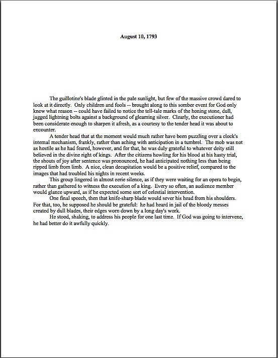
Formatpalooza XII: it may be possible to see a world in a grain of sand and eternity in an hour, but that doesn’t mean a submitter should play tricks with the space-time continuum

green anemone

For the past few posts in this series, we’ve been comparing manuscripts in standard format with improperly-formatted ones — on their title pages, their first pages, and their mid-text pages — to see the rules in action, as well as how your submission’s chances could be hurt if you deviate from them. I hope you’ve been finding this more useful than a simple list of submission guidelines; in my experience, most rookie submitter mistakes arise not merely from simple ignorance of the strictures of standard format, but from the low-level panic that comes from having to guess whether one is performing the secret handshake correctly.

The better an aspiring writer understands the rules, the less guesswork is involved. It may not eliminate the stress of submission entirely, but it does at least remove one of the most common stressors from the mix.

Heck, you might even become relaxed enough about the process to feel a few glimmerings of sympathy for Millicent the agency screener. Each and every week, she has to read thousands upon thousands of pages just like the ones we’ve been considering.

Does the very idea of empathizing with her seem strange to those of you new to the querying and submission process? Admittedly, she is also the person who rejects the vast majority of queries and submissions sent to her agency — remember, at a US agency of any size, a manuscript typically has to make it past one or two Millicents before getting anywhere near an agent’s desk; that’s one reason average turn-around times have risen in recent years from weeks to months. (Another reason: a lot of agencies have had to lay off Millicents and administrative assistants, meaning that fewer eyes are scanning more pages.)

Yet given what a small percentage of these documents are properly formatted and spell-checked and original andbook category-appropriate, much less well-written, it’s hard to blame her eye for becoming a trifle jaded over time. As enviable as her job sounds (Reading for a living! Sign me up! many writers think), reading for errors is actually not very pleasurable, usually.

And make no mistake: it’s a screener’s job to read for technical errors, with an eye to weeding out the aforementioned vast majority of submissions. Unfortunately, as a group, aspiring writers make it easier than it should be to reject a promising voice. Technical mistakes are so common that the lack of them is sometimes the difference between a well-written manuscript that strikes Millicent as well-written enough to keep reading beyond the first page or two and one that makes her exclaim, “Oh, too bad — this writer isn’t ready yet. Next!”

Way back in the dim days of yesteryear, before you had been initiated into the mysteries of standard format, the fact that the writing was not the only factor considered in rejection decisions probably annoyed you just a trifle, didn’t it? Now that you’ve passed the Rubicon and are formatting your manuscripts like a pro, you can afford to smile compassionately at both Millicent and the literally millions of queriers and submitters who ply her with unprofessional-looking pieces of paper.

Or does that smirk off your face mean that I’m once again overestimating my readers’ saintly willingness to walk a mile in the moccasins that routinely kick aspiring writers’ dreams into the rejection pile?

Okay, let me speak to the more practical side of your collective psyche: even if you aren’t in the habit of empathizing with people who reject writers for a living, there’s a good self-interested reason you should care about her state of mind — or an agent, editor, or contest judge’s, for that matter. Simply put, Even with the best will in the world, grumpy, over-burdened, and/or rushed readers tend to be harder to please than cheerful, well-treated, well-rested ones.

And she does tend, alas, to fall in the former categories on more days than the latter. Millicent is the Tiny Tim of the literary world, you know; at least the Bob Cratchits a little higher up on the office totem pole uniformly get paid, but our Millie often gets a paycheck that’s more an honorarium than a living wage. Heck, some Millicents are not paid at all. Some do it for college credit — or just the experience.

Phenomena that one might reasonably expect to become increasingly common, by the way: the worse a bad economy gets, the better an unpaid intern is going to look to a cash-conscious agency. Or, heaven help us, a worried publishing house that’s been laying off editors. (And editorial assistants, increasing turn-around times at publishing houses, too.)

Fortunately, literary contests in the U.S. are almost exclusively judged by volunteer Mehitabels, at least prior to the finalist round, so writing competitions continue to be judged very much as they ever were. The Hitties of the world tend to be public-spirited authors, freelance editors, writing teachers, etc. who honestly are in it to help discover exciting new voices. If anything, however, that let’s-improve-the-literary-world orientation usually renders them less tolerant of technical errors in entries than Millicent is, not more.

Hard to imagine, isn’t it? Which is why — you ‘Palooza followers can hear this coming, can’t you? — a savvy submitter always reads her ENTIRE manuscript IN HARD COPY and OUT LOUD before sending it to anyone even vaguely affiliated with a literary contest or the publishing industry. It’s much, much easier to catch formatting issues, typos, and logic problems that way.

Even if Millie’s not an intern, she’s still unlikely to be paid very much, at least relative to the costs of living in the cities where the major publishers dwell. Her hours are typically long, and quite a lot of what she reads in the course of her day is, let’s face it, God-awful. Not to mention poorly formatted.

Oh, wait; I have mentioned it. Repeatedly.

“So why are you bringing it up yet again?” the masses shout indignantly.

On the outside chance that I’m being too subtle here: it’s vital to any aspiring writer’s happiness to be aware that while God-awful manuscripts and book proposals are, naturally, self-rejecting, every year, thousands upon thousands of otherwise well-written manuscripts get rejected on purely technical grounds.

Millicent’s job, in short, is not the glamorous, power-wielding potentate position that those who have not yet passed the Rubicon of signing with an agency often assume it to be. Nor, ideally, will she be occupying the position of first screener long: rejecting queries and manuscripts by the score on-the-job training for a fledgling agent, in much the same way as an editorial assistant’s screening manuscripts at a publishing houses is the stepping-stone to becoming an editor.

You didn’t think determining a manuscript’s literary merits after just a few lines of text was a skill that came naturally to those who lead their lives right and got As in English, did you? To be good an their jobs, agents and editors have to learn to spot professional writing in the wild — which means, in part (out comes the broken record again) having to recognize what a properly-formatted manuscript should and should not look like.

Actually, the aspiring writer’s learning curve is often not dissimilar to Millicent’s: no one tumbles out of the womb already familiar with the rules of manuscript formatting. (Okay, so I practically was, growing up around so many authors, but I’m a rare exception.) Like Millicent, most of us learn the ropes only through reading a great deal.

She has the advantage over us, though: she gets to read books in manuscript form, and most aspiring writers, especially at the beginning of their journeys to publication, read only books. So what writers tend to produce in their early submissions are essentially imitations of books.

The problem is, the format of the two is, as I believe that I have pointed out, oh, several hundred times throughout this ‘Palooza, quite different — and not, as some of you may have been muttering in the darkness of your solitary studios throughout this series, merely because esoteric rules render it more difficult for new writers to break into the biz.

Just a few of the many, many things an aspiring writer often does not know before submitting for the first time: manuscripts should be typed (don’t laugh; it’s not unheard-of for diagrams to be hand-drawn, hand-number, or for late-caught typos to be corrected in pen), double-spaced, and have 1-inch margins all the way around.

Let’s see why all of those things are necessary, from a professional point of view. Speaking of Tiny Tim, let’s call upon our old friend Charles Dickens again to see what a page of a manuscript should look like,

Nice and easy to read, isn’t it? (Assuming that you find it so, of course. If it’s too small to read easily on your browser, try holding down the COMMAND key and hitting + until the type is large enough to read comfortably.)

To give you some idea of just how difficult it would be to read, much less hand-edit, a manuscript that was not double-spaced or had smaller margins, take a gander at this little monstrosity:

I believe the proper term for this is reader-hostile. Even an unusually patient and literature-loving Millicent would reject a submission like this immediately, without reading so much as a word. As would, more often than not, Mehitabel.

Did I hear a few spit-takes during that last paragraph? “My goodness, Anne,” those of you who are wiping coffee, tea, or the beverage of your choice off your incredulous faces sputter, “why would any sane person consider presentation violations that serious an offense? It is, after all, precisely the same writing.”

Well, think about it: even with nice, empty page backs upon which to scrawl copy edits, trying to cram spelling or grammatical changes between those lines would be well-nigh impossible. Knowing that, Millicent would never dream of passing such a manuscript along to the agent who employs her; to do so would be to invite a stern and probably lengthy lecture on the vicissitudes of the life editorial — and that fact that, despite impressive innovations in technology, most line editing a single-spaced document in either hard or soft copy is well-nigh impossible.

Too hard on the eyes — and where on earth would the comments go on the hard copy?

Don’t tempt her to reject your submission unread — and don’t even consider, I beg of you, providing the same temptation to a contest judge. Given the sheer volume of submissions Millicent reads, she’s not all that likely to resist. The contest judge, on the other hand, will be specifically instructed not to resist at all.

Yes, really. Even if the sum total of the provocation consists of a manuscript that’s shrunk to, say, 95% of the usual size, Mehitabel is likely to knock it out of the running on sight.

Some of you are blushing, aren’t you? Perhaps some past contest entrants and submitters who wanted to squeeze in a particularly exciting scene before the end of those requested 50 pages?

No? Let me fill you in on a much-deplored practice, then: faced with a hard-and-fast page limit, some wily writers will shrink the font or the margins, to shoehorn a few more words onto each page. After all, the logic runs, who is going to notice a tenth of an inch sliced off a left or right margin, or notice that the typeface is a trifle smaller than usual?

Millicent will notice, that’s who, and practically instantly. As will any reasonably experienced contest judge; after hours on end of reading 12-point type within 1-inch margins, a reader develops a visceral sense of roughly how many characters fit on a properly-formatted page.

Don’t believe me? Go back and study today’s first example, the correctly formatted page. Then take a gander at this wee gem of tricky intent:

I shaved only one-tenth of an inch off each margin and shrunk the text by 5% — far, far less of a reduction than most fudgers attempt. Admit it: you can tell it’s different, can’t you, even without whipping out a ruler?

So could a professional reader. And let me tell you, neither the Millicents of this world nor the contest judges appreciate attempts to trick them into extraneous reading. Next!

The same principle applies, incidentally, to query letters: often, aspiring writers, despairing of fitting a coherent summary of their books within the standard single page, will shrink the margins or typeface on a query. Trust me, someone who reads queries all day, every day, will be able to tell.

The other commonly-fudged spacing technique involves skipping only one space after periods and colons, rather than the grammatically-requisite two spaces. Frequently, writers won’t even realize that this is fudging: as we’ve discussed, and recently, ever since published books began omitting these spaces in order to save paper, there are plenty of folks out there who insist that skipping the extra space in manuscripts is obsolete.

Including, as we have also discussed, some agents — and yes, Virginia, it is the submitter’s responsibility to check agency websites to make sure whether the particular agent to whom he is submitting happens to harbor that particular preference. If you encounter an agent who does, your path is clear — and feel free to shout this one out along with me, conscientious ‘Palooza-followers: if an agency’s guidelines ask for something specific in a submission, for heaven’s sake, give it to them. Just don’t generalize individual preferences to the entire industry.

If they don’t express a preference for single-spacing, stick to standard format, regardless of what you may have heard online about how nobody is using double-spacing after periods and colons anymore. It’s simply not true.

But that’s not what you’d think from the vehemence of the single-space faithful, is it? Frequently, the proponents will insist that manuscripts that include the space look hopelessly old-fashioned to agents and editors.

Well, guess what, cookie — standard manuscript format is old-fashioned, by definition; that fact doesn’t seem to stop most of the currently-published authors of the English-speaking world from using it. In fact, in all of my years writing and editing, I have never — not once — seen an already agented manuscript rejected or even criticized for including the two spaces that English prose requires after a period or colon.

I have, however, heard endless complaint from professional readers — myself included — about those second spaces being omitted. Care to guess why?

Reward yourself with a virtual partridge in a pear tree if you said that cutting those spaces throws off word count estimation; the industry estimates assume those doubled spaces. (If you don’t know how and why word count is tallied, please see the HOW TO ESTIMATE WORD COUNT — AND WHY category on the archive list at right.)

And give yourself five golden rings if you also suggested that omitting them renders a manuscript harder to hand-edit. We all know the lecture Millicent is likely to get if she forgets about that, right?

Again, a pro isn’t going to have to look very hard at a space-deprived page to catch on that there’s something fishy going on — and again, we’re going to take a gander at why. Since Dickens was so fond of half-page sentences, the examples I’ve been using above won’t illustrate this point very well, so (reaching blindly into the depths of the bookshelf next to my computer), let’s take a random page out of Elizabeth Von Arnim’s wonderful take on the Bluebeard myth, VERA:

Vera correctly

There are 310 words on this page; I wasn’t kidding the other day about how far off the standard word count estimations were. Now cast your eye over the same text improperly formatted:

Doesn’t look significantly different to the naked eye, does it? The word count is only slightly lower on this version of this page — 295 words — but enough to make quite a difference over the course of an entire manuscript.

Do I see some hands shooting up out there? “But Anne,” I hear some sharp-eyed readers exclaim, “wasn’t the word count lower because there was an entire line missing from the second version?”?

Well spotted, criers-out: the natural tendency of omitting the second spaces would be to include more words per page, not less. But not spacing properly between sentences was not the only deviation from standard format here; Millicent, I assure you, would have caught two others.

I tossed a curve ball in here, to make sure you were reading as closely as she was. Wild guesses? Anyone? Anyone?

The error that chopped the word count was a pretty innocent one, almost always done unconsciously: the writer did not turn off the widow/orphan control, found in Word under FORMAT/PARAGRAPH/LINE AND PAGE BREAKS. As we discussed only the other day, this insidious little function, the default unless one changes it, prevents single lines of multi-line paragraphs from getting stranded on either the bottom of one page of the top of the next.

As you may see, keeping this function operational results in an uneven number of lines per page. Which, over the course of an entire manuscript, is going to do some serious damage to the word count.

As would tinkering with the bottom margin to allow an extra line on the page. Here it is with only a minor change, a .9 inch bottom margin instead of 1 inch, a modification so minute that a non-professional reader would probably not notice that it was non-standard. To compress a bit more, let’s have only one space after each period.

Vera with extra line

A bit claustrophobic, is it not? If you don’t find it so, consider it as Millicent would: not as an individual page, isolated in space and time, but as one of the several thousand she has read that week. Lest we forget, most of the ones she will have been taking seriously will have looked like this:

Vera correctly

See it now? While Millicent is highly unlikely to have either the time or the inclination to whip out a ruler to check whether that bottom margin is really a full inch (although Mehitabel might), she will be able to tell that this page has more words on the page than the others she has seen that day. She might not be able to tell instantly precisely how this page has been modified, but she will be able to tell that something’s off.

“But Anne,” clever rule-manipulators all over North America shout, “I’ve been modifying my submissions this way for years, and nobody has ever called me out on it. Therefore, I do not believe it’s ever been a factor in my work being rejected — and it does allow me to stay under that all-important 400-page limit.”

Perhaps, rules-lawyers, but let me ask you a question: have you ever had such a manuscript accepted?

It’s an extremely common submitter’s misconception, especially amongst those brand-new to the game or who have only submitted pages as part of a query packet, rather than as requested materials, that if they were really doing something wrong, the rejecter would tell them so. In these days of form-letter rejections — and even no-reply rejections — this is simply an unrealistic expectation.

Especially for a formatting error. Since most submissions contain at least one — and remember, formatting problems, like spelling and grammar gaffes, tend to travel in packs — and since non-adherence to standard format is so universally regarded as symptomatic of a lack of professional knowledge, it would be prohibitively time-consuming for Millicent to scrawl try learning how to format a manuscript, then resubmit.

No, regardless of whether the ultimate rejection trigger was that extra line per page, the second misspelling in paragraph 2, or a premise that Millicent has seen seventeen times that week, the reasons given for sending back the submission will probably run like this: I’m sorry, but this manuscript does not fit our needs at this time. I just didn’t fall in love with this story, and I don’t feel that I can sell this in the current tough market. Best of luck placing it elsewhere.

The moral of this sad, sad story: it seldom pays to assume that you’re doing it right just because you haven’t been told you are doing it wrong. And it pays even less often to conclude from the generalities of a boilerplate rejection that there can’t have been any specific technical problem that caused Millicent, if not to reject it outright, then at least to take the submission less seriously.

Besides, there was another notorious agents’ pet peeve in an earlier example — although, frankly, it would have irritated a contest judge far more than Millicent. Here’s the page again; see if you can spot it this time. (Hint: it was not in the properly-formatted version.)

Take ten lords a-leaping out of petty cash if you ran your eyes thoughtfully over this example and became riveted to the next-to-last line of the page: an emdash (“But—“) instead of a doubled dash. Here again, we see that the standards that apply to printed books are not proper for manuscripts.

Which brings me to yet another moral for the day: just because a particular piece of formatting looks right to those of us who have been reading books since we were three doesn’t mean that it is correct in a manuscript.

Or book proposal. Or contest entry.

Remember, Millicent reads manuscripts all day; contest judges read entries for hours at a time. After a while, a formatting issue that might well not even catch a lay reader’s attention can begin to seem gargantuan.

Please don’t dismiss this as unimportant to your success as a writer. If writing is solid, it deserves to be free of distracting formatting choices. You want agents, editors, and contest judges to be muttering, “Wow, this is good,” over your manuscript, not “Oh, God, he doesn’t know the rules about dashes,” do you not?

Spare Tiny Tim the chagrin, please; both you and she will be the happier for it. Believe me, she could use a brilliantly-written, impeccably-formatted submission to brighten her possibly Dickensian day. Be compassionate toward her plight — and your submission’s, proposal’s, and/or contest entry’s. Pay close enough attention to the technical details that yours the submission that makes her say, “Oh, here is good writing, well presented.”

Do you feel your self-editorial eyes sharpening? Excellent. Next time, I’ll bring more practical examples as whetting stones. And if you can manage to wipe that completely distasteful metaphor from your mind until tomorrow, keep up the good work!
Formatpalooza, part XI: setting some boundaries, or, wait, Millicent — why have you stopped reading?

Carcassone outer wall

Have you been enjoying our in-depth guided tour of the manuscript from the top down? Not gone tumbling down any parapets, have we>

No, that’s not just some clumsy publishing-world metaphor. So far, we’ve talked about the piece of paper on top of the submission stack, the title page; we’ve talked about the next sheet of paper, the first page of text and how it differs from both the title page and the pages that come after it; we’ve extrapolated from that first page to standards for the first page of each chapter and any titled section breaks.

Now, it’s time to talk about all of those pages in the middle Perhaps, while we’re at it, we could engage in some more of those nifty compare-and-contrast exercises we engaged in so fruitfully last time.

Hard to contain your enthusiasm within reasonable boundaries, isn’t it?

Okay, so it’s not a particularly sexy topic, but it’s a really, really good idea for an aspiring writer to devote some serious time to comparing properly and improperly formatted manuscripts. Writing time is precious for all of us — and scarce for most of us — and school compare-and-contrast exercises left most graduates with but think of it as an investment in your writing career: once you’re learned to spot formatting problems easily, you’ll be a much, much more effective proofreader. Not to mention being able to format your manuscripts correctly from the get-go.

Oh, that doesn’t sound like much of a door prize to you? Just wait until you’re trying madly to pull a submission packet together overnight in response to a request for materials, or frantically constructing a contest entry four hours before it needs to be postmarked. Or, even more stressfully marvelous, responding to a last-minute revision request from the editor who had originally told you that manuscript had been accepted as complete.

Believe me, when any of those stressful-but-happy days come, you’ll be very grateful then for every nanosecond that you don’t have to squander on wondering if your margins are consistent.

Because they had better be: believe me, our old pal, Millicent the agency screener, is very quick to discern the difference between a professionally-formatted manuscript and, well, everything else. At the end of a long day’s reading, they definitely jump out at her, and with good reason: once a professional reader gets used to seeing the similarities that pretty much all professional manuscripts share, submissions formatted in other ways might as well have UNPROFESSIONAL stamped on them in bright red ink.

And while Millicent, bless her literature-loving soul. may strive valiantly not to allow that impression to color her reading of the submission itself, it’s just not a good idea to assume that it won’t. She’s only human, after all.

It’s an even worse idea to assume a charitable reading for a contest entry, by the way. If anything, contest judges tend to be even more sensitive to the beauty of standard format than Millicent, for the simple reason that they’ve usually been reading a whole lot longer. The agency gig may well be Millie’s first job out of college, but the judge handed your entry may well have just retired from a long and fruitful career teaching English composition.

I don’t want to frighten any of you out of entering literary contests, but her fingers positively ache for the red pen of correction.

This is not entirely accidental — most well-respected contests require some professional credentials from their judges, either as writers, editors, or teachers. Which means, in practice, that judges have often been writing in standard format themselves for years or bludgeoning other writers into compliance with its requirements.

Translation: non-standard formatting won’t look right to them, either. By now, you’re having a similar reaction, aren’t you?

Don’t think you’ve been developing professional eyes throughout this autumn of ‘Paloozas? Or don’t want to believe you could conceivably share any traits with Millicent? Let’s test the proposition by trying a little Aphra Behn on for size.

If you don’t know her work, you should, at least historically: as far as we know, she was the first woman paid for writing in English — which, as Virginia Woolf pointed out, means that every female writer who earns so much as a sou from it now should be laying wreaths on her grave in gratitude.

Our girl Aphra’s also hilarious — and if you think it’s easy for a joke written in 1688 to remain funny today, well, I look forward to reading your comedic stylings in the year 2332.

Don’t believe me? Slip your tootsies into Millicent’s moccasins and consider the following page from THE FAIR JILT. (As always, if you’re having trouble reading the small writing, enlarge the image by holding down the COMMAND key and pressing +.) I defy you not to be too distracted by the story to notice how the page is put together.

Seriously, try not to think at all about the fact that Millicent probably would not even start to read this version. Don’t worry your pretty little head over why.

the fair jilt wrong

You clever souls could tell instantly that there was something wrong here, couldn’t you, and not just because Miranda’s trying to seduce her priest? (For convent, read monastery.) Set aside Aphra’s practically Dickensian affection for semicolons for the moment — which would tend to turn off a modern Millicent pretty quickly — and let’s ponder why this page almost certainly would not get a fair reading in a present-day agency.

Before you commit yourself irrevocably, here’s what it should have looked like in standard format:

Aphra Behn right

Quick, tell me: what’s the reason our Millie would not bother to start reading the first page 10, but would read the second?

If you flung your hand into the air and shouted, “The 10-point type, Anne! It will strain her already overworked eyes,” pat yourself on the back 47 times. If you also added, “And the Ariel typeface probably didn’t help here, either,” make that 48.

Why is the first in particular almost always a deal-breaker? She’s used to seeing every manuscript heading out of the agency to publishing houses in 12-point Times New Roman, so that first example — feel free to chant it with me here, ‘Palooza followers — it just doesn’t look right.

And why should she waste her time with that tiny type? She absolutely could not forward it to her boss that way; agents are susceptible to eye strain, too.

But those unfortunate cosmetic choices are not the only problems with the first version, are they? Let’s turn our magnifying glasses to the top of the page: the incorrect version does not have a proper slug line. Seeing this lone page out of context, it’s quite obvious why a slug line is a dandy idea, isn’t it? Without it, how would it be even remotely possible to return this wandering page back into the manuscript from whence it came.

“Who wrote this?” Millicent cries in ire, glaring around her cubicle at the 47 manuscripts lying there. “This stray piece of paper could be from any of these!”

At least Ms. Behn thought to number the pages of Example #1 — but did you catch the problem with how she did it? The page number is in the bottom right-hand margin, rather than in the slug line, where it belongs. And it’s so far down in the footer that the number got caught off halfway during printing.

Did you catch any other problems that might register on Millicent’s umbrage meter? What about that right margin? Mighty straight, isn’t it? That look proper to you?

What’s going on here is called block-justification, another problem that can be laid squarely at the feet of those who insist that a manuscript and a published book should be identical. The text in many published books, and certainly in many magazines and newspapers, is spaced so that each line begins at exactly the same distance from the left-hand edge of the page and ends (unless it’s the last line of a paragraph) at exactly the same distance from the right-hand edge of the page.

Why would this species of neatness bug the heck out of professional readers? A very practical reason indeed: it renders skimming quite a bit more difficult.

Why? Well, block formatting provides fewer landmarks, as it were, to the glancing eye, As you may see for yourself, Practically every line of narrative text resembles every other. To those of us used to the ragged right margins and even letter spacing of standard format, it’s actually kind of hard to read.

So there’s quite a bit in Example #1 that’s distracting from the actual writing, isn’t there? Doesn’t help sell the text, does it?

Okay, all of these rhetorical questions in a row are beginning to make me dizzy, so let’s move on to Example #2, the one Millicent and a contest judge would like. To save your weary fingertips a modicum of scrolling (hey, I do what I can), here it is again:

Aphra Behn right

Now, let’s take a gander at the same page in — ugh — business format; if you don’t know why it’s ugh-worthy, you might want to revisit my earlier post on the immense value of indentation.

Startlingly different, isn’t it, considering that I made a grand total of two formatting changes?

You did catch both of them on your skim through, right? All I did was I eliminate the indentations at the beginning of each paragraph and skipped a line between paragraphs to produce the norm for business correspondence, as well as for most of the text currently posted on the Internet. (Including this blog, unfortunately. As a professional writer and reader of manuscripts, it drives me nuts that my blogging program won’t allow me to indent paragraphs like a literate human being.)

Again, why is Millicent unlikely even to start reading that last rendition of page 10? Because — wait for it — it just doesn’t look right.

In fact, in both submissions and contest entries, business format is often grounds all by itself for knocking a manuscript out of finalist consideration. Finding yourself asking why again? Well, technically, indented paragraphs are grammatically requisite, so to a judge, non-indented paragraphs may well seem as great a violation of everything we hold dear as frequent misspellings or use of the wrong form of there, their, and they’re.

(Since not all of you laughed, allow me to beg you nervously: please tell me that some English teacher took the time to teach you the rules governing there, their, and they’re. We all see them used incorrectly so often nowadays that I shall not rest easy until I am positive that each and every one of you is aware that there refers to a place, their means belonging to them, and they’re is a contraction for they are. While I’m at it, I’d also like to point out that that it’s is a contraction for it is, whereas its means belonging to it. Thank you for humoring me; time to get back to the post already in progress.)

Fortunately for judges and Millicents who care deeply about the health of the language, errors seldom come singly in entries and submissions. Like spelling errors, formatting mistakes are apparently social: they like to travel in packs, roving all over a manuscript like Visigoths sacking Rome.

As a result of this convenient submission phenomenon, a manuscript that contains errors within the first few lines (or on the first page) is easy for a professional reader to dismiss; statistically speaking, it’s a pretty good bet that if Millicent kept reading the pages following a technically flawed opening, she would find more causes for umbrage.

Given how many submissions she has to screen between now and lunch, do you think she is going to (a) press on in the hope that the first error was a fluke, or (b) leap to the (perhaps unwarranted) assumption that there is more of the same to come and reject it right away?

I leave that one to your fine critical faculties to answer. Let’s just say that her umbrage-taking threshold tends to be on the low side, especially immediately after she has taken a sip from that too-hot latte that always seems to be by her side when we are watching her in action. (Let it cool next time, okay, Millie?)

Why am I bringing this up in the middle of a discussion of the perils of business format? Well, for starters, an ever-increasing number of agents are not only accepting e-mailed queries (a genuine rarity until quite recently), including some who ask queriers to include the opening pages, a synopsis, and/or other writing samples with their queries. Since few agents open attachments from writers with whom they’ve had no previous contact, many request that those opening pages be included in the body of the e-mail, pasted just below the letter.

Sense a potential problem barreling in our general direction? That’s right: most e-mail programs are not set up for easy tabbing; consequently, business format is the norm for e-mail communications. But that doesn’t mean that the Millicent assigned to screen those queries won’t turn up her nose at non-indented paragraphs in those pages.

Again, why? Are you sitting down, dislikers of indentation?

I hate to be the one to break this to you, but there are Millicents out there — and agents, editors, contest judges, and literate people everywhere — who will leap directly from noting a lack of indentation and unwarranted spaces between paragraphs to our old friend, option (b): if the submitter is not aware of how to format a paragraph of English prose properly, she reasons, aren’t there inevitably more snafus to come?

Now, not every Millicent — or agent, judge, etc. — will have this knee-jerk reaction, of course. But do you really want to take the chance that she’s not going to seize the opportunity to save herself a little time?

The specter of illiteracy is not the only reason using business format is likely to cost you, either. To a professional reader, the differences between the last two examples would be more than visually jarring — they’d be downright confusing. In standard format, the only reason for a skipped line between paragraphs would be a section break, so Millicent would be expecting the second paragraph to be about something new.

Okay, so a misconception like that might distract her attention for only few consecutive seconds, but let’s not kid ourselves: your garden-variety Millicent is spending less than a minute on most of the submissions she rejects — it’s actually not all that uncommon for her not to make into the second or third paragraph before reaching for the SASE and a copy of that annoying form rejection letter.

Take a moment for the implications to sink fully into your overtaxed brainpan. Don’t worry; I’ll wait.

While those of you new to the speed with which rejection typically occurs are already in shock, let me add for the sake of anyone who doesn’t already know: those who regard business format as a symptom of creeping illiteracy — hey, I just report the news; I don’t dictate it — are every bit as likely to frown upon it just as much in a query letter or synopsis as in a manuscript submission.

Time loss is not the only reason she might take umbrage at momentary confusion. Let me let you in on a little secret: professional readers, especially those who inhabit agencies and publishing houses, tend not to be overly fond of having their mental image of the story they are reading at the moment jarred.

How do I know this? Well, for one thing, they commonly refer to it as being tricked. As in, “I hate being tricked by a first paragraph that is about someone other than the protagonist.”

There’s a practical basis to this dislike, but it’s kind of complicated. I wrote a couple of fairly extensive posts on the subject a while back (here’s a link to the first, and here’s a link to the second, in case you’re interested), but I’ll run over the thumbnail version now.

Is everybody comfortably seated? My thumbnails are a tad long. (Just try to get THAT image out of your head anytime soon.)

To get through all of the submissions she’s assigned to screen each week, Millicent has to read quite quickly, right? If she doesn’t, she’ll get buried in paper, as basically, she’s got to make it through WAR AND PEACE several times over before she toddles wearily homeward on Friday afternoon.

That’s a whole lot of material to remember, by anyone’s standards — and remembering actually is important here. If she decides to allow a manuscript to make it to the next level of consideration, she is going to need to be able to tell her boss what the book is about: who the protagonist is, what the conflict is, why that conflict is important enough to the protagonist for the reader to be drawn into it, and so forth.

In essence, she’s going to need to be able to pitch it to the higher-ups at the agency, just as the agent is going to have to do in order to sell the book to an editor, and an editor is going to have to do in order to convince his higher-ups that the publishing house should acquire the book.

And, often, as first-round contest judges will need to do on an evaluation form in order to pass an entry onto the next round.

Okay, brace yourself, because explaining what comes next involves delving into one of the great cosmic mysteries that has long perplexed aspiring writers the world over. It’s not for the faint of heart.

Remember earlier in thus series, when I mentioned that agents and editors don’t read like other people? Well, one of the primary differences is that from line one of page one, they’re already imagining how they’re going to pitch this book. So if paragraph 2 or 3 (or page 2 or 3) suddenly informs them that their mental patter has been about the wrong character, they feel as if they’ve been backing the wrong horse.

And while there may have been any number of perfectly reasonable narrative reasons for the text to concentrate upon an alternate character for the opening, unless the writing and the story have already really wowed Millicent, her resentment about being tricked actively misled mistaken about the identity of the protagonist is often sufficient to make her reach for that SASE and form letter.

Feel free to go scream into the nearest pillow over that last piece of convoluted logic; you don’t want to keep that kind of existential cri de coeur pent up inside. I’ll wait until it’s out of your system.

Feel better? Good.

Before you go rushing off to see if your opening paragraphs might possibly be laying you open to a charge of trickery — because, for instance, you might have taken the bold authorial step of noticing that there is more than one human being in the world, and written about an interpersonal relationship accordingly — let’s return to the formatting issue that prompted my little segue into the psychology of resentment. Can we extrapolate any practical lesson about business format from it?

You bet your boots we can: it’s not a good idea to give the impression of a section break where there isn’t one. And when producing pages for people who read all day, you might want to stick to the rules governing written English and indent your paragraphs.

Starting to feel more at home with standard format? Excellent; my evil plan plot for world domination teaching strategy is working. Keep up the good work!

Formatpalooza, part X: look, darling! The majestic manuscript slug, running free in its natural habitat!

flooded ditch

No, Virginia, that squiggly brown thing near the bottom edge of the photo is not in fact a slug, literary or otherwise: I think it’s merely a well-camouflaged stick. Because I love you people — and because so many of you have told me that you tune into Author! Author! first thing in the morning, perhaps so you may peruse it while sipping your favorite caffeinated morning beverage — I would not present you with a close-up of a slug, stealthily or otherwise.

Hey, Millicent the agency screener’s not the only one susceptible to performing a spit-take with a too-hot latte.

Have we been talking so intensely about the first couple of pages of your manuscript — the title page, the first page of text — that standard format has invaded your dreams yet? I wouldn’t be entirely surprised if it had: this series on what professional manuscripts look like has been both example-ridden and extraordinarily nit-picky, even by my standards of detail-orientation. So you probably won’t be altogether astonished to learn that before we move on from the first page of the text (and of each chapter) to considering an ordinary page, I want to devote today to pagination.

And slug-lovers everywhere rise up to dance in the rain-slick streets!

Seriously, don’t groan; it’s an important issue. Not numbering your manuscript, book proposal, or contest entry’s pages an almost universal instant rejection offense; trust me, Millicent is going to notice how and if you do it. In fact, as cosmetic issues go, how and where an aspiring writer chooses to place the page number on the page can tell our Millie a tremendous amount about him.

Specifically, whether he has done his homework about submission, because there is only one place on a manuscript page that it is permissible to place a page number: in the slug line.

Is everybody quite sure where that is on the page? Just to be on the safe side, let’s take another gander at an example from last time.

memoir w ch title

See the slug frolicking in the upper left-hand margin? How happy it looks in its natural habitat.

The top margin is the page number’s natural habitat as well — which seems to come as a surprise to many aspiring writers. Let’s go ahead and forge a new axiom about it: the page number belongs within the slug line, rather than anywhere else on the page.

This is as proper on page 139 of a book manuscript as on page one. While we’re noticing such things, I would also like to call your attention to the fact that in each of these examples, the page’s only reference to the author’s name or the title of the book appears in the slug line.

That, too, would work equally well on p. 139 as on page 1. Sensing a pattern here?

I sincerely hope so, because the slug line confuses a lot of aspiring writers; until you have seen piles and piles of professional manuscripts, it looks kind of funny. So much so that to some would-be submitters, heads swimming from having been told over and over again that a manuscript should have a 1-inch margin on all sides, find it counterintuitive to add a line of text, even such a short one, within that margin.

But I assure you, it’s traditionally done that way. And why? Intrepid ‘Palooza followers everywhere, chant it with me now: because like every other aspect of standard format for manuscripts, placing the slug line there just looks right to professional readers.

Yes, that logic is a trifle tautological, now that you mention it. If you have a problem with that, I would suggest taking it up with the powers that rule the universe. As I believe I may have pointed out once or twice earlier in this autumn of ‘Paloozas, I do not count myself amongst those powers.

If I did, Microsoft Word would be set up to create documents in standard format automatically, Word for Mac and Word for Windows would be set up so those using one could easily give formatting advice to those using the other, air pollution would be merely a thing of distant memory, and ice cream cones would be free on Fridays. Oh, and the little girl across the street who believes slugs are her totem animal would come to liberate her little friends from my garden on a daily basis, rather than on a monthly one.

As none of these things seems to be true, let’s get back to business: how does one create that pesky slug line, anyway?

Back in the days when typewriters roamed the earth, it was perfectly easy to add a slug line to every page: all a writer had to do was insert it a half-inch down from the top of the page, left-justified, floating within the 1-inch-deep top margin. For word-processed documents, it’s a trifle more complicated.

The slug line still belongs in the same place, .5 inches from the top of the paper, suspended in the middle of the requisite 1-inch top margin. But instead of laboriously typing it on each page individually as writers did in the bad old days, one simply inserts it in the header. In most versions of Word (I can’t speak for all of them), the header may be found under the VIEW menu.

Before the Luddites out there trot out their usual grumble about the bother of tracking down the bells and whistles in Word, think about this: placing the slug line in the header also enables the writer to take advantage of one of the true boons of the advent of word processing, pages that number themselves.

As opposed to having to do it manually, laboriously retyping the slug line in its entirety on each and every page of the manuscript.

Oh, you may laugh, but several times each year, I receive a manuscripts constructed by a writer who was not aware that Word would do this for her. Instead of utilizing the header function, the poor writer will have elected to include the necessary information on the first line of text on the page.

Not only does this unfortunate misconception involve an absolutely monumental and ultimately unnecessary effort, but the result doesn’t pass the all-important does it look right? test. Take a peek for yourself:

See how pulling the slug line down into the text messes with the spacing of the page? Here, an entire line of text is sacrificed to it — and let me tell you, that line is not going to go quietly.

How so, you ask? Well, think about it: what’s inevitably going to happen if the author decides to insert a new sentence or two on a page formatted this way? That’s right: the writer is going to have to go back and move each and every one of those slug lines to match the NEW pagination.

I’d show you a practical example of this, but it’s just too tragic to contemplate. Trust me, it would be a heck of a lot of work, and writers who do it are likely to end up beating their heads against their studio walls.

Take a moment to peruse that last example again. See any other problems with the slug line? How about the fact that it includes the word page? Shouldn’t be there; just the numbers will suffice.

Did I just hear some huffs of indignation out there? “But Anne,” the formatting-ambitious cry, “I think it looks kind of classy to include page before the page number? It’s kinda stylish. If it’s just a matter of personal style, who could possibly be hurt by including it, if I like the way it looks?”

Well, you, for starters. And why? (Chanters, ready your lungs.) Because it just would not look right to someone who reads manuscripts, book proposals, or contest entries on a regular basis.

No kidding — I’ve seen screeners get quite indignant about this one. “Does this writer think I’m stupid?” Millicent is prone to huff. (Don’t bother to answer that question; it’s rhetorical.) “Does she think I don’t know that the numeral that appears on every page refers to the number of pages? Does she think I’m going to go nuts and suddenly decide that it is a statistic, or part of the title? Or maybe a wayward date that’s wandered off to the wrong part of the page?”

Don’t bait her; the lady has a hard life, even when she doesn’t accidentally burn her lip on a too-hot latte. Make her happy: do it the approved way.

Okay, did you spot any other problems? What about the fact that the first character is in a different typeface from the rest of the text? Or the equally disturbing fact that the first paragraph of the chapter is not indented?

Again, the writer may consider this nifty, but I can assure you, Millicent won’t. Fortunately for her blood pressure, the odd typeface for the first letter, in imitation of the illuminated texts hand-written by monks in the Middle Ages, doesn’t turn up all that often in manuscripts other than fantasy and YA, for one simple reason: books in that category are more likely to feature this it’s-a-new-chapter signal than others. But once again, what an editor may decide, rightly or wrongly, is appropriate for a published book has no bearing upon what Millicent expects to see in a manuscript.

Save the manuscript illumination for someone who will appreciate it. Hop in your time machine and track down a medieval monk to admire your handiwork, if you like, but in this timeframe, keep the entire manuscript in the same typeface and size.

The non-indented first paragraph of a chapter is fairly common in mystery submissions, I have noticed, and starting to become more prevalent in other kinds of fiction as well of late. (For an interesting discussion about why, please see the comments on this post and this one.) In fact, I’ve been told by many mystery writers — and rather tersely, too — that eschewing indentation in this context is an homage to the great early writers in the genre, an echo of their style, so who is yours truly to try to talk them out of that gesture of respect?

Well, since you asked, I’m someone familiar with what Millicent expects to see on a page — as well as someone who is aware that almost without exception, in Edgar Allan Poe’s time all the way down to our own, the editor has determined the formatting that appeared on any given printed page, not the author. To professional eyes, especially professionally peevish ones like Millicent’s, a manuscript that implicitly appropriates this sort of decision as authorial might as well be the first step to the writer’s marching into Random House, yanking off a well-worn riding glove, and striking the editor-in-chief with it.

It’s just not a good idea for someone brand-new to the biz to do.

Yes, you read that correctly: non-standard formatting choices are occasionally interpreted as a challenge to editorial authority. And while we could speculate for the next week about the level of insecurity that would prompt regarding a minor formatting choice as a harbinger of incipient insurrection, is the manuscript of your first book really the right place to engender that discussion amongst Millicent and her cronies?

Exactly. Save the formatting suggestions for a long, intimate discussion over coffee with your editor after she acquires the book. You’ll probably lose any disagreement on the subject, but at least you will have made your preferences known. Until that happy, caffeine-enhanced day, just accept that the industry prefers to see every paragraph in a manuscript indented the regulation half-inch.

It just looks right that way.

While we’re at it, how about the bolded chapter number and title in that last example? Nothing in a manuscript should be in boldface. Nothing, I tell you. Uh-uh. Not ever. (Except for that nonfiction exception we talked about last time. And I have seen authors get away with bolding the title on the tile page, but frankly, I wouldn’t chance it in a first book submission.)

Nor should anything be underlined — not even names of books, magazines, or song titles. Instead, they should be italicized, as should words in foreign tongues that are not proper nouns.

Yes, Virginia, back in the day when typewriters roamed the earth, underlining was the norm, for the simple reason that most typewriters did not have italic keys. So if you consult an older list of formatting restrictions or one intended solely for short story formatting — both of which seem to be circulating at an unprecedented rate on the web of late, pretty much always billed as universally-applicable rules for any type of writing, anywhere, anyhow, a phenomenon which simply does not exist — you might conceivably be told that publications, song titles, and/or foreign words (sacre bleu!) should be underlined. But trust me on this one: any agent is going to tell you to get rid of the underlining, pronto.

And why? All together now: because it just doesn’t look right that way.

All right, campers, do you feel ready to fly solo into a critique of a first page? Here are two pages of text, studded with standard format violations for your ferreting-out pleasure:

How did you do? Are those problems just leaping off the page at you now? If not, ask yourself: does that first page contain information that ought to be on the title page instead? Are the margins even? Are the paragraphs formatted correctly? And so forth.

In fact, it’s a terrific idea for any aspiring writer to get into the habit of asking those types of questions immediately after clapping eyes upon any manuscript, his own or anybody else’s. Why? Because that’s Millicent’s first instinct. However literature-loving a she may be, she sees so many incorrectly-formatted submissions that a properly-formatted one automatically looks at first glance like more professional writing to her.

As, with practice, it will to you. I promise. To get that ball rolling, as well as to reward you for so much hard work — or to provide you with some helpful comparison, depending upon how you did on that last little test — here are a couple of correctly-formatted pages, to soothe your tired eyes:

good example page 1

good example page 2

Whenever you start finding yourself chafing at the rules of standard format, come back and take a side-by-side gander at these last sets of examples, to regain perspective on what standard format is and why it’s important in a submission, proposal, or contest entry. I assure you, after a professional reader like Millicent has been screening manuscripts all day, every day for even a couple of months, every time she sees the bad example, mentally, she’s picturing the good example right next to it.

Small wonder, then, that — wait for it — manuscripts that look right get taken more seriously than those that don’t. Regardless of how you may feel about Millicent’s literary tastes, isn’t a serious read from her what you want for your book? Or your book proposal? Or your contest entry?

Did you notice that I snuck us from the first page of the text into the second in my last example? Next time, we’ll continue delving into the mysteries of the mid-manuscript page. On Friday, I’ll be offering a little reward for all of your virtue.

Hey, if treading the path of virtue is rewarded nowhere else on earth, it is here at Author! Author! Keep up the good work!
Formatpalooza, part IX: areas of authorial discretion, or, there are rules, and there are rules

full moon in the gutter

At the risk of seeming trite, I would like to point out that it has been raining a great deal in Seattle of late. Not the normal constant misty drizzle that characterizes our dark Pacific Northwest winters, but sheets. Buckets. The proverbial cats and dogs, with an antelope or two thrown in by whatever celestial water-monger has seen fit to try to drown us.

I’m not saying we’re worried. I’m saying my neighbors came over this evening to ask how long a cubit was, so they could read the blueprints for their ark.

But enough idly wondering where on earth they found a pair of yeti for their menagerie. Time to get back to the matter at hand: manuscript formatting.

Over the last couple of posts, we have been gladdening our hearts (okay, gladdening my detail-loving editorial heart) with discussion of something that Millicent the agency screener just loves to see, a properly-formatted first page of a manuscript, as well as phenomena she sees more often, but likes less, various species of improperly formatted page 1. The Millicent-pleasing version looked, if you will recall, a little something like this — and, as always, if you’re having trouble seeing the details, try enlarging the image by holding down the COMMAND key and pressing + repeatedly.

good example revised

Now that’s a lovely page 1: unprovocative, professional-looking, and flaunting lots of nice, clean white space at the top. “Ah,” Millicent murmurs, settling back into her chair, “now I can concentrate on the writing and the story.”

Contrast that, please, with the much more cluttered short story format all too many book and book proposal submitters mistakenly believe is universally applicable to any writing on paper:

Pretty distracting to the eye, is it not? Admittedly, not all embracers of this format will choose to clutter the space up further with an epigraph — which, as we discussed last time, it not generally the best idea at the submission stage, no matter what you want the published version of your book to look like — but one does not need to be the Amazing Kreskin to predict that their submission packets all share another unprofessional characteristic: no title page.

How do I know that? Well, think about it: since all of that eye-displacing verbiage — title, book category, word count, contact information — would in a properly-constructed submission packet appear on the title page, why would a submitter repeat all of it at the top of page 1?

Both page 1 and the opening of each subsequent chapter should include all of the spaciousness of that first example, not launching into the text until 14 single lines from the top of the page. (Or, to put it another way, 6 double-spaced lines under the chapter title. And for those of you who do not know how to insert a hard page break into a Word document, it’s located under the INSERT menu. Select BREAK, then PAGE BREAK.)

Did that bit about the subsequent chapters catch any of you by surprise? To prevent that kind of confusion in future, let’s go ahead and hatch a new axiom: each new chapter should begin on a fresh page, but the first page of every chapter should be formatted exactly like page 1.

Yes, Virginia: exactly, at least in terms of formatting. Since the book’s title should appear on the title page, why would the opening of the book and the opening of Chapter 6 be different?

So you may see that in action (and to prove that I practice what I preach), here’s what could be the first page of Chapter Six my memoir:

Memoir wo title

I said could, because actually, I’m not a big fan of chapters named Chapter Six, even if they happen to be the sixth chapter in the manuscript. It’s sort of like dubbing a suburban street lined with elm trees Elm Street: there’s nothing inherently wrong with a straightforward, descriptive title, but you must admit, it’s not startlingly original.

It’s not precisely going to come as a shock to many readers when Chapter Six appears immediately after Chapter Five, after all. At least not readers whose counting skills have moved past their first hand.

Speaking of hands, I see many of them waving in the air, apparently trying to attract my attention. “Okay, Anne,” those of you fond of naming things inquire, “how should a chapter title appear on the page, if I also want to number it? Or do I need to choose between numbering and titling?”

Not at all — go ahead and include both, if that makes you happy. In fact, it’s actually a little easier for agents and editors if you do number titled chapters; it’s simpler for a feedback-giver to say, “Please tone down the snarkiness in Chapter 6 of your memoir, Ermintrude,” than “You know the snarky tone in the chapter called something like How I Had My Way with Ocelots, or, Twenty-seven Ways to Skin a Cat? Give it a rest, Ermintrude.”

The formatting is very simple: just add the chapter title on the second double-spaced line of text, centered under the chapter number designation. (Freeing up mental space to speculate: what was Ermintrude doing with all of those ocelots?)

This format should sound at least a trifle familiar: we’ve already seen it in action in today’s first example. But in furtherance of my ongoing mission to place so many examples of correctly-formatted manuscript pages in front of your weary eyes that you’ll start automatically recoiling from pages in published books, muttering, “Well, that wouldn’t work in a manuscript submission, let’s take a gander at another one:

memoir w ch title

Actually, I had an ulterior motive in showing you that last example: in comparing it to the example just before it, do you notice anything about the amount of space between the chapter number and the beginning of the text?

If you immediately shot your hand into the air, exclaiming, “By gum, Anne, the area between the two appears identical! You’ve simply placed the chapter title within it, you clever lady,” award yourself an extra helping of hot fudge on your sundae. (If devoting a couple of weeks to discussing standard format doesn’t entitle an aspiring writer to dessert, nothing does.)

Regardless of whether a chapter’s opening page contains a chapter designation, a title, or both, the text should begin the same distance from the top of the page. The same logic would apply to any other information you might see fit to include at the beginning of a chapter — alerting the reader to a break between Part I and Part II of a book, for instance.

Since so many aspiring writers ask me about part breaks — hey, I’m not known as the Format Queen for nothing; I would much, much rather that my readers ask me than misformat their submissions — let’s take a look at the phenomenon in action. If Chapter 6 were the beginning of Part II of my memoir (it isn’t, but we aim to please here at Author! Author!), I would have formatted it thus:

memoir w part break

Starting to get the hang of this? Okay, let’s talk about inserting another common piece of introductory information in that heading: identifying a narrator-du-chapter in a multiple point-of-view novel.

If the switch comes at the beginning of a chapter, it couldn’t be easier: it’s simply another reader-signal that belongs above the pre-text white space, right? To see this principle in action, let’s pretend our ongoing example is fiction (which it isn’t; my middle school honestly was pelted with migratory spiders) and place the narrator’s name in the traditional spot:

new chapter with name

That’s the way one would handle the matter in a multiple POV manuscript like, say, Barbara Kingsolver’s THE POISONWOOD BIBLE, where the narrator changes with the chapter. If there were also a chapter title (perhaps not advisable in this case, as there’s already significant information at the top of that page for the reader to absorb), it would go between the chapter heading and the narrator identifier.

The important thing here is to be consistent — and that’s not always easy. Most seasoned authors probably wouldn’t appreciate my revealing a working secret, but pretty much everyone worries that someday her will forget to hit return one of the necessary times, so that Chapter 5 will begin — gasp! — twelve lines from the top, while Chapter 1-4 and 6 on will begin fourteen lines down.

Gives you the willies even to contemplate how Millicent might react to that level of formatting inconsistency, doesn’t it? Double-check each and every chapter opening before you submit; trust me, you’ll be happier in the long run.

Oh, my — that was an unpopular suggestion, wasn’t it? Fully a third of you have your hands waving impatiently in the air. “That would be absurdly time-consuming, Anne,” the irate third huff. “Oh, I understand that the chapter number or title needs to appear at the top of the first page and each subsequent chapter; I’m perfectly happy to leave six double-spaced blank lines between it and the first line of text, so the first paragraph starts seven lines down. But surely there’s an easier way to do this — a template or something? Perhaps Word has some sort of default setting I can employ so I need never worry about the issue again as long as I live?”

Standard format templates do exist, now that you mention it, but frankly, Word is already equipped with two perfectly dandy features for reproducing formatting exactly in more than one place in a document: COPY and PASTE.

In other words, create your own template. It’s very simple to do: just copy from “Chapter One” down through the first line of text, then paste it on the first page of Chapter 2, 3, etc. Once the format is in place, it’s a snap to fill in the information appropriate to the new chapter.

Oh, dear — now another group of you have raised your hands. Yes? “But Anne,” exclaim those of you who favor switching narrator (or place, or time) more often than once per chapter, “we are, as we believe the tag line identifying us as speakers just mentioned, advocates of those nifty mid-chapter signposts that we see all the time in published books, boldfaced notifications that the time, place, or speaker has just changed. How would I format that in a manuscript?”

You’re talking about incorporating subheadings into a novel, right? Or at least what would be a subheading in a nonfiction manuscript: a section break followed by a new title.

I’m fully prepared to answer this question, of course, if only to show all of you nonfiction writers out there what your subheadings should look like. Before I do, however, I’d like to ask novelists interested in adopting this strategy a quick question: are you absolutely positive that you want to do that?

That’s not an entirely flippant question, you know. There are plenty of Millicents out there who have been trained by old-fashioned agents — and even more editorial assistants who work for old-fashioned editors. And that’s important to know, because even in an age when mid-chapter subheadings aren’t all that uncommon in published books, there are still plenty of professional readers whose knee-jerk response to seeing ‘em is invariably, “What is this, a magazine article? In my day, fiction writers used language to indicate a change in time or place, rather than simply slapping down a subheading announcing it; if they wanted to indicate a change of point of view, they would either start a new chapter, find a graceful way to introduce the shift into the text, or have the narrative voice change so markedly that the shift would be immistakable! O tempore! O mores!

I just mention.

To this ilk of pros, the practice of titling a section, or even a chapter, with clear indicators of time, place, or speaker will always seem to be indicative of a show, don’t tell problem. And you have to admit, they sort of have a point: novelists have been indicating changes of time and space by statements such as The next day, back at the ranch… ever since the first writer put pen to paper, right?

As a result, fiction readers expect to see such orienting details emerge within the course of the narrative, rather than on top of it. Most of the time, this information isn’t all that hard to work into a narrative — and if a novelist is looking to please a tradition-hugging agent or editor, that’s probably a better strategy to embrace, at least at the submission stage. As with any other authorial preference for how a published book should look, you can always try to negotiate an editorial change of heart after a publisher acquires your novel.

At least if you don’t happen to write in a book category that routinely uses such subheadings. If recent releases in your book category are crammed with the things, don’t worry your pretty little head about editorial reaction to ‘em. An editor — or agent, Millicent, or contest judge — who routinely handles books in that category may be trusted to realize that you’re simply embracing the norms of your genre.

Millicents tend to approve of that. It shows that the submitter has taken the time to become conversant with what’s being published these days in the category within which he has chosen to write.

Which is to say: these days, plenty of very good fiction writers prefer to alert the reader to vital shifts with titles and subheadings. And nonfiction writers have been using them for decades; in fact, they’re more or less required in a book proposal. (More insight on those follows later in this series, I promise.) I just didn’t want any of you to be shocked if the agent of your dreams sniffs in the early days after signing you, “Mind taking out these subheadings? Seven of the ten editors to whom I’m planning to submit this hate them, and I’d rather be spared yet another lecture on the pernicious influence of newspapers and magazine formatting upon modern literature, okay?”

All that being said — and now that I’ve completely unnerved those of you who are considering submitting manuscripts with subheadings — you do need to know how to do it properly.

It’s quite straightforward, actually: a subheading is just a section break followed by a left-justified title. The text follows on the next double-spaced line.

Want to see that in action? Okay. Just to annoy traditionalists who draw a sharp distinction between fiction and nonfiction writing, let’s take a peek at a nonfiction page by a well-respected novelist:

Wharton subheading example

That caused some bloodshot eyes to pop wide open, didn’t it? “But Anne!” the detail-oriented exclaim, “that subheading is in BOLDFACE! Didn’t the rules of standard format specifically tell me never, under any circumstances, to boldface anything in my manuscript?”

Well caught, sharp-eyed ones: boldfacing the subheading does indeed violate that particular stricture of standard format. However, since nonfiction manuscripts and proposals have been routinely boldfacing subheadings (and only subheadings) for over a decade now — those crotchety old-fashioned editors are partially right about the creeping influence of article practices into the book world, you know — I thought that you should know about it.

It’s definitely not required, though; Millicent is unlikely to scowl at a nonfiction submission that doesn’t bold its subheadings. Like font choice, you make your decision, you take your chances.

In a fiction submission, though, I definitely wouldn’t advise it; traditionalists lurk in much, much higher concentrations on the fiction side of the industry, after all. Here’s the same page, formatted as fiction — and since we’re already talking about exceptions to the rules, let’s make this example a trifle more instructive by including a date and time in the subheading:

Wharton example2

Unsure why I used numerals in the subheading, rather than writing out all of the numbers under a hundred, as standard format usually requires? Full dates, like specific times and currency, are rendered in numeric form in manuscripts. Thus, I paid $14.17 for a train ticket at 12:45 a.m. on November 3, 1842, officer is correct; I paid fourteen dollars and seventeen cents for a train ticket at twelve forty-five a.m. on November three, eighteen hundred and forty-two is not. (It would, however, be perfectly permissible to include quarter to one in the afternoon on November third.)

Everybody clear on all of that that? Now would be a dandy time to start waving your hand at the Format Queen, if not.

Next time, we shall be continuing our in-depth look at chapter openings. In the meantime, keep up the good work!
Formatpalooza, part VIII: but I see it done constantly in published books!

Seattle mossgin and tonic
oxidized polebeach rock2

As those of you who have been perusing the sage advice underneath the pictures here at Author! Author! for some time may have noticed, I’m a big fan of artists’ looking at ordinary, everyday things and showing us the beauty inherent in them. The coy models in the shots above could not have been more prosaic if they had tried: clockwise from top left, that’s perfectly ordinary moss on a perfectly ordinary concrete wall, photographed during a perfectly ordinary Seattle rainstorm, a genuinely mundane gin-and-tonic (commonplace Bombay Sapphire, instead of my preferred Hendrick’s), a salt-of-the-earth beach rock nice enough to hold still and pose for me, and a regular old municipal light pole attacked by regular old municipal rust.

And while I was clicking away to capture that first shot, a perfectly run-of-the-mill artist-meets-dubious-public moment: while crunching my body sideways in order to get that first shot, a Central Casting mother told her standard-issue wee daughter to veer away from the you-meet-‘em-every-day crazy lady. Yet another case of a misunderstood artist — and another a child being warned that if she tries to look at something from an unusual perspective, people are bound to think she’s strange.

And that, my friends, is how budding artists are discouraged from potentially glorious careers: being told that normalcy requires seeing things just like everybody else does.

Perhaps not astonishingly, writers tend to find beauty in found words. An overhead scrap of conversation, perhaps, or a favorite phrase in a book. And often — far too often, from Millicent the agency screener’s perspective — aspiring writers celebrate these words lifted from other places by quoting them at the beginning of their manuscripts.

That’s right, campers: today, I’m going to be talking about proper formatting for that extremely popular opening-of-text decoration, the epigraph. You know, those nifty little quotes from other sources that we writers adore enough to want to reproduce in our own books.

And who can blame us? It’s not as though the publishing industry doesn’t encourage us to think of them this way: in a published book, the epigraph, if any, is almost always presented in a place of honor, either at the top of each chapter or by itself on the page before the text proper starts.

Take, for example, the placement of the well-known epigraph to Alice Walker’s THE COLOR PURPLE, an excerpt from Stevie Wonder’s DO LIKE YOU. Even in my cheap, well-worn paperback edition, it scores a page all to itself, right between the copyright information on the flip side of the title page and the opening of Chapter One.

The color purple's epigraph

Okay, so that picture didn’t really do the words justice; not all of my photos can be winners, you know. Let’s try a tighter shot:

epigraph2

Not only is it allocated space; it’s allocated white space, to set it off from the other text. That is quite an honor, in an age when acknowledgments pages are routinely omitted, along with the second spaces after periods and colons, in order to save paper.

Especially since nobody but writers like epigraphs much — but I’m getting ahead of myself, amn’t I?

We writers-who-read think they’re great, don’t we? Particularly if those pithy little quotes come from obscure sources; they feel so literary. Or deep-in-the-national-psyche, know-your-Everyman populist, if they’re culled from songs. By evoking the echo of another writer’s words, be it an author’s or a songwriter’s, we use them to set the tone for the story to come.

I don’t think conceptual aptness is all there is to the appeal, though. There is something powerfully ritualistic about typing the words of a favorite author at the beginning of our manuscripts; it’s a way that we can not only show that we are literate folk — as opposed to the (ugh!) other kind — but that by writing a book, we are joining some pretty exalted company.

Feeling that way about the little dears, I truly hate to mention this, but here goes: it’s a waste of ink to include them in a manuscript intended for submission to an agency. 99.9998% of the time, they will not be read at all.

Stop glaring at me; it’s not my fault. I don’t stand over Millicent with a bullhorn, admonishing her to treat every syllable of every submission with respect. (Although admittedly, that’s an interesting idea.)

The sad fact is, most Millicents are specifically trained not to read epigraphs in manuscripts; it’s widely considered a waste of time. I’ve literally never met a professional reader who doesn’t simply skip epigraphs in a first read — or (brace yourselves, italics-lovers) any other italicized paragraph or two at the very beginning of a manuscript, even if it was actually part of the text.

Oh, dear — I told you to brace yourselves. “Why on earth,” italics-lovers the world over gasp in aghast unison, “would any literature-loving human do such a thing? Published books open all the time with italicized bits!”

A fair question, but actually, there’s a pretty fair answer. Most Millicents just assume, often not entirely without justification, that if opening is in italics, it doesn’t really have much to do with the story at hand, which (they conclude, not always wrongly) begins with the first line of plain text.

In other words, our Millie treats any slanted text at the beginning of a manuscript as if it were an epigraph. It’s kind of hard to blame her, really: she’s there to read your writing, not somebody else’s.

Of course, there’s another, less ego-flattering reason that Millicents tend to skip ‘em: at the submission stage of the game, no one cares who a writer’s favorite authors are. A writer’s reading habits, while undoubtedly influential in developing her personal voice, are properly the subject of post-publication interviews, not manuscript pre-screening considerations.

After all, it’s not as though Millicent can walk into her boss’ office and say, “Look, I think you should read this submission, rather than that one, because the first’s writer has really terrific literary taste — it opens with a quote from William Godwin’s CALEB WILLIAMS, OR THINGS AS THEY ARE,” can she?

For those of you who didn’t howl with laughter at that little history-of-publishing joke, novelist William Godwin was political theorist and novelist Mary Wollstonecraft’s editor around the time of the French Revolution. They also produced another literary marvel together: Mary Wollstonecraft Shelley, the author of Frankenstein, was their daughter. Isn’t it fun being hyper-literate?

Still not rolling in the aisles, are you? That’s how Millicent feels when confronted with a genuinely esoteric quote at the top of a manuscript.

Whichever reason to skip the darned thing most appeals to the Millicent who happens to have your submission lingering on her desk (right next to that too-hot latte she’s always sipping, no doubt), it’s a safe bet that she’s not going to be reading your carefully-chosen epigraph. She feels pretty good about this choice, too.

Why? Well, the official justification for this practice — yes, there is one to which Millicents will admit in public — is not only reasonable, but even noble-sounding. See if it sounds at all familiar: even the busiest person at an agency or publishing house picks up a submission in order to read its author’s writing, not somebody else’s.

Kind of hard to fault them for feeling that way, isn’t it? Given our druthers, I suspect it would be hard to find an aspiring writer who wouldn’t prefer that the pros notice the individual brilliance of her respective styles than marvel over her esoteric reading habits.

Some of you are still clutching your quote books to your heaving chests, aren’t you? Okay, sentiment aside, let’s look at what including an epigraph in a book achieves on a practical level, as well as its strategic liabilities.

Let’s assume for a moment that you have selected the perfect quotation to open your story. Even better than that, it’s gleaned from an author that readers in your chosen book category already know and respect. By picking that quote, you’re announcing from page 1 — or before page 1, if you allocate it its own page in your manuscript — you’re telling Millicent that not only are you well-read in your book category, but you’re ready and able to take your place amongst its best authors.

Sounds plausible from a writerly perspective, doesn’t it? That’s one hard-working little quote.

But what happens when Millicent first claps eyes on your startlingly apt epigraph? Instead of impressing her with your erudition, the epigraph will to prompt her to start skimming before she gets to the first line of your text — and you will have made her wonder if you realized that manuscript format and book format are not the same.

So you tell me: was including it a good idea? Or the worst marketing notion since New Coke?

If that all that hasn’t convinced you, try this on for size: while individual readers are free to transcribe extracts to their hearts’ contents, the issue of reproducing words published elsewhere is significantly more problematic for a publishing house. While imitation may be the sincerest form of flattery, reproduction of published text without the author’s permission is known in the biz by another, less flattering name: copyright infringement.

What does that mean in practice? Well, if the epigraph is from a book that is not in the public domain, the publisher will need to obtain explicit permission to use any quote longer than fifty words. Ditto for any quote from a song that isn’t in the public domain, even if it is just a line or two.

So effectively, most epigraphs in manuscripts might as well be signposts shouting to an editor: “Here is extra work for you, buddy, if you buy this book! You’re welcome!”

I’m sensing some disgruntlement out there, amn’t I? “But Anne,” I hear some epigraph-huggers cry,
“the material I’m quoting at the opening of the book is absolutely vital! The book simply isn’t comprehensible without it!”

Before I respond, let me ask a follow-up question: do you mean that it is crucial to the reader’s understanding the story, or that you have your heart set on that particular quote’s opening this book when it’s published?

If it’s the latter, including the epigraph in your manuscript is absolutely the wrong way to go about making that dream come true. Like any other book formatting issue, whether to include an epigraph — or acknowledgements, or a dedication — is up to the editor, not the author.

And besides — chant it with me now, ‘Palooza faithful — a manuscript should not look like a published book.

Consequently, the right time to place your desired epigraph under professional eyes is after the publisher has acquired the book, not before. You may well be able to argue successfully for including that magically appropriate quote, if you broach the subject at the right time. Politely.

Just to set my trouble-borrowing mind at ease: you do know better than to include either acknowledgements or a dedication in your manuscripts at submission time, right? It’s for precisely the same reason: whether they’ll end up in the published book is the editor’s call. (I wouldn’t advise getting your hopes up, though: in these paper-conserving days, the answer is usually no on both counts, at least for a first book.)

Quite a few of you were beaming virtuously throughout those last three paragraphs, though, weren’t you? “I know better than to second-guess an editor,” stalwart souls everywhere announce proudly. “I honestly meant what I said: my opening quote is 100% essential to any reader, including Millicent and her cohorts, understanding my work.”

Okay, if you insist, I’ll run through the right and wrong ways to slip an epigraph into a manuscript — but bear in mind that I can’t promise that even the snazziest presentation will cajole Millicent into doing anything but skipping that quote you love so much.

For starters, do not, under any circumstances, include a quote on the title page as an epigraph. Which is, alas, what submitters are most likely to do. Let’s take a gander at what their title pages tend to look like:

Does that leave you wondering whether Millicent will notice the quote at all, much less find it obnoxious? She will, because this is was what she was expecting to see:

Actually, that was sort of a red herring — that page wasn’t precisely what she expected. Did you catch the vital piece of information Eeyore left off his title page?

If you said that he neglected to include the book category on the second example, award yourself a pile of thistles. (Hey, that’s what he would have given you.) His title page should have looked like this:

Eeyore good title

And yes, I am going to keep showing you properly-formatted title pages until you start seeing them in your sleep; why do you ask? Take a moment to compare the third example with the first: the quote in the first example is going to stand out to Millicent like the nail in a certain critter’s tail, isn’t it?

Other submitters choose to eschew the title page route in order to place an epigraph on the first page of text. The result is immensely cluttered, by anyone’s standards — especially if the submitter has made the very common mistake I mentioned in my discussion of title pages last time, omitting the title page altogether and cramming all of its information onto page 1:

Where did all of our lovely white space go? Into quoting Ambrose Bierce, partially.

Not that I’m against anyone doing that, ever. Except — wait for it — on the top of a manuscript submission.

The third popular but ill-advised way to include an introductory epigraph is to place it on a page all by itself in the manuscript, between the title page and the first page of text. In other words, as it might appear in a published book:

What’s wrong with this, other than the fact that Poe died before our boy D.H. wrote Sons and Lovers? At the risk of repeating myself, a manuscript is not supposed to look just like a published book; it has its own proper format.

At best, Millicent is likely to huffily turn past this page unread. At worst, she’s going to think, “Oh, no, not another writer who doesn’t know how to format a manuscript properly. I’ll bet that when I turn to page one, it’s going to be rife with terrible errors.”

Does either outcome sound especially desirable to you? I thought not.

So what should an epigraph-insistent submitter do? Leave it out of the submission, of course — weren’t you listening before?

But if it is absolutely artistically necessary to include it, Mssr. Poe actually wasn’t all that far off: all he really did wrong here was include a slug line. The best way to include an introductory epigraph is on an unnumbered page PRIOR to page 1. On that unnumbered page, it should begin 12 lines down and be centered. But I’m not going to show you an example of that.

Why? Because I really, truly would advise against including an epigraph at all at the submission stage.

Just in case I hadn’t made that clear. And had I mentioned that manuscripts specifically should not resemble published books?

That doesn’t mean you should abandon your cherished epigraph altogether, however. Squirrel all of those marvelous quotes away until after you’ve sold the book — then wow your editor with your erudition and taste.

“My,” the editor will say, “this writer has spent a whole lot of time scribbling down other authors’ words. He must read quite a bit.”

Or, if you can’t wait that long, land an agent first and wow her with your erudition and taste. But don’t be surprised if she strongly advises you to keep those quotation marks to yourself for the time being. After all, she will want the editor of her dreams to be reading your writing, not anyone else’s, right?

Wait — where have I heard that before?

If you are submitting directly to a small press, do be aware that most publishing houses now place the responsibility for obtaining the necessary rights squarely upon the author. If you include epigraphs, editors at these houses will simply assume that you have already obtained permission to use them. Ditto with self-publishing presses.

This expectation covers, incidentally, quotes from song lyrics, regardless of length.

Yes, really. If you want to use a lyric from a song that is not yet in the public domain, it is generally the author’s responsibility to get permission to use it — and while for other writing, a quote of less than 50 consecutive words is considered fair use, ANY excerpt from an owned song usually requires specific permission, at least in North America. Contact the American Society of Composers, Authors, and Publishers (ASCAP) for assistance in making such requests. (For a very funny first-hand view of just what a nightmare this process can be, please see FAAB Joel Derfner’s guest post on the subject.)

Have I talked you out of including an epigraph yet — particularly an excerpt from a copyrighted song, like Alice Walker’s? How about holding off for the creative reason: Millicent sees the same quotes over and over again?

Oh, you were positive that nobody else was a William Godwin fan?

I know that it hurts to cut your favorite quote from your manuscript, but take comfort in the fact that at the submission stage, no cut is permanent. Just because you do not include your beloved quote in your submission does not mean that it cannot be in the published book.

Contrary to what 99% of aspiring writers believe, at the submission stage, even the most polished manuscript is a draft, not a finished work. In actuality, nothing in a manuscript is exempt from alteration until the book is actually printed — and folks in the industry make editing requests accordingly.

That’s going to help all of you sleep better tonight, isn’t it? Actually, it should: just as tight copyright restrictions prevent your favorite authors from having long chunks of their texts excerpted without their permission — or, sacre bleu! entire paragraphs from CALEB WILLIAMS being passed off as somebody else’s work — so will it protect your writing from predatory borrowers.

Just a bit of proverbial food for thought. Keep noticing the beauty in the everyday, everybody, and as always, keep up the good work!
Formatpalooza, part VII: it’s all a matter of perspective, or, let’s move the piano over here. Wait — how would it look over there? And other tales of title page formatting

sagrada familia ceiling3

Ever since I launched on this last ‘Palooza of autumn, I’ve been hearing some discontented murmuring amongst aesthetes out there in the ether. “But Anne,” visually-oriented aspiring writers murmur under their breath, so as not to attract the wrath of their nemesis, Millicent the agency screener, “I feel that the rules of standard format for book manuscripts and proposals — not to be confused with the formatting norms for short stories, magazine articles, screenplays, or any other kind of writing intended for professional submission — are stepping all over my right to creative expression. If I believe my writing looks best in a special font like Abadi MT Condensed Extra Bold, why shouldn’t I run with it? It’s how I want my words to look in the published book, so why shouldn’t I present my manuscript that way?”

Do you want the short answers or the long ones, murmuring aesthetes? The short are actually the same for both questions: because Millicent will take your writing more seriously if you format it as she expects to see it.

And why might that be, devoted ‘Palooza followers? Pull out your hymnals and sing along: a manuscript should not resemble a published book in many important respects. Therefore, formatting a submission to reflect one’s publication preferences on matters like font (which is the publishing house’s decision, anyway, not the author’s) will not appear to be a creative choice, but a reflection of a misunderstanding of how publishing works — and an indication that the writer has not taken the time to learn the rules of submission.

A trifle broad-ranging a conclusion to draw from something as simple as font choice or a title page graced with a photograph? Perhaps, but to someone who deals with manuscripts and/or book proposals all day, every day, it’s not all that far-fetched.

Let me try to put all of this into perspective for you. Quick, tell me: did I take the photograph above while looking down into an abyss, sideways into an alcove, or up at an impossibly high ceiling?

Hard to tell which way is up, isn’t it? (But here’s a hint: the purple stuff is flying dust.) Without some orienting landmarks, it’s difficult even to know for sure what you’re looking at, or from what direction.

That’s more or less the same problem the average aspiring writer faces when looking at her own first manuscript or book proposal with an eye to figuring out whether it is formatted correctly. (Oh, you thought that analogy wasn’t going to pay off right away? Au contraire, mon fr?re.)

Let’s face it, very, very few as-yet-to-be-published writers have ever seen a professional manuscript up close and personal; still fewer have had the opportunity to glance through a professional book proposal. Oh, there’s plenty of advice out there on how it should be done, of course, but as many of you have no doubt noted with chagrin, sources differ.

So how on earth is someone new to the game supposed to figure out which end of the manuscript is up, figuratively speaking? The trick lies in remembering that the principles governing manuscript formatting are practical and historical, not purely aesthetic.

Thus, while two-inch margins and a cursive typeface may strike a writer as the perfect expressive extension of the spirit of his novel, to someone who reads manuscripts for a living, they’re just puzzling. And, frankly, distracting from the writing.

Where you stand, in other words, depends on where you sit. From where Millicent is sitting, deviation from standard format demonstrates a lack of knowledge about how the industry works, not creativity. She has good reason to feel that way: because professional manuscripts and book proposals are formatted in a particular way, she knows that her boss, the agent of your dreams, would have a hard time convincing an editor at a major publishing house to read even the first page of an unprofessional formatted manuscript.

Which brings be back to where we left off last time, right? For the past couple of posts, we’ve been engaging in compare-and-contrast exercises, showing common examples of title pages and fine-tuning your binoculars so you might see how our old friend Millie — or her boss, or an editor, or a contest judge — might view them. As I sincerely hope those of you who read yesterday’s post can attest, it was pretty obvious that the professionally-formatted title page won the beauty contest hands-down — and took top honors in the practicality category, too.

Yes, Virginia, a choice as small as a typeface can make an astonishingly great difference to how professional your work looks to the pros. That comes as something of a surprise to most aspiring writers — who, not entirely surprisingly, tend to regard that particular decision as a purely aesthetic one. “Why,” they ask, and not unreasonably, “should it matter? Good writing’s good writing, isn’t it?”

Well, yes and no. Yes, good writing is a thing of beauty and a joy forever. No, insofar as good writing tends to have less impact on the average Millicent when it’s presented in an unusual typeface.

Yes, really. To see why, let’s once again start at the top of the submission packet, taking a gander at the same title page in three different typefaces. Here it is in 12-point Times New Roman, one of the two preferred typefaces:

Austen title good

That’s what anyone sitting in Millicent’s seat would expect to see. Now let’s look at exactly the same information, assuming that Aunt Jane had favored 12-point Helvetica so strongly that she just couldn’t resist submitting in it:

Austen title helvetica

The letters are quite a bit bigger, don’t they? Not enough so to appear to be, say, 14-point font, but large enough to make Millicent wonder whether the word count is accurate. (Estimated word count does, after all, vary by typeface: Times New Roman is estimated at 250 words/page, Courier at 200. More on that below.)

And do you really want her speculating about your credibility before the first page of your manuscript? Now that we have seated ourselves firmly in Millicent’s office chair, we can see that Aunt Jane’s choice of Helvetica, while not a deal-breaker, does not necessarily present her manuscript to its best advantage.

Does the increased volume of disgruntled ethereal muttering mean some of you want to see a typeface that might be a deal-breaker? Happy to oblige.

Austen title brushscript

Can’t really blame Millicent for not wanting to turn the page on that one, can we? Despite containing all of the information that a title page should include, in the right places and in the right order, it’s unprofessional-looking. Not to mention hard to read.

Got Millicent’s perspective firmly imbedded in your mind? Excellent. If you want to switch back to the writer’s point of view, all you have to do is remember that the manuscript that follows even this last title page is SENSE AND SENSIBILITY.

The moral: even the best writing may be placed at a competitive disadvantage by unprofessional presentation. Standard format is the good writer’s friend, not her enemy.

Shall I assume that all of that clanking is a thousand writers’ hackles being raised? “But Anne,” outraged voices thunder, “aren’t you making Millicent out to be pretty shallow? Whenever I’ve heard agents and editors asked at conferences or on their websites about whether cosmetic issues can get a manuscript rejected, they often disclaim the notion with scorn. I’ve even heard a few of them say that they don’t care about issues like typeface, spaces after periods and colons, or where the chapter title lies — and that strikes me as significant, as I’ve never, ever heard one say it was okay to let a query letter run longer than a single page. Isn’t it the writing that matters in a submission, ultimately?”

Again, yes and no, hackle-raisers. Yes, the writing matters — but it’s not all that matters.

Naturally, the writing matters most in a submission, with freshness, audience-appropriateness, marketability, and fit with the agent or editor reading it jostling for second place. Equally naturally, and something that I often point out here, individual agents, editors, and even contest judges harbor individual preferences as well and have been known to express them at conferences. Or on their blogs, Twitter feeds, and over drinks at that bar that’s never more than 100 yards from any literary conference in North America.

One person’s pet peeve, however, may not be another’s. Since few aspiring writers have access to the industry-specific information required to find out the preferences of every agent to whom they are submitting, adhering to standard format minimizes the probability of running afoul of unknown annoyance-triggers.

Adopting the norms of standard format and clinging to them like an unusually tenacious leech will also help you preserve your sanity throughout the often-protracted submission process. — because, honestly, trying to apply every single one of the expressed opinions floating around out there to your manuscript will drive you 100% nuts. The pet peeves one hears about are too often mutually contradictory, for one thing.

Chant it with me now, ‘Palooza followers: if an agent to whom you are submitting asks for something different, for heaven’s sake, give it to her. If, as is almost always the case, you just don’t know, keep the presentation unprovocative and professional so that your writing may shine.

In other words, adhere to the strictures of standard format, rather than assuming, as so many aspiring writers do to their cost, that the writing is the only thing that matters.

Remember, where you stand depends on where you sit. It’s a matter of perspective. And from both Millicent and the aspiring writer’s perspective, taking the time to present writing professionally is honestly worth it.

Admittedly, one does hear of cases where a kind, literature-loving agent has looked past bizarre formatting in order to see a potential client’s, well, potential, one also hears of isolated cases where a manuscript rife with spelling and grammatical errors gets picked up, or one that has relatively little chance of selling well in the current market. The age of miracles has not entirely passed, apparently.

But — and this is a BIG but — these cases get talked about because they are exceptions, and rare ones at that. 9,999 times out of 10,000, any of these problems will result in, if not instantaneous rejection, then rejection upon Millicent’s lighting upon the next problem in the manuscript.

Those pesky hackles are clacking again, aren’t they? “Okay,” the hackled concede, “I can understand how Millicent would be tempted to skip reading a submission like #3 above, where she’s likely to strain her eyes. I can seen see why she might leap to some negative conclusions about #2, since, as you have mentioned before, she knows that it’s going to be more time-consuming, and thus more costly, to take on a client who needs to be trained how to present her work professionally. But if presentation is so darned important, why don’t aspiring writers hear about it more often at conferences, in articles about submission, or even just in discussions amongst ourselves?”

Excellent question, h-raisers. I can’t say for sure, but I suspect that’s not just because a sane, sensible individual with a reputation to protect is unlikely to stand up in front of 500 eager potential submitters and say, “Look, if you’re planning to submit a grimy photocopy of your book, or insist upon presenting it in 10-point type, or not indenting your paragraphs, just don’t bother to query me.”

Having actually seen a well-meaning agent tell an indignant crowd that he really only took seriously query letters from writers he met at conferences (yes, really; there were many, many witnesses), I can tell you precisely what would happen if some honest soul did take this astounding step: instantly, 500 pens would scrawl on 500 programs, DO NOT QUERY THIS ONE; HE’S MEAN.

Which would rather defeat the agent’s purpose in coming to the conference to recruit new clients, wouldn’t it?

As someone who frequently teaches writing and formatting classes, I can think of another reason that a speaker might want to be careful about such pronouncements: an agent or editor doesn’t have to speak at many conferences (or blog for very long) before recognizing that anything she says about submissions is likely to be repeated with the ?clat of a proverb, to borrow a phrase from Aunt Jane, for years to come amongst the writing community.

Seriously, it’s true. I’ve heard offhand comments made from the dais, or even jokes, being debated for hours in conference hallways, particularly if those comments happen to relate to the cosmetic aspects of querying and submission. 5-4 Supreme Court decisions are routinely discussed with less vim and vitriol. Some of Miss Snark’s pronouncements have been more commented upon than St. Paul’s second letter to the Corinthians.

Okay, so that last is a slight exaggeration. My point is, the very notion of from-the-horse’s-mouth rightness carries such a luster that such speakers are constantly in extreme danger of having everything they say quoted back to them as an inflexible rule.

Which is why, I must admit, I occasionally experience qualms about presenting the rules of standard format as inflexible rules. On the pro-regulation side, we are talking, after all, about an industry that both values creativity and considers submitting a book proposal in anything but a black folder dangerously radical. (Yes, really.) On the con side, literally nothing else I talk about here consistently raises as much writerly ire.

The very topic of presentation seems to be emotionally trying for a lot of writers — disproportionately so, from where Millicent is sitting. Tell an aspiring writer that his dialogue is turgid, or his pacing drags, or that he’s left a necessary section out of his book proposal, and most of the time, he’ll be at least curious about why you think so. (If a bit defensive.) Yet suggest to the same writer that he might be better off reformatting his manuscript to include such niceties as paragraph indentation or moving his page number to the slug line, and a good quarter of the time, he’ll look at you as though you’d just kicked his grandmother. Thrice.

Go figure, eh?

Presentation issues definitely do matter — which is, again, not to say that the quality of the writing doesn’t. But — and again, this is a BIG but — as we’ve discussed, rejection decisions are more often than not made on page 1 of a manuscript. Sometimes even within the course of the first paragraph. If a manuscript is hard to read due to a funky typeface or odd spacing or just plain poor print quality, Millicent may just pass on reading it at all.

While these phenomena are, in fact, quite widely recognized as true, the person who announced them this baldly from the dais at a literary conference would be covered head to foot with flung tomatoes in twenty seconds flat. Metaphorically, at least.

Which is why I’m going to keep saying it until I’m blue in the face and you die of boredom: from the perspective of someone who reads manuscripts for a living, professional formatting is simply the least distracting way a book can possibly be presented. Adhering to the industry’s cosmetic expectations renders it more likely that an agent or editor will concentrate upon the beauty of the writing, not less.

Think about it: they can’t fall in love with your good writing until they read it, can they? So don’t you want to do everything within your power to convince them that your manuscript is the one that deserves more than a cursory glance?

Of course you do; if you didn’t, you would have given up on ‘Paloozaing a paragraph into the fall’s first series, right? Instead of thinking of the rigors of standard format as a series of unimportant (or even silly) superficial choices, try regarding them as translating your calling card, a means of catching Millicent’s tired eye and informing her that this is a manuscript that should be taken seriously.

Have I got you sufficiently fired up about superficial manuscript prettiness yet? Grand; let’s get back to the incredibly nit-picky issue of typeface.

As I mentioned earlier in this series, I would highly recommend using either Times, Times New Roman, or Courier typefaces, both on the title page and in the manuscript as well. These are the standards of the industry, and thus the least likely to raise Millicent’s ever-knitted eyebrows. But like some of the other strictures of standard format, there’s a pretty good reason for this one: from where she is sitting, word count estimation is always predicated upon one of these typefaces.

Why is the question of estimating relevant on a title page? Again, we must look to Millicent’s perspective: word counts in book manuscripts are generally estimated, not the actual count; for short stories and articles, use the actual count.

Was that giant gust of wind that just knocked my desk over your collective gasp of astonishment? I’m not entirely surprised; a lot of aspiring writers are confused on this point. “But Anne,” they protest, and who can blame them? “My Word program will simply tell me how many words there are in the document. Since it’s so easy to be entirely accurate, why shouldn’t I be as specific as possible? Or, to put it another way, why would an agent or editor ask for the word count, then expect me to guess?”

Would you fling something at me if I said once again that this is a matter of perspective? From Millicent’s seat, the answer is pretty obvious: industry practices dictate how manuscripts are handled, not the whims of the fine folks at Microsoft.

That makes perfect sense, does it not? The Microsofties I know are sterling human beings to a man, but they’re hardly experts on the publishing industry’s requirements. And really, why should they be?

Contrary to popular opinion amongst aspiring writers, just because Word is set up to allow certain things — giving you an exact word count, for instance, or access to 200 typefaces — doesn’t mean that the publishing industry wants writers to do things that way. (And if you doubt that, consider the doubled dash vs. the automatic emdash Word favors.) Word processing programs came into use long, long after standard format for manuscripts, after all; why should agents, editors, and Millicents allow computer programmers to dictate what strikes them as professional?

Perspective, people: which makes more sense, assuming that the word count on your title page will be read by Millicent, or Bill Gates?

I cannot, naturally, speak to Mssr. Gates’ point of view on the subject, but here is why Millicent would care on the estimation front. The Times family is estimated at 250 words/page; Courier at 200. So a 400-page manuscript in Times New Roman is estimated to be roughly 100,000 words if it’s in Times — something Millicent should be able to tell as soon as she claps eyes on the submission’s title page, right? — and 80,000 if it’s in Courier.

Finding the logic behind that is at all confusing? Book manuscripts are typically discussed in estimated word count, not actual; since word length vary, and because manuscripts shrink around 2/3rds in the transition to published book, the number of pages is actually a better measure of how much it will cost to print and bound the thing. So if your title page says that your baby is 86,250 words and it’s in Times New Roman, a pro will just assume that it’s 345 pages (345 x 250= 86,250) rather than flipping to the bottom of the stack of papers to check. If it’s in Courier, she would conclude that it is 431 pages — and that your math skills are not particularly good.

Now, in actual fact, a 400-page manuscript in TNR is usually closer to 115,000 words than 100,000; as any writer who has compared the estimated word count for her book with the total her word processing program so kindly provides, they tend to differ wildly. But word count, like beauty, is in the eye of the beholder: a novelist whose title page reported, accurately, that her 400-page novel was 115,000 words might well see it rejected out of hand on the grounds that it was too long.

Why? Well, math may not have been Millicent’s best subject, either (as one might expect, the inmates of agencies tend overwhelmingly English majors), but she can do third-grade multiplication in her head: 115,000 words at 250 words/page would equal a 460-page manuscript. That’s quite a bit longer than editors tend to expect first novels in most genres to be these days; at around 450 pages, binding costs rise significantly.

In other words, next!

Boy, those hackles are getting a workout today, aren’t they? “But Anne, why is Millicent estimating at all? If she wants to know how long it is, why doesn’t she just flip to the last page and check the page number, for heaven’s sake?”

I could give you a long song and dance about how much her wrists hurt from opening all those query envelopes all day, or how her secret midnight e-mail orgies have rendered pinching a torture, but in practice, the answer is far less personal than practical: because the word count is right there on the title page.

Tell me, oh submitters: why on earth should she doubt its accuracy? Unless, say, the title page were in a non-standard typeface like Helvetica, she’s going to assume that an aspiring writer familiar enough with standard format to include the word count on the title page would also know how to estimate it accurately.

I know, I know: from a writerly perspective, that’s kind of a wacky assumption. But her chair boasts a different view than ours.

Besides, how exactly could she manage to turn to page 400 of a manuscript, when her boss requested that the writer send only the first 50, without resorting to some pretty impressive maneuvering through time and space?

I’m aware that I’m running quite long today, but in the interest of clarity, let’s invest another few minutes in turning to the first page of the submission, to see how much of a difference font and typeface make at first glance. Here’s a correctly-formatted page 1 in Times New Roman. Just for giggles, I’m going to use that notorious editor’s nightmare, the opening paragraphs of A TALE OF TWO CITIES:

2 cities page 1 proper

Pretty spiffy, eh? And definitely not how this opening would appear in a published book, right?

Now let’s take a peek at the same page, also correctly formatted, in Courier. Note how many fewer words per page it allows:

2 cities proper Courier

Got both of those firmly imbedded in your brainpan? Good. Now format your first pages that way for the rest of your natural life.

Well, my work here is obviously done. I’m off to do a spot of Christmas shopping.

Just kidding — you want to see why it’s a good idea, don’t you? Okay, take a gander at the same first page, not in standard manuscript format. See how many differences you can spot:

Fascinating how just a few small formatting changes can alter the presentation, isn’t it? It’s exactly the same writing, but it just doesn’t look as professional. To Millicent, who reads hundreds of pages per day, the differences between the last three examples could not be clearer.

And yet, if we’re going to be honest about it, there were really very few deviations from standard format in the last example. For those of you playing at home, the typeface is Georgia; the chapter title is in the wrong place, and there isn’t a slug line. Also, the page is numbered in the wrong place — the default setting, incidentally, in many word processing programs.

In all probability, none of these infractions against the rules of standard format are serious enough to cause Millicent to toss a submission aside as soon as she notices them. But when poor formatting is combined with literary experimentation — like, say, that paragraph-long opening sentence ol’ Charles managed to cough up — which do you think she is going to conclude, that Dickens is a writer who took the time to polish his craft, or that he just doesn’t know what he’s doing?

Don’t tempt a professional reader to draw the wrong conclusion about your devotion to your craft. Remember, where a manuscript stands depends upon where the reader sits.

Before any hackles start rocketing skyward again, I hasten to add: where the submitting writer sits often makes a difference to Millicent’s perception, too. Her reception of that last example is very likely to be different before Dickens became a household name or after, although once he was established.

Unless you happen to be famous, I wouldn’t advise taking the risk. And if you do happen to be famous, could I interest you in writing a back jacket blurb?

In fairness to Millicent, though, it’s highly unlikely that it would even occur to our Charles to deviate this markedly from standard format, if he already had experience working with an agent or editor. The longer you remain in the business, the more those little things will strike you as just, well, matters of right and wrong. As, fortunately or not, they do Millicent and her ilk.

Come to think of it, that sense of fitness may well be the reason that discussions of formatting tend to become so vitriol-stained: we all like to be right, and after all, propriety is in the eye of the beholder. After all, each of us is most familiar with the view from her own chair.

Pulling back from one’s own perspective can be most helpful. There’s a reason that it’s called the bigger picture, people.

In that spirit, let’s take a longer view of the photo above, to situate ourselves:

sagrada familia ceiling

Easier to tell up from down now, isn’t it? Taking a broader perspective, you can see that the green light on the left is coming from a stained-glass window; on the left, there’s a decorative support beam. From the myopic tight shot, it was far less obvious that this was a cathedral.

Making sure your writing is framed properly can have a similar effect. More show-and-tell follows next time, of course. Keep up the good work!

Formatpalooza, part VI: me and you and a boy? girl? dog? named Snafu

Johnny_Cash_-_A_Boy_Named_SueJohnny_Cash_-_A_Boy_Named_SueJohnny_Cash_-_A_Boy_Named_Sue

Still hanging in there, ‘Palooza followers? Excellent. Last time, I showed how the first page of text does not, from a professional perspective, make an adequate substitute for a title page. Instead of being a replica of a hoped-for book cover, as many submitters produce, or a shouted-out declaration of the book’s title and who wrote it, the properly-formatted title page is a quiet, practical piece of paper, containing a specific set of marketing information.

That is not always the purpose a title page serves in a submission, alas — if, indeed, the submitter is professional enough to include a title page at all. As I pointed out yesterday, some aspiring writers attempt to consolidate the proper functions of the title page and page 1 of the text onto a single piece of paper, as would be appropriate for a short story submission. To someone who reads book manuscripts for a living — like our good friend Millicent the agency screener, first line of literary defense — this is simply going to look, well, wrong. It’s so presumed to be part of a properly-formatted manuscript that her agency’s submission guidelines might not bother to mention title pages at all.

Which may be why, in practice, submitting without a title page is far more common than including one, especially for electronic submissions. This presentation choice is particularly common for contest entries, perhaps because contest rules do not always say, “Hey, buddy, include a title page, why doncha?” — and they virtually never say, “Hey, buddy, don’t bother with a title page, because we don’t need it.” Instead, they usually just ask entrants to include certain information with their entries: the category the writer is entering, perhaps, with contact information on a separate sheet of paper.

And already, I see a forest of hands in the air. “But Anne,” murmur those of you who currently have submissions floating around out there without your contact information attached, “I’d like to go back to that part about the expectation that a manuscript should include a title page being so widespread that a pro putting together submission guidelines might not even think to bring it up. Assuming that pretty much everyone else whose submission will land on Millicent’s desk on the same day as mine was in the dark about this as I was until yesterday (thanks to your fine-yet-sleep-disturbing post), should I even worry about not having included a title page? I mean, if Millie were going to reject manuscripts on this basis alone, she’d be a non-stop rejection machine.”

Of course, she isn’t a non-stop rejection machine. She’s a virtually non-stop rejection machine; she approves some submissions.

But let’s delve into the crux of your question, worried submitters: you’re quite right that this omission is too common to be an instant-rejection offense at most agencies, despite the fact that including it renders it far, far easier for the agent of your dreams to contact you after he has fallen in love with your writing.

However, as we discussed yesterday, any deviation from standard format on page 1 — or, in the case of the title page, before page 1 — will make a manuscript look less professional to someone who reads submissions day in, day out. It lowers expectations about what is to follow.

To gain a better a sense of why, let’s take another look at R.Q. Snafu and Faux Pas’ submissions from last time:

While such a top page does indeed include the requisite information Millicent or her boss would need to contact the author (although Faux Pas’ does it better, by including more means of contact), cramming it onto the first page of text doesn’t really achieve anything but saving a piece of paper. It doesn’t even shorten the manuscript or contest entry, technically speaking: the title page is never included in a page count; that’s why pagination begins on the first page of text.

So what should a proper title page for a book manuscript or proposal look like? Glad you asked:

Got all three of those images indelibly burned into your cranium? Good. Now weigh the probability that someone who reads as many manuscripts per day as Millicent — or her boss, or the editor to whom her boss likes to sell books — would not notice a fairly substantial difference in the presentation. Assess the likelihood of that perception’s coloring any subsequent reading of the manuscript in question.

The answer’s kind of obvious once you know the difference, isn’t it?

No? Okay, take a gander at another type of title page Millicent sees with great frequency — one that contains all of the right information, but is so unprofessionally formatted that the care with which the writer followed the content rules gets entirely lost:

title picture

Where should I even begin with this one? It’s pretty, undoubtedly, but would anyone care to start listing any of the five things wrong with it?

If you immediately zeroed in on the picture, give yourself a gold star for the day; there is literally no chance that any image a writer chooses to place on a manuscript or proposal’s title page will end up on the published book’s cover — the usual rationale for including them at this stage, by the way. So decorating your submission’s title page with photos or drawings will just seem bizarre to Millicent. (And that goes double for Mehitabel, the veteran literary contest judge. She is likely to emit a well-bred little scream when she opens the envelope.)

Award yourself two gold stars if you said Ms. White should nix the red lettering — or any lettering that isn’t black, for that matter — or that her contact information should not have been centered. Pin a great big blue ribbon on yourself, too, if you also pointed out that Ms. White used two different typefaces here, a classic standard format no-no. Not to mention the fact — although I do seem to be mentioning it, don’t I? — that the type size varies.

I feel an axiom coming on: like everything else in the manuscript, the title page should be entirely in 12-point type. It should also be in the same font as the rest of the manuscript.

With the usual caveat: unless an agent specifically requests otherwise, of course. Or contest’s rules; double-check for title page restrictions, which are quite common.

You may place the title in boldface if you like, but that’s it on the funkiness scale. No matter how cool your title page looks with 24-point type or the picture you would like to see on the book jacket, resist the urge, because Millicent will be able to tell from across the room if you didn’t.

Don’t believe that size matters? See for yourself:

Quite a difference, isn’t it? Apart from Mssr. Smith’s tragic font choice and his not having countermanded Word’s annoying propensity to reproduce e-mail addresses in blue ink, did you notice any potentially-distracting problems with this title page?

If you said that it included both a slug line (the author’s name and title in the upper right margin of the page) and a page number in the bottom right corner, snag yourself yet another gold star from petty cash. Add whipped cream and walnut clusters if you mentally added the reason that those additions are incorrect: because the title page is not the first page of text, and thus should not be formatted as if it were.

While I’m on a boldface kick, nor should title pages be numbered. This means, incidentally, that the title page should not be counted as one of the 50 pages in those 50 pages the agent of your dreams asked you to submit. Nor would it count toward the total number of pages for a contest entry.

That loud whoop you just heard was contest-entering writers everywhere realizing that they could squeeze another page of text into their entries.

While you’ve got those title pages firmly imprinted upon your brainpan — let me briefly address incisive reader Lucy’s observation on today’s first example. Specifically, here’s what she had to say when I originally introduced it:

You mention initials being a gender-less faux-pas… what if you have a weird name which is gender confusing? Say a boy named Sue? Should he put Mr. Sue Unfortunate on his title page? Or just Sue Unfortunate?

Lucy’s responding, of course, to the fine print on R.Q.’s first page. Here it is again, to save you some scrolling:

I was having a little fun in that last paragraph with the still surprisingly common writerly belief that the agents and editors will automatically take a submission by a woman more seriously if the author submits it under her initials, rather than under her given first name. J.K. Rowling aside, this just isn’t true, at least in fiction circles.

In fact, in North America, women buy the overwhelming majority of novels — and not just women’s fiction, either. A good 90% of literary fiction readers (and agents, and editors) have two X chromosomes — and some of them have been known to prefer reading books by Susans rather than Roberts.

So unless you have always hated your parents for christening you Susan, you won’t really gain anything professionally by using initials in your nom de plume instead. Go ahead and state your name boldly.

unfortunate2

Even better, why not publish under a name you actually like instead? That’ll show your Susan-loving parents.

I just ruffled a few feathers out there, didn’t I? “But Anne,” I hear many an initialed purist exclaim, “I don’t want to be judged as a female writer; I want to be judged as a writer. What’s wrong with removing gender markers altogether from my title page — or my query letter, for that matter?”

Well, there’s nothing wrong with it per se, Susan, except that people are probably going to leap to a conclusion about your sex regardless. These days, Millicent’s first response upon seeing initials on a title page — especially if neither the By part and the contact information contain a first name, is usually, “Oh, this is a female writer who doesn’t want to be identified as one,” rather than “Gee, I wonder who this mystery person without a first name is. I’m just going to leap right into this manuscript with no gender-based expectations at all.”

Why might young Millie have this reaction — and her older boss be even more likely to respond this way? Because female writers — and with a few notable exceptions, almost exclusively female writers — have been submitting this way for a couple of hundred years now. It’s not all that hard a code to crack.

Historically, the hide-my-sex-for-success strategy has been used far, far less by male authors — except, of course, that hugely prolific and apparently immortal author, Anonymous, and the reputedly male writers of such ostensibly female-penned first-person classics of estrogen-fueled wantonness (avert your eyes, children) as THE HAPPY HOOKER, COFFEE, TEA, OR ME? and MEMOIRS OF A GEISHA. Even during periods when the most popular and respected novelists have been women (and there have been quite a few in the history of English and American prose, contrary to what your high school English textbook probably implied), when someone named Stanley Smith wrote a novel, the title page has generally said so.

Because, you see, even back in the 19th century, many readers would have assumed S. Smith the novelist was a nice lady named Susan. It’s probably where your parents got the idea to christen you that. (Or those readers would have assumed that you were an Oxford don writing fiction on the side, but that avocation has historically resulted in fewer book readers naming their children Susan.)

That being said, the choice to identify yourself with initials or not is entirely up to you — or, more accurately, to you and your agent, you and your editor, and you and your future publisher’s marketing department. Some sets of initials look cool in print, just as some names look better than others on book jackets.

Or so claimed my father, the intrepid fellow who demanded that the maternity ward nurse convey him to a typewriter to see how my name looked in print before committing to filling out my birth certificate. You know, to see how if it would look good on a book jacket. So for those of you who have wondered: however improbable it sounds, Anne Mini is in fact my given name; it just happens to look great in print, thanks to a little paternal forethought.

All of that, of course, is preliminary to answering Lucy’s trenchant question, which is: how on earth does a writer with a gender-ambiguous name delicately convey whether s/he would prefer to be addressed as Ms. or Mr.? Actually, s/he doesn’t, at least on the title page, or indeed in the query letter; that’s a matter for subsequent conversation with the agent. At worst, the agent will call and ask for Ms. Unfortunate; you can live with that, can’t you, Susan?

Besides, unless a writer’s gender (or sex, for that matter) is crucial to the story being told, why should it come up before then?

See earlier commentary about being judged by one’s writing, not one’s sex. But if a writer is genuinely worried about it, s/he could always embrace Sue’s strategy above, and use a more gender-definite middle name in the contact information.

Keep your chins up, Susans everywhere — you may have little control over what literary critics will say about your work, but you do have control over what name they call you. That’s worth something, isn’t it?

More concrete examples of properly and improperly formatted manuscripts follow next time, of course. Keep up the good work!