As I don’t see how anyone prone to hanging out here at Author! Author! could fail to be aware, I’m not a big fan of making aspiring writers guess what they’re supposed to do; writing and submitting a first book is stressful enough without having to wonder what page 37 should look like or what query with synopsis means in practical terms. That’s why once a year, whether anyone likes it or not, I devote at least a couple of weeks to going over how professional book manuscripts should be formatted.
And yes, new readers, I do it in my trademarked level of detail. Nary a period, dash, or margin width shall go unexplained, if I can help it.
I didn’t incorporate illustrations into these explanations when I first began blogging, but after the first couple of years, I started including page shots. Why? Well, I kept hearing that many, many submissions and contest entries were striking Millicent the agency screener and her aunt, Mehitabel the veteran contest judge, as unprofessional. That’s usually not an instant-rejection offense, but it does tend to mean that even if the writing on a wackily-presented page is very good, the pros begin reading it with a slightly jaundiced eye.
The logic runs thus: if a writer is really serious about getting published, s/he will take the time to learn how professional book manuscripts are formatted; if the manuscript/contest entry in front of them deviates from standard format in one or more significant respects, the writer must not have done that homework. From there, it’s not a very great conceptual leap to concluding that the writer has not taken the time to learn much about his or her chosen book category, writing craft, or other matters essential to becoming a successful author.
Personally, I don’t think a lack of authorial seriousness the usual reason manuscripts and contest entries so often show up looking like the writer isn’t aware of professional standards. I think it’s almost always because the writer has only a vague notion of what a book manuscript should look like — or simply does not know that a standard format exists. Most of the time, rookies simply assume that a manuscript and a published book should be, if not identical, at least close.
Adding to the ambient confusion: a staggeringly high proportion of the formatting information floating around out there does not draw a distinction between what’s proper for a book manuscript and how, say, a short story or magazine article should be formatted for submission. Contrary to popular belief, not all writing should be presented identically. Indeed, the first page of a short story and the first page of a book manuscript look so different that Millicent can tell at first glance whether the submitter knows the difference.
Yes, really — and yes, the difference honestly is that stark to those of us who deal with manuscripts for a living. Unfortunately, though, some of the particulars can be awfully hard to spot for someone who has never seen a professionally-formatted manuscript before.
Which is to say: virtually everyone submitting a manuscript to an agency for the first time.
Today, I’m going to attempt to remedy that. In this post, I shall be going over the rules of standard format very briefly — and, for the benefit of those of you brand-new to considering how words should look on a page, I shall be sharing snapshots of what your baby should look like on the page.
Never fear, extensive explanation-lovers: in the days to come, I shall revisit these rules, explaining them in greater detail. I just wanted to define our terms visually, since so many writers have difficulty picturing what they’ve never seen in person.
Which is, of course, completely understandable. But just try telling that to Millicent and Mehitabel.
Actually, I don’t only want to define the terms — although if you would like me to clarify anything below, please feel free to drop a question in the comments section at the end of this post. Many of you have asked over the years for a single-post rendition of the formatting rules, and frankly, I’ve resisted. I don’t like to lay down the law without telling you why adhering to a particular standard is necessary; I think barking unexplained orders is an insult to a writer’s intelligence.
Let’s face it, though: the Internet is a haven for one-stop information dumps. I hear all the time from writers new to this site that they would love to see here what they’ve found elsewhere, a bullet-pointed list of rules that they can scan in a few minutes. To which my response has, I’m afraid, habitually been: arf, arf.
I’ve been listening for years, however, to how members of the Author! Author! community talk about how talk about how they did — or didn’t — find out about the industry’s standards, and I have to say I’ve been hearing that most writers start out looking for one-stop answers. I’ve also noticed that the more visual examples I’ve worked into earlier posts on the subject, the better folks seem to like it. And, frankly, I’ve been wondering what someone for whom English was, say, a fourth or fifth language would make of the plethora of manuscript formatting out there.
Here, then, are the rules of standard format, suitably illustrated and with all of the relevant terms defined. I would encourage each and every one of you to learn more about how book manuscripts are put together, but hey, it’s a start.
No, wait: before we start, let’s take a quick look at the first couple of pages of a professionally-formatted manuscript. Page 1 or a book manuscript (remember, other types of writing adhere to other standards) should look like this in person:
If you’re having trouble seeing the individual words, don’t worry — for now, I just want to concentrate on the general shape of words on the page. If you prefer, though, you can either double-click on the image or hold down the COMMAND key and press + to enlarge the image. Here’s page 2, under a slightly brighter light:
Yes, yes, I know: full-spectrum light bulbs might have been a great choice for my studio in most respects, but untinted photography was not one of them. Ignore the golden tint, then, please: we’re looking for overall shapes and placement here. With them firmly in mind, let’s launch into the rules.
(1) All manuscripts should be printed or typed in black ink and double-spaced, with one-inch margins around all edges of the page, on 20-lb. or better white paper.
Let’s unpack all of that terminology, shall we? Handwritten manuscripts are not acceptable for books these days, but it is in fact possible to produce an acceptable manuscript on a typewriter. Eventually, your future agent and editor are going to expect you to be able to produce a copy of your book in MS Word, but unless an agency, publishing house, or contest’s rules specifically state that pages must be produced on a computer, submitting a typed version will seldom result in rejection. It will save you time in the long run, however, if you just write your book in Word.
Double-spacing is, I hope, fairly self-explanatory: unlike published books, manuscripts are not printed on every available line on the page. The margins are the spaces left blank on the left and right sides of the page, as well as the bottom and the top.
Okay, so I probably didn’t need to show you a picture of the margins. I invite you to notice, however, the impressive proof that I spent kindergarten reading while other children were acquiring much better arrow-cutting skills; the only scissors editors find themselves called upon to use regularly are metaphorical.
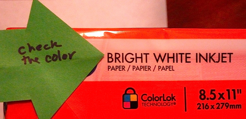
Am I correct in assuming, though, that some of you would enjoy seeing some clarification of what’s meant by 20-lb. or better white paper? Paper quality is measured by how much a certain number of pages weigh; as you’ve probably noticed in office supply stores, the heavier the paper, the more expensive it is. You’ll usually find the weight printed on the end of the ream:
As you may see, I generally use 24-lb. paper: it holds up better on repeated readings. That can be important in a submission, as more than one person at an agency, publishing house, and contest judging environment typically reads a page. 20-lb. paper is just fine for most submissions, though — it’s heavy enough that the type on the second page in a stack is not visible through the first.
Generally speaking, the greater the contrast between the whiteness of the paper and the darkness of the ink, the sharper your manuscript will look on the page, so this is no time to be trotting out the buff or ecru. Yes, choosing an off-white would make your pages stand out from the crowd, but believe me, it would not be in a good way.
Doubt that? Okay, compare the page 1 image above with page 2. If you were a Millicent expecting pages to be white, which would strike you as easier to read?
Stick with a bright white. Brightness levels can usually be found on the side of the ream, too.
All of that is clear, I hope? Excellent. Let’s move on to the second rule.
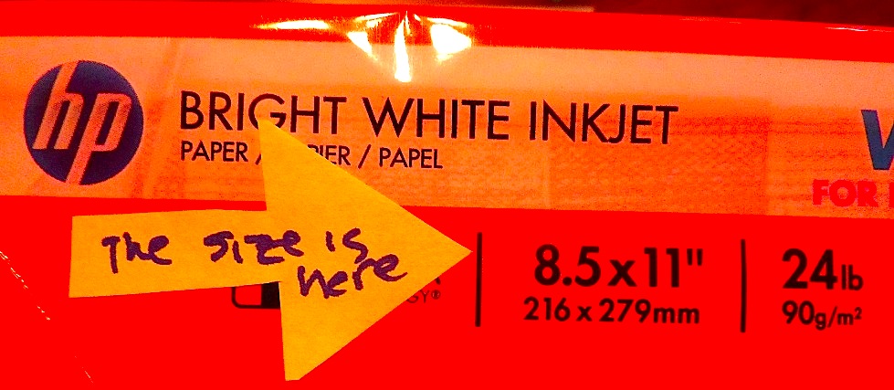
(2) All manuscripts should be printed on one side of the page and unbound in any way. For submission to US-based agencies, publishing houses, and contests, the pages in question should be US-standard 8.5″ x 11″ paper.
Again, much of this is probably self-explanatory, but since aspiring writers sometimes read the rules quite differently from those of us who work with manuscripts every day, I don’t want to take any definitions for granted. In that spirit, then, allow me to point out that the back of every page of your manuscript should look like this:
There’s a full page of text on the reverse side of that sheet, by the way, and your humble servant’s shadow cast near the bottom. See what I mean about the benefits of higher-quality paper? If an agent or editor wanted to write notes on it, there would be no visual distraction from bled-through ink.
Like many of us who handle manuscripts professionally, I’m always astonished if they show up bound, but spiral-binding does seem to be popular with a heck of a lot of aspiring writers. That’s fine for circulating your manuscript to your kith, kin, and writers’ group, but an agent or editor is going to want to be able to separate those pages. Your manuscript should pop out of its shipping container looking like this:
You will want to form it into a nice, neat stack, of course, but beyond that, it’s on its own. In order to help it navigate a long journey more happily, writers submitting to US-based agencies and publishing houses do need to be aware that regardless of whether requested materials arrive by mail or via e-mail, the expectation will be that the manuscript will be formatted for US business-size paper, not A4. (Don’t worry — I shall be tackling this sometimes thorny problem later in this series.)
Where might one find paper size, you ask? How about on the end of the ream, with the other relevant information?
Any questions so far? Lay ‘em on me. In the meantime, let’s move on to another rule.
(3) The text should be left-justified, NOT block-justified. By definition, manuscripts should not resemble published books in this respect.
This one seems to puzzle quite a few submitters — and even more literary contest entrants — I suspect because of the wording. It’s really not all that complicated: block-justified text produces a page on which the beginnings of the first word of each line form a straight line down the page on the left, while the end of each line on the right also ends at the same place.
We see this in magazines and newspapers all the time, right? I’m reluctant to show an example of block-justification, lest I throw anyone off. It’s easy, though, to get the basic idea from what the left margin is doing here.
As we can see in that example, though, a book manuscript is not block-justified, but left-justified. That means it boasts a straight margin on the left-hand side of the page, but an uneven right margin. Washing out the image a little makes the pattern down the page a bit easier to notice.
What Millicent will be expecting to see, in other words, are left and right margins that don’t look the same, like this:
All of which is, naturally, just another way of saying: just because you’ve seen formatting in print does not mean that it’s acceptable in a manuscript submission. It may look cool on the page, but remember, Millicent is not looking for cool. She’s looking for strong stories and good writing; non-standard format is only going to distract her from what the text is actually saying.
That’s also likely to be the case if the font is funky, by the way. Let’s talk about that next.
(4) The preferred typefaces are 12-point Times, Times New Roman, Courier, or Courier New — unless you’re writing screenplays, in which case you may only use Courier. For book manuscripts, pick one (and only one) and use it consistently throughout your entire submission packet.
Aspiring writers often believe, wrongly, that if MS Word offers a font, it should be fair game to use in a manuscript. To be quite candid, this pervasive belief drives professional readers nuts, for precisely the reason we just saw: since professionally-formatted manuscripts utilize only a couple of font options, anything else just looks odd to Millicent.
Let’s see why. Here is a properly-formatted page of dialogue in 12-point Times New Roman, the industry standard:
Now here’s that same run of dialogue in Courier. Notice how many fewer words fit on the page.
Perfectly readable, right? Now take a gander at our interaction in one of the more fanciful fonts offered by Word:
Hard to read, isn’t it? It also comes across as unprofessional: clearly, the writer who sent this Millicent’s way did not understand that presentation mattered. That means, unfortunately, that this page would simply scream at her that this writer would require an unusual amount of work to represent. Someone would need to sit down with the person that considered this font nifty and explain what standard format is: the least distracting way possible to show one’s writing to an agent or editor.
Did you catch the extremely common gaffe in those last two examples? No? Okay, here’s a close-up:
Catch it that time? The slug line — that concise run of information in the header — was in Times New Roman, while the text below was in Courier. Sort of looks like our writer wasn’t paying very close attention, doesn’t it? It also violates our next rule.
(5) The entire manuscript should be in the same font and size — no switching typefaces for any reason. Industry standard is 12-point.
No exceptions, I’m afraid, no matter what you have seen in published books. Any funky font choices in print are the publisher’s call, not the author’s.
The same principle applies, incidentally, to the title page; as we shall discuss later in this series, aspiring writers tend to go a little nuts there. Remember, though, the goal is not to grab Millicent’s eye with graphics, but with your writing. With that in mind, compare a properly-formatted title page in 12-point Times New Roman:
With the same title page with an array of fonts, some larger than 12 point:
The overwhelming majority of submitters would not see a great difference between the two — or, if they did, most would consider the second more visually appealing. As you may recall my having mentioned about thirty seconds ago, however, a savvy submitter does not lobby for an agent’s attention with anything other than the high quality of the writing and the strength of the story being told.
Trust me, you’re better off with something less flashy. Let’s move on.
(6) Do not use boldface anywhere in the manuscript but on the title page — and I would advise against it even there.
Again, just because Word provides a formatting option does not necessarily mean it is proper to include in a manuscript. If you want to emphasize words or phrases, use italics.
And on the title page, stick to the basics: remember, it’s the first part of your manuscript Millicent will see; it’s a great time to impress her with your professionalism. That being the case, I’m afraid the following is as dressed-up as a properly-formatted title page can manage:
Not much more exciting than the non-bold version above, is it? So it is really worth the trouble?
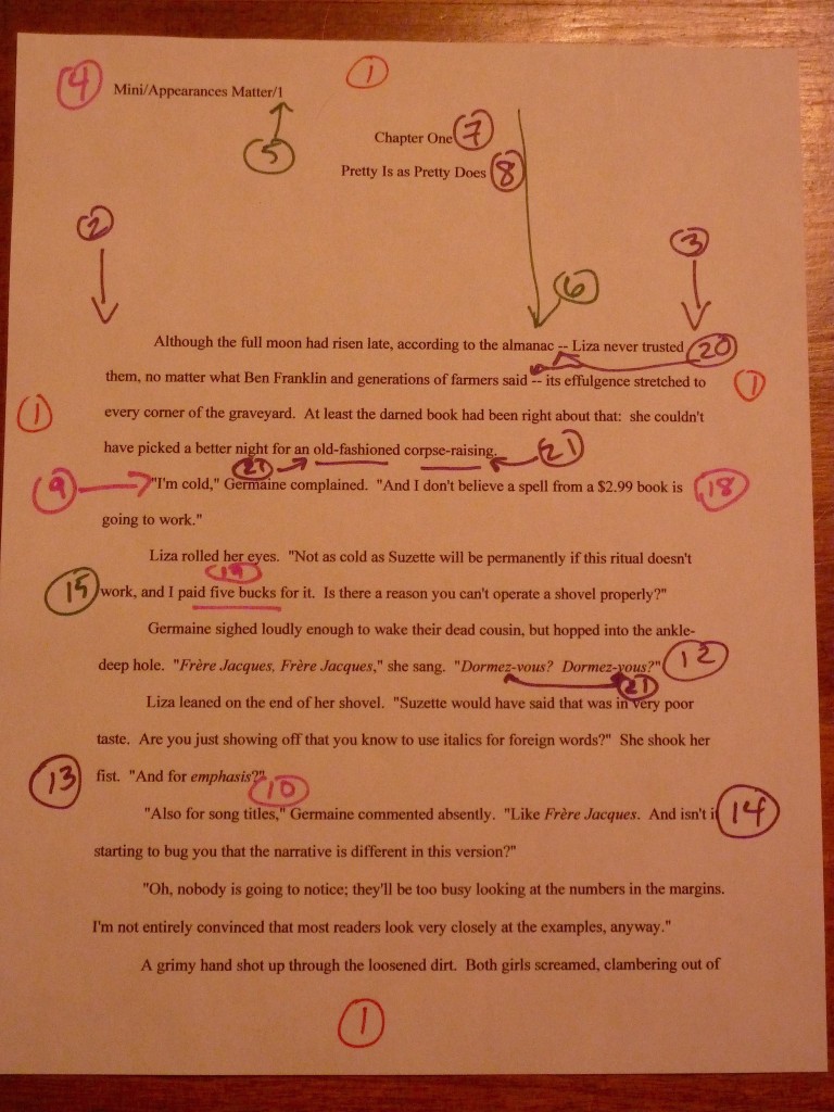
(7) Every page in the manuscript should be numbered — except the title page. The first page of text is page 1, not the title page.
For some reason that absolutely no one who habitually works with manuscripts can understand, aspiring writers often don’t number their pages. It’s rude to the reader, period. It also makes it perfectly obvious that the writer has never read his own manuscript in hard copy; it’s very, very easy to mix up unnumbered pages.
Fortunately, standard format provides a number on every page. It belongs in the header.
A title page, though, is neither numbered nor included in the page count. As, indeed, our exuberant arrow indicates:
But what else is going on in that header, you ask? Good question.
(8) Each page of the manuscript (other than the title page) should have a standard slug line in the header. The page number should appear in the slug line, not anywhere else on the page.
Don’t let the slimy name intimidate you: a slug line is simply the author’s last name/book’s title/page #, included so that if a page accidentally falls out of the manuscript, someone at the agency will be able to figure out from which manuscript it tumbled. Let’s take another look at it on the page:
This is the only exception to the one-inch margin on all sides of the page, right? The slug line sits in the middle of the header, and the page number rests within it. If you have been working with a version of Word that automatically places the page number somewhere else, it’s your responsibility to change it.
Yes, it matters that much. Millicent won’t look for the page number anywhere else.
Speaking of elements of standard format that don’t always mesh seamlessly with Word’s defaults, here comes our next rule.
(9) The first page of each chapter should begin a third of the way down the page. The chapter title should appear on the first line of the page, not on the line immediately above where the text begins.
This is another one of the areas in which published books, short story format, and standard format for book manuscripts differ: a new chapter begins on a fresh page, 1/3 of the way down. And no, just because an agency’s submission guidelines ask queriers to send the first five pages with the query does not mean that it’s permissible to ignore the opening space requirement. Millicent is expecting page 1 to look like this:
And while we’re on the subject of how little standard format for book manuscripts and short story format look alike…
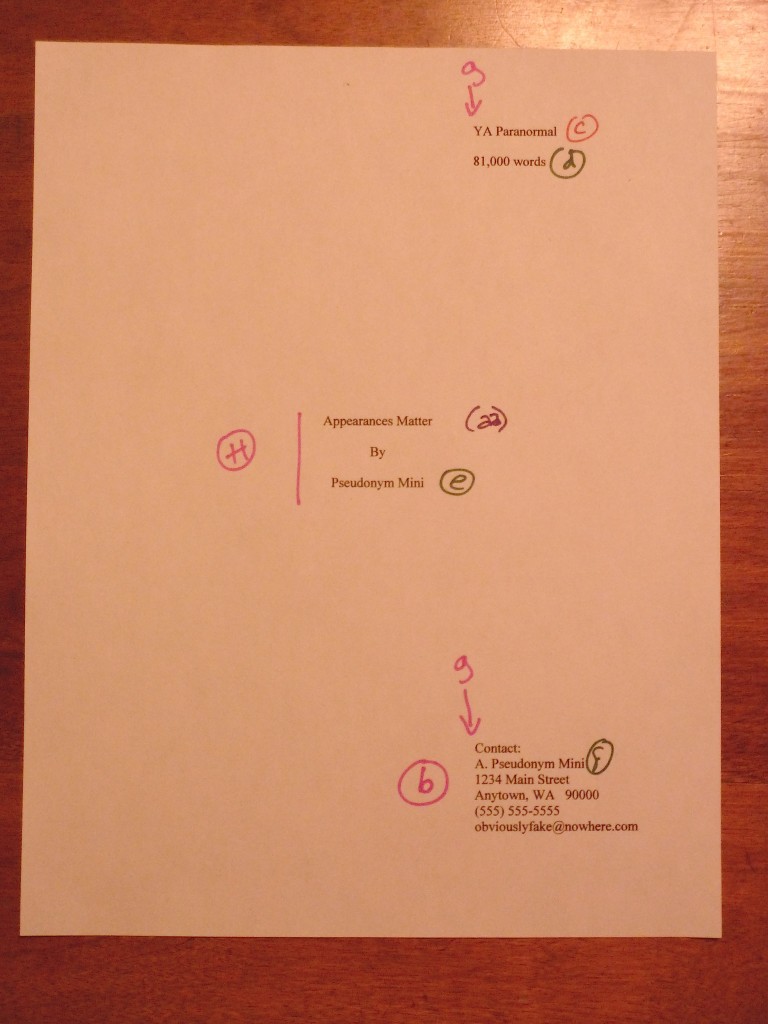
(10) Contact information for the writer belongs on the title page, not on page 1.
A surprisingly number of online sources seem not to make this distinction clear (or at all), but in a manuscript for a book-length work, the writer’s information should not be crammed onto page 1. That’s proper for a short story or article. It just goes to show you: not everything called a manuscript is identical — or aimed at the same group of professional readers.
Still, you will want to make it as simple as humanly possible for an agent who falls in love with your work to tell you so, right? We’ve already seen where it will be best appreciated — and where Millicent will be looking for it.
And yes, in response to what the overwhelming majority of writers who have been asked to submit partial manuscripts, just thought very loudly indeed, Millicent will be looking for that information if her boss requested only the first 50 pages as well. Which brings us to our next rule:
(11) Every submission should include a title page, even partial manuscripts.
Again, omitting a title page is seldom an instant-rejection offense, but honestly, it looks more professional than simply stacking a cover letter on top of page 1 — and much, much more professional than just shoving the manuscript into an envelope with no toppers at all. Yet Millicent and I are perpetually gob smacked by how many requested partial manuscripts show up without any authorial identification at all. At least if the submitter has adhered to short story format, his contact information will be on the first page, but astonishingly often, the writer’s last name and title in the slug line constitute the only clues to the sender’s identity.
Don’t see why that would be a problem? Okay, pretend that you’re Millicent, and you’ve just opened a box containing a requested manuscript. This would be what you would see:
See the problem? If Millicent or her boss, the agent of this submitter’s dreams, fall in love with those opening pages, the agency’s staff will have to dig up the query letter or leaf through a few thousand e-mails to find the writer’s contact information. Millie thinks this is just inconsiderate, but I suspect something else is going on here: the writer who sent the title page-free manuscript simply doesn’t understand how many submissions a well-established agency receives in any given week.
By contrast, look how simple it is for Millicent to figure out who sent this little number:
Make it easy for them to ask for the rest of your manuscript. Include a title page with your contact information on it with any requested pages, no matter how few.
(12) The beginning of every paragraph of text should be indented .5 inch. No exceptions, ever.
This would not have been a topic of discussion even thirty years ago, and frankly, most of us who read for a living don’t really accept that this would require explanation at all. The rise of both e-mail and business correspondence style has misled some aspiring writers into believing, wrongly, that it’s perfectly acceptable to omit indentation. Instead, they separate paragraphs by a skipped line.
That’s not how Millicent will expect a manuscript to be presented — or how her boss, the agent, would even consider submitting it to an editor at a publishing house. Everyone concerned will want your paragraphs to commence like this:
In other words, just the way paragraphs would be indented in a published book. Which means, of course, that those skipped lines that would have been necessary to keep paragraphs from running into one another have no place here. With one exception.
(13) Don’t skip an extra line between paragraphs, except to indicate a section break.
Contrary to popular opinion, it’s not necessary to do anything fancy to demonstrate in a book manuscript that one section of text has ended and the next has begun, as it is in a short story. (And in some contests for book-length works — check the rules.) For a book, all a writer has to do is hit the SPACE bar once. The result:
It resembles a section break in most published books, doesn’t it? Our next rule also adheres to that principle.
(14) Nothing in a book manuscript should be underlined. Titles of songs and publications, as well as words in foreign languages and phrases you wish to emphasize, should be italicized.
Actually, we’ve just seen this one in action in our previous example. As our attention was focused elsewhere, let’s take another peek.
I sense those of you fond of using italics to denote thought or find the common publishing practice of including an italicized opening champing at the bit, but hold those horses: I shall be devoting an entire post later in this series to the burning issue of when italics use is and is not acceptable. For now, let’s just assume that you’re going to be dotting your manuscript with ‘em, so we can move on to another peculiarity of book manuscripts.
(15) Numbers over 100 and those containing decimal points (like currency) or colons (like specific times) should be written as numerals. Numbers under 100 should be written out in word form.
So twenty-four should be written that way, but 1,557, 12:32 p.m., and $68.34 would be expressed numerically. Let’s see these principles in action on a page of text.
That’s fairly clear, I hope. One last rule that could bear a visual example, then we shall be done for the day.
(16) Dashes should be doubled — rather than using an emdash like this — with a space at either end. Hyphens are single and are not given extra spaces at either end, as in self-congratulatory.
My blogging program does not permit me to include manuscript-style dashes, I’m sorry to report — it automatically replaces them with that long line between words gracing this very sentence. I am forced, then, to resort to a page shot to provide you with the gratifying sight of proper dash use on a manuscript page.
See how the doubled dash and the spaces between the dashes and the words that surround them render it impossible to mistake the intended dash for a hyphen? Sometimes, aspiring writers mistakenly use this format for a hyphen, but that would be incorrect in any context. Why? Well, a hyphen joins parts of a single word — counter-intuitive, ten-foot pole, a three-year-old child — while a dash sets off a part of a compound sentence. As, indeed, two of them did in that last sentence.
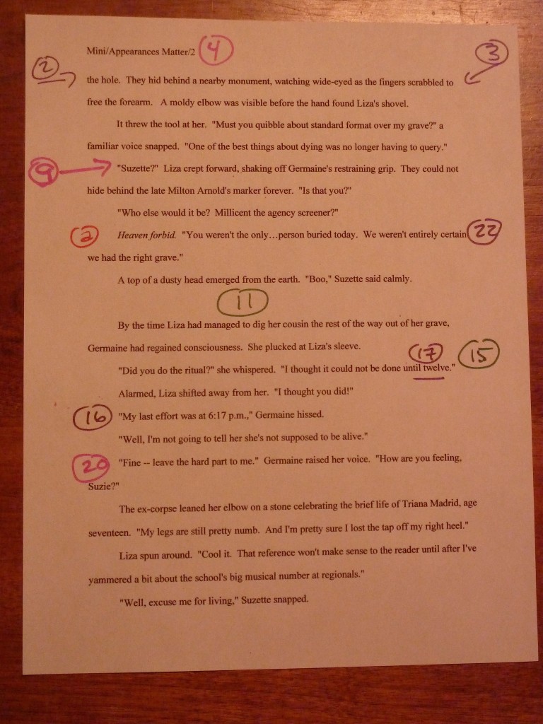
You want to see a few more dashes and commas in their natural habitat, don’t you? Perfectly reasonable. Here are a few dancing across a manuscript page, suitably marked.
And those, my friends, are the basic contours of a book manuscript in standard format. If all of these images went by too fast, don’t worry: my next few posts will be going over the rules at a more leisurely pace, for the benefit of those who enjoy extensive explanations. After that, I shall be delving into some of the more common formatting faux pas. Sounds like fun, eh?
Well, maybe not, but would you rather guess how to do it? Or have me bark at you? Keep up the good work!


