Formatpalooza, part IX: areas of authorial discretion, or, there are rules, and there are rules

full moon in the gutter

At the risk of seeming trite, I would like to point out that it has been raining a great deal in Seattle of late. Not the normal constant misty drizzle that characterizes our dark Pacific Northwest winters, but sheets. Buckets. The proverbial cats and dogs, with an antelope or two thrown in by whatever celestial water-monger has seen fit to try to drown us.

I’m not saying we’re worried. I’m saying my neighbors came over this evening to ask how long a cubit was, so they could read the blueprints for their ark.

But enough idly wondering where on earth they found a pair of yeti for their menagerie. Time to get back to the matter at hand: manuscript formatting.

Over the last couple of posts, we have been gladdening our hearts (okay, gladdening my detail-loving editorial heart) with discussion of something that Millicent the agency screener just loves to see, a properly-formatted first page of a manuscript, as well as phenomena she sees more often, but likes less, various species of improperly formatted page 1. The Millicent-pleasing version looked, if you will recall, a little something like this — and, as always, if you’re having trouble seeing the details, try enlarging the image by holding down the COMMAND key and pressing + repeatedly.
good example revised

Now that’s a lovely page 1: unprovocative, professional-looking, and flaunting lots of nice, clean white space at the top. “Ah,” Millicent murmurs, settling back into her chair, “now I can concentrate on the writing and the story.”

Contrast that, please, with the much more cluttered short story format all too many book and book proposal submitters mistakenly believe is universally applicable to any writing on paper:

Pretty distracting to the eye, is it not? Admittedly, not all embracers of this format will choose to clutter the space up further with an epigraph — which, as we discussed last time, it not generally the best idea at the submission stage, no matter what you want the published version of your book to look like — but one does not need to be the Amazing Kreskin to predict that their submission packets all share another unprofessional characteristic: no title page.

How do I know that? Well, think about it: since all of that eye-displacing verbiage — title, book category, word count, contact information — would in a properly-constructed submission packet appear on the title page, why would a submitter repeat all of it at the top of page 1?

Both page 1 and the opening of each subsequent chapter should include all of the spaciousness of that first example, not launching into the text until 14 single lines from the top of the page. (Or, to put it another way, 6 double-spaced lines under the chapter title. And for those of you who do not know how to insert a hard page break into a Word document, it’s located under the INSERT menu. Select BREAK, then PAGE BREAK.)

Did that bit about the subsequent chapters catch any of you by surprise? To prevent that kind of confusion in future, let’s go ahead and hatch a new axiom: each new chapter should begin on a fresh page, but the first page of every chapter should be formatted exactly like page 1.

Yes, Virginia: exactly, at least in terms of formatting. Since the book’s title should appear on the title page, why would the opening of the book and the opening of Chapter 6 be different?

So you may see that in action (and to prove that I practice what I preach), here’s what could be the first page of Chapter Six my memoir:
Memoir wo title

I said could, because actually, I’m not a big fan of chapters named Chapter Six, even if they happen to be the sixth chapter in the manuscript. It’s sort of like dubbing a suburban street lined with elm trees Elm Street: there’s nothing inherently wrong with a straightforward, descriptive title, but you must admit, it’s not startlingly original.

It’s not precisely going to come as a shock to many readers when Chapter Six appears immediately after Chapter Five, after all. At least not readers whose counting skills have moved past their first hand.

Speaking of hands, I see many of them waving in the air, apparently trying to attract my attention. “Okay, Anne,” those of you fond of naming things inquire, “how should a chapter title appear on the page, if I also want to number it? Or do I need to choose between numbering and titling?”

Not at all — go ahead and include both, if that makes you happy. In fact, it’s actually a little easier for agents and editors if you do number titled chapters; it’s simpler for a feedback-giver to say, “Please tone down the snarkiness in Chapter 6 of your memoir, Ermintrude,” than “You know the snarky tone in the chapter called something like How I Had My Way with Ocelots, or, Twenty-seven Ways to Skin a Cat? Give it a rest, Ermintrude.”

The formatting is very simple: just add the chapter title on the second double-spaced line of text, centered under the chapter number designation. (Freeing up mental space to speculate: what was Ermintrude doing with all of those ocelots?)

This format should sound at least a trifle familiar: we’ve already seen it in action in today’s first example. But in furtherance of my ongoing mission to place so many examples of correctly-formatted manuscript pages in front of your weary eyes that you’ll start automatically recoiling from pages in published books, muttering, “Well, that wouldn’t work in a manuscript submission, let’s take a gander at another one:
memoir w ch title

Actually, I had an ulterior motive in showing you that last example: in comparing it to the example just before it, do you notice anything about the amount of space between the chapter number and the beginning of the text?

If you immediately shot your hand into the air, exclaiming, “By gum, Anne, the area between the two appears identical! You’ve simply placed the chapter title within it, you clever lady,” award yourself an extra helping of hot fudge on your sundae. (If devoting a couple of weeks to discussing standard format doesn’t entitle an aspiring writer to dessert, nothing does.)

Regardless of whether a chapter’s opening page contains a chapter designation, a title, or both, the text should begin the same distance from the top of the page. The same logic would apply to any other information you might see fit to include at the beginning of a chapter — alerting the reader to a break between Part I and Part II of a book, for instance.

Since so many aspiring writers ask me about part breaks — hey, I’m not known as the Format Queen for nothing; I would much, much rather that my readers ask me than misformat their submissions — let’s take a look at the phenomenon in action. If Chapter 6 were the beginning of Part II of my memoir (it isn’t, but we aim to please here at Author! Author!), I would have formatted it thus:
memoir w part break

Starting to get the hang of this? Okay, let’s talk about inserting another common piece of introductory information in that heading: identifying a narrator-du-chapter in a multiple point-of-view novel.

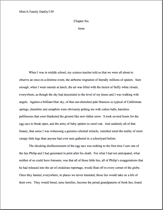
If the switch comes at the beginning of a chapter, it couldn’t be easier: it’s simply another reader-signal that belongs above the pre-text white space, right? To see this principle in action, let’s pretend our ongoing example is fiction (which it isn’t; my middle school honestly was pelted with migratory spiders) and place the narrator’s name in the traditional spot:
new chapter with name

That’s the way one would handle the matter in a multiple POV manuscript like, say, Barbara Kingsolver’s THE POISONWOOD BIBLE, where the narrator changes with the chapter. If there were also a chapter title (perhaps not advisable in this case, as there’s already significant information at the top of that page for the reader to absorb), it would go between the chapter heading and the narrator identifier.

The important thing here is to be consistent — and that’s not always easy. Most seasoned authors probably wouldn’t appreciate my revealing a working secret, but pretty much everyone worries that someday her will forget to hit return one of the necessary times, so that Chapter 5 will begin — gasp! — twelve lines from the top, while Chapter 1-4 and 6 on will begin fourteen lines down.

Gives you the willies even to contemplate how Millicent might react to that level of formatting inconsistency, doesn’t it? Double-check each and every chapter opening before you submit; trust me, you’ll be happier in the long run.

Oh, my — that was an unpopular suggestion, wasn’t it? Fully a third of you have your hands waving impatiently in the air. “That would be absurdly time-consuming, Anne,” the irate third huff. “Oh, I understand that the chapter number or title needs to appear at the top of the first page and each subsequent chapter; I’m perfectly happy to leave six double-spaced blank lines between it and the first line of text, so the first paragraph starts seven lines down. But surely there’s an easier way to do this — a template or something? Perhaps Word has some sort of default setting I can employ so I need never worry about the issue again as long as I live?”

Standard format templates do exist, now that you mention it, but frankly, Word is already equipped with two perfectly dandy features for reproducing formatting exactly in more than one place in a document: COPY and PASTE.

In other words, create your own template. It’s very simple to do: just copy from “Chapter One” down through the first line of text, then paste it on the first page of Chapter 2, 3, etc. Once the format is in place, it’s a snap to fill in the information appropriate to the new chapter.

Oh, dear — now another group of you have raised your hands. Yes? “But Anne,” exclaim those of you who favor switching narrator (or place, or time) more often than once per chapter, “we are, as we believe the tag line identifying us as speakers just mentioned, advocates of those nifty mid-chapter signposts that we see all the time in published books, boldfaced notifications that the time, place, or speaker has just changed. How would I format that in a manuscript?”

You’re talking about incorporating subheadings into a novel, right? Or at least what would be a subheading in a nonfiction manuscript: a section break followed by a new title.

I’m fully prepared to answer this question, of course, if only to show all of you nonfiction writers out there what your subheadings should look like. Before I do, however, I’d like to ask novelists interested in adopting this strategy a quick question: are you absolutely positive that you want to do that?

That’s not an entirely flippant question, you know. There are plenty of Millicents out there who have been trained by old-fashioned agents — and even more editorial assistants who work for old-fashioned editors. And that’s important to know, because even in an age when mid-chapter subheadings aren’t all that uncommon in published books, there are still plenty of professional readers whose knee-jerk response to seeing ‘em is invariably, “What is this, a magazine article? In my day, fiction writers used language to indicate a change in time or place, rather than simply slapping down a subheading announcing it; if they wanted to indicate a change of point of view, they would either start a new chapter, find a graceful way to introduce the shift into the text, or have the narrative voice change so markedly that the shift would be immistakable! O tempore! O mores!

I just mention.

To this ilk of pros, the practice of titling a section, or even a chapter, with clear indicators of time, place, or speaker will always seem to be indicative of a show, don’t tell problem. And you have to admit, they sort of have a point: novelists have been indicating changes of time and space by statements such as The next day, back at the ranch… ever since the first writer put pen to paper, right?

As a result, fiction readers expect to see such orienting details emerge within the course of the narrative, rather than on top of it. Most of the time, this information isn’t all that hard to work into a narrative — and if a novelist is looking to please a tradition-hugging agent or editor, that’s probably a better strategy to embrace, at least at the submission stage. As with any other authorial preference for how a published book should look, you can always try to negotiate an editorial change of heart after a publisher acquires your novel.

At least if you don’t happen to write in a book category that routinely uses such subheadings. If recent releases in your book category are crammed with the things, don’t worry your pretty little head about editorial reaction to ‘em. An editor — or agent, Millicent, or contest judge — who routinely handles books in that category may be trusted to realize that you’re simply embracing the norms of your genre.

Millicents tend to approve of that. It shows that the submitter has taken the time to become conversant with what’s being published these days in the category within which he has chosen to write.

Which is to say: these days, plenty of very good fiction writers prefer to alert the reader to vital shifts with titles and subheadings. And nonfiction writers have been using them for decades; in fact, they’re more or less required in a book proposal. (More insight on those follows later in this series, I promise.) I just didn’t want any of you to be shocked if the agent of your dreams sniffs in the early days after signing you, “Mind taking out these subheadings? Seven of the ten editors to whom I’m planning to submit this hate them, and I’d rather be spared yet another lecture on the pernicious influence of newspapers and magazine formatting upon modern literature, okay?”

All that being said — and now that I’ve completely unnerved those of you who are considering submitting manuscripts with subheadings — you do need to know how to do it properly.

It’s quite straightforward, actually: a subheading is just a section break followed by a left-justified title. The text follows on the next double-spaced line.

Want to see that in action? Okay. Just to annoy traditionalists who draw a sharp distinction between fiction and nonfiction writing, let’s take a peek at a nonfiction page by a well-respected novelist:

Wharton subheading example

That caused some bloodshot eyes to pop wide open, didn’t it? “But Anne!” the detail-oriented exclaim, “that subheading is in BOLDFACE! Didn’t the rules of standard format specifically tell me never, under any circumstances, to boldface anything in my manuscript?”

Well caught, sharp-eyed ones: boldfacing the subheading does indeed violate that particular stricture of standard format. However, since nonfiction manuscripts and proposals have been routinely boldfacing subheadings (and only subheadings) for over a decade now — those crotchety old-fashioned editors are partially right about the creeping influence of article practices into the book world, you know — I thought that you should know about it.

It’s definitely not required, though; Millicent is unlikely to scowl at a nonfiction submission that doesn’t bold its subheadings. Like font choice, you make your decision, you take your chances.

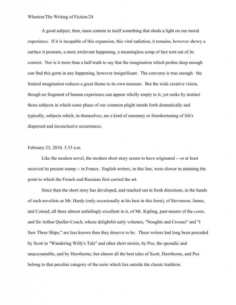
In a fiction submission, though, I definitely wouldn’t advise it; traditionalists lurk in much, much higher concentrations on the fiction side of the industry, after all. Here’s the same page, formatted as fiction — and since we’re already talking about exceptions to the rules, let’s make this example a trifle more instructive by including a date and time in the subheading:
Wharton example2

Unsure why I used numerals in the subheading, rather than writing out all of the numbers under a hundred, as standard format usually requires? Full dates, like specific times and currency, are rendered in numeric form in manuscripts. Thus, I paid $14.17 for a train ticket at 12:45 a.m. on November 3, 1842, officer is correct; I paid fourteen dollars and seventeen cents for a train ticket at twelve forty-five a.m. on November three, eighteen hundred and forty-two is not. (It would, however, be perfectly permissible to include quarter to one in the afternoon on November third.)

Everybody clear on all of that that? Now would be a dandy time to start waving your hand at the Format Queen, if not.

Next time, we shall be continuing our in-depth look at chapter openings. In the meantime, keep up the good work!
Formatpalooza, part IV: drawing some much-needed lines in the sand

lines in the sand

Before we begin today, a heads-up about a long-time member of the Author! Author! community’s exciting new project: tonight at 7 and 10 EST is the premiere of memoirist, blogger, and all-around fab guyJoel Derfner‘s new reality show, Girls Who Like Boys Who Like Boys on the Sundance Channel. Best of luck, Joel, and may the film editors be kind to you!

Those of you who have been hanging out here for a while may know Joel better under his commenting/blogging moniker, Faustus, M.D.. Or for his informative and funny guest blogs on getting permission to use song lyrics in one’s books (oh, yes, Virginia, explicit permission is required, unless the song is in the public domain) and how much input an author does and doesn’t get on his book covers. Or perhaps the name rings a bell because I have regularly been heard to say over the last couple of years that his memoir, SWISH: My Quest to Become the Gayest Person Ever and What Happened Instead, represents some of the best memoir writing of the last decade.

Who can say? Memory is a funny thing.

Speaking of which, you might want to bookmark this post, campers: since I’m going to be wrapping up my theoretical discussion of standard format today, I’m going to list all of the rules we have discussed so far.

That’s right: the whole shebang, listed in a single post. Can’t you feel the excitement in the air? Let’s get cracking.

(1) All manuscripts should be printed or typed in black ink and double-spaced, with one-inch margins around all edges of the page, on 20-lb or better white paper.

(2) All manuscripts should be printed on ONE side of the page and unbound in any way.

(3) The text should be left-justified, NOT block-justified. By definition, manuscripts should NOT resemble published books in this respect.

(4) The preferred typefaces are 12-point Times, Times New Roman, Courier, or Courier New — unless you’re writing screenplays, in which case you may only use Courier. For book manuscripts, pick one (and ONLY one) and use it consistently throughout your entire submission packet.

(5) The ENTIRE manuscript should be in the same font and size — no switching typefaces for any reason. Industry standard is 12-point.

(6) Do NOT use boldface anywhere in the manuscript BUT on the title page — and not even there, necessarily.

(7) EVERY page in the manuscript should be numbered EXCEPT the title page.

(8) Each page of the manuscript (other than the title page) should have a standard slug line in the header. The page number should appear in the slug line, not anywhere else on the page.

(9) The first page of each chapter should begin a third of the way down the page, with the chapter title appearing on the FIRST line of the page, NOT on the line immediately above where the text begins.

(10) Contact information for the author belongs on the title page, NOT on page 1.

(11) Every submission should include a title page, even partial manuscripts.

(12) The beginning of EVERY paragraph of text should be indented .5 inch. No exceptions, ever.

(13) Don’t skip an extra line between paragraphs, except to indicate a section break.

(14) NOTHING in a manuscript should be underlined. Titles of songs and publications, as well as words in foreign languages and those you wish to emphasize, should be italicized.

All of those make sense, I hope, at least provisionally? Excellent. Moving on…

(15) All numbers under 100 should be written out in full: twenty-five, not 25. But numbers over 100 should be written as numbers: 1,243, not one thousand, two hundred and forty-three.

Violations of this one routinely make people who read manuscripts for a living twitch uncontrollably. Yet an unfortunately high percentage of otherwise industry-savvy aspiring writers are apparently unaware of this particular rule — or apply it incorrectly.

The instinct to correct it in a submission is universal in professional readers. From that impulse to rejection is often a fairly short journey, because once the notion gee, this writer hasn’t taken the time to learn the ropes has occurred to a professional reader, it’s hard to unthink. After that, anything from a major cliché to a minor typo would just seem like corroboration of this uncharitable — and in some cases unfair — conclusion.

Translation: NOT presenting your numbers correctly will not help you win friends and influence people at agencies and publishing houses. Don’t say I didn’t warn you.

Like pointing out foreign-language words with special formatting, this formatting rule was originally for the benefit of the manual typesetters. When numbers are entered as numbers, a single slip of a finger can result in an error, whereas when numbers are written out, the error has to be in the inputer’s mind.

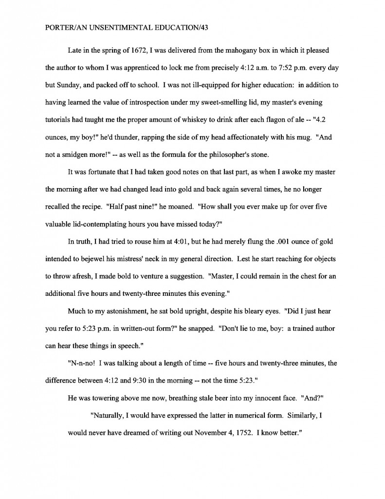
There are only three exceptions to this rule: dates, currency, and, of course, page numbers. Thus, a properly-formatted manuscript dealing with events on November 11 would look like this on the page:

Abbott/The Great Voyage/82

The sandwich cost $3.76.

On November 11, 1492, fifty-three scholars divided into eighteen parties in preparation for sailing to Antarctica. It took 157 rowboats ten trips apiece to load all of their books, papers, and personal effects onboard.

And not like this:

Abbott/The Great Voyage/Eighty-two

The sandwich cost three dollars and seventy-six cents, cash American.

On November eleventh, fourteen hundred and ninety-two, fifty-three scholars divided into eighteen parties in preparation for sailing to Antarctica. It took a hundred and fifty-seven rowboats ten trips apiece to load all of their books, papers, and personal effects onboard.

Do I see some hands waving in the air? “But Anne,” inveterate readers of newspapers protest, “I’m accustomed to seeing numbers like 11, 53, 18, and 10 written as numerals in print. Does that mean that when I read, say, a magazine article with numbers under 100 depicted this way, that some industrious editor manually changed all of those numbers after the manuscript was submitted?”

No, it doesn’t — although I must say, the mental picture of that poor, unfortunate soul assigned to spot and make such a nit-picky change is an intriguing one. What you have here is yet another difference between book manuscript format and, well, every other kind of formatting out there: in journalism, they write out only numbers under 10.

Unfortunately, many a writing teacher out there believes that the over-10 rule should be applied to all forms of writing, anywhere, anytime. Yes, this is true for newspaper articles, where space is at a premium, but in a book manuscript, it is WRONG, WRONG, WRONG.

Did I mention it was wrong? And that my aged eyes have actually seen contest entries knocked out of finalist consideration over this particular issue? More than once? And within the last year?

AP style differs from standard format in several important respects, not the least being that in standard format (as in other formal presentations in the English language), the first letter of the first word after a colon should not be capitalized, since technically, it’s not the beginning of a new sentence. I don’t know who introduced the convention of post-colon capitalization, but believe me, I’m not the only one who read the submissions of aspiring book writers for a living that’s mentally consigned that language subversive to a pit of hell that would make even Dante avert his eyes in horror.

That’s the way we nit-pickers roll. We like our formatting and grammatical boundaries firm.

Heck, amongst professional readers, my feelings on the subject are downright non-confrontational. I’ve been in more than one contest judging conference where tables were actually banged and modern societies deplored. Trust me, you don’t want your entry to be the one that engenders this reaction.

So let’s all chant it together, shall we? The formatting and grammatical choices you see in newspapers will not necessarily work in manuscripts or literary contest entries.

Everyone clear on that? Good, because — are you sitting down, lovers of newspapers? — embracing journalistic conventions like the post-colon capital and writing out only numbers under ten will just look like mistakes to Millicent and her ilk on the submission page.

And no, there is no court of appeal for such decisions; proper format, like beauty, is very much in the eye of the beholder. So if you were planning to cry out, “But that’s the way USA TODAY does it!” save your breath.

Unfortunately, although my aforementioned heart aches for those of you who intended to protest, “But how on earth is an aspiring writer to know that the standards are different?” this is a cry that is going to fall on deaf ears as well. Which annoys me, frankly.

The sad fact is, submitters rejected for purely technical reasons are almost never aware of it. With few exceptions, the rejecters will not even take the time to scrawl, “Take a formatting class!” or “Next time, spell-check!” on the returned manuscript. If a writer is truly talented, they figure, she’ll mend her ways and try again.

And that, in case any of you lovely people had been wondering, is why I revisit the topic of standard format so darned often. How can the talented mend their ways if they don’t know how — or even if — their ways are broken?

(16) Dashes should be doubled — rather than using an emdash — with a space at either end. Hyphens are single and are not given extra spaces at either end, as in self-congratulatory.

Yes, yes, I know: you’ve probably heard that this rule is obsolete, too, gone the way of underlining. The usual argument for its demise: books no longer preserve these spaces, for reasons of printing economy, so many writing teachers tell their students just to go ahead and eliminate them. An AP-trained teacher will tell you to use the longer emdash, as will the Chicago Manual of Style.

In this, however, they are wrong, at least as far as manuscripts are concerned. (You’re starting to get used to that, right?)

Standard format is invariable upon this point: a doubled dash with a space on either end is correct; anything else is not.

And yes, it is indeed a common enough pet peeve that the pros will complain to one another about how often submitters get it wrong. They also bemoan how often they see manuscripts where this rule is applied inconsistently: two-thirds of the dashes doubled, perhaps, sometimes with a space at either end and sometimes not, with the odd emdash and single dash dotting the text as well.

It may seem like a minor, easily-fixable phenomenon from the writer’s side of the submission envelope, but believe me, inconsistency drives people trained to spot minor errors nuts.

Your word-processing program probably changes a double dash to an emdash automatically, but CHANGE IT BACK. If only as a time-saver: any agent would make you do this before agreeing to submit your manuscript to an editor, so you might as well get into this salutary habit as soon as possible.

(17) Adhere to the standard rules of punctuation and grammar, not what it being done on the moment in newspapers, magazines, books, or on the Internet — including the rule calling for TWO spaces after every period and colon.

In other words, do as Strunk & White say, not what others do. Assume that Millicent graduated with honors from the best undergraduate English department in the country (or at least the fifteenth-best), taught by the grumpiest, meanest, least tolerant stickler for grammar that ever snarled at a student unfortunate enough to have made a typo, and you’ll be fine.

Or, if that mental image isn’t frightening enough, try envisioning the many, many professional writers who delighted in leaping upon the slightest hint of grammatical impropriety even in spoken English throughout my formative years. I know that works for me.

The primary deviation I’ve been seeing in recent years is leaving only one space, rather than the standard two, after a period. The rationale runs thus: printed books usually do this now, to save paper; the fewer the spaces on a page, the more words can be crammed onto it. Since we’ve all seen it done in recently-released books, some argue — and vehemently — it would be ludicrous to format a manuscript any other way.

Indeed, you may have seen that one touted as the proper way to format a manuscript. A number of writing-advice websites, I notice, and even some writing teachers have been telling people that this is the wave of the future — and that adhering to the two-space norm makes a manuscript look obsolete. Some even tout this as a universal instant-rejection offense.

At the risk of sounding like the harsh grammar-mongers of my youth, poppycock. Agents, very good ones, routinely submit manuscripts with doubled spaces to editors, also very good ones, all the time. Successfully. But truth compels me to point out that there are also many agents, also good ones, who have embraced the single-space convention, and quite adamantly. Although some agents and editors do now request eliminating the second space at the submission stage, the doubled space is still the norm — except amongst the minority who feel very strongly that it is not.

Clear as pea soup, right?

So which convention should you embrace? The answer, as it so often is, involves doing your homework about the specific agent or publisher you are planning to approach. As always, it’s ultimately up to you; it’s really a question of choosing whom to please — or producing two different manuscripts for submission.

Once you get in the habit of doing that research, I suspect those of you who have heard horror stories about how everybody now positively hates the second space convention will be astonished to see how few agencies even mention it in their submission guidelines. If they don’t, it’s usually safe to assume that they adhere to the older convention — or at the very least, don’t care. If, however, you happen to be submitting to one of those people who specifically asks for single spaces, in which case, you’d be silly not to bow to their expressed preferences. (Sensing a pattern here?)

Fortunately, for aspiring writers everywhere, those agents who do harbor a strong preference for the single space tend not to keep mum about it. If they actually do tell their Millicents to regard a second space as a sign of creeping obsolescence, chances are very, very good that they’ll mention that fact on their websites.

Again, double-check before you submit. If the agent of your dreams has not specified, double-space.

Why should that be the default option, since proponents of eliminating the second space tend to be so very vocal? Those who cling to the older tradition tend to be, if anything, a shade more vehement.

Why, you ask? Editing experience, usually. Preserving that extra space after each sentence in a manuscript makes for greater ease of reading, and thus editing. As anyone who has ever edited a long piece of writing can tell you, the white space on the page is where the comments — grammatical changes, pointing out flow problems, asking, “Does the brother really need to die here?” — go.

Less white space, less room to comment. It honestly is that simple.

Oh, and it drives the grammar-hounds nuts to hear that time-honored standards are being jettisoned in the name of progress. “What sane human being,” they ask through gritted teeth, “seriously believes that replacing tonight with tonite, or all right with alright constitutes progress? Dropping the necessary letters and spaces doesn’t even save significant page space!”

Those are some pretty vitriol-stained lines in the sand, aren’t they?

Let’s just say that until everyone in the industry makes the transition editing in soft copy — which is, as I have pointed out many times in this forum, both harder and less efficient than scanning a printed page — the two-space rule is highly unlikely to change universally. Just ask a new agent immediately after the first time he’s submitted to an old-school senior editor: if he lets his clients deviate from the norms, he’s likely to be lectured for fifteen minutes on the great beauty of the English language and the imperative to protect its graceful strictures from the invading Goths, Visigoths, and journalists.

I sense that some of you are starting to wring your hands and rend your garments in frustration. “I just can’t win here! Most want it one way, a few another. I’m so confused about what’s required that I keep switching back and forth between two spaces and one while I’m typing.”

I hate to be the one to break it to you, but inconsistent formatting is likely to annoy both sides of the aisle. Whichever choice you embrace, be consistent about it throughout your manuscript; don’t kid yourself that an experienced professional reader isn’t going to notice if you sometimes use one format, sometimes the other.

He will. So will a veteran contest judge. Pick a convention and stick with it.

But don’t fret over it too much. This honestly isn’t as burning a debate amongst agents and editors as many aspiring writers seem to think. But as always: check before you submit. If the agent’s website, contest listing, and/or Twitter page doesn’t mention individual preferences, assume s/he’s going to be submitting to old-school editors and retain the second space.

And be open to the possibility — brace yourselves; you’re not going to like this — that you may need to submit your manuscript formatted one way for a single agent on your list, and another for the other nineteen.

Hey, I warned you that you weren’t going to like it.

(18) Turn off the widow/orphan control; it gives pages an uneven number of lines.

The widow/orphan control, for those of you new to the term. is the setting on a word processing program that controls how many lines appear on any given page. The default setting prevents the first line of a new paragraph from being left alone on a page if the rest of the paragraph is on the next (a line so left behind is called an orphan) or the last line of a paragraph begun on a previous page from appearing at the top of the next page all by itself (and that’s called a widow).

Thus, if the widow/orphan control is left on, lines will be stolen from one page and added to the ones before and after. Result: some of your pages will have more lines of text on them than others. Why might that be problematic? Well, unless your pages are standardized, you can’t justify estimating your word count (at # of pages x 250 in Times New Roman). Since word counts for book-length projects are expected to be estimated (you’ll need to use the actual count for short stories or articles), and actual count can be as much as 20% higher than estimated, it’s certainly in the best interest of anyone who tends to run a little long to estimate.

And even if your manuscript isn’t over 400 pages (100,000 words, estimated), the usual dividing line for Millicent to cry, “Oh, too bad; it’s too long for a first novel in this book category. Next!” she’s going to dislike seeing an extra inch of white space on the bottom of some of your pages. Not necessarily enough to shout, “Next!” anyway, but do you really want something that superficial to be your submission’s last straw?

Here’s how to turn it off in Word: under the FORMAT menu, select PARAGRAPH…, then LINE AND PAGE BREAKS. Un-check the Widow/Orphan control box, and you’re home free!

There you have it: the rules. Practice them until they are imbedded into your very bones, my friends: literally every page of text you submit to an agent, editor, or literary contest for the rest of your professional life (yes, including the synopsis) should be in standard format.

Confused? Now would be a delightful time to ask some questions. Tomorrow, it’s on to concrete examples. Keep up the good work!

The objectively subjective question of subjective objectivity, and other issues our teachers raised that may have left us wanting to ask follow-up questions

nike in my yard

Another snapshot directly attributable to my having played hooky in my yard last weekend, observing Nike, the winged goddess of victory, overseeing the annual triumph of the narcissus over the early tulip. The more of these I post here, the less those few hours seem retrospectively like a holiday. Which means, I suppose, that I’ve been blogging long enough that devoting time to you fine people, however frivolously, has become a sort of guilt-deductible activity: the more I do it, the less time devoted to my other vices cost, ethically speaking.

Don’t get me wrong — I don’t actually see blogging as a vice. That’s my agent’s job. He would prefer that I devote roughly, oh, 100% of my waking hours to remunerative writing. And he’s not all that happy about having to limit that preference to my waking hours, either.

So in order to render today’s post at least potentially a money-making proposition, I open today with a question for all of you Pacific Northwest-based writers: if I added some extra sessions to my already-booked April and May classes — this year, one on book proposal crafting, one on query and submission packet troubleshooting, and one on crafting and perfecting a killer pitch — would any of you be interested in attending?

I don’t normally advertise my classes here at Author! Author! (mostly because they tend to fill up pretty quickly), but this year, I have received so many requests from my excellent readers to cast my eye over their proposals, queries, synopses, and opening pages that it occurred to me that some of you might potentially be interested in spending a day in a seminar where — wait for it — I guide a few writers (8-15, usually; I prefer small classes) through their proposals, queries, synopses, and/or opening pages. In the pitching class, we begin from scratch, but the proposal and query/submission classes, we will be working with already-written text. Typically, students arrive with proposals at least roughed out and/or query letters and opening pages in hand, so that we may have at ‘em.

It’s a great way to spend half a weekend, as well as a fabulous way to double-check your submissions before sending them out. Over and above reading them IN THEIR ENTIRETY, IN HARD COPY, and OUT LOUD, of course.

Oh, you thought I was going to stop harping on that advice, now that we have finished going over standard format? My friends, if the Millicents of the world had any say in the matter, I would never cease shouting out that particular set of bon mots.

If spending a day engaged in in-depth face-to-face discussion of any of these subjects sounds like just your cup of tea, please drop me a note in the comments or drop me an e-mail, and I’ll send you more information. (If you prefer the comments route, don’t post your contact info for all to see; the blogging program stores commenters’ e-mail addresses.) Make sure to let me know which class interests you most — or heck, put your bid in for all three. Oh, and don’t forget to mention whether Seattle or Portland would be more convenient for you; I’m planning to teach in both this spring.

There’s the day’s non-blog business out of the way. On to the goal of today’s post: a graceful segue between the formatting issues of recent weeks and our long-anticipated foray into craft.

Fortunately for all of us, sharp-eyed reader EuroPorter recently asked the perfect question to propel us from one to the other. Although thanks largely to readers’ questions, I had devoted quite a bit more of our latest foray into the mysteries of standard format to dealing with numbers in the text, EP’s aforementioned perceptive peepers noticed an oversight in my overview:

Hey, Anne, great post, as ever. And while I’m reading my material here IN ITS ENTIRETY, IN HARD COPY, and OUT LOUD to myself, I’ve handled my numbers per your and Les Millicents’ rules, but ran into a question. Let’s say a character is speaking about some very large sums of money. Because the numbers appear in dialogue, is it still correct to express them in numerals (100 and above), rather than writing them out? An English teacher of mine back in the 17th Century told me that spoken numbers needed to be written out because “people do not speak numerals, young man.”

By what divine inspiration she knew this, I have no idea, but she seemed dreadfully sure of herself on the point. What say you? In dialogue — still numerals for 100 and higher? Or write them out? THANKS!

Before I answer EP’s intriguing question (and believe me, I’m looking forward to tangling with that 17th-century schoolmarm) let me first pause to thank all of you who have written in to ask probing questions about numbers in manuscripts. I’d honestly had no inkling that aspiring writers might have been experiencing some confusion on this point, or that the rules required more examples for clarification; one of the mixed blessing of working for so many years in standard format is that I’ve developed an almost visceral sense of what’s proper on the page.

So if you intrepid souls had not brought numeral-wrangling to my attention, I might never have thought to clarify the issue. In your honor, I’m inaugurating a new category on the archive list today, so future readers may benefit from your bravery: NUMBERS IN MANUSCRIPTS.

The moral, as always: keep asking those good questions!

Back to the emphatic assertion of EP’s 17th-century schoolmarm. Before we weigh it in the scale of probability, let’s first recap what we already know about how numbers should appear in standard format. so far, we know both the basic rule:

All numbers under 100 should be written out in full: twenty-five, not 25. But numbers over 100 should be written as numbers: 1,243, not one thousand, two hundred and forty-three.

and the date caveat:

Full dates, as well as specific times, are rendered in numeric form in manuscripts. Thus, 12:45 a.m. on November 3, 1842 is correct; twelve forty-five a.m. on November three, eighteen hundred and forty-two is not. (It would, however, be perfectly permissible to include quarter to one in the afternoon on November third.)

EP, however, enraged his schoolmarm by calling upon the currency conundrum:

Since specific amounts of currency over a dollar are expressed a three-character combination ($2.34), accompanied by symbols ($, £, etc.), they are usually treated as a number over a hundred and written as numerals: $2.34 would be correct in a manuscript. Two dollars and thirty-four cents, however, would be questionable, but technically permissible. However, the former is the typical form.

If, however, a general number or one with only one or two elements may properly be written out: a million dollars is correct, but so is five dollars or a buck fifty.

In other words, the question of whether the number in question was arithmetically greater than 100 is not the only issue here; decimal places may factor into the decision as well. The same logic holds true for non-monetary amounts expressed in decimals, by the way: it’s proper to speak of one-tenth of an inch in standard format, but if we’re talking about .1098 inch, that level of specificity is best expressed in numerals.

Everyone happy with that? Apparently, EP’s schoolmarm was not.

Let’s take a gander at why she might have blown her top. If EP was referring in his dialogue to an uneven amount — for the sake of argument, let’s assume it was $12,456,981.01 — he was perfectly correct in presenting it in numerals in the text. And if you’ll have the goodness to imagine how much room twelve million, four hundred and fifty-six thousand, nine hundred and eighty-one and one cent would have taken up on the manuscript page, it’s not hard to see why Millicent would side with him on this one: it looks darned odd in print.

But if his protagonist was talking about three million dollars, was Dame Pickypants right, or was she merely expressing a personal preference? (Perhaps belonging to a former teacher of hers, since she presented it as a Law Inviolable; have you noticed how often teachers new to the game will not make that particular distinction?)

Actually, she was half-right. On a manuscript’s page, it would have been permissible to write either three million dollars or $3,000,000, but a case certainly could be made that the former is the more elegant expression of the amount. My guess would be that her headmaster (born in the late 16th century, no doubt, when men were men and rules were rules) rapped her on her noggin for inelegance at some crucial point in her development, and voilà! His preference is magically transformed into a hard-and-fast rule.

Thank goodness that never happens these days, right?

But what of her claim that the rules for numbers in dialogue are inherently different than numbers in narrative text, because dialogue should be a reflection of the spoken word? Purest poppycock, as far as standard format for book manuscripts is concerned.

Numbers are numbers in a manuscript — but as we have seen, not all numbers are treated equally. Take a gander, for instance, at all of the different numbers that appear on this page of text, every single one of them correctly.

numbers in MS

Everybody clear on why each of these numbers is presented the way it is? As always, if not, please speak up.

Speaking of dialogue — and of graceful segues — our approaching foray into craft issues reminded me of a screenwriting seminar I took a few years ago from an estimable playwright and screenwriter, Mark Troy. Not that I harbor any particular aspirations to writing for the screen myself, per se; I just like to hear what folks in other parts of the writing biz are up to from time to time.

Halfway through the day-long seminar — we’re just bursting with connections to earlier parts of this post now, aren’t we? — Mssr. Troy asked a question bound to startled a novelist.

“What is the most important line of dialogue in a movie?” he asked rhetorically, as if everyone in the room should already know the answer. I racked my brains, anticipating a trick, but his answer was perfectly straightforward: “The first line the audience hears the main character say, of course.”

Well, apparently, everyone who has ever given passing consideration to writing a screenplay already knew this, but in a writer’s typical conference state — sleep-disenabled, moisture-deprived, and highly caffeinated — this struck me as a pretty profound question to ask about a novel.

Oh, I’ve been in (and taught) more craft classes than I can shake the proverbial stick at where we all obsessed about how important the first sentence is to the success of a novel. In a particularly memorable one, the seminar leader gushed for twenty minutes about the first sentence of ONE HUNDRED YEARS OF SOLITUDE, in her opinion the greatest first line — nay, first several lines — ever:

Many years later, as he faced the firing squad, Colonel Aureliano Buendia was to remember that distant afternoon when his father took him to discover ice. At that time Macondo was a village of twenty adobe houses, built on the bank of a river of clear water that ran along a bed of polished stones, which were white and enormous, like prehistoric eggs. The world was so recent that many things lacked names, and in order to indicate them it was necessary to point.

A grabber of an opening for a novel, you must admit, although not my absolute favorite by a long shot. (Yes, yes, we’ll get to that.) When a few of us in the audience attempted to suggest a few other great openings, the seminar leader crushed our hopes of fruitful discussion flat: no, the opening to ONE HUNDRED YEARS OF SOLITUDE was the best opening, ever, period. As an editor at a fashion magazine whose most creative work was a positively fawning biography of the then-governor of New Jersey, she let us know in no uncertain terms, we were not to dispute her opinion on this point — or any other, evidently.

Now, I’d be the last to deny that it is indeed a remarkably evocative opening sentence, but the third time that she referred to that particular sentence as “the greatest opening sentence in the history of the English language,” I felt compelled to speak up.

“You ARE aware that it was originally written in Spanish, right?” I offered in as neutral a tone as I could manage. “So you’re actually showing it to us in translation.”

She did not speak to me, or call on me, for the rest of the conference; she must have been descended from EP’s 17th-century schoolmarm. My right arm turned positively blue from waving about in the air, trying to reintroduce myself into the conversation.

My original point (and I’m relatively sure I have one, over and above the suggestion that an inflexible teacher wrong about something can make a perfectly marvelous foil for a spunky protagonist) was that I have literally never heard any discussion in a writerly context about the importance of the first sentence that a novel’s protagonist says OUT LOUD, as opposed to the first line of narration.

Perhaps it’s because we only hear our protagonists speak in our minds — unless, of course, we are conscientious enough to read every draft of our manuscripts IN THEIR ENTIRETY, IN HARD COPY, and OUT LOUD. (Didn’t see that one coming, did you?)

The more I thought about Mssr. Troy’s question as it applied to novels — or memoirs, for that matter — the more intrigued I became. It’s pretty easy to see why the first line a character speaks in a movie would set the tone for the character, but often, the protagonist of a novel is introduced lines, paragraphs, or even pages before she speaks. She often thinks before she speaks, in fact, or feels sensations, or even narrates.

But actually, the first words a protagonist speaks are often the way she is introduced to the other characters to her fictional world, isn’t it? It honestly an important moment, dramatically speaking, and I think it’s worth taking a few minutes to making those first words count.

Here’s a modest proposal: why not use the opportunity for character development?

Naturally, as soon as the class ended, I rushed to my laptop, to see whether the first thing the protagonist of the novel I was revising at the time was, you know, catchy. Much to my surprise, what she says first is not only character-revealing, but positively integral to her character: the very first words within quotation marks are, “What can I do to help?”

I patted myself on the back so hard that I started to cough. My protagonist in that novel was a pediatrician who specialized in treating abused and neglected children — and who had spent her entire life bailing various members of her extended commune-dwelling family out of their various self-induced messes.

I felt awfully darned clever, let me tell you.

But then I started to wonder: perhaps we all know subconsciously that the first line a character speaks is important; maybe most of our first lines of dialogue are pretty apt. Perhaps — hard as this is to believe — many of us have been making those first few words count without (gasp!) being told to do it by some writing guru.

At least, I would like to think so. Which is why I am going to turn the question over to you, both for your commentary and your composition consideration: what is the first line of dialogue YOUR protagonist speaks in your novel? And is it character-revealing?

If not, how could you change it to make it so? Could it show who your protagonist is, just a little, rather than just saying it? Could it, like the opening to ONE HUNDRED YEARS OF SOLITUDE, include telling details that Millicent is unlikely to see in any other piece of character-revealing dialogue this month?

If beginning this discussion with an incisive question from a reader to me and ending it with a series of probing questions from me to you isn’t the most graceful of symmetry, it is, in my experience, a lot more likely to get good writers thinking than simply barking a set of rules in their general direction. Particularly if those rules happen to be, as so many so-called firm rules of writing turn out to be, personal preferences all dressed up in the robes of authority.

Did that get you all revved up to start talking objectively about topics that are inherently subjective? I know I am.

Next time, we leap into craft with both feet, flying arms, and, we hope, the blessings of Nike, goddess of victory. Feel the excitement building, campers, and keep up the good work!
The mysteriously mysterious strictures of standard format, part XIII: letters, diary entries, and what on earth is this hotel’s wifi doing to my coding?

the places youll go cover

That was an unusually long break between posts, wasn’t it? By my hyper-communicative standards, at least. Honestly, I didn’t mean for it to be. I’ve been on business trip to someplace small, and, as often seems to be the case when conducting novel research, getting there required several airplanes each way. While you intrepid readers have been twiddling your thumbs, breathlessly awaiting another discussion of standard format, I’ve been busily tapping away at my keyboard, wedged between a window and a man who claimed his wife didn’t understand him.

Yes, on every leg of the flight. Either air flight is the haven of the misunderstood husband, or these guys’ wives understand only too well how they act while traveling.

So why, given how hard I was trying to ignore the small army of fellow flyers wishing to discuss their failing marriages with me, was I not posting constantly throughout the trip? Oddly, my hotel’s wifi seemed to have a penchant for scrambling the coding on such blogging decorations as photographs and italics; when I tried to post, the result looked as though it had been designed by Dr. Seuss.

And not in a good way, I’m afraid.

Not posting seemed to be the better part of valor, then, yet since my typing speed was directly proportional to just how much those fellows wanted to tell me about their wives (does that ever work as a pick-up technique, by the way?), I returned to Seattle up to my ears in post material. Seldom has so much been written on formatting in so short a time.

So fasten your seatbelts and extinguish all smoking materials, everybody — it’s going to be an extra-long post. As will tomorrow’s, and probably the day after’s, because frankly, the misunderstood men weren’t the only irritant spurring my fingers to fly.

As someone who travels a lot (I teach all over the place, should anyone be interested in flying me someplace to hear me talk about, say, querying or pitching), I’ve become accustomed, if not precisely resigned, to the fact that pretty much every airport in the country has slightly different security regulations. Even within any given airport, enforcement is variable. What is required in, say, Los Angeles will sometimes get you scolded in Duluth — and sometimes even in Los Angeles, if a new manager happens to come on shift.

Seriously, I’ve seen lipstick confiscated as a potential liquid in Seattle (yes, really), but been chided in Newark for cluttering my requisite 1-quart bag of carried-on liquids with Perky Passion. New Orleans seems to harbor an antipathy against pointy tweezers, a fear apparently reserved in Boston for the smallest gauge of knitting needles. In Chicago, I heard a lady screamed at because it hadn’t occurred to her to place her asthma inhaler in the plastic bag with her carried-on liquids; in Newark, the same poor woman was permitted to retain her inhaler, but was grilled mercilessly about the glass jar of seasoned salt that she was taking to her sister. And if there is any sort of national standard about whether shoes should be placed in a box or directly upon the conveyor belt, it must change at least twice weekly.

Like all of us, I try to be flexible, open-minded, cooperative, reminding myself that the person chiding me for doing precisely what the official in the last airport told me to do four hours ago is merely enforcing the rules as she understands them, and that alerting her to the fact that she is apparently the only security officer in the continental U.S. that genuinely believes that socks, as well as shoes, need to be removed and run through the scanner is unlikely to improve the situation. Chances are, she’ll only get miffed, and I’ll still end up strolling through the metal detector barefooted except for the Perky Passion on my toes.

Coming home this time, however, I received an instruction that left me dumbfounded. After I scurried, shoeless, through the metal detector, the security officer made a grab at my skirt. “I have to pat it down,” she told me when I snatched it back. “New regulation.”

New, as in it had apparently been made up on the spot; even as she said it, beskirted women were passing unmolested through the three other security stations. As were men in baggy pants, priests in vestments, and bagpipers in kilts. “I flew wearing this skirt two days ago,” I told her politely, “and nobody ran his hands over it. Is the regulation new as of today?”

She looked at me blankly. “I suppose,” she said after a moment’s thought, “I could have you turn around while I did it, to make it less embarrassing.”

A brief, enlightening chat with her very apologetic supervisor later, she still apparently didn’t understand just how she had misinterpreted the latest instructions. “But the skirt’s below her knee,” she kept saying, as if a strumpet in a miniskirt on this 27° day would have been substantially less suspect than a lady dressed for the weather. “I have to pat her down, don’t I?”

As I reclaimed my hem from her grasp, I thought of you, my friends. Honestly, I did. There’s a moral here, one’s that’s highly applicable to any aspiring writer’s attempt to navigate all of the many conflicting pieces of formatting advice out there: while the rules themselves do not change, interpretations do vary. In situations where the deciding party holds all the power, it’s best not to quibble over even the wackiest interpretations.

Or, to put it in the terms we use here at Author! Author!: if the agent of your dreams has just tweeted angrily that she just HATES seeing a second space after a period, don’t waste your time pointing out that those spaces are in fact proper in English. You’d be right, of course, but if she’s sure enough of her interpretation to devote 140 words to it, you’re not going to win the fight.

Give her what she wants — yes, even if finding out what she wants involves checking her agency’s website, guide listing, and her Twitter account. (I know, I know — that’s pretty time-consuming, but remember, it has probably never occurred to her that the good writers querying her are probably also trying to discover similar information for twenty or thirty other agents. She’s just trying to come up with something interesting to tweet.)

But don’t, whatever you do, assume that particular agent’s pet peeve is shared by everyone else in the industry. As we’ve seen earlier in this series, not only are some of the newer standards far from standard — adhering to some of them might actually alienate more traditional agents and editors.

In fact, when trying to decide whether to follow any new guideline, it’s always prudent to consider the source. Someone new to the rules — who, for instance, is simply passing along a list he discovered somewhere — is far more likely to apply offbeat interpretations than someone who has had a great deal of practical experience with professional manuscripts, and advice heard first-hand from an agent or editor at a conference may alter considerably by the time it becomes fourth- or fifth-hand news. All it takes to skew the message is one link in the chain to get a tiny detail wrong in the retelling, after all.

Or, as with my would-be groper, to misunderstand a key word or phrase in the original instructions. One person’s suspiciously bulging fabric below the waistband is another person’s skirt.

Unfortunately, offbeat interpretations of the rules of standard format are not the exclusive province of fourth-hand advice-givers. Sometimes, newly-minted contest judges and even freshly-trained Millicents can give a tried-and-true rules a mighty original twist. In a contest that gives entrants critique or an agency that permits its screeners to scrawl individual observations in the margins of its form-letter rejections (as some do), even a small misunderstanding on the reader’s end has resulted in perplexing feedback for many an aspiring writer.

Even more unfortunately, the Mehitabels and Millicents producing this feedback seldom think to phrase their understanding of the relevant rule tactfully. To them, the rule’s the rule, just as calf-length skirts were security threats to my airport guard; why not just bark it?

The cumulative result of all of that barking of all of those interpretations of all of those rules: writers often end up feeling scolded, if not actually yelled at and shamed. Hands up, if this has ever happened to you.

My hand is raised, by the way. I’ve received snarling admonitions from contest judges for formatting that my agency flatly requires all of its clients to follow. Then, too, back in my querying days, a West Coast Millicent once huffily informed me that he’d hated my premise when he’d first read my query three months before at his previous job in an East Coast agency. Evidently, I should have been following his movements closely enough not to have run my query under the same person’s eye twice.

Shame on me for not having read his mind correctly.

But realistically, what good would it have done my manuscript to argue with him? It was indeed absurd of a faceless, anonymous Millicent to expect any aspiring writer to know anything about who is working behind the scenes at any agency, much less who is moving from one agency to another and when. It was also misguided of the contest judge to tell me that I should put my chapter heading where the title of a short story should be — a common judge’s misconception, by the way, since those with the publication credentials to be literary judges are more often successful short story writers than novelists. (And if that last sentence was mystifying to you, run, don’t walk to the discussion earlier in this series on the dos and don’ts of chapter openings.)

But do you know what would have been even more absurd and misguided? My automatically assuming that these barkers were right, simply because they were speaking from an apparent position of authority and with vehemence.

Contrary to popular opinion, being right and sounding insistent have no necessary relationship to each other. Had I automatically followed their advice without double-checking its soundness, I simply would have been compounding their interpretive missteps. (And my current agent would have been pretty annoyed with me about my chapter headings, because as it happens, I was already constructing them in the manner my agency prefers.)

I’m bringing this up not because it is integral to understanding today’s foray into the complexities of formatting — it isn’t, especially — but to reiterate the importance of not simply adopting every formatting and writing tip you hear. Look those gift horses very closely in the mouth before you ride any of ‘em home.

Yes, even the ones grazing in my pasture. Many a soi-disant writing guru has ultimately proven to be factually wrong, and when that happens, it’s not the guru that gets hurt; it’s the aspiring writers who blithely follow his advice because it sounds authoritative. Ditto, unfortunately, when aspiring writers misinterpret agents’ pronouncements of their personal preferences as iron-clad rules of the industry.

Remember: when in doubt, the smart thing to do is ask follow-up questions; many an aspiring writer has run afoul of Millicent simply because he didn’t fully understand Rule #10 on an under-explained list of 27.

I hear some of you tittering. Okay, so by my exhaustive standards, practically all of the advice out there is under-explained — but that’s precisely why it’s important not to accept any one interpretation blindly. If an advice-giver can’t (or won’t) answer questions, don’t just get a second opinion (or third or fourth or eighteenth); keep asking until you find an explanation that makes sense to you.

Isn’t that a better use of your energies than feeling crushed because some yahoo contest judge barked at you? Or fighting with an agent who cares enough about her personal hatred of italics to tweet about it every other month?

Personally, I love it when readers post questions; it helps everyone learn. For instance, here’s a terrific formatting question inveterate commenter Dave posted some time back:

While I have your attention, it seems that some time ago you were going to mention something about manuscript format. To be exact, I think you were going to tell us how to format longer passages that a character is voicing or reading, those that in published form are often printed with wider margins, in italics, or even with a different font. As a more concrete example, I’m thinking of a letter the protagonist might receive that is presented to the reader in its entirety.

The short answer is, as it so often is in this game, it depends.

Upon what, you ask? Well, upon the length of the letter one wants to include, for one thing. Also, if we want to get technical about it (and the masses cry, We do! We do!), it depends upon whether the manuscript in question is an academic work or not — or is a nonfiction work of the type often produced by academics.

That last declaration left some of you scratching your heads, didn’t it? And like sensible writers, you formulate a follow-up question: “Why on earth would it make a difference whether a professor — or someone else who aspired to that level of expertise — wrote the darned thing? Standard format is standard format, isn’t it?”

Well, it is and it isn’t. Long-time readers, chant it with me now: what is proper in a book manuscript is not necessarily what’s proper in a short story manuscript; what’s expected in a book proposal is not precisely what’s expected in a novel submission; contests often have specific rules that run contrary to the prevailing rules of standard format. And as we have so often discussed, if an individual agent or editor publicly expresses a personal preference, anyone who submits to him should honor it. It’s the writer’s responsibility to check what’s appropriate for the submission at hand.

In other words, sometimes a skirt is just a skirt. And maybe the guy in seat 27D’s wife actually doesn’t understand him. Exceptions do exist.

As much as aspiring writers would love it if all written materials were subject to the same standards, assuming that any writing, anywhere, anytime should be formatted identically, or that any stack of papers called a manuscript will look the same, is simply wishful thinking. True, life would be a whole lot easier for writers everywhere if that particular wish came true, but in case you hadn’t yet noticed, the publishing world isn’t really set up with an eye to making things more convenient for those just breaking into the biz.

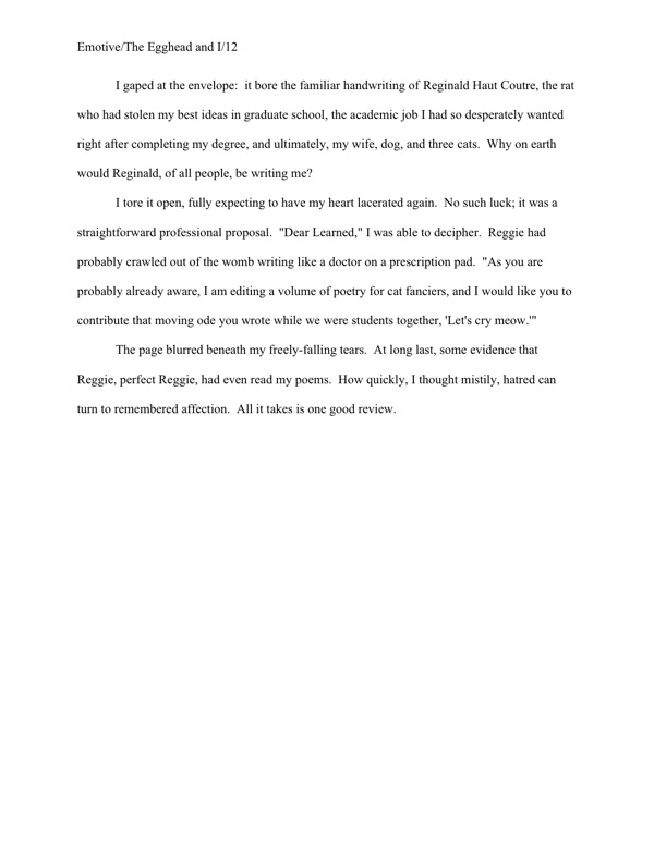
So how might a scholar handle this problem? A university press — or college professor reading a thesis, for that matter — would expect any quotation longer than 3 lines of text to be offset, devoid of quotation marks, and single-spaced, provided that the quote in question is not longer than a page; quotes less than three full lines long are simply placed within quotation marks. Offsetting, for the benefit of those intrepid readers who did not automatically skip the rest of this paragraph immediately after the words university press, is achieved by skipping a line, then indenting the quoted material five spaces (or half an inch, using Word’s standard tabs) on both the left and right margins. After the quote comes another blank line, then the text resumes normally.

In practice, then, a page featuring quotations in an academic manuscript might look a little something like this:

academic example

Why do scholars mark quotes from other works so VERY well? That way, there can be absolutely no question about when a professor is borrowing material from somebody else’s published or unpublished work. (There tends to be a lot of unpublished work floating around the average university at any given time, after all.)

In a book proposal or nonfiction manuscript that isn’t a memoir, it’s perfectly permissible to present long quotes tend to be in this manner — although in non-academic nonfiction, the quote would be double-spaced. It’s clear, it’s direct, and most important of all, Millicents who work for NF-representing agents will get it. (Although most ultimately published memoirs begin life as book proposals, at least in the U.S., memoir manuscripts follow the formatting conventions of novels. Hey, I don’t make the rules; I just tell you about ‘em.)

“That’s all very well and good,” enough of you to get together and raise a barn are probably muttering, “but this doesn’t really address Dave’s question, does it? You’ve told us that a letter in a novel or memoir manuscript should not be treated like a quote one academic lifted from another and stuffed wholesale into her dissertation, but you don’t tell us how it should be handled. And how about showing us a practical example of that double-spaced offset quote you mentioned above?”

Don’t worry: a concrete NF example follows below. (Hey, I wasn’t kidding about the length of this post!) On the other front, patience, my friends, patience — because, again, it depends.

If the letter in question is short (or the excerpt being reproduced in the narrative is), there’s no need to treat it as anything but a regular old quote, like any other in the novel:

novel-letter-example1

Perfectly obvious what’s going on here, isn’t it? It doesn’t require special formatting for the reader to understand that this is an excerpt from a letter.

For short letters — say, under a page — some writers prefer to use italics (probably because, as Dave pointed out, they’ve seen them used that way in published books), but frankly, I wouldn’t recommend it in a novel or a memoir manuscript; it implies an ignorance of the fact that the editor, not the author, is always the one who makes decisions about how text will appear in a published version.

You don’t want to induce barking on the subject, do you?

However, since some of you are undoubtedly not going to listen to me on this one, here is how to use italics properly in this context:

novel-letter-example2

I sense some of you shaking your heads. “But Anne,” epistle-lovers everywhere cry in protest, “that doesn’t LOOK like a letter. I like a letter to look like a letter on the page; that’s part of its charm. So how do I convey that without seeming as though I’m usurping editorial authority?”

I had a feeling I would be hearing from you folks: there’s no shortage of writers who feel very strongly that every single syllable of every note passed between characters must be reproduced faithfully and its entirety in the text, as if the average reader had never seen a letter before and thus could not even begin to imagine what one might look like.

Frankly, it’s seldom actually necessary to a plot to include the parts of a letter that would be hard to squeeze within the strictures of standard format: the letterhead, if any; the date; the salutation; the signature. Within the context of a novel (or memoir), some or all of these are often self-evident — honestly, if the heroine is addressing her long-lost lover by, say, his given name and signs with her own, what additional insight could even the most imaginative reader derive from reproducing those salutations and signatures for each and every letter they right? Or even just one?

Even if she habitually opened with, “Dear Snotnose,” and signed off with, “Your affectionate bedbug,” that would only be character-revealing the first time she did it, right?

But you head-shakers are not convinced by that, are you? And I’m not going to be able to blandish you into believing that the 15-page letter starting on pg. 82 might work better simply broken off into its own chapter entitled The Letter, am I? (A fabulous solution with very long letters, by the way.)

Okay, here are the two acceptable ways of formatting a letter like a letter in a manuscript — which, not entirely coincidentally, will also work beautifully for letters that go on for pages and pages. First, unsurprisingly, it may be presented like dialogue, within quotes:

novel-letter-example-long

As with any other multi-paragraph quote, quotation marks do not appear at the end of a paragraph if the opening of the next paragraph is still part of the letter. They do, however, show up at the beginning of each paragraph within the letter, to alert the reader that this is not normal text.

The other option — and this will work with long quotes in nonfiction as well — is to offset the letter text, as one would with a long quote in an academic work. In a non-academic manuscript, however, the offset quote should be double-spaced, like the rest of the text:

novel-letter-example-long2

See? I told you that I’d give you a practical example.

Although this format does work well for long quotes, I’m not a huge fan for letters in fiction or memoir, I must admit. To my eye, it’s not as distinctive as the first option, and there’s always the off chance that a rapidly-skimming reader (like, say, Millicent) might not realize that the salutation is the opening of an offset section.

Don’t laugh; it happens, and not for reasons that necessarily reflect negatively upon the average Millicent’s intelligence. She’s got hundreds of pages to get through in any given day, and skimming eyes can miss details. Don’t fall into the extremely common aspiring writer’s trap of believing that every reader will read — and more importantly, absorb — every single syllable on every page of your entire manuscript.

Sometimes, being obvious is a really, really good idea, especially in a situation where a part of the text is deliberately in a different voice than the rest of the narrative, as is almost always the case with a letter. Bear in mind that the goal here is not to reproduce the letter exactly as it appeared in the story, or as you would like to see it in the published book — it’s to make it absolutely clear when the text is an excerpt from a letter and when it is not.

Like academic publishers, Millicents don’t like to leave such things open for interpretation; it tends to make her bark-prone. Don’t make her guess where a letter — or any other long quote — begins or ends.

That last format would also work for a diary entry — and that’s fortuitous, as it happens, because intrepid commenter Icy was asking about how to format a diary entry just the other day. Again, though, if all the reader needs to know could be summed up in a few short sentences, why not quote the diary entry within the regular text, just as you would an excerpt from a letter?

“But Anne!” diary-lovers exclaim. “I like to see entire diary entries in novels or memoirs! Even if some of the material in the entry is off-topic or even a trifle dull, that just adds to the sense of realism!”

Okay, okay — I know an idée fixe when I hear one; I’m not even going to try to talk you out of that one. (Except to remind you: Millicent’s threshold of boredom is quite a bit lower than the average reader’s. So’s Mehitabel’s; edit accordingly.) Let’s take a gander at all four types of diary entry format on the manuscript page.

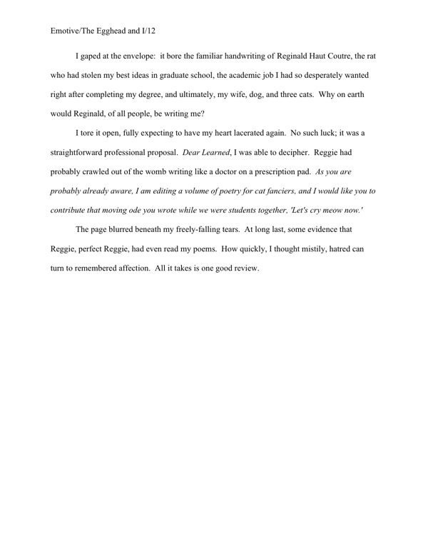
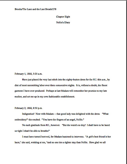
Yes, I did indeed say four — because, again, it depends on the type of manuscript in which the diary entry appears. In a scholarly work, it would look like this:

academic diary entry

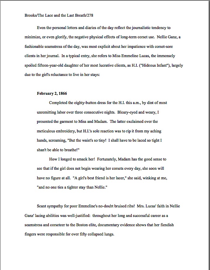
That’s not a tremendous surprise, right? In a nonfiction book on the subject not aimed at the academic market, however, Nellie’s diary would look like this on the page:

NF diary entry 1

No chance of Millicent’s not spotting the difference between the academic version and the standard format version, is there? To her eye, only the latter is formatted for professional consideration.

If the nonfiction writer preferred not to introduce the date of the entry in the paragraph preceding the diary entry, she could use a NF convention we discussed last week, the subheading. For many writers, there’s a distinct advantage to presenting a diary entry this way: a subheading, the entry would more closely resemble the way a reader might find it in a published book:

NF diary entry b

As you may see, this format takes up more room on the page — not always an inconsiderable matter, to a writer who is trying to edit for length. As with a letter, the more of the formal elements the writer chooses to include, the more space it will take. (Which often begs the question: is verisimilitude it worth taking up an extra few lines of text in a manuscript that’s already a bit on the long side? If so, a less literal rendering of frequent letters and diary entries can be a quick, easy way to reclaim a page or two of lines over the course of an entire manuscript.)

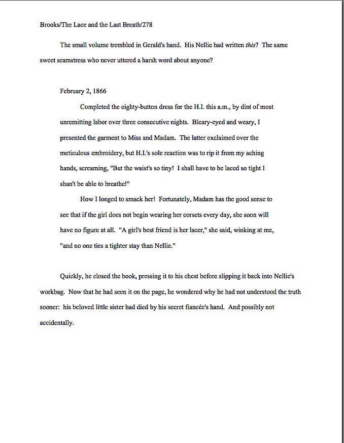
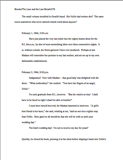
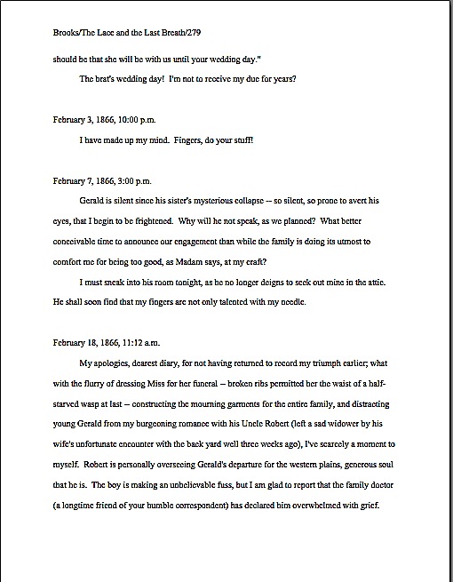
For fiction or memoir, a similar format should be used for diary entries longer than a few lines but less than a couple of pages long — unless several diary entries appear back-to-back. (But of that, more below.) A novelist or memoirist faces a structural problem: it can be considerably harder in fiction to work the entry’s date into the preceding text (although many a fine writer has managed it with such sterling phrases as The minute volume trembled in Gerald’s hand. On May 24, 1910, his mother had written:), so the subheading is a popular choice for indicating the date.

As with other subheadings in fiction, the date should not be in boldface. Let’s take a peek at what the resultant short diary entry would look like on the page.

diary fiction 1

Still clear what is and is not diary entry, isn’t it? By offsetting the text, even a swiftly-skimming Millicent would find it easy to figure out where Nellie’s words end and Gerald’s thoughts begin.

But how, you may well be wondering, would a writer present several short diary entries in a row? If the diary did not go on for more than a couple of pages, all that would be necessary would be to insert a section break between each.

In other words, by skipping a line between ‘em. Like so:

diary fiction 2

If a series of diary entries goes on for pages at a time, however, offsetting them makes less sense; the point of offsetting is, after all, to make a clear distinction between the offset text and the regular text. After the third or fourth page of offsetting in a row, a skimming Millicent (or, more disastrous, an agent flipping forward in the manuscript) might leap to the incorrect conclusion that the margins just aren’t consistent in this manuscript.

May I suggest an elegant alternative, one that would side-step the possibility of this type of misinterpretation entirely? Consider devoting an entire chapter to them, titling that chapter something descriptive and unprovocative like Nellie’s Diary, and formatting all of the entries as regular text with subheadings.

Curious about what that might look like? You’re in luck; here are the first two pages of Chapter Eight:
diary chapter 1

diary chapter 2

Lovely and clear, isn’t it? It’s also, in case those of you who are trying to shorten your manuscripts happen to be interested, the most space-efficient means of presenting these diary entries on the page. What a difference a half an inch of margin on either side makes, eh?

Oh, dear: I can’t justify saying anything more on the subject, and there are still twenty minutes of the flight to go. Maybe if I surreptitiously slip my paperback out of my computer bag, I can have it in front of my face before the misunderstood husband next to me notices I’ve turned off my computer.

Oh, the places I go. Keep up the good work!
The mysteriously mysterious strictures of standard format, part IX: and then there are the rules that are sort of bendy sometimes

ice dancers

I’m posting a trifle later than usual tonight, campers, resulting in more of a Tuesday morning post than my planned Monday evening billet-doux to standard format for manuscripts. I blame the Olympics; does the coverage ever stop? Just when I manage to tear my weary eyes away from ice dancing, three hours of curling magically appear after midnight. It’s as if somebody in the programming department said, “You know what I’d really like to do this year? Schedule seven-hour blocks of competition in events where the athletes wear jewelry on ice.”

Oh, you may laugh, but have you taken a gander at the wrists, earlobes, and/or necks of the women curlers over the last few days? My eyes may be bleary from overuse, but I could have sworn that the U.K.’s wunderkind was sporting a charm bracelet today. On her throwing hand.

Enough frivolity. Back to business.

A few days ago, I introduced something that Millicent the agency screener just loves to see, a properly-formatted first page of a manuscript. It looked, if you will recall, a little something like this:

good example

This is also, in case you had been wondering, what the opening of each subsequent chapter should look like as well: on a fresh page, 14 single lines from the top. Or, to put it another way, 6 double-spaced lines under the chapter title. (For those of you who do not know how to insert a hard page break into a Word document, it’s located under the INSERT menu. Select BREAK, then PAGE BREAK.)

Not certain what that might look like in practice? Okay, here’s an example I have ready to hand: the first page of the sixth chapter of my memoir might conceivably look like this:

Memoir wo title

I said might, because actually, I’m not a big fan of chapters named Chapter Six, even if they happen to be the sixth chapter in the manuscript. It’s sort of like dubbing a suburban street lined with elm trees Elm Street: there’s nothing inherently wrong with a straightforward descriptive title, of course, but you must admit, it’s not precisely going to come as a shock to many readers when Chapter Six appears immediately after Chapter Five.

All of which is a rather heavy-handed lead-in (inevitable, perhaps, after having spent so many hours watching curling) to a question I’m sure many title-namers out there have been harboring: how should a titled chapter be formatted? Specifically, if a chapter has a title, should it also be numbered?

In a word, yes. The chapter title appears, centered, on the first double-spaced line under the chapter number, also centered.

As, indeed, we’ve already seen in today’s first example. But in furtherance of my ongoing mission to place so many examples of correctly-formatted manuscript pages in front of your weary eyes that you’ll start automatically recoiling from pages in published books, muttering, “Well, that wouldn’t work in a manuscript submission, let’s take a gander at another one:

memoir w ch title

Actually, I had an ulterior motive in showing you that last example: in comparing it to the example just before it, do you notice anything about the amount of space between the chapter number and the beginning of the text?

If you immediately shot your hand into the air, exclaiming, “By gum, Anne, the area between the two appears identical! You’ve simply placed the chapter title within it, you clever lady,” award yourself 1700 Brownie points. (Or a bronze medal — there seem to be an awful lot of them lying around these days.) Regardless of whether a chapter’s opening page contains a chapter designation, a title, or both, the text begins the same distance from the top of the page.

The same logic would apply, of course, to any other section-breaking information you might care to include at the beginning of a chapter — alerting the reader to a break between Part I and Part II of a book, for instance. While we’re at it, let’s take a look at that in practice: if Chapter 6 were the beginning of Part II of the book (it isn’t, but we aim to please here at Author! Author!), I would have formatted it thus:

memoir w part break

Starting to get the hang of this?

Not yet completely comfortable? Okay, let’s try inserting another common piece of introductory information: identifying a narrator-du-chapter in a multiple point-of-view novel.

If the switch comes at the beginning of a chapter, it couldn’t be easier: it’s simply another reader-signal that belongs above the pre-text white space, right? To see this principle in action, let’s pretend our ongoing example is fiction (which it isn’t; my middle school honestly was pelted with migratory spiders) and place the narrator’s name in the traditional spot:

new chapter with name

That’s the way one would handle the matter in a manuscript like, say, Barbara Kingsolver’s THE POISONWOOD BIBLE, where the narrator changes with the chapter. If there were also a chapter title (perhaps not advisable in this case, as there’s already significant information at the top of that page for the reader to absorb), it would go between the chapter heading and the narrator identifier.

I would show you an example of that, but it’s late; there’s curling on, and I’m positive that you can extrapolate.

You’re thinking that there must be an easier way to format the first page of a chapter than to memorize the way it should look and reproduce it from scratch each time, aren’t you? You’re not alone, if so; most seasoned authors probably wouldn’t appreciate my revealing a working secret, but pretty much everyone worries that someday her will forget to hit return one of the necessary times, so that Chapter 5 will begin — gasp! — ten lines from the top, while Chapter 1-4 and 6 on will begin twelve lines down.

I know: gives you the willies even to contemplate how Millicent might react to that level of formatting inconsistency, doesn’t it? Double-check each and every chapter opening before you submit; trust me, you’ll be happier in the long run.

Ooh — that was an unpopular suggestion, wasn’t it? Fully a third of you have your hands waving impatiently in the air. “That’s an absurdly time-consuming suggestion, Anne,” the irate third huff. “Oh, I understand that the chapter number or title needs to appear at the top of the first page and each subsequent chapter; I’m perfectly happy to leave five double-spaced blank lines between it and the first line of text, so the first paragraph starts six lines down. But surely there’s an easier way to do this — a template or something? Perhaps Word has some sort of default setting I can employ so I need never worry about the issue again as long as I live?”

Standard format templates do exist, now that you mention it, but frankly, Word is already equipped with two perfectly dandy features for reproducing formatting exactly in more than one place in a document: COPY and PASTE.

The easiest way to make sure from the outset each chapter opening is identical is to create your own template. It’s very simple to do: just copy from “Chapter One” down through the first line of text, then paste it on the first page of chapter 2, 3, etc. Once the format is in place, it’s a snap to fill in the information appropriate to the new chapter.

Easy as the proverbial pie, right?

Oh, dear — now another group of you have raised your hands. Yes? “But Anne,” exclaim those of you who favor switching narrator — or place, or time — more often than once per chapter, “we are, as we believe the tag line identifying us as speakers just mentioned, advocates of those nifty mid-chapter signposts that we see all the time in published books, boldfaced notifications that the time, place, or speaker has just changed. How would I format that in a manuscript?”

You’re basically talking about incorporating subheadings into a novel, right? Or at least what would be a subheading in a nonfiction manuscript: a section break followed by a new title.

I’m fully prepared to answer this question, of course, if only to show all of you nonfiction writers out there what your subheadings should look like. Before I do, however, I’d like to ask fiction writers interested in adopting this strategy a quick question: are you absolutely positive that you want to do that?

That’s not an entirely flippant question, you know. There are plenty of Millicents out there who have been trained by old-fashioned agents — and even more editorial assistants who work for old-fashioned editors. And that’s important to know, because even in an age when mid-chapter subheadings aren’t all that uncommon in published books, there are still plenty of professional readers whose knee-jerk response to seeing ‘em is invariably, “What is this, a magazine article? In my day, fiction writers used language to indicate a change in time or place, rather than simply slapping down a subheading announcing it; if they wanted to indicate a change of point of view, they would either start a new chapter, find a graceful way to introduce the shift into the text, or have the narrative voice change so markedly that the shift would be immistakable! O tempore! O mores!

I just mention.

To pros of this ilk, the practice of titling a section, or even a chapter, with clear indicators of time, place, or speaker will always seem to be indicative of a show, don’t tell problem. And you have to admit, they sort of have a point: novelists have been indicating changes of time and space by statements such as The next day, back at the ranch… ever since the first writer put pen to paper, right?

As a result, fiction readers expect to see such orienting details emerge within the course of the narrative, rather than on top of it. Most of the time, this information isn’t all that hard to work into a narrative — and if a novelist is looking to please a tradition-hugging agent or editor, that’s probably a better strategy to embrace, at least at the submission stage. As with any other authorial preference for how a published book should look, you can always try to negotiate an editorial change of heart after a publisher acquires your novel.

At least if you don’t happen to write in a book category that routinely uses such subheadings. If recent releases in your book category are crammed with the things, don’t worry your pretty little head about editorial reaction to ‘em. An editor — or agent, Millicent, or contest judge — who routinely handles books in that category may be trusted to realize that you’re simply embracing the norms of your genre.

Millicents tend to approve of that. It shows that the submitter has taken the time to become conversant with what’s being published these days in the category within which he has chosen to write.

Which is to say: these days, plenty of very good fiction writers prefer to alert the reader to vital shifts with titles and subheadings. And nonfiction writers have been using them for decades; in fact, they’re more or less required in a book proposal. (Of those, more follows later in this series, I promise.) I just didn’t want any of you to be shocked if the agent of your dreams sniffs in the early days after signing you, “Mind taking out these subheadings? Seven of the editors to whom I’m planning to submit this hate them, and I’d rather be spared yet another lecture on the pernicious influence of newspapers and magazine formatting upon modern literature, okay?”

All that being said — and now that I’ve completely unnerved those of you who are considering submitting manuscripts with subheadings — you do need to know how to do it properly.

It’s quite straightforward, actually: a subheading is just a section break followed by a left-justified title. The text follows on the next double-spaced line.

Want to see that in action? Okay. Just to annoy traditionalists who draw a sharp distinction between fiction and nonfiction writing, let’s take a peek at a nonfiction page by a well-respected novelist:

Wharton subheading example

That caused some weary eyes to pop wide open, didn’t it? “But Anne!” the sharper-eyed exclaim, “that subheading is in BOLDFACE! Didn’t the rules of standard format specifically tell me never, under any circumstances, to boldface anything in my manuscript?”

Well caught, sharp-eyed ones: boldfacing the subheading does indeed violate that particular stricture of standard format. However, since nonfiction manuscripts and proposals have been routinely boldfacing subheadings (and only subheadings) for over a decade now — those crotchety old-fashioned editors are partially right about the creeping influence of article practices into the book world, you know — I thought that you should know about it.

It’s definitely not required, though; Millicent is unlikely to scowl at a nonfiction submission that doesn’t bold its subheadings. Like font choice, you make your decision, you take your chances.

In a fiction submission, though, I definitely wouldn’t advise it; those traditionalists I was talking about lurk in much, much higher concentrations on the fiction side of the industry, after all. Here’s the same page, formatted as fiction — and since we’re already talking about exceptions to the rules, let’s make this example a trifle more instructive by including a date and time in the subheading:

Wharton example2

Unsure why I used numerals in the subheading, rather than writing out all of the numbers under a hundred, as standard format usually requires? Full dates, as well as specific times, are rendered in numeric form in manuscripts. Thus, 12:45 a.m. on November 3, 1842 is correct; twelve forty-five a.m. on November three, eighteen hundred and forty-two is not. (It would, however, be perfectly permissible to include quarter to one in the afternoon on November third.)

Everybody clear on that? Now would be a dandy time to raise your hand, if not. Or perhaps engage in some ice dancing; I like watching that.

I have quite a bit more to say on the subject of first pages of chapters, but I’ve just noticed the clock: I seem to have written straight through the curling match! If only I had reason to believe a similar match would be televised in the wee hours of tomorrow night…oh, wait; one is.

Who could have predicted that, eh? Keep up the good work!

The mysteriously mysterious strictures of standard format, part IV: drawing some lines in the sand

seagull in the sand

I’m so sorry, everyone — my website experienced a wee meltdown late Thursday night. Some hidden toggle evidently got switched, and ever since, apparently, it has been impossible to post a comment on my last post. Rather unfriendly, wasn’t it, since I’d specifically asked all of you to comment with questions?

Rest assured, any reluctance to hear from you rested firmly on the technology side, not the human one. So please, feel free to comment away.

This would be an especially good time to bring up any long-smoldering concerns about formatting, actually, since I’m going to be devoting next week’s posts to showing you how standard format for manuscripts looks on the printed page. Some of my best examples were derived from readers’ questions; this time around, in fact, in response to a recent reader’s request, I’m going to be adding an entire post on how to format a book proposal.

So if there’s a principle we’ve discussed within the last few days that you’d like to see in action, please, don’t be shy.

Today, I’m going to be wrapping up my theoretical discussion of standard format. In the interest of having all of the rules listed in a single post, let’s recap what we’ve already covered.

(1) All manuscripts should be printed or typed in black ink and double-spaced, with one-inch margins around all edges of the page, on 20-lb or better white paper.

(2) All manuscripts should be printed on ONE side of the page and unbound in any way.

(3) The text should be left-justified, NOT block-justified. By definition, manuscripts should NOT resemble published books in this respect.

(4) The preferred typefaces are 12-point Times, Times New Roman, Courier, or Courier New — unless you’re writing screenplays, in which case you may only use Courier. For book manuscripts, pick one (and ONLY one) and use it consistently throughout your entire submission packet.

(5) The ENTIRE manuscript should be in the same font and size. Industry standard is 12-point.

(6) Do NOT use boldface anywhere in the manuscript BUT on the title page — and not even there, necessarily.

(7) EVERY page in the manuscript should be numbered EXCEPT the title page.

(8) Each page of the manuscript (other than the title page) should have a standard slug line in the header. The page number should appear in the slug line, not anywhere else on the page.

(9) The first page of each chapter should begin a third of the way down the page, with the chapter title appearing on the FIRST line of the page, NOT on the line immediately above where the text begins.

(10) Contact information for the author belongs on the title page, NOT on page 1.

(11) Every submission should include a title page, even partial manuscripts.

(12) The beginning of EVERY paragraph of text should be indented .5 inch. No exceptions, ever.

(13) Don’t skip an extra line between paragraphs, except to indicate a section break.

(14) NOTHING in a manuscript should be underlined. Titles of songs and publications, as well as words in foreign languages and those you wish to emphasize, should be italicized.

All of those make sense, I hope, at least provisionally? Excellent. Moving on…

(15) All numbers under 100 should be written out in full: twenty-five, not 25. But numbers over 100 should be written as numbers: 1,243, not one thousand, two hundred and forty-three.

I’m surprised how often otherwise industry-savvy aspiring writers are unaware of this particular rule, but the instinct to correct it in a submission is universal in professional readers. Translation: NOT doing it will not help you win friends and influence people at agencies and publishing houses.

Like pointing out foreign-language words with special formatting, this formatting rule was originally for the benefit of the manual typesetters. When numbers are entered as numbers, a single slip of a finger can result in an error, whereas when numbers are written out, the error has to be in the inputer’s mind.

There are only two exceptions to this rule: dates and, of course, page numbers. Thus, a properly-formatted manuscript dealing with events on November 11 would look like this on the page:

ABBOTT/THE GREAT VOYAGE/82

On November 11, 1492, fifty-three scholars divided into eighteen parties in preparation for sailing to Antarctica. It took 157 rowboats ten trips apiece to load all of their books, papers, and personal effects onboard.

And not like this:

ABBOTT/THE GREAT VOYAGE/Eighty-two

On November eleventh, fourteen hundred and ninety-two, fifty-three scholars divided into eighteen parties in preparation for sailing to Antarctica. It took a hundred and fifty-seven rowboats ten trips apiece to load all of their books, papers, and personal effects onboard.

Do I see some hands waving in the air? “But Anne,” inveterate readers of newspapers protest, “I’m accustomed to seeing numbers like 11, 53, 18, and 10 written as numerals in print. Does that mean that when I read, say, a magazine article with numbers under 100 depicted this way, that some industrious editor manually changed all of those numbers after the manuscript was submitted?”

No, it doesn’t — although I must say, the mental picture of that poor, unfortunate soul assigned to spot and make such a nit-picky change is an intriguing one. What you have here is yet another difference between book manuscript format and, well, every other kind of formatting out there: in journalism, they write out only numbers under 10.

Unfortunately, many a writing teacher out there believes that the over-10 rule should be applied to all forms of writing, anywhere, anytime. Yes, this is true for newspaper articles, where space is at a premium, but in a book manuscript, it is WRONG, WRONG, WRONG.

Did I mention it was wrong? And that my aged eyes have actually seen contest entries knocked out of finalist consideration over this particular issue? More than once? And within the year?

AP style differs from standard format in several important respects, not the least being that in standard format (as in other formal presentations in the English language), the first letter of the first word after a colon should NOT be capitalized, since technically, it’s not the beginning of a new sentence. I don’t know who introduced the convention of post-colon capitalization, but believe me, I’m not the only one who read the submissions of aspiring book writers for a living that’s mentally consigned that language subversive to a pit of hell that would make even Dante avert his eyes in horror.

That’s the way we nit-pickers roll. We like our formatting and grammatical boundaries firm.

Heck, amongst professional readers, my feelings on the subject are downright mild. I’ve been in more than one contest judging conference where tables were actually banged and modern societies deplored. Trust me, you don’t want your entry to be the one that engenders this reaction.

So let’s all chant it together, shall we? The formatting and grammatical choices you see in newspapers will not necessarily work in manuscripts or literary contest entries.

Everyone clear on that? Good, because — are you sitting down, lovers of newspapers? — embracing journalistic conventions like the post-colon capital and writing out only numbers under ten will just look like mistakes to Millicent and her ilk on the submission page.

And no, there is no court of appeal for such decisions; proper format, like beauty, is very much in the eye of the beholder. So if you were planning to cry out, “But that’s the way USA TODAY does it!” save your breath.

Unfortunately, although my aforementioned heart aches for those of you who intended to protest, “But how on earth is an aspiring writer to KNOW that the standards are different?” this is a cry that is going to fall on deaf ears as well. Which annoys me, frankly. The sad fact is, submitters rejected for purely technical reasons are almost never aware of it. With few exceptions, the rejecters will not even take the time to scrawl, “Take a formatting class!” or “Next time, spell-check!” on the returned manuscript. If a writer is truly talented, they figure, she’ll mend her ways and try again.

And that, in case any of you had been wondering, is why I revisit the topic of standard format so darned often. How can the talented mend their ways if they don’t know how — or even if — their ways are broken?

(16) Dashes should be doubled — rather than using an emdash — with a space at either end. Hyphens are single and are not given extra spaces at either end, as in self-congratulatory.

Yes, yes, I know: you’ve probably heard that this rule is obsolete, too, gone the way of underlining. The usual argument for its demise: books no longer preserve these spaces, for reasons of printing economy, so many writing teachers tell their students just to go ahead and eliminate them. An AP-trained teacher will tell you to use the longer emdash, as will the Chicago Manual of Style.

In this, however, they are wrong, at least as far as manuscripts are concerned. (You’re starting to get used to that, right?)

Standard format is invariable upon this point: a doubled dash with a space on either end is correct; anything else is not. And yes, it is indeed a common enough pet peeve that the pros will complain to one another about how often submitters get it wrong.

They also whine about how often they see manuscripts where this rule is applied inconsistently: two-thirds of the dashes doubled, perhaps, sometimes with a space at either end and sometimes not, with the odd emdash and single dash dotting the text as well. It may seem like a minor, easily-fixable phenomenon from the writer’s side of the submission envelope, but believe me, inconsistency drives people trained to spot minor errors nuts.

Your word-processing program probably changes a double dash to an emdash automatically, but CHANGE IT BACK. If only as a time-saver: any agent would make you do this before agreeing to submit your manuscript to an editor, so you might as well get into this salutary habit as soon as possible.

(17) Adhere to the standard rules of punctuation and grammar, not what it being done on the moment in newspapers, magazines, books, or on the Internet — including the rule calling for TWO spaces after every period and colon.

In other words, do as Strunk & White say, not what others do. Assume that Millicent graduated with honors from the best undergraduate English department in the country, taught by the grumpiest, meanest, least tolerant stickler for grammar that ever snarled at a student unfortunate enough to have made a typo, and you’ll be fine.

Imagining half the adults around me in my formative years who on the slightest hint of grammatical impropriety even in spoken English will work, too.

The primary deviation I’ve been seeing in recent years is leaving only one space, rather than the standard two, after a period. Yes, printed books often do this, to save paper (the fewer the spaces on a page, the more words can be crammed onto it, right?). A number of writing-advice websites, I notice, and even some writing teachers have been telling people that this is the wave of the future — and that adhering to the two-space norm makes a manuscript look obsolete.

At the risk of sounding like the harsh grammar-mongers of my youth, poppycock. Although some agents and editors do now request eliminating the second space at the submission stage, the doubled space is still the norm. Agents, very good ones, routinely submit manuscripts with doubled spaces to editors, also very good ones, all the time. Successfully.

So when in doubt, adhere to the rules of English. Unless, of course, you happen to be submitting to one of those people who specifically asks for single spaces, in which case, you’d be silly not to bow to their expressed preferences. (Sensing a pattern here?)

Fortunately, for aspiring writers everywhere, those agents who do harbor a strong preference for the single space tend not to keep mum about it. If they actually do tell their Millicents to regard a second space as a sign of creeping obsolescence, chances are very, very good that they’ll mention that fact on their websites.

Double-check before you submit. If the agent of your dreams has not specified, double-space.

Why should that be the default option, since proponents of eliminating the second space tend to be so very vocal? Those who cling to the older tradition are, if anything, more vehement.

Why, you ask? Editing experience, usually. Preserving that extra space after each sentence in a manuscript makes for greater ease of reading, and thus editing. As anyone who has ever edited a long piece of writing can tell you, the white space on the page is where the comments — grammatical changes, pointing out flow problems, asking, “Does the brother really need to die here?” — go.

Less white space, less room to comment. It really is that simple.

Oh, and it drives the grammar-hounds nuts to hear that time-honored standards are being jettisoned in the name of progress. “What sane human being,” they ask through gritted teeth, “seriously believes that replacing tonight with tonite, or all right with alright constitutes progress? Dropping the necessary letters and spaces doesn’t even save significant page space!”

Those are some pretty vitriol-stained lines in the sand, aren’t they?

Let’s just say that until everyone in the industry makes the transition editing in soft copy — which is, as I have pointed out many times in this forum, both harder and less efficient than scanning a printed page — the two-space rule is highly unlikely to change universally. Just ask a new agent immediately after the first time he’s submitted to an old-school senior editor: if he lets his clients deviate from the norms, he’s likely to be lectured for fifteen minutes on the rules of the English language.

I sense that some of you are starting to wring your hands and rend your garments in frustration. “I just can’t win here! Most want it one way, a few another. I’m so confused about what’s required that I keep switching back and forth between two spaces and one while I’m typing.”

I hate to be the one to break it to you, but inconsistent formatting is likely to annoy both sides of the aisle. Whichever choice you embrace, be consistent about it throughout your manuscript; don’t kid yourself that an experienced professional reader isn’t going to notice if you sometimes use one format, sometimes the other.

He will. So will a veteran contest judge. Pick a convention and stick with it.

But don’t fret over it too much. This honestly isn’t as burning a debate amongst agents and editors as many aspiring writers seem to think. Both ways have advocates, and frankly, there are plenty of agents out there who report that they just don’t care.

As always: check before you submit. If the agent’s website, contest listing, and/or Twitter page doesn’t mention individual preferences, assume s/he’s going to be submitting to old-school editors and retain the second space.

And be open to the possibility — brace yourselves; you’re not going to like this — that you may need to submit your manuscript formatted one way for a single agent on your list, and another for the other nineteen.

I told you that you weren’t going to like it.

(18) Turn off the widow/orphan control; it gives pages into an uneven number of lines.

That one’s pretty self-explanatory, isn’t it? Think of it as my Valentine’s Day present to you.

What, too practical? You would have preferred something made out of lace or chocolate?

There you have it: the rules. Practice them until they are imbedded into your very bones, my friends: literally every page of text you submit to an agent, editor, or literary contest (yes, including the query letter and synopsis) for the rest of your professional life should be in standard format.

Okay, so maybe that’s not the most romantic view of the future imaginable, but we’re all about practicality here at Author! Author! That, and drawing some much-needed lines in the sand.

Happy Valentine’s and Presidents’ Days, everybody. Keep up the good work!