Pursuing complexity in a “Get to the point, will ya?” world, or, what on earth (or off it) am I going to do with my subtitle?

We have ample cause for public rejoicing at Author! Author! today, gentlefolk: for the first time in several nerve-wracking weeks, most of my site’s images appear to be visible to the naked eye of a casual bystander. And that’s good news, I suspect, both for your humble correspondent, the toiling soul generating most of the aforementioned imagery, and those of you kind enough to take more than a casual interest in my mid-blog examples.

To celebrate (and, if I’m being honest about it, to double-check that page-shot images are once again loading correctly), I shall be using this post to dunk a cautious toe back into the warm waters of explanatory illustration. While I’m at it, I’m going to seize the opportunity to answer a question a reader posted during our picture-free hiatus, a question that has been popping up in various forms and guises in the comments since I started the blog.

The purport of those questions, if you’ll permit me to paraphrase: “Gee, Anne, it’s terrific that you’ve recently walked us through the rules of standard format for book manuscripts — not to be confused, naturally, with the proper format for short stories, magazine articles, or the like, as not all writing should be formatted identically. I especially appreciated your having at long last given in to tumultuous popular demand and offered us a one-post visual tour of the constituent parts of a well-formatted manuscript. However, as a devotee of writing in increments, whether it be in complex titling (Puppy Love in Giant Squid: Why Land-lubbers Should Care) or in movie-style series titles (Jason and the Argonauts, Part II: The Harpy-repelling Years), I found myself glancing at your title page and slug line examples and wondering, ‘Hey, what does all of this mean for my beloved colons?’”

Okay, okay, so that’s not the most graceful of paraphrases, but you try summing up 7 1/2 years of writers’ angst in a single paragraph. You get why colon-lovers and subtitle-huggers have been stressing out about this, though, right? Authors tend to become pretty darned attached to their titles — a pity, really, as it’s so very common for publishers’ marketing departments to remark cheerfully to first-time authors, “We love everything about your book, so we’re going to change the title, okay?”

Until an aspiring writer finds herself in that jaw-dropping position (said the lady who murmured in response, “Okay, go ahead and change the title, but would you mind telling me what A Family Darkly means? It’s not a use of an adverb that’s common in English as it is actually spoken.”), however, she can cling to the blissful faith that the author, and the author alone, gets to dictate what verbiage goes on her own book’s cover. The first places that she typically gets to share that usually quite strong preference with the publishing world are the query (even if queriers leave out other necessary elements — and they frequently do — they virtually never forget to include the book’s title), the synopsis, and the manuscript itself.

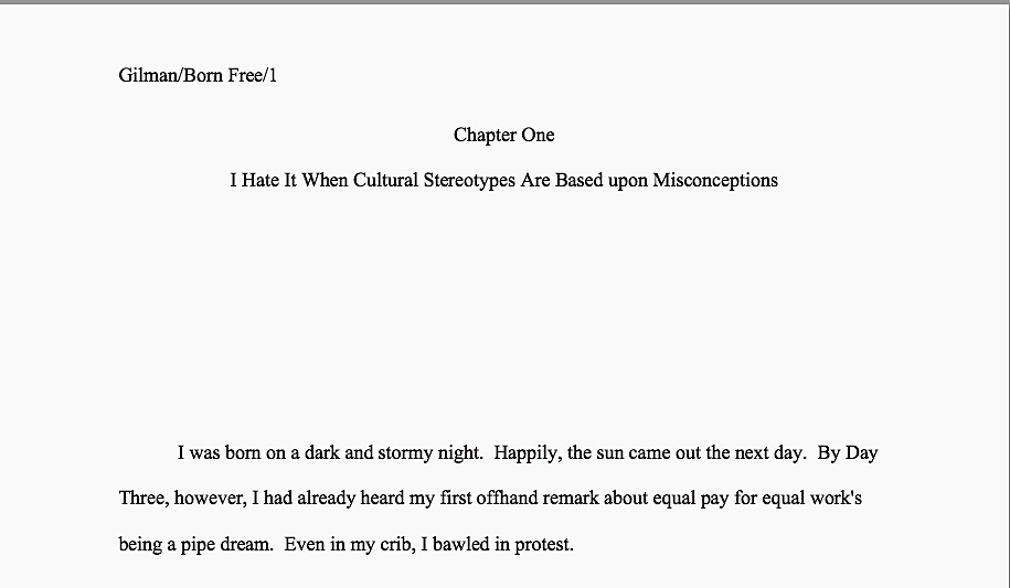
Specifically, on the manuscript’s title page. Let’s take a peek — at the general shapes of a properly-formatted manuscript, that is. My apologies in advance for variation in distinction across the examples that follow. For some reason that remains as unclear as the lettering here, the site’s begrudging acceptance of imagery does not seem to be extending either to photographs (how I originally attempted to show you these pages) or sharp images in saved jpegs. I’m going to press on, nevertheless, and I hope you will join me.

And in the slug line at the top of every page of text:

Wow, page 1 was pretty light, wasn’t it? Let’s try our luck with page 2.

Even at those odd dark/light levels, that format looks familiar, I hope. With a book with a short title like this and no subtitle, the formatting is perfectly straightforward.

How, though, would the writer of Born Free: Why I Burned My Bra (Although We All Know That Movement Started Because Folks in the Media Mixed Up a War Protest in which Draft Cards Were Burned with a Beauty Contest Protest at which Bras Were Thrown into Trash Cans, Right?) arrange her rather cumbersome title?

In the query, the answer is simple: reproduce the title in its entirety. The only possibly counterintuitive formatting in that context would be to remember that in a query, as in a manuscript, it’s proper to skip two spaces after a colon, not one. But since that’s how civilized people treat colons in every context except newspapers, magazines, and some published books — decisions in every case determined by the editors of those publications, not the authors — that shouldn’t present too much of a problem, should it?

In the synopsis, too, there’s no real problem: the title and subtitle should both appear at the top of the first page. Easy as the proverbial pie.

For the manuscript itself, however, the issue is more complex — or is it? After all, one does not include subtitles in the slug line. So why would one do it here?

Actually, one does not include particularly long titles in the slug line, either; there isn’t room. If a title runs longer than about 40 characters, it’s fine to use a truncated version. In this, our subtitle-embracing writer can simply use the main title:

I hear long title enthusiasts everywhere gasp, but remember, the point of including the title in the slug line is to identify a stray page if it wanders from the manuscript, not to reproduce the entire title as the author would prefer it to appear on the book cover. It merely needs to be recognizably referring to the title.

On the title page, naturally, there’s no reason not to display the subtitle in all of its glory. It’s traditional, however, to allow the main title to occupy its own line, then begin the subtitle on the next double-spaced line. With a subtitle this long, it’s considered unstylish to let it run the entire breadth of the page. Bringing in the left and right margins by an inch and a half each will make it clear that this is all intended as subtitle, rather than misformatted text.

With a shorter subtitle, of course, this would not be necessary.

Everybody clear on that — or, at any rate, as clear as the fuzzy pages will permit? Now would be an excellent time to speak up, if not.

Ah, I see some hands waving out there in the ether. Yes? “But Anne, my book doesn’t have a subtitle per se — it’s the first/third/107th volume in a series that has its own title. So how would I format a title page and slug line for Shooting Arrows in All Directions, the first book in my Running Amok series? I would presume that I would do it as it is formatted in the following examples that I’m mentally beaming to you, but is that correct?”

That’s a good question, series writers. Let’s show your fellow writers what you were imagining, and see how they think Millicent the agency screener will respond.

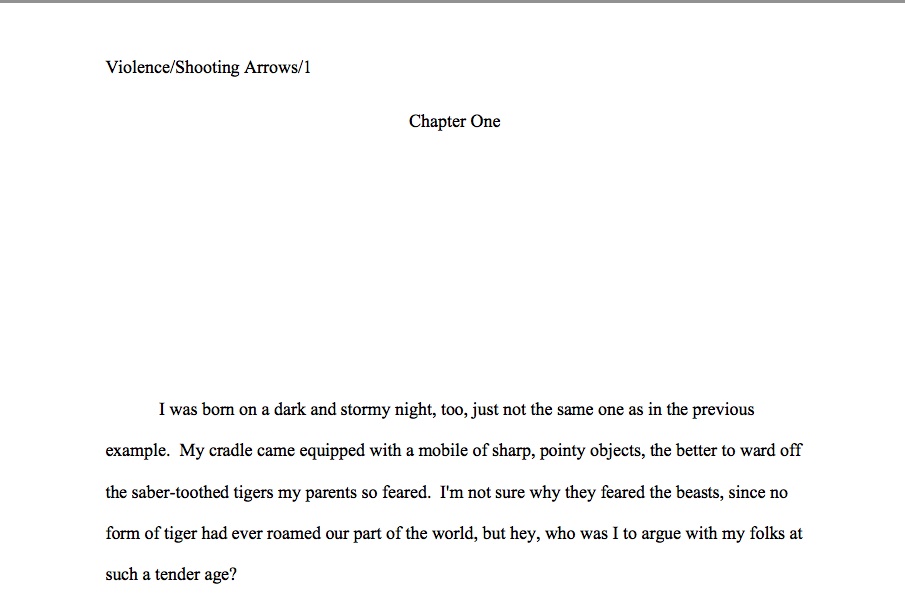
Is this page 1 correctly formatted or not? To help make that question easier to answer, let’s take a nice, close look.

If you leapt to your dainty feet, shouting, “By Jove, Anne, that’s not right! How can it be, when it violates the slug line length restriction we were discussing mere moments ago,” congratulations. Even if it were completely legitimate to embrace the recent movie title practice of slapping the title of the series at the front of the individual book’s title — hint, hint — it would never be acceptable to include a subtitle in a slug line.

You can see why our friend Sens opted to do it that way, though, right? As he pictured the book covers in his series, he naturally envisioned the series title emblazoned above the titles of each individual volume; in his mind, both were legitimately part of the title. And if that’s the case, just showing the main title — in this case, the series title — in the slug line would mean that every book in the series would sport an identical slug line.

Not all that helpful if the Millicent carrying the manuscript of Shooting Arrows in All Directions happens to collide with the intern toting Volume 3 of the same series, is it? It’s not hard to picture the aftermath: “You got Shooting Arrows in my Hatchet Wielding for Fun and Profit!” “Yeah, well, you got Hatchet Wielding for Fun and Profit in my Shooting Arrows!” “Darn, there’s no way to figure out from which manuscript page 37 floated!”

Not a pretty scene, is it? And it definitely would defeat the purpose of the slug line.

So what should Sens have done instead? Treat the title of the book the slug line is marking as — wait for it — the title of the book. Actually, since the first book’s title is rather lengthy, let’s go with a shortened version.

Still perfectly easy to identify on a dark and stormy night, is it not? By contrast, let’s take a peek at how Sens was planning to format his title page.

At initial submission time, it doesn’t matter to Millicent that this book is the first in a series — her boss, the agent of Sens’ dreams, is going to have to fall in love with Volume I on its own merits. So why weigh down the slug line with unnecessary information?

And immediately, other series writers leap to Sens’ defense. “Unnecessary!” they huff. “I see this done with movie titles all the time!”

Precisely — but that doesn’t mean that the publishing industry has embraced the convention. Technically, series titles are not part of the title. Unless, of course, the series in question happens to follow the most common pattern of series naming, using the title of the first book in the series as the basis for the series’ title.

That’s an issue upon which that I’m sure Sens’ future publisher’s marketing department will hold strong opinions. For the nonce, however, all that concerns us is how his title page should appear in his manuscript submissions, right? Here you go.

I can sense some hackles rising out there, can I not? “But Anne,” some of you moan, and who could blame you? “What about individual expression, for goodness sake! These title pages all look the same!”

Exactly. Professionally-formatted book manuscripts differ in the writing, not in their formatting. Not to knock anybody’s right to individual expression, but as a writer, wouldn’t you rather be judged on the text you submit, rather than how you chose to slap it on a page?

Let me guess: quite a few of you had been thinking of it the other way around, hadn’t you? Completely understandable: when first facing the daunting prospect of learning to apply the rules of standard format, most aspiring writers regard its rigors as restricting what they can do. It takes time and experience to recognize that for good writing, anything that distracts Millicent, the agent for whom she toils, or the acquiring editor the agent will be trying to interest in the book from the words on the page and how prettily the narrative flows is both superfluous and poor submission strategy.

Let your writing speak for itself, friends. Series or not, subtitle-bearing or no, that’s how a talented writer should want to be judged.

Speaking of your fine writing, do drop me a note in the comments if the images did not come through properly this time around. I’m a glass-half-full sort of person, so I shall keep visualizing clear visuals while we celebrate having any visuals at all. Keep up the good work!

Continuing our discussion of standard format for book manuscripts: not all truths are self-evident

gumballs

Hard to believe anyone in his right mind would actually need to be told that those are gumballs, isn’t it? They strike me as the epitome of the breed: large, spherical, colorful, and — dare I say it? — potentially jaw-breaking. Yet clearly, at some point in the probably not-too-distant past, some passing myopic presumably asked the proprietor, “What are those, gumballs?”

Or maybe it was not a solitary forgetter of much-needed spectacles, or even a half-dozen passers-by with a shared clawing, pathological need to have even their most mundane personal observations confirmed by external sources. Perhaps the poor proprietor simply got tired of answering the same question 4,217 times per week and slapped up a sign.

Those of us who work with manuscripts for a living can sympathize. Merely breathing an editor (or my preferred title, a book doctor), preceded by the pronoun I and the verb to be in quick succession, anywhere in the vicinity of someone harboring even the slightest urge to pen the Great American Novel is to invite an avalanche of questions about manuscripts: how to get them published, how to position them under the eyes of an agent, how to keep them from getting rejected, and, surprisingly often, what they should look like.

Perfectly reasonable questions all, of course: no writer, regardless of how many times the Muses may have whacked her with their talent wands, is born knowing all about the practical aspects of manuscript production. As Plato suggests in his Theaetetus (oh, you thought I was just a pretty face?), in order to recognize something for what it truly is, one first must have a mental image of that thing with which to match it.

To put it a trifle less esoterically: it’s much, much harder to make your pages look right if you’ve never seen a professionally-formatted book manuscript. Call me zany, but in my experience, the best remedy for that is to show aspiring writers — wait for it — a few dozen examples of professionally-formatted book manuscript pages, rather than making them guess.

In close-up, even, as in the first post in this series. I like to think of this endeavor as both pleasing to ol’ Plato and a serious contribution to, if not the future of literature, at least to human happiness. Too many good writers have gotten rejected over the years for not being aware of the rules, or even that rules exist.

Look, kid, here’s a gumball. Study it well, so you may recognize it in the wild.

I know: how nice would it have been had some kind soul discreetly pulled you aside 35 seconds after you first decided to write a book and explained that to you, right? If you’re like most writers, it would have saved you a tremendous amount of time and chagrin to have known before you sat down to compose page 1 that since (a) all professional book manuscripts in the U.S. look more or less alike and (b) any writer who has worked with an agent or publisher would presumably be aware of that, (c) those of us who read for a living can often tell just how long an aspiring writer has been at it by the briefest glance at the page. Thus, contrary to what virtually every aspiring writer completely reasonably presumes at first, (d) one of the best things you can do to get your writing taken seriously by the pros is to format it according to their expectations.

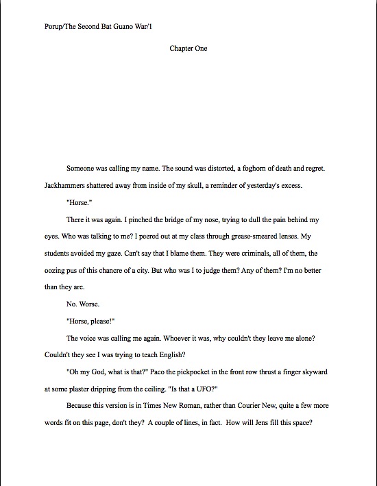
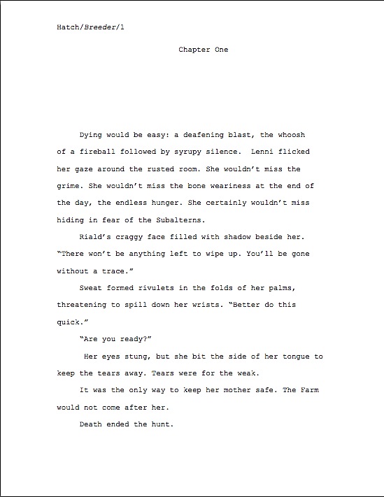
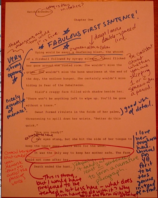
Let me guess, though: you did not tumble squalling into this world knowing any of that, did you? The weird thing is that neither were agents, editors, contest judges, or screeners. Once you’ve had the benefit of seeing a few hundred thousand correctly-formatted manuscript pages, however, you don’t even have to look very hard to notice the difference between a page 1 like this:

And one that looked like this:
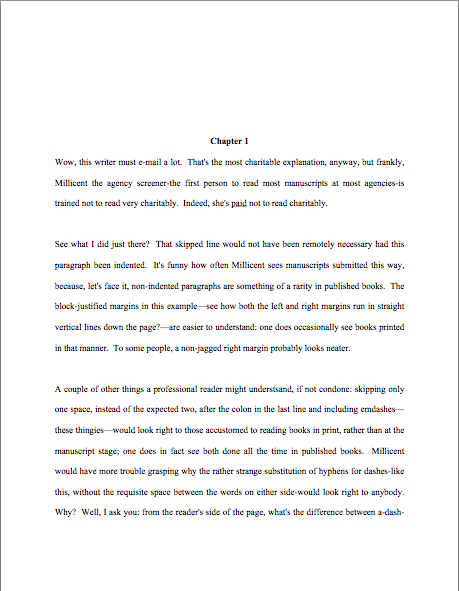
You can see the difference from halfway across the room, can you not? So, as it happens, can Millicent the agency screener, her boss, the agent of your dreams, and the editor who will someday, the Muses willing, acquire your book. That’s the inevitable result of experience. Year in, year out, come rain, shine, or hailing wildcats, we cast our eyes over book manuscripts done right and, well, the other kind.

And that, in case any of you perplexed by how much of the information about manuscript formatting floating around out there seems to come from somewhere in the ether, rather than directly from, say, an agency or a publishing house, is why professional readers don’t spend much time doing what I’m sure a lot of aspiring writers positively long for us do, policing the Internet for rogue advice on manuscript formatting. Why would someone who already familiar with the rigors and beauties of standard format bother to look it up online, much less fact-check?

We already know a properly-formatted page when we see it — and when we don’t. “What do you mean — are those gumballs?” we mutter, incredulous. “Isn’t it self-evident?”

So strongly do some of us have the Platonic standard manuscript page in mind that it might not even occur to us that, say, there exist writers in the English-speaking world not aware of what a slug line is. It astounds us to hear that indented paragraphs are not the automatic choice of every literate person. It makes sense to us that, as much as anyone might want to conserve paper, submitting a manuscript printed on both the front and back sides and/or — sacre bleu! — spiral- or perfect-bound would generally result in its being rejected unread.

Because we are so steeped in the standard format tradition, even the smallest deviation from it draws our attention like the lone zebra in a crowd of centaurs. How could it not affect our perception of a writer’s eye for detail to discover that s/he apparently thought her page 2 would look better like this:

Than like this:
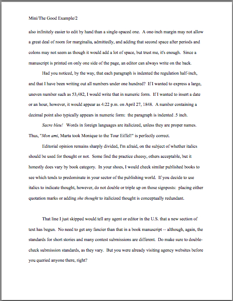
Less obvious that time, wasn’t it? Still, I suspect you were unlikely to confuse the bona fide gumball with the stick of spearmint. Unless, of course, you’d heard someplace that the last thing Millicent ever want to see in gum is a spherical shape.

Oh, don’t bother to deny it — most aspiring writers glean at least a bit of misinformation while constructing their first book-length manuscripts. How do I know? Those of us who spend any time at all around aspiring writers find ourselves constantly in the position of being asked to confirm what to us has become through long experience self-evident. Even more often, we’re called upon to defend the shape of the Platonic gumball to those who have heard somewhere that even so much as a curled-up edge will result in instant and contemptuous rejection.

“What do you mean, paragraphs have to be indented?” writers who have entertained alternate theories often snap at us, flabbergasted. “I’ve heard that’s considered old-fashioned now. And are you mad, recommending doubled dashes?”

Since either of those formatting innovations would be news to folks who read manuscripts for a living, it can be a bit trying to be told otherwise, sometimes at ear-splitting volumes, early and often. Even as a great proponent of explanations as yours truly tends to find it wearying the 87th time in any given month that a total stranger burning for publication accosts me like the Ancient Mariner, wanting to spend two hours arguing about the latest rumor flying around the web about how standard format has abruptly altered in some fundamental-yet-mysteriously-secret manner rightly understood by only whatever generous soul chose to promulgate the change.

No one knows who this public benefactor is, of course; aspiring writers seeking confirmation of such rumors name their sources so seldom that by the turn of the century, I had begun to think of them collectively as He Who Must Not Be Named. (Take that, Voldemort!) In recent years, however, I have rechristened this shadowy figure by the name his proponents must often cite: But I heard…

But I Heard is an insidious opponent, believe you me, as only a faceless entity can be — he seems to be everywhere. His power, as nearly as I can tell, stems almost entirely from his amorphousness. Because it’s impossible to find out where he’s getting his ostensibly inside information, no amount of proof can refute his arguments to his adherents’ satisfaction; because he so seldom explains himself, logic has been known to bounce right off him and hit innocent bystanders. And that’s kind of annoying to those of us who juggle manuscripts on a daily basis, because But I Heard seems to be retailing some pretty wacky notions these days.

That puzzles the pros: standard format for manuscripts actually hasn’t changed all that much since Saul Bellow was a callow youth, much less since he shuffled off this mortal coil. Once typed manuscripts became the norm, standard format pulled up a chair and stayed for a while. And contrary to astoundingly popular opinion, it has shifted in its seat relatively little since Truman Capote joined the choir invisible.

But that’s not what you’ve heard, is it? The rise of the personal computer has made less of a difference than But I Heard would have you believe. Oh, underlining is out and italics are in to designate words in foreign languages (in the post-Capote universe, one should never underline anything in a book manuscript; I’ll be getting to that), and how one actually figures out how much to indent a paragraph has altered a bit with the adoption of Microsoft Word as the industry standard for electronic submission (unlike a typewriter, Word measures its tabs in fractions of an inch, not character spaces). Overall, though, the professionally-formatted book manuscript of today quite closely resembles the professionally-formatted book manuscript of, say, 1958.

Which is to say: not very much like the short stories of that very good year for short stories. The gumball’s shape has not altered much over that period, either.

The relative lack of change, But I Heard tells me, is far from self-evident. He would prefer to believe that all writing should be formatted identically, regardless of type. In that, alas, he is misinformed: short story format is different from standard format for books and book proposals, and has been for quite some time. So are essay format, academic format, journalistic format, and even how a published book will look on a page.

That very notion makes But I Heard squirm. But that’s not going to stop me from saying what I know from experience to be true: book manuscripts presented in standard format look professional to people who handle book manuscripts for a living. If those are the people a writer is trying to please, does it really matter what anybody else thinks writing should look like on the page?

Does that mean every professional reader, everywhere, every time, will want to see your work formatted as we have been discussing? No, of course not: should you happen to be submitting to an agent, editor, or contest that specifically asks you to do something other than I advise here, obviously, you should give him, her, or it what he or his stated guidelines request.

That’s just common sense, right? Not to mention basic courtesy. Yet judging by the plethora of ambient speculation on the subject, it’s not self-evident.

Yet if an agent or agency has been considerate enough of its future clients to post submission guidelines, it just makes sense to acknowledge their efforts. I would actively encourage every writer currently milling about the earth’s crust not only to check every agency’s website, every time, to make sure that any individual agent to whom you were planning to submit does not harbor alternate preferences — some do — but also to Google him, to double-check that he hasn’t stated in some public forum that, for instance, he is so deeply devoted to paper conservation that he actively prefers only a single space after a period or a colon. Or that due to a childhood trauma involving a newspaper (she doesn’t like to talk about it), she positively twitches at the sight of Times New Roman instead of Courier. Or that a particular agency’s staff believes that a doubled dash is the secret symbol of the kind of murderous cult that used to populate 1970s horror movies.

Really, though, if the agent of your dreams says he wants to see your submission formatted a particular way, can you think of any particular reason you wouldn’t want to honor that preference?

“I can think of one!” But I Heard shouts. “It would be considerably less work to format my manuscript once and submit it that way to every agent currently drawing breath, rather than taking the time to hunt down a specific agent’s expressed preferences, saving a separate copy of one’s manuscript, applying those preferences to it (and only it), and sending a personalized version to that agent. Why, think of how time-consuming to go through those same steps for every agent, every time!”

It might be, if alternate preferences were either widespread (they’re not, particularly) or often posted on agency websites (see previous parenthesis). At the risk of repeating myself, standard format is called that for a reason.

But I Heard certainly has a point, though. He also has, as you may have noticed over the years, an exceedingly simple means of promoting that point and ones just like it: by leaping to the conclusion that because one has a strong preference for a non-standard format element, every agent or agency must necessarily have tossed all previous norms to the winds in order to embrace that preference. And, for reasons best known to themselves, they’ve elected not to notify any working author you might care to mention about this monumental collective decision, preferring instead to disseminate the information via the much more reliable and trustworthy game of Telephone.

You remember that game, right? The first kid whispers a secret to the person next to her; #2 repeats what he heard to #3, and so on around the circle. By the time the news has passed through a dozen pairs of lips, the original content has become so transfigured in transit that it’s hardly recognizable.

I hate to spoil But I Heard’s good time — there’s little he likes better than inflating something someone said someone else overhead an agent said say at a conference once upon a time into the new trend sweeping the nation — but personal preferences do in fact exist. And contrary to what you might have heard, agents and agencies that favor specific deviations from standard format tend not to be all that shy about mentioning them.

In case I’m being too subtle here: check their websites. Or their listings in one of the major guides to literary agents.

Do I spot some timid hands raised out there in the ether? “But Anne,” point out some confused by conflicting advice — and who could blame them, given how busy But I Heard has been in recent years? “I’ve been checking websites, and the overwhelming majority of agency websites I’ve found don’t talk about manuscript format at all. Does that mean that they don’t care about how I present my writing?”

Of course, they care, but standard format is just that: standard. If what they want is a gumball, why should they take the time to explain that they don’t desire a bar of chocolate?

Yes, But I Heard? You would like to add something? “I get it,” he moans, rattling the Jacob Marley chains appropriate to his disembodied state. “All my long-time nemesis, Millicent the agency screener, cares about in a submission is how it looks, not how it is written. How literature has tumbled from its pedestal! No one cares about good writing anymore!”

Did you see what that dastardly wraith just did to my non-threatening piece of sugar-laden analysis? But I Heard is a past master at ripping statements out of context, blowing them out of proportion, and whisking them off to parts unknown to their original utterers. But you’re too savvy, I’m sure, to join him in the wild surmise that Millicent’s paying attention to how a manuscript looks means, or even implies, that how a submission is written doesn’t make a difference. Of course, writing talent, style, and originality count. Yet in order to be able to appreciate any of those properly, a reader has to approach the page with a willingness to be wowed.

That willingness can wilt rapidly in the face of incorrect formatting — which isn’t, in response to what But I Heard just shouted in your ears, necessarily the result of mere market-mindedness on Millie’s part. After you’ve read a few thousand manuscripts, deviations from standard format leap out at you. As will spelling and grammatical errors, phrase repetition, clich?s, telling rather than showing, and all of the tried-and-true submission red flags about which But I Heard has been kind enough to keep us informed over the years.

Again, he has a legitimate point: all of these are distractions from your good writing. So, as it happens, are deviations from standard format, to a reader used to seeing writing presented that way. That means, in practice, that presenting your manuscript as Millie expects to see it is the way that she is least likely to find distracting.

What does she see if you present your manuscript as she expects to see it? Your writing.

I hear those of you who have spent years slaving over your craft groaning — believe me, I sympathize. For those of you who have not already started composing your first drafts in standard format (which will save you a lot of time in the long run, incidentally), many of the tiny-but-pervasive changes I am about to suggest that you make to your manuscript are going to be irksome to implement. Reformatting a manuscript is time-consuming and tedious, and I would be the first to admit that at first, some of these rules can seem arbitrary.

At least on their faces. Quite a few of these restrictions remain beloved even in the age of electronic submissions because they render a manuscript a heck of a lot easier to edit — and to read, in either hard or soft copy. As I will demonstrate with abundant examples later in this series, a lot of these rules have survived for completely practical purposes — designed, for instance, to maximize white space in which the editor may scrawl trenchant comments like, “Wait, wasn’t the protagonist’s brother named James in the last chapter? Why is he Aloysius here?”

Ready to take my word for that in the meantime? Excellent; help yourself to a gumball. Let’s recap the rules we covered last time:

(1) All manuscripts should be printed or typed in black ink and double-spaced, with one-inch margins around all edges of the page, on 20-lb or better white paper.

(2) All manuscripts should be printed on ONE side of the page and unbound in any way. For submission to US-based agencies, publishing houses, and contests, the pages in question should be US-standard 8.5″ x 11″ paper.

(3) The text should be left-justified, NOT block-justified. By definition, manuscripts should NOT resemble published books in this respect.

(4) The preferred typefaces are 12-point Times, Times New Roman, Courier, or Courier New — unless you’re writing screenplays, in which case you may only use Courier. For book manuscripts, pick one (and ONLY one) and use it consistently throughout your entire submission packet.

Is everyone happy with those? If not, I await your questions. While I’m waiting, however, I’m going to move on.

(5) The entire manuscript should be in the same font and size — no switching typefaces for any reason. Industry standard is 12-point font.

No exceptions, please. No matter how cool your favored typeface looks, be consistent. Yes, even on the title page, where almost everyone gets a little wacky the first time out.

No pictures or symbols here, either, please. Just the facts. I hate to be the one to break it to you, but there’s a term for title pages with 24-point fonts, fancy typefaces, and illustrations.

It’s high school book report. Need I say more?

(6) Do not use boldface anywhere in the manuscript but on the title page — and not even there, it’s not a particularly good idea.

This seems like an odd one, right, since word processing programs render including boldface so easy? Actually, the no-bolding rule is a throwback to the old typewriter days, where only very fancy machines indeed could darken selected type. Historically, then using bold was considered a bit tacky for the same reason that wearing white shoes before Memorial Day is in certain circles: it’s a subtle display of wealth.

You didn’t think all of those white shoes the Victorians wore cleaned themselves, did you? Shiny white shoes denoted scads of busily-polishing servants.

You may place your title in boldface on the title page, if you like, but that’s it. Nothing else in the manuscript should be in boldface. (Unless it’s a section heading in a nonfiction proposal or manuscript — but don’t worry about that for now; I’ll be showing you how to format both a book proposal and a section break later on in this series, I promise. I shall also be tossing many, many examples of properly-formatted title pages your way, never fear.)

(7) Every page in the manuscript should be numbered, except the title page. The first page of text is page 1, not the title page.

Even if you choose to disregard literally everything else I’ve said here, please remember to number your pages. Millicent’s usual response to the sight of an unnumbered manuscript is to reject it unread.

Yes, really; this omission is considered genuinely rude. Few non-felonious offenses irk the professional reader (including yours truly, if I’m honest about it) more than an unnumbered submission or contest entry. It ranks right up there with assault, arson, and beginning a query letter with, Dear Agent instead of Dear Ms. Smith.

Why? Gravity, my friends, gravity. What goes up tends to come down. If the object in question happens to be an unbound stack of paper, and the writer who sent it did not bother to number those pages…well, picture it for yourself: two manuscript-bearing interns walking toward each other in an agency hallway, each whistling a jaunty tune. Between them, a banana peel, a forgotten skateboard, and a pair of blindfolded participants in a three-legged race clutching a basket stuffed to the brim with ping-pong balls between them.

You may giggle, but anyone who has ever worked with submissions has first-hand experience of what would happen should any two of those elements come into direct contact. After the blizzard of flying papers has subsided, and the interns rehash that old Reese’s Peanut Butter Cup commercial’s dialogue (“You got romance novel in my literary fiction!” “You got literary fiction in my romance novel!”), guess what needs to happen?

Some luckless soul has to put all of those pages back in proper order, that’s what. Just how much more irksome is that task going to be if the pages are not numbered?

Obey Rule #7. Trust me, it is far, far easier for Millicent to toss the entire thing into the reject pile than to spend the hours required to guess which bite-sized piece of storyline belongs before which in an unnumbered manuscript.

Wondering why the first page of the text proper is page 1 of the text, not the title page, and should be numbered as such? Or why, if your opus has an introduction or preface, the first page of that is page 1, not the first page of chapter 1?

Long-time readers, pull out your hymnals and sing along: because gumballs are round, and books manuscripts do not resemble published books.

The title page is not the only one commonly mislabeled as 1, by the way: epigraphs — those quotations from other authors’ books so dear to the hearts of writers everywhere — should not appear on their own page in a manuscript, as they sometimes do in published books. If you feel you must include one (which you might want to reconsider at the submission stage: 99.9999% of the time, Millicent will just skip over it), include it between the chapter title and text on page 1.

If that last paragraph left your head in a whirl, don’t worry — I’ll show you how to format epigraphs properly later in this series. (Yes, including some discussion of that cryptic comment about Millicent’s wandering peepers. All in the fullness of time, my friends.)

(8) Each page of the manuscript (other than the title page) should have a standard slug line in the header. The page number should appear in the slug line, not anywhere else on the page.

Including the slug line means that every page of the manuscript has the author’s name on it — a great idea, should you, say, want an agent or editor to be able to contact you after s/he’s fallen in love with it. Or be able to tell your submission from the other one that ran afoul of the banana peel in our earlier example.

The slug line should appear in the upper left-hand margin (although no one will sue you if you put it in the upper right-hand margin, left is the time-honored location) of every page of the text except the title page (which should have nothing in the header or footer at all).

A trifle confused by all that terminology? I’m not entirely surprised. Most writing handbooks and courses tend to be a trifle vague about this particular requirement, so allow me to define the relevant terms: a well-constructed slug line includes the author’s last name, book title, and page number, to deal with that intern-collision problem I mentioned earlier. (The slug line allows the aforementioned luckless individual to tell the romance novel from the literary fiction.) And the header, for those of you who have not yet surrendered to Microsoft Word’s lexicon, is the 1-inch margin at the top of each page.

Having trouble finding it in our page examples above? Here’s a subtle hint:
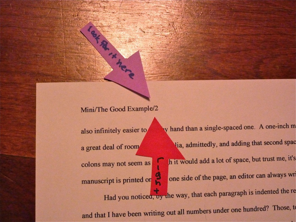
Since the only place a page number should appear on a page of text is in the slug line, if you are in the habit of placing numbers wacky places like the middle of the footer, do be aware that it does not look strictly professional to, well, professionals. Double-check that your word processing program is not automatically adding extraneous page numbers elsewhere on the page.

Do not, I beg of you, yield like so many aspiring writers to the insidious temptation add little stylistic bells and whistles to the slug line, to tart it up. Page numbers should not have dashes on either side of them, be in italics or bold, or be preceded by the word page. Trust me, Millicent will know what that number is, provided that it appears here — and only here:
Sensing just a bit of urgency on this one? Good. Those of us predisposed to regard gumballs as inherently spherical are always surprised to see how many aspiring writers regard page numbering as a tempting forum for self-expression. Remember, professional readers do not regard formatting choices as matters of personal style. The point here is not to make your slug line stand out for its innovative visual impact, but to provide practical guidance in reestablishing sequence should those ping-pong balls start bouncing about underfoot.

If your book has a subtitle, don’t include it in the slug line — and if it boasts a very long title, feel free to abbreviate, to keep the slug line from running all the way across the top of the page. Millicent needs to be able to identify the manuscript at a glance, not to reproduce the entire book jacket.

Why not? Well, technically, a slug line should be 30 spaces or less, but there’s no need to stress about that in the computer age. (A slug, you see, is the old-fashioned printer’s term for a pre-set chunk of, you guessed it, 30 spaces of type. Aren’t you glad you asked?) Let’s assume for the sake of example that I’ve written a novel entitled THE SMILING FROWNER BEMUSED– 26 characters, counting spaces. Since my last name is quite short, I could get away with putting it all in the slug line, to look like this:

Mini/The Smiling Frowner Bemused/1

If, however, my last name were something more complicated, such as Montenegro-Copperfield — 22 characters all by itself, including dash — I might well feel compelled to abbreviate.

Montenegro-Copperfield/Smiling Frowner/1

Incidentally, should anyone out there come up with a bright idea for a category heading on the archive list for this issue other than SLUG LINE — a category that already exists, but is unlikely to be found by anyone not already familiar with the term — I’d be delighted to hear suggestions. I’ve called it a slug line ever since I first clapped eyes on a professional manuscript (an event that took place so long ago my response to the sight was not, “What’s that at the top of the page, Daddy?” but “Goo!”), so I’m probably not going to be coming up with a good alternative anytime soon. Thanks.

(9) The first page of each chapter should begin a third of the way down the page. The chapter title should appear on the first line of the page, not on the line immediately above where the text begins.

That’s fourteen single-spaced lines down, incidentally. The chapter title (or merely “Chapter One”) should be centered, and it should neither be in boldface nor underlined. To revisit today’s first example:

“But Anne,” But I Heard protests, “why shouldn’t the title appear immediately above the text? I’ve often seen that suggested — and illustrated online. What gives?”

Would any of you care to field that one? Perhaps someone who took the time to read the text of today’s positive and negative examples? Feel free to chant the answer with me, sharp-eyed perusers: “Because that’s where the title of a short story lives, not a book’s.”

Self-evident once you’ve heard it, isn’t it?

Because confusing the two formats is so common, very frequently, agents, editors and contest judges are presented with improperly-formatted first pages that have the title of the book, by Author’s Name, and/or the writer’s contact information floating in the space above the text. To professional eyes, a manuscript that includes any of this information on the first page of the manuscript (other than in the slug line, of course) seems like it just ended up in the wrong office. Clearly, the writer wanted not the agency to which she sent it, but the magazine down the street.

So where does all of that necessary contact information go, you ask? Read on.

(10) Contact information for the author belongs on the title page, not on page 1.

This is one of the most obvious visual differences between a short story submission (say, to a literary journal) and a book-length manuscript. To submit a manuscript — or contest entry, for that matter — with this information on page 1 is roughly the equivalent of taking a great big red marker and scrawling, “I don’t know much about the business of publishing,” across it.

Just don’t do it. Millicent likes her gumballs.

“But wait,” I hear some of you out there murmuring, “My gumball — I mean, my manuscript — needs a title page? Since when?”

What a timely question.

(11) Every submission should include a title page, even partial manuscripts.

This one seems to come as a surprise to a lot of aspiring writers. You should include a title page with ANY submission of ANY length, including contest entries and the chapters you send after the agent has fallen in love with your first 50 pages.

And again, But I Heard expresses disgruntlement. “More work!” he cries. “If you’d only let us shoehorn our contact information onto page 1 (as I notice you have artfully resisted showing as a counterexample, lest some reader mistake it for acceptable book format), this would not be at all necessary!”

At the risk of sounding callous, so what? You want to make it as easy as humanly possible for the agent of your dreams to let you know that she wants to represent this book, don’t you? And it’s not as though she would ever dream of sending anything you wrote to an editor at a publishing house without a title page.

Yes, really. Literally every manuscript that any agent in North America submits to any editor in hard copy will include one, for the exceedingly simple reason that it’s the page that includes the agent’s contact information.

Yet, astonishingly, a good 95% of writers submitting to agencies seem to be unaware that including it is standard. I blame But I Heard: to him, the cover letter, address on the SASE, or the e-mail to which the requested materials were attached are identification enough. But in practice, it’s none of those things will necessarily still be attached to your pages at the point when your ideal agent says, “By jingo, I’m thoroughly wowed. This is a writer I must sign, and pronto!”

Oh, you thought that your SASE won’t go flying when those interns collide in the hallway? Or that e-mails never get deleted accidentally? Once those ping-pong balls get rolling, they end up everywhere; the damage they do is incalculable.

On the plus side, the broad reach of But I Heard’s pernicious influence — coupled, I suspect, with the fact that including a title page just never occurs to a lot of first-time submitters — means that if you are industry-savvy enough to include a professionally-formatted title page, your submission automatically looks like a top percentile ranker to professional eyes from the moment it’s pulled out of the envelope. It’s never too early to make a good first impression, right?

If you do not know how to format a proper title page — and yes, Virginia, there is a special format for it, too — please see the aptly-named HOW TO FORMAT TITLE PAGE category on the archive list at right. Or wait a few days until I cover it later in this series.

It’s entirely up to you. No pressure here. Have a gumball while you wait.

Before anyone who currently has a submission languishing at an agency begins to panic: you’re almost certainly not going to get rejected solely for forgetting to include a title page. It’s too common a gaffe to be an automatic deal-breaker for most Millicents. Ditto with improperly-formatted ones. And yes, one does occasionally run into an agent at a conference or one blogging online who says she doesn’t care one way or the other about whether a submission has a title page resting on top at all.

Bully for them for being so open-minded, but as I have pointed out to relative strangers roughly 147,329 times in the past year, how can you be sure that the person deciding whether to pass your submission upstairs or reject it isn’t a stickler for professionalism?

I sense some shoulders sagging at the very notion of all the work it’s going to be to alter your pages before you send them out. Please believe me when I tell you that, as tedious as it is to change these things in your manuscript now, by the time you’re on your third or fourth book, it will be second nature to you. Why, I’ll bet that the next time you sit down to begin a new writing project, you will automatically format it correctly.

Think of all of the time that will save you down the line. Goody, goody gumdrops.

More guidelines follow in the next couple of posts — yes, those of you whose hearts just sank audibly, standard format does indeed have that many rules — and then we shall move on swiftly to concrete examples of what all of this formatting looks like in practice. I want you to have enough information on the subject to be able to understand why following them might be a good idea.

Rather than, say, walking away with the vague feeling that you heard about these rules somewhere. Keep up the good work!

Formatpalooza, part XXIII: taking the guesswork out of the equation — or are we?

Once again, I had to laugh, campers: just as we were winding up this series on standard format for manuscripts — that’s book manuscripts and book proposals, mind you; if you are writing short stories, magazine articles, or for an academic journal, please seek out their specific requirements elsewhere — news sources all over North America suddenly began shouting that astronomers had determined that the astrological zodiac was off by about thirty degrees. That meant that instead of twelve signs, there were now thirteen, and most people were forcibly dragged into the sign before the one they had been used to reading in the newspaper.

I assume you heard all of the noise about it. The only problem: it wasn’t true.

Now, this outcome probably was not all that surprising to those whose first response to the breaking story was, “Gee, isn’t astronomers declaring that the basic principles of astrology have changed rather like orthodontists deciding that everything we have previously known about lipstick application is misguided?” but unfortunately, in the rumor-based news market, under-researched reporting is not particularly rare. Even more unfortunately, the time-honored and honorable newspaper practice of printing retractions is not especially common in television media — and virtually unheard-of in Internet declarations.

As those of you who have ever tried to look up information about submission format online are undoubtedly already aware, the result is a lingering mish-mash of the true, the partially true, and the blatantly false, mostly declared in identical tones of certainty, and all equally prone to generating a, “But I heard…” response. The underlying assumption is, and not entirely unreasonably, that each individual is now responsible for doing the necessary background research that reporters used routinely to provide.

Hands up, everybody whose last ten Google searches involved any research whatsoever beyond typing in a keyword or two, hitting RETURN, and scrolling through the top ten or twenty hits. Realistically, although most surfers know that not everything posted online is true, busy lives dictate that they act as though it were.

Case in point: the dizzying array of formatting, submission, and even grammatical advice floating around out there. I have nothing but sympathy for any poor aspiring writer whose first — or only — attempt to understand how new writing gets published in this fine country is gleaned from typing how to get published, literary agents, or even manuscript format into a search engine. Although I am fully aware that’s how some of you might have stumbled upon Author! Author!, the fact that I’m barraged on a daily basis by pleas from confused writers, begging me to reconcile what they read somewhere with what I’m suggesting, leads me to believe that while the Internet has in some ways made obtaining credible guidance for professional submission easier, in many respects, it’s harder than it was ten years ago.

And that is indeed unfortunate, because, let’s face it, it’s also significantly harder for a new writer to land an agent than ten years ago. Not only is the competition greater, but the economic downturn and resulting contraction of the publishing industry has meant that at most agencies, more aspiring writers are competing for far fewer client slots.

In a banner year, an agent might take on three or four new clients. In a lean year — or in what is expected to be a lean year — it might be even fewer.

Let’s pause a moment, to allow the implications of that last statement to sink in fully. Although the overwhelming majority of submitters to agencies simply assume that the average agent will simply pick up any good writing that arrives on her doorstep, that’s always been a logistical impossibility; there are far, far too many good writers out there. Even the more sophisticated submitters, the ones who have done their homework sufficiently to understand that there is no such thing as a generalist agent, often operate on the assumption that the only factors playing into whether the agent of their dreams decides to offer to represent them or not are the quality of the writing in the manuscripts and their respective fit into their authors’ chosen book categories.

In practice, that’s always been far from true. Ostensibly, it’s the agent’s job to be able to tell the difference between good writing in general, good writing in a selected book category, and good writing in a selected book category that could potentially interest an editor in the current book market. Any well-respected agent will receive literally thousands of queries and submission per year that fall into the first two groups — and hundreds that fall into the last.

And if that doesn’t strike you as potentially problematic for even the best new writers in your chosen book category, I can only suggest that you go back and re-read the last three paragraphs. You might have missed something.

As we discussed throughout the autumn of ‘Paloozas — don’t worry; we’ll be moving away from submission matters and back to craft next week — an agent has to consider many, many factors in deciding which dish out of the rich buffet of offerings to embrace as his next project. Quite a few of those factors are entirely outside the writer’s control: publishing trends, social movements, what’s being whispered around editorial water coolers these days, what any particular agent has just heard pitched recently at a literary conference. If your book category doesn’t happen to be hot right now, it is necessarily going to be harder to interest an agent in selling your book than if your category is rumored to be the next big thing.

Some factors, however, lie completely within the writer’s hands. Whether the manuscript is presented in standard format, for instance, and whether the formatting is consistent. The typeface and size the writer chooses. The percentage of backstory included on page 1. Whether the story opens with conflict or with ordinary interaction. Whether all the phrasing on page 1 is original, or whether it is peppered with catchphrases.

And so forth. Despite the consistent writers’ conference complaint, we writers honestly do make most of the decisions about our own manuscripts. That comes at a cost: agents, editors, and contest judges therefore have a right to assess our work not only on the writing, but also upon how well we adhere to the rules of standard format, grammar, punctuation, and the like.

Was that giant sucking sound that just rocked the universe the sharp collective intake of breath by aspiring writers everywhere who hadn’t realized before that any or all of those matters could be rejection triggers all by themselves? Or was it merely the audible dismay of those of you who did not proofread your last e-mailed submission IN ITS ENTIRETY, IN HARD COPY, and OUT LOUD before sending it off?

I mention e-mailed queries and submissions advisedly, because their steep rise in popularity has presented its own problem. Whereas in years passed, agents, editors, and contest judges were only able to judge submission only upon what appeared on the printed page, now, they can see not only the presentation polish of a submission, but also how the writer got it to look that way.

It is only reasonable, then, to expect Millicent the agency screener — who, after all, is employed specifically to reject the overwhelming majority of both queries and submissions before they get anywhere near the agent’s desk or computer screen — to take these matters seriously. While it has always been true that publishing types have associated incorrect grammar, punctuation, and even deviations from standard format with poor writing (an unfair correlation, perhaps, but a practically universal one), now that spell- and grammar-checkers are built into word processing programs and people like me yammer endlessly about proper manuscript format online, the tolerance for these gaffes has gone down, not up.

Anyone see the problem with that happening while we’re all constantly being exposed to the effects of the Internet’s unique combination of widespread disregard of the rules of grammar and punctuation, most e-mail and blogging programs’ outright hostility to proper indentation (oh, you thought I LIKED writing this in business format?), and the tendency of online advice-givers to contradict one another? Anyone?

Where these forces collide most harmfully for the aspiring writer is in the e-mailed or online submission. While a decade ago, an aspiring author who didn’t know to put the slug line in the header, but typed it at the top of each page of text, might have gotten past Millicent, in today’s online submission environment, his manuscript would be rejected by the top of page 2. Similarly, a writer could have gotten away with indenting each paragraph by hitting the space bar a certain number of times, as one would on a typewriter, whereas now, it’s immediately apparent to anyone looking at a soft copy submission that such a writer simply doesn’t know how to set tabs in Word.

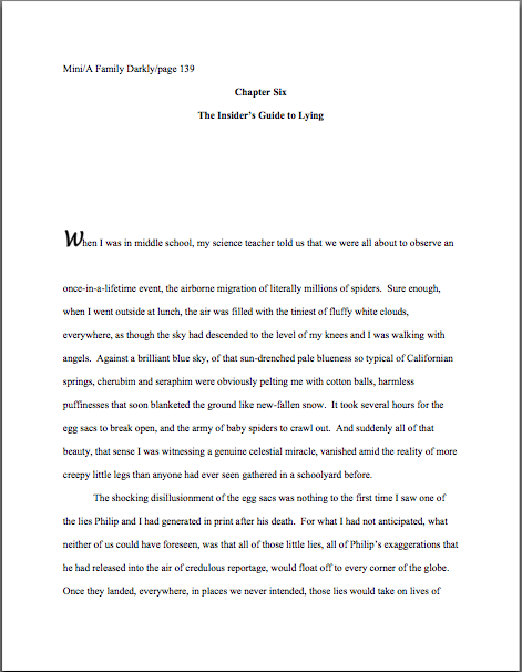
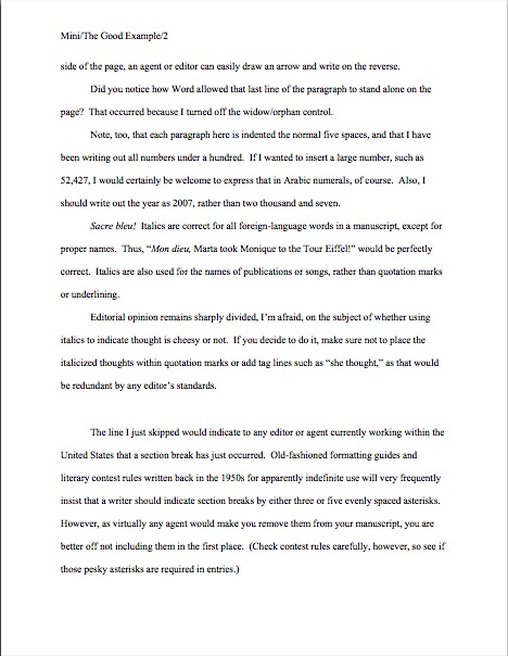
Already, I’m sensing hands shooting into the air out there, but hold your proverbial horses, please: not everyone may have gotten why precisely Millicent might conclude that a writer who made these mistakes might be a harder client for her boss to represent, and thus one to reject right off the bat. Consider, please, these two submission openings — and, as always, if you are having trouble seeing the particulars, try holding down the COMMAND key and hitting + to enlarge the image:

Quick, tell me: what are the three major formatting differences between these two page 1s?

Oh, you didn’t spot them? That’s not too terribly surprising — in a paper submission, Millicent probably would not have caught them, either. They look more or less identical, right?

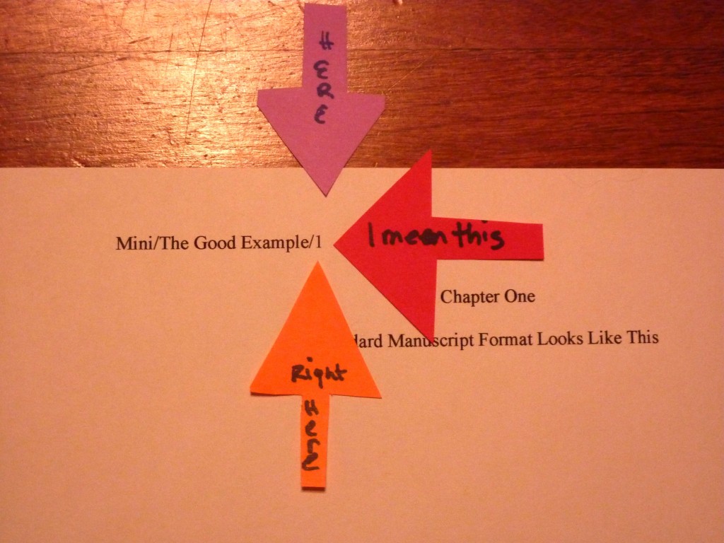
Had either you or Millicent been able to open the relevant Word file, however — as our Millie would have had to do in order to consider an e-mailed submission — you would instantly have noticed several serious problems. First, the slug line (Mini/The Good Example/1) is not located in the header, but typed laboriously at the top of each page. That would mean, in practice, that after virtually any revision, the slug lines would shift either lower on the page or backward onto the previous page, rendering the pagination useless.

Second, and as a direct result, the chapter designation is on the third line of page 1, not line 1, where it should be. Third, both the chapter designation and the chapter title were hand-centered by the simple expedient of hitting the space bar repeatedly until the text was in the right place, as one would on a typewriter. Third, all of the indentation was done not by setting a tab, but by hitting the space bar 9 times at the beginning of each paragraph.

“But Anne,” many of you cry out in protest, “why would it matter? Isn’t all that counts for standard format how the page looks?”

Yes and no, dismayed protesters. Yes, for a hard-copy manuscript, looking right is sufficient. No, for a soft-copy manuscript, the words being in the right positions on the page is not enough to look professional.

Why not? Well, ease of subsequent revision, mostly. Just as the page numbers would have to be changed by hand in the second version, using the typewriter-style centering would mean that if the title changed, the writer would have to refigure how many spaces to insert, rather than using the Center function (found on the FORMATTING PALETTE under the VIEW menu in Word) to recenter it automatically. And even on a typewriter, not setting a tab (easily done using the RULER function under the VIEW menu) for something that needs to be done at the beginning of each and every paragraph in the manuscript is, well, a trifle strange.

If you found that last paragraph mystifying, may I make a simple suggestion that will make your life as a submitting writer far, far easier in the long run? Invest a few hours in taking a basic class on the functions of Word, because any agent or editor currently working in the United States will expect a new writer to be familiar with how it works.

Unfortunately, this is not information you’re likely to be able to find in a 2-minute Google search. You’re going to want to take an actual class, so you can ask as many questions as you need in order to get comfortable with all the bells and whistles.

Call your local computer store and ask; if you use a Mac, most Apple stores offer these tutorials for free. If you can’t find a class near you, try calling the local community college, asking to be directed to the Computer Science or English departments, and inquiring whether there is an advanced student who might like to make a few bucks by spending an hour or two showing you how to set up a document according to the rules of standard format.

I would repeat the same advice, with different emphasis, to any aspiring writer unsure of the rules of punctuation and/or grammar. In the long run, one of the best things an aspiring writer can do to improve his chances of getting professional recognition is to invest the time in a good, basic grammar course. Heck, I’m a big fan of every writer taking a refresher course every five or ten years.

I realize that this flies in the face of the web-based expectation of instant answers, and yes, I am always delighted to answer such questions here, especially as they relate to page formatting (the Formatpalooza post on punctuation in dialogue was in response to a reader’s question, for instance). But at least for as long as my agent keeps insisting that now is not the right time to bring out Author! Author! in book form (a now that has extended for a good five years, only six months less than I’ve been blogging), I can’t be standing next to you while you are composing, can I?

Trust me, both the writing and submission processes are significantly easier for an aspiring writer with a firm grasp of the rules of the language. If for no other reason than that those who are already conversant with how to use a semicolon correctly don’t have to waste hours upon hours wading through the widely divergent advice on the subject currently to be found online.

This is, after all, a business in which both spelling and grammar count. Very much. I would even go so far as to say that being good at both are a job requirement for a professional writer.

Like the strictures of standard format, however, grammar is not something that anyone is born knowing. The rules need to be learned, and applying them is a learned skill. Just as no aspiring baseball player would expect to hit a home run the first time she steps up to bat, neither should an aspiring writer cling to a misguided belief that if her writing is good enough, Millicent will overlook spelling, grammar, or punctuation problems.

She won’t. Period. Less so now than ever, because these days, it’s widely believed in publishing circles that there is more than adequate training in such matters readily available on the web.

Tell me, those of you who have gone looking for it, is that true? And if it is, how easy is it to tell a credible source from one that’s just winging it?

The same perception dominates the publishing world about standard format for manuscripts, by the way. The last time I announced I was going to run through the rules of standard format again, an agent of my acquaintance, a tireless advocate for my giving up this blog in order to rechannel the considerable time and energy I devote to it into my other writing, even bet me a nickel that no one would even comment, much less ask questions, throughout my next foray into the subject. Despite my readers’ consistent devotion to improving both their writing skills and ability to present them professionally, he wagered that you would be so tired of formatting after my revisiting repeatedly it for five years that the posts that time around would pass relatively uncommented-upon.

Actually, he didn’t suggest betting on it until after I stopped laughing at his contention. “What’s so funny?” he demanded. “It’s not as though your past posts on the subject aren’t well-marked, or as if there aren’t a million other sites on the web devoted to the subject. Why can’t readers just go there to find out what to do?”

Because I like the guy and I’m not in the habit of lecturing agents, I restrained myself from suggesting that he just didn’t understand how a blog works. “Some will, but many of my readers don’t have the time to comb the archives.” (See? I honestly am aware of that.) “And the writers brand-new to the game may not yet know that there is a standard format at all. By going over it two or three times a year, I’m doing my part to make sure that everyone’s writing can look its best for you. You should be grateful.”

He was, in a word, not. “Did you spend your last three lifetimes blithely violating the rules of grammar and structure, condemning yourself to the Sisyphean task of explaining them over and over again this time around? You’re dreaming, my friend — your readership doesn’t need this. I’ll bet you twenty bucks that you get fewer comments this time than last.”

Well, great as my faith in my readers undoubtedly is, I seldom bet more than a nickel (although I did win a quarter off my mother during the last campaign season for accurately predicting the outcome of the Nevada senate race), so he had to settle for that. “You’ll see,” I told him. “Not only will readers comment more than usual, but they’ll come up with questions neither you nor I would have thought of addressing.”

He handed over the nickel after Part III. One of you lovely people asked a perfectly reasonable about indentation he’d never heard before. Better yet, one that had never occurred to him before.

Now he is yet another convert to what I have long held is the truth about aspiring writers: contrary to practically universal opinion amongst professional readers, deviations from standard format are not usually the result of writers’ being too lazy to find out how to present a manuscript. Most of the aspiring writers I encounter are downright starved for accurate information on the subject; the underlying problem is that there isn’t enough authoritative information out there to combat all of the inaccurate rumors.

I’ve always been a big proponent of agency websites simply posting a page with the formatting rules, if only so I could devote our shared time here to craft. Some do, but most don’t; virtually all that do simply assume that any aspiring writer serious about getting published will already be familiar with standard format.

And that, in case those of you who have been hanging around Author! Author! for years have been wondering, is why I revisit the strictures of standard format at least twice per year. Call it my charitable contribution to the writing community.

If you feel it has been helpful and you are reading this before 10 p.m. on Sunday, January 16, 2011, may I suggest that a delightful means of expressing that would be to take a couple of minutes to nominate Author! Author! for a Bloggie Award? The more nominations, the more likely the blog is to make it to the finalist round, and thus be read by judges.

Again, I just mention. No pressure, of course. But I’d really like to see the stars line up right this year.

Next time, we shall plunge head-first back into the rigors of craft. Keep up the good work!

Formatpalooza, part X: look, darling! The majestic manuscript slug, running free in its natural habitat!

flooded ditch

No, Virginia, that squiggly brown thing near the bottom edge of the photo is not in fact a slug, literary or otherwise: I think it’s merely a well-camouflaged stick. Because I love you people — and because so many of you have told me that you tune into Author! Author! first thing in the morning, perhaps so you may peruse it while sipping your favorite caffeinated morning beverage — I would not present you with a close-up of a slug, stealthily or otherwise.

Hey, Millicent the agency screener’s not the only one susceptible to performing a spit-take with a too-hot latte.

Have we been talking so intensely about the first couple of pages of your manuscript — the title page, the first page of text — that standard format has invaded your dreams yet? I wouldn’t be entirely surprised if it had: this series on what professional manuscripts look like has been both example-ridden and extraordinarily nit-picky, even by my standards of detail-orientation. So you probably won’t be altogether astonished to learn that before we move on from the first page of the text (and of each chapter) to considering an ordinary page, I want to devote today to pagination.

And slug-lovers everywhere rise up to dance in the rain-slick streets!

Seriously, don’t groan; it’s an important issue. Not numbering your manuscript, book proposal, or contest entry’s pages an almost universal instant rejection offense; trust me, Millicent is going to notice how and if you do it. In fact, as cosmetic issues go, how and where an aspiring writer chooses to place the page number on the page can tell our Millie a tremendous amount about him.

Specifically, whether he has done his homework about submission, because there is only one place on a manuscript page that it is permissible to place a page number: in the slug line.

Is everybody quite sure where that is on the page? Just to be on the safe side, let’s take another gander at an example from last time.

memoir w ch title

See the slug frolicking in the upper left-hand margin? How happy it looks in its natural habitat.

The top margin is the page number’s natural habitat as well — which seems to come as a surprise to many aspiring writers. Let’s go ahead and forge a new axiom about it: the page number belongs within the slug line, rather than anywhere else on the page.

This is as proper on page 139 of a book manuscript as on page one. While we’re noticing such things, I would also like to call your attention to the fact that in each of these examples, the page’s only reference to the author’s name or the title of the book appears in the slug line.

That, too, would work equally well on p. 139 as on page 1. Sensing a pattern here?

I sincerely hope so, because the slug line confuses a lot of aspiring writers; until you have seen piles and piles of professional manuscripts, it looks kind of funny. So much so that to some would-be submitters, heads swimming from having been told over and over again that a manuscript should have a 1-inch margin on all sides, find it counterintuitive to add a line of text, even such a short one, within that margin.

But I assure you, it’s traditionally done that way. And why? Intrepid ‘Palooza followers everywhere, chant it with me now: because like every other aspect of standard format for manuscripts, placing the slug line there just looks right to professional readers.

Yes, that logic is a trifle tautological, now that you mention it. If you have a problem with that, I would suggest taking it up with the powers that rule the universe. As I believe I may have pointed out once or twice earlier in this autumn of ‘Paloozas, I do not count myself amongst those powers.

If I did, Microsoft Word would be set up to create documents in standard format automatically, Word for Mac and Word for Windows would be set up so those using one could easily give formatting advice to those using the other, air pollution would be merely a thing of distant memory, and ice cream cones would be free on Fridays. Oh, and the little girl across the street who believes slugs are her totem animal would come to liberate her little friends from my garden on a daily basis, rather than on a monthly one.

As none of these things seems to be true, let’s get back to business: how does one create that pesky slug line, anyway?

Back in the days when typewriters roamed the earth, it was perfectly easy to add a slug line to every page: all a writer had to do was insert it a half-inch down from the top of the page, left-justified, floating within the 1-inch-deep top margin. For word-processed documents, it’s a trifle more complicated.

The slug line still belongs in the same place, .5 inches from the top of the paper, suspended in the middle of the requisite 1-inch top margin. But instead of laboriously typing it on each page individually as writers did in the bad old days, one simply inserts it in the header. In most versions of Word (I can’t speak for all of them), the header may be found under the VIEW menu.

Before the Luddites out there trot out their usual grumble about the bother of tracking down the bells and whistles in Word, think about this: placing the slug line in the header also enables the writer to take advantage of one of the true boons of the advent of word processing, pages that number themselves.

As opposed to having to do it manually, laboriously retyping the slug line in its entirety on each and every page of the manuscript.

Oh, you may laugh, but several times each year, I receive a manuscripts constructed by a writer who was not aware that Word would do this for her. Instead of utilizing the header function, the poor writer will have elected to include the necessary information on the first line of text on the page.

Not only does this unfortunate misconception involve an absolutely monumental and ultimately unnecessary effort, but the result doesn’t pass the all-important does it look right? test. Take a peek for yourself:

See how pulling the slug line down into the text messes with the spacing of the page? Here, an entire line of text is sacrificed to it — and let me tell you, that line is not going to go quietly.

How so, you ask? Well, think about it: what’s inevitably going to happen if the author decides to insert a new sentence or two on a page formatted this way? That’s right: the writer is going to have to go back and move each and every one of those slug lines to match the NEW pagination.

I’d show you a practical example of this, but it’s just too tragic to contemplate. Trust me, it would be a heck of a lot of work, and writers who do it are likely to end up beating their heads against their studio walls.

Take a moment to peruse that last example again. See any other problems with the slug line? How about the fact that it includes the word page? Shouldn’t be there; just the numbers will suffice.

Did I just hear some huffs of indignation out there? “But Anne,” the formatting-ambitious cry, “I think it looks kind of classy to include page before the page number? It’s kinda stylish. If it’s just a matter of personal style, who could possibly be hurt by including it, if I like the way it looks?”

Well, you, for starters. And why? (Chanters, ready your lungs.) Because it just would not look right to someone who reads manuscripts, book proposals, or contest entries on a regular basis.

No kidding — I’ve seen screeners get quite indignant about this one. “Does this writer think I’m stupid?” Millicent is prone to huff. (Don’t bother to answer that question; it’s rhetorical.) “Does she think I don’t know that the numeral that appears on every page refers to the number of pages? Does she think I’m going to go nuts and suddenly decide that it is a statistic, or part of the title? Or maybe a wayward date that’s wandered off to the wrong part of the page?”

Don’t bait her; the lady has a hard life, even when she doesn’t accidentally burn her lip on a too-hot latte. Make her happy: do it the approved way.

Okay, did you spot any other problems? What about the fact that the first character is in a different typeface from the rest of the text? Or the equally disturbing fact that the first paragraph of the chapter is not indented?

Again, the writer may consider this nifty, but I can assure you, Millicent won’t. Fortunately for her blood pressure, the odd typeface for the first letter, in imitation of the illuminated texts hand-written by monks in the Middle Ages, doesn’t turn up all that often in manuscripts other than fantasy and YA, for one simple reason: books in that category are more likely to feature this it’s-a-new-chapter signal than others. But once again, what an editor may decide, rightly or wrongly, is appropriate for a published book has no bearing upon what Millicent expects to see in a manuscript.

Save the manuscript illumination for someone who will appreciate it. Hop in your time machine and track down a medieval monk to admire your handiwork, if you like, but in this timeframe, keep the entire manuscript in the same typeface and size.

The non-indented first paragraph of a chapter is fairly common in mystery submissions, I have noticed, and starting to become more prevalent in other kinds of fiction as well of late. (For an interesting discussion about why, please see the comments on this post and this one.) In fact, I’ve been told by many mystery writers — and rather tersely, too — that eschewing indentation in this context is an homage to the great early writers in the genre, an echo of their style, so who is yours truly to try to talk them out of that gesture of respect?

Well, since you asked, I’m someone familiar with what Millicent expects to see on a page — as well as someone who is aware that almost without exception, in Edgar Allan Poe’s time all the way down to our own, the editor has determined the formatting that appeared on any given printed page, not the author. To professional eyes, especially professionally peevish ones like Millicent’s, a manuscript that implicitly appropriates this sort of decision as authorial might as well be the first step to the writer’s marching into Random House, yanking off a well-worn riding glove, and striking the editor-in-chief with it.

It’s just not a good idea for someone brand-new to the biz to do.

Yes, you read that correctly: non-standard formatting choices are occasionally interpreted as a challenge to editorial authority. And while we could speculate for the next week about the level of insecurity that would prompt regarding a minor formatting choice as a harbinger of incipient insurrection, is the manuscript of your first book really the right place to engender that discussion amongst Millicent and her cronies?

Exactly. Save the formatting suggestions for a long, intimate discussion over coffee with your editor after she acquires the book. You’ll probably lose any disagreement on the subject, but at least you will have made your preferences known. Until that happy, caffeine-enhanced day, just accept that the industry prefers to see every paragraph in a manuscript indented the regulation half-inch.

It just looks right that way.

While we’re at it, how about the bolded chapter number and title in that last example? Nothing in a manuscript should be in boldface. Nothing, I tell you. Uh-uh. Not ever. (Except for that nonfiction exception we talked about last time. And I have seen authors get away with bolding the title on the tile page, but frankly, I wouldn’t chance it in a first book submission.)

Nor should anything be underlined — not even names of books, magazines, or song titles. Instead, they should be italicized, as should words in foreign tongues that are not proper nouns.

Yes, Virginia, back in the day when typewriters roamed the earth, underlining was the norm, for the simple reason that most typewriters did not have italic keys. So if you consult an older list of formatting restrictions or one intended solely for short story formatting — both of which seem to be circulating at an unprecedented rate on the web of late, pretty much always billed as universally-applicable rules for any type of writing, anywhere, anyhow, a phenomenon which simply does not exist — you might conceivably be told that publications, song titles, and/or foreign words (sacre bleu!) should be underlined. But trust me on this one: any agent is going to tell you to get rid of the underlining, pronto.

And why? All together now: because it just doesn’t look right that way.

All right, campers, do you feel ready to fly solo into a critique of a first page? Here are two pages of text, studded with standard format violations for your ferreting-out pleasure:

How did you do? Are those problems just leaping off the page at you now? If not, ask yourself: does that first page contain information that ought to be on the title page instead? Are the margins even? Are the paragraphs formatted correctly? And so forth.

In fact, it’s a terrific idea for any aspiring writer to get into the habit of asking those types of questions immediately after clapping eyes upon any manuscript, his own or anybody else’s. Why? Because that’s Millicent’s first instinct. However literature-loving a she may be, she sees so many incorrectly-formatted submissions that a properly-formatted one automatically looks at first glance like more professional writing to her.

As, with practice, it will to you. I promise. To get that ball rolling, as well as to reward you for so much hard work — or to provide you with some helpful comparison, depending upon how you did on that last little test — here are a couple of correctly-formatted pages, to soothe your tired eyes:

good example page 1

good example page 2

Whenever you start finding yourself chafing at the rules of standard format, come back and take a side-by-side gander at these last sets of examples, to regain perspective on what standard format is and why it’s important in a submission, proposal, or contest entry. I assure you, after a professional reader like Millicent has been screening manuscripts all day, every day for even a couple of months, every time she sees the bad example, mentally, she’s picturing the good example right next to it.

Small wonder, then, that — wait for it — manuscripts that look right get taken more seriously than those that don’t. Regardless of how you may feel about Millicent’s literary tastes, isn’t a serious read from her what you want for your book? Or your book proposal? Or your contest entry?

Did you notice that I snuck us from the first page of the text into the second in my last example? Next time, we’ll continue delving into the mysteries of the mid-manuscript page. On Friday, I’ll be offering a little reward for all of your virtue.

Hey, if treading the path of virtue is rewarded nowhere else on earth, it is here at Author! Author! Keep up the good work!

Authorbiopalooza VII: framing Jack O. Lantern’s smiling authorial face

grinning pumpkin 2

I’m smiling myself this morning, campers, although not quite as widely as Jack. Congratulate me, for I am officially the Nicest Lady in the Neighborhood, a title I hope to hold until next Halloween rolls around. How did I score this enviable title? Well, I am usually in the running: ours is the only house within a multi-block radius that gives out full-size candy bars. (You should see the look on the little ones’ faces when they first clap eyes on our candy tray.)

This year, however, we also had the dubious distinction of being one of the only houses in the neighborhood giving out candy at all. Blame the economy, not the neighbors, I say, but naturally, it was hard for the kids to understand. So I told them that if they went away for half an hour and came up with a story about the characters they were impersonating for the night, they could each have another three candy bars. One especially creative ninja reappeared three times, each with a different tale to tell.

I heard some great stories. Score one for the future writers of America, and a big loss for dental hygiene.

Back to business. I’m going to be wrapping up author bios and photos today, tying up a few loose ends and answering a few perennial first-time autobiographers’ lingering questions. Since this is my last Authorbiopalooza post — presuming that no one posts a magnificently insightful follow-up question as a comment over the next few days, hint, hint — I’m going to seize the opportunity to say something vital just one more time, for the benefit of all you procrastinators out there.

broken-recordPlease, I implore you, do not put off writing at least a viable first draft of your bio until the day after an agent or editor has actually asked you to provide one. Set aside some time to do it soon.

Why? Because unless an agency’s submission guidelines ask for a bio up front, chances are, the request to provide one is going to come swooping down at you out of a pellucidly blue sky. Tossed out as an afterthought just after you’ve given the best pitch in the history of Western civilization, for instance, or when the agent who fell in love with your first 50 pages asks to see the rest of the book. It will seem like good news — until you realize that you need to come up with a bio within the next forty-eight hours.

On that happy day, you will be a much, much happier human being in every way if you already have at least the beginnings of a great bio sitting on your hard drive. Trust me on this one.

To that end, may I suggest that those of you involved in writers’ groups — critique-based or support; in either case, good for you — devote part of a meeting to brainstorming about and giving feedback on one another’s bios? Or query letters, for that matter? And what about synopses?

Don’t look at me so blankly. Why wouldn’t a success-oriented group of writers want to invest time in mutual critique of marketing materials? Long-time readers, chant it with me now: every single sentence on every single page in a query or submission packet is a writing sample. It all needs to be polished.

It also, at the risk of starting up that broken record player, all needs to be interesting — and that’s where a little outside perspective can be very helpful. Yet even very market-focused critique groups seldom set aside time for mutual bio critique. A trifle mystifying to me, as a session devoted to it can be a whole lot of fun, as well as very useful indeed.

Besides, how much do you really know about that sharp-eyed person who keeps barking at you to show, not tell?

Speaking of great questions (yes, I know; I was speaking of it several paragraphs ago, but humor me here), let’s get right to the promised answers to past reader questions on bio-related points. Yes, shorter versions of these answers are already available elsewhere on this site, but since the comments are not searchable from your side of the site and not everyone reads the comment strings — especially, I notice, whilst perusing the archives — I wanted to have all of this information gathered in one place, all ready to pop up in a site search using that nifty search engine located in the upper right-hand corner of this page.

I love readers’ questions, because, frankly, you clever souls often come up with angles it would not otherwise have occurred to me to pursue. Those of us who have been staring at bios, queries, synopses, and professionally-formatted manuscripts for years may be able to tell in an instant how the page in front of us is not right, but since we have such a strong mental image of what the right format, for instance, is, we seldom invest time in considering how someone who had never seen a successful author bio formatted for submission, for example, might picture it.

That’s why, in case anybody had been wondering, I so often encourage my readers to ask challenging questions of agents and editors at conferences: the question that’s been bugging you for months might not be one a speaker would know to include in her talk. So for heaven’s sake, ask; it’s good for everybody concerned.

To illustrate, here is a question from intrepid reader Doug about how a writer using a pen name might approach the bio. Specifically,

Is the author’s name one’s pseudonym (when applicable)? Both in the heading and in the text?

This is a great question, Doug, one that I’m positive perplexes many a pseudonymous writer. To make sure that we’re all on the same page, so to speak, what Doug is inquiring about is the boldfaced author name at the top of the bio, as well as how to refer to the author within the bio itself. To borrow an example from last time, so we may see how the author’s name dots the page:

Ste. Cecile author bio2

In the bio, the author’s name should be the same as it is on the title page and in the slug line; it’s confusing if they’re different. So if you’ve decided to use a pseudonym under the By… part of the title page (as opposed to the contact info, which should use the name to which you’d prefer to have your royalty checks made out), be consistent throughout your query or submission packet.

You want to see that in action, don’t you? Fair enough.

pen name title page

If Arthur Worrieswhathisrelativeswillthink were to write an author bio — and he would definitely need to do so, even for a memoir, despite the fact that the entire manuscript could be construed as a bio — he has a choice: he can either show his real name on the bio, or he can list his pen name, Unabashed R. Pseudonym, as long as it is the name he uses (a) appears on the title page, as we’ve seen above, and (b) is the name in the slug line at the top of every manuscript page. In a first book, it’s usually more prudent to use one’s real name, so that contracts — like, say, the representation agreement Arthur wants the agent of his dreams to offer him — are made out properly.

One’s agent does, after all, have to know one’s real identity. So unless you are an international man of mystery fleeing justice (which would look terrific in a bio), it doesn’t really make sense to use a pseudonym at all at the querying or submission stage.

Think about it: a writer using a pen name doesn’t actually have to commit to it until after a publisher has already acquired the book. Both the representation contract and the publication contract are under the author’s legal name (although the publication contract may well stipulate the use of a pseudonym), so unless you feel that

(a) using your real name might somehow harm the book’s chances with the agent of your dreams (Begrunga Nevercleansherkitchen would be a lousy name for a cookbook writer, for instance),

(b) you already have something published in a different book category under your real name and want to avoid confusion, or

(c) you don’t want to tip Interpol off to your whereabouts,

you don’t really need to stress about the pseudonym issues until later on. Give your pretty little head a rest; you wouldn’t want your eyes to look tired in your author photo.

Everybody clear on that? Excellent. Here’s a thought-provoking question from long-time reader Gordon:

I’m not sure how to word this, but I’ll try – should an author bio written by an unpublished (in any media) writer include what you call ‘promotional parts’? Meaning life connections with the novel’s subject matter. As a youngster in his seventies there have been many twists and turns in my life. Should one’s bio chronologically hit the high points or mainly focus on the ones pertinent to the novel being submitted?

You did fine on the self-expression front, Gordon. The short answer is yes, on both counts.

Well, glad to have cleared THAT up. Moving along…

I didn’t really fool you there, did I? Especially since those of you who have been following Authorbiopalooza closely undoubtedly immediately cried, “Wait, Anne dealt with this in an earlier post. Perhaps she is trying, albeit clumsily, to drive home the point that good questions from readers help to expand the range of her posts.”

Well, I like to think so; I am, after all, the Nicest Lady in the Neighborhood, and this is an extremely common writerly conundrum. Let’s tackle it directly.

The direct answer: it depends.

To be specific, which way one should fall on the choice between devoting one’s bio to a chronological account of the highlights of one’s life as, say, an obituary might tell it (sorry, but it’s the obvious analogy) vs. creating the impression that every significant event in one’s life was leading inevitably to the writing of this book and no other depends largely upon several factors, including:

a) whether there are events in one’s life that are legitimately related to the subject matter of the book in question — and if they are easy for the reader to follow without too many logical leaps.

If mentioning a particular life experience would tend to make you a more credible source, it’s usually to your advantage to include it in your bio, to differentiate yourself from any other yahoo who might just have been guessing what that particular experience was like. Expressive Q. Author visited the Statue of Liberty once, when Expressive’s protagonist passes through Ellis Island briefly in Chapter Two, is a stretch; Expressive Q. Author spent twenty years as a merchant marine, when his entire plotline takes place on a pirate ship, is not.

b) whether one has genuinely lead a life that would produce a couple of entertaining paragraphs, regardless of connection to the book.

It never hurts to sound darned interesting in your bio. However — and in practice, this is a BIG however — writers of purely chronological bios often…how shall I put this delicately…overestimate the detail in which a rushed industry type might want to hear the life story of someone she has never met.

Remember, Millicent the agency screener reads a lot of bios; keep yours snappy.

If you’re in doubt whether yours is leaning toward overkill, hand your bio to someone who doesn’t know you particularly well (having asked politely for his assistance first, of course; don’t just accost a stranger) and have him read it through twice. Buy the cooperative soul a cup of coffee, and around the time that your cup begins to seem light in your hand, ask your guinea pig to tell your life story back to you uninterrupted.

The points that he can’t reproduce without prompting are probably inherently less memorable than the ones he can recount in glowing detail. Ask yourself about the ones left out or garbled: they honestly helping you look interesting and/or credible?

c) in the lucky instance where both (a) and (b) are genuinely true, whether the wealth of interesting biographical detail threatens to render the connections to the book less memorable.

When in doubt, lean toward the directly applicable; it’s more important information for the marketing department.

Remember, the point of an author bio is not to tell your life story — that’s what post-publication interviews and memoirs are for, right? — nor to include all of the things that you would like total strangers who pick up volumes in a future bookstore to know about you. The goal in a query or submission bio is to make the case that you are an interesting person well qualified to have written the book in question. Or, in the case of nonfiction, to write the book being proposed.

Everyone clear on the relevant distinctions? Good. Let’s move on to another question. Another long-term reader, Cerredwyn, wrote in to ask,

Does an author photo need to be a head shot?

No, it doesn’t — as long as you are identifiable (“That’s she, officer. That’s the author of the book!“) and the background isn’t too busy, you can certainly use a broader shot.

In fact, as Elinor Glyn’s author photo for IT clearly demonstrates, a head-and-torso shot is perfectly acceptable, and actually a bit more common on jacket flaps than the pure headshot.

However, 1/2, 3/4, and even full standing shots are not unheard-of. John Irving’s early works tended to have particularly hunky-looking shots from the waist up, for instance.

Not that I noticed as a teenager or anything. I was reading his books for the writing and the stories, I tell you.

If you’re having trouble deciding between different ranges of shot, spend some time in a well-stocked bookstore, taking a gander at the author photos published in books in your chosen book category within the last few years. Not in every new release, mind you, but in books like yours. If you notice an overall trend in styles, you’re not going to offend anyone by submitting something similar.

Oh, and speaking of styles, unless you have written something ultra-hip or happen to be a magazine writer (whose material by definition changes constantly), it’s usually not a great idea to dress in the latest fashion for your author photo — and it’s DEFINITELY not the time to sport a hairstyle that’s not likely to be around a decade hence.

Don’t believe me? Ask any 80s author who embraced a mohawk. Or Elinor Glyn, a decade after the photo above was taken.

Remember, if your book is successful, it will be gracing shelves in private homes, libraries, and book exchanges for even longer than it will be hanging out in Barnes & Noble. A too-trendy style will date the photo. So as a general rule, adorning yourself for your photo with the expectation that the resulting photo will dog you for the rest of your natural life is a good plan.

You also might want to give some thought to how certain colors and patterns photograph — and how a checkered jacket that works beautifully in an 8 x 10 glossy might just look dusty in a 3 x 5 or 2 x 3 (both fairly common sizes for jacket photos). Generally speaking, solids work better than prints, and strong, dark colors on the body are distract less from the face. Bear in mind, too, that black, white, and red sometimes look quite different in print than in real life, and that the eye tends to zoom in on the red and the shiny.

If that’s your lip gloss, great; if it’s your belt, less great. Unless you are trying to find an agent or publisher for a book about belts, that is.

The answer to the next reader question, posed by Jaepu, could be extrapolated from the last paragraph but one, I notice, but that doesn’t mean it isn’t a trenchant question. Let’s revisit it, just in case anyone out there was wondering:

Must the author photo be in color?

No, it may be in black and white — in fact, until fairly recently, that was the norm. However, with the rise of digital photography, color author photos have become more common. Do be aware, though, that a black-and-white photo won’t tell an agent whether you might look good in a television interview as well as a color picture would.

The more important issue is photo clarity. You’d be surprised at how many author photos are actually out of focus, presumably because the writer prefers the blurry shot to other, clearer ones. (Either that, or he moves around too quickly to be caught easily on film.)

Nor is this a time to make a funny face, even if you write humor; this is, after all, a photo intended to present you as a professional to be taken seriously. Let’s face it, even if a less-sharp image is genuinely cool, this image of trick-or-treating expert Jack O. Lantern

jekll hyde pumpkin

is simply not as effective a marketing tool as this comparatively mundane smile.

Rick's pumpkin

My apologies to those with low self-esteem, but the author bio photo actually does have to look like you. Not some idealized, air-brushed ideal version of what someone who spends hours on end frantically tapping her thoughts on a keyboard, but you.

Pop quiz: what is good about both of these photos of Jack? (Hint: it has to do with his area of expertise.)

If you immediately cried, “By jingo, he’s depicted in a context that is relevant to the subject matter of his book!” take a candy bar out of the jar. Since Jack is writing about trick-or-treating, what would be a more natural background than his Halloween locale?

In fact, he could even take it a step farther, sacrificing a bit of facial close-up range for a photo that unquestionably establishes him as someone who knows his Halloween doorsteps. As long as his face is clearly visible, a slightly farther-away shot is fine.

cat and pumpkin

Speaking of low self-esteem, a reader apparently too shy to be comfortable with self-identification asked:

I’m all excited about my next book, but I’m marketing my first. Would it be completely tacky to mention what I’m working on now in my bio? What if the books are in different genres?

It’s far from being tacky, Anonymous One; in fact, it’s downright common for a bio to end with a mention of the author’s next writing project. Try to keep it to a single sentence, however, so it does not overpower the rest of the bio.

Lincoln lives in Springfield, Illinois with his wife, eight sons, and golden retriever, Manifest Destiny. He is currently working on his second book, Hey! Where Are You Taking Half of My Country?, a comic memoir covering the Civil War years.

“Yeah, right, Anne,” I hear some of you scoff. “Stop pulling our collective legs. I’ve never seen an author bio on a book jacket that covers future work, or even unpublished work. Bios, like tombstone epitaphs, are always backward-looking, aren’t they?”

Actually, jacket bios that mentioned future projects used to be fairly standard; in the mid-70s, the last line of most dust jacket bios was some flavor of Smith lives in Connecticut, where he is working on his next novel. Gradually, this has been falling out of fashion, perhaps because it implies some faith on the publisher’s part that Smith’s current release will sell well enough that they will WANT him to bring out another. (It’s probably not entirely a coincidence that this particular last sentence fell out of fashion at approximately the same time as multi-book contracts for first-time novelists.)

However, the author bio that an aspiring writer tucks into a query or submission packet and the one that ends up on a dust jacket are not the same thing — as we discussed earlier in Authorbiopalooza, they are intended for the eyes of two different audiences, to create two different impressions. The dust jacket bio is promotional copy aimed at the reader, designed to pique interest and answer basic questions like why should I believe this guy’s NF account of life on the moon? The query or submission bio, by contrast, is designed to impress agents, editors, and their respective Millicents with the author’s claim to be an interesting person well qualified to have written the book in question.

Is there an echo in here? I could have sworn that I’ve heard that last bit somewhere before.

Because the submission bio is geared for industry-savvy eyes, mentioning completed book projects in categories other than the one to which the currently-submitted manuscript belongs (try saying THAT three times fast), as the Anonymous Questioner suggested, is a perfectly legitimate use of page space. No need to hawk the other projects; simply mention the book category within the course of a single-sentence description that describes the project as still in progress. As in:

Now nicely recovered from his contretemps with an assassin, Garfield lives in retirement, working on his next book projects, a YA baseball romance and a historical retrospective of his own brief presidency.

Why would Pres. Garfield speak of his completed YA book as a work-in-progress? Strategy, my dears, strategy: it neatly sidesteps the question why isn’t it published? Clever, eh?

Finally, reader Rose inquired:

I’m at a whole single-spaced page, no photo. I have a pro photo, recently taken, that looks great. Would it be better to reduce the bio and add the photo?

I’m querying for a novel, btw — and I’d been under the impression that you shouldn’t submit an author photo when trying to pitch one.

Contrary to the impression Rose has, by her own admission, picked up she knows not where, there is no hard-and-fast rule about whether a fiction writer’s submission bio should to include a photo. No Millicent who has found a submission engaging enough to read all the way to the last page, where the author bio lurks, is going to cast her latte aside in a petulant fit at the sight of a photo, screaming, “Oh, darn — now I have to reject it. I liked that manuscript, too.”

The reason photos are often not included in novelists’ bios is not because they’re unwelcome, but because the burden for gathering marketing materials prior to selling a novel has historically been significantly lower than for a nonfiction book. (If any of you novelists doubt this, take a gander at a book proposal sometime; its many, many pages of marketing material will make you feel much, much better about having to write only a query letter and a synopsis.)

If your photo is pretty ravishing, Rose, I say go ahead and include it. A nice photo does make the bio look a touch more professional, after all, and it’s never a bad thing for an agent or editor to think, “Hey, this author is photogenic!”

Even without the picture, though, it sounds as though Rose’s bio is a bit long for professional purposes: the norm is one DOUBLE-spaced page, or 1/2 – 2/3 page single-spaced under a photo. Yes, one does occasionally hear agents mentioning that they’ve been seeing more single-spaced full-page bios lately — but as I’ve virtually always heard this pronounced with a gnashing of teeth, I’m inclined to regard such statements as complaints, not cries of rapture.

Call me zany, but I tend to interpret moaning as an indication that the moaned-about activity is unwelcome. I’d stick to a more standard length. As with a query letter, when in doubt, err on the side of brevity. Believe me, if your bio is too short, the agent of your dreams will be only to happy to tell you so –after she signs you.

(Don’t cringe: she’s going to want you to change a lot of things after she signs you, no matter how much she initially loved your book or book proposal. Don’t say I didn’t warn you.)

One last thought on the subject before I sign off for the day: stick to a single page, unless you are specifically asked for something much longer or shorter. (Requests for 1- or 2-paragraph bios aren’t that uncommon.) Beyond that, try not to obsess too much about length. Concentrate instead on sounding fascinating.

Seriously, if, over the years I’ve been a book doctor and particularly over the 5+ years I’ve been answering questions online, someone had given me a nickel for every time an aspiring writer asked me whether the spacing or length of the bio — or query, or synopsis — REALLY mattered, I would have been able to build my own publishing house.

I don’t mean that I would have been able to buy one; I mean that I would have been able to construct the necessary buildings and offices entirely out of coins.

Would it surprise you to hear, then, that even after that many repetitions of the same question, my answer has never changed, no matter how much aspiring writers might have wished it to do so? Or that if I could wave my magic wand and remove all formatting requirements, I probably wouldn’t do it?

Why, I hear you gasp? Because when an author bio — or query letter, or synopsis, or manuscript — is properly formatted, the only bases for judging it have to do with the quality of the writing, the premise’s marketability, whether the professional reader likes it, and so forth.

You know, the bases upon which aspiring writers WANT to be judged.

So yes, agents really tend to hold aspiring writers to the standards of the industry, just as they hold their clients to them. (See earlier comment about one’s dream agent making demands upon one.) They don’t do this to be mean; it’s just that when someone — like, say, Millicent — spends hour after hour, day after day, month after month staring at manuscripts, she’s unlikely not to notice if one is formatted differently than the norm.

As in, for instance, an author bio that doesn’t look like the ones I showed you last time. Even if a single-spaced bio sans photograph does indeed fit onto the requisite single page, thus meeting the bare minimum standard for professionalism, it’s not going to resemble the bios Millicent’s boss is sending out with her clients’ submissions.

Or at least, it probably will not. Naturally, as with any group of human beings, some agents have individual preferences that deviate from the industry standard — the source, I suspect, of Rose’s impression of unspecified origin — and if you can find out what these quirky desires are, you should definitely adhere to them in your submissions to that particular agent. It seldom pays, however, to assume that any one such preference is universal to the industry.

My point is, as annoying as it may be to bring your bios — and queries, synopses, and manuscripts — into line with the most common professional standards is so that Millicent may ignore the formatting and concentrate on what you are SAYING. Because, after all, your aim in your submission bio is not to cram as many facts as you can onto a single page, but to make the case that you are an interesting person well qualified to have written the book in question.

Yes, you have heard that somewhere before. See, I don’t recommend sticking to the general standards just to be mean, either.

Congratulations, campers: I don’t know whether you have noticed it, but since Labor Day, you have completed a crash course in all of the standard elements of the query and submission packet. Which, in case you are the kind who likes to track such things, makes you more knowledgeable about how to market your writing to agents than roughly 97% of the aspiring writer population.

You should be very, very proud of yourself for taking the time — let’s face it, many of these posts have been hefty — to learn how to present yourself professionally. Keep up the good work!

First pages that grab: Author! Author! Great First Page Made Even Better first-place winners in adult fiction, Curtis Moser’s Perdition and Jens Porup’s The Second Bat Guano War

Curtis Moser author photoJens_Porup_photo

Welcome back to our ongoing salute to the winners of the Author! Author! Great First Page Made Even Better Contest in Category I: Adult Fiction. I am genuinely thrilled, not only to be able to bring you tantalizing tastes of some very talented writers’ prose, but also by the extraordinarily rich fund of discussion points these page 1s have been providing. Honestly, even though I’ve been chattering on here at Author! Author! for over five years about craft, presentation, voice, submission, and manuscript formatting, I keep finding myself thinking while I am typing, is it possible I’ve never blogged about this before?

Today’s exemplars are particularly fine ones, Adult Fiction first-place winners Jens Porup (the dapper fellow on the right, above) and Curtis Moser (the gentleman on the left with the two wee friends). The judges felt, and I concur, that both of their first pages were remarkable examples of strong authorial voice precisely suited to their target audiences.

They also felt, as do I, that there were some presentation issues that might prevent either of these exciting, fresh voices from getting a sympathetic reading from our old pal Millicent, the caffeine-quaffing agency screener. And since I know from long, long experience working with first-time authors that these specific presentation problems dog many, many otherwise well-done first pages, I am delighted to have the excuse to talk about them at length today.

First, though, to the voices. As we’ve discussed in the last couple of posts, the match between narrative voice and chosen book category can be vital to the success of a submission, particularly for genre fiction and YA: ideally, a great first page should cause Millicent to sigh pleasurably and murmur, “Ah, this is a fresh take on a story my boss can sell to this market, appropriate in voice, vocabulary, and tone for the intended readership, that also displays a fluency in the conventions of the genre.”

Okay, so that’s quite a bit to murmur over the first paragraph of a submission, but since it is safe to assume that a Millicent employed by an agency that represents a lot of, say, thrillers will be staring at queries and submissions for thrillers for a hefty chunk of any given workday, the last response a thriller-mongering querier or submitter should want to elicit is a spit-take of too-hot latte and a cry of, “Wait — hasn’t this writer ever read a book in this category?” or “What’s that kind of word choice doing in a manuscript intended for this market?”

Or even, saddest of all, “Wow, this is a fresh, exciting new voice. What a shame that it’s not appropriate for the book category in which this talented person has chosen to write.”

Unfortunately for both literature and the health of Millicent’s throat, all three of these reactions to well-written first pages are a part of her normal workday. Often, in the joy of creation, aspiring writers lose sight of the fact that no novel is intended for a general audience. Even bestsellers that turn out to appeal to wide swathes of the reading public begin their publishing lives as books aimed at a specific part of that audience.

And frankly, the reading public expects that. Even the most eclectic of readers understands that a YA novel is not going to read like a romance novel, science fiction, or Western, even if the book contains elements of any or all of those genres, and that an adult genre novel will adhere, at least roughly, to the conventions, tone, and general reading level of its book category.

Were that not the case, brick-and-mortar bookstores would not organize their offerings by category, right? Oh, they usually have a generalized fiction or literature section, but if you’re looking for fantasy, it’s probably going to have a bookshelf of its own, crammed to the gills with novels that share, if not subject matter, at least a species resemblance of storytelling structure and voice.

So while naturally, an aspiring writer should not strive to produce a carbon-copy voice — why should Millicent recommend that her boss pick up a book that sounds precisely like another that’s already on the market? — it’s an excellent idea to re-read one’s submission with an eye to genre-appropriateness. Especially the opening pages, since, as I hope we all know by now, most submissions are rejected on page 1.

Thus it follows as dawn the night that the book description and the first page are not too early to establish that your book fits comfortably into the category you have chosen for it — and thus into Millicent’s boss’ client list. Remember, just as no novel is actually intended for every conceivable reader, no agent represents every type of book. They specialize, and so should you.

Why, yes, now that you mention it, gearing your voice to your chosen book category would be a heck of a lot easier if you invested some time in reading what’s come out recently in it. How savvy of you to realize that what might have struck Millicent as a fresh take fifteen years ago would probably not elicit the same pleased murmuring today.

As fate would have it, both of today’s winning entries fall into the same general book category: thrillers. However, these books are aimed at different readerships within the thriller genre. Curtis’ PERDITION is a paranormal thriller:

Colt Miller has driven by the cemetery house for years. When the owner died, he watched the shingles curl and the porch sag, and in his mind he nurtured the fantasy of restoring it to its former beauty. So when the bank finally brings it up for auction and there are no bidders, Colt is thrilled to purchase it cheap. After he finds the body of a little girl in the basement, however, the thrill ebbs along with his enthusiasm, and the memory of the loss of his own daughter threatens to swallow up what remains of his business, his life, and his sanity.

Sounds like a story about an interesting person in an interesting situation, right? Yet the potential for paranormal activity didn’t jump out until that last sentence, did it? If I were editing this paragraph in a query, I would bump some of the skin-crawling feeling up to the first sentence, on the general principle that a Millicent who read queries for paranormal thrillers all day might not be automatically creeped out by the word cemetery.

But it does read as genre-appropriate, and that’s the most important thing. So does Jens’ brief description for THE SECOND BAT GUANO WAR (the judges’ favorite title in the competition, by the way):

This hard-boiled spy thriller set in Peru and Bolivia is an unflinching look at vice and corruption among expatriate Americans living in South America. When the hero’s best friend and CIA handler goes missing, he must risk everything to find him.

While this is a perfectly fine description, as those of you who followed the recent Querypalooza series are no doubt already aware, I prefer even the briefest novel description to give more of an indication of the book’s storytelling style and voice. Unlike Millicent, though, I did not need to judge the style on this terse paragraph: I asked Jens for a more extensive description.

Rats ate his baby daughter while he partied in a disco. Now Horace “Horse” Mann is a drugged-out expat teaching English to criminals in Lima, Peru. Oh, and doing the odd favor for the CIA.

When his drinking buddy and CIA contact, Pitt Watters, goes missing, Horse’s efforts to find him hit a snag. He comes home to find his lover, Lynn — Pitt’s mother — strangled in his apartment. Arrested and charged with murder, Horse escapes Lima and follows his only lead to a Buddhist ashram on the shores of Lake Titicaca.

There, Horse uncovers his friend’s involvement with a group of Gaia-worshipping terrorists who want to kill off the human “disease” infecting the earth.

The group’s leader, a world-famous vulcanologist, explains that only a new generation of lithium-ion batteries can replace the dwindling supply of fossil fuels. The group plans to set off a volcanic chain reaction that would destroy the world’s most promising lithium fields, and thus ensure that man pays for his polluting sins.

Horse finally finds Pitt on top of a volcano, his thumb on the detonator. Pitt confesses to killing Lynn, begs Horse to join him in the purification of Gaia. Horse must choose: end the world, himself, his guilt? Or forgive himself the death of his daughter, and find a way to live again?

Complete at 80,000 words, THE SECOND BAT GUANO WAR is a hard-boiled thriller set in South America, with an environmental twist.

Sounds like precisely what the first description promised: a hard-boiled spy thriller. But this description shows these qualities, in a voice that’s book category-appropriate; the first just asserts them.

And if you found yourself murmuring, “Show, don’t tell,” congratulations: you’re starting to think like Millicent.

I love this description for another reason, though — it’s a glorious illustration my earlier point about Millicents working in agencies that represent different kinds of books looking for different things at the querying and submission stage. A Millicent habituated to screening thrillers would glance at that first sentence and murmur, “Wow, that’s a graphic but fascinating detail; I don’t see that every day,” whereas a literary fiction-reading Millicent have quite the opposite response: “Wait, didn’t rats eat a protagonist’s baby sister in Mario Vargas Llosa’s AUNT JULIA AND THE SCRIPTWRITER?”

The moral, in case I’m being too subtle here: what’s fresh in one book category will not necessarily be in another. If Cormac McCarthy’s beautifully-written THE ROAD had shown up as a first novel in a science fiction/fantasy-representing agency, its Millicent would have rolled her eyes and muttered, “Not this old premise again!”

Happily, the target audience for hard-boiled spy thrillers tends not to have much overlap with that for literary fiction. For one thing, about 90% of habitual literary fiction buyers are female, whereas the overwhelming majority of spy thriller readers are male. So not only does Jens not need to worry too much about perusers of the Nobel Prize in Literature short list catching the similarity; they probably won’t even be browsing in the same part of the bookstore.

Before I move on to what really makes these two entries remarkable, the strong voices in their openings, I can’t resist pointing out a common synopsis and book description faux pas in that last example. Take another peek at its last paragraph: can anyone tell me why it might be problematic at query or submission time?

Award yourself a gold star if you instantly cried out, “A synopsis or book description for a novel should concentrate on the plot!” (And take two more gold stars out of petty cash if you thought that the first time you read that description.) When an agency’s guidelines ask for a synopsis, they expect an overview of the plot: basic introductions to the main characters and their conflicts. Mentions of technical matters like the length or book category do not belong here.

But that’s not actually the reason I flagged this paragraph. Any other guesses? (Hint: a LOT of queriers include this faux pas in their letters, too.)

Give up? The phrase Complete at 80,000 words actually doesn’t make sense in a novel query. Novels are ASSUMED to be complete before the writer begins to query them — so why mention it? All bringing it up achieves is to make Millicent wonder if the querier is also sending out letters for other novels that are not yet complete.

Also, the mention of the word count, while well within the standard range for thrillers, is not particularly helpful information to include. It’s not a usual element in a synopsis or book description, but even in a query, it can only hurt you.

Why? Well, as I argued at the beginning of Querypalooza, the only use Millicent can make of word count in a query is if it is higher or lower than expected for that book category. And that use is, “Next!”

“130,000 words!” she exclaims, reaching for the form-letter rejections. “Far too long for my boss to be able to submit to editors in this book category. Too bad, because the book description sounded interesting until that last bit about the word count. And why on earth would she be wasting my time with a manuscript that wasn’t complete?”

That’s why, in case you had been wondering, some agency guidelines (but not many; check) do specify that they would like to see word count mentioned in queries: speed of rejection. Think about it: if Millicent does not realize until she has opened the requested materials submission packet that the manuscript is longer than her agency wishes, she will usually read at least the first page anyway. And if she is taken by that first page, she might well read on.

So by the time she realizes that there are 120 more pages in that manuscript than her boss would like, she might already have fallen in love with it. The agent might have, too. In the worst-case scenario, their only course might be to sign the writer and ask her to trim the manuscript.

So including the word count is to the querier’s advantage how, precisely?

Speaking of falling in love with a new writer’s voice, I imagine that you’re getting impatient to read those aptly-voiced first pages I’ve been going on and on about. Let’s begin with Curtis Moser’s:

Curtis Moser page 1

And here is Jens Porup’s:

Jens Porup p1

Original, assured authorial voices, right? Fresh without sending up red flags that the book to follow might not fit comfortably into the stated book category (although personally, I found the Colt 45 joke in the first a bit obvious: wouldn’t it be funnier to let the reader figure out later in the story that the guy named Colt was indeed 45?), these opening pages both announce where these books will sit in a bookstore and promise good, genre-appropriate writing to come.

Not only that, but both protagonists come across as interesting, quirky people faced with interesting, unexpected challenges. We as readers might be quite happy to follow these guys around for a few hundred pages.

But did something seem slightly off on both of those page 1s? Something, perhaps, in the formatting department?

Hint: they should look quite a bit more alike than they currently do. An even bigger hint: in one major respect, they have opposite problems.

Still not seeing it? Okay, let’s take a gander at both first pages with the formatting irregularities fixed. Again, Curtis first, then Jens:

Curtis reformatted

Jens page 1 reformatted

They look much more alike this way, don’t they? That’s not entirely coincidental: the point of standard format is that all manuscripts should look alike. That way, the formatting does not distract from professional readers’ evaluation of the writing.

Award yourself one of those gold stars I’ve been tossing about so freely if you cried upon comparing the original versions to the revisions, “By Jove, margins were quite off the first time around. Curtis’ left and right margins are too big; Jens’ left, right, and bottom are too small. And is the slug line in the second in a rather unusual place in the header?”

Exactly so — and as Goldilocks would say, the margins in the revised versions are just right. Nice point about the slug line, too. As small as these deviations from standard format may seem, to someone accustomed to reading professionally-formatted manuscripts, they would be indicative of a certain lack of familiarity with submission norms. At minimum, a pro’s first glance at these pages would tend to lead to reading the actual text with a jaundiced eye: remember, new clients who need to be coached in how the biz works are significantly more time-consuming for an agent to sign than those who already know the ropes.

Even if that were not a consideration, these formatting problems would be a significant distraction from the good writing on these pages. In fact (avert your eyes, children; this sight is going to be almost as distressing to the average aspiring writer as a baby gobbled up by rats), there’s a better than even chance that the formatting would have prompted Millicent not to read these pages at all.

Okay, so it’s not up to baby-consumption levels of horror, but it’s still a pretty grim prospect, right? See why I was so thrilled to have the opportunity to comment upon these pages? A few small formatting changes will render them much, much more appealing to Millicent.

Bonus: all of the formatting gaffes you see above are very, very common in submissions. In fact, they were extremely common in the entries to this contest — which is why, in case any of you had been wondering for the last few paragraphs, deviations from standard format, although explicitly forbidden in the contest’s rules, did not disqualify anybody.

Hey, there’s a reason that I run my HOW TO FORMAT A MANUSCRIPT series a couple of times per year. (Conveniently gathered for your reading pleasure under the category of the same name on the archive list at right, by the way.) The overwhelming majority of aspiring writers believe, wrongly, that formatting is a matter of style, rather than simply the way the pros expect writing to be presented.

Let’s take these pages one at a time. Curtis’ left and right margins are set at 1.25″, rather than the expected 1″. While this formatting choice was actually rather nice for me as an editor (don’t worry, the marked-up versions are following below), it would necessarily throw the estimated word count for a loop: as you may see from the before and after versions, 1″ margins allow for quite a few more words on the page. So does turning off the widow/orphan control (which you will find under the FORMAT/PARAGRAPH/LINE AND PAGE BREAKS section in Word), so that every page has the same number of lines of text.

Now let’s talk slug line, that bit in the header containing the author’s last name, book title, and page number. Or rather, it should contain the page number: on this page, the number is off on its own, on the far side of the page. So the slug line looks like this:

Moser / Perdition

Rather than the expected:

Moser/Perdition/1

As you have no doubt already noticed, the expected version does not feature spaces before and after the slashes. What you may not have noticed, however, was that in the original, the slug line was in 10-point type, rather than the 12-point that should characterize every word in a manuscript. Also, the chapter title is in 14-point type AND in boldface, both standard format no-nos.

I’d actually be astonished if you spotted the other font-based problem, because the key to diagnosing it lies in being able to see it in soft copy: the skipped double-spaced lines between the chapter title and the first line of text are in 14-point, too. The difference on the printed page is miniscule, admittedly, but while we’re revising, we might as well go the whole hog, eh?

Jens’ page 1 is even more likely to be rejected on sight, due to his margins: 1.17″ at the top, .79 inch along the other three sides, and as the exclaimers above pointed out, the slug line is at the bottom of the header, rather than at the usual .5 from the top of the paper. In most literary contests, shrinking the margins to this extent would result in instant disqualification, but hey, we do things a little bit differently here at Author! Author!.

The funny thing is, shrinking the margins actually didn’t get much more material on this page. As some of you compare-and-contrasters may already have noticed, were the chapter title and space between the top of the page and the beginning of the text shrunk to standard format for a chapter opening, only a line and a half would be pushed to page 2.

Actually, if Jens were willing to change the font to Times New Roman, he’d actually gain space. To tell you the truth, I always discourage my editing clients from submitting work in Courier, anyway (or, in this case, Courier New): yes, it’s technically acceptable (and required for screenplays), but Times New Roman is the industry standard for novels.

Besides, it’s spiffy. Take a gander:

Jens page 1 TNR

Looks quite a bit sharper, doesn’t it? True, part of that increased neatness comes from bringing the page more in line with what Millicent would expect cosmetically: starting the text 1/3 of the way down the page, moving the Chapter One up to the top, not left-justifying anything but the slug line, and removing both the extra spaces and selective capitalization from that.

Hey, every little bit helps, right?

Now that we’ve gotten all of that distracting formatting out of the way, let’s see how Millicent responds to Jens’ first page now that she is reading it:

Jens edit2

Pretty positively, by professional readers’ standards, right? The judges felt the same way — but believed, as I do, that a couple of minor text changes would make Millicent like it even more. The first suggestion, however, would require substantial rearrangement of this opening scene.

Why? Well, in a novel’s opening, speech without a speaker identified – or, in this case, without the narrative’s even specifying whether the voice was male or female — is a notorious agents’ pet peeve. It’s not on every pet peeve list, but it’s on most. Guessing really drives ‘em nuts.

“It’s the writer’s job to show me what’s going on,” Millicent mutters, jabbing her pen at the dialogue, “not my job to fill in the logical holes. Next!”

On Jens’ page 1, having the action of the scene turn on a disembodied voice is even more dangerous, because it raises the possibility that perhaps this book should have been categorized on the other side of the thriller spectrum: as a paranormal thriller like Curtis’, rather than a spy thriller. Oh, it didn’t occur to you that the voice might have been of supernatural origin? It would to a Millicent whose boss represents both types of thriller.

The other avoidable potential red flag here is the word choice chancre. It’s a great word, but let’s face it, thriller-readers tend not to be the types to drop a book on page 1 in order to seek out a dictionary’s assistance. Even if Millicent happened to be unusually familiar with social disease-related terminology, she would probably feel, and rightly so, that this word is aimed above the day-to-day vocabulary level of this book’s target audience.

And no, I’m not going to define it for you. Despite all of this talk of baby-eating, this is a family-friendly website.

Dismissing the manuscript on these grounds would be a genuine shame — this is one of the most promising thriller voices I’ve seen in a long time. This jewel deserves the best setting possible to show off its scintillations.

And once again, isn’t it remarkable just how much more closely professional readers examine even very good text than the average reader? Here, Curtis’ first page gets the Millicent treatment:

Curtis edit

Again, a great opening, exciting new voice, and genre-appropriate, with the fringe benefit of a real grabber of an opening sentence. (That, ladies and gentleman, is how one constructs a hook.) The character-revealing specifics in the second paragraph are also eye-catching: considering that all of these telling details are external characteristics, they certainly give a compelling first glimpse of the man.

I see that Millicent agrees with me that that drawing the reader’s attention to the Colt 45 analogy twice on a single page might be overkill, though. Funny how that worked out, eh? She left it in the title — as, remarkably, would I — but advised cutting the unnecessary explanation at the beginning of paragraph 2.

The other easily-fixable element is an old favorite from this summer’s first page revision series: all of those ands. As we discussed in Juniper Ekman’s grand prize-winning entry last time, the frequent use of and is common in both YA and first-person narratives, as an echo of everyday speech.

On the printed page, especially if that printed page happens to be page 1 of an adult narrative, all of those ands can become wearying to the eye. As, indeed, does any word or phrase repetition: they tempt the weary skimmer to skip lines. Take a gander at how the word and phrase repetition here might jump out at Millicent:

Curtis page 1 ands

See how that percussive repetition conveys the impression that the sentence structure is far less varied than it actually is? Yet as individual sentences, most of this is nicely written — and despite all of the ands, there is only one honest-to-goodness run-on here.

The good news is that, like most word repetition, this is going to be quite simple to fix. It merely requires taking a step back from the text to see it as a pro would: not merely as one nice sentence following another to make up a compelling story and fascinating character development, but as a set of patterns on a page.

Wow, that was a productive little discussion, wasn’t it? Many thanks to Jens and Curtis for prompting it.

Oh, and once again, congratulations!

Next time — which may well follow late tonight, post-PT energies permitting; we’ve got a lot of contest winners to get through between now and the grand opening of Synopsispalooza on Saturday — I shall present you with another set of first-place-winning entries, this time in YA. Keep up the good work!

First pages that grab: Author! Author! Great First Page Made Even Better first-place winner in YA, Natalie Hatch’s Breeder

N.Hatch

I’ve got a relatively short one for you tonight, campers: YA Natalie Hatch’s BREEDER, first-prize winner in Category II: YA. I’m fond of this entry, perhaps because Natalie had me by the end of the first page of her brief description: the tale of a runaway girl who takes up with a crew of space pirates.

What’s not to like, really?

Should the length of this post be seen as in itself a commentary upon Natalie’s first page? Well, yes and no. No, because I’m hurrying through our ongoing praise/critique fiesta on the winning entries in the Author! Author! Great First Page Made Even Better Contest — the reason I am posting twice today, to make sure that we get through them all before Synopsispalooza begins on Saturday. And yes, because today’s winning page does not offer all that many gaffes to point out.

That’s a good thing, of course, and perhaps not an altogether surprising one. Since entries closed for this contest, Natalie tells me, BREEDER won the YA category in an Australian children’s and YA writers’ competition. So were I to devote this post entirely to praise and skimp on the critique, I doubt anyone would blame me.

But that’s not really my style, is it? I’m here to milk these marvelous first pages for all of the discussion value I can.

A little praise to start out, however: Natalie’s book definitely has a great premise, an interesting protagonist in an interesting situation, facing a genuinely difficult conflict. In YA, that last is not a foregone conclusion: as our old pal, Millicent the agency screener would be only too glad to tell you, many, if not most, YA submissions feature relatively low-stakes conflicts.

Oh, what’s going on may feel like the end of the world to the protagonists of these novels, but the actual consequences of their actions, even in a worst-case scenario, are often as low as oh, no, my parents might find out. Not that there haven’t been interesting YA plots with this as the most horrifying imaginable outcome, but still, you can understand why a Millicent who screens YA queries and submissions all day, every day might conceivably long for something a bit more dramatic.

The book description for BREEDER will definitely make her sit bolt-upright in her chair. The stakes could hardly be higher for the protagonist:

The Farm needs Breeders, young girls drafted into two years of human egg production for the benefit of rich, but infertile, inner worlds. Lenni Nichols would rather die than receive the riches that await her at the completion of compulsory service. Unfortunately, faking her own death, disguising herself as a male and getting off world is harder than it looks. When Lenni signs on as an engineer to a scavenger vessel, she hopes most of her worries are over. Besides, all she has to do is hide from The Farm’s bounty hunters until the two years are complete and she will be free. Instead, she is plunged head-first into the treacherous life of space pirates. Faced with betrayal, love and loss, Lenni must overcome her own weaknesses in order to survive. She allows vengeance to taint her life and is almost consumed by it, straddling the fine line separating vigilante and villain.

Admit it — you’re already imagining the treacherous life of space pirates, aren’t you?

So am I, and yet, as a longtime reader of adult SF and fantasy, this plot does remind me a little of Octavia Butler’s superlative trilogy, XENOGENESIS, where human women are forced to become breeders for an alien-human hybrid race. Some resisters do in fact planet-hop, flee for their lives against incredible odds, etc., but biology turns out to be destiny in some very unexpected ways.

Given the subject matter here — delightfully original for a YA novel, as the judges kept pointing out to one another — the comparison may be unavoidable. However, I, for one, am not any the less eager to read Natalie’s work for reminding me of Octavia Butler’s.

Again, what’s not to like?

As the pros say, though, it all depends upon the writing. As it happens, that writing is quite good:

Natalie Hatch p1

I ask you, however: had you not already read the book description, would you have thought of that grabber of a first page as YA? Or would you have focused instead on the subject matter and categorized it as science fiction?

Give that matter a bit of thought, please. Before I give my opinion on the subject — and the judges’ — I want to slip a word in edgewise about my favorite editorial obsession, manuscript format.

Oh, didn’t you catch the formatting problems in the page shot above? Why don’t you go back and take a closer, Millicent-style look? I’ll wait. (If you’re having trouble seeing specifics, try holding down the COMMAND key and hitting + in order to enlarge the image.)

Need a hint? Okay: there are five formatting problems here, one major and four minor. Need a better hint? We saw a very similar major problem in one of the first prize-winning entries in the Adult Fiction category.

If you have been jumping up and down for the last two paragraphs, shouting, “I know! I know! The left and right margins are too wide!” give yourself a gold star. (I’ve been saying that enough throughout this series that I feel as though I should start including downloadable gold stars in my posts.) They are indeed too wide, by U.S. submission standards: 1″ on all four sides is the norm.

Natalie’s page has 1.25″ margins on the left and right, 1″ margins above. While, as I mentioned yesterday, super-wide margins actually are very nice from an editorial perspective — so much more room for scrawling commentary! Be still, my beating heart! — they are not what Millicent has been trained to expect. Also, they throw off the word count estimate terribly.

Perhaps even more serious from a submission perspective (and definitely more serious if Natalie should decide to query an agency that permits the inclusion of the opening page in her query packet), widening the margins also decreases the amount of text she can include on page 1. And why might that be problematic, campers?

If you cried out, “Because the majority of submissions are rejected on page 1, Anne,” well, you probably already have a closet full of gold stars by now. But well reasoned, anyway.

To show those of you strapped for space just how much more room, here is Natalie’s first page, reformatted. To buy her even more room to wow Millicent, I switched the typeface from Courier New to Times New Roman.

Natalie reformatted

Did you catch the four minor problems, now that I’ve fixed them? All of them would have been easier to catch in hard copy than on a computer screen (if you were already murmuring, “Read every page I’m planning to submit to an agency IN HARD COPY, IN ITS ENTIRETY, and OUT LOUD,” good), but the changes are apparent, if you look for them. In the order they appeared in the original:

1. The title of the book was italicized in the slug line.

2. Not enough space between the chapter heading and the first line of text.

3. The text is not consistent about whether it is going to use 2 spaces after a period or just 1.

4. Line -5 began with a space, not a letter.

Of these, #3 is far and away the most common in submissions. Before the rise of the Internet, and thus before public squabbles about whether it was time to jettison the second space after a period (it is never correct to use only a single space after a colon), it was quite rare to see inconsistent inter-sentence spacing: everybody just hit the space bar twice, and that was that. Now, however, since some agents call for one space and some for two, aspiring writers seem to have become confused, sometimes doing it one way, sometimes another.

This solution is unacceptable to neither party. Whether you decide to embrace the double-space convention (correct, but annoying to the small-but-vocal single-space minority) or the single space (pleasing to enthusiasts, but annoying to everyone else), you must apply it consistently throughout your manuscript.

Yes, even if you do the prudent thing and format your manuscript as single-spaced for agents who request it that way, and double-spaced for everyone else. As with all formatting, doing it sporadically will only make your manuscript look confused.

Now that we have those nit-picky-yet-vital formatting issues out of the way, we can return to the question of voice. Clearly, this voice works for this story, but it is YA? If so, what makes it YA, as opposed to the same story aimed at adult readers?

Frankly, I think it depends upon whether this page 1 lands in a YA-representing agency, one that does exclusively adult fiction, or both. Setting the issue of voice-appropriateness aside for the moment, look how Millicent responds to this opening:

Natalie edit

Personally, as an editor, I might have asked a few more follow-up questions than Millicent: how can silence be syrupy, for instance, a word usually associated with saccharine expressions of emotion? If it’s meant literally here (and, from the context, I suspect it is), how could enough of our heroine be left after an explosion to deserve the descriptor syrupy? What are the ages of these two characters? What is their relationship? Why does her suicide benefit her mother?

But as a reader, I would definitely been have been willing to turn the page in order to find the answers. Turn the page being the operative phrase here, right?

Most submissions are, after all, rejected on page 1. Which is precisely why the question of age-level appropriateness is so crucial in this case: if a YA-seeking Millicent sees this as adult-aimed — or, even more dangerous, adult-themed — writing, she may well reject it, regardless of how it is labeled.

I see some knitted brows out there. “But Anne,” some readers pipe up, “I don’t understand why you’re making such a big deal about this. A single narrative voice might well appeal to both teens and adult readers. What’s the big deal?”

The big deal, if you were not sufficiently frightened by the prospect of Millicent rejecting this page on voice-appropriateness grounds, is that this is going to be a tough premise to sell to YA booksellers, school librarians, and other adults responsible for determining what books are available to young readers. Traditionally, reproductive issues have not been all that popular with these adults as subject matter for teens; selling girls’ reproductive capacity might then reasonably be regarded as even trickier to convince an angry parent should be in a high school library.

I’m bringing this up because the voice on this page could very easily be tweaked in order to gear this story to adults. Had the reader been given some reason to believe one or both of the characters in the first scene were teens, that might not be possible, but in the absence of any reference to age, as it stands, there’s nothing about the voice, vocabulary, or even the protagonist that just screams YA voice.

Frankly, the judges engaged in some debate about whether this would have worked better as adult fiction. I was not the only judge to bring up Octavia Butler; the main (only, really) female character in William Gibson’s NEUROMANCER was also mentioned, but that seemed like a bit of a stretch. Most of us felt that this plot and this first page could make it in the tough adult SF market, although when the book description was added to the mix (particularly the part in the contest entry that said the target market was age 15 and up), the consensus was that this first page could also work as YA.

But there was a problem with that formulation: while readers aged 15-21 are technically part of the YA market, in practice, even older YA tends to be aimed at 13-year-olds. And there’s a good reason for that, especially for SF or fantasy — readers above that age are often already fairly deeply into adult fiction.

So what precisely is the difference between writing for Natalie’s intended target audience and for adults?

The usual answer — and one I do not like very much, on general principle — is that if the protagonist is an older teenager (say, around the age of the target market for this book), and female, the book must be YA, because (the logic runs) only a teenage girl would care about a teenage girl protagonist. (Cough, cough.) If, on the other hand, the protagonist is an older teenager and male, whether the book is YA or not depends entirely upon the situation and the writing.

Why? Hold onto your hats, ladies: because both male and female readers are more used to identifying with male protagonists.

Had I mentioned that I dislike this argument? It pops up all the time in literary fiction circles; the same story that with a male protagonist would be marketed as LF might well be steered toward the YA market if it’s about a girl. Rather than hash out that grand debate, though, let’s get back to Natalie’s first page.

Ultimately, the judges decided to take the writer’s word about the target audience — and happily, there is nothing on this page (barring the subject matter itself, which will be an insuperable barrier for some parents) that would rule it out as a YA voice. For a writer harboring sophisticated expectations of her readership, that was a savvy choice.

Given the subject matter, though — reproduction-for-sale has not historically been parents of teenagers’ rush-out-and-buy-it topic for their progeny — I would advise erring on the side of divulging too much about these characters on page 1, rather than too little. Even an oblique reference to age, perhaps accompanied by some expression of feeling toward the protagonist’s mother, might well land this opening firmly in the YA camp.

Although for YA, the nagging question will remain, unavoidably: did the mother sell our heroine into reproductive indentured servitude? Followed closely by: since subaltern is generally just a descriptive term for someone at a lower level in an organization, why is the word capitalized here?

For the answers to these and other burning questions, of course, we must turn to the rest of the book. Which, naturally, was impossible for the contest’s judges — and for the rest of us, until we may purchase it in a bookstore. By then, presumably, the book category issue will have been resolved by the person with the ultimate say: the acquiring editor at a publishing house.

Congratulations on a fine job, Natalie; congratulations on both contest wins. As always, keep up the good work!