Formatpalooza, part VI: me and you and a boy? girl? dog? named Snafu

Johnny_Cash_-_A_Boy_Named_SueJohnny_Cash_-_A_Boy_Named_SueJohnny_Cash_-_A_Boy_Named_Sue

Still hanging in there, ‘Palooza followers? Excellent. Last time, I showed how the first page of text does not, from a professional perspective, make an adequate substitute for a title page. Instead of being a replica of a hoped-for book cover, as many submitters produce, or a shouted-out declaration of the book’s title and who wrote it, the properly-formatted title page is a quiet, practical piece of paper, containing a specific set of marketing information.

That is not always the purpose a title page serves in a submission, alas — if, indeed, the submitter is professional enough to include a title page at all. As I pointed out yesterday, some aspiring writers attempt to consolidate the proper functions of the title page and page 1 of the text onto a single piece of paper, as would be appropriate for a short story submission. To someone who reads book manuscripts for a living — like our good friend Millicent the agency screener, first line of literary defense — this is simply going to look, well, wrong. It’s so presumed to be part of a properly-formatted manuscript that her agency’s submission guidelines might not bother to mention title pages at all.

Which may be why, in practice, submitting without a title page is far more common than including one, especially for electronic submissions. This presentation choice is particularly common for contest entries, perhaps because contest rules do not always say, “Hey, buddy, include a title page, why doncha?” — and they virtually never say, “Hey, buddy, don’t bother with a title page, because we don’t need it.” Instead, they usually just ask entrants to include certain information with their entries: the category the writer is entering, perhaps, with contact information on a separate sheet of paper.

And already, I see a forest of hands in the air. “But Anne,” murmur those of you who currently have submissions floating around out there without your contact information attached, “I’d like to go back to that part about the expectation that a manuscript should include a title page being so widespread that a pro putting together submission guidelines might not even think to bring it up. Assuming that pretty much everyone else whose submission will land on Millicent’s desk on the same day as mine was in the dark about this as I was until yesterday (thanks to your fine-yet-sleep-disturbing post), should I even worry about not having included a title page? I mean, if Millie were going to reject manuscripts on this basis alone, she’d be a non-stop rejection machine.”

Of course, she isn’t a non-stop rejection machine. She’s a virtually non-stop rejection machine; she approves some submissions.

But let’s delve into the crux of your question, worried submitters: you’re quite right that this omission is too common to be an instant-rejection offense at most agencies, despite the fact that including it renders it far, far easier for the agent of your dreams to contact you after he has fallen in love with your writing.

However, as we discussed yesterday, any deviation from standard format on page 1 — or, in the case of the title page, before page 1 — will make a manuscript look less professional to someone who reads submissions day in, day out. It lowers expectations about what is to follow.

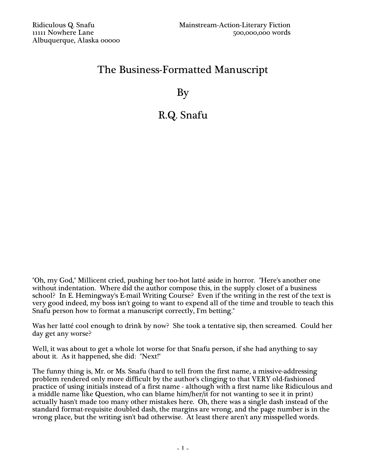
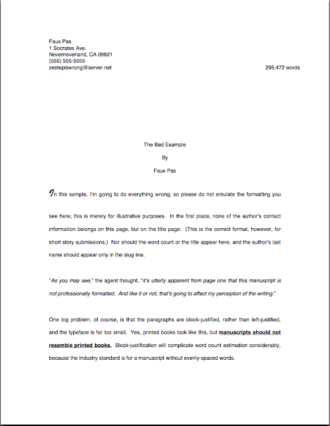
To gain a better a sense of why, let’s take another look at R.Q. Snafu and Faux Pas’ submissions from last time:

While such a top page does indeed include the requisite information Millicent or her boss would need to contact the author (although Faux Pas’ does it better, by including more means of contact), cramming it onto the first page of text doesn’t really achieve anything but saving a piece of paper. It doesn’t even shorten the manuscript or contest entry, technically speaking: the title page is never included in a page count; that’s why pagination begins on the first page of text.

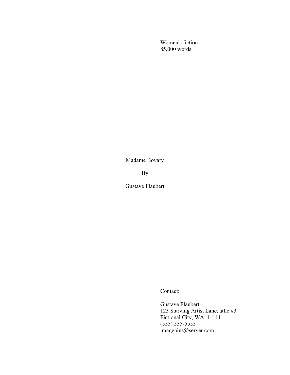
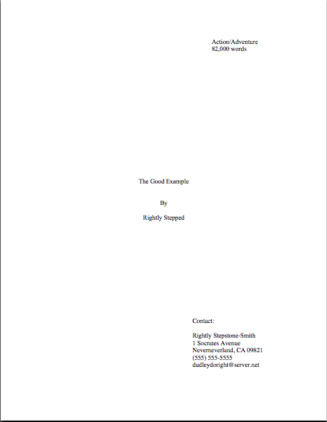
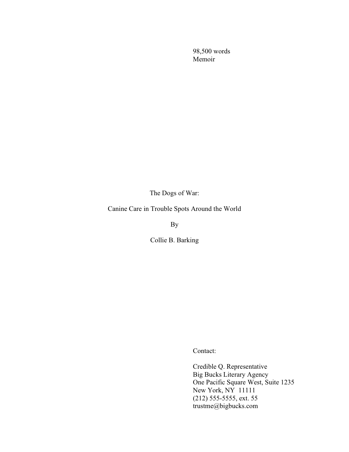
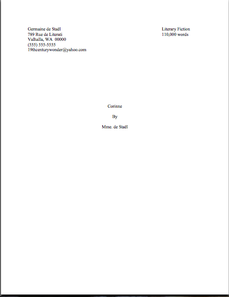
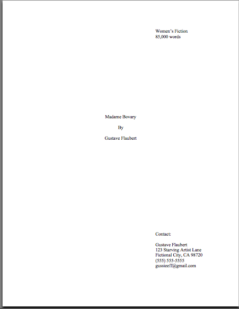
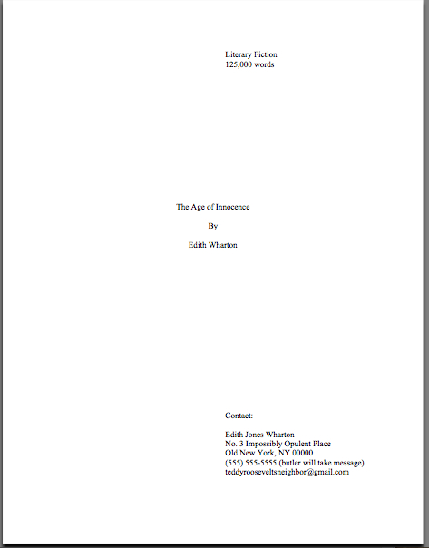
So what should a proper title page for a book manuscript or proposal look like? Glad you asked:

Got all three of those images indelibly burned into your cranium? Good. Now weigh the probability that someone who reads as many manuscripts per day as Millicent — or her boss, or the editor to whom her boss likes to sell books — would not notice a fairly substantial difference in the presentation. Assess the likelihood of that perception’s coloring any subsequent reading of the manuscript in question.

The answer’s kind of obvious once you know the difference, isn’t it?

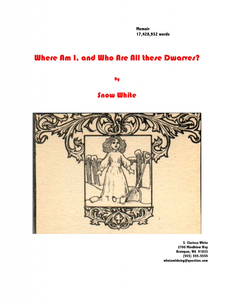
No? Okay, take a gander at another type of title page Millicent sees with great frequency — one that contains all of the right information, but is so unprofessionally formatted that the care with which the writer followed the content rules gets entirely lost:
title picture

Where should I even begin with this one? It’s pretty, undoubtedly, but would anyone care to start listing any of the five things wrong with it?

If you immediately zeroed in on the picture, give yourself a gold star for the day; there is literally no chance that any image a writer chooses to place on a manuscript or proposal’s title page will end up on the published book’s cover — the usual rationale for including them at this stage, by the way. So decorating your submission’s title page with photos or drawings will just seem bizarre to Millicent. (And that goes double for Mehitabel, the veteran literary contest judge. She is likely to emit a well-bred little scream when she opens the envelope.)

Award yourself two gold stars if you said Ms. White should nix the red lettering — or any lettering that isn’t black, for that matter — or that her contact information should not have been centered. Pin a great big blue ribbon on yourself, too, if you also pointed out that Ms. White used two different typefaces here, a classic standard format no-no. Not to mention the fact — although I do seem to be mentioning it, don’t I? — that the type size varies.

I feel an axiom coming on: like everything else in the manuscript, the title page should be entirely in 12-point type. It should also be in the same font as the rest of the manuscript.

With the usual caveat: unless an agent specifically requests otherwise, of course. Or contest’s rules; double-check for title page restrictions, which are quite common.

You may place the title in boldface if you like, but that’s it on the funkiness scale. No matter how cool your title page looks with 24-point type or the picture you would like to see on the book jacket, resist the urge, because Millicent will be able to tell from across the room if you didn’t.

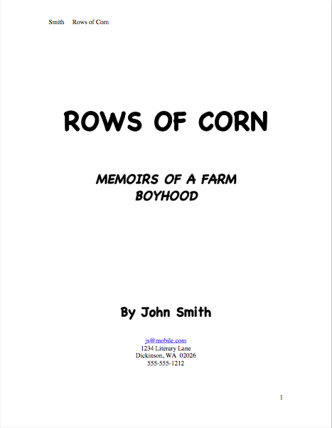
Don’t believe that size matters? See for yourself:

Quite a difference, isn’t it? Apart from Mssr. Smith’s tragic font choice and his not having countermanded Word’s annoying propensity to reproduce e-mail addresses in blue ink, did you notice any potentially-distracting problems with this title page?

If you said that it included both a slug line (the author’s name and title in the upper right margin of the page) and a page number in the bottom right corner, snag yourself yet another gold star from petty cash. Add whipped cream and walnut clusters if you mentally added the reason that those additions are incorrect: because the title page is not the first page of text, and thus should not be formatted as if it were.

While I’m on a boldface kick, nor should title pages be numbered. This means, incidentally, that the title page should not be counted as one of the 50 pages in those 50 pages the agent of your dreams asked you to submit. Nor would it count toward the total number of pages for a contest entry.

That loud whoop you just heard was contest-entering writers everywhere realizing that they could squeeze another page of text into their entries.

While you’ve got those title pages firmly imprinted upon your brainpan — let me briefly address incisive reader Lucy’s observation on today’s first example. Specifically, here’s what she had to say when I originally introduced it:

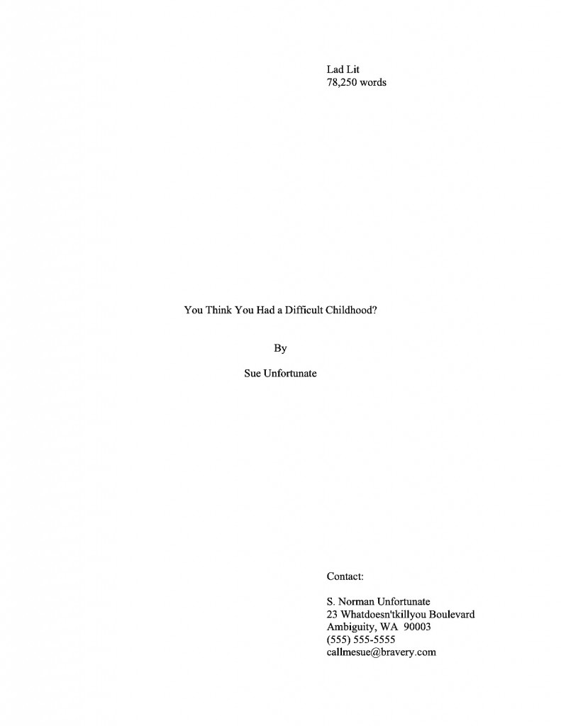
You mention initials being a gender-less faux-pas… what if you have a weird name which is gender confusing? Say a boy named Sue? Should he put Mr. Sue Unfortunate on his title page? Or just Sue Unfortunate?

Lucy’s responding, of course, to the fine print on R.Q.’s first page. Here it is again, to save you some scrolling:

I was having a little fun in that last paragraph with the still surprisingly common writerly belief that the agents and editors will automatically take a submission by a woman more seriously if the author submits it under her initials, rather than under her given first name. J.K. Rowling aside, this just isn’t true, at least in fiction circles.

In fact, in North America, women buy the overwhelming majority of novels — and not just women’s fiction, either. A good 90% of literary fiction readers (and agents, and editors) have two X chromosomes — and some of them have been known to prefer reading books by Susans rather than Roberts.

So unless you have always hated your parents for christening you Susan, you won’t really gain anything professionally by using initials in your nom de plume instead. Go ahead and state your name boldly.
unfortunate2

Even better, why not publish under a name you actually like instead? That’ll show your Susan-loving parents.

I just ruffled a few feathers out there, didn’t I? “But Anne,” I hear many an initialed purist exclaim, “I don’t want to be judged as a female writer; I want to be judged as a writer. What’s wrong with removing gender markers altogether from my title page — or my query letter, for that matter?”

Well, there’s nothing wrong with it per se, Susan, except that people are probably going to leap to a conclusion about your sex regardless. These days, Millicent’s first response upon seeing initials on a title page — especially if neither the By part and the contact information contain a first name, is usually, “Oh, this is a female writer who doesn’t want to be identified as one,” rather than “Gee, I wonder who this mystery person without a first name is. I’m just going to leap right into this manuscript with no gender-based expectations at all.”

Why might young Millie have this reaction — and her older boss be even more likely to respond this way? Because female writers — and with a few notable exceptions, almost exclusively female writers — have been submitting this way for a couple of hundred years now. It’s not all that hard a code to crack.

Historically, the hide-my-sex-for-success strategy has been used far, far less by male authors — except, of course, that hugely prolific and apparently immortal author, Anonymous, and the reputedly male writers of such ostensibly female-penned first-person classics of estrogen-fueled wantonness (avert your eyes, children) as THE HAPPY HOOKER, COFFEE, TEA, OR ME? and MEMOIRS OF A GEISHA. Even during periods when the most popular and respected novelists have been women (and there have been quite a few in the history of English and American prose, contrary to what your high school English textbook probably implied), when someone named Stanley Smith wrote a novel, the title page has generally said so.

Because, you see, even back in the 19th century, many readers would have assumed S. Smith the novelist was a nice lady named Susan. It’s probably where your parents got the idea to christen you that. (Or those readers would have assumed that you were an Oxford don writing fiction on the side, but that avocation has historically resulted in fewer book readers naming their children Susan.)

That being said, the choice to identify yourself with initials or not is entirely up to you — or, more accurately, to you and your agent, you and your editor, and you and your future publisher’s marketing department. Some sets of initials look cool in print, just as some names look better than others on book jackets.

Or so claimed my father, the intrepid fellow who demanded that the maternity ward nurse convey him to a typewriter to see how my name looked in print before committing to filling out my birth certificate. You know, to see how if it would look good on a book jacket. So for those of you who have wondered: however improbable it sounds, Anne Mini is in fact my given name; it just happens to look great in print, thanks to a little paternal forethought.

All of that, of course, is preliminary to answering Lucy’s trenchant question, which is: how on earth does a writer with a gender-ambiguous name delicately convey whether s/he would prefer to be addressed as Ms. or Mr.? Actually, s/he doesn’t, at least on the title page, or indeed in the query letter; that’s a matter for subsequent conversation with the agent. At worst, the agent will call and ask for Ms. Unfortunate; you can live with that, can’t you, Susan?

Besides, unless a writer’s gender (or sex, for that matter) is crucial to the story being told, why should it come up before then?

See earlier commentary about being judged by one’s writing, not one’s sex. But if a writer is genuinely worried about it, s/he could always embrace Sue’s strategy above, and use a more gender-definite middle name in the contact information.

Keep your chins up, Susans everywhere — you may have little control over what literary critics will say about your work, but you do have control over what name they call you. That’s worth something, isn’t it?

More concrete examples of properly and improperly formatted manuscripts follow next time, of course. Keep up the good work!
The mysteriously mysterious strictures of standard format, part VI: me and you and a boy (?) named Snafu

Johnny_Cash_-_A_Boy_Named_SueJohnny_Cash_-_A_Boy_Named_SueJohnny_Cash_-_A_Boy_Named_Sue

Before I launch into today’s installment in our ongoing series on manuscript formatting, I’m delighted to announce some good news about a long-time member of the Author! Author! community: the ever-fabulous Joel Derfner, author of the genuinely hilarious and moving memoir SWISH: My Quest to Become the Gayest Person Ever and What Happened Instead has a new musical opening off-Broadway tonight! Here’s the skinny:

Signs of Life JoelSigns of Life is about a girl coming of age in Theresienstadt, the Czech town the Nazis set up as a propaganda ghetto to show the rest of the world how well Hitler was treating the Jews. Theresienstadt was filled with artists, musicians, and intellectuals; there were nightly concerts, there were swing bands, there were operas, there were enough instrumentalists to fill two symphony orchestras. So a piece of musical theater seemed like a natural fit.”

Sounds fascinating, Joel, and congratulations! Tickets are available at Ovationtix; an unusually reliable little bird told me that throughout the month of February, if you use the promotion code HOUSE, you can get two tickets for the price of one.

I just mention. Back to business.

Last time, I showed how the first page of text does not, from a professional perspective, make an adequate substitute for a title page. Instead of being a replica of a hoped-for book cover, as many submitters produce, or a shouted-out declaration of the book’s title and who wrote it, the properly-formatted title page is a quiet, practical piece of paper, containing a specific set of marketing information.

That is not always the purpose a title page serves in a submission, alas — if, indeed, the submitter is professional enough to include a title page at all. As I pointed out last time, some writers attempt to consolidate the proper functions of the title page and first page of text into a single sheet of paper. This formatting choice is particularly common for contest entries, for some reason. To get a sense of why this might be problematic, let’s take another look at R.Q. Snafu and Faux Pas’ submissions from yesterday:

While such a top page does indeed include the requisite information Millicent or her boss would need to contact the author (although Faux Pas’ does it better, by including more means of contact), cramming it onto the first page of text doesn’t really achieve anything but saving a piece of paper. It doesn’t even shorten the manuscript or contest entry, technically speaking: the title page is never included in a page count; that’s why pagination begins on the first page of text.

So what should a proper title page for a book manuscript or proposal look like? Glad you asked:

Got all three of those images indelibly burned into your cranium? Good. Now weigh the probability that someone who reads as many manuscripts per day as Millicent the agency screener — or her boss, or the editor to whom her boss likes to sell books — would NOT notice a fairly substantial difference in the presentation. Assess the likelihood of that perception’s coloring any subsequent reading of the manuscript in question.

The answer’s kind of obvious once you know the difference, isn’t it? Isn’t it?

No? Okay, take a gander at another type of title page Millicent often sees — one that contains the right information, but is so unprofessionally formatted that the care with which the writer followed the content rules gets entirely lost:

title picture

Where should I even begin with this one? It’s pretty, undoubtedly, but would anyone care to start listing any of the five things wrong with it?

If you immediately zeroed in on the picture, give yourself a gold star for the day; since there is literally no chance that any image a writer chooses to place on a manuscript or proposal’s title page will end up on the published book’s cover (the usual rationale for including them at this stage), decorating your submission’s title page with photos or drawings will just seem bizarre to Millicent. (And that goes double for Mehitabel, the veteran literary contest judge.)

Award yourself two gold stars if you said Ms. White should nix the red lettering — or any lettering that isn’t black, for that matter — or that her contact information should not have been centered. Pin a great big blue ribbon on yourself, too, if you also pointed out that Ms. White used two different typefaces here, a classic standard format no-no. Not to mention the fact — although I do seem to be mentioning it, don’t I? — that the type size varies.

I feel a rule coming on: like everything else in the manuscript, the title page should be entirely in 12-point type. It should also be in the same font as the rest of the manuscript.

With the usual caveat: unless an agent specifically requests otherwise, of course. Or contest’s rules; double-check for title page restrictions, which are quite common.

Otherwise, you may place the title in boldface if you like, but that’s it on the funkiness scale. No matter how cool your title page looks with 24-point type or the picture you would like to see on the book jacket, resist the urge, because Millicent will be able to tell from across the room if you didn’t.

Don’t believe me that size matters? See for yourself:

Quite a difference, isn’t it? Apart from Mssr. Smith’s tragic font choice and his not having countermanded Word’s annoying propensity to reproduce e-mail addresses in blue ink, did you notice any potentially-distracting problems with this title page?

If you said that it included both a slug line (the author’s name and title in the upper right margin of the page) and a page number in the bottom right corner, snag yourself yet another gold star from petty cash. Add whipped cream and walnut clusters if you mentally added the reason that those additions are incorrect: because the title page is not the first page of text, and thus should not be formatted as if it were.

Nor should title pages be numbered. This means, incidentally, that the title page should not be counted as one of the 50 pages in those 50 pages the agent of your dreams asked you to submit, either. Nor would it count toward the total number of pages for a contest entry.

That loud whoop you just heard was contest-entering writers everywhere realizing that they could squeeze another page of text into their entries.

Before I sign off for today — and while you’ve got title pages on the brain — let me briefly address incisive reader Lucy’s observation on today’s first example. Specifically, here’s what she had to say when I originally introduced it yesterday:

You mention initials being a gender-less faux-pas… what if you have a weird name which is gender confusing? Say a boy named Sue? Should he put Mr. Sue Unfortunate on his title page? Or just Sue Unfortunate?

Lucy’s responding, of course, to the fine print on R.Q.’s first page. Here it is again, to save you some scrolling:

I was having a little fun in that last paragraph with the still surprisingly common writerly belief that the agents and editors will automatically take a submission by a woman more seriously if the author submits it under her initials, rather than under her given first name. J.K. Rowling aside, this just isn’t true, at least in fiction circles.

In fact, in North America, women buy the overwhelming majority of novels — and not just women’s fiction, either. Literary fiction readers (and agents, and editors) tend to have two X chromosomes — and some of them have been known to prefer reading books by Susans rather than Roberts.

Again, I just mention.

So unless you have always hated your parents for christening you Susan, you won’t really gain anything professionally by using initials in your nom de plume instead. Go ahead and state your name boldly:

unfortunate2

Even better, why not publish under a name you actually like instead? That’ll show your Susan-loving parents.

I just ruffled a few feathers out there, didn’t I? “But Anne,” I hear an initialed purist exclaim, “I don’t want to be judged as a female writer; I want to be judged as a writer. What’s wrong with removing gender markers altogether from my title page — or my query letter, for that matter?”

Well, there’s nothing wrong with it per se, Susan, except that these days, it almost invariably results in Millicent’s seeing such initials and murmuring, “Oh, this is a female writer who doesn’t want to be identified as one,” rather than “Gee, I wonder who this mystery person without a first name is. I’m just going to leap right into this manuscript with no gender-based expectations at all.”

Why will Millie have this reaction, you ask? Because female writers — and with a few notable exceptions, almost exclusively female writers — have been submitting this way for a couple of hundred years now. It’s not all that hard a code to crack.

Historically, the hide-my-sex-for-success strategy has been used far, far less by male authors — except, of course, that hugely prolific and apparently immortal author, Anonymous, and the reputedly male writers of such ostensibly female-penned classics of wantonness (avert your eyes, children) as THE HAPPY HOOKER and COFFEE, TEA, OR ME?. Even during periods when the most popular and respected novelists have been women (and there have been quite a few in the history of English prose, contrary to what your high school English textbook probably implied), when someone named Stanley Smith wrote a novel, the title page has generally said so.

Because, you see, even back then, readers would have assumed S. Smith the novelist was a nice lady named Susan. It’s probably where your parents got the idea to christen you that.

All that being said, the choice to initial or not is entirely up to you — or, more accurately, to you and your agent. Some sets of initials look cool in print, just as some names look better than others on book jackets.

Or so claimed my father, the intrepid fellow who demanded that the maternity ward nurse convey him to a typewriter to see how my name looked in print before committing to filling out my birth certificate. You know, to see how if it would look good on a book jacket. So for those of you who have wondered: however improbable it sounds, Anne Mini IS in fact my given name; it just happens to look great in print, thanks to a little paternal forethought.

All of that, of course, is preliminary to answering Lucy’s trenchant question, which is: how on earth does a writer with a gender-ambiguous name delicately convey whether s/he would prefer to be addressed as Ms. or Mr.? Actually, s/he doesn’t, at least on the title page, or indeed in the query letter; that’s a matter for subsequent conversation with the agent. At worst, the agent will call and ask for Ms. Unfortunate; you can live with that, can’t you, Susan?

Besides, unless a writer’s gender is crucial to the story being told, why should it come up before then?

See earlier commentary about being judged by one’s writing, not one’s gender. But if a writer is genuinely worried about it, s/he could always embrace Sue’s strategy above, and use a more gender-definite middle name in the contact information.

And keep your chins up, Susans everywhere — you may have little control over what literary critics will say about your work, but you do have control over what name they call you. That’s worth something, isn’t it?

Keep up the good work!

Publishing – the good news, by guest blogger Stan Trollip, better known as half of the amazing writing team Michael Stanley

seconddeath cover michael stanley

Hello, campers —

Still on retreat in France, of course (and yes, the weather is precisely as gorgeous as you’re imagining, thank you very much), but I’m checking in quickly to introduce a long-anticipated treat: today, police procedural author and fab guy Stanley Trollip. Stan is best known as Michael Stanley, nom de plume of Stan Trollip and Michael Sears.

/stanley-trollip-small.jpgThose of you who were hanging around the Author! Author! virtual lounge may remember Stan from last year, when he was kind enough to visit with a very interesting guest post on collaboration, because who would know more about it than an author who has won some pretty hefty awards for doing just that?

What kind of awards, you ask? Well, the Los Angeles Times named their last novel, A CARRION DEATH, as one of the top ten crime novels of 2008 — a year that certainly wasn’t lacking in terrific crime novels, by the way. Some of the awards are yet to be decided, of course, but it’s currently a finalist for the Minnesota Book Award, Strand Magazine’s Critics Award for Best First Novel, and Mystery Readers International Macavity Award for Best First Novel.

Yeah, I know: impressive, to say the least. I don’t wheedle just anybody to come and share his insights with you, you know.

Their new book, THE SECOND DEATH OF GOODLUCK TINUBU, will be coming out June 2, but it’s already available for presale on Amazon Canada. It’s already in bookstores everywhere else in the world as A DEADLY TRADE.

Here’s the publisher’s blurb for THE SECOND DEATH OF GOODLUCK TINUBU. While we’re at it, let’s take a gander at the cover (and title) you’d see if you happened to be browsing in a Canadian or UK bookstore:

deadlytrade cover Michael StanleyHow can a man die twice?

That is the question facing Detective David “Kubu” Bengu when a mutilated body is found at a tourist camp in Northern Botswana. The corpse of Goodluck Tinubu displays the classic signs of a revenge killing. But when his fingerprints are analyzed, Kubu makes a shocking discovery: Tinubu is already dead. He was slain in the Rhodesian war thirty years earlier.

Kubu quickly realizes that nothing at the camp is as it seems. As the guests are picked off one by one, time to stop the murderer is running out. With rumors of horrifying war crimes, the scent of a drug-smuggling trail, and mounting pressure from his superiors to contend with, Kubu doesn’t notice there is one door still left unguarded – his own. And as he sets a trap to find the criminals, the hunters are closing on him…

And that, boys and girls, is how to grab a reader in just a couple of paragraphs. Those of you embroiled in constructing summaries for your query letters and/or pitches might want to take note: see how the clever use of both telling details and a strong forward momentum makes you want to read this book? An agent is likely to react that way, too.

I’ve said it before, and I’ll no doubt say it again: never, ever forget that even the most tedious chore in book description is an opportunity to show what a good storyteller you are.

The Michael Stanley duo is extraordinarily talented at storytelling — but wait, you don’t have to take my word for that, do you? Here are some advance reviews from the most respected of industry sources:

Booklist, May 1, 2009
*Starred* Review! 
“ . . .. a brilliant sequel to last year’s Carrion Death… Stanley (the pseudonym for the writing team of Michael Sears and Stanley Trollip) is not content with a single plot line, effectively juggling the murders with cross-border drug smuggling and the circumstances surrounding an upcoming African Union meeting. Kubu, a dedicated gourmand, is just one of many fully fleshed and charmingly realistic characters. From slightly annoying sister-in-law Peasant to Kubu’s intense and acerbic boss Mabuku to Scottish pathologist MacGregor, each character is memorable and adds depth to this tense and involving police procedural. Suggest to fans of The No. 1 Ladies’ Detective Agency series, who will appreciate Kubu’s laid-back style and happy home life, and to Henning Mankell fans, who will respond to the complex plots and palpable sense of place.”

Library Journal Reviews, April 1, 2009
“Following his spectacular debut, A Carrion Death, Stanley comes roaring back with an even better tale. Bringing a love of Africa similar to Alexander McCall Smith’s popular “No. 1 Ladies’ Detective Agency” series, the author has created an excellent new venue for those who love to read about other cultures while enjoying a good mystery. Highly recommended.”

And that makes you curious about their multiple prize-winning first collaboration, doesn’t it, the one that the LA Times named as one of the top crime books of 2008? If so, then you’ll be pleased to hear that A CARRION DEATH is available Amazon, Amazon Canada, and Amazon UK.

I’m always delighted when I’m able to blandish an established working writer into sharing his views on the practicalities of the biz with you, dear readers, because the common writerly fantasies about what getting published and making a living as a writer entails tend to be, well, a bit fantastic. The write book/have agent show up on doorstep the next day/sell book to publisher in a week/quit day job immediately/appear on Oprah within a month scenario, while fun to think about, isn’t really the industry works.

All of which is a long-winded way of saying: if you’re even vaguely considering trying to make money by writing books, do pay careful attention to what Stan says here about advances, publication contracts, and book promotion. (And for more insight on both, please feel free to consult the aptly-named ADVANCES, PUBLICATION CONTRACTS, and BOOK PROMOTION categories on the archive list on the lower right-hand side of this page.)

Without further ado, then, please join me in a big Author! Author! welcome for Stan Trollip! Take it away, Stan!

Michael Stanley smiling with cat

The publishing world is full of bad news. Editors being let go; contracts not being honored; staff being laid off; fewer manuscripts being bought; less money for publicity. The list goes on. Everyone in the industry is depressed.

Or nearly everyone. I’m not depressed. Nor is my writing partner, Michael Sears.
We are actually having a ball and are in the midst of a worldwide tour promoting our second Detective Kubu novel, which is titled THE SECOND DEATH OF GOODLUCK TINUBU in the States and A DEADLY TRADE in the rest of the world.

Despite the great distance to be traveled and living out of a suitcase, it is inspiring to meet people who sell books and people who read books. It is remarkable to see how passionate these people are about reading in general and about books specifically. And of course it is a thrill when we find a stack of our books in a bookstore or see people with one of our books in hand.

We are Stanley Trollip (that’s me) and Michael Sears. Collectively we write under the name of Michael Stanley. Six years ago, neither of us had any aspirations of being published authors. Today, our first novel, A CARRION DEATH, is published in the U.S.A., the U.K., Italy, and France (to be released in September). Our second novel is already out in the British Commonwealth and will be released in the States on June 2.

So what’s there to be depressed about?

Seriously, ours is a writer’s dream come true. We started writing for fun in mid-2003, fifteen years after we had an idea for a novel. In the mid-80s, I would load a small plane with friends and wine and head off to Botswana to watch game and birds. One day we watched a pack of hyenas demolish a wildebeest – bones and all.

Aha, we thought. If one wanted to get rid of a body, leaving it for the hyenas would be a great way of doing so. Fifteen years later we started writing our first novel, A CARRION DEATH, using the hyena idea as the opening. In the book, the hyena is interrupted in its meal, leaving the remnants of a corpse. The perfect murder wasn’t perfect anymore.

To our surprise, we found an outstanding agent in New York, who was able to get HarperCollins to make us a two-book offer for worldwide English rights. Not long after, they sold rest of the world English rights to Headline in the UK. Our agent,Marly Rusoff, then sold the manuscript to JC Lattes in France and Sonzogno in Italy. To us, the unbelievable had come true.

A CARRION DEATH has been critically well received, being shortlisted for three awards – two still to be decided – and being named as one of the Los Angeles Times top ten crime books of 2008.

Is A CARRION DEATH a best seller? No! Are we making money hand over fist? No! In fact, we still have a long way to go in paying back our initial advance. But we have had a great start, selling about 25,000 copies in various languages worldwide. More importantly, Michael and I have had an enormous amount of fun writing together even though we are often on different continents – Michael in Africa, and I in the States.

So how does it work having multi-book contracts and books being published in different languages? It is useful to understand some of the simple dynamics – something we knew nothing about when we started – in fact we knew so little that we didn’t realize that two people weren’t supposed to write fiction together.

Contractual stuff
I seldom read in blogs like Author! Author! how the contractual aspects of publishing work – let alone how an author deals with multiple publishers and multiple contracts. So I’m going to take a few paragraphs to describe, in simple, terms how this all works.

First, when you write something, you own all the rights (unless you have been commissioned to write the piece, and the person commissioning you retains the rights). So when we finished A CARRION DEATH, we owned all the associated rights.

We sold some of these (worldwide English rights) to HarperCollins in New York. They decided to retain only the English rights for North America, and sold the subsidiary English rights for the rest of the world to Headline in the UK. We then sold worldwide French rights to JC Lattes in France (due out in September 2009) and worldwide Italian rights to Sonzogno in Italy (published in October 2008).

We still hold all the other rights, including all other language rights, radio rights, and movie rights. (If you know anyone who wants to buy these, …!)

When we sold the worldwide English rights to HarperCollins, they bought them by offering us an advance against royalties – an amount of money, to be delivered in three parts (a third on signing, a third on acceptance of the manuscript, and a third on publication). An advance against royalties means that the publisher has advanced us the money, which we have to pay off through royalties on sales, etc.

From our point of view, the good news is that if our royalties don’t ever pay off the advance, we don’t have to fork out the difference. So the advance against royalties is the way a publisher acknowledges that writing is a slow process, and that writers need to live. They take a risk by paying these advances because they may never recover them.

So how do we pay off the advance? For each book sold we receive a royalty that ranges from 10% to 15% of the cover price. All these royalties start paying off the advance. Also, when HarperCollins sold the subsidiary rights to Headline, the amount they sold them for, less a commission, also went to pay off the advance.

Today the royalties earned by A CARRION DEATH sold anywhere in the world go to paying off our advance. And only when the advance is paid off will we see any more money.

In the same way, we received advances from our French and Italian publishers and are in process of paying them back through royalties from books sold.

In our case, it could be some time before we pay off the advances and see any further royalties. Indeed it is often the case that authors never see additional royalties. That may happen to us too.

Now we are about to release our second mystery, called THE SECOND DEATH OF GOODLUCK TINUBU in North America and A DEADLY TRADE in the rest of the English-speaking world. For this book, the whole financial process starts again. We receive an advance in three installments and pay it off through royalties and the sale of subsidiary rights.

If very successful, we may see additional royalties in the future. If not, we can keep the advance.

You may ask why the book has two titles. Good question. Our original title was THE SECOND DEATH OF GOODLUCK TINUBU, but Headline in the UK thought it sounded a bit too much like an Alexander McCall Smith novel and wanted something a bit snappier. After several weeks of brainstorming we came up with A DEADLY TRADE, which we like also.

Multiple editors
Another interesting issue that we didn’t anticipate was having multiple editors. We have a wonderful editor at HarperCollins – Claire Wachtel – who takes our manuscript and provides feedback such as “the pace falls off here,” or “move this chapter later to maintain tension,” or “take this character out – he doesn’t add anything.”

Despite the pain that we often feel when reading such comments, Claire is usually right, and we do what she says. It always improves the book. When she approves the changes, the manuscript goes to a copy editor who helps to improve language and often catches annoying discrepancies.

But what about the UK edition? Is it the same book?

For A CARRION DEATH, after the manuscript had been approved by HarperCollins, we translated it from American into English, then submitted it to our UK editor, Sherise Hobbs. Like Claire Wachtel, she read the manuscript and made suggestions, not as fundamental as Claire’s, but still extremely insightful and useful. After we finished addressing her concerns, the English manuscript was copy edited again, and only then went to printing.

So the US and UK editions are different, but only in minor ways, such as spelling, grammar, and some colloquialisms and culture-dependent references. For example a car has a bonnet and boot in English, and a hood and trunk in American. In English the past participles of lean and burn are leant and burnt. In American they are leaned and burned. American readers are more comfortable is dealing with distances in miles, yards, feet, and inches, while readers elsewhere typically use the metric equivalents of kilometers (spelled (spelt) kilometres outside north America), meters, centimeters and millimeters. The measurement of weight has similar differences.

From our point of view, we think we have two superb editors who improve our books immeasurably. Fortunately, they pull in the same direction, and we haven’t had to deal with any conflicts.

So far we have had little or no interaction with the editors of the French and Italian editions, mainly because neither Michael nor I have the language skills to make any meaningful input. However, we have been asked to comment on covers and titles. The Italian edition of A CARRION DEATH, for example, is titled IL DETECTIVE KUBU rather than a direct translation of the English title. The French title is still undecided.

To close
We have just started promoting A DEADLY TRADE and THE SECOND DEATH OF GOODLUCK TINUBU and will come back to Author! Author! in a few weeks with a report on what it is like to launch a book in multiple countries.

THE SECOND DEATH OF GOODLUCK TINUBU will have its worldwide launch on June 2, 2009 at the wonderful Once Upon A Crime bookstore in Minneapolis. Please visit our website for up-to-date news and information about upcoming events. There you can also sign up for our newsletter which comes out four or five times a year.

Thanks, Stan — that was hugely informative! Best of luck with the new book, and we’re all looking forward to seeing you back here again soon!

Michael Stanley smiling with catMichael Stanley is the writing team of Michael Sears and Stanley Trollip.

Both are retired professors who have worked in academia and business. They were both born in South Africa. Michael is a mathematician, specializing in geological remote sensing. He lives in Johannesburg, South Africa, and is a tournament bridge player. Stanley is an educational psychologist, specializing in the application of computers to teaching and learning, and a pilot. He splits his time between Knysna, South Africa, and Minneapolis in the United States. He is an avid golfer.

Their first novel, A CARRION DEATH, featuring Detective David “Kubu” Bengu, was published in 2008 and received critical acclaim. The Los Angeles Times listed it as one of its top ten crime novels of 2008. It is a nominee for the Minnesota Book Award, Strand Magazine’s Critics Award for Best First Novel, and Mystery Readers International Macavity Award for Best First Novel.

How to format a book manuscript properly, part IV: some things just look better printed on a page than others

shakespeare-first-folio
Hey, do you know what today is? It’s the one-week anniversary of the announcement of my blog’s entrée into the serious award-granting stage of its career, First Periodic Author! Author! Awards for Expressive Excellence. Not only is that a prize win that would look awfully pretty on a query letter or in an author bio — hey, I worry about the progress of your writing career, you know — but it’s a chance for those of you who feel strongly about the subject of our ongoing series on censorship, subtle and otherwise, to get your work published side-by-side with some pretty impressive published authors.

Oh, and there are some more tangible prizes as well. You’ll find the rules here. Chief among them: in order to win or place, an entry must be in standard manuscript format.

Why, what a remarkable coincidence: we seem to be in the midst of a series on standard format! The universe sure works in mysterious ways, doesn’t it?

Which means, of course, that it’s time to get back to work. Has everyone recovered from the last few days’ worth of inoculation with professional formatting know-how?

Yes, that was a whole lot of information to absorb at once, and it may have left a bit of a sore place, but much better a one-time quick sting than engendering years of rejection without knowing why, I always say. Once you’ve gotten exposed to the correct way to format a book manuscript, chances are that you’ll be immune to formatting problems in the future.

Why, yes, I have run that metaphor right into the ground. How kind of you to notice.

There’s a reason I’m hammering on it so hard, however: one of the great fringe benefits of inoculation is that, as unpleasant as it may have been at the sticking-point, so to speak, the stuck usually doesn’t have to think all that much about smallpox or whooping cough for quite a long time afterward.

So too with standard format for book manuscripts — once a writer gets used to how a professional submission is supposed to look, everything else is going to look wacky.

No, really. As I have been threatening begging you to believe against all evidence promising you repeatedly every few minutes while running through the standard format strictures, once you get used to how a professional manuscript is put together, any other formatting is going to feel downright uncomfortable.

And to prove it to you, I’m going to spend the rest of this series let you see precisely HOW different standard format and non-standard format appears to the pros.

But first, the usual caveats: what I’m about to show you is for BOOKS and BOOK PROPOSALS only, folks. At the risk of repeating myself (and repeating myself and repeating myself), I’ve been talking for the last few days ONLY about how books and book proposals should be formatted, not about short stories, screenplays, poetry, magazine and newspaper articles, or anything else; if you’re looking for formatting tips for any of the latter, run, don’t walk, to consult with those knowledgeable souls who deal with that kind of writing on a day-to-day basis.

Translation: first, if the agent or editor of your dreams (or the agent or editor with whom you are currently signed, if they don’t happen to be the same person) has expressed a strong preference for his clients formatting in a manner opposed to what you see here, run with that — but only for submission to that particular agent.

Yes, major deviations from this format are genuinely uncommon — among manuscripts that agents are currently submitting to editors at major US publishing houses, at least — but let’s face it, you’re not going to get anywhere telling an established agent that no one else’s clients are using 18-point Copperplate Gothic Bold if he happens to have an unnatural affection for it. Part of working with an agent entails trusting that he knows more about marketing books than you do. If he doesn’t, you wouldn’t WANT to be working with him, right?

I must have misheard all of the query-weary submitters out there. The proper answer is YES.

And before my last statement sends anyone out there into that time-honored writerly I’ve just signed with an agency but what if I chose the wrong one? panic, remember this: if you’ve done your homework before you signed, and thus are certain that he has a solid recent track record selling books in your category, you have every reason to have faith in your representative.

Or so I keep telling myself when I can’t sleep at night. Handing one’s hopes and dreams to someone else to market is hard.

Second, please recognize that not everything that falls under the general rubric writing should be formatted identically. So if your favorite source — other than yours truly, of course — tells you to do something diametrically opposed to what I’m showing you here, may I suggest double-checking that the other source is indeed talking about book manuscripts and not, say, submissions to a magazine that accepts short stories?

I hate to burst anyone’s bubble, but contrary to popular belief, submission standards differ by type of publication.

Yet surprisingly often, those giving practical to aspiring writers will conflate the format for, say, short stories, one with that for book manuscripts, resulting in a first page that will look incorrect to either. (Although, generally speaking, such guidelines tend to stick closer to the short story format than to the book.)

Don’t worry; I’ll be showing you the first pages of both very soon. In the spirit of that old chestnut, SHOW, DON’T TELL, I shall demonstrate just how different a manuscript that follows the rules looks from one that doesn’t.

But not before I give you just one more reason to study these examples very, very carefully if you are planning to submit book-length work to a North American agent or editor anytime soon: writers often overlook odd formatting as a possible reason that an otherwise well-written manuscript might have been rejected.

Oh, not all by itself, generally speaking, unless the violation was truly egregious by industry standards, something along the lines of submitting unnumbered pages or not indenting paragraphs, for instance. But in a garden-variety well-written manuscript that combines non-standard format with even just a couple of the common agents’ pet peeves — a cliché on page 1, for instance, or several misspellings in the first paragraph — the result is generally fatal.

Certainly, other rejection reasons get a lot more airplay, particularly at writers’ conferences. If you want to take a long, hard look at some of the better-discussed reasons, I would urge you to gird your loins and plunge into the REJECTION ON PAGE ONE category at right. (For those of you who missed it this past January, I went over list of instant-response rejection reasons given by a group of agents going over a stack of actual submissions at a conference, one by painful one. Pretty horrifying.)

Yet surprisingly little conference time seems to be devoted to deviations from standard format for manuscripts. Why shouldn’t conference speakers take thirty seconds of their speaking gigs to pointing out, for instance, that the ways in which a professional manuscript does not resemble a published book — ways that are unfortunately quite obvious to an agent, editor, contest judge, etc., from practically the moment their eyes light upon a submission?

Why is it so very apparent, you ask? Because much of the time, submitting writers will work overtime to make it apparent.

Seriously, many aspiring writers clearly go out of their way to format their submissions to resemble published books, in the mistaken belief that this will make their work seem more professional. As we’ve already discussed in this series, the opposite is generally true — and often, it’s apparent in a professional reader’s first glance at the first page of a submission.

If the implications of that last assertion made you dizzy — if, for instance, you found yourself picturing our old pal Millicent the agency screener pulling a submitted manuscript out of its envelope, casting a critical eye over the first page, hooting, and stuffing the whole thing into the handy SASE along with a photocopied rejection letter — try placing your head between your knees and breathing slowly.

Go ahead. I’ll wait until you recover.

And then follow up with a hard truth that may get those of you new to the game hyperventilating again: the VAST majority of submissions are rejected not only on page 1, but within the first few lines of page 1. Heck, a harried Millicent will derive a negative impression of a manuscript even PRIOR to page 1.

Keep taking nice, deep breaths. That dizziness will pass shortly.

Ah, some of you have found your breaths again, haven’t you? “Oh, come on, Anne,” I hear some hard-boiled submission veterans scoff, “she makes up her mind prior to page 1? How is that even possible?”

Well, the most common trigger is the absence of any title page whatsoever. Many submitters, for reasons best known to themselves, omit the title page altogether — often, I suspect, because they are unaware that a professional book-length manuscript ALWAYS has a title page.

Why? Long-time readers (or even those who have been paying attention over the last several days), chant it with me now: a properly-formatted title page tells an agent PRECISELY how to contact the brilliant author who wrote it — and tells an editor PRECISELY how to contact the agent who represents her.

To set the minds of those of you who have title page-free submissions circulating at the moment, relax: forgetting to include a title page almost certainly won’t prevent Millicent from reading your submission at all; she tends to read even the most bizarrely-formatted submissions for at least a line or two (although often no more than that). But that initial impression of an author’s lack of professionalism — or, to call it by a kinder name, of having a lot to learn about how the publishing industry works — does often translate into a rather jaundiced reading eye for what comes next.

Why? Well, let’s take a peek through her reading glasses, shall we? The first thing Millicent sees when she opens the average requested materials package is something like this:

Or like this:

Or, heaven help us, like this:

So tell me: why might Millicent take one look at these and conclude that their respective submitters could use a good class on manuscript formatting — and thus would be time-consuming clients for her boss to sign?

I see all of you long-term blog readers out there with your hands in the air, jumping up and down, eager to tell everyone what’s wrong with this as a first page of text — and you’re absolutely right, of course. We’re going to be talking about precisely those points in the days to come.

For now, however, I want you to concentrate upon how this example has failed as both a title page and a first page of text: by not including the information that Millicent would expect to see on either.

What makes me so sure she would find this discovery disappointing, at best? Because what she (or her boss agent, or an editor, or a contest judge) would have expected to see on top of that pile of paper was this:

This is a standard manuscript title page for the same book — rather different, isn’t it? Visibly different, in fact, from several paces away, even if Millicent isn’t wearing her reading glasses.

Again, submitting the earlier examples rather than that last would not necessarily be instantly and automatically fatal to a manuscript’s chances, of course. Most of the time, Millicent will go ahead and plunge into that first paragraph of text anyway.

However, human nature and her blistering reading schedule being what they are (for those of you new to this screener’s always-rushed ways, she has a stack of manuscripts up to her chin to screen — and that’s at the end of a long day of screening queries; manuscript submission is in addition to that), if she has already decided that a submission is flawed, just how charitable an eye do you think she is likely to cast upon the NEXT problem on the page?

To use her favorite word: next!

To be fair to Millicent, while it may well be uncharitable of her to leap to the conclusion that Faux Pas’ or Ridiculous’ manuscript is likely to be unpolished because they did not include a proper title page, agencies do have a vested interest in signing writers who present themselves professionally. For one thing, they’re cheaper to represent, in practical terms: the agent doesn’t have to spend as much time working with them, getting their manuscripts ready to submit to editors.

And no agent in his right mind would send out a manuscript that didn’t include a standard title page. It serves a number of important — nay, vital — marketing functions.

To understand why, let’s take another look at the professional version. So you don’t have to keep scrolling up and down the page, here it is again:

Did you take a nice, long look? Good. While we’re at it, let’s also take a gander at a proper title page for a book with a subtitle (I haven’t forgotten your question, Harvey!):

Those formats firmly in your mind? Excellent. Now for a pop quiz: how precisely do Rightly and Collie’s first sheets of paper promote their respective books than Faux Pas or Ridiculous’ first pages?

Well, right off the bat, the good examples tell a prospective agent or editor what kind of book it is, as well as its approximate length. (If you do not know how to estimate the number of words in a manuscript, or why you should use an estimate rather than relying upon your word processor’s count, please see the WORD COUNT category at right.) Both of these are pieces of information that will tell Millicent instantly whether the submission in her hand would meet the requirements of the editors to whom her agency tends to sell.

Oh, yes, that’s important in a submission, whether to an agency or a publishing house. Really, really important.

Why? Well, think about it: if Millicent’s boss had decided not to represent Action/Adventure anymore, or if editors at the major houses had started saying that they were only interested in seeing Action/Adventure books longer than 90,000 words, Rightly Stepped would be out of luck.

But then, being a savvy submitter, ol’ Rightly would also want his work to be represented by an agent who just ADORES very long Action/Adventure novels — and regularly goes to lunch with scads and scads of editors who feel precisely the same way, right?

As I MAY have mentioned seven or eight hundred times before (in this post, it feels like), the standard title page also tells Millicent precisely how to contact the author to offer representation — and that’s a very, very good thing for everyone concerned. If I’ve said it once, I’ve said it a thousand times: it’s ALWAYS in an aspiring writer’s interest to make it easy for an agent to help her.

I might be wrong, of course, but I suspect that NOT forcing Millicent to forage through the mountain of paper on her desk to find a misplaced cover letter with your phone number on it MIGHT be a good start toward being easily helpable.

By contrast, Faux Pas’ first page doesn’t really do anything but announce the title of the book and leap right into the story. That’s one underachieving piece of paper.

Some writers attempt to consolidate the proper functions of the title page and first page of text into a single sheet of paper. This format is particularly common for contest entries, for some reason. Let’s take another look at Ridiculous and Faux Pas’ submissions:

While such a top page does indeed include the requisite information Millicent or her boss would need to contact the author (although Faux Pas’ does it better, by including more means of contact), cramming it onto the first page of text doesn’t really achieve anything but saving a piece of paper. It doesn’t even shorten the manuscript or contest entry, technically speaking: the title page is never included in a page count; that’s why pagination begins on the first page of text.

I shall go into what DOES belong on the first page of text tomorrow, with accompanying visual aids. For today, let’s keep our focus simple: all I ask is that you would look at the proper title and the unprofessional examples side by side.

Go back and look again. I’ve got some time to kill.

Got all of those images indelibly burned into your cranium? Good. Now weigh the probability that someone who reads as many manuscripts per day as Millicent — or her boss, or the editor to whom her boss likes to sell books — would NOT notice a fairly substantial difference in the presentation. Assess the probability of that perception’s coloring any subsequent reading of the manuscript in question.

The answer’s kind of obvious once you know the difference, isn’t it?

Before I sign off for today — and while you’ve got R.Q. Snafu’s example still in the front of your mind — let me briefly address the still surprisingly common writerly belief that the agents and editors will automatically take a submission by a woman more seriously if the author submits it under her initials, rather than under her given first name.

J.K. Rowling aside, this just isn’t true, at least in fiction circles.

So unless you have always hated your parents for christening you Susan, you won’t really gain anything professionally by using initials in your nom de plume instead. And even if you did, why not publish under a name you actually like instead?

That’ll show your Susan-loving parents.

I just ruffled a few feathers out there, didn’t I? “But Anne,” I hear an initialed purist exclaim, “I don’t want to be judged as a FEMALE writer — I want to be judged as a WRITER. What’s wrong with removing gender markers altogether?”

Well, there’s nothing wrong with it per se, Susan, except that these days, it almost invariably results in Millicent’s seeing such initials and thinking, “Oh, this is a female writer who doesn’t want to be identified as one,” rather than “Gee, I wonder who this mystery person without a first name is. I’m just going to leap right into this manuscript with no gender-based expectations at all.”

Why will Millie have this reaction, you ask? Because female writers — and with a few notable exceptions, almost exclusively female writers — have been submitting this way for a couple of hundred years now. It’s not all that hard a code to crack.

Historically, the hide-my-sex-for-success strategy has been used far, far less by male authors — except, of course, that hugely prolific and apparently immortal author, Anonymous, and the reputedly male writers of such ostensibly female-penned classics of wantonness (avert your eyes, children) as THE HAPPY HOOKER and COFFEE, TEA, OR ME?. Even during periods when the most popular and respected novelists have been women (and there have been quite a few in the history of English prose, contrary to what your high school English textbook probably implied), when someone named Stanley Smith wrote a novel, the title page has generally said so.

Because, you see, even back then, readers would have assumed S. Smith the novelist was a nice lady named Susan. It’s probably where your parents got the idea to christen you that.

Something else for initial-favoring fiction writers to consider: in North America, women buy the overwhelming majority of novels — and not just women’s fiction, either. Literary fiction readers (and agents, and editors) tend to have two X chromosomes — and some of them have been known to prefer reading books by Susans rather than Roberts.

I just mention.

All that being said, the choice to initial or not is entirely up to you — or, more accurately, to you and your agent. Some sets of initials look cool in print, just as some names look better than others on book jackets.

Or so claimed my father, the intrepid fellow who demanded that the maternity ward nurse convey him to a typewriter to see how my name looked in print before committing to filling out my birth certificate. You know, to see how if it would look good on a book jacket. So for those of you who have wondered: Anne Mini IS in fact my given name; it just happens to look great in print, thanks to a little forethought.

Keep your chin up, Susan — you have some say in what the literary critics will call you. And keep up the good work!

Manuscript formatting 101, part IV: let’s see what this looks like in practice

Has everyone recovered from this weekend’s inoculation of professional formatting know-how? Yes, that was a whole lot of information to absorb at once, and it may have left a bit of a sore place, but much better a one-time quick sting than engendering years of rejection without knowing why, I always say. Once you’ve gotten exposed to the correct way to format a book manuscript, chances are that you’ll be immune to formatting problems in the future.

Why, yes, I have run that metaphor right into the ground. How kind of you to notice. But there’s a reason I’m hammering on it so hard: one of the great fringe benefits of inoculation is that, as unpleasant as it may have been at the sticking-point, so to speak, the stuck usually doesn’t have to think all that much about smallpox or whooping cough for quite a long time afterward.

So too with standard format for book manuscripts — once a writer gets used to how a professional submission is supposed to look, everything else is going to look wacky.

No, really. As I have been threatening promising you repeatedly every few minutes while running through the standard format strictures, once you get used to how a professional manuscript is put together, any other formatting is going to feel downright uncomfortable. And to prove it to you, I’m going to spend the rest of this series let you see precisely HOW different standard format and non-standard format appears to the pros.

The usual caveats: what I’m about to show you is for BOOKS and BOOK PROPOSALS, folks. At the risk of repeating myself (and repeating myself and repeating myself), I’ve been talking for the last few days ONLY about how books and book proposals should be formatted, not about short stories, screenplays, poetry, magazine and newspaper articles, or anything else; if you’re looking for formatting tips for any of the latter, run, don’t walk, to consult with those knowledgeable souls who deal with that kind of writing on a day-to-day basis.

Translation: first, if the agent or editor of your dreams (or the agent or editor with whom you are currently signed, if they don’t happen to be the same person) has expressed a strong preference for his clients formatting in a manner opposed to what you see here, run with that — but only for submission to that particular agent.

Yes, major deviations from this format are genuinely uncommon — among manuscripts that agents are currently submitting to editors at major US publishing houses, at least — but let’s face it, you’re not going to get anywhere telling an established agent that no one else’s clients are using 18-point Copperplate Gothic Bold if he happens to have an unnatural affection for it. Part of working with an agent entails trusting that he knows more about marketing books than you do. If he doesn’t, you wouldn’t WANT to be working with him, right?

I must have misheard all of the query-weary submitters out there. The proper answer is YES.

And before my last statement sends anyone out there into that time-honored writerly I’ve just signed with an agency but what if I chose the wrong one? panic, remember this: if you’ve done your homework before you signed, and thus are certain that he has a solid recent track record selling books in your category, you have every reason to have faith in your representative.

Or so I keep telling myself when I can’t sleep at night. Handing one’s hopes and dreams to someone else to market is hard.

Second, please recognize that not everything that falls under the general rubric writing should be formatted identically. So if your favorite source — other than yours truly, of course — tells you to do something diametrically opposed to what I’m showing you here, may I suggest double-checking that the other source is indeed talking about book manuscripts and not, say, submissions to a magazine that accepts short stories?

Contrary to popular belief, standards differ by type of publication. Yet surprisingly often, those giving practical to aspiring writers will conflate the format for, say, short stories, one with that for book manuscripts, resulting in a first page that will look incorrect to either. (Although, generally speaking, such guidelines tend to stick closer to the short story format than to the book.)

Don’t worry; I’ll be showing you the first pages of both very soon. In the spirit of that old chestnut, SHOW, DON’T TELL, I shall demonstrate just how different a manuscript that follows the rules looks from one that doesn’t.

But not before I give you just one more reason to study these examples very, very carefully if you are planning to submit book-length work to a North American agent or editor anytime soon: writers often overlook odd formatting as a reason that an otherwise well-written manuscript might have been rejected.

Certainly, other reasons get a lot more airplay, particularly at writers’ conferences. If you want to take a long, hard look at some of the better-discussed reasons, I would urge you to gird your loins and plunge into the FIRST PAGES AGENTS DISLIKE category at right. (For those of you who missed it, a couple of falls ago, I went over list of instant-response rejection reasons given by a group of agents going over a stack of actual submissions at a conference, one by painful one. Pretty horrifying.)

Yet surprisingly little conference time seems to be devoted to deviations from standard format for manuscripts. Why shouldn’t conference speakers take thirty seconds of their speaking gigs to pointing out, for instance, that the ways in which a professional manuscript does not resemble a published book — ways that are unfortunately quite obvious to an agent, editor, contest judge, etc., from practically the moment their eyes light upon a submission?

Why is it so very apparent, you ask? Because much of the time, submitting writers will work overtime to make it apparent.

Seriously, many aspiring writers clearly go out of their way to format their submissions to resemble published books, in the mistaken belief that this will make their work seem more professional. The opposite is generally true — and often, it’s apparent in a professional reader’s first glance at the first page of a submission.

If the implications of that last assertion made you dizzy — if, for instance, you found yourself picturing our old pal Millicent the agency screener pulling a submitted manuscript out of its envelope, casting a critical eye over the first page, hooting, and stuffing the whole thing into the handy SASE along with a photocopied rejection letter — try placing your head between your knees and breathing slowly. I’ll wait until you recover.

And then follow up with a hard truth: the VAST majority of submissions are rejected not only on page 1, but within the first few lines of page 1. And often, a harried Millicent will derive a negative impression of a manuscript even PRIOR to page 1.

Keep taking nice, deep breaths. That dizziness will pass shortly.

Ah, some of you have found your breaths again, haven’t you? “Oh, come on, Anne,” I hear some hard-boiled submission veterans scoff, “she makes up her mind prior to page 1? How is that even possible?”

Well, the most common trigger is the absence of any title page whatsoever. Many submitters, for reasons best known to themselves, omit the title page altogether — often, I suspect, because they are unaware that a professional book-length manuscript ALWAYS has a title page.

Why? Long-time readers (or even those who have been paying attention over the last several days), chant it with me now: a properly-formatted title page tells an agent PRECISELY how to contact the brilliant author who wrote it — and tells an editor PRECISELY how to contact the agent who represents her.

To set the minds of those of you who have title page-free submissions circulating at the moment, relax: forgetting to include a title page almost certainly won’t prevent Millicent from reading your submission at all; she tends to read even the most bizarrely-formatted submissions for at least a line or two (although often no more than that). But that initial impression of an author’s lack of professionalism — or, to call it by a kinder name, of having a lot to learn about how the publishing industry works — does often translate into a rather jaundiced reading eye for what comes next.

Why? Well, let’s take a peek through her reading glasses, shall we? The first thing Millicent sees when she opens the average requested materials package is something like this:

Or like this:

Or, heaven help us, like this:

So tell me: why might Millicent take one look at these and conclude that their respective submitters could use a good class on manuscript formatting — and thus would be time-consuming clients for her boss to sign?

I see all of you long-term blog readers out there with your hands in the air, jumping up and down, eager to tell everyone what’s wrong with this as a first page of text — and you’re absolutely right, of course. We’re going to be talking about precisely those points in the days to come.

For now, however, I want you to concentrate upon how this example has failed as both a title page and a first page of text: by not including the information that Millicent would expect to see on either.

What makes me so sure she would find this discovery, at best, disappointing? Because what she (or her boss agent, or an editor, or a contest judge) would have expected to see on top of that pile of paper was this:

This is a standard manuscript title page for the same book — rather different, isn’t it? Visibly different, in fact, from several paces away, even if Millicent isn’t wearing her reading glasses.

Again, submitting the first example rather than the second would not necessarily be instantly and automatically fatal to a manuscript’s chances, of course. Most of the time, Millicent will go ahead and plunge into that first paragraph of text anyway.

However, human nature and her blistering reading schedule being what they are (for those of you new to this screener’s always-rushed ways, she has a stack of manuscripts up to her chin to screen — and that’s at the end of a long day of screening queries; manuscript submission is in addition to that), if she has already decided that a submission is flawed, just how charitable an eye do you think she is likely to cast upon the NEXT problem on the page?

Uh-huh. To use her favorite word: next!

To be fair to Millicent, while it may well be uncharitable of her to leap to the conclusion that Faux Pas’ or Ridiculous’ manuscript is likely to be unpolished because they did not include a proper title page, agencies do have a vested interest in signing writers who present themselves professionally. For one thing, they’re cheaper to represent, in practical terms: the agent doesn’t have to spend as much time working with them, getting their manuscripts ready to submit to editors.

And no agent in his right mind would send out a manuscript that didn’t include a standard title page. It serves a number of important — nay, vital — marketing functions.

Let’s take another look at the professional version, shall we? So you don’t have to keep scrolling up and down the page, here it is again:

Did you take a nice, long look? Good. While we’re at it, let’s also take a gander at a proper title page for a book with a subtitle (I haven’t forgotten your question, Harvey!):

Those formats firmly in your mind? Excellent. Now for a pop quiz: how precisely do Rightly and Collie’s first sheets of paper promote their respective books than Faux Pas or Ridiculous’ first pages?

Well, right off the bat, the good examples tell a prospective agent or editor what kind of book it is, as well as its approximate length. (If you do not know how to estimate the number of words in a manuscript, or why you should use an estimate rather than relying upon your word processor’s count, please see the WORD COUNT category at right.) Both of these are pieces of information that will tell Millicent instantly whether the submission in her hand would meet the requirements of the editors to whom her agency tends to sell.

Oh, yes, that’s important in a submission, whether to an agency or a publishing house. Really, really important.

Why? Well, think about it: if Millicent’s boss had decided not to represent Action/Adventure anymore, or if editors at the major houses had started saying that they were only interested in seeing Action/Adventure books longer than 90,000 words, Rightly Stepped would be out of luck.

But then, being a savvy submitter, ol’ Rightly would also want his work to be represented by an agent who just ADORES very long Action/Adventure novels — and regularly goes to lunch with scads and scads of editors who feel precisely the same way, right?

As I MAY have mentioned seven or eight hundred times before (in this post, it feels like), the standard title page also tells Millicent precisely how to contact the author to offer representation — and that’s a very, very good thing for everyone concerned. If I’ve said it once, I’ve said it a thousand times: it’s ALWAYS in an aspiring writer’s interest to make it easy for an agent to help her.

I might be wrong, of course, but I suspect that NOT forcing Millicent to forage through the mountain of paper on her desk to find a misplaced cover letter with your phone number on it MIGHT be a good start toward being easily helpable.

By contrast, Faux Pas’ first page doesn’t really do anything but announce the title of the book and leap right into the story. That’s one underachieving piece of paper.

Some writers attempt to consolidate the proper functions of the title page and first page of text into a single sheet of paper. This format is particularly common for contest entries, for some reason. Let’s take another look at Ridiculous and Faux Pas’ submissions:

While such a top page does indeed include the requisite information Millicent or her boss would need to contact the author (although Faux Pas’ does it better, by including more means of contact), cramming it onto the first page of text doesn’t really achieve anything but saving a piece of paper. It doesn’t even shorten the manuscript or contest entry, technically speaking: the title page is never included in a page count; that’s why pagination begins on the first page of text.

I shall go into what DOES belong on the first page of text tomorrow, with accompanying visual aids. For today, let’s keep our focus simple: all I ask is that you would look at the proper title and the unprofessional examples side by side.

Go back and look again. I’ve got some time to kill.

Got all of those images burned into your cranium? Good. Now weigh the probability that someone who reads as many manuscripts per day as Millicent — or her boss, or the editor to whom her boss likes to sell books — would NOT notice a fairly substantial difference in the presentation. Assess the probability of that perception’s coloring any subsequent reading of the manuscript in question.

Kind of obvious, once you know the difference, isn’t it?

Before I sign off for today, and while you’ve got R.Q. Snafu’ sexample still in the front of your mind, let me briefly address the still surprisingly common writerly belief that the agents and editors will automatically take a submission by a woman more seriously if the author submits it under her initials, rather than under her given first name. J.K. Rowling aside, this just isn’t true, at least in fiction circles.

So unless you have always hated your parents for christening you Susan, you won’t really gain anything professionally by using initials in your nom de plume instead. And even if you did, why not publish under a name you actually like instead?

That’ll show your Susan-loving parents.

I just ruffled a few feathers out there, didn’t I? “But Anne,” I hear an initialed purist exclaim, “I don’t want to be judged as a FEMALE writer — I want to be judged as a WRITER. What’s wrong with removing gender markers altogether?”

Well, there’s nothing wrong with it per se, Susan, except that these days, it almost invariably results in Millicent’s seeing such initials and thinking, “Oh, this is a female writer who doesn’t want to be identified as one,” rather than “Gee, I wonder who this mystery person without a first name is. I’m just going to leap right into this manuscript with no gender-based expectations at all.”

Why will Millie have this reaction, you ask? Because female writers — and with a few notable exceptions, almost exclusively, female writers — have been submitting this way for a couple of hundred years now. It’s not all that hard a code to crack.

Historically, the hide-my-sex-for-success strategy has been used far, far less by male authors — except, of course, that hugely prolific and apparently immortal author, Anonymous, and the reputedly male writers of such ostensibly female-penned classics of wantonness (avert your eyes, children) as THE HAPPY HOOKER and COFFEE, TEA, OR ME?. Even during periods when the most popular and respected novelists have been women (and there have been quite a few in the history of English prose, contrary to what your high school English textbook probably implied), when someone named Stanley Smith wrote a novel, the title page has generally said so.

Because, you see, even back then, readers would have assumed S. Smith the novelist was a nice lady named Susan.

Something else for initial-favoring fiction writers to consider: in North America, women buy the overwhelming majority of novels — and not just women’s fiction, either. Literary fiction readers (and agents, and editors) tend to have two X chromosomes — and some of them have been known to prefer reading books by Susans rather than Roberts.

I just mention.

All that being said, the choice to initial or not is entirely up to you — or, more accurately, to you and your agent. Some sets of initials look cool in print, just as some names look better than others on book jackets. Or so claimed my father, the intrepid fellow who demanded that the maternity ward nurse convey him to a typewriter to see how my name looked in print before committing to filling out my birth certificate. (And yes, for those of you who have wondered Anne Mini IS in fact my given name; it just happens to look great in print, thanks to a little forethought.)

Keep up the good work!

What a professional title page looks like, part III, or, just look at all that lovely, lovely open space

Hello again, campers –

After my long, long introduction yesterday on the advisability of writing what you know — or at least the desirability of NOT writing what you DON’T know — I’m going to cut to the chase quickly today.

For those of you joining us mid-series, I’m combining some of my earlier blog posts to create a new series on what precisely a submission packet should look like in order to be treated with the respect accorded professional writing. To that end, I’ve been running through the rigors of standard manuscript format (which does not, contrary to what many aspiring writers seem to have heard, resemble the formatting of a published book much at all) and its invariable first sheet: the title page. Which, again, should not resemble the title page of a published book.

So what SHOULD it look like and why? Read on.

Yesterday, I waxed long, if not precisely eloquent, about what a difference a professional-looking title page can make to a submission or contest entry. I hit this point pretty hard, because I know from experience as both a freelance editor and a contest judge that many, many talented aspiring writers simply assume that they don’t need a title page — a misconception that definitely costs them presentation points.

So where do these sterling souls tend to place the title page information, such as contact information and the book’s title? On page 1 of the text, where one might expect to find it in a short story submitted to a literary magazine.

Trust me, this is not where a professional reader is going to expect to find this information in a manuscript — and in many contests, including requested information such as genre and target audience on the first page of the text, rather than on a title page, can actually get an entry disqualified.

(To address the most common reason contest entrants misplace this information: don’t worry about the title page’s adding to your page count; it is not included in the page total. In every type of manuscript, pagination begins on the first page of TEXT, not on the title page.)

In a submission to an agency or publishing house, a professional reader will expect to see pieces of information on the title page: title, author’s name (and nom de plume, if s/he’s using one), book category, word count (estimated), and contact information. If an author has an agent, the agent’s contact information will appear on the title page, but for your garden-variety submission, the contact info will be the writer’s.

As I mentioned yesterday, it really is to your advantage to arrange your contact information precisely where an agent or editor expects to find it. You want to make it as easy as humanly possible for them to say yes to you, right?

That being said, as in so many aspects of the publishing industry, there is actually more than one way to structure a title page. Two formats are equally acceptable from an unagented writer. (After you sign with an agent, trust me, your agent will tell you which one she prefers.)

I like to call Format #1 the Me First, because it renders it as easy as possible for an agent to contact you after falling in love with your work. It’s the less common of the two at agencies, and it’s a trifle spare, compared to most title pages. Lots and lots of blank page space, which is catnip to writers. We long to fill it.

But resist that urge, because the experienced submitter’s title page is a festival of whiteness. Lookee:

And here are the step-by-step directions. Standard format restrictions apply, so 1-inch margins, please, as well as 12-point type, and do use the same typeface as you used in your manuscript. However, unlike every other page of the text, the title page should neither have a slug line nor be numbered. As I mentioned above, it is not included in either the page or the word count.

In the upper left-hand corner, list:

Your name
Your address
Your phone number
Your e-mail address.

That’s your REAL name, by the way, the one to which you would eventually like to see on royalty checks. If you are using a nom de plume, it should appear elsewhere on the page, not with your contact information.

If the manuscript is represented by an agent, the agent’s information will appear here, rather than the author’s. (However, as most agents prefer the second title page format I’m going to introduce below, one rather seldom sees represented work presented in this manner.)

And that, in case you were wondering, is one reason that it is so very easy for the major US publishing houses to enforce their no-unsolicited-submissions-from-unagented-writers rule: the merest glance at the contact information will tell an editorial assistant instantly whether there is an agent involved.

Back to formatting. Don’t include a slug line (AUTHOR’S LAST NAME/TITLE/#) on the title page, or a page number. Just leave the header and footer blank.

In the upper right-hand corner, list:

The book category (see how important it is to be up front about it? It’s the very top of the title page!)
Estimated word count.

Skip down 10-12 lines (personal preferences differ), then add, centered on the page:

Your title
(Skip a line)
By
(Skip a line)
Your name (here’s where you should put your nom de plume, if you’re using one)

There should be NO other information on the title page in Format #1. Luxuriate in all of that lovely, lovely white space.

Why, you may be wondering, does the author’s name appear twice on the page? For two reasons: first, as I mentioned above, in case you are writing under a name other than your own, as many writers choose to do. It’s quite common for writers to use only their pseudonyms in submissions — which can cause some real confusion when a fictional person’s name appears on under the signature line on a contract.

Standard format eliminates any possible confusion by clearly delineating between the name the writer wishes to use on the title page (which appears, straightforwardly enough, under the title) and the one the writer would like to see on royalty checks (listed under the contact information).

The second reason that the writer’s name appears twice on the title page is to make it as easy as possible for the agent or editor to acquire the book. That should sound familiar by now, right?

The other title page style, the Ultra-Professional, is my preferred method — a preference shared by most professional authors, in fact. While the Me First format is perfectly fine, the Ultra-professional, more closely replicates what most agents want their authors’ ultimate manuscript title pages to look like. Take a gander:

Elegant, isn’t it? And yet very market-oriented, too, because all of the requisite information is so very easy to find.

I probably don’t need to walk through how to construct this little gem, but as my long-term readers know, I’m a great believer in making directions as straightforward as possible. Or, to put it even more bluntly, I like them to be easy to follow in the ten minutes after an agent has said, “My God, I love your premise! Provide me with the manuscript instantly!”

Call me zany, but on that happy day, I suspect that you’re going to have a lot on your mind.

So here’s how to put this little number together. Set up a page with the usual standard format for manuscripts defaults — 1-inch margins all around, 12-point Times, Times New Roman, or Courier — then type in the upper right-hand corner:

Book category (If you’re unclear on what this is, are tempted to vacillate between several, or resent having to categorize your complex book at all, believe me, I sympathize — but please see the BOOK CATEGORIES category at right with all possible speed.)

Estimated word count (if you’re unclear on the hows and whys of estimation, please see the WORD COUNT category at right.)

Skip down 12 lines, then add, centered on the page:
Your title
(Skip a line)
By
(Skip a line)
Your name (or your nom de plume)

Skip down 12-14 more lines (depending upon typeface; the goal here is to have the last line of what comes next come on the last line of the page), then add in the lower right corner:

Your real name
Line 1 of your address
Line 2 of your address, if any
Your telephone number
Your e-mail address

Again, there should be NO other information on the title page, just lots and lots of pretty, pretty white space. Again, don’t include a slug line or page number.

As you may see from the example, it looks nifty if the information in the top section and the information in the bottom one share the same left margin. That’s not absolutely necessary, though; some agents prefer it to be slightly farther over, like this:

Since some addresses are longer than others, using this format results in that left margin’s being set at different points on the page for different manuscripts. While Flaubert’s address is short, Edith Wharton’s is not, producing a cosmetically altered title page:

That’s it, my friends – the two primary options you have, if you want your title page to look like the bigwigs’ do. And believe me, you do. Try formatting yours accordingly, and see if your work is not treated with greater respect!

I sense some raised hands out there. “But Anne,” I hear some of the more electronically-oriented of you cry, “the agent that I met at a conference last month asked me to send my my first 50 pages as an e-mail attachment. For hard copy submissions, I’ve been just having my title page be a separate document, so I don’t need to worry about a slug line appearing on it. Should I just leave the title page out of my e-submission, or should I send it as a separate attachment?”

It is just as excellent an idea to include a title page with an e-submission as with a hard-copy submission. This may seem counter-intuitive, since an agent who sends you an e-mail to ask for a full or partial manuscript, like one who calls after reading your first 50 pages to ask for the rest of the book, obviously has your contact information already. So why repeat it by sending a title page?

The first reason — and not the least significant, in an industry that values uniformity of format — is that every professional title page includes this information. It’s what agents and editors expect to see, and believe me, any agent who accepts e-queries receives enough e-mail in a day to render the prospect of scrolling through those received a few weeks ago a Herculean task.

Make it easy for her to contact you, and she’s more likely to do it.

Second, even if the agent or screener scrupulously noted all of your contact information from your query AND filed away your e-mail address for future reference, agencies are very busy places. Haven’t you ever accidentally deleted an e-mail you intended to save?

I tremble to mention this, but most of the agents of my acquaintance who’ve been in the game for a while have at least one horror story about reading a terrific piece of writing, jumping up to show it to someone else in the office — and when they’ve returned, not being able to find the mystery author’s contact information.

Don’t let them tell a story like this about you: Millicent is unlikely to scroll through 700 e-mails to track down even the most captivating author’s contact information. And even if an agent asks for an e-mailed submission, he will not necessarily read all of it on screen — once it’s printed out, it’s as far from the e-mail that sent it as if it had come by regular mail.

Besides, do you really want to begin your relationship with the agent of your dreams (or editor of your passions) by deviating from standard format, even virtually? As every successful civil disobedient knows, you are generally better off politely meeting expectations in matters of little moment, so you may save your deviations for the things that really matter.

As Flaubert famously advised writers, “Be regular and orderly in your life, so that you may be violent and original in your work.”

Okay, so he wasn’t talking about title pages, or even standard format, but the same principle applies: a title page — or lack thereof — does make a strong statement about the professionalism of the manuscript, regardless of context.

I wouldn’t advise sending the title page as a separate attachment, though: because viruses can be spread through attachments, folks in the industry tend not to open attachments they did not specifically ask to see. Instead, insert the title page at the beginning of your manuscript file.

Do I see a few more raised hands out there? “But Anne,” I hear some quick-on-the-draw readers cry, “won’t including it in the document make the title page look wrong? Won’t it automatically have a slug line, and won’t including it mess up my pagination?”

Good questions, all, but these outcomes are relatively easy to avoid in Word. To prevent a slug line’s appearing on the title page, insert the title page into the document, then go to the Format menu and select Document, then Layout. There should be an option there called “Different First Page.” If you select that, you can enter a different header and footer for the first page of the document, without disturbing the slug line you will want to appear on every other page.

To ensure that the first page of text (which will be page 2 of the document, right?) is numbered as page 1, you will need to designate the title page as 0. In Word, you do this by going to the View menu, selecting Header and Footer, then Page Number Format.

Regardless of while title page format you choose, do not, under any circumstances, include a quote on the title page as an epigraph. It’s the wrong place for it, as is a page inserted between the title page and the first page of text.

Where SHOULD you put it? Ah, that’s a topic for another day.

Keep up the good work!

So what does standard format look like, anyway?

Hello, campers –

Has everyone recovered from this weekend’s inoculation of professional formatting? It may have left a bit of a sore place, but much better a quick sting than engendering years of rejection without knowing why, I always say. Once you’ve gotten exposed to the correct way to format a book manuscript, chances are that you’ll be immune to formatting problems in the future.

In fact, once you get used to how a professional manuscript looks, any other formatting is going to look downright strange to you.

Stop laughing — I’m quite serious about this. And to prove it to you, I’m going to spend the next few days re-running a series of posts designed to let you see precisely HOW different standard format appears to the pros.

The usual caveats: if the agent of your dreams (or the agent with whom you are currently signed, if they don’t happen to be the same person) has expressed a strong preference for his clients formatting in a manner opposed to what you see here, run with that — but only for submission to that particular agent. Yes, deviations from this format are uncommon, but you’re not going to get anywhere telling an established agent that no one else’s clients are using 18-point Copperplate Gothic Bold, I assure you, and part of working with an agent entails trusting that he knows more about marketing books than you do.

If he doesn’t, you wouldn’t WANT to be working with him, right?

And before my last statement sends anyone out there into that time-honored I’ve-just-signed-but-what-if-I-chose-the-wrong-one? panic, remember this: if you’ve done your homework before you signed, and thus are certain that he has a solid recent track record selling books in your category, you have every reason to have faith in your representative.

The other caveat — and it’s a big one — is that the format I am showing here is for BOOK manuscripts, not articles or short stories. All too often, advice-givers to aspiring writers will conflate the format for one with the other, resulting in a first page that will look incorrect to either. (Although, generally speaking, such guidelines tend to stick closer to the short story format than to the book.)

Let’s hear it for visual aids! Enjoy!

As you may have noticed, I’ve been quiet for the last few days, having recently returned from giving a completely different talk: a species of my favorite class to teach to writers, a blow-by-blow on how VERY different a professional manuscript looks from, well, any other stack of paper an agent or editor might receive in the mail. I love teaching it.

Admittedly, it’s a trifle depressing to watch the inevitable cloud of gloom descend upon my students as they begin to realize just how many small mistakes there are that can result in a manuscript’s getting rejected — but it’s a pure joy to watch those brows unfurrow and those shoulders unclench as their owners learn that there is something they can DO about improving their books’ chances of success.

Over the next few days, I am going to attempt a similar trick at a distance and, like the Flying Wallendas, without a safety net. Drum roll, please: in the spirit of that old chestnut, SHOW, DON’T TELL, I shall demonstrate just how different a manuscript that follows the rules looks from one that doesn’t.

Hold on tight.

Writers often overlook odd formatting as a reason that a manuscript might have been rejected. Certainly, other reasons get a lot more airplay, particularly at writers’ conferences. If you want to take a long, hard look at some of the better-discussed reasons, I would urge you to gird your loins and plunge into the FIRST PAGES AGENTS DISLIKE category at right. For those of you who missed it, last autumn, I went over list of instant-response rejection reasons given by a group of agents going over a stack of actual submissions at a conference, one by painful one.

Yet surprisingly little conference time seems to be devoted to the most common mistakes of them all, deviations from standard format for manuscripts.

Not to be confused with what is correct for published books.

In answer to all of the cries of “Huh?” that elicited from readers new to this site, a professional manuscript SHOULD differ from the published version of the same book in a number of subtle but important ways. All too few aspiring writers realize this, a fact that is unfortunately quite obvious to an agent, editor, contest judge, etc., from practically the moment their eyes light upon a submission.

Why is it so very apparent? Because much of the time, writers new to the business clearly go out of their way to format their submissions to resemble published books, in the mistaken belief that this will make their work seem more professional.

The opposite is generally true — and often, it’s apparent in a professional reader’s first glance at the first page of a submission.

(If the implications of that last assertion made you dizzy — if, for instance, you found yourself picturing our old pal Millicent the agency screener pulling a submitted manuscript out of its envelope, casting a critical eye over the first page, hooting, and stuffing the whole thing into the handy SASE — try placing your head between your knees and breathing deeply. I’ll wait until you recover.)

And then follow up with a hard truth: the VAST majority of submissions are rejected not only on page 1, but within the first few lines of page 1. Clearly, Millicent arrives at her conclusions rather quickly.

How can she? Because, unfortunately, aspiring writers so often render rejection very, very easy by submitting manuscripts that simply scream out, “Here’s someone who would benefit from a better knowledge of how publishing works.”

The most common initial signal is the absence of any title page whatsoever. Many submitters, for reasons best known to themselves, omit the title page altogether — often, I suspect, because they are unaware that a professional book-length manuscript ALWAYS has a title page.

For one very, very simple reason: a properly-formatted title page tells an agent PRECISELY how to contact the brilliant author who wrote it — and tells an editor PRECISELY how to contact the agent who represents her. But of that, more below.

To set your minds at ease, forgetting to include a title page almost certainly won’t prevent Millicent from reading your submission at all; she tends to read even the most bizarrely-formatted submissions for at least a line or two. But that initial impression of an author’s lack of professionalism — or, to call it by a kinder name, of having a lot to learn about how the publishing industry works — does often translate into a rather jaundiced reading eye for what comes next.

Why? Well, let’s take a peek through her reading glasses, shall we? The first thing Millicent sees when she opens the average requested materials package is something like this:

Or like this:

Or, heaven help us, like this:

So tell me: why might Millicent take one look at these and conclude that their respective submitters could use a good class on manuscript formatting?

I see all of you long-term blog readers out there with your hands in the air, jumping up and down, eager to tell everyone what’s wrong with this as a first page of text — and you’re absolutely right, of course. We’re going to be talking about precisely those points in the days to come.

For now, however, I want you to concentrate upon how this example has failed as both a title page and a first page of text: by not including the information that Millicent would expect to see on either.

What makes me so sure she would find this discovery, at best, disappointing? Because what she (or her boss agent, or an editor, or a contest judge) would have expected to see on top of that pile of paper was this:

This is a standard manuscript title page for the same book — rather different, isn’t it? Visibly different, in fact, from several paces away, even if Millicent isn’t wearing her reading glasses.

Again, submitting the first example rather than the second would not necessarily be instantly and automatically fatal to a manuscript’s chances, of course. Most of the time, Millicent will go ahead and plunge into that first paragraph of text anyway.

However, human nature and her blistering reading schedule being what they are (for those of you new to this screener’s always-rushed ways, she has a stack of manuscripts up to her chin to screen — and that’s at the end of a long day of screening queries; manuscript submission is in addition to that), if she has already decided that a submission is flawed, just how charitable an eye do you think she is likely to cast upon the NEXT problem on the page?

Uh-huh. To use her favorite word: next!

To be fair to Millicent, while it may well be uncharitable of her to leap to the conclusion that Faux Pas’ or Ridiculous’ manuscript is likely to be unpolished because they did not include a proper title page, agencies do have a vested interest in signing writers who present themselves professionally. For one thing, they’re cheaper to represent, in practical terms: the agent doesn’t have to spend as much time working with them, getting their manuscripts ready to submit to editors.

And no agent in his right mind would send out a manuscript that didn’t include a standard title page. It serves a number of important — nay, vital — marketing functions.

Let’s take another look at the professional version, shall we? So you don’t have to keep scrolling up and down the page, here it is again:

How is this sheet of paper a better piece of marketing material than Faux Pas or Ridiculous’ first page?

Well, right off the bat, it tells a prospective agent or editor what kind of book it is, as well as its approximate length. (If you do not know how to estimate the number of words in a manuscript, or why you should use an estimate rather than relying upon your word processor’s count, please see the WORD COUNT category at right.) Both of these are pieces of information that will tell Millicent instantly whether the submission in her hand would meet the requirements of the editors to whom her agency tends to sell.

For instance, if her boss had decided not to represent Action/Adventure anymore, or if editors at the major houses had started saying that they were only interested in seeing Action/Adventure books longer than 90,000 words, Rightly Stepped would be out of luck.

But then, being a savvy submitter, ol’ Rightly would also want his work to be represented by an agent who just ADORES very long Action/Adventure novels — and regularly goes to lunch with scads and scads of editors who feel precisely the same way, right?

The standard title page also tells Millicent precisely how to contact the author to offer representation — and that’s a very, very good thing for everyone concerned. If I’ve said it once, I’ve said it a thousand times: it’s ALWAYS in an aspiring writer’s interest to make it easy for an agent to help her.

I might be wrong, of course, but I suspect that NOT forcing Millicent to forage through the mountain of paper on her desk to find a misplaced cover letter with your phone number on it MIGHT be a good start.

By contrast, Faux Pas’ first page doesn’t really do anything but announce the title of the book and leap right into the story. That’s one underachieving piece of paper.

Some writers attempt to consolidate the proper functions of the title page and first page of text into a single sheet of paper. This format is particularly common for contest entries, for some reason. Let’s take another look at Ridiculous and Faux Pas’ submissions:


While such a top page does indeed include the requisite information Millicent or her boss would need to contact the author (although Faux Pas’ does it better, by including more means of contact), cramming it onto the first page of text doesn’t really achieve anything but saving a piece of paper. It doesn’t even shorten the manuscript or contest entry, technically speaking: the title page is never included in a page count; that’s why pagination begins on the first page of text.

I shall go into what DOES belong on the first page of text tomorrow, with accompanying visual aids. For today, let’s keep it simple: all I ask is that you would look at the proper title and the unprofessional examples side by side.

Got all of those images firmly in your mind? Good. Now weigh the probability that someone who reads as many manuscripts per day as Millicent — or her boss, or the editor to whom her boss likes to sell books — would NOT notice a fairly substantial difference in the presentation. Assess the probability of that perception’s coloring any subsequent reading of the manuscript in question.

Kind of obvious, once you know the difference, isn’t it?

Before I sign off for today, and while you’ve got R.Q. Snafu’ sexample still in the front of your mind, let me briefly address the still surprisingly common writerly belief that the industry will automatically take a submission by a woman more seriously if the author submits it under her initials, rather than under her given first name. J.K. Rowling aside, this just isn’t true, at least in fiction circles.

So unless you have always hated your parents for christening you Susan, you won’t really gain anything professionally by using initials in your nom de plume instead. And even if you did, why not publish under a name you actually like instead?

That’ll show your Susan-loving parents.

I just ruffled a few feathers out there, didn’t I? “But Anne,” I hear an initialed purist exclaim, “I don’t want to be judged as a FEMALE writer — I want to be judged as a WRITER. What’s wrong with removing gender markers altogether?”

Well, there’s nothing wrong with it per se, Susan, except that these days, it almost invariably results in Millicent’s seeing such initials and thinking, “Oh, this is a female writer who doesn’t want to be identified as one,” rather than “Gee, I wonder who this mystery person without a first name is. I’m just going to leap right into this manuscript with no gender-based expectations at all.”

Why will Millie have this reaction, you ask? Because female writers — and only female writers — have been submitting this way for a couple of hundred years now. It’s not all that hard a code to crack.

Also, it’s logic that historically, male authors have virtually never used — except, of course, that hugely prolific and apparently immortal author, Anonymous. Even during periods when the most popular and respected novelists have been women (and there have been quite a few in the history of English prose, contrary to what your high school English textbook probably implied), when someone named Stanley Smith wrote a novel, the title page has generally said so.

Because, you see, even back then, readers would have assumed S. Smith the novelist was a nice lady named Susan.

Something else for initial-favoring fiction writers to consider: in North America, women buy the overwhelming majority of novels — and not just women’s fiction, either. Literary fiction readers (and agents, and editors) tend to have two X chromosomes — and some of them have been known to prefer reading books by Susans rather than Roberts. I just mention.

All that being said, the choice to initial or not is entirely up to you — or, more accurately, to you and your agent. Some sets of initials look cool in print, just as some names look better than others on book jackets. Or so claimed my father, the intrepid fellow who demanded that the maternity ward nurse convey him to a typewriter to see how my name looked in print before committing to filling out my birth certificate. (And yes, for those of you who have wondered Anne Mini IS in fact my given name; it just happens to look great in print, thanks to a little forethought.)

Keep up the good work!

Telling your life story to the judge, part II

tiger5.gif tiger5.gif tiger5.gif

Before I launch into today’s topic, campers, I have a bit of a modification to yesterday’s post. My interview on Dickien.fr is indeed located in the links I listed — here for English and here for French — but in order to leave a comment, readers will need to go to the site’s homepage and click on Commentaires. I know from delightful experience that many of you are inveterate web commenters.

Far be it from me to curtail your freedom of expression. That’s not my style. And frankly, it would be nice for the interviewer to hear that English-speaking readers are interested in my book.

Let’s get back to work.

After yesterday’s post on the advisability of quadruple-checking your memoir entries to make super-sure that they contain NO usages of your first or last name, I believe I heard some murmurs of dissent out there. “Wait just a second,” the voice in the ether I choose to attribute to my readers kept saying, “isn’t this tactic bordering on paranoid overkill? How is the judge ever going to know if I use my name? In a blind-judged contest, the judges never see the author’s name attached to the manuscript, and thus could not know that the name mentioned IS the author’s.”

Well, that’s a good point, disembodied voice. But you still shouldn’t do it for several reasons, all of which boil down to this: are you sure enough about that to risk your entry’s getting disqualified?

First, as I mentioned yesterday, such is the seriousness with which blind judging is taken that if a judge even SUSPECTS that an entry contains the author’s name, that entry may be toast. It doesn’t matter if the judge can GUESS who the author is — since the rules don’t call for complete negation of the memoirist’s identity, all they can catch you on is the use of your name. They watch for it like the proverbial hawks.

But, to be fair, it does not require much of a cognitive leap to conclude that the Sheila Mae who is narrating a memoir excerpt is, in fact, the same Sheila Mae who wrote it.

Second, it is not unheard-of for contests to employ (or, more commonly, impress volunteers into servitude as) initial screeners, whose SOLE function is to check the entries for rule violations before the entries are distributed to the judges who will rate them on more sophisticated bases.

These screeners sometimes do have your entire entry packet – and thus your name, and will be able to tell immediately if you have violated the don’t-use-your-name rule. So there.

Third — and while this one is the simplest, it is also the way self-namers are most often caught == even in a contest that does not pass entries under the watchful eyes of screeners, someone is going to have to slit open that envelope, if only to extract the check. Someone is going to have to note your name in the contest log, assign your entry the identification number that will allow it to be judged blindly, and pass your entry along to the proper section’s judges.

It’s a boring job. So tell me: how likely do you think it is that such a mail-sorter would glance at the first page of the entry, to render the process a trifle less tedious?

And how many memoir first pages have you ever seen that DIDN’T include SOME mention of the memoir subject’s name? I rest my case.

Except to say: I know that my harping on this is going to throw the more conscientious memoirists out there into a frenzy of proofreading. Actually, though, the entry where the writer has obviously made a determined effort to rid the document of his own name but missed a single instasnce is not usually the one that ends up getting disqualified. Oh, it will certainly get marked down, but probably not thrown into the trash.

So what kinds of violations of this rule DO tend to get the entry disqualified on sight? The one where the entrant clearly didn’t bother to read the rules, but simply printed up the already-existing first chapter and submitted it.

You’d be astonished at how common that is — and how obvious it is to the judges. At least, I hope you would be.

There is, as I mentioned yesterday, one absolutely foolproof, not very time-consuming means of avoiding the problem altogether, of course: use a pseudonym within the context of the entry, adding a note on your title page, STATING that you have changed the names in order to adhere to the rules of the contest.

“For the purposes of this entry,” you could write, “I have changed my family name to Parrothead.”

Yes, it’s kind of silly, but that way, you make it pellucidly clear that you’re not referring to yourself. And, after all, how is the judge to know whether you have substituted the names or not, if you do not say so?

Other good tip for memoirists entering their work in contests is to do a bit of market research prior to entry. (Actually, this is a good idea for anyone writing a book, and certainly for everyone who has to write a synopsis for a contest.) Are there memoirs currently on the market — and in case you were not aware of it, for the industry to consider a published book part of the market, a book either has to have been released within the last five years or have been a bestseller within the last ten — similar to yours?

To put it another way, is your memoir in fact absolutely unique, or does it fit into a well-defined market niche? If it’s the latter, is there a way that you can make its individual appeal to that particular segment of the market clearer in the pages you are submitting?

It is a question well worth asking before entering a memoir into a contest – or indeed, before trying to market it at all.

All of us tend to think of our own experiences as unique, which of course they are; every point of view is to a very great extent original. However, every memoir is about something in addition to the personality of the person writing it, right?

The frequency with which books on those other subjects turn up on the shelves of Barnes & Noble is definitely a matter of fashion; there are fads in memoir-writing, just as in any other kind of publishing, and you can bet your boots that if a particular subject matter is hot this year, the nonfiction rolls of every contest in the country will receive quantities of that type of memoir.

Remember, for instance, after Lance Armstrong’s book came out, and suddenly there were a zillion upbeat I-survived-a-lethal-illness memoirs?

Well, so do contest judges: they read thousands of them. Which meant, in practical terms, that it was quite a bit harder to wow a judge with an illness memoir in that period than at any other time in human history.

Also, certain life experiences tend to recur across a population with predictable regularity, and if you are writing about a well-trodden topic, it is IMPERATIVE that you make it clear in your contest entry PRECISELY how your book is different from the others currently on the market.

Because – and I tremble to tell you this, but it’s true – if you are writing on certain over-mined topics, even the most heart-felt prose can start those cliché warning bells pealing in the average judge’s brainpan.

This is not to say that your personal take is not worth telling – if you’re a good writer with a truly individual take on the world around you, it undoubtedly is. Remember, though, that judges tend to be reading for marketability, and if they perceive that you are writing in an already glutted submarket, your entry may not do as well as an entry on a less well-trodden topic.

Before you bemoan this, recall that not only do agents, editors, and contest judges get tired of seeing the same types of books over and over again; so do readers. Think about how many people suddenly started writing accounts of growing up poor immediately after ANGELA’S ASHES hit the big time, or about over-medicated, over-sexed teenagerhoods in the wake of PROZAC NATION, and plan accordingly.

Sheer repetition can wear down even the most conscientious judge after a while; remember, most contest judges do not judge a single contest only, but return year after year. Certain topics are perennial contest entry favorites.

The result? “Oh, God,” the judge whimpers, instinctively backing away from the papers in front of her, “not another well-written, emotionally rich story about a Baby Boomer daughter nursing her mother through her final illness, and in the process learning to heal the long-standing rift between them!”

Not that any of these judges have anything against women who care for their aging parents; nor is anyone is rooting for those life-long disagreements NOT to be mended. But honestly, after fifteen or twenty of these in a single year’s crop of entries — that’s not an exaggeration, incidentally — a judge does start to long for a nice entry about, say, someone who was mauled by a tiger. Or hit by lightning.

Or at least not following in the wheeltracks of Lance Armstrong.

Conditioned reflex, I’m afraid. Pavlov’s dogs salivated at the sound of a bell, and contest judges wince at the sight of the third similar entry of the day. That’s just the way they’re built.

So if you happen to be any of the following, you might want to give some serious thought to how your book ISN’T like the others: a former drug addict/alcoholic/workaholic rediscovering the beauty of day-to-day life; a former hippie/swinger/disco queen recounting his or her glory days; your magnificent weight loss or gain and how that journey made you a better person; a teacher from a white, upper-middle-class background who went to teach in the inner city; a new father confessing that he was not prepared for the practicalities of caring for children; a new mother discovering that motherhood is significantly harder than it is cracked up to be; anyone who worked at a dot com that went bust.

And any reworking of the concepts of THE DA VINCI CODE or the bestsellers of last year.

This is not to say that you shouldn’t bother to enter memoirs that encroach upon these well-trodden areas. You should, if that is the story you burn to tell.

But alert the judge to the ways your book is different and better as soon as possible: on page one of the entry, if you can, and within the first few paragraphs of the synopsis. And don’t just SAY that your book is unique: SHOW it.

For instance, if your memoir details your spiritual awakening, your discovery that the giant corporation for which you worked is corrupt — because, you know, that’s always a surprise — you might want to invest some time in market research to figure out how to make your book come across as fresh and exciting to jaded professional readers.

How? Well, if you check a well-stocked bookstore, or even run your subject matter through an Amazon search, you will get a pretty firm idea of how many other accounts there are that resemble your own, at least superficially.

Some of you are feeling a trifle grumpy at this prospect, aren’t you? I can’t say as I blame you, really. Try to
think of this research as practice for writing that inevitable book proposal.

(All of you memoirists are aware that memoirs are seldom sold on the entire book, right? I keep running into memoir-writers to whom this is news, so I will go ahead and say it: it is not necessary to have a completed memoir before selling it to a publishing house. As with other NF books, the average memoir book proposal contains only a chapter or two — and a WHOLE lot of marketing material.)

One of the best ways to make your work stand out from the crowd is to use the synopsis to show how YOUR memoir is QUITE different than the other memoirs on the subject — and knowing the existing memoir market will be most helpful in figuring out what aspects to stress. What made your experience special, unique, unforgettable from the point of view of a third party? Why couldn’t anyone else on earth have written it, and why will readers want to buy it?

If a reasonably intelligent judge could make it through your memoir entry without being able to answer these questions, you should probably consider a spot of revision before you mail off the entry.

“But wait!” I hear some of you cry. “My book may be on a common topic, but my literary voice is unique! But I can hardly say in my synopsis, this book is different from others on the market because it is better-written, without sounding like a jerk, can I?”

Well, no, but unfortunately, if you are writing about a common experience, you also probably cannot get away with assuming that the writing alone will differentiate it from the other submissions. Again, if there’s recently been a bestseller along similar lines as yours, yours will almost certainly not be the only entry that resembles it.

To put it another way, you can’t be certain that the finding a sense of wholeness after the death of a loved one memoir that the judge read immediately before yours was not written by Emily Brontë and Gustave Flaubert’s oddly gifted spiritual love child, can you?

Sad but true, if you are writing on a common topic, the bar automatically goes higher, alas, for making YOUR story stand out amongst the rest. You really have to knock their socks off, to an extent that you might not if your topic were not popular that year.

Sorry.

No need to turn your synopsis into a back jacket blurb, but do show how your work is UNLIKE anything else the judge is going to read. Yes, each judge will have your chapter, or few pages, or however much the contest allows you to show him, but sometimes, the difference between a “Thank you for entering” letter and one that says, “Congratulations – you’re a finalist!” is a synopsis that makes the case that THIS entry, out of the half-dozen entries on the same general topic, is the one that is going to hit the big time.

Yes, yes, I know: I’m asking a lot of you here, but I’m positive that you can do this.

You want to know how I know? Because a writer with the staggering courage and honestly to write a truly self-revealing memoir, rather than one that simply makes the self look good, is a writer who has had to master many subtle writing skills. Call me zany, but compared to laying your soul bare on paper, doing a little market research and a bit of book promotion is a walk in the park.

Not a very pleasant park, true, but still, not a minefield. Keep up the good work!

More contest entry bugbears: what’s in a name?

anne-and-valis-cover.jpg
Anne contemplates her past at Harvard.

Before I launch into today’s topic, I wanted to give you all a heads-up about an interview I have just given to that excellent French Philip K. Dick fansite, Dickien.fr on the subject of my long-delayed memoir, A FAMILY DARKLY: LOVE, LOSS, AND THE FINAL PASSIONS OF PHILIP K. DICK. For those of you who have been curious about the book (and the hold-up), this interview may answer a few questions.

Charmingly, they’ve posted it both in English and in French. I got a big kick out of that. It’s not the first time my work has been published in other tongues (I wrote for a Dutch magazine, briefly), but it IS the first time it’s been in a language I can read. It makes me sound very soigné.

Fair warning: over the last few years, most of my attempts to tell the story behind my memoir (or, to put it another way, my life before the age of 15) have resulted in nasty lawsuit threats. The question of whether I own my memories or a small corporation does is, in addition to a fabulous-sounding premise for a Philip K. Dick novel, the central fact of my writing life of late.

Call it a literary identity crisis.

In keeping with the theme of the interview, this seems like the natural moment to concentrate for a post upon a category dear to my heart: memoir. As a past PNWA Zola Award winner for best nonfiction book/memoir — for an early draft of the book mentioned above, as it happens — I have a thing or two to say on what does and doesn’t tend to make a memoir entry sing.

So let’s get right to it, shall we? Because I have been concentrating upon technicalities for the past few days, let me begin with the most important one for memoir — and the one most frequently violated:

please, I implore you, if you are submitting a memoir entry to a blind-judged contest, FOLLOW THE RULE ABOUT NOT HAVING YOUR OWN NAME APPEAR ANYWHERE IN THE MANUSCRIPT. And do bear in mind that this applies to EITHER your first OR your last name.

Actually, every contest entry everywhere should follow all the rules in the contests they enter, but this is the single most common way for memoir entries to get themselves disqualified – and the reason that for a memoir entry, you should NEVER just print up the opening chapter of your book and send it in.

Seriously, memoirists run afoul of this rule all the time, for the exceedingly simple reason that their names tend to appear a whole lot more often in their work than, say, a SF writer’s would in his. (Philip is a notable exception, of course; he created fictional characters with permutations of his own name all the time.) It’s pretty easy to overlook a single reference to the protagonist in a book that’s written in the first person.

Unless, of course, you are writing anonymously, or under a pseudonym. Even then, it is a good idea to add a note on the title page, saying something along the lines of:

since the contest forbids mention of the author’s name, I have substituted “Billie Bartolucci” throughout.

Billy Bartolucci, incidentally, was an immense linebacker at my high school, sweet enough to get a big kick out of the fact that the girls in the drama club used to claim that they were Miss Billie when some ne’er-do-well asked for their names and phone numbers. Billy sounded like Darth Vader on the phone, so the effects were sometimes dramatic.

But I digress. For those of you who have not yet tread the memoir path (which is, I notice, more or less de rigeur for a novelist who hopes to win the Nobel Prize someday), it’s practically impossible NOT refer to yourself by name in the story of your own life. Contest judges are aware of that, and become accordingly eagle-eyed.

And why is that a problem? Everybody, sing along with me now: because the judges are trying to weed out as many entries from the finalist running as swiftly as possible.

As usual, it all comes down to time.

The no-name rule, however, exists for a very good reason: for a contest to be worth its salt, it must be able to claim that its judging procedures are not biased; the first step to assuring lack of personal bias is to institute blind judging, where no judge knows the name of any given author. Now, as I explained in my earlier blogs on how to pick the right contest for you, some competitions are only apparently unbiased, but for the most part, contest organizers take authorial anonymity very seriously indeed.

So no, finding a clever way to get around the rules is not going to endear you to them. Not at one iota.

Make yourself comfortable; I’m going to tell you a little story about where such cleverness might lead. I went to college with Danny, a very clever, very ambitious writer who periodically contributed pieces to the on-campus humor magazine. Now, it was the practice of the magazine to publish all of its pieces without bylines, to encourage collaboration amongst members of the writing club.

But as I said, Danny was ambitious: he, like many of the other writers in the club, was anxious to graduate with clippings he could use to promote his work later on.

So he did something exceptionally crafty: he inserted his own name into every ostensibly anonymous piece he wrote, much as Jerry Lee Lewis used to refer to himself in his own lyrics, so radio listeners would know who sang the song. Danny’s favorite way of doing this was to have an imaginary conversation with himself, so an alter ego could address him by name, as in, “Danny boy, you’re really in trouble now!” Occasionally, he would vary it by having an authority figure yell at his narrator: “Wilson, you’re out of line!”

(For the sake of MY own credibility, and because Danny is now a fairly prominent magazine writer, I should say straightaway: to protect his identity, Wilson is not Danny’s actual last name.)

Now, as my parenthetical aside just told you indirectly, Danny’s little stratagem actually did help him generate the clippings he coveted, but he was relying upon his club’s editorial indulgence to let him get away with breaking the rules. In a contest, however,this practice would have gotten him disqualified immediately.

I bring this up not because there are legions of Machiavellian-minded rule-manglers out there — although there apparently are — but because I have seen so many contest entries that have apparently done inadvertently what Danny did on purpose. Within the first-person narrative common to memoirs, narrators tend to talk to themselves all the time, à la Hamlet: “Danny, you get ahold of yourself, now.”

And that single reference, to a judge who was looking to pounce upon contest rule violations, could get a memoir entry disqualified.

Yes, even though it would be highly unlikely, without the judge’s having the list of memoir entrants by his side for first-name cross-referencing purposes, for the judge to guess the author’s identity. Simply the implication that the author might have referred to himself can appear to be a rule violation.

So a word to the wise: innocent mistakes can knock your entry out of competition.

Now, I think this is pretty mean, personally. Usually, the author’s name (almost always the first) comes up as an unconscious slip, where it’s pretty obvious that the author thought she had expunged all relevant references to herself. But, as I have been telling you for the last couple of weeks, the submitter has absolutely no control over who is going to read his manuscript; it would behoove to prepare your entry, like your queries, under the assumption that the judge who is going to read it is the nastiest, most curmudgeonly nit-picker since, well, me.

“But Anne,” I hear some of you cry, pale at the prospect of encountering yours truly as a contest judge, “if this mistake is usually made inadvertently, how can I hope to avoid it?”

Well asked, oh fearful trembler. Experience sharpens the editing eye. Rest yourself upon the judge’s reading couch for a moment, and let’s take a gander at where these slips most commonly occur.

Let’s say the memoir’s author is named Biddy MacAlister-Thames, not a name anyone’s eye is likely to encounter on a page without noticing. Naturally, a simple search-and-replace could weed out uses of the name, but late at night, just before a contest deadline, slips do occur.

Luckily, these slips tend to concentrate within certain contexts. Biddy should check her entry especially carefully in the following scenes:

(1) When another character directly addresses the narrator: “Biddy, have you seen the our pet tiger, Max?”

(2) When another character is talking about the narrator behind her back: “Ward, I’m worried about the Beaver. He’s paying too much attention to that Biddy next door.”

(3) And, in the VAST MAJORITY of childhood memoirs, when the narrator gets in trouble, some adult says: “Elizabeth Deirdre MacAlister-Thames, you come in this house this instant!”

Remember, in order to violate the rule, even if a character OTHER than the author appears with the author’s last name, it can cost you. So keep our Biddy should keep her eye out for these kinds of situations, too:

(4) When a third party addresses a family member: “Mrs. MacAlister-Thames, your daughter is under arrest.”

(5) When the narrator refers to her family collectively, or to a possession as theirs: The Easter Bunny had been unusually generous to the MacAlister-Thames family that year.

And, as I mentioned above, self-references to EITHER your first or last name, not just to both together, are often counted as rule violations. So Biddy would be wise to do a search-and-replace for BOTH her first AND last names in her entry before she prints it up.

Yes, it’s a tedious thing to have to do, Biddy, and yes, you have my sympathies for having to do it. But frankly, I would rather see you annoyed and on the finalist list than not proofread and disqualified.

I’m funny that way. Keep up the good work!

Book marketing 101: a professional-looking title page, part III

Well, so much for predicting how tired I would be: the very day after I said I didn’t want to abandon you all in mid-title page, I found myself too wiped out to do my promised next post on title pages. Mea culpa — but I think I shall be taking the next few days off from posting, until I figure out how to integrate it with the masses of sleep I seem to need at the moment.

Let me move on to the second style of title page quickly, though, while I am fresh from a nap.

Last time, I mentioned that there were two formats commonly used in professional title pages. The one I showed you last time, what I like to call the Me First, is actually rather more common in submissions to agents than submissions from agents to editors, but it is certainly acceptable.

While the Me First format is perfectly fine, the other standard format, which I like to call the Ultra-professional, more closely replicates what most agents want their authors’ ultimate manuscript title pages to look like. Take a gander:

snapshot-of-ultra-pro-title.tiff

Elegant, isn’t it? And yet very market-oriented, because all of the requisite information is so very easy to find. Here is a downloadable version of the same, for those of you who would prefer to have it on hand.

I probably don’t need to walk through how to construct this little gem, but as my long-term readers know, I’m a great believer in making directions as straightforward as possible. I like them to be easy to follow in the ten minutes after an agent has said, “My God, I love your premise! Provide me with the manuscript instantly!” Call me zany, but on that happy day, I suspect that you’re going to have a lot on your mind.

So here’s how to put this little gem together. Set up a page with the usual standard format for manuscripts defaults — 1-inch margins all around, 12-point Times, Times New Roman, or Courier — then type in the upper right-hand corner:

Book category (If you’re unclear on what this is, are tempted to vacillate between several, or resent having to categorize your complex book at all, believe me, I sympathize — but please see the BOOK CATEGORIES category at right with all possible speed.)

Estimated word count (If you’re unclear on the hows and whys of estimation, please see the WORD COUNT category at right.)

Skip down 12 lines, then add, centered on the page:
Your title
(Skip a line)
By
(Skip a line)
Your name (or your nom de plume)

Skip down 12 more lines, then add in the lower right corner:

Your real name
Line 1 of your address
Line 2 of your address
Your telephone number
Your e-mail address

As you may see from the example, it looks nifty if the information in the top section and the information in the bottom one share the same left margin. Since some addresses are longer than others, using this format results in that left margin’s being set at different points on the page for different manuscripts. While Flaubert’s address is short, Edith Wharton’s is not, producing a cosmetically altered title page:

snapshot-edith-wharton-title.tiff

Again, there should be NO other information on the title page, just lots and lots of pretty, pretty white space. After you sign with an agency, your agent’s contact information will appear where your contact information does.

That’s it, my friends – the two primary options you have, if you want your title page to look like the bigwigs’ do. And believe me, you do. Try formatting yours accordingly, and see if your work is not treated with greater respect!

After my last post, forward-thinking reader Christa anticipated my next point, so I have already covered the issue of whether you should include a title page in an e-mailed submission. Since the comments are less easily searched than the text of my posts, I’m going to go over the logic a bit here as well.

The answer, in case you were wondering, is yes — it is an excellent idea to include a title page with an e-submission. It’s an even better idea to include it as PART of the manuscript attachment, rather than as a separate attachment.

A bit perplexed? You’re not alone. Let me deal with the whys first, then the hows.

As Christa rightly points out, an agent who sends you an e-mail to ask for a full or partial manuscript, like one who calls after reading your first 50 pages to ask for the rest of the book, obviously has your contact information already. So why repeat it by sending a title page?

The first reason — and not the least significant, in an industry that values uniformity of format — is that every professional title page includes this information. It’s what agents and editors expect to see, and believe me, any agent who accepts e-queries receives enough e-mail in a day to render the prospect of scrolling through those received a few weeks ago a Herculean task. Make it easy for her to contact you, and she’s more likely to do it.

Second, even if the agent or screener scrupulously noted all of your contact information from your query AND filed away your e-mail address for future reference, agencies are very busy places. Haven’t you ever accidentally deleted an e-mail you intended to save?

I tremble to mention this, but most of the agents of my acquaintance who’ve been in the game for a while have at least one horror story about reading a terrific piece of writing, jumping up to show it to someone else in the office — and when they’ve returned, not being able to find the mystery author’s contact information.

Don’t let them tell a story like this about you: Millicent is unlikely to scroll through 700 e-mails to track down even the most captivating author’s contact information. And even if an agent asks for an e-mailed submission, he will not necessarily read all of it on screen — once it’s printed out, it’s as far from the e-mail that sent it as if it had come by regular mail.

Besides, do you really want to begin your relationship with the agent of your dreams (or editor of your passions) by deviating from standard format, even virtually? As every successful civil disobedient knows, you are generally better off politely meeting expectations in matters of little moment, so you may save your deviations for the things that really matter.

As Flaubert famously advised writers, “Be regular and orderly in your life, so that you may be violent and original in your work.”

Okay, so he wasn’t talking about title pages. But the same principle applies here: a title page — or lack thereof — does make a strong statement about the professionalism of the manuscript, regardless of context.

I wouldn’t advise sending the title page as a separate attachment, though: because viruses can be spread through attachments, folks in the industry tend not to open attachments they did not specifically ask to see. Instead, insert the title page at the beginning of your manuscript file.

Do I see a raised hand or twelve out there? “But Anne,” I hear some quick-on-the-draw readers cry, “won’t including it in the document make the title page look wrong? Won’t it automatically have a slug line, and won’t including it mess up my pagination?”

Good questions, all, but these outcomes are relatively easy to avoid in Word. To prevent a slug line’s appearing on the title page, insert the title page into the document, then go to the Format menu and select Document, then Layout. There should be an option there called “Different First Page.” If you select that, you can enter a different header and footer for the first page of the document, without disturbing the slug line you will want to appear on every other page.

Don’t include a slug line (AUTHOR’S LAST NAME/TITLE/#) on the title page, or a page number. Just leave the header and footer blank.

To ensure that the first page of text (which will be page 2 of the document, right?) is numbered as page 1, you will need to designate the title page as 0. In Word, you do this by going to the View menu, selecting Header and Footer, then Page Number Format.

While I’m on the subject of formatting, and now that I know how to insert snapshots of pages into this blog, I think that next time, I shall take reader Dave’s excellent suggestion and show you what a page of text in standard format looks like. I have long been yearning to show how to format the first page of a chapter correctly.

And that’s the kind of longing I have when I’m NOT feverish; there’s no accounting for taste, eh? Speaking of which, my couch is calling me again, so I am signing off for today. Keep up the good work!

Increasing your chances: in a contest title page, pretty is as pretty does

As sharp-eyed longtime reader Serenissima pointed out, I have been talking blithely all throughout this extended series on contest entries about what you should and should not put on your entry’s title page. This implies that every entry in every contest SHOULD include a title page to contain all of this information, no?

So why, you may have wondered, do most contest rules, including the PNWA’s, contain no mention of a title page? Is this just my clever, underhanded way of placing the Author! Author! stamp upon each and every one of my readers’ entries?

No. It’s my clever, underhanded way of helping you make your entries look more professional to contest judges — and since professional presentation is one of the factors being weighed, that can only help your entry’s chances.

For those of you just tuning in, here’s why: no agent in North America would even consider submitting a manuscript to an editor without a title page; for one thing, it’s the only place in a manuscript that the agent’s contact information appears. (Of which, more below.) But it is also yet another of those small signals that a writer should be taken seriously — it’s a bow to the conventions of the industry.

And yes, even though we have all been told since we were in diapers not to judge a book by its cover, people in the industry routinely judge manuscripts at least in part by their title pages.

“Wait just a paper-wasting minute,” I hear some of you out there saying. “What’s there to judge about a title page? They’re pretty straightforward, right? Surely, if there is an area where a writer new to submissions may safely proceed on simple common sense, it is the title page…”

Wrong. Like everything else in a manuscript, there is a standard format for it. (And don’t you wish you had known THAT before the first time you sent pages to an agent?)

The title page of a manuscript tells agents and editors quite a bit about both the book itself and the experience level of the writer. Not including it at all, the most common mistake, naturally sends up flares indicating someone new to the biz. So do the typeface and font choices displayed there. There is information that should be on the title page, and information that shouldn’t, and all this sends messages about how seriously folks in the industry should take the manuscript before them.

Yes, of course this unfair; of course, it discriminates against writers new to the business.

If it makes you feel better, there are a LOT of aspiring writers in the same boat. Speaking with my professional editing hat on for a moment, virtually every rough draft I see has a non-standard title page, so it is literally the first thing I will correct in a manuscript. I can only assume that for every ms. I can correct before they are sent to agents and editors, there must be hundreds of thousands that make similar mistakes.

Here again is an area where I feel that writers are under-informed — and where keeping those new to the game in the dark is beneficial to nobody. Writers who make mistakes are their title pages are very seldom TOLD what those mistakes are. Their manuscripts are merely rejected on the grounds of unprofessionalism, usually without any comment at all. I do not consider this fair to aspiring writers, but as I have been bemoaning, well, since I started writing this blog, I do not make the rules, alas, nor do I rule the universe.

So now you know: anytime you are submitting a manuscript, even a partial one, it would behoove you to include a title page, to show that you are hip to the standards of professional format. Your future agent is going to make you come up with one eventually, anyway. And honestly, after you’ve agonized for months over the perfect title, don’t you want to showcase it?

On the bright side, properly-formatted title pages are rare enough that a good one will make your manuscript (or your excerpt, if an agent asks to see the first chapter or two) shine preeminently competent, like the sole shined piece of silver amidst an otherwise tarnished display.

Besides being professional-looking and a nice touch, there’s another very, very good reason to include a title page with your contest entry: it minimizes the possibility of your entry’s being mixed up with the one directly on top of it in the stack. Need I even say that I’ve seen this happen? A lot?

But, again, not just any title page will do: you need a professional-looking one. To maximize the usefulness of this post, I’m going to go through what the industry’s basic title page looks like first, then show you how to narrow it down for a contest entry.

In the first place, the title page should be in the same font and point size as the rest of the manuscript — which, as I have pointed out before, should be in 12-point Times, Times New Roman, or Courier.

So, say it with me now, class: EVERY word on your title page should be in 12-point Times, Times New Roman, or Courier.

No exceptions, and DEFINITELY do not make the title larger than the rest of the text, as virtually every writer does. It may look cool to you, but to professional eyes, it looks rather like a child’s picture book. You may use boldface, if you wish, but that is as fancy as you may legitimately get.

“Oh, come on,” I hear some of you saying, “the FONT matters that much? What about the content of the book? What about my platform? What about my brilliant writing? Surely, the typeface pales in comparison to these crucial elements?”

You’re right — it does, PROVIDED you can get an agent or editor to sit down and read your entire submission. Or, in the case of a contest, provided that your entry is not disqualified on sight for using a different typeface than the one specified in the rules.

Unfortunately, this is a business of snap decisions, where impressions are formed very quickly. In a contest, just as in an agency, if the cosmetic elements of your manuscript imply a lack of knowledge of industry norms, your manuscript is entering its first professional once-over with one strike against it. It may be silly — okay, it IS silly — but it’s true.

Most of my clients do not believe me about this until they after they switch, incidentally. Even queries in the proper typefaces tend to be better received. Go ahead and experiment, if you like, sending out one set of queries in Times New Roman and one in Helvetica. (But for heaven’s sake, don’t perform this experiment with your PNWA contest submission, which specifies Times New Roman!) Any insider will tell you that the Times New Roman queries are more likely to strike agents (and agency screeners, and contest judges) as coming from a well-prepared writer, one who will not need to be walked through every nuance of the publication process to come.

Yet, after all this, as with so many aspects of the mysterious publishing industry, there is actually more than one way to structure a title page. Two formats are equally acceptable from an unagented writer. (After you sign with an agent, trust me, she will tell you how she wants you to format your title page toute de suite.) The unfortunate technical restrictions of a blog render it impossible for me to show it to you exactly as it should be, but here is the closest approximation my structural limitations will allow:

Format one, which I like to call the Me First, because it renders it as easy as possible for an agent to contact you after falling in love with your work:

Upper right-hand corner:
Book category
Word count (approximate)

Upper left-hand corner:
Your name (your real name, not your pen name: the one to whom you would like your checks to be made out)
First line of your address
Second line of your address
Your phone number
Your e-mail address

(Skip down 10 lines, then add, centered on the page:)
Your title
(skip a line)
By
(skip a line)
Your name (or your nom de plume)

There should be NO other information on the title page. Title pages are NEVER numbered, nor are they EVER included in the page count.

Why, you may be wondering, does the author’s name appear twice on the page in this format? For two reasons: first, in case you are writing under a name other than your own, as many writers choose to do, and second, because the information in the top-left corner is the contact information that permits an agent or editor to acquire the book. Clean, easy, and standard.

If you are in doubt about which category best describes your book, you’re not alone — the categories change all the time, in a way that’s both bewildering to writers and doesn’t seem to inform where the book will actually sit in Barnes and Noble. Where biographies and memoirs, for instance, generally occupy the same shelf. I’ve developed some rough guidelines to help you, under BOOK CATEGORIES at right.

Word count can be approximate — in fact, as I have mentioned before, it looks a bit more professional if it is. This is one of the advantages of working in Times New Roman: in 12-point type, everyone estimates a double-spaced page with one-inch margins in the business at 250 words. If you use this as a guideline, you can’t go wrong.

Never mind that 250 words/page RADICALLY underestimates actual word count. It’s just the way it’s done in the industry. Go figure.

Do not, under ANY circumstances, include a quote on the title page — or, in a contest entry, on the first page. Many authors do this, because they have seen so many published authors use quotes at the openings of their books. Trust me: putting your favorite quote on the title page will not make your work look good; it will merely advertise that you are unfamiliar with the difference between manuscript format and book format.

While the Me First format is perfectly fine, the other standard format, which I like to call the Ultra-professional, is more common in the industry. It most closely replicates what most agents want their authors’ ultimate manuscript title pages to look like:

Upper right corner:
Book category
Word count

(Skip down 12 lines, then add, centered:)
Title
(skip a line)
By
(skip a line)
Your name (or your nom de plume)

(Skip down 12 lines, then add in the lower right corner:)
Your real name
Line 1 of your address
Line 2 of your address
Your telephone number
Your e-mail address

Again, there should be NO other information, just lots of pretty, pretty white space. After you sign with an agency, your agent’s contact information will appear where your contact information does — because the last thing your agent will want will be an interested editor’s being able to contact you directly.

Obviously, such a wealth of information is not desirable for a contest title page; in fact, it might actually get your entry disqualified. The trick is to put all of the information the contest rules require you on the title page, and leave out the rest. That way, your first page of text looks like a professional first page of text in a manuscript.

Such niceties make judges smile at the end of a hard day’s reading, I promise you.

For instance, the PNWA contest’s rules specify that each entry should be clearly labeled with the category and category number in which it is being entered. For the genre categories, you are also asked to list genre; for the nonfiction categories, market and readership. Piece o’ cake.

Let’s say you are entering a Futuristic Fantasy novel into the Adult Genre Novel category in this year’s contest. Your title page should look like this, centered on the page in Times New Roman 12-point:

TITLE
(skip a line)
(Futuristic Fantasy)
(skip 3 lines)
An entry in the Category 2: Adult Genre Category of the 2007 PNWA Literary Contest

That’s it. Leave the rest of the page absolutely white. For an entry where you also need to list market and readership, it might look something like this:

TITLE
(skip a line)
A How-to book aimed at Gen X Mothers-To-Be
(skip 3 lines)
An entry in the Category 7: Nonfiction Book/Memoir

I said this last week, but allow me to reiterate: entry purposes, your title page would not count toward the 28-page limit on entries. The first page of text is page one, which they specify should not be numbered at all (so the slug line should just read TITLE), and the second page of text should be numbered as page 2 (slug line = TITLE/2).

Yes, I know it’s simple, and even a little boring. As I said, if I ran the universe, things would be QUITE different. But this format invariably looks professional — and as those of you who have been following this series already know, professionalism is the first criterion contest judges tend to note.

Good luck, everybody. And keep up the good work!

To pen name or not to pen name, part II

Yesterday, in response to a reader’s question, I went into the contentious issue of whether an author who writes in a number of different genres or book categories should use a unique nom de plume for each. As I pointed out yesterday, there are many in the industry who would say that unless your work sells awfully well, it simply doesn’t matter: unless the two books are likely to end up on the same bestseller table, who besides the alphabetizers at Amazon and a few scattered librarians is likely to notice?

Those who favor a different name for each book category would disagree: seeing the same name on disparate book spines can only lead to confusion, they aver. Not only does it make it harder for readers in a particular genre to track down the book they want online (for much the same reason that fans of an author named John Smith might have difficulties: a whole lot of hits would come up in a web search), but it also renders it less likely that an employee in a bookstore is going to be able to lead a curious potential customer to your book. 80% of the books sold in North America are still sold in bookstores, so word of mouth among bookstore employees is almost as important as it ever was.

Do you really, such arguers will ask an aspiring writer archly, want to make it harder for them to push your book?

It’s not quite this simple, however, and it’s probably no accident that defenders of the one-name-one-genre rule tend to be older people, ones who have been in the biz for 20 or 30 years. Quite a bit has changed in the interim: which books got face-out space on shelves, for instance, and positions on those tables near the cash registers, used to left up to the discretion of bookstore managers, but now, in the big chain stores, publishers rent that space in order to push their books. (I know; disillusioning, isn’t it?) And most buyers familiar with online shopping are too used to getting 3,000 hits on a single query to hold it against a particular author.

Also, computers have made it much, much easier for booksellers to track an individual author’s sales than in the bad old days – which makes it harder for distributors to push a second or third book to the big chains, if the author’s first book did not sell well. Or his most recent.

Which leads me to the most current reason semi-established writers adopt different names for themselves for new books, even if a subsequent book is in the same book category as earlier ones: to start fresh within the booksellers’ databases. It’s an industry-accepted means to clear the substantial stigma of a flop.

So the next time you pick up a book and think, “Gee, this new writer, George Washington, reminds me of Betsy Ross, that writer I liked five years ago. I wonder what ever happened to ol’Betsy,” maybe you shouldn’t wonder whether George was a writing student of hers in some obscure MFA program. Maybe you should wonder if Betsy had a name makeover instead.

All that being said, there are more one-name-one-genre advocates in the industry than those who advocate a more laissez-faire approach; unless a name is already fairly well established, many agents will advise writers to have different names for their fiction and nonfiction works, at least.

This does not apply to academic works, interestingly enough, from the industry’s point of view; frankly, practically no one in mainstream publishing follows academic publishing closely enough to notice if an author is getting published in both. Since there are an awful lot of professors who write fiction on the side, the more literary the book categories concerned (i.e., the better-educated the anticipated readership), the more acceptable keeping the same name is considered by agents and editors.

So it is indeed worth considering picking one name for each type of book you write. No one in the industry will fault you for doing it, certainly, and in a business that runs very heavily on name recognition, it’s not a bad idea to brand your mysteries differently from your literary fiction.

Which brings up an interesting question: given your druthers, which book cover would you rather have your real name gracing?

How do you pick otherwise? The standard wisdom dictates that if you already have articles on a subject published under a given name, every subsequent publication on that subject should be under that name. It establishes you as an expert – and that’s important for NF, for you will want to include these old clippings in your book proposals. If you have the luxury of publications under one name across a wide array of topics when you are moving on to books, figure out which articles had the widest readership, and keep the original writing name with those topics.

However, if your fiction and nonfiction is on similar subject matter, have a serious talk with your agent about whether you are more likely to retain your former readership under one name or two. Readers think a whole lot less about book categories than folks in the industry do: as much as publishing types like to tell one another that only a particular type of person buys a particular category of book, the fact is, the most cursory glance at how book buyers move around a bookstore will demonstrate that few readers look at only one or two shelves. If you are a good writer, your readers may well want to follow your work around the bookstore.

Recycle those past readers, I say.

So what does all this mean for strategizing your writing career? Well, obviously, if you are planning to write a book on a topic, it will be easier to sell to agents and editors if you have already published articles on the topic, under any name; equally obviously, if you are unfortunate enough to have released a book that did not sell well, you might not want to carry that contretemps into your next book’s marketing.

But regardless, naming decisions are generally made toward the end of the publication process, rather than the beginning: at the getting-an-agent stage, it matters far more that you HAVE past publications than which nom de plume you chose to slap upon them. Because even if you do decide to publish under several different names, it’s not as though you are going to keep your real identity a secret from your agent or editor, right?

You’re not Superman, after all. Although, come to think of it, have I ever seen you and Superman together?

Because, ostensibly, you would like your advance and royalty checks to be made out to the name your bank manager likes to call you, your real name AND any pen name you elect to use will be on the title page of any manuscript you submit to an agency or publishing house. (If you’re not sure how to pull this off gracefully, check out the Your Title Page category at right. There’s a standard formatting trick for this situation.) Trust me, if your agent thinks you should be marketing your next book under a new name, you’ll be the first person she’ll tell.

My advice: if you write across a number of genres or book categories, and are getting material published – hallelujah! – start establishing a different name for each type of unrelated work you write. That way, by the time you start publishing books in each of those genres or categories, your readers will already know your name(s).

After all, in the long run, isn’t your loyal fans being able to find your books far more important than what the industry wants you to do?

Keep up the good work!

P.S. Hey, if you live in the greater Seattle area, are even vaguely interested in children’s or YA fiction, and are not completely iced in this coming Saturday, December 2nd, why not check out the Secret Garden Bookshop’s 30th Annual Holiday Author Celebration? It runs from 10 am to 6 pm at 2214 NW Market Street (in the Ballard neighborhood of Seattle, so if you get a craving for lutefisk while you’re there, you’ll only have to step around the corner to get it), and they have an impressive array of well-respected writers all lined up to read their work – and chat with those who would like to emulate their successes.

Quite apart from the facts that this event is extraordinarily likely to be a lot of fun for kids and adults alike AND is a good opportunity for those of you with aspirations to write for the under-voting-age crowd to make excellent connections, the Secret Garden has a long track record of being simply marvelous about supporting local writers. It’s a genuinely marvelous independent bookstore, and that alone is worth celebrating! I’ll be there after 4:30 or so; if you can swing by to say hello, please do!

A writer by any other name…

Oh, the luxury of having polished off a long series of posts! I get to write about whatever I want again. And what I want to do is revisit some of the many excellent questions readers have been posting as comments in recent weeks. My psychic detectors (and feedback from some readers) tell me that not everyone follows the comment strings — which, in many cases, would involve revisiting an already-read post — so I want to make sure that these important issues get addressed in the larger forum, too.

For instance, weeks back, inveterate wonderful question-formulator MooCrazy asked:

“Can a writer publish in different genres or on several different topics without diluting her ‘product’ and confusing the ‘customer?’ I think having been a free-lance magazine writer has resulted in my thinking that I can hop from one fascinating topic to the next. Please do a blog or series sometime about strategizing a writing career. Thanks!”

Moo, this is a great question, one that I know will speak to many, many writers. Most of us suffer from what Flaubert called, “the lust of the pen,” don’t we, an excited desire to write on a wide array of topics? Yet opinions differ widely within the industry about whether all of these literary effusions should be released under your primary handle: it really does depend upon both how well-known your writing is AND how common your name is. So lots of meaty discussion material here.

As with so much else that goes on in publishing, the prevailing wisdom varies on this point. Ask any given agent or editor whether a writer should (or could) use the same nom de plume across genres, and you will either be told that it just doesn’t matter OR that it would be absolute folly to use the same name on a horror novel and a mystery.

According to this latter school of thought, revealing that you have, like most mortal souls currently wandering the planet, a broad array of interests is a luxury reserved for only the best-known of writers: Anne Rice, for instance, or Stephen King. For lesser luminaries, this ilk advises, stick to one name per genre.

Well, that clears it up nicely, doesn’t it? Next!

No, but seriously, it’s worth looking into why each school of thought has its adherents before you make a decision on the subject. Publishing is a business, after all: presumably, if how we bill ourselves is of interest to the people who sell our books, it can only fascinate them for reasons related, however obliquely, to marketing. If using the names on our birth certificates for everything we write is going to be problematic, obviously, we should know about it.

About 75% of the authors I know who use pen names do so for non-marketing reasons, however. They may want to use their maiden names, perhaps, having spent their high school years fantasizing about how “Edna Curmudgeon” would look on a dust jacket. They may want not to use their current names, because they are writing a roman à clef, or because they have a nasty habit of incorporating their coworkers’ secrets into their novels, or because they really do not want their junior high school-age children to know that Mommy writes erotica. Sometimes, they just hate their birth names, or want to honor a passed-away grandmother. The reasons vary.

Or – and this is more common than one might suspect, given how hard it is for a writer to gain recognition in the first place – they want to retain their privacy. Now, there may be some very solid reasons for this; do you want, for instance, the signature you scrawl at book signings to be identical to the one that graces your checks? (I know a LOT of authors who develop a book signing-specific signature for this reason.) Do you want your readers to be able to look you up on the internet? In the local telephone directory? To be able to show up on your doorstep to argue with you about an ending they disliked?

Hands up, everyone who saw or read MISERY. (Speaking of writers with a history of writing under a number of different names.)

I have to say, having grown up around writers famous enough to have fans actually showing up on their doorsteps from time to time, I did have to think seriously about whether I wanted to publish under my real name. Both Philip K. Dick and Henry Miller, for instance, were well-established enough by the time I appeared on this terrestrial scene to attract the occasional stalker; I could tell you stories about science fiction conference incidents that would turn your hair gray overnight.

And, truth be told, I do have nonfiction published under several different names, so it would not be confused with my academic work. Most of the time, the objections to an academic’s publishing fiction under her real name comes from the academy side, not the publishing side, driven by the fear of being denied tenure, rather than confusing potential readers. Rumor has it, for instance, that there’s a quite prominent sociologist at a local university that shall remain nameless who writes steamy novels about her coworkers under an absurdly obvious pseudonym. But I digress.

However, once I decided to write a memoir, I made the decision: if I’m going to be honest about everything else in my life, why not own up to my real name? (Yes, believe it or not, Anne Mini is in fact the name on my birth certificate. My parents thought about my publishing career, too: according to family legend, they asked the maternity nurse to type out the name possibilities for me before they committed, so they could see what each would look like in print – and thus on a dust jacket.)

I’ve met a LOT of aspiring writers who fear the invasion of their privacy, but let’s be realistic about this for a moment: how many of your favorite authors would you recognize if you walked by them on the street? Most jacket photos are seriously outdated – sometimes for reasons of vanity, sometimes for reasons of economy, sometimes to make the author more fan-repellent – and let’s face it, few fiction writers are famous enough to be interviewed much on television. The chances of your being spotted just because you travel under your pen name are minimal. And if your name is a common one, changing it will not protect you.

Many writers change their names to make them either less common, less ethnic, or more memorable — the writer’s choice, mind you, rarely the agent or publisher’s. I happen to have been born with a very memorable name (a good indicator: how easy it was for kids to make fun of it in elementary school; I’ll spare you what they came up with for me), but if your name is, say, John Smith, you might want to punch it up a trifle. Ditto if you happen to have been christened Ernest Hemingway or Alice Walker – you really do want a name that readers will identify solely with you.

The ethnicity question is less straightforward. On general principle, I tend to frown upon writers (or actors, or directors, or politicians) Anglicizing their names, because collectively, it conveys the false impression that authors with non-northern European monikers are less worth reading. If you doubt the cumulative effect, think about the movie stars of yesteryear: to judge by their stage names, almost all of them hopped directly from the British Isles to Hollywood. And practically none of them, according to the names spelled out in lights, were Jewish, a fact that must have come as something of a surprise to their mothers.

The practice of automatic Anglicization is less common than it used to be, of course, but people still do it, alas. The usual argument is that more mainstream names are less likely to be mispronounced, and speaking as someone with Greek middle names, I guess I can understand that. Although my second middle name, Apostolides, is on every diploma I have ever received, and I always provided a phonetic transcription of it, every graduation of my life has been exactly the same: the degree-conferrer looks down at my diploma, pales visibly, looks up at me helplessly – and then announces me as only Anne Mini. Polysyllabic names are not for the faint of heart. And naturally, there is a good argument to be made in favor of your potential readers being able to walk into a bookstore and ask for your work by name, rather than stammering, “Do you have a book by Anne Apos…um…Apos…you know, that Greek lady?”

Does all of this seem incidental to the issue of whether or not it makes sense to use different pen names for different types of book? Actually, it isn’t: for those who say it doesn’t matter, the concerns above are the primary reasons for a writer to use an alternate name. Unless you sell a significant number of books in one genre, they argue, it’s not likely to confuse anyone who has ever done a computer search before to find you listed as an author in another genre.

If it excites comment at all amongst booksellers, they say, it will be of the “Margaret Atwood writes mysteries, too? No kidding?” variety, not the “Oh, my God, there’s a Margaret Atwood listed under fiction, and one under cookbooks! Am I going INSANE?!?” type.

Tomorrow, I’ll deal a bit more with the other, and rather more common, view on the subject. In the meantime, write widely, dear readers – and keep up the good work!