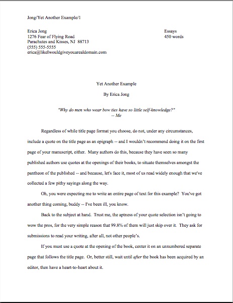
Formatpalooza, part XXII: dates, places, and the passage of time


Before we launch into today’s festivities, a couple of quick announcements. First, all of us here at Author! Author! are wafting good wishes toward science fiction author Orson Scott Card, who suffered a mild stroke last Saturday. Here’s to a speedy recovery, OSC!

Second, a heads-up for Seattle residents and those lucky enough to live in her relatively snow-free environs: Heidi Durrow, author of The Girl Who Fell from the Sky, will be giving a reading tonight at the Northwest African-American Museum (2300 S. Massachusetts St.), as well as signing her book at Costco (4401 4th Avenue S.) on Friday at 12:30 p.m. and reading at Third Place Books (17171 Bothell Way NE, Lake Forest Park) on Saturday at 6:30 p.m. I shall be at the Saturday night event, so please do come up and introduce yourself!

In other news, nominations for the Bloggies — which celebrate precisely what you think they do — are now open, and shall remain open through this coming Sunday, January 16th. So if anybody out there should happen to admire any particular blog, this would be a lovely time to express that sentiment through a nomination, if you catch my drift. Only the most-nominated blogs in any category (say, art/craft or topical) will proceed to the judging round, so if you have an opinion on the subject, now would be the time to weigh in about any blog you’d found particularly helpful within the last year.

I just mention. Back to the business at hand.

Earlier in this series, incisive reader Bruce (seconded by sharp-eyed reader Elizabeth) pointed out an issue that had somehow so far slipped between the cracks of Formatpalooza. Ahem:

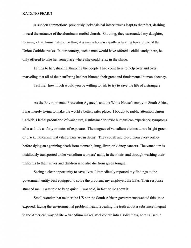
The first page of my novel begins with a dateline. How would you treat it? As a typical dateline, as in a mag or newspaper? As a header?

or as something in-between?

At first, I must admit, I was a trifle nonplused by this question. Had we not discussed the issue of inserting articles, letters, and journal entries earlier in this series and did not that jolly little monologue include discussion of how to include a dateline?

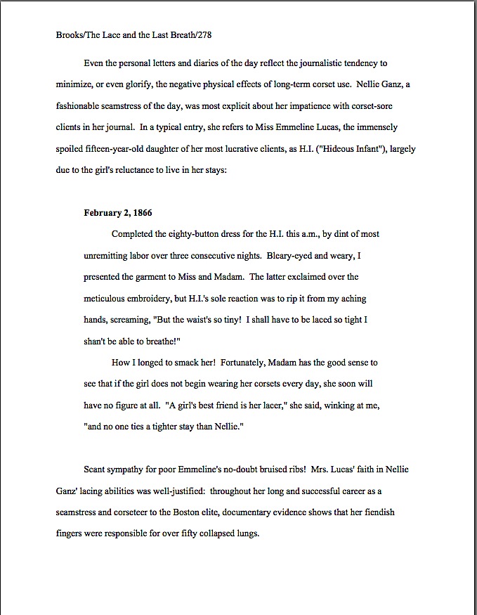
Well, it did and it didn’t, as I learned upon going back and doing a spot of re-reading. That earlier post did indeed show a couple of options for including a dateline for an article, letter, or diary entry imbedded within a non-academic manuscript. (For guidelines covering this kind of long quote in academic work, please see that previous post.) One could introduce the relevant date in the text just before the excerpted bit:

That would work in either a fiction or nonfiction manuscript. Nonfiction writers, however, also enjoy the option of using a boldfaced subheading. This format is especially popular for excerpting newspaper articles, as it would more closely resemble the way a reader might find it in a published book. Take a gander:

Doesn’t leave much doubt about when ol’ Nellie wrote that journal entry, does it? If this same entry were to appear in a novel manuscript, however, the boldfacing would not be appropriate.

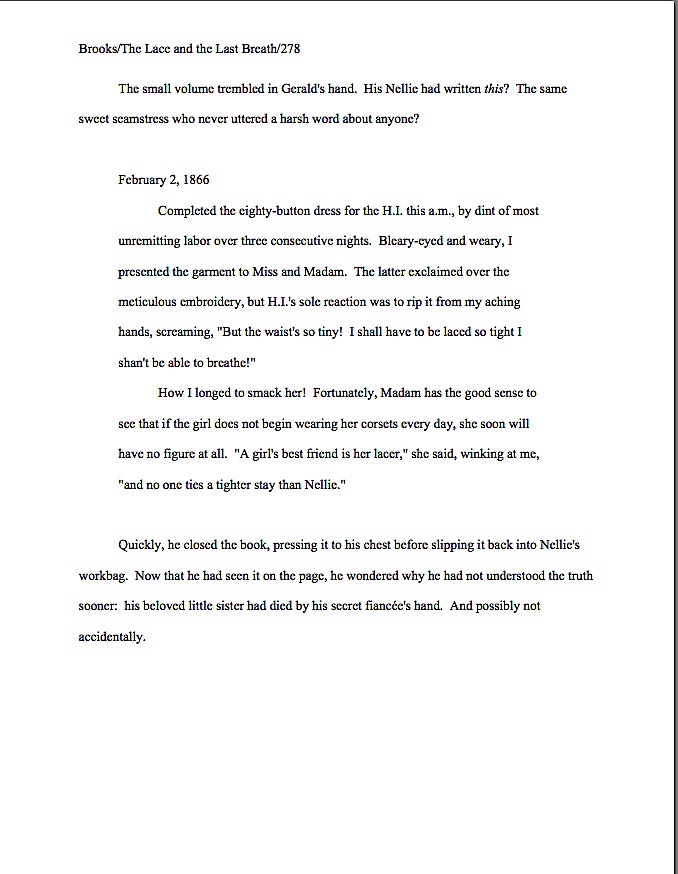
Why the dichotomy? Pull out your hymnals and sing along now: in a novel manuscript, nothing whatsoever should be in boldface or underlined. In a nonfiction manuscript, only subheadings may be in boldface.

Thus, in a novel, Nellie’s diary entry would look like this on the page:

Everybody clear on that? I want to make certain, because as we saw in our last Formatpalooza post, in the welter of manuscript-formatting information out there, it’s very, very easy for an aspiring writer to conflate what would be appropriate for a dateline in one context — in this case, mid-chapter in a fiction or nonfiction manuscript — with what is called for in another.

Say, if the date, time, and/or place designation were opening a chapter, or even, as Bruce and Elizabeth would like to do, the book.

I have good reason to be cautious: if an unwary writer were simply to type dateline + manuscript format into Google, much of what would pop up in the first page would be either inapplicable or wrong. Actually, I just did it, and Result #6 was a link to Bruce’s question on this site. It also turned up a self-styled expert ordering an eager questioner to use underlining instead of italics, which is flatly incorrect for a book manuscript. Not entirely surprisingly, the expert didn’t bother to mention — and perhaps was unaware — that standard format for short stories, articles, and books is different, and thus it’s absurd to pretend that all writing, anywhere, anytime should be formatted identically for submission.

The moral here: before you accept ANY formatting advice, make sure it is specifically aimed at your type of writing. If a list of guidelines claims, either by positive assertion or omission, to be universally applicable for all manuscripts, run, don’t walk, in the opposite direction. And perhaps this goes without saying, but if you don’t know what precisely makes the person giving the advice an expert, ask follow-up questions, rather than believing — as an astonishingly high percentage of aspiring writers seeking advice online seem to do — that all online sources are equally credible.

It’s just not true, and trying to follow all of that wildly disparate advice simultaneously will only drive you nuts. Seriously, it’s a waste of your valuable time and energy. Find a credible source for your particular type of writing, cross-check what that source says with agency and publishing house submission guidelines before you even consider following the source’s advice, and don’t allow yourself to be distracted by every new suggestion you see online.

Especially if the source leaves you guessing whether the rule being touted is intended to apply to short story submissions (as, say, underlining to indicate italics would be) or book-length works (as in the imperative never to underline anything at all, under any circumstances). Just because the words manuscript, submission, and writing may be applied to both of these wildly different venues does not mean that the expectations are identical in each.

This is not a guessing game, after all. Actual standards do exist — they are merely industry-specific.

My point is — I honestly have had one lurking in the background throughout those last few paragraphs — one of the perennial problems faced by any aspiring writer trying to glean information online is the necessity for boiling complex concepts down to super-simple search terms. It’s led, unfortunately, to a tendency for definitional creepage.

You know what I’m talking about, right? It’s when a key word or phrase is ripped out of context often enough and used to mean other things in other venues that it comes to lose its specificity — and, eventually, its utility as a search term. Unfortunately, on the writing grapevine, definitional creepage is practically as common as complaints about how hard it is to land an agent in these trying times.

We saw a great example in our last post: a questioner used the term teaser to refer to a brief scene placed at the beginning of a novel, even though it would fall temporally later in the plot, in order to draw the reader into the book’s central conflict and open with action. It’s a comprehensible use of the word, but more specific uses, a teaser is everything from a promotional offer used in advertising to a rhetorical question used at the beginning of a newspaper or magazine article to tempt the reader into reading on to a theatrical curtain draped across the top of the proscenium arch to mask the flies and, along with the tormentors, provide a fabric frame for a stage.

And that’s not even counting the (avert your eyes, children) sexual definitions. The mind positively reels at the number of websites a curious writer might turn up by trying to find a little basic guidance on how to write one.

Think I’m digressing again? Au contraire, mon frère, because definitional creepage has almost certainly rendered it significantly more difficult for today’s brave questioners to find credible answers to this legitimate and serious formatting question.

Why? Well, primarily because not every date designation in writing is a dateline (or, in its more common usage, date line). In journalism, a dateline is the bit at the beginning of the article that tells the reader the date and place from which the news within the article was reported, usually presented in all capital letters: SEATTLE, JANUARY 12. Its purpose is not merely to indicate where the reporter was within the space-time continuum when she filed the story, but to enable readers to tell yesterday’s news from an article filed three weeks ago.

But that’s not its old definition, is it? Those of you addicted to looking things up will also be delighted to know that a date line is also how some earth scientists refer to the 180th meridian of longitude, better known to the rest of us as the International Date Line.

Now, clearly, Bruce wasn’t inquiring about the hypothetical dividing point where, by international agreement, a traveler moves from one day to the next. As a reasonable, sane human being, this definition did not even occur to me when I first read his question. Search engines, however, are not human beings, capable of considering the larger context, but must instead rely solely upon the search terms fed into them.

Yes, even extremely well-designed search engines. See the potential problem?

Why bring all of this up, rather than simply answering the original question? Two reasons. First, as an explanation and apology to all of the future web searchers who will undoubtedly end up on this page after having fed the term dateline or date line into their preferred search engines. Next time, you might want to add an extra term or to, to provide specific context.

Second, I’m REALLY glad that this term showed up in today’s question, because definitional creepage appears to be a factor in approximately 1 out of every 10 questions the Author! Author! comments. A lot of good writers out there seem to be frustrated by the results of insufficiently specific search terminology — and downright annoyed by the plethora of advice about ostensibly the same subject, when so many of the advice-givers are actually talking about different matters.

Didn’t think I could bring that diatribe full circle, did you? I’m a professional; don’t try this at home.

Let’s make things easy on the next aspiring writer looking for an answer to the question that Bruce and Elizabeth were kind and brave enough to bring forward for discussion by labeling the answer as clearly as humanly possible. Please, if you can think of other ways you might conceivably search for this information, mention it in the comments, so it can turn up in future web searches.

How to present a date and/or time at the beginning of a chapter or manuscript
As is often the case, the lucky writer has a couple of formatting options, both with concomitant advantages and disadvantages. One could, as we saw in our last post, simply use the date and/or time as the subtitle on page 1:

Or even as the title:

There is, however, a third and quite popular option: insert something that does in fact resemble a dateline in a newspaper article. Obviously, though, one would not want to format it exactly like a dateline — one should not, for instance, present it in all capital letters or substitute it for the necessary indentation at the beginning of the first paragraph of text.

And why wouldn’t we want to do either of those things, campers? Shout it out with me now: because a book manuscript should look like a book manuscript, not like any other kind of manuscript — or like any species of published writing. It is governed by its own rules.

Everybody got that, or should I attempt to wake up that deceased equine for another pummeling?

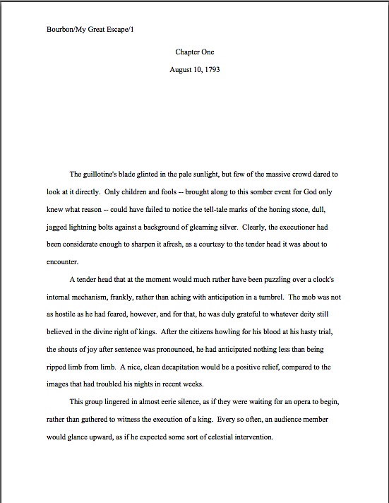
So how might a savvy writer of books format such a thing? By treating it like any other subheading in a manuscript, placing it where the first line of text would be if the date/time/place designation were not there.

In other words, the space format restrictions at the top of the chapter should not change at all. For fiction, it should look like this:

And for nonfiction, it should look like this:

Do I spot some raised hands waving at me from the ether? “But Anne,” a few thousand sharp-eyed readers point out, “that’s a less efficient use of page space! By adding the date as a subheading, we’ve lost a line of text!”

Quite true, date-lovers: there’s no such thing as a cost-free formatting alteration. While you gain in resemblance to an article’s dateline, you get fewer words per page. For those of you bumping up against that 400-page ceiling, the exchange might not be worth it. However, it’s up to you.

Thanks, Bruce and Elizabeth, for bringing this one up; I think the result has been a valuable addition to Formatpalooza. Thanks, too, to the many, many entrants to our recent Rings True competition whose first pages featured such date, time, and/or place designations; I honestly hadn’t realized that opening a book this way was enjoying a renaissance right now, at least amongst aspiring writers.

Keep those great questions rolling in, everybody. I’m planning to wrap up this series tomorrow, so we can launch back into nice, juicy craft questions over the weekend, but hey, I’m always delighted to clarify a formatting issue.

Keep up the good work!

Formatpalooza, part XVIII: checking off all of those boxes, or, how to format a book proposal

How’s everybody doing out there? Are all of you nonfiction writers excited that I’ve been talking about writing specific to your book categories, or is everyone still too burned out from New Year’s festivities that you’re sitting there, glassy-eyed, silently willing the first Monday of 2011 to be over, already? Or — and I sincerely hope this is the case — are you paying attention to this post with one part of your brain, while another delightedly plots how to polish up your entries to the Author! Author! Rings True Writing Competition? There are both fiction and nonfiction categories this time around, folks, so I hope all of you memoirists who just dropped by for the formatting tips will at least consider entering.

Personally, I can’t wait to see what you’ll send in. As those of you who have been hanging out here at Author! Author! for a while may have sensed, I honestly do like to see what my readers are writing.

And, of course, to know how I can help you present your manuscripts and proposals more professionally. If you have a question about standard format, or something for which you would like to see more practical examples, by all means, let me know. That’s why the comment function is there, folks!

Seriously, it’s to everybody’s benefit if you ask; trust me, if you have been wondering, so have hundreds of other writers. The overwhelming majority of aspiring writers have never seen a professionally-formatted manuscript or book proposal, after all. I would much, much rather you asked me than took a wild guess in your submissions.

Readers’ questions also allow me to fine-tune the archive list at right — I want to make it as intuitive as possible for a panicked aspiring writer to use. (Speaking of which, since no one has commented yet on last November’s rather radical rearrangement of the archive list, am I to conclude that (a) most of you are finding it easier to use than its previous incarnation, (b) most of you are finding it harder to use, but are too polite to say so, (c) despite the monumental effort of rearranging it under subheadings, the result is precisely as user-friendly as the simple alphabetical list it replaced, or (d) nobody has noticed? It would be quite helpful for me to know.)

I’m particularly interested in finding out what pieces of information are comparatively difficult to find in my frankly pretty hefty archives. Why, only last February, eagle-eyed reader Kim was kind enough to point out a fairly extensive omission in my twice-yearly examinations of standard format for manuscripts: although I had been providing illustrations of same for several years now, I’d never shown the innards of a properly-formatted book proposal. In fact, as Kim explained,

Anne — Thank you for this glorious blog. It is a wealth of information. I am putting together a submissions package (requested materials, yea!), which includes a book proposal. After searching through your site, I still can’t find a specific format for the thing. For example, should the chapter summaries be outlined? double-spaced? Should I start a new page for each subheading? Also, my book has several very short chapters (80 in total). Should I group some of them together in the summaries, lest it run too long? Or is it better to give a one sentence description of each? Thanks again.

My first response to this thoughtful set of observations, I must admit, was to say, “No way!” After all, I had written a quite extensive series entitled HOW TO WRITE A BOOK PROPOSAL (beginning here) as recently as…wait, did that date stamp say August of 2005?

As in within a month of when I started this blog? More to the point, since before I sold my second nonfiction book to a publisher? (No, you haven’t missed any big announcements, long-time readers: that one isn’t out yet, either.)

Clearly, I had a bit of catching up to do. Equally clearly, I am deeply indebted to my intrepid readers for telling me when they cannot find answers to their burning questions in the hugely extensive Author! Author! archives.

The burning question du jour: how is a book proposal formatted differently than a book manuscript? Or is it?

In most ways, it isn’t; in some ways, however, it is. Rather than assume, as I apparently did for four and a half years, that merely saying that book proposals should be in standard manuscript format (with certain minimal exceptions), let’s see what that might look like in action.

In fact, since I’ve been going over the constituent parts in order, let’s go ahead recap from the beginning, talking a little about what purpose each portion of it serves. Here, ladies and gentlemen of the Author! Author! community, are the building blocks of a professional book proposal, illustrated for your pleasure. As you will see, much of it is identical in presentation to a manuscript.

1. The title page
Like any other submission to an agent or editor, a book proposal should have a title page. Why? To make it easier to contact you — or your agent — and buy the book, of course.

As we discussed in our last ‘Palooza post, once a writer has landed an agent, the agency’s contact information belongs on the title page, so the editor of one’s dreams may contact one’s agent easily to acquire the book. Prior to either the happy day of an offer on one’s book or the equally blissful day one signs with an agent, the writer’s contact information belongs on the title page.

2. The overview
First-time proposers often shirk on this part, assuming — wrongly — that all that’s required to propose a nonfiction book is to provide the kind of 1-, 3-, or 5-page synopsis one might tuck into a query packet. In practice, however, a successful overview serves a wide variety of purposes:

(a) It tells the agent or editor what the proposed book will be about, and why you are the single best person on earth to write about it. Pretty much everyone gets that first part, but presenting one’s platform credibly is often overlooked in an overview. (I hate to be the one to break it to you, but if an agent or editor makes it to the bottom of page 3 of your proposal without understanding why you are a credible narrator for this topic, your proposal is going to fall flat, no matter how inherently interesting your topic may be.

(b) It presents the central question or problem of the book, explaining why the topic is important and to whom , amplifying on the argument in (a), couching it in larger terms and trends. Or, to put it another way: why will the world be a better place if this book is published?

No, that’s not an egomaniac’s way to look at it. Why do your readers need to read this book? How will their lives or understanding of the world around them be strengthened or reshaped by it?

(c) It demonstrates why this book is needed now, as opposed to any other time in literary history. That one is self-explanatory, I hope.

(d) It answers the burning question: who is the target audience for this book, anyway? To reframe the question as Millicent’s boss will: how big is the intended market for this book, and how do we know that they’re ready to buy a book on this subject?

(e) It explains why this book will appeal to the target audience as no book currently on the market will. (In other words, how are potential readers’ needs not being served by what’s been published within the last five years — the usual definition of the current market — and why will your book serve those needs in a better, or at any rate different, manner?

(f) It shows how your platform will enable you to reach this target audience better than anyone else who might conceivably write this book. Essentially, this involves tying together all of the foregoing, adding your platform, and stirring.

(g) It makes abundantly clear the fact that you can write. Because, lest we forget, a book proposal is a job application at base: the writer’s primary goal is to get an agent or editor to believe that she is the right person to hire to write the book she’s proposing.

Yes, there should be separate sections of the book proposal that address all of these points in detail. The overview is just that: a quick summary of all of the important selling points for your book, presented in a manner intended to entice an agent or editor to read on to the specifics.

In the interest of establishing points (a), (b), and (g) right off the bat, I like to open a book proposal with an illustrative anecdote or direct personal appeal that thrusts the reader right smack into the middle of the central problem of the piece, reducing it to an individual human level. Basically, the point here is to answer the question why would a reader care about this subject? within the first few lines of the proposal, while showing off the writer’s best prose.

For a general nonfiction book — particularly one on a subject that Millicent might at first glance assume, perish the thought, to be a bit on the dry side — this is a great opportunity for the writer to give a very concrete impression of why a reader might care very deeply about the issue at hand. Often, the pros open such an anecdote with a rhetorical question.

overview NF page 1

The opening anecdote gambit works especially well for a memoir proposal, establishing both the voice and that the memoir’s central figure is an interesting person in an interesting situation. While it’s best to keep the anecdote brief — say, anywhere between a paragraph and a page and a half — it’s crucial to grab Millicent’s attention with vividly-drawn details and surprising turns of event. To revisit our example from last time:

overview1

overview2

As we saw in that last example, you can move from the anecdote or opening appeal without fanfare, simply by inserting a section break — in other words, by skipping a line. While many book proposals continue this practice throughout the overview, it’s visually more appealing to mark its more important sections with subheadings, like so:

subheading in proposal

Incorporating subheadings, while not strictly speaking necessary, renders it very, very easy for Millicent the agency screener to find the answers to the basic questions any book proposal must answer. If the text of the proposal can address those questions in a businesslike tone that’s also indicative of the intended voice of the proposed book, so much the better.

Please note, however, that I said businesslike, not in business format. Under no circumstances should a book proposal either be single-spaced or present non-indented paragraphs.

This one confuses a lot of first-time proposers, I’ve noticed. “But Anne!” they protest, and not entirely without justification. “A book proposal is a business document, isn’t it? Doesn’t that mean that it should be in business format?”

The short answer is my God — no! The not-so-short answer is: not if you want Millicent to read it. An aspiring writer who does not indent her paragraphs is presumed illiterate.

Long-time readers, chant it with me now: the publishing industry does not use business format, even in its business letters; always, always, ALWAYS indent your paragraphs.

3. The competitive market analysis
The competitive market analysis is probably the most widely misunderstood portion of the book proposal. What the pros expect to see here is a brief examination of similar books that have come out within the last five years, accompanied by an explanation of how the book being proposed will serve the shared target audience’s needs in a different and/or better manner. Not intended to be an exhaustive list, the competitive market analysis uses the publishing successes of similar books in order to make a case that there is a demonstrable already-existing audience for this book.

But that’s not how you’ve heard this section described, is it? Let me take a stab at what most of you have probably heard: it’s a list of 6-12 similar books.

Period. The sad, sad result usually looks like this:

competitive market analysis bad

Makes it pretty plain that the writer thinks all that’s required here is proof that there actually have been other books published on the subject in the past, doesn’t it? Unfortunately, to Millicent’s critical eye, such a list doesn’t merely seem like ignorance of the goal of the competitive market analysis — it comes across as proof positive of the authorial laziness of a writer who hasn’t bothered to learn much about either how books are proposed or the current market for the book he’s proposing.

To be fair, this is the section where first-time proposers are most likely to skimp on the effort. Never a good idea, but a particularly poor tactic here. After all of these years, the average Millicent is darned tired of proposers missing the point of this section: all too often, first-time proposers assume that it has no point, other than to create busywork.

As you may see above, the bare-bones competitive market analysis makes the writer seem as if he’s gone out of his way to demonstrate just how stupid he thinks this particular exercise is. That’s because he’s missed the point of the exercise.

The goal here is not merely to show that other books exist, but that the book being proposed shares salient traits with books that readers are already buying. And because the publishing industry’s conception of the current market is not identical to what is actually on bookstore shelves at the moment, the savvy proposer includes in his competitive market analysis only books that have been released by major houses within the last five years.

That last point made some of you choke on your tea, didn’t it? Don’t you wish someone had mentioned that little tidbit to you before the first time you proposed?

Even when proposers do take the time to research and present the appropriate titles, a handful of other mistakes tend to mark the rookie’s proposal for Millicent. Rather than show you each of them individually, here’s an example that includes several. Take out your magnifying glass and see how many you can catch.

competitive market analysis 2

How did you do?

Let’s take the more straightforward, cosmetic problems first, the ones that should immediately leap out at anyone familiar with standard format. There’s no slug line, for starters: if this page fell out of the proposal — as it might; remember, proposals are unbound — Millicent would have no idea to which of the 17 proposals currently on her desk it belonged. It does contain a page number, but an unprofessionally-presented one, lingering at the bottom of the page with, heaven help us, dashes on either side.

Then, too, one of the titles is underlined, rather than italicized, demonstrating formatting inconsistency, and not all of the numbers under 100 are written out in full. Not to mention the fact that it’s single-spaced!

All of this is just going to look tacky to Millie, right?

Okay, what else? Obviously, this version is still presented as a list, albeit one that includes some actual analysis of the works in question; it should be in narrative form. Also, it includes the ISBN numbers, which to many Millicent implies — outrageously! — a writerly expectation that she’s going to take the time to look up the sales records on all of these books.

I can tell you now: it’s not gonna happen. If a particular book was a runaway bestseller, the analysis should have mentioned that salient fact.

There’s one other, subtler problem with this example — did you catch it?

I wouldn’t be astonished if you hadn’t; many a pro falls into this particular trap. Let’s take a peek at this same set of information, presented as it should be, to see if the gaffe jumps out at you by contrast.

competitive market analysis3

Any guesses? How about the fact that the last example’s criticism is much, much gentler than the one immediately before it?

Much too frequently, those new to proposing books will assume, wrongly, that their job in the competitive market analysis is rip apart every previous book on the subject. They try to make the case that every other book currently available has no redeeming features, as a means of making their own book concepts look better by contrast.

Strategically, this is almost always a mistake. Anybody out there have any ideas why?

If it occurred to you that perhaps, just perhaps, the editors, or even the agents, who handled the books mentioned might conceivably end up reading this book proposal, give yourself three gold stars. It’s likely, isn’t it? After all, agents and editors both tend to specialize; do you honestly want the guy who edited the book you trashed to know that you thought it was terrible?

Let me answer that one for you: no, you do not. Nor do you want to insult that author’s agent. Trust me on this one.

No need to go overboard and imply that a book you hated was the best thing you’ve ever read, of course — the point here is to show how your book will be different and better, so you will need some basis for comparison. You might want to avoid phrases like terrible, awful, or an unforgivable waste of good paper, okay?

I had hoped to get a little farther in the proposal, but as I’m already running long, I’m going to sign off for the day. But since you’re all doing so well, here’s one final pop quiz before I go: what lingering problem remains in this last version, something that might give even an interested Millicent pause in approving this proposal?

If you immediately leapt to your feet, shouting, “I know! I know! Most of these books came out more than five years ago, and of those, The Gluten-Free Gourmet is the only one that might be well enough known to justify including otherwise,” give yourself seven gold stars for the day.

Heck, take the rest of the day off; I am. Keep up the good work!

Formatpalooza, part XVII: not all that glitters is…well, you know the rest

sequined hat

I had hoped to wrap up Formatpalooza by the end of the year, but frankly, I think it’s going to be a trifle on the tight side, unless I post a couple of times tomorrow. Even by my standards of vim, that might be overkill.

My vehemence is kindly-motivated, I assure you: contrary to popular opinion amongst aspiring writers, how a submission is presented can make a very great difference in how it’s received. Yes, yes, I hear you, those of you who have been running around to writers’ conferences in recent years: you can hardly throw a piece of bread at an agent or editor’s forum without hitting a pro saying, “It all depends upon the writing.”

They tend to spout this aphorism for a very good reason — it is in fact true. But as we discussed both earlier in this series and in earlier ‘Paloozas, that doesn’t mean that the quality of the writing is the only criterion agents, editors, contest judges, or any of the rest of us who read manuscripts for a living use when deciding whether to read beyond the first page of a submission. Professional presentation plays a role, as does marketability, a story’s probability of appealing to its target audience (not exactly the same thing), what happens to be the surprise bestseller of the moment — and yes, that whole slew of intangibles that make up personal taste.

There is, in short, no such thing as a foolproof formula for producing the perfect manuscript for submission. Sorry to be the one to break that to you.

As I’ve been arguing throughout this ‘Palooza, however, agents, editors, contest judges, screeners, and other professional readers develop an almost visceral sense of when a manuscript is properly formatted. So rather than screening submissions with a list of don’t by their sides, they more or less automatically discount pages that are cosmetically incorrect.

This is most emphatically not the same thing, though, as rejecting such pages on the spot because, say, an aspiring writer underlined a foreign-language word on page 1 instead of italicizing it. (I know, I know: sacre bleu!) Much as a reader with impeccable grammar will not necessarily throw down a book that misuses semicolons, most professional readers will not instantly reject an improperly-formatted submission without some further provocation.

But as we discussed last time, the writer in both cases is going to have to work a whole lot harder to impress the pro as literate. Unfortunately, the prevailing standards for printed books — which, as we have seen, differ in many significant respects from manuscripts — often lead innocent writers astray.

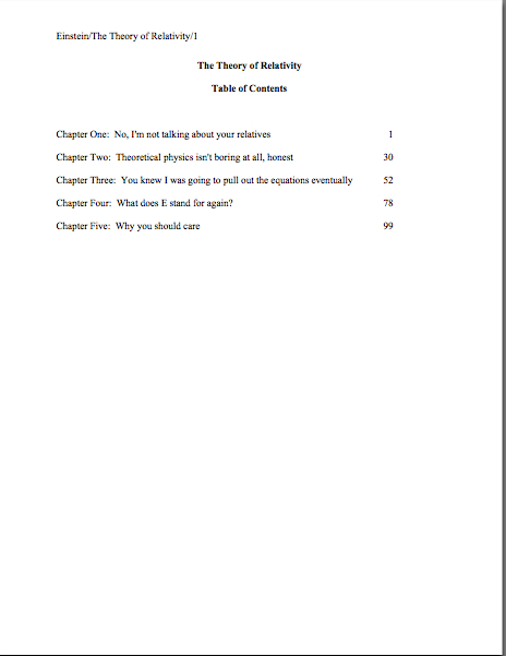
Leading them to, say, include a table of contents in a manuscript submission.

That seems as if it would be a helpful page to tuck in there, doesn’t it? One can make an argument for it, certainly: in fiction, including it would enable an agent to go back and re-read the submission easily; in nonfiction, it would permit an editor to skip ahead to a chapter of particular interest. And heck, if the manuscript fell upon the floor in the kind of you got chocolate in my peanut butter!/you got peanut butter in my chocolate! we witnessed with horror earlier in this series, a well-organized table of contents might render it a trifle easier to reassemble, right?

Wrong. Including a table of contents in a manuscript submission is a classic rookie mistake, the kind of stunt that makes Millicent the agency screener roll her eyes.

Why is it such a serious strategic error? Well, in a published book, a table of contents, like an index, is a courtesy to browsers trying to get a feel for the contents and buyers who do not necessarily want to read the entire book. In order to serve this function well, however, the pages listed would have to match up with the beginnings of the relevant sections, right?

This is difficult in a manuscript, for several reasons. First, Millicent doesn’t expect to see a table of contents, particularly in a novel submission; it just won’t look right to her. Second, since a published book is typically about 2/3rds the length of its original manuscript (documents shrink in the transition to the printed page), the pages listed on a manuscript table of contents would ultimately be inaccurate, anyway.

Third — and perhaps most relevant at the submission stage — including a table of contents implies that the writer does not expect the agent of her dreams to read the manuscript in its entirety, but merely to flip to the pages that interest him most. From the publishing industry’s point of view, that’s a pretty jaw-dropping assumption: why, they wonder, would an agent or editor be interested in acquiring a book if he doesn’t like it well enough to read it in full?

So really, including a table of contents in a manuscript is just wasting a page. It does not belong in a manuscript, any more than an index or those boxes around text that magazines are so fond of printing. To professional eyes, it looks unprofessional, especially in a novel submission.

It’s also an inconvenience — and yes, Virginia, to someone who has to skim as quickly as Millicent to get through the day’s reading, having to turn over an extra page is an actual inconvenience.

Don’t believe me? Okay, think about our time-strapped friend’s expectations when opening a submission envelope: when she turns over the title page, she is looking forward to finding the first page of text there waiting for her, all ready to be judged in a flash. If instead she finds a table of contents, something she would only find helpful if she were to read the entire manuscript, she may well be a trifle miffed. Given that she tends to reject most submissions somewhere between paragraph 1 and page 5, the information that Chapter 8 begins on page 112 will most likely strike her as at best gratuitous — and at worst presumptuous.

“What gives?” she’ll say, taking an extra sip of her too-hot latte as she impatiently gets the table of contents out of her way. “Doesn’t this writer know the difference between a manuscript and a book?”

‘Nuff said, I think.

Or maybe not — do I hear some aspiring nonfiction writers clamoring for my attention? “But Anne,” these excellent souls point out, “a book proposal is supposed to include a table of contents for the planned book, isn’t it? I read it in an article on how to write a book proposal.”

Ah, I’m glad that you brought this up, nonfictionists, because first-time proposers often conflate the table of contents one might find in a published book with the annotated table of contents required in a book proposal. They are in fact quite different things.

Again, mixing up terms is a classic rookie mistake. Over and over again, I see aspiring writers new to the game simply assuming that because a term means something in one context, it must necessarily mean exactly the same thing in another context.

As a general rule of thumb, that’s not always true. In this case, it most definitely is not.

When hyper-literal proposers hear the term table of contents, they assume, wrongly, that an agent or editor is simply asking to see what the writer thinks the table of contents in the published book will look like, presumably as an exercise in guessing how many pages each of the proposed chapters will contain. (It’s hard to imagine it serving any other purpose.)

As a result, first-time proposals tend to include a section that looks a little something like this:

Leaving aside for the moment the fact that Millicent simply would not expect to see this page in a book proposal at all , do you see any problems with this as a marketing document intended to convince an editor to pay the writer to write the proposed book?

Actually, I’m sure that some of your hands shot into the air even before I showed this example, in your eagerness to take issue with the notion that a submission should resemble a published book in the first place — and thus that the kind of table of contents one might expect to see in a nonfiction book would clearly be out of place in a submission.

Well caught, eager wavers. Spot any other problems?

If you said, “Well, for starters, the example above doesn’t include information that could possibly be either accurate or useful to an editor,” give yourself a gold star for the day. Obviously, it would be impossible for a proposer to state with certainty where the chapter breaks would fall in the proposed book when published; all the information s/he could reasonably offer in this sort of table of contents would be educated guesses about how long each chapter might be. Or perhaps a list of where those breaks fall in the draft manuscript.

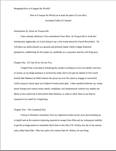
But that’s not the information nonfiction agents and editors want to see in the book proposal; they’re perfectly aware that since the book in question has not yet been written (or needn’t be), any length estimates must be just that, estimates, not fact. The information they do want to see in the annotated table of contents section of a book proposal is a brief description of the CONTENTS of each chapter.

The word annotated should have been a clue, I guess.

Typically, each proposed chapter is summarized in one or two paragraphs. Well, typically is a bit of an exaggeration; what’s actually typical in a first time proposer’s book proposal is either the information-light version we saw in today’s first example or an entire page devoted to each chapter.

Neither is what is expected, however. The typical form I am talking about here is what professional nonfiction authors use.

And like so many other differences between professional formatting and, well, everything else they see in submissions, it’s really, really obvious at first glance to someone who has seen a book proposal before whether the submitter du jour has followed the rules. Compare what the first page of a correctly put-together annotated table of contents looks like with the truncated version above:

See the difference? Millicent will. From ten paces away.

Hey, while we’re on the subject, why don’t we take a quick gander at all of the constituent parts of a book proposal, so all of you nonfiction writers out there may be sure that Millicent will like the look of yours? To make the overview even more useful, let’s run through the sections in the order they would appear in the proposal.

First, let’s take a peek at the title page. See if you notice anything distinctive about it:

If you immediately cried, “Why, unlike a title page for a novel, the proposal’s title page does not include a word count,” give yourself another gold star. (You’re racking them up today, aren’t you?) The length of a nonfiction book is a contractual matter; since what a proposal is offering is not the finished book, but a book concept and an author to write it to the specifications desired by the publisher, it does not make sense for the writer to guesstimate the length up front.

Award yourself yet another if you also mentioned that the contact information listed here is Scaredy’s agent’s, not Scaredy’s. Naturally, if Napolèon does not yet have an agent, naturally, he would list his own contact info in the bottom-right corner.

Any guesses why his address would be replaced by his agent’s down the line?

The reason is pretty straightforward: no agent in his right mind would allow his clients to circulate their proposals (or manuscripts, for that matter) without his contact info on them. After all, if an editor falls in love with the proposal, it’s the agent she’s supposed to be contacting, not the writer.

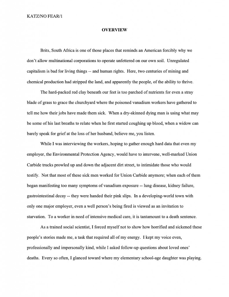
What follows next in a book proposal is the overview, a brief description of what the book is about and why the writer proposing it is the best person on earth to write it. Never, ever forget that this is both a marketing document and a job application, proposers: you’re trying to get the publisher to hire you to write this book, right?)

Most first-time proposers just include the bare bones here, leaping right into the description, but I like to open with a little sample of the type of writing the editor may expect to see in the completed book. To this end, I always advise starting a proposal with a vividly-told illustrative anecdote.

The first page of the proposal, then, would look like this:

overview1

As you may see, like everything else in the book proposal, the overview should be in standard format: double-spaced, indented paragraphs, 12-point Times, Times New Roman, or Courier. Unlike the opening of a chapter, however, each new section is simply titled, a line skipped, and the text begun. Since this is a nonfiction document, whether to place OVERVIEW in boldface is up to you; my agency happens to like it, as well as the all-caps titling.

Notice, please, that because this is a proposal for a memoir, the anecdote is written in the first person singular. The rest of the proposal should be as well. Many memoirists mistakenly believe that writing about their books in the third person is more professional, but that’s simply not the case.

Back to formatting. Just as a simple section break is sufficient to separate scenes in a novel or memoir, all that’s required in a proposal to differentiate the opening anecdote from the description of the proposed book is a skipped line:

overview2

Since the overview typically covers a broad range of topics, I like to break it down into several smaller sections, to make it easier for an agent or editor to find the answers to the pertinent questions any good book proposal must answer. Every proposal is slightly different, of course, but typically, apart from the opening anecdote and the book’s description, I advise including subsections on why the proposed book will appeal to readers (this is a great place to bring up any demographic information you may have collected on your readership), why the book is needed now (as opposed to any other time in publishing history; this provides an excellent opportunity to bring up any relevant trends), and how to convince the target readership that this is the book for them (not a specific marketing plan, mind you — that comes later in the proposal — but a brief explanation of who the target reader is and why that reader might pick it up).

Nit-picky? Sure. But that’s the nature of a book proposal.

How does one mark each of these subsections? You already know how to do this one, actually: as is permissible in a nonfiction manuscript, to differentiate between topics within sections — to alert the reader to the start of the subsection on why you’re the best person currently gracing the crust of the earth to tell this particular story, for instance, or to usher onstage your explanation of precisely why the literate world needs this story right now — you may insert a subheading. To reuse the example from the last time we discussed subheadings:

Wharton subheading example

When moving between major sections of a book proposal, convention dictates inserting a page break between sections. Why? Because unlike a novel manuscript, proposals are often broken apart, with one section going to a publisher’s marketing department another going to legal, a third staying with the editor interested in acquiring it, and so forth.

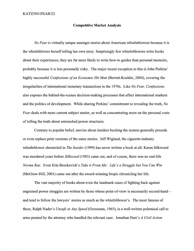
It’s also customary to begin a new major section with a centered title. For example, when moving from the overview to the competitive market analysis (i.e., the section of the proposal where the writer lists similar books currently on the market, then explains why his proposed book is different and better), the latter section would begin like this:

comp market analysis

I’ve written at some length about how to construct a competitive market analysis — contrary to popular opinion, it’s not just a list of similar books currently on the market — so I shan’t go into the ins and out of creating this narrative here. But if you’d like to hear more, please check out the posts collected under the aptly-named HOW TO WRITE A BOOK PROPOSAL category on the archive list at right.

There are a couple of formatting curiosities I would like to point out, however. First, the competitive market analysis should be written in a narrative style, not as a list. Second, it does not include all of the bibliographic information for the book. Just the author and title — in italics, as is appropriate for a book title in standard format — with the publisher and year of publication following in parentheses, will generally suffice. (Although if the agent of your dreams asks for something more, like the ISBN, for heaven’s sake, give it to her.)

Is that all there is to a book proposal, you ask hopefully? Heavens, no: there are several more vital sections. As usual, I have a great deal to say about each, so I am going to sign off for today and pick it up next time. Keep up the good work!
Formatpalooza, part IX: areas of authorial discretion, or, there are rules, and there are rules

full moon in the gutter

At the risk of seeming trite, I would like to point out that it has been raining a great deal in Seattle of late. Not the normal constant misty drizzle that characterizes our dark Pacific Northwest winters, but sheets. Buckets. The proverbial cats and dogs, with an antelope or two thrown in by whatever celestial water-monger has seen fit to try to drown us.

I’m not saying we’re worried. I’m saying my neighbors came over this evening to ask how long a cubit was, so they could read the blueprints for their ark.

But enough idly wondering where on earth they found a pair of yeti for their menagerie. Time to get back to the matter at hand: manuscript formatting.

Over the last couple of posts, we have been gladdening our hearts (okay, gladdening my detail-loving editorial heart) with discussion of something that Millicent the agency screener just loves to see, a properly-formatted first page of a manuscript, as well as phenomena she sees more often, but likes less, various species of improperly formatted page 1. The Millicent-pleasing version looked, if you will recall, a little something like this — and, as always, if you’re having trouble seeing the details, try enlarging the image by holding down the COMMAND key and pressing + repeatedly.

good example revised

Now that’s a lovely page 1: unprovocative, professional-looking, and flaunting lots of nice, clean white space at the top. “Ah,” Millicent murmurs, settling back into her chair, “now I can concentrate on the writing and the story.”

Contrast that, please, with the much more cluttered short story format all too many book and book proposal submitters mistakenly believe is universally applicable to any writing on paper:

Pretty distracting to the eye, is it not? Admittedly, not all embracers of this format will choose to clutter the space up further with an epigraph — which, as we discussed last time, it not generally the best idea at the submission stage, no matter what you want the published version of your book to look like — but one does not need to be the Amazing Kreskin to predict that their submission packets all share another unprofessional characteristic: no title page.

How do I know that? Well, think about it: since all of that eye-displacing verbiage — title, book category, word count, contact information — would in a properly-constructed submission packet appear on the title page, why would a submitter repeat all of it at the top of page 1?

Both page 1 and the opening of each subsequent chapter should include all of the spaciousness of that first example, not launching into the text until 14 single lines from the top of the page. (Or, to put it another way, 6 double-spaced lines under the chapter title. And for those of you who do not know how to insert a hard page break into a Word document, it’s located under the INSERT menu. Select BREAK, then PAGE BREAK.)

Did that bit about the subsequent chapters catch any of you by surprise? To prevent that kind of confusion in future, let’s go ahead and hatch a new axiom: each new chapter should begin on a fresh page, but the first page of every chapter should be formatted exactly like page 1.

Yes, Virginia: exactly, at least in terms of formatting. Since the book’s title should appear on the title page, why would the opening of the book and the opening of Chapter 6 be different?

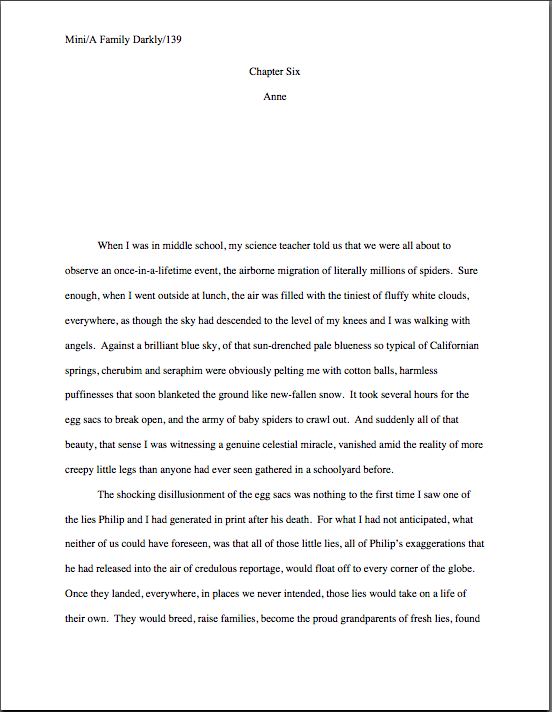
So you may see that in action (and to prove that I practice what I preach), here’s what could be the first page of Chapter Six my memoir:

Memoir wo title

I said could, because actually, I’m not a big fan of chapters named Chapter Six, even if they happen to be the sixth chapter in the manuscript. It’s sort of like dubbing a suburban street lined with elm trees Elm Street: there’s nothing inherently wrong with a straightforward, descriptive title, but you must admit, it’s not startlingly original.

It’s not precisely going to come as a shock to many readers when Chapter Six appears immediately after Chapter Five, after all. At least not readers whose counting skills have moved past their first hand.

Speaking of hands, I see many of them waving in the air, apparently trying to attract my attention. “Okay, Anne,” those of you fond of naming things inquire, “how should a chapter title appear on the page, if I also want to number it? Or do I need to choose between numbering and titling?”

Not at all — go ahead and include both, if that makes you happy. In fact, it’s actually a little easier for agents and editors if you do number titled chapters; it’s simpler for a feedback-giver to say, “Please tone down the snarkiness in Chapter 6 of your memoir, Ermintrude,” than “You know the snarky tone in the chapter called something like How I Had My Way with Ocelots, or, Twenty-seven Ways to Skin a Cat? Give it a rest, Ermintrude.”

The formatting is very simple: just add the chapter title on the second double-spaced line of text, centered under the chapter number designation. (Freeing up mental space to speculate: what was Ermintrude doing with all of those ocelots?)

This format should sound at least a trifle familiar: we’ve already seen it in action in today’s first example. But in furtherance of my ongoing mission to place so many examples of correctly-formatted manuscript pages in front of your weary eyes that you’ll start automatically recoiling from pages in published books, muttering, “Well, that wouldn’t work in a manuscript submission, let’s take a gander at another one:

memoir w ch title

Actually, I had an ulterior motive in showing you that last example: in comparing it to the example just before it, do you notice anything about the amount of space between the chapter number and the beginning of the text?

If you immediately shot your hand into the air, exclaiming, “By gum, Anne, the area between the two appears identical! You’ve simply placed the chapter title within it, you clever lady,” award yourself an extra helping of hot fudge on your sundae. (If devoting a couple of weeks to discussing standard format doesn’t entitle an aspiring writer to dessert, nothing does.)

Regardless of whether a chapter’s opening page contains a chapter designation, a title, or both, the text should begin the same distance from the top of the page. The same logic would apply to any other information you might see fit to include at the beginning of a chapter — alerting the reader to a break between Part I and Part II of a book, for instance.

Since so many aspiring writers ask me about part breaks — hey, I’m not known as the Format Queen for nothing; I would much, much rather that my readers ask me than misformat their submissions — let’s take a look at the phenomenon in action. If Chapter 6 were the beginning of Part II of my memoir (it isn’t, but we aim to please here at Author! Author!), I would have formatted it thus:

memoir w part break

Starting to get the hang of this? Okay, let’s talk about inserting another common piece of introductory information in that heading: identifying a narrator-du-chapter in a multiple point-of-view novel.

If the switch comes at the beginning of a chapter, it couldn’t be easier: it’s simply another reader-signal that belongs above the pre-text white space, right? To see this principle in action, let’s pretend our ongoing example is fiction (which it isn’t; my middle school honestly was pelted with migratory spiders) and place the narrator’s name in the traditional spot:

new chapter with name

That’s the way one would handle the matter in a multiple POV manuscript like, say, Barbara Kingsolver’s THE POISONWOOD BIBLE, where the narrator changes with the chapter. If there were also a chapter title (perhaps not advisable in this case, as there’s already significant information at the top of that page for the reader to absorb), it would go between the chapter heading and the narrator identifier.

The important thing here is to be consistent — and that’s not always easy. Most seasoned authors probably wouldn’t appreciate my revealing a working secret, but pretty much everyone worries that someday her will forget to hit return one of the necessary times, so that Chapter 5 will begin — gasp! — twelve lines from the top, while Chapter 1-4 and 6 on will begin fourteen lines down.

Gives you the willies even to contemplate how Millicent might react to that level of formatting inconsistency, doesn’t it? Double-check each and every chapter opening before you submit; trust me, you’ll be happier in the long run.

Oh, my — that was an unpopular suggestion, wasn’t it? Fully a third of you have your hands waving impatiently in the air. “That would be absurdly time-consuming, Anne,” the irate third huff. “Oh, I understand that the chapter number or title needs to appear at the top of the first page and each subsequent chapter; I’m perfectly happy to leave six double-spaced blank lines between it and the first line of text, so the first paragraph starts seven lines down. But surely there’s an easier way to do this — a template or something? Perhaps Word has some sort of default setting I can employ so I need never worry about the issue again as long as I live?”

Standard format templates do exist, now that you mention it, but frankly, Word is already equipped with two perfectly dandy features for reproducing formatting exactly in more than one place in a document: COPY and PASTE.

In other words, create your own template. It’s very simple to do: just copy from “Chapter One” down through the first line of text, then paste it on the first page of Chapter 2, 3, etc. Once the format is in place, it’s a snap to fill in the information appropriate to the new chapter.

Oh, dear — now another group of you have raised your hands. Yes? “But Anne,” exclaim those of you who favor switching narrator (or place, or time) more often than once per chapter, “we are, as we believe the tag line identifying us as speakers just mentioned, advocates of those nifty mid-chapter signposts that we see all the time in published books, boldfaced notifications that the time, place, or speaker has just changed. How would I format that in a manuscript?”

You’re talking about incorporating subheadings into a novel, right? Or at least what would be a subheading in a nonfiction manuscript: a section break followed by a new title.

I’m fully prepared to answer this question, of course, if only to show all of you nonfiction writers out there what your subheadings should look like. Before I do, however, I’d like to ask novelists interested in adopting this strategy a quick question: are you absolutely positive that you want to do that?

That’s not an entirely flippant question, you know. There are plenty of Millicents out there who have been trained by old-fashioned agents — and even more editorial assistants who work for old-fashioned editors. And that’s important to know, because even in an age when mid-chapter subheadings aren’t all that uncommon in published books, there are still plenty of professional readers whose knee-jerk response to seeing ‘em is invariably, “What is this, a magazine article? In my day, fiction writers used language to indicate a change in time or place, rather than simply slapping down a subheading announcing it; if they wanted to indicate a change of point of view, they would either start a new chapter, find a graceful way to introduce the shift into the text, or have the narrative voice change so markedly that the shift would be immistakable! O tempore! O mores!

I just mention.

To this ilk of pros, the practice of titling a section, or even a chapter, with clear indicators of time, place, or speaker will always seem to be indicative of a show, don’t tell problem. And you have to admit, they sort of have a point: novelists have been indicating changes of time and space by statements such as The next day, back at the ranch… ever since the first writer put pen to paper, right?

As a result, fiction readers expect to see such orienting details emerge within the course of the narrative, rather than on top of it. Most of the time, this information isn’t all that hard to work into a narrative — and if a novelist is looking to please a tradition-hugging agent or editor, that’s probably a better strategy to embrace, at least at the submission stage. As with any other authorial preference for how a published book should look, you can always try to negotiate an editorial change of heart after a publisher acquires your novel.

At least if you don’t happen to write in a book category that routinely uses such subheadings. If recent releases in your book category are crammed with the things, don’t worry your pretty little head about editorial reaction to ‘em. An editor — or agent, Millicent, or contest judge — who routinely handles books in that category may be trusted to realize that you’re simply embracing the norms of your genre.

Millicents tend to approve of that. It shows that the submitter has taken the time to become conversant with what’s being published these days in the category within which he has chosen to write.

Which is to say: these days, plenty of very good fiction writers prefer to alert the reader to vital shifts with titles and subheadings. And nonfiction writers have been using them for decades; in fact, they’re more or less required in a book proposal. (More insight on those follows later in this series, I promise.) I just didn’t want any of you to be shocked if the agent of your dreams sniffs in the early days after signing you, “Mind taking out these subheadings? Seven of the ten editors to whom I’m planning to submit this hate them, and I’d rather be spared yet another lecture on the pernicious influence of newspapers and magazine formatting upon modern literature, okay?”

All that being said — and now that I’ve completely unnerved those of you who are considering submitting manuscripts with subheadings — you do need to know how to do it properly.

It’s quite straightforward, actually: a subheading is just a section break followed by a left-justified title. The text follows on the next double-spaced line.

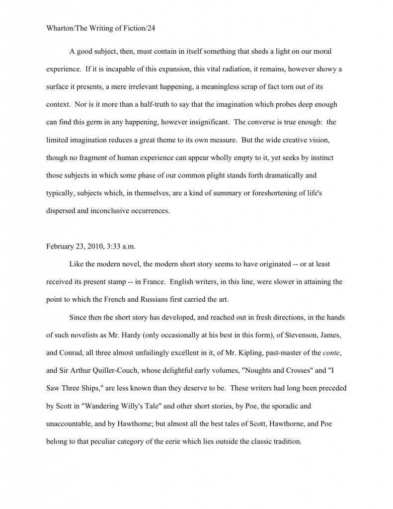
Want to see that in action? Okay. Just to annoy traditionalists who draw a sharp distinction between fiction and nonfiction writing, let’s take a peek at a nonfiction page by a well-respected novelist:

Wharton subheading example

That caused some bloodshot eyes to pop wide open, didn’t it? “But Anne!” the detail-oriented exclaim, “that subheading is in BOLDFACE! Didn’t the rules of standard format specifically tell me never, under any circumstances, to boldface anything in my manuscript?”

Well caught, sharp-eyed ones: boldfacing the subheading does indeed violate that particular stricture of standard format. However, since nonfiction manuscripts and proposals have been routinely boldfacing subheadings (and only subheadings) for over a decade now — those crotchety old-fashioned editors are partially right about the creeping influence of article practices into the book world, you know — I thought that you should know about it.

It’s definitely not required, though; Millicent is unlikely to scowl at a nonfiction submission that doesn’t bold its subheadings. Like font choice, you make your decision, you take your chances.

In a fiction submission, though, I definitely wouldn’t advise it; traditionalists lurk in much, much higher concentrations on the fiction side of the industry, after all. Here’s the same page, formatted as fiction — and since we’re already talking about exceptions to the rules, let’s make this example a trifle more instructive by including a date and time in the subheading:

Wharton example2

Unsure why I used numerals in the subheading, rather than writing out all of the numbers under a hundred, as standard format usually requires? Full dates, like specific times and currency, are rendered in numeric form in manuscripts. Thus, I paid $14.17 for a train ticket at 12:45 a.m. on November 3, 1842, officer is correct; I paid fourteen dollars and seventeen cents for a train ticket at twelve forty-five a.m. on November three, eighteen hundred and forty-two is not. (It would, however, be perfectly permissible to include quarter to one in the afternoon on November third.)

Everybody clear on all of that that? Now would be a dandy time to start waving your hand at the Format Queen, if not.

Next time, we shall be continuing our in-depth look at chapter openings. In the meantime, keep up the good work!