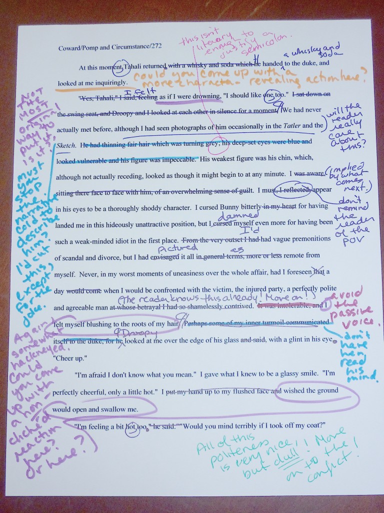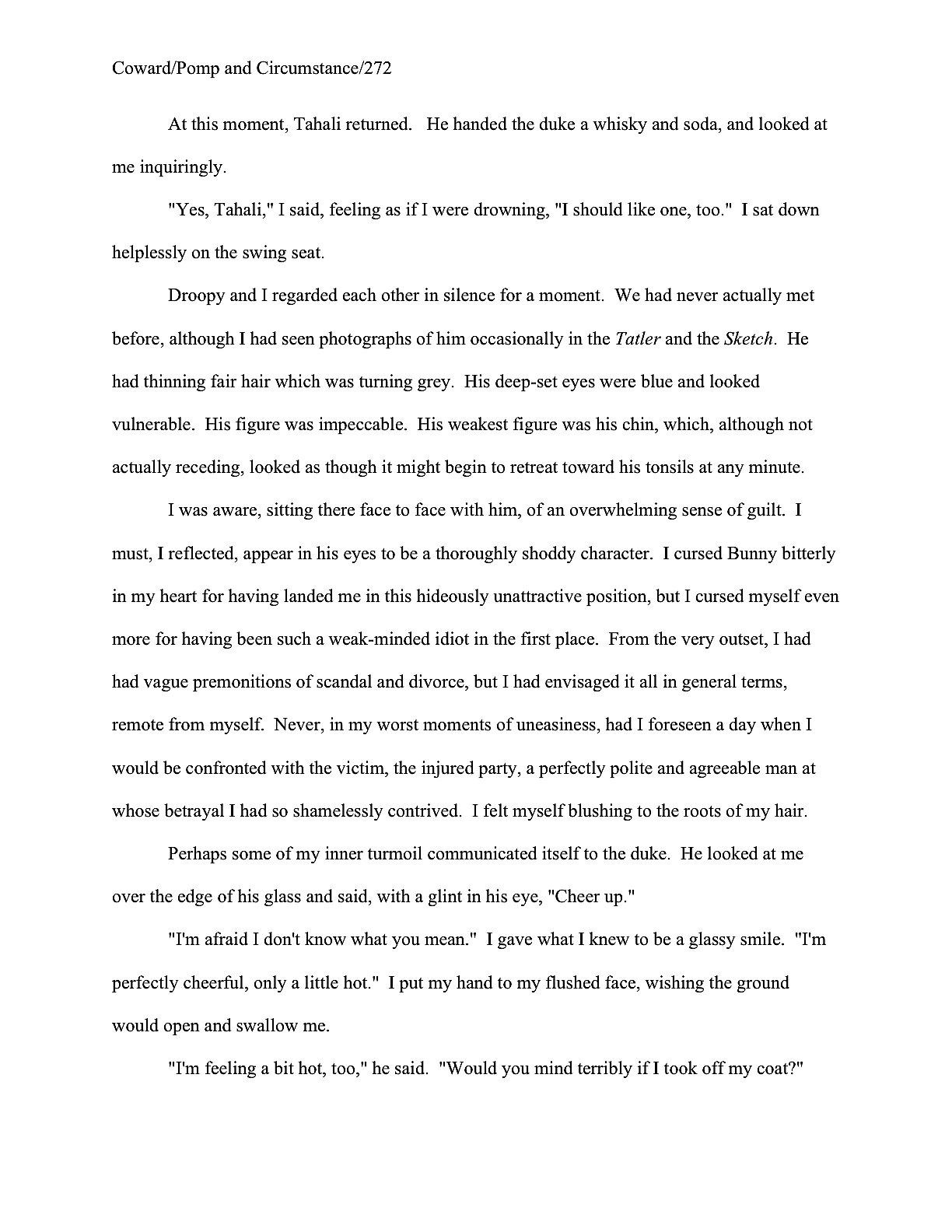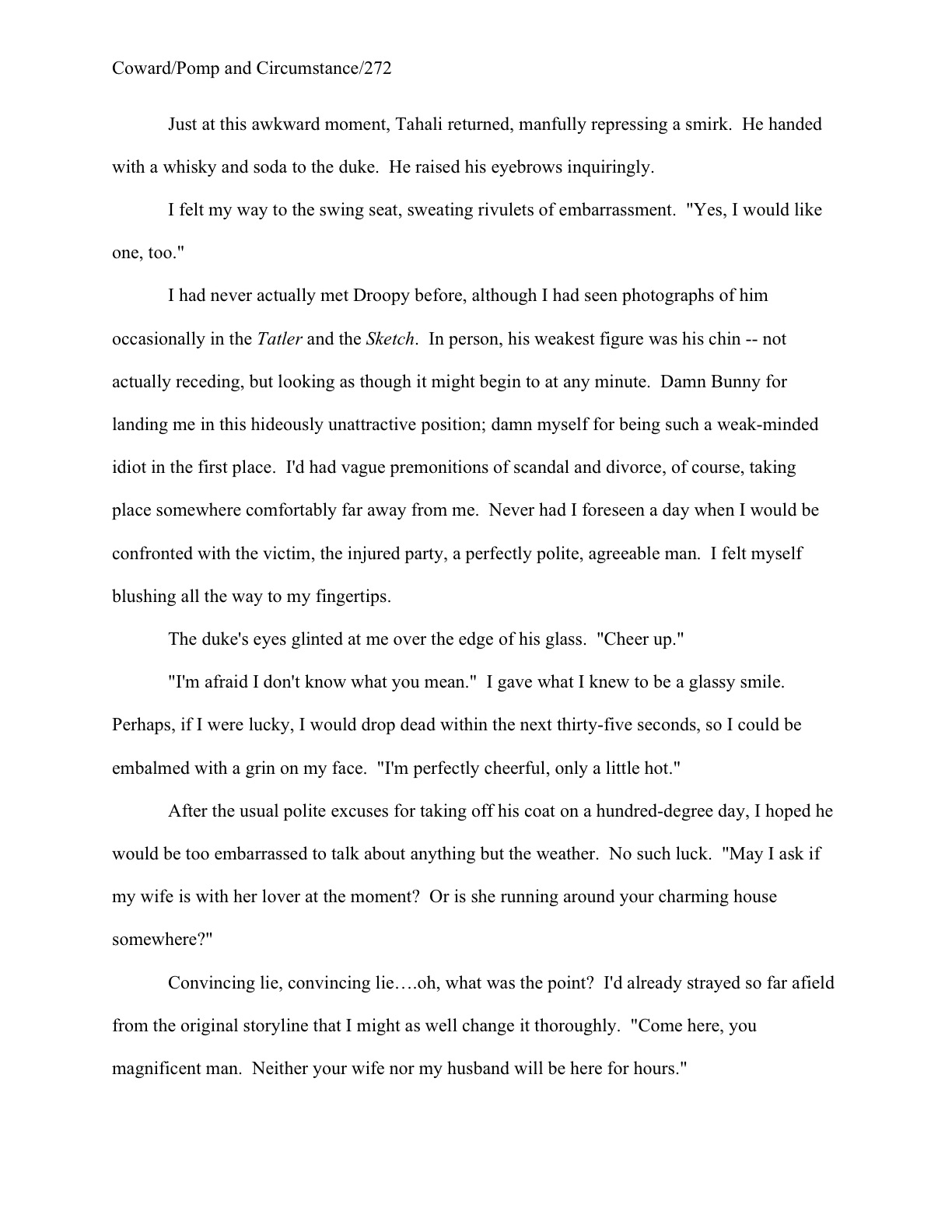

Welcome back to our ongoing salute to the winners of the Author! Author! Great First Page Made Even Better Contest in Category I: Adult Fiction. I am genuinely thrilled, not only to be able to bring you tantalizing tastes of some very talented writers’ prose, but also by the extraordinarily rich fund of discussion points these page 1s have been providing. Honestly, even though I’ve been chattering on here at Author! Author! for over five years about craft, presentation, voice, submission, and manuscript formatting, I keep finding myself thinking while I am typing, is it possible I’ve never blogged about this before?
Today’s exemplars are particularly fine ones, Adult Fiction first-place winners Jens Porup (the dapper fellow on the right, above) and Curtis Moser (the gentleman on the left with the two wee friends). The judges felt, and I concur, that both of their first pages were remarkable examples of strong authorial voice precisely suited to their target audiences.
They also felt, as do I, that there were some presentation issues that might prevent either of these exciting, fresh voices from getting a sympathetic reading from our old pal Millicent, the caffeine-quaffing agency screener. And since I know from long, long experience working with first-time authors that these specific presentation problems dog many, many otherwise well-done first pages, I am delighted to have the excuse to talk about them at length today.
First, though, to the voices. As we’ve discussed in the last couple of posts, the match between narrative voice and chosen book category can be vital to the success of a submission, particularly for genre fiction and YA: ideally, a great first page should cause Millicent to sigh pleasurably and murmur, “Ah, this is a fresh take on a story my boss can sell to this market, appropriate in voice, vocabulary, and tone for the intended readership, that also displays a fluency in the conventions of the genre.”
Okay, so that’s quite a bit to murmur over the first paragraph of a submission, but since it is safe to assume that a Millicent employed by an agency that represents a lot of, say, thrillers will be staring at queries and submissions for thrillers for a hefty chunk of any given workday, the last response a thriller-mongering querier or submitter should want to elicit is a spit-take of too-hot latte and a cry of, “Wait — hasn’t this writer ever read a book in this category?” or “What’s that kind of word choice doing in a manuscript intended for this market?”
Or even, saddest of all, “Wow, this is a fresh, exciting new voice. What a shame that it’s not appropriate for the book category in which this talented person has chosen to write.”
Unfortunately for both literature and the health of Millicent’s throat, all three of these reactions to well-written first pages are a part of her normal workday. Often, in the joy of creation, aspiring writers lose sight of the fact that no novel is intended for a general audience. Even bestsellers that turn out to appeal to wide swathes of the reading public begin their publishing lives as books aimed at a specific part of that audience.
And frankly, the reading public expects that. Even the most eclectic of readers understands that a YA novel is not going to read like a romance novel, science fiction, or Western, even if the book contains elements of any or all of those genres, and that an adult genre novel will adhere, at least roughly, to the conventions, tone, and general reading level of its book category.
Were that not the case, brick-and-mortar bookstores would not organize their offerings by category, right? Oh, they usually have a generalized fiction or literature section, but if you’re looking for fantasy, it’s probably going to have a bookshelf of its own, crammed to the gills with novels that share, if not subject matter, at least a species resemblance of storytelling structure and voice.
So while naturally, an aspiring writer should not strive to produce a carbon-copy voice — why should Millicent recommend that her boss pick up a book that sounds precisely like another that’s already on the market? — it’s an excellent idea to re-read one’s submission with an eye to genre-appropriateness. Especially the opening pages, since, as I hope we all know by now, most submissions are rejected on page 1.
Thus it follows as dawn the night that the book description and the first page are not too early to establish that your book fits comfortably into the category you have chosen for it — and thus into Millicent’s boss’ client list. Remember, just as no novel is actually intended for every conceivable reader, no agent represents every type of book. They specialize, and so should you.
Why, yes, now that you mention it, gearing your voice to your chosen book category would be a heck of a lot easier if you invested some time in reading what’s come out recently in it. How savvy of you to realize that what might have struck Millicent as a fresh take fifteen years ago would probably not elicit the same pleased murmuring today.
As fate would have it, both of today’s winning entries fall into the same general book category: thrillers. However, these books are aimed at different readerships within the thriller genre. Curtis’ PERDITION is a paranormal thriller:
Colt Miller has driven by the cemetery house for years. When the owner died, he watched the shingles curl and the porch sag, and in his mind he nurtured the fantasy of restoring it to its former beauty. So when the bank finally brings it up for auction and there are no bidders, Colt is thrilled to purchase it cheap. After he finds the body of a little girl in the basement, however, the thrill ebbs along with his enthusiasm, and the memory of the loss of his own daughter threatens to swallow up what remains of his business, his life, and his sanity.
Sounds like a story about an interesting person in an interesting situation, right? Yet the potential for paranormal activity didn’t jump out until that last sentence, did it? If I were editing this paragraph in a query, I would bump some of the skin-crawling feeling up to the first sentence, on the general principle that a Millicent who read queries for paranormal thrillers all day might not be automatically creeped out by the word cemetery.
But it does read as genre-appropriate, and that’s the most important thing. So does Jens’ brief description for THE SECOND BAT GUANO WAR (the judges’ favorite title in the competition, by the way):
This hard-boiled spy thriller set in Peru and Bolivia is an unflinching look at vice and corruption among expatriate Americans living in South America. When the hero’s best friend and CIA handler goes missing, he must risk everything to find him.
While this is a perfectly fine description, as those of you who followed the recent Querypalooza series are no doubt already aware, I prefer even the briefest novel description to give more of an indication of the book’s storytelling style and voice. Unlike Millicent, though, I did not need to judge the style on this terse paragraph: I asked Jens for a more extensive description.
Rats ate his baby daughter while he partied in a disco. Now Horace “Horse” Mann is a drugged-out expat teaching English to criminals in Lima, Peru. Oh, and doing the odd favor for the CIA.
When his drinking buddy and CIA contact, Pitt Watters, goes missing, Horse’s efforts to find him hit a snag. He comes home to find his lover, Lynn — Pitt’s mother — strangled in his apartment. Arrested and charged with murder, Horse escapes Lima and follows his only lead to a Buddhist ashram on the shores of Lake Titicaca.
There, Horse uncovers his friend’s involvement with a group of Gaia-worshipping terrorists who want to kill off the human “disease” infecting the earth.
The group’s leader, a world-famous vulcanologist, explains that only a new generation of lithium-ion batteries can replace the dwindling supply of fossil fuels. The group plans to set off a volcanic chain reaction that would destroy the world’s most promising lithium fields, and thus ensure that man pays for his polluting sins.
Horse finally finds Pitt on top of a volcano, his thumb on the detonator. Pitt confesses to killing Lynn, begs Horse to join him in the purification of Gaia. Horse must choose: end the world, himself, his guilt? Or forgive himself the death of his daughter, and find a way to live again?
Complete at 80,000 words, THE SECOND BAT GUANO WAR is a hard-boiled thriller set in South America, with an environmental twist.
Sounds like precisely what the first description promised: a hard-boiled spy thriller. But this description shows these qualities, in a voice that’s book category-appropriate; the first just asserts them.
And if you found yourself murmuring, “Show, don’t tell,” congratulations: you’re starting to think like Millicent.
I love this description for another reason, though — it’s a glorious illustration my earlier point about Millicents working in agencies that represent different kinds of books looking for different things at the querying and submission stage. A Millicent habituated to screening thrillers would glance at that first sentence and murmur, “Wow, that’s a graphic but fascinating detail; I don’t see that every day,” whereas a literary fiction-reading Millicent have quite the opposite response: “Wait, didn’t rats eat a protagonist’s baby sister in Mario Vargas Llosa’s AUNT JULIA AND THE SCRIPTWRITER?”
The moral, in case I’m being too subtle here: what’s fresh in one book category will not necessarily be in another. If Cormac McCarthy’s beautifully-written THE ROAD had shown up as a first novel in a science fiction/fantasy-representing agency, its Millicent would have rolled her eyes and muttered, “Not this old premise again!”
Happily, the target audience for hard-boiled spy thrillers tends not to have much overlap with that for literary fiction. For one thing, about 90% of habitual literary fiction buyers are female, whereas the overwhelming majority of spy thriller readers are male. So not only does Jens not need to worry too much about perusers of the Nobel Prize in Literature short list catching the similarity; they probably won’t even be browsing in the same part of the bookstore.
Before I move on to what really makes these two entries remarkable, the strong voices in their openings, I can’t resist pointing out a common synopsis and book description faux pas in that last example. Take another peek at its last paragraph: can anyone tell me why it might be problematic at query or submission time?
Award yourself a gold star if you instantly cried out, “A synopsis or book description for a novel should concentrate on the plot!” (And take two more gold stars out of petty cash if you thought that the first time you read that description.) When an agency’s guidelines ask for a synopsis, they expect an overview of the plot: basic introductions to the main characters and their conflicts. Mentions of technical matters like the length or book category do not belong here.
But that’s not actually the reason I flagged this paragraph. Any other guesses? (Hint: a LOT of queriers include this faux pas in their letters, too.)
Give up? The phrase Complete at 80,000 words actually doesn’t make sense in a novel query. Novels are ASSUMED to be complete before the writer begins to query them — so why mention it? All bringing it up achieves is to make Millicent wonder if the querier is also sending out letters for other novels that are not yet complete.
Also, the mention of the word count, while well within the standard range for thrillers, is not particularly helpful information to include. It’s not a usual element in a synopsis or book description, but even in a query, it can only hurt you.
Why? Well, as I argued at the beginning of Querypalooza, the only use Millicent can make of word count in a query is if it is higher or lower than expected for that book category. And that use is, “Next!”
“130,000 words!” she exclaims, reaching for the form-letter rejections. “Far too long for my boss to be able to submit to editors in this book category. Too bad, because the book description sounded interesting until that last bit about the word count. And why on earth would she be wasting my time with a manuscript that wasn’t complete?”
That’s why, in case you had been wondering, some agency guidelines (but not many; check) do specify that they would like to see word count mentioned in queries: speed of rejection. Think about it: if Millicent does not realize until she has opened the requested materials submission packet that the manuscript is longer than her agency wishes, she will usually read at least the first page anyway. And if she is taken by that first page, she might well read on.
So by the time she realizes that there are 120 more pages in that manuscript than her boss would like, she might already have fallen in love with it. The agent might have, too. In the worst-case scenario, their only course might be to sign the writer and ask her to trim the manuscript.
So including the word count is to the querier’s advantage how, precisely?
Speaking of falling in love with a new writer’s voice, I imagine that you’re getting impatient to read those aptly-voiced first pages I’ve been going on and on about. Let’s begin with Curtis Moser’s:
And here is Jens Porup’s:

Original, assured authorial voices, right? Fresh without sending up red flags that the book to follow might not fit comfortably into the stated book category (although personally, I found the Colt 45 joke in the first a bit obvious: wouldn’t it be funnier to let the reader figure out later in the story that the guy named Colt was indeed 45?), these opening pages both announce where these books will sit in a bookstore and promise good, genre-appropriate writing to come.
Not only that, but both protagonists come across as interesting, quirky people faced with interesting, unexpected challenges. We as readers might be quite happy to follow these guys around for a few hundred pages.
But did something seem slightly off on both of those page 1s? Something, perhaps, in the formatting department?
Hint: they should look quite a bit more alike than they currently do. An even bigger hint: in one major respect, they have opposite problems.
Still not seeing it? Okay, let’s take a gander at both first pages with the formatting irregularities fixed. Again, Curtis first, then Jens:


They look much more alike this way, don’t they? That’s not entirely coincidental: the point of standard format is that all manuscripts should look alike. That way, the formatting does not distract from professional readers’ evaluation of the writing.
Award yourself one of those gold stars I’ve been tossing about so freely if you cried upon comparing the original versions to the revisions, “By Jove, margins were quite off the first time around. Curtis’ left and right margins are too big; Jens’ left, right, and bottom are too small. And is the slug line in the second in a rather unusual place in the header?”
Exactly so — and as Goldilocks would say, the margins in the revised versions are just right. Nice point about the slug line, too. As small as these deviations from standard format may seem, to someone accustomed to reading professionally-formatted manuscripts, they would be indicative of a certain lack of familiarity with submission norms. At minimum, a pro’s first glance at these pages would tend to lead to reading the actual text with a jaundiced eye: remember, new clients who need to be coached in how the biz works are significantly more time-consuming for an agent to sign than those who already know the ropes.
Even if that were not a consideration, these formatting problems would be a significant distraction from the good writing on these pages. In fact (avert your eyes, children; this sight is going to be almost as distressing to the average aspiring writer as a baby gobbled up by rats), there’s a better than even chance that the formatting would have prompted Millicent not to read these pages at all.
Okay, so it’s not up to baby-consumption levels of horror, but it’s still a pretty grim prospect, right? See why I was so thrilled to have the opportunity to comment upon these pages? A few small formatting changes will render them much, much more appealing to Millicent.
Bonus: all of the formatting gaffes you see above are very, very common in submissions. In fact, they were extremely common in the entries to this contest — which is why, in case any of you had been wondering for the last few paragraphs, deviations from standard format, although explicitly forbidden in the contest’s rules, did not disqualify anybody.
Hey, there’s a reason that I run my HOW TO FORMAT A MANUSCRIPT series a couple of times per year. (Conveniently gathered for your reading pleasure under the category of the same name on the archive list at right, by the way.) The overwhelming majority of aspiring writers believe, wrongly, that formatting is a matter of style, rather than simply the way the pros expect writing to be presented.
Let’s take these pages one at a time. Curtis’ left and right margins are set at 1.25″, rather than the expected 1″. While this formatting choice was actually rather nice for me as an editor (don’t worry, the marked-up versions are following below), it would necessarily throw the estimated word count for a loop: as you may see from the before and after versions, 1″ margins allow for quite a few more words on the page. So does turning off the widow/orphan control (which you will find under the FORMAT/PARAGRAPH/LINE AND PAGE BREAKS section in Word), so that every page has the same number of lines of text.
Now let’s talk slug line, that bit in the header containing the author’s last name, book title, and page number. Or rather, it should contain the page number: on this page, the number is off on its own, on the far side of the page. So the slug line looks like this:
Moser / Perdition
Rather than the expected:
Moser/Perdition/1
As you have no doubt already noticed, the expected version does not feature spaces before and after the slashes. What you may not have noticed, however, was that in the original, the slug line was in 10-point type, rather than the 12-point that should characterize every word in a manuscript. Also, the chapter title is in 14-point type AND in boldface, both standard format no-nos.
I’d actually be astonished if you spotted the other font-based problem, because the key to diagnosing it lies in being able to see it in soft copy: the skipped double-spaced lines between the chapter title and the first line of text are in 14-point, too. The difference on the printed page is miniscule, admittedly, but while we’re revising, we might as well go the whole hog, eh?
Jens’ page 1 is even more likely to be rejected on sight, due to his margins: 1.17″ at the top, .79 inch along the other three sides, and as the exclaimers above pointed out, the slug line is at the bottom of the header, rather than at the usual .5 from the top of the paper. In most literary contests, shrinking the margins to this extent would result in instant disqualification, but hey, we do things a little bit differently here at Author! Author!.
The funny thing is, shrinking the margins actually didn’t get much more material on this page. As some of you compare-and-contrasters may already have noticed, were the chapter title and space between the top of the page and the beginning of the text shrunk to standard format for a chapter opening, only a line and a half would be pushed to page 2.
Actually, if Jens were willing to change the font to Times New Roman, he’d actually gain space. To tell you the truth, I always discourage my editing clients from submitting work in Courier, anyway (or, in this case, Courier New): yes, it’s technically acceptable (and required for screenplays), but Times New Roman is the industry standard for novels.
Besides, it’s spiffy. Take a gander:
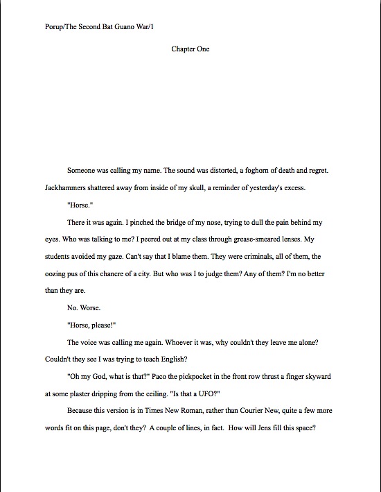
Looks quite a bit sharper, doesn’t it? True, part of that increased neatness comes from bringing the page more in line with what Millicent would expect cosmetically: starting the text 1/3 of the way down the page, moving the Chapter One up to the top, not left-justifying anything but the slug line, and removing both the extra spaces and selective capitalization from that.
Hey, every little bit helps, right?
Now that we’ve gotten all of that distracting formatting out of the way, let’s see how Millicent responds to Jens’ first page now that she is reading it:

Pretty positively, by professional readers’ standards, right? The judges felt the same way — but believed, as I do, that a couple of minor text changes would make Millicent like it even more. The first suggestion, however, would require substantial rearrangement of this opening scene.
Why? Well, in a novel’s opening, speech without a speaker identified – or, in this case, without the narrative’s even specifying whether the voice was male or female — is a notorious agents’ pet peeve. It’s not on every pet peeve list, but it’s on most. Guessing really drives ‘em nuts.
“It’s the writer’s job to show me what’s going on,” Millicent mutters, jabbing her pen at the dialogue, “not my job to fill in the logical holes. Next!”
On Jens’ page 1, having the action of the scene turn on a disembodied voice is even more dangerous, because it raises the possibility that perhaps this book should have been categorized on the other side of the thriller spectrum: as a paranormal thriller like Curtis’, rather than a spy thriller. Oh, it didn’t occur to you that the voice might have been of supernatural origin? It would to a Millicent whose boss represents both types of thriller.
The other avoidable potential red flag here is the word choice chancre. It’s a great word, but let’s face it, thriller-readers tend not to be the types to drop a book on page 1 in order to seek out a dictionary’s assistance. Even if Millicent happened to be unusually familiar with social disease-related terminology, she would probably feel, and rightly so, that this word is aimed above the day-to-day vocabulary level of this book’s target audience.
And no, I’m not going to define it for you. Despite all of this talk of baby-eating, this is a family-friendly website.
Dismissing the manuscript on these grounds would be a genuine shame — this is one of the most promising thriller voices I’ve seen in a long time. This jewel deserves the best setting possible to show off its scintillations.
And once again, isn’t it remarkable just how much more closely professional readers examine even very good text than the average reader? Here, Curtis’ first page gets the Millicent treatment:

Again, a great opening, exciting new voice, and genre-appropriate, with the fringe benefit of a real grabber of an opening sentence. (That, ladies and gentleman, is how one constructs a hook.) The character-revealing specifics in the second paragraph are also eye-catching: considering that all of these telling details are external characteristics, they certainly give a compelling first glimpse of the man.
I see that Millicent agrees with me that that drawing the reader’s attention to the Colt 45 analogy twice on a single page might be overkill, though. Funny how that worked out, eh? She left it in the title — as, remarkably, would I — but advised cutting the unnecessary explanation at the beginning of paragraph 2.
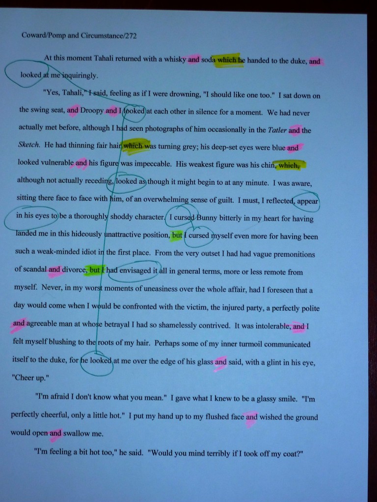
The other easily-fixable element is an old favorite from this summer’s first page revision series: all of those ands. As we discussed in Juniper Ekman’s grand prize-winning entry last time, the frequent use of and is common in both YA and first-person narratives, as an echo of everyday speech.
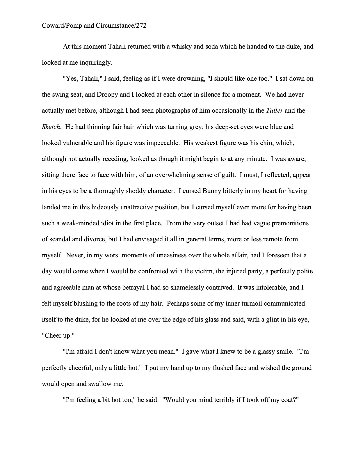
On the printed page, especially if that printed page happens to be page 1 of an adult narrative, all of those ands can become wearying to the eye. As, indeed, does any word or phrase repetition: they tempt the weary skimmer to skip lines. Take a gander at how the word and phrase repetition here might jump out at Millicent:
See how that percussive repetition conveys the impression that the sentence structure is far less varied than it actually is? Yet as individual sentences, most of this is nicely written — and despite all of the ands, there is only one honest-to-goodness run-on here.
The good news is that, like most word repetition, this is going to be quite simple to fix. It merely requires taking a step back from the text to see it as a pro would: not merely as one nice sentence following another to make up a compelling story and fascinating character development, but as a set of patterns on a page.
Wow, that was a productive little discussion, wasn’t it? Many thanks to Jens and Curtis for prompting it.
Oh, and once again, congratulations!
Next time — which may well follow late tonight, post-PT energies permitting; we’ve got a lot of contest winners to get through between now and the grand opening of Synopsispalooza on Saturday — I shall present you with another set of first-place-winning entries, this time in YA. Keep up the good work!


 No matter how many pages or extra materials you were asked to send, do remember to read your submission packet IN ITS ENTIRETY, IN HARD COPY, and OUT LOUD before you seal that envelope. Lest we forget, everything you send to an agency is a writing sample: impeccable grammar, punctuation, and printing, please.


