The rules, part III: the bare necessities

restrooms & cemeteries

The wee tourist trap where I took this is stuffed to the gills with practical people, evidently. If you look closely in the background, you’ll see that there’s also a liquor-and-sundries store. In retrospect, I wish I’d documented what the locals considered sundry, as opposed to requisite.

Beginning to sense a theme here? Excellent. Today, I would like us to focus our collective minds firmly on the practical while we continue our chat about how to present a book manuscript in a professional manner.

I would hate, after all, for any of you lovely people to fall into the oh-so-common pre-submission trap of believing that because implementing one or more of these rules will take some time (and thus slow the egress of your manuscript from your writing digs), any of them may be treated as optional. Oh, our old pal Millicent the agency screener isn’t going to burst into your studio, wrest the keyboard from your trembling hands, and forcibly insert indentation into your paragraphs. She’s not going to take a ruler to your margins, either, in all probability, or call you on the phone to yell at you because Chapter 2 began on the same page as the end of Chapter 1, any more than she’s likely to tell everyone in the literary world that for some reason best known to yourself, you’ve evidently decided that Microsoft’s defaults have come to dictate formatting in the entirely unrelated publishing industry.

She simply doesn’t have the time to do any of that. She’s got hundreds of submissions to read.

That doesn’t mean, however, that a screener or contest judge might not get the urge to indulge in a little educational mayhem. Like anyone else in a position to read an average day’s complement of submissions, our Millicent sees an incredible amount of good writing presented as though presentation couldn’t possibly matter.

As I’m hoping today’s grim opening image will remind you, that’s just not true. Inevitably, the cosmetic aspects of a submission affect how someone who works with professionally-formatted manuscripts will respond to what’s on the page.

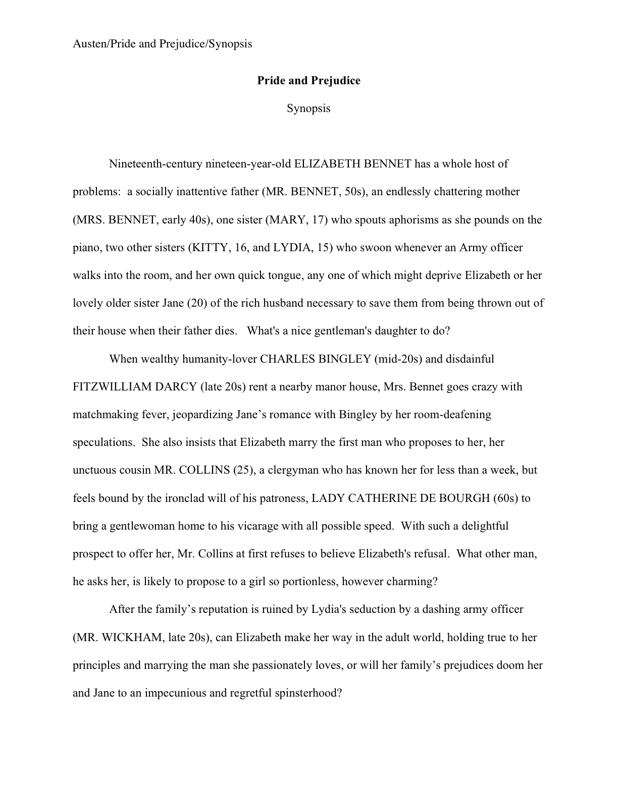
Don’t believe me? Perhaps you missed our recent brief visual tour of a properly-formatted manuscript. If so, slip your tootsies into Millicent’s moccasins and compare what you would have expected a page 1 to look like:

With the following page 1, riddled with fairly common deviations from standard format. If you’re having trouble seeing the details, try holding down the COMMAND key and pressing + to enlarge the image.

Visibly different from across the room, isn’t it? As we’ve been discussing, since U.S.-based agencies send out their clients’ manuscripts in a specific format, a submission presented in any other manner just doesn’t look right to those of us who read for a living. Once you know how a page is supposed to look, even minor deviations distract the eye.

Since that generally comes as a big, ugly surprise to writers who have never had the opportunity to see a professionally-formatted manuscript, the temptation to fudge is quite understandable. Especially in a contest entry, in order to fit desired text into a limited number of pages, something that has occurred to so many entrants for so many years that many literary contests simply disqualify any entry that doesn’t follow its formatting rules.

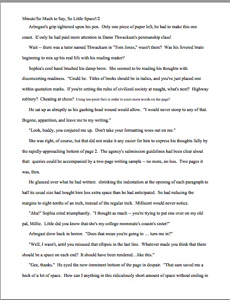
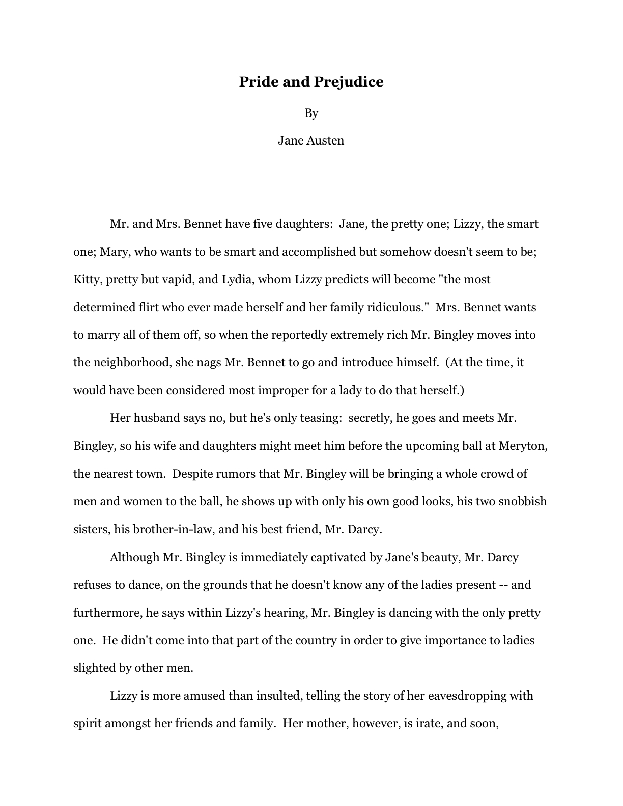
Sadly, the writers pulling off this sort of trick often believe they’re being subtle — or don’t know that fudging in order to include more words per page than other entrants is a knock-you-out-of-finalist-consideration offense. But how could it not be, when the results are so obviously different from a manuscript adhering to standard format? Compare this page 2:

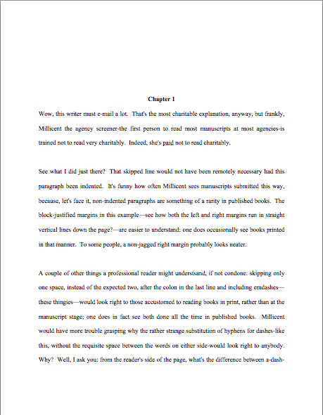
With this:

Really no chance of Millicent’s missing the spacing tricks here, is there? See what I mean about those familiar with standard format’s enjoying a distinct advantage at submission time?

While I’m horrifying you, guess what she’s trained to do with a partial manuscript in which the writer has messed with the margins, font size, or new chapter formatting in order to have a favorite scene fall within the requested page limit? Or, even more commonly, to prevent the break at the bottom of page 50 (or whatever is the last of the requested pages) from occurring in mid-scene, if not mid-sentence?

Uh-huh: “Next!”

Don’t see why? Well, in the first place, it never fails to astonish, amuse, and/or perplex those of us who read for a living that any aspiring writer, no matter how inexperienced, would presume that an agent or editor would ask for a set number of pages, expecting a scene, section, chapter, or even sentence to end precisely at the bottom of it. That virtually never happens naturally.

You’d never know that, though, from how often an agency’s request for the first 50 pages yields either the type of compressed text we saw above or this type of chapter break:

I’d show you a counterexample of a chapter break correctly formatted, but you’ve already seen it, in essence: the opening of Chapter Two should begin on a fresh page — and look precisely like the first page of Chapter One.

Hard to get more practical than that, eh?

Whether you are being surprised and stunned by the rigors of standard format for the first time or working your way though this series as a veteran, it is very much to your advantage to learn these rules, then apply them consistently throughout your manuscript. While it is undoubtedly time-consuming, investing a few days in formatting your manuscript properly will in the long term save you a whole heck of a lot of time.

It’s true, honest. While the applying these rules to a manuscript already in progress may seem like a pain, practice makes habit. After a while, the impulse to conform to the rules of standard format becomes second nature for working writers. The manuscript came into the world correct — which, in turn, saves the writer revision time. On a deadline, those conserved minutes and hours can save the writer’s backside as well.

Oh, you may laugh, but the more successful you are as a writer, the more likely the day will come when you’re not going to have the half an hour it would take to reformat a inconsistent manuscript before your editor calls to demand why you didn’t e-mail those revisions yesterday. Writing a requested new chapter (yes, it happens) in standard format may make the difference between getting it under your agent’s nose before she leaves for the day/weekend/her honeymoon/to deliver that baby and missing the boat. And hands up, every contest entrant who has dashed panting into a post office 32 seconds before it closed, to get that entry postmarked on the last possible day.

Seriously, committing to formatting your pages correctly from the get-go will render you a better professional writer — and definitely a better agency client. Think about it: if you were Millicent’s boss, the agent of your dreams, would you rather be drumming your fingers on her desk for the extra hour it will take your client who prefers to write in some other format to whip the new version of Chapter 7 that editor interested in acquiring the book requested, or would you prefer to receive it as soon as the writer polishes it off?

And if you were lucky enough to be the writer in this situation — hey, acquiring editors don’t ask for changes in manuscripts they don’t like — would you be happier performing that lighthearted little revision changing the protagonist’s sister Wendy into her brother Ted if you did not also have to make the time to alter the formatting, or if you did? You’re going to have enough on your plate, rushing to work those revisions into the plot: s/he is no longer a corporate lawyer, but a longshoreman, and Uncle George dies not of a heart attack, but of 12,000 pounds of under-ripe bananas falling on him from a great height when he goes to the docks to tell Ted that Great-Aunt Mandy is now Great-Uncle Armand. (If only Ted had kept a better eye on that load-bearing winch!)

Stop looking so smug, nonfiction writers: you’re even more likely to end up wanting those saved minutes. Nonfiction contracts often specify delivering the finished manuscript rather quickly, and it’s far from unusual for the acquiring editor to ask for a different running order, or even different chapters, than a proposal laid out. Trust me, at that junctures, the last thing you’ll want to have to worry about is whether your margins are consistent.

And all of that’s the good news, what happens if everything goes right. The more successful you are as a writer — any kind of writer — the more often you will be churning out pages in a hurry. Just ask any author whose agent is breathing down her neck after a deadline has passed. Especially if the writer didn’t know about the deadline until it had already come and gone.

Oh, how I wish I were kidding about that. And don’t even get me started on the phenomenon of one’s agent calling the day after Thanksgiving to announce, “I told the editor that you could have the last third of the book completely reworked by Christmas — that’s not going to be a problem, is it?”

Think you’re going to want to be worrying about your formatting then? Believe me, you’re going to be kissing yourself in retrospect for learning how to handle the rote matters right the first time, so you can concentrate on the hard stuff. (What would many tons of bananas dropped from that height look like in transit, anyway?)

Fortunately, standard format sinks into one’s very bones with use; in practical terms, it honestly is easier than what many aspiring writers are already doing to their pages. I’m constantly encountering writers who tinker endlessly with the settings on their Word programs because they heard somewhere (in the finest tradition of rumor, they are often unsure precisely where) that the default setting for double-spacing is not the precise size agents really want, or hand-constructing quotation marks out of pixels so they will look like the ones in a favorite published book, or painstakingly typing the slug line onto the top of each and every page of a word-processed document, rather than typing the darned thing into the header once and being done with it.

All of these are bits of writerly obsession I’ve seen in person, by the way. I wasn’t kidding about these rules saving you time in the long run.

Still don’t believe that it’s worth your time to learn the rules — and to apply them consistently every single time you sit down to write any prose that might conceivably end up in a book manuscript? Okay, here’s an even stronger motivation: virtually always, an agent, editor, contest judge, or screener’s first reaction to an improperly-formatted manuscript is not to take the writing it contains very seriously.

Why should they? Obviously, this writer is still learning how to play the game; if she’s truly talented and determined, the logic runs, she’ll respond to the bone-crushing depressive effect of rejection by realizing she needs to learn the rules. In the long run, that will make her a better, more productive professional writer. And if by some mysterious chance she does not respond to being told her book isn’t agency-ready by giving up on it, or if she does not possess the psychic skills to derive you should find out what professional manuscripts look like from a form letter blandly stating, this manuscript does not meet our needs at this time, well, Millicent sees too many perfectly-formatted submissions in any given week of screening to fill her boss’ new client spots several times over.

I know: trying. Yet as I believe I may have mentioned once or twice before, I do not run the universe, and thus do not make the rules. Sorry. No matter how much I would like to absolve you from some of them, it is outside my power. Take it up with the fairy godmother who neglected to endow me with that gift at birth, okay?

Until you have successfully made your case with her, I’m going to stick to wielding the skills that she did grant me, acquired through a childhood surrounded by professional writers and editors who made me learn to format pages the right way the first time. Oh, you may chuckle, but my fifth-grade history paper was in standard format; I can still hear my mother blithely dismissing my poor, befuddled teacher’s protests that none of the other kids in the class were typing their papers with, “Well, honestly, if Annie doesn’t get into the habit of including slug lines now, where will she be in twenty years?”

Where, indeed? The strictures of standard format are hardly something that she would have wanted me to pick up on the street, after all.

So let’s start inculcating some lifetime habits, shall we? To recap the rules we’ve studied so far:

(1) All manuscripts should be printed or typed in black ink and double-spaced, with one-inch margins around all edges of the page, on 20-lb or better white paper.

(2) All manuscripts should be printed on only one side of the page and unbound in any way. For submission to US-based agencies, publishing houses, and contests, the pages in question should be US-standard 8.5″ x 11″ paper.

(3) The text should be left-justified, not block-justified. By definition, manuscripts should not resemble published books in this respect.

(4) The preferred typefaces are 12-point Times, Times New Roman, Courier, or Courier New — unless you’re writing screenplays, in which case you may only use Courier. For book manuscripts, pick one (and ONLY one) and use it consistently throughout your entire submission packet.

(5) The entire manuscript should be in the same font and size — no switching typefaces for any reason. Industry standard is 12-point.

(6) Do not use boldface anywhere in the manuscript but on the title page — and not even there, necessarily.

(7) Every page in the manuscript should be numbered — except the title page. The first page of text is page 1, not the title page.

(8) Each page of the manuscript (other than the title page) should have a standard slug line in the header. The page number should appear in the slug line, not anywhere else on the page.

(9) The first page of each chapter should begin a third of the way down the page. The chapter title should appear on the first line of the page, not on the line immediately above where the text begins.

(10) Contact information for the author belongs on the title page, not on page 1.

(11) Every submission should include a title page, even partial manuscripts.

Everyone ready to devote the rest of his or her long, productive creative life doing all of that? If not, this would be a dandy time to pipe up with questions, concerns, and fruitless protests. While you’re formulating ‘em, let’s move on.

(12) The beginning of every paragraph of text should be indented .5 inch. No exceptions, ever.

Right off the bat, here is a way to save some of you conscientious rule-followers some time. Most word-processing programs (Including Word, if left to its own devices) automatically indent .5 inch (12.7 mm, if my junior high school conversion formula is still correct), but as you’ve probably noticed in practice, that’s more than five spaces.

Such is the way of the world. If you set your tabs to .5 inch, you’ll be set.

Why is the number of spaces relevant here? Well, the usual way this rule is expressed is indent every paragraph 5 spaces, a quaint hangover from the days when typewriters reigned supreme. As you may have heard somewhere, however, MS Word, the standard word processing program of the U.S. publishing industry, automatically sets its default first tab at .5 inch. Yet unless you happen to be using an unusually large typeface like Courier, you’ve probably noticed that hitting the space bar five times will not take you to .5 inches away from the left margin; in Times New Roman, it’s more like 8 spaces.

Does this mean all of us should be whipping out our measuring tapes, painstakingly hand-crafting a specialized tab that’s the exact equivalent of five actual characters, down to the last micron? Of course not — but would you be surprised to hear how many aspiring writers do just that?

Their confusion is understandable: this is genuinely one of those things that actually has changed in theory, if not visibly on the page, since the advent of the personal computer. To set the nervous at ease, let’s take a moment to talk about why is standard indentation at .5 inch now, rather than at five characters.

History, my dears, history: back in the days when return bars roamed the earth instead of ENTER keys, there were only two typefaces commonly found on typewriters, Pica and Elite. They yielded different sizes of type (Pica roughly the equivalent of Courier, Elite more or less the size of Times New Roman), but as long as writers set a tab five spaces in, and just kept hitting the tab key, manuscripts were at least internally consistent.

With the advent of the home computer, however, word-processed manuscripts became the norm. The array of possible typefaces exploded. Rather than simply accepting that every font would yield slightly different indentation sizes, the publishing industry (and the manufacturers of Word) simply came to expect that writers everywhere would keep hitting the tab key, rather than hand-spacing five times at the beginning of each paragraph. The result: the amount of space from the left margin became standardized, so that every manuscript, regardless of font choice, would be indented the same amount.

So why pick .5 inch as the standard indentation? Well, Elite was roughly the size of Times New Roman, 12 characters per inch. Pica was about the size of Courier, 10 characters per inch. The automatic tab at .5 inch, therefore, is as close as even the most historical-minded editor could desire to five spaces from the left margin in Pica.

All of which is a long-winded way of saying that in this instance, at least, Word’s default settings are the writer’s friend. Keep on hitting that tab key.

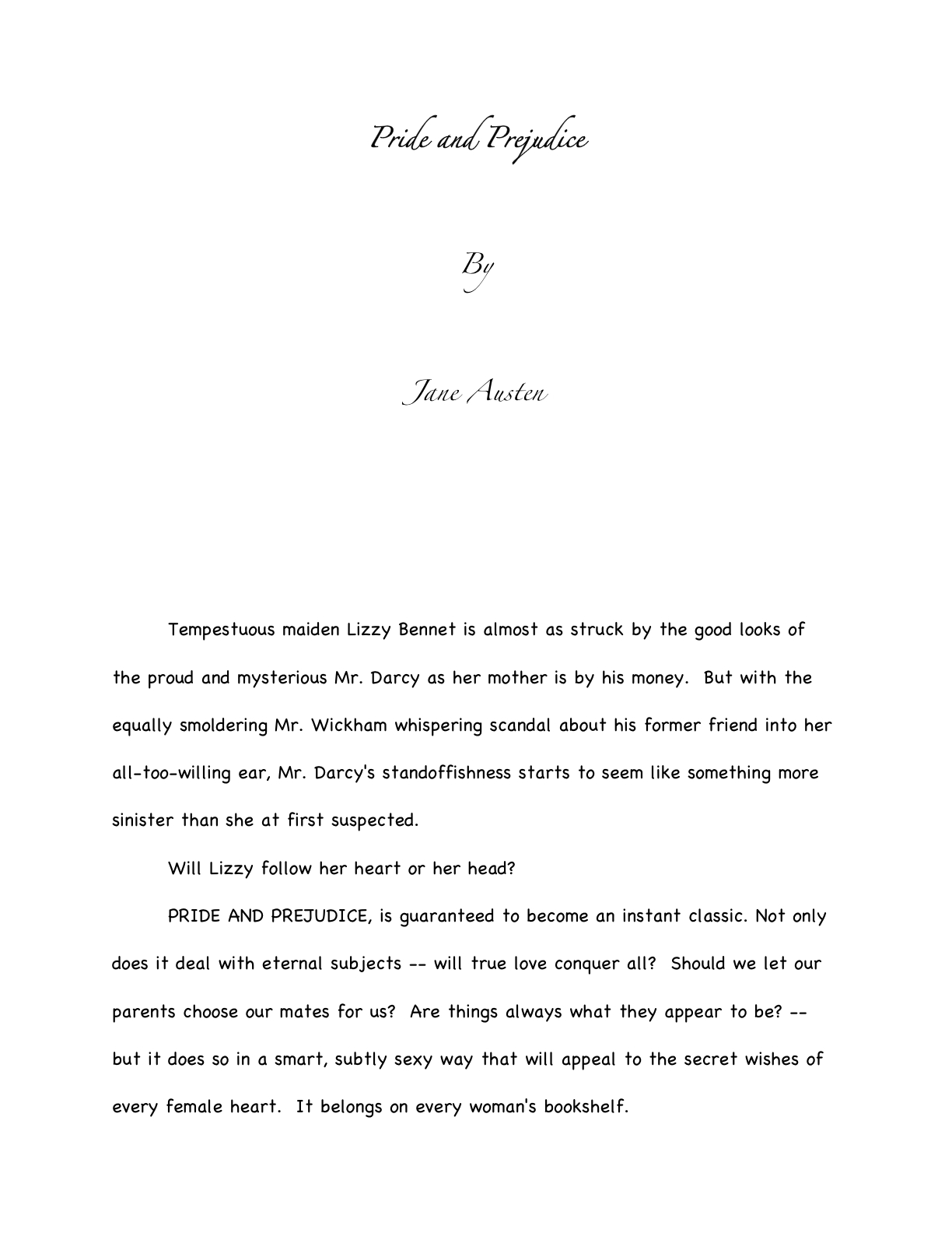
Again, no exceptions. If I had my way, no aspiring writer would ever send so much as a Christmas card in block-style business format to anyone working in the publishing industry. It’s fine in an e-mail (and thus an e-mailed query, although not in any pages an agency’s submission guidelines might permit a querier to include in the body of the e-mail), but on the page, it just looks as though the sender is unfamiliar with how words appear in print in American English. Take a gander, if you can bear it:

Wildly different from standard format, isn’t it? And, to those who work with manuscripts and/or published books, it does not look particularly literate.

Why should a savvy writer care about that perception, so long as the writing is good? Well, although literacy has become decreasingly valued in the world at large — picture me weeping copiously — the people who have devoted themselves to bringing excellent writing to publication still tend to take it awfully darned seriously. To folks like your humble correspondent, any document with no indentations, skipping a line between paragraphs, and the whole shebang left-justified carries the stigma of (ugh) business correspondence, not high literature or even stylish letter-writing.

Think of it this way: do you really want the person you’re trying to impress with your literary genius to wonder whether you’ve ever read a published book?

I thought not. And which do you think is going to strike format-minded industry professionals as more literate, a query letter in business format or one in correspondence format (indented paragraphs, date and signature halfway across the page, no skipped line between paragraphs)?

Uh-huh. And don’t you wish that someone had told you that before you sent out your first query letter?

That clattering sound you just heard was the more nervous type of aspiring writer reaching frantically for his mouse, to open up all of his writing files and change them instantly. And frankly, he should: despite the fact that everyone from CEOs to the proverbial little old lady from Pasadena has been known to use block format from time to time (blogs are set up to use nothing else, right?), technically, non-indented paragraphs are not proper for English prose.

Period. That being the case, what do you think Millicent’s first reaction to a non-indented page 1 like our last example is likely to be? Given how many submissions she needs to get through before she can break for lunch, how tempted do you think she would be not to read it at all?

Trust me on this one: indent your paragraphs in any document that’s ever going to pass under the nose of anyone even remotely affiliated with the publishing industry. Make my fairy godmother happy.

Not a good enough reason? Okay, here’s another: adhering to rule #12 carries a fringe benefit — it renders running afoul of rule #13 much less likely, for the exceedingly simple reason that it’s not necessary to keep your paragraphs from running together. Let’s make it official:

(13) Don’t skip an extra line between paragraphs, except to indicate a section break.

That makes sense, right? Since the entire manuscript should be double-spaced with indented paragraphs, there is no need to skip a line to indicate a paragraph break. Which is, in case you were not aware of it, what a skipped line between paragraph means in a single-spaced or non-indented document.

That couldn’t possibly apply to a book manuscript, by definition. There’s a practical reason for that: it’s a comparative pain to edit a single-spaced document, either in hard copy or on a computer screen. The eye skips between lines too easily, and in hard copy, there’s nowhere to scrawl comments like Mr. Dickens, was it the best of times or was it the worst of times? It could hardly have been both!

That being the case, why do aspiring writers so often blithely send off manuscripts with skipped lines, single-spaced or otherwise? My guess would be for one of two reasons: either they think business format is proper English formatting (which it isn’t) or they’re used to seeing skipped lines in print. Magazine articles, mostly. Or blogs. (The blogging program makes me do it, Millicent, I swear.)

Just don’t do it. Reserve the skipped line for section breaks.

A few hands have been waving urgently in the air since I started this section. “But Anne!” those of you who have seen conflicting advice point out, “I’ve always heard that there are specific markers for section breaks! Shouldn’t I, you know, use them?”

You mean the * * * or # to indicate a section break, right? That’s a throwback to the age of typewriters. Their original purpose was to alert the typesetter that the missing line of text was intentional, the author honestly did mean for the chapter to end there, and the narrative ceased because the story was over, not because the writer had passed out from the effort of banging for years on a keyboard that required considerable force to operate.

These days, though, it’s customary to presume that not only will an agent or editor be swift enough on the uptake to understand that the end of the text means the end of the manuscript, but also that the end of one section and the beginning of another is comprehensible without the addition of hieroglyphics. For book manuscripts and proposals, at least; remember, the rules for short stories are different.

If you are writing a book-length work, unless you’re entering a contest that specifically calls for them, or the agency to which you’re planning to submit mentions a preference for them in its submission requirements, don’t distract Millicent by including these extras. Do check contest rules carefully, though; you’d be amazed at how seldom some long-running literary contests update their rules.

And while we’re speaking of rules that have undergone some transformation over time…

(14) Nothing in a book manuscript should be underlined. Titles of songs and publications mentioned in the text, as well as words in foreign languages and those you wish to emphasize, should be italicized. Titles of poems, however, belong within quotation marks.

That’s fairly straightforward, right? Italics are one of the few concessions manuscript format has made to the computer age — again, for practical reasons: underlining uses more ink than italics in the book production process. Thus, italics are cheaper in than underlining.

So if a character feels really strongly that “The Raven” is a much better example of Edgar Allan Poe’s sensibilities than his first published book of poetry, Tamerlane and Other Poems, all Millicent can say is, “Mon ami, I cannot say I agree. Back then, the poor man was still singing Aura Lee with the other cadets.”

In which, of course, she would not be entirely correct. Oh, the formatting’s right — Aura Lee‘s a Civil War song, and Poe left West Point long before that.

Fair warning, though: if you consult an old style manual (or a website that is relying upon an old style manual), you may be urged to underline some or all of the words and phrases mentioned above. As will anyone who learned how to format a manuscript before the home computer became common, for the exceedingly simple reason that the average typewriter doesn’t feature italic keys as well as regular type; underlining used to be the only option. Although I remain fond of typewriters — growing up in a house filled with writers, the sound used to lull me to sleep as a child — the fact is, the publishing industry now assumes that all manuscripts are produced on computers. In Word, even.

I suspect outdated manuals are not the only reason Millicent and her ilk so often receive manuscripts containing underlining, though: as I may have mentioned a few (or a few hundred) times on this site, different fields have different standards. There are some areas of writing endeavor in which underlining is still de rigueur. Unfortunately, it’s really, really common for writing guidelines from all over the place to be posted online as though they are applicable to all writing, anytime, anywhere.

If you are writing a book manuscript or proposal, the only formatting guidelines that should concern you are those specifically applicable to books. Don’t even consider importing rules from, say, short story format; your manuscript will merely come across as confused.

And no wonder, with so much misinformation about italics use floating around the web. To minimize the possibility of any member of the Author! Author! community’s falling prey to this misguided miasma, let’s swiftly review the proper use of italics in a book manuscript.

(a) For foreign-language words appearing in an English-language manuscript, unless the words in question are proper names: people, places. The logic behind this part of the rule is very straightforward: you don’t want the agent of your dreams to think you’ve made a typo, do you?

(b) To emphasize particular words or phrases, as a speaker might do out loud. Since we’ve all seen a million times in print, I shan’t belabor the logic, except to say that typewriter-bound authors used to use underlining for this. So did hand-writers.

(c) Some authors like to use italics to indicate thought, but there is no hard-and-fast rule on this. Remember, though, if thought is italicized in a text, the narrative must be consistent about it. This would be logically redundant such a manuscript:

I’m so cold, Musette thought.

Before you decide whether to italicize thought at all, it’s a good idea to check recently-published books in your chosen book category — not new releases in general, as the practice varies across genres — to see how common it is. Do be aware, too, that many agents and editors actively dislike this style choice. They feel, and with some justification, that a good writer should be able to make it clear that a character is thinking something, or indicate inflection, without resorting to funny type.

I have to confess, as a reader, I’m with them on that last one, but that’s just my personal preference. I find it distracting, especially if a narrative leans to hard upon it: many aspiring writers seem to labor under the impression that dialogue readers will want to know every single time a character applies more breath to one word than another. Like any literary trick, the more often it appears over a short run of text, the more likely the reader is to tire of it — and thus the less efficacious it is as a device.

There are, however, many agents and editors who don’t have a problem with italics at all. Which means, I’m afraid, there is no fail-safe option here. Sorry. You submit your work, you take your chances.

Whichever route you take, however, do make certain to adhere to it throughout your manuscript — you would be astounded at how many submissions will italicize words in foreign languages for ten pages, then underline them for the next sixty. Or simply don’t appear to have been subject to any overarching guidelines at all.

To a professional reader, an uneven application of the rules of standard format can be a red flag, again for practical reasons. Consistency is the hallmark of a strong authorial voice, after all, and professional writers are expected to read and re-read their own work to refine it. If a manuscript simply bellows that its writer has not only never sat down and read the current draft beginning to end — the only way to catch certain types of plot inconsistencies, by the way — it’s usually a pretty good indication that it could benefit from further revision.

And it’s not as though an agent could submit an inconsistently-formatted manuscript to an editor at a publishing house; it wouldn’t show off the writing to its best advantage. Which is, of course, true when the writer submits the manuscript to an agency or literary contest as well.

As I said, the goal here is practical: you want your writing to shine. At minimum, you’re going to want to rid your manuscript of anything that distracts from it.

Next time, we’ll polish off the rest of the rules, and perhaps talk a little about presentation finesse. Keep up the good work!

Formatpalooza, part XI: setting some boundaries, or, wait, Millicent — why have you stopped reading?

Carcassone outer wall

Have you been enjoying our in-depth guided tour of the manuscript from the top down? Not gone tumbling down any parapets, have we>

No, that’s not just some clumsy publishing-world metaphor. So far, we’ve talked about the piece of paper on top of the submission stack, the title page; we’ve talked about the next sheet of paper, the first page of text and how it differs from both the title page and the pages that come after it; we’ve extrapolated from that first page to standards for the first page of each chapter and any titled section breaks.

Now, it’s time to talk about all of those pages in the middle Perhaps, while we’re at it, we could engage in some more of those nifty compare-and-contrast exercises we engaged in so fruitfully last time.

Hard to contain your enthusiasm within reasonable boundaries, isn’t it?

Okay, so it’s not a particularly sexy topic, but it’s a really, really good idea for an aspiring writer to devote some serious time to comparing properly and improperly formatted manuscripts. Writing time is precious for all of us — and scarce for most of us — and school compare-and-contrast exercises left most graduates with but think of it as an investment in your writing career: once you’re learned to spot formatting problems easily, you’ll be a much, much more effective proofreader. Not to mention being able to format your manuscripts correctly from the get-go.

Oh, that doesn’t sound like much of a door prize to you? Just wait until you’re trying madly to pull a submission packet together overnight in response to a request for materials, or frantically constructing a contest entry four hours before it needs to be postmarked. Or, even more stressfully marvelous, responding to a last-minute revision request from the editor who had originally told you that manuscript had been accepted as complete.

Believe me, when any of those stressful-but-happy days come, you’ll be very grateful then for every nanosecond that you don’t have to squander on wondering if your margins are consistent.

Because they had better be: believe me, our old pal, Millicent the agency screener, is very quick to discern the difference between a professionally-formatted manuscript and, well, everything else. At the end of a long day’s reading, they definitely jump out at her, and with good reason: once a professional reader gets used to seeing the similarities that pretty much all professional manuscripts share, submissions formatted in other ways might as well have UNPROFESSIONAL stamped on them in bright red ink.

And while Millicent, bless her literature-loving soul. may strive valiantly not to allow that impression to color her reading of the submission itself, it’s just not a good idea to assume that it won’t. She’s only human, after all.

It’s an even worse idea to assume a charitable reading for a contest entry, by the way. If anything, contest judges tend to be even more sensitive to the beauty of standard format than Millicent, for the simple reason that they’ve usually been reading a whole lot longer. The agency gig may well be Millie’s first job out of college, but the judge handed your entry may well have just retired from a long and fruitful career teaching English composition.

I don’t want to frighten any of you out of entering literary contests, but her fingers positively ache for the red pen of correction.

This is not entirely accidental — most well-respected contests require some professional credentials from their judges, either as writers, editors, or teachers. Which means, in practice, that judges have often been writing in standard format themselves for years or bludgeoning other writers into compliance with its requirements.

Translation: non-standard formatting won’t look right to them, either. By now, you’re having a similar reaction, aren’t you?

Don’t think you’ve been developing professional eyes throughout this autumn of ‘Paloozas? Or don’t want to believe you could conceivably share any traits with Millicent? Let’s test the proposition by trying a little Aphra Behn on for size.

If you don’t know her work, you should, at least historically: as far as we know, she was the first woman paid for writing in English — which, as Virginia Woolf pointed out, means that every female writer who earns so much as a sou from it now should be laying wreaths on her grave in gratitude.

Our girl Aphra’s also hilarious — and if you think it’s easy for a joke written in 1688 to remain funny today, well, I look forward to reading your comedic stylings in the year 2332.

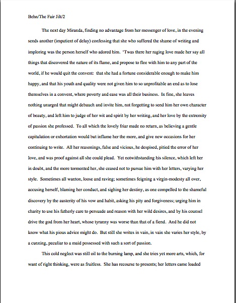
Don’t believe me? Slip your tootsies into Millicent’s moccasins and consider the following page from THE FAIR JILT. (As always, if you’re having trouble reading the small writing, enlarge the image by holding down the COMMAND key and pressing +.) I defy you not to be too distracted by the story to notice how the page is put together.

Seriously, try not to think at all about the fact that Millicent probably would not even start to read this version. Don’t worry your pretty little head over why.

the fair jilt wrong

You clever souls could tell instantly that there was something wrong here, couldn’t you, and not just because Miranda’s trying to seduce her priest? (For convent, read monastery.) Set aside Aphra’s practically Dickensian affection for semicolons for the moment — which would tend to turn off a modern Millicent pretty quickly — and let’s ponder why this page almost certainly would not get a fair reading in a present-day agency.

Before you commit yourself irrevocably, here’s what it should have looked like in standard format:

Aphra Behn right

Quick, tell me: what’s the reason our Millie would not bother to start reading the first page 10, but would read the second?

If you flung your hand into the air and shouted, “The 10-point type, Anne! It will strain her already overworked eyes,” pat yourself on the back 47 times. If you also added, “And the Ariel typeface probably didn’t help here, either,” make that 48.

Why is the first in particular almost always a deal-breaker? She’s used to seeing every manuscript heading out of the agency to publishing houses in 12-point Times New Roman, so that first example — feel free to chant it with me here, ‘Palooza followers — it just doesn’t look right.

And why should she waste her time with that tiny type? She absolutely could not forward it to her boss that way; agents are susceptible to eye strain, too.

But those unfortunate cosmetic choices are not the only problems with the first version, are they? Let’s turn our magnifying glasses to the top of the page: the incorrect version does not have a proper slug line. Seeing this lone page out of context, it’s quite obvious why a slug line is a dandy idea, isn’t it? Without it, how would it be even remotely possible to return this wandering page back into the manuscript from whence it came.

“Who wrote this?” Millicent cries in ire, glaring around her cubicle at the 47 manuscripts lying there. “This stray piece of paper could be from any of these!”

At least Ms. Behn thought to number the pages of Example #1 — but did you catch the problem with how she did it? The page number is in the bottom right-hand margin, rather than in the slug line, where it belongs. And it’s so far down in the footer that the number got caught off halfway during printing.

Did you catch any other problems that might register on Millicent’s umbrage meter? What about that right margin? Mighty straight, isn’t it? That look proper to you?

What’s going on here is called block-justification, another problem that can be laid squarely at the feet of those who insist that a manuscript and a published book should be identical. The text in many published books, and certainly in many magazines and newspapers, is spaced so that each line begins at exactly the same distance from the left-hand edge of the page and ends (unless it’s the last line of a paragraph) at exactly the same distance from the right-hand edge of the page.

Why would this species of neatness bug the heck out of professional readers? A very practical reason indeed: it renders skimming quite a bit more difficult.

Why? Well, block formatting provides fewer landmarks, as it were, to the glancing eye, As you may see for yourself, Practically every line of narrative text resembles every other. To those of us used to the ragged right margins and even letter spacing of standard format, it’s actually kind of hard to read.

So there’s quite a bit in Example #1 that’s distracting from the actual writing, isn’t there? Doesn’t help sell the text, does it?

Okay, all of these rhetorical questions in a row are beginning to make me dizzy, so let’s move on to Example #2, the one Millicent and a contest judge would like. To save your weary fingertips a modicum of scrolling (hey, I do what I can), here it is again:

Aphra Behn right

Now, let’s take a gander at the same page in — ugh — business format; if you don’t know why it’s ugh-worthy, you might want to revisit my earlier post on the immense value of indentation.

Startlingly different, isn’t it, considering that I made a grand total of two formatting changes?

You did catch both of them on your skim through, right? All I did was I eliminate the indentations at the beginning of each paragraph and skipped a line between paragraphs to produce the norm for business correspondence, as well as for most of the text currently posted on the Internet. (Including this blog, unfortunately. As a professional writer and reader of manuscripts, it drives me nuts that my blogging program won’t allow me to indent paragraphs like a literate human being.)

Again, why is Millicent unlikely even to start reading that last rendition of page 10? Because — wait for it — it just doesn’t look right.

In fact, in both submissions and contest entries, business format is often grounds all by itself for knocking a manuscript out of finalist consideration. Finding yourself asking why again? Well, technically, indented paragraphs are grammatically requisite, so to a judge, non-indented paragraphs may well seem as great a violation of everything we hold dear as frequent misspellings or use of the wrong form of there, their, and they’re.

(Since not all of you laughed, allow me to beg you nervously: please tell me that some English teacher took the time to teach you the rules governing there, their, and they’re. We all see them used incorrectly so often nowadays that I shall not rest easy until I am positive that each and every one of you is aware that there refers to a place, their means belonging to them, and they’re is a contraction for they are. While I’m at it, I’d also like to point out that that it’s is a contraction for it is, whereas its means belonging to it. Thank you for humoring me; time to get back to the post already in progress.)

Fortunately for judges and Millicents who care deeply about the health of the language, errors seldom come singly in entries and submissions. Like spelling errors, formatting mistakes are apparently social: they like to travel in packs, roving all over a manuscript like Visigoths sacking Rome.

As a result of this convenient submission phenomenon, a manuscript that contains errors within the first few lines (or on the first page) is easy for a professional reader to dismiss; statistically speaking, it’s a pretty good bet that if Millicent kept reading the pages following a technically flawed opening, she would find more causes for umbrage.

Given how many submissions she has to screen between now and lunch, do you think she is going to (a) press on in the hope that the first error was a fluke, or (b) leap to the (perhaps unwarranted) assumption that there is more of the same to come and reject it right away?

I leave that one to your fine critical faculties to answer. Let’s just say that her umbrage-taking threshold tends to be on the low side, especially immediately after she has taken a sip from that too-hot latte that always seems to be by her side when we are watching her in action. (Let it cool next time, okay, Millie?)

Why am I bringing this up in the middle of a discussion of the perils of business format? Well, for starters, an ever-increasing number of agents are not only accepting e-mailed queries (a genuine rarity until quite recently), including some who ask queriers to include the opening pages, a synopsis, and/or other writing samples with their queries. Since few agents open attachments from writers with whom they’ve had no previous contact, many request that those opening pages be included in the body of the e-mail, pasted just below the letter.

Sense a potential problem barreling in our general direction? That’s right: most e-mail programs are not set up for easy tabbing; consequently, business format is the norm for e-mail communications. But that doesn’t mean that the Millicent assigned to screen those queries won’t turn up her nose at non-indented paragraphs in those pages.

Again, why? Are you sitting down, dislikers of indentation?

I hate to be the one to break this to you, but there are Millicents out there — and agents, editors, contest judges, and literate people everywhere — who will leap directly from noting a lack of indentation and unwarranted spaces between paragraphs to our old friend, option (b): if the submitter is not aware of how to format a paragraph of English prose properly, she reasons, aren’t there inevitably more snafus to come?

Now, not every Millicent — or agent, judge, etc. — will have this knee-jerk reaction, of course. But do you really want to take the chance that she’s not going to seize the opportunity to save herself a little time?

The specter of illiteracy is not the only reason using business format is likely to cost you, either. To a professional reader, the differences between the last two examples would be more than visually jarring — they’d be downright confusing. In standard format, the only reason for a skipped line between paragraphs would be a section break, so Millicent would be expecting the second paragraph to be about something new.

Okay, so a misconception like that might distract her attention for only few consecutive seconds, but let’s not kid ourselves: your garden-variety Millicent is spending less than a minute on most of the submissions she rejects — it’s actually not all that uncommon for her not to make into the second or third paragraph before reaching for the SASE and a copy of that annoying form rejection letter.

Take a moment for the implications to sink fully into your overtaxed brainpan. Don’t worry; I’ll wait.

While those of you new to the speed with which rejection typically occurs are already in shock, let me add for the sake of anyone who doesn’t already know: those who regard business format as a symptom of creeping illiteracy — hey, I just report the news; I don’t dictate it — are every bit as likely to frown upon it just as much in a query letter or synopsis as in a manuscript submission.

Time loss is not the only reason she might take umbrage at momentary confusion. Let me let you in on a little secret: professional readers, especially those who inhabit agencies and publishing houses, tend not to be overly fond of having their mental image of the story they are reading at the moment jarred.

How do I know this? Well, for one thing, they commonly refer to it as being tricked. As in, “I hate being tricked by a first paragraph that is about someone other than the protagonist.”

There’s a practical basis to this dislike, but it’s kind of complicated. I wrote a couple of fairly extensive posts on the subject a while back (here’s a link to the first, and here’s a link to the second, in case you’re interested), but I’ll run over the thumbnail version now.

Is everybody comfortably seated? My thumbnails are a tad long. (Just try to get THAT image out of your head anytime soon.)

To get through all of the submissions she’s assigned to screen each week, Millicent has to read quite quickly, right? If she doesn’t, she’ll get buried in paper, as basically, she’s got to make it through WAR AND PEACE several times over before she toddles wearily homeward on Friday afternoon.

That’s a whole lot of material to remember, by anyone’s standards — and remembering actually is important here. If she decides to allow a manuscript to make it to the next level of consideration, she is going to need to be able to tell her boss what the book is about: who the protagonist is, what the conflict is, why that conflict is important enough to the protagonist for the reader to be drawn into it, and so forth.

In essence, she’s going to need to be able to pitch it to the higher-ups at the agency, just as the agent is going to have to do in order to sell the book to an editor, and an editor is going to have to do in order to convince his higher-ups that the publishing house should acquire the book.

And, often, as first-round contest judges will need to do on an evaluation form in order to pass an entry onto the next round.

Okay, brace yourself, because explaining what comes next involves delving into one of the great cosmic mysteries that has long perplexed aspiring writers the world over. It’s not for the faint of heart.

Remember earlier in thus series, when I mentioned that agents and editors don’t read like other people? Well, one of the primary differences is that from line one of page one, they’re already imagining how they’re going to pitch this book. So if paragraph 2 or 3 (or page 2 or 3) suddenly informs them that their mental patter has been about the wrong character, they feel as if they’ve been backing the wrong horse.

And while there may have been any number of perfectly reasonable narrative reasons for the text to concentrate upon an alternate character for the opening, unless the writing and the story have already really wowed Millicent, her resentment about being tricked actively misled mistaken about the identity of the protagonist is often sufficient to make her reach for that SASE and form letter.

Feel free to go scream into the nearest pillow over that last piece of convoluted logic; you don’t want to keep that kind of existential cri de coeur pent up inside. I’ll wait until it’s out of your system.

Feel better? Good.

Before you go rushing off to see if your opening paragraphs might possibly be laying you open to a charge of trickery — because, for instance, you might have taken the bold authorial step of noticing that there is more than one human being in the world, and written about an interpersonal relationship accordingly — let’s return to the formatting issue that prompted my little segue into the psychology of resentment. Can we extrapolate any practical lesson about business format from it?

You bet your boots we can: it’s not a good idea to give the impression of a section break where there isn’t one. And when producing pages for people who read all day, you might want to stick to the rules governing written English and indent your paragraphs.

Starting to feel more at home with standard format? Excellent; my evil plan plot for world domination teaching strategy is working. Keep up the good work!

Formatpalooza, part III: the necessities, or, how you would feel if you got locked in Millicent’s mailbag

restrooms & cemeteries

Ah, life’s quotidian necessities. If you look closely in the background, you’ll see that there’s also a liquor store. The wee tourist trap where I took this is a town of practical people, evidently.

I’ve got practicality on my mind today, campers — as should you, really. Whether you are being surprised and stunned by the rigors of standard format for the first time or working your way though this series as a veteran, it is very much to your practical advantage to learn these rules, then apply them consistently throughout your manuscript. While it is undoubtedly time-consuming, investing a few days in formatting your manuscript properly will in the long term save you a whole heck of a lot of time.

Was that massive sound wave that just washed over my studio two-thirds of you suddenly crying, “Huh?”

It’s true, honest. While the applying these rules to a manuscript already in progress may seem like a pain, practice makes habit. After a while, the impulse to conform to the rules of standard format becomes second nature for working writers. Trust me, it’s a learned instinct that can save a writer oodles of time and misery come deadline time.

How, you ask? Well, to a writer for whom proper formatting has become automatic, there is no last-minute scramble to change the text. It came into the world correct — which, in turn, saves a writer revision time. Sometimes, those conserved minutes and hours can save the writer’s proverbial backside as well.

Scoff not: even a psychic with a very, very poor track record for predictions could tell you that if you are lucky enough to land an agent and get published, there will be times in your writing career when you don’t have the time to proofread as closely as you would like, much less check every page to make absolutely certain it looks right. Sometimes, the half an hour it would take to reformat a inconsistent manuscript can make the difference between making and missing a contest deadline.

Or between delighting or disappointing the agent or editor of your dreams currently drumming her fingers on her desk, waiting for you to deliver those minor requested revisions to Chapter 7. You know, that lighthearted little revision changing the protagonist’s sister Wendy to her brother Ted; s/he is no longer a corporate lawyer, but a longshoreman, and Uncle George dies not of a heart attack, but of 12,000 pounds of under-ripe bananas falling on him from a great height when he goes to the docks to tell Ted that Great-Aunt Mandy is now Great-Uncle Armand. (If only Ted had kept a better eye on that load-bearing winch!)

Or, for nonfiction writers, delivering the finished book you proposed by the date specified in your publishing contract. Trust me, at any of these junctures, the last thing you’ll want to have to worry about are consistent margins.

Perversely, this is a kind of stress that makes writers happy — perhaps not in the moment we are experiencing it, but on a career-long basis. The more successful you are as a writer — any kind of writer — the more often you will be in a hurry, predictably. No one has more last-minute deadlines than a writer with a book contract.

Just ask any author whose agent is breathing down her neck after a deadline has passed. Especially if the writer didn’t know about the deadline until it had already come and gone. (Oh, how I wish I were kidding about that.) And don’t even get me started on the phenomenon of one’s agent calling the day after Thanksgiving to announce, “I told the editor that you could have the last third of the book completely reworked by Christmas — that’s not going to be a problem, is it?”

Think you’re going to want to be worrying about your formatting then? Believe me, you’re going to be kissing yourself in retrospect for learning how to handle the rote matters right the first time, so you can concentrate on the hard stuff. (What would many tons of bananas dropped from that height look like, anyway?)

That’s the good news about how easily standard format sinks into one’s very bones; in practical terms, it honestly is easier than what many aspiring writers are already doing to their pages. The rise of the Internet has led to a proliferation of time-consuming rumors about secret handshake-type requirements for submissions. I’m constantly encountering writers who tinker endlessly with the settings on their Word programs because they heard somewhere (in the finest tradition of rumor, they are often unsure precisely where) that the default setting for double-spacing is not the precise size agents really want, or hand-constructing quotation marks out of pixels so they will look like the ones in a favorite published book, or painstakingly typing the slug line onto the top of each and every page of a word-processed document, rather than typing the darned thing into the header once and being done with it.

All of these are real examples of writerly obsession, by the way. I wasn’t kidding about these rules saving you time in the long run.

The less-good news about standard format is that once someone — like, say, the average agent, editor, or Millicent — has spent enough time staring at professionally-formatted manuscripts, anything else starts to look, well, unprofessional.

The implications of this mindset are vast. First, as I mentioned yesterday, if an agent or editor requested pages, it would behoove you to send them in standard format, unless s/he specifically tells you otherwise. Ditto with contest entries: it’s just what those who read manuscripts professionally expect to see. It’s so much assumed that s/he probably won’t even mention it, because most agents and editors believe that these rules are already part of every serious book-writer’s MO.

So much so, in fact, that agents who’ve read my blog sometimes ask me why I go over these rules so often. Doesn’t everyone already know them? Isn’t this information already widely available? Aren’t there, you know, books on how to put a manuscript together?

I’ll leave those of you reading this post to answer those for yourselves. Suffice it to say that our old pal Millicent the agency screener believes the answers to be: because I like it, yes, yes, and yes.

Second, this mindset means that seemingly little choices like font and whether to use a doubled dash or an emdash — of which more below — can make a rather hefty difference to how Millicent perceives a manuscript. (Yes, I know: I point this out with some frequency. However, as it still seems to come as a great surprise to the vast majority aspiring writers; I can only assume that my voice hasn’t been carrying very far the last 852 times I’ve said it.)

I hate to be the one to break it to you, but professional-level critique is HARSH; it’s like having your unmade-up face examined under a very, very bright light by someone who isn’t afraid to hurt your feelings by pointing out flaws. In the industry, this level of scrutiny is not considered even remotely mean.

Actually, if your work generates tell-it-like-it-is feedback from a pro, you should be a bit flattered — it’s how they habitually treat professional authors. Yet the aforementioned vast majority of submitting writers seem to assume, at least implicitly, that agents and their staffs will be hugely sympathetic readers of their submissions, willing to overlook technical problems because of the quality of the writing or the strength of the story.

I’m not going to lie to you, though — every once in a very, very long while, the odd exception that justifies this belief does in fact occur. If the writing is absolutely beautiful, or the story is drool-worthy, but the formatting is all akimbo and the spelling is lousy, there’s an outside chance that someone at an agency might be in a saintly enough mood to overlook the problems and take a chance on the writer.

You could also have a Horatio Alger moment where you find a billionaire’s wallet, return it to him still stuffed with thousand-dollar bills, and he adopts you as his new-found son or daughter. Anything is possible, of course.

But it’s probably prudent to assume, when your writing’s at stake, that yours is not going to be the one in 10,000,000 exception.

Virtually all of the time, an agent, editor, contest judge, or screener’s first reaction to an improperly-formatted manuscript is the same as to one that is dull but technically perfect: speedy rejection. From a writerly point of view, this is indeed trying. Yet as I believe I may have mentioned once or twice before, I do not run the universe, and thus do not make the rules.

Sorry. No matter how much I would like to absolve you from some of them, it is outside my power. Take it up with the fairy godmother who neglected to endow me with that gift at birth, okay?

Until you have successfully made your case with her, I’m going to stick to using the skills that she did grant me, a childhood surrounded by professional writers and editors who made me learn to do it the right way the first time. My fifth-grade history paper was in standard format; I can still hear my mother blithely dismissing my poor, befuddled teacher’s protests that none of the other kids in the class were typing their papers with, “Well, honestly, if Annie doesn’t get into the habit of including slug lines now, where will she be in twenty years?”

Where, indeed? The strictures of standard format are hardly something that she would have wanted me to pick up on the street, after all.

So let’s start inculcating some lifetime habits, shall we? To recap Formatpalooza thus far:

(1) All manuscripts should be printed or typed in black ink and double-spaced, with one-inch margins around all edges of the page, on 20-lb or better white paper.

(2) All manuscripts should be printed on ONE side of the page and unbound in any way.

(3) The text should be left-justified, NOT block-justified. By definition, manuscripts should NOT resemble published books in this respect.

(4) The preferred typefaces are 12-point Times, Times New Roman, Courier, or Courier New — unless you’re writing screenplays, in which case you may only use Courier. For book manuscripts, pick one (and ONLY one) and use it consistently throughout your entire submission packet.

(5) The ENTIRE manuscript should be in the same font and size. Industry standard is 12-point.

(6) Do NOT use boldface anywhere in the manuscript BUT on the title page — and not even there, necessarily.

(7) EVERY page in the manuscript should be numbered EXCEPT the title page.

(8) Each page of the manuscript (other than the title page) should have a standard slug line in the header. The page number should appear in the slug line, not anywhere else on the page.

(9) The first page of each chapter should begin a third of the way down the page, with the chapter title appearing on the FIRST line of the page, NOT on the line immediately above where the text begins.

(10) Contact information for the author belongs on the title page, NOT on page 1.

(11) Every submission should include a title page, even partial manuscripts.

Everyone clear on all that? If not, this would be a dandy time to pipe up with questions. While you’re formulating ‘em, let’s move on.

(12) The beginning of EVERY paragraph of text should be indented .5 inch. No exceptions, ever.

Right off the bat, here is a way to save some of you conscientious rule-followers some time. Most word-processing programs (Including Word, if left to its own devices) automatically indent .5 inch (12.7 mm, if my junior high school conversion formula is still correct), but as you’ve probably noticed in practice, that’s more than five spaces.

Such is the way of the world. If you set your tabs to .5 inch, you’ll be set.

Why bring up the number of spaces relevant here? Well, the usual way this rule is expressed is indent every paragraph 5 spaces, a quaint hangover from the days of typewriter. As you may have heard somewhere, however, MS Word, the standard word processing program of the publishing industry, automatically sets its default first tab at .5 inch. Yet unless you happen to be using an unusually large typeface like Courier, you’ve probably noticed that hitting the space bar five times will not take you to .5 inches away from the left margin; in Times New Roman, it’s more like 8 spaces.

Does this mean all of us should be whipping out our measuring tapes, painstakingly hand-crafting a specialized tab that’s the exact equivalent of five actual characters, down to the last micron? Of course not — but would you be surprised to hear how many aspiring writers do?

Their confusion is understandable: this is genuinely one of those things that actually has changed in theory, if not visibly on the page, since the advent of wide-spread computer use. To set the nervous at ease, let’s talk about why is standard indentation at .5 inch now, rather than at five characters.

History, my dears, history: back in the days when return bars roamed the earth instead of ENTER keys, there were only two typefaces commonly found on typewriters, Pica and Elite. They yielded different sizes of type (Pica roughly the equivalent of Courier, Elite more or less the size of Times New Roman), but as long as writers set a tab five spaces in, and just kept hitting the tab key, manuscripts were at least consistent.

After the advent of the home computer, however, word-processed manuscripts became the norm. The array of possible typefaces exploded. Rather than simply accepting that every font would have slightly different indentations, the publishing industry (and the manufacturers of Word) simply came to expect that writers everywhere would keep hitting the tab key, rather than hand-spacing five times at the beginning of each paragraph. The result: the amount of space from the left margin became standardized, so that every manuscript, regardless of font, would be indented the same amount.

So why pick .5 inch as the standard indentation? Well, Elite was roughly the size of Times New Roman, 12 characters per inch. Pica was about the size of Courier, 10 characters per inch. The automatic tab at .5 inch, therefore, is pretty much exactly five spaces from the left margin in Pica.

All of which is a long-winded way of saying that in this instance, at least, Word’s default settings are the writer’s friend. Keep on hitting that tab key.

Which brings me back to the no exceptions part: nothing you send to anyone in the industry should EVER be in block-style business format. To people in the publishing industry, it simply looks illiterate.

That clattering sound you just heard was the more nervous type of aspiring writer reaching frantically for his mouse, to open up all of his writing files and change them instantly. And frankly, he should: despite the fact that everyone from CEOs to the proverbial little old lady from Pasadena has been known to use block format from time to time (blogs are set up to use nothing else, right?), technically, non-indented paragraphs are not proper for English prose.

Period. That being the case, what do you think Millicent’s first reaction to a non-indented page 1 is likely to be?

Yes, what all of you newly well-lit souls are thinking right now is quite true: those submissions may well have been rejected at first glance by a Millicent in a bad mood. Heck, there are agencies where a manuscript that designates paragraphs by skipping a line between paragraphs rather than by indenting simply would not be read.

Yes, even if the writers submitted those manuscripts via e-mail. (See why I’m always harping on how submitting in hard copy, or at the very worst as a Word attachment, is inherently better for a submitter?) And that’s a kinder response than Mehitabel the veteran contest judge would have had: she would have looked at a block-formatted first page and sighed, “Well, that’s one that can’t make the finals.”

Why the knee-jerk response? Well, although literacy has become decreasingly valued in the world at large, the people who have devoted themselves to bringing good writing to publications still tend to take it awfully darned seriously. To publishing types, any document with no indentations, skipping a line between paragraphs, and the whole shebang left-justified carries the stigma of (ugh) business correspondence — and that’s definitely not good.

Why, you ask? Well, do you really want the person you’re trying to impress with your literary genius to wonder about your literacy?

I thought not. And which do you think is going to strike format-minded industry professionals as more literate, a query letter in business format or one in correspondence format (indented paragraphs, date and signature halfway across the page, no skipped line between paragraphs)?

Uh-huh. And don’t you wish that someone had told you that before you sent out your first query letter?

Trust me on this one: indent your paragraphs in any document that’s ever going to pass under the nose of anyone even remotely affiliated with the publishing industry.

Including the first paragraph of every chapter, incidentally. Yes, Virginia, published books — particularly mysteries, I notice — often begin chapters and sections without indentation. But again, that lack of indentation was the editor’s choice, not the author’s, and copying it in a submission, no matter to whom it is intended as an homage, might get your work knocked out of consideration.

Speaking of problems adhering to business format might cause…

(13) Don’t skip an extra line between paragraphs, except to indicate a section break.

I’m serious about that being the only exception: skip an extra line to indicate a section break in the text, and for no other reason.

Really, this guideline is just common sense — so it’s a continual surprise to professional readers how often we see manuscripts that are single-spaced with a line skipped between paragraphs. (Again, much like blog format, seen here in all of its glory. The blogging program makes me do it, Millicent, I swear.)

Why surprising? Well, since the entire manuscript should be double-spaced with indented paragraphs, there is no need to skip a line to indicate a paragraph break. (Which is, in case you were not aware of it, what a skipped line between paragraph means in a single-spaced or non-indented document.) In a double-spaced document, a skipped line means a section break, period.

Also — and this is far from insignificant, from a professional reader’s point of view — it’s practically impossible to edit a single-spaced document, either in hard copy or on screen. The eye skips between lines too easily, and in hard copy, there’s nowhere to scrawl comments like Mr. Dickens, was it the best of times or was it the worst of times? It could hardly have been both!

So why do aspiring writers so often blithely send off manuscripts with skipped lines, single-spaced or otherwise? My guess would be for one of two reasons: either they think business format is proper English formatting (which it isn’t) or they’re used to seeing skipped lines in print. Magazine articles, mostly.

But — feel free to shout it along with me now; you know the words — a professional book manuscript or proposal is not, nor should it be, formatted like any published piece of writing. Manuscripts should not resemble books.

A few hands have been waving urgently in the air since I started this section. “But Anne!” those of you who have seen conflicting advice point out, “I’ve always heard that there are specific markers for section breaks! Shouldn’t I, you know, use them?”

I wouldn’t advise including these throwbacks to the age of typewriters — the * * * section break is no longer necessary in a submission to an agency or publishing house, nor is the #. So unless you’re entering a contest that specifically calls for them, or the agency to which you’re planning to submit mentions a preference for them in its submission requirements, it’s safe to assume that professional readers won’t expect to see them in a book manuscript or proposal.

Why were these symbols ever used at all? To alert the typesetter that the missing line of text was intentional.

That being said, although most Millicents will roll their eyes upon seeing one of these old-fashioned symbols, they tend not to take too much umbrage at it, because the # is in fact proper for short story format. A writer can usually get away with including them. However, since every agent I know makes old-fashioned writers take these markers out of book manuscripts prior to submission, it’s going to save you time in the long run to get into the habit of trusting the reader to understand what a skipped line means.

(To be fair, I know a grand total of one agent who allows his clients to use short-story formatting in book manuscripts. But only if they write literary fiction and have a long resume of short story publications. He is more than capable of conveying this preference to his clients, however.)

One caveat to contest-entrants: do check contest rules carefully, because some competitions still require * or #. You’d be amazed at how seldom many long-running literary contests update their rules.

(14) Nothing in a manuscript should be underlined, ever. Titles of songs and publications, as well as words in foreign languages and those you wish to emphasize, should be italicized.

Professional readers are perpetually amazed at how often otherwise perfectly-formatted manuscripts get this rule backwards — seriously, it’s a common topic of conversation at the bar that’s never more than 100 yards from any writers’ conference in North America. (You already knew that the conference center’s bar is the single best place to meet most of the agents, editors, and authors presenting at the average writers’ conference, didn’t you?) According to this informal and often not entirely sober polling data, an aspiring writer would have to be consulting a very, very outdated list of formatting restrictions to believe that underlining is ever acceptable.

Again, since your future agent is going to make you change all of that underlining to italics anyway, you might as well get out of the habit of underlining now. Like, say, before submitting your manuscript — because if Millicent happens to be having a bad day (again, what’s the probability?) when she happens upon underlining in a submission, she is very, very likely to roll her eyes and think, “Oh, God, not another one.”

Fair warning: if you consult an old style manual (or a website that is relying upon an old style manual), you may be urged to underline the words and phrases mentioned above. And just so you know, anyone who follows AP style will tell you to underline these. As will anyone who learned how to format a manuscript before the home computer became common, for the exceedingly simple reason that the average typewriter doesn’t feature italic keys as well as regular type; underlining used to be the only option.

DO NOT LISTEN TO THESE TEMPTERS: AP style is for journalism, not book publishing. They are different fields, and have different standards. And although I remain fond of typewriters — growing up in a house filled with writers, the sound used to lull me to sleep as a child — the fact is, the publishing industry now assumes that all manuscripts are produced on computers. In Word, even.

So DO NOT BE TEMPTED. In a submission for the book industry, NOTHING should be underlined. Ever.

Are all those capital letters conveying my ABSOLUTE SINCERITY about the importance of your NEVER doing this? I hope so: violations of this particular rule are rejection-triggers more often than not.

Italics are one of the few concessions manuscript format has made to the computer age — again, for practical reasons: underlining uses more ink than italics in the book production process. Thus, italics are cheaper in than underlining.

But that little history lesson didn’t really set your mind at ease about italics, did it? Calm down: the rules governing their use are not at all complicated.

(a) The logic behind italicizing foreign words is very straightforward: you don’t want the agent of your dreams to think you’ve made a typo, do you?

(b) The logic behind using italics for emphasis, as we’ve all seen a million times in print, is even more straightforward: writers used to use underlining for this. So did hand-writers.

(c) Some authors like to use italics to indicate thought, but there is no hard-and-fast rule on this. Before you make the choice, do be aware that many agents and editors actively dislike this practice. Their logic, as I understand it: a good writer should be able to make it clear that a character is thinking something, or indicate inflection, without resorting to funny type.

I have to confess, as a reader, I’m with them on that last one, but that’s just my personal preference. There are, however, many other agents and editors who think it is perfectly fine — but you are unlikely to learn which is which until after you have sent in your manuscript, alas.

Which means — again, alas — there is no fail-safe for this choice. Sorry. You submit your work, you take your chances.

I have a few more rules to cover, but this seems like a dandy place to break for the day. Don’t worry if you’re having trouble picturing what all of this might look like on the page: next week, I’m going to be showing you so many images of actual manuscript pages that you’re going to feel as if you’d gotten locked inside Millicent’s mailbag.

Hey, our intent is practical here. Keep up the good work!
Synopsispalooza, Part IV: getting down to the nitty-gritty, or, is this the part where I get to stomp on Tokyo?

300px-godzilla_1954_extras-1

Fair warning, campers: I’m in a foul mood today. I’ve answered the phone for eight telemarketers so far this evening, seven of whom refused to believe that I have not been secretly operating the A+ Mini-Mart out of my home. My physical therapists’ office forgot that I had an appointment today, so I got dressed up in my silly gym clothes for nothing. A client’s deadline just got moved up by a couple of months, meaning that his manuscript was due, oh, yesterday.

All of that I could take with equanimity. What really got my proverbial goat were the two — count ‘em, two — aspiring writers who chose today to appear out of the blue and demand that I drop everything to pay attention to them, despite the fact that neither knows me well enough to be asking for a favor, let alone demanding it, and did so in the rudest manner imaginable. Not only that, but each was so self-absorbed that s/he actually became angry with me for setting limits on how much of my time I would allow them to co-opt.

I was really very nice about it, honest. But both evidently chose to believe that because they had faith in their talent, I owed them my professional attention. One even sent me a document, presumably for me to edit out of the goodness of my heart.

Because, obviously, I could not possibly have anything else to do. I could get back to stomping on Tokyo later.

I wish I could say that this kind of thing does not happen to those of us who are kind enough to give the occasional free advice to the aspiring, but truth compels me to say otherwise. In fact, this attitude is so pervasive that quite a few pros simply avoid giving any advice to up-and-comers at all.

Which is why, in case any of you recent conference-goers had been wondering, it can be very hard to ask some of the speakers a pertinent question or track down an attending agent for a hallway pitch. They’ve probably been the victims of aspiring writers who mistook momentary interest, the willingness to answer a complex question, or even just plain old politeness for a commitment to a lifetime of non-stop assistance. One doesn’t have to encounter too many such boundary-leapers to start erecting some pretty hefty walls in self-defense.

Oh, I understand the impulse to push it from the aspiring writer’s perspective: since can be so hard to catch a pro’s eye that when you meet someone in the know who is actually nice to you, it can feel like the beginning of a friendship. And it may be — down the line. But from the pro’s point of view, all that friendly interaction was, or could possibly be construed as being, is just that, a friendly interaction with a stranger.

So imagine the pro’s surprise when she arrives back in her office to find five e-mails from that stranger, each more desperate and demanding than the last.

Wildly different understandings of the same interaction are especially prevalent at conferences that schedule pitching appointments for attendees. Most first-time pitchers walk into their sessions so terrified that if the agent or editor smiles even a little and listens sympathetically, they just melt. Here, at last, is a personal connection in an industry that can seem appallingly impersonal from the outside. So when the agent or editor concludes the meeting with a fairly standard request for pages, these pitchers sometimes conclude that the pro only made the request to be nice; s/he couldn’t possibly have meant it.

That’s the less common reaction. The significantly more common is to act as though the agent or editor has already committed to taking on the book. If not actually serving as best man or maid of honor at the writer’s wedding.

Yes, really — I see it at conferences all the time. The writer rushes home, instantly prints up his manuscript, and overnights it to his new friend. Or she rushes home, opens her e-mail account, and instantly sends the requested pages as an attachment to her new friend. Even if they received requests from other agents or editors, they won’t send ‘em out — that might offend the new friend, who clearly by now has a deep stake in signing the writer.

Then both writers fill Hefty bags with Doritos and plop themselves down between their telephones and their computers, waiting for the positive response that will doubtless come any minute now. And they wait.

Many of them are still waiting, in this era where some agencies have policies where no response equals assumed rejection. Others are stunned to receive form-letter rejections that contain no mention of their positive personal interaction at the conference at all. Some are unwise enough to follow up upon either of these reactions with a hurt or angry e-mail to that faithless new friend.

Who will, I guarantee you, be mystified to receive it. “Why is this writer taking my rejection so personally,” they murmur to their screeners, “not to mention so unprofessionally? We talked for five minutes at a conference; it’s not as though I made a commitment to help him. It’s my job to talk to writers at conferences, after all.”

“Hey, look,” Millicent says, pointing at her boss’ e-mail inbox, “your new protégé has just sent you yet another e-mail. Ooh, there’s a third. And a fourth!”

The agent buries her head in her hands. “Cancel my e-mail account. I’m moving to Peru to become a llama herder.”

What we have here, my friends, is a failure to communicate. Agents, editors, conference speakers, and writing gurus are nice to aspiring writers, when they are, because they are nice people, not because any of us (not the sane ones among us, anyway) are likely to pick a single aspirant at random and decide to devote all of our resources to helping him. Any of us who interact with aspiring writers on a regular basis meet hundreds, if not thousands, of people just burning for a break, yet not one of us possesses the magical ability to stare deeply into the eyes of a writer we’ve just met, assess the talent coiled like a spring in that psyche, and determine whether she, alone of those thousands, is worth breaking a few rules to help get into print. Nor are most of us living lives of such leisure that we have unlimited time or resources to devote to helping total strangers.

Yes, yes, I know: this blog is devoted to helping total strangers along the road to publication, and I do in fact post almost every day. Don’t quibble; I’m on a roll here.

Yet that level of instant, unlimited devotion is precisely what many aspiring writers simply assume is the natural next step after a pleasant initial interaction with a publishing professional. While most, thank goodness, have the intrinsic good sense or Mom-inculcated good manners not to start demanding favors instantly or barrage that nice pro with e-mails asking for advice or a leg up, the few who do are so shameless that, alas, they give all aspiring writers a bad name.

The moral: sometimes, a pleasant conversation at a conference is just a pleasant conversation at a conference. Don’t assume that polite interest in your writing equals a commitment to help you promote it. And never, ever, EVER risk alienating the rare pro who is willing to give a little free advice by presuming that the proper response to an act of kindness is to treat it as an invitation to ask for still more favors.

Any buildings still standing, or have I smashed them all with my giant lizard feet?

Okay, I feel better now. Time to get back to doing today’s single professional favor for masses and masses of writers I have never met. After that, I’m off the charitable clock.

For the last couple of posts, I’ve been showing you examples of good and not-so-good 1-page synopses, so we could talk about (okay, so I could conduct a monologue about) the overarching strategies that rendered them more or less effective. Since the response so far has been no more traumatized than one might expect from writers faced with the prospect of constructing a 1-page synopsis for a 400-page novel of a complexity that would make Tolstoy weep, I’m going to assume that we’re all pretty comfortable with the basic goals and strategy of a 1-page synopsis intended for tucking into a query envelope or to copy and paste at the bottom of an e-mailed query.

Before I move on to the ins and outs of writing the longer synopsis, I feel I should respond to some of the whimpers of confusion I’ve been sensing coming from some of my more structurally-minded readers. “Hey, Anne,” some of you have been thinking quite loudly, “I appreciate that you’ve been showing us visual examples of properly-formatted synopses — a sort of SYNOPSES ILLUSTRATED, if you will — but I’m still not positive that I’m doing it right. If I clutch my rabbit’s foot and wish hard enough, is there any chance that you might go over the various rather odd-looking formatting choices you’ve used in them before, say, I need to send out the 1-page synopsis currently wavering on my computer screen? Please? Pretty please? With sugar on top?”

Who am I to resist the charms of a well-stroked rabbit’s foot — especially when the request accompanying it is expressed so politely? Let’s take another gander at the good 1-page synopsis for PRIDE AND PREJUDICE:

For veterans of my extended forays into the joys and terrors of standard format for manuscripts, none of the formatting here is too surprising, right? Printed out, this 1-page synopsis strongly resembles a properly-constructed manuscript page — and with good reason.

For the most part, standard format for a synopsis is the same as for a page of manuscript: double-spaced, 1-inch margins all around, indented paragraphs (ALWAYS), doubled dashes, numbers under 100 written out in full, slug line, 12-point Times, Times New Roman, or Courier, the works. (If you’re unfamiliar with the rules of standard format, you will find them conveniently summarized under the HOW TO FORMAT A MANUSCRIPT category on the list at right. Or you could wait until later in the autumn, when I shall be launching into Formatpalooza.)

What it should NOT look like, but all too many query packet synopses do, is this:

P&P synopsis no indent

Why might our Millicent instantly take umbrage at this alternate formatting? Chant it with me, long-time readers of this blog: the only time business formatting (i.e., non-indented paragraphs) is acceptable is in business letters (but not query letters or personal correspondence) or e-mails. Because folks in the industry are aware of that, there is a well-established publishing tradition of regarding block formatting as the structural choice of the illiterate.

So the disturbingly common practice of submitting a block-formatted synopsis (“Well, it’s not a manuscript page, so why should it be formatted like one?”) or query letter (“It’s a business letter, isn’t it? I’m trying to break into the book-writing business.”) is — how shall put this delicately? — a really bad idea. Remember, everything in a query or submission packet is a writing sample. Format the constituent parts so they will convince Millicent of your deep and abiding commitment to excellence in the written word.

As in manuscript, the author’s contact information does not appear on the first page of the synopsis. Unlike the first page of a manuscript, however, the title of the book should appear on the first page of a synopsis, along with the information that it IS a synopsis.

Hey, Millicent has a lot of pieces of paper littering her desk. Do you really want yours to go astray — or be mistaken for a page of your manuscript?

Worried about what might happen to all of that formatting if you e-mail your 1-page synopsis? Relax: if it’s a requested synopsis, you’ll be sending it as a Word attachment, anyway.

If the synopsis will be accompanying an e-mailed query, you’re still going to want to write it initially in Word. As with manuscript pages, if you format your synopsis like this in Word, copy it, and paste it into the body of an e-mail (as many agencies’ querying guidelines now request), much of the formatting will remain intact: indented and double-spaced. Easy as the proverbial pie. Of course, the slug line — the author’s last name/title/page # that should appear in the header of every page of your writing you intend to submit to professional readers — won’t appear in the e-mailed version, nor will the margins, but you can live with that, can’t you?

More to the point, Millicent can — much, much better, usually, than with a block-formatted synopsis. The fewer provocations you can give for her to start stomping on nearby buildings, the better.

I see some of the sharper-eyed among you jumping up and down, hands raised. “Anne! Anne!” the eagle-eyed shout. “That’s not a standard slug line in your first example! It says Synopsis where the page number should be! Why’d you do it that way? Huh? Huh?”

Well caught, eager pointer-outers. I omitted the page number for the exceedingly simple reason that this is a one-page synopsis; the slug line’s there primarily so Millicent can figure out whose synopsis it is should it happen to get physically separated from the query or submission it accompanied. (Yes, it happens. As I MAY already have mentioned, Millie and her cronies deal with masses and masses of white paper.)

If this were a multi-page synopsis, the slug line would include the page number, but regardless of length, it’s a good idea to include the info that it is a synopsis here. That way, should any of the pages mistakenly find their way into a nearby manuscript (again, it happens), it would be easy for Millicent to spot it and wrangle it back to the right place.

Sometimes, it seems as though those pages have a life of their own. Especially when the air conditioning breaks down and someone in the office has the bright idea of yanking the rotating fan out of the closet. Or Godzilla decides to take a stroll down a nearby avenue, shaking everything up.

Oh, you may laugh, but think about it: like a manuscript, a query or submission synopsis should not be bound in any way, not even by a paper clip. So if a synopsis page does not feature either the writer’s name or the title of the work (and the subsequent pages of most query synopsis often fail to include either), how could Millicent possibly reunite it with its fellows if it goes a-wandering?

Heck, even if it’s all together, how is she supposed to know that a document simply entitled Synopsis and devoid of slug lines is describes a manuscript by Ignatz W. Crumble entitled WHAT I KNOW ABOUT EVERYTHING AND YOU SHOULD, TOO?

Don’t make Millicent guess; she may have had a hard day. Unidentified pages tend to end up in the recycling — or, if the Millicent happens to work in one of the many, many agencies that does not recycle paper (you’d be amazed), in the trash.

A second (or third, or fifth; extrapolate) page should also look very similar to any other page of standard-formatted manuscript, with one vital exception: the slug line for a synopsis should, as I mentioned above, SAY that the page it decorates is from a synopsis, not a manuscript, in addition to displaying the author’s last name, the title of the book, and the page number. (If you don’t know why a slug line is essential to include in any professional manuscript or why anyone would name something on a pretty page of text after a slimy creature, please see the SLUG LINE category on the archive list conveniently located at the lower right-hand side of this page.)

One caveat: if you are planning to submit a synopsis to a contest, double-check the rules: many literary contests simply disqualify any entry that includes the entrant’s name anywhere but on the entry form. (This is a sign of honesty in a contest, incidentally; it’s substantially harder to rig the outcome if the judges don’t know which entrant wrote which entry.) If you’re entering a name-banning contest, you should still include a slug line, but omit the first part: TITLE/SYNOPSIS/PAGE #.

Okay, some of you have had your hands in the air since you read the example above. “But Anne,” the tired-armed point out, “aren’t you ignoring the giant lizard in the room — or, in this case, on the page? You seem to have given some of the character names in all capital letters, followed by their ages in parentheses. Why?”

I’m glad you asked. It’s not absolutely necessary, technically speaking, but most professional fiction and memoir synopses capitalize the entire name of each major character the first time it appears. Not every time, mind you; just the first.

Why only the first? To alert a skimming agent or editor to the fact that — wait for it — a new character has just walked into the story.

Because Millicent might, you know, miss ’em otherwise. She reads pretty fast, you know.

It is also considered pretty darned nifty (and word-count thrifty) to include the character’s age in parentheses immediately after the first time the name appears, resulting in synopsis text that looks something like this:


ST. THERESA OF AVILA (26) has a problem. Ever since she started dating multi-millionaire GEORGE ARMSTRONG CUSTER (82), all of her friends have unaccountably decided that she is mercenary and hates Native Americans. Apart from JEANNE D’ARC (30), her wacky landlady-cum-bowling-partner, who uses every opportunity to pump Theresa for man-landing tips, none of the residents of Theresa’s swanky Upper East Side co-op are even speaking to her — at least until they start desperately vying for invitations to her exclusive wedding extravaganza, a lavish event to be held onstage at the Oscars, with THE REVEREND DOCTOR OWEN WILSON (44 if he’s a day) officiating. How will Theresa find a maid of honor — and if she does, what will her jealous old boyfriend GOD (∞) do in response?


Should any of you out there think you’re up to rounding out the plot above into some measure of coherence and submitting it, please, be my guest. Really. I’d love to read it.

For the rest of you, please note what I have done here: in preparing a synopsis for a comedy, I have produced — sacre bleu! — a humorous treatment of the material. Brevity need not be the death of wit.

And if I were creating a synopsis for a steamy romance novel with the same premise (although I tremble to think what a sex romp with that particular cast of characters would entail), you can bet your last wooden nickel that I would take some writerly steps to make my reader’s mouth go dry and his breath become short while perusing it.

Would I do this because I’m wacky? No, because — sing it out now, long-time readers — in a query or submission packet, the synopsis is a writing sample.

Oh, had I mentioned that fourteen or fifteen times already in this series? Well, it cannot be said too often, in my opinion. The sensible writer aims to use the synopsis to demonstrate not only that it is a good (or at least marketable) story, an attention-grabbing yarn peopled with fascinating, well-rounded characters, but that the s/he is a terrific storyteller.

I heard that monumental collective gasp of dread. Don’t worry — in the days to come, I shall be talking about ways in which you can tweak your synopsis in order to convey that lovely impression.

For the nonce, let’s take a quick field trip back to yesterday’s examples of a not-so-hot 1-page synopsis. Now that you know what Millicent is expecting to see, do you notice any formatting problems here?

If you immediately leapt to your feet, screaming, “It doesn’t have a slug line! It doesn’t have a slug line!” award yourself a gold star for the day. Make that two if you also bellowed that it doesn’t say anywhere on the page that it is a synopsis.

Take a medal out of petty cash if you noticed that the pages are not numbered: a major no-no in any submission, ever, and one of the more common mistakes. And yes, you should number it (although technically, it’s optional for a one-page synopsis — and no, you should not number it consecutively with the manuscript, unless a contest rules SPECIFICALLY tell you to do so. Just as the first page of Chapter 1 is always page 1, regardless of what may come before it in a submission packet, the first page of a synopsis is always page 1.

Top yourself with a halo if you also discovered that Aunt Jane made the rookie mistake of adding her name to the synopsis anywhere but in the slug line. For book-length works, the first page of text — regardless of whether it is in the manuscript, the synopsis, or any other requested materials — is not a title page.

Don’t treat it as if it were one; it looks unprofessional to the pros. Save your contact information for your query or cover letter and your title page.

Everyone happy with his or her score on that quiz? Excellent. Let’s tackle yesterday’s other negative example:

Where do we even begin? Millicent would almost certainly not even read this one — in fact, she might burst into laughter from several paces away. Any guesses why?

Well, for starters, it starts too far down on the page, falling into the same title-page error as the previous example. It’s the over-the-top typeface, though, and the fact that the page uses more than one of them, that would set Millicent giggling and showing it to her coworkers.

Oh, and it doesn’t contain a slug line or numbering, either. But I doubt Millicent would even notice that in mid-guffaw. Or while she is crying, “Next!”

It makes one other error for a fiction synopsis, a subtler one — and this one may surprise you: it mentions the title of the book in the text of the synopsis.

Why is this a problem? Well, for the same reason that it’s considered unprofessional to begin the descriptive paragraph in a query letter with something like LETTERS FROM HOME is the story of…: it’s considered stylistically weak, a sign that the synopsis is talking about the book instead of getting the reader involved in the story. Or, to put it another way, and a bit more bluntly: a fiction synopsis is supposed to tell the story of the book; one that pulls the reader out of the story by talking about it at a distance tends not to do that well.

And anyway, the title is already both at the top of the page (and SHOULD be in the slug line). Why, Millicent wonders impatiently, cradling her too-hot latte until it cools — she’s learning, she’s learning — would the writer WANT to waste the space and her time by repeating the information?

“Wait just a minute, Anne,” I hear some of my former questioners call from the rear of the auditorium. “You’re talking about the cosmetic aspects of the query synopsis as though it were going to be judged as pitilessly as the manuscript I’m hoping Millicent will ask me to submit. Surely, that’s not the case? The synopsis is just a technical requirement, right?”

Um, no. As I said, it’s considered a WRITING SAMPLE. So yes, the writing in it does tend to be judged — and dismissed — just as readily as problematic text anywhere else in the query packet.

Sorry to be the one to break that to you. But isn’t it better that you hear it from me than to be left to surmise it from a form-letter rejection? Or, as is more often the case, NOT surmise it from a form-letter rejection and keep submitting problematic synopses?

What? I couldn’t hear your replies over the deafening roar of aspiring writers all over the English-speaking world leaping to their feet, shouting, “Wait — my query or submission might have gotten rejected because of its formatting, rather than its writing or content?”

Um, yes — did that seriously come as a surprise to anyone? Oh, dear: I guess it really is time for a Formatpalooza.

While my former questioners are frantically re-examining their query packets and rethinking their former condemnations of Millicents, is anyone harboring any lingering questions about submission formatting? This would be a great time to ask, because next time, we’ll be leaving technicalities behind and delving into the wonderful world of storytelling on the fly.

After I trample that one last cottage on the edge of time. If I’m on a rampage, I might as well be thorough. Keep up the good work!

Querypalooza, part II: state your business!

ozgatemanozgatemanozgateman

Are some of you still feeling a bit shell-shocked after this morning’s Querypalooza post? I wouldn’t be at all surprised if you were: in it, I set out a very basic structure for a query letter. In deference to everyone’s possibly strained nerves, I’m going to take it a bit more gently in this post, assuaging the fears of the nervous, adding nuances to the prototype, and generally spreading joy and enlightenment abroad.

And then I’m going to plunge you back into shock again. Don’t say I didn’t warn you. It’s for your own good, I promise.

Querying, I think we can all agree, is a necessary evil: no one likes it. It generates a whole lot of inconvenience for writer and agency alike, and to engage in it is to put one’s ego on the line in a very fundamental way.

Rejection hurts, and you can’t be rejected if you never send out your work, right? So you can either try to lie low, keeping your dreams to yourself, or you can attempt to approach those high-and-mighty gatekeepers of the industry, asking to be let inside the Emerald City.

Sounds a lot like high school social dynamics, doesn’t it?

Just as many people stay away from their high school reunions because they fear exposing themselves to the judgment of people whom past experience has led them to believe to be, well, kinda shallow and hurtful, many, many writers avoid querying, or give up after just a handful of queries, because they fear to be rejected by folks they have heard are — wait for it — kinda shallow and prone to be hurtful.

There are a variety of ways to deal with such fears. One could, for instance, not query at all, and resign oneself to that great novel or brilliant nonfiction book’s never being published. Alternatively, one could query just a couple of times, then give up.

Or — and if you haven’t guessed by now, this would be my preferred option — you could recognize that while some of the people at the reunion may in fact turn out to be kind of unpleasant, you really only need to find the one delightful person who finds you truly fascinating to make the entire enterprise worthwhile.

You’ll be pleased to hear, though, that unlike a hapless ex-school kid gearing up to attend a reunion, there are certain things an aspiring writer can do before querying to increase the probability of a positive reception. Certain elements mark a query letter as coming from someone who has taken the time to learn how the publishing industry works.

Agents like writers who bother to do that, you know, and with good reason. Such new clients are much less time-consuming than those whose ideas of how books are sold bear only scant relation to reality. Aspiring writers harboring unrealistic expectations tend not only to express resentment when their work encounters stumbling-blocks — they often end up feeling disappointed when things are going well.

I just mention.

The query letter structure I proposed last time — which is, I must reiterate, NOT the only one possible by any means, or even the only one that works; it’s just what has worked best in my experience — also frees the writer from the well-nigh impossible task of trying to cram everything good about a book into a single page. Which is, I have noticed over the years, precisely what most aspiring writers try to do.

No wonder they get intimidated and frustrated long before they query the 50 or 100 agents (yes, you read that correctly) it often takes these days for a good book to find the right fit. To put this in perspective, a truly talented writer might well end up querying the equivalent of my entire high school graduating class before being signed.

Believe it or not, masses of rejected queries are not necessarily a reflection on the manuscript in question. Rejection is often a function of heavy competition, agent specialization, and aspiring writers not being aware of what information a query letter is supposed to contain.

Apart from doing the necessary homework to get a query that DOES contain the right information onto the desk of an agent who does habitually represent that type of book, the only way that I know to speed up that process is to make the query letter itself businesslike, but personable.

Don’t tense up — I’m not talking about spilling your soul onto a single sheet of paper. I’m talking about making your query letter unique.

And not in the all-too-common misdefinition of the word as a synonym for special. I mean unique in its proper sense of one of a kind.

A tall order, you say? Well, keep in mind that the SOLE purpose of the query is to engender enough excitement in an agent (or, more commonly, in Millicent the agency screener: it is rare for agents at the larger agencies to screen query letters themselves; thus Millicent’s being the one to get the paper cuts) that she will ask to see a representative chunk of the book itself, not to reproduce what you would like to see on the book’s back jacket or to complain about having to work through an agent at all.

If either of the last two options made you chuckle in disbelief, good. Believe it or not, I’ve seen both turn up many, many times in unsuccessful query letters. Boasting and petulance both abound, and both tend to discourage positive response.

Now, I know that my readers are too savvy to do either of those things deliberately, but isn’t it worth sitting down with your query letter and asking yourself: could an exhausted Millicent — in a bad mood, with a cold, having just broken up with her boyfriend AND burned her lip on that over-hot latte yet again — possibly construe that letter as either?

Yes, querying is a chore, and an intimidating one at that; yes, ultimately it will be the agent’s job, not yours, to market your work to publishers, and an agent or editor probably would have a far better idea of how to spin your book than you would.

Agents and their screeners are in fact aware of all of these things. You don’t need to tell them.

Your query letter needs to market your book impeccably anyway, in a tone that makes you sound like an author who LOVES his work and is eager to give agent and editor alike huge amounts of his time to promote it. Not a walk in the park, definitely, but certainly doable by a smart, talented writer who approaches it in the right spirit.

Sound like anyone you know?

So start thinking, please, about how to make your query the one that waltzes into the reunion with a positive attitude, not the one who storms in with a chip on its little shoulder. Or, heaven forefend, the one that doesn’t stick its nose through the door at all.

The gates of the Emerald City are not going to open unless you knock, people. The only manuscript that has absolutely no chance of getting published is the one that is never queried or pitched.

Yet even as I typed that, I could sense some ardor-deflation out there. “”My God,” the little voice in the back of my head which I choose to attribute to my readership is saying, “how is all of that possible within the context of a single-page missive? How can I cram all I need to say to grab their attention in that little space, much less seem unique while doing it?”

Um, are you sitting down? You don’t actually have the entire page to catch their attention; to be on the safe side, figure you have only about five lines to convince them to keep reading.

Yes, you read that correctly. While you already have the heart medication and/or asthma inhaler at the ready, it seems like a good time to add: most query letters are not even read to their ends by Millicent and her ilk.

Are you rending your garments and shouting, “Why, oh Lord, why?” Because the vast majority of query letters disqualify themselves from serious consideration before the end of the opening paragraph.

Hey, I told you to sit down first.

At the risk of repeating myself, this is largely attributable to aspiring writers’ not being aware of what information a query letter should and should not contain. Unfortunately, Americans are so heavily exposed to hard-sell techniques that many aspiring writers make the mistake of using their query letters to batter the agent with predictions of future greatness so over-inflated (and, from the agent’s point of view, so apparently groundless, coming from a previously unpublished writer) that they may be dismissed out of hand.

Like what, you ask? Here are some popular favorites:

This is the next (fill in name of bestseller here)!

You’ll be sorry if you let this one pass by!

Everyone in the country will want to read this book!

Women everywhere will want to buy this book!

It’s a natural for Oprah!

This book is like nothing else on the market!

I hate to burst anyone’s bubble (yet I do seem to be doing it quite a bit lately, don’t I?), but to professional eyes, these are all absurd statements to discover in a query letter. Yes, even if the book in question IS the next DA VINCI CODE.

Why? Because these aren’t descriptions of the book; they’re back-jacket blurbs, marketing copy, equally applicable to (and equally likely to be true about) any manuscript that crosses their desks.

After one has heard the same claim 1500 times, it starts to lose a little vim. “Why do these queriers keep telling me that their books are unique?” Millicent grumbles, reaching for her fourth latte of the afternoon. “Why aren’t they SHOWING me?”

Ah, there’s the rub: assertions like these simply are not as effective at establishing a writer’s ability or a story’s appeal as demonstrating both practically, through well-written sentences and a summary containing lively and unusual details. Even in the extremely rare instances that these statements aren’t just empty boasts based upon wishful thinking, consider: whose literary opinion would you be more likely to believe in Millicent’s shoes, the author’s vague claim of excellence about his own book or another reader’s recommendation?

To put it another way, if someone you’d never met before came up to you on the street and said, “Hey, I bake the world’s best mincemeat pies, the kind that can change your life in a single bite,” would you believe him? Would you trustingly place that total stranger’s good-looking (or not) slice of God-knows-what into your mouth?

Or would you want some assurances that, say, this hard-selling yahoo knows something about cooking, had produced the pie in a vermin-free kitchen, and/or hadn’t constructed the mincemeat out of ground-up domestic pets?

Oh, you may laugh, thinking that this isn’t really an apt parallel, but why would agents and editors’ desire to hear about a new writer’s past publication history — or educational background, or even platform — if NOT to try to figure out if that pie is made of reasonable materials and in a manner up to professional standards of production?

That’s why, in case you’ve been wondering, a good query letter includes what I like to call ECQLC, Eye-Catching Query Letter Candy, platform information and/or selling points that will make Millicent sit up and say either, “Wow, this writer has interesting credentials,” “Wow, this writer is uniquely qualified to tell this story,” and/or “Wow, this book has greater market appeal/a larger target audience/is significantly more important to human existence than I would have guessed.”

The crucial exclamation to elicit, obviously, is “Wow!” Not merely because Millicent honestly does enjoy discovering exciting new writing projects (yes, even though it’s her job to reject 98% of the ones that cross her desk), but because a query letter that mentions either the writer’s credentials or the book’s selling points is genuinely rare.

I sense some disgruntled muttering out there, do I not? “Here we go again, Anne,” some mutterers, well, mutter. “I can’t STAND it when the pros start rattling on about platform. Isn’t that just code for we’re not interested in taking a chance on previously unpublished authors?”

Actually, it isn’t. Agents and their Millicents don’t ask to see platform information in queries in order to seem exclusionary toward previously unpublished writers (okay, not merely to seem exclusionary). They want it to be there because specific references to specific past literary achievements are signals to a quick-scanning screener that this is a query letter to take seriously.

As will an opening paragraph that states clearly and concisely why the writer decided to query this agent, as opposed to any other; a well-crafted single-paragraph elevator speech for the book; some indication of the target market, and a polite, respectful tone.

The same basic elements, in short, as an effective verbal pitch.

Did some light bulbs just flicker on over some heads out there? That’s right, campers — the difference between a vague boast and solid information about your book and why THIS agent is the best fit for it is actually a show, don’t tell problem, at base. Part of your goal in the query letter is to demonstrate through your professional presentation of your project that this is a great book by an exciting new author, not just to say it.

So you might want to eschew such statements as, “My friends say this is the greatest novel since THE GRAPES OF WRATH. It’s also a natural for Oprah.” You can make better arguments for your manuscript’s relevance.

“But Anne,” I hear some of you protest, “my book really is a natural for Oprah! I’m going on her show next week!”

Well, congratulations — go ahead and open your query letter with the date of your appearance on the show, and the best of luck to you. For the overwhelming majority of you who have not already negotiated with her production staff, I would recommend against mentioning your book’s Oprah potential at all, either in the query letter or, if you write nonfiction, in the book proposal.

Why? Because, conservatively speaking, at least 40% of book proposals Millicent sees mention the possibility of appearing on Oprah. As will most marketing plans, a hefty percentage of verbal pitches, and a higher percentage of query letters than I even like to say.

What’s the result of all of that repetition? Usually, Millicent will simply stop reading if a query letter opens with an empty boast like that, because to her, including such statements is like a writer’s scrawling on the query in great big red letters, “I have absolutely no idea how the publishing industry works.” Which, while an interesting tactic, is unlikely to get an agent or her screener to invest an additional ten seconds in reading on to your next paragraph.

That’s right, I said ten seconds: as much as writers like to picture agents and their screeners agonizing over their missives, trying to decide if such a book is marketable or not, the average query remains under a decision-maker’s eyes for less than 30 seconds.

That doesn’t seem like a lot of time to make up one’s mind, does it? Actually, it is ample for a query letter rife with typos and unsubstantiated claims about how great the book is to turn a professional reader off.

Try not to blame Millicent for this. I can’t stress enough that agency screeners do not reject quickly merely to be mean. It’s their job, and to a certain extent, developing pet peeves and shortcuts is a necessary psychological defense for someone handling hundreds of people’s hopes and dreams in any given day’s work.

Even the best-intentioned Millicent might conceivably, after as short a time as a few weeks of screening queries, might start relying pretty heavily upon her first impressions. Consider, for instance, the English major’s assumption that business format is in fact not proper formatting for either query letters or manuscripts. Think about it from a screener’s point of view: it’s true, for one thing, and let’s face it, improper formatting is the single quickest flaw to spot in either a query or manuscript.

So why wouldn’t Millicent free up an extra few seconds in her day by rejecting paper query letters devoid of indentation on sight? Especially when empirical experience has shown her that aspiring writers who don’t use grammatically-necessary indentation in their query letters often eschew it in their manuscripts as well?

I’m hearing more huffing. “But Anne,” some of you demand indignantly, and who could blame you? “What does indentation have to do with the actual writing in a manuscript? Or a query, for that matter?”

Potentially plenty, from Millicent’s point of view: remember, the competition for both client spots at agencies and publication contracts is fierce enough that any established agent fill her typically scant new client quota hundreds of times over with technically perfect submissions: formatted correctly, spell- and grammar-checked to within an inch of their lives, AND original. So there’s just not a lot of incentive for her to give a query with formatting, spelling, or grammatical problems the benefit of the doubt.

Some of you still don’t believe me about the dangers of using business formatting, do you? Okay, let’s take a gander at what Millicent expects to see, a letter formatted observing standard English rules of paragraph-formation:

mars query indented

Now let’s take a look at exactly the same letter in business format:

biz style mars query

Interesting how different it is, isn’t it, considering that the words are identical? And isn’t it astonishing how many paces away a reader can be for the difference to be obvious?

One lone exception to the intent-your-paragraphs rule: in an e-mailed query, of course, the business format would be acceptable, but on paper, it’s not the best strategic choice. Ditto with requested materials, even if you are sending them via e-mail. (Unless her agency specifies otherwise, Millicent will expect you to send any requested pages as Word attachments, not as inserts in the body of an e-mail; thus, all pages should include indented text. FYI, agencies that tell queriers to include sample pages or chapters with their queries are not technically requesting material: they simply like for Millie to have more information at her fingertips before she makes a decision. For an in-depth discussion of the differences between query packets and submission packets, please see the HOW TO PUT TOGETHER A QUERY PACKET and HOW TO PUT TOGETHER A SUBMISSION PACKET on the archive list at right.)

Indented paragraphs are, to put it bluntly, the industry standard. Unfortunately, a lot of aspiring writers seem not to be aware that business format tends to be regarded as less-than-literate, regardless of whether it appears in a query letter, a marketing plan, or — heaven forfend! — a submitted manuscript. (If you don’t know why I felt the need to invoke various deities to prevent you from using business format your manuscripts, please run, don’t walk to the HOW TO FORMAT A MANUSCRIPT category at right.)

In fact, I am perpetually meeting writers at conferences and in classes who insist, sometimes angrily, that a query letter is a business letter, and thus should be formatted as such. They tell me that standards have changed, that e-mail has eliminated the need for observing traditional paragraph standards, that it’s the writing that counts, not the formatting.

I understand the logic, of course, but it simply doesn’t apply here: not all businesses work in the same way. As anyone who works in an agency or publishing house would no doubt be delighted to tell you, there are many, many ways in which publishing doesn’t work like any other kind of business. One does not, for instance, require an agent in order to become a success at selling shoes or to become a well-respected doctor.

If you’re looking for evidence of the biz’ exceptionalism, all you have to do is walk into a bookstore with a good literary fiction section. Find a book by a great up-and-coming author that’s sold only 500 copies since it came out last year, and ask yourself, “Would another kind of business have taken a chance like this, or would it concentrate on producing only what sells well? Would it continue to produce products like this year after year, decade after decade, out of a sense of devotion to the betterment of the human race?”

Okay, so some businesses would, but it’s certainly not the norm.

Yet almost invariably, when I try to tell them that publishing is an old-fashioned industry fond of its traditions, and that agents and their screeners tend to be people with great affection for the English language and its rules, I receive the same huffy reply from writers who dislike indenting: some version of, “Well, I heard/read/was told that a query/marketing plan had to be businesslike. Therefore, it must be in business format. QED, tradition-hugger.”

I’m always glad when they bring this up — because I strongly suspect that this particular notion is at the root of the surprisingly pervasive rumor that agents actually prefer business format. I can easily envision agents stating point-blank at conferences that they want to receive businesslike query letters.

But businesslike and business format are not the same thing. Businesslike means professional, market-savvy, not overly-familiar — in short, the kind of query letter we talked about last time.

Business format, on the other hand, doesn’t dictate any kind of content at all; it’s purely about how the page is put together. There’s absolutely nothing about this style, after all, that precludes opening a query with the threat, “You’ll regret it for the rest of your natural life if you let this book pass you by!”

All of these negative examples are lifted from actual query letters, by the way. My spies are everywhere.

All that being said, there’s another reason that I would strenuously advise against using business format in your query letters. A comparative glance at the two letters above will demonstrate why.

Take another look, then put yourself in Millicent’s shoes for a moment and ask yourself: based upon this particular writing sample, would you assume that Aspiring Q. Author was familiar with standard format? Would you expect Aspiring’s paragraphs to be indented, or for him/her (I have no idea which, I now realize) NOT to skip lines between paragraphs?

Okay, would your answer to those questions change if you had a hundred query letters to read before you could get out of the office for the day, and you’d just burned your lip on a too-hot latte? (Millicent never seems to learn, does she?)

No? Well, what if it also contained a typo within the first line or two, had odd margins, or began with, “This is the best book you’ll read this year!” or some similar piece of boasting? Wouldn’t you be at least a LITTLE tempted to draw some negative conclusions from the format?

Even if you wouldn’t, Millicent would — and perhaps even should. Why? Because although most aspiring writers seem not to be aware of it, every sentence a writer submits to an agency is a writing sample.

Even if the writer doesn’t treat it as such, a screener will. After all, when that stranger comes up to sell you a meat pie, you’re going to be looking for whatever clues you can to figure out if he’s on the up-and-up.

I can feel some of you getting depressed over this, but actually, I find it empowering that the high rejection rate is not arbitrary. Quick rejections are not about being mean or hating writers — they’re about plowing through the mountains of submissions that arrive constantly. The average agency receives 800-1200 queries per week (that’s not counting the post-Labor Day backlog or New Year’s Resolution Rush, folks), so agents and screeners have a very strong incentive to weed out as many of them as possible as rapidly as possible.

That’s why, in case you were wondering, that agents will happily tell you that any query that begins “Dear Agent” (rather than addressing a specific agent by name) automatically goes into the rejection pile. So does any query that addresses the agent by the wrong gender in the salutation. (If you’re unsure about a Chris or an Alex, call the agency and ask; no need to identify yourself as anything but a potential querier.)

So does any query that is pitching a book in a category the agent is not looking to represent. Yes, even if the very latest agents’ guide AND the agency’s website says otherwise. This is no time to play rules lawyer; these people know what their own connections are.

And you know what? These automatic rejections will, in all probability, generate exactly the same form rejection letter as queries that were carefully considered, but ultimately passed upon.

So how precisely is an aspiring writer to learn what does and doesn’t work in a query? By finding out what Millicent has been trained to spot — and learning what appeals to her.

A great place to start: go to writers’ conferences and ask questions of agents about what kind of queries they like to see. Attend book readings and ask authors about how they landed their agents. Take writers who have successfully landed agents out to lunch and ask them how they did it.

But do not, whatever you do, just assume that what works in other kinds of marketing will necessarily fly in approaching an agent. After all, almost universally, agency guidelines specifically ask aspiring writers not to use the hard-sell techniques used in other types of business: writers seeking representation are expected not to telephone to pitch, send unrequested materials, or engage in extracurricular lobbying like sending cookies along with a query letter.

Instead, be businesslike, as befits a career writer: approach them in a manner that indicates that you are aware of the traditions of their industry. Tune in late tonight for some more tips on how. And, of course, keep up the good work!

The mysteriously mysterious strictures of standard format, part XI: page 137 deserves your loving scrutiny, too, or, no time for napping yet, gargoyle!

napping gargoyle in Carcassonne

Have you been enjoying our in-depth guided tour of the manuscript from the top down? Literally: so far, we’ve talked about the piece of paper on top of the submission stack, the title page; we’ve talked about the next sheet of paper, the first page of text and how it differs from both the title page and the pages that come after it; we’ve extrapolated from that first page to standards for the first page of each chapter and any titled section breaks.

Now, it’s time to talk about all of those pages in the middle, don’t you think? Perhaps, while we’re at it, we could engage in some more of those nifty compare-and-contrast exercises we engaged in so fruitfully yesterday.

I know, I know: hard to contain your enthusiasm, isn’t it?

Okay, so it’s not a particularly sexy topic, but as I mentioned yesterday, it’s a really, really good idea for an aspiring writer to devote a spot of time in comparing properly and improperly formatted manuscripts. Yes, yes, writing time is precious for all of us — and scarce for most of us — and school compare-and-contrast exercises left most graduates with but think of it as an investment in your writing career: once you’re learned to spot formatting problems easily, you’ll be a much, much more effective proofreader. Not to mention being able to format your manuscripts correctly from the get-go.

Oh, that doesn’t sound like much of a door prize to you? Just wait until you’re trying madly to pull a submission packet together in response to a request for materials, or frantically constructing a contest entry four hours before it needs to be postmarked. Or, even more stressfully marvelous, responding to a last-minute revision request from your editor. Believe me, you’ll be very grateful then for every nanosecond that you don’t have to devote to wondering if your margins are consistent.

With an eye to building up those vital professional skills, I have been running through the strictures of standard manuscript format and some common deviations from it, to demonstrate just how clearly our old pal, Millicent the agency screener, discerns the differences between a professionally-formatted manuscript and, well, everything else. At the end of a long day’s reading, they definitely jump out at her, and with good reason: once a professional reader gets used to seeing the similarities that pretty much all professional manuscripts share, submissions formatted in other ways might as well have UNPROFESSIONAL stamped on them in bright red ink.

And while Millicent may strive valiantly not to allow that impression to color her reading of the submission itself, it’s just not a good idea to assume that it won’t. She’s only human, after all.

It’s an even worse idea to assume a charitable reading for a contest entry, by the way. If anything, contest judges tend to be even more sensitive to the beauty of standard format than Millicent, for the simple reason that they’ve usually been reading a whole lot longer. The agency gig may well be Millie’s first job out of college, but the judge handed your entry may well have just retired from a long and fruitful career teaching English composition.

Her fingers positively ache for the red pen of correction.

This is not entirely accidental — most well-respected contests require some professional credentials from their judges, either as writers, editors, or teachers. Which means, in practice, that judges have often been writing in standard format themselves for years or bludgeoning other writers into compliance with its requirements.

Translation: other kinds of formatting won’t look right to them, either. By now, you’re having a similar reaction, aren’t you?

Don’t think you’re developing professional eyes? Or don’t want to believe you could conceivably share any traits with Millicent? Let’s test the proposition by trying a little Aphra Behn on for size.

If you don’t know her work, you should, at least historically: as far as we know, she was the first woman paid for writing in English — which, as Virginia Woolf pointed out, means that every female writer who earns so much as a sou from it now should be laying wreaths on her grave in gratitude.

Our girl Aphra’s also hilarious — and if you think it’s easy for a joke written in 1688 to remain funny today, well, I look forward to reading your comedic stylings in the year 2332.

Don’t believe me? Here is a page from THE FAIR JILT. (If you’re having trouble reading the small writing, try double-clicking on the image, then enlarging the resulting window.) Try not to be too distracted by the story to notice how the page is put together.

You clever souls could tell instantly that there was something wrong here, couldn’t you, and not just because Miranda’s trying to seduce her priest? (For convent, read monastery.) Set aside Aphra’s practically Dickensian affection for semicolons for the moment — which would tend to turn off a modern Millicent pretty quickly — why might this page have a hard time as a submission.

Before you commit to a final answer, here’s what it should have looked like in standard format:

Let’s take the problems in the first version from the top of the page: the incorrect version does not have a proper slug line. Seeing this lone page out of context, it’s quite obvious why a slug line is a dandy idea, isn’t it? Without it, how would it be even remotely possible to return this wandering page back into the manuscript from whence it came.

“Who wrote this?” Millicent cries in ire, glaring around her cubicle at the 47 manuscripts lying there. “This stray piece of paper could be from any of these!”

At least Ms. Behn thought to number the pages of Example #1 — but did you catch the problem with how she did it? The page number is in the bottom right-hand margin, rather than in the slug line, where it belongs.

Okay, that’s enough review from my last post. Did you catch any other problems that might register on Millicent’s umbrage meter??

What about the 10-point type, which will strain Millicent’s already overworked eyes? Or the Ariel typeface? There is nothing inherently wrong with either, but when she’s used to see practically every manuscript that heads out of the agency to publishing houses in 12-point Times New Roman, (chant it with me here) it just doesn’t look right.

Anything else? What about that right margin? Mighty straight, isn’t it? That look proper to you?

What’s going on here is called block-justification, another problem that can be laid squarely at the feet of those who insist that a manuscript and a published book should be identical. The text in many published books, and certainly in many magazines and newspapers, is spaced so that each line begins at exactly the same distance from the left-hand edge of the page and ends (unless it’s the last line of a paragraph) at exactly the same distance from the right-hand edge of the page.

Which, to let you in on why this type of neatness bugs the heck out of professional readers, renders skimming quite a bit more difficult.

Why? Well, as you may see for yourself, block formatting provides fewer landmarks, as it were; to the glancing eye, practically every line of narrative text resembles every other. To those of us used to the ragged right margins and even letter spacing of standard format, it’s actually kind of hard to read.

So there’s quite a bit in Example #1 that’s distracting from the actual writing, isn’t there? Doesn’t help sell the text, does it?

Okay, all of these rhetorical questions in a row are beginning to make me dizzy, so I’m going to wind down for the day. But before I do, let’s take one more look at Example #2, the one Millicent and a contest judge would like:

Now, let’s take a gander at the same page in — ugh — business format; if you don’t know why it’s ugh-worthy, you might want to revisit this series’ earlier post on the immense value of indentation.

Startlingly different, isn’t it, considering that I made a grand total of two formatting changes?

You did catch both of them on your skim through, right? All I did was I eliminate the indentations at the beginning of each paragraph and skipped a line between paragraphs to produce the norm for business correspondence, as well as for most of the text currently posted on the Internet.

Including this blog, unfortunately. As a professional writer and reader of manuscripts, it drives me nuts that my blogging program won’t allow me to indent paragraphs.

Why? Because — wait for it — it just doesn’t look right. So much so that in a contest entry, as in a submission, business format is often grounds all by itself for knocking a manuscript out of finalist consideration.

Finding yourself asking why again? Well, technically, indented paragraphs are grammatically requisite, so to a judge, non-indented paragraphs may well seem as great a violation of everything we hold dear as frequent misspellings or use of the wrong form of there, their, and they’re.

Fortunately for judges and Millicents who care deeply about the health of the language, errors seldom come singly in entries and submissions. Like spelling errors, formatting mistakes are apparently social: they like to travel in packs, roving all over a manuscript like Visigoths sacking Rome.

As a result of this convenient phenomenon, a manuscript that contains errors within the first few lines (or on the first page) is easy for a professional reader to dismiss; statistically speaking, it’s a pretty good bet that if Millicent kept reading after a technically flawed opening, she would find more causes for umbrage.

Given how many submissions she has to screen between now and lunch, do you think she is going to (a) press on in the hope that the first error was a fluke, or (b) leap to the (perhaps unwarranted) assumption that there is more of the same to come and reject it right away?

I leave that one to your fine critical faculties to answer. Let’s just say that her umbrage-taking threshold tends to be on the low side.

Why am I bringing this up in the middle of a discussion of the perils of business format, you ask? Well, for starters, an ever-increasing number of agents are not only accepting e-mailed queries (a genuine rarity until astonishingly recently), including some who ask queriers to include the opening pages, a synopsis, and/or other writing samples with their queries. Since few agents open attachments from writers with whom they’ve had no previous contact, many request that those opening pages be included in the body of the e-mail, pasted just below the letter.

See a potential problem there? That’s right: most e-mail programs are not set up for easy tabbing; consequently, business format is the norm for e-mail communications. But that doesn’t mean that the Millicent assigned to screen those queries won’t turn up her nose at non-indented paragraphs in those pages.

Again, why? Are you sitting down, dislikers of indentation?

I hate to be the one to break this to you, but there are Millicents out there (and agents, editors, and contest judges as well) who will leap directly from noticing a lack of indentation and unwarranted spaces between paragraphs to our friend, option (b): if the submitter is not aware of how to format a paragraph of English prose properly, she reasons, aren’t there inevitably more snafus to come?

Not every Millicent — or agent, judge, etc. — will have this knee-jerk reaction, of course. But do you really want to take the chance that she’s not going to seize the opportunity to save herself a little time?

The specter of illiteracy is not the only reason using business format is likely to cost you, either. To a professional reader, the differences between the last two examples would be more than visually jarring — they’d be downright confusing. In standard format, the only reason for a skipped line between paragraphs would be a section break, so Millicent would be expecting the second paragraph to be about something new.

Okay, so a misconception like that might distract her attention for only few consecutive seconds, but let’s not kid ourselves: your garden-variety Millicent is spending less than a minute on most of the submissions she rejects — it’s actually not all that uncommon for her not to make into the second or third paragraph before reaching for the SASE and a copy of that annoying form rejection letter.

Take a moment for the implications of that to sink in fully. Don’t worry; I’ll wait.

While those of you new to the speed with which rejection typically occurs are already in shock, let me add for the sake of anyone who doesn’t already know: those who regard business format as a symptom of creeping illiteracy — hey, I just report the news; I don’t dictate it — are every bit as likely to frown upon it just as much in a query letter or synopsis as in a manuscript submission.

Time loss is not the only reason she might take umbrage at momentary confusion. Let me let you in on a little secret: professional readers, especially those who inhabit agencies and publishing houses, tend not to be overly fond of having their mental image of the story they are reading at the moment jarred. How do I know this? Well, for one thing, they commonly refer to it as being tricked.

As in, “I hate being tricked by a first paragraph that is about someone other than the protagonist.”

There’s a practical basis to this dislike, of course, but it’s kind of complicated. I wrote a couple of fairly extensive posts on the subject a while back (here’s a link to the first, and here’s a link to the second, in case you’re interested), but I’ll run over the thumbnail version now.

Is everybody comfortably seated? My thumbnails are a tad long. (Just try to get THAT image out of your head anytime soon.)

To get through all of those manuscripts she’s assigned to screen each week, Millicent has to read quite quickly, right? If she doesn’t, she’ll get buried in paper, as basically, she’s got to make it through WAR AND PEACE several times over in a week.

That’s a whole lot of material to remember, by anyone’s standards — and remembering actually is important here. If she decides to allow a manuscript to make it to the next level of consideration, she is going to need to be able to tell her boss what the book is about: who the protagonist is, what the conflict is, why that conflict is important enough to the protagonist for the reader to be drawn into it, and so forth.

In essence, she’s going to need to be able to pitch it to the higher-ups at the agency, just as the agent is going to have to do in order to sell the book to an editor, and an editor is going to have to do in order to convince his higher-ups that the publishing house should acquire the book.

And, often, as first-round contest judges will need to do on an evaluation form in order to pass an entry onto the next round.

Okay, brace yourself, because explaining what comes next involves delving into one of the great cosmic mysteries that has long perplexed aspiring writers the world over. It’s not for the faint of heart.

Remember earlier in thus series, when I mentioned that agents and editors don’t read like other people? Well, one of the primary differences is that from line one of page one, they’re already imagining how they’re going to pitch this book. So if paragraph 2 or 3 (or page 2 or 3) suddenly informs them that their mental patter has been about the wrong character, they feel as if they’ve been backing the wrong horse.

And while there may have been any number of perfectly reasonable narrative reasons for the text to concentrate upon an alternate character for the opening, unless the writing and the story have already really wowed Millicent, her resentment about being tricked mistaken about the identity of the protagonist is often sufficient to make her reach for that SASE and form letter.

Feel free to go scream into the nearest pillow over that last piece of convoluted logic; you don’t want to keep that kind of existential cri de coeur pent up inside. I’ll wait until it’s out of your system.

Feel better? Good.

Before you go rushing off to see if your opening paragraphs might possibly be laying you open to a charge of trickery — because, for instance, you might have taken the bold authorial step of noticing that there is more than one human being in the world, and written about an interpersonal relationship accordingly — let’s return to the formatting issue that prompted my little segue into the psychology of resentment. Can we extrapolate any practical lesson about business format from it?

You bet your boots we can: it’s not a good idea to give the impression of a section break where there isn’t one. And when producing pages for people who read all day, you might want to stick to the rules governing written English and indent your paragraphs.

Starting to feel more at home with standard format? Excellent; my evil plan plot for world domination teaching strategy is working. More compare-and-contrast exercises follow in the days to come, so keep up the good work!

The mysteriously mysterious strictures of standard format, part III: pretty is as pretty does

yard with petals

Another pretty picture for you today, campers, to soothe the fractured soul and as a refresher for those you trapped in that magnificent East Coast blizzard. As Shelley wrote, if winter comes, can spring be far behind?

It’s also a reward for virtue, both for those brave enough to be learning the contours of standard format for the first time and those dedicated many who stick with it every time I revisit the topic. Believe me, feedback and questions from both categories of intrepid reader have made Author! Author! an infinitely better, more useful, and friendlier place for writers. You all deserve far more than a nice photo of my back yard, of course, but I am, as always, most grateful.

So here’s another gift, a little trifle that I was going to save for the end of this series: working your way first through this series, then through your manuscript, while undoubtedly time-consuming, will in the long term save you a whole heck of a lot of time.

Was that massive sound wave that just washed over my studio two-thirds of you suddenly crying, “Huh?”

It’s true, honest. While the applying these rules to a manuscript already in progress may seem like a pain, practice makes habit. After a while, the impulse to conform to the rules of standard format becomes second nature for working writers. Trust me, it’s a learned instinct that can save a writer oodles of time and misery come deadline time.

How, you ask? Well, to a writer for whom proper formatting has become automatic, there is no last-minute scramble to change the text. It came into the world correct — which, in turn, saves a writer revision time. Sometimes, those conserved minutes and hours can save the writer’s proverbial backside as well.

Scoff not: even a psychic with a very, very poor track record for predictions could tell you that there will be times in your writing career when you don’t have the time to proofread as closely as you would like, much less check every page to make absolutely certain it looks right. Sometimes, the half an hour it would take to reformat a inconsistent manuscript can make the difference between making and missing a contest deadline.

Or between delighting or disappointing the agent or editor of your dreams currently drumming her fingers on her desk, waiting for you to deliver those minor requested changes to Chapter 7. (You know, that lighthearted little revision changing the protagonist’s sister Wendy to her brother Ted; s/he is no longer a corporate lawyer, but a longshoreman, and Uncle George dies not of a heart attack, but of 12,000 pounds of under-ripe bananas falling on him from a great height when he goes to the docks to tell Ted that Great-Aunt Mandy is now Great-Uncle Armand. If only Ted had kept a better eye on that load-bearing winch!)

Or, for nonfiction writers, delivering the finished book you proposed by the date specified in your publishing contract. Trust me, at any of these junctures, the last thing you’ll want to have to worry about are consistent margins.

Perversely, this is a kind of stress that makes writers happy — perhaps not in the moment we are experiencing it, but on a career-long basis. The more successful you are as a writer — ANY kind of writer — the more often you will be in a hurry, predictably. No one has more last-minute deadlines than a writer with a book contract.

Just ask any author whose agent is breathing down her neck after a deadline has passed. Especially if the writer didn’t know about the deadline until it had already come and gone. (Oh, how I wish I were kidding about that.) And don’t even get me started on the phenomenon of one’s agent calling the day after Thanksgiving to announce, “I told the editor that you could have the last third of the book completely reworked by Christmas — that’s not going to be a problem, is it?”

Think you’re going to want to be worrying about your formatting then? Believe me, you’re going to be kissing yourself in retrospect for learning how to handle the rote matters right the first time, so you can concentrate on the hard stuff. (What would many tons of bananas dropped from that height look like, anyway?)

That’s the good news about how easily standard format sinks into one’s very bones. The down side, is that once people — like, say, the average agent, editor, or Millicent — have spent enough time staring at professionally-formatted manuscripts, anything else starts to look, well, unprofessional.

The implications of this mindset are vast. First, as I mentioned yesterday, if an agent or editor requested pages, it would behoove you to send them in standard format, unless s/he SPECIFICALLY tells you otherwise. Ditto with contest entries: it’s just what those who read manuscripts professionally expect to see. It’s so much assumed that s/he probably won’t even mention it, because most agents and editors believe that these rules are already part of every serious book-writer’s MO.

So much so, in fact, that agents who’ve read my blog sometimes ask me why I go over these rules so often. Doesn’t everyone already know them? Isn’t this information already widely available? Aren’t there, you know, books on how to put a manuscript together?

I’ll leave those of you reading this post to answer those for yourselves. Suffice it to say that our old pal Millicent the agency screener believes the answers to be: because I like it, yes, yes, and yes.

Second, this mindset means that seemingly little choices like font and whether to use a doubled dash or an emdash — of which more below — can make a rather hefty difference to how Millicent perceives a manuscript. (Yes, I know: I point this out with some frequency. However, as it still seems to come as a great surprise to the vast majority aspiring writers; I can only assume that my voice hasn’t been carrying very far the last 700 times I’ve said it.)

I hate to be the one to break it to you, but professional-level critique is HARSH; it’s like having your unmade-up face examined under a very, very bright light by someone who isn’t afraid to hurt your feelings by pointing out flaws. In the industry, this level of scrutiny is not considered even remotely mean.

Actually, if your work generates tell-it-like-it-is feedback from a pro, you should be a bit flattered — it’s how they habitually treat professional authors. Yet the aforementioned vast majority of submitting writers seem to assume, at least implicitly, that agents and their staffs will be hugely sympathetic readers of their submissions, willing to overlook technical problems because of the quality of the writing or the strength of the story.

I’m not going to lie to you, though — every once in a very, very long while, the odd exception that justifies this belief does in fact occur. If the writing is absolutely beautiful, or the story is drool-worthy, but the formatting is all akimbo and the spelling is lousy, there’s an outside chance that someone at an agency might be in a saintly enough mood to overlook the problems and take a chance on the writer.

You could also have a Horatio Alger moment where you find a billionaire’s wallet, return it to him still stuffed with thousand-dollar bills, and he adopts you as his new-found son or daughter. Anything is possible, of course.

But it’s probably prudent to assume, when your writing’s at stake, that yours is not going to be the one in 10,000,000 exception.

Virtually all of the time, an agent, editor, contest judge, or screener’s first reaction to an improperly-formatted manuscript is the same as to one that is dull but technically perfect: speedy rejection. From a writerly point of view, this is indeed trying. Yet as I believe I may have mentioned once or twice before, I do not run the universe, and thus do not make the rules.

Sorry. No matter how much I would like to absolve you from some of them, it is outside my power. Take it up with the fairy godmother who neglected to endow me with that gift at birth, okay?

Until you have successfully made your case with her, I’m going to stick to using the skills that she did grant me, a childhood surrounded by professional writers and editors who made me learn to do it the right way the first time. As in my fifth-grade history paper was in standard format; I can still hear my mother blithely dismissing my poor, befuddled teacher’s protests that none of the other kids in the class were typing their papers with, “Well, honestly, if Annie doesn’t get into the habit of including slug lines now, where will she be in twenty years?”

Where, indeed? The strictures of standard format are hardly something that she would have wanted me to pick up on the street, after all.

So let’s start inculcating some lifetime habits, shall we? To recap from earlier posts:

(1) All manuscripts should be printed or typed in black ink and double-spaced, with one-inch margins around all edges of the page, on 20-lb or better white paper.

(2) All manuscripts should be printed on ONE side of the page and unbound in any way.

(3) The text should be left-justified, NOT block-justified. By definition, manuscripts should NOT resemble published books in this respect.

(4) The preferred typefaces are 12-point Times, Times New Roman, Courier, or Courier New — unless you’re writing screenplays, in which case you may only use Courier. For book manuscripts, pick one (and ONLY one) and use it consistently throughout your entire submission packet.

(5) The ENTIRE manuscript should be in the same font and size. Industry standard is 12-point.

(6) Do NOT use boldface anywhere in the manuscript BUT on the title page — and not even there, necessarily.

(7) EVERY page in the manuscript should be numbered EXCEPT the title page.

(8) Each page of the manuscript (other than the title page) should have a standard slug line in the header. The page number should appear in the slug line, not anywhere else on the page.

(9) The first page of each chapter should begin a third of the way down the page, with the chapter title appearing on the FIRST line of the page, NOT on the line immediately above where the text begins.

(10) Contact information for the author belongs on the title page, NOT on page 1.

(11) Every submission should include a title page, even partial manuscripts.

Everyone clear on all that? If not, this would be a dandy time to pipe up with questions. While you’re formulating ‘em, let’s move on.

(12) The beginning of EVERY paragraph of text should be indented .5 inch. No exceptions, ever.
The usual way this rule is expressed — and, indeed, the way I expressed it as recently as the last time I went over standard format — is indent every paragraph 5 spaces. MS Word, however, the standard word processing program of the publishing industry, automatically sets its default first tab at .5 inch.. Yet unless you happen to be using an unusually large typeface like Courier, you’ve probably noticed that hitting the space bar five times will not take you to .5 inches away from the left margin; in Times New Roman, it’s more like 8 spaces.

This discrepancy leaves some aspiring writers perplexed, understandably. Clearly, a choice needed to be made here — so why is standard indentation at .5 inch now, rather than at five characters?

History, my dears, history: the five spaces rule is from the days of typewriters. Back in the days when return bars roamed the earth, there were only two typefaces commonly found on typewriters, Pica and Elite. They yielded different sizes of type (Pica roughly the equivalent of Courier, Elite more or less the size of Times New Roman), but as long as writers set a tab five spaces in, and just kept hitting the tab key, manuscripts were at least consistent.

After the advent of the home computer, however, computer-generated manuscripts have become the norm. The array of possible typefaces exploded. Rather than simply accepting that every font would have slightly different indentations, the publishing industry (and the manufacturers of Word) simply came to expect that writers everywhere would keep hitting the tab key, rather than hand-spacing five times at the beginning of each paragraph. The result: the amount of space from the left margin became standardized, so that every manuscript, regardless of font, would be indented the same amount.

So why pick .5 inch as the standard indentation? Well, Elite was roughly the size of Times New Roman, 12 characters per inch. Pica was about the size of Courier, 10 characters per inch. The automatic tab at .5 inch, therefore, is pretty much exactly five spaces from the left margin in Pica.

All of which is a long-winded way of saying that in this instance, at least, Word’s default settings are the writer’s friend. Keep on hitting that tab key.

Which brings me back to the no exceptions, ever, part: NOTHING you send to anyone in the industry should EVER be in block-style business format. And for a pretty good reason: despite the fact that everyone from CEOs to the proverbial little old lady from Pasadena has been known to use block format from time to time (blogs are set up to use nothing else, right?), technically, non-indented paragraphs are not proper for English prose.

Period. That being the case, what do you think Millicent’s first reaction to a non-indented page 1 is likely to be?

That loud clicking sound that some of you may have found distracting was the sound of light bulbs going on over the heads of all of those readers who have been submitting their manuscripts (and probably their queries as well) in block paragraphs. Yes, what all of you newly well-lit souls are thinking right now is quite true: those submissions may well have been rejected at first glance by a Millicent in a bad mood. (And when, really, is she not?)

Yes, even if the writer submitted those manuscripts via e-mail. (See why I’m always harping on how submitting in hard copy, or at the very worst as a Word attachment, is inherently better for a submitter?) And that’s a kinder response than Mehitabel the veteran contest judge would have had: she would have looked at a block-formatted first page and sighed, “Well, that’s one that can’t make the finals.”

Why the knee-jerk response? Well, although literacy has become decreasingly valued in the world at large, the people who have devoted themselves to bringing good writing to publications still tend to take it awfully darned seriously. To publishing types, any document with no indentations, skipping a line between paragraphs, and the whole shebang left-justified carries the stigma of (ugh) business correspondence — and that’s definitely not good.

Why, you ask? Well, do you really want the person you’re trying to impress with your literary genius to wonder about your literacy?

I thought not. And which do you think is going to strike format-minded industry professionals as more literate, a query letter in business format or one in correspondence format (indented paragraphs, date and signature halfway across the page, no skipped line between paragraphs)?

Uh-huh. And don’t you wish that someone had told you THAT before you sent out your first query letter?

Trust me on this one: indent your paragraphs in any document that’s ever going to pass under the nose of anyone even remotely affiliated with the publishing industry.

Including the first paragraph of every chapter, incidentally. Yes, published books — particularly mysteries, I notice — often begin chapters and sections without indentation. But again, that lack of indentation was the editor’s choice, not the author’s, and copying it in a submission, no matter to whom it is intended as an homage, might get your work knocked out of consideration.

(13) Don’t skip an extra line between paragraphs, except to indicate a section break.

I’m serious about that being the ONLY exception: skip an extra line to indicate a section break in the text, and for no other reason.

Really, this guideline is just common sense — so it’s a continual surprise to professional readers how often we see manuscripts that are single-spaced with a line skipped between paragraphs (much like blog format, seen here in all of its glory).

Why surprising? Well, since the entire manuscript should be double-spaced with indented paragraphs, there is no need to skip a line to indicate a paragraph break. (Which is, in case you were not aware of it, what a skipped line between paragraph means in a single-spaced or non-indented document.) In a double-spaced document, a skipped line means a section break, period.

Also — and this is far from insignificant, from a professional reader’s point of view — it’s practically impossible to edit a single-spaced document, either in hard copy or on screen. The eye skips between lines too easily, and in hard copy, there’s nowhere to scrawl comments like Mr. Dickens, was it the best of times or was it the worst of times? It could hardly have been both!

So why do aspiring writers so often blithely send off manuscripts with skipped lines, single-spaced or otherwise? My guess would be for one of two reasons: either they think business format is proper English formatting (which it isn’t) or they’re used to seeing skipped lines in print. Magazine articles, mostly.

But — feel free to shout it along with me now; you know the words — a professional book manuscript or proposal is not, nor should it be, formatted like any published piece of writing.

A few hands have been waving urgently in the air since I started this section. “But Anne!” those of you who have seen conflicting advice point out, “I’ve always heard that there are specific markers for section breaks! Shouldn’t I, you know, use them?”

I wouldn’t advise including these throwbacks to the age of typewriters — the * * * section break is no longer necessary in a submission to an agency or publishing house, nor is the #. So unless you’re entering a contest that specifically calls for them, or the agency to which you’re planning to submit mentions a preference for them in its submission requirements, it’s safe to assume that professional readers won’t expect to see them in a book manuscript or proposal.

Why were these symbols ever used at all? To alert the typesetter that the missing line of text was intentional.

That being said, although most Millicents will roll their eyes upon seeing one of these old-fashioned symbols, they tend not to take too much umbrage at it, because the # is in fact proper for short story format. A writer can usually get away with including them. However, since every agent I know makes old-fashioned writers take these markers out of book manuscripts prior to submission, it’s going to save you time in the long run to get into the habit of trusting the reader to understand what a skipped line means.

(Actually, I do know a grand total of one agent who allows his clients to use short-story formatting in book manuscripts. But only if they write literary fiction and have a long resume of short story publications. He is more than capable of conveying this preference to his clients, however.)

One caveat to contest-entrants: do check contest rules carefully, because some competitions still require * or #. You’d be amazed at how seldom many long-running literary contests update their rules.

(14) NOTHING in a manuscript should be underlined. Titles of songs and publications, as well as words in foreign languages and those you wish to emphasize, should be italicized.

Fair warning: if you consult an old style manual (or a website that is relying upon an old style manual), you may be urged to underline the words and phrases mentioned above. And just so you know, anyone who follows AP style will tell you to underline these. As will anyone who learned how to format a manuscript before the home computer became common, for the exceedingly simple reason that the average typewriter doesn’t feature italic keys as well as regular type; underlining used to be the only option.

DO NOT LISTEN TO THESE TEMPTERS: AP style is for journalism, not book publishing. They are different fields, and have different standards. And although I remain fond of typewriters — growing up in a house filled with writers, the sound used to lull me to sleep as a child — the fact is, the publishing industry now assumes that all manuscripts are produced on computers. In Word, even.

So DO NOT BE TEMPTED. In a submission for the book industry, NOTHING should be underlined. Ever.

Professional readers are AMAZED at how often otherwise perfectly-formatted manuscripts get this rule backwards — seriously, it’s a common topic of conversation at the bar that’s never more than 100 yards from any writers’ conference in North America. (You already knew that the conference center’s bar is the single best place to meet most of the agents, editors, and authors presenting at the average writers’ conference, didn’t you?) According to this informal and often not entirely sober polling data, an aspiring writer would have to be consulting a very, very outdated list of formatting restrictions to believe that underlining is ever acceptable.

Again, since your future agent is going to make you change all of that underlining to italics anyway, you might as well get out of the habit of underlining now. Like, say, before submitting your manuscript — because if Millicent happens to be having a bad day (again, what’s the probability?) when she happens upon underlining in a submission, she is very, very likely to roll her eyes and think, “Oh, God, not another one.”

Italics are one of the few concessions manuscript format has made to the computer age — again, for practical reasons: underlining uses more ink than italics in the book production process. Thus, italics are cheaper. So when should you use them and why?

(a) The logic behind italicizing foreign words is very straightforward: you don’t want the agent of your dreams to think you’ve made a typo, do you?

(b) The logic behind using italics for emphasis, as we’ve all seen a million times in print, is even more straightforward: writers used to use underlining for this. So did hand-writers.

(c) Some authors like to use italics to indicate thought, but there is no hard-and-fast rule on this. Before you make the choice, do be aware that many agents and editors actively dislike this practice. Their logic, as I understand it: a good writer should be able to make it clear that a character is thinking something, or indicate inflection, without resorting to funny type.

I have to confess, as a reader, I’m with them on that last one, but that’s just my personal preference. There are, however, many other agents and editors who think it is perfectly fine — but you are unlikely to learn which is which until after you have sent in your manuscript, alas.

Which means — again, alas — there is no fail-safe for this choice. Sorry. You submit your work, you take your chances.

I have a few more rules to cover, but this seems like a dandy place to break for the day. Don’t worry if you’re having trouble picturing what all of this might look like on the page: next week, I’m going to be showing you so many images of actual manuscript pages that you’re going to feel as if you’d gotten locked inside Millicent’s mailbag.

You want to be able to recognize a pretty manuscript when you see one, right? Keep up the good work!
Let’s continue with the basics: how do professional writers format manuscripts, anyway?

Buster Keaton reading

Some of you are already yawning, aren’t you? “Manuscript formatting?” I hear many an aspiring writer grumbling. “What on earth does that have to do with landing an agent and/or getting my book published?”

Plenty, actually; submitting the way professional authors do gives an aspiring writer a competitive advantage in submission. Before I go into why, bear with me for a moment while I share a little editorial anecdote.

Remember how I was telling you that a hefty percentage of the aspiring writers of North America tend to gird their loins, ratchet up their nerves, and send out queries and requested materials in early January of each year, in fulfillment of New Year’s resolutions to get cracking on getting published? These same resolutions lead freelance editors’ desks, or at any rate their e-mail inboxes, to groan under the weight of clients eager to seek their counsel. It’s also the time of year when we can get a preview of what Millicent the agency screener is likely to see for the next eleven months.

I can already tell you this year’s trend, alas: not double-spacing manuscripts. Last year, it was not indenting paragraphs.

A few of my fellow editors laughed at me when I brought it up at lunch last month, deploring that so many aspiring writers had apparently not done their homework on how manuscripts should be formatted. “Oh, come on, Anne,” they scoffed. “The formatting isn’t really the problem for most of those writers. Most of the manuscripts you’re talking about would have gotten rejected by agencies, anyway; the ones who don’t double-space tend not to spell-check, either.”

I sensed a bit of buck-passing. “But what about the ones who do spell-check — and proof-read, and take the time to get feedback on their work before sending it out? Improper formatting can as easily be the result of simple ignorance as of authorial laziness. I’m constantly meeting good writers new to the biz who haven’t the vaguest idea about what a professional manuscript looks like, for the exceedingly simple reason that they’ve never seen one.”

More scoffing. One of the editors even trotted out that old agents’ truism: “If a writer’s serious about getting published, he’ll take the time to learn what the formatting norms are. There are books that explain how to do it.”

“Not to mention your blog, Anne,” another quipped. “How often are you revisiting the rules of standard format these days? Once a year? Twice?”

Actually, it used to be three, but that was before I learned to keep reminding readers to check the archive lists. Still, I wasn’t about to let my friends off that easy. “I’m not denying that it’s possible to learn how to do it right; I’m just pointing out that most of the time, the writers whose manuscripts get rejected unread because of formatting problems have no idea that they’re not getting rejected on the writing itself.” Half the table looked skeptical. “Okay, fine — let’s do a little survey. Hands up: how many of you would read a single-spaced manuscript, if a potential client sent it to you? Or even one-and-a-half spacing? What about non-indented paragraphs?”

Crickets.

And that, my friends, should tell you a lot about just how seriously people who read manuscripts for a living take formatting. Even amongst the open-minded, there is a deep, pervasive prejudice against manuscripts that don’t look right cosmetically. Millicent the agency screener, Maury the editorial assistant, Mehitabel the contest judge: all of these readers whose approval a manuscript must get in order to land an agent, get picked up by a publisher, or make the finals of a contest are so conditioned to expect professional formatting that when they see one that deviates from the rules in any significant respect, they tend to assume, as did the editors above, that the writer is falling down on the job in other respects.

What does that mean in practical terms? Usually, that incorrectly-formatted manuscripts and contest entries are rejected unread.

Why? Well, it’s one of the easiest ways conceivable to narrow the submission pool — which is, if you think about it, job #1 for Millicent, Maury, and Mehitabel. Do the math: if the average agent receives 800-1200 queries per week and agrees to read even five percent of the manuscripts (high for most agents, by the way), that’s 40-60 manuscripts per week, and thus somewhere in the neighborhood of 2,000-3,000 per year. Since even a very successful agent could take on, at most, 4-5 new clients per year, Millicent had better narrow down that applicant pool, pronto, hadn’t she?

So had Maury. So had Mehitabel. Isn’t it fortunate, then, that the vast majority of submitters help these first readers out by presenting their writing unprofessionally?

Yes — really: the majority of submissions are not professionally formatted. They either resemble published books (which is not correct for a manuscript submission), short stories (ditto), or just whatever the submitter happens to think looks nice on the page (extrapolate the answer from the previous two).

All of which makes Millicent, Maury, and Mehitabel shout, “Hallelujah,” especially of late, when both query and submission rates have been skyrocketing. A lot of closet writers for whom writing a book has always been plan B — and with the economy in its current state, many folks seem to be pulling partially-finished manuscripts out of desk drawers these days. (Well, okay, off their hard disks, but it amounts to the same thing.) Because of the aforementioned books coming out of drawers, agencies and small publishing houses are seeing more queries than usual right now. The timing’s a tad unfortunate, since this is also a period where publishing houses have been laying off editors and other staff.

Translation: you know how fierce the competition to get picked up by an agent already was before the economy went south? It’s become even tougher.

While those of you who have been at it awhile are still reeling from the implications of that last statement, let me slip a few hard facts under the noses of those who have yet to submit for the first time:

(1) There exists a standard format for manuscripts to which US-based agents and editors expect submissions to adhere, regardless of whether those manuscripts are produced by seasoned pros with many book sales under their belts or those brand-new to the biz, and thus

(2) using fancy typefaces, including cover artwork, printing manuscript pages on colored paper, and/or any other deviations from standard format in one’s submission will NOT be regarded as interesting expressions of the author’s individual point of view, but rather as evidence that the author doesn’t know about (1). As a result,

(3) manuscripts submitted in standard format tend to be treated with SUBSTANTIALLY more respect by agency screeners, editorial assistants, contest judges, and pretty much everyone who happens to read unpublished prose for a living. Despite this fact,

(4) one does occasionally hear agents and editors ask for deviations from standard format; one should definitely give them precisely what they ask to see. However, it’s never advisable to generalize what one individual says s/he wants into a brand-new trend sweeping the industry. Nor is it a good idea to ape the formatting choices one sees in a published book, because

(5) book manuscripts do not resemble published books in many important respects, and for many excellent, practical reasons. That being the case, those who screen manuscripts for a living tend to draw unfavorable conclusions about submissions that do aspire to book formatting, much as they do when aspiring writers are not aware that

(6) standard format for book-length manuscripts is NOT business format, either, and just using what you learned about short stories won’t do, either. Nor is it necessarily identical to what your word processor’s grammar checker will ask you to do, or even the AP style one sees in newspapers and magazines. None of these will look correct to an agent or editor who deals with book manuscripts, because the norms there are very specific. This may seem nit-picky and irrelevant to the quality of the writing in question, but think about it:

(7) if a host asks you to a formal dinner, it’s only polite to wear formal attire; a guest who shows up in flip-flops and a Hawaiian shirt is going to stand out like the proverbial sore thumb. (If it’s not clear to you why, review point 2.) Similarly, when placed side-by-side with professional manuscripts, as a successful submission inevitably will, a wackily put-together manuscript will stand out as unprofessional, a phenomenon that all too often leads to

(8) most manuscript submissions get rejected on page 1. Not always because it deviates from standard format — although the vast majority of submissions do — but because an unprofessionally-formatted manuscript already has one strike against it, and who needs that? Ultimately,

(9) it’s just not worth your while to try to fudge your way out of these standards, since the price of a submission’s annoying a professional reader can be so high. And as I mentioned above, no matter how many times my readers, students, and editing clients ask me if agents, editors, and contest judges are REALLY serious about them, I’m not going to give you permission to ignore any single one of the standard format strictures. No way. Stop asking, already.

Why might knowing all this — and, more importantly, acting upon this knowledge — translate into higher acceptance rates, typically? Well, the aspiring writer who acts upon this information conscientiously is probably producing submissions within the top 2% of what crosses Millicent the agency screener’s desk on any given day.

Yes, really. So if any of the information on the list above came as a surprise to you in any way, it’s incredibly important that you should join me on a tiptoe through the intricacies of standard format.

I implore those of you who have been through this material with me before: don’t just skip these posts on standard format. I see manuscripts all the time by experienced albeit unpublished writers that contain standard format violations; heck, they occasionally turn up in the work of published writers, if the complaints their agents and editors make in those bars that are never more than a hundred yards from any writers’ conference in North America are to be believed.

Seriously, all of us could use a review from time to time — say, the twice per year I bring the matter up here. Because, you see, I am far from the only professional reader who takes umbrage, when manuscripts deviate from certain time-honored restrictions. Trust me, Millicent started twitching at the very sight of them before she’d had her job three weeks.

Yes, even if the formatting in question would be perfectly legitimate in other writing environments. (See points 2, 3, 5, and 6 above, for instance.) And yes, yes, oh, yes, even if the deviation is precisely what some agent, editor, writing guru, or darned fool writing expert like me has suddenly announced to the world is the new norm.

Millicent didn’t get that memo.

Think about it: why would she, unless she happens to work for the agent-who-blogs or editor-who-is-trying-to-be-helpful who promulgated the new advice? Indeed, why would anyone who works with manuscripts for a living go out looking to see what folks outside the industry — or, at minimum, outside her agency’s office — are demanding of writers these days, when the basics of standard format have actually changed very little for decades?

Actually, it would be very much against her self-interest to go trolling for such information, because –chant it with e now — it’s so much easier just to regard submissions that don’t adhere to standard format as inherently unprofessional, and thus (by implication) less likely to contain writing destined to take the publishing world by storm.

To put it bluntly, it would slow her per-submission rejection time.

I hope no one out there fainted, because this is a vital fact for any submitting writer to understand: the folks who read submissions (and queries) in order to decide who gets a break and who doesn’t are in a HURRY. Remember the stats above; these people have a heck of a lot of reading to do.

As we saw in our series on how manuscripts get published, in the face of that many pieces of paper to plow through, even the reading of submissions tends to be awfully rushed: the goal becomes to weed out as many as possible as quickly as possible, rather than seeking out gems. Once a professional reader like Millicent has been at it for a while, s/he will usually develop a knack for coming to a conclusion about a piece of writing within the first paragraph or two.

Sometimes even within the first line or two. (For a fairly frightening run-down of the common first-page rejection reasons, you might want to check out the HOW NOT TO WRITE A FIRST PAGE category on the list at right.)

What does this trigger-happiness mean for aspiring writers who scoff at standard format, or just don’t know about it? Well, it’s not good: agency screeners, agents, editors, and contest judges tend to regard submissions formatted in any other way as either unpolished (if they’re feeling generous) or unprofessional (if they’re not).

And unfortunately for writers unaware of the rules, a non-standard manuscript is child’s play to spot from the moment a professional reader lays eyes upon it. That can be an extremely serious problem for a submission, because — wait for it — being identified as not professionally formatted renders it FAR more likely to be rejected.

Why? Shout it with me now: agencies and publishing houses get so many submissions that a screener’s primary goal is to weed out the one she is reading at the moment.

The faster she can do that, the better, to move through that mountain of paper on her desk. So a first page that cries out the moment Millicent lays eyes on it, “This writer is brand-new to the game and will require quite a bit of your boss’ time to coach into being able to produce a manuscript that an agent would be comfortable submitting to an editor!” is a downright gift to her: she can feel completely comfortable rejecting it at the very first typo, cliché, or word choice she doesn’t happen to like.

Heck, she might not even wait to spot any of the above. She might just say, “Oh, look — single-spacing. Next!”

This dark, dark cloud is not without its proverbial silver lining, however. By logical extension, the more professional your manuscript looks, the more likely it is to be read with interest by a screener in a hurry.

See now why aspiring writers cognizant of points (1) – (9) enjoy a considerable competitive advantage at submission time?

I don’t know about you, but I’m all for anything that helps a good writer’s work get taken more seriously, especially in the current super-tight submission environment, which is more rejection-happy than I’ve ever seen it — and I’ve been listening to writers, agents, and editors complain about the state of the literary market since I was in my cradle. (Literally. Long story.)

Right now, Harry Houdini himself would have extreme difficulty sneaking a non-standard manuscript past an agency screener, even though he undoubtedly has the world’s best platform to write a book on extricating oneself from tight situations. (And if that last quip didn’t make you groan, if not chuckle, it’s time to brush up on your industry-speak.)

So to help give you that competitive edge, I’m going to start running though the rules of standard format — and no, Virginia, none of them are negotiable.

(1) All manuscripts should be printed or typed in black ink and double-spaced, with one-inch margins around all edges of the page, on 20-lb or better white paper.

No exceptions, unless someone in the industry (or a contest’s rules) SPECIFICALLY asks you to do otherwise. And I’m dead serious about using ONLY white paper: ecru paper, no off-white, no Dr. Seuss-type stripes.

Yes, yes, buff or parchment can look very nice, but there’s a strategic reason to use bright white paper: very sharp black-white contrast is strongly preferred by virtually every professional reader out there, probably as a legacy of having read so many dim photocopies over the course of their lifetimes.

The ONLY colored paper that should ever go anywhere near a manuscript is the single sheet that separates one copy of a submission or book proposal from the next, so it is easy for an agent to see where to break the stack. (But you don’t need to know about that until your agent asks you to send 15 copies of your book for submitting to editors. Put it out of your mind for now.)

Nice, clear, dark print is optimal here, so do spring for a new printer cartridge. You’d be amazed (at least, I hope you would) at how poor the printing quality is on some submissions; it’s as though the author dunked in a swiftly-flowing river several times before popping it in the mail.

Which is sad, because submissions with poor print quality are — you’re ahead of me on this one, aren’t you? — almost never read.

Speaking of never, never, ever, eversubmit a dim photocopy; print out an original, every time, You’d be amazed (at least, I hope you would) at how poor the printing quality is on some submissions; it’s as though the author dunked in a swiftly-flowing river several times before popping it in the mail.

Oh, you may chuckle at the notion of sending out a grainy photocopy, but believe me, any contest judge has seen many, many entries submitted that way. Mehitabel likes them, actually: for every one that pops up, her reading time is shortened. Any guesses why?

(2) All manuscripts should be printed on ONE side of the page and unbound in any way (again, unless you are specifically asked to do otherwise)

Yes, this IS criminally wasteful of paper, especially when you consider the literally millions of pages of submissions that go flying into the agencies and publishing houses every month. Most agencies do not even recycle; as I mentioned in my last series, the vast majority of agencies did not even consider accepting e-mailed queries at all until the anthrax-in-envelopes scare.

I assure you, if I ran the universe, paper conservation would be the norm, and recycling mandatory. Also, writers would all be granted an extra month a year in which to write, excellent and inexpensive child care while writing, a cedar-lined cabin on the shores of Lake Michigan in which to do it, and a pineapple upside-down cake on Kurt Vonnegut’s birthday. Perhaps some hard candies on Agatha Christie’s birthday as well, in affluent years, and dancing on Mme. de Staël’s.

But since the unhappy reality is that I do NOT run the universe (see disclaimer above), we shall all have to live with the status quo.

Which is to say: the publishing industry is one vast paper-wasting enterprise. Sorry.

Unbound means precisely what it says: no binding of any kind. You’d be surprised at how often writers violate the thou-shalt-not-bind rule, including paper clips, rubber bands, or even binders with their submissions. Since agents always circulate manuscripts without any sort of binding, these doohickeys just scream, “I’m unfamiliar with the industry.”

SASE, open wide: here comes a returned manuscript.

The ONLY exception to this rule is a nonfiction book proposal — not the manuscript, just the proposal — which is typically presented UNBOUND in a black folder, the kind with horizontal pockets. (For tips on how a book proposal should be presented, please see the aptly-titled BOOK PROPOSALS category on the list at right.)

Which doesn’t mean that you aren’t perfectly welcome to print double-sided or bind copies for your own purposes; just don’t show your work to the pros that way. As Author! Author!’s very first commenter Dave tends to chime in when I bring this up — and helpfully — if you wish to make double-sided, 3-hole-punched, be-bindered drafts for circulating to your first readers for ease of toting around, be my guest.

But NEVER submit in that manner to a professional reader unless s/he has asked you to do so. Trust me on this one.

(3) The text should be left-justified, NOT block-justified, as published books, e-mails, business letters, and online writing tend to be.

Translation: the left margin should be straight; the right margin should not.

Many fledgling writers find (3) nearly impossible to accept, because it is one of the most visually obvious ways in which a professional manuscript differs from a printed book. They believe, wrongly, that anything that makes their submission look more like what’s on the shelves at Barnes & Noble is inherently professional. In practice, quite the opposite is true.

Yes, books feature text that runs in straight vertical lines along both side margins, and yes, your word processing program can replicate that practically effortlessly, if you ask it nicely to do so. Bully for it.

But don’t take advantage of that pleasing capacity, I beg you: the straight margin should be the left one; the right should be ragged, as if you had produced the manuscript on a typewriter.

Fear not if you’re having trouble picturing this: I shall be showing you concrete examples later in this series. For now, you’re just going to have to trust me when I tell you that block-justifying your submission is going to appeal to your garden-variety Millicent about as much as a slap in the face.

Speaking of things I’m going to demonstrate in the days to come, NEVER format a query or cover letter to someone in the industry in business format: indent those paragraphs. (And yes, now that you bring it up, I do intend to show you why. Hold your proverbial horses, already.)

(4) The preferred typefaces are 12-point Times, Times New Roman, Courier, or Courier New; pick one and use it consistently throughout your entire submission packet.

Even if you have a strong preference for the lettering in your book when it is published, use one of these typefaces for submission purposes. Personally, I would never dream of allowing a client of mine to submit a manuscript in anything but Times New Roman, nor would I ever submit any of my work in anything else. It is the standard typeface of the publishing industry, just as Courier is the norm of screenwriting.

A tad silly, you say? Perhaps, but it’s one of the bizarre facts of publishing life that manuscripts in these fonts tend to be taken far more seriously, and with good reason: these are the typefaces upon which the most commonly-used word count estimations are based. (Psst: if you don’t know why you should be estimating the length of your manuscript rather than using actual word count, please see the WORD COUNT category at right.)

To forestall the usual question someone brings up at this point: yes, most published books ARE in typefaces other than Times or Courier, but typeface decisions for published books are made by the publishing house, not the author. Submission time is not the appropriate period for making your preferences known.

Why? Shout it with me now, understanders of point (5) at the top of this post — MANUSCRIPTS AND PUBLISHED BOOKS AREN’T SUPPOSED TO LOOK THE SAME.

If you’re very nice down the line, after a publishing house has acquired your book, they may listen to your suggestions. They may giggle a little, true, but they might listen. Ditto with the cover and the title, which are — brace yourselves — almost never under the author’s control.

Why? Because these are considered matters of packaging and marketing, not content.

All of which begs the question, of course: why do word processing programs tempt us so many typefaces from which to choose, if we’re not supposed to use them?

Answer: because the people who make word processing programs are not the same people who decide what books get published in North America. Which is why, in case you’re wondering, what Microsoft Word means by word count and what the average agent or editor does are not typically the same thing.

Again, so there.

There are a few agents out there who have their own font preferences (usually Courier, and usually because they also represent screenplays) so do check their websites and/or listings in the standard agency guides. As ever, the golden rule of dealing with an agent you want to represent you is GIVE ‘EM PRECISELY WHAT THEY ASK TO SEE, not what you would like them to see.

Fair warning: if you are a writer who likes to have different voices presented in different typefaces, or who chooses boldface for emphasis, a submission is not a forum where you can express those preferences freely. Yes, one sees this in a published book occasionally, but I assure you, the choice to indulge in these formatting differences was the editor’s, not the author’s.

Sorry. (See my earlier disclaimer about proprietorship of the universe.)

I’m still sensing some skepticism out there on the font issue, but that may be a hangover from reader reactions to previous series on standard format. Almost invariably, around the time that I bring up Rule #4, someone posts a comment informing me huffily that website X advises something different, that this agent said at a conference she doesn’t care what typeface you use, that a certain manual said that standards have changed from the traditional guidelines I set out here, or some other observation presumably intended to make me rend my garments and cry, “Finally, I see the error of my ways! I guess I’ll disregard the fact that I’ve never seen the change you mention actually in use in a professional manuscript and declare it to be the new norm!”

To save you the trouble and sound like a broken record at the same time: it’s not gonna happen.

I have no doubt that all of these comments are indeed pointing out legitimate differences in advice, but it is not my purpose here to police the net for standardization of advice. If you like guidelines you find elsewhere better, by all means follow them.

All I claim for these rules — and it is not an insubstantial claim — is that nothing I advise here will EVER strike an agent or editor as unprofessional; even if any give agent, editor, or contest judge should happen to harbor personal preferences for other formatting choices, anyone who has been in the biz for a while will recognize pages in standard format as the industry norm.

Why is that important? Adhering to these rules will mean that your writing is going to be judged on your writing, not your formatting. And that, my friends, is nothing at which to sneeze.

Speaking of which: my apologies for being a trifle slow to get to this topic, campers — that flu I had last week has developed into bronchitis, and I try not to post when I’m feverish. Tends to make me a trifle testy. So if I’m a trifle slow in answering questions left in the comments over the next week or so, I’m sure you’ll understand. Rest assured, I’ll get to them just as soon as I stop coughing.

More rules follow next time, of course, as well as buckets more explanation. In the meantime, keep up the good work!

How to write a really good query letter, part I, or what do you mean, I already have the building blocks of a query at my fingertips?

rettig-in-5000-fingers

Cast your mind back to those thrilling days of yesteryear, way back in mid-July, and you’ll find that when I first began talking about how to pull together a verbal pitch. Back in those practically prehistoric times, I promised that doing so it would help you crank out a stellar query letter.

And the laughter could be heard for miles around. Those of you who had never pitched or queried before shook your heads in wondering skepticism, rent your garments, and troubled the heavens with bootless cries of, “How is that possible, when verbal pitches and written queries are such different things? When will this horrible miasma of confusion end?”

To be precise, now.

Today, I’m going to start talking about how to construct a query letter from the building blocks of the pitch. (And if you’re joining us late and are not clear about what they are, check the category list at the lower right-hand side of this page — each has its own category, for easy reference.) This is a perfect time of year to be working on polishing a query — as I’ve mentioned before, the vast majority of the publishing industry goes on vacation from mid-August until after Labor Day, so waiting until early-to-mid-September (after Labor Day, but before the Frankfort Book Fair, since I’m on a precision kick) makes good strategic sense.

I should probably acknowledge before I start that there are almost as many formulae out there for sure-fire query letters as there are professional givers of writing advice. Personally, I don’t believe that the perfect query exists, at least in a generic form: in my experience, the most effective query letters are the alchemical effect of a combination of a well-written, professional letter, a writer who has taken the time to learn to talk about her manuscript in terms meaningful to the publishing industry, a book concept that happens to be appealing to the current literary market, and an open-minded agent with the already-existing connections to sell it successfully.

Such a confluence doesn’t occur all that often — and it virtually never happens by accident.

Did I just sense a multitude of jaws dropping out there? “Heavens, Anne,” some prospective query-writers scoff, “if that’s your standard of querying perfection, I’m not surprised that you think it doesn’t happen very often. As Elizabeth Bennet told Mr. Darcy after he listed his criteria for a genuinely educated woman, I do not wonder at your not knowing many; I wonder at your knowing any at all.”

Touché, oh skeptics, but as a matter of fact, I know scads of writers who were able to produce such query letters by dint of persistent and intelligent effort — but only because they realized that there is no such thing as a single query letter perfect for every conceivable recipient.

There is, however, such a thing as a perfectly wonderful query letter specialized to appeal to a specific agent, as well as a slightly modified version personalized for another. For the next week or so, we’re going to be talking about cobbling together a whole flock of such letters.

Already, I hear martyred sighs rising across the English-speaking world. “But Anne,” easy-fix advocates protest, “that sounds like a whole heck of a lot of work, and I already resent taking time away from my writing to query agents. Couldn’t I, you know, just recycle the same letter over and over again?”

Well, you could, oh protesters, but I doubt it would result in identical outcomes each time. Or perhaps not even a single outcome that you would like.

I understand your frustration, though — I’m fully aware that in advising a tailored approach, I’m placing myself firmly in the minority of writer advisors. You could, I assure you, stop reading this right now, invest less than 20 seconds in a Google search of writing the perfect query letter, and come up with literally hundreds of one-size-fits-all templates that would make your life easier in the short run.

But I don’t think you should use any of those. Frankly, I think that the literally thousands of sources out there telling writers to follow this or that fool-proof formula are doing a disservice to those they advise.

Why? A tendency to produce unwarranted self-blame, mostly: if an aspiring writer believes that the one-size-fits-all approach she is using cannot be the problem, then the only possible reasons for rejection could be problems with the book concept or pages submitted, right?

Actually, no. The culprit could also be having made the right case to the wrong agent, or having made the wrong case to the right agent.

Or having formatted the letter oddly, or having failed to follow the directions on the agent’s website, agency guide listing, or Publishers’ Marketplace page. (Yes, PM has very informative explanations of who represents what and what they like to see in a query, but fair warning: it’s a for-pay site.) It could even have been a matter of having adhered to the standards set forth on one of these sources after the agency has changed its rules, or because the targeted agent no longer represents one or more of the types of book one of those sources says she does.

Rejection may, in short, come flying at an aspiring writer from any number of sources. As I think would be quite apparent to your garden-variety querier writers talked amongst themselves more about both rejection and the nuts and bolts of querying.

I know, I know: that’s a rather startling statement for an online writing guru to make, but hear me out. Most of the query letters currently floating through the US Mail or flying via e-mail actually do deserve to be rejected by professional standards, but not because the books they are pushing are poorly written, lousy concepts, or any of the million other reasons a manuscript might not be up to publication standard.

No, most queries fail on a few very basic levels: unprofessional presentation, non-standard spelling and/or grammar, omitting to mention necessary information, hostile tone, being sent to an agent who does not represent the kind of book presented, and, most notorious of all, obviously being a boilerplate letter designed to be sent out indiscriminately to every agent currently operating in North America.

Agents have a pet name for the latter: they’re called Dear Agent letters, because some of them are so generic that they are not even addressed to a particular agent. Virtually without exception, US-based agents simply reject Dear Agent letters unread.

Also destined for the reject pile: queries sporting overused tricks to attract an agent’s attention — strategies, incidentally, often borrowed from one of the zillion guides out there, each giving ostensibly foolproof guidelines for how to construct a positively infallible query letter. Perhaps it is unfair, but nothing says generic letter like the hip new lead-in that some hugely popular marketing guru was advising two years ago.

In my experience, simple works better than gimmicky. Quite possibly because it is rarer.

Although I am confident that my readers are too savvy to fall into the pitfalls that plague the average querier, the vast majority of query letters agents receive are either uncommunicative, petulant in tone, just poor marketing — or obviously copied from a standard one-size-fits-all pattern.

We can do better than that, I think. So let’s start at ground zero and work our way up, shall we?

For those of you absolutely new to the process, a query letter is a 1-page (single-spaced) polite, formal inquiry sent out to an agent or editor in the hope of exciting professional interest in the manuscript it describes.

A strong query is not, contrary to popular practice, an occasion for either begging or boasting; you will want to come across as a friendly, professional write who has done her homework. (Or his, as the case may be.) Nor is its goal to make the agent fall down on the floor, foaming at the mouth and crying, “I will die if I do not sign this author immediately!” but to prompt a request to submit pages.

In order to elicit the admittedly less dramatic but ultimately more respectful of your writing latter option, an effective query introduces the book and the author to a prospective agent in precisely the terms the industry would use to describe them.

This should sound awfully familiar to those of you who stuck with me all the way through my recent Pitching 101 series (conveniently gathered in the archive list at right, for those of you who missed it.) To cast the query in the context we’ve been discussing for the last month or so, the query is a written pitch, intended not to prompt an instantaneous offer to represent the book, but a request to read some or all of the manuscript or book proposal.

Ah, I just lost some of you with that comparison to pitching, didn’t I? “That’s all very easy to say, Anne,” those of you who find the prospect of sitting down face-to-face with a real, live agent about as appealing as hand-feeding a hungry wolf marshmallows by balancing them on your nose point out, “but you just got finished telling us that there’s no such thing as a one-size-fits-all formula. So how does a writer trying to break into the biz pull it off without a prescriptive plan that tells him precisely what to do at every step?”

Well, for starters, don’t feed wild animals that way. What, are you trying to get mauled?

Once you toss aside the preconception that there is only one kind of perfect query letter and you are being expected to guess what it contains, constructing a good query letter introduction for your manuscript or query letter becomes quite a bit easier. It just requires a bit of advance preparation.

I just felt you tense up again, but trust me, this is prep that you are uniquely qualified to do: figuring out what your book is about, who might want to read it, and why. Once you have established those, writing the query letter is a matter of building a structure with parts you already have on-hand. And that’s a comparative breeze, because instead of trying to chase an elusive wraith of an ideal or copying what worked for somebody else, you’re talking about a book you love.

What’s more natural to a writer than that?

Let me hasten to add: being natural does not mean presentation doesn’t count. Your query needs to be businesslike without using business format (long-time readers, chant it with me now: documents without indented paragraphs appear illiterate to folks in the publishing industry), discussing your book project in terms that an agent might use to describe it to an editor.

Keep taking those nice, deep breaths; you are already well prepared to do this.

Don’t believe me? Okay, let’s take a gander at the information you would need to include, so you may see for yourself just how much of it you already have at your fingertips. Typically, a query letter consists of five basic elements:

1. The opening paragraph, which includes the following information:

* A brief statement about why you are approaching this particular agent
Hint: be specific. “I enjoyed hearing you speak at Conference X,”  “Since you so ably represent Author Q,” and “Since you are interested in (book category), I hope you will be intrigued by my book” all work better than not mentioning how you picked the agent in the first place.)

*The book’s title
Self-explanatory, I should hope.

*The book’s category
I.e., where your book would sit in Barnes & Noble. Most queries omit it, but as in a pitch, it’s essential; no agent represents every type of book on the planet. (If you don’t know why, or are not sure where your book will fall, please see the BOOK CATEGORIES section at right).

*Word count.
This one is completely optional. Actually, I have never included this, because it makes many novels easier to reject right off the bat, but many agents to have it up front. Because, you see, it makes it easier to reject so many queries off the bat. If your work falls within the normal word count for your genre — for most works of fiction, between 80,000 and 100,000 words — go ahead and include it. (And if you don’t know how to estimate word count — most of the industry does not operate on actual word count — please see the WORD COUNT category at right.)

2. A paragraph pitching the book.
This is the part that stymies most queriers. Relax — we’re getting to it.

3a. A BRIEF paragraph explaining for whom you have written this book That’s the target market, mind you, not a paraphrase of your dedication page.

3b. and why this book might appeal to that demographic in a way that no other book currently on the market does.
If the demographic is not especially well-known (or even if it is; agents tend to underestimate the size of potential groups of readers), go ahead and include numbers.

Don’t make the very common mistake, though, of having your book sound like a carbon copy of a current bestseller: you want to show here that your work is unique. If you can compare your book to another within the same genre that has sold well within the last five years, this is the place to do it, but make sure to make clear how your book serves the target market differently and better.

4. An optional paragraph giving your writing credentials and/or expertise that renders you the ideal person to have written this book
Or, indeed, absolutely the only sentient being in the universe who could have. Here is where you present your platform — or, to put it in a less intimidating manner, where you explain why the agent should take you seriously as the author of this book.

Actually, this paragraph is not optional for nonfiction, and it’s a good idea for everyone. Include any past publications (paid or unpaid) in descending order of impressiveness, as well as any contest wins, places, shows, semi-finalist lists, etc., and academic degrees (yes, even if they are not relevant to your book).

If you have no credentials that may legitimately be listed here, don’t panic: just omit this paragraph. However, give the matter some serious, creative thought first. If you have real-life experience that gives you a unique insight into your book’s topic, include it. (Again, it need not have been paid work.) Or any public speaking experience — that’s actually a selling point for a writer, since so few have ever read in public before their first books have come out. Or ongoing membership in a writers’ group.

Anything can count, as long as it makes you look like a writer who is approaching the industry like a professional. Or like a person who would be interesting to know, read, and represent.

5. An EXTREMELY brief closing paragraph
Here is where you thank the agent for her time, mentioning any enclosed materials (synopsis, first five pages, or whatever the agent lists as desired elements), calling the agent’s attention to the fact that you’ve sent a SASE (self-addressed stamped envelope), and giving your contact information, if it is not already listed at the top of the letter. (If you can’t afford to have letterhead printed up, just include your contact information, centered, in the header.) Say you look forward to hearing from her soon, and sign off.

There, that’s not impossible to pull off in a single page, is it?

Oh, dear, you’re tensing up again at the prospect, aren’t you? If so, I have some very, very good news for you.

If you have been prepping your pitch throughout our recent Pitching 101 series, you’ve already constructed most of the constituent parts of a professional-looking query letter. You merely have to pull them together into a polite missive personalized for each agent you plan to approach.

Don’t believe me on the preparation front? Look at how easily the building blocks snap together to make a log cabin:

Dear Ms./Mr. agent’s last name,

I enjoyed hearing you speak at the Martian Writers’ Conference. Not many New York-based agents take the time to come to Mars to meet the local writers; we really appreciate the ones who do.

Since you so ably represented BLUE-EYED VENUSIAN, I hope you will be interested in my book, {TITLE}. It is a {BOOK CATEGORY} that will appeal to {TARGET MARKET} because {#1 SELLING POINT}.

{ELEVATOR SPEECH}

I am uniquely qualified to tell this story, because {the rest of your SELLING POINTS, including any writing credentials}.

Thank you for your time in reviewing this, and I hope that the enclosed synopsis will pique your interest. I may be reached at the address and telephone number above, as well as via e-mail at {e-dress}. I enclose a SASE for your convenience, and I look forward to hearing from you soon.

Sincerely,

Aspiring Q. Author

Or, to show it as it might appear on an actual piece of paper (bright white, please; this is not the time to break out the solar yellow in an misguided effort to grab Millicent the agency screener’s attention), like this:

You can pull that off without breaking a sweat, right?

I see quite a few lit-up eyes out there. “Um, Anne?” some wily sorts murmur, jotting down hasty notes. “What you’ve just shown looks suspiciously like a template. Mind if I borrow it wholesale and use it as such?”

Actually, I do, but not because I’m especially proud of having penned a sentence like I enclose a SASE for your convenience, and I look forward to hearing from you soon. You should eschew copying anybody else’s query letter for the very simple reason that it is important that your query letter sounds like your book.

Not my book or the creation of any of the small army of writing gurus, but yours. After all, you’re not seeking representation for a generic volume; you’re looking for the best agent for your particular manuscript.

Don’t worry; this structure isn’t my last word on the query, by any stretch of the imagination; today’s post is the lead-in for one of my patented exhaustively in-depth discussions. By the time we’re finished, the very suggestion that your book’s chances would be improved by utilizing boring, one-size-fits-all query copy is going to make you laugh out loud.

At least, I hope it will. Keep up the good work!
How to format a book manuscript properly, part VIII: yet another cosmic mystery solved — sort of

I hope that those of you who were alarmed by the lost Ms on my keyboard at the end of last Friday’s post will be delighted to see them fully functional today. Unfortunately, that doesn’t mean that my laptop survived its brush with a fellow airline passenger’s spilled drink — he said it was club soda, but my keyboard still smells strongly of gin; perhaps that explains the wedge of lime he sent flying into my lap –entirely unscathed, alas. My poor baby is going to have to go into the shop.

What it does mean is that compulsive worriers like yours truly are right to hang onto the paraphernalia of long-retired computers. Turns out that my old Mac’s keyboard plugs right into the M-less laptop, and on we go. Hurrah!

In a not entirely unrelated note, when’s the last time you backed up your writing files? Naturally, I wish your computer well in its travels, but somehow, I suspect that the clumsy gin-swiller next to me is not the only threat to the health and welfare of all the laptops traveling around out there.

Better safe than sorry, I always say. (As proof of that: for those of you who don’t know what your backing-up options are, you’ll find a slew o’ advice on the subject under the BACK-UP COPIES category on the archive list at right.)

Back to business, Ms and all. The lovely lady above is Nike, the winged goddess of victory, bringing a laurel wreath for reader ACD, who will be famed in song and story forevermore for the comment she posted on an earlier formatting blog. Why? Because she, clever soul, wrote in with a method for using Word’s Find and Replace feature to change single spaces between sentences into double spaces within sentences.

Actually, ACD was kind enough to share this information quite some time ago, but if that’s not a piece of generosity worthy of a laurel leaf or two in perpetuity, I should like to know what is.

If ACD’s contribution to human knowledge isn’t enough to meet whatever standard you may be cherishing for what constitutes a reason to initiate dancing in the streets, long-time reader Chris gone far above and beyond the call of duty and written an entire blog post on the subject.

Retrospective and perpetual thanks to Chris, ACD, and everyone who participated in the genuinely useful discussions on the subject here and here. Laurel leaves all around!

For the last couple of weeks, I have been running through the strictures of standard manuscript format and some common deviations from it, to demonstrate just how clearly our old pal, Millicent the agency screener, discerns the differences between a professionally-formatted manuscript and, well, everything else. At the end of a long day’s reading, they definitely jump out at her, and with good reason: once a professional reader gets used to seeing the similarities that pretty much all professional manuscripts share, submissions formatted in other ways might as well have UNPROFESSIONAL stamped on them in bright red ink.

And while Millicent may strive valiantly NOT to allow that impression to color her reading of the submission itself, it’s just not a good idea to assume that it won’t. She’s only human, after all.

It’s an even worse idea to assume a charitable reading for a contest entry, by the way. If anything, contest judges tend to be even more sensitive to the beauty of standard format than Millicent, for the simple reason that they’ve usually been reading a whole lot longer.

The agency gig may well be Millie’s first job out of college, but the judge handed your entry may well have just retired from a long and fruitful career teaching English composition. Her fingers positively ache for the red pen of correction.

This is not accidental — most well-respected contests require some professional credentials from their judges, either as writers, editors, or teachers. Which means, in practice, that judges have often been writing in standard format themselves for years or bludgeoning other writers into compliance with its requirements. Translation: other kinds of formatting won’t look right to them, either.

By now, you’re probably having a similar reaction, aren’t you?

Don’t think you’re developing professional eyes? Or don’t want to believe you could conceivably share any traits with Millicent? Let’s test the proposition by trying a little Aphra Behn on for size.

If you don’t know her work, you should, at least historically: as far as we know, she was the first woman paid for writing in English — which, as Virginia Woolf pointed out, means that every female writer who earns so much as a sou from it now should be laying wreaths on her grave in gratitude.

She’s also hilarious.) Here is a page from THE FAIR JILT (1688):

You clever souls could tell instantly that there was something wrong here, couldn’t you, and not just because Miranda’s trying to seduce her priest? (For convent, read monastery.) Set aside her practically Dickensian affection for semicolons for the moment — which would tend to turn off a modern Millicent pretty quickly — and try to tote up in your mind all of the deviations from standard format.

To refresh your memory and gladden your now-sharpened eyes, here’s what it should have looked like in standard format:

Let’s take the problems on the first version from the top of the page: the incorrect version does not have a proper slug line. (For those of you who aren’t already aware of it, a slug line is AUTHOR’S LAST NAME/TITLE/PAGE #, repeated in the header of every page of the text; it’s how professional manuscripts are numbered.)

Seeing this lone page out of context, it’s quite obvious why a slug line is a dandy idea, isn’t it? Without it, how would it be even remotely possible to return this wandering page back into the manuscript from whence it came.

“Who wrote this?” Millicent cries in ire, glaring around her cubicle at the 47 manuscripts lying there. “This stray piece of paper could be from any of these!”

At least Ms. Behn thought to number the pages of Example #1 — but did you catch the problem with how she did it? The page number is in the bottom right-hand margin, rather than in the slug line, where it belongs.

Did you catch any other problems that might register on Millicent’s umbrage meter??

What about the 10-point type, which will strain Millicent’s already overworked eyes? Or the Ariel typeface? There is nothing inherently wrong with either, but when she’s used to see practically every manuscript that heads out of the agency to publishing houses in 12-point Times New Roman, it (chant it with me here) just doesn’t look right.

Anything else? What about that right margin? Mighty straight, isn’t it? That look proper to you?

What’s going on here is called block-justification, and it’s another problem that can be laid squarely at the feet of those who insist that a manuscript and a published book should be identical. The text in many published books, and certainly in many magazines and newspapers, is spaced so that each line begins at exactly the same distance from the left-hand edge of the page and ends (unless it’s the last line of a paragraph) at exactly the same distance from the right-hand edge of the page.

Which, to let you in on why this type of neatness bugs professional readers, renders skimming quite a bit more difficult.

Why? Well, as you may see for yourself, block formatting provides fewer landmarks, as it were; to the glancing eye, practically every line of narrative text resembles every other. To those of us used to the ragged right margins and even letter spacing of standard format, it’s actually kind of hard to read.

So there’s quite a bit in Example #1 that’s distracting from the actual writing, isn’t there? Doesn’t help sell the text, does it?

Okay, all of these rhetorical questions in a row are beginning to make me dizzy, so I’m going to wind down for the day. But before I do, let’s take one more look at Example #2, the one Millicent and a contest judge would like:

Now, let’s take a gander at the same page in — ugh — business format:

Startlingly different, isn’t it, considering that I made only two formatting changes? Did you catch them on your skim through?

All I did was I eliminate the indentations at the beginning of each paragraph and skipped a line between paragraphs to produce the norm for business correspondence, as well as for most of the text currently posted on the Internet.

Including this blog, unfortunately. As a professional writer and reader of manuscripts, it drives me NUTS that my blogging program won’t allow me to indent paragraphs.

Why? Because it just doesn’t look right. So much so that in a contest entry, as in a submission, business formatting is often grounds all by itself for knocking a manuscript out of finalist consideration.

Finding yourself asking why again? Well, technically, indented paragraphs are grammatically requisite, so to a judge, non-indented paragraphs may well seem as great a violation of everything we hold dear as frequent misspellings or use of the wrong form of there, their, and they’re.

Fortunately for judges and Millicents who care deeply about the health of the language, errors seldom come singly in entries and submissions. Like spelling errors, formatting mistakes are apparently social: they like to travel in packs, roving all over a manuscript like Visigoths sacking Rome.

Nike was apparently out of town that day. Visiting the ancient Greeks, perhaps.

As a result of this phenomenon, a manuscript that contains errors within the first few lines (or on the first page) is easy for a professional reader to dismiss; statistically speaking, it’s a pretty good bet that if Millicent kept reading after a technically flawed opening, she would find more causes for — you guessed it — umbrage.

Given how many submissions she has to screen between now and lunch, do you think she is going to (a) press on in the hope that the first error was a fluke, or (b) leap to the (perhaps unwarranted) assumption that there is more of the same to come and reject it right away?

I leave that one to your fine critical faculties to answer. Let’s just say that her umbrage-taking threshold tends to be on the low side.

Why am I bringing this up in the middle of a discussion of the perils of business format, you ask? Because — are you sitting down, dislikers of indentation? — one hears rumors that there are Millicents out there (and agents, editors, and contest judges as well) who will leap directly from noticing a lack of indentation and unwarranted spaces between paragraphs to our friend, option (b): if the submitter is not aware of how to format a paragraph of English prose properly, she reasons, aren’t there inevitably more snafus to come?

Not every Millicent — or agent, judge, etc. — will have this knee-jerk reaction, of course. But do you really want to take the chance that she’s not going to seize the opportunity to save herself a little time?

The specter of illiteracy is not the only reason using business format is likely to cost you, either. To a professional reader, the differences between the last two examples would be more than visually jarring — they’d be downright confusing. In standard format, the only reason for a skipped line between paragraphs would be a section break, so Millicent would be expecting the second paragraph to be about something new.

Okay, so a misconception like that might distract her attention for only few consecutive seconds, but let’s not kid ourselves: your garden-variety Millicent is spending less than a minute on most of the submissions she rejects — it’s actually not all that uncommon for her not to make into the second or third paragraph before reaching for the SASE and a copy of that annoying form rejection letter.

Take a moment for the implications of that to sink in fully. Don’t worry; I’ll wait.

While those of you new to the speed with which rejection typically occurs are already in shock, let me add for the sake of anyone who doesn’t already know: those who regard business format as a symptom of creeping illiteracy — hey, I just report the news; I don’t dictate it — are likely to frown upon it just as much in a query letter or synopsis as in a manuscript submission.

Time loss is not the only reason she might take umbrage at momentary confusion. Let me let you in on a little secret: professional readers, especially those who inhabit agencies and publishing houses, tend not to be overly fond of having their mental image of the story they are reading at the moment jarred.

How do I know this? Well, for one thing, they commonly refer to it as being tricked. As in, “I hate being tricked by a first paragraph that is about someone other than the protagonist.”

There’s a practical basis to this dislike, of course, but it’s kind of complicated. I wrote a couple of fairly extensive posts on the subject a while back (here’s a link to the first, and here’s a link to the second, in case you’re interested), but I’ll run over the thumbnail version now.

Is everybody comfortably seated? My thumbnails are a tad long. (Just try to get THAT image out of your head anytime soon.)

To get through all of those manuscripts she’s assigned to screen each week, Millicent has to read quite quickly, right? If she doesn’t, she’ll get buried in paper, as basically, she’s got to make it through WAR AND PEACE several times over in a week.

That’s a whole lot of material to remember, by anyone’s standards — and remembering actually is important here. If she decides to allow a manuscript to make it to the next level of consideration, she is going to need to be able to tell her boss what the book is about: who the protagonist is, what the conflict is, why that conflict is important enough to the protagonist for the reader to be drawn into it, and so forth.

In essence, she’s going to need to be able to pitch it to the higher-ups at the agency, just as the agent is going to have to do in order to sell the book to an editor, and an editor is going to have to do in order to convince HIS higher-ups that the publishing house should acquire the book.

And, often, as first-round contest judges will need to do on an evaluation form in order to pass an entry onto the next round.

Okay, brace yourself, because explaining what comes next involves delving into one of the great cosmic mysteries that has long perplexed aspiring writers the world over. It’s not for the faint of heart.

Remember earlier in thus series, when I mentioned that agents and editors don’t read like other people? Well, one of the primary differences is that from line one of page one, they’re already imagining how they’re going to pitch this book. So if paragraph 2 or 3 (or page 2 or 3) suddenly informs them that their mental patter has been about the wrong character, they feel as if they’ve been backing the wrong horse.

And while there may have been any number of perfectly reasonable narrative reasons for the text to concentrate upon an alternate character for the opening, unless the writing AND the story have already really wowed Millicent, her resentment about being trickedwrong about the identity of the protagonist is often sufficient to make her reach for that SASE and form letter.

Feel free to go scream into the nearest pillow over that last piece of convoluted logic; you don’t want to keep that kind of existential cri de coeur pent up inside. I’ll wait until it’s out of your system.

Feel better? Good.

Before you go rushing off to see if your opening paragraphs might possibly be open to an interpretation of trickery — because, for instance, you might have taken the bold authorial step of noticing that there is more than one human being in the world, and reported a piece of action accordingly — let’s return to the formatting issue that prompted my little segue into the psychology of resentment. Can we extrapolate any practical lesson about business format from it?

You bet your boots we can: it’s not a good idea to give the impression of a section break where there isn’t one. And when producing pages for people who read all day, you might want to stick to the rules governing written English and indent your paragraphs.

Still a bit confused? Don’t worry: the show-and-tell is far from over. Hang in there for the rest of this series, and keep up the good work!

PS: Hey, I know a great way to distract yourself from confusion and potentially rack up some pretty great ECQLC (eye-catching query letter candy) at the same time) — why not work on your entry to the First Periodic Author! Author! Awards for Expressive Excellence? The deadline is midnight on May 18; don’t say I didn’t warn you.

How to format a book manuscript properly, part III: yes, the details matter. Really, really matter.

a-bunch-of-narcissus-buds

Fair warning, campers: today’s is going to be a long, long post, even by my standards. Yes, I could have chopped it in half, but for the sake of readers in the months to come who will be tracking down the rules-only part of this series on standard format for manuscripts in the archives, I wanted to cram the list of rules into as few posts as possible.

While the applying these rules to a manuscript already in progress may seem like a pain, remember, practice makes habitual. After a while, the impulse to conform to the rules of standard format becomes second nature. Trust me, it’s a learned instinct that can save a writer oodles of time and misery come deadline time.

How, you ask? Well, to a writer for whom proper formatting has become automatic, there is no last-minute scramble to change the text. It came into the world correct — which, in turn, saves a writer revision time.

And sometimes, those conserved minutes and hours can save the writer’s proverbial backside as well. Scoff not: even a psychic with a very, very poor track record for predictions could tell you that there will be times in your career when you don’t have the time to proofread as closely as you would like. At some point, that half an hour it would take to reformat will make the difference between making and missing your deadline.

Perversely, this is a kind of stress that will probably make you happy — perhaps not in the moment you are experiencing it, but in general. The more successful you are as a writer — ANY kind of writer — the more often you will be in a hurry, predictably. No one has more last-minute deadlines than a writer with a book contract…just ask any author whose agent is breathing down her neck after a deadline has passed. Or about which neither the editor nor agent remembered to tell her in the first place.

Oh, how I wish I were kidding about that. And don’t even get me started on the phenomenon of one’s agent calling the day after Thanksgiving to announce, “I told the editor that you could have the last third of the book completely reworked by Christmas — that’s not going to be a problem, is it?”

Think you’re going to want to be worrying about your formatting at that juncture? (And no, I wasn’t making up that last example, either; I had a lousy holiday season that year, as long-term readers of this blog may recall.) Believe me, you’re going to be kissing yourself in retrospect for learning how to handle the rote matters right the first time, so you can concentrate on the hard stuff.

That’s the good news about how easily standard format sinks into one’s very bones. The down side, is that once people — like, say, the average agent, editor, or Millicent — have spent enough time staring at professionally-formatted manuscripts, anything else starts to look, well, unprofessional.

The implications of this mindset are vast. First, it means that IF AN AGENT OR EDITOR REQUESTED YOU TO SEND PAGES, S/HE IS EXPECTING THEM TO BE IN STANDARD FORMAT, unless s/he SPECIFICALLY tells you otherwise.

Translation: it’s so much assumed that s/he probably won’t even mention it, because most agents and editors believe that these rules are already part of every serious book-writer’s MO.

So much so, in fact, that agents who’ve read my blog sometimes ask me why I go over these rules so often. Doesn’t everyone already know them? Isn’t this information already widely available? Aren’t there, you know, books on how to put a manuscript together?

I’ll leave those of you reading this post to answer those for yourselves. Suffice it to say that our old pal Millicent the agency screener believes the answers to be: because I like it, yes, yes, and yes.

Second, this mindset means that seemingly little choices like font and whether to use a doubled dash or an emdash — of which more below — can make a HUGE difference to how Millicent perceives a manuscript. (Yes, I know: I point this out with some frequency. However, as it still seems to come as a great surprise to the vast majority aspiring writers; I can only assume that my voice hasn’t been carrying very far when I’ve said it the last 700 times.)

I hate to be the one to break it to you, but professional-level critique is HARSH; it’s like having your unmade-up face examined under a very, very bright light by someone who isn’t afraid to hurt your feelings by pointing out flaws. In the industry, this level of scrutiny is not considered even remotely mean. Actually, if your work generates tell-it-like-it-is feedback from a pro, you should be a bit flattered — it’s how they habitually treat professional authors.

Yet the aforementioned vast majority of submitting writers seem to assume, at least implicitly, that agents and their staffs will be hugely sympathetic readers of their submissions, willing to overlook technical problems because of the quality of the writing or the strength of the story.

I’m not going to lie to you — every once in a very, very long while, the odd exception that justifies this belief does in fact occur. If the writing is absolutely beautiful, or the story is drool-worthy, but the formatting is all akimbo and the spelling is lousy, there’s an outside chance that someone at an agency might be in a saintly enough mood to overlook the problems and take a chance on the writer.

You could also have a Horatio Alger moment where you find a billionaire’s wallet, return it to him still stuffed with thousand-dollar bills, and he adopts you as his new-found son or daughter.

Anything is possible, of course. But it’s probably prudent to assume, when your writing’s at stake, that yours is not going to be the one in 10,000,000 exception.

Virtually all of the time, an agent, editor, contest judge, or screener’s first reaction to an improperly-formatted manuscript is the same as to one that is dull but technically perfect: speedy rejection.

Yes, from a writerly point of view, this is indeed trying. Yet as I believe I may have mentioned once or twice before, I do not run the universe, and thus do not make the rules.

Sorry. No matter how much I would like to absolve you from some of them, it is outside my power. Take it up with the fairy godmother who neglected to endow me with that gift at birth, okay?

Until you have successfully made your case with her, I’m going to stick to using the skills that she DID grant me, a childhood filled with professional writers who made me learn to do it the right way the first time. Let’s recap some of the habits they inculcated, shall we?

(1) All manuscripts should be printed or typed in black ink and double-spaced, with one-inch margins around all edges of the page, on 20-lb or better white paper.

(2) All manuscripts should be printed on ONE side of the page and unbound in any way.

(3) The text should be left-justified, NOT block-justified. By definition, manuscripts should NOT resemble published books in this respect.

(4) The preferred typefaces are 12-point Times, Times New Roman, Courier, or Courier New — unless you’re writing screenplays, in which case you may only use Courier. For book manuscripts, pick one (and ONLY one) and use it consistently throughout your entire submission packet.

(5) The ENTIRE manuscript should be in the same font and size. Industry standard is 12-point.

(6) Do NOT use boldface anywhere in the manuscript BUT on the title page — and not even there, necessarily.

(7) EVERY page in the manuscript should be numbered EXCEPT the title page.

(8) Each page of the manuscript (other than the title page) should have a standard slug line in the header. The page number should appear in the slug line, not anywhere else on the page.

(9) The first page of each chapter should begin a third of the way down the page, with the chapter title appearing on the FIRST line of the page, NOT on the line immediately above where the text begins.

(10) Contact information for the author belongs on the title page, NOT on page 1.

(11) Every submission should include a title page, even partial manuscripts.

Everyone clear on all that? Good. Let’s move on.

(12) The beginning of EVERY paragraph of text should be indented five spaces. No exceptions, EVER.

To put it another way: NOTHING you send to anyone in the industry should EVER be in block-style business format. And for a pretty good reason: despite the fact that everyone from CEOs to the proverbial little old lady from Pasadena has been known to use block format from time to time(and blogs are set up to use nothing else), technically, non-indented paragraphs are not proper for English prose.

Period. Don’t bother quibbling about it — and don’t skip lines between paragraphs, either. (The logic for that last bit follows in a moment, never fear.)

That loud clicking sound that some of you may have found distracting was the sound of light bulbs going on over the heads of all of those readers who have been submitting their manuscripts (and probably their queries as well) in block paragraphs. Yes, what all of you newly well-lit souls are thinking right now is quite true: those queries and submissions may well have been rejected at first glance by a Millicent in a bad mood. (And when, really, is she not?)

Yes, even if you submitted those manuscripts via e-mail. (See why I’m always harping on how submitting in hard copy, or at the very worst as a Word attachment, is inherently better for a submitter?)

Why the knee-jerk response? Well, although literacy has become decreasingly valued in the world at large, the people who have devoted themselves to bringing good writing to publications still tend to take it awfully darned seriously. To publishing types, any document with no indentations, skipping a line between paragraphs, and the whole shebang left-justified carries the stigma of (ugh) business correspondence — and that’s definitely not good.

Why, you ask? Well, do you really want the person you’re trying to impress with your literary genius to wonder about your literacy?

I thought not. And which do you think is going to strike format-minded industry professionals as more literate, a query letter in business format or one in correspondence format (indented paragraphs, date and signature halfway across the page, no skipped line between paragraphs)?

Uh-huh. And don’t you wish that someone had told you THAT before you sent out your first query letter?

Trust me on this one: indent your paragraphs in any document that’s ever going to pass under the nose of anyone even remotely affiliated with the publishing industry.

Including the first paragraph of every chapter, incidentally. Yes, published books — particularly mysteries, I notice — often begin chapters and sections without indentation. But again, that lack of indentation was the editor’s choice, not the author’s, and copying it in a submission, no matter to whom it is intended as an homage, might get your work knocked out of consideration.

(13) Don’t skip an extra line between paragraphs, except to indicate a section break.

I’m serious about that being the ONLY exception: skip an extra line to indicate a section break in the text, and for no other reason.

Really, this guideline is just common sense — so it’s a continual surprise to professional readers how often we see manuscripts that are single-spaced with a line skipped between paragraphs (much like blog format, seen here in all of its glory).

Why surprising? Well, since the entire manuscript should be double-spaced with indented paragraphs, there is no need to skip a line to indicate a paragraph break. (Which is, in case you were not aware of it, what a skipped line between paragraph means in a single-spaced or non-indented document.) In a double-spaced document, a skipped line means a section break, period.

Also — and this is far from insignificant, from a professional reader’s point of view — it’s COMPLETELY impossible to edit a single-spaced document, either in hard copy or on screen. The eye skips between lines too easily, and in hard copy, there’s nowhere to scrawl comments like Mr. Dickens, was it the best of times or was it the worst of times? It could hardly have been both!

So why do aspiring writers so often blithely send off manuscripts with skipped lines, single-spaced or otherwise? My guess would be for one of two reasons: either they think business format is proper English formatting (which it isn’t) or they’re used to seeing skipped lines in print. Magazine articles, mostly.

But — feel free to shout it along with me now; you know the words — A MANUSCRIPT SHOULD NOT RESEMBLE A PUBLISHED PIECE OF WRITING.

The * * * section break is obsolete, as is the #; no one will fault you for using either — although most Millicents will roll their eyes upon seeing one of these old-fashioned formats, the latter is in fact proper for short story format. However, every agent I know makes old-fashioned writers take them out of book manuscripts prior to submission — but still, these throwbacks to the age of typewriters are no longer necessary in a submission to an agency or publishing house.

Why were they ever used at all? To alert the typesetter that the missing line of text was intentional.

One caveat to contest-entrants: do check contest rules carefully, because some competitions still require * or #. You’d be amazed at how seldom long-running contests update their rules.

(14) NOTHING in a manuscript should be underlined. Titles of songs and publications, as well as words in foreign languages and those you wish to emphasize, should be italicized.

Fair warning: if you consult an old style manual (or a website that is relying upon an old style manual), you may be urged to underline the words and phrases mentioned above. And just so you know, anyone who follows AP style will tell you to underline these. As will anyone who learned how to format a manuscript before the home computer became common, for the exceedingly simple reason that the average typewriter doesn’t feature italic keys as well as regular type; underlining used to be the only option.

DO NOT LISTEN TO THESE TEMPTERS: AP style is for journalism, not book publishing. They are different fields, and have different standards. And although I remain fond of typewriters — growing up in a house filled with writers, the sound used to lull me to sleep as a child — the fact is, the publishing industry now assumes that all manuscripts are produced on computers. In Word, even.

So DO NOT BE TEMPTED. In a submission for the book industry, NOTHING should be underlined. Ever.

Professional readers are AMAZED at how often otherwise perfectly-formatted manuscripts get this backwards — seriously, many’s the time that a bunch of us has sat around and talked about it at the bar that’s never more than 100 yards from any writers’ conference in North America. According to this informal and often not entirely sober polling data, an aspiring writer would have to be consulting a very, very outdated list of formatting restrictions to believe that underlining is ever acceptable.

Or, to put it another way: since your future agent is going to make you change all of that underlining to italics anyway, you might as well get out of the habit of underlining now. Like, say, before submitting your manuscript — because if Millicent happens to be having a bad day (again, what’s the probability?) when she happens upon underlining in a submission, she is very, very likely to roll her eyes and think, “Oh, God, not another one.”

Italics are one of the few concessions manuscript format has made to the computer age — again, for practical reasons: underlining uses more ink than italics in the book production process. Thus, italics are cheaper. So when should you use them and why?

(a) The logic behind italicizing foreign words is very straightforward: you don’t want the agent of your dreams to think you’ve made a typo, do you?

(b) The logic behind using italics for emphasis, as we’ve all seen a million times in print, is even more straightforward: writers used to use underlining for this. So did hand-writers.

(c) Some authors like to use italics to indicate thought, but there is no hard-and-fast rule on this. Before you make the choice, do be aware that many agents and editors actively dislike this practice. Their logic, as I understand it: a good writer should be able to make it clear that a character is thinking something, or indicate inflection, without resorting to funny type.

I have to confess, as a reader, I’m with them on that last one, but that’s just my personal preference.

However, there are many other agents and editors who think it is perfectly fine — but you are unlikely to learn which is which until after you have sent in your manuscript, alas. You submit your work, you take your chances.

There is no fail-safe for this choice. Sorry.

(15) All numbers (except for dates) under 100 should be written out in full: twenty-five, not 25. But numbers over 100 should be written as numbers: 1,243, not one thousand, two hundred and forty-three.

I’m surprised how often otherwise industry-savvy writers are unaware of this one, but the instinct to correct it in a submission is universal in professional readers. Translation: NOT doing it will not help you win friends and influence people at agencies and publishing houses.

Like pointing out foreign-language words with special formatting, this formatting rule was originally for the benefit of the manual typesetters. When numbers are entered as numbers, a single slip of a finger can result in an error, whereas when numbers are written out, the error has to be in the inputer’s mind.

Again, be warned, those of you who have been taught by teachers who adhere to the AP style: they will tell you to write out only numbers under 10.

Yes, this is true for newspaper articles, where space is at a premium, but in a book manuscript, it is WRONG, WRONG, WRONG.

Did I mention it was wrong? And that my aged eyes have actually seen contest entries knocked out of finalist consideration over this particular issue? More than once? And within the year?

(16) Dashes should be doubled — rather than using an emdash — with a space at either end. Hyphens are single and are not given extra spaces at either end, as in self-congratulatory.

Yes, yes, I know: you’ve probably heard that this rule is obsolete, too, gone the way of underlining. The usual argument for its demise: books no longer preserve these spaces, for reasons of printing economy, so many writing teachers tell their students just to go ahead and eliminate them. An AP-trained teacher will tell you to use the longer emdash, as will the Chicago Manual of Style.

In this, however, they are wrong, at least as far as manuscripts are concerned. Standard format is invariable upon this point: a doubled dash with a space on either end is correct; anything else is not. And yes, it is indeed a common enough pet peeve that the pros will complain to one another about how often submitters do it.

They also whine about how often they see manuscripts where this rule is applied inconsistently: two-thirds of the dashes doubled, perhaps, sometimes with a space at either end and sometimes not, with the odd emdash and single dash dotting the text as well. It may seem like a minor, easily-fixable phenomenon from the writer’s side of the submission envelope, but believe me, inconsistency drives people trained to spot minor errors nuts.

Your word-processing program probably changes a double dash to an emdash automatically, but CHANGE IT BACK. Any agent would make you do this before agreeing to submit your manuscript to an editor, so you might as well get into this salutary habit as soon as possible.

(17) Adhere to the standard rules of punctuation and grammar, not what it being done on the moment in newspapers, magazines, books, or on the Internet — including the rule calling for TWO spaces after every period and colon.

In other words, do as Strunk & White say, not what others do. Assume that Millicent graduated with honors from the best undergraduate English department in the country, taught by the grumpiest, meanest, least tolerant stickler for grammar that ever snarled at a student unfortunate enough to have made a typo, and you’ll be fine.

Imagining half the adults around me in my formative years who on the slightest hint of grammatical impropriety even in spoken English will work, too.

The primary deviation from proper grammar I’ve been seeing in recent years is leaving only one space, rather than the standard two, after a period. Yes, printed books often do this, to save paper (the fewer the spaces on a page, the more words can be crammed onto it, right?). A number of writing-advice websites, I notice, and even some writing teachers have been telling people that this is the wave of the future — and that adhering to the two-space norm makes a manuscript look obsolete.

At the risk of sounding like the harsh grammar-mongers of my youth, poppycock.

There is a very, very practical reason to preserve that extra space after each sentence in a manuscript: ease of reading and thus editing. As anyone who has ever edited a long piece of writing can tell you, the white space on the page is where the comments — grammatical changes, pointing out flow problems, asking, “Does the brother really need to die here?” — go.

Less white space, less room to comment. It really is that simple.

Translation: until everyone in the industry makes the transition editing in soft copy — which is, as I have pointed out many times in this forum, both harder and less efficient than scanning a printed page — the two-space rule is highly unlikely to change.

However, as some of you are probably already gearing up to tell me in the comments, one does hear differing opinions on this subject; it’s not all that uncommon, for instance, for an agent relatively new to the game to announce at conferences that NOBODY still expects that single space. If you’re planning to submit to her, by all means, listen to her — but I would advise against assuming that she is speaking for everybody in the industry.

Why? Well, the agents and editors who still edit in hard copy feel pretty strongly about the two-space rule — which is, incidentally, still the norm for typing in the English language; I’ve literally never heard an editor at a conference insist that the norm is a single space, for instance, although that will probably change over time as the industry becomes more computer-savvy. So whenever I hear a young agent telling a roomful of eager aspiring writers that absolutely nobody in publishing wants to see the second space after the period anymore, I always think, “I wonder if he’ll still be giving that advice after the first time submits to an old-school senior editor who lectures him for fifteen minutes on the rules of the English language.”

Because the old-schoolers are, if anything, more vehement than the advocates for change, I would not allow any of my editing clients submit with a single space. Nor have any of them (or I) ever been asked to change their two spaces after periods and colons to a single space. I just mention.

All of which is to say: make your own choice and be consistent about it throughout your manuscript; don’t kid yourself that an experienced professional reader isn’t going to notice if you sometimes use one format, sometimes the other. (Later in this series, I will show you the same page of text both ways, so you may see why it’s pretty obvious which is being used.)

There you have it: the rules. Practice them until they are imbedded into your very bones, my friends: literally every page of text you submit to an agent, editor, or literary contest (yes, including the synopsis) for the rest of your professional life should be in standard format.

Oh, and it’s a good idea to make sure everything is spelled correctly, too, and to turn off the widow/orphan control; it makes pages into an uneven number of lines.

If you’re having a hard time absorbing all of these rules in one fell swoop, don’t despair: for the next couple of weeks, we’re going to be observing them in their natural habitat, the manuscript.

Tomorrow, though, I’m going to take a break in this rather breathless series to bring you a treat: another post in our episodic series on various aspects of censorship. Make sure to tune in; this one’s going to be especially fascinating for any of you who ever gave even passing thought to whether your work could possibly fit comfortably within a single book category.

In the meantime, keep pondering your entries for the First Periodic Author! Author! Awards for Expressive Excellence — and, as always, keep up the good work!
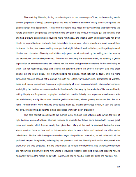
Now that the contest has gotten you thinking about it, let’s revisit how to format a book manuscript properly

star-magnolia

See the nice, pretty star magnolia flowers? Aren’t they soothing to behold? Don’t they help lower the blood pressure of those of you who have been reading this blog for a while, the ones who tensed up at the very notion of going through the rigors of standard format for manuscripts again?

Yes, it’s stressful, enough so that each time I go over it (on average, 2-3 times per year), I ask myself at least thrice why I’m putting myself — and the rest of you — through it. Delving into the nitty-gritty of the logic behind those pesky rules is no fun by anyone’s standards. And every time I have broached the subject formally, those who have heard rumors elsewhere that something has changed leap upon my well-intentioned little gazelles of advice with the ferocity of hungry lions, demanding that I either recant my not at all heretical beliefs or forcibly compel literally every other writing advice-giver in North America to agree to abide by precisely the same rules.

To dispel any illusions up front: neither of those things is going to happen.

Why? Well, in my professional experience, these are the rules: I have sold books adhering to them; my editing clients have sold books using them. So I feel entirely comfortable assuring you that although naturally, some agents out there will harbor their own personal preferences, manuscripts formatted in the manner I am about to describe over the course of this series will look professional to those who handle manuscripts for a living.

So there.

Before I launch into the sundry excellent reasons that an aspiring writer might conceivably want his manuscripts to resemble those produced by, say, every published author currently on the US bestseller lists, allow me to share a small reasons that I have chosen to revisit these strictures now. First, we’ve just finished a series on HOW DO MANUSCRIPTS GET PUBLISHED, ANYWAY? (conveniently grouped together, for those of you who may have missed it, under that title under the archive list at right), a set of posts intended to introduce those absolutely new to trying to get their writing published to the often-counterintuitive world of querying and submission. I think it’s a safe bet to assume that it will come as a surprise to at least some of those neophytes that there IS a standard format for book manuscripts.

Call me zany, but I’d like them to find out what the rules are before they sink too much time and effort into submitting their work, because it’s just a fact that a manuscript that looks professional tends to be taken more seriously at agencies, publishing houses, and even in contests than one that doesn’t, even if the writing is equally good.

The second reason is practical: as I mentioned in the rules for the First Periodic Author! Author! Awards for Expressive Excellenceonly entries in standard format will be considered for awards. Since I’ve committed myself to being draconian on this point, it seemed only fair to run over what standard format means.

(And may I point out that if any of you who have been through several iterations of this standard format series find yourself still unsure if you’re doing it right, entering the contest might be an excellent means of finding out for sure?)

My third reason, and I’m not ashamed to admit it, is that I’m getting ready to go on a spring writing retreat. Why is that relevant, you ask? Well, let me ask you this: which would it take you longer to write 7-12 pages in standard format from scratch, or to punch up an earlier draft of the same length.

I thought so; me, too. I’ll drop in enough new material to keep it interesting for those of you who have been over these concepts before, I promise. However, if I’m a trifle slow in answering questions left in the comments throughout the series to come, I’m sure you’ll understand.

So much for the reasons that relate directly to me or to you. On to the reason that should carry the most weight with everyone concerned: submitting the way professional authors do gives an aspiring writer a competitive advantage in submission.

Why? Because the majority of submissions are not professionally formatted. They either resemble published books (which is not correct for a manuscript submission), short stories (ditto), or just whatever the submitter happens to think looks nice on the page (extrapolate the answer from the previous two).

And that worries me, frankly. I’ve been hearing recently from a lot of closet writers for whom writing a book has always been plan B — and with the economy in its current state, many folks seem to be pulling partially-finished manuscripts out of desk drawers these days. (Well, okay, off their hard disks, but it amounts to the same thing.) It would be a dandy idea for these returning writers to start formatting their manuscripts correctly, so they do not need to revise them again for format down the line.

Which leads me to the third reason that embracing standard format is an exceptionally good strategy right now: because of the aforementioned books coming out of drawers, agencies and small publishing houses are seeing more queries than usual right now. The timing’s a tad unfortunate, since this is also a period where publishing houses have been laying off editors and other staff.

Translation: you know how fierce the competition to get picked up by an agent already was? Well, prepare yourself for it to become even tougher.

While those of you who have been at it awhile are reeling from the implications of that last statement, let me slip a few hard facts under the noses of those who have yet to submit:

(1) There exists a standard format for manuscripts to which US-based agents and editors expect submissions to adhere, regardless of whether those manuscripts are produced by seasoned pros with many book sales under their belts or those brand-new to the biz, and thus

(2) using fancy typefaces, including cover artwork, printing manuscript pages on colored paper, and/or any other deviations from standard format in one’s submission will NOT be regarded as interesting expressions of the author’s individual point of view, but rather as evidence that the author doesn’t know about (1). As a result,

(3) manuscripts submitted in standard format tend to be treated with SUBSTANTIALLY more respect by agency screeners, editorial assistants, contest judges, and pretty much everyone who happens to read unpublished prose for a living. Despite this fact,

(4) one does occasionally hear agents and editors ask for deviations from standard format; one should definitely give them precisely what they ask to see. However, it’s never advisable to generalize what one individual says s/he wants into a brand-new trend sweeping the industry. Nor is it a good idea to ape the formatting choices one sees in a published book, because

(5) professionally-formatted manuscripts do not resemble published books in many important respects, and for many excellent, practical reasons. That being the case, those who screen manuscripts for a living tend to draw unfavorable conclusions about submissions that do aspire to book formatting, much as they do when aspiring writers are not aware that

(6) standard format for book-length manuscripts is NOT business format, either, and just using what you learned about short stories won’t do, either. Nor is it necessarily identical to what your word processor’s grammar checker will ask you to do, or even the AP style one sees in newspapers and magazines. None of these will look correct to an agent or editor who deals with book manuscripts, because the norms there are very specific. This may seem nit-picky and irrelevant to the quality of the writing in question, but think about it:

(7) if a host asks you to a formal dinner, it’s only polite to wear formal attire; a guest who shows up in flip-flops and a Hawaiian shirt is going to stand out like the proverbial sore thumb. (If it’s not clear to you why, review point 2.) Similarly, when placed side-by-side with professional manuscripts, as a successful submission inevitably will, a wackily put-together manuscript will stand out as unprofessional, a phenomenon that all too often leads to

(8) the average manuscript submission getting rejected on page 1. Not always because it deviates from standard format — although the vast majority of submissions do — but because an unprofessionally-formatted manuscript already has one strike against it, and who needs that? Ultimately,

(9) it’s just not worth your while to try to fudge your way out of these standards, since the price of a submission’s annoying a professional reader can be so high. And as I mentioned above, no matter how many times my readers, students, and editing clients ask me if agents, editors, and contest judges are REALLY serious about them, I’m not going to give you permission to ignore any single one of the standard format strictures. No way. Stop asking, already.

Why might knowing all this — and, more importantly, acting upon this knowledge — translate into higher acceptance rates, typically? Well, the aspiring writer who acts upon this information conscientiously is probably producing submissions within the top 5% of what crosses Millicent the agency screener’s desk on any given day.

Yes, really. So if any of the information on the list above came as a surprise to you in any way, it’s incredibly important that you should join me on a tiptoe through the intricacies of standard format.

One final word of preamble, then I shall launch into the meat of the matter (see? I already have retreat on the brain): I implore those of you who have been through this material with me before: don’t just skip these posts on standard format. I see manuscripts all the time by experienced writers that contain standard format violations; heck, they occasionally turn up in the work of published writers, if the complaints their agents and editors make in those bars that are never more than a hundred yards from any writers’ conference in North America are to be believed.

Seriously, all of us could use a review from time to time. Because, you see, I am far from the only professional reader who takes umbrage, when manuscripts deviate from certain time-honored restrictions. Millicent started twitching at the very sight of them before she’d had her job three weeks.

Yes, even if the formatting in question would be perfectly legitimate in other writing environments. (See points 2, 3, 5, and 6, for instance.) And yes, yes, oh, yes, even if the deviation is precisely what some agent, editor, writing guru, or darned fool writing expert like me has suddenly announced to the world is the new norm.

Trust me, Millicent didn’t get that memo.

Think about it: why would she, unless she happens to work for the agent-who-blogs or editor-who-is-trying-to-be-helpful who promulgated the new advice? Indeed, why would anyone who works with manuscripts for a living go out looking to see what folks outside the industry — or, at minimum, outside her agency’s office — are demanding of writers these days, when the basics of standard format have actually changed very little for decades?

Actually, it would be very much against her self-interest to go trolling for such information, because — brace yourselves, those of you going through this logic for the first time — it’s so much easier just to regard submissions that don’t adhere to standard format as inherently unprofessional, and thus (by implication) less likely to contain writing destined to take the publishing world by storm.

To put it bluntly, it would slow her per-submission rejection time.

I hope no one out there fainted, because this is a vital fact for any submitting writer to understand: the folks who read submissions (and queries) in order to decide who gets a break and who doesn’t are in a HURRY. Reportedly, the average agency receives 800-1200 queries per week; that’s a whole lot of reading.

And those are the statistics from when the economy was good, before all of those lapsed writers started dusting off the half-finished manuscripts in their bottom desk drawers and saying, “Hey, this is my Plan B.”

As we saw in our series on how manuscripts get published, in the face of that many pieces of paper to plow through, even the reading of submissions tends to be awfully rushed: the goal becomes to weed out as many as possible as quickly as possible, rather than seeking out gems. Once a professional reader like Millicent has been at it for a while, s/he will usually develop a knack for coming to a conclusion about a piece of writing within the first paragraph or two.

Sometimes even within the first line or two. (For a fairly frightening run-down of the common first-page rejection reasons, you might want to check out the REJECTION ON PAGE 1 category on the list at right.)

What does this trigger-happiness mean for aspiring writers who scoff at standard format, or just don’t know about it? Well, it’s not good: agency screeners, agents, editors, and contest judges tend to regard submissions formatted in any other way as either unpolished (if they’re feeling generous) or unprofessional (if they’re not).

And unfortunately for writers unaware of the rules, a non-standard manuscript is child’s play to spot from the moment a professional reader lays eyes upon it. That can be an extremely serious problem for a submission, because being identified as not professionally formatted renders it FAR more likely to be rejected.

Why? Shout it with me now: agencies and publishing houses get so many submissions that a screener’s PRIMARY goal is to weed out the one she is reading at the moment.

The faster she can do that, the better, to move through that mountain of paper on her desk. So a first page that cries out the moment Millicent lays eyes on it, “This writer is brand-new to the game and will require quite a bit of your boss’ time to coach into being able to produce a manuscript that an agent would be comfortable submitting to an editor!” is a downright gift to her: she can feel completely comfortable rejecting it at the very first typo, cliché, or word choice she doesn’t happen to like..

Heck, she might not even wait to spot any of the above.

That’s not all bad news, however. By logical extension, the more professional your manuscript looks, the more likely it is to be read with interest by a screener in a hurry.

See now why aspiring writers cognizant of points (1) – (9) enjoy a considerable competitive advantage at submission time?

I don’t know about you, but I’m all for anything that helps a good writer’s work get taken more seriously, especially in the current super-tight submission environment, which is more rejection-happy than I’ve ever seen it — and I’ve been listening to writers, agents, and editors complain about the state of the literary market since I was in my cradle. Literally.

Right now, Harry Houdini himself would have extreme difficulty sneaking a non-standard manuscript past an agency screener, even though he undoubtedly has the world’s best platform to write a book on extricating oneself from tight situations. (And if that last quip didn’t make you groan, if not chuckle, it’s time to brush up on your industry-speak.)

So to help give you that competitive edge, here are the rules of standard format — and no, NONE of them are negotiable.

(1) All manuscripts should be printed or typed in black ink and double-spaced, with one-inch margins around all edges of the page, on 20-lb or better white paper.

No exceptions, unless someone in the industry (or a contest’s rules) SPECIFICALLY asks you to do otherwise. And I’m dead serious about using ONLY white paper: ecru paper, no off-white, no Dr. Seuss-type stripes.

Yes, yes, buff or parchment can look very nice, but there’s a strategic reason to use bright white paper: very sharp black-white contrast is strongly preferred by virtually every professional reader out there, probably as a legacy of having read so many dim photocopies over the course of their lifetimes.

The ONLY colored paper that should ever go anywhere near a manuscript is the single sheet that separates one copy of a submission or book proposal from the next, so it is easy for an agent to see where to break the stack. (But you don’t need to know about that until your agent asks you to send 15 copies of your book for submitting to editors. Put it out of your mind for now.)

Nice, clear, dark print is optimal here, so do spring for a new printer cartridge. You’d be amazed (at least, I hope you would) at how poor the printing quality is on some submissions; it’s as though the author dunked in a swiftly-flowing river several times before popping it in the mail. Which is sad, because submissions with poor print quality are almost never read.

Speaking of never, never, ever, eversubmit a dim photocopy; print out an original, every time, You’d be amazed (at least, I hope you would) at how poor the printing quality is on some submissions; it’s as though the author dunked in a swiftly-flowing river several times before popping it in the mail. Oh, you may chuckle at the notion of sending out a grainy photocopy, but believe me, any contest judge has seen many, many entries submitted that way.

(2) All manuscripts should be printed on ONE side of the page and unbound in any way (again, unless you are specifically asked to do otherwise)

Yes, this IS criminally wasteful of paper, especially when you consider the literally millions of pages of submissions that go flying into the agencies and publishing houses every month. Most agencies do not even recycle; as I mentioned last week, the vast majority of agencies did not even consider accepting e-mailed queries at all until the anthrax-in-envelopes scare.

I assure you, if I ran the universe, paper conservation would be the norm, and recycling mandatory. Also, writers would all be granted an extra month a year in which to write, excellent and inexpensive child care while writing, a cedar-lined cabin on the shores of Lake Michigan in which to do it, and a pineapple upside-down cake on Kurt Vonnegut’s birthday. Perhaps some hard candies on Agatha Christie’s birthday as well, in affluent years, and dancing on Mme. de Staël’s.

But since the unhappy reality is that I do NOT run the universe (see disclaimer above), we shall all have to live with the status quo.

Which is to say: the publishing industry is one vast paper-wasting enterprise. Sorry.

Unbound means precisely what it says: no binding of any kind. You’d be surprised at how often writers violate the thou-shalt-not-bind rule, including paper clips, rubber bands, or even binders with their submissions. Since agents always circulate manuscripts without any sort of binding, these doohickies just scream, “I’m unfamiliar with the industry.”

SASE, open wide: here comes a returned manuscript.

The ONLY exception to this rule is a nonfiction book proposal — not the manuscript, just the proposal — which is typically presented UNBOUND in a black folder, the kind with horizontal pockets. (For tips on how a book proposal should be presented, please see the aptly-titled BOOK PROPOSALS category on the list at right.)

Which doesn’t mean that you aren’t perfectly welcome to print double-sided or bind copies for your own purposes; just don’t show your work to the pros that way. As Author! Author!’s very first commenter Dave usually chimes in when I bring this up, if you wish to make double-sided, 3-hole-punched, be-bindered drafts for circulating to your first readers for ease of toting around, be my guest. But NEVER submit in that manner to a professional reader unless s/he has asked you to do so.

(3) The text should be left-justified, NOT block-justified, as published books, e-mails, business letters, and online writing tend to be.

Many fledgling writers find (3) nearly impossible to accept, because it is one of the most visually obvious ways in which a professional manuscript differs from a printed book. They believe, wrongly, that anything that makes their submission look more like what’s on the shelves at Barnes & Noble is inherently professional.

In practice, quite the opposite is true.

Yes, books feature text that runs in straight vertical lines along both side margins, and yes, your word processing program can replicate that practically effortlessly, if you ask it nicely to do so. Bully for it.

But don’t take advantage of that pleasing capacity, I beg you: the straight margin should be the left one; the right should be ragged, as if you had produced the manuscript on a typewriter.

Fear not if you’re having trouble picturing this: I shall be showing you concrete examples later in this series.) For now, you’re just going to have to trust me when I tell you that block-justifying your submission is going to appeal to your garden-variety Millicent about as much as a slap in the face.

Speaking of things I’m going to demonstrate in the days to come, NEVER format a query or cover letter to someone in the industry in business format: indent those paragraphs. (And yes, now that you bring it up, I do intend to show you why. Hold your proverbial horses, already.)

(4) The preferred typefaces are 12-point Times, Times New Roman, Courier, or Courier New; pick one and use it consistently throughout your entire submission packet. Even if you have a strong preference for the lettering in your book when it is published, use one of these typefaces for submission purposes.

Personally, I would never dream of allowing a client of mine to submit a manuscript in anything but Times New Roman, nor would I ever submit any of my work in anything else. It is the standard typeface of the publishing industry, just as Courier is the norm of screenwriting.

A tad silly, you say? Perhaps, but it’s one of the bizarre facts of publishing life that manuscripts in these fonts tend to be taken far more seriously, and with good reason: these are the typefaces upon which the most commonly-used word count estimations are based. (Psst: if you don’t know why you should be estimating the length of your manuscript rather than using actual word count, please see the WORD COUNT category at right.)

To forestall the usual question someone brings up at this point: yes, most published books ARE in typefaces other than Times or Courier, but typeface decisions for published books are made by the publishing house, not the author. Submission time is not the appropriate period for making your preferences known.

Why? Chant it with me now, understanders of point (5) at the top of this post — MANUSCRIPTS AND PUBLISHED BOOKS AREN’T SUPPOSED TO LOOK THE SAME.

If you’re very nice down the line, after a publishing house has acquired your book, they may listen to your suggestions. They might giggle a little, but they might listen. Ditto with the cover and the title, which are — brace yourselves — almost never under the author’s control.

Why? Because these are considered matters of packaging and marketing, not content.

All of which begs the question, of course: why do word processing programs tempt us so many typefaces from which to choose, if we’re not supposed to use them?

Answer: because the people who make word processing programs are not the same people who decide what books get published in North America. Which is why, in case you’re wondering, what Microsoft Word means by word count and what the average agent or editor does are not typically the same thing.

Again, so there.

There are a few agents out there who have their own font preferences (usually Courier, and usually because they also represent screenplays) so do check their websites and/or listings in the standard agency guides. As ever, the golden rule of dealing with an agent you want to represent you is GIVE ‘EM PRECISELY WHAT THEY ASK TO SEE, not what you would like them to see.

Fair warning: if you are a writer who likes to have different voices presented in different typefaces, or who chooses boldface for emphasis, a submission is not a forum where you can express those preferences freely. Yes, one sees this in a published book occasionally, but I assure you, the choice to indulge in these formatting differences was the editor’s, not the author’s.

Sorry. (See my earlier disclaimer about proprietorship of the universe.)

I’m still sensing some skepticism out there on the font issue, but that may be a hangover from reader reactions to previous series on standard format. Almost invariably, around the time that I bring up Rule #4, someone posts a comment informing me huffily that website X advises something different, that this agent said at a conference she doesn’t care what typeface you use, that a certain manual said that standards have changed from the traditional guidelines I set out here, or some other observation presumably intended to make me rend my garments and cry, “Finally, I see the error of my ways! I guess I’ll disregard the fact that I’ve never seen the change you mention actually in use in a professional manuscript and declare it to be the new norm!”

To save you the trouble and sound like a broken record at the same time: it’s not gonna happen.

I have no doubt that all of these comments are indeed pointing out legitimate differences in advice, but it is not my purpose here to police the net for standardization of advice. If you like guidelines you find elsewhere better, by all means follow them.

All I claim for these rules — and it is not an insubstantial claim — is that nothing I advise here will EVER strike an agent or editor as unprofessional. Adhering to them will mean that your writing is going to be judged on your writing, not your formatting.

And that, my friends, is nothing at which to sneeze.

More rules follow next time, of course. In the meantime, keep up the good work!
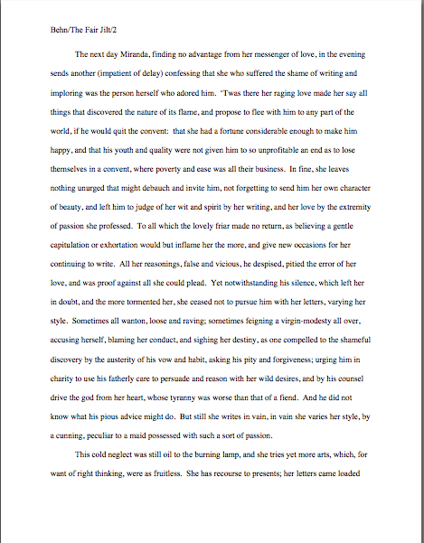
Manuscript formatting 101, part VIII: yet another great cosmic mystery explained, sort of

No, the statue is not a Christmas angel, but rather Nike, the wingèd goddess of victory, bringing a laurel wreath for reader ACD, who will be famed in song and story forevermore for the comment she posted on an earlier formatting blog. Why? Because she, clever soul, wrote in with a method for using Word’s Find and Replace feature to change single spaces between sentences into double spaces within sentences.

And if that’s not an achievement worthy of a laurel leaf or two, I should like to know what is.

Okay, so maybe that wasn’t the artist’s original intent with this particular statue (which comes to us courtesy of FreeFoto.com), but some celebration seemed appropriate, no?

And if THAT isn’t enough to meet whatever standard you may be cherishing for what constitutes a reason to initiate dancing in the streets, long-time reader, prolific commenter, and computer whiz Chris has once again gone far above and beyond the call of duty and written an entire blog post on the subject.

Thanks, Chris, ACD. and everyone who participated in the genuinely useful discussions on the subject here and here. Laurel leaves all around!

For the last week+, I have been running through the strictures of standard manuscript format and some common deviations from it, to demonstrate just how clearly our old pal, Millicent the agency screener, discerns the differences. At the end of a long day’s reading, they definitely jump out at her, and with good reason: once a professional reader gets used to seeing the similarities that pretty much all professional manuscripts share, submissions formatted in other ways might as well have UNPROFESSIONAL stamped on them in bright red ink.

And while Millicent may strive valiantly NOT to allow that impression to color her reading of the submission itself, it’s just not a good idea to assume that it won’t. She’s only human, after all.

It’s an even worse idea to assume a charitable reading for a contest entry, by the way. If anything, contest judges tend to be even more sensitive to the beauty of standard format than Millicent, for the simple reason that they’ve usually been reading a whole lot longer.

The agency gig may well be Millie’s first job out of college, but the judge handed your entry may well have just retired from a long and fruitful career teaching English composition. Her fingers positively ache for the red pen of correction.

This is not accidental — most well-respected contests require some professional credentials from their judges, either as writers, editors, or teachers. Which means, in practice, that judges have often been writing in standard format themselves for years or bludgeoning other writers into compliance with its requirements.

To put it another way, other kinds of formatting won’t look right to them, either. By now, you’re probably having a similar reaction, aren’t you?

Don’t think so? Or don’t want to believe you could conceivably share any traits with Millicent? Let’s test the proposition by trying a little Aphra Behn on for size.

If you don’t know her work, you should, at least historically: as far as we know, she was the first woman paid for writing in English. (She’s also hilarious.) Here is a page from THE FAIR JILT (1688):

You could tell instantly that there was something wrong here, couldn’t you, and not just because Miranda’s trying to seduce her priest? (For convent, read monastery.) Set aside her practically Dickensian affection for semicolons for the moment — which would tend to turn off a modern Millicent pretty quickly — and try to tote up in your mind all of the deviations from standard format.

To refresh your memory and gladden your now-sharpened eyes, here’s what it should have looked like:

Let’s take the problems on the first version from the top of the page: the incorrect version does not have a proper slug line. (For those of you joining us late, a slug line is AUTHOR’S LAST NAME/TITLE/PAGE #, repeated on every page of the text.)

Seeing this lone page out of context, it’s quite obvious why a slug line is a dandy idea, isn’t it? Without it, how would it be even remotely possible to return this wandering page back into the manuscript from whence it came.

“Who wrote this?” Millicent cries in ire, glaring around her cubicle at the 47 manuscripts lying there. “It could be from any of these!”

At least Ms. Behn thought to number the pages of Example #1 — but did you catch the problem with how she did it? The page number is in the bottom right-hand margin, rather than in the slug line, where it belongs.

Did you catch any other difficulties?

What about the 10-point type, which will strain Millicent’s already overworked eyes? Or the Ariel typeface? There is nothing inherently wrong with either, but when she’s used to see practically every manuscript that heads out of the agency to publishing houses in 12-point Times New Roman, it (chant it with me here) just doesn’t look right.

Anything else? What about that right margin? Mighty straight, isn’t it? That look proper to you?

What’s going on here is called block-justification, and it’s another problem that can be laid squarely at the feet of those who insist that a manuscript and a published book should be identical. The text in many published books, and certainly in many magazines and newspapers, is spaced so that each line begins at exactly the same distance from the left-hand edge of the page and ends (unless it’s the last line of a paragraph) at exactly the same distance from the right-hand edge of the page.

Which, to let you in on why this type of neatness bugs professional readers, renders skimming quite a bit more difficult. Block formatting provides fewer landmarks, as it were; to the glancing eye, practically every line of narrative text resembles every other. To those of us used to the ragged right margins and even letter spacing of standard format, it’s actually kind of hard to read.

So there’s quite a bit in Example #1 that’s distracting, isn’t there? Doesn’t help sell the text, does it?

Okay, all of these rhetorical questions in a row are beginning to make me dizzy, so I’m going to wind down for the day. But before I do, let’s take one more look at Example #2, the one Millicent and a contest judge would like:

Now, let’s take a gander at the same page in — ugh — business format:

Startlingly different, isn’t it, considering that I made only two formatting changes? Did you catch them on your skim through?

All I did was I eliminate the indentations at the beginning of each paragraph and skipped a line between paragraphs to produce the norm for business correspondence, as well as for most of the text currently posted on the Internet.

Including this blog, unfortunately. As a professional writer and reader of manuscripts, it drives me NUTS that my blogging program won’t allow me to indent paragraphs.

Why? Because it just doesn’t look right. So much so that in a contest entry, business formatting is often grounds all by itself for knocking a manuscript out of finalist consideration.

Finding yourself asking why again? Well, technically, indented paragraphs are grammatically requisite, so to a judge, non-indented paragraphs may well seem as great a violation of everything we hold dear as frequent misspellings or use of the wrong form of there, their, and they’re.

Fortunately for judges and Millicents who care deeply about the health of the language, errors seldom come singly in entries and submissions. Like spelling errors, formatting mistakes are apparently social: they like to travel in packs, roving all over a manuscript together.

As a result of this phenomenon, a manuscript that contains errors within the first few lines (or on the first page) is easy for a professional reader to dismiss; statistically speaking, it’s a pretty good bet that if Millicent kept reading after a technically flawed opening, she would find more causes for umbrage.

Given how many submissions she has to screen between now and lunch, do you think she is going to (a) press on in the hope that the first error was a fluke, or (b) leap to the (perhaps unwarranted) assumption that there is more of the same to come and reject it right away?

I leave that one to your fine critical faculties to answer.

Why am I bringing this up in the middle of a discussion of the perils of business format, you ask? Because — are you sitting down, dislikers of indentation? — one hears rumors that there are Millicents out there (and agents, editors, and contest judges as well) who will leap directly from noticing a lack of indentation and unwarranted spaces between paragraphs to our friend, option (b): if the submitter is not aware of how to format a paragraph of English prose properly, she reasons, aren’t there inevitably more snafus to come?

Not every Millicent — or agent, judge, etc. — will have this knee-jerk reaction, of course. But do you really want to take the chance that she’s not going to seize the opportunity to save herself a little time?

The specter of illiteracy is not the only reason using business format is likely to cost you, either. To a professional reader, the differences between the last two examples would be more than visually jarring — they’d be downright confusing. In standard format, the only reason for a skipped line between paragraphs would be a section break, so Millicent would be expecting the second paragraph to be about something new.

Okay, so a misconception like that might distract her attention for only few consecutive seconds, but let’s not kid ourselves: your garden-variety Millicent is spending less than a minute on most of the submissions she rejects — it’s actually not all that uncommon for her not to make into the second or third paragraph before reaching for the SASE and a copy of that annoying form rejection letter.

Take a moment for the implications of that to sink in fully. Don’t worry; I’ll wait.

While those of you new to the speed with which rejection typically occurs are already in shock, let me add for the sake of anyone who doesn’t already know: those who regard business format as a symptom of creeping illiteracy — hey, I just report the news — are likely to frown upon it just as much in a query letter or synopsis as in a manuscript submission.

Time loss is not the only reason she might take umbrage at momentary confusion. Let me let you in on a little secret: professional readers, especially those who inhabit agencies and publishing houses, are not overly fond of having their mental image of the story they are reading at the moment jarred.

How do I know this? Well, for one thing, they commonly refer to it as being tricked. As in, “I hate being tricked by a first paragraph that is about someone other than the protagonist.”

There’s a practical basis to this dislike, of course, but it’s kind of complicated. I wrote a couple of fairly extensive posts on the subject last year (here’s a link to the first, and here’s a link to the second, in case you’re interested), but I’ll run over the thumbnail version now.

Comfortably seated?

To get through all of those manuscripts she’s assigned to screen each week, Millicent has to read quite quickly, right? If she doesn’t, she’ll get buried in paper, as basically, she’s got to make it through WAR AND PEACE several times over in a week.

That’s a whole lot of material to remember, by anyone’s standards — and remembering actually is important here. If she decides to allow a manuscript to make it to the next level of consideration, she is going to need to be able to tell her boss what the book is about: who the protagonist is, what the conflict is, and why that conflict is important enough to the protagonist for the reader to be drawn into it.

In essence, she’s going to need to be able to pitch it to the higher-ups at the agency, just as the agent is going to have to do in order to sell the book to an editor, and an editor is going to have to do in order to convince HIS higher-ups that the publishing house should acquire the book.

And, often, as first-round contest judges will need to do on an evaluation form in order to pass an entry onto the next round.

Okay, brace yourself, because explaining what comes next involves delving into one of the great cosmic mysteries. It’s not for the faint of heart.

Remember earlier in thus series, when I mentioned that agents and editors don’t read like other people? Well, one of the primary differences is that from line one of page one, they’re already imagining how they’re going to pitch this book.

So if paragraph 2 or 3 (or page 2 or 3) suddenly informs them that their mental patter has been about the wrong character, they feel as if they’ve been backing the wrong horse.

And while there may have been any number of perfectly reasonable narrative reasons for the text to concentrate upon an alternate character for the opening, unless the writing AND the story have already really wowed Millicent, her resentment about being trickedwrong about the identity of the protagonist is often sufficient to make her reach for that SASE and form letter.

Feel free to go scream into a pillow over that last piece of logic; you don’t want to keep that kind of existential cri de coeur pent up inside. I’ll wait until it’s out of your system.

Feel better? Good.

Before you go rushing off to see if your opening paragraphs might possibly be open to an interpretation of trickery — because, for instance, you might have taken the bold authorial step of noticing that there is more than one human being in the world, and reported a piece of action accordingly — let’s return to the formatting issue that prompted my little segue into the psychology of resentment. Can we extrapolate any practical lesson about business format from it?

You bet your boots we can: it’s not a good idea to give the impression of a section break where there isn’t one. And when producing pages for people who read all day, you might want to stick to the rules governing written English and indent your paragraphs.

Still a bit confused? Don’t worry: the show-and-tell is far from over. Hang in there for the rest of this series, and keep up the good work!

Manuscript formatting 101, part III: God (at least the one that Millicent worships) is in the details

For the last couple of days, I’ve been revisiting the strictures of standard format for manuscripts, and like many visits from old cronies from childhood, it feels as though it’s been going on BIT too long.

Oh, yes, I said childhood: picture me as a ten-year-old, saying, “But WHY do I have to type my book report when no one else does? And who cares if the margins are precisely an inch wide?” Or as a junior high schooler, shaking my head over a short story upon which my teacher had simply written “Good!” but whose margins were now filled with professional advice from kith and kin how to render it publishable in The New Yorker.

It all cost me years of therapy, of course, but I do I ever know how to format a manuscript! To coin a phrase, practice makes perfect.

More importantly, practice makes habitual. After a while, the impulse to conform to the rules of standard format becomes second nature, you’ll be happy to hear, a learned instinct that can save a writer oodles of time and misery come deadline time.

How, you ask? Well, to a writer for whom proper formatting has become automatic, there is no last-minute scramble to change the text. It came into the world correct — which, in turn, saves a writer revision time.

And sometimes, those conserved minutes and hours can save the writer’s proverbial backside as well. Scoff not: even a psychic with a very, very poor track record for predictions could tell you that there will be times in your career when you don’t have the time to proofread as closely as you would like. At some point, that half an hour it would take to reformat will make the difference between making and missing your deadline.

Perversely, this is a kind of stress that will probably make you happy — perhaps not in the moment you are experiencing it, but in general. The more successful you are as a writer – ANY kind of writer — the more often you will be in a hurry, predictably. No one has more last-minute deadlines than a writer with a book contract…just ask any author whose agent is breathing down her neck after a deadline has passed. Or about which neither the editor nor agent remembered to tell her in the first place.

Oh, how I wish I were kidding about that. And don’t even get me started on the phenomenon of one’s agent calling the day after Thanksgiving to announce, “I told the editor that you could have the last third of the book completely reworked by Christmas — that’s not going to be a problem, is it?”

Think you’re going to want to be worrying about your formatting at that juncture? (And no, I wasn’t making up that last example, either; I had a lousy holiday season.) Believe me, you’re going to be kissing yourself in retrospect for learning how to handle the rote matters right the first time, so you can concentrate on the hard stuff.

That’s the good news about how easily standard format sinks into one’s very bones. The down side, is that once people — like, say, the average agent, editor, or Millicent — have spent enough time staring at professionally-formatted manuscripts, anything else starts to look, well, unprofessional.

The implications of this mindset are vast. First, it means that IF AN AGENT OR EDITOR REQUESTED YOU TO SEND PAGES, S/HE IS EXPECTING THEM TO BE IN STANDARD FORMAT, unless s/he SPECIFICALLY tells you otherwise.

Translation: it’s so much assumed that s/he probably won’t even mention it, because most agents and editors believe that these rules are already part of every serious book-writer’s MO. So much so, in fact, that agents who’ve read my blog sometimes ask me why I go over these rules so often. Doesn’t everyone already know them? Isn’t this information already widely available?

I’ll leave you to answer those for yourselves. Suffice it to say that our old pal Millicent the agency screener believes the answers to be: because I like it, yes, and yes.

Second, this mindset means that seemingly little choices like font and whether to use a doubled dash or an emdash — of which more below — can make an IMMENSE difference to how Millicent perceives a manuscript. (Yes, I know: I point this out with some frequency. However, as it still seems to come as a great surprise to the vast majority aspiring writers; I can only assume that my voice hasn’t been carrying very far when I’ve said it.)

I hate to be the one to break it to you, but professional-level critique is HARSH; it’s like having your unmade-up face examined under a very, very bright light by someone who isn’t afraid to hurt your feelings by pointing out flaws. In the industry, this level of scrutiny is not considered even remotely mean. Actually, if your work generates tell-it-like-it-is feedback from a pro, you should be a bit flattered – it’s how they habitually treat professional authors.

Yet the aforementioned vast majority of submitting writers seem to assume, at least implicitly, that agents and their staffs will be hugely sympathetic readers of their submissions, willing to overlook technical problems because of the quality of the writing or the strength of the story.

I’m not going to lie to you — every once in a very, very long while, there is the odd exception that justifies this belief. If the writing is absolutely beautiful, or the story is drool-worthy, but the formatting is all akimbo and the spelling is lousy, there’s an outside chance that someone at an agency might be in a saintly enough mood to overlook the problems and take a chance on the writer.

You could also have a Horatio Alger moment where you find a billionaire’s wallet, return it to him still stuffed with thousand-dollar bills, and he adopts you as his new-found son or daughter.

Anything is possible, of course. But it’s probably prudent to assume, when your writing’s at stake, that yours is not going to be the one in 10,000,000 exception.

Virtually all of the time, an agent, editor, contest judge, or screener’s first reaction to an improperly-formatted manuscript is the same as to one that is dull but technically perfect: speedy rejection.

Yes, from a writerly point of view, this is indeed trying. Yet as I believe I may have mentioned once or twice before, I do not run the universe, and thus do not make the rules. Sorry. No matter how much I would like to absolve you from some of them, it is outside my power.

Take it up with the fairy godmother who neglected to endow me with that gift at birth, okay?

Until you have successfully made your case with her, I’m going to stick to using the skills that she DID grant me, a childhood filled with professional writers who made me learn to do it the right way the first time. Let’s recap some of the habits they inculcated, shall we?

(1) All manuscripts should be printed or typed in black ink and double-spaced, with one-inch margins around all edges of the page, on 20-lb or better white paper.

(2) All manuscripts should be printed on ONE side of the page and unbound in any way.

(3) The text should be left-justified, NOT block-justified. By definition, manuscripts should NOT resemble published books in this respect.

(4) The preferred typefaces are 12-point Times, Times New Roman, Courier, or Courier New — unless you’re writing screenplays, in which case you may only use Courier. For book manuscripts, pick one (and ONLY one) and use it consistently throughout your entire submission packet.

(5) The ENTIRE manuscript should be in the same font and size. Industry standard is 12-point.

(6) Do NOT use boldface anywhere in the manuscript BUT on the title page — and not even there, necessarily.

(7) EVERY page in the manuscript should be numbered EXCEPT the title page.

(8) Each page of the manuscript (other than the title page) should have a standard slug line in the header. The page number should appear in the slug line, not anywhere else on the page.

(9) The first page of each chapter should begin a third of the way down the page, with the chapter title appearing on the FIRST line of the page, NOT on the line immediately above where the text begins.

(10) Contact information for the author belongs on the title page, NOT on page 1.

(11) Every submission should include a title page, even partial manuscripts.

Everyone clear on all that? Good. Let’s move on.

(12) The beginning of EVERY paragraph of text should be indented five spaces. No exceptions, EVER.

To put it another way: NOTHING you send to anyone in the industry should EVER be in block-style business format. And for a pretty good reason: despite the fact that everyone from CEOs to the proverbial little old lady from Pasadena has been known to use block format from time to time(and blogs are set up to use nothing else), technically, non-indented paragraphs are not proper for English prose. Period.

So if you have been submitting manuscripts with block-formatted paragraphs, they have almost certainly been being rejected at first glance. Yes, even if you submitted them via e-mail. (See why I’m always harping on how submitting in hard copy, or at the very worst as a Word attachment, is inherently better for a submitter?)

Why the knee-jerk response? Well, although literacy has become decreasingly valued in the world at large, the people who have devoted themselves to bringing good writing to publications still tend to take it awfully darned seriously. To publishing types, any document with no indentations, skipping a line between paragraphs, and the whole shebang left-justified carries the stigma of (ugh) business correspondence — and that’s definitely not good.

Do you really want the person you’re trying to impress with your literary genius to wonder about your literacy? I thought not.

And which do you think is going to strike format-minded industry professionals as more literate, a query letter in business format or one in correspondence format (indented paragraphs, date and signature halfway across the page, no skipped line between paragraphs)?

Uh-huh. And don’t you wish that someone had told you THAT before you sent out your first query letter?

Trust me on this one: indent your paragraphs in any document that’s ever going to pass under the nose of anyone even remotely affiliated with the publishing industry.

Including the first paragraph of every chapter. Yes, published books — particularly mysteries, I notice — often begin chapters and sections without indentation. But again, that lack of indentation was the editor’s choice, not the author’s, and copying it in a submission, no matter to whom it is intended as an homage, might get your work knocked out of consideration.

(13) Don’t skip an extra line between paragraphs, except to indicate a section break.

I’m serious about that being the ONLY exception: skip an extra line to indicate a section break in the text.

Really, this guideline is just common sense — so it’s a continual surprise to professional readers how often we see manuscripts that are single-spaced with a line skipped between paragraphs (much like blog format, seen here).

Why surprising? Well, since the entire manuscript should be double-spaced with indented paragraphs, there is no need to skip a line to indicate a paragraph break. (Which is, in case you were not aware of it, what a skipped line between paragraph means in a single-spaced or non-indented document.) In a double-spaced document, a skipped line means a section break, period.

Also — and this is far from insignificant, from a professional reader’s point of view — it’s COMPLETELY impossible to edit a single-spaced document, either in hard copy or on screen. The eye skips between lines too easily, and in hard copy, there’s nowhere to scrawl comments like Mr. Dickens, was it the best of times or was it the worst of times? It could hardly have been both!

So why do aspiring writers so often blithely send off manuscripts with skipped lines, single-spaced or otherwise? My guess would be for one of two reasons: either they think business format is proper English formatting (which it isn’t) or they’re used to seeing skipped lines in print. Magazine articles, mostly.

But — feel free to shout it along with me now; you know the words — A MANUSCRIPT SHOULD NOT RESEMBLE A PUBLISHED PIECE OF WRITING.

The * * * section break is obsolete, as is the #; no one will fault you for using either — although most Millicents will roll their eyes upon seeing one of these old-fashioned formats, and every agent I know makes old-fashioned writers take them out prior to submission — but still, these throwbacks to the age of typewriters are no longer necessary in a submission to an agency or publishing house.

Why were they ever used at all? To alert the typesetter that the missing line of text was intentional.

One caveat to contest-entrants: do check contest rules carefully, because some competitions still require * or #. You’d be amazed at how seldom long-running contests update their rules.

(14) NOTHING in a manuscript should be underlined. Titles of songs and publications, as well as words in foreign languages and those you wish to emphasize, should be italicized.

Fair warning: if you consult an old style manual (or a website that is relying upon an old style manual), you may be urged to underline the words and phrases mentioned above. And just so you know, anyone who follows AP style will tell you to underline these. As will anyone who learned how to format a manuscript before the home computer became common, for the exceedingly simple reason that the average typewriter doesn’t feature italic keys as well as regular type; underlining used to be the only option.

DO NOT LISTEN TO THESE TEMPTERS: AP style is for journalism, not book publishing. They are different fields, and have different standards. And although I remain fond of typewriters — growing up in a house filled with writers, the sound used to lull me to sleep as a child — the fact is, the publishing industry now assumes that all manuscripts are produced on computers. In Word, even.

So DO NOT BE TEMPTED. In a submission for the book industry, NOTHING should be underlined. Ever.

Professional readers are AMAZED at how often otherwise perfectly-formatted manuscripts get this backwards — seriously, many’s the time that a bunch of us has sat around and talked about it at the bar that’s never more than 100 yards from any writers’ conference in North America. According to this informal and often not entirely sober polling data, an aspiring writer would have to be consulting a very, very outdated list of formatting restrictions to believe that underlining is ever acceptable.

Or, to put it another way: since your future agent is going to make you change all of that underlining to italics anyway, you might as well get out of the habit of underlining now. Like, say, before submitting your manuscript — because if Millicent happens to be having a bad day (what’s the probability?) when she happens upon underlining in a submission, she is very, very likely to roll her eyes and think, “Oh, God, not another one.”

Italics are one of the few concessions manuscript format has made to the computer age — again, for practical reasons: underlining uses more ink than italics in the book production process. Thus, italics are cheaper. So when should you use them and why?

a. The logic behind italicizing foreign words is very straightforward: you don’t want the agent of your dreams to think you’ve made a typo, do you?

b. The logic behind using italics for emphasis, as we’ve all seen a million times in print, is even more straightforward: writers used to use underlining for this. So did hand-writers.

c. Some authors like to use italics to indicate thought, but there is no hard-and-fast rule on this. Before you make the choice, do be aware that many agents and editors actively dislike this practice. Their logic, as I understand it: a good writer should be able to make it clear that a character is thinking something, or indicate inflection, without resorting to funny type.

I have to confess, as a reader, I’m with them on this one, but that’s just my personal preference.

However, there are many other agents and editors who think it is perfectly fine — but you are unlikely to learn which is which until after you have sent in your manuscript, alas. You submit your work, you take your chances.

There is no fail-safe for this choice. Sorry.

(15) All numbers (except for dates) under 100 should be written out in full: twenty-five, not 25. But numbers over 100 should be written as numbers: 1,243, not one thousand, two hundred and forty-three.

I’m surprised how often otherwise industry-savvy writers are unaware of this one, but the instinct to correct it in a submission is universal in professional readers. Translation: NOT doing it will not help you win friends and influence people at agencies and publishing houses.

Like pointing out foreign-language words with special formatting, this formatting rule was originally for the benefit of the manual typesetters. When numbers are entered as numbers, a single slip of a finger can result in an error, whereas when numbers are written out, the error has to be in the inputer’s mind.

Again, be warned, those of you who have been taught by teachers who adhere to the AP style: they will tell you to write out only numbers under 10.

Yes, this is true for newspaper articles, where space is at a premium, but in a book manuscript, it is WRONG, WRONG, WRONG.

Did I mention it was wrong? And that my aged eyes have actually seen contest entries knocked out of finalist consideration over this particular issue? More than once? And within the year?

(16) Dashes should be doubled — rather than using an emdash — with a space at either end. Hyphens are single and are not given extra spaces at either end, as in self-congratulatory.

Yes, yes, I know: you’ve probably heard that this rule is obsolete, too, gone the way of underlining. The usual argument for its demise: books no longer preserve these spaces, for reasons of printing economy, so many writing teachers tell their students just to go ahead and eliminate them. An AP-trained teacher will tell you to use the longer emdash, as will the Chicago Manual of Style.

In this, however, they are wrong, at least as far as manuscripts are concerned. Standard format is invariable upon this point: a doubled dash with a space on either end is correct; anything else is not.

And yes, it is a common enough pet peeve that the pros will complain to one another about how often submitters do it. They also whine about how often they see manuscripts where this rule is applied inconsistently: two-thirds of the dashes doubled, perhaps, sometimes with a space at either end and sometimes not, with the odd emdash and single dash dotting the text as well.

Your word-processing program probably changes a double dash to an emdash automatically, but CHANGE IT BACK. Any agent would make you do this before agreeing to submit your manuscript to an editor, so you might as well get into this salutary habit as soon as possible.

(17) Adhere to the standard rules of punctuation and grammar, not what it being done on the moment in newspapers, magazines, books, or on the Internet. Especially the rule calling for TWO spaces after every period and colon.

In other words, do as Strunk & White say, not what others do. Assume that Millicent graduated with honors from the best undergraduate English department in the country, taught by the grumpiest, meanest, least tolerant stickler for grammar that ever snarled at a student unfortunate enough to have made a typo, and you’ll be fine.

Imagining half the adults around me in my formative years who on the slightest hint of grammatical impropriety even in spoken English will work, too.

The primary deviation from proper grammar I’ve been seeing in the last couple of years is leaving only one space, rather than the standard two, after a period. Yes, printed books often do this, to save paper (the fewer the spaces on a page, the more words can be crammed onto it, right?). A number of writing-advice websites, I notice, and even some writing teachers have been telling people that this is the wave of the future — and that adhering to the two-space norm makes a manuscript look obsolete.

At the risk of sounding like the harsh grammar-mongers of my youth, poppycock.

There is a very, very practical reason to preserve that extra space after each sentence in a manuscript: ease of reading and thus editing. As anyone who has ever edited a long piece of writing can tell you, the white space on the page is where the comments — grammatical changes, pointing out flow problems, asking, “Does the brother really need to die here?” — go.

Less white space, less room to comment. It really is that simple.

Translation: until everyone in the industry makes the transition editing in soft copy — which is, as I have pointed out before, both harder and less efficient than scanning a printed page — the two-space rule is highly unlikely to change.

There you have it: the rules. Practice them until they are imbedded into your very bones, my friends: literally every page of text you submit to an agent, editor, or literary contest (yes, including the synopsis) for the rest of your professional life should be in standard format.

Oh, and it’s a good idea to make sure everything is spelled correctly, too, and to turn off the widow/orphan control; it makes pages into an uneven number of lines.

Time to be on my merry way — but wait; some of you remain unsatisfied with this list, don’t you?

In fact, throughout the preceding, I’ve been sensing those of you following submission guidelines gleaned from books written in 1953 shifting uncomfortably in your chairs — and those who have been driven mad by trying simultaneously to observe every rule found on the Internet probably turned bright purple three rules ago. All of this discussion of the logic behind this or that renders some of you uncomfortable, I gather.

Why the heck isn’t there, some of you are left wondering wistfully, just a single list of rules that you can follow, no questions asked, upon which literally every source agrees?

How do I know that some of you have been muttering over this? Because so many of you have been commenting on back posts in the archives in recent months, and generally speaking, for every commenter, there are at least 112 quiet mutterers. Some even post excerpts from other writing blogs or links to them, demanding that I reconcile my advice with someone of whom I have never even heard, or complain angrily that those of us in the biz should really get our act together and publish a fail-safe list of rules, as if there were a publishing world congress that met biannually to vote on such measures.

An interesting idea, actually, but quite unlikely to happen.

Seriously, those of you who read only the current posts have been missing out on a lot of angst about cross-source consistency in the archives. To quote from the most recent comment on the subject:

While everyone seems to agree upon the basics (double spaced, ragged right, 25 lines a page), it’s all the details that seem to lack all consensus. In fact, as I look over all the interesting material you’ve covered in this series (the details of formatting a bio, synopsis, query letter, and manuscript), I’ve found conflicting answers concerning every issue that I’m interested in, leading to nothing but uncertainty and headaches and wasted hours.

For example, the italics and underline debate. I’ve found plenty of authors and agents who say to underline, while others say it doesn’t matter. I’ve found some who describe a “proper” manuscript as having the slug line on the *left*, and not the right (and my 20-year-old manuscript software does it that way, too). Some say no spaces around the two hyphens that you use for em dashes. Others say insert a pound sign (#) centered on a line of its own to indicate a section break (while some say to use “# # #” here), and (for a short story manuscript) use “# # #” to indicate the end (others insist that “-86-” is okay while still others say to use the two words you use to end a novel manuscript: “THE END”).

In the first place, if anyone is looking for terse, bullet-pointed to-do lists for writers, I think any of my long-term readers can tell you that this blog is NOT the place to start. As the thousands of pages of archived posts here can attest, I am the queen of elaboration.

Lots and lots of elaboration.

That being said, I do think that this commenter and the many, many like him have a legitimate beef: there is a lot of formatting advice out there, and some of it is conflicting. In part, this is due to some few standards having changed over the last hundred years or so; the fact that standards differ by type of writing, as I mentioned, undoubtedly plays a role, too. And frankly, I suspect that when most advice-givers, myself included, post lists of what we believe to be helpful rules for neophytes, we don’t write them up anticipating that our readers will be comparing and contrasting what we say with every other source out there.

In that, I suspect we content-providers tend to be a bit naïve about how readers actually do research on the Internet.

I have sympathy for how confusing all of the various advice out there must be for those who have never seen a professional manuscript up close and personal — that is, as I have said many times, why I revisit this decidedly unsexy topic so often. But honestly, some of the rules that commenters have asked about over the last three years must be from sources that predate World War II, or perhaps the Boer War. I’ve been editing book manuscripts for most of my adult life (and proofing galleys since early junior high school), and I have to say, I’ve literally never seen a single one that ended with “-86-”

Again, many of these seemingly confusing standards are lifted from other types of writing. For a BOOK manuscript, the proper way to end it is simply to end it. No bells, no whistles, no # # #.

In fact, I know plenty of Millicents (and their bosses, and editors, and contest judges) who routinely giggle at the use of THE END to indicate that a manuscript is not, in fact, going to continue. “What is this writer thinking?” they ask one another, amused. “That I’m going to keep reading all of that blank space after the last paragraph, wondering where all of the ink went? That I’m incapable of understanding why there aren’t any more pages in the submission? Please!”

Remember what I was saying earlier about professional critique being harsh? Don’t even get me started about professional ridicule.

But you can sort of see Millicent’s point of view here, can’t you? As I mentioned yesterday, to people who read professional manuscripts for a living in the US, the very notion of there NOT being a consensus is downright odd: why, the evidence that there is a consensus is sitting right in front of them. The mailman bring stacks of it, every single day.

“Oh, come on — everyone doesn’t already know these rules?” Millicent asks, incredulous. “This information is widely available, isn’t it?”

That’s a QUOTE, people — but as someone who regularly works with folks on both sides of the submission aisle, I have come to believe that the wide availability of the information is actually part of the problem here. The rules governing book manuscripts haven’t changed all that much over the years, from an insider’s perspective, but from the POV of someone new to the game, the fact that they have changed at all, ever — coupled with these rules not being applicable to every conceivable type of professional writing — can look an awful lot like inconsistency.

Which is why, in case you have been wondering, I always spend so much time and space here explaining the logic behind each rule I advise using. I’m just not a fan of the do-it-because-I-say-so school of teaching, and besides, I want the right way to sink into your bones, so it may save you time for the rest of your writing career.

To that end, I’m going to do something that will show you just how big a difference these little tweaks can make to a professional reader: for the rest of this series, I’m going to be showing you concrete examples of properly-formatted pages side-by-side with other popular options. I think that this will be a far, far better use of your reading time — and my blogging time — than trying to take on every other giver of writing advice on the web.

If, by the end of this series, you don’t think that these rules make sense or are likely to improve your submissions’ chances of acceptance, don’t apply them; go embrace the advice of others, and the best of luck to you. If, however, you decide to do as I say — and, incidentally, as I do; the manuscript my agent is circulating right now is formatted in this manner — well, I think your work will be better off for it.

Seem fair? Excellent. See you next time, and keep up the good work!
The single best thing you can do to help your submission’s chances, or, the monster always returns

Those of you who gasped as soon as you saw the title, “Oh, heavens above, can it really be time to go over standard format for manuscripts AGAIN?” give yourselves a gold star for the day. Heck, go ahead and give yourself two or even three, because an aspiring writer who knows, accepts, and embraces the following unpleasant truths enjoys a considerable competitive advantage in submission:

(a) that there exists a standard format for manuscripts to which US-based agents and editors expect submissions to adhere, regardless of whether those manuscripts are produced by seasoned pros with many book sales under their belts or those brand-new to the biz, and thus

(b) using fancy typefaces, including cover artwork, printing manuscript pages on colored paper, and/or any other deviations from standard format in one’s submission will NOT be regarded as interesting expressions of the author’s individual point of view, but rather as evidence that the author doesn’t know about (a). As a result,

(c) manuscripts submitted in standard format tend to be treated with SUBSTANTIALLY more respect by agency screeners, editorial assistants, contest judges, and pretty much everyone who happens to read unpublished prose for a living. Despite this fact,

(d) one does occasionally hear agents and editors ask for deviations from standard format; one should definitely give them precisely what they ask to see. However, it’s never advisable to generalize what one individual says s/he wants into a brand-new trend sweeping the industry. Nor is it a good idea to ape the formatting choices one sees in a published book, because

(e) professionally-formatted manuscripts do not resemble published books in many important respects, and for many excellent, practical reasons. That being the case, those who screen manuscripts for a living tend to draw unfavorable conclusions about submissions that do aspire to book formatting, much as they do when aspiring writers are not aware that

(f) standard format for book-length manuscripts is NOT business format, either, and just using what you learned about short stories won’t do, either. Nor is it necessarily identical to what your word processor’s grammar checker will ask you to do, or even the AP style one sees in newspapers and magazines. None of these will look correct to an agent or editor who deals with book manuscripts, because the norms there are very specific. This may seem nit-picky and irrelevant to the quality of the writing in question, but think about it:

(g) if a host asks you to a formal dinner, it’s only polite to wear formal attire; a guest who shows up in flip-flops and a Hawaiian shirt is going to stand out like the proverbial sore thumb. (See point b.) Similarly, when placed side-by-side with professional manuscripts, as a successful submission inevitably will, a wackily put-together manuscript will stand out as unprofessional, a phenomenon that all too often leads to

(h) the average manuscript submission gets rejected on page 1. Not always because it deviates from standard format — although the vast majority of submissions do — but because an unprofessionally-formatted manuscript already has one strike against it, and who needs that? Ultimately,

(i) it’s just not worth your while to try to fudge your way out of these standards, since the price of a submission’s annoying a professional reader can be so hight. And as I mentioned in yesterday’s post, no matter how many times my readers, students, and editing clients ask me if agents, editors, and contest judges are REALLY serious about them, I’m not going to give you permission to ignore any single one of the standard format strictures. No way. Stop asking, already.

Why does knowing all this — and, more importantly, acting upon this knowledge — translate into higher acceptance rates, typically? Well, the aspiring writer who acts upon this information conscientiously is probably producing submissions within the top 5% of what crosses Millicent the agency screener’s desk on any given day.

Yes, really. So if any of the information on the list above came as a surprise to you in any way, it’s incredibly important that you should join me on a walk through the intricacies of standard format.

It’s the rest of you, the ones who have been hanging around Author! Author! long enough to have survived my previous jaunts through the rigors of standard format, who have the right to inquire why I am running through it again right now. “Hey, wait a minute,” these sterling souls protest. “Weren’t you writing about all this at the beginning of August? And haven’t you been promising months of discussion of craft for quite some time now?

“And is the photograph above a representation of snooty people scowling at me, or is that just a bunch of wet sand onto which I am projecting my paranoid fantasies?”

Legitimate questions, all. But listen: Thanksgiving (that’s next Thursday, for those of you reading this outside the United States) traditionally marks the beginning of the annual publishing world slow-down. With so many different religions and cultures cramming so many different holidays into the next month and a half, it’s genuinely hard to get an entire editorial committee into a room long enough to consider acquiring a book. Desks are piled high with the unread manuscripts from the previous year.

Besides, everyone has shopping to do.

The result: turn-around times for submissions and queries typically slow to a crawl between Thanksgiving and the New Year. And as I BELIEVE I have mentioned once or twice (or eighty or ninety) times before, half the writers of the English-speaking world seem to make a New Year’s resolution to get that raft of queries in the mail or get that long tinkered-with manuscript out the door to the agent who requested it last summer, turn-around times don’t really start to speed up again until after the Martin Luther King, Jr., long weekend.

That’s the third weekend of January, for those of you reading outside the US. We like to hold inaugurations around then.

Since my readers tend to be pretty industry-savvy — go ahead and pat yourselves on the back — then, I’m assuming that many of you are frantically running around now, trying to get those submissions ship-shape to beat the proverbial Christmas rush.

And lo! in the west, there appeared a serious discussion of standard format. What timing, eh?

I may be wrong about this, but you must admit that it would explain the downright avalanche of formatting questions posted as comments in the archives lately, not to mention those turning up in my e-mail. (Which I discourage, as a general rule: answering questions one by one is incredibly time-consuming, whereas answers to questions posted here may be read, enjoyed, and commented-upon by many, a much more efficient use of my volunteer question-answering time.)

And, frankly, the weekend before Thanksgiving just didn’t seem like the best time to start a brand-new topic from scratch — and not only because I’m expecting 28 people to crowd around my dinner table on Thursday. Since most of my audience (at least those who comment regularly) seem to be US-based themselves, and those of us in the States are going to be spending the next week juggling the demands of relatives, over-large birds, competing sporting events, and, often, post-election political discussions with those with whom one does not necessarily see eye-to-eye, I may not have everyone’s full attention right now, anyway.

Hey, agents and editors aren’t the only ones who are busy during the holidays. As I write this, my SO is in the kitchen, creating his famous gluten-free stuffing to take to the first of the pre-Thanksgiving Thanksgiving dinners of our holiday season, scheduled for TOMORROW.

And let’s not even mention the three books of my own — one already sold, one not yet sold but in my agent’s hands, and one that I’m trying to finish ASAP in response to at least alleged editorial interest — that seem to be requiring virtually daily attention from me at the moment. Each and every one of these projects would shout hallelujah in unison if I didn’t start a brand-new topic from scratch right now.

Oh, and you don’t serve leftovers occasionally when you’re working on a deadline?

One final word of preamble, then I shall launch into the meat of the matter (see? I already have turkey on the brain): I implore those of you who have been through this material with me before: don’t just skip these posts on standard format. I see manuscripts all the time by experienced writers that contain standard format violations. Until a writer has worked closely with an editor or agent long enough for these rules to become second nature, it’s just too easy to let an exception or two slip by.

Seriously, all of us could use a review from time to time. Because, you see, I am far from the only professional reader who takes umbrage, when manuscripts deviate from certain time-honored restrictions. Millicent started twitching at the very sight of them before she’d had her job three weeks.

Yes, even if the formatting in question would be perfectly legitimate in other writing environments. (See points b, c, e, and f, for instance.) And yes, yes, oh, yes, even if the deviation is precisely what some agent, editor, writing guru, or darned fool writing expert like me has suddenly announced to the world is the new norm.

Trust me, Millicent didn’t get that memo.

Think about it: why would she, unless she happens to work for the agent-who-blogs or editor-who-is-trying-to-be-helpful who promulgated the new advice? Indeed, why would anyone who works with manuscripts for a living go out looking to see what folks outside the industry — or, at minimum, outside her agency’s office — are demanding of writers these days, when the basics of standard format have actually changed very little for decades?

Actually, it would be very much against her self-interest to go trolling for such information, because — brace yourselves, those of you going through this logic for the first time — it’s so much easier just to regard submissions that don’t adhere to standard format as inherently unprofessional, and thus (by implication) less likely to contain writing destined to take the publishing world by storm.

To put it bluntly, it would slow her per-submission rejection time.

I hope no one out there fainted, because this is a vital fact for any submitting writer to understand: the folks who read submissions (and queries) in order to decide who gets a break and who doesn’t are in a HURRY. Reportedly, the average agency receives 800-1200 queries per week; that’s a whole lot of reading.

And those are the statistics from when the economy was good, before all of those hobbyist writers started dusting off the half-finished manuscripts in their bottom desk drawers and saying, “Hey, this is my Plan B.”

In the face of that many pieces of paper to plow through, even the reading of submissions tends to be awfully rushed: the goal becomes to weed out as many as possible as quickly as possible, rather than seeking out gems. Once a professional reader like Millicent has been at it for a while, s/he will usually develop a knack for coming to a conclusion about a piece of writing within the first paragraph or two.

Sometimes even within the first line or two.

What does this mean for aspiring writers who scoff at standard format, or just don’t know about it? Well, it’s not good: agency screeners, agents, editors, and contest judges tend to regard submissions formatted in any other way as either unpolished (if they’re feeling generous) or unprofessional (if they’re not).

And unfortunately for writers unaware of the rules, a non-standard manuscript is child’s play to spot from the moment a professional reader lays eyes upon it. That’s can be an extremely serious problem for a submission, because being identified as not professionally formatted renders it FAR more likely to be rejected than any writing-related problem.

Why? Shout it with me now: agencies and publishing houses get so many submissions that a screener’s PRIMARY goal is to weed out the one she is reading at the moment. The faster she can do that, the better, to move through that mountain of paper on her desk. So a first page that cries out the moment Millicent lays eyes on it, “This writer is brand-new to the game and will require quite a bit of your boss’ time to coach into being able to produce a manuscript that an agent would be comfortable submitting to an editor!” is a downright gift to her: she can feel completely comfortable rejecting it at the very first typo, cliché, or word choice she doesn’t happen to like..

Heck, she might not even wait to spot any of the above.

That’s not all bad news, however. By logical extension, the more professional your manuscript looks, the more likely it is to be read with interest by a screener in a hurry.

See now why aspiring writers cognizant of points (a) -(i) enjoy a considerable competitive advantage at submission time?

I don’t know about you, but I’m all for anything that helps a good writer’s work get taken more seriously, especially in the current super-tight submission environment, which is more rejection happy than I’ve ever seen it — and I’ve been listening to writers, agents, and editors complain about the state of the literary market since I was in my cradle. Right now, Harry Houdini himself would have extreme difficulty sneaking a non-standard manuscript past an agency screener, even though he undoubtedly has the world’s best platform to write a book on extricating oneself from tight situations.

If that last quip didn’t make you groan, if not chuckle, it’s time to brush up on your agent-speak.

So to help give you that competitive edge, here are the rules of standard format — and no, NONE of them are negotiable.

(1) All manuscripts should be printed or typed in black ink and double-spaced, with one-inch margins around all edges of the page, on 20-lb or better white paper.

No exceptions, unless someone in the industry (or a contest’s rules) SPECIFICALLY asks you to do otherwise. And I’m dead serious about using ONLY white paper: ecru paper, no off-white, no Dr. Seuss-type stripes.

Yes, yes, buff or parchment can look very nice, but there’s a strategic reason to use bright white paper: very sharp black-white contrast is strongly preferred by virtually every professional reader out there, probably as a legacy of having read so many dim photocopies over the course of their lifetimes.

The ONLY colored paper that should ever go anywhere near a manuscript is the single sheet that separates one copy of a submission or book proposal from the next, so it is easy for an agent to see where to break the stack. (But you don’t need to know about that until your agent asks you to send 15 copies of your book for submitting to editors. Put it out of your mind for now.)

And do spring for a new printer cartridge, and skip the trip to the copy center. Submissions with poor print quality are almost never read. You’d be amazed (at least, I hope you would) at how poor the printing quality is on some submissions; it’s as though the author dunked in a swiftly-flowing river several times before popping it in the mail.

Speaking of never, never, ever submit a dim photocopy; print out an original, every time, and make sure the ink is nice and dark on every page. Oh, you may chuckle at the notion of sending out a grainy photocopy, but believe me, any contest judge has seen many, many entries submitted that way.

(2) All manuscripts should be printed on ONE side of the page and unbound in any way (again, unless you are specifically asked to do otherwise).

Yes, this IS criminally wasteful of paper, especially when you consider the literally millions of pages of submissions that go flying into the agencies and publishing houses every month. Most agencies do not even recycle; the vast majority of agencies did not even consider accepting e-mailed queries at all until the anthrax-in-envelopes scare.

I swear I’m not making that up.

I assure you, if I ran the universe, paper conservation would be the norm, and recycling mandatory. Also, writers would all be granted an extra month a year in which to write, excellent and inexpensive child care while writing, a cedar-lined cabin on the shores of Lake Michigan in which to do it, and a pineapple upside-down cake on Kurt Vonnegut’s birthday. Perhaps some hard candies on Agatha Christie’s birthday as well, in affluent years, and dancing on Mme. de Staël’s.

But since the unhappy reality is that I do NOT run the universe (see disclaimer above), we shall all have to live with the status quo.

Which is to say: the publishing industry is one vast paper-wasting enterprise. Sorry.

Unbound means precisely what it says: no binding of any kind. You’d be surprised at how often writers violate the thou-shalt-not-bind rule, including paper clips, rubber bands, or even binders with their submissions. Since agents always circulate manuscripts without any sort of binding, these doohickies just scream, “I’m unfamiliar with the industry.”

SASE, here we come.

The ONLY exception to this rule is a nonfiction book proposal — not the manuscript, just the proposal — which is typically presented UNBOUND in a black folder, the kind with horizontal pockets. (For tips on how a book proposal should be presented, please see the aptly-titled BOOK PROPOSALS category on the list at right.)

To forestall the comment beloved reader Dave usually posts when I bring this up, if you wish to make double-sided, 3-hole-punched, be-bindered drafts for circulating to your first readers for ease of toting around, be my guest. But NEVER submit in that manner to a professional reader unless s/he has asked you to do so.

(3) The text should be left-justified, NOT block-justified, as published books, e-mails, business letters, and online writing tend to be.

Yes, books feature text that runs in straight vertical lines along both side margins, and yes, your word processing program can replicate that practically effortlessly, if you ask it nicely to do so.

But don’t: the straight margin should be the left one; the right should be ragged, as if you had produced the manuscript on a typewriter.

Many writers find this one nearly impossible to accept, because it is one of the most visually obvious ways in which a professional manuscript differs from a printed book. They believe, wrongly, that anything that makes their submission look more like what’s on the shelves at Barnes & Noble is inherently professional.

Quite the opposite is true. In a few days, I’m going to show you a practical demonstration of why, but for now, you’re just going to have to trust me when I tell you that block-justifying your submission is going to appeal to your garden-variety Millicent about as much as a punch the jaw.

Speaking of things I’m going to demonstrate in the days to come, NEVER format a query or cover letter to someone in the industry in business format: indent those paragraphs.

(4) The preferred typefaces are 12-point Times, Times New Roman, Courier, or Courier New; pick one and use it consistently throughout your entire submission packet. Even if you have a strong preference for the lettering in your book when it is published, use one of these typefaces for submission purposes.

Personally, I would never dream of allowing a client of mine to submit a manuscript in anything but Times New Roman, nor would I ever submit any of my work in anything else. It is the standard typeface of the industry.

It’s one of the bizarre facts of publishing life that manuscripts in these fonts tend to be taken far more seriously, and with good reason: these are the typefaces upon which the most commonly-used word count estimations are based. (Psst: if you don’t know why you should be estimating the length of your manuscript rather than using actual word count, please see the WORD COUNT category at right.)

There are advocates of Courier, too, so you may use it, but I implore you, do not get any wackier than that. If you write screenplays, you may ONLY use Courier. Most screenplay agents will not read even the first page of a script in another typeface — which means that most contest judges will follow suit.

There are a few agents out there who have their own font preferences, so do check their websites and/or listings in the standard agency guides. As ever, the golden rule of dealing with an agent you want to represent you is GIVE ‘EM PRECISELY WHAT THEY ASK TO SEE, not what you would like them to see.

If you are a writer who likes to have different voices presented in different typefaces, or who chooses boldface for emphasis, a submission is not a forum where you can express those preferences freely. Yes, one sees this in a published book occasionally, but I assure you, the choice to indulge in these formatting differences was the editor’s, not the author’s.

Sorry. (See my earlier disclaimer about proprietorship of the universe.)

To forestall the usual question someone brings up at this point: yes, most published books ARE in typefaces other than Times or Courier, but typeface decisions for published books are made by the publishing house, not the author. Submission time is not the appropriate period for making your preferences known.

Why? Chant it with me now, understanders of point (e) at the top of this post — MANUSCRIPTS AND PUBLISHED BOOKS AREN’T SUPPOSED TO LOOK THE SAME.

If you’re very nice down the line, after a publishing house has acquired your book, they may listen to your suggestions. They might giggle a little, but they might listen. Ditto with the cover and the title, which are — brace yourselves — almost never under the author’s control.

Why? Because these are considered matters of packaging and marketing, not content.

All of which begs the question, of course: why do word processing programs tempt us so many typefaces from which to choose, if we’re not supposed to use them?

Answer: because the people who make word processing programs are not the same people who decide what books get published in North America. Which is why, in case you’re wondering, what Microsoft Word means by word count and what the average agent or editor does are not typically the same thing.

So there.

I’m still sensing some skepticism out there on the font issue, but that may be a hangover from reader reactions to previous series on standard format. Almost invariably, around the time that I bring up Rule #4, someone posts a comment informing me huffily that website X advises something different, that this agent said at a conference she doesn’t care what typeface you use, that a certain manual said that standards have changed from the traditional guidelines I set out here, or some other observation presumably intended to make me rend my garments and cry, “Finally, I see the error of my ways! I guess I’ll disregard the fact that I’ve never seen the change you mention actually in use in a professional manuscript and declare it to be the new norm!”

To save you the trouble: it’s not gonna happen.

I have no doubt that all of these comments are indeed pointing out legitimate differences in advice, but it is not my purpose here to police the net for standardization of advice. If you like guidelines you find elsewhere better, by all means follow them.

All I claim for these rules — and it is not an insubstantial claim — is that nothing I advise here will EVER strike an agent or editor as unprofessional. Adhering to them will mean that your writing is going to be judged on your writing, not your formatting.

And that, my friends, is nothing at which to sneeze.

More rules follow next time, of course. In the meantime, keep up the good work!