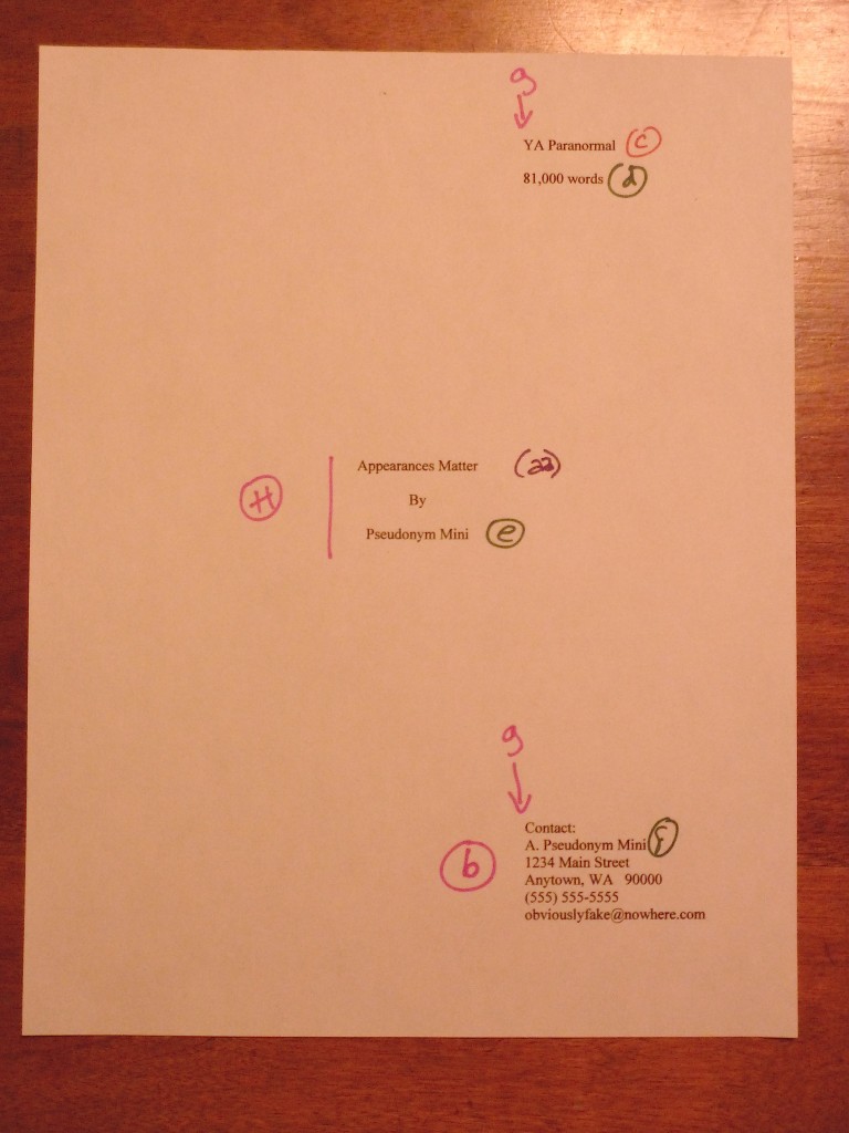
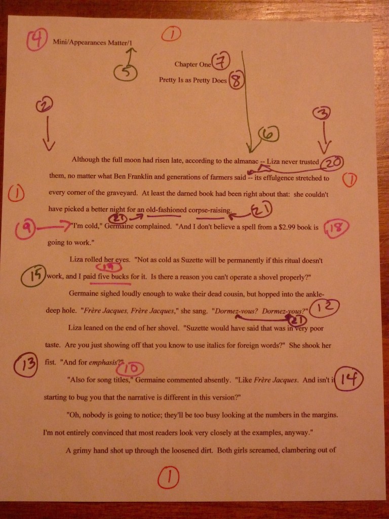
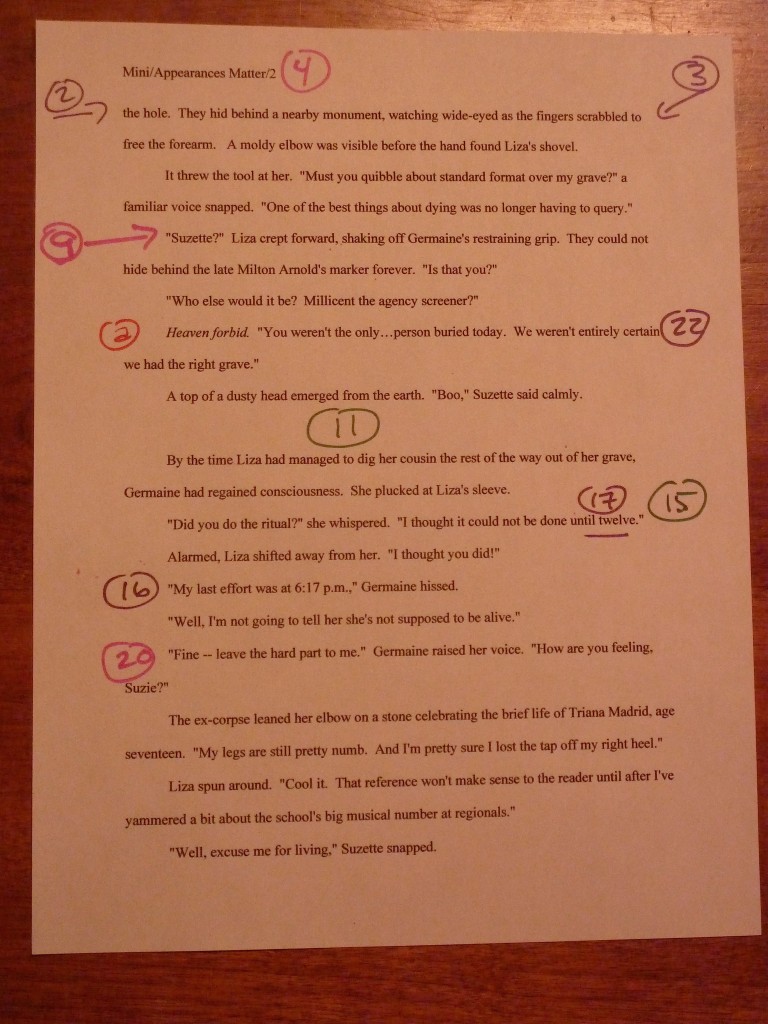
It may be possible to see a world in a grain of sand and eternity in an hour, but that doesn’t mean a submitter should play fast and loose with the space-time continuum

green anemone

Happy Memorial Day weekend, U.S.-based readers! Since one of the many, many sacrifices those of us devoted to the difficult task of self-expression routinely make is to trade what other folks might do with their long weekends for gloriously uninterrupted hours of writing — or, better yet, revising! — I thought you might appreciate a glimpse of the world outside your writing studios. Now get back to work!

Actually, I have an ulterior motive for opening with that photo: as I’m certainly not going to be the first to point out, those of us who read manuscripts for a living are noted for looking not just at the big picture — is this an interesting story? Does it grab the reader from the get-go? And the question dear to writers everywhere, is it well-written? — but also at the granular level. It also probably won’t stop the presses to point out that the notoriously close reading any given manuscript has to survive in order to be seriously considered for publication tends to come as a great, big, or even nasty surprise to a lot of first-time submitters. And don’t even get me started on how many literary contest entrants seem to operate on the assumption that contest judges are specifically selected for their propensity to read with a charitable eye.

Does that giant gasp I just heard indicate that some of you fine people have been laboring under one or both of those impressions, or is somebody about to go for a nice, leisurely swim? If it’s the former, you’re definitely not alone: all too often, talented writers new to the game rush their manuscripts out the door the instant after they’ve typed the last page, presumably in the fond hope that all agents, editors, and contest judges are such lovers of literature that they will judge the book by nothing but how well it’s written. And possibly, to a lesser extent, by the inherent interest of the story.

Or so Millicent the agency screener must surmise from how many of those submissions apparently have not been spell-checked. Or grammar-checked. Or even read through since the last revision, because how else could the writer not have noticed that several words seem to have dropped out of that sentence on page 33?

Oh, stop groaning. Don’t you want your future agent and acquiring editor to fall so in love with your writing that they examine it from every angle, down to the last grain of sand?

Before I take that resounding, “Heavens, no!” for an unqualified yes, let me hasten to remind you that in the long run, it truly is better for your book if the agent of your dreams (and Millicent, the stalwart soul s/he has entrusted to narrowing the thousands of queries and hundreds of submissions a good agent receives to the handful that s/he would actually have time to read without sacrificing the book-selling side of the job entirely) pays attention to the little stuff. Why? Well, let me put it this way: if Millicent’s eye may legitimately be called nit-picky, a good acquiring editor’s peepers should be regarded as microscopic.

Oh, you thought it was easy to read closely enough to catch that the narrative has used the same image on page 12 and page 315? Or that the writer fell so in love with the word verdant that it appears every time that anything vaguely green flashes by the reader’s consciousness? In a book about lawn care?

So if this series’ focus upon the little visual details has occasionally seemed a trifle, well, obsessive, congratulations — you’re gaining real insight into what professional readers are trained to do. And think about it: if Millicent and her ilk must pay such close attention to the text, how likely are they to catch any formatting glitches?

Uh-huh. Hard to miss that sea anemone lying on the sand, isn’t it?

In order to give you a Millicent’s-eye view of your manuscript, for the past few posts in this series, we’ve been comparing manuscripts in standard format with improperly-formatted ones. Yes, it’s been a lengthy slog, but hands up, those of you who have never had the opportunity to see a manuscript that actually got picked up by an agent and published by a traditional house up close and personal.

See, I told you that you were not alone. Quite the forest of hands, isn’t it?

In my experience, most rookie submitter mistakes arise not merely from simple ignorance of the strictures of standard format, but from the low-level panic that comes from having to guess whether one is performing the secret handshake correctly. The better an aspiring writer understands the rules, the less guesswork is involved. It may not eliminate the stress of submission entirely, but it does at least remove one of the most common stressors from the mix.

Okay, so it’s not what the average would think of as a little light weekend recreational stress release. Were you under the impression that being a brilliantly incisive observer and chronicler of the human condition was ordinary?

Which is why I’m completely confident that you’re up to the challenge of thinking of your writing on several levels simultaneously. Particularly when, like the savvy submitter that you are, you are reading your ENTIRE manuscript IN HARD COPY and OUT LOUD before sending it to anyone even vaguely affiliated with a literary contest or the publishing industry. Lest we forget, it’s much, much easier to catch formatting issues, typos, and logic problems that way.

Do I sense that simmering resentment at how hard it is for a new writer to break into print beginning to bubble up to the surface? “But Anne!” I hear aspiring writers everywhere shout, and who could blame you? “I don’t have a problem with making my manuscript ship-shape on a writing level before passing it under Millicent’s critical spectacles. Granted, revision can be a trifle irritating, but what really irks me is that after I’ve done it, that lovingly worked and reworked prose could be knocked out of consideration because of some arbitrary expectations about how professional book manuscripts should look on the page. Isn’t that just an annoying additional hoop through which I’m expected to leap, and don’t I have every right to resent it?”

Well, not exactly, bubblers-up. As we’ve been discussing, the rules of standard format actually are not arbitrary; most of them have a strong practical basis that might not be readily apparent from the writer’s side of the submission desk. Let’s take, for instance, the relatively straightforward requirements that manuscripts should be entirely typed, double-spaced, and have 1-inch margins all the way around.

I hear some of you snickering, but Millicent regularly reads submissions that do not conform to standard format in one or even all of these respects. It’s not unheard-of for diagrams to be hand-drawn, pages hand-numbered, or for late-caught typos to be corrected in pen. Or for an e-mailed query to an agency that asks to see the first few pages to be single-spaced — because that’s the norm for an e-mail, right?

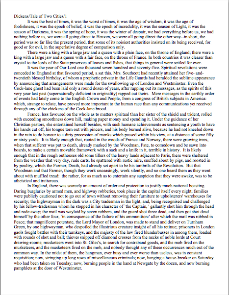
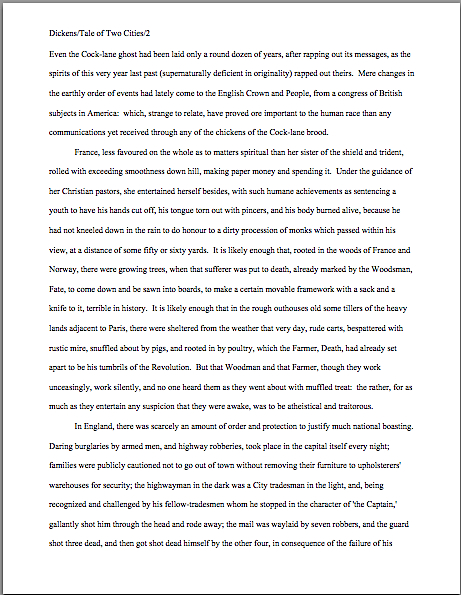
Let’s take a peek at why all of those rules necessary, from a professional point of view. For continuity’s sake, let’s once again call upon our old friend Charles Dickens again to see what a page of a manuscript should look like — actually, since we’ve been looking at so many first pages lately, let’s live dangerously, shall we? Here are pages 1 and two.

2 cities good
2 CIties right page 2

Relatively easy to read, isn’t it? (Assuming that you find it so, of course. If it’s too small to read easily on your browser, try holding down the COMMAND key and hitting + until the type is large enough to read comfortably.)

To give you some idea of just how difficult it would be to screen, much less hand-edit, a manuscript that was not double-spaced or had smaller margins, take a gander at this little monstrosity. To render it an even better example of what makes Millicent’s optician rend his garments in despair, I’ve gone ahead and submitted a fuzzy photocopy, rather than a freshly-printed original.

I believe the proper term for this is reader-hostile. Even an unusually patient and literature-loving Millicent would reject a submission like this immediately, without reading so much as a word. As would, more often than not, Mehitabel.

And honestly, can you blame them?

Did I hear a few spit-takes after that last set of assertions from those of you joining us in mid-argument? “My goodness, Anne,” sputter those of you wiping coffee, tea, or other beverage of your choice off your incredulous faces, “why would any sane person consider presentation violations that serious an offense? It is, after all, precisely the same writing. Sure, it’s a little harder to read, but if it’s an e-mailed submission, Millicent could just expand the image. And it’s not as though Millicent’s boss, the agent of Charles’ dreams, couldn’t just ask him to reformat it.”

Yes on both counts, but surely you can appreciate why the Charles who submitted that last page would strike anyone accustomed to handling manuscripts as a much, much more difficult writer to work with than the Charles behind our first set of examples. The latter displays a fairly significant disregard for not only the norms of standard format, but also the optical comfort of the reader. Not to mention just shouting, “Hey, I don’t expect any feedback on this, ever!”

Oh, you didn’t spot that? Anyone who handles manuscripts for a living would. Even with nice, empty page backs upon which to scrawl copy edits, trying to cram spelling or grammatical changes between those lines would be well-nigh impossible. Knowing that, Millicent would never dream of passing such a manuscript along to the agent who employs her; to do so would be to invite a stern and probably lengthy lecture on the vicissitudes of the life editorial — and that fact that, despite impressive innovations in technology, intensive line editing a single-spaced document in either hard or soft copy is well-nigh impossible.

Too hard on the eyes — and where on earth would the comments go on the hard copy?

Don’t tempt her to reject your submission unread — and don’t even consider, I beg of you, providing a similar temptation to a contest judge. Given the sheer volume of submissions Millicent reads, she’s not all that likely to resist. The contest judge, on the other hand, will be specifically instructed not to resist at all.

Yes, really. Even if the sum total of the provocation consists of a manuscript that’s shrunk to, say, 95% of the usual size, Mehitabel is likely to knock it out of the running on sight.

Are some of you are blushing? Perhaps some past contest entrants and submitters who wanted to squeeze in a particularly exciting scene before the end of those requested 50 pages?

No? Let me fill you in on a much-deplored practice, then: faced with a hard-and-fast page limit, some wily writers will shrink the font or the margins, to shoehorn a few more words onto each page. After all, the logic runs, who is going to notice a tenth of an inch sliced off a left or right margin, or notice that the typeface is a trifle smaller than usual?

Millicent will, that’s who, and practically instantly. As will any reasonably experienced contest judge; after hours on end of reading 12-point type within 1-inch margins, a reader develops a visceral sense of roughly how many characters fit on a properly-formatted page.

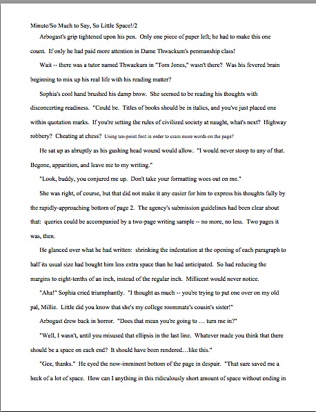
Don’t believe me? Go back and study the correctly formatted page 2 in our first example. Then take a gander at this wee gem of tricky intent:

2 Cities cheating page 2

Admit it: you can tell it’s different, can’t you, even without whipping out a ruler? Yet I shaved only one-tenth of an inch off each margin and shrunk the text by 5% — far, far less of a reduction than most fudgers attempt when, say, they’re trying to fit 26 pages of manuscript into a contest entry with a 25-page limit. So how likely is this little gambit to pay off for the submitter?

Exactly. Amazingly enough, people who read for a living very seldom appreciate attempts to trick them into extraneous reading. No matter how much Charles felt that last example added life to his opening — or how right he was about that — Millicent will simply notice that he tried to cheat in order to get more of his words in front of her eyeballs than writers conscientious enough to follow the rules. Next!

The same principle applies, incidentally, to query letters: Alarmingly often, aspiring writers, despairing of fitting a coherent summary of their books within the standard single page, will shrink the margins or typeface on a query. “What’s two tenths of an inch?” they reassure themselves. “And honestly, who is going to be able to tell the difference between 12-point type at 99%, rather than 100%?”

Help yourself to a gold star for the day if you immediately answered: “Someone who reads queries all day, every day. And two-tenths of an inch all around can, as Uncle Charles has just demonstrated, add up to a great deal more text on a page.”

Another common means of fudging spacing: incomplete adherence to the rules bout skipping spaces after periods and colons. Specifically, skipping two spaces (as tradition requires) in most instances, but omitting the second space when doing so would make the difference between a paragraph’s ending with a single word on the last line and being able to use that line to begin a new paragraph.

Shame on you, those who just bellowed, “Wow, that’s a great idea — over the course of an entire chapter, that might free up a page of text for my nefarious purposes!” Don’t you think inconsistent spacing is the kind of thing a reader trained to spot textual oddities might conceivably notice?

And for good reason: waffling about how often to hit the space bar can be a tell-tale sign that a writer isn’t altogether comfortable with writing in standard format. Such a writer’s work would, presumably, need to be proofread for formatting more closely than other agency clients’ work, would it not? And that in turn would mean that signing such a writer would inevitably means devoting either unanticipated staff time to double-checking his manuscripts or training in the delights of consistent rule application, right?

Those rhetorical questions would be equally applicable whether the agency in question happened to favor either the two-space or one-space convention, incidentally. Consistency is the key to proper manuscript formatting, after all, and all the more likely to be valued if an agency’s guidelines ask for something specific in a submission.

Why? Well, think about it: when you first thought about querying and submitting, would it have occurred to you to check each and every agency’s website (if it has one; not all do, even at this late date) for submission guidelines? So if you were the Millicent screening manuscripts for an agent with a desperate aversion to that second space after the comma (she had a nasty run-in with a journalist on a cross-country flight , perhaps; he may have menaced her with a copy of the AP’s formatting guidelines), and your boss had been considerate enough to post a reference to that aversion on the agency’s website, on her blog, and in 47 online interviews, wouldn’t that be one of the first things you looked for in a submission?

Let’s all chant it together, shall we? If an agency or publishing house’s submission guidelines ask for something specific, for heaven’s sake, give it to them. But don’t generalize that individual preferences to the entire industry, okay? And if they don’t express a preference, stick to standard format.

Yes, regardless of what you may have heard online about how nobody is using double-spacing after periods and colons in book manuscripts anymore. It’s simply not true that it’s generally an instant-rejection offense, on the grounds that manuscripts including the second space look hopelessly old-fashioned to agents and editors.

Well, guess what, cookie — standard manuscript format is old-fashioned, by definition. That doesn’t seem to stop most of the currently-published authors of the English-speaking world from using it. In fact, in all of my years writing and editing, I have never — not once — seen an already agented manuscript rejected or even criticized for including the two spaces that English prose requires after a period or colon. Possibly because those that feel strongly about the single-space convention tend to be up front about not being likely to fall in love with submissions featuring what they perceive to be extra spaces.

I have, however, heard endless complaint from professional readers about those second spaces being omitted. Care to guess why?

If you said that cutting those spaces throws off word count estimation, clap yourself heartily on the back: standard estimates assume those doubled spaces. (If you don’t know how and why word count is tallied, please see the HOW TO ESTIMATE WORD COUNT — AND WHY category on the archive list at right.) Give yourself a nice, warm hug if you also suggested that omitting them renders a manuscript harder to hand-edit. Because we all know about the lecture Millicent is likely to get if she forgets about that, right?

I can sense blood pressure rising over this issue, but honestly, inconsistent application of either rule is far more likely to raise red flags with Millicent than clinging like an unusually tenacious leech to either the one- or two-space convention. Particularly if that inconsistency — or slightly off sizing — seems to allow more words per page than is usual.

My point, should you care to know it, is that a pro isn’t going to have to look very hard at a space-deprived page to catch on that there’s something fishy going on, so let’s work a bit more to increase your visceral sense that something is wrong. Since Dickens was so fond of half-page sentences, the examples I’ve been using above won’t illustrate my next common gaffe very well.

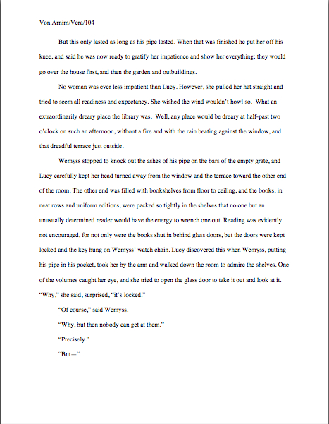
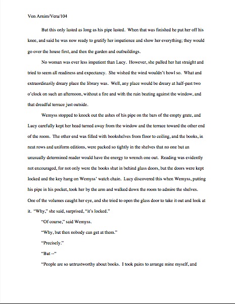
Reaching blindly into the depths of the bookshelf next to my computer, I seem to have grabbed Elizabeth Von Arnim’s wonderful take on the Bluebeard myth, VERA. Taking a page at random, let’s take a look at it properly formatted in manuscript form.
Vera correctly

There are 310 words on this page; I wasn’t kidding the other day about how far off the standard word count estimations could be. Now cast your eye over the same text with a couple of very minor formatting alterations.

Doesn’t look significantly different to the naked eye, does it? Yet the word count is slightly lower on this version of this page — 295 words. That may not seem like a big difference, but it’s enough to make quite a difference over the course of an entire manuscript.

“But Anne,” I hear some sharp-eyed readers exclaim, “wasn’t the word count lower because there was an entire line missing from the second version?”?

Well spotted, criers-out: the natural tendency of omitting the second spaces would indeed be to allow more words per page, not less. But the scanter space between sentences was not the only deviation from standard format here; Millicent, I assure you, would have caught two others.

I tossed a curve ball in here, to make sure you were reading as closely as she was. Wild guesses? Anyone? Anyone?

The error that chopped the word count was a pretty innocent one, almost always done unconsciously: the writer apparently did not turn off the widow/orphan control, found in Word under FORMAT/PARAGRAPH/LINE AND PAGE BREAKS. As we were discussing only the other day, this insidious little function, the default unless one changes it, prevents single lines of multi-line paragraphs from getting stranded on either the bottom of one page of the top of the next.

As you may see, keeping this function operational results in an uneven number of lines per page. Which, over the course of an entire manuscript, is going to do some serious damage to the word count.

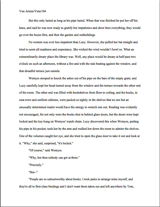
As would tinkering with the bottom margin to allow an extra line on the page. Here it is with only a minor change, a .9 inch bottom margin instead of 1 inch, a modification so minute that a non-professional reader would probably not notice that it was non-standard. To compress a bit more, let’s have only one space after each period.
Vera with extra line

A bit claustrophobic, is it not? If you don’t find it so, consider it as Millicent would: not as an individual page, isolated in space and time, but as one of the several thousand she has read that week. Lest we forget, most of the ones she will have been taking seriously will have looked like this:

Vera correctly

See it now? While Millicent is highly unlikely to have either the time or the inclination to whip out a ruler to check whether that bottom margin is really a full inch (although Mehitabel might), she will be able to tell that this page has more words on the page than the others she has seen that day. She might not be able to tell instantly precisely how this page has been modified, but she will be able to tell that something’s off.

“But Anne,” clever rule-manipulators all over North America shout, “I’ve been modifying my submissions this way for years, and nobody has ever called me out on it. Therefore, I do not believe it’s ever been a factor in my work being rejected — and it does allow me to stay under that all-important 400-page limit.”

Perhaps, rules-lawyers, but let me ask you a question: have you ever had such a manuscript accepted?

Well might some jaws drop. It’s an extremely common submitter’s misconception, especially amongst those brand-new to the game or who have only submitted pages as part of a query packet, rather than as requested materials, that if they were really doing something wrong, the rejecter would tell them so. And tell them what it is, naturally, so they could do better next time.

In these days of form-letter rejections — and even no-reply rejections — this is simply an unrealistic expectation. Unless an agent or editor is asking for the writer to revise and resubmit the manuscript (in itself something of a rarity these days), why would they take the time?

Well, yes, to be nice would be a perfectly acceptable response, from a writer’s perspective. If a well-established agent received only a hundred queries per month and asked for one manuscript — not all that uncommon a ratio thirty years ago — writing personalized rejections would be both kind and not unduly time-consuming. Presuming, of course, that the rejected writer of the month did not consider a detailed rejection an invitation to argue about the manuscripts merits.

Consider for a moment, though, the agent that receives hundreds of queries per day. See why kindly advice-giving rejection letters might have become something of a rarity?

Especially if the rejection reason had to do with a formatting error. Honestly, it would eat up half of Millicent’s screening day. Why? Well, most submissions contain at least one — formatting problems, like typos, grammar gaffes, and wolves, tend to travel in packs. Even with the best of wills, it would be prohibitively time-consuming for Millicent to scrawl try learning how to format a manuscript, honey.

No, regardless of whether the ultimate rejection trigger for VERA was that extra line per page, the second misspelling in paragraph 2, or a premise that Millicent has seen seventeen times that week, the reasons given for sending back the submission would probably run like this: I’m sorry, but this manuscript does not fit our needs at this time. I just didn’t fall in love with this story, and I don’t feel that I can sell this in the current tough market. Best of luck placing it elsewhere.

The moral of this sad, sad story: it seldom pays to assume that you’re doing it right just because you haven’t been told you are doing it wrong. It pays even less often to conclude from the generalities of a boilerplate rejection that there can’t have been any specific technical problem that caused Millicent, if not to reject it outright, then at least to take the submission less seriously.

Besides, another notorious agents’ pet peeve was lurking in the background — although in all probability, it would have irritated a contest judge far more than Millicent. Here’s the page again; see if you can spot it this time. Hint: it was not in the properly-formatted version.

Crown yourself with a laurel wreath if, while running your eyes thoughtfully over that last example, your peepers became riveted to the next-to-last line of the page: an emdash (–, one long line) instead of a doubled dash with spaces on either end. Here again, we see that the standards that apply to printed books are not applicable to manuscripts.

Which brings me to yet another moral for the day: just because a particular piece of formatting looks right to those of us who have been reading books since we were three doesn’t mean that it is correct in a manuscript. Or book proposal. Or contest entry.

Or a professional reader wouldn’t instantly spot a trifle imported from the wonderful world of published books. Remember, Millicent scans manuscripts all day; contest judges read entries for hours at a time. After a surprisingly short while, a formatting issue that might well not even catch a lay reader’s attention can begin to seem gargantuan.

Please don’t dismiss this as unimportant to your success as a writer. If writing is solid, it deserves to be free of distracting formatting choices. You want agents, editors, and contest judges to be muttering, “Wow, this is good,” over your manuscript, not “Oh, God, he doesn’t know the rules about dashes,” do you not?

Spare Millie the chagrin, please; both you and she will be the happier for it. Believe me, she could use a brilliantly-written, impeccably-formatted submission to brighten her possibly Dickensian day. Be compassionate toward her plight — and your submission’s, proposal’s, and/or contest entry’s. Pay close enough attention to the technical details that yours the submission that makes her say, “Oh, here is good writing, well presented.”

My, all of those individual grains of sand are attractive, aren’t they? Keep up the good work!

The rules, part III: the bare necessities

restrooms & cemeteries

The wee tourist trap where I took this is stuffed to the gills with practical people, evidently. If you look closely in the background, you’ll see that there’s also a liquor-and-sundries store. In retrospect, I wish I’d documented what the locals considered sundry, as opposed to requisite.

Beginning to sense a theme here? Excellent. Today, I would like us to focus our collective minds firmly on the practical while we continue our chat about how to present a book manuscript in a professional manner.

I would hate, after all, for any of you lovely people to fall into the oh-so-common pre-submission trap of believing that because implementing one or more of these rules will take some time (and thus slow the egress of your manuscript from your writing digs), any of them may be treated as optional. Oh, our old pal Millicent the agency screener isn’t going to burst into your studio, wrest the keyboard from your trembling hands, and forcibly insert indentation into your paragraphs. She’s not going to take a ruler to your margins, either, in all probability, or call you on the phone to yell at you because Chapter 2 began on the same page as the end of Chapter 1, any more than she’s likely to tell everyone in the literary world that for some reason best known to yourself, you’ve evidently decided that Microsoft’s defaults have come to dictate formatting in the entirely unrelated publishing industry.

She simply doesn’t have the time to do any of that. She’s got hundreds of submissions to read.

That doesn’t mean, however, that a screener or contest judge might not get the urge to indulge in a little educational mayhem. Like anyone else in a position to read an average day’s complement of submissions, our Millicent sees an incredible amount of good writing presented as though presentation couldn’t possibly matter.

As I’m hoping today’s grim opening image will remind you, that’s just not true. Inevitably, the cosmetic aspects of a submission affect how someone who works with professionally-formatted manuscripts will respond to what’s on the page.

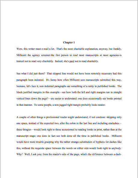
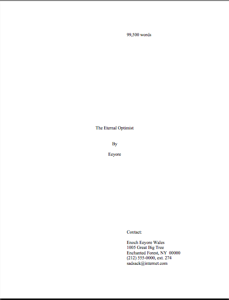
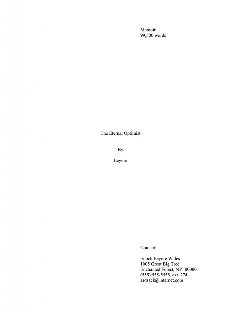
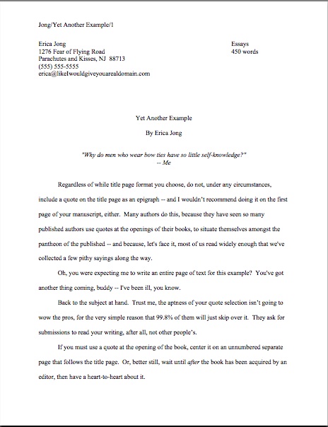
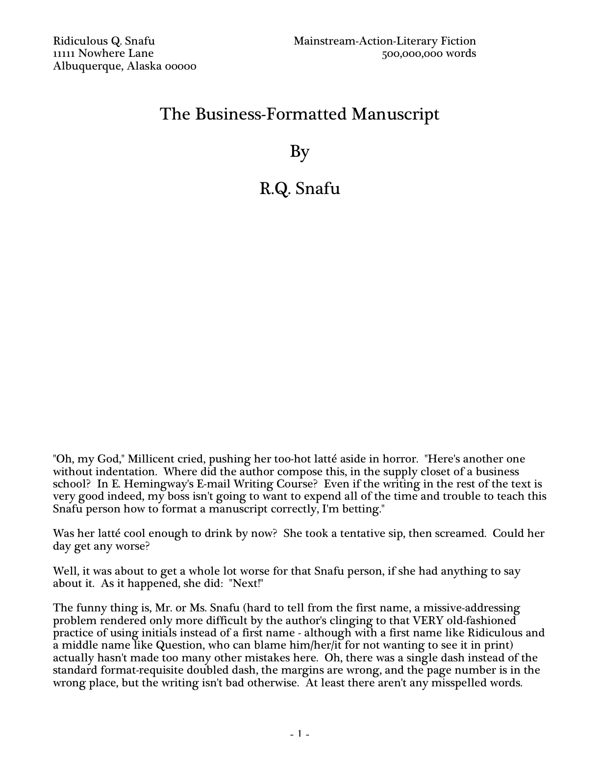
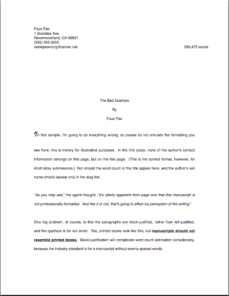
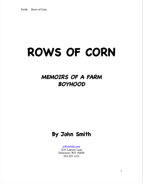
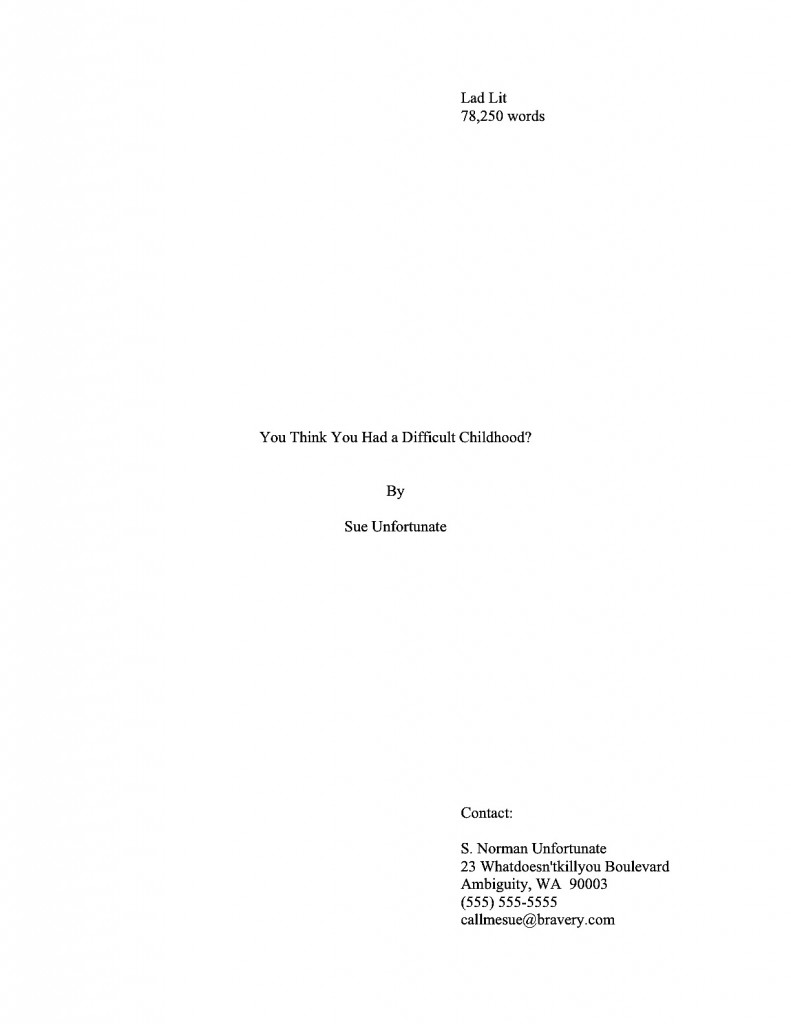
Don’t believe me? Perhaps you missed our recent brief visual tour of a properly-formatted manuscript. If so, slip your tootsies into Millicent’s moccasins and compare what you would have expected a page 1 to look like:

With the following page 1, riddled with fairly common deviations from standard format. If you’re having trouble seeing the details, try holding down the COMMAND key and pressing + to enlarge the image.

Visibly different from across the room, isn’t it? As we’ve been discussing, since U.S.-based agencies send out their clients’ manuscripts in a specific format, a submission presented in any other manner just doesn’t look right to those of us who read for a living. Once you know how a page is supposed to look, even minor deviations distract the eye.

Since that generally comes as a big, ugly surprise to writers who have never had the opportunity to see a professionally-formatted manuscript, the temptation to fudge is quite understandable. Especially in a contest entry, in order to fit desired text into a limited number of pages, something that has occurred to so many entrants for so many years that many literary contests simply disqualify any entry that doesn’t follow its formatting rules.

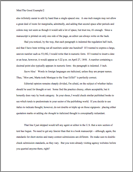
Sadly, the writers pulling off this sort of trick often believe they’re being subtle — or don’t know that fudging in order to include more words per page than other entrants is a knock-you-out-of-finalist-consideration offense. But how could it not be, when the results are so obviously different from a manuscript adhering to standard format? Compare this page 2:

With this:

Really no chance of Millicent’s missing the spacing tricks here, is there? See what I mean about those familiar with standard format’s enjoying a distinct advantage at submission time?

While I’m horrifying you, guess what she’s trained to do with a partial manuscript in which the writer has messed with the margins, font size, or new chapter formatting in order to have a favorite scene fall within the requested page limit? Or, even more commonly, to prevent the break at the bottom of page 50 (or whatever is the last of the requested pages) from occurring in mid-scene, if not mid-sentence?

Uh-huh: “Next!”

Don’t see why? Well, in the first place, it never fails to astonish, amuse, and/or perplex those of us who read for a living that any aspiring writer, no matter how inexperienced, would presume that an agent or editor would ask for a set number of pages, expecting a scene, section, chapter, or even sentence to end precisely at the bottom of it. That virtually never happens naturally.

You’d never know that, though, from how often an agency’s request for the first 50 pages yields either the type of compressed text we saw above or this type of chapter break:

I’d show you a counterexample of a chapter break correctly formatted, but you’ve already seen it, in essence: the opening of Chapter Two should begin on a fresh page — and look precisely like the first page of Chapter One.

Hard to get more practical than that, eh?

Whether you are being surprised and stunned by the rigors of standard format for the first time or working your way though this series as a veteran, it is very much to your advantage to learn these rules, then apply them consistently throughout your manuscript. While it is undoubtedly time-consuming, investing a few days in formatting your manuscript properly will in the long term save you a whole heck of a lot of time.

It’s true, honest. While the applying these rules to a manuscript already in progress may seem like a pain, practice makes habit. After a while, the impulse to conform to the rules of standard format becomes second nature for working writers. The manuscript came into the world correct — which, in turn, saves the writer revision time. On a deadline, those conserved minutes and hours can save the writer’s backside as well.

Oh, you may laugh, but the more successful you are as a writer, the more likely the day will come when you’re not going to have the half an hour it would take to reformat a inconsistent manuscript before your editor calls to demand why you didn’t e-mail those revisions yesterday. Writing a requested new chapter (yes, it happens) in standard format may make the difference between getting it under your agent’s nose before she leaves for the day/weekend/her honeymoon/to deliver that baby and missing the boat. And hands up, every contest entrant who has dashed panting into a post office 32 seconds before it closed, to get that entry postmarked on the last possible day.

Seriously, committing to formatting your pages correctly from the get-go will render you a better professional writer — and definitely a better agency client. Think about it: if you were Millicent’s boss, the agent of your dreams, would you rather be drumming your fingers on her desk for the extra hour it will take your client who prefers to write in some other format to whip the new version of Chapter 7 that editor interested in acquiring the book requested, or would you prefer to receive it as soon as the writer polishes it off?

And if you were lucky enough to be the writer in this situation — hey, acquiring editors don’t ask for changes in manuscripts they don’t like — would you be happier performing that lighthearted little revision changing the protagonist’s sister Wendy into her brother Ted if you did not also have to make the time to alter the formatting, or if you did? You’re going to have enough on your plate, rushing to work those revisions into the plot: s/he is no longer a corporate lawyer, but a longshoreman, and Uncle George dies not of a heart attack, but of 12,000 pounds of under-ripe bananas falling on him from a great height when he goes to the docks to tell Ted that Great-Aunt Mandy is now Great-Uncle Armand. (If only Ted had kept a better eye on that load-bearing winch!)

Stop looking so smug, nonfiction writers: you’re even more likely to end up wanting those saved minutes. Nonfiction contracts often specify delivering the finished manuscript rather quickly, and it’s far from unusual for the acquiring editor to ask for a different running order, or even different chapters, than a proposal laid out. Trust me, at that junctures, the last thing you’ll want to have to worry about is whether your margins are consistent.

And all of that’s the good news, what happens if everything goes right. The more successful you are as a writer — any kind of writer — the more often you will be churning out pages in a hurry. Just ask any author whose agent is breathing down her neck after a deadline has passed. Especially if the writer didn’t know about the deadline until it had already come and gone.

Oh, how I wish I were kidding about that. And don’t even get me started on the phenomenon of one’s agent calling the day after Thanksgiving to announce, “I told the editor that you could have the last third of the book completely reworked by Christmas — that’s not going to be a problem, is it?”

Think you’re going to want to be worrying about your formatting then? Believe me, you’re going to be kissing yourself in retrospect for learning how to handle the rote matters right the first time, so you can concentrate on the hard stuff. (What would many tons of bananas dropped from that height look like in transit, anyway?)

Fortunately, standard format sinks into one’s very bones with use; in practical terms, it honestly is easier than what many aspiring writers are already doing to their pages. I’m constantly encountering writers who tinker endlessly with the settings on their Word programs because they heard somewhere (in the finest tradition of rumor, they are often unsure precisely where) that the default setting for double-spacing is not the precise size agents really want, or hand-constructing quotation marks out of pixels so they will look like the ones in a favorite published book, or painstakingly typing the slug line onto the top of each and every page of a word-processed document, rather than typing the darned thing into the header once and being done with it.

All of these are bits of writerly obsession I’ve seen in person, by the way. I wasn’t kidding about these rules saving you time in the long run.

Still don’t believe that it’s worth your time to learn the rules — and to apply them consistently every single time you sit down to write any prose that might conceivably end up in a book manuscript? Okay, here’s an even stronger motivation: virtually always, an agent, editor, contest judge, or screener’s first reaction to an improperly-formatted manuscript is not to take the writing it contains very seriously.

Why should they? Obviously, this writer is still learning how to play the game; if she’s truly talented and determined, the logic runs, she’ll respond to the bone-crushing depressive effect of rejection by realizing she needs to learn the rules. In the long run, that will make her a better, more productive professional writer. And if by some mysterious chance she does not respond to being told her book isn’t agency-ready by giving up on it, or if she does not possess the psychic skills to derive you should find out what professional manuscripts look like from a form letter blandly stating, this manuscript does not meet our needs at this time, well, Millicent sees too many perfectly-formatted submissions in any given week of screening to fill her boss’ new client spots several times over.

I know: trying. Yet as I believe I may have mentioned once or twice before, I do not run the universe, and thus do not make the rules. Sorry. No matter how much I would like to absolve you from some of them, it is outside my power. Take it up with the fairy godmother who neglected to endow me with that gift at birth, okay?

Until you have successfully made your case with her, I’m going to stick to wielding the skills that she did grant me, acquired through a childhood surrounded by professional writers and editors who made me learn to format pages the right way the first time. Oh, you may chuckle, but my fifth-grade history paper was in standard format; I can still hear my mother blithely dismissing my poor, befuddled teacher’s protests that none of the other kids in the class were typing their papers with, “Well, honestly, if Annie doesn’t get into the habit of including slug lines now, where will she be in twenty years?”

Where, indeed? The strictures of standard format are hardly something that she would have wanted me to pick up on the street, after all.

So let’s start inculcating some lifetime habits, shall we? To recap the rules we’ve studied so far:

(1) All manuscripts should be printed or typed in black ink and double-spaced, with one-inch margins around all edges of the page, on 20-lb or better white paper.

(2) All manuscripts should be printed on only one side of the page and unbound in any way. For submission to US-based agencies, publishing houses, and contests, the pages in question should be US-standard 8.5″ x 11″ paper.

(3) The text should be left-justified, not block-justified. By definition, manuscripts should not resemble published books in this respect.

(4) The preferred typefaces are 12-point Times, Times New Roman, Courier, or Courier New — unless you’re writing screenplays, in which case you may only use Courier. For book manuscripts, pick one (and ONLY one) and use it consistently throughout your entire submission packet.

(5) The entire manuscript should be in the same font and size — no switching typefaces for any reason. Industry standard is 12-point.

(6) Do not use boldface anywhere in the manuscript but on the title page — and not even there, necessarily.

(7) Every page in the manuscript should be numbered — except the title page. The first page of text is page 1, not the title page.

(8) Each page of the manuscript (other than the title page) should have a standard slug line in the header. The page number should appear in the slug line, not anywhere else on the page.

(9) The first page of each chapter should begin a third of the way down the page. The chapter title should appear on the first line of the page, not on the line immediately above where the text begins.

(10) Contact information for the author belongs on the title page, not on page 1.

(11) Every submission should include a title page, even partial manuscripts.

Everyone ready to devote the rest of his or her long, productive creative life doing all of that? If not, this would be a dandy time to pipe up with questions, concerns, and fruitless protests. While you’re formulating ‘em, let’s move on.

(12) The beginning of every paragraph of text should be indented .5 inch. No exceptions, ever.

Right off the bat, here is a way to save some of you conscientious rule-followers some time. Most word-processing programs (Including Word, if left to its own devices) automatically indent .5 inch (12.7 mm, if my junior high school conversion formula is still correct), but as you’ve probably noticed in practice, that’s more than five spaces.

Such is the way of the world. If you set your tabs to .5 inch, you’ll be set.

Why is the number of spaces relevant here? Well, the usual way this rule is expressed is indent every paragraph 5 spaces, a quaint hangover from the days when typewriters reigned supreme. As you may have heard somewhere, however, MS Word, the standard word processing program of the U.S. publishing industry, automatically sets its default first tab at .5 inch. Yet unless you happen to be using an unusually large typeface like Courier, you’ve probably noticed that hitting the space bar five times will not take you to .5 inches away from the left margin; in Times New Roman, it’s more like 8 spaces.

Does this mean all of us should be whipping out our measuring tapes, painstakingly hand-crafting a specialized tab that’s the exact equivalent of five actual characters, down to the last micron? Of course not — but would you be surprised to hear how many aspiring writers do just that?

Their confusion is understandable: this is genuinely one of those things that actually has changed in theory, if not visibly on the page, since the advent of the personal computer. To set the nervous at ease, let’s take a moment to talk about why is standard indentation at .5 inch now, rather than at five characters.

History, my dears, history: back in the days when return bars roamed the earth instead of ENTER keys, there were only two typefaces commonly found on typewriters, Pica and Elite. They yielded different sizes of type (Pica roughly the equivalent of Courier, Elite more or less the size of Times New Roman), but as long as writers set a tab five spaces in, and just kept hitting the tab key, manuscripts were at least internally consistent.

With the advent of the home computer, however, word-processed manuscripts became the norm. The array of possible typefaces exploded. Rather than simply accepting that every font would yield slightly different indentation sizes, the publishing industry (and the manufacturers of Word) simply came to expect that writers everywhere would keep hitting the tab key, rather than hand-spacing five times at the beginning of each paragraph. The result: the amount of space from the left margin became standardized, so that every manuscript, regardless of font choice, would be indented the same amount.

So why pick .5 inch as the standard indentation? Well, Elite was roughly the size of Times New Roman, 12 characters per inch. Pica was about the size of Courier, 10 characters per inch. The automatic tab at .5 inch, therefore, is as close as even the most historical-minded editor could desire to five spaces from the left margin in Pica.

All of which is a long-winded way of saying that in this instance, at least, Word’s default settings are the writer’s friend. Keep on hitting that tab key.

Again, no exceptions. If I had my way, no aspiring writer would ever send so much as a Christmas card in block-style business format to anyone working in the publishing industry. It’s fine in an e-mail (and thus an e-mailed query, although not in any pages an agency’s submission guidelines might permit a querier to include in the body of the e-mail), but on the page, it just looks as though the sender is unfamiliar with how words appear in print in American English. Take a gander, if you can bear it:

Wildly different from standard format, isn’t it? And, to those who work with manuscripts and/or published books, it does not look particularly literate.

Why should a savvy writer care about that perception, so long as the writing is good? Well, although literacy has become decreasingly valued in the world at large — picture me weeping copiously — the people who have devoted themselves to bringing excellent writing to publication still tend to take it awfully darned seriously. To folks like your humble correspondent, any document with no indentations, skipping a line between paragraphs, and the whole shebang left-justified carries the stigma of (ugh) business correspondence, not high literature or even stylish letter-writing.

Think of it this way: do you really want the person you’re trying to impress with your literary genius to wonder whether you’ve ever read a published book?

I thought not. And which do you think is going to strike format-minded industry professionals as more literate, a query letter in business format or one in correspondence format (indented paragraphs, date and signature halfway across the page, no skipped line between paragraphs)?

Uh-huh. And don’t you wish that someone had told you that before you sent out your first query letter?

That clattering sound you just heard was the more nervous type of aspiring writer reaching frantically for his mouse, to open up all of his writing files and change them instantly. And frankly, he should: despite the fact that everyone from CEOs to the proverbial little old lady from Pasadena has been known to use block format from time to time (blogs are set up to use nothing else, right?), technically, non-indented paragraphs are not proper for English prose.

Period. That being the case, what do you think Millicent’s first reaction to a non-indented page 1 like our last example is likely to be? Given how many submissions she needs to get through before she can break for lunch, how tempted do you think she would be not to read it at all?

Trust me on this one: indent your paragraphs in any document that’s ever going to pass under the nose of anyone even remotely affiliated with the publishing industry. Make my fairy godmother happy.

Not a good enough reason? Okay, here’s another: adhering to rule #12 carries a fringe benefit — it renders running afoul of rule #13 much less likely, for the exceedingly simple reason that it’s not necessary to keep your paragraphs from running together. Let’s make it official:

(13) Don’t skip an extra line between paragraphs, except to indicate a section break.

That makes sense, right? Since the entire manuscript should be double-spaced with indented paragraphs, there is no need to skip a line to indicate a paragraph break. Which is, in case you were not aware of it, what a skipped line between paragraph means in a single-spaced or non-indented document.

That couldn’t possibly apply to a book manuscript, by definition. There’s a practical reason for that: it’s a comparative pain to edit a single-spaced document, either in hard copy or on a computer screen. The eye skips between lines too easily, and in hard copy, there’s nowhere to scrawl comments like Mr. Dickens, was it the best of times or was it the worst of times? It could hardly have been both!

That being the case, why do aspiring writers so often blithely send off manuscripts with skipped lines, single-spaced or otherwise? My guess would be for one of two reasons: either they think business format is proper English formatting (which it isn’t) or they’re used to seeing skipped lines in print. Magazine articles, mostly. Or blogs. (The blogging program makes me do it, Millicent, I swear.)

Just don’t do it. Reserve the skipped line for section breaks.

A few hands have been waving urgently in the air since I started this section. “But Anne!” those of you who have seen conflicting advice point out, “I’ve always heard that there are specific markers for section breaks! Shouldn’t I, you know, use them?”

You mean the * * * or # to indicate a section break, right? That’s a throwback to the age of typewriters. Their original purpose was to alert the typesetter that the missing line of text was intentional, the author honestly did mean for the chapter to end there, and the narrative ceased because the story was over, not because the writer had passed out from the effort of banging for years on a keyboard that required considerable force to operate.

These days, though, it’s customary to presume that not only will an agent or editor be swift enough on the uptake to understand that the end of the text means the end of the manuscript, but also that the end of one section and the beginning of another is comprehensible without the addition of hieroglyphics. For book manuscripts and proposals, at least; remember, the rules for short stories are different.

If you are writing a book-length work, unless you’re entering a contest that specifically calls for them, or the agency to which you’re planning to submit mentions a preference for them in its submission requirements, don’t distract Millicent by including these extras. Do check contest rules carefully, though; you’d be amazed at how seldom some long-running literary contests update their rules.

And while we’re speaking of rules that have undergone some transformation over time…

(14) Nothing in a book manuscript should be underlined. Titles of songs and publications mentioned in the text, as well as words in foreign languages and those you wish to emphasize, should be italicized. Titles of poems, however, belong within quotation marks.

That’s fairly straightforward, right? Italics are one of the few concessions manuscript format has made to the computer age — again, for practical reasons: underlining uses more ink than italics in the book production process. Thus, italics are cheaper in than underlining.

So if a character feels really strongly that “The Raven” is a much better example of Edgar Allan Poe’s sensibilities than his first published book of poetry, Tamerlane and Other Poems, all Millicent can say is, “Mon ami, I cannot say I agree. Back then, the poor man was still singing Aura Lee with the other cadets.”

In which, of course, she would not be entirely correct. Oh, the formatting’s right — Aura Lee‘s a Civil War song, and Poe left West Point long before that.

Fair warning, though: if you consult an old style manual (or a website that is relying upon an old style manual), you may be urged to underline some or all of the words and phrases mentioned above. As will anyone who learned how to format a manuscript before the home computer became common, for the exceedingly simple reason that the average typewriter doesn’t feature italic keys as well as regular type; underlining used to be the only option. Although I remain fond of typewriters — growing up in a house filled with writers, the sound used to lull me to sleep as a child — the fact is, the publishing industry now assumes that all manuscripts are produced on computers. In Word, even.

I suspect outdated manuals are not the only reason Millicent and her ilk so often receive manuscripts containing underlining, though: as I may have mentioned a few (or a few hundred) times on this site, different fields have different standards. There are some areas of writing endeavor in which underlining is still de rigueur. Unfortunately, it’s really, really common for writing guidelines from all over the place to be posted online as though they are applicable to all writing, anytime, anywhere.

If you are writing a book manuscript or proposal, the only formatting guidelines that should concern you are those specifically applicable to books. Don’t even consider importing rules from, say, short story format; your manuscript will merely come across as confused.

And no wonder, with so much misinformation about italics use floating around the web. To minimize the possibility of any member of the Author! Author! community’s falling prey to this misguided miasma, let’s swiftly review the proper use of italics in a book manuscript.

(a) For foreign-language words appearing in an English-language manuscript, unless the words in question are proper names: people, places. The logic behind this part of the rule is very straightforward: you don’t want the agent of your dreams to think you’ve made a typo, do you?

(b) To emphasize particular words or phrases, as a speaker might do out loud. Since we’ve all seen a million times in print, I shan’t belabor the logic, except to say that typewriter-bound authors used to use underlining for this. So did hand-writers.

(c) Some authors like to use italics to indicate thought, but there is no hard-and-fast rule on this. Remember, though, if thought is italicized in a text, the narrative must be consistent about it. This would be logically redundant such a manuscript:

I’m so cold, Musette thought.

Before you decide whether to italicize thought at all, it’s a good idea to check recently-published books in your chosen book category — not new releases in general, as the practice varies across genres — to see how common it is. Do be aware, too, that many agents and editors actively dislike this style choice. They feel, and with some justification, that a good writer should be able to make it clear that a character is thinking something, or indicate inflection, without resorting to funny type.

I have to confess, as a reader, I’m with them on that last one, but that’s just my personal preference. I find it distracting, especially if a narrative leans to hard upon it: many aspiring writers seem to labor under the impression that dialogue readers will want to know every single time a character applies more breath to one word than another. Like any literary trick, the more often it appears over a short run of text, the more likely the reader is to tire of it — and thus the less efficacious it is as a device.

There are, however, many agents and editors who don’t have a problem with italics at all. Which means, I’m afraid, there is no fail-safe option here. Sorry. You submit your work, you take your chances.

Whichever route you take, however, do make certain to adhere to it throughout your manuscript — you would be astounded at how many submissions will italicize words in foreign languages for ten pages, then underline them for the next sixty. Or simply don’t appear to have been subject to any overarching guidelines at all.

To a professional reader, an uneven application of the rules of standard format can be a red flag, again for practical reasons. Consistency is the hallmark of a strong authorial voice, after all, and professional writers are expected to read and re-read their own work to refine it. If a manuscript simply bellows that its writer has not only never sat down and read the current draft beginning to end — the only way to catch certain types of plot inconsistencies, by the way — it’s usually a pretty good indication that it could benefit from further revision.

And it’s not as though an agent could submit an inconsistently-formatted manuscript to an editor at a publishing house; it wouldn’t show off the writing to its best advantage. Which is, of course, true when the writer submits the manuscript to an agency or literary contest as well.

As I said, the goal here is practical: you want your writing to shine. At minimum, you’re going to want to rid your manuscript of anything that distracts from it.

Next time, we’ll polish off the rest of the rules, and perhaps talk a little about presentation finesse. Keep up the good work!
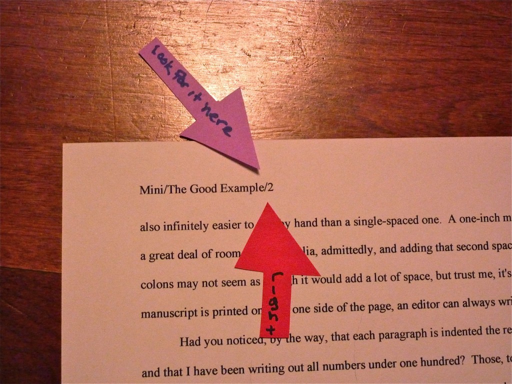
Continuing our discussion of standard format for book manuscripts: not all truths are self-evident

gumballs

Hard to believe anyone in his right mind would actually need to be told that those are gumballs, isn’t it? They strike me as the epitome of the breed: large, spherical, colorful, and — dare I say it? — potentially jaw-breaking. Yet clearly, at some point in the probably not-too-distant past, some passing myopic presumably asked the proprietor, “What are those, gumballs?”

Or maybe it was not a solitary forgetter of much-needed spectacles, or even a half-dozen passers-by with a shared clawing, pathological need to have even their most mundane personal observations confirmed by external sources. Perhaps the poor proprietor simply got tired of answering the same question 4,217 times per week and slapped up a sign.

Those of us who work with manuscripts for a living can sympathize. Merely breathing an editor (or my preferred title, a book doctor), preceded by the pronoun I and the verb to be in quick succession, anywhere in the vicinity of someone harboring even the slightest urge to pen the Great American Novel is to invite an avalanche of questions about manuscripts: how to get them published, how to position them under the eyes of an agent, how to keep them from getting rejected, and, surprisingly often, what they should look like.

Perfectly reasonable questions all, of course: no writer, regardless of how many times the Muses may have whacked her with their talent wands, is born knowing all about the practical aspects of manuscript production. As Plato suggests in his Theaetetus (oh, you thought I was just a pretty face?), in order to recognize something for what it truly is, one first must have a mental image of that thing with which to match it.

To put it a trifle less esoterically: it’s much, much harder to make your pages look right if you’ve never seen a professionally-formatted book manuscript. Call me zany, but in my experience, the best remedy for that is to show aspiring writers — wait for it — a few dozen examples of professionally-formatted book manuscript pages, rather than making them guess.

In close-up, even, as in the first post in this series. I like to think of this endeavor as both pleasing to ol’ Plato and a serious contribution to, if not the future of literature, at least to human happiness. Too many good writers have gotten rejected over the years for not being aware of the rules, or even that rules exist.

Look, kid, here’s a gumball. Study it well, so you may recognize it in the wild.

I know: how nice would it have been had some kind soul discreetly pulled you aside 35 seconds after you first decided to write a book and explained that to you, right? If you’re like most writers, it would have saved you a tremendous amount of time and chagrin to have known before you sat down to compose page 1 that since (a) all professional book manuscripts in the U.S. look more or less alike and (b) any writer who has worked with an agent or publisher would presumably be aware of that, (c) those of us who read for a living can often tell just how long an aspiring writer has been at it by the briefest glance at the page. Thus, contrary to what virtually every aspiring writer completely reasonably presumes at first, (d) one of the best things you can do to get your writing taken seriously by the pros is to format it according to their expectations.

Let me guess, though: you did not tumble squalling into this world knowing any of that, did you? The weird thing is that neither were agents, editors, contest judges, or screeners. Once you’ve had the benefit of seeing a few hundred thousand correctly-formatted manuscript pages, however, you don’t even have to look very hard to notice the difference between a page 1 like this:

And one that looked like this:

You can see the difference from halfway across the room, can you not? So, as it happens, can Millicent the agency screener, her boss, the agent of your dreams, and the editor who will someday, the Muses willing, acquire your book. That’s the inevitable result of experience. Year in, year out, come rain, shine, or hailing wildcats, we cast our eyes over book manuscripts done right and, well, the other kind.

And that, in case any of you perplexed by how much of the information about manuscript formatting floating around out there seems to come from somewhere in the ether, rather than directly from, say, an agency or a publishing house, is why professional readers don’t spend much time doing what I’m sure a lot of aspiring writers positively long for us do, policing the Internet for rogue advice on manuscript formatting. Why would someone who already familiar with the rigors and beauties of standard format bother to look it up online, much less fact-check?

We already know a properly-formatted page when we see it — and when we don’t. “What do you mean — are those gumballs?” we mutter, incredulous. “Isn’t it self-evident?”

So strongly do some of us have the Platonic standard manuscript page in mind that it might not even occur to us that, say, there exist writers in the English-speaking world not aware of what a slug line is. It astounds us to hear that indented paragraphs are not the automatic choice of every literate person. It makes sense to us that, as much as anyone might want to conserve paper, submitting a manuscript printed on both the front and back sides and/or — sacre bleu! — spiral- or perfect-bound would generally result in its being rejected unread.

Because we are so steeped in the standard format tradition, even the smallest deviation from it draws our attention like the lone zebra in a crowd of centaurs. How could it not affect our perception of a writer’s eye for detail to discover that s/he apparently thought her page 2 would look better like this:

Than like this:

Less obvious that time, wasn’t it? Still, I suspect you were unlikely to confuse the bona fide gumball with the stick of spearmint. Unless, of course, you’d heard someplace that the last thing Millicent ever want to see in gum is a spherical shape.

Oh, don’t bother to deny it — most aspiring writers glean at least a bit of misinformation while constructing their first book-length manuscripts. How do I know? Those of us who spend any time at all around aspiring writers find ourselves constantly in the position of being asked to confirm what to us has become through long experience self-evident. Even more often, we’re called upon to defend the shape of the Platonic gumball to those who have heard somewhere that even so much as a curled-up edge will result in instant and contemptuous rejection.

“What do you mean, paragraphs have to be indented?” writers who have entertained alternate theories often snap at us, flabbergasted. “I’ve heard that’s considered old-fashioned now. And are you mad, recommending doubled dashes?”

Since either of those formatting innovations would be news to folks who read manuscripts for a living, it can be a bit trying to be told otherwise, sometimes at ear-splitting volumes, early and often. Even as a great proponent of explanations as yours truly tends to find it wearying the 87th time in any given month that a total stranger burning for publication accosts me like the Ancient Mariner, wanting to spend two hours arguing about the latest rumor flying around the web about how standard format has abruptly altered in some fundamental-yet-mysteriously-secret manner rightly understood by only whatever generous soul chose to promulgate the change.

No one knows who this public benefactor is, of course; aspiring writers seeking confirmation of such rumors name their sources so seldom that by the turn of the century, I had begun to think of them collectively as He Who Must Not Be Named. (Take that, Voldemort!) In recent years, however, I have rechristened this shadowy figure by the name his proponents must often cite: But I heard…

But I Heard is an insidious opponent, believe you me, as only a faceless entity can be — he seems to be everywhere. His power, as nearly as I can tell, stems almost entirely from his amorphousness. Because it’s impossible to find out where he’s getting his ostensibly inside information, no amount of proof can refute his arguments to his adherents’ satisfaction; because he so seldom explains himself, logic has been known to bounce right off him and hit innocent bystanders. And that’s kind of annoying to those of us who juggle manuscripts on a daily basis, because But I Heard seems to be retailing some pretty wacky notions these days.

That puzzles the pros: standard format for manuscripts actually hasn’t changed all that much since Saul Bellow was a callow youth, much less since he shuffled off this mortal coil. Once typed manuscripts became the norm, standard format pulled up a chair and stayed for a while. And contrary to astoundingly popular opinion, it has shifted in its seat relatively little since Truman Capote joined the choir invisible.

But that’s not what you’ve heard, is it? The rise of the personal computer has made less of a difference than But I Heard would have you believe. Oh, underlining is out and italics are in to designate words in foreign languages (in the post-Capote universe, one should never underline anything in a book manuscript; I’ll be getting to that), and how one actually figures out how much to indent a paragraph has altered a bit with the adoption of Microsoft Word as the industry standard for electronic submission (unlike a typewriter, Word measures its tabs in fractions of an inch, not character spaces). Overall, though, the professionally-formatted book manuscript of today quite closely resembles the professionally-formatted book manuscript of, say, 1958.

Which is to say: not very much like the short stories of that very good year for short stories. The gumball’s shape has not altered much over that period, either.

The relative lack of change, But I Heard tells me, is far from self-evident. He would prefer to believe that all writing should be formatted identically, regardless of type. In that, alas, he is misinformed: short story format is different from standard format for books and book proposals, and has been for quite some time. So are essay format, academic format, journalistic format, and even how a published book will look on a page.

That very notion makes But I Heard squirm. But that’s not going to stop me from saying what I know from experience to be true: book manuscripts presented in standard format look professional to people who handle book manuscripts for a living. If those are the people a writer is trying to please, does it really matter what anybody else thinks writing should look like on the page?

Does that mean every professional reader, everywhere, every time, will want to see your work formatted as we have been discussing? No, of course not: should you happen to be submitting to an agent, editor, or contest that specifically asks you to do something other than I advise here, obviously, you should give him, her, or it what he or his stated guidelines request.

That’s just common sense, right? Not to mention basic courtesy. Yet judging by the plethora of ambient speculation on the subject, it’s not self-evident.

Yet if an agent or agency has been considerate enough of its future clients to post submission guidelines, it just makes sense to acknowledge their efforts. I would actively encourage every writer currently milling about the earth’s crust not only to check every agency’s website, every time, to make sure that any individual agent to whom you were planning to submit does not harbor alternate preferences — some do — but also to Google him, to double-check that he hasn’t stated in some public forum that, for instance, he is so deeply devoted to paper conservation that he actively prefers only a single space after a period or a colon. Or that due to a childhood trauma involving a newspaper (she doesn’t like to talk about it), she positively twitches at the sight of Times New Roman instead of Courier. Or that a particular agency’s staff believes that a doubled dash is the secret symbol of the kind of murderous cult that used to populate 1970s horror movies.

Really, though, if the agent of your dreams says he wants to see your submission formatted a particular way, can you think of any particular reason you wouldn’t want to honor that preference?

“I can think of one!” But I Heard shouts. “It would be considerably less work to format my manuscript once and submit it that way to every agent currently drawing breath, rather than taking the time to hunt down a specific agent’s expressed preferences, saving a separate copy of one’s manuscript, applying those preferences to it (and only it), and sending a personalized version to that agent. Why, think of how time-consuming to go through those same steps for every agent, every time!”

It might be, if alternate preferences were either widespread (they’re not, particularly) or often posted on agency websites (see previous parenthesis). At the risk of repeating myself, standard format is called that for a reason.

But I Heard certainly has a point, though. He also has, as you may have noticed over the years, an exceedingly simple means of promoting that point and ones just like it: by leaping to the conclusion that because one has a strong preference for a non-standard format element, every agent or agency must necessarily have tossed all previous norms to the winds in order to embrace that preference. And, for reasons best known to themselves, they’ve elected not to notify any working author you might care to mention about this monumental collective decision, preferring instead to disseminate the information via the much more reliable and trustworthy game of Telephone.

You remember that game, right? The first kid whispers a secret to the person next to her; #2 repeats what he heard to #3, and so on around the circle. By the time the news has passed through a dozen pairs of lips, the original content has become so transfigured in transit that it’s hardly recognizable.

I hate to spoil But I Heard’s good time — there’s little he likes better than inflating something someone said someone else overhead an agent said say at a conference once upon a time into the new trend sweeping the nation — but personal preferences do in fact exist. And contrary to what you might have heard, agents and agencies that favor specific deviations from standard format tend not to be all that shy about mentioning them.

In case I’m being too subtle here: check their websites. Or their listings in one of the major guides to literary agents.

Do I spot some timid hands raised out there in the ether? “But Anne,” point out some confused by conflicting advice — and who could blame them, given how busy But I Heard has been in recent years? “I’ve been checking websites, and the overwhelming majority of agency websites I’ve found don’t talk about manuscript format at all. Does that mean that they don’t care about how I present my writing?”

Of course, they care, but standard format is just that: standard. If what they want is a gumball, why should they take the time to explain that they don’t desire a bar of chocolate?

Yes, But I Heard? You would like to add something? “I get it,” he moans, rattling the Jacob Marley chains appropriate to his disembodied state. “All my long-time nemesis, Millicent the agency screener, cares about in a submission is how it looks, not how it is written. How literature has tumbled from its pedestal! No one cares about good writing anymore!”

Did you see what that dastardly wraith just did to my non-threatening piece of sugar-laden analysis? But I Heard is a past master at ripping statements out of context, blowing them out of proportion, and whisking them off to parts unknown to their original utterers. But you’re too savvy, I’m sure, to join him in the wild surmise that Millicent’s paying attention to how a manuscript looks means, or even implies, that how a submission is written doesn’t make a difference. Of course, writing talent, style, and originality count. Yet in order to be able to appreciate any of those properly, a reader has to approach the page with a willingness to be wowed.

That willingness can wilt rapidly in the face of incorrect formatting — which isn’t, in response to what But I Heard just shouted in your ears, necessarily the result of mere market-mindedness on Millie’s part. After you’ve read a few thousand manuscripts, deviations from standard format leap out at you. As will spelling and grammatical errors, phrase repetition, clich?s, telling rather than showing, and all of the tried-and-true submission red flags about which But I Heard has been kind enough to keep us informed over the years.

Again, he has a legitimate point: all of these are distractions from your good writing. So, as it happens, are deviations from standard format, to a reader used to seeing writing presented that way. That means, in practice, that presenting your manuscript as Millie expects to see it is the way that she is least likely to find distracting.

What does she see if you present your manuscript as she expects to see it? Your writing.

I hear those of you who have spent years slaving over your craft groaning — believe me, I sympathize. For those of you who have not already started composing your first drafts in standard format (which will save you a lot of time in the long run, incidentally), many of the tiny-but-pervasive changes I am about to suggest that you make to your manuscript are going to be irksome to implement. Reformatting a manuscript is time-consuming and tedious, and I would be the first to admit that at first, some of these rules can seem arbitrary.

At least on their faces. Quite a few of these restrictions remain beloved even in the age of electronic submissions because they render a manuscript a heck of a lot easier to edit — and to read, in either hard or soft copy. As I will demonstrate with abundant examples later in this series, a lot of these rules have survived for completely practical purposes — designed, for instance, to maximize white space in which the editor may scrawl trenchant comments like, “Wait, wasn’t the protagonist’s brother named James in the last chapter? Why is he Aloysius here?”

Ready to take my word for that in the meantime? Excellent; help yourself to a gumball. Let’s recap the rules we covered last time:

(1) All manuscripts should be printed or typed in black ink and double-spaced, with one-inch margins around all edges of the page, on 20-lb or better white paper.

(2) All manuscripts should be printed on ONE side of the page and unbound in any way. For submission to US-based agencies, publishing houses, and contests, the pages in question should be US-standard 8.5″ x 11″ paper.

(3) The text should be left-justified, NOT block-justified. By definition, manuscripts should NOT resemble published books in this respect.

(4) The preferred typefaces are 12-point Times, Times New Roman, Courier, or Courier New — unless you’re writing screenplays, in which case you may only use Courier. For book manuscripts, pick one (and ONLY one) and use it consistently throughout your entire submission packet.

Is everyone happy with those? If not, I await your questions. While I’m waiting, however, I’m going to move on.

(5) The entire manuscript should be in the same font and size — no switching typefaces for any reason. Industry standard is 12-point font.

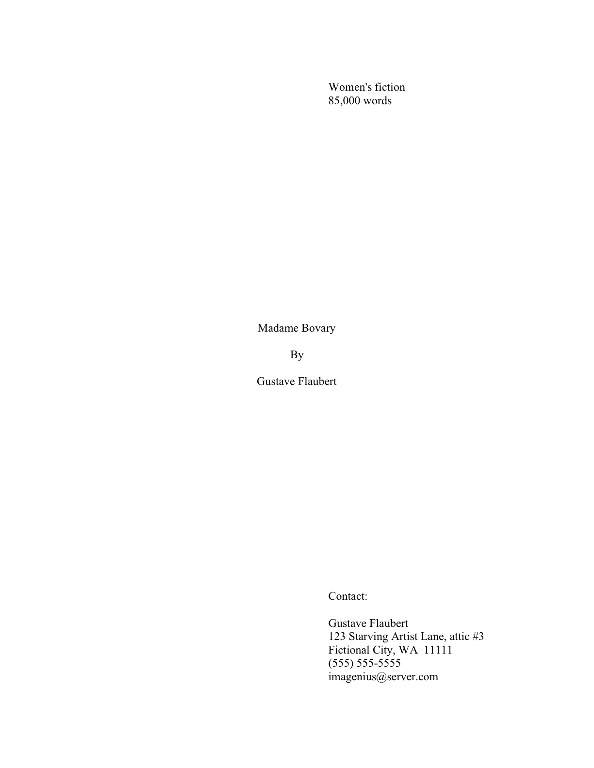
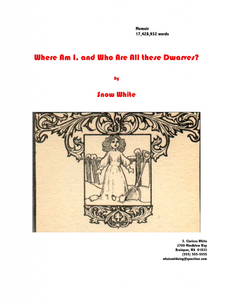
No exceptions, please. No matter how cool your favored typeface looks, be consistent. Yes, even on the title page, where almost everyone gets a little wacky the first time out.

No pictures or symbols here, either, please. Just the facts. I hate to be the one to break it to you, but there’s a term for title pages with 24-point fonts, fancy typefaces, and illustrations.

It’s high school book report. Need I say more?

(6) Do not use boldface anywhere in the manuscript but on the title page — and not even there, it’s not a particularly good idea.

This seems like an odd one, right, since word processing programs render including boldface so easy? Actually, the no-bolding rule is a throwback to the old typewriter days, where only very fancy machines indeed could darken selected type. Historically, then using bold was considered a bit tacky for the same reason that wearing white shoes before Memorial Day is in certain circles: it’s a subtle display of wealth.

You didn’t think all of those white shoes the Victorians wore cleaned themselves, did you? Shiny white shoes denoted scads of busily-polishing servants.

You may place your title in boldface on the title page, if you like, but that’s it. Nothing else in the manuscript should be in boldface. (Unless it’s a section heading in a nonfiction proposal or manuscript — but don’t worry about that for now; I’ll be showing you how to format both a book proposal and a section break later on in this series, I promise. I shall also be tossing many, many examples of properly-formatted title pages your way, never fear.)

(7) Every page in the manuscript should be numbered, except the title page. The first page of text is page 1, not the title page.

Even if you choose to disregard literally everything else I’ve said here, please remember to number your pages. Millicent’s usual response to the sight of an unnumbered manuscript is to reject it unread.

Yes, really; this omission is considered genuinely rude. Few non-felonious offenses irk the professional reader (including yours truly, if I’m honest about it) more than an unnumbered submission or contest entry. It ranks right up there with assault, arson, and beginning a query letter with, Dear Agent instead of Dear Ms. Smith.

Why? Gravity, my friends, gravity. What goes up tends to come down. If the object in question happens to be an unbound stack of paper, and the writer who sent it did not bother to number those pages…well, picture it for yourself: two manuscript-bearing interns walking toward each other in an agency hallway, each whistling a jaunty tune. Between them, a banana peel, a forgotten skateboard, and a pair of blindfolded participants in a three-legged race clutching a basket stuffed to the brim with ping-pong balls between them.

You may giggle, but anyone who has ever worked with submissions has first-hand experience of what would happen should any two of those elements come into direct contact. After the blizzard of flying papers has subsided, and the interns rehash that old Reese’s Peanut Butter Cup commercial’s dialogue (“You got romance novel in my literary fiction!” “You got literary fiction in my romance novel!”), guess what needs to happen?

Some luckless soul has to put all of those pages back in proper order, that’s what. Just how much more irksome is that task going to be if the pages are not numbered?

Obey Rule #7. Trust me, it is far, far easier for Millicent to toss the entire thing into the reject pile than to spend the hours required to guess which bite-sized piece of storyline belongs before which in an unnumbered manuscript.

Wondering why the first page of the text proper is page 1 of the text, not the title page, and should be numbered as such? Or why, if your opus has an introduction or preface, the first page of that is page 1, not the first page of chapter 1?

Long-time readers, pull out your hymnals and sing along: because gumballs are round, and books manuscripts do not resemble published books.

The title page is not the only one commonly mislabeled as 1, by the way: epigraphs — those quotations from other authors’ books so dear to the hearts of writers everywhere — should not appear on their own page in a manuscript, as they sometimes do in published books. If you feel you must include one (which you might want to reconsider at the submission stage: 99.9999% of the time, Millicent will just skip over it), include it between the chapter title and text on page 1.

If that last paragraph left your head in a whirl, don’t worry — I’ll show you how to format epigraphs properly later in this series. (Yes, including some discussion of that cryptic comment about Millicent’s wandering peepers. All in the fullness of time, my friends.)

(8) Each page of the manuscript (other than the title page) should have a standard slug line in the header. The page number should appear in the slug line, not anywhere else on the page.

Including the slug line means that every page of the manuscript has the author’s name on it — a great idea, should you, say, want an agent or editor to be able to contact you after s/he’s fallen in love with it. Or be able to tell your submission from the other one that ran afoul of the banana peel in our earlier example.

The slug line should appear in the upper left-hand margin (although no one will sue you if you put it in the upper right-hand margin, left is the time-honored location) of every page of the text except the title page (which should have nothing in the header or footer at all).

A trifle confused by all that terminology? I’m not entirely surprised. Most writing handbooks and courses tend to be a trifle vague about this particular requirement, so allow me to define the relevant terms: a well-constructed slug line includes the author’s last name, book title, and page number, to deal with that intern-collision problem I mentioned earlier. (The slug line allows the aforementioned luckless individual to tell the romance novel from the literary fiction.) And the header, for those of you who have not yet surrendered to Microsoft Word’s lexicon, is the 1-inch margin at the top of each page.

Having trouble finding it in our page examples above? Here’s a subtle hint:

Since the only place a page number should appear on a page of text is in the slug line, if you are in the habit of placing numbers wacky places like the middle of the footer, do be aware that it does not look strictly professional to, well, professionals. Double-check that your word processing program is not automatically adding extraneous page numbers elsewhere on the page.

Do not, I beg of you, yield like so many aspiring writers to the insidious temptation add little stylistic bells and whistles to the slug line, to tart it up. Page numbers should not have dashes on either side of them, be in italics or bold, or be preceded by the word page. Trust me, Millicent will know what that number is, provided that it appears here — and only here:

Sensing just a bit of urgency on this one? Good. Those of us predisposed to regard gumballs as inherently spherical are always surprised to see how many aspiring writers regard page numbering as a tempting forum for self-expression. Remember, professional readers do not regard formatting choices as matters of personal style. The point here is not to make your slug line stand out for its innovative visual impact, but to provide practical guidance in reestablishing sequence should those ping-pong balls start bouncing about underfoot.

If your book has a subtitle, don’t include it in the slug line — and if it boasts a very long title, feel free to abbreviate, to keep the slug line from running all the way across the top of the page. Millicent needs to be able to identify the manuscript at a glance, not to reproduce the entire book jacket.

Why not? Well, technically, a slug line should be 30 spaces or less, but there’s no need to stress about that in the computer age. (A slug, you see, is the old-fashioned printer’s term for a pre-set chunk of, you guessed it, 30 spaces of type. Aren’t you glad you asked?) Let’s assume for the sake of example that I’ve written a novel entitled THE SMILING FROWNER BEMUSED– 26 characters, counting spaces. Since my last name is quite short, I could get away with putting it all in the slug line, to look like this:

Mini/The Smiling Frowner Bemused/1

If, however, my last name were something more complicated, such as Montenegro-Copperfield — 22 characters all by itself, including dash — I might well feel compelled to abbreviate.

Montenegro-Copperfield/Smiling Frowner/1

Incidentally, should anyone out there come up with a bright idea for a category heading on the archive list for this issue other than SLUG LINE — a category that already exists, but is unlikely to be found by anyone not already familiar with the term — I’d be delighted to hear suggestions. I’ve called it a slug line ever since I first clapped eyes on a professional manuscript (an event that took place so long ago my response to the sight was not, “What’s that at the top of the page, Daddy?” but “Goo!”), so I’m probably not going to be coming up with a good alternative anytime soon. Thanks.

(9) The first page of each chapter should begin a third of the way down the page. The chapter title should appear on the first line of the page, not on the line immediately above where the text begins.

That’s fourteen single-spaced lines down, incidentally. The chapter title (or merely “Chapter One”) should be centered, and it should neither be in boldface nor underlined. To revisit today’s first example:

“But Anne,” But I Heard protests, “why shouldn’t the title appear immediately above the text? I’ve often seen that suggested — and illustrated online. What gives?”

Would any of you care to field that one? Perhaps someone who took the time to read the text of today’s positive and negative examples? Feel free to chant the answer with me, sharp-eyed perusers: “Because that’s where the title of a short story lives, not a book’s.”

Self-evident once you’ve heard it, isn’t it?

Because confusing the two formats is so common, very frequently, agents, editors and contest judges are presented with improperly-formatted first pages that have the title of the book, by Author’s Name, and/or the writer’s contact information floating in the space above the text. To professional eyes, a manuscript that includes any of this information on the first page of the manuscript (other than in the slug line, of course) seems like it just ended up in the wrong office. Clearly, the writer wanted not the agency to which she sent it, but the magazine down the street.

So where does all of that necessary contact information go, you ask? Read on.

(10) Contact information for the author belongs on the title page, not on page 1.

This is one of the most obvious visual differences between a short story submission (say, to a literary journal) and a book-length manuscript. To submit a manuscript — or contest entry, for that matter — with this information on page 1 is roughly the equivalent of taking a great big red marker and scrawling, “I don’t know much about the business of publishing,” across it.

Just don’t do it. Millicent likes her gumballs.

“But wait,” I hear some of you out there murmuring, “My gumball — I mean, my manuscript — needs a title page? Since when?”

What a timely question.

(11) Every submission should include a title page, even partial manuscripts.

This one seems to come as a surprise to a lot of aspiring writers. You should include a title page with ANY submission of ANY length, including contest entries and the chapters you send after the agent has fallen in love with your first 50 pages.

And again, But I Heard expresses disgruntlement. “More work!” he cries. “If you’d only let us shoehorn our contact information onto page 1 (as I notice you have artfully resisted showing as a counterexample, lest some reader mistake it for acceptable book format), this would not be at all necessary!”

At the risk of sounding callous, so what? You want to make it as easy as humanly possible for the agent of your dreams to let you know that she wants to represent this book, don’t you? And it’s not as though she would ever dream of sending anything you wrote to an editor at a publishing house without a title page.

Yes, really. Literally every manuscript that any agent in North America submits to any editor in hard copy will include one, for the exceedingly simple reason that it’s the page that includes the agent’s contact information.

Yet, astonishingly, a good 95% of writers submitting to agencies seem to be unaware that including it is standard. I blame But I Heard: to him, the cover letter, address on the SASE, or the e-mail to which the requested materials were attached are identification enough. But in practice, it’s none of those things will necessarily still be attached to your pages at the point when your ideal agent says, “By jingo, I’m thoroughly wowed. This is a writer I must sign, and pronto!”

Oh, you thought that your SASE won’t go flying when those interns collide in the hallway? Or that e-mails never get deleted accidentally? Once those ping-pong balls get rolling, they end up everywhere; the damage they do is incalculable.

On the plus side, the broad reach of But I Heard’s pernicious influence — coupled, I suspect, with the fact that including a title page just never occurs to a lot of first-time submitters — means that if you are industry-savvy enough to include a professionally-formatted title page, your submission automatically looks like a top percentile ranker to professional eyes from the moment it’s pulled out of the envelope. It’s never too early to make a good first impression, right?

If you do not know how to format a proper title page — and yes, Virginia, there is a special format for it, too — please see the aptly-named HOW TO FORMAT TITLE PAGE category on the archive list at right. Or wait a few days until I cover it later in this series.

It’s entirely up to you. No pressure here. Have a gumball while you wait.

Before anyone who currently has a submission languishing at an agency begins to panic: you’re almost certainly not going to get rejected solely for forgetting to include a title page. It’s too common a gaffe to be an automatic deal-breaker for most Millicents. Ditto with improperly-formatted ones. And yes, one does occasionally run into an agent at a conference or one blogging online who says she doesn’t care one way or the other about whether a submission has a title page resting on top at all.

Bully for them for being so open-minded, but as I have pointed out to relative strangers roughly 147,329 times in the past year, how can you be sure that the person deciding whether to pass your submission upstairs or reject it isn’t a stickler for professionalism?

I sense some shoulders sagging at the very notion of all the work it’s going to be to alter your pages before you send them out. Please believe me when I tell you that, as tedious as it is to change these things in your manuscript now, by the time you’re on your third or fourth book, it will be second nature to you. Why, I’ll bet that the next time you sit down to begin a new writing project, you will automatically format it correctly.

Think of all of the time that will save you down the line. Goody, goody gumdrops.

More guidelines follow in the next couple of posts — yes, those of you whose hearts just sank audibly, standard format does indeed have that many rules — and then we shall move on swiftly to concrete examples of what all of this formatting looks like in practice. I want you to have enough information on the subject to be able to understand why following them might be a good idea.

Rather than, say, walking away with the vague feeling that you heard about these rules somewhere. Keep up the good work!
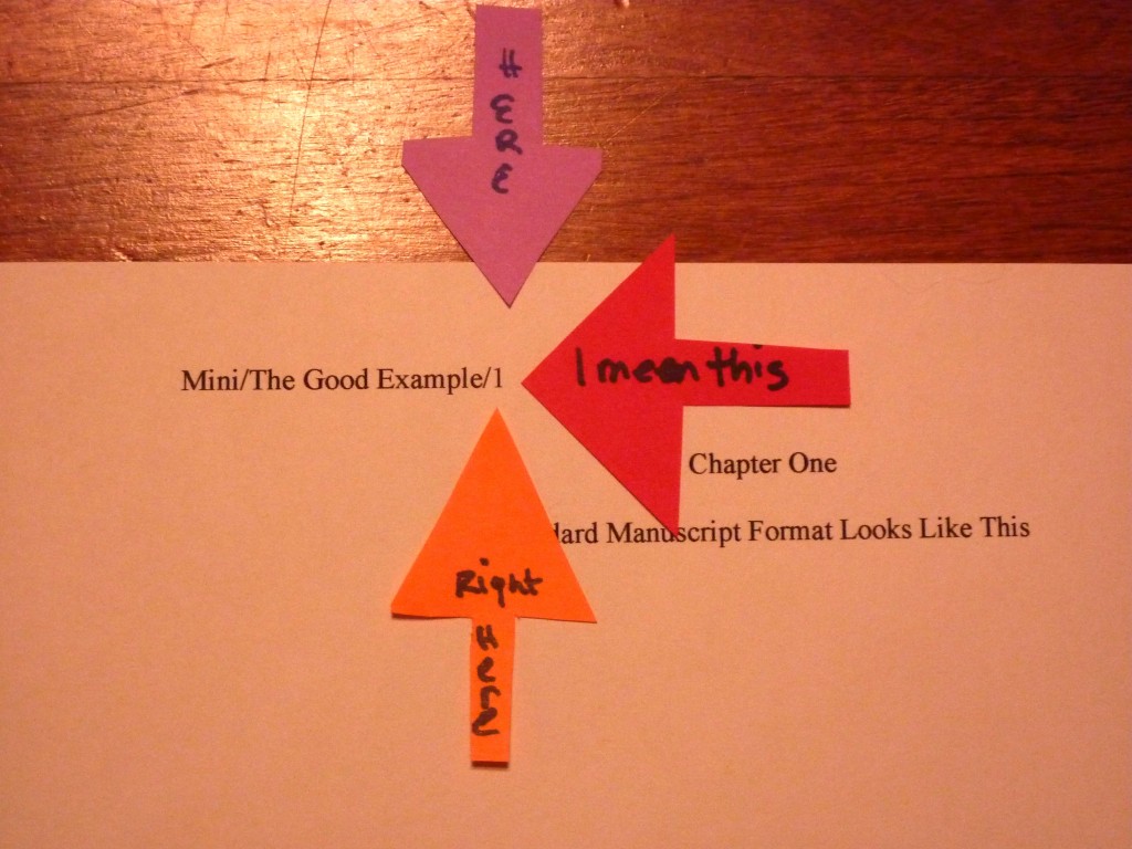
So you’ve pitched successfully — now what? Part II: what does a professionally-formatted book manuscript look like, anyway?

Hint: not like this

I’m going to try something a little different today, campers. This post is for all of you strong, silent types: instead of explaining at my usual great length how to put together a manuscript for submission to the agent of your dreams, I’m going to show you.

What brought on this change in tactic? Well, last time, I gave those of you that had just pitched your work successfully to an agent — which, contrary to astoundingly pervasive opinion amongst conference-goers, means that the agent asked to see all or part of your manuscript or book proposal, not offered on the spot to represent you — a brief overview of what that agent would expect to see in a submission. I did that not only to aid writers in a whirl about how to get their work out the door, but also to provide advance knowledge to those of you planning upon pitching at a writers’ conference in the months to come and those of you planning to send out queries. In fact, I shall be devoting the rest of the week to this worthy endeavor.

Why devote so much energy to talking about something as seemingly simply straightforward as packing up a manuscript and sending it to someone that has asked to see it? Because knowing what’s expected can both streamline the submission process and render the preparation stage substantially less stressful. Because there’s more to it than meets the eye. And, frankly, because most submitters do some part of it wrong.

How? Oh, in a broad array of ways. Some manuscripts are formatted as if they were published books. Others are mostly correct, but do not apply the rules consistently or present the text in a wacky font. Still others cherry-pick which rules to follow, or combine the rules for short stories and those for book-length works into an unholy mish-mash of styles.

And those are just the manuscripts put together by writers that are aware that some standards for professional presentation exist. Agents see plenty of submissions from those that evidently believe that everything from margin width to typeface is purely an expression of individual style.

Back in the decadent days when being asked to submit a manuscript meant, if not an offer of representation, then at least an explanation of why the agent was passing on the project, rejected writers were often firmly but kindly told to learn the ropes before submitting again. And today, many agencies have been considerate enough to post some indication of their formatting requirements on their websites. But more often than not, submitters whose manuscripts deviated from expectations never find out that unprofessional presentation played any role at all in their rejection.

So how are they to learn how to improve their writing’s chances of pleasing the pros?

This evening, I’m going to be concentrating on the cosmetic expectations for a manuscript. But before my long-term readers roll their eyes — yes, yes, I know, I do talk about standard format quite a bit — let me hasten to add that in this post, I am going to present manuscript pages in a different manner than I ever have before.

You see, I’ve been talking about standard format for manuscripts for almost seven years now at Author! Author!, long enough to notice some trends. First trend: this is one of the few writer-oriented online sources for in-depth explanations of how and why professional manuscripts are formatted in a very specific manner — and are formatted differently than short stories, magazine articles, or published books. As the sharper-eyed among you may have gleaned from the fact that I devote several weeks of every year to discussing standard format and providing visual examples (the latest rendition begins here), I take that responsibility very seriously.

Which is why the second trend troubles me a little: whenever a sponsor a writing contest — and I am offering two this summer, one aimed at adult writers writing for the adult market and a second for writers under voting age and adult YA writers — a good two-thirds of the entries are improperly formatted. Not just in one or two minor respects, either. I’m talking about infractions serious enough that, even if they would not necessarily prompt our old pal, Millicent the agency screener, to reject those pages on the spot, they would at least encourage her to take the writing less seriously.

Why might someone that reads submissions for a living respond that drastically? Chant it with me now, long-time readers: because all professional book-length manuscripts handled by US-based agencies and publishing houses look essentially the same, writing presented in any other manner distracts Millicent. So if you want your work to claim her full attention, it’s very much to your advantage to present it as the pros do.

I could encourage you to embrace this excellent strategy in a number of ways. I could, for instance, keep inventing reasons to shoehorn the link to the rules for standard format for book manuscripts. I could also make adhering to the strictures of standard format a requirement for entering a writing contest, and then construct a post in which I list the rules one by one, showing how incorporating each would change how a manuscript aimed at an adult audience appeared on the page. I could even, I suppose, take a theoretical entry to a young writers’ contest, apply the rules to it, and post the results.

All of that would be helpful, I suspect, to the many, many aspiring writers who have never seen a professionally-formatted manuscript in person. Yet I must confess, I worry about writers that learn more easily from visual examples than extensive explanation. Not to mention those that are in just too much of a hurry to read through post after post of careful demonstration of the rules in practice.

Today, then, I am going to present standard format for book manuscripts in the quickest, visually clearest way that I can: I’m going to draw you a map.

Or, to be a trifle more precise about it, this post will provide a guide to the professional manuscript page that will allow those new to it to navigate around it with ease. Let’s start by taking a peek at the first three pages an agent would expect to see in a manuscript, as the agent would expect to see it: the title page, page 1, and page 2.


Pretty innocuous presentation, isn’t it? (If you’re experiencing difficulty seeing the details, try holding down the COMMAND key and pressing + repeatedly to enlarge the images.) As we may see, book manuscripts differ from published books in many important respects. Some respects that might not be obvious above:

Book manuscripts should be typed or printed in black ink on 20-lb or heavier white paper.

I encourage my clients to use bright white 24-lb paper; it doesn’t wilt.

Manuscripts are printed or typed on one side of the page and are unbound in any way.

The preferred typefaces for manuscripts are 12-point Times New Roman or Courier.

No matter how cool your desired typeface looks, or how great the title page looks with 14-point type, keep the entire manuscript in the same font and typeface.

Due to the limitations of blog format, you’re just going to have to take my word for it that all of these things were true of the manuscript pages I am about to show you. I printed them out and labeled their constituent parts, so we could talk about them more easily. Then I slapped the result onto the nearest table, and snapped some glamour shots. The lighting could have been better, but here they are, in all their glory.

I’ll go into the reasoning behind including a title page in a submission (it’s a good idea, even if you’ve been asked to send only the first few pages) in tomorrow’s post, so for now, let’s just note what information it contains and where it appears on the page. A professionally-formatted title page presents:

A professionally-formatted title page should include all of the following: the manuscript’s book category (c), word count (d), author’s intended publication name (e), author’s real name (f), and author’s contact information (b).

Don’t worry; I shall be defining all of these terms in my next post.

The title and author’s pen name should be centered on the page. (h)

The book category, word count, and contact information should all be lined up vertically on the page. (g)

The easiest way to pull this off is to set a tab at 4″ or 4.5″.

Do not use boldface anywhere in the manuscript but on the title page — and even there, it’s optional.

As you may see here, I have elected not to use it. If I did, the only place where it would be appropriate is at (aa), the title.

Contact information for the author belongs on the title page, not page 1. (b)

Which is, of course, a nicety that would escape the notice of a submitter that believed that short story format (in which the word count and contact information are presented on page 1) and book manuscript format were identical. By including a title page, you relieve yourself of the necessity to cram all of that information onto the first page of a chapter. As you may see, the result is visually much less cluttered.

Every page in the manuscript should be numbered except the title page. The first page of text is page 1. (5)

In other words, do not include the title page in a page count.

Everyone finding everything with relative ease so far? Excellent. In order to zoom in on (5), let’s take a closer look at the first page of Chapter 1.

Got that firmly in your mind? Now let’s connect the dots.

All manuscripts are double-spaced, with 1-inch margins on all four edges. (1)

Do not even consider trying to fudge either the line spacing or the margin width. Trust me, any Millicent that’s been at it a while will instantly spot any shrinkage or expansion in either. The same holds true of using any font size other than 12 point, by the way.

The text should be left-justified, not block-justified.

This one often confuses writers, because text in newspapers, magazines, and some published books is block-justified: the text is spaced so that every line in the same length. The result is a left margin and a right margin that visually form straight lines running down the page.

But that’s not proper in a book manuscript. As we see here, the left margin should be straight (2), while the right is uneven (3).

Every page of text should feature a standard slug line in the header (4), preferably left-justified.

That’s the bit in the top margin of each page containing the Author’s Last Name/Title/#. As you can see here, the slug line should be in the header — in other words, in the middle of the one-inch top margin — not on the first line of text.

The slug line should appear in the same plain 12-point type as the rest of the manuscript, by the way. No need to shrink it to 10 point or smaller; Millicent’s too used to seeing it to find it visually distracting.

The page number (5) should appear in the slug line and nowhere else on the page.

Another one that often confuses writers new to the biz: word processing programs are not, after all, set up with this format in mind. Remember, though, that the fine people at Microsoft do not work in the publishing industry, and every industry has the right to establish its own standards.

Every page in the manuscript should be numbered. The first page of text is page 1.

Do not scuttle your chances submitting an unpaginated manuscript; 99% of the time, it will be rejected unread. Yes, even if you are submitting it via e-mail. People who read for a living consider unnumbered pages rude.

The first page of a chapter should begin a third of the way down the page (6), with the chapter number (7) and/or title (8) centered at the top.

If the chapter does not have a title, just skip line (8).

Is everyone comfortable with what we have covered so far? If not, please ask. While I’m waiting for trenchant questions, I’m going to repost page 2, so we may contemplate its majesty.

Awesomely bland, is it not? Let’s check out the rest of the rules.

The beginning of each paragraph should be indented .5 inch. (9)

Yes, including the first paragraph of each chapter, no matter what you have seen in a published book. The decision not to indent the first paragraph of the chapter rests with the publisher, not the writer; if you have strong preferences on the subject, take it up with the editor after you have sold the book.

It may seem counterintuitive, but the manuscript is not the right place to express those preferences. No formatting choice in the manuscript will necessarily end up in the published book.

That includes, by the way, an authorial preference for business format. If you happen to prefer non-indented paragraphs that force a skipped line between paragraphs, too bad. Which leads us to…

Don’t skip an extra line between paragraphs (10), except to indicate a section break. (11)

As we see here, section breaks are formed by skipping one double-spaced line. Do not indicate a section break by # # # or any other marker UNLESS you are writing a short story, article, or entering a contest that requires the inclusion of a specific symbol. (Check the rules.)

Words in foreign languages should be italicized (12), as should emphasized words (13) and titles of copyrighted works like songs (14). Nothing in the text should be underlined.

This one’s pretty self-explanatory, I think, except for the always-burning question of whether to italicize thought (as I’ve done here at a) or not. There is no hard-and-fast rule on this one: some agents like it, some consider it a narrative cop-out. Because its acceptability varies wildly between book categories, your best bet is to check five or ten recent releases similar to yours to see if italicized thought appears there.

If you ultimately decide to embrace the italicized thought convention, you must be 100% consistent in applying it throughout the text. What you should never do, however, is make the common mistake of both saying that a character is thinking something and italicizing it. To an agent or editor, this

I’m so frightened! Irma thought.

is redundant. Pick one means of indicating thought and stick to it.

All numbers under 100 should be written out in full: twenty-five, not 25. (15)

This one is not quite as straightforward as it sounds. As we can see in the text, dates, times, and currency is sometimes expressed as numbers. When a time is specific (16), it is written in number form, but a general time (17) is written out in full. September 4, 1832 is fine, but without the year, the fourth of September is correct. By the same token, a specific amount of money (18) is in numeral form, but a round number (19) is conveyed in words.

Dashes should be doubled (20), with spaces at either end, but hyphens are single, with no spaces. (21)

Why? So a typesetter can tell them apart. (Okay, so that made more sense when manuscripts were produced on typewriters. Humor Millie on this one.)

#22 is not precisely a formatting matter, but manuscript submissions so often misuse them that I wanted to flag it here. In American English (and thus when submitting to a US-based agency), ellipses contain only three periods UNLESS they come at the end of a quote that ends in a period. When an ellipsis indicates a pause in speech, as it does here at (22), there should not be a space between it and the words around it.

And that’s it! Unless an agency’s submission guidelines specify some other formatting preferences, you will not go wrong with these.

I shall now tiptoe quietly away, so you may study them in peace. Tune in tomorrow for more discussion of title pages, and, as always, keep up the good work!
P.S.: there’s a good discussion in the Comments section about formatting quotes and citations in manuscripts and book proposals.

A few words about the virtues of continuity, or, so long, Mr. B

It’s all about the writing: Author! Author! Rings True literary fiction winners Daniel Light and Austin Gary


Daniel, author of Wider Than the Sea


Austin, author of Genius

I’m most excited about today’s group of winners in theAuthor! Author! Rings True literary competition — and not just because they write in a category near to my heart, literary fiction. Daniel Light and Austin Gary’s entries are a far cry from the literary fiction stereotype of being about nothing but the writing: their pages and synopses present strong storylines, interesting premises, and interesting writing, told in unique authorial voices. Well done, both!

Adding to the excitement: I shall be discussing these intriguing entries with the ever-fabulous Heidi Durrow, author of the blockbuster literary fiction debut, The Girl Who Fell from the Sky. (Now available in paperback!) Since Heidi writes literary fiction and I edit it, we both waxed poetic in discussing it.

I’m also rather tickled by how many of this contest’s array of winners (and entrants in general) come from far-flung corners of the earth. Daniel wins the long-distance entrant prize — he lives in Jerusalem — while Austin inhabits lovely British Columbia. John Turley and Fiona Maddock, of Rings True freestyle category fame hail from Colorado and the United Kingdom, respectively; memoir winners Kathryn Cureton and Margie Borchers are from Missouri and Washington state. For a blog that started out five and a half years ago as the voice of a regional writers’ association, the diversity of entries is most gratifying.

This contest’s winners are really interesting people, too; I’m so glad that I asked for author bios this time around. Fair warning: I’m going to make this a regular feature for Author! Author! contests, so now would be a great time to start thinking about your own bio, as well as what you would use as an author photo if the agent of your dreams asked for either or both tomorrow. (For tips on pulling your own together, take a peek at the aptly-named HOW TO WRITE AN AUTHOR BIO category on the archive list at right.)

A moral that I hope everybody will take from these winners’ posts: an author bio need not be crammed to the gills with publication credentials in order to make the writer sound interesting. Austin and Daniel’s bios are very different, but they both would make Millicent the agency screener want to chat with these writers over a steaming-hot latte. First, check out Austin’s more traditional bio:

Austin Gary is a BMI award-winning songwriter (as Gary Heyde), with recordings by artists such as Tammy Wynette, John Berry & Jeff Carson. He’s been an editor of a weekly newspaper; an actor/director; copywriter; director of radio and TV broadcast; a jingle writer; owner of a music production company; and a teacher of English, speech, drama and film. Austin’s been seriously writing since 2007. In 2008, he was a fiction finalist in the PNWA lit contest (“Ask Me No Secrets:); 2009 semi-finalist in the Faulkner-Wisdom fiction competition (“Miss Madeira”); and 2010 a finalist in the Faulkner-Wisdom novel-in-progress (“Genius”). He recently moved from Des Moines, WA to Port Moody, B.C., where he’s writing full-time.

Makes him sound pretty formidable, does it not? Now take a gander at Daniel’s less standard, but equally interesting bio:

Daniel Light is an ordained rabbi who has taught Talmud and Bible part-time in several schools in Israel and has run a listserv dedicated to essays that harmonize between Judaism and popular culture. He holds a Bachelor of Commerce from McGill University and a Bachelor of Law from Hebrew University and, following a year-long internship in corporate law, is currently living in Jerusalem and studying for the Israeli Bar exam. WIDER THAN THE SEA is his first novel and the fruit of his experiences in, and knowledge of, law, medicine, religion, psychology, morality, and life.

Not as many publishing credentials, admittedly — but if you were inviting luminaries to a literary luncheon, you would want both Austin and Daniel on your guest list, wouldn’t you? So would Millicent. Except as someone who habitually thinks in terms of book marketing, she would also make a mental note that either of these writers would probably give a great interview and be genuinely interesting public speakers.

If you think those are not a selling points for a writer, I can only assume that you do not attend many book readings. Unfortunately, new authors (and even established ones) who spend entire hours-long promotional events with their noses three inches from their own books, assiduously avoiding eye contact, are the norm, not the exception. It’s not even all that uncommon to see authors who evidently experience difficulty reading out loud.

Yet another reason to get into the habit of reading your manuscripts IN THEIR ENTIRETY, IN HARD COPY, and OUT LOUD, should you need another. If your critique group doesn’t set aside time for members to read to one another, you have my permission to tell yours that I said it was excellent training for future author readings. (And while we’re on the subject, would any of you regular readers be interested in my running a series of public reading dos and don’ts?)

As interesting as the bios are, however, for literary fiction, what matters most is on the manuscript page: more than in any other book category, literary fiction readers pay attention to sentence structure, vocabulary, and imagery. As folks in the industry like to say, it all depends on the writing.

Specifically, how literary the writing is. Lest we forget, in publishing terms, there is no such thing as universally good writing: what constitutes good writing on the literary fiction page is quite different from stylistic excellence in a mystery and vice-versa. And while agents have been known to say, “It’s a {fill in book category here}, but in a literary voice,” they don’t mean that the author of the book in question has jettisoned the conventions and expected vocabulary of the category; they merely mean that the narrative contains unusually pretty writing.

Do I spot some raised hands out there? “But Anne,” the many, many aspiring writers who have been assuming that their work was literary fiction protest, “isn’t pretty writing half the definition of literary fiction? And isn’t the other half a story driven by character, rather than by the needs of the plot?”

Well, yes and no on both counts, literary assumers. Yes, nice writing and a character-driven story are standard elements of literary fiction. No, that doesn’t mean a book without a plot that features impeccably-crafted sentences. Nor — and this may come as more of a surprise to some of you — does it mean that any well-written character development is literary fiction.

Don’t feel bad if you thought this — if that giant gulping sound we just heard out there in the ether is any indication, you were certainly not alone in conflating good writing with literary writing. Aspiring writers presume that literary fiction is merely a euphemism for good writing; if their writing is stylistically strong, they reason, and if it is fiction, it must therefore be literary fiction.

Which renders it rather confusing when the pros state categorically that there is good writing in every book category, doesn’t it?

But book categories are not subjective judgments about authorial voice and style; they are marketing containers for books that share certain expectations about plot, character development, subject matter, and audience. Literary fiction is its own distinct book category — consisting of narratives more prone to dwell on character, true, but also written in a vocabulary and sentence style aimed to please a college-educated readership. In the U.S. market, that readership is between 90-95% female, depending upon whom you ask and whether the respondent considers John Irving’s work literary or mainstream fiction.

Oh, you may laugh, but for many years, debate raged over how to categorize THE WORLD ACCORDING TO GARP. (If you don’t believe me, check out The New York Times’ extremely uncomfortable original review.) Until fairly recently, one of the best ways to find out how a literarily-aware person felt about the desirability of high literature’s being accessible to a mainstream readership was to bring up the inimitable Mssr. Irving and ask whether the aforementioned reader regarded him as a writer of literary fiction or not.

Bearing this ongoing debate in mind, let’s step gingerly into Millicent’s moccasins and peruse Daniel’s page 1. (As always, if you are having trouble making out the details, try holding down the COMMAND key and pressing + to enlarge the image.) Is it literary fiction, or is it just good writing?

Have you made up your mind? Good. Now take a gander at Daniel’s synopsis, and see if your opinion about the book category changes.

Have you come to a conclusion? Or, after our discussion last time about the differences between fiction and nonfiction synopses, did the analytical statement the novel reaches a climax distract you too much to be able to form a firm opinion? If it’s the latter, you’re thinking like Millicent: in a synopsis for a novel, regardless of book category, she expects to see the story told directly, not to see the plot talked about indirectly, in academic terms.

That’s another common misconception amongst aspiring writers: the notion that using technical terms like climax, protagonist, antagonist, central conflict, etc. will make their queries and synopses sound professional. In practice, however, while people in the publishing industry do occasionally use these terms, an agent pitching fiction to an editor or an editor pitching it to an editorial committee would rarely describe it this way.

Instead, they would tell the story — as should the writer. As beautifully as possible. After all, part of what’s being sold here is the writing style, and (feel free to chant it with me now, long-term readers) every sentence a writer submits to an agency, publishing house, or contest is a writing sample.

Again, those assessments are not going to be based solely upon whether the writing is strong in a general sense; every book category has slightly different standards for what constitutes good writing. As you may see for yourself, even two habitual readers of literary fiction may disagree on whether an opening page is or not. (Please forgive the giant BOOM! in the background; we know not whence it came.)