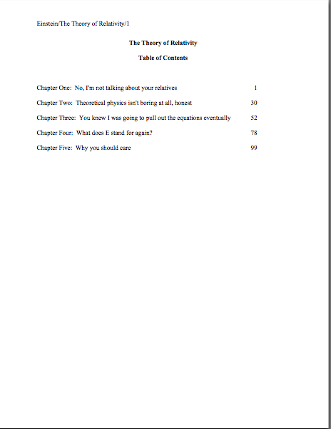
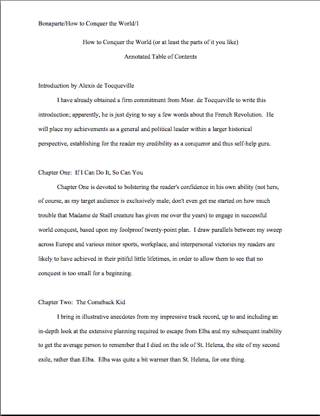
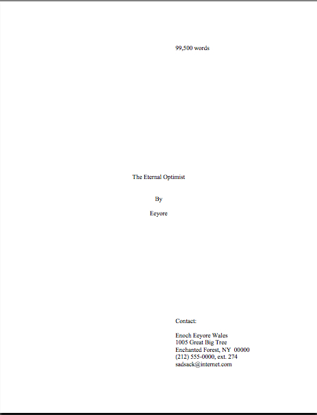
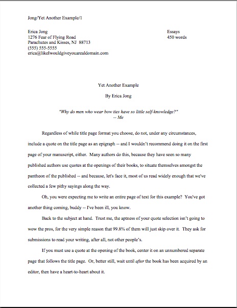
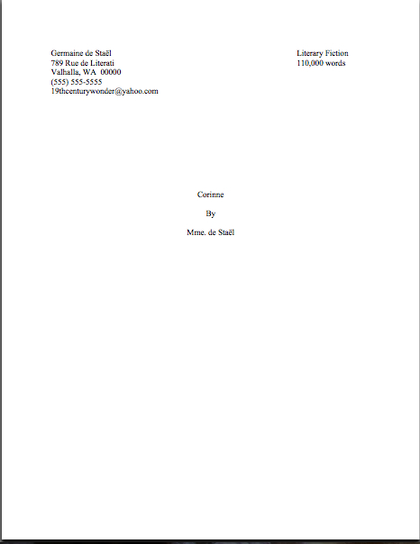
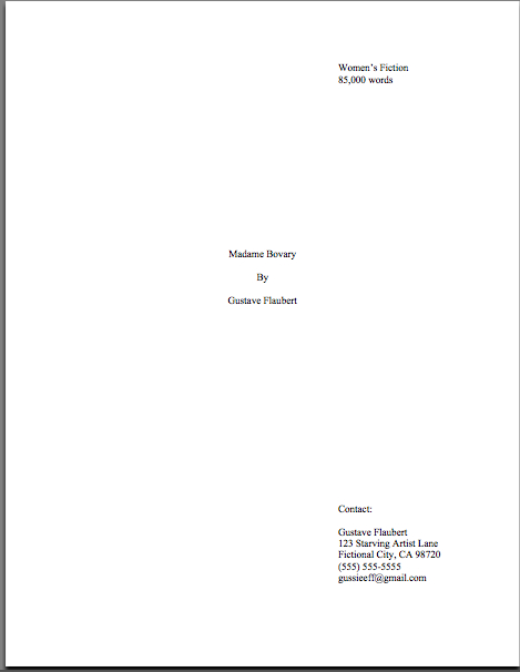
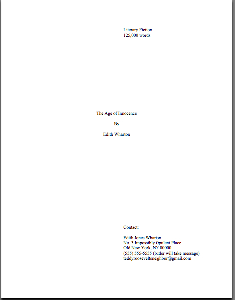
The mysteriously mysterious strictures of standard format, part II: the eye of the beholder

Lenten roses

See the nice, pretty Lenten roses? Aren’t they soothing to behold? Don’t they help lower the blood pressure of those of you who have been reading this blog for a while, the ones who tensed up at the very notion of going through the rigors of standard format for manuscripts again?

No? Well, how about those of you hearing about it for the first time? Or those — and I know you’re out there; I heard from one only yesterday — whose chest tighten at the very notion of writers talking about manuscript presentation amongst themselves at all?

I’ll admit it: it’s a stressful topic, enough so that each time I go over it (on average, 2-3 times per year), I ask myself at least thrice why I’m putting myself — and the rest of you — through it. Delving into the nitty-gritty of the logic behind those pesky rules is no fun by anyone’s standards. And every time I have broached the subject formally, those who have heard rumors elsewhere that something has changed leap upon my well-intentioned little gazelles of advice with the ferocity of hungry lions, demanding that I either recant my not at all heretical beliefs or, as I mentioned yesterday, to compel literally every other writing advice-giver in North America to agree to abide by precisely the same rules.

To dispel any illusions up front: neither of those things is going to happen. In my professional experience, the formatting I’m discussing here is indeed important, and not just in theory. I have sold books adhering to these rules; my editing clients have sold books using them. So I feel entirely comfortable in saying that manuscripts formatted in this manner tend to look professional to people who handle manuscripts for a living.

Does that mean every professional reader, everywhere, every time, will want to see your work formatted this way? No, of course not: should you happen to be submitting to an agent, editor, or contest that specifically asks you to do something else, obviously, you should give him, her, or it what he wants to see.

That’s just common sense, right? Not to mention basic courtesy.

In fact, I would actively encourage you not only to check the standard agency guides for expressions of these preferences, but to run an internet search on any individual agent to whom you were planning to submit, to double-check that s/he hasn’t stated loud and clear that, for instance, s/he prefers only a single space after a period or a colon. Admittedly, it requires a bit more effort on the submitter’s part, but hey, it’s worth it.

Why? Long-time readers, chant it with me now: if an agent or editor has been kind enough to take the time to tell aspiring writers precisely what s/he wants, a savvy writer should pay attention.

Again, that’s just being both smart and polite, isn’t it?

I spot some timid hands raised out there. “But Anne,” point out some confused by conflicting advice — and who could blame them, given the multiplicity of it? “I’ve been doing my homework, and the vast majority of the guide listings and websites I’m seeing don’t talk about format at all. What should I do then?”

Glad you asked. In my opinion — and it’s just my opinion, mind — the best course is to adhere to the rules of standard format.

That’s why I revisit this topic so often. But to repeat the disclaimer I’ve run every single time I’ve run a series on formatting: these are the rules that I use myself, the ones that my lengthy experience tells me work. There are, however, other rules out there, presented by some very credible sources. If you find other guidelines that make sense to you, use them with my good wishes.

Seriously: as far as I’m concerned, what you do with your manuscript up to you; I’m only trying to be helpful here. That’s why I provide such extensive explanations for each of my suggested guidelines — so my readers may consider the various recommendations out there and form their own opinions.

You’re smart people; I know you’re up to the challenge.

I’m also confident that my readers are savvy enough to understand that paying attention to how a manuscript looks does not imply that how it is written doesn’t make a difference. Of course, writing talent, style, and originality count. Yet in order to notice any of those, a reader has to approach the page with a willingness to be wowed.

That willingness can wilt rapidly in the face of incorrect formatting — which isn’t, in response to what half of you just thought, necessarily the result of mere market-mindedness on the part of the reader. After you’ve read a few hundred or thousand manuscripts, deviations from standard format leap out at you. As do spelling and grammatical errors, phrase repetition, clichés, and all of the writing problems we’ve all heard so much about at writers’ conferences.

They’re distractions from your good writing, in other words. My goal here is to help you minimize the distractions that would catch the eye first.

I hear those of you who have spent years slaving over your craft groaning out there — believe me, I sympathize. For those of you who have not already started composing your first drafts in standard format (which will save you a LOT of time in the long run, incidentally), I fully realize that many of the tiny-but-pervasive changes I am about to suggest that you make to your manuscript are going to be irksome to implement. Reformatting a manuscript is time-consuming and tedious, and I would be the first to admit that at first, some of these rules can seem arbitrary.

At least on their faces. Quite a few of these restrictions remain beloved even in the age of electronic submissions because they render a manuscript a heck of a lot easier to edit — and to read, in either hard or soft copy. As I will show later in this series, a lot of these rules exist for completely practical purposes — designed, for instance, to maximize white space in which the editor may scrawl trenchant comments like, “Wait, wasn’t the protagonist’s sister named Maeve in the last chapter? Why is she Belinda here?”

One last, quick caveat before I launch back into the list: the standard format restrictions I’m listing here are not intended to be applied to short stories, poetry, journalistic articles, academic articles, or indeed any other form of writing. The guidelines in this series are for BOOK manuscripts and proposals, and thus should not be applied to other kinds of writing. Similarly, the standards applicable to magazine articles, short stories, dissertations, etc. should not be applied to book proposals and manuscripts.

For the guidelines for these, you may — and should — seek elsewhere. (See my earlier disclaimer of omniscience.)

Everyone clear on that and ready to dive back into the matter at hand? Excellent. To recap from yesterday:

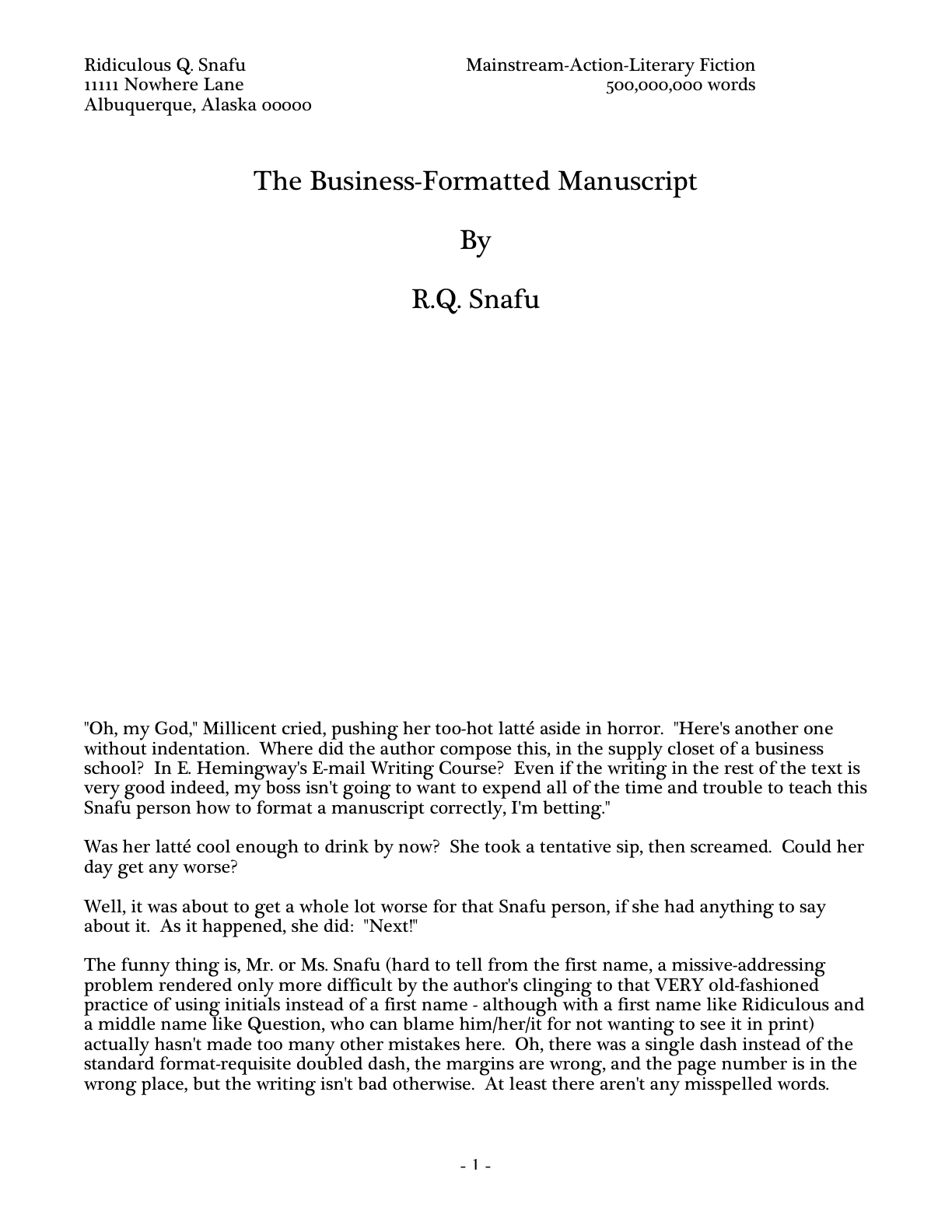
(1) All manuscripts should be printed or typed in black ink and double-spaced, with one-inch margins around all edges of the page, on 20-lb or better white paper.

(2) All manuscripts should be printed on ONE side of the page and unbound in any way.

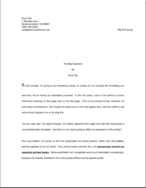
(3) The text should be left-justified, NOT block-justified. By definition, manuscripts should NOT resemble published books in this respect.

(4) The preferred typefaces are 12-point Times, Times New Roman, Courier, or Courier New — unless you’re writing screenplays, in which case you may only use Courier. For book manuscripts, pick one (and ONLY one) and use it consistently throughout your entire submission packet.

Is everyone happy with those? PLEASE pipe up with questions, if not. In the meantime, let’s move on.

(5) The ENTIRE manuscript should be in the same font and size. Industry standard is 12-point.

No exceptions, please. No matter how cool your desired typeface looks, or how great the title page looks with 14-point type.

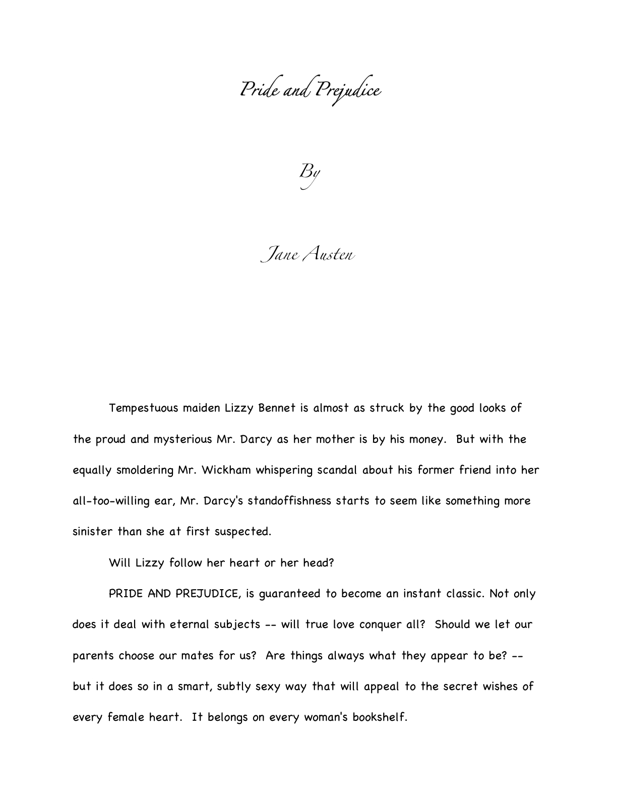
Yes, even on the title page, where almost everyone gets a little wacky the first time out. No pictures or symbols here, either, please. Just the facts. (If you don’t know how to format a title page professionally, please see the TITLE PAGE category on the list at right.)

I hate to be the one to break it to you, but there’s a term for title pages with 24-point fonts, fancy typefaces, and illustrations.

It’s high school book report. Need I say more?

(6) Do not use boldface anywhere in the manuscript BUT on the title page — and not even there, it’s not mandatory.

Yes, you read that correctly: you may place your title in boldface on the title page, if you like, but that’s it. Nothing else in the manuscript should be bolded. (Unless it’s a section heading in a nonfiction proposal or manuscript — but don’t worry about that for now; I’ll be showing you how to format both a book proposal and a section break later on in this series, I promise.)

This seems like an odd one, right? Actually, the no-bolding rule is a throwback to the old typewriter days, where only very fancy machines indeed could darken selected type. So historically, using bold in-text is considered a bit tacky for the same reason that wearing white shoes before Memorial Day is in certain circles: it’s a subtle display of wealth.

You didn’t think all of those white shoes the Victorians wore cleaned themselves, did you? Shiny white shoes equaled scads of busily-polishing staff.

(7) EVERY page in the manuscript should be numbered — EXCEPT the title page.

This may seem like a little thing, but you’d be surprised how often violating this rule results in instantaneous rejection. Even if you take no other advice from this series, please remember to number your pages.

Few non-felonious offenses irk the professional manuscript reader (including yours truly, if I’m honest about it) more than an unnumbered submission or contest entry. It ranks right up there on their rudeness scale with assault, arson, and beginning a query letter with, “Dear Agent.”

Why? Gravity, my friends, gravity. What goes up tends to come down — and if the object in question happens to be an unbound stack of paper…

Did that seem like an abstract metaphor? Not at all. Picture, if you will, two manuscript-bearing interns colliding in an agency hallway.

You may giggle, but anyone who has ever worked with submissions has first-hand experience of this, as well as what comes next: after the blizzard of flying papers dies down, and the two combatants rehash that old Reese’s Peanut Butter Cup commercial’s dialogue (“You got romance novel in my literary fiction!” “You got literary fiction in my romance novel!”), what needs to happen?

Yup. Some luckless soul has to put all of those pages back in the proper order. Put yourself in Millicent’s moccasins for a moment: just how much more irksome is that task going to be if the pages are not numbered?

Number your pages. Trust me, it is far, far, FAR easier for Millicent to toss the entire thing into the reject pile than to spend the hours required to guess which bite-sized piece of storyline belongs before which.

FYI, the first page of the text proper is page 1 of the text, not the title page, and should be numbered as such. If your opus has an introduction or preface, the first page of THAT is page 1, not the first page of chapter 1.

Why, you ask? Long-time readers, pull out your hymnals and sing along: BECAUSE A MANUSCRIPT SHOULD NOT LOOK IDENTICAL TO A PUBLISHED BOOK.

The title page is not the only one commonly mislabeled as page one, by the way: epigraphs — those quotations from other authors’ books so dear to the hearts of writers everywhere — should not appear on their own page in a manuscript, as they sometimes do in published books. If you feel you must include one (considering that 99.9999% of the time, Millicent will just skip over it), include it between the chapter title and text on page 1.

If that last sentence left your head in a whirl, don’t worry — I’ll show you how to format epigraphs properly later in this series. (Yes, including some discussion of that cryptic comment about Millicent. All in the fullness of time, my friends.)

(8) Each page of the manuscript (other than the title page) should have a standard slug line in the header. The page number should appear in the slug line, not anywhere else on the page.

Including the slug line means that every page of the manuscript has the author’s name on it — a great idea, should you, say, want an agent or editor to be able to contact you after s/he’s fallen in love with it. The slug line should appear in the upper left-hand margin (although no one will sue you if you put it in the upper right-hand margin, left is the time-honored location) of every page of the text EXCEPT the title page (which should have nothing in the header or footer at all).

A trifle confused by all that terminology? I’m not entirely surprised. Most writing handbooks and courses tend to be a trifle vague about this particular requirement, so allow me to define the relevant terms: a well-constructed slug line includes the author’s last name, book title, and page number, to deal with that intern-collision problem I mentioned earlier. (The slug line allows the aforementioned luckless individual to tell the romance novel from the literary fiction.) And the header, for those of you who have not yet surrendered to Microsoft Word’s lexicon, is the 1-inch margin at the top of each page.

Traditionally, the slug line appears all in capital letters, but it’s not strictly necessary. Being something of a traditionalist, the third page of my memoir has a slug line that looks like this:

MINI/A FAMILY DARKLY/3

Since the ONLY place a page number should appear on a page of text is in the slug line, if you are in the habit of placing numbers wacky places like the middle of the footer, do be aware that it does not look strictly professional to, well, professionals. Double-check that your word processing program is not automatically adding extraneous page markers.

Do not, I beg of you, yield like so many aspiring writers to the insidious temptation add little stylistic bells and whistles to the slug line, to tart it up. Page numbers should not have dashes on either side of them, be in italics or bold, or be preceded by the word “page.”

If that news strikes you as a disappointing barrier to your self-expression, remember, professional readers do not regard formatting choices as conveyers of personal style. The point here is not to make your slug line stand out for its innovative style, but for your manuscript’s pages to look exactly like every other professional writer’s.

And yes, I AM going to keep making that point over and over until you are murmuring it in your sleep. Why do you ask?

If you have a subtitle, don’t include it in the slug line — and if you have a very long title, feel free to abbreviate, to keep the slug line from running all the way across the top of the page. The goal here is to identify the manuscript at a glance, not to reproduce the entire book jacket.

Why not? Well, technically, a slug line should be 30 spaces or less, but there’s no need to stress about that in the computer age. (A slug, you see, is the old-fashioned printer’s term for a pre-set chunk of, you guessed it, 30 spaces of type. Aren’t you glad you asked?)

Keep it brief. For instance. my agent is currently circulating a novel of mine entitled THE BUDDHA IN THE HOT TUB — 26 characters, counting spaces. Since my last name is quite short, I could get away with putting it all in the slug line, to look like this:

MINI/THE BUDDHA IN THE HOT TUB/1

If, however, my last name were something more complicated, such as Montenegro-Copperfield — 22 characters all by itself, including dash — I might well feel compelled to abbreviate:

MONTENEGRO-COPPERFIELD/BUDDHA/1

Incidentally, should anyone out there come up with a bright idea for a category heading on the archive list for this issue other than slug line — a category that already exists, but is unlikely to be found by anyone not already familiar with the term — I’d be delighted to hear suggestions. I’ve called it a slug line ever since I first clapped eyes on a professional manuscript (an event that took place so long ago my response to the sight was not, “What’s that at the top of the page, Daddy?” but “Goo!”), so I’m not coming up with a good alternative. Thanks.

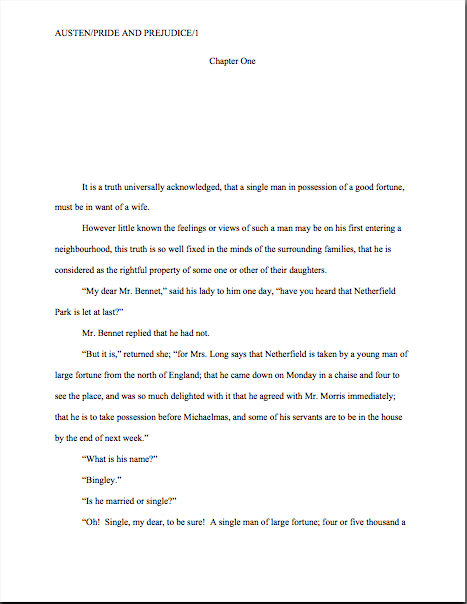
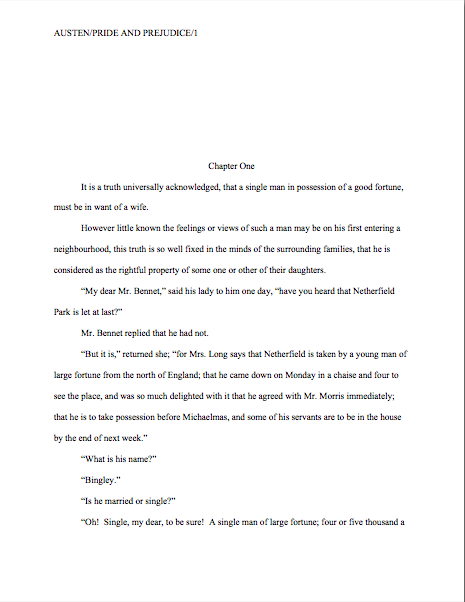
(9) The first page of each chapter should begin a third of the way down the page, with the chapter title appearing on the FIRST line of the page, NOT on the line immediately above where the text begins.

That’s twelve single-spaced lines, incidentally. Don’t panic if you’re having trouble visualizing this — I’ll be giving concrete examples of what the first page of a chapter should look like later in this series.

The chapter title (or merely “Chapter One”) may appear on the FIRST line of the first page — not on the last line before the text, as so many writers mistakenly do. The chapter title or number should be centered, and it should NOT be in boldface or underlined.

Why shouldn’t the title appear immediately above the text, as one so often sees — and, frankly, as some other writing sites advise? Because that’s where the title of a short story lives, not a book’s.

Very frequently, agents, editors and contest judges are presented with improperly-formatted first pages that include the title of the book, “by Author’s Name,” and/or the writer’s contact information in the space above the text. This is classic rookie mistake. To professional eyes, a manuscript that includes any of this information on the first page of the manuscript (other than in the slug line, of course) seems term paper-ish.

So where does all of that necessary contact information go, you ask? Read on.

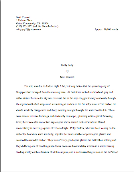
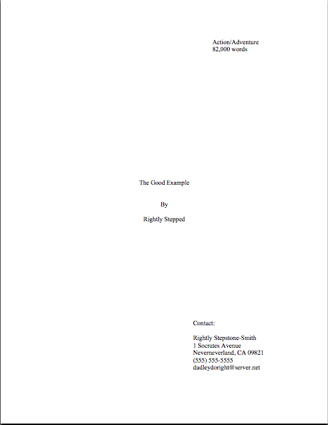
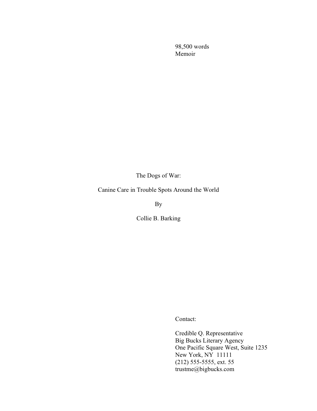
(10) Contact information for the author belongs on the title page, NOT on page 1.

This is one of the main differences between a short story submission (say, to a literary journal) and a novel submission. To submit a manuscript — or contest entry, for that matter — with this information on page 1 is roughly the equivalent of taking a great big red marker and scrawling, “I don’t know much about the business of publishing,” across it.

Just don’t do it.

“But wait,” I hear some of you out there murmuring, “I need a title page? Since when?”

Funny you should mention that, because…

(11) Every submission should include a title page, even partial manuscripts.

This one seems to come as a surprise to a lot of aspiring writers. You should ALWAYS include a title page with ANY submission of ANY length, including contest entries and the chapters you send after the agent has fallen in love with your first 50 pages.

Why, you ask? Because it is genuinely unheard-of for a professional manuscript not to have a title page: literally every manuscript that any agent in North America sends to any editor in hard copy will include one, for the exceedingly simple reason that it’s the page that includes the agent’s contact information. Yet, astonishingly, a good 95% of writers submitting to agencies seem to be unaware that including it is industry standard.

On the bright side, this means that if you are industry-savvy enough to include a professionally-formatted title page with your work, your submission automatically looks like a top percentile ranker to professional eyes from the moment it’s pulled out of the envelope. It’s never too early to make a good first impression, right?

If you do not know how to format a proper title page — and yes, Virginia, there IS a special format for it, too — please see the TITLE PAGE category at right. Or wait a few days until I cover it later in this series.

Again, it’s entirely up to you. No pressure here.

Before anyone who currently has a submission languishing at an agency begins to panic: you’re almost certainly not going to get rejected SOLELY for forgetting to include a title page. Omitting a title page is too common a mistake to be an automatic deal-breaker for most Millicents. Ditto with improperly-formatted ones. And yes, one does occasionally run into an agent at a conference or one blogging online who says she doesn’t care one way or the other about whether a submission has a title page resting on top at all.

Bully for them for being so open-minded, but as I point out roughly 127,342 times per year in this forum, how can you be sure that the person deciding whether to pass your submission upstairs or reject it isn’t a stickler for professionalism?

I sense some shoulders sagging at the very notion of all the work it’s going to be to alter your pages before you send them out. Please believe me when I tell you that, as tedious as it is to change these things in your manuscript now, by the time you’re on your third or fourth book, it will be second nature to you. Why, I’ll bet that the next time you sit down to begin a new writing project, you will automatically format it correctly. Think of all of the time THAT will save you down the line.

Hey, in this business, you learn to take joy in the small victories.

Next time, I’m going to finish going through the guidelines, so we may move on swiftly to concrete examples of what all of this formatting looks like in practice — because, again, I’m not asking you to embrace these guidelines just because I say so. I want you to have enough information on the subject to be able to understand why following them might be a good idea.

I’m funny that way. Keep up the good work!

The getting-a-book-published basics, part II: the control conundrum

tug-of-war-photo

My last post was so excessively long that I wore myself out, apparently: I barely had the energy to work my way through the couple of hundred e-mails from well-meaning readers of the Wall Street Journal, asking if (a) I’d seen this article and (b) whether those mentioned within its paragraphs were the same who kept threatening to sue my publishers (although not, perversely, yours truly) over my as-yet-to-be-released memoir, A FAMILY DARKLY: LOVE, LOSS, AND THE FINAL PASSIONS OF PHILIP K. DICK. I appreciate all of you kind souls taking the time to make sure I had (a), but since the answer to (b) is yes (and with arguments similar to those mentioned in the article), it would probably be prudent for me not to comment upon it here. Or, indeed, anywhere.

Except to say: ever get that feeling of déjà vu?

Back to the business at hand. For those of you who happened to miss yesterday’s epic post, I’m going to be devoting the next couple of weeks to explaining briefly how a manuscript moves from the writer’s fingertips to publication. There are several ways that this can happen, of course, and but for starters, let’s concentrate upon what most people mean by a book’s getting published: being brought to press and promoted by a large publisher. In the US, that publisher’s headquarters will probably be located in New York.

Everyone clear on the parameters — and that what I am about to say might not be applicable to a big publishing house in Paris, Johannesburg, or Vladivostok? Or indeed, a small, independent US publisher? Good. Let’s recap a bit from last time — and while we’re at it, let’s get conversant with some of the terms of the trade.

How a manuscript typically comes to publication at a major U.S. publishing house these days (as opposed to way back when)
As we discussed last time, fiction is typically sold as a completed manuscript; nonfiction is usually sold as a book proposal, a packet of marketing materials that includes a sample chapter and a competitive market analysis, showing how the proposed book will offer the target readership something different and better than similar books already on the market. While the proposal will also include a summary of each of the chapters in the book-to-be-written (in a section known as the annotated table of contents; for tips on how to construct this and the other constituent parts of a book proposal, please see the perversely-named HOW TO WRITE A BOOK PROPOSAL category on the archive list located at the lower right-hand side of this page), the editor will often ask the writer to add or subtract chapters or change the book’s running order.

Which underscores a point I made last time: a nonfiction book proposal is essentially a job application wherein the writer is trying to convince the publisher to pay him to write the book being proposed; a novel is a product that the author is trying to sell.

I can already feel some of your eyes glazing over from jargon fatigue, can’t I? Hang in there; I assure you that there are plot twists to come. (Not to mention a self-editing tip for those of you who long for the return of my December series of same!)

A hundred years ago, writers who wished to get their books published went about it in a fairly straightforward manner, by approaching editors at major publishing houses directly. If the editor liked the book, he would take it to what was (and still is) known as an editorial committee, a group of editors and higher-ups who collectively decided what books the house would bring out in the months and years to come. If the editorial committee decided to go ahead with the project, the publisher would typically pay the author an advance against projected royalties, edit the manuscript, and have it typeset (by hand, no less).

Today, a writer who intends to approach a large U.S. publisher generally must do so through an agent. The agent’s job is to ferret out which editors might be interested in her clients’ books and pitch to them. Unless an editor happens to be exceptionally well-established at his or her house, however, s/he is not the only one who needs to approve a book’s acquisition: typically, the book will still go before an editorial committee.

At that point, back in the day as well as now, it’s the editor’s turn to be the advocate for the book s/he wants to publish — and that’s not always an easy task, because other editors will be fighting for their pet projects at the meeting as well. Since a publishing house can only afford to bring out a very small number of books in any given marketing season, the battle for whose project will see print can become quite intense, and not only amongst the editors around the table. At a large publishing house, the marketing and legal departments might weigh in as well.

If a manuscript makes it through the hurly-burly of editorial committee debate, the editor will offer the writer a publication contract. (Actually, s/he will offer it to the writer’s agent, but it amounts to the same thing.) Contractual terms vary widely, but at base, a publishing contract will state that in return for pocketing the lion’s share of the profits, the publisher would bear all of the production and promotional costs, as well as responsibility for getting the book onto bookstore shelves.

In return, the author will agree to provide the manuscript for by a particular date (usually quite soon for a novel — which, as you will recall, is already written before the agent takes it to the editor) or as much as a year and a half later for a book proposal. After the author delivers the completed manuscript (usually in both hard copy and as a Word document), if the editor wants changes, s/he will issue an editorial memo requesting them.

If your heart rate went up by more than a third at the very suggestion of being asked to alter your manuscript, you might want to sit down, put your feet up, and sip a soothing beverage whilst perusing the next section. (Chamomile tea might be a good choice.)

Why? Because when an author signs a book contract, she’s agreeing to more than allowing the publisher to print the book.

Control over the text itself
The author gets to decide what her own book does and doesn’t say, right? Not to mention how it’s expressed.

Actually, no, if she sells the rights to a publisher. While the author may negotiate over contested points, the editor will have final say over what will appear on the pages of the finished book. The contract will say so.

And no, in response to what you’re probably thinking: you’re almost certainly not going to be able to win an argument over whether something your editor wants changed will harm the artistic merit of the book. (Sorry about that, but it’s better that you’re aware of this fact going in.)

How do I know? Experience, mostly. After all, pretty much every first-time author faced with editorial demands has attempted to declare something along the lines of, “Hey, buddy, I’m the author of this work, and what you see on the page represents my artistic vision. Therefore, I refuse to revise in accordance with your (boneheaded) suggestion. Oh, well, that’s that.” Or at least thought it very loudly indeed.

That’s an argument that might conceivably work for a well-established, hugely marketable author, but as virtually all of those aforementioned first-time authors could tell you, no one, but no one, at a publishing house is going to find the “My art — my way!” argument particularly compelling.

Or even original.

Why? Well, remember my earlier quip about how publishing houses can only bring out a few titles in any book category per year, far, far more than their editors would like to bring to press?

Uh-huh. It’s never wise to issue a take-it-or-leave-it ultimatum to people so well equipped with alternatives that they can easily afford to leave it. Especially if the issue in question is something as small as cutting your favorite paragraph.

I’m telling you all this not to depress you — although it’s not all that difficult to imagine what I just typed having that effect, admittedly — but so that you will not waste your energy and reputation on battling over every single requested change with your editor. If you bring a book to successful publication, I can virtually guarantee that you will have to compromise on something; editorial control is built into the publishing process. Learning to pick your battles, figuring out when give in gracefully and when to go to the mat, will serve both your interests and your book’s best in the long run.

May I hear an amen? No? How about a few begrudging grunts of acknowledgment? Well, suit yourself, but if you found that last argument trying, you might want to find something to bite down upon before you read on.

Why, you ask with trembling voice? Well, final say over the actual text and the ability to determine the timing of publication are not generally the only authorial rights one signs over via a publishing contract.

Other matters that aspiring writers generally assume that they will control after they sign a book contract, but usually don’t
Just a few of the tidbits that most first-time authors are stunned to learn that they cannot dictate for their own books: the typeface, the type of binding, the use of italics or special fonts, the number of illustrations, if any, when it will come out, and what the cover will look like.

Also almost always beyond a first-time author’s ability to do anything about: the book’s title (that’s generally the marketing department’s call, believe it or not) and whether there is an acknowledgments page (the reason that they have become rarer in recent years is not that authors as a group have magically become less grateful, but that, like the dedication and epigraphs — those nifty quotes from other authors that often appear in published works — they take up extra page space, and thus render publishing a book more expensive).

I feel you glowering, but don’t blame me — I’m just the messenger here. As a memoirist whose title was summarily changed by her publisher from something she expected to be changed (Is That You, Pumpkin?) to one that was bizarrely ungrammatical (A Family Darkly), believe me, my sympathies are mostly on the writers’ side here. (And no, no publishing house employee was ever able to explain to me with any degree of precision what they thought their preferred title meant. The marketing department just thought it would be a good idea for the cover to make a vague reference to A SCANNER DARKLY, because the movie would be coming out around the same time.)

My point is, while landing a publication contract for a first book is certainly a coup, you’ll have a much, much happier life as a professional writer if you don’t expect it all to be one big literary luncheon where the glitterati congratulate you warmly on the beauty of your prose and the insight of your book’s worldview. It’s going to be hard work — for a crash course in just how hard many first-time authors find it, please see the GETTING GOOD AT INCORPORATING FEEDBACK category on the list at right — and if you’re going to be successful at it, you’re going to need to come to terms with what you can and cannot control.

Speaking of which…

The hows and whens of book publishing
Another matter that the publication contract will specify is the format in which the publisher will release the book. Translation: it won’t be up to you whether your book will be released in hardcover or not. That may not distress you now, but it may well come the release date: historically, the author’s percentage of the cover price (a.k.a. the royalty) has been higher for a hardcover book than for a paperback.

One reason for that: hardcover books were considered more serious, literarily speaking, than a volume a reader could fold and stuff into a back pocket. In fact, until fairly recently, newspapers and magazines habitually reviewed only hardcovers for most novel categories, since that was the standard for high-quality fiction releases.

In the last 15-20 years, however, fiction (and quite a bit of nonfiction, too) has been released in trade paper, those high-quality softcovers that so conveniently may be rolled and stuffed into a purse or backpack, so the earlier review restriction has softened. That’s definitely good news for first-time novelists, as well as those of us who like to lug around several different books when we travel. Typically, the author’s royalty on a trade paper release is lower than for a hardback, but higher than for paper.

Everyone with me so far, or are you mentally calculating how much you will end up making per hour for writing your novel. Don’t even go there; that way lies madness.

Once an editor has acquired a manuscript, it is assigned a place in the publisher’s print queue. In other words, the publisher will tell the author when the book will actually be printed. Since much must happen between the time the editor receives a finished manuscript and when it goes to press, the contracted date by which the author must provide the book is generally months prior to the print date.

This, too, often comes as a surprise to a first-time author. If you wish to see your books published, though, you will have to come to terms with the fact that an author’s life is a hurry up/wait/hurry up/wait existence.

Its main manifestation: how long it takes for a major publisher to bring out a book. Although they sometimes will do a rush job to meet the demands of a current fad, the typical minimum time between an author’s signing a book contract and the volume’s appearance in bookstores is at least a year.

And that’s for fiction — which, as you will no doubt recall, is already written before the publisher has any contact with the book at all. For nonfiction, the time lapse is often substantially longer, in order to permit the author to write the book in question.

The moral: although one does indeed see books on current news stories hitting the shelves within a matter of weeks (the OJ Simpson trial, anyone?), that is most emphatically not the norm. A savvy writer takes this into account when constructing a narrative, avoiding references that might seem absolutely up-to-the-minute when he first types them, but will be as stale as last year’s fashions a year or two hence, when the book is finally available for readers to buy.

The publishing world’s term for a book that contains references likely to spoil over time is easily dated. Unless you are trying to tie your characters to a very specific time and place (as most contemporary fiction doesn’t), excising such references prior to submission usually increases its marketability.

A market-savvy self-editing tip for novelists and memoir-writers: go through your manuscript, highlighting any cultural reference that might not make sense to a reader five years hence. When in doubt, whip out your highlighting pen. Mention of a character on a TV show? Mark it. Complaint about a politician currently in office? Mark it? Any reference at all to Paris Hilton? Perez Hilton?

You get the idea. This is not a moral judgment you’re making, but a calculation about pop culture longevity.

While you’re reading, take the time to note what the reference is and the manuscript page on which it appears. After you finish, go back and read through the list: would your target reader have recognized each of these five years ago? If you’re writing for adults, would a reader in high school now know what you’re talking about? Are you really willing to bank on whether Arby’s latest moniker for a sandwich is here to stay — or that your target reader will even know about it?

If you aren’t sure about the long-term cultural resonance of, say, the McRib, walk into your local community library, find the person reading the 19th-century novel (if you can’t find one in the stacks, try behind the check-out desk), and offer to buy that kind soul a nice cup of coffee if s/he will be nice enough to take a gander at your list. If the lady with her nose in a minor Charlotte Brontë novel doesn’t recognize a cultural reference, chances are that it’s not as pervasive a phenomenon as you may have thought.

After you have figured out which references need to be changed or omitted, go back and examine the ones you decided could stay. Is that reference actually necessary to the paragraph in which it appears? Is there another way that you could make the same point without, for instance, using a brand name?

Meanwhile, back at the ranch…
As I was walking you through that last exercise, I spotted some raised hands out there. “Um, Anne?” the folks attached to those hands inquire timidly. “I don’t mean to seem shallow about my writing, but I notice that you haven’t said much about how and when an author actually gets paid for her work. Since I will have invested years of unpaid effort in writing a novel or perhaps months in constructing a marketable book proposal, is it unreasonable for me to wonder when I might start to see some sort of a tangible return on that investment?”

Of course it isn’t shallow. Let’s take a closer look at how and when a writer might conceivably start cashing in for those manuscripts and/or book proposals she’s written on spec.

How authors get paid for their books
As I mentioned in passing above, an author who publishes through a large publisher is paid a pre-agreed proportion of the book’s sale price, known as a royalty. An advance against royalties (known colloquially just as an advance) is an up-front payment of a proportion of what the publisher expects the author’s percentage of the jacket price for the initial print run (i.e., the total number of books in the first edition).

Generally speaking, the more spectacularly the publisher expects the book to sell, the larger the advance. That’s a calculation based upon a lot of factors: how much it will cost to print the book (anything over 500 pages requires more expensive binding, for instance, and color photos are expensive to reproduce), how large the already-existing market is for similar books, how difficult the marketing department thinks it will be to reach those readers, whether Barnes and Noble is having a bad year, and so forth.

It is, in fact, a guesstimate — and as such, tends to be low, especially for first-time authors.

Why not aim high, let the author quit her day job, and hope for the best? Because the advance is by definition an estimate of a number that no human being could predict with absolute accuracy, if the publisher’s estimate was too high, and thus the advance too large for the royalties to exceed, the author is seldom expected to pay back the advance if the book doesn’t sell well. However, once the book is released, the author does not receive further royalty payments until after her agreed-upon share of the books sold exceeds the amount of the advance.

Since approximately 2/3rds of you just gasped audibly, let me repeat that last bit: the advance is not in addition to royalties, but a prepaid portion of them. An advance is not a signing bonus, as most people think, but a down payment toward what a publisher believes it will eventually owe the author.

While your jaw is already dropped, let me hasten to add that royalties over and above the advance amount are usually not paid on an as-the-books-sell basis, which could entail the publisher’s cutting a check every other day, but at regularly-scheduled intervals. Once every three or six months is fairly standard.

The moral: read your publication contract carefully. If you don’t understand what it says, ask your agent to explain it to you; it’s her job.

Those hands just shot up again, didn’t they? “I’m glad you brought that up, Anne. You’ve made it clear why I would need an agent to help me though this process, which sounds like a drawn-out and somewhat unpredictable one. So how do I go about finding the paragon who will protect me and my work?”

I’m glad you asked, hand-raisers — but I’m afraid agent-seeking is a topic for another day.

Before I signed off, allow me to add: don’t feel bad if you were previously unaware of how writers get paid; half the published authors I know were completely in the dark about that last point until their first books had been out for five months or so. It’s not something that we talk about much in the writing community, perversely. And that’s a shame, because In the current market, when advances for new are often reflective of the gloomiest projections, while those for bestselling authors keep rising, I suspect that a significant percentage of the authors who sign their first publication contracts in the months to come are going to be mystified at being offered an honorarium when they expected enough dosh, if not to allow them to retire to write full-time, at least to permit cut back their hours.

Don’t panic; conditions change. One thing you may rely upon to remain the same, however: the writer who is in it for the love of literature probably going to be happier enduring the ups and downs of getting published than the one who walks into it with dollar signs in his eyes. Good writing is a gift to humanity, after all, every bit as much as it is a commodity for its author to sell.

Keep up the good work!

Pillory This, by guest blogger Flavia Alaya

under the rose alaya coverPhoto:  Ellen Denuto

Hello, campers –

Yes, I know: we’ve been trying to polish off our ongoing series on polishing up a query letter, but now that the holiday weekend is upon us, I thought we should pause, take a breath, and celebrate just how much work all of you have done throughout this series — or, depending upon your reading habits, give some of you time to catch up. Hey, query-writing is hard stuff.

Which is why I am so delighted to bring you my promised reward for virtue: a fascinating post on dealing with having one’s book reviewed by memoirist and nonfiction writer Flavia Alaya, author of the incredibly brave and revealing UNDER THE ROSE: A CONFESSION, among many, many other works. (Seriously, her bio will astound you — see the end of this post.) From the publisher’s blurb:

Beneath its “scandalous” surface, Flavia Alaya’s story goes to the heart of women’s struggles for independence, self-definition, and sexual agency. When she first met Father Harry Browne, Alaya was a vibrant but sheltered young woman on a Fulbright scholarship to Italy. When the attraction that began in a cafe in Perugia became too compelling to resist, they embarked on a love affair that violated some of the deepest taboos of society, the Church, and her Italian American family, yet endured for over two decades, through years of shared dedication to social activism and through the birth of three children.

Intriguing, no? From the slightly more revealing Library Journal review:

At 22 years of age, in a cafe in Italy, Alaya met fellow Fulbright recipient Harry Browne, 16 years her senior. Raised in New York’s Hell’s Kitchen, Browne was a social activist, a historian — and a Catholic priest. Their relationship endured for over 20 years, producing three children and seemingly sustaining both extraordinary parties quite well. Not a martyr to love, Alaya was able to hold onto independence and self-possession while experiencing a profoundly passionate attachment to a fascinating human being. Through the bonding of social activism, Browne and Alaya weathered many civil rights storms, the 1960s antiwar movement, and a grass-roots campaign against a New York real estate grab. Browne championed the poor and fought to better their housing situation; Alaya wrote scholarly articles on 19th-century literature. The relationship’s secrecy (it was hidden “under the rose”), its continual trials and stress, and the ousting of Browne as priest when it was discovered pull the reader along for the ride with elegiac style.

And the still more descriptive ForeWord review:

She was a twenty-two-year-old Fulbright scholar from New York fleeing her immigrant Italian family’s claustrophobic love, he was a thirty-eight year old Catholic priest from the city’s Irish tenements of Hell’s Kitchen, researching Church archives. They met in a Perugia café in 1957: a thunderbolt, opera’s grand coup de foudre of destiny.

Their affair, shamelessly shameful, was to be sub rosa, under Cupid’s rose of secrecy. In small rented rooms, in the fervid, emotive culture, Italy itself seemed to become their duenna and collaborator. They returned to New York, she to an apartment on the Upper West Side, he (as fate would have it) to a parish blocks away, the fiction of their friendship so carefully maintained that not even her own family knew the father of her children. Ironically, their private war against the Church’s conservative patriarchy augured the decade’s larger battles of civil disobedience and feminist freedom. With their own adopted neighborhood soon slated for massive urban renewal, which would displace so many working poor, Father Harry Browne moved quickly into political activism. (It was in Father Browne’s office that the FBI arrested Father Berrigan, notorious for burning Pentagon draft records to protest the Vietnam War.) Thus, as in opera as in life, love and politics are ever held close, one of the many paradoxes Alaya so lovingly, so wisely ponders in Under the Rose.

Those asking for theology or psychotherapy may be disappointed, but those asking for well-written honesty will be handsomely rewarded. In a poignant, lucid language that combines the pace of fiction with the intimacy of a love letter, her “memory-ghosts” bring private and social history to full circle, the story of an immigrant’s search for freedom of expression. Under the Rose is the very model of memoir writing, of a woman’s voice finally finding perfect pitch.

Why am I showing you three different plot summaries, you ask, rather than just the usual publisher’s blurb? For a couple of reasons, one pertaining to our series-in-progress, one to today’s topic.

First, did you notice anything about those three descriptions of the same book? The first two were of reasonable lengths to use as the summary paragraph of a query letter — 99 and 162 words, respectively. So what makes the first strong back jacket copy, but the second a better bet for a query or pitch?

If you immediately cried, “By gum, Anne, the vivid details in the second!” give yourself a gold star for the week: you’ve been paying attention. The specifics really make a difference in the storytelling department, don’t they, even in so short a piece?

If you also shouted, “The blurb reviews, while the second demonstrates why a reader might be interested in the book,” award yourself a second gold star. Heck, take yourself out for an ice cream sundae: that was an astute observation.

But wait; today’s pop quiz is not over yet. Since the first two descriptions illustrated my ongoing point so beautifully, any guesses about why I saw fit to include the third?

Hint: the answer lies in the word count.

Okay, I’ll just give you this one: at 302 words, it would make a pretty good 1-page synopsis. You know, the kind that agencies’ websites and agency guides’ listings keep asking writers of 350-page books to send with their queries and/or pages. True, the last paragraph is pure review, as is the last sentence of the second.

But it just goes to show you: it is indeed possible to give the contours of a story in that number of words without resorting to blurry generalities. No matter how many times you re-checked that requirement on the agent of your dreams’ website, hoping you had misread it, it’s actually not all that unreasonable a request.

The second reason to walk you through all of those reviews was even more straightforward: Flavia’s going to talk to us today about what it’s like to get a book reviewed. And not necessarily nicely.

One of the classic writerly fears, right? Flavia is going to tell us how to confront it straight-on, instead of running away screaming.

I’m very excited about this guest post, and not merely because, as those of you who have been dropping by Author! Author! for a while are no doubt already aware, I’m a huge fan of wrestling those big, bad writerly fears out into the open, examining them thoroughly, and talking about how to deal with them practically. There’s been a lot of talk on the conference circuit lately about career writers, the kind who have more than one book in ‘em.

Career writers’ work used to be considered the backbone of the publishing business, you know. A blockbuster may sell a million copies on a fluke, but authors whose established readerships kept returning for subsequent books provide publishers with consistent, relatively predictable income. With the decline of the multi-book contract, however, many agents in recent years had become less interested in hearing about a prospective clients’ other book ideas than in whether the manuscript in front of them might be the next breakout hit.

With the economic downturn, however, the phrase career writer has been turning up on more and more lips. It’s not even all that unusual these days for agents to ask newly-signed clients to come up with one-paragraph descriptions of their next three or four projects, just to have at the ready in case an editor impressed with a manuscript asks.

Don’t tense up; start brainstorming.

As this trend has been heating up in recent months, I’ve been eagerly blandishing career writers to come and share their insights with our little writing community. You want to know what a long-term career strategy looks like, don’t you?

So please join me in welcoming Flavia Alaya, career writer and memoirist extraordinaire. But before I hand you over to her, let me add: UNDER THE ROSE is available on Amazon and, of course, directly from the publisher. Oh, and that lovely photo of Flavia above was taken by Ellen Denuto.

Take it away, Flavia!

under the rose alaya covermilk-of-almonds-cover-alayareconciling-catholicism-coverunder-the-rose-alaya-cover-2

Under the Rose is memoir as collage—less in style than in process. When it began its manuscript life, the book was the relatively brief and tidy account (with a few flashbacks) of my first 13 or so years with Harry, in Italy, then in New York—essentially our secret life together…sub rosa, or “under the rose.” When the manuscript (which was sold three times over 16 years of writing and rewriting—long story!) was finally acquired by The Feminist Press and positioned for their Cross-cultural Memoir Series, publisher Florence Howe asked to see the core theme in the context of a “life.” This meant weaving two or three more complex narratives into the original—the back-stories (what was it in both our early lives made us able to tolerate, maybe even need, that kind of secrecy?) and the post- and post-post-scripts: how we both met the critical test of going public, and then how I faced life without him when he died.

A challenge. Many challenges. First, unpacking more hard truths about my family—and his—than I’d ever intended to. Then (harder) untangling the sticky weave of that final public decade together in the ‘70s, when we struggled to float the flimsy raft of a “liberated” partnership—with three small kids nailed to it—through virtual tsunamis of academic and ecclesiastical politics. Not only did I have to tear the book apart and reassemble it. I had to back off from it. I had to take the entire project (which had seemed so obvious and simple, once) more seriously…and myself less. Much less.

Which is one reason this review struck me as so baffling:

What is the point of her ‘confession’? That she’s a good and put-upon person? If so, it is better left to others to make the point for her; none of us can afford the luxury of publishing our questionable righteousness.

A bite, a mere rebarbative nine-year-old mouthful of what used to be standard Barbara Grizzuti Harrison agita in The New York Times Book Review…except that it was directed at me and my memoir.

Baffling. Because if I’d had my way, Under the Rose would have been subtitled, with obvious irony: “A Life in Six Operas.” Even the present “Confession” has its edge—absolution was the last thing I was looking for! But here was the Press again, hoping a more salty subtitle might trump their off-putting imprint and win them some new readers. Inside, however, opera names still define the book’s six parts (Tosca, Gioconda, Traviata, etc.), and adjust the tone (or so I thought) in two self-satirical ways, denoting the spectacular Italian American family culture I grew up in, first, and then caricaturing the over-the-top romanticism I’d internalized with it. Maybe it was a complex way to suggest, as a part of the theme, why my inner diva took so very long to outgrow, and why it cost so much tearing of heart muscle. But I didn’t think it inaccessible, especially to a Times reviewer.

On the other hand…

Well, on the other hand, Harry was a very funny man. You couldn’t take him anywhere—not without pulling a crowd that would quickly be doubled over in bodily pain. No invidious comparisons with great Italian literature are intended, but maybe Under the Rose should come with a warning label: if clerical sex doesn’t make you laugh, close the book. Or burn it.

I girded myself to reread the review for this blog, but I was sure I could deal with it. I was way too sensitive then. And besides, she’s dead. And besides, nine years is long enough.

But no, the bloody thing still had its ghoulish way with me, like a Dracula lover. Be objective, I tell myself. And I am. Objectively, it must be one of the most venomous reviews of a memoir ever to appear in The New York Times Book Review. OK, limit the sample to ex-editor Charlie McGrath’s wrathful-God Book Review universe, where there were body-counts. The citation still stings.

Right now, you know what I’m thinking? I’m thinking it would be really nice if you’d take my word for it, but I bet you feel double-dared to go and read it. Well, damn you, go ahead. But come back afterward, because that review never should have been the end of it—not for me, but not even for her.

Here it is.

OK. Agree with me on this, that what Harrison’s maundering few-hundred words are unleashing is disgust, a given, a natural response to the book’s basic and objectively revolting premise, that I actually had an underground career as a priest’s “wife.” Well, it is objectively revolting, isn’t it? For an Opus Dei sort like herself, of whom it could be said—and was—that the Curia was kindlier and less Roman? Please.

And now, seeing as Roman is the only form of Catholicism to demand a pretense of lifelong eunuchry in its priesthood, channel the fair-minded editor of the Book Review assigning the book to her: who could be more qualified to review a challenge to the ideal of Catholic celibacy? Let her rip! “Fortunately Alaya loves herself sufficiently, {sic} to relieve the reviewer of any obligation to protect her ego.”

Ah, what fortress faith, what crusading passion, to crush the nano-flash of pity that inspired that line. I still find it hard to get past it.

Pearl of Writerly-Wisdom #1:
A brutal review goes straight to your voice. For a while it’s as if somebody has carved out your larynx with a bread-knife and you keep on trying to make the breath you still push through the replacement tube sound like you.

For years I’ve twitched whenever people said they’d come across that review on the web. Sure, I was onto Grizzuti’s rap-sheet as hitwoman, but what was I supposed to say? That she’d slashed the likes of Joan Didion and Spike Lee too, and look at the company I’m in?

There are some reviews you should never read twice, unless you have another larynx to turn. No, nine years are not enough. And now Google can serve up Grizzuti’s little murder, on demand, to me or anybody looking for me, almost always at the top of the hit-list. Maybe forever—all the forever that matters to a writer.

There’s a silly analogy to Keats’s urn in here somewhere. Instead of those lovers forever yearning toward each other to the sound of a silent flute, there’s this worthless writer forever pinioned by this bloody reviewer’s disgust, somehow never able to “love herself sufficiently” to get outside that shell of ego-protecting denial.

But…

Pearl of Writerly-Wisdom # 2:
You don’t stop talking just because you get told to shut up. I’m not saying you shouldn’t, just that you don’t. And, yes, you probably shouldn’t.

Maybe stories like this don’t end till you really go silent. As self-writing goes, let’s just say I’m probably at the end of the middle of whatever story this is, where I gravitate to scholars of autobiography and reflect on their wisdom. Lauren Berlant is one. She says in pretty good academy-speak that to write the self is to try to create “a spectacular interiority worthy of public notice” (The Queen of America Goes to Washington City, 1997).

I love the compression of this. Right at the top it says that you’re making a spectacle of yourself, which I admit I have done, and still do.

But the “worthy of public notice” part? That’s the paradox for Berlant to unfold. If the interior self you’re exposing isn’t normative, if it’s different in a way not embraced by the larger culture, or if what you’re exposing—maybe a hidden truth or reality, an injustice—is something the majority culture (or somebody in its service) would rather not see exposed, then it’s difficult to make it “worthy” of public notice, isn’t it.

Except perhaps over time, and in this sense, to write the truly “spectacular” self is to write to the future. Because as you write it, in that time, it must be by definition unworthy, and by somebody’s standards even shameful, or better, shameless. Something to be pilloried, in service to the spectacle of your shamelessness.

Pillory this. Grizzuti and the Times did, bless ‘em, and I guess from that perspective there‘s an edge of flattery in it. Otherwise, why me? Under the Rose, my first non-academic book, had come out of CUNY’s Feminist Press, so minor and semi-academic a publishing house by Times standards that not one of its best books had yet had a single dedicated review within their pages. Mine should have been an equivalent non-event, yet they gave it a full-page that Sunday, with artwork, no less, page 9.

John Updike was there a week later.

Maybe BGH hated my book for good literary reasons, but I doubt it. Her deft surgical skills were simply at the service of a special version of the normative—hers, of course, but also the Times‘ then, before the scandals that made Catholic pretensions to purity fair game. You and I know that if it were true that “none of us can afford the luxury of publishing our questionable righteousness,” there’d be a lot fewer book reviews than memoirs.

This is good to remember, to score up there on the wall (as one of my writer-friends does) with other great self-help mantras. It also self-helped (it still does) that Under the Rose went to press with the imprimaturs not just of Marilyn French but of Nuala O’Faolain and Sandra Gilbert, both brilliant memoirists, both sometime Catholics, and both household saints in my calendar. I wonder by my own litmus test whether I really was “writing to the future” if some pretty testy other reviewers said some pretty nice things about Under the Rose in some pretty good places.

But back then, of course, in the fresh wake of Grizzuti, it didn’t matter who liked it. Behind that thick bark of ego she gave me there was barely a trickle of self-love left for savoring praise. Only weeks before that review was published my father had died—the patriarch who’d figured so huge in my story that I’d once actually thought of calling it Father—and the very Sunday it appeared I was in flight to California to help empty his house.

For a while, I’d say his death probably silenced me more than Grizzuti. Remembering it now makes me wonder what else I lost, or had to lose? Well, some things I thought I wanted, like the respect of my academic colleagues, the more careerist of whom instantly smelled Times roadkill and cut me off. It took awhile for me to see that academic cachet was something I’d already begun to de-value—otherwise why write a memoir in the first place? Maybe they’d known that before I did.

Could be, then, whatever else I lost, whatever still hangs somewhere in that vague .alt universe, was some of the same stuff—stuff I only thought I wanted.

Pearl of Writerly-Wisdom #3:
We have more than one life to live, and more than one voice to give.

I had a lot of possible voices from the beginning. So it could be that the right analogy for that review was not a laryngectomy but a stink-bomb. It emptied the building. But it didn’t take long to hear the riot of squatters rumbling up the stairs to fill the place. All those voices! They may have been attached to the same maimed name, but they had something, spectacular or not, still left in them to say.

milk-of-almonds-cover-alaya

I was nearly immediately invited to contribute to two anthologies, one a group of Italian American women writing on food and culture (a short story, “Love Lettuce,” to The Milk of Almonds (Feminist Press, 2002); and an essay for a gathering of mostly Catholic feminists on their complicated attachments to the Church (“The Elephant is Slow to Mate” in Reconciling Catholicism and Feminism?, the University of Notre Dame Press, 2003, a publication that, by the way, merits a special little Grizzuti-star).

reconciling-catholicism-cover

But my favorite re-gift came from an Italian scholar with a passion for sex and the sacred, Serena Anderlini-D’Onofrio, who trumped the grimly silent Academy (and it must be my formidable ego that makes me LOVE to repeat this story) by making Under the Rose a cameo text at a conference session of the MLA’s annual meeting in New York. (Serena is a serious trip: see her own memoir, Eros: A Journey of Multiple Loves, 2006, and her website.)

eros-jacket-1

And then, as you know, the future—or one of the futures—I was writing to came maybe sooner than anybody expected, and what is fondly termed the Priestly Pedophilia Scandal burst on the culture scene.

Almost immediately, a Dublin publisher (New Island Press) contracted to do their own edition of Under the Rose.

under-the-rose-alaya-cover-2

Whereupon the Irish—who live in such an intimately conflicted family relationship with the Church, bought it, read it, reviewed it (quite soberly and generously), eventually made a half-hour TV movie about it, and seemed generally delighted to deflect attention away from the boys, and in the direction of my consensual, heterosexual, and mostly cavorting relationship with an utterly charismatic, brilliantly political, and howlingly funny Irish-American person who was, as it happened, also a priest “to the bone.”

Still, I have never published another book. Those “squatter” voices, a half-dozen or so like this one, slip in and slip away. Some are quite true, not ringers, slowly reclaiming the place now that the furniture in the apartment is a bit ratty but less odiferous.

I keep telling myself I have to get some new furniture. Or a whole new apartment—my ever recidivist self-love certain that there’s an absolutely brilliant historical novel in me…or maybe a series of murder mysteries, a theme on which I’ve become more expert with time.

But I cannot tell a lie. I was probably never meant to tell anything but true stories, truly. I regret that I didn’t devote more craft to making my one big book three smaller and better ones. And now I’d love to pull together a collection of hilariously picaresque true tales about my rogue of a lover-husband on this, my second time around.

flavia-and-husband

FLAVIA ALAYA, who dubs herself “a writer of all work,” professed cultural history at Ramapo College of New Jersey and helped found its original School of Intercultural Studies. (Sub)versions of infamy and secrecy attract her: her first book, a Harvard Press biography of Anglo-Scot writer William Sharp, is the still-standard account of his masquerade as a female poet (“Fiona Macleod”). Later work pioneered a feminist revaluation of Elizabeth Barrett Browning, the disparaged English poet who was, of course, also a consummate (if more discreet) memoirist.

But a little like Elizabeth, Flavia has always been too love-struck for the perfect feminist, and when her partner, star labor and immigration historian—and Roman Catholic priest—Harry Browne, died of leukemia in 1980, the project of writing about him—about them—seemed a way to prolong their life together. The adventures detailed inside this memoir made for a rocky manuscript adventure outside it that didn’t end (as you’ll see) with its publication by the Feminist Press in 1999.

But the “writer of all work” scrubs on, maybe more in the kitchen than the front parlor. As a civil rights advocate post-9/11 she wrote immigration detention exposés (and recounted anti-detention street activism) for the online journal CounterPunch. But always under the spell of city life and culture, her skills have turned not just to preservation activism but to “scripting the (local) landscape” as a form of community resistance to change, a vaguely subversive culture underground. From New York’s West Side to Paterson, New Jersey, small books—hidden histories revealed—like Gaetano Federici: The Artist as Historian, Silk and Sandstone, and Bridge Street to Freedom (a multi-layered account of the landmarking of a station of the Underground Railroad) have become a favorite medium. In collaboration with a local sports maven, she recently unpacked the lively story of Paterson’s Depression-era Negro Leagues stadium into a successful National Register application and a website.

Two Geraldine R. Dodge Foundation writing fellowships at the Vermont Studio Center helped complete her memoir and then carry forward a draft novel on the life and amazing disappeared career of Joseph McDonnell, once-flamboyant Fenian, cofounder of the First International, editor of the long-lived Paterson Labor Standard, and pioneer author of the first progressive labor legislation in New Jersey. She has paused in this unfinished business to script narratives of industrial, labor and women’s history into the landscape of Bridgeton, New Jersey, her new base, as well as home of the largest historic district in the state.

An inside look at a formal writing retreat, part II: the application process

a-view-from-behind-the-writing-desk

Yesterday, I began an interview with Kerry Eielson and John Fanning, the brave souls responsible for running the remote writing retreat from which I have recently returned, La Muse. Since I utterly forgot to run a basic description of the place yesterday, here are the basics:

La Muse Writers’ and Artists’ retreat in Southern France is located in an ancient village perche called Labastide Esparbairenque, in the historic Aude department of Languedoc. We provide a space where artists and writers can work in a peaceful, isolated and inspiring setting. We have hosted poets, novelists, non-fiction writers, screenwriters, painters, visual artists, photographers, chefs, composers, directors, healers and more. Rooms are available to barters, recipients of fellowships and grants, and to individuals who apply directly through La Muse.

The house overlooks its own intimate valley and river. Enjoy magnificent views from every room as well as from our terrace and gardens. On breaks from work, go wine tasting, visit local markets, swim in the nearby lake or just enjoy nature. We are located in the midst of the French national walks system, where well-marked trails scribble the countryside.

What we offer is quite specific: time and space to create among peers, and access to nature, culture and good food. The retreats create a rewarding environment for attendees as well as our ever-growing artistic community. So come create and participate in a growing creative community, one that encourages artistic diversity as well as an exchange between cultures from all over the world.

Something I also neglected to mention yesterday: you’ll find the application here. Even if you are not in the market for a retreat experience, you might want to take a quick gander at the application requirements, as they are relevant to what I’ve been talking about for a week now — and speak very directly to our topic du jour, which is all about how people write their way into someplace like La Muse.

Why veer away from the daydream-worthy retreat experience to talk about something as practical as what makes a winning application? While I could post for weeks on what day-to-day life is like at La Muse and similar artists’ retreats — I could, for instance, have blogged about it on a daily basis while I was there — my first priority in this interview series is to glean as much practical information as possible for those of you who might be considering investing in some serious retreat time.

So for this part of the interview, I ruthlessly turned the conversation toward a topic we pursued a few days ago: residency applications, fellowships, and just how writers’ retreats decide who should and should not come.

Did I just hear a gasp of disbelief from those of you who have never tried to gain acceptance to a formal writers’ retreat? Almost universally, it’s not enough to show up on with the requisite fee, a burning desire to write, and the time to do it: very few artists’ colonies are willing to take everyone who applies. As I mentioned on Monday, serious retreats require an application packet that demonstrates not only the potential applicant’s willingness to retreat, but talent and professional acumen.

Knowing how I love you people, was I going to allow a rare opportunity to grill folks who evaluate writers’ retreat applications on a regular basis?

Of course not. Let’s join the conversation already in progress — and to humanize the potentially fearsome souls on the other side of the application envelope, here’s a snapshot I took of Kerry and John at a moment of retreat conviviality. (Those two homemade vegetable pizzas were fresh out of the oven, incidentally.)

john-and-kerry-serve-dinner-at-la-muse

Anne: Something I’ve noticed that we have in common is our strong belief that writers should help one another. Since you are so supportive of writers at every stage of their careers, why did you decide to establish an application process, rather than just accepting anyone who wanted to come?

John: People need to know what it is they are coming here for. It helps them and us to know exactly what they are going to be working on. Otherwise they get frustrated and annoyed with themselves for wasting their own time.

Kerry: We wanted to make sure people didn’t expect Club Med.

Anne: Oh, I know that kind of retreater: ostensibly getting away from everything to write, but outraged to learn that there isn’t round-the-clock room service and a shopping mall with a movie theatre next door to the retreat.

Kerry: We really want people who are going to benefit from La Muse in the way we intended, people who are coming to work on a creative project. We charge significantly less than a B&B of comparable quality. If we wanted people on vacation, we’d run a hotel.

We also want to make sure that interested writers and artists know that the house isn’t by aim social (though conviviality is a nice boon), and that everyone else here at any given time is here to be absorbed in a solitary, creative activity.

The best way to convey all that is to make it official, ask them why they’re coming, and help them get organized before they come.

Anne: I’m going to toss tact to the four winds and come right and ask what every writer who applies for a residency most wants to know: what do you like to see in an application? In general, what separates a strong packet from a weak one?

Kerry: First and foremost, I respond well to someone who is both professional and personable. I like a polite, formal but warm address, something respectful but not rigid—good attributes in a small community setting.

Anne: That makes a lot of sense; it’s the same note an aspiring writer should strike in a query letter or pitch. Since capturing that tone puzzles many writers, do you have any pointers on how to achieve that balance in a first approach or application?

Kerry: Write the email like a good old-fashioned cover letter. Answer the points and include the documents we request on the how-to-apply page of our website. Show us you’ve done some research, and have at least read the website.

Anne: I can’t tell you how often I’ve heard agents say precisely the same thing about querying. Queries, pitches, and applications that seem unsuited to the recipient tend not to go over well.
view-from-library-at-la-muse

Anne: Anything else?

Kerry: I love an application that doesn’t have any parts missing. That said, if something’s missing in an otherwise good application, I ask for it; I point out errors.

Anne: That’s incredibly nice of you, considering the volume of applications you must receive. I’m constantly regaling my readers with horror stories about how Millicent the agency screener and Mehitabel the contest judge just toss back queries, submissions, and entries that don’t follow the rules.

Kerry: I lost a great job due to an error on my resume; it was a good lesson that I can gently pass on by pointing their mistakes out to applicants. No matter how good the writing, I will not forward an application to John with typos.

John: Typos. That’s a good example! That gets me going. All right, with an artist I can understand this to an extent in an email, but a writer. That’s your job! As Stephen King would put it, it’s part of the toolbox you carry around with you everywhere.

Anne: They’re a pet peeve of mine, too, and most of us who read manuscripts for a living. Nothing says, “I didn’t bother to proofread this before I submitted it,” like a bouquet of typos.

John: Spell-check is not only important, I feel, but mandatory. If you can’t spell-check an application, then that’s a red flag.

Anne: Hear that, readers? Is this where I get to say I told you so?

John: An electrician doesn’t go to work without a screwdriver. Why would a writer go to work without a tool as simple as spell-check?

It’s the little things that tell you so much about an applicant. It’s just like with title pages for screenplays or books. You don’t do massive block capitals on a front page. It’s done a certain way and if you don’t do it that way then you get onto the slush pile with all the rest of the unprofessionally presented things. Like, you don’t say that a ms. is copy written, it’s just understood.

Anne: That’s a hard one to get writers brand-new to the biz to understand. They think that it looks more professional if a title page or footer contains © Neophyte McWriterly, but to the pros, it’s just the opposite.

John: You are a professional. You copy write everything before you even send it to a friend, never mind an agent or house. It works the same way with a retreat. Give what you’re asked for. Don’t give what you imagine someone wants and be professional about it.

artists-on-the-terrace-at-la-muse

Anne: What other kinds of things really turn you off in an application?

John: Actually, we don’t really get that many problematic applications and when we do, we see the red flags straight away. They are the type of application that draws attention to themselves very quickly.

Kerry: Honestly, unless it has something to do with the project (and in that instance it’s perfectly acceptable), I don’t want to know about someone’s political, religious, or sexual orientation in their introductory email or application—again, unless it’s related to their project.

Anne: That’s interesting — that’s another one I hear from agents and contest judges quite often. Aspiring writers often seem to assume that the person reading their applications, query letters, or entries will be exactly like them. The world’s just a whole lot more diverse than that.

Kerry: I like opinionated people, but in retreat settings it’s good to have people who are able to be discreet when in the company of other religions, political and sexual leanings, or in a professional exchange. It’s best for a person not to assume that everyone will jump aboard his or her bandwagon. I believe it’s best for that information to come out over dinner (where it always does, we can bash Bush till the sun rises) than in an application.

As well, I don’t want my opinion to get in the way of accepting a talented artist with a perfectly acceptable application. We’re fortunate to have very high quality applications most of the time.

Anne: Let me turn the question around: what would your dream applicant be like?

Kerry: Talented.

Anne: I like that. Is that orientation how you end up welcoming such a broad range of ages and levels of professional accomplishment? In the two groups of retreaters when I was in residence, I was struck by the diversity of personalities and ages: in my first cohort, there was 26-year-old and a 74-year-old. And both were indeed very talented writers.

John: The range of ages, cultures, the diversity, is what makes La Muse so great, I feel. The last retreat, we had an Irishman, an English couple, a South African who lives in Grenoble, a New Zealand couple, a Canadian who lives in California, and the previous retreat there were Americans and…it goes on. We love the diversity and so do the people that come here. It’s fun to find out about other cultures and ways of thinking and living and what they read and love. It informs and elaborates your experience here.

Anne: Was there something about our applications that told you that all of our personalities would mesh well?

Kerry: People usually get along. The odd time there is some kind of tension, people are grown-up about it. After all, they all came here for other reasons, anyway.

Anne: So applicants not good at dealing with others tend not to be looking for this kind of retreat? Or is it that the artists who are drawn to a place with a communal kitchen are expecting to make friends?

Kerry: People who come here have a lot in common, no matter their age or art form. They’re smart, interesting and creative. They like to travel. They like nature. They like France and its food, language, history and architecture. They’re serious about what they’re here for. They want to work alone in their room with the option to see a friendly face, ask for advice, to walk or cook with another person.

Anne: I’m glad you mentioned that, because I suspect that many gifted aspiring writers who might hugely enjoy a formal retreat are fearful of spending a great big chunk of time alone, staring at a computer screen. But I’ve met some of my best friends at retreats; if everyone is serious about working, it’s definitely possible to get a lot done and still have social contact. And that’s great, because retreaters tend to be such interesting people.

I also suspect that most aspiring writers don’t know that being admitted to a serious retreat is a respected professional credential, something to catch an editorial or agent’s eye in a bio or query letter.

John: It’s just another thing that says I take what I do seriously and am willing to commit time out of my life back home to that end.

Anne: Has it been your experience that Musers use having attended as a writing credential later on?

Kerry: Yes. They also use each other as references for jobs or other opportunities; they use each other as readers for manuscripts, and have collaborated with each other on all kinds of projects. We get a lot of writers who at La Muse find illustrators for their books!

John: Not only that, but we put new Musers in touch with previous ones. We’ll get people to send their work to other attendees that have been here before who are editors of reviews or heads of writing programs or to agents or editors at publishing houses. The most important thing that attendees get, though, is the reward of knowing that they’ve attended a retreat and because of that they will put it down on their CV/resume because to people like agents, editors, marketing departments, it shows a broader outreach of your potential readership or buyers.

Anne: I’ve noticed over the years that going on a formal retreat can do a great deal toward helping a writer think of herself as a professional — as in, “Hey, these people who screen residency applications all the time think I’m talented enough to take seriously; maybe I should be thinking of this as my life’s work.”

But since this is an interview, I suppose I should be asking questions, rather than making statements. So I’ll ask you: speaking as people who get to see many attendees grow and change over the course of their retreats, what seem to be the greatest benefits?

Kerry: It’s deep immersion, which makes room for inspiration. It’s genuinely exhilarating and puts people back in touch with why they became artists, why they do what they do. When in your real life do you really get a chance to have uninterrupted focus on your work?

John: Exactly, it’s a gift to yourself to go on a retreat. The vast majority of attendees leave La Muse revitalized and re-inspired.

Anne: That’s a good thought to leave my readers pondering, so I’m going to break here for today. Thanks, John and Kerry, for sharing your experience with all of us here at Author! Author!

I’d also like to throw the question to all of you out there: what is actually necessary for you to take your writing seriously as your art, rather than as just a hobby? Most of the successful authors of my acquaintance can point to a specific event, level of recognition, or decision on their part — what is it, or will it be, for you?

As always, keep up the good work!

People do judge a book by its cover, by guest blogger Joel Derfner

swishcoverblog
Hello again, campers –
This has been a star-studded month here at Author! Author!, hasn’t it, cram-packed with visits from illustrious literati? First, we heard from an exciting array of guest bloggers on the subject of censorship, up to and including my review of a new book on the subject by a bunch of Nobel Prize winners and short-listers. Earlier this week, award-winning mystery novelist Stan Trollip dropped by to give us a behind-the-scenes peek at how multi-book contracts work.

As if all that weren’t enough to fill our collective cup of joy to overflowing, memoirist Joel Derfner has arrived today to illuminate the opaque process by which book covers spring to life. Then, this weekend, you’re all going to send in your entries to the first periodic Author! Author! Awards for Expressive Excellence.

While I suppose I might take the cynical view that all of this is delightful because people other than me are doing most of the writing on the blog this week — not an inconsiderable boon, given that I’m still on retreat in France — I genuinely do enjoy alerting all of you when an author who deserves to make it big has a book coming out.

In case I’m being too subtle here: today’s guest blogger deserves to make it big.

In fact, speaking as a memoirist myself (and no matter what Amazon keeps telling people, my memoir is not in fact out of print — my publisher still has not released it, due to lawsuit threats), Joel’s current book, SWISH: My Quest to Become the Gayest Person Ever and What Happened Instead, represents some of the best memoir writing of the last decade.

For those of you not up on recent autobiography, the last decade has been a pretty great time for memoir.

So it was not by accident that Joel ended up as the last star to glitter in this month’s Milky Way, as it were. I’m really delighted to bring him to you today.

Am I still being too subtle? This is an author I genuinely admire, and one whose work I would very much like to see more widely known. Call me zany, but I think the book world could use more brilliance in these dark times.

All of you blog aficionados out there may already know Joel’s writing through his hilariously pointed blog, the Search for Love in Manhattan. Here at Author! Author!, he is better known as frequent commenter Faustus, MD. He’s also been generous enough to guest blog in the past on common mistakes writers make in contest entries — which might be worth a gander while you’re prepping for the first periodic Author! Author! Awards for Expressive Excellence, since you’re going to enter, right? — and how authors obtain permission to use song lyrics in their books.

In answer to what lyric-lovers across the globe just thought: yes, you have to, even if you’ve used only a line, if the song is not yet in the public domain — and yes, in the United States, it’s typically the author’s responsibility to obtain permission for reprinted lyrics, not the publisher’s.

Hey, don’t take my word for it — ask Joel.

SWISH has had an honestly jaw-dropping publishing history — but wait, I’m getting ahead of myself. Here’s the publisher’s blurb; see if you can pick up the faint subtext in this marketing excerpt about whom they expect to be the primary audience for this book:

Joel Derfner is gayer than you.

Don’t feel too bad about it, though, because he has made being gayer than you his life’s work. At summer day camp, when he was six, Derfner tried to sign up for needlepoint and flower arranging, but the camp counselors wouldn’t let him, because, they said, those activities were for girls only. Derfner, just to be contrary, embarked that very day on a solemn and sacred quest: to become the gayest person ever. Along the way he has become a fierce knitter, an even fiercer musical theater composer, and so totally the fiercest step aerobics instructor (just ask him—he’ll tell you himself).

In Swish, Derfner takes his readers on a flamboyant adventure along the glitter-strewn road from fabulous to divine. Whether he’s confronting the demons of his past at a GLBT summer camp, using the Internet to “meet” “men” many, many men—or plunging headfirst (and nearly naked) into the shady world of go-go dancing, he reveals himself with every gayer-than-thou flourish to be not just a stylish explorer but also a fearless one. So fearless, in fact, that when he sneaks into a conference for people who want to cure themselves of their homosexuality, he turns the experience into one of the most fascinating, deeply moving chapters of the book. Derfner, like King Arthur, Christopher Columbus, and Indiana Jones—but with a better haircut and a much deeper commitment to fad diets—is a hero destined for legend.

Written with wicked humor and keen insight, Swish is at once a hilarious look at contemporary ideas about gay culture and a poignant exploration of identity that will speak to all readers—gay, straight, and in between.

Anyone manage to crack the code here? Would it help if I called your attention to a name that appears twice on the cover above to Joel’s once?

If you immediately exclaimed, “By gum, I strongly suspect that the target audience here is gay men and the people who like them,” give yourself a great big gold star for the day. Reading marketing blurbs is a magnificent exercise for an aspiring writer, as a means of learning how the publishing world thinks: for them, there is no such thing as a publishable book without a target readership.

Which is why, in case you’ve been wondering, blurbs seldom leave much doubt about the type of reader they’re trying to reach. This lack of ambiguity tends to be reflected in reviews as well — or at least in how they’re placed. Take a gander at some of the reviews of Joel’s memoir:

“In a culture where we disguise vulnerability with physical perfection and material success, Derfner skewers heartache with Wildean wit . . . [Derfner is] the next Noël Coward.” —Out.com

“Searing.” —Washington Blade

“Derfner’s writing is perfect. . . . He’s your best friend. He’s your brother. He is you.” — EDGE Los Angeles

“Sometimes hilarious, sometimes poignant, always clever, and unpredictable.” —Philadelphia Gay News

Again, seeing a pattern here? When SWISH first came out — it’s about to be re-released, for reasons that Joel will tell you all about below as soon as I stop yammering about book promotion and let him get on with it — the marketing focus was even tighter.

So if you responded by the pop quiz above by murmuring, “Hmm, it seems as though the target market here is people just like Joel,” you’re not far off; memoirs are very, very frequently marketed to the author’s own demographic — or demographics, as is often the case.

And while it’s not really fair to summarize SWISH’s first marketing campaign as aimed at humorous gay men with linguistics degrees from Harvard and graduate degrees in musical theatre, I do feel compelled to point out that even though I LOVED this book when it came out last year (if I hadn’t yet made that clear), I might not even have heard about it, because I did not fall into any of the targeted audiences.

Which is a little weird, frankly, as Joel and I have quite a bit in common, including an alma mater.

I’m bringing this up for a couple of reasons. First, first-time authors are frequently stunned at how specific book marketing tends to be, as well as how little say they have over it; while the writer is generally asked for input, the publisher’s marketing department makes the actual decisions about book promotion.

And about the cover, generally, and about the title. Give that some thought the next time you’re browsing in a bookstore.

Second, and more relevant to this particular author, having read SWISH, I feel very strongly that I was — and am — very much part of this memoir’s ideal readership, despite being straight, female, and some undefined number of years older than Joel. I think this book would speak to any woman, any person really, who has struggled with the paradox of attraction and desirability, or with the tension between wanting people to think you’re beautiful and wanting them to think you’re smart.

Which is to say: I think a huge part of this book’s audience is going to be intelligent women who love good writing — who, incidentally, tend to be major-league book-buyers.

So I’m going to be honest here: I was one of the naysayers Joel mentions below. Not only did I feel when the book came out that the original cover, while a lot of fun, was not an accurate representation of the book within; I felt very strongly that SWISH was being marketed to far too narrow an audience, pigeonholed because of its subject matter.

Yes, this memoir deals in what is euphemistically called gay subject matter, but at base, it’s a beautifully written, insightful memoir about working through a whole array of very human insecurities — about whether one is attractive enough, smart enough, lovable enough.

These are universal worries, and Joel’s memoir handles them in an unusually subtle manner. There are insights in this book that I’ve never even seen touched upon in print before — and believe me, people, I read a lot of books and manuscripts in any given year.

In short, it’s a great read, and I was pretty miffed that it wasn’t being marketed that way. SWISH should have been read by a broader range of people when it came out last year; it should have been nominated for awards.

Not being noted for reticence on such subjects, I believe I said so. About 500 times. As both Gore Vidal and I have been pointing out for quite some time now, there is no human problem that could not be solved if only everyone would do exactly as I advise.

Imagine my delighted surprise, then, to learn that a new, improved, updated and retitled SWISH is coming out in June. I’ll let Joel tell you all about it. However, in an industry that’s not exactly notorious for second chances, I think this re-release is something worth celebrating.

As is, however belatedly, the chance to dance in the streets, shouting, “I told you so!”

So please join me in congratulating a great author whose writing is getting the second chance it so richly deserves, Joel Derfner. Take it away, Joel!

joel_inset_2

When Broadway Books sent me the cover for my memoir, Swish: My Quest to Become the Gayest Person Ever, I was thrilled, because it was hysterically funny:

swish-cover
The ridiculous, over-the-top Spencerian quality of the script, the silhouettes of the posing bodybuilders, the pink thong — they were a perfect foil to the book itself, which started with ideas as shallow and stereotypical as these images and moved from there to (if I do say so myself) depth, insight, and humanity. So we both thought the cover was perfect. We suspected there might be some difficulty in navigating the marketing divide between humor and depth, but we figured that if we erred toward the side of humor we’d be okay, because, as I said to my editor, funny is always better.

So the book was released, perfect cover and all, and I was delighted, and then reviews started coming in, and I was even more delighted, because for the most part they were very good. But then I started to notice something, which was that almost every one said something along the lines of, “From the cover I thought this was going to be silly and annoying, but then I read it and I loved it.” Then people who had read the book started e-mailing me, and almost every one said something along the lines of, “From the cover I thought this was going to be silly and annoying, but then I read it and I loved it.”

And we started getting worried. If so many people who read the book had seen the cover and thought it was going to be silly and annoying, how many people saw the cover, thought the same thing—and didn’t pick up the book?

The answer, unfortunately, turned out to be “a lot.” The problem was that there’s a subgenre of gay literature that appears similar to my book on the outside—flashy, clever, shallow—and that is also flashy, clever, shallow on the inside (Behind Every Woman There’s a Fabulous Gay Man, for example, or How to Get Laid: The Gay Man’s Essential Guide to Hot Sex). Since I knew myself, and since my editor knew me, we got a kick out of the disjunct between the cotton-candy outside of my book and the rich center. Unfortunately, we forgot that the book-buying public did not know me. Seeing the unsubstantial outside, therefore, they assumed that book had an unsubstantial inside as well. It was awful.

The following things gradually became clear:

  1. Straight people thought the book would be interesting only to gay people, so they didn’t buy it.
  2. Gay people who liked good writing though the book would be interesting only to people who liked fluff, so they didn’t buy it.
  3. Gay people who liked fluff bought the book and then, quite often, got angry when it wasn’t fluffy. (Seriously. A couple reviews were like, what is this? Where’s the Cher? There are hunky guys on the cover, why is he telling us about his dead mother?)

(There’s also of course the possibility that the reason people didn’t buy the book is that it was bad. But in that case this post would be completely unhelpful, so let’s assume for the sake of discussion that this wasn’t so.)

During this time I also sent a few pieces around to magazines and newspapers, none of which expressed any interest. Again, it could be that what I sent was bad, or that it simply wasn’t what the people I sent it to were looking for, but I have to believe that when they saw the title of my book in a cover letter or e-mail it didn’t do me any favors.

My agent took me to lunch and told me that Broadway was planning to sell the paperback rights, which is very bad; it usually means that the publisher has given up on a book and wants to get out while they can still make some sort of profit. “This failure isn’t your fault,” she said.

“Failure?” I said, and wanted to die.

Then I got a phone call from Elton John.

He had read the book and loved it, he said; he also offered to blurb it or write a foreword or help in any way he could.

After I regained the power of speech—which, as you can imagine, took some time—I called my agent and told her, and after she regained the power of speech she called Broadway and told them, and somehow it didn’t seem quite as urgent that they sell the paperback rights.

After a long and undoubtedly agonizing negotiation (none of which I had anything to do with, thank God), Broadway decided that not only would they issue the paperback themselves, but they wanted to repackage the book entirely, with a new cover and a new subtitle. It took literally months to come up with them, but my editor’s assistant told me that I should see this as a good sign, because they wouldn’t spend so much energy on something they didn’t really believe in. (Then my editor got laid off, but her assistant stayed, so I felt I could still trust her advice.)

So the paperback is being released in a couple weeks. It’s called Swish: My Quest to Become the Gayest Person Ever and What Ended Up Happening Instead, it has a beautiful cover that matches the material inside, and it’s graced with a foreword by Elton John. Of course I hope it will become a smash hit, but mostly I’m just grateful that the book has gotten a second chance.

And I’ve learned a valuable lesson for next time, which is that if I’m not careful, my work won’t reach my intended audience because they just won’t pick it up in the first place. Or, more simply put, that people do judge a book by its cover.

swishcoverblogswish-covergay_haiku
joel_portraitSwish: My Quest to Become the Gayest Person Ever and Gay Haiku author Joel Derfner is from South Carolina, where his great-grandmother had an affair with George Gershwin. After fleeing the south as soon as he possibly could, he got a B.A. in linguistics from Harvard. A year after he graduated, his thesis on the Abkhaz language was shown to be completely wrong, as the word he had been translating as “who” turned out to be not a noun but a verb. Realizing that linguistics was not his métier, he moved to New York to get an M.F.A. in musical theater writing from the Tisch School of the Arts.

Musicals for which he has written the scores have been produced in London, New York, and various cities in between (going counterclockwise). In an attempt to become the gayest person ever, he joined Cheer New York, New York’s gay and lesbian cheerleading squad, but eventually he had to leave because he was too depressed. In desperation, he started knitting and teaching aerobics, though not at the same time. He hopes to come to a bad end.

Publishing – the good news, by guest blogger Stan Trollip, better known as half of the amazing writing team Michael Stanley

seconddeath cover michael stanley

Hello, campers —

Still on retreat in France, of course (and yes, the weather is precisely as gorgeous as you’re imagining, thank you very much), but I’m checking in quickly to introduce a long-anticipated treat: today, police procedural author and fab guy Stanley Trollip. Stan is best known as Michael Stanley, nom de plume of Stan Trollip and Michael Sears.

/stanley-trollip-small.jpgThose of you who were hanging around the Author! Author! virtual lounge may remember Stan from last year, when he was kind enough to visit with a very interesting guest post on collaboration, because who would know more about it than an author who has won some pretty hefty awards for doing just that?

What kind of awards, you ask? Well, the Los Angeles Times named their last novel, A CARRION DEATH, as one of the top ten crime novels of 2008 — a year that certainly wasn’t lacking in terrific crime novels, by the way. Some of the awards are yet to be decided, of course, but it’s currently a finalist for the Minnesota Book Award, Strand Magazine’s Critics Award for Best First Novel, and Mystery Readers International Macavity Award for Best First Novel.

Yeah, I know: impressive, to say the least. I don’t wheedle just anybody to come and share his insights with you, you know.

Their new book, THE SECOND DEATH OF GOODLUCK TINUBU, will be coming out June 2, but it’s already available for presale on Amazon Canada. It’s already in bookstores everywhere else in the world as A DEADLY TRADE.

Here’s the publisher’s blurb for THE SECOND DEATH OF GOODLUCK TINUBU. While we’re at it, let’s take a gander at the cover (and title) you’d see if you happened to be browsing in a Canadian or UK bookstore:

deadlytrade cover Michael StanleyHow can a man die twice?

That is the question facing Detective David “Kubu” Bengu when a mutilated body is found at a tourist camp in Northern Botswana. The corpse of Goodluck Tinubu displays the classic signs of a revenge killing. But when his fingerprints are analyzed, Kubu makes a shocking discovery: Tinubu is already dead. He was slain in the Rhodesian war thirty years earlier.

Kubu quickly realizes that nothing at the camp is as it seems. As the guests are picked off one by one, time to stop the murderer is running out. With rumors of horrifying war crimes, the scent of a drug-smuggling trail, and mounting pressure from his superiors to contend with, Kubu doesn’t notice there is one door still left unguarded – his own. And as he sets a trap to find the criminals, the hunters are closing on him…

And that, boys and girls, is how to grab a reader in just a couple of paragraphs. Those of you embroiled in constructing summaries for your query letters and/or pitches might want to take note: see how the clever use of both telling details and a strong forward momentum makes you want to read this book? An agent is likely to react that way, too.

I’ve said it before, and I’ll no doubt say it again: never, ever forget that even the most tedious chore in book description is an opportunity to show what a good storyteller you are.

The Michael Stanley duo is extraordinarily talented at storytelling — but wait, you don’t have to take my word for that, do you? Here are some advance reviews from the most respected of industry sources:

Booklist, May 1, 2009
*Starred* Review! 
“ . . .. a brilliant sequel to last year’s Carrion Death… Stanley (the pseudonym for the writing team of Michael Sears and Stanley Trollip) is not content with a single plot line, effectively juggling the murders with cross-border drug smuggling and the circumstances surrounding an upcoming African Union meeting. Kubu, a dedicated gourmand, is just one of many fully fleshed and charmingly realistic characters. From slightly annoying sister-in-law Peasant to Kubu’s intense and acerbic boss Mabuku to Scottish pathologist MacGregor, each character is memorable and adds depth to this tense and involving police procedural. Suggest to fans of The No. 1 Ladies’ Detective Agency series, who will appreciate Kubu’s laid-back style and happy home life, and to Henning Mankell fans, who will respond to the complex plots and palpable sense of place.”

Library Journal Reviews, April 1, 2009
“Following his spectacular debut, A Carrion Death, Stanley comes roaring back with an even better tale. Bringing a love of Africa similar to Alexander McCall Smith’s popular “No. 1 Ladies’ Detective Agency” series, the author has created an excellent new venue for those who love to read about other cultures while enjoying a good mystery. Highly recommended.”

And that makes you curious about their multiple prize-winning first collaboration, doesn’t it, the one that the LA Times named as one of the top crime books of 2008? If so, then you’ll be pleased to hear that A CARRION DEATH is available Amazon, Amazon Canada, and Amazon UK.

I’m always delighted when I’m able to blandish an established working writer into sharing his views on the practicalities of the biz with you, dear readers, because the common writerly fantasies about what getting published and making a living as a writer entails tend to be, well, a bit fantastic. The write book/have agent show up on doorstep the next day/sell book to publisher in a week/quit day job immediately/appear on Oprah within a month scenario, while fun to think about, isn’t really the industry works.

All of which is a long-winded way of saying: if you’re even vaguely considering trying to make money by writing books, do pay careful attention to what Stan says here about advances, publication contracts, and book promotion. (And for more insight on both, please feel free to consult the aptly-named ADVANCES, PUBLICATION CONTRACTS, and BOOK PROMOTION categories on the archive list on the lower right-hand side of this page.)

Without further ado, then, please join me in a big Author! Author! welcome for Stan Trollip! Take it away, Stan!

Michael Stanley smiling with cat

The publishing world is full of bad news. Editors being let go; contracts not being honored; staff being laid off; fewer manuscripts being bought; less money for publicity. The list goes on. Everyone in the industry is depressed.

Or nearly everyone. I’m not depressed. Nor is my writing partner, Michael Sears.
We are actually having a ball and are in the midst of a worldwide tour promoting our second Detective Kubu novel, which is titled THE SECOND DEATH OF GOODLUCK TINUBU in the States and A DEADLY TRADE in the rest of the world.

Despite the great distance to be traveled and living out of a suitcase, it is inspiring to meet people who sell books and people who read books. It is remarkable to see how passionate these people are about reading in general and about books specifically. And of course it is a thrill when we find a stack of our books in a bookstore or see people with one of our books in hand.

We are Stanley Trollip (that’s me) and Michael Sears. Collectively we write under the name of Michael Stanley. Six years ago, neither of us had any aspirations of being published authors. Today, our first novel, A CARRION DEATH, is published in the U.S.A., the U.K., Italy, and France (to be released in September). Our second novel is already out in the British Commonwealth and will be released in the States on June 2.

So what’s there to be depressed about?

Seriously, ours is a writer’s dream come true. We started writing for fun in mid-2003, fifteen years after we had an idea for a novel. In the mid-80s, I would load a small plane with friends and wine and head off to Botswana to watch game and birds. One day we watched a pack of hyenas demolish a wildebeest – bones and all.

Aha, we thought. If one wanted to get rid of a body, leaving it for the hyenas would be a great way of doing so. Fifteen years later we started writing our first novel, A CARRION DEATH, using the hyena idea as the opening. In the book, the hyena is interrupted in its meal, leaving the remnants of a corpse. The perfect murder wasn’t perfect anymore.

To our surprise, we found an outstanding agent in New York, who was able to get HarperCollins to make us a two-book offer for worldwide English rights. Not long after, they sold rest of the world English rights to Headline in the UK. Our agent,Marly Rusoff, then sold the manuscript to JC Lattes in France and Sonzogno in Italy. To us, the unbelievable had come true.

A CARRION DEATH has been critically well received, being shortlisted for three awards – two still to be decided – and being named as one of the Los Angeles Times top ten crime books of 2008.

Is A CARRION DEATH a best seller? No! Are we making money hand over fist? No! In fact, we still have a long way to go in paying back our initial advance. But we have had a great start, selling about 25,000 copies in various languages worldwide. More importantly, Michael and I have had an enormous amount of fun writing together even though we are often on different continents – Michael in Africa, and I in the States.

So how does it work having multi-book contracts and books being published in different languages? It is useful to understand some of the simple dynamics – something we knew nothing about when we started – in fact we knew so little that we didn’t realize that two people weren’t supposed to write fiction together.

Contractual stuff
I seldom read in blogs like Author! Author! how the contractual aspects of publishing work – let alone how an author deals with multiple publishers and multiple contracts. So I’m going to take a few paragraphs to describe, in simple, terms how this all works.

First, when you write something, you own all the rights (unless you have been commissioned to write the piece, and the person commissioning you retains the rights). So when we finished A CARRION DEATH, we owned all the associated rights.

We sold some of these (worldwide English rights) to HarperCollins in New York. They decided to retain only the English rights for North America, and sold the subsidiary English rights for the rest of the world to Headline in the UK. We then sold worldwide French rights to JC Lattes in France (due out in September 2009) and worldwide Italian rights to Sonzogno in Italy (published in October 2008).

We still hold all the other rights, including all other language rights, radio rights, and movie rights. (If you know anyone who wants to buy these, …!)

When we sold the worldwide English rights to HarperCollins, they bought them by offering us an advance against royalties – an amount of money, to be delivered in three parts (a third on signing, a third on acceptance of the manuscript, and a third on publication). An advance against royalties means that the publisher has advanced us the money, which we have to pay off through royalties on sales, etc.

From our point of view, the good news is that if our royalties don’t ever pay off the advance, we don’t have to fork out the difference. So the advance against royalties is the way a publisher acknowledges that writing is a slow process, and that writers need to live. They take a risk by paying these advances because they may never recover them.

So how do we pay off the advance? For each book sold we receive a royalty that ranges from 10% to 15% of the cover price. All these royalties start paying off the advance. Also, when HarperCollins sold the subsidiary rights to Headline, the amount they sold them for, less a commission, also went to pay off the advance.

Today the royalties earned by A CARRION DEATH sold anywhere in the world go to paying off our advance. And only when the advance is paid off will we see any more money.

In the same way, we received advances from our French and Italian publishers and are in process of paying them back through royalties from books sold.

In our case, it could be some time before we pay off the advances and see any further royalties. Indeed it is often the case that authors never see additional royalties. That may happen to us too.

Now we are about to release our second mystery, called THE SECOND DEATH OF GOODLUCK TINUBU in North America and A DEADLY TRADE in the rest of the English-speaking world. For this book, the whole financial process starts again. We receive an advance in three installments and pay it off through royalties and the sale of subsidiary rights.

If very successful, we may see additional royalties in the future. If not, we can keep the advance.

You may ask why the book has two titles. Good question. Our original title was THE SECOND DEATH OF GOODLUCK TINUBU, but Headline in the UK thought it sounded a bit too much like an Alexander McCall Smith novel and wanted something a bit snappier. After several weeks of brainstorming we came up with A DEADLY TRADE, which we like also.

Multiple editors
Another interesting issue that we didn’t anticipate was having multiple editors. We have a wonderful editor at HarperCollins – Claire Wachtel – who takes our manuscript and provides feedback such as “the pace falls off here,” or “move this chapter later to maintain tension,” or “take this character out – he doesn’t add anything.”

Despite the pain that we often feel when reading such comments, Claire is usually right, and we do what she says. It always improves the book. When she approves the changes, the manuscript goes to a copy editor who helps to improve language and often catches annoying discrepancies.

But what about the UK edition? Is it the same book?

For A CARRION DEATH, after the manuscript had been approved by HarperCollins, we translated it from American into English, then submitted it to our UK editor, Sherise Hobbs. Like Claire Wachtel, she read the manuscript and made suggestions, not as fundamental as Claire’s, but still extremely insightful and useful. After we finished addressing her concerns, the English manuscript was copy edited again, and only then went to printing.

So the US and UK editions are different, but only in minor ways, such as spelling, grammar, and some colloquialisms and culture-dependent references. For example a car has a bonnet and boot in English, and a hood and trunk in American. In English the past participles of lean and burn are leant and burnt. In American they are leaned and burned. American readers are more comfortable is dealing with distances in miles, yards, feet, and inches, while readers elsewhere typically use the metric equivalents of kilometers (spelled (spelt) kilometres outside north America), meters, centimeters and millimeters. The measurement of weight has similar differences.

From our point of view, we think we have two superb editors who improve our books immeasurably. Fortunately, they pull in the same direction, and we haven’t had to deal with any conflicts.

So far we have had little or no interaction with the editors of the French and Italian editions, mainly because neither Michael nor I have the language skills to make any meaningful input. However, we have been asked to comment on covers and titles. The Italian edition of A CARRION DEATH, for example, is titled IL DETECTIVE KUBU rather than a direct translation of the English title. The French title is still undecided.

To close
We have just started promoting A DEADLY TRADE and THE SECOND DEATH OF GOODLUCK TINUBU and will come back to Author! Author! in a few weeks with a report on what it is like to launch a book in multiple countries.

THE SECOND DEATH OF GOODLUCK TINUBU will have its worldwide launch on June 2, 2009 at the wonderful Once Upon A Crime bookstore in Minneapolis. Please visit our website for up-to-date news and information about upcoming events. There you can also sign up for our newsletter which comes out four or five times a year.

Thanks, Stan — that was hugely informative! Best of luck with the new book, and we’re all looking forward to seeing you back here again soon!

Michael Stanley smiling with catMichael Stanley is the writing team of Michael Sears and Stanley Trollip.

Both are retired professors who have worked in academia and business. They were both born in South Africa. Michael is a mathematician, specializing in geological remote sensing. He lives in Johannesburg, South Africa, and is a tournament bridge player. Stanley is an educational psychologist, specializing in the application of computers to teaching and learning, and a pilot. He splits his time between Knysna, South Africa, and Minneapolis in the United States. He is an avid golfer.

Their first novel, A CARRION DEATH, featuring Detective David “Kubu” Bengu, was published in 2008 and received critical acclaim. The Los Angeles Times listed it as one of its top ten crime novels of 2008. It is a nominee for the Minnesota Book Award, Strand Magazine’s Critics Award for Best First Novel, and Mystery Readers International Macavity Award for Best First Novel.

How to format a book manuscript properly, part VI: quotation is not necessarily the sincerest form of flattery

daffodils-and-rose-thorns
For the last week or so I’ve been talking about how to format a manuscript professionally, and I’m beginning to fear that in my eagerness and vim, I may have scared some of you a little. Or a whole lot.

My vehemence is kindly-motivated, I assure you: contrary to popular opinion amongst aspiring writers, how a submission is presented can indeed make a very great difference in how it’s received.

Yes, yes, I hear you, those of you who have been running around to writers’ conferences in recent years: you can hardly throw a piece of bread at an agent or editor’s forum without hitting a pro saying, “It all depends upon the writing.” They tend to spout this aphorism for a very good reason — it is in fact true.

But as we discussed last time, that doesn’t mean that the quality of the writing is the ONLY criterion agents, editors, contest judges, or any of the rest of us who read manuscripts for a living use when deciding whether to read beyond the first page of a submission. Professional presentation weighs in, as do marketability, a story’s probability of appealing to its target audience (not exactly the same thing), what happens to be the surprise bestseller of the moment — and yes, that whole slew of intangibles that make up personal taste.

There is, in short, no such thing as a foolproof formula for producing the perfect manuscript for submission.

As I’ve been arguing throughout this series on formatting, however, agents, editors, contest judges, screeners, and other professional readers develop an almost visceral sense of when a manuscript is properly formatted. So rather than screening submissions with a list of don’t by their sides, they more or less automatically discount pages that are cosmetically incorrect.

This is most emphatically not the same thing, though, as rejecting such pages on the spot because, say, an aspiring writer underlined a foreign-language word on page 1 instead of italicizing it. (Sacre bleu!)

Much as a reader with impeccable grammar will not necessarily throw down a book that misuses semicolons, most professional readers will not instantly reject an improperly-formatted submission without SOME further provocation. But believe me, the writer in both cases is going to have to work a whole lot harder to impress the reader as literate.

Unfortunately, the prevailing standards for printed books — which, as we have seen, differ in many significant respects from manuscripts — often lead innocent writers astray. Case in point: including a table of contents in a manuscript.

That seems as if it would be helpful, doesn’t it? In fiction, including it would enable an agent to go back and re-read the submission easily; in nonfiction, it would permit an editor to skip ahead to a chapter of particular interest.

And heck, if the manuscript fell upon the floor in the kind of you got chocolate in my peanut butter!/you got peanut butter in my chocolate! we witnessed with horror last week, a well-organized table of contents might render it a trifle easier to reassemble, right?

Wrong: this is a notorious rookie mistake. In a published book, a table of contents, like an index, is a courtesy to bookstore browsers trying to get a feel for the contents and buyers who do not necessarily want to read the entire book. Why, runs the industry’s logic, would an agent or editor be interested in acquiring a book if he doesn’t like it well enough to read it in its entirety?

So really, a table of contents in a manuscript is just a wasted page. Do not include it in a manuscript submission, any more than you would include an index or those boxes around text that magazines are so fond of printing. To professional eyes, it looks unprofessional, especially in fiction.

It’s also an inconvenience — and it’s never a good idea to fritter away the energies of people you want to do you great big favors like offering to represent your book, is it?

Why inconvenient? Well, think about our time-strapped friend Millicent the agency screener for a moment: when she turns over the title page, she expects to find the first page of text there waiting for her, all ready to be judged in a flash. If instead she finds a table of contents, something she would only find helpful if she were to read the entire manuscript, she may well be a trifle miffed. Given that she tends to reject submissions somewhere between paragraph 1 and page 5, the information that Chapter 8 begins on page 112 will most likely strike her as at best gratuitous — and at worst presumptuous.

“What gives?” she’ll say, taking an extra sip of her too-hot latte as she impatiently gets the table of contents out of her way. “Doesn’t this writer know the difference between a manuscript and a book?”

‘Nuff said, I think.

Or maybe not — do I hear some aspiring nonfiction writers clamoring for my attention? “But Anne,” these excellent souls point out, “a book proposal is supposed to include a table of contents for the planned book!”

Ah, I’m glad that you brought this up, because this is a very common misconception amongst first-time proposers, who tend to cram precisely the table of contents they expect to see in their eventually-published books into their proposals. They look a little something like this:

See any problems with this as a marketing document?

Actually, I’m sure that some of your hands shot into the air even before I showed this example, in your eagerness to take issue with the notion that a submission should resemble a published book in the first place — and thus that the kind of table of contents one might expect to see in a nonfiction book would clearly be out of place in a submission. Well caught, eager wavers.

Spot any other problems?

If you said that the example above doesn’t include information that could possibly be either accurate or useful, give yourself a gold star for the day. Obviously, it would be impossible for a proposer to state with certainty where the chapter breaks would fall in the proposed book when published; all the information s/he could reasonably offer in this sort of table of contents, then, would be educated guesses about how long each chapter might be. Or perhaps a list of where those breaks fall in the draft manuscript.

But that’s not the information nonfiction agents and editors want to see in the book proposal. The information they do want to see in the annotated table of contents is a brief description of the CONTENTS of each chapter.

The word annotated should have been a clue, I guess.

And like so many other differences between professional formatting and, well, everything else they see in submissions, it’s really, really obvious at first glance to someone who has seen a book proposal before whether the submitter du jour has followed the rules. Compare what the first page of a correctly put-together annotated table of contents looks like with the truncated version above:

See the difference? I assure you, Millicent will. From ten paces away.

I don’t feel I may leave this topic without addressing the other EXTREMELY common opening-of-text decoration: epigraphs, those nifty little quotes from other sources that we writers so adore.

Nobody else likes them much, but we writers think they’re great, don’t we? There is something powerfully ritualistic about typing the words of a favorite author at the beginning of our manuscripts; it’s a way that we can not only show that we are literate, but that by writing a book, we are joining some pretty exalted company.

Feeling that way about the little dears, I truly hate to mention this, but here goes: it’s a waste of ink to include them in a submission. 99.9998% of the time, they will not be read at all.

Stop glaring at me that way; it’s not my fault. I don’t stand over Millicent with a riding crop, forcing her to treat each submission with respect (although admittedly, it’s an interesting idea).

It’s true, alas: I’ve literally never met a professional reader who doesn’t just skip epigraphs in a first read — or (brace yourselves, italics-lovers) any other italicized paragraph or two at the very beginning of a manuscript.

They just assume, often not entirely without justification, that if it’s in italics, it doesn’t really have much to do with the story at hand, which (they conclude, not always wrongly) begins with the first line of plain text. And there’s another reason that they tend to skip ‘em: the sad fact is, at the submission stage of the game, no one cares who a writer’s favorite authors are.

The official justification for this — yes, there is one — is quite interesting: even the busiest person at an agency or publishing house picks up a manuscript in order to read ITS author’s writing, not someone else’s.

Kinda hard to fault them for feeling that way, isn’t it, since we all want them to notice the individual brilliance of our respective work?

Sentiment aside, let’s look at what including an epigraph achieves on a practical level. Instead of startling Millicent with your erudition in picking such a great quote, the epigraph will to prompt her to start skimming BEFORE she gets to the first line of your text — AND you will have made her wonder if you realized that manuscript format and book format are not the same.

Good idea? Or the worst marketing idea since New Coke?

If that all that hasn’t convinced you, try this on for size: while individual readers are free to transcribe extracts to their hearts’ contents, the issue of reproducing words published elsewhere is significantly more problematic for a publishing house. While imitation may be the sincerest form of flattery, reproduction of published text without the author’s permission is known in the biz by another, less flattering name: copyright infringement.

If the quote is from a book that is not in the public domain, the publisher will need to obtain explicit permission to use any quote longer than fifty words. Ditto for ANY quote from a song that isn’t in the public domain, even if it is just a line or two.

So effectively, most epigraphs in manuscripts are signposts shouting to an editor: “Here is extra work for you, buddy, if you buy this book! You’re welcome!”

I’m sensing some disgruntlement out there, amn’t I? “But Anne,” I hear some epigraph-huggers cry,
“the material I’m quoting at the opening of the book is absolutely vital to include! The book simply isn’t comprehensible without it!”

Okay, if you insist, I’ll run through the right and wrong ways to slip an epigraph into a manuscript — but bear in mind that I can’t promise that even the snazziest presentation will cajole Millicent into doing anything but skipping that quote you love so much. Agreed?

Regardless of while title page format you choose, do not, under any circumstances, include a quote on the title page as an epigraph — which is what submitters are most likely to do, alas. Let’s take a gander at what their title pages tend to look like:

How likely is Millicent to notice the quote at all? Well, this was what she was expecting to see:

Actually, that wasn’t precisely what she expected — did you catch the vital piece of information he left off his title page?

If you said that Eeyore neglected to include the book category on the second example, give yourself a pile of thistles. (Hey, that’s what he would have given you.) My point is, the quote in the first example is going to stand out to Millicent like the nail in a certain critter’s tail.

Other submitters choose to eschew the title page route in order to place an epigraph on the first page of text. The result is immensely cluttered, by anyone’s standards — especially if the submitter has made the very common mistake I mentioned in my discussion of title pages last time, omitting the title page altogether and cramming all of its information onto page 1:

Where did all of our lovely white space from yesterday and the day before go? Into quoting, partially.

The last popular but ill-advised way to include an introductory epigraph is to place it on a page all by itself, as it might appear in a published book:

What’s wrong with this, other than the fact that Poe died before our author wrote Sons and Lovers? Chant it with me now, everyone: A MANUSCRIPT IS NOT SUPPOSED TO RESEMBLE A PUBLISHED BOOK.

At best, Millicent is likely to huffily turn past this page unread. At worst, she’s going to think, “Oh, no, not another writer who doesn’t know how to format a manuscript properly. I’ll bet that when I turn to page one, it’s going to be rife with terrible errors.”

Does either outcome sound desirable to you? I thought not.

So what SHOULD an epigraph-insistent submitter do? Leave it out, of course — weren’t you listening before?

But if it is absolutely artistically necessary to include it, our pal Mssr. Poe actually wasn’t all that far off: all he really did wrong here was include a slug line. The best way to include an introductory epigraph is on an unnumbered page PRIOR to page 1. On that unnumbered page, it should begin 12 lines down and be centered.

But I’m not going to show you an example of that. Why? Because I really, truly don’t think you should be including an epigraph at all at the submission stage.

Just in case I hadn’t made that clear.

That doesn’t mean you should abandon the idea of epigraphs altogether, however. Squirrel all of those marvelous quotes away until after you’ve sold the book to a publisher — then wow your editor with your erudition and taste. “My,” the editor will say, “this writer has spent a whole lot of time scribbling down other authors’ words.”

Or, if you can’t wait that long, land an agent first and wow her with your erudition and taste. But don’t be surprised if she strongly advises you to keep those quotation marks to yourself for the time being.

If you are submitting directly to a publisher, do be aware that most publishing houses now place the responsibility for obtaining the necessary rights squarely upon the author. If you include epigraphs, many editors at these houses will simply assume that you have ALREADY obtained permission to use them. Ditto with self-publishing presses.

This expectation covers, incidentally, quotes from song lyrics, regardless of length.

I’m quite serious about this. If you want to use a lyric from a song that is not yet in the public domain, it is generally the author’s responsibility to get permission to use it — and while for other writing, a quote of less than 50 consecutive words is considered fair use, ANY excerpt from an owned song usually requires specific permission, at least in North America. Contact the American Society of Composers, Authors, and Publishers (ASCAP) for assistance in making such requests. (For a very funny first-hand view of just what a nightmare this process can be, please see FAAB Joel Derfner’s guest post on the subject.)

Have I talked you out of including an epigraph yet? I hope so.

Remember, just because you do not include your cherished quotes in your submission does not mean that they cannot be in the book as it is ultimately published. Contrary to what 99% of aspiring writers believe, a manuscript is a DRAFT, not a finished work. In actuality, nothing in a manuscript is unchangeable until the book is actually printed — and folks in the industry make editing requests accordingly.

In other words, you can always negotiate with your editor after the book is sold about including epigraphs. After you have worked out the permissions issue, of course.

There’s nothing like a good practical example to clarify things, is there? More follow next time. Keep up the good work!

How to format a book manuscript properly, part V: beauty is not the only thing that’s in the eye of the beholder

Last week, I began a rather complicated compare-and-contrast exercise, showing common examples of the first pages of submissions and fine-tuning your binoculars so you might see how our old friend Millicent the Agency Screener might view them. As I sincerely hope those of you who read the post can attest, it was pretty obvious that the professionally-formatted title page won the beauty contest hands-down.

Or, if the bulk of you aren’t willing to attest to that, may I at least hope that everyone is now at least aware that propriety, like beauty, lies in the eye of the beholder?

Yet after I posted it last week, I heard wee pixie voices bearding me. “But Anne,” I heard these winsome creatures pipe, “aren’t you assuming that Millicent’s pretty shallow? Whenever I’ve heard agents and editors asked at conferences or on their websites about whether cosmetic issues can get a manuscript rejected, they generally disclaim the notion with scorn. I’ve even heard some of them say that they don’t care about issues like typeface, spaces after periods and colons, or where the chapter title lies — and that strikes me as significant, as I’ve never, ever heard one say it was okay to let a query letter run longer than a single page. Isn’t it the writing that matters in a submission, ultimately?”

Well, yes and no, querying sprites. Yes, the writing matters — but it’s not all that matters.

Naturally, the writing matters MOST, with freshness, audience-appropriateness, marketability, and fit with the agent or editor reading it jostling for second place. Equally naturally, and something that I often point out here, individual agents, editors, and even contest judges harbor individual preferences as well and have been known to express them at conferences. Or on their blogs. Or even on an apparently very interesting Twitter conference that reader Mike wrote in to tell us about recently.

One person’s pet peeve, however, may not be another’s, and since few aspiring writers of my acquaintance either take the trouble or have the information required to find out the preferences of every agent to whom they are submitting, adhering to standard format minimizes the probability of running afoul of unknown annoyance-triggers.

Yes, yes, I know — I’ve been harping on that last bit during this series, but it honestly is important to bear in mind, because trying to apply every single one of the expressed opinions floating around out there to your manuscript will drive you 100% nuts. The pet peeves are too often mutually contradictory, for one thing.

Which is to say: if an agent to whom you are submitting asks for something different, for heaven’s sake, give it to her; if, as is usually the case, you just don’t know, keep the presentation unprovocative so that your writing may shine.

In other words, don’t assume, as so many aspiring writers do, that the writing is the only thing that matters.

Taking the time to present your work professionally is honestly worth it. Yes, admittedly, one does hear of cases where a kind, literature-loving agent has looked past bizarre formatting in order to see a potential client’s, well, potential, one also hears of isolated cases where a manuscript rife with spelling and grammatical errors gets picked up, or one that has relatively little chance of selling well in the current market.

The age of miracles has not entirely passed, apparently.

But — and this is a BIG but — these cases get talked about because they are exceptions, and rare ones at that. 9,999 times out of 10,000, any of these problems will result in, if not instantaneous rejection, then rejection upon Millicent’s lighting upon the next problem in the manuscript.

So why don’t aspiring writers hear that more often at conferences, in articles about submission, or even just amongst ourselves?

I can’t say for sure, but I suspect that’s not just because a sane, sensible individual with a reputation to protect is unlikely to stand up in front of 500 eager potential submitters and say, “Look, if you’re planning to submit a grimy photocopy of your book, or insist upon presenting it in 10-point type, or not indenting your paragraphs, just don’t bother to query me.”

Having actually seen a well-meaning agent tell an indignant crowd that he really only took seriously query letters from writers he met at conferences (yes, really; there were many, many witnesses), I can tell you precisely what would happen if some honest soul did take this astounding step: instantly, 500 pens would scrawl on 500 programs, DO NOT QUERY THIS ONE; SHE’S MEAN.

Which would rather defeat the agent’s purpose in coming to the conference to recruit new clients, wouldn’t it?

As someone who frequently teaches writing and formatting classes, I can think of another reason that a speaker might want to be careful about such pronouncements: an agent or editor doesn’t have to speak at many conferences (or blog for very long) before recognizing that anything they about submissions is likely to be repeated with the éclat of a proverb for years to come amongst the writing community.

Seriously, it’s true. I’ve heard offhand comments made from the dais, or even jokes, being debated for hours in conference hallways, particularly if those comments happen to relate to the cosmetic aspects of querying and submission. 5-4 Supreme Court decisions are discussed with less vim. Some of Miss Snark’s pronouncements have been more commented upon than St. Paul’s second letter to the Corinthians.

Okay, so that last is a slight exaggeration. My point is, the very notion of from-the-horse’s-mouth rightness carries such a luster that such speakers are constantly in extreme danger of having everything they say quoted back to them as an inflexible rule.

Which is why, I have to say, I occasionally experience qualms about presenting the rules of standard format as inflexible rules. On the pro-regulation side, we are talking, after all, about an industry that both values creativity and considers submitting a book proposal in anything but a black folder dangerously radical. On the con side, literally nothing else I talk about here consistently raises as much ire — so much so, in fact, that every time I revisit this topic, I find myself wondering by halfway through the series if I should ever return to it again.

It’s emotionally trying for me, too. Does that make those of you new to the process feel any better about slogging through it?

It seems to be emotionally trying for a lot of writers, disproportionately so. Tell an aspiring writer that his dialogue is turgid, or his pacing drags, or that he’s left a necessary section out of his book proposal, and most of the time, he’ll be at least curious about why you think so. (If a bit defensive.) Yet suggest to the same writer that he might be better off reformatting his manuscript to include such niceties as paragraph indentation or moving his page number to the slug line, and a good quarter of the time, he’ll look at you as though you’d just kicked his grandmother. Thrice.

Go figure, eh?

Presentation issues definitely do matter — which is, again, not to say that the quality of the writing doesn’t. But — and again, this is a BIG but — as we’ve discussed, rejection decisions are often made on page 1 of a manuscript. Sometimes even within the course of the first paragraph. If the manuscript is hard to read, due to a funky typeface or odd spacing or just plain poor print quality, it may not be read at all.

While these phenomena are, in fact, quite widely recognized as true, the person who announced them this baldly from the dais at a literary conference would be covered head to foot with flung tomatoes in twenty seconds flat. Metaphorically, at least.

Which is why I’m going to keep saying it until I’m blue in the face and you die of boredom: to the eye of someone who reads manuscripts for a living, professional formatting is simply the least distracting way a book can possibly be presented. Perversely, adhering to the industry’s cosmetic expectations renders it MORE likely that an agent or editor will concentrate upon the beauty of the writing, not less.

Think about it: they can’t fall in love with your good writing until they read it, can they? So don’t you want to do everything within your power to convince them that your manuscript is the one that deserves more than a cursory glance?

Of course you do; if you didn’t, you would have given up on this series a paragraph into it, right? Instead of thinking of the rigors of standard format as a series of unimportant (or even silly) superficial choices, try regarding them as translating your calling card, a means of catching Millicent’s tired eye and informing her that this is a manuscript that should be taken seriously.

Have I got you sufficiently fired up about superficial manuscript prettiness yet? Grand; let’s tackle more practicalities.

Last time, I showed how the first page of text does not, from a professional perspective, make an adequate substitute for a title page. Instead of being a replica of a hoped-for book cover, as many submitters produce, or a shouted-out declaration of the book’s title and who wrote it, the properly-formatted title page is a quiet, practical piece of paper, containing a specific set of marketing information.

It should look, in case you missed it, like this:

Like everything else in the manuscript, the title page should be entirely in 12-point type, unless an agent SPECIFICALLY requests otherwise. (Or contest’s rules; double-check for title page restrictions, which are quite common.) You may place the title in boldface if you like, but that’s it on the funkiness scale; a title page with photos, drawings, or bizarre fonts is just distracting.

I’m quite serious about this. No matter how cool your title page looks with 24-point type or the picture you would like to see on the book jacket, resist the urge, because Millicent will be able to tell from across the room if you didn’t.

Don’t believe me? See for yourself:

Quite a difference, isn’t it? Apart from the font choice, did you notice any other potentially-distracting dissimilarities between the first example and the second?

If you said that Mssr. Smith’s title page included both a slug line (the author’s name and title in the upper right margin of the page) and a page number in the bottom right corner, give yourself a gold star for the day. Add whipped cream and walnut clusters if you mentally added the reason that those additions are incorrect: because the title page is not the first page of text.

Technically, it should not be numbered. This means, incidentally, that the title page should not be counted as one of the 50 pages in those 50 pages the agent of your dreams asked you to submit, either. Nor would it count toward the total number of pages for a contest entry.

That loud whoop you just heard was contest-entering writers everywhere realizing that they could squeeze another page of text into their entries.

On both the title page and elsewhere, I would highly recommend using either Times, Times New Roman, or Courier typefaces, both here and in the manuscript as well, as these are the standards of the industry.

I know, I know: it’s more cosmetic tinkering. But like some of the other strictures of standard format, there’s a pretty good reason for this one: word count estimation is predicated upon these typefaces. The Times family is estimated at 250 words/page; Courier at 200. So a 400-page manuscript in Times New Roman is estimated to be roughly 100,000 words. (To make the math clear, 400 x 250 = 100,000; for further explanation, please see the WORD COUNT category on this list at right.)

Now, in actual fact, it’s probably closer to 115,000 words; as any writer who has compared the estimated word count for her book with the total her word processing program so kindly provides, they tend to differ wildly. But word count, like beauty, is in the eye of the beholder: a novelist whose title page reported, accurately, that her 400–age novel was 115,000 words might well see it rejected out of hand on the grounds that it was too long.

Why? Well, math may not have been Millicent’s best subject (as one might expect, the inmates of agencies tend overwhelmingly English majors), but she can do third-grade multiplication in her head: 115,000 words at 250 words/page would equal a 460-page manuscript. That’s quite a bit longer than editors tend to expect first novels in most genres to be.

In other words, next!

“But Anne,” I hear you cry, “why is Millicent estimating at all? If she wants to know how long it is, why doesn’t she just flip to the last page and check the page number, for heaven’s sake?”

Arguably, she might, but I wouldn’t bet upon it. I could give you a long song and dance about how much her wrists hurt from opening all those query envelopes all day, or how her secret midnight e-mail orgies have rendered pinching a torture, but in practice, the answer is far less personal: because the word count is right there on the title page.

Tell me, oh submitters: why on earth should she doubt its accuracy?

Also, how exactly could she manage to turn to page 400 of a manuscript, when her boss requested that the writer send only the first 50, without resorting to some pretty impressive maneuvering through time and space?

Let’s turn to the first page of the submission, to see how much of a difference font and typeface make at first glance. Here’s a correctly-formatted page 1 in Times New Roman. Just for giggles, I’m going to use that notorious editor’s nightmare, the opening paragraphs of A TALE OF TWO CITIES:

Pretty spiffy, eh? And definitely not how this opening would appear in a published book, right?

Just for giggles, let’s take a peek at the same page, also correctly formatted, in Courier. Note how many fewer words per page it allows:

Got both of those firmly imbedded in your brainpan? Good. Now format your first pages that way for the rest of your natural life.

Well, my work here is obviously done.

Okay, okay — you want to see why it’s a good idea, don’t you? Take a gander at the SAME first page, not in standard manuscript format. See how many differences you can spot:

Fascinating how just a few small formatting changes can alter the presentation, isn’t it? It’s exactly the same WRITING — but it just doesn’t look as professional. To Millicent, who reads hundreds of pages per day, the differences between the last three examples could not be clearer.

And yet, if we’re going to be honest about it, there were really very few deviations from standard format in the last example. For those of you playing at home, the typeface is Georgia; the chapter title is in the wrong place, and there isn’t a slug line. Also, the page is numbered in the wrong place — the default setting, incidentally, in many word processing programs.

Again, none of these infractions against the rules of standard format are serious enough to cause Millicent to toss a submission aside as soon as she notices them. But when poor formatting is combined with literary experimentation — like, say, that paragraph-long first sentence ol’ Charles managed to cough up — which do you think she is going to conclude, that Dickens is a writer who took the time to polish his craft, or that he just doesn’t know what he’s doing?

Don’t tempt her to draw the wrong conclusion. Remember, literary beauty, like every other kind, is in the eye of the beholder.

Of course, there is the occasional exception — if you answered that it all depends upon whether Millicent reading it before Dickens is a household name or after, give yourself yet another gold star for the day. Unless you happen to be famous, I wouldn’t advise taking the risk.

And if you do happen to be famous, could I interest you in writing a back jacket blurb?

At the risk of hatching an axiom, it’s worth a writer’s while pay attention to the little details. The longer you remain in the business, the more those little things will strike you as just, well, matters of right and wrong. As, fortunately or not, they do Millicent and her ilk.

Come to think of it, that sense of fitness may well be the reason that discussions of formatting tend to become so vitriol-stained: we all like to be right, and after all, propriety is in the eye of the beholder.

More show-and-tell follows next time, naturally. Keep up the good work!

How to format a book manuscript properly, part IV: some things just look better printed on a page than others

shakespeare-first-folio
Hey, do you know what today is? It’s the one-week anniversary of the announcement of my blog’s entrée into the serious award-granting stage of its career, First Periodic Author! Author! Awards for Expressive Excellence. Not only is that a prize win that would look awfully pretty on a query letter or in an author bio — hey, I worry about the progress of your writing career, you know — but it’s a chance for those of you who feel strongly about the subject of our ongoing series on censorship, subtle and otherwise, to get your work published side-by-side with some pretty impressive published authors.

Oh, and there are some more tangible prizes as well. You’ll find the rules here. Chief among them: in order to win or place, an entry must be in standard manuscript format.

Why, what a remarkable coincidence: we seem to be in the midst of a series on standard format! The universe sure works in mysterious ways, doesn’t it?

Which means, of course, that it’s time to get back to work. Has everyone recovered from the last few days’ worth of inoculation with professional formatting know-how?

Yes, that was a whole lot of information to absorb at once, and it may have left a bit of a sore place, but much better a one-time quick sting than engendering years of rejection without knowing why, I always say. Once you’ve gotten exposed to the correct way to format a book manuscript, chances are that you’ll be immune to formatting problems in the future.

Why, yes, I have run that metaphor right into the ground. How kind of you to notice.

There’s a reason I’m hammering on it so hard, however: one of the great fringe benefits of inoculation is that, as unpleasant as it may have been at the sticking-point, so to speak, the stuck usually doesn’t have to think all that much about smallpox or whooping cough for quite a long time afterward.

So too with standard format for book manuscripts — once a writer gets used to how a professional submission is supposed to look, everything else is going to look wacky.

No, really. As I have been threatening begging you to believe against all evidence promising you repeatedly every few minutes while running through the standard format strictures, once you get used to how a professional manuscript is put together, any other formatting is going to feel downright uncomfortable.

And to prove it to you, I’m going to spend the rest of this series let you see precisely HOW different standard format and non-standard format appears to the pros.

But first, the usual caveats: what I’m about to show you is for BOOKS and BOOK PROPOSALS only, folks. At the risk of repeating myself (and repeating myself and repeating myself), I’ve been talking for the last few days ONLY about how books and book proposals should be formatted, not about short stories, screenplays, poetry, magazine and newspaper articles, or anything else; if you’re looking for formatting tips for any of the latter, run, don’t walk, to consult with those knowledgeable souls who deal with that kind of writing on a day-to-day basis.

Translation: first, if the agent or editor of your dreams (or the agent or editor with whom you are currently signed, if they don’t happen to be the same person) has expressed a strong preference for his clients formatting in a manner opposed to what you see here, run with that — but only for submission to that particular agent.

Yes, major deviations from this format are genuinely uncommon — among manuscripts that agents are currently submitting to editors at major US publishing houses, at least — but let’s face it, you’re not going to get anywhere telling an established agent that no one else’s clients are using 18-point Copperplate Gothic Bold if he happens to have an unnatural affection for it. Part of working with an agent entails trusting that he knows more about marketing books than you do. If he doesn’t, you wouldn’t WANT to be working with him, right?

I must have misheard all of the query-weary submitters out there. The proper answer is YES.

And before my last statement sends anyone out there into that time-honored writerly I’ve just signed with an agency but what if I chose the wrong one? panic, remember this: if you’ve done your homework before you signed, and thus are certain that he has a solid recent track record selling books in your category, you have every reason to have faith in your representative.

Or so I keep telling myself when I can’t sleep at night. Handing one’s hopes and dreams to someone else to market is hard.

Second, please recognize that not everything that falls under the general rubric writing should be formatted identically. So if your favorite source — other than yours truly, of course — tells you to do something diametrically opposed to what I’m showing you here, may I suggest double-checking that the other source is indeed talking about book manuscripts and not, say, submissions to a magazine that accepts short stories?

I hate to burst anyone’s bubble, but contrary to popular belief, submission standards differ by type of publication.

Yet surprisingly often, those giving practical to aspiring writers will conflate the format for, say, short stories, one with that for book manuscripts, resulting in a first page that will look incorrect to either. (Although, generally speaking, such guidelines tend to stick closer to the short story format than to the book.)

Don’t worry; I’ll be showing you the first pages of both very soon. In the spirit of that old chestnut, SHOW, DON’T TELL, I shall demonstrate just how different a manuscript that follows the rules looks from one that doesn’t.

But not before I give you just one more reason to study these examples very, very carefully if you are planning to submit book-length work to a North American agent or editor anytime soon: writers often overlook odd formatting as a possible reason that an otherwise well-written manuscript might have been rejected.

Oh, not all by itself, generally speaking, unless the violation was truly egregious by industry standards, something along the lines of submitting unnumbered pages or not indenting paragraphs, for instance. But in a garden-variety well-written manuscript that combines non-standard format with even just a couple of the common agents’ pet peeves — a cliché on page 1, for instance, or several misspellings in the first paragraph — the result is generally fatal.

Certainly, other rejection reasons get a lot more airplay, particularly at writers’ conferences. If you want to take a long, hard look at some of the better-discussed reasons, I would urge you to gird your loins and plunge into the REJECTION ON PAGE ONE category at right. (For those of you who missed it this past January, I went over list of instant-response rejection reasons given by a group of agents going over a stack of actual submissions at a conference, one by painful one. Pretty horrifying.)

Yet surprisingly little conference time seems to be devoted to deviations from standard format for manuscripts. Why shouldn’t conference speakers take thirty seconds of their speaking gigs to pointing out, for instance, that the ways in which a professional manuscript does not resemble a published book — ways that are unfortunately quite obvious to an agent, editor, contest judge, etc., from practically the moment their eyes light upon a submission?

Why is it so very apparent, you ask? Because much of the time, submitting writers will work overtime to make it apparent.

Seriously, many aspiring writers clearly go out of their way to format their submissions to resemble published books, in the mistaken belief that this will make their work seem more professional. As we’ve already discussed in this series, the opposite is generally true — and often, it’s apparent in a professional reader’s first glance at the first page of a submission.

If the implications of that last assertion made you dizzy — if, for instance, you found yourself picturing our old pal Millicent the agency screener pulling a submitted manuscript out of its envelope, casting a critical eye over the first page, hooting, and stuffing the whole thing into the handy SASE along with a photocopied rejection letter — try placing your head between your knees and breathing slowly.

Go ahead. I’ll wait until you recover.

And then follow up with a hard truth that may get those of you new to the game hyperventilating again: the VAST majority of submissions are rejected not only on page 1, but within the first few lines of page 1. Heck, a harried Millicent will derive a negative impression of a manuscript even PRIOR to page 1.

Keep taking nice, deep breaths. That dizziness will pass shortly.

Ah, some of you have found your breaths again, haven’t you? “Oh, come on, Anne,” I hear some hard-boiled submission veterans scoff, “she makes up her mind prior to page 1? How is that even possible?”

Well, the most common trigger is the absence of any title page whatsoever. Many submitters, for reasons best known to themselves, omit the title page altogether — often, I suspect, because they are unaware that a professional book-length manuscript ALWAYS has a title page.

Why? Long-time readers (or even those who have been paying attention over the last several days), chant it with me now: a properly-formatted title page tells an agent PRECISELY how to contact the brilliant author who wrote it — and tells an editor PRECISELY how to contact the agent who represents her.

To set the minds of those of you who have title page-free submissions circulating at the moment, relax: forgetting to include a title page almost certainly won’t prevent Millicent from reading your submission at all; she tends to read even the most bizarrely-formatted submissions for at least a line or two (although often no more than that). But that initial impression of an author’s lack of professionalism — or, to call it by a kinder name, of having a lot to learn about how the publishing industry works — does often translate into a rather jaundiced reading eye for what comes next.

Why? Well, let’s take a peek through her reading glasses, shall we? The first thing Millicent sees when she opens the average requested materials package is something like this:

Or like this:

Or, heaven help us, like this:

So tell me: why might Millicent take one look at these and conclude that their respective submitters could use a good class on manuscript formatting — and thus would be time-consuming clients for her boss to sign?

I see all of you long-term blog readers out there with your hands in the air, jumping up and down, eager to tell everyone what’s wrong with this as a first page of text — and you’re absolutely right, of course. We’re going to be talking about precisely those points in the days to come.

For now, however, I want you to concentrate upon how this example has failed as both a title page and a first page of text: by not including the information that Millicent would expect to see on either.

What makes me so sure she would find this discovery disappointing, at best? Because what she (or her boss agent, or an editor, or a contest judge) would have expected to see on top of that pile of paper was this:

This is a standard manuscript title page for the same book — rather different, isn’t it? Visibly different, in fact, from several paces away, even if Millicent isn’t wearing her reading glasses.

Again, submitting the earlier examples rather than that last would not necessarily be instantly and automatically fatal to a manuscript’s chances, of course. Most of the time, Millicent will go ahead and plunge into that first paragraph of text anyway.

However, human nature and her blistering reading schedule being what they are (for those of you new to this screener’s always-rushed ways, she has a stack of manuscripts up to her chin to screen — and that’s at the end of a long day of screening queries; manuscript submission is in addition to that), if she has already decided that a submission is flawed, just how charitable an eye do you think she is likely to cast upon the NEXT problem on the page?

To use her favorite word: next!

To be fair to Millicent, while it may well be uncharitable of her to leap to the conclusion that Faux Pas’ or Ridiculous’ manuscript is likely to be unpolished because they did not include a proper title page, agencies do have a vested interest in signing writers who present themselves professionally. For one thing, they’re cheaper to represent, in practical terms: the agent doesn’t have to spend as much time working with them, getting their manuscripts ready to submit to editors.

And no agent in his right mind would send out a manuscript that didn’t include a standard title page. It serves a number of important — nay, vital — marketing functions.

To understand why, let’s take another look at the professional version. So you don’t have to keep scrolling up and down the page, here it is again:

Did you take a nice, long look? Good. While we’re at it, let’s also take a gander at a proper title page for a book with a subtitle (I haven’t forgotten your question, Harvey!):

Those formats firmly in your mind? Excellent. Now for a pop quiz: how precisely do Rightly and Collie’s first sheets of paper promote their respective books than Faux Pas or Ridiculous’ first pages?

Well, right off the bat, the good examples tell a prospective agent or editor what kind of book it is, as well as its approximate length. (If you do not know how to estimate the number of words in a manuscript, or why you should use an estimate rather than relying upon your word processor’s count, please see the WORD COUNT category at right.) Both of these are pieces of information that will tell Millicent instantly whether the submission in her hand would meet the requirements of the editors to whom her agency tends to sell.

Oh, yes, that’s important in a submission, whether to an agency or a publishing house. Really, really important.

Why? Well, think about it: if Millicent’s boss had decided not to represent Action/Adventure anymore, or if editors at the major houses had started saying that they were only interested in seeing Action/Adventure books longer than 90,000 words, Rightly Stepped would be out of luck.

But then, being a savvy submitter, ol’ Rightly would also want his work to be represented by an agent who just ADORES very long Action/Adventure novels — and regularly goes to lunch with scads and scads of editors who feel precisely the same way, right?

As I MAY have mentioned seven or eight hundred times before (in this post, it feels like), the standard title page also tells Millicent precisely how to contact the author to offer representation — and that’s a very, very good thing for everyone concerned. If I’ve said it once, I’ve said it a thousand times: it’s ALWAYS in an aspiring writer’s interest to make it easy for an agent to help her.

I might be wrong, of course, but I suspect that NOT forcing Millicent to forage through the mountain of paper on her desk to find a misplaced cover letter with your phone number on it MIGHT be a good start toward being easily helpable.

By contrast, Faux Pas’ first page doesn’t really do anything but announce the title of the book and leap right into the story. That’s one underachieving piece of paper.

Some writers attempt to consolidate the proper functions of the title page and first page of text into a single sheet of paper. This format is particularly common for contest entries, for some reason. Let’s take another look at Ridiculous and Faux Pas’ submissions:

While such a top page does indeed include the requisite information Millicent or her boss would need to contact the author (although Faux Pas’ does it better, by including more means of contact), cramming it onto the first page of text doesn’t really achieve anything but saving a piece of paper. It doesn’t even shorten the manuscript or contest entry, technically speaking: the title page is never included in a page count; that’s why pagination begins on the first page of text.

I shall go into what DOES belong on the first page of text tomorrow, with accompanying visual aids. For today, let’s keep our focus simple: all I ask is that you would look at the proper title and the unprofessional examples side by side.

Go back and look again. I’ve got some time to kill.

Got all of those images indelibly burned into your cranium? Good. Now weigh the probability that someone who reads as many manuscripts per day as Millicent — or her boss, or the editor to whom her boss likes to sell books — would NOT notice a fairly substantial difference in the presentation. Assess the probability of that perception’s coloring any subsequent reading of the manuscript in question.

The answer’s kind of obvious once you know the difference, isn’t it?

Before I sign off for today — and while you’ve got R.Q. Snafu’s example still in the front of your mind — let me briefly address the still surprisingly common writerly belief that the agents and editors will automatically take a submission by a woman more seriously if the author submits it under her initials, rather than under her given first name.

J.K. Rowling aside, this just isn’t true, at least in fiction circles.

So unless you have always hated your parents for christening you Susan, you won’t really gain anything professionally by using initials in your nom de plume instead. And even if you did, why not publish under a name you actually like instead?

That’ll show your Susan-loving parents.

I just ruffled a few feathers out there, didn’t I? “But Anne,” I hear an initialed purist exclaim, “I don’t want to be judged as a FEMALE writer — I want to be judged as a WRITER. What’s wrong with removing gender markers altogether?”

Well, there’s nothing wrong with it per se, Susan, except that these days, it almost invariably results in Millicent’s seeing such initials and thinking, “Oh, this is a female writer who doesn’t want to be identified as one,” rather than “Gee, I wonder who this mystery person without a first name is. I’m just going to leap right into this manuscript with no gender-based expectations at all.”

Why will Millie have this reaction, you ask? Because female writers — and with a few notable exceptions, almost exclusively female writers — have been submitting this way for a couple of hundred years now. It’s not all that hard a code to crack.

Historically, the hide-my-sex-for-success strategy has been used far, far less by male authors — except, of course, that hugely prolific and apparently immortal author, Anonymous, and the reputedly male writers of such ostensibly female-penned classics of wantonness (avert your eyes, children) as THE HAPPY HOOKER and COFFEE, TEA, OR ME?. Even during periods when the most popular and respected novelists have been women (and there have been quite a few in the history of English prose, contrary to what your high school English textbook probably implied), when someone named Stanley Smith wrote a novel, the title page has generally said so.

Because, you see, even back then, readers would have assumed S. Smith the novelist was a nice lady named Susan. It’s probably where your parents got the idea to christen you that.

Something else for initial-favoring fiction writers to consider: in North America, women buy the overwhelming majority of novels — and not just women’s fiction, either. Literary fiction readers (and agents, and editors) tend to have two X chromosomes — and some of them have been known to prefer reading books by Susans rather than Roberts.

I just mention.

All that being said, the choice to initial or not is entirely up to you — or, more accurately, to you and your agent. Some sets of initials look cool in print, just as some names look better than others on book jackets.

Or so claimed my father, the intrepid fellow who demanded that the maternity ward nurse convey him to a typewriter to see how my name looked in print before committing to filling out my birth certificate. You know, to see how if it would look good on a book jacket. So for those of you who have wondered: Anne Mini IS in fact my given name; it just happens to look great in print, thanks to a little forethought.

Keep your chin up, Susan — you have some say in what the literary critics will call you. And keep up the good work!

How to format a book manuscript properly, part II: you got chocolate in Millicent’s peanut butter!

peanut-butter-cups
Welcome back to my refresher course on standard format for manuscripts — or, to put it another way, the basic how-to for anyone planning to submit an entry to the First Periodic Author! Author! Awards for Expressive Excellence. That’s right, folks: I’m so serious about my readers knowing how to present their work professionally that I’m now actually offering prizes for it.

That, and for writing something fabulously insightful on the subject of our periodic series, subtle censorship. (To take a gander at the rules — and the prizes — click here.)

Of course, the information in this series might also prove rather useful to those of you who are scrambling like crazy after yesterday’s post because you hadn’t realized until then that there WAS a standard format for book manuscript submissions. Even those of you who are already confident in your manuscript formatting might want to sit in on this series, just to be sure.

If you’re not willing to do it for your own sake, do it for mine. It breaks my heart to see good writers, even great ones, making the same formatting mistakes year in and year out, getting rejected for reasons that are apparent to professional readers from halfway across the room.

And no, Virginia, I’m not kidding about the halfway across the room part.

Although it pains me to have to point it out (on average, 2-3 times per year), how a manuscript looks can have an IMMENSE impact upon how an agent, editor, contest judge, or even a book doctor like me will respond to it. Writing talent, style, and originality count, of course, but in order to notice any of those, a reader has to approach the page with a willingness to be wowed.

That willingness can wilt rapidly in the face of incorrect formatting — which isn’t, in response to what half of you just thought, the result of mere market-minded shallowness on the part of the reader. Reading manuscripts for a living makes deviations from standard format leap out at one. As do spelling and grammatical errors, phrase repetition, clichés, and all of the many notorious agents’ pet peeves. (If you think I’m exaggerating, check out some of the lulus under the FIRST PAGES AGENTS DISLIKE and AGENCY SCREENERS’ PET PEEVES OF THE NOTORIOUS VARIETY categories on the list at right.)

The sheer repetition of mistakes across manuscripts means that professional readers tend to focus on technical details when scanning the work of a new writer; don’t fall prey to the fallacy that the little details just don’t matter. In practice, the little things I’m talking about in this series matter for a very solid reason: because all professional manuscripts are formatted identically, it’s INCREDIBLY obvious when one isn’t.

This is a really, really good thing to know BEFORE you submit to an agent or editor: even if 99.9% of the format is right, that .1% deviation actually will distract a professional reader from even the most beautiful writing.

And that’s not merely a matter of being obsessive-compulsive (although truth compels me to say that in this line of work, OCD is hardly an occupational drawback; for editing, it’s a positive boon) — as I shall be showing you later on in this series, to someone who reads manuscripts for a living, deviations from standard format might as well be printed in blood-red ink.

So while it may seem tedious, annoying, or just a whole lot of work to go through your submissions with the proverbial fine-toothed comb in order to weed out this kind of distraction.

I hear those of you who have spent years slaving over your craft groaning out there — believe me, I sympathize. For those of you who have not already started composing your first drafts in standard format (which will save you a LOT of time in the long run), I fully realize that many of the tiny-but-pervasive changes I am about to suggest that you make to your manuscript are going to be irksome to implement. Reformatting a manuscript is time-consuming and tedious, and I would be the first to admit that at first, some of these rules can seem arbitrary.

At least on their faces, that is.

Speaking as someone who reads manuscripts for a living, I can let you in on a little secret: quite a few of these restrictions remain beloved of the industry even in the age of electronic submissions because they render a manuscript a heck of a lot easier to edit in hard copy — still the norm, incidentally. As I will show later in this series, a lot of these rules exist for completely practical purposes — designed, for instance, to maximize white space in which the editor may scrawl trenchant comments like, “Wait, wasn’t the protagonist’s sister named Maeve in the last chapter? Why is she Belinda here?”

Again, this is one line of work where a touch of compulsiveness is extremely helpful. Treat this brain pattern with the respect it deserves — and treat your own writing with the respect it deserves by taking the time to present it professionally.

Obviously, competition to land an agent and get published is very intense, but if you’re going to get rejected, wouldn’t you rather it be because an agent or editor legitimately disagreed with your writing choices, instead of because you didn’t follow the rules? Or, as is more often the case, because you weren’t aware of them?

Frankly, it’s bad for writers everywhere that these rules are not more widely known. Okay, so it keeps freelance editors like me in business, but it has created a submission environment where poor formatting is generally considered a warning sign of poor WRITING to come.

By Millicent the agency screener, her cousin Maury the editorial assistant, and their aunt Mehitabel the contest judge, in any case.

And that drives conscientious aspiring writers, the ones who — like you, perhaps — have invested considerable time and sweat in learning something about the trade, completely batty. Because, like so much generalized criticism, the fine folks who take the advice most seriously tend to be the ones who need it least, I know that there are thousands of you out there who stay up nights, compulsively going over their manuscripts for the 147th time, trying to ferret out that one last bit of less-than-professional presentation.

Bless your heart, if you’re one of those. You’re helping raise aspiring writers’ collective reputation within the industry. On behalf of all of us who know enough agents, editors, and contest judges to be just a little tired of hearing them complain about how few writers seem to do their homework, I thank you.

One quick caveat before we get started today: the standard format restrictions I’m listing here are for BOOK submissions, not for short stories, poetry, journalistic articles, academic articles, or indeed any other form of writing. For the guidelines for these, you may — and should — seek elsewhere.

Allow me repeat that, because it’s important: the guidelines in this series are for BOOK manuscripts and proposals, and thus should not be applied to other kinds of writing. Similarly, the standards applicable to magazine articles, short stories, dissertations, etc. should not be applied to book proposals and manuscripts.

Which is a gentle way of saying that the formatting and grammatical choices you see in newspapers will not necessarily work in manuscripts. AP style is different from standard format in several important respects, not the least being that in standard format (as in other formal presentations in the English language), the first letter of the first word after a colon should NOT be capitalized, since technically, it’s not the beginning of a new sentence.

I don’t know who introduced the convention of post-colon capitalization, but believe me, those of us who read the submissions of aspiring book writers for a living have mentally consigned that language subversive to a pit of hell that would make even Dante avert his eyes in horror.

Everyone clear on that? Good, because — are you sitting down, lovers of newspapers? — embracing journalistic conventions like the post-colon capital and writing out only numbers under ten (see below) will just look like mistakes to Millicent and her ilk on the submission page.

And no, there is no court of appeal for such decisions. So if you were planning to cry out, “But that’s the way USA TODAY does it!” save your breath.

Unfortunately, although my aforementioned heart aches for those of you who intended to protest, “But how on earth is an aspiring writer to KNOW that the standards are different?” this is a cry that is going to fall on deaf ears as well.

Which annoys me, frankly. The sad fact is, submitters rejected for purely technical reasons are almost never aware of it. With few exceptions, the rejecters will not even take the time to scrawl, “Take a formatting class!” or “Next time, spell-check!” on the returned manuscript. If a writer is truly talented, they figure, she’ll mend her ways and try again.

Perhaps I’m a bleeding-heart editor, but I’d like to speed up that learning curve. I think that the way-mending might go a TRIFLE faster if the writer knew that the manuscript was broken

It’s not as though the strictures of standard format are state secrets, after all. To recap from yesterday:

(1) All manuscripts should be printed or typed in black ink and double-spaced, with one-inch margins around all edges of the page, on 20-lb or better white paper.

(2) All manuscripts should be printed on ONE side of the page and unbound in any way.

(3) The text should be left-justified, NOT block-justified. By definition, manuscripts should NOT resemble published books in this respect.

(4) The preferred typefaces are 12-point Times, Times New Roman, Courier, or Courier New — unless you’re writing screenplays, in which case you may only use Courier. For book manuscripts, pick one (and ONLY one) and use it consistently throughout your entire submission packet.

Everyone clear on those? PLEASE pipe up with questions, if not. In the meantime, let’s move on.

(5) The ENTIRE manuscript should be in the same font and size. Industry standard is 12-point.

No exceptions. I hate to be the one to break it to you, but there’s a term in the industry for title pages with 24-point fonts, fancy typefaces, and illustrations.

It’s high school book report. Need I say more?

The font rule also applies to your title page, incidentally, where almost everyone gets a little wacky the first time out. No matter how cool your desired typeface looks, or how great the title page looks with 14-point type.

No pictures or symbols here, either, please. Just the facts. (If you don’t know how to format a title page professionally, please see the TITLE PAGE category on the list at right.)

(6) Do NOT use boldface anywhere in the manuscript BUT on the title page — and not even there, necessarily.

Yes, you read that correctly: you may place your title in boldface on the title page, if you like, but that’s it. Nothing else in the manuscript should be bolded. (Unless it’s a section heading in a nonfiction proposal or manuscript — but don’t worry about that for now; I’ll be showing you how to format a section break later on in this series, I promise.)

The no-bolding rule is a throwback to the old typewriter days, where only very fancy machines indeed could darken selected type. Historically, using bold in-text is considered a bit tacky for the same reason that wearing white shoes before Memorial Day is in certain circles: it’s a subtle display of wealth.

You didn’t think all of those white shoes the Victorians wore cleaned themselves, did you? Shiny white shoes equaled scads of busily-polishing staff.

(7) EVERY page in the manuscript should be numbered EXCEPT the title page.

Violating this rule will result in instantaneous rejection virtually everywhere. Number those pages if it’s the last thing you do.

Few non-felonious offenses irk the professional manuscript reader (including yours truly, if I’m honest about it) more than an unnumbered submission — it ranks right up there on their rudeness scale with assault, arson, and beginning a query letter with, “Dear Agent.”

Why? Gravity, my friends, gravity. What goes up tends to come down — and if the object in question happens to be an unbound stack of paper…

Did that seem like an abstract metaphor? Not at all. Picture, if you will, two manuscript-bearing interns colliding in an agency hallway.

You may giggle, but anyone who has ever worked with submissions has first-hand experience of this, as well as what comes next: after the blizzard of flying papers dies down, and the two combatants rehash that old Reese’s Peanut Butter Cup commercial’s dialogue (“You got romance novel in my literary fiction!” “You got literary fiction in my romance novel!”), what needs to happen?

Yup. Some luckless soul has to put all of those pages back in the proper order. Put yourself in Millicent’s moccasins for a moment: just how much more irksome is that task going to be if the pages are not numbered?

Number your pages. Trust me, it is far, far, FAR easier for Millicent to toss the entire thing into the reject pile than to spend the hours required to guess which bite-sized piece of storyline belongs before which.

FYI, the first page of the text proper is page 1 of the text, not the title page, and should be numbered as such. If your opus has an introduction or preface, the first page of THAT is page 1, not the first page of chapter 1.

Why, you ask? Long-time readers, pull out your hymnals: BECAUSE A MANUSCRIPT SHOULD NOT LOOK IDENTICAL TO A PUBLISHED BOOK.

To run over the other most popular choices for pages to mislabel as page 1: manuscripts do not contain tables of contents, so there should be no question of pagination for that. Also, epigraphs — those quotations from other authors’ books so dear to the hearts of writers everywhere — should not appear on their own page in a manuscript, as they sometimes do in published books; if you feel you must include one (considering that 99.9999% of the time, Millicent will just skip over it), include it between the chapter title and text on page 1.

If that last sentence left your head in a whirl, don’t worry — I’ll show you how to format epigraphs properly later in this series. (Yes, including some discussion of that cryptic comment about Millicent. All in the fullness of time, my friends.)

(8) Each page of the manuscript (other than the title page) should have a standard slug line in the header. The page number should appear in the slug line, not anywhere else on the page.

Most writing handbooks and courses tend to be a trifle vague about this particular requirement, so allow me to define the relevant terms: a well-constructed slug line includes the author’s last name, book title, and page number, to deal with that intern-collision problem I mentioned earlier. (The slug line allows the aforementioned luckless individual to tell the romance novel from the literary fiction.) And the header, for those of you who have not yet surrendered to Microsoft Word’s lexicon, is the 1-inch margin at the top of each page.

Including the slug line means that every page of the manuscript has the author’s name on it — a great idea, should you, say, want an agent or editor to be able to contact you after s/he’s fallen in love with it.

The slug line should appear in the upper left-hand margin (although no one will sue you if you put it in the upper right-hand margin, left is the time-honored location) of every page of the text EXCEPT the title page (which should have nothing in the header or footer at all).

Traditionally, the slug line appears all in capital letters, but it’s not strictly necessary. Being something of a traditionalist, the third page of my memoir has a slug line that looks like this:

MINI/A FAMILY DARKLY/3

Since the ONLY place a page number should appear on a page of text is in the slug line, if you are in the habit of placing numbers wacky places like the middle of the footer, do be aware that it does not look strictly professional to, well, professionals. Double-check that your word processing program is not automatically adding extraneous page markers.

Do not, I beg of you, yield like so many aspiring writers to the insidious temptation add little stylistic bells and whistles to the slug line, to tart it up. Page numbers should not have dashes on either side of them, be in italics or bold, or be preceded by the word “page.”

If that news strikes you as a disappointing barrier to your self-expression, remember, professional readers do not regard formatting choices as conveyers of personal style. The point here is not to make your slug line stand out for its innovative style, but for your manuscript’s pages to look exactly like every other professional writer’s.

And yes, I AM going to keep making that point over and over until you are murmuring it in your sleep. Why do you ask?

If you have a subtitle, don’t include it in the slug line — and if you have a very long title, feel free to abbreviate, to keep the slug line from running all the way across the top of the page. The goal here is to identify the manuscript at a glance, not to reproduce the entire book jacket.

Why not? Well, technically, a slug line should be 30 spaces or less, but there’s no need to stress about that in the computer age. A slug, you see, is the old-fashioned printer’s term for a pre-set chunk of, you guessed it, 30 spaces of type.)

Keep it brief. For instance. my agent is currently circulating a novel of mine entitled THE BUDDHA IN THE HOT TUB — 26 characters, counting spaces. Since my last name is quite short, I could get away with putting it all in the slug line, to look like this:

MINI/THE BUDDHA IN THE HOT TUB/1

If, however, my last name were something more complicated, such as Montenegro-Copperfield — 22 characters all by itself, including dash — I might well feel compelled to abbreviate:

MONTENEGRO-COPPERFIELD/BUDDHA/1

Incidentally, should anyone out there come up with a bright idea for a category heading on the archive list for this issue other than slug line — a category that already exists, but is unlikely to be found by anyone not already familiar with the term — I’m open to suggestions. I’ve called it a slug line ever since I first clapped eyes on a professional manuscript (an event that took place so long ago my response to the sight was not, “What’s that at the top of the page, Daddy?” but “Goo!”), so I’m not coming up with a good alternative. Thanks.

(9) The first page of each chapter should begin a third of the way down the page, with the chapter title appearing on the FIRST line of the page, NOT on the line immediately above where the text begins.

That’s twelve single-spaced lines, incidentally. The chapter name (or merely “Chapter One”) may appear on the FIRST line of the first page — not on the last line before the text, as so many writers mistakenly do. The chapter title or number should be centered, and it should NOT be in boldface or underlined.

Don’t panic if you’re having trouble visualizing this — I’ll be giving concrete examples of what the first page of a chapter should look like later in this series.

Why shouldn’t the title appear immediately above the text, as one so often sees? Because that’s where the title of a SHORT STORY lives, not a book’s.

Very frequently, agents, editors and contest judges are presented with improperly-formatted first pages that include the title of the book, “by Author’s Name,” and/or the writer’s contact information in the space above the text. This is classic rookie mistake. To professional eyes, a manuscript that includes any of this information on the first page of the manuscript (other than in the slug line, of course) seems term paper-ish.

So where does all of that necessary contact information go, you ask? Read on.

(10) Contact information for the author belongs on the title page, NOT on page 1.

This is one of the main differences between a short story submission (say, to a literary journal) and a novel submission. To submit a manuscript — or contest entry, for that matter — with this information on page 1 is roughly the equivalent of taking a great big red marker and scrawling, “I don’t know much about the business of publishing,” across it.

Just don’t do it.

“But wait,” I hear some of you out there murmuring, “I need a title page? Since when?”

Funny you should mention that, because…

(11) Every submission should include a title page, even partial manuscripts.

This one seems to come as a surprise to a LOT of aspiring writers. You should ALWAYS include a title page with ANY submission of ANY length, including contest entries and the chapters you send after the agent has fallen in love with your first 50 pages.

Why, you ask? Because it is genuinely unheard-of for a professional manuscript not to have a title page: literally every manuscript that any agent in North America sends to any editor will include one. Yet, astonishingly, 95% of writers submitting to agencies seem to be unaware that including it is industry standard.

On the bright side, this means that if you are industry-savvy enough to include a professionally-formatted title page with your work, your submission automatically looks like a top percentile ranker to professional eyes from the moment it’s pulled out of the envelope. It’s never too early to make a good first impression, right?

If you do not know how to format a proper title page — and yes, Virginia, there IS a special format for it, too — please see the TITLE PAGE category at right. Or wait a few days until I cover it later in this series. It’s entirely up to you.

Before anyone who currently has a submission languishing at an agency begins to panic: omitting a title page is too common a mistake to be an automatic deal-breaker for most Millicents; she’s almost certainly not going to toss out a submission ONLY because it has a properly-formatted title page or none at all. And yes, one does occasionally run into an agent at a conference or one blogging online who says she doesn’t care one way or the other about whether a submission has a title page resting on top at all.

Bully for them for being so open-minded, but as I point out roughly 127,342 times per year in this forum, how can you be sure that the person deciding whether to pass your submission upstairs or reject it ISN’T a stickler for professionalism?

I sense some shoulders sagging at the very notion of all the work it’s going to be to alter your pages before you send them out. Please believe me when I tell you that, as tedious as it is to change these things in your manuscript now, by the time you’re on your third or fourth book, it will be second nature to you.

Why, I’ll bet that the next time you sit down to begin a new writing project, you will automatically format it correctly. Think of all of the time THAT will save you down the line. (Hey, in this business, you learn to take joy in the small victories.)

More importantly, if you embrace these standards, any submissions you might happen to send out in the near future will look like the work of a pro. Again, call me zany, but I would rather see an agent or editor evaluate your book on the basis of your writing and your story, not your formatting knowledge.

I’m funny that way.

Next time, I’m going to finish going through the rules, so we may move on swiftly to concrete examples of what all of this formatting looks like in practice. Start working on those contest entries, everybody, and keep up the good work!

So how does a book go from manuscript to published volume, anyway? Part II: show me the money!

pile-of-money

My last post was so excessively long that I wore myself out, apparently: thus the skipped day between posts. I honestly hadn’t planned it that way. Let’s see if I learned my lesson sufficiently to keep today’s within a more reasonable range.

Stop your chortling, long-time readers. Perhaps it’s unlikely that I’ll be terse, given my track record, but I’ll give it the proverbial old college try.

For those of you who happened to miss Tuesday’s epic, I’m devoting a few days this week to explaining briefly how a manuscript moves from the writer’s fingertips to publication. There are several ways that this can happen, of course, and but for now, I’m concentrating upon what most people mean by a book’s getting published: being brought to press and promoted by a large publisher. In the US, that publisher’s headquarters will probably be located in New York.

Everyone clear on the parameters — and that what I am about to say might not be applicable to a big publishing house in Paris, Johannesburg, or Vladivostok? Good. Let’s recap a bit from last time — and while we’re at it, let’s get conversant with some of the terms of the trade.

How a manuscript typically comes to publication at a major U.S. publishing house these days (as opposed to way back when)
As we discussed yesterday, fiction is typically sold as a completed manuscript; nonfiction is usually sold as a book proposal, a packet of marketing materials that includes a sample chapter and a competitive market analysis, showing how the proposed book will offer the target readership something different and better than similar books already on the market. While the proposal will also include a summary of each of the chapters in the book-to-be-written (in a section known as the annotated table of contents; for tips on how to construct this and the other constituent parts of a book proposal, please see the HOW TO WRITE A BOOK PROPOSAL category on the archive list at right), the editor will often ask the writer to add or subtract chapters or change the book’s running order.

Which underscores a point I made last time: a nonfiction book proposal is essentially a job application wherein the writer is trying to convince the publisher to pay him to write the book being proposed; a novel is a product that the author is trying to sell.

I can already feel some of your eyes glazing over from jargon fatigue, can’t I? Hang in there; I assure you that there are plot twists to come.

A hundred years ago, writers who wished to get their books published went about it in a fairly straightforward manner, by approaching editors at major publishing houses directly. If the editor the author approached liked the book, he would take it to what was (and still is) known as an editorial committee, a group of editors and higher-ups who collectively decided what books the house would bring out in the months and years to come. If the editorial committee decided to go ahead with the project, the publisher would typically pay the author an advance against projected royalties, edit the manuscript, and have it typeset (by hand, no less).

Today, a writer who intends to approach a large U.S. publisher must do so through an agent. The agent’s job is to ferret out which editors might be interested in her clients’ books and pitch to them. Unless an editor happens to be exceptionally well-established at his or her house, however, s/he is not the only one who needs to approve a book’s acquisition: typically, the book will still go before an editorial committee.

At that point, back in the day as well as now, it’s the editor’s turn to be the advocate for the book s/he wants to publish — and that’s not always an easy task, because other editors will be fighting for their pet projects at the meeting as well. Since a publishing house can only afford to bring out a very small number of books in any given marketing season, the battle for whose project will see print can become quite intense, and not only amongst the editors around the table. At a large publishing house, the marketing and legal departments might weigh in as well.

If a manuscript makes it through the hurly-burly of the editorial committee, the editor will offer the writer a publication contract. (Actually, s/he will offer it to the writer’s agent, but it amounts to the same thing.) Contractual terms vary widely, but at base, they will stipulate that in return for pocketing the lion’s share of the profits, the publisher would bear all of the production and promotional costs, as well as responsibility for getting the book onto bookstore shelves.

In return, the author will agree to provide the manuscript for by a particular date (usually quite soon for a novel — which, as you will recall, is already written before the agent takes it to the editor) or as much as a year and a half later for a book proposal. If the editor wants changes, s/he will issue an editorial memo requesting them.

Some of you just had a strong visceral reaction to the idea of being asked to alter your manuscript, didn’t you? If your heart rate went up by more than a third at the very suggestion, you might want to sit down, put your feet up, and sip a soothing beverage whilst perusing the next section. (Camomile tea might be a good choice.)

Why? Because when an author signs a book contract, she’s agreeing to more than allowing the publisher to print the book.

Control over the text itself
While the author may negotiate over contested points, the editor will have final say over what will go into the finished book. The contract will say so. And no, in response to what you’re probably thinking: you’re almost certainly not going to be able to win an argument over whether something your editor wants changed will harm the artistic merit of the book. (Sorry about that, but it’s better that you’re aware of this fact going in.)

How do I know? Experience, mostly. After all, pretty much every first-time author faced with editorial demands has attempted to declare something along the lines of, “Hey, buddy, I’m the author of this work, and what you see on the page represents my artistic vision. Therefore, I refuse to revise in accordance with your (boneheaded) suggestion. Oh, well, that’s that.” Or at least thought it very loudly indeed.

That’s an argument that might conceivably work for a well-established, hugely marketable author, but as virtually all of those aforementioned first-time authors could tell you, no one, but no one, at a publishing house is going to find the “My art — my way!” argument particularly compelling.

Or even original.

Why? Well, remember my earlier quip about how publishing houses can only bring out a few titles in any book category per year, far, far more than their editors would like to bring to press?

Uh-huh. It’s never wise to issue a take-it-or-leave-it ultimatum to people so well equipped with alternatives that they can easily afford to leave it. Especially if the issue in question is something as small as cutting your favorite paragraph.

I’m telling you all this not to depress you — although it’s not all that difficult to imagine its having that effect, admittedly — but so that you will not waste your energy and reputation on battling over every single requested change with your editor. If you bring a book to successful publication, I can virtually guarantee that you will have to compromise on something; editorial control is built into the publishing process. Learning to pick your battles, figuring out when give in gracefully and when to go to the mat, will serve both your interests and your book’s best in the long run.

May I hear an amen? No? How about a few begrudging grunts of acknowledgment? Well, suit yourself, but if you found that last argument trying, you might want to find something to bite down upon before you read on.

Why, you ask with trembling voice? Well, final say over the actual text and the ability to determine the timing of publication are not generally the only authorial rights one signs over via a publishing contract.

A few little matters that most first-time authors are stunned to learn that they cannot dictate for their own books: the typeface, the type of binding, the use of italics or special fonts, the number of illustrations, if any, when it will come out, and what the cover will look like. Also almost always beyond a first-time author’s ability to do anything about: the book’s title (that’s generally the marketing department’s call, believe it or not) and whether there is an acknowledgments page (the reason that they have become rarer in recent years is not that authors as a group have magically become less grateful, but that, like the dedication and epigraphs — those nifty quotes from other authors that often appear in published works — they take up extra page space, and thus render publishing a book more expensive).

Hey, don’t blame me — I’m just the messenger here. As a memoirist whose title was summarily changed by her publisher from something she expected to be changed (Is That You, Pumpkin?) to one that was bizarrely ungrammatical (A Family Darkly), believe me, my sympathies are mostly on the writers’ side here. (And no, no employee of my former publishing house was ever able to explain to me with any degree of precision what they thought their preferred title meant.)

My point is, while landing a publication contract for a first book is certainly a coup, you’ll have a much, much happier life as a professional writer if you don’t expect it all to be one big literary luncheon where the glitterati congratulate you warmly on the beauty of your prose and the insight of your book’s worldview. It’s going to be hard work — for a crash course in just how hard many first-time authors find it, please see the GETTING GOOD AT INCORPORATING FEEDBACK category on the list at right — and if you’re going to be successful at it, you’re going to need to come to terms with what you can and cannot control.

Speaking of which…

The hows and whens of book publishing
Another matter that the publication contract will specify is the format in which the publisher will release the book — and no, it won’t be up to you whether your book will be released in hardcover or not. Historically, the author’s percentage has been higher for a hardcover book than for a paperback; until fairly recently, newspapers and magazines habitually reviewed only hardcovers for most novel categories, since that was the standard for high-quality fiction releases.

In the last 15-20 years, however, fiction (and quite a bit of nonfiction, too) has increasingly been released in trade paper, those high-quality softcovers that so conveniently may be rolled and stuffed into a pocket or backpack, so the earlier review restriction has softened. That’s definitely good news for first-time novelists, as well as those of us who like to lug around several different books when we travel.

Once an editor has acquired a manuscript, it is assigned a place in the publisher’s print queue. In other words, they will tell the author when the book will actually be printed. Since much must happen between the time the editor receives a finished manuscript and when it goes to press, the contracted date by which the author must provide the book is typically months prior to the print date. This often comes as a surprise to a first-time author.

If you wish to see your books published, though, you will have to come to terms with the fact that an author’s life is a hurry up/wait/hurry up/wait existence. The main manifestation of this: how long it takes for a major publisher to bring out a book. Although they sometimes will do a rush job to meet the demands of a current fad, the typical minimum time between an author’s signing a book contract and the volume’s appearance in bookstores is at least a year.

And that’s for fiction — which, as you will no doubt recall, is already written before the publisher has any contact with the book at all. For nonfiction, the time lapse is often substantially longer, in order to permit the author to write the book in question.

The moral: although one does indeed see books on current news stories hitting the shelves within a matter of weeks (the OJ Simpson trial, anyone?), that is most emphatically not the norm. A savvy writer takes this into account when constructing a narrative, avoiding references that might seem absolutely up-to-the-minute when he first types them, but will be as stale as last year’s fashions a year or two hence, when the book is finally available for readers to buy.

I could go on and on about timing and control issues, but I’m seeing some raised hands out there. “Um, Anne?” the folks attached to those hands ask timidly. “I don’t mean to seem shallow about my writing, but I notice that you haven’t said much about how and when an author actually gets paid for her work. Since I will have invested years of unpaid effort in writing a novel or perhaps months in constructing a marketable book proposal, is it unreasonable for me to wonder when I might start to see some tangible return on that investment?”

Of course it isn’t. Let’s take a closer look at how and when a writer might conceivably start cashing in for those manuscripts and/or book proposals she’s written on spec.

How authors get paid for their books
An author who publishes through a large publisher is paid a pre-agreed proportion of the book’s sale price, known as a royalty. An advance against royalties (known colloquially just as an advance) is an up-front payment of a proportion of what the publisher expects the author’s percentage of the jacket price for the initial print run (i.e., the total number of books in the first edition).

Thus, the more spectacularly the publisher expects the book to sell, the larger the advance. And because the advance is by definition an estimate of a number that no human being could predict with absolute accuracy, if the publisher’s estimate was too high, and thus the advance too large for the royalties to exceed, the author is seldom expected to pay back the advance if the book doesn’t sell well. However, once the book is released, the author does not receive further royalty payments until after her agreed-upon share of the books sold exceeds the amount of the advance.

Since approximately 2/3rds of you just gasped audibly, let me repeat that last bit: the advance is not in addition to royalties, but a prepaid portion of them. An advance is not a signing bonus, as most people think, but a down payment toward what a publisher believes it will eventually owe the author.

While your jaw is already dropped, let me hasten to add that royalties over and above the advance amount are usually not paid on an as-the-books-sell basis, which could entail the publisher’s cutting a check every other day, but at regularly-scheduled intervals. Once every six months is fairly standard.

Don’t feel bad if you were previously unaware of how writers get paid; half the published authors I know were completely in the dark about that last point until their first books had been out for five months or so.

The moral: read your publication contract carefully. If you don’t understand what it says, ask your agent to explain it to you; it’s her job.

Those hands just shot up again, didn’t they? “I’m glad you brought that up, Anne. You’ve made it clear why I would need an agent to help me though this process, which sounds like a drawn-out and somewhat unpredictable one. So how do I go about finding the paragon who will protect me and my work?”

I’m glad you asked, hand-raisers — but I’m afraid agent-seeking is a topic for another day. In the meantime, keep up the good work!

Manuscript formatting 101, part X: if everyone else jumped off the Golden Gate Bridge…

The end of the road for this emotionally-trying series on formatting is within sight, I promise — one doesn’t like to tempt the easily-affronted gods by predicting TOO far into the future, but I believe I can state with assurance that I SHALL finish up tomorrow, or at any rate in the course of my next post (see earlier comment about god-tempting). Since we are so very close to the finish line, I’m going to take a bit of a risk and revisit what seems to be a perennial controversy amongst aspiring writers: whether to place a chapter title (or just “Chapter One”) on the first line of a page or on the line just above where the text starts.

Don’t laugh, those of you who are new to this particular debate: this one has generated a body count over the years.

To place the possibilities before you in all of their lush magnificence, should the first page of a chapter look like this:

Or like this?

Now, I could just tell you what to do here, because, to be blunt about it, the first version is in standard format; the second is not. No way, no how.

So why might a professional reader prefer the first? Chant it with me now, children: BECAUSE IT LOOKS RIGHT TO THEM.

Oh, how tempting it is to leave it at that…but truth does compel me to tell you (and if not truth, those pesky mercurial gods I was talking about earlier), agents and contest judges see far, far more examples of version #2 than #1. Many, many times more. So much so that — brace yourselves, because I haven’t said this very often throughout this series — at this point, you could get away with either.

I know — it sort of creeps me out to hear myself saying such a thing, too.

That being said, I would be reluctant to buy into the astonishingly pervasive theory that if masses and masses of people do something, it automatically becomes correct. As anyone who screens manuscripts for a living could tell you, a much higher percentage of them are incorrectly formatted than presented properly. And really, as everyone’s mother was wont to say (at least on the West Coast), if everyone else jumped off the Golden Gate Bridge, would you, too?

I was delighted to discover when I moved to the East Coast for college that the moms out there were prone to asking the same question with reference to the Empire State Building. There must be something about that particular period of architecture (the GGB was built in 1933-37, the ESB in 1930-31) that promotes suicidal ideas.

Speaking of body counts.

The weird thing about this particular formatting oddity is how often it appears in otherwise perfectly presented manuscripts. That fact sets Millicent the agency screener’s little head in a spin. As, I must admit, it does mine, as well as the brainpan of virtually every other professional reader I know.

Why is it so very puzzling to us, you ask? Because at least in my case — and I don’t THINK I’m revealing a trade secret here — I have literally never seen an agent submit a manuscript to a publishing house with format #2. Heck, I have literally never even heard of an agent, editor, or anyone else in the publishing industry’s ASKING for a chapter heading to be moved from the top of the page to just above the text.

And that strikes me as odd, because as I’ve heard some pretty strange requests from agents and editors in my time, believe me; I’m not easily shocked anymore. But to hear a pro insist upon placing the chapter heading where you have to skip down a third of a page to read it…well, that would have me reaching for my smelling salts.

Do they even make those anymore? And if everyone else jumped off the Golden Gate Bridge clutching them, would I?

Clearly, however, somebody out there is preaching the place-it-just-above-the-text gospel, because agents, editors, and contest judges are simply inundated with examples of this formatting anomaly. We see bushels of ‘em. Hordes of aspiring writers are apparently absolutely convinced that the sky will fall in if that chapter heading is located anywhere but immediately above the text.

In fact, many aspiring writers are SO convinced of the rightness of the drooping title heading that it’s not all that uncommon for an editor to find that after she has left a couple of subtle hints like this that the writer should change the formatting…

…the subsequent drafts remain unchanged. The writer will have simply ignored the advice.

(Off the record: editors HATE it when their advice is ignored. So do agents. Contest judges probably wouldn’t be all that fond of it, either, but blind submissions mean that in order to get dunned for brushing off a judge’s feedback, a writer would have to submit the same chapter two years running to the same contest, have the entry land in the same judge’s pile — in itself rather rare — AND the judge would have to remember having given that feedback. Oh, and for the entrant to hear about it, the contest would have to be one of the few that gives editorial feedback.)

The up v. down debate may seem like a rather silly controversy — after all, in the cosmic scheme of things, why should it matter if the white space is above or below the title? — but sheer repetition and writerly tenacity in clinging to version #2 have turned it from a difference of opinion into a vitriol-stained professional reader pet peeve. (See earlier comment about how we tend to react to our advice being ignored; it isn’t pretty.)

Which, unfortunately, tends to mean that in discussions of the issue at conferences degenerate into writing-teacher-says-X, editor-at-Random-House-says-Y: lots of passion demonstrated, but very little rationale produced, beyond each side’s insisting that the other’s way just looks wrong.

However, there is a pretty good reason that moving the chapter heading information to just above the text looks wrong to someone who edits book manuscripts for a living: it’s a formatting tidbit borrowed from short stories, whose first pages look quite, quite different. Lookee:

As you may see for yourself, for a short story like this one, there’s a mighty fine reason to list the title just above the text: a heck of a lot of information has to come first on the page, because short stories, unlike book manuscripts, are not submitted with a title page.

But that would not be proper in a book-length manuscript, would it? Let’s see what Noël’s editor might have said upon viewing this as as the first page of a book:

Ouch. (That last bit would have been funnier if the entire page were readable, by the way, but my camera batteries were running low. Sorry about that.) But as Millicent and that angry mob of pitchfork-wielding ignored editors would be only too happy to tell you, short stories don’t HAVE chapters, so who on earth are they to be telling those of us in the book world how to format our manuscripts?

Stick with version #1.

Which is not to say, of course, that this particular small deviation will automatically and invariably result in instantaneous rejection. It won’t, even in the latté-stained hands of the most format-sensitive Millicent. (See, she spilled coffee on her hands after she took a sip while it was still too hot — and if you didn’t get that joke, you probably haven’t been reading this blog for very long.) If a submission is beautifully written AND technically correct in every other respect, she might only shake her head over the location of the chapter heading, making a mental note to tell you to change it between when her boss, the agent, signs the writer and when they will be submitting the manuscript to editors at publishing houses.

But if you don’t mind my saying so, that’s a mighty hefty set of ifs.

While I’ve got the camera all warmed up, this would probably be a good time to illustrate another ubiquitous agent and editor pet peeve, the bound manuscript – and this one IS generally an automatic-rejection offense.

Manuscripts, and I don’t care who hears me say it, should not be bound in any way. There’s an exceedingly simple reason for this: binding renders it impossible (or at least a major pain in the fingertips) to pull out a chapter, stuff it in one’s bag, and read it on the subway.

Hey, paper is heavy. Would YOU want to lug home ten manuscripts every night on the off chance you’ll read them?

As with other ploys to make a manuscript appear identical to a published book, binding the loose pages of a manuscript for submission will NOT win you friends in the publishing world. Not only does this not look right (I spared you the chanting this time), but it seems so wrong that Millicent will be positively flabbergasted to see a submitter to do it.

She might, for instance, forget that her latte is still too hot to drink, take a sip, and scald her tongue. It’s been known to happen.

Seriously, the unbound manuscript is one of those rules so engrained in the professional reader’s mind that it seldom even occurs to authors, agents, or editors to mention it as a no-no at writers’ conferences. Heck, I’m not sure that I’ve mentioned it once within the last six months — and by anyone’s standards, I’m unusually communicative about how manuscripts should be presented.

So I’m going to repeat myself, because you’re not going to hear this very often: by definition, manuscripts should NEVER be bound in any way. Not staples, not spiral binding, not perfect binding. If you take nothing else away from this series, binding-lovers, I implore you to remember this.

Why? Well, in practice, I’m sorry to report, a bound manuscript will seldom survive long enough in the screening process for the chapter-separation dilemma to arise, because — and it pains me to be the one to break this to those of you who’ve been submitting bound manuscripts, but if I don’t tell you, who will? — those pretty covers tend never to be opened at all.

Did you just exclaim, “Ye gods, WHY?” again? I can’t say as I blame you, but try for a moment to envision what a bound manuscript might look like from Millicent’s perspective.

To ramp up your stress levels to the proper level to understand her, envision a desk simply smothered with an immense pile of submissions to screen before going home for the day. Envision further that it’s already 6:30 PM, and eyeballs already dry as dust from a long, hard day of rejecting query letters.

Just lost your sympathy, didn’t she? Try, try again to place yourself in her proverbial moccasins.

Picturing the pile of envelopes clearly again? Okay, now slit open an envelope that reads REQUESTED MATERIALS on the outside. (You DO know that you should ALWAYS scrawl that in two-inch letters in the lower left-hand corner of a submission envelope, don’t you, so your requested materials don’t get buried in the slush pile?)

If you’re Millicent — and right now, you are, singed tongue and all — you fully expect to see something like this lurking between the cover letter and the SASE tucked underneath:

But in the case of the bound manuscript, you would instead encounter something like this:

Kind of hard to miss the difference, isn’t it? And unfortunately, nine times out of ten, the next sound a bystander would hear would be all of that nice, expensive binding grating against the inside of the SASE, just before Millicent tucks a photocopied form rejection letter on top of it.

Honestly, it’s not that she is too lazy to flip open the cover; she just doesn’t see why she should. Her logic may not be fair or open-minded, from a writerly perspective, but it’s a fairly common argument throughout the industry: if this submitter does not know this very basic rule of manuscripts, how likely is she to know the rules of standard format?

And if she does not know either, how likely is she to be producing polished prose?

I know, I know — this logic often does not hold water when it comes down to an individual case; despite my best efforts over the last few years, there are plenty of good writers out there who happen to be clueless about the rules of standard format.

But even if they all jumped off the Golden Gate Bridge, you shouldn’t.

Here’s why: from Millicent’s perspective, the fact that good writers aren’t necessarily born aware of the norms of the industry matters less than we writers would like — because, as unpleasant as it is for aspiring writers to realize, her agency is going to see enough technically perfect submissions this week to afford to be able to leap to unwarranted conclusions about this one.

Don’t waste your money on binding.

Seem arbitrary? From a professional reader’s point of view, it isn’t — the enforcement of standard formatting isn’t actually any more complicated than the simple axiom that any game has rules, and you will play better if you take the time to learn them.

Think about it: if you saw a batter smack a baseball, then dash for third base instead of first on his way around the diamond, would you expect his home run to count? Would an archer who hit the bulls-eye in her neighbor’s target instead of her own win the grand prize? If you refused to pay the rent on Park Place because you didn’t like the color on the board, would you win the Monopoly game?

I can go on like this for days, you know. Please say that you are getting the parallels, so I may move on.

Submitting art to the marketplace has rules, too, and while your fourth-grade P.E. teacher probably did not impart them to you (as, if I ran the universe, s/he would have), you’re still going to be a whole lot better at playing the game if you embrace those rules, rather than fight them.

You’ll also, in the long run, enjoy playing the game more. I know that it may not seem that way the first time one is struggling to change an already-written manuscript into standard format, but trust me, it will be much more fun when you finish your next manuscript and realize that there’s nothing that needs to be changed.

Let all of those other folks jump off the Golden Gate Bridge without you, I say. Remember, you’re playing this game by choice: you could, after all, make your own rules and publish your book yourself. If you want to play with the big kids, you’re going to need to abide by their rules.

I’ll wrap up this topic next time, I promise, and after we’re done, I’ve got a tremendous treat in store for you. Hang in there, and keep up the good work!

Manuscript formatting 101, part IV: let’s see what this looks like in practice

Has everyone recovered from this weekend’s inoculation of professional formatting know-how? Yes, that was a whole lot of information to absorb at once, and it may have left a bit of a sore place, but much better a one-time quick sting than engendering years of rejection without knowing why, I always say. Once you’ve gotten exposed to the correct way to format a book manuscript, chances are that you’ll be immune to formatting problems in the future.

Why, yes, I have run that metaphor right into the ground. How kind of you to notice. But there’s a reason I’m hammering on it so hard: one of the great fringe benefits of inoculation is that, as unpleasant as it may have been at the sticking-point, so to speak, the stuck usually doesn’t have to think all that much about smallpox or whooping cough for quite a long time afterward.

So too with standard format for book manuscripts — once a writer gets used to how a professional submission is supposed to look, everything else is going to look wacky.

No, really. As I have been threatening promising you repeatedly every few minutes while running through the standard format strictures, once you get used to how a professional manuscript is put together, any other formatting is going to feel downright uncomfortable. And to prove it to you, I’m going to spend the rest of this series let you see precisely HOW different standard format and non-standard format appears to the pros.

The usual caveats: what I’m about to show you is for BOOKS and BOOK PROPOSALS, folks. At the risk of repeating myself (and repeating myself and repeating myself), I’ve been talking for the last few days ONLY about how books and book proposals should be formatted, not about short stories, screenplays, poetry, magazine and newspaper articles, or anything else; if you’re looking for formatting tips for any of the latter, run, don’t walk, to consult with those knowledgeable souls who deal with that kind of writing on a day-to-day basis.

Translation: first, if the agent or editor of your dreams (or the agent or editor with whom you are currently signed, if they don’t happen to be the same person) has expressed a strong preference for his clients formatting in a manner opposed to what you see here, run with that — but only for submission to that particular agent.

Yes, major deviations from this format are genuinely uncommon — among manuscripts that agents are currently submitting to editors at major US publishing houses, at least — but let’s face it, you’re not going to get anywhere telling an established agent that no one else’s clients are using 18-point Copperplate Gothic Bold if he happens to have an unnatural affection for it. Part of working with an agent entails trusting that he knows more about marketing books than you do. If he doesn’t, you wouldn’t WANT to be working with him, right?

I must have misheard all of the query-weary submitters out there. The proper answer is YES.

And before my last statement sends anyone out there into that time-honored writerly I’ve just signed with an agency but what if I chose the wrong one? panic, remember this: if you’ve done your homework before you signed, and thus are certain that he has a solid recent track record selling books in your category, you have every reason to have faith in your representative.

Or so I keep telling myself when I can’t sleep at night. Handing one’s hopes and dreams to someone else to market is hard.

Second, please recognize that not everything that falls under the general rubric writing should be formatted identically. So if your favorite source — other than yours truly, of course — tells you to do something diametrically opposed to what I’m showing you here, may I suggest double-checking that the other source is indeed talking about book manuscripts and not, say, submissions to a magazine that accepts short stories?

Contrary to popular belief, standards differ by type of publication. Yet surprisingly often, those giving practical to aspiring writers will conflate the format for, say, short stories, one with that for book manuscripts, resulting in a first page that will look incorrect to either. (Although, generally speaking, such guidelines tend to stick closer to the short story format than to the book.)

Don’t worry; I’ll be showing you the first pages of both very soon. In the spirit of that old chestnut, SHOW, DON’T TELL, I shall demonstrate just how different a manuscript that follows the rules looks from one that doesn’t.

But not before I give you just one more reason to study these examples very, very carefully if you are planning to submit book-length work to a North American agent or editor anytime soon: writers often overlook odd formatting as a reason that an otherwise well-written manuscript might have been rejected.

Certainly, other reasons get a lot more airplay, particularly at writers’ conferences. If you want to take a long, hard look at some of the better-discussed reasons, I would urge you to gird your loins and plunge into the FIRST PAGES AGENTS DISLIKE category at right. (For those of you who missed it, a couple of falls ago, I went over list of instant-response rejection reasons given by a group of agents going over a stack of actual submissions at a conference, one by painful one. Pretty horrifying.)

Yet surprisingly little conference time seems to be devoted to deviations from standard format for manuscripts. Why shouldn’t conference speakers take thirty seconds of their speaking gigs to pointing out, for instance, that the ways in which a professional manuscript does not resemble a published book — ways that are unfortunately quite obvious to an agent, editor, contest judge, etc., from practically the moment their eyes light upon a submission?

Why is it so very apparent, you ask? Because much of the time, submitting writers will work overtime to make it apparent.

Seriously, many aspiring writers clearly go out of their way to format their submissions to resemble published books, in the mistaken belief that this will make their work seem more professional. The opposite is generally true — and often, it’s apparent in a professional reader’s first glance at the first page of a submission.

If the implications of that last assertion made you dizzy — if, for instance, you found yourself picturing our old pal Millicent the agency screener pulling a submitted manuscript out of its envelope, casting a critical eye over the first page, hooting, and stuffing the whole thing into the handy SASE along with a photocopied rejection letter — try placing your head between your knees and breathing slowly. I’ll wait until you recover.

And then follow up with a hard truth: the VAST majority of submissions are rejected not only on page 1, but within the first few lines of page 1. And often, a harried Millicent will derive a negative impression of a manuscript even PRIOR to page 1.

Keep taking nice, deep breaths. That dizziness will pass shortly.

Ah, some of you have found your breaths again, haven’t you? “Oh, come on, Anne,” I hear some hard-boiled submission veterans scoff, “she makes up her mind prior to page 1? How is that even possible?”

Well, the most common trigger is the absence of any title page whatsoever. Many submitters, for reasons best known to themselves, omit the title page altogether — often, I suspect, because they are unaware that a professional book-length manuscript ALWAYS has a title page.

Why? Long-time readers (or even those who have been paying attention over the last several days), chant it with me now: a properly-formatted title page tells an agent PRECISELY how to contact the brilliant author who wrote it — and tells an editor PRECISELY how to contact the agent who represents her.

To set the minds of those of you who have title page-free submissions circulating at the moment, relax: forgetting to include a title page almost certainly won’t prevent Millicent from reading your submission at all; she tends to read even the most bizarrely-formatted submissions for at least a line or two (although often no more than that). But that initial impression of an author’s lack of professionalism — or, to call it by a kinder name, of having a lot to learn about how the publishing industry works — does often translate into a rather jaundiced reading eye for what comes next.

Why? Well, let’s take a peek through her reading glasses, shall we? The first thing Millicent sees when she opens the average requested materials package is something like this:

Or like this:

Or, heaven help us, like this:

So tell me: why might Millicent take one look at these and conclude that their respective submitters could use a good class on manuscript formatting — and thus would be time-consuming clients for her boss to sign?

I see all of you long-term blog readers out there with your hands in the air, jumping up and down, eager to tell everyone what’s wrong with this as a first page of text — and you’re absolutely right, of course. We’re going to be talking about precisely those points in the days to come.

For now, however, I want you to concentrate upon how this example has failed as both a title page and a first page of text: by not including the information that Millicent would expect to see on either.

What makes me so sure she would find this discovery, at best, disappointing? Because what she (or her boss agent, or an editor, or a contest judge) would have expected to see on top of that pile of paper was this:

This is a standard manuscript title page for the same book — rather different, isn’t it? Visibly different, in fact, from several paces away, even if Millicent isn’t wearing her reading glasses.

Again, submitting the first example rather than the second would not necessarily be instantly and automatically fatal to a manuscript’s chances, of course. Most of the time, Millicent will go ahead and plunge into that first paragraph of text anyway.

However, human nature and her blistering reading schedule being what they are (for those of you new to this screener’s always-rushed ways, she has a stack of manuscripts up to her chin to screen — and that’s at the end of a long day of screening queries; manuscript submission is in addition to that), if she has already decided that a submission is flawed, just how charitable an eye do you think she is likely to cast upon the NEXT problem on the page?

Uh-huh. To use her favorite word: next!

To be fair to Millicent, while it may well be uncharitable of her to leap to the conclusion that Faux Pas’ or Ridiculous’ manuscript is likely to be unpolished because they did not include a proper title page, agencies do have a vested interest in signing writers who present themselves professionally. For one thing, they’re cheaper to represent, in practical terms: the agent doesn’t have to spend as much time working with them, getting their manuscripts ready to submit to editors.

And no agent in his right mind would send out a manuscript that didn’t include a standard title page. It serves a number of important — nay, vital — marketing functions.

Let’s take another look at the professional version, shall we? So you don’t have to keep scrolling up and down the page, here it is again:

Did you take a nice, long look? Good. While we’re at it, let’s also take a gander at a proper title page for a book with a subtitle (I haven’t forgotten your question, Harvey!):

Those formats firmly in your mind? Excellent. Now for a pop quiz: how precisely do Rightly and Collie’s first sheets of paper promote their respective books than Faux Pas or Ridiculous’ first pages?

Well, right off the bat, the good examples tell a prospective agent or editor what kind of book it is, as well as its approximate length. (If you do not know how to estimate the number of words in a manuscript, or why you should use an estimate rather than relying upon your word processor’s count, please see the WORD COUNT category at right.) Both of these are pieces of information that will tell Millicent instantly whether the submission in her hand would meet the requirements of the editors to whom her agency tends to sell.

Oh, yes, that’s important in a submission, whether to an agency or a publishing house. Really, really important.

Why? Well, think about it: if Millicent’s boss had decided not to represent Action/Adventure anymore, or if editors at the major houses had started saying that they were only interested in seeing Action/Adventure books longer than 90,000 words, Rightly Stepped would be out of luck.

But then, being a savvy submitter, ol’ Rightly would also want his work to be represented by an agent who just ADORES very long Action/Adventure novels — and regularly goes to lunch with scads and scads of editors who feel precisely the same way, right?

As I MAY have mentioned seven or eight hundred times before (in this post, it feels like), the standard title page also tells Millicent precisely how to contact the author to offer representation — and that’s a very, very good thing for everyone concerned. If I’ve said it once, I’ve said it a thousand times: it’s ALWAYS in an aspiring writer’s interest to make it easy for an agent to help her.

I might be wrong, of course, but I suspect that NOT forcing Millicent to forage through the mountain of paper on her desk to find a misplaced cover letter with your phone number on it MIGHT be a good start toward being easily helpable.

By contrast, Faux Pas’ first page doesn’t really do anything but announce the title of the book and leap right into the story. That’s one underachieving piece of paper.

Some writers attempt to consolidate the proper functions of the title page and first page of text into a single sheet of paper. This format is particularly common for contest entries, for some reason. Let’s take another look at Ridiculous and Faux Pas’ submissions:

While such a top page does indeed include the requisite information Millicent or her boss would need to contact the author (although Faux Pas’ does it better, by including more means of contact), cramming it onto the first page of text doesn’t really achieve anything but saving a piece of paper. It doesn’t even shorten the manuscript or contest entry, technically speaking: the title page is never included in a page count; that’s why pagination begins on the first page of text.

I shall go into what DOES belong on the first page of text tomorrow, with accompanying visual aids. For today, let’s keep our focus simple: all I ask is that you would look at the proper title and the unprofessional examples side by side.

Go back and look again. I’ve got some time to kill.

Got all of those images burned into your cranium? Good. Now weigh the probability that someone who reads as many manuscripts per day as Millicent — or her boss, or the editor to whom her boss likes to sell books — would NOT notice a fairly substantial difference in the presentation. Assess the probability of that perception’s coloring any subsequent reading of the manuscript in question.

Kind of obvious, once you know the difference, isn’t it?

Before I sign off for today, and while you’ve got R.Q. Snafu’ sexample still in the front of your mind, let me briefly address the still surprisingly common writerly belief that the agents and editors will automatically take a submission by a woman more seriously if the author submits it under her initials, rather than under her given first name. J.K. Rowling aside, this just isn’t true, at least in fiction circles.

So unless you have always hated your parents for christening you Susan, you won’t really gain anything professionally by using initials in your nom de plume instead. And even if you did, why not publish under a name you actually like instead?

That’ll show your Susan-loving parents.

I just ruffled a few feathers out there, didn’t I? “But Anne,” I hear an initialed purist exclaim, “I don’t want to be judged as a FEMALE writer — I want to be judged as a WRITER. What’s wrong with removing gender markers altogether?”

Well, there’s nothing wrong with it per se, Susan, except that these days, it almost invariably results in Millicent’s seeing such initials and thinking, “Oh, this is a female writer who doesn’t want to be identified as one,” rather than “Gee, I wonder who this mystery person without a first name is. I’m just going to leap right into this manuscript with no gender-based expectations at all.”

Why will Millie have this reaction, you ask? Because female writers — and with a few notable exceptions, almost exclusively, female writers — have been submitting this way for a couple of hundred years now. It’s not all that hard a code to crack.

Historically, the hide-my-sex-for-success strategy has been used far, far less by male authors — except, of course, that hugely prolific and apparently immortal author, Anonymous, and the reputedly male writers of such ostensibly female-penned classics of wantonness (avert your eyes, children) as THE HAPPY HOOKER and COFFEE, TEA, OR ME?. Even during periods when the most popular and respected novelists have been women (and there have been quite a few in the history of English prose, contrary to what your high school English textbook probably implied), when someone named Stanley Smith wrote a novel, the title page has generally said so.

Because, you see, even back then, readers would have assumed S. Smith the novelist was a nice lady named Susan.

Something else for initial-favoring fiction writers to consider: in North America, women buy the overwhelming majority of novels — and not just women’s fiction, either. Literary fiction readers (and agents, and editors) tend to have two X chromosomes — and some of them have been known to prefer reading books by Susans rather than Roberts.

I just mention.

All that being said, the choice to initial or not is entirely up to you — or, more accurately, to you and your agent. Some sets of initials look cool in print, just as some names look better than others on book jackets. Or so claimed my father, the intrepid fellow who demanded that the maternity ward nurse convey him to a typewriter to see how my name looked in print before committing to filling out my birth certificate. (And yes, for those of you who have wondered Anne Mini IS in fact my given name; it just happens to look great in print, thanks to a little forethought.)

Keep up the good work!

Manuscript formatting 101, part II: presenting your writing nicely framed

Welcome back to my refresher course on standard format for manuscripts. Since I know that many of you are scrambling like crazy, trying to get submissions out the door before the dreaded holiday publishing world malaise sets in, or scrambling like crazy to get submissions in shape in anticipation of the moment that the agent of your dreams answers affirmatively to the query letter that you are sending out before the annual malaise, or are scrambling like crazy after yesterday’s post, since you hadn’t realized that there WAS a standard format for manuscript submissions, I wanted to take another run at it.

My apologies for revisiting this to those of you who are already formatting your manuscripts perfectly — but unless you are ABSOLUTELY POSITIVE that you are, you might want to sit in on this series, too.

If you’re not willing to do it for your own sake, do it for mine. It breaks my heart to see good writers, even great ones, making the same formatting mistakes year in and year out, getting rejected for reasons that are apparent to professional readers from halfway across the room.

And no, Virginia, I’m not kidding about the halfway across the room part.

Although it pains me to confess it, how a manuscript looks can have an IMMENSE impact upon how an agent, editor, contest judge, or even a book doctor like me will respond to it. Talent, style, and originality count, of course, but in order to notice any of those, a reader has to approach the page with a willingness to be wowed.

That willingness can wilt rapidly in the face of incorrect formatting — which isn’t, in response to what half of you just thought, the result of mere market-minded shallowness on the part of the reader. Reading manuscripts for a living makes deviations from standard format leap out at one. As do spelling and grammatical errors, phrase repetition, clichés, and all of the many notorious agents’ pet peeves. (If you think I’m exaggerating, check out some of the lulus under the FIRST PAGES AGENTS DISLIKE and AGENCY SCREENERS’ PET PEEVES OF THE NOTORIOUS VARIETY categories on the list at right.)

The sheer repetition of mistakes across manuscripts means that professional readers tend to focus on technical details when scanning the work of a new writer. Because all professional manuscripts are formatted identically, it’s INCREDIBLY obvious when one isn’t.

This is a really, really good thing to know BEFORE you submit to an agent or editor: even if 99.9% of the format is right, that .1% deviation actually will distract a professional reader from even the most beautiful writing.

And that’s not merely a matter of being obsessive-compulsive (although truth compels me to say that in this line of work, OCD is hardly an occupational drawback) — as I shall be showing you later on in this series, to someone who reads manuscripts for a living, deviations from standard format might as well be printed in blood-red ink.

So while it may seem tedious, annoying, or just a whole lot of work to go through your submissions with the proverbial fine-toothed comb in order to weed out this kind of distraction.

I hear those of you who have spent years slaving over your craft groaning out there — believe me, I sympathize. I fully realize that many of the tiny-but-pervasive changes I am about to suggest that you make to your manuscript are going to be irksome to implement. Reformatting a manuscript is time-consuming and tedious – and I would be the first to admit that at first, some of these rules can seem arbitrary.

At least on their faces, that is.

Speaking as someone who reads manuscripts for a living, I can let you in on a little secret: quite a few of these restrictions remain beloved of the industry even in the age of electronic submissions because they render a manuscript a heck of a lot easier to edit in hard copy — still the norm, incidentally. As I will show later in this series, a lot of these rules exist for completely practical purposes — designed, for instance, to maximize white space in which the editor may scrawl trenchant comments like, “Wait, wasn’t the protagonist’s sister named Maeve in the last chapter? Why is she Belinda here?”

As I said above, this is one line of work where a touch of compulsiveness is a positive boon. Treat this brain pattern with the respect it deserves.

And treat your own writing with the respect it deserves by taking the time to present it professionally. Obviously, competition to land an agent and get published is very intense, but if you’re going to get rejected, wouldn’t you rather it be because an agent or editor legitimately disagreed with your writing choices, instead of because you didn’t follow the rules?

Or, more commonly, because you weren’t aware of them?

Frankly, it’s bad for writers everywhere that these rules are not more widely known. Okay, so it keeps freelance editors like me in business, but it has created a submission environment where poor formatting is generally considered a warning sign of poor WRITING to come.

By Millicent the agency screener, her cousin Maury the editorial assistant, and their aunt Mehitabel the contest judge, in any case.

And that drives conscientious aspiring writers, the ones who — like you, perhaps — have invested considerable time and sweat in learning something about the trade, completely batty. Because, like so much generalized criticism, the fine folks who take the advice most seriously tend to be the ones who need it least, I know that there are thousands of you out there who stay up nights, compulsively going over their manuscripts for the 147th time, trying to ferret out that one last bit of less-than-professional presentation.

Bless your heart, if you’re one of those. You’re helping raise aspiring writers’ collective reputation within the industry.

One quick caveat before we get started today: the standard format restrictions I’m listing here are for BOOK submissions, not for short stories, poetry, journalistic articles, academic articles, or indeed any other form of writing. For the guidelines for these, you may — and should — seek elsewhere.

Let me repeat that, because it’s important: the guidelines in this series are for BOOK manuscripts and proposals, and thus should not be applied to other kinds of writing. Similarly, the standards applicable to magazine articles, short stories, dissertations, etc. should not be applied to book proposals and manuscripts.

Which is a gentle way of saying that the formatting and grammatical choices you see in newspapers will not necessarily work in manuscripts. AP style is different from standard format in several important respects, not the least being that in standard format (as in other formal presentations in the English language), the first letter of the first word after a colon should NOT be capitalized, since technically, it’s not the beginning of a new sentence.

I don’t know who introduced the convention of post-colon capitalization, but believe me, those of us who read the submissions of aspiring book writers for a living have mentally consigned that language subversive to a pit of hell that would make even Dante avert his eyes in horror.

Everyone clear on that? Good, because — are you sitting down, lovers of newspapers? — embracing journalistic conventions like the post-colon capital and writing out only numbers under ten (see below) will just look like mistakes to Millicent and her ilk on the submission page.

And no, there is no court of appeal for such decisions. So if you were planning to cry out, “But that’s the way USA TODAY does it!” save your breath.

Unfortunately, although my aforementioned heart aches for those of you who intended to protest, “But how on earth is an aspiring writer to KNOW that the standards are different?” this is a cry that is going to fall on deaf ears as well. Which annoys me, frankly.

The sad fact is, submitters rejected for purely technical reasosn are almost never aware of it. With few exceptions, the rejecters will not even take the time to scrawl, “Take a formatting class!” or “Next time, spell-check!” on the returned manuscript. If a writer is truly talented, they figure, she’ll mend her ways and try again.

Call me zany, but I’d like to speed up that learning curve. I think that the way-mending might go a TRIFLE faster if the writer knew that the manuscript was broken

It’s not as though the strictures of standard format are state secrets, after all. To recap from yesterday:

(1) All manuscripts should be printed or typed in black ink and double-spaced, with one-inch margins around all edges of the page, on 20-lb or better white paper.

(2) All manuscripts should be printed on ONE side of the page and unbound in any way.

(3) The text should be left-justified, NOT block-justified. By definition, manuscripts should NOT resemble published books in this respect.

(4) The preferred typefaces are 12-point Times, Times New Roman, Courier, or Courier New — unless you’re writing screenplays, in which case you may only use Courier. For book manuscripts, pick one (and ONLY one) and use it consistently throughout your entire submission packet.

Everyone clear on those? PLEASE pipe up with questions, if not. In the meantime, let’s move on.

(5) The ENTIRE manuscript should be in the same font and size. Industry standard is 12-point.

No exceptions. I hate to be the one to break it to you, but there’s a term in the industry for title pages with 24-point fonts, fancy typefaces, and illustrations.

It’s “high school book report.” Need I say more?

The font rule also applies to your title page, incidentally, where almost everyone gets a little wacky the first time out. No matter how cool your desired typeface looks, or how great the title page looks with 14-point type.

No pictures or symbols here, either, please. Just the facts. (If you don’t know how to format a title page professionally, please see the TITLE PAGE category on the list at right.)

(6) Do NOT use boldface anywhere in the manuscript BUT on the title page — and not even there, necessarily.

Yes, you read that correctly: you may place your title in boldface on the title page, if you like, but that’s it. Nothing else in the manuscript should be bolded.

This rule is a throwback to the old typewriter days, where only very fancy machines indeed could darken selected type. Historically, using bold in-text is considered a bit tacky for the same reason that wearing white shoes before Memorial Day is in certain circles: it’s a subtle display of wealth.

(You didn’t think all of those white shoes the Victorians wore cleaned themselves, did you? Shiny white shoes equaled scads of busily-polishing staff.)

(7) EVERY page in the manuscript should be numbered EXCEPT the title page.

Violating this rule will result in instantaneous rejection virtually everywhere. Number those pages if it’s the last thing you do.

Few non-felonious offenses irk the professional manuscript reader (including yours truly, if I’m honest about it) more than an unnumbered submission — it ranks right up there on their rudeness scale with assault, arson, and beginning a query letter with, “Dear Agent.”

Why? Gravity, my friends, gravity. What goes up tends to come down — and if the object in question happens to be an unbound stack of paper…

Did that seem like an abstract metaphor? Not at all. Picture, if you will, two manuscript-bearing interns colliding in an agency hallway.

You may giggle, but anyone who has ever worked with submissions has first-hand experience of this, as well as what comes next: after the blizzard of flying papers dies down, and the two combatants rehash that old Reese’s Peanut Butter Cup commercial’s dialogue (“You got romance novel in my literary fiction!” “You got literary fiction in my romance novel!”), what needs to happen?

Yup. Some luckless soul has to put all of those pages back in the proper order. Think about it: just how much more irksome is that task going to be if the pages are not numbered?

Number your pages. Trust me, it is far, far, FAR easier to toss the entire thing into the reject pile than to spend the hours required to guess which bite-sized piece of storyline belongs before which.

FYI, the first page of the text proper is page 1 of the text, not the title page, and should be numbered as such. If your opus has an introduction or preface, the first page of THAT is page 1, not the first page of chapter 1.

Why, you ask? Long-time readers, pull out your hymnals: BECAUSE A MANUSCRIPT SHOULD NOT LOOK IDENTICAL TO A PUBLISHED BOOK.

To run over the other most popular choices for pages to mislabel as page 1: manuscripts do not contain tables of contents, so there should be no question of pagination for that. Also, epigraphs — those quotations from other authors’ books so dear to the hearts of writers everywhere — should not appear on their own page in a manuscript, as they sometimes do in published books; if you feel you must include one (considering that 99.9999% of the time, Millicent will just skip over it), include it between the chapter title and text on page 1.

If that last sentence left your head in a whirl, don’t worry — I’ll show you how to format epigraphs properly later in this series. (Yes, including some discussion of that cryptic comment about Millicent.)

(8) Each page of the manuscript (other than the title page) should have a standard slug line in the header. The page number should appear in the slug line, not anywhere else on the page.

Most writing handbooks and courses tend to be a trifle vague about this particular requirement, so allow me to define the relevant terms: a well-constructed slug line includes the author’s last name, book title, and page number, to deal with that intern-collision problem I mentioned earlier. (The slug line allows the aforementioned luckless individual to tell the romance novel from the literary fiction.) And the header, for those of you who have not yet surrendered to Microsoft Word’s lexicon, is the 1-inch margin at the top of each page.

Including the slug line means that every page of the manuscript has the author’s name on it — a great idea, should you, say, want an agent or editor to be able to contact you after s/he’s fallen in love with it.

The slug line should appear in the upper left-hand margin (although no one will sue you if you put it in the upper right-hand margin, left is the time-honored location) of every page of the text EXCEPT the title page (which should have nothing in the header or footer at all).

Traditionally, the slug line appears all in capital letters, but it’s not strictly necessary. Being something of a traditionalist, the third page of my memoir has a slug line that looks like this:

MINI/A FAMILY DARKLY/3

Since the ONLY place a page number should appear on a page of text is in the slug line, if you are in the habit of placing numbers wacky places like the middle of the footer, do be aware that it does not look strictly professional to, well, professionals. Double-check that your word processing program is not automatically adding extraneous page markers.

Do not, I beg of you, yield like so many aspiring writers to the insidious temptation add little stylistic bells and whistles to the slug line, to tart it up. Page numbers should not have dashes on either side of them, be in italics or bold, or be preceded by the word “page.”

If that news strikes you as a disappointing barrier to your self-expression, remember, professional readers do not regard formatting choices as conveyers of personal style. The point here is not to make your slug line stand out for its innovative style, but for your manuscript’s pages to look exactly like every other professional writer’s.

And yes, I AM going to keep making that point over and over until you are murmuring it in your sleep. Why do you ask?

If you have a subtitle, don’t include it in the slug line — and if you have a very long title, feel free to abbreviate, to keep the slug line from running all the way across the top of the page. The goal here is to identify the manuscript at a glance, not to reproduce the entire book jacket.

Why not? Well, technically, a slug line should be 30 spaces or less, but there’s no need to stress about that in the computer age. A slug, you see, is the old-fashioned printer’s term for a pre-set chunk of, you guessed it, 30 spaces of type.)

Keep it brief. For instance. my agent is currently circulating a novel of mine entitled THE BUDDHA IN THE HOT TUB — 26 characters, counting spaces. Since my last name is quite short, I could get away with putting it all in the slug line, to look like this:

MINI/THE BUDDHA IN THE HOT TUB/1

If, however, my last name were something more complicated, such as Montenegro-Copperfield — 22 characters all by itself, including dash — I might well feel compelled to abbreviate:

MONTENEGRO-COPPERFIELD/BUDDHA/1

(9) The first page of each chapter should begin a third of the way down the page, with the chapter title appearing on the FIRST line of the page, NOT on the line immediately above where the text begins.

That’s twelve single-spaced lines, incidentally. The chapter name (or merely “Chapter One”) may appear on the FIRST line of the first page — not on the last line before the text, as so many writers mistakenly do. The chapter title or number should be centered, and it should NOT be in boldface or underlined.

Don’t panic if you’re having trouble visualizing this — I’ll be giving concrete examples of what the first page of a chapter should look like later in this series.

Why shouldn’t the title appear immediately above the text, as one so often sees? Because that’s where the title of a SHORT STORY lives, not a book’s.

Very frequently, agents, editors and contest judges are presented with improperly-formatted first pages that include the title of the book, “by Author’s Name,” and/or the writer’s contact information in the space above the text. This is classic rookie mistake. To professional eyes, a manuscript that includes any of this information on the first page of the manuscript (other than in the slug line, of course) seems term paper-ish.

So where does all of that necessary contact information go, you ask? Read on.

(10) Contact information for the author belongs on the title page, NOT on page 1.

This is one of the main differences between a short story submission (say, to a literary journal) and a novel submission. To submit a manuscript — or contest entry, for that matter — with this information on page 1 is roughly the equivalent of taking a great big red marker and scrawling, “I don’t know much about the business of publishing,” across it.

Just don’t do it.

“But wait,” I hear some of you out there murmuring, “I need a title page? Since when?”

Funny you should mention that, because…

(11) Every submission should include a title page, even partial manuscripts.

This one seems to come as a surprise to a LOT of aspiring writers. You should ALWAYS include a title page with ANY submission of ANY length, including contest entries and the chapters you send after the agent has fallen in love with your first 50 pages.

Why, you ask? Because it is genuinely unheard-of for a professional manuscript not to have a title page: literally every manuscript that any agent in North America sends to any editor will include one. Yet, astonishingly, 95% of writers submitting to agencies seem to be unaware that including it is industry standard.

On the bright side, this means that if you are industry-savvy enough to include a professionally-formatted title page with your work, your submission automatically looks like a top percentile ranker to professional eyes from the moment it’s pulled out of the envelope. It’s never too early to make a good first impression, right?

If you do not know how to format a proper title page (and yes, Virginia, there IS a special format for it, too), please see the TITLE PAGE category at right. Or wait a few days until I cover it later in this series. It’s entirely up to you.

Before anyone asks: omitting a title page is too common a mistake to be an automatic deal-breaker for most Millicents; she’s almost certainly not going to toss out a submission ONLY because it has a properly-formatted title page or none at all. And yes, one does occasionally run into an agent at a conference or one blogging online who says she doesn’t care one way or the other about whether a submission has a title page resting on top at all.

Bully for them for being so open-minded, but as I point out roughly 127,342 times per year in this forum, how can you be sure that the person deciding whether to pass your submission upstairs or reject it ISN’T a stickler for professionalism?

I sense some shoulders sagging at the very notion of all the work it’s going to be to alter your pages before you send them out. Please believe me when I tell you that, as tedious as it is to change these things in your manuscript now, by the time you’re on your third or fourth book, it will be second nature to you.

Why, I’ll bet that the next time you sit down to begin a new writing project, you will automatically format it correctly. Think of all of the time THAT will save you down the line.

More importantly, if you embrace these standards, any submissions you might happen to send out in the near future will look like the work of a pro. Again, call me zany, but I would rather see an agent or editor evaluate your book on the basis of your writing and your story, not your formatting knowledge.

I’m funny that way.

Next time, I’m going to finish going through the rules, so we may move on swiftly to concrete examples of what all of this formatting looks like in practice. Keep up the good work!

Synopsis-writing 101, part IV: the technicalities, or, what, you think I’m MADE of mushrooms?

Okay, so the joke in the title would have been funnier if I had in fact been posting on consecutive days, as I had originally planned. But as the illustrious comic Stephen Wright is fond of pointing out — you can’t have everything; where would you put it?

For the last couple of posts, I’ve been showing you examples of good and not-so-good 1-page synopses, so we could talk about (read: so I could conduct a monologue about) the overarching strategies that rendered them more or less effective. Since I haven’t exactly been overwhelmed with howls of protest on the subject — really? The prospect of constructing a 1-page synopsis for a 400-page novel of a complexity that would make Tolstoy weep annoys nobody? — I’m going to assume that we’re all pretty comfortable with the strategic part.

Before I move on to the ins and outs of writing the longer synopsis, I feel I should respond to some of the whimpers of confusion from the more structurally-minded of my readers. “But Anne,” I have heard some of you pointing out, “you’ve shown us a couple of visual examples of properly-formatted synopses — a sort of SYNOPSES ILLUSTRATED, if you will. Any chance that you might go over the various rather odd-looking formatting choices you’ve used in them before, say, we need to send out our own?”

Oh, certainly. Let’s take another example at the good 1-page synopsis for PRIDE AND PREJUDICE:

For veterans of any of my extended forays into the joys and terrors of standard format for manuscripts, nothing here should be too surprising. By and large, standard format for a synopsis is the same as for a page of manuscript: double-spaced, 1-inch margins all around, indented paragraphs, Times, Times New Roman, or Courier, the works. (If you’re unfamiliar with the rules of standard format, you will find them conveniently summarized in the HOW TO FORMAT A MANUSCRIPT and STANDARD FORMAT ILLUSTRATED categories on the list at right.

Please notice that, as with the first page of a manuscript, the author’s contact information does not appear on the first page of the synopsis. Unlike the first page of a manuscript, however, the title of the book should appear on the first page of a synopsis, along with the information that it IS a synopsis.

Why the latter? Because the synopsis and the manuscript it accompanies — to say nothing of the synopsis and query that often arrive in the same envelope — often become separated during the reading and evaluation process. It never pays to assume, then, that the reader of one will automatically know things about the other.

The title, for instance.

A second (or third, or fifth; extrapolate) page should also look very similar to any other page of standard-formatted manuscript, with one vital exception: the slug line for a synopsis should, as I mentioned in the previous sentence, SAY that the page it decorates is from a synopsis, not a manuscript, in addition to displaying the author’s last name, the title of the book, and the page number. (If you don’t know what a slug line is, why anyone would use it, or, indeed, why anyone would name something on a pretty page of text after a slimy creature, please see the SLUG LINE category on the list at right.)

Why include a slug line here? Because pages do occasionally go astray, and because synopses, like manuscripts, should never be bound in any way — unless a contest’s rules specifically state otherwise, of course.

Do I hear some nervous shifting in chairs out there? “But Anne,” I hear some of you cry out, “aren’t you ignoring the elephant in the room — or, in this case, on the page? You seem to have given some of the character names in all capital letters. Why?”

I’m glad you asked. It’s not absolutely necessary, technically speaking, but most professional fiction synopses CAPITALIZE THE ENTIRE NAME of each major character the first time it appears. Not every time, mind you; just the first.

Why only the first? To alert a skimming agent or editor to the fact that — wait for it — a new character has just walked into the story.

Because Millicent might, you know, miss ’em otherwise.

It is also considered pretty darned nifty (and word-count thrifty) to include the character’s age in parentheses immediately after the first time the name appears, resulting in synopses that look something like this:

ST. THERESA OF AVILA (26) has a problem. Ever since she started dating multi-millionaire GEORGE ARMSTRONG CUSTER (82), all of her friends have unaccountably decided that she is mercenary and hates Native Americans. Apart from JEANNE D’ARC (30), her wacky landlady-cum-bowling-partner, who uses every opportunity to pump Theresa for man-landing tips, none of the residents of Theresa’s swanky Upper East Side co-op are even speaking to her — at least until they start desperately vying for invitations to her exclusive wedding extravaganza, a lavish event to be held onstage at the Oscars, with THE REVEREND DOCTOR OWEN WILSON (44 if he’s a day, I would guess; Author! Author! hopes he feels better soon) officiating. How will Theresa find a maid of honor — and if she does, what will her jealous old boyfriend GOD (∞) do?

Should any of you out there think you’re up to rounding out the plot above into some measure of coherence and submitting it, please, be my guest. Really. I’d love to read it.

For the rest of you, please note what I have done here: in preparing a synopsis for a comedy, I have produced a — wait for it! — humorous treatment of the material.

And if I were creating a synopsis for a steamy romance novel with the same premise (although I tremble to think what a sex romp with that particular cast of characters would entail), you can bet your last wooden nickel [that] I would take some writerly steps to make my reader’s mouth go dry and his breath become short while perusing it.

Would I do this because I’m wacky? No, because — those of you who have been following this series, chant it with me now — the synopsis, like the first 50 pages, is a writing sample.

Oh, had I mentioned that before? Well, it cannot be said too often, in my opinion. The sensible writer’s primary goal in producing it is to demonstrate not only that it is a good (or at least marketable) story, an attention-grabbing yarn peopled with fascinating characters, but that the writer is a terrific storyteller.

Don’t worry — in the days to come, I shall be talking about ways in which you can tweak your synopsis in order to convey that lovely impression.

For the nonce, let’s take a quick field trip back to yesterday’s examples of a not-so-hot 1-page synopsis. Do you notice any formatting problems here?

If you immediately leapt to your feet, screaming, “It doesn’t have a slug line! It doesn’t have a slug line!” give yourself a gold star for the day. Further points if you bellowed that it doesn’t say anywhere on the page that it is a synopsis.

Extra credit if you noticed that the pages are not numbered — a major no-no in any submission, ever, yet one of the more common ones. And yes, you should number it, even for a one-page synopsis — and no, you should not number it consecutively with the manuscript, unless a contest rule’s SPECIFICALLY tell you to do so. The first page of a synopsis is always page 1.

Top yourself with a halo if you also discovered that Aunt Jane made the rookie mistake of adding her name to the synopsis anywhere but in the slug line. For book-length works, the first page of text — regardless of whether it is in the manuscript, the synopsis, or any other requested materials — is not a title page.

Don’t treat it as if it were one; it looks unprofessional to the pros.

Everyone happy with his or her score on that quiz? Let’s take on the other negative example:

Where do we even begin? Millicent the screener would almost certainly not even read this one — in fact, she might burst into laughter from several paces away.

Let’s go over why. It stars too far down on the page, for one thing, falling into the same title-page error as the previous example. It’s the over-the-top typeface, though, and the fact that the page uses more than one of them, that would set Millicent giggling and showing it to her coworkers.

Oh, and it doesn’t contain a slug line or numbering. But I doubt Millicent would even notice that over her guffaws.

It makes one other error for a fiction synopsis, a subtler one — any guesses what?

This one may surprise some of you: it mentions the title of the book IN the text of the synopsis. Why is this a problem? Well, it’s considered stylistically weak, a sign that the synopsis is talking ABOUT the book instead of getting the reader involved in the story. Or, to put it another way, and a bit more bluntly: a fiction synopsis is supposed to tell the story of the book; one that pulls the reader out of the story by talking about it at a distance tends not to do that well.

And anyway, the title is already both at the top of the page (and SHOULD be in the slug line): why, Millicent wonders impatiently, cradling her too-hot latte until it cools — she’s learning, she’s learning — would the writer WANT to waste the space and her time by repeating the information?

“Wait just a minute, Anne,” I hear some of my former questioners call from the rear of the auditorium. “You’re talking about the cosmetic aspects of the synopsis as though it were going to be judged as pitilessly as the manuscript I submit. Surely, that’s not the case? The synopsis is just a technical requirement, right?”

Um, no — as I said, it’s considered a WRITING SAMPLE. So yes, it does tend to be judged — and dismissed — just as readily as problematic text anywhere else in the submission packet.

Sorry to be the one to break that to you. But isn’t it better that you hear it from me than surmise it from a form-letter rejection? Or, as is more often the case, NOT surmise if from a form-letter rejection and keep submitting problematic synopses?

Something worth mulling over, I think.

Next time, we’ll leave technicalities behind and delve into the wonderful world of storytelling on the fly. Keep up the good work!

While I’m at it, let’s go ahead and talk about how to put together a submission packet

After I signed off yesterday, I began to experience a qualm or two: yes, I had gone over how to use a SASE (that pesky self-addressed, stamped envelope queriers and submitters are expected to tuck into their queries and submissions), but had I really said enough about what should and should not go into a submission packet? Had I, in fact, explained it all clearly enough that a reader wrapped up in the dizzying excitement of receiving her first request to submit pages could skim it (when trying to get a manuscript out the door, who has time for deep reading?), comprehend it, and slap together a bang-up submission packet on the spot, without digging into the archives?

And the ghostly voices in the ether I choose to attribute to my readers moaned, “No…”

In short, I think it’s worth delaying my promised series on synopsis-writing a day or so in order to round out our discussion of all things mailed, don’t you?

I’m choosing to take all of the silence out there as a yes. Let’s pretend for a moment that like my fantasy reader above, you have just been asked to submit materials to the agent of your dreams.

To be absolutely clear, I’m not talking about sending pages to an agency that asks queriers to include the first chapter, a few pages, or a synopsis with a query — all of these would, in the industry’s eyes, be unsolicited pages. I know; it’s a bit counter-intuitive that a blanket statement that the agent would like to see these materials from all queriers doesn’t constitute solicitation, but it doesn’t.

A solicited submission is one that an agent is WAITING to see, usually following a successful pitch or query.

Let’s further assume that your manuscript (or whatever portion of it an agent or editor has requested that you send to be perused by Millicent, the Platonic agency screener) is already in tip-top formatting shape, all typos and logic problems removed, and thus what the industry calls clean — and if you’re not absolutely positive that your pages meet ALL of those conditions, stop right here and make a plan for tidying up your pages.

Trust me, this is a situation where spelling counts. As does grammar.

But once your work is in apple-pie order, as Louisa May Alcott used to say, what next? What should your submission packet include, and in what order?

In part, this is a trick question, because — long-time readers, chant it with me now — the packet should include precisely what the agent asked you to include, no more, no less. In the words of the immortal Fats Waller, find out what they like and how they like it, and let ‘em have it just that way.

Okay, so he wasn’t talking about literature when he sang that. Roll with me here.

Agents are usually quite specific about what they want in a submission. If you doubt this, check out an agency’s website or one of the standard agency guides, then attend a conference where agents are scheduled to speak. Raise your hand and ask whether it’s okay to send, say, the 55 pages it would take to round out a chapter when an agent has asked to see the first 50. You will be astonished at how people who say their preferences in clients are as vague as writers who produce “good writing in any genre” will suddenly transform into rule-hugging lovers of draconian efficiency.

To save you the trouble of asking, let me tell you what they will say: never, ever, EVER send what you THINK they want to see instead of what they have asked to see. Of course, you may offer in your cover letter to send more, but that is all.

Which means, in practice, that if you’ve been asked for the first 50, and the chapter ends in a blow-your-socks-off cliffhanger on p. 51, you should still only send the first 50. Of course, if you wanted to be Machiavellian about it, you could always perform a little strategic snipping prior to that, so said cliffhanger topples just on the bottom of p. 50. No one would fault you for that.

However — and this should sound familiar on the secret handshake front — any agent is going to assume that a writer of your caliber is already aware that certain requests imply certain inclusions. Here they are, in the order in which they are generally expected to appear in the packet:

1. Cover letter
An astonishingly high percentage of submissions arrive without a cover letter, and often without a title page as well, begging the question: what makes these writers so positive that the requesting agent will still remember their queries or pitches well enough to render page one of chapter one instantly recognizable?

I hate to burst anyone’s bubble, but it’s not going to be — in fact, in many agencies, the person who heard the pitch or read the query won’t even be the first person to screen the submission. So it doesn’t really make sense to assume that everyone who sets eyes on your manuscript will already be familiar with your work.

Besides, including a cover letter is polite. No need for a long-winded missive — a simple thank-you to the agent for having asked to see the materials enclosed will do.

If you met the agent at a conference, mention that in the first paragraph of the letter, to help place your submission in context. (As crushing as it may be to the writerly ego to contemplate, an agent who spent days on end listening to hundreds of pitches probably is not going to remember each one. No need to re-pitch, but a gentle reminder never hurts.

If another agent is already reading all or part of the manuscript you’re sending — or has asked to see it — mention this in your cover letter. No need to say who it is or how long s/he has had it; just tell the recipient that s/he’s not the only one considering representing this book. Unless the agency has a policy forbidding simultaneous submissions, withholding this information will only generate resentment down the line if more than one agent wants to represent your book.

Yes, even if that agent to whom you submitted 9 months ago has just never responded. Actually, it’s in your strategic interest to contact that non-responder to let her know that another agent is interested.

Most importantly, make sure ALL of your contact information is on the letter, either in the header (letterhead-style) or under your signature, and do be absolutely certain that the letter includes the title of your book, just in case the letter and the manuscript end up on different desks.

Yes, it does happen. You want them to be able to get ahold of you to tell you how much they love your writing, don’t you?

2. Title page
ALWAYS include this, if ANY manuscript pages have been requested – yes, even if you have already sent the first 50 pages, and are now sending the rest of the book. (If you have never formatted a professional manuscript before, please see the YOUR TITLE PAGE category at right.)

Why? Long-time readers, chant it with me now: because the submission looks more professional that way.

Also, like the cover letter, the title page renders it easy for an agent to track you down. Believe me, if the agent of your dreams falls in love with your manuscript, you’re going to want to hear about it right away.

3. The requested pages in standard format.
Oh, please, don’t get me started again on the necessity of sending ONLY the pages the agents asked to see…or about the desirability of sending professionally-formatted manuscript pages. This time of year, when I have a lot of clients calling me up all excited because they’ve pitched successfully at a conference, the rules keep running through my head like a nagging tune.

If you’re new to reading this blog, or have somehow avoided my repeated and vehement posts on standard format for manuscripts, please see the HOW TO FORMAT A MANUSCRIPT and STANDARD FORMAT ILLUSTRATED categories on the list at right.

For the benefit of those of you who are going to blow off that last piece of advice because you’re in a hurry — oh, I know that you’re out there — allow me to add something you would have learned from those posts on formatting: a manuscript intended for submission should not be bound in any way.

Oh, and do use at least 20-lb, bright white paper. Cheaper paper can begin to wilt after the first screener has rifled through it. Yes, it does increase the already quite substantial cost of submission, but this is one situation where being penny-wise can cost you serious presentation points.

4. Synopsis, if one was requested, clearly labeled AS a synopsis.
With fiction, when an outline is requested, they usually mean a synopsis, not an annotated table of contents. For nonfiction, an outline means an annotated table of contents.

Most of the time, though, what an agent will ask to see for either is a synopsis.

As I mentioned earlier in this post, I haven’t done a synopsis how-to in a while, so I shall be revisiting it beginning this coming weekend. For those of you in a greater hurry, please check out the HOW TO WRITE A SYNOPSIS category at right. (How do I come up with these category titles?)

5. Author bio, if one was requested.
An author bio is a one-page (double-spaced) or half-page (single-spaced) plus photo account of the submitting writer’s professional credentials. Typically, when an agent submits a manuscript or book proposal to editors, the author Since these are far from easy to write, I always recommend that aspiring writers construct them well in advance, so they have a great one on hand to tuck into the submission packet.

I suspect that I’m going to yield to those nagging voices in the ether and revisit how to write an author bio soon — but dag nab it, I really want to get back to craft. For those of you who need to toss one together while this internal debate rages, you can find a step-by-step guide to writing one under the AUTHOR BIO category on the list at right.

6. A SASE big enough to fit the entire manuscript.
This should be automatic by now, but to recap for those of you who will read this weeks or months from now in the archives: that’s a self-addressed, stamped envelope, for those of you new to the game. Always use stamps, not metered postage, for the SASE.

Why? Because since 9/11, someone who wants to mail a pre-metered package that weighs over two pounds via USPS has to tote it to a post office. Due to the paper-consumptive rigors of standard format, one rarely, if ever, meets a full-length manuscript that weighs less than two pounds.

If you’ve been asked to submit an entire manuscript, rather than a partial, it is, as I mentioned yesterday, completely acceptable to ask the agency to reuse the original shipping box as the SASE. Include a return mailing label, already made out to you, the proper stamps for postage (metered strips will not work here), and add a paragraph to your cover letter explaining that you want them to reuse the box. To be on the safe side, explain HOW you want them to reuse the box: peel the back off the mailing label, stick it over the old label, affix new postage, and seal.

You didn’t hear it from me, of course, but sometimes, they evidently have trouble figuring it out.

7. Optional extras.
If you want to send a second, business-size envelope SASE as well, to make it easy for them to request the rest of the manuscript, place it at the bottom of the packet (and mention it in your cover letter.)

It’s also a good idea to include a self-addressed, stamped postcard for the agency to mail to you to acknowledge receipt of the manuscript. Don’t worry about this causing trouble; it doesn’t, and you will have proof that they received it. This is important, because manuscripts do go astray from time to time.

8. Pack it all in a durable container that will keep your submission from getting damaged en route.
I hear all the time from writers stressing out about what kind of box to use, and not without good reason. In the old days — say, 30+ years ago — the author was expected to provide a box, and a rather nice one, then wrap it in plain brown paper for shipping. These old boxes are beautiful, if you can still find one: dignified black cardboard, held together by shining brass brads.

However, now, if you can get the requested materials there in one piece box-free (say, if it is an excerpt short enough to fit into a Manila folder or Priority Mail cardboard envelope), go ahead. Do bear in mind, though, that you want to have your pages arrive looking fresh and unbent, so make sure that your manuscript fits comfortably in its holder in such a way that the pages are unlikely to wrinkle.

Remember my comment above about its being penny-wise and pound-foolish to use cheap paper for submissions? This is part of the reason why.

Or, to put it another way: if your submission is the next one opened immediately after Millicent has burned her lip on that latté that she never seems to remember to let cool, do you think you’ll be better off if the pages are slightly mangled, or if they are smooth?

Yeah. Appearances count.

For an entire manuscript, find an inexpensive box. You’re going to want a box with the right footprint to ship a manuscript without too much internal shifting. Going a little big and adding peanuts or bubble wrap is usually your best bet. (Avoid the temptation to use newspaper; newsprint stains.)

Most office supply stores carry perfectly serviceable white boxes, but if you live in the greater Seattle area, funky plastic junk store Archie McPhee’s, of all places, routinely carries fabulous red and blue boxes exactly the right size for a 450-page manuscript WITH adorable little black plastic handles for about a buck each. AND you can get a bobble-head Edgar Allan Poe doll that bears an uncomfortably close resemblance to Robert Goulet — and if that’s not one-stop shopping, I should like to know what is.

Your local post office will probably stock manuscript-sized boxes as well. Do be warned, though, that the USPS’ 8 1/2” x 11” boxes only LOOK as though they will fit a manuscript comfortably without bunching the pages. the actual footprint of the bottom of the box is the size of a piece of paper, so there is no wiggle room to, say, insert a stack of paper without wrinkling it.

Trust me, that’s NOT something you want to find out after you’ve already printed out your submission.

Yes, yes, I know: the USPS is purportedly the best postal service in the world, a boon to humanity, and one of the least expensive to boot. Their gallant carriers have been known to push forward through the proverbial sleet, hail, dark of night, and mean dogs. But when faced with an only apparently manuscript-ready box on a last-minute deadline, the thought must occur to even the most flag-proud: do the postal services of other countries confound their citizens in this way? What do they expect us to put in an 8 1/2” x 11” box OTHER than a manuscript?

Okay, that’s out of my system now. But whatever difficulties you may have finding an appropriately-sized box, DO NOT, under any circumstances, reuse a box clearly marked for some other purpose, such as holding dishwashing soap.

Yes, it’s been known to happen.

The most economical box source for US-based writers are those free Priority Mail boxes that the post office provides, the ones that are about 2 inches deep. They’ll actually hold two 400-page manuscripts side-by-side quite comfortably, so add padding to keep the unbound manuscripts from bouncing around too much. I want it to look good when it gets there, after all.

Since it would be impracticable to fold up another Priority Mail box inside, I advise enclosing the label and postage, as I described above, or just nabbing one of those tough little everything-you-can-cram-in-here-is-one-price Priority Mail envelopes, self-addressing it, adding postage, and sticking it into the box.

If you don’t care if your manuscript comes back to you a little bent, this is a wonderfully cash-conscious way to go. Those envelopes are surprisingly tough, in my experience — what are they made out of, kryptonite? — and while the pages don’t look too pretty after a cross-country trip in them, they do tend to arrive safely.

In case you couldn’t tell, I’m not a big fan of writers over-investing in impressive return postage. It’s bad enough that we writers are expected to underwrite the costs of agencies rejecting our work (which is, effectively, what the SASE accomplishes, right?). If you’re getting the manuscript back, it’s because they’ve rejected it. Who cares if the pages show up on your doorstep bent?

Unless, of course, you intend to iron those pages and submit them somewhere else.

And that, my friends, is the low-down on the submission packet. Don’t forget that EVERYTHING you send to an agency is a writing sample: impeccable grammar, punctuation, and printing please. No smudges or bent corners, either. Make it all pretty.

Questions? Comments? Anyone up for a nice, long walk where we talk about something else entirely?

Keep up the good work!

What a professional title page looks like, part III, or, just look at all that lovely, lovely open space

Hello again, campers –

After my long, long introduction yesterday on the advisability of writing what you know — or at least the desirability of NOT writing what you DON’T know — I’m going to cut to the chase quickly today.

For those of you joining us mid-series, I’m combining some of my earlier blog posts to create a new series on what precisely a submission packet should look like in order to be treated with the respect accorded professional writing. To that end, I’ve been running through the rigors of standard manuscript format (which does not, contrary to what many aspiring writers seem to have heard, resemble the formatting of a published book much at all) and its invariable first sheet: the title page. Which, again, should not resemble the title page of a published book.

So what SHOULD it look like and why? Read on.

Yesterday, I waxed long, if not precisely eloquent, about what a difference a professional-looking title page can make to a submission or contest entry. I hit this point pretty hard, because I know from experience as both a freelance editor and a contest judge that many, many talented aspiring writers simply assume that they don’t need a title page — a misconception that definitely costs them presentation points.

So where do these sterling souls tend to place the title page information, such as contact information and the book’s title? On page 1 of the text, where one might expect to find it in a short story submitted to a literary magazine.

Trust me, this is not where a professional reader is going to expect to find this information in a manuscript — and in many contests, including requested information such as genre and target audience on the first page of the text, rather than on a title page, can actually get an entry disqualified.

(To address the most common reason contest entrants misplace this information: don’t worry about the title page’s adding to your page count; it is not included in the page total. In every type of manuscript, pagination begins on the first page of TEXT, not on the title page.)

In a submission to an agency or publishing house, a professional reader will expect to see pieces of information on the title page: title, author’s name (and nom de plume, if s/he’s using one), book category, word count (estimated), and contact information. If an author has an agent, the agent’s contact information will appear on the title page, but for your garden-variety submission, the contact info will be the writer’s.

As I mentioned yesterday, it really is to your advantage to arrange your contact information precisely where an agent or editor expects to find it. You want to make it as easy as humanly possible for them to say yes to you, right?

That being said, as in so many aspects of the publishing industry, there is actually more than one way to structure a title page. Two formats are equally acceptable from an unagented writer. (After you sign with an agent, trust me, your agent will tell you which one she prefers.)

I like to call Format #1 the Me First, because it renders it as easy as possible for an agent to contact you after falling in love with your work. It’s the less common of the two at agencies, and it’s a trifle spare, compared to most title pages. Lots and lots of blank page space, which is catnip to writers. We long to fill it.

But resist that urge, because the experienced submitter’s title page is a festival of whiteness. Lookee:

And here are the step-by-step directions. Standard format restrictions apply, so 1-inch margins, please, as well as 12-point type, and do use the same typeface as you used in your manuscript. However, unlike every other page of the text, the title page should neither have a slug line nor be numbered. As I mentioned above, it is not included in either the page or the word count.

In the upper left-hand corner, list:

Your name
Your address
Your phone number
Your e-mail address.

That’s your REAL name, by the way, the one to which you would eventually like to see on royalty checks. If you are using a nom de plume, it should appear elsewhere on the page, not with your contact information.

If the manuscript is represented by an agent, the agent’s information will appear here, rather than the author’s. (However, as most agents prefer the second title page format I’m going to introduce below, one rather seldom sees represented work presented in this manner.)

And that, in case you were wondering, is one reason that it is so very easy for the major US publishing houses to enforce their no-unsolicited-submissions-from-unagented-writers rule: the merest glance at the contact information will tell an editorial assistant instantly whether there is an agent involved.

Back to formatting. Don’t include a slug line (AUTHOR’S LAST NAME/TITLE/#) on the title page, or a page number. Just leave the header and footer blank.

In the upper right-hand corner, list:

The book category (see how important it is to be up front about it? It’s the very top of the title page!)
Estimated word count.

Skip down 10-12 lines (personal preferences differ), then add, centered on the page:

Your title
(Skip a line)
By
(Skip a line)
Your name (here’s where you should put your nom de plume, if you’re using one)

There should be NO other information on the title page in Format #1. Luxuriate in all of that lovely, lovely white space.

Why, you may be wondering, does the author’s name appear twice on the page? For two reasons: first, as I mentioned above, in case you are writing under a name other than your own, as many writers choose to do. It’s quite common for writers to use only their pseudonyms in submissions — which can cause some real confusion when a fictional person’s name appears on under the signature line on a contract.

Standard format eliminates any possible confusion by clearly delineating between the name the writer wishes to use on the title page (which appears, straightforwardly enough, under the title) and the one the writer would like to see on royalty checks (listed under the contact information).

The second reason that the writer’s name appears twice on the title page is to make it as easy as possible for the agent or editor to acquire the book. That should sound familiar by now, right?

The other title page style, the Ultra-Professional, is my preferred method — a preference shared by most professional authors, in fact. While the Me First format is perfectly fine, the Ultra-professional, more closely replicates what most agents want their authors’ ultimate manuscript title pages to look like. Take a gander:

Elegant, isn’t it? And yet very market-oriented, too, because all of the requisite information is so very easy to find.

I probably don’t need to walk through how to construct this little gem, but as my long-term readers know, I’m a great believer in making directions as straightforward as possible. Or, to put it even more bluntly, I like them to be easy to follow in the ten minutes after an agent has said, “My God, I love your premise! Provide me with the manuscript instantly!”

Call me zany, but on that happy day, I suspect that you’re going to have a lot on your mind.

So here’s how to put this little number together. Set up a page with the usual standard format for manuscripts defaults — 1-inch margins all around, 12-point Times, Times New Roman, or Courier — then type in the upper right-hand corner:

Book category (If you’re unclear on what this is, are tempted to vacillate between several, or resent having to categorize your complex book at all, believe me, I sympathize — but please see the BOOK CATEGORIES category at right with all possible speed.)

Estimated word count (if you’re unclear on the hows and whys of estimation, please see the WORD COUNT category at right.)

Skip down 12 lines, then add, centered on the page:
Your title
(Skip a line)
By
(Skip a line)
Your name (or your nom de plume)

Skip down 12-14 more lines (depending upon typeface; the goal here is to have the last line of what comes next come on the last line of the page), then add in the lower right corner:

Your real name
Line 1 of your address
Line 2 of your address, if any
Your telephone number
Your e-mail address

Again, there should be NO other information on the title page, just lots and lots of pretty, pretty white space. Again, don’t include a slug line or page number.

As you may see from the example, it looks nifty if the information in the top section and the information in the bottom one share the same left margin. That’s not absolutely necessary, though; some agents prefer it to be slightly farther over, like this:

Since some addresses are longer than others, using this format results in that left margin’s being set at different points on the page for different manuscripts. While Flaubert’s address is short, Edith Wharton’s is not, producing a cosmetically altered title page:

That’s it, my friends – the two primary options you have, if you want your title page to look like the bigwigs’ do. And believe me, you do. Try formatting yours accordingly, and see if your work is not treated with greater respect!

I sense some raised hands out there. “But Anne,” I hear some of the more electronically-oriented of you cry, “the agent that I met at a conference last month asked me to send my my first 50 pages as an e-mail attachment. For hard copy submissions, I’ve been just having my title page be a separate document, so I don’t need to worry about a slug line appearing on it. Should I just leave the title page out of my e-submission, or should I send it as a separate attachment?”

It is just as excellent an idea to include a title page with an e-submission as with a hard-copy submission. This may seem counter-intuitive, since an agent who sends you an e-mail to ask for a full or partial manuscript, like one who calls after reading your first 50 pages to ask for the rest of the book, obviously has your contact information already. So why repeat it by sending a title page?

The first reason — and not the least significant, in an industry that values uniformity of format — is that every professional title page includes this information. It’s what agents and editors expect to see, and believe me, any agent who accepts e-queries receives enough e-mail in a day to render the prospect of scrolling through those received a few weeks ago a Herculean task.

Make it easy for her to contact you, and she’s more likely to do it.

Second, even if the agent or screener scrupulously noted all of your contact information from your query AND filed away your e-mail address for future reference, agencies are very busy places. Haven’t you ever accidentally deleted an e-mail you intended to save?

I tremble to mention this, but most of the agents of my acquaintance who’ve been in the game for a while have at least one horror story about reading a terrific piece of writing, jumping up to show it to someone else in the office — and when they’ve returned, not being able to find the mystery author’s contact information.

Don’t let them tell a story like this about you: Millicent is unlikely to scroll through 700 e-mails to track down even the most captivating author’s contact information. And even if an agent asks for an e-mailed submission, he will not necessarily read all of it on screen — once it’s printed out, it’s as far from the e-mail that sent it as if it had come by regular mail.

Besides, do you really want to begin your relationship with the agent of your dreams (or editor of your passions) by deviating from standard format, even virtually? As every successful civil disobedient knows, you are generally better off politely meeting expectations in matters of little moment, so you may save your deviations for the things that really matter.

As Flaubert famously advised writers, “Be regular and orderly in your life, so that you may be violent and original in your work.”

Okay, so he wasn’t talking about title pages, or even standard format, but the same principle applies: a title page — or lack thereof — does make a strong statement about the professionalism of the manuscript, regardless of context.

I wouldn’t advise sending the title page as a separate attachment, though: because viruses can be spread through attachments, folks in the industry tend not to open attachments they did not specifically ask to see. Instead, insert the title page at the beginning of your manuscript file.

Do I see a few more raised hands out there? “But Anne,” I hear some quick-on-the-draw readers cry, “won’t including it in the document make the title page look wrong? Won’t it automatically have a slug line, and won’t including it mess up my pagination?”

Good questions, all, but these outcomes are relatively easy to avoid in Word. To prevent a slug line’s appearing on the title page, insert the title page into the document, then go to the Format menu and select Document, then Layout. There should be an option there called “Different First Page.” If you select that, you can enter a different header and footer for the first page of the document, without disturbing the slug line you will want to appear on every other page.

To ensure that the first page of text (which will be page 2 of the document, right?) is numbered as page 1, you will need to designate the title page as 0. In Word, you do this by going to the View menu, selecting Header and Footer, then Page Number Format.

Regardless of while title page format you choose, do not, under any circumstances, include a quote on the title page as an epigraph. It’s the wrong place for it, as is a page inserted between the title page and the first page of text.

Where SHOULD you put it? Ah, that’s a topic for another day.

Keep up the good work!

A double-take to reexamine title pages — and a brief detour into why WRITE WHAT YOU KNOW still isn’t a bad idea

Before I launch into the intro to today’s topic — and yes, I’m aware that a preamble to a prologue intended to introduce a re-run post is a tad confusing on the temporal front, especially in a medium as couched in the now as a blog — I can’t resist doing something that I very rarely do here: reviewing a movie. Since presumably you, dear readers, presumably visit this blog (and, I hope, revisit often) to peruse my observations on writing, submission, and the author’s life, I tend to assume, perhaps wrongly, that you’re not necessarily interested in my opinions of, say, every movie I see or play I attend. And even if you did, it’s seldom that I feel compelled to comment on a first-release movie, even if, as in this case, I saw in a film festival a couple of months prior to its release.

Bottle Shock, however, happens to be set in the Napa Valley, where I grew up — to be precise, it’s set about ten miles from the Zinfandel vineyard that surrounded my house. It’s about winemaking, my father’s profession. Heck, it’s largely set in a winery where he used to work, and ostensibly, at least, about people who used to cheer at my 4th-grade softball games.

So I don’t feel entirely unqualified to point out that this may well be the least-accurate story ever made about winemaking, from a technical perspective — including, believe it or not, the episode of Falcon Crest featured winery owners rushing out into the vineyards in $200 designer jeans to pick grapes (which leave permanent stains). Or the howls of laughter at A Walk in the Clouds, where winery owners rushed out into the vineyards to waft warm air onto grapes that were almost ready to pick, exclaiming that the crop would be ruined. (As it might have, if the frost in the film had occurred two seasons before, when the vines were in bud.)

So why, in the face of such robust competition, does Bottle Shock win my vote for worst of all time? Well, let me put it this way: the gaffes in the other stories were merely improbable; characters did things in Bottle Shock that would not only have ruined the wine that (spoiler alert) was destined to make the winery in question famous — they broke laws that would have brought the Bureau of Alcohol, Tobacco, and Firearms running into the cellar, warrants a-blazing.

Seriously, the filmmakers seemed to be unaware that wine is ever aged in bottles, or that grapes need to ripen before being harvested. Neither, to the best of my knowledge, are state secrets, even in California.

As it that weren’t enough, someone had apparently told most of the actors that the purpose of tasting wine was to have it in one’s mouth for as short a time as humanly possible and never smell it at all — which made the always-excellent Alan Rickman and genuinely talented Freddie Rodriguez, who evidently took the time to learn how the experts they’re playing actually DO taste wine, just look ridiculous. Poor Mssr. Rodriguez (whose casting is, as nearly as I can tell, the film’s sole acknowledgment that most of the actual physical labor involved in winemaking is not done by blonds) is even at one point forced to syphon a bottle’s worth of red wine from a barrel STORED IN DIRECT SUNLIGHT (as opposed to the deep, dark, cool cellars those in the trade favor) directly into an ALREADY-LABELED BOTTLE that already has a capsule on it, carry it about 20 paces away, and pour it into a pair of glasses, as if he had no idea what a cork is for.

And he’s supposed to be the film’s GOOD winemaker. I sincerely hope your next role treats you better, sir.

Actually, I think that novelists who set their books in glamorous-but-unfamiliar settings can learn quite a lot from this movie — and not merely that the old saw write what you know is darned good advice.

Technical gaffes like this are NOTORIOUSLY common in submissions: accountants don’t seem to know much about tax law; policemen parrot the Miranda warnings then proceed to violate them by interrogating suspects who have invoked their rights to remain silent and/or speak to an attorney; senators and presidents don’t even have an eighth-grader’s understanding of how the Constitution defines their offices.

I’m not saying that only working surgeons or nurses should write books set in hospitals, of course. But if you’re writing about a profession with which you are unfamiliar, your manuscript is much, much less likely to provoke bad laughter if you do a spot of research before you write.

People who work in wineries tend to be friendly, you know; they’d probably answer a question or two, if a screenwriter or director asked politely.

Another good rule of thumb, as often violated on the page as on the screen, is to make sure that your characters honor the rules of the profession and environment in which you’ve placed them — especially if you’re going to have a character or the narrative tell the reader what those rules are.

Seriously, storytellers violate this precept all the time. In Bottle Shock — to pick an example out of thin air — the viewer is told frequently (and correctly) that it will harm fine wine to shake it, but that doesn’t seem to stop several of the characters from doing it. In fact, in a scene during which the reliably talented Mssr. Rickman gives an impassioned speech to a crowd of onlookers about the vital importance of handling bottles gently, another character who AGREES with him makes his point while, you guessed it, waving a bottle of wine destined for competitive tasting wildly in the air while he pleads.

I swear that I’m not making that up.

Inconsistencies like this can cost a storyline more than the occasional guffaw from an expert — they can knock the reader out of the story. “Wait just a second,” Millicent is likely to say, hastily flipping back fifteen pages, “didn’t Horatio mention in the last chapter that the building would explode if he did what I’ve just seen him do without consequence on page 45?”

Sounds like another great reason to READ YOUR ENTIRE MANUSCRIPT IN HARD COPY and OUT LOUD, doesn’t it?

Okay, I think I’ve hammered on the consistency anvil enough for one day. Let’s move on to the topic at hand.

For the last couple of days, I have been showing examples of title pages, as part of my ongoing series on standard format for manuscripts. After I posted yesterdays exemplars, I realized that it had been quite a few months since I had explained the logic behind the professional title page. It seemed, then, like a good time to run through it again.

Don’t worry — this doesn’t mean that I’ve abandoned the What Does Standard Format Look Like, Anyway? series; it will be back a few days hence, I assure you.

In the meantime, enjoy!

I want to spend today talking about the very first thing an agent or editor will see IN your submission: the title page.

Yes, Virginia, EVERY submission needs one, as does every contest entry. Even if you are sending chapters 2-38 after an agent has pronounced herself delighted with chapter 1, you should send a title page with every hunk of writing you submit.

I know, I know: pretty much nobody ASKS you to include one (although contests sometimes include it explicitly in the rules), but a manuscript, even a partial one, that is not topped by one looks undressed to folks in the publishing industry. So much so that it would be completely out of the question for an agent to submit a book to a publishing house without one.

Why? Because, contrary to popular belief amongst writers, it is not just a billboard for your book’s title and your chosen pen name. It’s the only page of the manuscript that contains your contact information, book category, and word count.

In words, it is both the proper place to announce how you may best be reached and a fairly sure indicator of how much experience you have dealing with the publishing industry.

Why the latter? Because aspiring writers so often either omit it entirely or include the wrong information on it. You, however, are going to do it right — and that is going to make your submission look very good by comparison.

You’re welcome.

There is information that should be on the title page, and information that shouldn’t; speaking with my professional editing hat on for a moment, virtually every manuscript I see has a non-standard title page, so it is literally the first thing I, or any editor, will correct in a manuscript.

I find this trend sad, because for every ms. I can correct before they are sent to agents and editors, there must be hundreds of thousands that make similar mistakes. Even sadder, the writers who make mistakes are their title pages are very seldom TOLD what those mistakes are. Their manuscripts are merely rejected on the grounds of unprofessionalism, usually without any comment at all.

I do not consider this fair to aspiring writers — but once again, I do not, alas, run the universe, nor do I make the rules that I report to you. If I set up the industry’s norms, I would decree that every improperly-formatted title page would be greeted with a very kind letter, explaining precisely what was done wrong, saying that it just doesn’t count this time, and inviting the writer to revise and resubmit.

Perhaps, in the worst cases, the letter could be sent along with a coupon for free ice cream. Chances are, the poor writer is going to be shocked to learn that the title page of which he is so proud is incorrectly formatted.

But I digress.

The single most common mistake: a title page that is not in the same font and point size as the rest of the manuscript.

Since the rise of the personal computer and decent, inexpensive home printers, it has become VERY common for writers to use immense type and fancy typefaces for title pages, or even photographs, designs, or other visually appealing whatsits.

From a creative point of view, the tendency is completely understandable: if you have 50 or 100 fonts at your disposal, why not use the prettiest? And while you’re at it, why not use a typeface that’s visible from five feet away?

For one extremely simple reason: professional title pages are noteworthy for only two things, their visual spareness and the consequent ease of finding information upon them.

It’s rare, in fact, that any major US agency would allow its clients to send out a title page in anything BUT 12-point Times, Times New Roman, or Courier for a submission, since these are the standards for the industry.

Why these fonts? The logic is complicated here, but in essence, it boils down to an affection for the bygone days of the typewriter: Times is the equivalent of the old elite typeface; Courier is pica. (I know, I know: there are other explanations floating around the Internet, but as this is what people in the industry have actually said when asked about it for the last 25 years, I’m going to continue to report it here.)

More to the point, agents and editors are used to estimating word counts as 250 words/page for the Times family and 200/page for the Courier family. When a submitting writer uses other fonts, it throws off calculations considerably.

Mind you, in almost every instance, an actual word count will reveal that these estimates are woefully inaccurate, sometimes resulting in discrepancies of tens of thousands of words over the course of a manuscript. But if you check the stated word counts of published books from the major houses, you’ll almost always find that the publisher has relied upon the estimated word count, not the actual.

Unless an agency or publishing house SPECIFICALLY states a preference for actual word count, then, you’re usually better off sticking to estimation. Trust me, everyone concerned is already aware that the estimates are a reflection of length on the page, rather than the total you would have reached had you been making a hash mark every time you typed a word.

I wish that this were more often made clear at literary conferences; it would save masses of writerly chagrin. When an agent or editor at conference makes everyone in the room groan by announcing that she would have a hard time selling a novel longer than 100,000 words, she is generally referring not to a book precisely 100,012 words long, but a 400-page manuscript.

Is that hoopla I hear out there the rejoicing of those of you who tend to run a mite long? Or perhaps those who just realized that unless an edit cuts or adds an entire page to the manuscript, it isn’t going to affect the estimated word count? These are not insignificant benefits for following industry norms, are they?

So let’s take it as given that your title page should be in 12-point Times, Times New Roman, or Courier. All of it, even the title. No exceptions — and no pictures, designs, or other bits of whimsy. You may place the title in boldface, if you like, or in all capitals, but that’s as elaborate as it is safe to get.

DEFINITELY do not make the title larger than the rest of the text. It may look cool to you, but to professional eyes — I hate to tell you this, but better you find out from me — it looks rather like a child’s picture book.

Do I hear disgruntled voices out there? “Oh, come on,” I hear some of you saying, “the FONT matters that much? What about the content of the book? What about my platform? What about my brilliant writing? Surely, the typeface choice pales in comparison to these crucial elements?”

You’re right, of course — it does, PROVIDED you can get an agent or editor to sit down and read your entire submission.

Which happens far less often than aspiring writers tend to think. Ask any agent — it’s not at all uncommon for a submission to be rejected on page 1. So isn’t it better if the submission hasn’t already struck the screener as unprofessional prior to page 1?

Unfortunately, this is a business of snap decisions, especially in the early stages of the road to publication, where impressions are often formed, well, within seconds. If the cosmetic elements of your manuscript imply a lack of knowledge of industry norms, your manuscript is entering its first professional once-over with one strike against it.

It seem be silly — in fact, I would go so far as to say that it IS silly — but it’s true, nevertheless.

Even queries in the proper typefaces tend to be better received. If you are feeling adventurous, go ahead and experiment, sending out one set of queries in Times New Roman and one in Helvetica, and see which gets a better response.

As any agency screener will tell you after you have bought him a few drinks (hey, I try to leave no stone left unturned in my quest to find out what these people want to see in submissions, so I may pass it along to you), the Times New Roman queries are more likely to strike agents (and agents’ assistants, once they sober up again) as coming from a well-prepared writer, one who will not need to be walked through every nuance of the publication process to come.

Yes, I know — it seems shallow. But think of conforming to title page requirements in the same light as following a restaurant’s dress code. No one, not even the snottiest maitre d’, seriously believes that forcing a leather-clad punk to don a dinner jacket or a tie will fundamentally alter the disposition of the wearer for the duration of the meal. But it does guarantee a certain visual predictability to the dining room, at least insofar as one overlooks facial piercings, tattoos, and other non-sartorial statements of individuality.

And, frankly, setting such standards gives the maitre d’ an easy excuse to refuse entry on an impartial basis, rather than by such mushy standards as his gut instinct that the lady in the polyester pantsuit may be consorting with demons in her off time. Much less confrontational to ask her to put on a skirt or leave.

Sending your submission into an agency or publishing house properly dressed minimizes the chances of a similar knee-jerk negative reaction. It’s not common that a submission is rejected on its title page alone (although I have heard of its happening), but an unprofessional title page — or none at all — does automatically lower expectations.

Or, to put it another way, Millicent the screener is going to be watching the guy with the tie a whole lot less critically than the guy with the studded leather dog collar and 27 visible piercings, and is far less likely to dun the former for using the wrong fork for his salad.

Tomorrow, I am going to go over the two most common formats for a professional title page — and, if my newly-learned computer trick works, give you some concrete examples. In the meantime, keep up the good work!

So what does standard format look like, anyway?

Hello, campers –

Has everyone recovered from this weekend’s inoculation of professional formatting? It may have left a bit of a sore place, but much better a quick sting than engendering years of rejection without knowing why, I always say. Once you’ve gotten exposed to the correct way to format a book manuscript, chances are that you’ll be immune to formatting problems in the future.

In fact, once you get used to how a professional manuscript looks, any other formatting is going to look downright strange to you.

Stop laughing — I’m quite serious about this. And to prove it to you, I’m going to spend the next few days re-running a series of posts designed to let you see precisely HOW different standard format appears to the pros.

The usual caveats: if the agent of your dreams (or the agent with whom you are currently signed, if they don’t happen to be the same person) has expressed a strong preference for his clients formatting in a manner opposed to what you see here, run with that — but only for submission to that particular agent. Yes, deviations from this format are uncommon, but you’re not going to get anywhere telling an established agent that no one else’s clients are using 18-point Copperplate Gothic Bold, I assure you, and part of working with an agent entails trusting that he knows more about marketing books than you do.

If he doesn’t, you wouldn’t WANT to be working with him, right?

And before my last statement sends anyone out there into that time-honored I’ve-just-signed-but-what-if-I-chose-the-wrong-one? panic, remember this: if you’ve done your homework before you signed, and thus are certain that he has a solid recent track record selling books in your category, you have every reason to have faith in your representative.

The other caveat — and it’s a big one — is that the format I am showing here is for BOOK manuscripts, not articles or short stories. All too often, advice-givers to aspiring writers will conflate the format for one with the other, resulting in a first page that will look incorrect to either. (Although, generally speaking, such guidelines tend to stick closer to the short story format than to the book.)

Let’s hear it for visual aids! Enjoy!

As you may have noticed, I’ve been quiet for the last few days, having recently returned from giving a completely different talk: a species of my favorite class to teach to writers, a blow-by-blow on how VERY different a professional manuscript looks from, well, any other stack of paper an agent or editor might receive in the mail. I love teaching it.

Admittedly, it’s a trifle depressing to watch the inevitable cloud of gloom descend upon my students as they begin to realize just how many small mistakes there are that can result in a manuscript’s getting rejected — but it’s a pure joy to watch those brows unfurrow and those shoulders unclench as their owners learn that there is something they can DO about improving their books’ chances of success.

Over the next few days, I am going to attempt a similar trick at a distance and, like the Flying Wallendas, without a safety net. Drum roll, please: in the spirit of that old chestnut, SHOW, DON’T TELL, I shall demonstrate just how different a manuscript that follows the rules looks from one that doesn’t.

Hold on tight.

Writers often overlook odd formatting as a reason that a manuscript might have been rejected. Certainly, other reasons get a lot more airplay, particularly at writers’ conferences. If you want to take a long, hard look at some of the better-discussed reasons, I would urge you to gird your loins and plunge into the FIRST PAGES AGENTS DISLIKE category at right. For those of you who missed it, last autumn, I went over list of instant-response rejection reasons given by a group of agents going over a stack of actual submissions at a conference, one by painful one.

Yet surprisingly little conference time seems to be devoted to the most common mistakes of them all, deviations from standard format for manuscripts.

Not to be confused with what is correct for published books.

In answer to all of the cries of “Huh?” that elicited from readers new to this site, a professional manuscript SHOULD differ from the published version of the same book in a number of subtle but important ways. All too few aspiring writers realize this, a fact that is unfortunately quite obvious to an agent, editor, contest judge, etc., from practically the moment their eyes light upon a submission.

Why is it so very apparent? Because much of the time, writers new to the business clearly go out of their way to format their submissions to resemble published books, in the mistaken belief that this will make their work seem more professional.

The opposite is generally true — and often, it’s apparent in a professional reader’s first glance at the first page of a submission.

(If the implications of that last assertion made you dizzy — if, for instance, you found yourself picturing our old pal Millicent the agency screener pulling a submitted manuscript out of its envelope, casting a critical eye over the first page, hooting, and stuffing the whole thing into the handy SASE — try placing your head between your knees and breathing deeply. I’ll wait until you recover.)

And then follow up with a hard truth: the VAST majority of submissions are rejected not only on page 1, but within the first few lines of page 1. Clearly, Millicent arrives at her conclusions rather quickly.

How can she? Because, unfortunately, aspiring writers so often render rejection very, very easy by submitting manuscripts that simply scream out, “Here’s someone who would benefit from a better knowledge of how publishing works.”

The most common initial signal is the absence of any title page whatsoever. Many submitters, for reasons best known to themselves, omit the title page altogether — often, I suspect, because they are unaware that a professional book-length manuscript ALWAYS has a title page.

For one very, very simple reason: a properly-formatted title page tells an agent PRECISELY how to contact the brilliant author who wrote it — and tells an editor PRECISELY how to contact the agent who represents her. But of that, more below.

To set your minds at ease, forgetting to include a title page almost certainly won’t prevent Millicent from reading your submission at all; she tends to read even the most bizarrely-formatted submissions for at least a line or two. But that initial impression of an author’s lack of professionalism — or, to call it by a kinder name, of having a lot to learn about how the publishing industry works — does often translate into a rather jaundiced reading eye for what comes next.

Why? Well, let’s take a peek through her reading glasses, shall we? The first thing Millicent sees when she opens the average requested materials package is something like this:

Or like this:

Or, heaven help us, like this:

So tell me: why might Millicent take one look at these and conclude that their respective submitters could use a good class on manuscript formatting?

I see all of you long-term blog readers out there with your hands in the air, jumping up and down, eager to tell everyone what’s wrong with this as a first page of text — and you’re absolutely right, of course. We’re going to be talking about precisely those points in the days to come.

For now, however, I want you to concentrate upon how this example has failed as both a title page and a first page of text: by not including the information that Millicent would expect to see on either.

What makes me so sure she would find this discovery, at best, disappointing? Because what she (or her boss agent, or an editor, or a contest judge) would have expected to see on top of that pile of paper was this:

This is a standard manuscript title page for the same book — rather different, isn’t it? Visibly different, in fact, from several paces away, even if Millicent isn’t wearing her reading glasses.

Again, submitting the first example rather than the second would not necessarily be instantly and automatically fatal to a manuscript’s chances, of course. Most of the time, Millicent will go ahead and plunge into that first paragraph of text anyway.

However, human nature and her blistering reading schedule being what they are (for those of you new to this screener’s always-rushed ways, she has a stack of manuscripts up to her chin to screen — and that’s at the end of a long day of screening queries; manuscript submission is in addition to that), if she has already decided that a submission is flawed, just how charitable an eye do you think she is likely to cast upon the NEXT problem on the page?

Uh-huh. To use her favorite word: next!

To be fair to Millicent, while it may well be uncharitable of her to leap to the conclusion that Faux Pas’ or Ridiculous’ manuscript is likely to be unpolished because they did not include a proper title page, agencies do have a vested interest in signing writers who present themselves professionally. For one thing, they’re cheaper to represent, in practical terms: the agent doesn’t have to spend as much time working with them, getting their manuscripts ready to submit to editors.

And no agent in his right mind would send out a manuscript that didn’t include a standard title page. It serves a number of important — nay, vital — marketing functions.

Let’s take another look at the professional version, shall we? So you don’t have to keep scrolling up and down the page, here it is again:

How is this sheet of paper a better piece of marketing material than Faux Pas or Ridiculous’ first page?

Well, right off the bat, it tells a prospective agent or editor what kind of book it is, as well as its approximate length. (If you do not know how to estimate the number of words in a manuscript, or why you should use an estimate rather than relying upon your word processor’s count, please see the WORD COUNT category at right.) Both of these are pieces of information that will tell Millicent instantly whether the submission in her hand would meet the requirements of the editors to whom her agency tends to sell.

For instance, if her boss had decided not to represent Action/Adventure anymore, or if editors at the major houses had started saying that they were only interested in seeing Action/Adventure books longer than 90,000 words, Rightly Stepped would be out of luck.

But then, being a savvy submitter, ol’ Rightly would also want his work to be represented by an agent who just ADORES very long Action/Adventure novels — and regularly goes to lunch with scads and scads of editors who feel precisely the same way, right?

The standard title page also tells Millicent precisely how to contact the author to offer representation — and that’s a very, very good thing for everyone concerned. If I’ve said it once, I’ve said it a thousand times: it’s ALWAYS in an aspiring writer’s interest to make it easy for an agent to help her.

I might be wrong, of course, but I suspect that NOT forcing Millicent to forage through the mountain of paper on her desk to find a misplaced cover letter with your phone number on it MIGHT be a good start.

By contrast, Faux Pas’ first page doesn’t really do anything but announce the title of the book and leap right into the story. That’s one underachieving piece of paper.

Some writers attempt to consolidate the proper functions of the title page and first page of text into a single sheet of paper. This format is particularly common for contest entries, for some reason. Let’s take another look at Ridiculous and Faux Pas’ submissions:


While such a top page does indeed include the requisite information Millicent or her boss would need to contact the author (although Faux Pas’ does it better, by including more means of contact), cramming it onto the first page of text doesn’t really achieve anything but saving a piece of paper. It doesn’t even shorten the manuscript or contest entry, technically speaking: the title page is never included in a page count; that’s why pagination begins on the first page of text.

I shall go into what DOES belong on the first page of text tomorrow, with accompanying visual aids. For today, let’s keep it simple: all I ask is that you would look at the proper title and the unprofessional examples side by side.

Got all of those images firmly in your mind? Good. Now weigh the probability that someone who reads as many manuscripts per day as Millicent — or her boss, or the editor to whom her boss likes to sell books — would NOT notice a fairly substantial difference in the presentation. Assess the probability of that perception’s coloring any subsequent reading of the manuscript in question.

Kind of obvious, once you know the difference, isn’t it?

Before I sign off for today, and while you’ve got R.Q. Snafu’ sexample still in the front of your mind, let me briefly address the still surprisingly common writerly belief that the industry will automatically take a submission by a woman more seriously if the author submits it under her initials, rather than under her given first name. J.K. Rowling aside, this just isn’t true, at least in fiction circles.

So unless you have always hated your parents for christening you Susan, you won’t really gain anything professionally by using initials in your nom de plume instead. And even if you did, why not publish under a name you actually like instead?

That’ll show your Susan-loving parents.

I just ruffled a few feathers out there, didn’t I? “But Anne,” I hear an initialed purist exclaim, “I don’t want to be judged as a FEMALE writer — I want to be judged as a WRITER. What’s wrong with removing gender markers altogether?”

Well, there’s nothing wrong with it per se, Susan, except that these days, it almost invariably results in Millicent’s seeing such initials and thinking, “Oh, this is a female writer who doesn’t want to be identified as one,” rather than “Gee, I wonder who this mystery person without a first name is. I’m just going to leap right into this manuscript with no gender-based expectations at all.”

Why will Millie have this reaction, you ask? Because female writers — and only female writers — have been submitting this way for a couple of hundred years now. It’s not all that hard a code to crack.

Also, it’s logic that historically, male authors have virtually never used — except, of course, that hugely prolific and apparently immortal author, Anonymous. Even during periods when the most popular and respected novelists have been women (and there have been quite a few in the history of English prose, contrary to what your high school English textbook probably implied), when someone named Stanley Smith wrote a novel, the title page has generally said so.

Because, you see, even back then, readers would have assumed S. Smith the novelist was a nice lady named Susan.

Something else for initial-favoring fiction writers to consider: in North America, women buy the overwhelming majority of novels — and not just women’s fiction, either. Literary fiction readers (and agents, and editors) tend to have two X chromosomes — and some of them have been known to prefer reading books by Susans rather than Roberts. I just mention.

All that being said, the choice to initial or not is entirely up to you — or, more accurately, to you and your agent. Some sets of initials look cool in print, just as some names look better than others on book jackets. Or so claimed my father, the intrepid fellow who demanded that the maternity ward nurse convey him to a typewriter to see how my name looked in print before committing to filling out my birth certificate. (And yes, for those of you who have wondered Anne Mini IS in fact my given name; it just happens to look great in print, thanks to a little forethought.)

Keep up the good work!

But what happens if they LIKE my pitch?

Congratulations to long-time reader Auburn McCanta, who took third place in the Pacific Northwest Writers’ Association’s literary contest’s poetry division! Well done, Auburn!

Please join me in a big round of applause to everyone who was nominated, and I’ll keep reporting good news as it rolls in. Or not, as the case may be. But I’m proud of all the finalists, and everyone who was brave enough to enter.

Congratulations, too, to all of you who have mustered up the courage to pitch, query, and/or submit this year. It takes genuine bravery to put yourself and your work out there; I don’t think the writing community gives aspiring writers enough credit for that. I’m proud of you, though.

In an effort to become prouder of those of you who do not have easy access to face-to-face pitching opportunities or — dare I say it? — the vast majority of you who do not have the resources readily available to attend a first-rate writers’ conference, I am going to show you how to apply those lessons we learned in constructing a pitch to crafting a pleasing query letter. I hope you’ll pardon me, though, if I put that worthy topic on hold for a week or so to go over how to put together a submission packet.

I know, I know: I’ve been lavishing a lot of attention on pitching lately, and I freely admit that the timing on this week’s series is all about trying to help those pitching this conference season. However, since all of you, I hope, will be facing the joyous-but-stressful prospect of responding to a request for pages at some point, whether you get there by querying or pitching, I feel justified in dealing with this all-important topic now.

Another reason to leap right into submission packets: for those of you who aren’t already aware of it, much of the NYC-based publishing industry goes on vacation between mid-August and Labor Day — and yes, that includes the staff of the average agency. So if you’re pitching or querying this summer (or already have), you’re better off either sending your submission within the next couple of weeks or waiting until after Labor Day.

If you haven’t had the opportunity to read your pages for submission IN HARD COPY, IN ITS ENTIRETY, and OUT LOUD, might want to take advantage of the annual August break to do that. Ditto if you have yet to get good feedback from first readers outside of your circle of family and close friends (who tend to have a hard time giving unbiased feedback, no matter how gifted they are as readers; for more on the hows and whys of selecting good first readers, please see the GETTING GOOD FEEDBACK category at right).

But I see that mad light in some recent pitchers’ eyes — some of you are determined not to sleep, eat, or take your multivitamins until you get those requested materials out the door, right?

Okay, let me tackle your dilemma…but wait; what is that strange whirling object floating in the air before you? You are getting sleepy, I tell you. Sleepy…

Did it work? I thought not. Worth a try, though, because the single best piece of advice those of you who have pitched or queried successfully recently could get right now is RELAX.

Actually, it’s some of the best advice you could take at any point of the marketing process: you are relaxing, I tell you, RELAXING in the face of your upcoming pitching appointment…your only goal is to get these people to ask to see your work…you are buttonholing agents in at conference events and successfully giving your hallway pitch…you are calmly going through your 2-minute pitch to an agent who is delighted to hear it…your only goal is to get these people to ask to see your work, and you are thrilled when they do…

So let’s assume for the moment that the mantras I’ve been chanting at you for the last few weeks have worked, and an agent or editor has asked to see the first chapter, the first 50 pages, or even the entirety of your manuscript. What do you do next?

In the first place, you should send your submissions simultaneously to everyone who asked for them, for reasons I explained via example over the weekend: it’s in your best interest to do it..

Your heart may tell you to give that dreamy agent who was so nice to you an unrequested exclusive, but believe me, your brain should be telling you to play the field. Don’t tell me that love is blind. Wear your glasses, for heaven’s sake.

Second, you should send precisely what each agent asked you to send.

The first 50 means just that: the first 50 pages in standard format. Under no circumstances should you round up or down, even if pp. 49 or 51 is the last of the chapter.
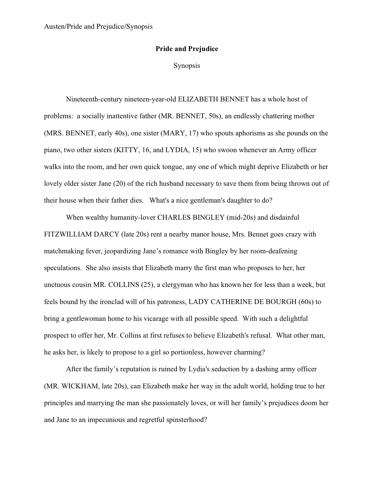
Yes, even if that means stopping the submission in mid-sentence. (And if you aren’t absolutely positive that your manuscript IS in standard format or if you were not aware that manuscripts are NOT formatted like published books, please run, do not walk, to the FORMATTING MANUSCRIPTS category at right. Or wait a few days until I run over the rules again.)

No slipping in an extra five pages because there’s nifty writing in it, no adding a videotape of you accepting the Congressional Medal of Honor, no cookies or crisp $20 bills as bribes.

Need I say that I know writers who have done all these things, and now know better? Remember, showing the beauty and innovation of your writing is not the only purpose of submission — part of the point of this exercise is to show that you can follow directions, a rather desirable attribute in a potential client who might be expected to meet sudden deadlines or make surprise revisions down the line.

Believe me, an agent who decides to sign a writer will be issuing a LOT of directions between that initial handshake and sending out that book or proposal to editors. A writer who cannot follow basic packaging directions (such as “Send me the first 50 pages, please.”) is inherently more time-consuming to represent.

Is that really the first impression you want your submission to convey?

If you’re asked for a specific number of pages, don’t count the title page as one of them — but no matter how long an excerpt you have been asked to send, DO include a title page.

I shall be going over how to construct one in a few days, but if you’re in a hurry and if you don’t know how to format a professional title page, or even that there is a professional format for one, please wend your way to the YOUR TITLE PAGE category at right. (You see, I really have been preparing my readers for this moment.)

If asked for a synopsis, send one; do not enclose one otherwise. Ditto for an author bio (don’t worry; I’ll be talking about how to build one soon; if you’re in a hurry, check out the AUTHOR BIO category on the list at right), table of contents (unless you’ve been asked to submit a book proposal), illustrations, letters of recommendation from your favorite writing teacher, and/or the aforementioned cookies.

Just send what you’ve been asked to send: no more, no less. With two exceptions: you should include a SASE, industry-speak for a stamped (not metered), self-addressed envelope for the manuscript’s safe return, and you should include a cover letter.

Why the cover letter? Well, in the first place, render it as easy as humanly possible to contact you — the last thing you want is to make it hard for them to ask for more pages, right? But also, you should do it for the same good, practical reason that I’m going to advise you to write

(Conference name) — REQUESTED MATERIALS

in 3-inch letters on the outside of the envelope: so your work doesn’t end up languishing in the slush pile of unsolicited manuscripts (which are, incidentally, almost invariably rejected).

Agents and editors hear a LOT of pitches in the course of the average conference; no matter how terrific your book is, it’s just not reasonable to expect them to remember yours weeks after the fact (which it almost certainly will be, by the time they get around to reading it) simply by its title and your name.

Thus, it is in your best interests to remind them that they did, indeed, ask to see your manuscript.

Be subtle about the reminder — no need to state outright that you are worried that they’ve confused you with the other 150 people they met that day — but it is a good idea to provide some context. Simply inform the agent or editor him/her where you met and that s/he asked to see what you’re sending. As in,

Dear Mr. White,

I very much enjoyed our meeting at the recent Conference X. Thank you for requesting my fantasy novel, WHAT I DID TO SAVE THE PLANET.

I enclose a SASE for your convenience, and look forward to hearing from you soon. I may be reached at the address and phone number below, or via email at…

Regards,

A. Writer

That’s it. No need to recap your plot or re-pitch your concept. Just simple, clean, businesslike.

But do NOT, I beg you, present it in block-indented business format, as the rigors of blog format have forced me to do above — indent your paragraphs. Why? Well, many folks in the industry regard business format as only marginally literate, at best.

Trust me, they don’t care what you do in the multi-million dollar factory you run: indent those paragraphs whenever you are dealing with anyone in publishing.

Oh, and if other agents or editors requested pages, say that others are also looking at it. No need to be specific. This is considered good manners, and often gets your submission read a bit faster.

The other reason that mentioning where you met is a good idea is — and I tremble to tell you this, but it does happen — there are some unscrupulous souls who, aware that pitch fatigue may well cause memory blurring, send submissions that they CLAIM are requested, but in fact were not.

“Oh, like he’s going to remember ANY pitcher’s name,” these ruthless climbers scoff, stuffing first chapters into the envelopes of everyone who attended a particular conference.

Such scoffers occasionally receive a comeuppance redolent with poetic justice: VERY frequently, the roster of agents and editors scheduled to attend a particular conference changes at the last minute. How well received do you think a, “I enjoyed our conversation at last weekend’s Conference That Shall Not Be Named,” letter goes over with an agent who missed a plane and didn’t show up at that particular conference?

Tee hee.

Do remember, though, for the sake of your blood pressure, you do NOT need to drop everything and mail off requested materials within hours of a conference’s end. The standard writers’ conference wisdom advises getting it out within three weeks of the conference, but actually, that’s not necessary.

Especially this time of year. Had you heard that the publishing industry pretty much shuts down from early August until after Labor Day, anyway?

And no, an agent or editor’s perceived friendliness during the pitching session should NOT be regarded as a legitimate reason to rush a submission out the door willy-nilly. As I believe I said half a dozen times in the week leading up to the Conference That Shall Not Be Named, a nice conversation with an agent or editor at a conference is just a nice conversation at a conference, not a blood pact.

Nothing has yet been promised — and it can’t have been. As I have mentioned several dozen times throughout this series, no agent is going to sign you on a pitch alone; no matter how good your book concept is, they are going to want to see actual pages before committing.

Why? Consult that old industry truism: “It all depends upon the writing.”

By the same token, you are not bound to honor the request for materials instantaneously. And no, the fact that you said you would send it the moment you got home from the conference does NOT mean that you should send it off without proofing and performing any necessary revisions; unless they asked for an exclusive, they do not expect you to send it within a day or two, or to overnight it.

Besides, it is very much to your advantage that they see your work at its absolute best, after all, not as our work tends to be before a hard-copy proofing.

Long-time readers, chant it with me now: take the time to read EVERY page you intend to submit to ANYONE in the industry in hard copy, out loud, every time.

There is no better way to weed out the mistakes that will strike you a week later as boneheaded (for real-life samples of these, see the archived Let’s Talk About This on the subject), and the extra couple of weeks fixing any problems might take will not harm your chances one iota.

Trust me, agents and editors meet too many writers at conferences to sit around thinking, “Darn it, where is that Jane Doe’s manuscript? I asked for it two weeks ago! Well, I guess I’m just going to reject it now, sight unseen.”

A common writers’ negative fantasy, but it just doesn’t happen. These people are simply too busy for that. If you wait 6 months to send it, they may wonder a little, but 6 days or 6 weeks? Please.

So unless you already have the manuscript in apple-pie order (which includes having read it — take a deep breath now, so you can say it along with me — in its ENTIRETY, IN HARD COPY, and ALOUD), it’s worth your while to take the time for a final polish.

You want your book to be pretty for its big date, right?

While you’re doing that, I’m going to be running over how to pull together a submission packet that just bellows, “This writer has done her homework! How refreshing!” So do keep checking in throughout the next week or so.

In the meantime, you are relaxing about getting those requested materials out the door, I tell you…relaxing…

Keep up the good work!