An antidote to literary naysaying — or at least a slim volume to keep within reach of your writing space

burn-this-book-cover

Before I begin today’s show-and-tell, I want to blandish those of you who haven’t yet done so into entering the First Periodic Author! Author! Awards for Expressive Excellence. Entry is free, the topic interesting (your very own contribution to our fascinating ongoing series on subtle censorship and other factors that discourage writers from writing what and how they want), and fabulous prizes await the winners.

Not to mention the immortal fame and ECQLC (eye-catching query letter candy) that winning such an award would doubtless entail.

The deadline for entry is Monday, May 18. To get those of you who have not yet entered inspired, I shall be devoting the rest of this week to continuing our discussion of ways in which writers are discouraged from sharing their stories, their writing, or even their opinions with the world at large.

In other words, to further exposition on the contest’s essay topic.

Not entirely coincidentally, today, I’d like to talk about a brand-new collection of essays on censorship edited by Nobel laureate Toni Morrison, BURN THIS BOOK: PEN Writers Speak Out on the Power of the Word (HarperStudio). Given the subject matter, I had picked it up in the expectation that it would provide a tremendous amount of food for thought about our ongoing subject; what came as a pleasant surprise was how squarely some of the essays in it spoke to writers about the problems of self-expression that are not externally imposed.

Before I get too carried away, here’s the publisher’s blurb for the book. I added the links, so anyone who is interested may learn more about the authors cited:

Published in conjunction with the PEN American Center, Burn this Book is a powerful collection of essays that explore the meaning of censorship, and the power of literature to inform the way we see the world, and ourselves. Contributors include literary heavyweights like Toni Morrison, Salman Rushdie, Orhan Pamuk, David Grossman, Nadine Gordimer discusses the role of the writer as observer, and as someone who sees “what is really taking place.” She looks to Proust, Oe, Flaubert, and Graham Greene to see how their philosophy squares with her own, ultimately concluding, “Literature has been and remains a means of people rediscovering themselves.” “In Freedom to Write,” Orhan Pamuk elegantly describes escorting Arthur Miller and Harold Pinter around Turkey and how that experience changed his life.

As Americans. we often take our freedom of speech for granted. When we talk about censorship, we talk about China, the former Soviet Union. But the recent presidential election has shined a spotlight on profound acts of censorship in our own backyard. Both provocative and timely, Burn this Book includes a sterling list of award winning writers; it is sure to ignite spirited dialogue.

If some of those names sound familiar, it’s because the only reason that some of them aren’t on the current short list for the Nobel Prize in Literature is that most of these writers have already won it, and some of the others have already passed on to That Great Literary Salon in the Sky. (That, and the fact that I mentioned Graham Greene on this very blog only yesterday might have left him rattling around regular readers’ brainpans.)

This is, in other words, not just a book of commentary by writers on writing. It’s a book of commentary by WRITERS on WRITING.

The Who’s Who line-up is part of the fun of this book, actually, insofar as a serious collection of essays on the horrors of censorship can be said to be fun: quite a number of these essays involve exceedingly well-known authors whom we all admire writing about the work of exceedingly well-known authors that they admire. Let me tell you, if you’ve never seen John Updike gush about the bravery of Henry Miller’s early novels, or Francine Prose sigh about how she wishes she had known Roberto Bolaño — well, suffice it to say the besotted reader is a side of an Eminènce Grise one seldom sees.

Since pretty much all writers start out life as besotted readers, it’s rather refreshing to behold the greats owning up to it. And hey, I’m not too proud to admit it: I did feel incrementally cooler, literarily speaking, upon seeing that Ms. Prose and I share an admiration for Wallace Shawn’s THE DESIGNATED MOURNER — but of that excellent play, more follows below.

This volume’s tendency to praise means, among other things, that BURN THIS BOOK is an absolutely terrific source for what I like to call good book surfing — learning what books have influenced authors one loves, tracking those works down, and reading them. I know of few better ways to gain a sense of being part of a literary tradition.

(The months I spent following the reading tips Jane Austen so carefully laid out in NORTHANGER ABBEY completely changed my understanding of 18th-century female authorship, for instance. Aunt Jane’s shelves were apparently stuffed to the gills with women’s writing — which I imagine would come as something of a surprise to all of the compilers of English literature syllabi who habitually present her as having sprung into literary history as a complete anomaly. And don’t even get me started on what Anne Brontë — whose brilliant novel about substance abuse, THE TENANT OF WILDFELL HALL, was dismissed by contemporary critics as “utterly unfit to be put into the hands of girls,” speaking of disregarded voices — or Mary Wollstonecraft Shelley were reading in their spare time.)

I also found it both fascinating and amusing to see really, really famous authors incorporate the same essay-writing tactics that, say, a high school junior might use in making a case against censorship. Who’d have thought, for instance, that Updike, surely enough of a literary name to express his own opinions unaided, would feel the need to justify his statements about how difficult writers find their work by citing what Flaubert said of his own struggles?

And after having spent many years patiently explaining to university students that defining one’s terms in an essay did not mean just opening the nearest dictionary and reproducing what’s printed there, what was I to make of Nadine Gordimer’s using the Oxford English Dictionary in precisely that manner in her essay? Oh, how glad I was that I’m no longer lecturing when I saw that. My students would surely have waved Ms. Gordimer’s piece in my face endlessly, as proof positive that it is possible to incorporate a verbatim dictionary definition gracefully into a written argument without boring readers to death.

But I would still urge amateurs not to try it at home. The twins goals of defining one’s terms in an essay are to demonstrate that one knows what one is talking about and to make sure that the reader does as well, not merely to plagiarize what some underpaid linguist at Funk & Wagnall’s said about a particular word or phrase. For this reason, hyper-literalists tend not to make the best essay-writers.

Despite undermining one of my first rules of academic essay-writing, I would highly recommend BURN THIS BOOK to readers of high school and college age. Why? Well, because this book contains so many good examples of the kinds of essays high school and college students are so frequently asked to write, it’s an inadvertently helpful how-to manual on how to structure and argue a piece on an abstract topic.

(Are the standardized test folks still giving vaguely provocative essay topics like, Censorship: is it ever a good idea? and Should a government try to legislate morality? They seem so open-ended, but the graders are invariably looking for a particular type of argument. In my day, the Achievement Test scorers would automatically spot you quite a few points if you managed to work Rosa Parks’ historic bus ride into your essay, regardless of the topic. The point of academic writing is not necessarily knock-your-socks-off style, if you catch my drift.)

For this reason, BURN THIS BOOK seems like a natural to assign in a composition course, to teach young writers the tricks o’ the trade, as it were. Or perhaps it would make more sense in a literature class. I would slap it onto the syllabus right after THE GRAPES OF WRATH, to provoke some interesting discussion about the hows and whys of banning books, and just before THE CATCHER IN THE RYE.

Speaking of Nobel laureates, are you surprised to hear that THE GRAPES OF WRATH was ever banned? No kidding: schoolteachers all over the US had a hard time assigning it for decades, and not always because of that left-leaning speech that Henry Fonda, the Tom Joad of the movie, gives at the end. (But usually. You’d be amazed at how seldom clamorers against a book have actually read it; it’s not unheard-of for parents to go roaring into school board meetings to scream about a scene from the movie version of an assigned book, only to learn that the objectionable bits were the filmmaker’s invention. The protests over the movie version of THE LAST TEMPTATION OF CHRIST, for instance, were over a love scene that wasn’t particularly startling in the book; what brought the threat of excommunication onto novelist Nikos Kazantzakis’ head was the book’s treatment of Judas‘ role in the story, not the Big Guy’s.)

Wondered long enough what anyone who wasn’t worried about Communist infiltration of America’s high schools might have had against THE GRAPES OF WRATH? Not surprisingly, it’s a scene that didn’t make it into the movie, although it’s far from explicitly written: Rose of Sharon feeds a man who’s starved too long to be able to ingest solid food what, ahem, she might otherwise have fed her stillborn baby.

The reason I’m being a bit vague here, incidentally, is that some of my readers have access to this blog only through their school or public library computers. If I described the ending of the book any more clearly, the individual words that I would have to use might result in this page getting blocked by what are euphemistically known as parental control programs.

I know; it’s not pleasant to contemplate. But like it or not, it is the world in which we write.

By suggesting that BURN THIS BOOK might make for some interesting classroom discussion, I don’t mean to imply that that all of the essays here are equally good; they’re not. At times, the reader is left wondering what some of this undoubtedly well-written rambling has to do with the topic at hand, or even if there is a single topic tying the book’s many entries together. (Also, semicolons are not always used correctly throughout, something that’s likely to bug a teacher charged with explaining to students that ; and is in fact redundant in a list that contains a series of semicolons, since the earlier semicolons were ostensibly replacing and.)

The authors’ assigned briefs seem to have been rather disparate, as if contributors were merely asked to contribute an essay, rather than an essay on book-banning: collectively, this is a better collection of writing about writing than writing about censorship. As a result, the subtitle (PEN Writers Speak Out on the Power of the Word) is a substantially more accurate indication of what lies between the covers than the title.

Of course, being a book about writing is not necessarily a drawback in a collection of essays whose target market is writers. As one would expect from an edited volume by such a terrific bunch of writers (a contributor list that also includes Paul Auster, Pico Iyer, Russell Banks, and Ed Park, in case you were wondering), BURN THIS BOOK abounds in really glorious quotes, the kind that aspiring writers like to jot down on little scraps of paper and tape to their computer monitors to inspire them in moments of creative desperation.

Seriously, there is some lovely, inspiring stuff here. Take, for instance:


“A writer’s life and work are not a gift to mankind; they are its necessity.” -Toni Morrison

“When we write, we feel the world in flux, elastic, full of possibilities — unfrozen…I write, and the world does not close in on me. It does not grow smaller. It moves in the direction of what is open, future, possible. I imagine, and the act of imagination revives me. I am not fossilized or paralyzed in the face of predators. I invent characters. Sometimes I feel as if I am digging people out of the ice in which reality has encased them. But perhaps, more than anything, the person I am digging out at the moment is myself.” — David Grossman

“Thus the true task of the novelist is to dramatize first for himself or herself and ultimately for the rest of us what it is to be human in our time and for all time. What it is to be human in our place and in every place. As a species, we have always depended upon our storytellers to tell us what it means to be human. To be ourselves.” — Russell Banks.

“The artist’s personality has an awkward ambivalence: he is a cave dweller who yet hopes to be pursued into his cave…J.D. Salinger wrote a masterpiece, The Catcher in the Rye, recommending that readers who enjoy a book call up the author; then he spent his next twenty years avoiding the telephone.” — John Updike

Okay, so I thought that last one was sort of funny. My point is, there’s a lot of rich ore here for the writer searching for insight to mine.

Finally — and most relevant to our ongoing series — despite a certain range of topic, most of these essays have quite a few interesting things to say on censorship. Or, more precisely, about the kinds of things than can happen to people who write the truth when those in power don’t want those truths bruited about.

As Wallace Shawn’s THE DESIGNATED MOURNER (I told you I’d be coming back to it) makes so mournfully clear, the writers, the artists, the truth-tellers tend to be among the first carted off in times of great fear. The world is substantially less interesting for it — and less safe, my friends, for people like us.

BURN THIS BOOK reminds us to ask ourselves every so often when we look at the world around us, gathering impressions to inform our writing: what stories are going unheard? Whose voices are not particularly audible, from a literary perspective? Which voices are actively discouraged, and which do the fine folks who run publishing houses just not think will sell very well?

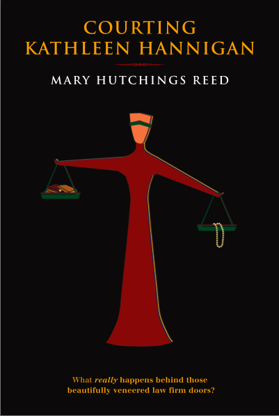
To share some questions that popped into my mind when I first began to contemplate running this series: what does the reader of mainstream memoir currently know about the kind of prison conditions that guest blogger Shaun Attwood told us about last weekend? Heck, how much does the mainstream novel reader know about the other side of the legal equation, what goes on behind the beautifully-veneered doors of the high-powered law firms Mary Hutchings Reed wrote about? If those inside these institutions don’t share with the world how they run, how precisely are the rest of us to find out? Telepathy?

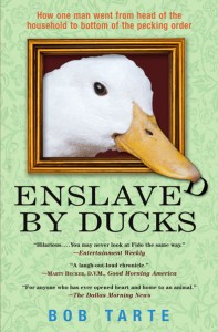
And how much does the fear of riling nay-sayers affect what we ask readers are able to find on the shelves? Considering how hot narrators with mental disabilities have been over the last few years, why do readers so seldom see book either about or by people with physical disabilities, as Eileen Cronin brought to our attention in April? Does a hot-button political debate actually have to be over before the publishing world would get excited about an intriguing memoir like Beren deMotier’s, which couldn’t possibly be more timely? How much does the prospect of negative reader reaction cause even established authors to alter their content in order to avoid controversy, as Bob Tarte discussed?

These questions trouble me in the dead of night; honestly, they do. And what’s more, they should.

Yet while all writers are potentially affected by censorship, subtle and otherwise, we don’t tend to talk much amongst ourselves the more draconian ways in which it is wielded, up to and including imprisoning or even killing outspoken authors. Those possibilities certainly deserve more of a place in writerly discussion of what does and doesn’t get published than we usually hear — and, to be candid, what you hear from me here on this blog.

For the most part, the untold stories and as-yet-undiscovered voices we discuss are ones that are having trouble pleasing someone with the authority to get them published, rather than the ones that must overcome actual legal barriers or strong social taboos in order to see the light of day at all. As a result, writers’ conferences, writers’ fora, and yes, blogs like this one tend to focus upon finding a market for our work, or better ways to touch the heart of a reader, or decoding the often perplexing ways of agencies and publishing houses.

So an alien from another planet landing in the middle of your garden-variety North American writers’ gathering would probably assume that a great undiscovered writer’s voice not being heard is primarily the result of her submissions being rejected or ignored, rather than, say, a heavily-enforced prohibition upon writing anything remotely critical about her government, or laws that ban a writer from offending someone else religious sensibilities. “My, what a lot of freedom creative artists have here,” E.T. might conclude.

That’s not meant as a criticism of the very practical concerns of those trying to get published — far from it. It’s completely natural that worrying about freedom of expression worldwide may not be the most immediate concern for a writer who is trying to find an agent for a torrid romance involving a country doctor and a cowgirl or hoping to publish a science fiction trilogy on the colonization of the Crab Nebula. At that juncture, it’s certainly understandable if trying to second-guess what the gatekeepers of the book world want to see is of far more absorbing interest than which might be happen to a writer one doesn’t know personally someplace else.

Heck, after seemingly endless rounds of querying, a series of rejected submissions, and/or being told flatly by an agent or editor after a verbal pitch, “Oh, there’s just no market for that kind of book right now,” plenty of writers feel that there’s an active conspiracy against their kind of work.

In a moment of feeling unheard — which, let’s face it, forms a large part of the frustration of trying to find an agent or waiting for one’s agent to sell one’s books — a collection of essays like this that deals with more drastic means of keeping writing (and writers) out of the public eye can be very useful for reestablishing perspective. Sometimes, we could all use someone who has been down the path before us to remind us that it is indeed worth taking — and that as writers, we are all part of a global community that some people are always going to find threatening.

I just mention.

While I’m at it, I’ll also mention that BURN THIS BOOK is available on Amazon and at Borders.

Does all of this high-falutin’ talk about the importance of considering the situation of writers worldwide mean that I’m abandoning the attention to nit-picky, practical details for which Author! Author! has become so justly famed? Of course not; rest assured, bread-and-butter issues will once again abound here soon.

But in the meantime, consider giving some thought to the big picture. And, as always, keep up the good work!

The tragedy of the self-silenced writer

candle-flames-at-lourdes
I had planned to write my own post on subtle censorship today, as it’s the first day in quite some time that I’m not going to be yammering at you about the rigors of standard format and I’ve been dying to jump into the conversation. Over the weekend, however, a couple of the comments on guest blogger Shaun Attwood’s post — who knew it would generate such a plethora of responses from readers? — got me thinking about a deadly form of censorship: the kind writers sometimes impose upon themselves.

Since I’ve depressed myself into a stupor thinking about it (not the best state of mind while on a writing retreat, alas), rather than write about it afresh and be-glumming myself still more, I’m going to re-run an earlier post on the subject. Some of you may remember the story; I try to honor Marc’s memory by telling some version of it here about once per year.

This is the story that Marc did not live to tell. He censored himself in many, many ways, including the ultimate one, before he could.

A moment of silence, please: I’m giving a eulogy today.

My friend Marc, a genuinely gifted poet and playwright, died a few years ago, and I, as one of the few people in our college class who was reading his writing hot off the keyboard, was asked to give his eulogy at our reunion. One of the liabilities (or joys, depending upon how one looks at it) of going to a reunion-happy school lies in the inevitability of, as time passes, more and more of one’s classmates requiring eulogies.

Today, it’s my turn to step up to the podium.

Marc was only 39; I had known him since we were both 18. Brilliantly talented, he lost faith in his own writing before he could find the right agent for his work. And so, out of respect for him, I am going to step aside from our ongoing series and devote today to urging you to maintain faith in your own writing talent.

Marc was one of those writers whose promise was obvious to everyone early. Year after year, all throughout school, he won poetry and essay prizes; his English teachers adored him as the kind of super-creative, insightful student who comes along only once in a blue moon; his basketball coach praised him as the ideal of a hard-working athlete with natural talent. Confident in his abilities, he never doubted that triumph would continue to follow triumph for the rest of his life.

Yet as every high school hero is shocked to learn, the rules change radically after graduation.

The talents that spelled success within the sheltered confines of a private school are not automatically lauded in the world outside, and as many a crestfallen college freshman can tell you, there are always more than enough highly-praised high school Juliets on campus to fill all the roles in a college production of ROMEO AND JULIET forty times over.

Big fish, welcome to the ocean; you’re not in your little pond anymore.

At Harvard, Marc was surrounded by brilliant young writers from all across the country and all around the world. His work was appreciated, because it was very good, but no longer was he the outstanding talent. While some writers might have embraced a new-found community of very talented people, Marc went the more common route: in the midst of such stellar competition, despite the fact that he was clearly able to hold his own with the best of them, he started to doubt himself.

Heaven help us, he started to wonder if he could really write.

Oh, if only we could all rewind our lives back to the point before we started to question our own talent! To before the demons of self-doubt and endless internal criticism started to nag us! How many among us have not been turned away from our computers at least once by the fear that our best was just not good enough?

Marc did keep writing, but increasingly, he kept his work to himself, thus reducing to zero the chance that it might see publication. He ceased entering contests; he gave up querying magazines; his writing resume languished. Like so many aspiring writers, he began to believe that the slightest defect poisoned an entire work, so he stopped being able to incorporate good criticism.

So what did he do with all of that pent-up creative energy? He wrote a solid first draft of an interesting novel — I know, because I’m one of the few human beings he allowed to read it. It would have been very marketable after a single revision, news that should have brought joy to his heart.

Instead, after only one or two rejections from agents, he stuffed it in a drawer, never to see the light of day again. As thousands of aspiring writers do every day.

He next turned his talents to writing plays, but there, too, even the most minor criticism seemed to make his confidence wilt. Eager at first, he soon came to regard attaining finalist status in a competition as evidence that he had failed abysmally.

Like so many aspiring writers, he fell into the trap of expecting every word that sprang from his fingertips to be perfect without revision. As, again, do thousands.

It’s very seldom the case, even with the most brilliant of writers, but it’s an easy trick to play on yourself: if you were truly talented, the imp of perfectionism whispers in our ears late at night, you wouldn’t have to struggle. The world would be beating a path to your door, unasked, to read your work.

This isn’t plausible, of course. It is utterly impossible to sell work that you don’t send out, just as it is impossible to win contests that you don’t enter. Yet self-doubt would rather not try than to risk defeat.

Because I’m a generally upbeat person, Marc and I frequently argued over our respective expectations of the literary market. He was astonished that I just kept plowing ahead, regardless of rejection, until agents and editors started saying yes; having attained success so easily in the past, he was suspicious of incremental gains made through persistent effort. Yet by insisting that his own work had to be born perfect before he would allow others to see it, he made it harder and harder to get himself to sit down and write at all.

This is a very common logical conundrum for writers, one I tried to understand at the time by incorporating an analogy gleaned from Neil Fiore’s excellent book on procrastination, THE NOW HABIT (without which, truth compels me to state, I probably would not have completed my master’s thesis). Fiore compares any major task to walking the length of a ten-foot board that is six inches wide.

When the board is sitting on the ground, getting across it would be an easy task, right? Yet the procrastinator worries about crossing the board perfectly — and thus waits until conditions are perfect. As the deadline nears, it becomes clearer and clearer that the task is getting harder to do well — thus emotionally raising that board until it feels like it is stretched between two five-story buildings.

Now, crossing the board is terrifying, as the stakes of failing are much more severe. What a procrastinator does to end this situation, Fiore argues, is to set fire to his own end of the board, metaphorically speaking: with absolutely no time to spare, perfection in execution does not matter nearly so much as simply scooting across the board as fast as possible.

For Marc, as for many, many writers, a similar logic applies to completing a book — or a play, or a poem, or a contest entry. They do not want just to walk across that board — they want to do so in such a memorable style that the admiring multitude will be telling their grandchildren about it for generations to come.

With such lofty intentions, that board is not just stretched between adjacent buildings; it is wavering in the wind between the Empire State building in New York and the Transamerica pyramid in San Francisco.

No wonder it’s terrifying: effectively, every sentence the writer produces has to be the greatest since the invention of the pen.

Marc, and writers like him, expect inspiration to waft them into a state of such divine creativity that all of their latent promise as artists will undergo some sort of instantaneous alchemy that produces the philosopher’s stone of writing, the book that is perfect with no revision.

Then, and only then, will they believe in their hearts that they are genuinely talented.

Every single time that inspiration, as is the way with muses, comes and goes at its own sweet pleasure, the self-doubter comes to doubt his own talent more. And even when, as in Marc’s case, inspiration does hit hard enough to produce a stellar short piece, that success apparently does not count as proof: it could have been a fluke, or it wasn’t a big enough success.

Or it was a short story, rather than a novel, or it was a genre work instead of literary fiction, or it was literary fiction and unlikely to appeal to a broad mainstream market. Any excuse will do, because there is no one more voracious for justification than a talented person in the throes of self-doubt.

Painful? You bet. And painful to watch? Absolutely.

I am telling you this, not to criticize Marc — that’s not usually the point of a eulogy, is it? — but in the hope that his story might help inspire those of you out there who are afraid that you’re not talented enough to start the book you’ve always dreamed of writing, or whose fears have paralyzed you into stopping in mid-draft or mid-revision to give yourselves a bit of a break.

Instead of abusing yourself for not producing perfection every time you sit down at a keyboard, why not reward yourself for sitting down there at all? Instead of berating yourself for being in the midst of writing a novel for a year or two or ten, why not break the task up into manageable smaller goals, and celebrate those achievements as you reach them?

There’s no better cure for self-doubt than tangible evidence of talent, and you’re more likely to convince yourself that you are indeed gifted if you don’t demand that you produce THE DIVINE COMEDY every time you sit down to write a poem.

Regardless of how talented you are.

Start small — remember, even the best-upholstered ego is a fragile thing, and it needs to be rebuilt with care. You could start by setting time goals for your writing, logging in the minutes as you go, or set yourself a page goal for each writing session. Keep track of your successes, so later on, when you start to berate yourself for not writing as often as you should, or as much, you can look back in your log and say, “Hey! I wrote for ten hours last week!” or “Hey! I have been averaging three pages per day!”

Start there, because no matter what the imps of doubt whisper in your ear, there’s never been a book written yet without the author’s sitting down day after day and writing.

So there.

If these goals seem too tiny to you, requiring too many added together to reach the goal of a completed book, remember this: prolific writer Graham Greene wrote only 147 words per day.

Which, I suspect, is why his dialogue exchanges are so short. Most of us can easily expend 147 words in debating where to go for lunch.

Greene carried around a little notebook, and (the story goes) would not allow himself his first drink of the day until after he had penned word 147. Now, I wouldn’t recommend emulating the drink part, at least not on a daily basis, but his strategy was basically sound: those words, few in and of themselves, added up to many very highly-respected novels.

Oh, and a Nobel prize in literature.

However you decide to go about it, please start easing up on yourself soon, because there isn’t always time to change.

I tell you this from experience, because I shall never be able to wipe from my mind that saddest of literary sights: a brilliant, partially-revised novel sitting in a drawer, awaiting the beneficial touch of a writer who can never come back to it again.

Keep up the good work, my friends. Your talent is worth it.

How to format a book manuscript properly, part XII: not all truths are self-evident, or, why a sensible writer should hang onto that massive grain of salt

signing-the-constitution

I’ve been making a Herculean effort not to gloat too much here at Author! Author! about being on a writing retreat in France — or at least to hold off on it until we’ve made it through this series on standard format so I can settle into a nice, luxurious series on how to apply for and what to expect from formal artists’ retreats. But I shall burst if I don’t chortle about just two things today — no, make it three.

First, this is my writing space:
la-muse-writing-room
I’m ALONE in that, incidentally. You can’t see the other fireplace or the wood stove, but I assure you that they’re there.

Second, this is the view from one of the four six-foot-high French windows in my writing space:
window-view
Third, when I asked the very kind proprietors if I might have another lamp in my writing space, they promptly installed what appears from here to be a early 20th century chandelier:
other-end-of-la-muse-writing-space
I’d been thinking something more along the lines of a $20 lamp from IKEA, but hey, I’ll live with it. I could throw an intimate dinner party in the armoire.

I’m just saying: La Muse is a very, very nice place to write. And yes, there are fellowships available — but you’ll be hearing more about all of this in the weeks to come.

Okay, the chortling is out of my system now, more or less. Back to business.

The last few times I have come to the end of an extended series on manuscript formatting — book manuscripts, that is; please be aware that short stories, magazine articles, theses, dissertations, and other types of writing are subject to other restrictions — I’ve ended with a rather peevish little discussion about why, in the face of so much conflicting information about submission requirements floating around these days, professional advice-givers like me don’t either:

(a) check out every other source out there to make sure that we’re all saying precisely the same thing (which would be so time-consuming that none of us would have time to give any further advice),

(b) take it upon ourselves to force every single individual who is empowered to pass judgment upon a manuscript within the confines of North America to agree upon a single (and preferably single-page) set of rules to which everyone without exception would adhere (which would require a convention so large that the framers of the U.S. Constitution would turn pale at the very thought), or

(c) shut up entirely and let those new to the biz try to figure out some genuinely counter-intuitive rules all by themselves.

I can’t speak for everyone currently giving advice on the subject, of course, but in my own case, the answer is really pretty straightforward: the norms I’ve been explaining throughout this series are in fact the ones I have used successfully myself for many, many years. Since neither I, any of my editing clients, or (as far as I know) any reader of this blog who has followed this advice to the letter has ever been asked by an agent or editor to make a single purely formatting change to his/her manuscript, I feel quite confident in continuing to give this particular set of advice.

But I will say something that one seldom hears advice-givers say: whether you choose to adhere to the rules of standard format I’ve set out here is ultimately up to you. But once you choose to follow a particular rule, you must obey it 100% of the time in your manuscript.

Let me repeat that, because it’s monumentally important: it’s not enough to adhere to a formatting rule most of the time; you must cleave to it in every single applicable instance in the text.

Why? You should know the words to the song by now: because inconsistency isn’t going to look professional to people who read manuscripts for a living.

I used to think that I didn’t actually need to state this requirement — after all, isn’t the part of the point of a rule that it should be followed on a regular basis, rather than just periodically? However, within the last year, I’ve seen enough manuscripts and contest entries (yes, I still judge from time to time) by good writers who sometimes use a single dash and sometimes a doubled one (if you’re not absolutely certain which is correct, I can only suggest that you return to the first post of this series and read through it again), or whose Chapters 1-3, 6, and 17 have a (ugh) single space after periods and colons, whereas Chs. 4, 5, and 10-12 have two, and the rest feature both…

Well, you get the picture. Apparently, the need for consistency is not as self-evident as I had previously believed.

I would point the finger at a few culprits for this astonishingly pervasive manuscript problem. First — and I’m quite positive that those of you who have been hanging around Author! Author! for a while have felt this one coming practically since the top of this post — the vast majority of aspiring writers simply do not reread their own work enough. I’m not talking about revision here (although most submissions could use more liberal helpings of that, frankly), but rather actually sitting down and scanning a manuscript IN ITS ENTIRETY, IN HARD COPY, and OUT LOUD.

What tips me off that very few writers actually do this before submitting their pages to an agent or a contest? Well, for starters, inconsistent formatting. And spelling errors. And repeated words. And scenes where characters do or say things that they’ve done or said half a page before.

You know, the kind of stuff that any reader would catch if s/he sat down with the actual pages and read them closely.

Often, such errors are not the result of compositional carelessness, but of repeated revision –the second culprit I’m dragging before the court in irons today. Zeroing in on the same page, paragraph, or even sentence over and over again without re-reading the entire section can easily result in what I like to call a Frankenstein manuscript, one that reads in hard copy as though it were cobbled together from the corpses of several drafts, sometimes ones written in different voices.

Come closer, and I’ll let you in on a secret of good writing: it flows smoothly. A sure narrative voice is a consistent one. That’s why writers brand-new to the writing game so often labor under the quite mistaken impression that their favorite books were their respective authors’ first drafts, and thus (one assumes) that their own first drafts should be marketable without further revision: because a the author of a well-crafted narrative works hard to create the illusion of spontaneous consistency.

Awfully hard. Seamlessness is no accident, you know.

So what do you think a professional reader like Millicent the agency screener, her cousin Maury the editorial assistant, or their aunt Mehitabel the veteran contest judge thinks when they encounter, say, one sentence that’s in the past tense, followed by three that are in the present? Or a character named George on page 8 and Jorge on page 127?

“Inconsistency,” they breathe in unison. “This manuscript needs more work.”

Or at least a good authorial read-through IN ITS ENTIRETY, IN HARD COPY, and OUT LOUD.

I’m going to be talking at greater length about the Frankenstein manuscript phenomenon soon, you’ll no doubt be happy to hear. Since it’s such a natural follow-up to the standard format series, I may defer my discussion of writing retreats to attend to it first. I’ll have to give it some thought. (Don’t worry: either way, you’ll be seeing some nice pictures of France.)

The third culprit — and I have yet another excellent question from a reader to thank for reminding me to bring it to your attention — is the fact that sometimes presenting a manuscript professionally means breaking one of the standing rules.

Yes, you read that correctly. Among the many, many things that those new to submitting to agencies and publishing houses are magically expected to know is the one instance where using boldface is not only acceptable, but generally expected. No one will hurt you if you don’t use it, mind you, but your future agent may ask you to change your book proposal if you don’t.

I’m talking, in case you’re wondering, about section headings in book proposals. And sometimes in nonfiction manuscripts, but it really depends upon the agent or editor’s personal preference. Brace yourselves, because this logic is going to be a bit convoluted: boldface shouldn’t be used for emphasis, but it’s okay to use in a section heading in nonfiction; some agents actively prefer it, as did my memoir’s publisher.

But seriously, don’t use boldface anywhere else.

Confused? You’re not alone. Quoth curious reader Odin:

I’m having trouble finding a credible source which discusses how to format when there are location headings at the start of sections within a chapter. In a published book, they’d be left-justified with a blank line between it and the start of the text. After a section, there would be two or three blank lines, then the next left justified heading.

How do I do this in a manuscript? Left-justified chapter heading, then a # for the blank line, then start the section. At the end of the section, one # for the blank line, then the heading, etc? I don’t like the # between the heading and the text it heads because when the manuscript is double spaced, it tends to float all alone. I put the headings directly above the text and just used one blank line with a # between the end of one block and the next. It gets the idea across and I’m consistent with it throughout the manuscript, but I’d love to know how to do it right.

I freely admit it: I’m always a bit nonplused when I get a question like this, one that cites as law a rule that just isn’t used in professional manuscripts. But since I do hear from readers who have stumbled across advice like this quite often, I shall pass along a tip for assessing its helpfulness: if the sources you’ve been consulting are telling you to mark skipped lines with # or *, you probably haven’t been consulting sources conversant with the current book market. (The # is used for short stories and articles, not book manuscripts, and I’ve never seen a professional manuscript (as opposed to a contest entry) use * to mark a skipped line.)

It’s also — again, brace yourself, if you’ve been hobnobbing with old rule lists — not at all necessary in a current book manuscript to add any marker at all to indicate a skipped line in the text. Just hit the return key and call it good.

Before those of you who have fallen under the spell of short story and article rules start shouting, “But…but…” allow me to remind you that as we discussed earlier in this series, NOT EVERYTHING THAT FALLS UNDER THE RUBRIC OF WRITING SHOULD BE FORMATTED IDENTICALLY.

Have you happened to notice that amazingly few sources out there bother to tell aspiring writers that?

I suspect that it’s not entirely a coincidence, therefore, that so many aspiring writers assume that all writing should be formatted precisely the same way, regardless of where it will be submitted. That’s just not true — but without some fairly hefty cross-source research, how is someone new to the professional writing to know that?

Case in point: Odin’s dilemma. Pretty much any US-based agent would make her take the #s out of her manuscript, because short story formatting would imply to an editor that both the author and the agent are inexperienced in dealing with book manuscripts. In a submission process where tiny details often make an immense difference, that’s a chance that few agents are going to be willing to take.

So as you make your way through the bewildering forest of advice out there, toting your massive grain of salt, be aware of the fact that many seemingly authoritative sources out there disagree on certain points for the very simple reason that they’re talking about different things, although they often do not say so explicitly. Bear in mind that because such a high percentage of the aspiring writers’ market wants easy answers, preferably in the form of a single-page list of rules universally applicable to every writing venue, the temptation to produce a short, one-size-fits-all list of rules is considerable.

That doesn’t mean you should disregard such lists entirely, of course. Just keep in mind that any list that purports to cover every type is necessarily going to run afoul of some established standard somewhere.

Just to make it perfectly clear: if anyone is looking for terse, bullet-pointed to-do lists for writers, I think any of my long-term readers can tell you that this blog is NOT the place to start. As the thousands of pages of archived posts here can attest, I am the queen of elaboration.

Lots and lots of elaboration.

Which is why Odin’s question so delighted me, I must say: in compiling my own quite specific list, I had overlooked the section heading exception. Yet another opportunity to elaborate and clarify!

So I am pleased to present the two options for what a section heading in a nonfiction book (or proposal) should look like — first, utilizing boldface:

wharton-section-break-example11

Quite straightforward, isn’t it? This format also — and this is important in a book proposal, as they are often read very quickly — renders skimming easy.

That being said, there are anti-boldface hard-liners who might object to this; they’re rare, but they exist. So here is an alternate, bold-free version:

wharton-section-break-example2

Again: simple, elegant, non-confrontational. And — again, important — it would be clear what is happening where, even to a rapidly-skimming eye.

I must confess, however, that I don’t like it as much as the first. Why? Pull out your hymnals, everyone: because it just doesn’t look right.

While I’m on the subject of unnecessary doohickeys writers are sometimes told to shoehorn into their book manuscripts and proposals, let’s talk about what should happen on the last page. For a BOOK manuscript, the proper way to end it is simply to end it.

No bells, no whistles, no # # #, no -86-. Just stop writing.

Even the ever-popular THE END is not needed. In fact, I know plenty of Millicents (and their bosses, and editors, and contest judges) who routinely giggle at the use of THE END to indicate that a manuscript is not, in fact, going to continue. “What is this writer thinking?” they ask one another, amused. “That I’m going to keep reading all of that blank space after the last paragraph, wondering where all of the ink went? That I’m incapable of understanding why there aren’t any more pages in the submission? Please!”

Remember what I was saying earlier in this series about professional critique being harsh? Don’t even get me started on professional ridicule.

Personally, I have sympathy for how confusing all of the various advice out there must be for those who have never seen a professional manuscript up close and personal — that is, as I have said many times, why I revisit this decidedly unsexy topic so often. But honestly, some of the rules that commenters have asked about over the last three years must be from sources that predate World War II, or perhaps the Boer War. I’ve been editing book manuscripts for most of my adult life (and proofing galleys since early junior high school), and I have to say, I’ve literally never seen a single one that ended with “-86-”

So truth compels me to admit that I can sort of see where Millicent might find it amusing to see in a submission.

But you can sort of see her point of view here, can’t you? To people who read book manuscripts for a living in the US, the very notion of there NOT being a consensus is downright odd: why, the evidence that there is a consensus is sitting right in front of them. The mailman brings stacks of it, every single day.

“Oh, come on — everyone doesn’t already know these rules?” Millicent asks, incredulous. “This information is widely available, isn’t it?”

That’s a QUOTE, people — but as someone who regularly works with folks on both sides of the submission aisle, I have come to believe that the wide availability of the information is actually part of the problem here. The rules governing book manuscripts haven’t changed all that much over the years, from an insider’s perspective, but from the POV of someone new to the game, the fact that they have changed at all, ever — coupled with these rules not being applicable to every conceivable type of professional writing — can look an awful lot like inconsistency.

And we all know how Millie, Maury, and Mehitabel feel about that, don’t we?

Which is why, in case you have been wondering, I always spend so much time and space here explaining the logic behind each rule I advise using. I’m just not a fan of the do-it-because-I-say-so school of teaching, and besides, I want the right way to sink into your bones, so it may save you time for the rest of your writing career.

If the flurry of rules starts to seem overwhelming, remind yourself that although submissions do indeed get rejected for very small reasons all the time, it’s virtually unheard-of for any manuscript to have only ONE problem. They seldom travel alone.

So I would caution any aspiring writer against assuming that any single problem, formatting or otherwise, was the ONLY reason a manuscript was getting rejected. Most of the time, it’s quite a few reasons working in tandem — which is why, unfortunately, it’s not all that uncommon for Millicent and her cohorts to come to believe that an obviously improperly-formatted manuscript is unlikely to be well-written. The notion that changing only ONE thing, even a major one, in the average manuscript would render it rejection-proof is not particularly easy for a professional reader to swallow.

There is no such thing as a rejection-proof manuscript, you know. While it would indeed be dandy if there were a magical formula that could be applied to any manuscript to render it pleasing to every Millicent out there, that formula simply doesn’t exist; individual tastes and market trends vary too much.

This is vital to understand about standard format: it’s not a magic wand that can be waved over a submission to make every agent, editor, and contest judge on the face of the earth squeal with delight at the very sight of it.

But it is a basic means of presenting your writing professionally, so your garden-variety Millicent will be able to weigh it on its non-technical merits. All I can claim for standard format — and this isn’t insignificant — is that adhering to it will make it less likely that your submission will be rejected on a knee-jerk basis.

However, I’m not going to lie to you: even a perfectly-formatted manuscript is going to garner its share of rejections, if it’s sent out enough. Why? Because every agent out there, just like every editor, harbors quirky, individuated ideas about how the perfect book should be written.

Sorry. If I ran the universe…well, you know the rest.

Whatever set of rules you decide to embrace, though, make it YOUR decision — and stick to it. Don’t leap to make every change you hear rumored to be an agent’s pet peeve unless you are relatively certain in your heart of hearts that implementing it will make your manuscript a better book.

Yes, even if the suggestion in question came from yours truly. It’s your manuscript, not mine.

Keep up the good work!

Author! Author! How to format a book manuscript properly, part XII: not all truths are self-evident, or, why a sensible writer should hang onto that massive grain of salt

signing-the-constitution

I’ve been making a Herculean effort not to gloat too much here at Author! Author! about being on a writing retreat in France — or at least to hold off on it until we’ve made it through this series on standard format so I can settle into a nice, luxurious series on how to apply for and what to expect from formal artists’ retreats. But I shall burst if I don’t chortle about just two things today — no, make it three.

First, this is my writing space:
la-muse-writing-room
I’m ALONE in that, incidentally. You can’t see the other fireplace or the wood stove, but I assure you that they’re there.

Second, this is the view from one of the four six-foot-high French windows in my writing space:
window-view
Third, when I asked the very kind proprietors if I might have another lamp in my writing space, they promptly installed what appears from here to be a early 20th century chandelier:
other-end-of-la-muse-writing-space
I’d been thinking something more along the lines of a $20 lamp from IKEA, but hey, I’ll live with it. I could throw an intimate dinner party in the armoire.

I’m just saying: La Muse is a very, very nice place to write. And yes, there are fellowships available — but you’ll be hearing more about all of this in the weeks to come.

Okay, the chortling is out of my system now, more or less. Back to business.

The last few times I have come to the end of an extended series on manuscript formatting — book manuscripts, that is; please be aware that short stories, magazine articles, theses, dissertations, and other types of writing are subject to other restrictions — I’ve ended with a rather peevish little discussion about why, in the face of so much conflicting information about submission requirements floating around these days, professional advice-givers like me don’t either:

(a) check out every other source out there to make sure that we’re all saying precisely the same thing (which would be so time-consuming that none of us would have time to give any further advice),

(b) take it upon ourselves to force every single individual who is empowered to pass judgment upon a manuscript within the confines of North America to agree upon a single (and preferably single-page) set of rules to which everyone without exception would adhere (which would require a convention so large that the framers of the U.S. Constitution would turn pale at the very thought), or

(c) shut up entirely and let those new to the biz try to figure out some genuinely counter-intuitive rules all by themselves.

I can’t speak for everyone currently giving advice on the subject, of course, but in my own case, the answer is really pretty straightforward: the norms I’ve been explaining throughout this series are in fact the ones I have used successfully myself for many, many years. Since neither I, any of my editing clients, or (as far as I know) any reader of this blog who has followed this advice to the letter has ever been asked by an agent or editor to make a single purely formatting change to his/her manuscript, I feel quite confident in continuing to give this particular set of advice.

But I will say something that one seldom hears advice-givers say: whether you choose to adhere to the rules of standard format I’ve set out here is ultimately up to you. But once you choose to follow a particular rule, you must obey it 100% of the time in your manuscript.

Let me repeat that, because it’s monumentally important: it’s not enough to adhere to a formatting rule most of the time; you must cleave to it in every single applicable instance in the text.

Why? You should know the words to the song by now: because inconsistency isn’t going to look professional to people who read manuscripts for a living.

I used to think that I didn’t actually need to state this requirement — after all, isn’t the part of the point of a rule that it should be followed on a regular basis, rather than just periodically? However, within the last year, I’ve seen enough manuscripts and contest entries (yes, I still judge from time to time) by good writers who sometimes use a single dash and sometimes a doubled one (if you’re not absolutely certain which is correct, I can only suggest that you return to the first post of this series and read through it again), or whose Chapters 1-3, 6, and 17 have a (ugh) single space after periods and colons, whereas Chs. 4, 5, and 10-12 have two, and the rest feature both…

Well, you get the picture. Apparently, the need for consistency is not as self-evident as I had previously believed.

I would point the finger at a few culprits for this astonishingly pervasive manuscript problem. First — and I’m quite positive that those of you who have been hanging around Author! Author! for a while have felt this one coming practically since the top of this post — the vast majority of aspiring writers simply do not reread their own work enough. I’m not talking about revision here (although most submissions could use more liberal helpings of that, frankly), but rather actually sitting down and scanning a manuscript IN ITS ENTIRETY, IN HARD COPY, and OUT LOUD.

What tips me off that very few writers actually do this before submitting their pages to an agent or a contest? Well, for starters, inconsistent formatting. And spelling errors. And repeated words. And scenes where characters do or say things that they’ve done or said half a page before.

You know, the kind of stuff that any reader would catch if s/he sat down with the actual pages and read them closely.

Often, such errors are not the result of compositional carelessness, but of repeated revision –the second culprit I’m dragging before the court in irons today. Zeroing in on the same page, paragraph, or even sentence over and over again without re-reading the entire section can easily result in what I like to call a Frankenstein manuscript, one that reads in hard copy as though it were cobbled together from the corpses of several drafts, sometimes ones written in different voices.

Come closer, and I’ll let you in on a secret of good writing: it flows smoothly. A sure narrative voice is a consistent one. That’s why writers brand-new to the writing game so often labor under the quite mistaken impression that their favorite books were their respective authors’ first drafts, and thus (one assumes) that their own first drafts should be marketable without further revision: because a the author of a well-crafted narrative works hard to create the illusion of spontaneous consistency.

Awfully hard. Seamlessness is no accident, you know.

So what do you think a professional reader like Millicent the agency screener, her cousin Maury the editorial assistant, or their aunt Mehitabel the veteran contest judge thinks when they encounter, say, one sentence that’s in the past tense, followed by three that are in the present? Or a character named George on page 8 and Jorge on page 127?

“Inconsistency,” they breathe in unison. “This manuscript needs more work.”

Or at least a good authorial read-through IN ITS ENTIRETY, IN HARD COPY, and OUT LOUD.

I’m going to be talking at greater length about the Frankenstein manuscript phenomenon soon, you’ll no doubt be happy to hear. Since it’s such a natural follow-up to the standard format series, I may defer my discussion of writing retreats to attend to it first. I’ll have to give it some thought. (Don’t worry: either way, you’ll be seeing some nice pictures of France.)

The third culprit — and I have yet another excellent question from a reader to thank for reminding me to bring it to your attention — is the fact that sometimes presenting a manuscript professionally means breaking one of the standing rules.

Yes, you read that correctly. Among the many, many things that those new to submitting to agencies and publishing houses are magically expected to know is the one instance where using boldface is not only acceptable, but generally expected. No one will hurt you if you don’t use it, mind you, but your future agent may ask you to change your book proposal if you don’t.

I’m talking, in case you’re wondering, about section headings in book proposals. And sometimes in nonfiction manuscripts, but it really depends upon the agent or editor’s personal preference. Brace yourselves, because this logic is going to be a bit convoluted: boldface shouldn’t be used for emphasis, but it’s okay to use in a section heading in nonfiction; some agents actively prefer it, as did my memoir’s publisher.

But seriously, don’t use boldface anywhere else.

Confused? You’re not alone. Quoth curious reader Odin:

I’m having trouble finding a credible source which discusses how to format when there are location headings at the start of sections within a chapter. In a published book, they’d be left-justified with a blank line between it and the start of the text. After a section, there would be two or three blank lines, then the next left justified heading.

How do I do this in a manuscript? Left-justified chapter heading, then a # for the blank line, then start the section. At the end of the section, one # for the blank line, then the heading, etc? I don’t like the # between the heading and the text it heads because when the manuscript is double spaced, it tends to float all alone. I put the headings directly above the text and just used one blank line with a # between the end of one block and the next. It gets the idea across and I’m consistent with it throughout the manuscript, but I’d love to know how to do it right.

I freely admit it: I’m always a bit nonplused when I get a question like this, one that cites as law a rule that just isn’t used in professional manuscripts. But since I do hear from readers who have stumbled across advice like this quite often, I shall pass along a tip for assessing its helpfulness: if the sources you’ve been consulting are telling you to mark skipped lines with # or *, you probably haven’t been consulting sources conversant with the current book market. (The # is used for short stories and articles, not book manuscripts, and I’ve never seen a professional manuscript (as opposed to a contest entry) use * to mark a skipped line.)

It’s also — again, brace yourself, if you’ve been hobnobbing with old rule lists — not at all necessary in a current book manuscript to add any marker at all to indicate a skipped line in the text. Just hit the return key and call it good.

Before those of you who have fallen under the spell of short story and article rules start shouting, “But…but…” allow me to remind you that as we discussed earlier in this series, NOT EVERYTHING THAT FALLS UNDER THE RUBRIC OF WRITING SHOULD BE FORMATTED IDENTICALLY.

Have you happened to notice that amazingly few sources out there bother to tell aspiring writers that?

I suspect that it’s not entirely a coincidence, therefore, that so many aspiring writers assume that all writing should be formatted precisely the same way, regardless of where it will be submitted. That’s just not true — but without some fairly hefty cross-source research, how is someone new to the professional writing to know that?

Case in point: Odin’s dilemma. Pretty much any US-based agent would make her take the #s out of her manuscript, because short story formatting would imply to an editor that both the author and the agent are inexperienced in dealing with book manuscripts. In a submission process where tiny details often make an immense difference, that’s a chance that few agents are going to be willing to take.

So as you make your way through the bewildering forest of advice out there, toting your massive grain of salt, be aware of the fact that many seemingly authoritative sources out there disagree on certain points for the very simple reason that they’re talking about different things, although they often do not say so explicitly. Bear in mind that because such a high percentage of the aspiring writers’ market wants easy answers, preferably in the form of a single-page list of rules universally applicable to every writing venue, the temptation to produce a short, one-size-fits-all list of rules is considerable.

That doesn’t mean you should disregard such lists entirely, of course. Just keep in mind that any list that purports to cover every type is necessarily going to run afoul of some established standard somewhere.

Just to make it perfectly clear: if anyone is looking for terse, bullet-pointed to-do lists for writers, I think any of my long-term readers can tell you that this blog is NOT the place to start. As the thousands of pages of archived posts here can attest, I am the queen of elaboration.

Lots and lots of elaboration.

Which is why Odin’s question so delighted me, I must say: in compiling my own quite specific list, I had overlooked the section heading exception. Yet another opportunity to elaborate and clarify!

So I am pleased to present the two options for what a section heading in a nonfiction book (or proposal) should look like — first, utilizing boldface:

wharton-section-break-example11

Quite straightforward, isn’t it? This format also — and this is important in a book proposal, as they are often read very quickly — renders skimming easy.

That being said, there are anti-boldface hard-liners who might object to this; they’re rare, but they exist. So here is an alternate, bold-free version:

wharton-section-break-example2

Again: simple, elegant, non-confrontational. And — again, important — it would be clear what is happening where, even to a rapidly-skimming eye.

I must confess, however, that I don’t like it as much as the first. Why? Pull out your hymnals, everyone: because it just doesn’t look right.

While I’m on the subject of unnecessary doohickeys writers are sometimes told to shoehorn into their book manuscripts and proposals, let’s talk about what should happen on the last page. For a BOOK manuscript, the proper way to end it is simply to end it.

No bells, no whistles, no # # #, no -86-. Just stop writing.

Even the ever-popular THE END is not needed. In fact, I know plenty of Millicents (and their bosses, and editors, and contest judges) who routinely giggle at the use of THE END to indicate that a manuscript is not, in fact, going to continue. “What is this writer thinking?” they ask one another, amused. “That I’m going to keep reading all of that blank space after the last paragraph, wondering where all of the ink went? That I’m incapable of understanding why there aren’t any more pages in the submission? Please!”

Remember what I was saying earlier in this series about professional critique being harsh? Don’t even get me started on professional ridicule.

Personally, I have sympathy for how confusing all of the various advice out there must be for those who have never seen a professional manuscript up close and personal — that is, as I have said many times, why I revisit this decidedly unsexy topic so often. But honestly, some of the rules that commenters have asked about over the last three years must be from sources that predate World War II, or perhaps the Boer War. I’ve been editing book manuscripts for most of my adult life (and proofing galleys since early junior high school), and I have to say, I’ve literally never seen a single one that ended with “-86-”

So truth compels me to admit that I can sort of see where Millicent might find it amusing to see in a submission.

But you can sort of see her point of view here, can’t you? To people who read book manuscripts for a living in the US, the very notion of there NOT being a consensus is downright odd: why, the evidence that there is a consensus is sitting right in front of them. The mailman brings stacks of it, every single day.

“Oh, come on — everyone doesn’t already know these rules?” Millicent asks, incredulous. “This information is widely available, isn’t it?”

That’s a QUOTE, people — but as someone who regularly works with folks on both sides of the submission aisle, I have come to believe that the wide availability of the information is actually part of the problem here. The rules governing book manuscripts haven’t changed all that much over the years, from an insider’s perspective, but from the POV of someone new to the game, the fact that they have changed at all, ever — coupled with these rules not being applicable to every conceivable type of professional writing — can look an awful lot like inconsistency.

And we all know how Millie, Maury, and Mehitabel feel about that, don’t we?

Which is why, in case you have been wondering, I always spend so much time and space here explaining the logic behind each rule I advise using. I’m just not a fan of the do-it-because-I-say-so school of teaching, and besides, I want the right way to sink into your bones, so it may save you time for the rest of your writing career.

If the flurry of rules starts to seem overwhelming, remind yourself that although submissions do indeed get rejected for very small reasons all the time, it’s virtually unheard-of for any manuscript to have only ONE problem. They seldom travel alone.

So I would caution any aspiring writer against assuming that any single problem, formatting or otherwise, was the ONLY reason a manuscript was getting rejected. Most of the time, it’s quite a few reasons working in tandem — which is why, unfortunately, it’s not all that uncommon for Millicent and her cohorts to come to believe that an obviously improperly-formatted manuscript is unlikely to be well-written. The notion that changing only ONE thing, even a major one, in the average manuscript would render it rejection-proof is not particularly easy for a professional reader to swallow.

There is no such thing as a rejection-proof manuscript, you know. While it would indeed be dandy if there were a magical formula that could be applied to any manuscript to render it pleasing to every Millicent out there, that formula simply doesn’t exist; individual tastes and market trends vary too much.

This is vital to understand about standard format: it’s not a magic wand that can be waved over a submission to make every agent, editor, and contest judge on the face of the earth squeal with delight at the very sight of it.

But it is a basic means of presenting your writing professionally, so your garden-variety Millicent will be able to weigh it on its non-technical merits. All I can claim for standard format — and this isn’t insignificant — is that adhering to it will make it less likely that your submission will be rejected on a knee-jerk basis.

However, I’m not going to lie to you: even a perfectly-formatted manuscript is going to garner its share of rejections, if it’s sent out enough. Why? Because every agent out there, just like every editor, harbors quirky, individuated ideas about how the perfect book should be written.

Sorry. If I ran the universe…well, you know the rest.

Whatever set of rules you decide to embrace, though, make it YOUR decision — and stick to it. Don’t leap to make every change you hear rumored to be an agent’s pet peeve unless you are relatively certain in your heart of hearts that implementing it will make your manuscript a better book.

Yes, even if the suggestion in question came from yours truly. It’s your manuscript, not mine.

Keep up the good work!

Jon’s Jail Journal, by guest blogger Shaun Attwood

shaun-attwood-author-photo

Welcome again to our ongoing series on censorship, subtle and otherwise. Fair warning: today’s is of the not-so-subtle variety, so as they say on television, viewer discretion is advised.

I’m quite serious: this is most emphatically not going to be a guest post for the queasy. It is, however, an important voice talking about often-taboo subjects — and, I think, a fairly stunning tale about a writer struggling against incredible odds to tell a story that desperately needed (and still needs) to be told.

Therefore, I’m delighted to be introducing today’s guest author, Shaun Attwood, blogger extraordinaire. Since 2004, he has been writing Jon’s Jail Journal — and yes, in response to what half of you just thought, it was not safe for him to write under his own name when he first began trying to expose the grim realities of prison life.

Inexplicably, the folks who ran the prison took exception to that. I imagine that the authorities in the Dreyfus case objected to Emile Zola’s writing about that, too.

As my parents liked to point approximately once every 42 seconds throughout my excruciatingly literary childhood, that’s precisely what good writers are supposed to do, isn’t it?

To give you a sense of the scope of the incredible story Shaun has to tell, here is a blurb for his memoir-in-progress — which I, for one, cannot wait to read — that he was kind enough to share with me:

Green Bologna and Pink Boxers: Surviving Sheriff Joe Arpaio’s Jail is an account of my journey through America’s most notorious jail system, a netherworld revolving around gang violence, drug use and racism. It provides a revealing glimpse into the tragedy, brutality, comedy and eccentricity of jail life and the men inside. It is also a story of my redemption, as incarceration leads to introspection, and a passion for literature, philosophy, and yoga. The book ends with me starting Jon’s Jail Journal, exposing the conditions in the jail.

Call me zany, but I suspect he knows more than most of the rest of us about institutional censorship. So I am positively overjoyed that he has agreed to share some of his thoughts on the subject with all of us here at Author! Author!

Those of you reading in the UK may already be familiar with Shaun’s writing, either through excerpts of his prison diary published in The Guardian or the numerous articles on his efforts to bring public attention to appalling conditions for prisoners. He also speaks to young people about his jail experiences and the consequences of his drug use.

Even if prison memoir is not your proverbial cup of tea — even if memoir isn’t your usual reading material — please try not to turn away from the horrendous story Shaun is about to share with you. Read it, and read his bio, below. Consider visiting his blog to read what a talented writer has to say about being denied the right to share his writing with the world.

As writers, no one knows better than we the vital importance of self-expression to the human soul; this entire series has been about that, hasn’t it? After all, telling the truth, regardless of obstacles, is what good writers are supposed to do.

So please join me in welcoming a very brave and interesting writer, Shaun Attwood. Take it away, Shaun!

arpaios-underweararpaios-prisonersarpaios-underwear

Towards the end of my stay at the Madison Street jail in Phoenix, Arizona, I asked a guard how Sheriff Joe Arpaio got away with flagrantly violating federal law by maintaining such subhuman conditions.

“The world has no idea what really goes on in here,” he replied.

I decided that was about to change.

sheriff_joeSome of you may be familiar with Sheriff Joe Arpaio, the star of the reality TV show, Smile…You’re Under Arrest! He’s the sheriff who feeds his prisoners green bologna, puts them to work on chain gangs, and makes them wear black-and-white bee stripes and pink underwear.

He has labelled himself “America’s toughest sheriff,” but he never mentions that he is the most sued sheriff in America due to the deaths, violence and medical negligence in a jail system subject to investigation by human rights organisations including Amnesty International and the American Civil Liberties Union.

In a maximum-security cell — about the size of a bus-stop shelter, with two steel bunks and a seatless toilet — I used a golf pencil sharpened on the cement-block wall to document the characters, cockroaches, suicide attempts, and deaths. Wearing only pink boxers, I wrote at the tiny stool and table bolted to the wall, trying to ignore the discomfort from my bleeding bedsores. Outdoor temperatures — that sometimes soared up to 120 °F — converted the cell into a concrete oven, making it difficult to write without the sweat from my hands and arms moistening the paper.

Here are the first few paragraphs I wrote:

19 Feb 04

The toilet I sleep next to is full of sewage. We’ve had no running water for three days. Yesterday, I knew we were in trouble when the mound in our steel throne peaked above sea level.

Inmates often display remarkable ingenuity during difficult occasions and this crisis has resulted in a number of my neighbours defecating in the plastic bags the mouldy breakfast bread is served in. For hours they kept those bags in their cells, then disposed of them downstairs when allowed out for showers. As I write, inmates brandishing plastic bags are going from cell door to door proudly displaying their accomplishments.

The whole building reeks like a giant Portaloo. Putting a towel over the toilet in our tiny cell offers little reprieve. My neighbour, Eduardo, is suffering diarrhoea from the rotten chow. I can’t imagine how bad his cell stinks.

I am hearing that the local Health Department has been contacted. Hopefully they will come to our rescue soon.

Fearing reprisals from guards notorious for murdering prisoners, I wrote under the pseudonym Jon. As the mail officer could inspect outgoing letters, posting my words was too risky. To get my words out undetected by the staff, I employed my aunt.

She visited every week, and I was allowed to release property to her, such as mail I’d received, legal papers, and books I’d read. The visitation staff’s chief concern was stopping incoming contraband such as drugs and tobacco, so they never thoroughly examined outgoing property.

I hid my words in the property I released to my aunt. She smuggled them out of the jail, typed them up and emailed them to my parents who posted them to the Internet. Considering the time involved in maintaining a blog, I was lucky to have such outside help.

That’s how Jon’s Jail Journal came about. It was one of the first prison blogs, and went on to attract international media attention after excerpts were published in The Guardian.

After serving almost six years for money laundering and drugs, I’m now a free man. I’ve kept Jon’s Jail Journal going, so the friends I made inside can share their stories.

Like most prisoners, those in Arizona do not have Internet access. To get their writing online, they need outside help. Unfortunately, most of them do not have family members willing to run a blog for them.

I started Jon’s Jail Journal unaware Arizona had been the first state to censor its prisoners from the Internet. This came about after the widow of a murder victim read an online pen-pal ad in which her husband’s murderer described himself as a kind-hearted lover of cats. A law passed in 2000 carried penalties for prisoners writing for the Internet. Privileges could be taken away, sentences lengthened.

The freedom to speak without censorship or limitation is guaranteed by the First Amendment, so the ACLU stepped in and challenged this law. In May 2003, Judge Earl Carroll declared the law unconstitutional. Since then, no other state has attempted to introduce such a law.

But even with that law repealed, any inmate writing openly about prison is running the risk of reprisals from the staff and the prisoners. The threat of being harmed or killed by your custodians or neighbours is a strong form of censorship.

I always got permission from the prisoners I wrote about. I hate to think of the consequences if I hadn’t. But even with that safeguard in place, I still ran into occasional problems.

I once wrote about how the prisoners made syringes from commissary items. A prisoner received a copy of that blog in the mail, and circulated it on the yard. Some of the older white gang members gave the order to have me smashed, claiming they were concerned the staff would read that blog and stop the inmate store from selling the items the prisoners needed to make the syringes.

Fortunately, I was writing stories about some well-established prisoners at the time. Like Two Tonys, a Mafia associate classified as a mass murderer. Frankie, a Mexican Mafia hitman. C-Ducc, a Crip with one of the toughest reputations on the yard. They intervened, pointing out that the staff were well aware of how the prisoners made syringes, and that I hadn’t divulged anything that the staff didn’t already know about. After a few tense days during which they instructed me not to walk the yard alone, the matter died down.

sheriffarpaioprisonerspinkshirts

To avoid conflict with the administration, I never used real staff or prisoner names. Using real names would have enabled the administration to classify me as a threat to the security of the institution. If you are deemed such a threat, the administration can invoke laws that strip you of your standard human rights. You can lose your privileges, be housed in the system’s darkest quarters, and if the staff really have it in for you, you may suddenly receive a gorilla-sized cellmate intent on using you as his plaything.

On that front, I must credit Shannon Clark — my friend in prison who writes the blog Persevering Prison Pages — for being a much braver man than I. He has sprinkled guards’ names liberally throughout his blog, and he’s not exactly praising them for their humanity. Shannon has a reputation for being fast to slap lawsuits on the staff, which I hope continues to protect him from major retaliation.

After my release in December 2007, I figured my censorship battles with the Arizona Department of Corrections were over. I was maintaining the blog mostly for the stories of the friends I’d made inside, stories they were mailing to me in England. But in August 2008, I stopped receiving mail from them. Then in September, I received a disturbing email:

I wanted to let you know that *** called me today with a message for you. I guess the prison spoke to all of the guys that write to you and told them they are not allowed to write to you anymore. He thinks it’s because they (the prison) don’t like what is being said on your blog. It is a free country isn’t it? Can they do that? It’s ridiculous!

Attempting to sabotage Jon’s Jail Journal, certain staff members had ordered the contributors to stop writing to me. If they continued to write to me, they would receive disciplinary sanctions such as losing their visits, phone calls, and commissary.

This violation of their freedom of speech earned me a nerve-racking live spot on Sky’s headline news. The publicity attracted a prisoners’-rights attorney, and the problem eventually went away.

With all of these obstacles, it’s unsurprising that so few prisoners are writing for the Internet.

Googling for prison bloggers, I immediately noticed the absence of women in this fledgling community. I found one writer, but she had been released. Hoping to bring the voices of women prisoners online, I wrote to two women — Renee, a lifer in America serving 60 years, and Andrea, a Scottish woman arrested for the attempted murder of her abusive boyfriend in England. I’m delighted that these two women are now regular contributors to Jon’s Jail Journal, giving their unique insights on what it’s like in women’s prisons.

To keep Jon’s Jail Journal going, I’ve had to overcome censorship from many angles, some foreseen, some unexpected. The blog has managed to survive these challenges, and to build up a loyal readership over the years. It has become a bridge to the outside world for my prisoner friends. They really enjoy the feedback from the public, and some of them receive pen pals from around the world. Through blogging, they are cultivating their own writing skills, and focusing on something positive in such a negative environment. Jon’s Jail Journal has come a long way since when I lived with the cockroaches.

shaun-attwoodShaun Attwood grew up in North West England where he was an early participant in the burgeoning rave scene that soon took over the whole country. Graduating from Liverpool University in 1991 with a business degree, he immigrated to Phoenix, Arizona to try his luck in the world of finance, and rose quickly through the ranks to become a top-producing stockbroker.

But it was not quite plain sailing. Shaun lost control of his life and finances in the mid-nineties, declared bankruptcy and quit his job.

The rave bug had never left him, and Shaun started to throw raves in Arizona while investing in technology stocks online. By 1999, he was living in a luxurious mountainside home in Tucson’s Sin Vacas, working as a day trader in the day and partying at night. It was the time of the dot-com bubble and he made over a million on paper, but the bubble was soon to burst and Shaun lost most of his fortune and moved back to Phoenix.

In May 2002, he was arrested in Scottsdale during a SWAT-team dawn raid, and alleged to be the head of an organisation involved in a club-drug conspiracy. The local media described him as “bigger than Sammy the Bull.” Facing a life sentence, he entered a lengthy legal battle.

In 2004, Shaun started the blog,Jon’s Jail Journal, documenting the inhumane conditions at the cockroach-infested Madison Street jail run by Sheriff Joe Arpaio. After two years of being held on remand while three trial dates were cancelled, Shaun signed a plea bargain admitting guilt to money laundering and drug offences. He was sentenced to 9 ½ years, of which he served almost 6.

Shaun had only read finance books prior to his arrest. While incarcerated, he submerged himself in literature – reading 268 books in 2006 alone, including many literary classics. By reading original texts in philosophy and psychology he sought to better understand himself and his past behaviour. His sister sent him a book on yoga, which he still practices.

In September 2004, blog excerpts were published in The Guardian attracting further media attention, including several BBC news stories.

Shaun was released in December 2007, and has since kept Jon’s Jail Journal going by posting prison stories sent to him from the friends he made inside. In July 2008, Shaun won a first prize, a Koestler/Hamish Hamilton Award, for a short story, which he read to an audience at the Royal Festival Hall. In February 2009, Shaun moved to London to work for the McLellan Practice speaking to audiences of youths about his jail experiences and the consequences of his drug taking. He is presently working on his memoir, Green Bologna and Pink Boxers: Surviving Sheriff Joe Arpaio’s Jail.

How to format a book manuscript properly, part XI: if everyone else jumped off the Golden Gate Bridge…or a brick cathedral…

gargoyle-at-albi

Perhaps I am cathedral-ignorant, but I hadn’t previously been aware that anyone had ever saw fit to build cathedrals out of red brick; even the gargoyle seems a bit dubious about it, doesn’t it? Speaking as someone who grew up in earthquake country, where bricks tend to become either projectiles or integral components of piles of rubble when one least expects it, my first instinct when I see a brick structure this large is to cover the back of my neck with my clasped hands and crawl under the nearest desk, as I was taught in elementary school earthquake drills.

This particular structure is indeed large: in fact, according to the copious signage at this particular cathedral at Albi, it’s the largest brick church in the world. Which actually isn’t all that surprising when you consider that the rest of the town looks like this:

pont-vieux-at-albi

Oh, you thought I had been traipsing around Cathar country and you weren’t going to be seeing some pictures of very old architecture? Don’t you remember how many sea-and-sand photos graced the blog after my retreat last fall to the Oregon coast? You might want to brace yourself for a few months of flying buttresses, stained glass, and Gothic shadows, my friends.

Speaking of hedging one’s bets (which is, as I understand it, largely the point of a flying buttress), one doesn’t like to tempt the easily-affronted gods by predicting TOO far into the future, but I believe I can state with assurance that I SHALL polish off this series on standard format early next week, or at any rate quite soon (see earlier comment about god-tempting).

Since we are so very close to the finish line (and since we have a protective gargoyle watching over this post), I’m going to take a bit of a risk and revisit what seems to be a perennial controversy amongst aspiring writers: whether to place a chapter title (or just “Chapter One”) on the first line of a page or on the line just above where the text starts.

Don’t laugh, those of you who are new to this particular debate: this one has generated quite a body count over the years. Former comrades in arms, veterans of the writing trenches, have ceased speaking altogether over this particular debate; even judges within the same literary contest have been known to differ sharply on the subject.

Which is a trifle puzzling to those of us who deal with professional manuscripts for a living, because there actually isn’t a debate on our end. The answer here is really as simple as the title belongs in one place if the manuscript is a book, and another if it’s a short story or article.

Why, then, the rampant confusion? I shall let you see for yourselves. To place the possibilities before you in all of their lush magnificence, should the first page of a book chapter look like this:

Or like this?

Now, I could just tell you what to do here, because, to be blunt about it, the first version is in standard format; the second is not. Which renders it a perfect case study to test whether you’ve been paying attention throughout this series: given that the difference is a relatively small one that’s not particularly reflective of the quality of the writing involved, why might a professional reader like Millicent the agency screener prefer the first?

Chant it with me now, dutiful followers of this series: BECAUSE IT LOOKS RIGHT TO THEM.

Oh, how tempting it is to leave it at that…but truth does compel me to tell you (and if not truth, those pesky mercurial gods I was talking about earlier), Millicents, the agents who employ them, and contest judges see far, far more examples of version #2 than #1. Many, many times more. So much so that — brace yourselves, because I haven’t said this very often throughout this series — at this point in publishing history, you could get away with either.

I know — it sort of creeps me out to hear myself saying such a thing, too.

That being said, I would be reluctant to buy into the astonishingly pervasive theory that if masses and masses of people do something, it automatically becomes correct. As anyone who screens manuscripts for a living could tell you, a much higher percentage of them are incorrectly formatted than presented properly.

And really, as everyone’s mother was wont to say (at least on the West Coast, the land of earthquakes), if everyone else jumped off the Golden Gate Bridge, would you, too?

I was delighted to discover when I moved to the East Coast for college that the moms out there were prone to asking the same question with reference to the Empire State Building. There must be something about that particular period of architecture (the GGB was built in 1933-37, the ESB in 1930-31) that promotes suicidal ideas.

Speaking of body counts.

The weird thing about this particular formatting oddity is how often the incorrect version appears in otherwise perfectly presented manuscripts. That fact sets Millicent’s little head in a spin. As, I must admit, it does mine, as well as the brainpan of virtually every other professional reader I know.

Why is it so very puzzling to us, you ask? Because at least in my case — and I don’t THINK I’m revealing a trade secret here — I have literally never seen an agent submit a manuscript to a publishing house with format #2. Heck, I have literally never even heard of an agent, editor, or anyone else in the publishing industry’s ASKING for a chapter heading to be moved from the top of the page to just above the text.

And that strikes me as odd, because as I’ve heard some pretty strange requests from agents and editors in my time, believe me; I’m not easily shocked anymore. But to hear a pro insist upon placing the chapter heading where you have to skip down a third of a page to read it…well, that would have me reaching for my smelling salts.

(Do they even make smelling salts anymore? And if everyone else jumped off the Golden Gate Bridge clutching them, would I?)

Clearly, somebody out there is preaching the place-it-just-above-the-text gospel, because agents, editors, and contest judges are simply inundated with examples of this formatting anomaly. We see bushels of ‘em. Hordes of aspiring writers are apparently absolutely convinced that the sky will fall in if that chapter heading is located anywhere but immediately above the text. And sometimes, when those die-hard advocates become contest judges, they even dock correctly-formatted first pages for having the title in the right place.

In fact, many aspiring writers are SO convinced of the rightness of the drooping title heading that it’s not all that uncommon for an editor to find that after she has left a couple of subtle hints like this that the writer should change the formatting…

…the subsequent drafts remain unchanged. The writer will have simply ignored the advice.

(Off the record: editors HATE it when their advice is ignored. So do agents. Contest judges probably wouldn’t be all that fond of it, either, but blind submissions mean that in order to get dunned for brushing off a judge’s feedback, a writer would have to submit the same chapter two years running to the same contest, have the entry land in the same judge’s pile — in itself rather rare — AND the judge would have to remember having given that feedback. Oh, and for the entrant to hear about it, the contest would have to be one of the few that gives editorial feedback.)

The up v. down debate may seem like a rather silly controversy — after all, in the cosmic scheme of things, why should it matter if the white space is above or below the title? — but sheer repetition and writerly tenacity in clinging to version #2 have turned it from a difference of opinion into a vitriol-stained professional reader pet peeve. (See earlier comment about how we tend to react to our advice being ignored; it isn’t pretty.)

Which, unfortunately, tends to mean that in discussions of the issue at conferences degenerate into writing-teacher-says-X, editor-at-Random-House-says-Y: lots of passion demonstrated, but very little rationale produced, beyond each side’s insisting that the other’s way just looks wrong.

However, there is a pretty good reason that moving the chapter heading information to just above the text looks wrong to someone who edits book manuscripts for a living: it’s a formatting tidbit borrowed from short stories, whose first pages are supposedto look quite, quite different from those belonging to book manuscripts or proposals. Take a gander:

As you may see for yourself, for a short story like this one, there’s a mighty fine reason to list the title just above the text: a heck of a lot of information has to come first on the page, because short stories, unlike book manuscripts, are not submitted with a title page.

But that would not be proper in a book-length manuscript, would it? Let’s see what Noël’s editor might have said upon viewing this as the first page of a book:

Ouch. (That last bit would have been funnier if the entire page were readable, by the way, but my camera batteries were running low. Sorry about that.) But as Millicent and that angry mob of pitchfork-wielding ignored editors would be only too happy to tell you, short stories don’t HAVE chapters, so who on earth are they to be telling those of us in the book world how to format our manuscripts?

Stick with version #1.

Which is not to say, of course, that this particular small deviation will automatically and invariably result in instantaneous rejection. It won’t, even in the latté-stained hands of the most format-sensitive Millicent. (See, she spilled coffee on her hands after she took a sip while it was still too hot — and if you didn’t get that joke, you probably haven’t been reading this blog for very long.) If a submission is beautifully written AND technically correct in every other respect, she might only shake her head over the location of the chapter heading, making a mental note to tell you to change it between when her boss, the agent, signs the writer and when they will be submitting the manuscript to editors at publishing houses.

But if you don’t mind my saying so, that’s a mighty hefty set of ifs.

While I’ve got the camera all warmed up, this would probably be a good time to illustrate another ubiquitous agent and editor pet peeve, the bound manuscript — and you’re going to want to pay close attention here, as this one IS almost universally an automatic-rejection offense.

Manuscripts, and I don’t care who hears me say it, should not be bound in any way. There’s an exceedingly simple reason for this: binding renders it impossible (or at least a major pain in the fingertips) to pull out a chapter, stuff it in one’s bag, and read it on the subway.

Hey, paper is heavy. Would YOU want to lug home ten manuscripts every night on the off chance you’ll read them?

As with other ploys to make a manuscript appear identical to a published book, binding the loose pages of a manuscript for submission will NOT win you friends in the publishing world. Not only does this not look right (I spared you the chanting this time), but it seems so wrong that Millicent will be positively flabbergasted to see a submitter to do it.

She might, for instance, forget that her latte is still too hot to drink, take a sip, and scald her tongue. It’s been known to happen.

Seriously, the unbound manuscript is one of those rules so engrained in the professional reader’s mind that it seldom even occurs to authors, agents, or editors to mention it as a no-no at writers’ conferences. Heck, I’m not sure that I’ve mentioned it once within the first two years I was writing this blog — and by anyone’s standards, I’m unusually communicative about how manuscripts should be presented.

Talk about it all day, I will.

So I’m going to repeat myself, because you’re not going to hear this very often: by definition, book manuscripts should NEVER be bound in any way. Not staples, not spiral binding, not perfect binding. If you take nothing else away from this series, binding-lovers, I implore you to remember this.

Why? Well, in practice, I’m sorry to report, a bound manuscript will seldom survive long enough in the screening process for the chapter-separation dilemma to arise, because — and it pains me to be the one to break this to those of you who’ve been submitting bound manuscripts, but if I don’t tell you, who will? — those pretty covers tend never to be opened at all.

Did you just exclaim, “Ye gods, WHY?” again? I can’t say as I blame you, but try for a moment to envision what a bound manuscript might look like from Millicent’s perspective.

To ramp up your stress levels to the proper level to understand her, envision a desk simply smothered with an immense pile of submissions to screen before going home for the day. Envision further that it’s already 6:30 PM, and eyeballs already dry as dust from a long, hard day of rejecting query letters.

Just lost your sympathy, didn’t she? Try, try again to place yourself in her proverbial moccasins.

Picturing the pile of envelopes clearly again? Okay, now slit open an envelope that reads REQUESTED MATERIALS on the outside. (You DO know that you should ALWAYS scrawl that in two-inch letters in the lower left-hand corner of a submission envelope, don’t you, so your requested materials don’t get buried in the slush pile?)

If you’re Millicent — and right now, you are, singed tongue and all — you fully expect to see something like this lurking between the cover letter and the SASE tucked underneath:

But in the case of the bound manuscript, you would instead encounter something like this:

Kind of hard to miss the difference, isn’t it? Unfortunately, 999 times out of 1000, the next sound a bystander would hear would be all of that nice, expensive binding grating against the inside of the SASE, just before Millicent tucks a photocopied form rejection letter on top of it.

Honestly, it’s not that she is too lazy to flip open the cover; she just doesn’t see why she should. Her logic may not seen particularly open-minded, from a writerly perspective, but it’s a fairly common argument throughout the industry: if this submitter does not know this very basic rule of manuscripts, how likely is he to know the rules of standard format?

And if he does not know either, how likely is he to be producing polished prose? If he hasn’t taken the time to polish his prose, is this manuscript really finished? And if it isn’t finished, why should I (you’re still Millicent, remember?) bother to invest my time in reading it before it is?

I know, I know — this logic often does not hold water when it comes down to an individual case; despite my best efforts over the last few years, there are plenty of good writers out there who happen to be clueless about the rules of standard format.

But even if they all jumped off the Golden Gate Bridge, you shouldn’t.

Here’s why: from Millicent’s perspective, the fact that good writers aren’t necessarily born aware of the norms of the industry matters less than we writers would like — because, as unpleasant as it is for aspiring writers to realize, her agency is going to see enough technically perfect submissions this week to afford to be able to leap to unwarranted conclusions about this one.

The moral: don’t waste your money on binding.

Seem arbitrary? From a professional reader’s point of view, it isn’t — the enforcement of standard formatting isn’t actually any more complicated than the simple axiom that any game has rules, and you will play better if you take the time to learn them.

Think about it: if you saw a batter smack a baseball, then dash for third base instead of first on his way around the diamond, would you expect his home run to count? Would an archer who hit the bulls-eye in her neighbor’s target instead of her own win the grand prize? If you refused to pay the rent on Park Place because you didn’t like the color on the board, would you win the Monopoly game?

I can go on like this for days, you know. Please say that you are getting the parallels, so I may move on.

Submitting art to the marketplace has rules, too, and while your fourth-grade P.E. teacher probably did not impart them to you (as, if I ran the universe, s/he would have), you’re still going to be a whole lot better at playing the game if you embrace those rules, rather than fight them.

You’ll also, in the long run, enjoy playing the game more. I know that it may not seem that way the first time one is struggling to change an already-written manuscript into standard format, but trust me, it will be much more fun when you finish your next manuscript and realize that there’s nothing that needs to be changed.

Let all of those other folks jump off the Golden Gate Bridge without you, I say. Remember, you’re playing this game by choice: you could, after all, make your own rules and publish your book yourself. If you want to play with the big kids, you’re going to need to abide by their rules.

And if you’re not absolutely positive that you have been abiding by them, why not submit an entry to the First Periodic Author! Author! Awards for Expressive Excellence, deadline May 18? Since only entries in standard format will be considered for awards, I have it on pretty good authority that entrants whose formatting is problematic will be informed of the fact by the judges.

Yes, really.

I’ll wrap up this series on Monday, I promise –although there’s another terrific reader question that I want to make sure to address before I do — but first, I’ve got a tremendous treat in store for you in Friday’s post, a guest blog by a memoirist I think you’re going to enjoy being able to say in future years that you read him way back when. Fair warning, however: his subject matter is most emphatically not for the faint of heart.

No, I’m not going to give you any more hints. You’ll just have to tune in tomorrow and see for yourself.

Keep up the good work!

How to format a book manuscript properly, part X: I’m gonna sit right down and write myself a letter/and make believe it came from you…

gaudi-door

What? No Fats Waller fans out there?

I would bet a nickel that those of you who have been reading this blog for a year or more have been thinking for the last couple of weeks, My, but Anne revisits the topic of standard format frequently. She must really feel passionate about a properly put-together manuscript! And I hope that the more charitable among you at least considered adding mentally, Although that might not be an altogether common passion, I consistently find Anne’s rather peculiar taste in subject matter interesting/helpful/not very annoying yet.

I am passionate about it — as I am about any skill that helps good aspiring writers get their work the positive attention it deserves. Also, I don’t want any of you to feel that I didn’t prepare you properly for the First Periodic Author! Author! Awards for Expressive Excellence, a competition for which adherence to standard format is the sina qua non of success.

Not to nag you, but were you aware that the deadline is Monday, May 18 (at midnight wherever you are), and that there are fabulous prizes involved, not to mention undying glory and a semi-permanent place in my good graces? For another gander at the rules (or your first, if you haven’t yet begun to contemplate your entry), please click here.

To be completely honest, though, I have had an ulterior motive for indulging this particular passion over this particular period, the best possible ulterior motive for a writer: to finagle myself some extra time to immerse myself in my current novel.

That’s right, boys and girls: it’s writing retreat time again.

And this time around, it’s somewhere pretty incredible: a tiny, magical artists’ space in a medieval village in the Montaigne Noir of southwestern France. Four writers, two painters, one nice dog, a whole lot of quiet — just what I need to plunge into a flurry of revision. So while you fine folks have been reading in daily installments about the joys of standard format and hearing weekly from guest posters, I have been wending my way up Spain’s Costa Brava on my way to the Langedoc.

I know — even I get jealous when I think about it.

So I’ll be signing off for the next few weeks. Best of luck on your submissions, and I’ll post again when I get back!

May I kid myself that at least a small handful of you believed that for a few consecutive seconds? Enough of you, say, to form an intramural softball league where the Credulous could pitch to the Easily Duped?

No? How about enough to play on a single team? Or to pull off a really good game of chess?

Okay, so my reputation for posting early, often, and long is evidently well-established. Besides, we still have some formatting business on our collective plate, a series on subtle censorship to pursue, and a contest to run here, people.

Not to mention the fact that I have scores of nifty pictures that I’m just dying to post. (That’s a side view of Gaudì’s cathedral door, in case you were wondering.)

I also have a sneaking suspicion that at least enough of you to form a truly sizzling mah johnng tournament are curious enough about how a hardcore, write-your-way-in artists’ retreat works that blogging about it while I’m actually here would be a worthwhile experiment. So in the weeks to come, I shall be talking about how a formal, intensive, artists colony-type retreat works, how to apply for such a thing (fellowships and/or work exchanges are often be available if one knows in advance that they exist), and how one prepares to go into hiding with one’s work, never fear.

Step one, in my case: hit up interesting authors to write guest posts. (We’ve got a lulu coming up on Friday, incidentally, so don’t forget to tune in this weekend to check it out.) Step two: spend a month revising posts on a well-beloved topic so I may post them later, while I’m on the road.

Because, let’s face it, I’m probably not going to be in the mood to think seriously about manuscript formatting just after staring at a street musician in Carcassonne reproduce Me and Bobby McGee phonetically, am I? (Freedom’s just another word for napping in Toulouse, apparently.)

Step three: steal a few spare moments whilst on the road to address some excellent questions from readers that honestly do deserve posts of their own — or, in this case, a shared post written while I was waiting in a train station in Figueres for an car rental clerk whose advertised 30-minute lunch break lasted a good two and a half hours.

So if what follows seems a trifle giddy at times, blame the train fumes and the concept of the siesta.

Instead of fuming, let’s turn our attention to a great formatting question inveterate commenter Dave posted some time back:

While I have your attention, it seems that some time ago you were going to mention something about manuscript format. To be exact, I think you were going to tell us how to format longer passages that a character is voicing or reading, those that in published form are often printed with wider margins, in italics, or even with a different font. As a more concrete example, I’m thinking of a letter the protagonist might receive that is presented to the reader in its entirety. To be direct, do you intend to post anything about that in the near future?

As I told Dave when he first asked this, sometime back in the Paleolithic era before I knew that I would be going on retreat, I did indeed intend to post something on the subject. In fact, I’ve been intending it for quite some time. (Hey, my to-blog list is of epic length — I get scads of provocative questions.) The time will never be riper than now, however, to address this particular question, because we’re already talking about formatting issues.

The short answer is, as it so often is in this game, it depends.

Upon what, you ask? Well, upon the length of the letter one wants to include, for one thing — but of that, more follows later. Also, if we want to get technical about it (and the masses cry, We do! We do!), it depends upon whether the manuscript in question is an academic work or not — or is a nonfiction work of the type often produced by academics.

Why on earth would it make a difference whether a professor — or someone else who aspired to that level of expertise — wrote the darned thing? Sure that you really want to know?

Okay, you asked for it: because a university press would expect any quotation longer than 3 lines of text to be offset, devoid of quotation marks, and single-spaced, PROVIDED that the quote in question is not longer than a page; quotes less than three full lines long are simply placed within quotation marks. Offsetting, for the benefit of those intrepid readers who did not automatically skip the rest of this paragraph immediately after the words university press, is achieved by skipping a line, then indenting the quoted material five spaces (or half an inch, in Word) on both the left and right margins. After the quote comes another blank line, then the text resumes normally.

In practice, then, a page featuring quotations in an academic manuscript might look a little something like this:

academic-sample2

Why mark quotes from other works so VERY well? That way, there can be absolutely no question about when a professor is borrowing material from somebody else’s published or unpublished work. (There tends to be a lot of unpublished work floating around the average university.)

“That’s all very well and good,” enough of you to get together and raise a barn are probably muttering, “but this doesn’t really address Dave’s question, does it? Or are we to conclude that a letter in a novel manuscript should be treated like a quote one academic lifted from another and stuffed wholesale into her dissertation?

Not exactly — but again, it depends.

If the letter in question is short (or the excerpt being reproduced in the narrative is), there’s no need to treat it as anything BUT a quote:

novel-letter-example1

Perfectly obvious what’s going on here, isn’t it?

Some writers prefer to use italics for short letters (probably because, as Dave pointed out, they’ve seen them used that way in books), but frankly, I wouldn’t recommend it; it implies an ignorance of the fact that the editor, not the author, is ALWAYS the one who makes decisions about how text will appear in a published version. However, since some of you are undoubtedly not going to listen to me on this one, here is how to use italics properly in this context:
novel-letter-example2

I sense some of you shaking your heads. “But Anne,” note-lovers everywhere cry in protest, “that doesn’t LOOK like a letter. I like a letter to look like a letter on the page; that’s part of its charm. So how do I convey that without seeming as though I’m usurping editorial authority?”

I had a feeling I would be hearing from you folks: there’s no shortage of writers who feel very strongly that every single syllable of every note passed between characters MUST be reproduced faithfully in the text, as if the reader had never seen a letter before and thus could not even begin to imagine what one might look like. Frankly, it’s seldom actually necessary to a plot to include the parts of a letter that would be hard to squeeze within the strictures of standard format: the letterhead, if any; the date; the salutation; the signature.

But you head-shakers are not convinced by that, are you? And I’m not going to be able to convince you that the 15-page letter starting on pg. 82 might work better simply broken off into its own chapter entitled The Letter, am I?

Okay, here are the two acceptable ways of formatting a letter like a letter in a manuscript — which, not entirely coincidentally, will also work beautifully for letters that go on for pages and pages. First, unsurprisingly, it may be presented like dialogue, within quotes:
novel-letter-example-long

As with any other multi-paragraph quote, quotation marks do not appear at the end of a paragraph if the opening of the next paragraph is still part of the letter. They do, however, show up at the beginning of each paragraph within the letter, to alert the reader that this is not normal text.

The other option — and this will work with long quotes in nonfiction as well — is to offset the letter text, as one would with a long quote in an academic work. In a non-academic manuscript, however, the offset quote should be double-spaced, like the rest of the text:

novel-letter-example-long2

Although this last format does work well for long quotes, I’m not a huge fan for letters. Frankly, I don’t think it’s as distinctive, and there’s always the off chance that a rapidly-skimming reader (like, say, Millicent) might not realize that the salutation is the opening of an offset section.

But it’s really up to you. Do bear in mind, though, that the goal here is not to reproduce the letter exactly as it appeared in the story, or as you would like to see it in the published book — it’s to make it absolutely clear when the text is an excerpt from a letter and when it is not.

Like academic publishers, Millicents don’t like to leave such things open for interpretation. Don’t make her guess where a letter — or any other long quote — begins or ends.

The tardy car clerk did eventually return, you’ll be happy to hear, but she was not able to handle the necessary paperwork to exchange the faulty GPS system. Her supervisor, she said, would be able to handle that when he came back from lunch.

Keep up the good work!

How to format a book manuscript properly, part IX: ladies and gentlemen, I am delighted to present a brand-new chapter, brought to you in part by readers’ excellent questions

purple-tulipspurple-tulips

One of the bizarre side effects of this year’s unusually cold winter in Seattle is that the bulbs that usually come up in mid-March suddenly popped up a couple of weeks ago, along with all of the ones that were supposed to be blooming now. I’m hoping that it’s a good omen for the economy, especially the part of it that affects how many books publishers decide it’s prudent to acquire in the near future and thus how many new clients agents see fit to take on.

See why I was so adamant in the recent HOW DO MANUSCRIPTS GET PUBLISHED, ANYWAY? series (conveniently gathered under that very name on the category list on the lower right-hand side of this page) that aspiring writers be aware of how the publishing industry actually works? It’s cyclical; it’s harder to break into the biz at some points than others. If a writer believes — as so many seem to do — that the only issue determining whether an agent chooses to represent a particular manuscript, or whether a publishing house elects to publish it is the quality of the writing, frustration is practically inevitable. The response is different for every writer, of course, but let’s just say that it’s pretty easy for someone querying and submitting like crazy during a period like this that his writing just isn’t very good.

Which is sad if the actual culprit is the economy, right?

All of which is to say: this is a tremendous time to hunker down and revise. Or to write something new — when your first book lands an agent, I can guarantee that you will be astonished at just how short a time passes before she’s bugging you for your next work. Or even to add some ECQLC to your writing résumé — that’s eye-catching query letter candy, for those of you new to this blog — by entering the running for First Periodic Author! Author! Awards for Expressive Excellence.

Oh, you thought I was going to allow a day to pass without plugging it? When the deadline is as close as midnight on May 18?

Since the rules specify that only entries submitted in standard format can win some pretty fabulous prizes, let’s move swiftly to cover the last few rules of standard format left in this series. Before you start dancing in the streets accordingly, I want to make sure that I’ve covered the basics clearly enough so that you can all spot correct and incorrect format in the wild, outside of this laboratory environment. Before I institute a pop quiz, I want to go over how to format the opening to a new chapter, whether or not it’s also the first page of your manuscript.

To get the discussion ball rolling, let’s take a gander at a properly-formatted chapter opening. Here is the first page of Chapter Six of my memoir:

Every chapter of a manuscript should begin like this: on a fresh page, 12 single lines (or 6 double-spaced) from the top. (For those of you who do not know how to insert a hard page break into a Word document, it’s located under the INSERT menu. Select BREAK, then PAGE BREAK.)

Notice how both the chapter number and the chapter title appear, centered, within these parameters. If there were no chapter title in this instance, the first page of Chapter 6 would look like this:

Since sharp-eyed reader Allison asked so very nicely, here’s what it would look like if Chapter 6 were the beginning of Part II of the book (it isn’t, but we aim to please here at Author! Author!):

And since inveterate question-asker Ken inquired about how one might identify a narrator-du-chapter in a multiple POV novel, let’s pretend this is fiction (which it isn’t) and place the narrator’s name in the traditional spot:

a-memoir-title-with-narrator-name

That’s the way one might do it in a manuscript like Barbara Kingsolver’s THE POISONWOOD BIBLE, where the narrator changes with the chapter. If there were also a chapter title (perhaps not advisable in this case, as there’s already significant information at the top of that page for the reader to absorb), it would go between the chapter heading and the narrator identifier. (I would show you an example of that, but it’s late, I’m tired, and I’m positive that you can extrapolate.)

Thinking that there must be an easier way to format the first page of a chapter than to memorize the way it should look and reproduce it from scratch each time? You’re not alone, if so; even seasoned authors worry that someday they will forget to hit return one of the necessary times, so that Chapter 5 will begin ten lines from the top, while Chapter 1-4 and 6 on will begin twelve lines down.

Why, curious reader David asked not all that long ago about how to get that formatting to stick, so to speak: “The chapter line will appear at the top of each page,” quoth he, “so I leave five doublespaced blank lines so the first paragraph starts six lines down? Is there something I can do in Microsoft Word so it will stay that way?”

Standard format templates do exist, of course, but frankly, Word is already equipped with two perfectly dandy features for reproducing formatting exactly in more than one place in a document: COPY and PASTE.

Or, to put it another way, the easiest way I know to make sure each chapter opening is identical is to create your own template. Copy from “Chapter One” down through the first line of text, then paste it on the first page of chapter 2, 3, etc. Once the format is in place, it’s a snap to fill in the information appropriate to the new chapter.

Does that make sense to everyone? Excellent.

Now I want to talk a bit about pagination — don’t groan; it’s an important issue. Let’s take another gander at our first example:

This time, I would like you to notice that in each of these examples, the only reference to the author’s name or the title should appear in the slug line, located in the upper left-hand margin. This is as proper on page 139 of a book manuscript as on page one. While you’re going around noticing things, notice that the page number belongs within the slug line, rather than anywhere else on the page.

The slug line confuses a lot of aspiring writers; until you have seen piles and piles of professional manuscripts, it looks kind of funny. And when you’ve been told over and over again that a manuscript should have a 1-inch margin on all sides, it can seem counterintuitive to add a line of text, even such a short one, IN that margin.

But I assure you, it’s always been done that way. And why? Followers of this series, chant it with me now: BECAUSE IT LOOKS RIGHT.

Yes, that logic IS tautological, now that you mention it. If you have a problem with that, I would suggest taking it up with the powers that rule the universe. As I believe the fact that my memoir has been in the hands of a reputable publisher for years and still has yet to be released (due to lawsuit threats concerning who owns my memories, believe it or not) makes abundantly clear, I apparently do not rule the universe.

If I did, Microsoft Word would be set up to create documents in standard format automatically, Word for Mac and Word for Windows would be set up so those using one could easily give formatting advice to those using the other, air pollution would be merely a thing of distant memory, and ice cream cones would be free on Fridays.

As none of these things seems to be true, let’s get back to business: how does one create that pesky slug line, anyway?

Back in the days when typewriters roamed the earth, it was perfectly easy to add a slug line to every page: all a writer had to do was insert it a half-inch down from the top of the page, left-justified, floating within the 1-inch-deep top margin. For word-processed documents, it’s a trifle more complicated.

The slug line still belongs in the same place, .5 inches from the top of the paper, but instead of laboriously typing it on each page individually as writers did in the bad old days, one simply inserts it in the header. In most versions of Word (I can’t speak for all of them), the header may be found under the VIEW menu.

Before the Luddites out there trot out their usual grumble about tracking down the bells and whistles in Word, think about this: placing the slug line in the header (located in Word under the VIEW menu) also enables the writer to take advantage of one of the true boons of the advent of word processing, pages that number themselves. Every so often, I will receive a manuscript where the author has, with obviously monumental effort, typed a slug line onto the first line of TEXT of each page, so it looks like this:

See how pulling the slug line down into the text messes with the spacing of the page? An entire line of text is sacrificed to it — and let me tell you, that line is not going to go quietly.

Why not? Well, what’s going to happen if new writing is inserted on a page formatted this way? That’s right: the author is going to have to go back and move each and every one of those slug lines to match the NEW pagination.

I’d show you a picture of this, but it’s just too ugly to contemplate. Trust me, it would be a heck of a lot of work, and writers who do it are likely to end up beating their heads against their studio walls.

But wait a minute — I promised you a pop quiz, didn’t I? Okay, try this on for size: see any other problems with this last example?

How about the fact that the slug line includes the word PAGE? Shouldn’t be there; just the numbers will suffice.

Did I just hear some huffs of indignation out there? “But Anne,” I hear the formatting-ambitious cry, “it looks kind of nifty to include PAGE before the page number, isn’t it? If it’s just a matter of personal style, who could possibly be hurt by including it, if I like the way it looks?”

Well, you, for starters. And why? (Chanters, ready your lungs.) BECAUSE IT JUST WOULD NOT LOOK RIGHT TO A PROFESSIONAL READER.

I’m quite serious about this; I’ve seen screeners get quite indignant about this one. “Does this writer think I’m STUPID?” Millicent is prone to huff. (Don’t bother to answer that question; it’s rhetorical.) “Does she think I DON’T know that the numeral that appears on every page refers to the number of pages? Does she think I’m going to go nuts and suddenly decide that it is a statistic, or part of the title?”

Don’t bait her; the lady has a hard life. Do it the approved way.

Okay, did you spot any other problems? What about the fact that the first paragraph of the chapter is not indented, and the first character is in a different typeface?

The odd typeface for the first letter, in imitation of the illuminated texts hand-written by monks in the Middle Ages, doesn’t turn up all that often in manuscripts other than fantasy and YA, for one simple reason: books in that category are more likely to feature this it’s-a-new-chapter signal than others. But once again, what an editor may decide, rightly or wrongly, is appropriate for a published book has no bearing upon what Millicent expects to see in a manuscript.

Save the manuscript illumination s for someone who will appreciate it. Hop in your time machine and track down a medieval monk to admire your handiwork, if you like, but in this timeframe, keep the entire manuscript in the same typeface and size.

The non-indented first paragraph of a chapter is fairly common in mystery submissions, I have noticed, and starting to become more prevalent in other kinds of fiction as well of late. (For an interesting discussion about why, please see the comments on this post and this one..) In fact, I’ve been told by many mystery writers — and rather tersely, too — that this is an homage to the great early writers in the genre, an echo of their style, so who is yours truly to try to talk them out of that gesture of respect?

Well, someone familiar with what Millicent expects to see on a page — as well as someone who is aware that almost without exception, in Edgar Allan Poe’s time all the way down to our own, the EDITOR has determined the formatting that appeared on any given printed page, not the author.

To professional eyes, especially peevish ones like Millicent’s, a manuscript that implicitly appropriates this sort of decision as authorial might as well be the first step to the writer’s marching into Random House, yanking off a well-worn riding glove, and striking the editor-in-chief with it. It’s just not a good idea for someone brand-new to the biz to do.

Yes, you read that correctly: it’s sometimes seen as a challenge to editorial authority. And while we could speculate for the next week about the level of insecurity that would prompt regarding a minor formatting choice as a harbinger of incipient insurrection, is the manuscript of your first book REALLY the right place to engender that discussion?

Exactly. Save the formatting suggestions for a long, intimate discussion over coffee with your editor AFTER he acquires the book. You’ll probably lose any disagreement on the subject, but at least you will have made your preferences known.

Until that happy, caffeine-enhanced day, just accept that the industry prefers to see every paragraph in a manuscript indented the regulation five spaces. It just looks right that way.

While we’re at it, how about the bolded chapter number and title? Nothing in a manuscript should be in boldface. Nothing, I tell you. Uh-uh. Not ever.

Well, there is an exception, a single one, but I’ll be getting to that tomorrow. And I have seen authors get away with the title itself on the tile page, but frankly, I wouldn’t chance it on a first book.

Nor should anything be underlined — not even names of books or song titles. Instead, they should be italicized, as should words in foreign tongues that are not proper nouns.

I heard that gigantic intake of breath out there from those of you who remember constructing manuscripts on typewriters: yes, Virginia, back in the day, underlining WAS the norm, for the simple reason that most typewriters did not have italic keys.

If you consult an older list of formatting restrictions or one intended solely for short story formatting — both of which seem to be circulating at an unprecedented rate on the web of late, pretty much always billed as universally-applicable rules for any type of writing, anywhere, anyhow, a phenomenon which simply does not exist — you might conceivably be told that publications, song titles, and/or foreign words (sacre bleu!) should be underlined. But trust me on this one: any agent is going to tell you to get rid of the underlining, pronto.

And why? All together now: because IT JUST DOESN’T LOOK RIGHT THAT WAY.

All right, campers, do you feel ready to fly solo? Here are two pages of text, studded with standard format violations for your ferreting-out pleasure. (I wrote these pages, too, in case anyone is thinking about suing me over it. Hey, stranger things have happened. To my memoir, even.)

How did you do? Are those problems just leaping off the page at you now? To reward you for so much hard work, here are a couple of correctly-formatted pages, to soothe your tired eyes:

Whenever you start finding yourself chafing at the rules of standard format, come back and take a side-by-side gander at these last sets of examples — because, I assure you, after a professional reader like Millicent has been at it even a fairly short time, every time she sees the bad example, mentally, she’s picturing the good example right next to it.

And you know what? Manuscripts that look right get taken more seriously than those that don’t. And regardless of how you may feel about Millicent’s literary tastes, isn’t a serious read from her what you want for your book?

We’re in the home stretch of going over the formatting rules, everyone. Hang in there, and as always, keep up the good work!

How to format a book manuscript properly, part VIII: yet another cosmic mystery solved — sort of

I hope that those of you who were alarmed by the lost Ms on my keyboard at the end of last Friday’s post will be delighted to see them fully functional today. Unfortunately, that doesn’t mean that my laptop survived its brush with a fellow airline passenger’s spilled drink — he said it was club soda, but my keyboard still smells strongly of gin; perhaps that explains the wedge of lime he sent flying into my lap –entirely unscathed, alas. My poor baby is going to have to go into the shop.

What it does mean is that compulsive worriers like yours truly are right to hang onto the paraphernalia of long-retired computers. Turns out that my old Mac’s keyboard plugs right into the M-less laptop, and on we go. Hurrah!

In a not entirely unrelated note, when’s the last time you backed up your writing files? Naturally, I wish your computer well in its travels, but somehow, I suspect that the clumsy gin-swiller next to me is not the only threat to the health and welfare of all the laptops traveling around out there.

Better safe than sorry, I always say. (As proof of that: for those of you who don’t know what your backing-up options are, you’ll find a slew o’ advice on the subject under the BACK-UP COPIES category on the archive list at right.)

Back to business, Ms and all. The lovely lady above is Nike, the winged goddess of victory, bringing a laurel wreath for reader ACD, who will be famed in song and story forevermore for the comment she posted on an earlier formatting blog. Why? Because she, clever soul, wrote in with a method for using Word’s Find and Replace feature to change single spaces between sentences into double spaces within sentences.

Actually, ACD was kind enough to share this information quite some time ago, but if that’s not a piece of generosity worthy of a laurel leaf or two in perpetuity, I should like to know what is.

If ACD’s contribution to human knowledge isn’t enough to meet whatever standard you may be cherishing for what constitutes a reason to initiate dancing in the streets, long-time reader Chris gone far above and beyond the call of duty and written an entire blog post on the subject.

Retrospective and perpetual thanks to Chris, ACD, and everyone who participated in the genuinely useful discussions on the subject here and here. Laurel leaves all around!

For the last couple of weeks, I have been running through the strictures of standard manuscript format and some common deviations from it, to demonstrate just how clearly our old pal, Millicent the agency screener, discerns the differences between a professionally-formatted manuscript and, well, everything else. At the end of a long day’s reading, they definitely jump out at her, and with good reason: once a professional reader gets used to seeing the similarities that pretty much all professional manuscripts share, submissions formatted in other ways might as well have UNPROFESSIONAL stamped on them in bright red ink.

And while Millicent may strive valiantly NOT to allow that impression to color her reading of the submission itself, it’s just not a good idea to assume that it won’t. She’s only human, after all.

It’s an even worse idea to assume a charitable reading for a contest entry, by the way. If anything, contest judges tend to be even more sensitive to the beauty of standard format than Millicent, for the simple reason that they’ve usually been reading a whole lot longer.

The agency gig may well be Millie’s first job out of college, but the judge handed your entry may well have just retired from a long and fruitful career teaching English composition. Her fingers positively ache for the red pen of correction.

This is not accidental — most well-respected contests require some professional credentials from their judges, either as writers, editors, or teachers. Which means, in practice, that judges have often been writing in standard format themselves for years or bludgeoning other writers into compliance with its requirements. Translation: other kinds of formatting won’t look right to them, either.

By now, you’re probably having a similar reaction, aren’t you?

Don’t think you’re developing professional eyes? Or don’t want to believe you could conceivably share any traits with Millicent? Let’s test the proposition by trying a little Aphra Behn on for size.

If you don’t know her work, you should, at least historically: as far as we know, she was the first woman paid for writing in English — which, as Virginia Woolf pointed out, means that every female writer who earns so much as a sou from it now should be laying wreaths on her grave in gratitude.

She’s also hilarious.) Here is a page from THE FAIR JILT (1688):

You clever souls could tell instantly that there was something wrong here, couldn’t you, and not just because Miranda’s trying to seduce her priest? (For convent, read monastery.) Set aside her practically Dickensian affection for semicolons for the moment — which would tend to turn off a modern Millicent pretty quickly — and try to tote up in your mind all of the deviations from standard format.

To refresh your memory and gladden your now-sharpened eyes, here’s what it should have looked like in standard format:

Let’s take the problems on the first version from the top of the page: the incorrect version does not have a proper slug line. (For those of you who aren’t already aware of it, a slug line is AUTHOR’S LAST NAME/TITLE/PAGE #, repeated in the header of every page of the text; it’s how professional manuscripts are numbered.)

Seeing this lone page out of context, it’s quite obvious why a slug line is a dandy idea, isn’t it? Without it, how would it be even remotely possible to return this wandering page back into the manuscript from whence it came.

“Who wrote this?” Millicent cries in ire, glaring around her cubicle at the 47 manuscripts lying there. “This stray piece of paper could be from any of these!”

At least Ms. Behn thought to number the pages of Example #1 — but did you catch the problem with how she did it? The page number is in the bottom right-hand margin, rather than in the slug line, where it belongs.

Did you catch any other problems that might register on Millicent’s umbrage meter??

What about the 10-point type, which will strain Millicent’s already overworked eyes? Or the Ariel typeface? There is nothing inherently wrong with either, but when she’s used to see practically every manuscript that heads out of the agency to publishing houses in 12-point Times New Roman, it (chant it with me here) just doesn’t look right.

Anything else? What about that right margin? Mighty straight, isn’t it? That look proper to you?

What’s going on here is called block-justification, and it’s another problem that can be laid squarely at the feet of those who insist that a manuscript and a published book should be identical. The text in many published books, and certainly in many magazines and newspapers, is spaced so that each line begins at exactly the same distance from the left-hand edge of the page and ends (unless it’s the last line of a paragraph) at exactly the same distance from the right-hand edge of the page.

Which, to let you in on why this type of neatness bugs professional readers, renders skimming quite a bit more difficult.

Why? Well, as you may see for yourself, block formatting provides fewer landmarks, as it were; to the glancing eye, practically every line of narrative text resembles every other. To those of us used to the ragged right margins and even letter spacing of standard format, it’s actually kind of hard to read.

So there’s quite a bit in Example #1 that’s distracting from the actual writing, isn’t there? Doesn’t help sell the text, does it?

Okay, all of these rhetorical questions in a row are beginning to make me dizzy, so I’m going to wind down for the day. But before I do, let’s take one more look at Example #2, the one Millicent and a contest judge would like:

Now, let’s take a gander at the same page in — ugh — business format:

Startlingly different, isn’t it, considering that I made only two formatting changes? Did you catch them on your skim through?

All I did was I eliminate the indentations at the beginning of each paragraph and skipped a line between paragraphs to produce the norm for business correspondence, as well as for most of the text currently posted on the Internet.

Including this blog, unfortunately. As a professional writer and reader of manuscripts, it drives me NUTS that my blogging program won’t allow me to indent paragraphs.

Why? Because it just doesn’t look right. So much so that in a contest entry, as in a submission, business formatting is often grounds all by itself for knocking a manuscript out of finalist consideration.

Finding yourself asking why again? Well, technically, indented paragraphs are grammatically requisite, so to a judge, non-indented paragraphs may well seem as great a violation of everything we hold dear as frequent misspellings or use of the wrong form of there, their, and they’re.

Fortunately for judges and Millicents who care deeply about the health of the language, errors seldom come singly in entries and submissions. Like spelling errors, formatting mistakes are apparently social: they like to travel in packs, roving all over a manuscript like Visigoths sacking Rome.

Nike was apparently out of town that day. Visiting the ancient Greeks, perhaps.

As a result of this phenomenon, a manuscript that contains errors within the first few lines (or on the first page) is easy for a professional reader to dismiss; statistically speaking, it’s a pretty good bet that if Millicent kept reading after a technically flawed opening, she would find more causes for — you guessed it — umbrage.

Given how many submissions she has to screen between now and lunch, do you think she is going to (a) press on in the hope that the first error was a fluke, or (b) leap to the (perhaps unwarranted) assumption that there is more of the same to come and reject it right away?

I leave that one to your fine critical faculties to answer. Let’s just say that her umbrage-taking threshold tends to be on the low side.

Why am I bringing this up in the middle of a discussion of the perils of business format, you ask? Because — are you sitting down, dislikers of indentation? — one hears rumors that there are Millicents out there (and agents, editors, and contest judges as well) who will leap directly from noticing a lack of indentation and unwarranted spaces between paragraphs to our friend, option (b): if the submitter is not aware of how to format a paragraph of English prose properly, she reasons, aren’t there inevitably more snafus to come?

Not every Millicent — or agent, judge, etc. — will have this knee-jerk reaction, of course. But do you really want to take the chance that she’s not going to seize the opportunity to save herself a little time?

The specter of illiteracy is not the only reason using business format is likely to cost you, either. To a professional reader, the differences between the last two examples would be more than visually jarring — they’d be downright confusing. In standard format, the only reason for a skipped line between paragraphs would be a section break, so Millicent would be expecting the second paragraph to be about something new.

Okay, so a misconception like that might distract her attention for only few consecutive seconds, but let’s not kid ourselves: your garden-variety Millicent is spending less than a minute on most of the submissions she rejects — it’s actually not all that uncommon for her not to make into the second or third paragraph before reaching for the SASE and a copy of that annoying form rejection letter.

Take a moment for the implications of that to sink in fully. Don’t worry; I’ll wait.

While those of you new to the speed with which rejection typically occurs are already in shock, let me add for the sake of anyone who doesn’t already know: those who regard business format as a symptom of creeping illiteracy — hey, I just report the news; I don’t dictate it — are likely to frown upon it just as much in a query letter or synopsis as in a manuscript submission.

Time loss is not the only reason she might take umbrage at momentary confusion. Let me let you in on a little secret: professional readers, especially those who inhabit agencies and publishing houses, tend not to be overly fond of having their mental image of the story they are reading at the moment jarred.

How do I know this? Well, for one thing, they commonly refer to it as being tricked. As in, “I hate being tricked by a first paragraph that is about someone other than the protagonist.”

There’s a practical basis to this dislike, of course, but it’s kind of complicated. I wrote a couple of fairly extensive posts on the subject a while back (here’s a link to the first, and here’s a link to the second, in case you’re interested), but I’ll run over the thumbnail version now.

Is everybody comfortably seated? My thumbnails are a tad long. (Just try to get THAT image out of your head anytime soon.)

To get through all of those manuscripts she’s assigned to screen each week, Millicent has to read quite quickly, right? If she doesn’t, she’ll get buried in paper, as basically, she’s got to make it through WAR AND PEACE several times over in a week.

That’s a whole lot of material to remember, by anyone’s standards — and remembering actually is important here. If she decides to allow a manuscript to make it to the next level of consideration, she is going to need to be able to tell her boss what the book is about: who the protagonist is, what the conflict is, why that conflict is important enough to the protagonist for the reader to be drawn into it, and so forth.

In essence, she’s going to need to be able to pitch it to the higher-ups at the agency, just as the agent is going to have to do in order to sell the book to an editor, and an editor is going to have to do in order to convince HIS higher-ups that the publishing house should acquire the book.

And, often, as first-round contest judges will need to do on an evaluation form in order to pass an entry onto the next round.

Okay, brace yourself, because explaining what comes next involves delving into one of the great cosmic mysteries that has long perplexed aspiring writers the world over. It’s not for the faint of heart.

Remember earlier in thus series, when I mentioned that agents and editors don’t read like other people? Well, one of the primary differences is that from line one of page one, they’re already imagining how they’re going to pitch this book. So if paragraph 2 or 3 (or page 2 or 3) suddenly informs them that their mental patter has been about the wrong character, they feel as if they’ve been backing the wrong horse.

And while there may have been any number of perfectly reasonable narrative reasons for the text to concentrate upon an alternate character for the opening, unless the writing AND the story have already really wowed Millicent, her resentment about being trickedwrong about the identity of the protagonist is often sufficient to make her reach for that SASE and form letter.

Feel free to go scream into the nearest pillow over that last piece of convoluted logic; you don’t want to keep that kind of existential cri de coeur pent up inside. I’ll wait until it’s out of your system.

Feel better? Good.

Before you go rushing off to see if your opening paragraphs might possibly be open to an interpretation of trickery — because, for instance, you might have taken the bold authorial step of noticing that there is more than one human being in the world, and reported a piece of action accordingly — let’s return to the formatting issue that prompted my little segue into the psychology of resentment. Can we extrapolate any practical lesson about business format from it?

You bet your boots we can: it’s not a good idea to give the impression of a section break where there isn’t one. And when producing pages for people who read all day, you might want to stick to the rules governing written English and indent your paragraphs.

Still a bit confused? Don’t worry: the show-and-tell is far from over. Hang in there for the rest of this series, and keep up the good work!

PS: Hey, I know a great way to distract yourself from confusion and potentially rack up some pretty great ECQLC (eye-catching query letter candy) at the same time) — why not work on your entry to the First Periodic Author! Author! Awards for Expressive Excellence? The deadline is midnight on May 18; don’t say I didn’t warn you.

Marriage Rights Fight Not Enough of a Conflict? by guest blogger Beren de Motier

berensmiling
Welcome back to the ongoing Author! Author! series on various stripes of censorship and how they affect writers. As those of you who have enjoyed these posts in previous weeks are already aware, in an effort to provoke serious thought and spur some interesting conversation, I have blandished a select group of some of the most interesting authors I know to share their thoughts on the forces that discourage writers from writing (or publishing) what they want — or writing in the way that they prefer.

I’m very pleased that today’s guest blogger, Beren deMotier, author of the multiple award-winning memoir THE BRIDES OF MARCH has agreed to share her insights with us.

I discovered her memoir — a beautifully-written, quirky look at the pros and cons of same-sex marriage from the inside out, smart without being preachy, funny without being bitter, emotional without being maudlin — as a judge in a well-respected writing competition. Since, like all respectable literary contests, the judging was blind (meaning that the judges do not know who the entrants are), I read her first chapter anonymously. I spent the long intervening months between my round of judging and the announcement of the winners gnawing on my nails, waiting to discover who this gifted memoirist was, so I could get my mitts on the rest of the manuscript. When I was able to track her down at the awards ceremony (after the judge’s ethical imperative to remain silent had evaporated), I more or less demanded to read the rest of it.

Nor was I disappointed in the result. This is a pretty amazing book.

I’m not the only reader — or the only contest judge — who has felt this way about it, either. In the years since THE BRIDES OF MARCH placed in my contest, it has won a National Indie Excellence Award, a , an Independent Publisher Book Award. It garnered Honorable Mentions in both the Writer’s Digest International Self-Published Book Awards and the Reader Views Awards.

It was also a finalist in creative nonfiction at the Oregon Book Awards, a pretty impressive achievement in any year. The head judge praised the book’s skillful “veering from laughter to despair and at times a breathless ‘you-are-there’ intensity…Beren deMotier manages to create a spirited romp out of a contentious and often painful civil rights issue.”

So you would think that a book like that would have agents and editors clamoring for it, wouldn’t you? Wouldn’t you?

Well, I’ll let Beren tell the story — I think it will be of vital interest to all of you memoirists out there. (For a more in-depth look at the book’s rocky road to publication, please see my interview series on the subject beginning here.)

Please join me, then, in welcoming today’s guest blogger, Beren de Motier. Take it away, Beren!

brides-of-march-cover-tinybrides-of-march-cover-tinybrides-of-march-cover-tinybrides-of-march-cover-tinybrides-of-march-cover-tinybrides-of-march-cover-tiny

I have become an expert, over the years, at receiving rejection letters. I know their feel, their smell; I can almost sense one in my mailbox.

When I first started sending manuscripts out years ago, rejection letters were crippling, leading to self-doubt, a re-questioning of priorities, and an aversion to completing any further literary projects. Then, I adapted somewhat, and though they didn’t stop me in my tracks upon arrival, they slowed me to a crawl, and three weeks could mysteriously pass without a word to paper. For a period they were depressing, requiring a day on the couch, much moaning, and an impulse purchase of lipstick or a half-gallon of ice cream. Nowadays, while I don’t rejoice over an envelope in the mail that contains a form letter or the personal note that still says “no,” I am definitely capable of surviving it intact and moving forward.

I got a lot of practice getting my memoir published.

Five years ago my spouse and I got married on a rainy Wednesday morning in March, and the next day I started writing a book about it. Not that I knew I was writing a book at the time. It began as a piece for my column, “I Kid You Not,” which ran in GLBTQ newspapers for over ten years. I called the piece “They Can’t Take This Away From Me.”

That morphed into a longer piece with a “you-are-there” urgency, trying to capture the day in its socio-political/romantic glory for those who couldn’t think of same-sex marriage other than theoretically. Then, when I heard a local gay rights advocate was pondering writing a book about the three thousand Multnomah County, Oregon, marriages, I decided I should write one, too; hadn’t I been writing articles about same-sex marriage for a decade?

The irony is that by the time I was finished writing my book, The Brides of March: Memoir of a Same-Sex Marriage, they had taken the marriage away from me — the marriages were annulled by state Supreme Court decision and declared null, void and legally non-existent. No gray area in that language. The book went from a joyous celebration of love conquering all after seventeen years and three kids together, to what I describe as “a giddy leap through a legal window, straight onto the barbeque pit of public debate.” History made it a better book (how many pages can you spend saying, “We finally got to get married and it was great!”), but I’d have bagged the book gladly and written a mystery if the marriages could have just stayed put.

After a strenuous campaign to get my memoir traditionally published, I self-published it so that I could add my two cents before same-sex marriage was off the political plate. This was definitely not my first choice for getting it in the hands of readers; having already published over a hundred articles, I had some confidence that I could write my way out of a paper bag, and the story seemed au courant and important. I was reasonably optimistic that it could find a publisher, however small, and maybe even an agent, after I did my leg work.

I know I did some of the right things (and read through Author! Author! to find out what these are, you won’t find better or more detailed writing advice anywhere) because not only were a good quarter of my rejection letters personally written by friendly editors and agents seemingly sorry that they couldn’t put my book on the best seller list (though that could have been an understandable desire to appear queer-friendly), but several agents and editors took it to the “send three chapters” and “send whole manuscript” level before deciding it was not for them. I was experienced enough to consider these rejections compliments, though a girl can’t help but get her hopes up.

However, some themes emerged among the rejection letters over time. One was of the “good writing/important story/can’t make any money” variety, and the low number of GLBTQ publishers who publish nonfiction (one, two?) indicates that the money part may be either a cold hard fact or an industry-wide assumption.

Another theme was “We don’t handle this kind of thing; you should send this to a gay-specific publisher, maybe Alyson?” I have a feeling that Alyson Books must get piles of submissions from writers rejected by “mainstream” publishing houses, but they can’t accept all of us.

The last and hardest to hear was the “not a big enough story” variety. One editor didn’t think it was a book — maybe a screenplay or a story for the New Yorker? One agent thought it could be “a novella or a terrific article.” Another agent said my writing was “charming, sexy, appealing and fun”… but that nothing dreadful happened; everyone lived, the couple was together in the beginning, still together at the end, and getting marriage rights denied, granted and taken away again wasn’t enough of a problem. She also said she’d have a better time getting my memoir published if I was an alcoholic, single mother—not that she wished that on me.

My wife, when I told her about it, responded, “Well, just rewrite the ending and have me killed by a hate crime; that should sell.”

Umm, talk about bad karma.

To give the agent credit, she read three edits of the book, which was darned generous.

But back up to the part about being denied the right to marry not being dreadful or enough of a problem; surely an author writing about interracial marriage before 1968, and how it impacted their family, wouldn’t be told that the subject lacked gravitas? Though the number of social commentary/humor memoirs about an interracial couple getting a marriage license with cries of “Why Don’t You Marry Your Dog?” and “God Hates This!” echoing from protesters outside the building, exchanging vows covered in cracker crumbs, holding a wedding reception only slightly marred by the additions of dog doo and razor blades in front of the house, mourning a constitutional amendment making sure their kind can never get married in that state again, and then their marriage being annulled by legal decision, must be low.

Anger was also something the book elicited; a literary contest judge (in which the unpublished manuscript won second place) began his comments with quotes from the synopsis of the book’s conclusion (“…devastated that the state we love, does not love us… How do you go on, in a nation that finds you so worthless?”) and wrote “That tone isn’t present in the chapters, but if it were it would make this reader stop at once. This book calls for humor, candor, insight, vulnerability and courage. Not self pity, and not made-up ideas of what the state or nation thinks.”

To paraphrase, it’s my memoir and I’ll cry if I want to.

But seriously, even though the lines he quoted are included in a synopsis of the book’s conclusion, and he himself says the tone isn’t present in the chapters he read, he found the lines so offensive, he put them at the top of his comments page.

The truth can be disconcerting; okay, all you queers reading this, raise your hand if you ever felt “devastated” and alienated when constitutional bans on same-sex marriage were passed? Anyone?

Yes, I’ve heard from you. Having our relationships legally defined as unworthy of marriage can make a person feel pretty worthless. I consider the ban on same-sex marriage character assassination on a national scale, and the idea that I shouldn’t find it “dreadful” enough to ponder repatriation involves a level of self-hate I’m not going back to. That’s what high school is for.

Not that, as a lesbian writer, I haven’t encountered the attitude again and again that “our” issues are less important than others, that all topics are straight unless otherwise specified, and that anything related to the queer community cannot be considered “universal.” I couldn’t count the number of times I’ve been asked by well-meaning people, “When are you going to write for real publications?” or been challenged by heterosexuals who think I’ve wasted my time writing about queer topics, i.e. the right to marry, my children (who happen to have two moms, making them a queer topic apparently), and, as a memoirist, my life.

There was the children’s book editor who asked why my main character needed to have two moms, instead of a mom and a dad, and I thought, well why not? About three million kids in the United States have gay parents. There was the literary journal editor who, looking at my list of published work, went on a tirade about one issue authors and found the issue of sexual orientation and gay relationships “tiring” and “looked forward to a day when gay men and women… can ‘forget’ about orientation and just write about all kinds of things.”

To the woman who writes about autism, Diet Coke, maggots, catching frogs, rejection letters, sex ed and being a high school “Band-aide,” among other things.

Fortunately, I’ve become a pro at receiving rejection letters and disparaging remarks with grace (and I wouldn’t share this story except that it does illustrate the subtle censorship that surrounds queer writing), so I didn’t give up on my book. After a whopping one hundred and ten rejections (ten percent “not without an agent,” forty-percent form letter, ten-percent hand-written note on returned query letter, ten percent “not at this address,” twenty-five percent individually written friendly letter, five-percent going on to request chapters or whole manuscript before saying no), I decided to self-publish through iUniverse, which was significantly less expensive at the time.

Since it was published in April 2007, The Brides of March : Memoir of a Same-Sex Marriage was a Finalist in the Oregon Book Awards in Creative Nonfiction, won a National Indie Excellence Award in Current Events: Political/Social, a in Gay/Lesbian Nonfiction, an Independent Publisher Book Award in Gay/Lesbian and Honorable Mentions in both the Writer’s Digest International Self-Published Book Awards in Life Stories and a Reader Views Award in Memoir/Autobiography.

I’m working on a Young Adult novel now, and yes, there are queer characters. There are also straight characters, Goth characters and a Pit Bull named Grendel. When it is time to send it out to agents and editors I will be interested to see if I get some of the same comments when the manuscript is fiction, not memoir, and lots of dreadful things happen (that’s what YA is all about, Charlie Brown).

Last fall I was on the “Queer Portland” panel at Wordstock, in Oregon, a sleeper hit of the literary festival full to the brim with writers and readers there to see Ariel Gore, Diane Anderson-Minshall, Marc Acito, Jake Anderson-Minshall, and me read and talk about our writing, and the invisibility/marginalization of queer writers. What seemed clear is that despite the success of specific GLBTQ authors, we are not at the place the literary journal editor described, where we can “forget” about orientation when it comes to where we can be published and what audience we reach, and that being “too gay” means limited options as an author.

Strangely enough, the underlying message of my memoir, wrapped in loopy conversational layers of relationship history, weaning the baby, exchanging vows, assembling a wedding reception in three days, and walking the beach in Canada with our kids, is that love is love, gay people are people, that the similarities vastly outweigh any differences between straight and gay, and that taking part in the culture we were raised in is not too much to ask.

The pronouns we employ in our writing shouldn’t limit access to an audience because publications and publishers find “queer topics” too marginal for the (assumed to be heterosexual) reading public. Right now, they do.

brides-of-march-cover-tinybrides-of-march-cover-tinybrides-of-march-cover-tinybrides-of-march-cover-tinybrides-of-march-cover-tinybrides-of-march-cover-tiny

berensmilingBeren de Motier spent her first 21 years in three seven-year stints in California, on Vancouver Island, and in Seattle, resulting in a Californadian accent confusing to her peers. After graduating from the University of Washington, she leapt head first into domestic bliss, moving increasingly south of Seattle, until coming to a full stop in cozy liberal Portland, Oregon. During that time, she wrote humor and social commentary about life as a lesbian mom for Curve, ecomagazine green*light.com, award-winning And Baby, prideparenting.com, on her website, and for newspapers across the country. She contributed to The Complete Lesbian & Gay Parenting Guide by Ari Istar Lev, and wrote for eHow as an expert in Gay/Lesbian Family and Relationships. The Brides of March was published in April 2007.

When she’s not up to her elbows in dishes, driving kids across town, or trying to find something funny to write about the flu, she paints portraits of dogs and horses. She lives with her spouse, their three children, and a Labrador the size of a small horse. You can read all about it on her blog, That Lesbian Mom Next Door.

How to format a book manuscript properly, part VII: what would we do without Millicent? Or, why spilled liquids are sometimes worth crying over

spilledmilk
How have you been enjoying our latest imaginative foray into the wonderful world of formatting book manuscripts? If you’re at a loss for words to describe the experience, how about gee, this is complicated, but it’s thrilling to know at last that I’m doing it right? Or I’d been doing it right, I see, but how fascinating to know the logic behind it?

Heck, I’d even settle for well, it’s kind of a slog, but at least now I know that my entry won’t be disqualified from the First Periodic Author! Author! Awards for Expressive Excellence when I enter on or before May 18, 2009. Phew!

Okay, so standard may not be the most scintillating subject in the world, but since it actually is sometimes the difference between a well-written manuscript that strikes Millicent, everybody’s favorite agency screener, as well-written enough to keep reading beyond the first page or two and one that makes her exclaim, “Oh, too bad — this writer isn’t ready yet. Next!” I do feel better if we run over the basics two or three times per year.

As those of you who have been reading this blog for a while have undoubtedly noticed. Hey, at least you were already prepared to enter the contest; nothing at which you should be sneezing.

Another non-sneeze-worthy achievement: after you’ve been through the rules a couple of times, the difference between a professionally formatted manuscript and one whose writer just thought it looked nice that way should be almost instantaneously apparent. As, indeed, it is to anyone who reads manuscripts for a living.

Like, say, Millicent. Pity her; she has the unenviable task of trying to see past all of those weird formatting (and spelling, and grammar) choices in order to try to discover fabulous new talent.

Wipe that smirk off your face. Even if you aren’t in the habit of empathizing with people who reject writers for a living, there’s a good self-interested reason you should care about her state of mind: even with the best will in the world, grumpy, over-burdened, and/or rushed readers tend to be harder to please than cheerful, well-treated, well-rested ones.

Millicent is the Tiny Tim of the literary world, you know; at least the Bob Cratchits a little higher up on the office totem pole uniformly get paid, but our Millie sometimes doesn’t, or gets a paycheck that’s more an honorarium than a living wage. A phenomenon that one might expect to become increasingly common, by the way: the worse a bad economy gets, the better an unpaid intern is going to look to a cash-conscious agency.

Or, heaven help us, a worried publishing house that’s been laying off editors.

Even if Millie’s not an intern, she’s still unlikely to be paid very much, at least relative to the costs of living in the cities where the major publishers dwell. Her hours are typically long, and quite a lot of what she reads in the course of her day is, let’s face it, God-awful.

Not to mention poorly formatted. But that should be obvious to you by now, right?

Millicent’s job, in short, is not the glamorous, power-wielding potentate position that those who have not yet passed the Rubicon of signing with an agency often assume it to be. Nor, ideally, will she be occupying the position of first screener long: rejecting queries and manuscripts by the score on-the-job training for a fledgling agent, in much the same way as an editorial assistant’s screening manuscripts at a publishing houses is the stepping-stone to becoming an editor.

You didn’t think determining a manuscript’s literary merits after just a few lines of text was a skill that came naturally to those who lead their lives right and got As in English, did you? Agents and editors have to learn to spot professional writing in the wild — which means, in part (out comes the broken record again) having to recognize what a properly-formatted manuscript should look like.

Actually, the aspiring writer’s learning curve is often not dissimilar to Millicent’s: no one tumbles out of the womb already familiar with the rules of manuscript formatting. (Okay, so I practically was, growing up around so many authors, but I’m a rare exception.) Like Millicent, most of us learn the ropes only through reading a great deal.

She has the advantage over us, though: she gets to read books in manuscript form, and most aspiring writers, especially at the beginning of their journeys to publication, read only books. So what writers tend to produce in their early submissions are essentially imitations of books.

The problem is, the format of the two is, as I believe that I have pointed out, oh, several hundred times before in this very forum, quite different — and not, as some of you may have been muttering in the darkness of your solitary studios throughout this series, merely because esoteric rules render it more difficult for new writers to break into the biz.

As a matter of fact, there are many reasons that a manuscript in book format would be hard for an agent or editor to handle. For starters, published books are printed on both sides of the page, manuscripts on one.

Why the difference, in these days of declining tree populations and editors huffily informing writers at conferences that paper is expensive? Simple: it’s easier to edit that way.

Which is why, even in these days of widely available word processors, scads of professional editing is still done by hand.

Again, why? Well, it’s a mite hard to give trenchant feedback while traveling in a crowded subway car if you have to maneuver a laptop (or, as I can tell you from personal experience this very minute, while squished between burly, restless fellow passengers on a plane).

Also, many agencies remain far too virus-fearful to allow their employees solicit attachments from writers who aren’t already clients. (Those who do generally have a policy that forbids the opening of unsolicited attachments, FYI.) Even in agencies that have caved in to new technology sufficiently to send their member agents on long airplane flights to writers’ conferences armed with a Kindle with 17 manuscripts on it, hand-written marginalia is still the norm, even if it means scanning hand-proofed pages and e-mailing them back to the author.

Ultimately, most editors edit in hard copy because they prefer it. The human eye is, of course, to blame for this: reading comprehension drops by about 70% when the material is presented on a computer screen; the eye tends to skim.

Which is why — you can hear this coming, can’t you? — a wise writer always reads her ENTIRE manuscript IN HARD COPY before submitting it to anyone even vaguely affiliated with the publishing industry. It’s much, much easier to catch typos and logic problems that way.

While you’ve got your hymnals out, long-time readers, let’s continue with the liturgy: manuscripts should also be typed (don’t laugh; it’s not unheard-of for diagrams to be hand-drawn, hand-number, or for late-caught typos to be corrected in pen), double-spaced, and have 1-inch margins all the way around.

Time to see why, from an editing point of view.

You had hoped that I’d gone too far afield to get back to the topic at hand, didn’t you? Not a chance. Let’s call upon our old friend Charles Dickens again to see what a page of a manuscript should look like:

Nice and easy to read, isn’t it? (If it’s too small to read easily on your browser, try double-clicking on the image.)

To give you some idea of just how difficult — or even impossible — it would be to hand-edit a manuscript that was NOT double-spaced or had smaller margins, take a gander at this little monstrosity:

I believe the proper term for this is reader-hostile. Even an unusually patient and literature-loving Millicent would reject a submission like this immediately, without reading so much as a word.

Were there a few spit-takes out there during that last sentence? “My goodness, Anne,” those of you who are wiping coffee, tea, or the beverage of your choice off your incredulous faces sputter, “why would any sane person consider it THAT serious an offense? It is, after all, precisely the same writing.”

Well, think about it: even with nice, empty page backs upon which to scrawl copy edits, trying to cram spelling or grammatical changes between those lines would be well-nigh impossible. Knowing that, Millicent would never dream of passing such a manuscript along to the agent who employs her; to do so would be to invite a stern and probably lengthy lecture on the vicissitudes of the editorial life.

She wasn’t born yesterday, you know. She’s SMART.

Don’t tempt her just to reject it unread — and don’t even consider, I beg of you, providing the same temptation to a contest judge. Given the sheer volume of submissions the average Millicent reads, she’s not all that likely to resist — and the contest judge will be specifically instructed not to resist at all.

Yes, really. Even if the sum total of the provocation consists of a manuscript that’s shrunk to, say, 95% of the usual size, it’s likely to get knocked out of the running on sight.

Some of you are blushing, aren’t you? Perhaps some past contest entrants and submitters who wanted to squeeze in a particularly exciting scene before the end of those requested 50 pages?

No? Let me fill you in on a much-deplored practice, then: faced with a hard-and-fast page limit for submission, some wily writers will shrink the font or the margins, to shoehorn a few more words onto each page. After all, the logic runs, who is going to notice a tenth of an inch sliced off a left or right margin, or notice that the typeface is a trifle smaller than usual?

Millicent will notice, that’s who, and practically instantly. As will any reasonably experienced contest judge; after hours on end of reading 12-point type within 1-inch margins, a reader develops a visceral sense of when something is off.

Don’t believe me? Go back and study today’s first example, the correctly formatted average page. Then take a gander at this:

I shaved only one-tenth of an inch off each margin and shrunk the text by 5% — far, far less than most fudgers attempt. Admit it: you can tell it’s different, can’t you, even without whipping out a ruler?

So could a professional reader. And let me tell you, neither the Millicents of this world nor the contest judges tend to appreciate attempts to trick them into extraneous reading. Next!

The same principle applies, incidentally, to query letters: often, aspiring writers, despairing of fitting a coherent summary of their books within the standard single page, will shrink the margins or typeface.

Trust me, someone who reads queries all day, every day, will be able to tell. (And if you would like to see precisely why, please check out the posts under the QUERY LETTERS ILLUSTRATED category on the list at right.)

The other commonly-fudged spacing technique involves skipping only one space after periods and colons, rather than the grammatically-requisite two spaces. Frequently, writers won’t even realize that this IS fudging: as readers have pointed out VEHEMENTLY in the comments whenever I have talked about this in the past, ever since published books began omitting these spaces in order to save paper, there are plenty of folks out there who insist that skipping the extra space in manuscripts is obsolete. Frequently, the proponents will insist that manuscripts that include the space look old-fashioned to agents and editors.

And I’m not going to lie to you here: to the agents who prefer this format, it is going to look old-fashioned. Sorry. Fortunately, however, the relatively few (and usually younger) agents who prefer the single-space option are usually exceedingly vocal about it, so aspiring writers seeking to submit to them usually don’t have a particularly hard time finding out about their preference.

How can you spot such an agent in the wild? She’s usually the one on the conference dais insisting that absolutely NOBODY accepts manuscripts with two spaces after periods and colons anymore.

Which just isn’t true; the language hasn’t actually changed, and the old-fashioned agents and editors who are aware of that tend to feel rather strongly about their preference, too. And those are the ones who will actually make the writers who work with them go through their manuscripts and add back that second space.

Yes, really — and yes, recently. One doesn’t hear of it happening the other way around.If the agent you have set your heart upon has not gone on the record about it, then, it is generally safer to go with the 2-space option.

I sense a bit of dissention out there, do I not? Perhaps a few faint whispers about how this view is old-fashioned, and is likely to be looked down upon as such?

Well, guess what, cookie — standard manuscript format IS old-fashioned, by definition; that fact doesn’t seem to stop most of the currently-published authors of the English-speaking world from using it. In fact, in all of my years writing and editing, I have never — not once — seen an already agented manuscript rejected or even criticized for including the two spaces that English prose requires after a period or colon.

I have, however, heard endless complaint from professional readers — myself included — about those second spaces being omitted. Care to guess why?

Reward yourself with a virtual candy cane if you said that cutting those spaces throws off word count estimation; the industry estimates assume those doubled spaces. (If you don’t know how and why word count is tallied, please see the WORD COUNT category on the archive list at right.)

And give yourself twelve reindeer if you also suggested that omitting them renders a manuscript harder to hand-edit. We all know the lecture Millicent is likely to get if she forgets about that, right?

Again, a pro isn’t going to have to look very hard at a space-deprived page to catch on that there’s something fishy going on. Since Dickens was so fond of half-page sentences, the examples I’ve been using above won’t illustrate this point very well, so (reaching blindly into the depths of the bookshelf next to my computer), let’s take a random page out of Elizabeth Von Arnim’s VERA:

There are 310 words on this page; I wasn’t kidding the other day about how far off the standard word count estimations were, obviously. Now cast your eye over the same text improperly formatted:

Doesn’t look much different to the naked eye, does it? The word count is only slightly lower on this version of this page — 295 words — but enough to make quite a difference over the course of an entire manuscript.

So I see some hands shooting up out there? “But Anne,” I hear some sharp-eyed readers exclaim, “wasn’t the word count lower because there was an ENTIRE LINE missing from the second version?”

Well spotted, criers-out: the natural tendency of omitting the second spaces would be to include MORE words per page, not less. But not spacing properly between sentences was not the only deviation from standard format here; Millicent, I assure you, would have caught two others.

I tossed a curve ball in here, to make sure you were reading as closely as she was. Wild guesses? Anyone? Anyone?

The error that chopped the word count was a pretty innocent one, almost always done unconsciously: the writer did not turn off the widow/orphan control, found in Word under FORMAT/PARAGRAPH/LINE AND PAGE BREAKS. This insidious little function, the default unless one changes it, prevents single lines of multi-line paragraphs from getting stranded on either the bottom of one page of the top of the next.

As you may see, keeping this function operational results in an uneven number of lines per page. Which, over the course of an entire manuscript, is going to do some serious damage to the word count.

The other problem — and frankly, the one that would have irritated a contest judge far more than Millicent — was on the last line of the page: using an emdash (“But—”) instead of a doubled dash. Here again, we see that the standards that apply to printed books are not proper for manuscripts.

Which brings me back to today’s moral: just because a particular piece of formatting looks right to those of us who have been reading books since we were three doesn’t mean that it is correct in a MANUSCRIPT.

Millicent reads manuscripts all day; contest judges read entries for hours at a time. After a while, a formatting issue that might well not even catch a lay reader’s attention can begin to seem gargantuan.

As I have perhaps pointed out once or twice throughout this series, if the writing is good, it deserves to be free of distracting formatting choices. You want agents, editors, and contest judges to be muttering, “Wow, this is good,” over your manuscript, not “Oh, God, he doesn’t know the rules about dashes,” don’t you?

Spare Millicent the chagrin, please; both you and she will be the happier for it. Believe me, she could use a brilliantly-written, impeccably-formatted submission to brighten her Dickensian day.

I shall have to sign off now, because the fellow sitting next to yours truly spilled his glass of water onto the keyboard, and I now do not appear to be able to use either the letter that follows L in the alphabet or the se()icolon. If I can get ()y co()puter fixed on the road, ()ore show-and-tell follows next time. If not, well, it was ti()e for another guest post on subtle censorship, anyway, right?

Think good thoughts for ()y ()issing letters() swift return — oh, God, the U now needs to be hit three ti()es in order to show up on the screen –and, of course, keep up the good work!

How to format a book manuscript properly, part VI: quotation is not necessarily the sincerest form of flattery

daffodils-and-rose-thorns
For the last week or so I’ve been talking about how to format a manuscript professionally, and I’m beginning to fear that in my eagerness and vim, I may have scared some of you a little. Or a whole lot.

My vehemence is kindly-motivated, I assure you: contrary to popular opinion amongst aspiring writers, how a submission is presented can indeed make a very great difference in how it’s received.

Yes, yes, I hear you, those of you who have been running around to writers’ conferences in recent years: you can hardly throw a piece of bread at an agent or editor’s forum without hitting a pro saying, “It all depends upon the writing.” They tend to spout this aphorism for a very good reason — it is in fact true.

But as we discussed last time, that doesn’t mean that the quality of the writing is the ONLY criterion agents, editors, contest judges, or any of the rest of us who read manuscripts for a living use when deciding whether to read beyond the first page of a submission. Professional presentation weighs in, as do marketability, a story’s probability of appealing to its target audience (not exactly the same thing), what happens to be the surprise bestseller of the moment — and yes, that whole slew of intangibles that make up personal taste.

There is, in short, no such thing as a foolproof formula for producing the perfect manuscript for submission.

As I’ve been arguing throughout this series on formatting, however, agents, editors, contest judges, screeners, and other professional readers develop an almost visceral sense of when a manuscript is properly formatted. So rather than screening submissions with a list of don’t by their sides, they more or less automatically discount pages that are cosmetically incorrect.

This is most emphatically not the same thing, though, as rejecting such pages on the spot because, say, an aspiring writer underlined a foreign-language word on page 1 instead of italicizing it. (Sacre bleu!)

Much as a reader with impeccable grammar will not necessarily throw down a book that misuses semicolons, most professional readers will not instantly reject an improperly-formatted submission without SOME further provocation. But believe me, the writer in both cases is going to have to work a whole lot harder to impress the reader as literate.

Unfortunately, the prevailing standards for printed books — which, as we have seen, differ in many significant respects from manuscripts — often lead innocent writers astray. Case in point: including a table of contents in a manuscript.

That seems as if it would be helpful, doesn’t it? In fiction, including it would enable an agent to go back and re-read the submission easily; in nonfiction, it would permit an editor to skip ahead to a chapter of particular interest.

And heck, if the manuscript fell upon the floor in the kind of you got chocolate in my peanut butter!/you got peanut butter in my chocolate! we witnessed with horror last week, a well-organized table of contents might render it a trifle easier to reassemble, right?

Wrong: this is a notorious rookie mistake. In a published book, a table of contents, like an index, is a courtesy to bookstore browsers trying to get a feel for the contents and buyers who do not necessarily want to read the entire book. Why, runs the industry’s logic, would an agent or editor be interested in acquiring a book if he doesn’t like it well enough to read it in its entirety?

So really, a table of contents in a manuscript is just a wasted page. Do not include it in a manuscript submission, any more than you would include an index or those boxes around text that magazines are so fond of printing. To professional eyes, it looks unprofessional, especially in fiction.

It’s also an inconvenience — and it’s never a good idea to fritter away the energies of people you want to do you great big favors like offering to represent your book, is it?

Why inconvenient? Well, think about our time-strapped friend Millicent the agency screener for a moment: when she turns over the title page, she expects to find the first page of text there waiting for her, all ready to be judged in a flash. If instead she finds a table of contents, something she would only find helpful if she were to read the entire manuscript, she may well be a trifle miffed. Given that she tends to reject submissions somewhere between paragraph 1 and page 5, the information that Chapter 8 begins on page 112 will most likely strike her as at best gratuitous — and at worst presumptuous.

“What gives?” she’ll say, taking an extra sip of her too-hot latte as she impatiently gets the table of contents out of her way. “Doesn’t this writer know the difference between a manuscript and a book?”

‘Nuff said, I think.

Or maybe not — do I hear some aspiring nonfiction writers clamoring for my attention? “But Anne,” these excellent souls point out, “a book proposal is supposed to include a table of contents for the planned book!”

Ah, I’m glad that you brought this up, because this is a very common misconception amongst first-time proposers, who tend to cram precisely the table of contents they expect to see in their eventually-published books into their proposals. They look a little something like this:

See any problems with this as a marketing document?

Actually, I’m sure that some of your hands shot into the air even before I showed this example, in your eagerness to take issue with the notion that a submission should resemble a published book in the first place — and thus that the kind of table of contents one might expect to see in a nonfiction book would clearly be out of place in a submission. Well caught, eager wavers.

Spot any other problems?

If you said that the example above doesn’t include information that could possibly be either accurate or useful, give yourself a gold star for the day. Obviously, it would be impossible for a proposer to state with certainty where the chapter breaks would fall in the proposed book when published; all the information s/he could reasonably offer in this sort of table of contents, then, would be educated guesses about how long each chapter might be. Or perhaps a list of where those breaks fall in the draft manuscript.

But that’s not the information nonfiction agents and editors want to see in the book proposal. The information they do want to see in the annotated table of contents is a brief description of the CONTENTS of each chapter.

The word annotated should have been a clue, I guess.

And like so many other differences between professional formatting and, well, everything else they see in submissions, it’s really, really obvious at first glance to someone who has seen a book proposal before whether the submitter du jour has followed the rules. Compare what the first page of a correctly put-together annotated table of contents looks like with the truncated version above:

See the difference? I assure you, Millicent will. From ten paces away.

I don’t feel I may leave this topic without addressing the other EXTREMELY common opening-of-text decoration: epigraphs, those nifty little quotes from other sources that we writers so adore.

Nobody else likes them much, but we writers think they’re great, don’t we? There is something powerfully ritualistic about typing the words of a favorite author at the beginning of our manuscripts; it’s a way that we can not only show that we are literate, but that by writing a book, we are joining some pretty exalted company.

Feeling that way about the little dears, I truly hate to mention this, but here goes: it’s a waste of ink to include them in a submission. 99.9998% of the time, they will not be read at all.

Stop glaring at me that way; it’s not my fault. I don’t stand over Millicent with a riding crop, forcing her to treat each submission with respect (although admittedly, it’s an interesting idea).

It’s true, alas: I’ve literally never met a professional reader who doesn’t just skip epigraphs in a first read — or (brace yourselves, italics-lovers) any other italicized paragraph or two at the very beginning of a manuscript.

They just assume, often not entirely without justification, that if it’s in italics, it doesn’t really have much to do with the story at hand, which (they conclude, not always wrongly) begins with the first line of plain text. And there’s another reason that they tend to skip ‘em: the sad fact is, at the submission stage of the game, no one cares who a writer’s favorite authors are.

The official justification for this — yes, there is one — is quite interesting: even the busiest person at an agency or publishing house picks up a manuscript in order to read ITS author’s writing, not someone else’s.

Kinda hard to fault them for feeling that way, isn’t it, since we all want them to notice the individual brilliance of our respective work?

Sentiment aside, let’s look at what including an epigraph achieves on a practical level. Instead of startling Millicent with your erudition in picking such a great quote, the epigraph will to prompt her to start skimming BEFORE she gets to the first line of your text — AND you will have made her wonder if you realized that manuscript format and book format are not the same.

Good idea? Or the worst marketing idea since New Coke?

If that all that hasn’t convinced you, try this on for size: while individual readers are free to transcribe extracts to their hearts’ contents, the issue of reproducing words published elsewhere is significantly more problematic for a publishing house. While imitation may be the sincerest form of flattery, reproduction of published text without the author’s permission is known in the biz by another, less flattering name: copyright infringement.

If the quote is from a book that is not in the public domain, the publisher will need to obtain explicit permission to use any quote longer than fifty words. Ditto for ANY quote from a song that isn’t in the public domain, even if it is just a line or two.

So effectively, most epigraphs in manuscripts are signposts shouting to an editor: “Here is extra work for you, buddy, if you buy this book! You’re welcome!”

I’m sensing some disgruntlement out there, amn’t I? “But Anne,” I hear some epigraph-huggers cry,
“the material I’m quoting at the opening of the book is absolutely vital to include! The book simply isn’t comprehensible without it!”

Okay, if you insist, I’ll run through the right and wrong ways to slip an epigraph into a manuscript — but bear in mind that I can’t promise that even the snazziest presentation will cajole Millicent into doing anything but skipping that quote you love so much. Agreed?

Regardless of while title page format you choose, do not, under any circumstances, include a quote on the title page as an epigraph — which is what submitters are most likely to do, alas. Let’s take a gander at what their title pages tend to look like:

How likely is Millicent to notice the quote at all? Well, this was what she was expecting to see:

Actually, that wasn’t precisely what she expected — did you catch the vital piece of information he left off his title page?

If you said that Eeyore neglected to include the book category on the second example, give yourself a pile of thistles. (Hey, that’s what he would have given you.) My point is, the quote in the first example is going to stand out to Millicent like the nail in a certain critter’s tail.

Other submitters choose to eschew the title page route in order to place an epigraph on the first page of text. The result is immensely cluttered, by anyone’s standards — especially if the submitter has made the very common mistake I mentioned in my discussion of title pages last time, omitting the title page altogether and cramming all of its information onto page 1:

Where did all of our lovely white space from yesterday and the day before go? Into quoting, partially.

The last popular but ill-advised way to include an introductory epigraph is to place it on a page all by itself, as it might appear in a published book:

What’s wrong with this, other than the fact that Poe died before our author wrote Sons and Lovers? Chant it with me now, everyone: A MANUSCRIPT IS NOT SUPPOSED TO RESEMBLE A PUBLISHED BOOK.

At best, Millicent is likely to huffily turn past this page unread. At worst, she’s going to think, “Oh, no, not another writer who doesn’t know how to format a manuscript properly. I’ll bet that when I turn to page one, it’s going to be rife with terrible errors.”

Does either outcome sound desirable to you? I thought not.

So what SHOULD an epigraph-insistent submitter do? Leave it out, of course — weren’t you listening before?

But if it is absolutely artistically necessary to include it, our pal Mssr. Poe actually wasn’t all that far off: all he really did wrong here was include a slug line. The best way to include an introductory epigraph is on an unnumbered page PRIOR to page 1. On that unnumbered page, it should begin 12 lines down and be centered.

But I’m not going to show you an example of that. Why? Because I really, truly don’t think you should be including an epigraph at all at the submission stage.

Just in case I hadn’t made that clear.

That doesn’t mean you should abandon the idea of epigraphs altogether, however. Squirrel all of those marvelous quotes away until after you’ve sold the book to a publisher — then wow your editor with your erudition and taste. “My,” the editor will say, “this writer has spent a whole lot of time scribbling down other authors’ words.”

Or, if you can’t wait that long, land an agent first and wow her with your erudition and taste. But don’t be surprised if she strongly advises you to keep those quotation marks to yourself for the time being.

If you are submitting directly to a publisher, do be aware that most publishing houses now place the responsibility for obtaining the necessary rights squarely upon the author. If you include epigraphs, many editors at these houses will simply assume that you have ALREADY obtained permission to use them. Ditto with self-publishing presses.

This expectation covers, incidentally, quotes from song lyrics, regardless of length.

I’m quite serious about this. If you want to use a lyric from a song that is not yet in the public domain, it is generally the author’s responsibility to get permission to use it — and while for other writing, a quote of less than 50 consecutive words is considered fair use, ANY excerpt from an owned song usually requires specific permission, at least in North America. Contact the American Society of Composers, Authors, and Publishers (ASCAP) for assistance in making such requests. (For a very funny first-hand view of just what a nightmare this process can be, please see FAAB Joel Derfner’s guest post on the subject.)

Have I talked you out of including an epigraph yet? I hope so.

Remember, just because you do not include your cherished quotes in your submission does not mean that they cannot be in the book as it is ultimately published. Contrary to what 99% of aspiring writers believe, a manuscript is a DRAFT, not a finished work. In actuality, nothing in a manuscript is unchangeable until the book is actually printed — and folks in the industry make editing requests accordingly.

In other words, you can always negotiate with your editor after the book is sold about including epigraphs. After you have worked out the permissions issue, of course.

There’s nothing like a good practical example to clarify things, is there? More follow next time. Keep up the good work!

How to format a book manuscript properly, part V: beauty is not the only thing that’s in the eye of the beholder

Last week, I began a rather complicated compare-and-contrast exercise, showing common examples of the first pages of submissions and fine-tuning your binoculars so you might see how our old friend Millicent the Agency Screener might view them. As I sincerely hope those of you who read the post can attest, it was pretty obvious that the professionally-formatted title page won the beauty contest hands-down.

Or, if the bulk of you aren’t willing to attest to that, may I at least hope that everyone is now at least aware that propriety, like beauty, lies in the eye of the beholder?

Yet after I posted it last week, I heard wee pixie voices bearding me. “But Anne,” I heard these winsome creatures pipe, “aren’t you assuming that Millicent’s pretty shallow? Whenever I’ve heard agents and editors asked at conferences or on their websites about whether cosmetic issues can get a manuscript rejected, they generally disclaim the notion with scorn. I’ve even heard some of them say that they don’t care about issues like typeface, spaces after periods and colons, or where the chapter title lies — and that strikes me as significant, as I’ve never, ever heard one say it was okay to let a query letter run longer than a single page. Isn’t it the writing that matters in a submission, ultimately?”

Well, yes and no, querying sprites. Yes, the writing matters — but it’s not all that matters.

Naturally, the writing matters MOST, with freshness, audience-appropriateness, marketability, and fit with the agent or editor reading it jostling for second place. Equally naturally, and something that I often point out here, individual agents, editors, and even contest judges harbor individual preferences as well and have been known to express them at conferences. Or on their blogs. Or even on an apparently very interesting Twitter conference that reader Mike wrote in to tell us about recently.

One person’s pet peeve, however, may not be another’s, and since few aspiring writers of my acquaintance either take the trouble or have the information required to find out the preferences of every agent to whom they are submitting, adhering to standard format minimizes the probability of running afoul of unknown annoyance-triggers.

Yes, yes, I know — I’ve been harping on that last bit during this series, but it honestly is important to bear in mind, because trying to apply every single one of the expressed opinions floating around out there to your manuscript will drive you 100% nuts. The pet peeves are too often mutually contradictory, for one thing.

Which is to say: if an agent to whom you are submitting asks for something different, for heaven’s sake, give it to her; if, as is usually the case, you just don’t know, keep the presentation unprovocative so that your writing may shine.

In other words, don’t assume, as so many aspiring writers do, that the writing is the only thing that matters.

Taking the time to present your work professionally is honestly worth it. Yes, admittedly, one does hear of cases where a kind, literature-loving agent has looked past bizarre formatting in order to see a potential client’s, well, potential, one also hears of isolated cases where a manuscript rife with spelling and grammatical errors gets picked up, or one that has relatively little chance of selling well in the current market.

The age of miracles has not entirely passed, apparently.

But — and this is a BIG but — these cases get talked about because they are exceptions, and rare ones at that. 9,999 times out of 10,000, any of these problems will result in, if not instantaneous rejection, then rejection upon Millicent’s lighting upon the next problem in the manuscript.

So why don’t aspiring writers hear that more often at conferences, in articles about submission, or even just amongst ourselves?

I can’t say for sure, but I suspect that’s not just because a sane, sensible individual with a reputation to protect is unlikely to stand up in front of 500 eager potential submitters and say, “Look, if you’re planning to submit a grimy photocopy of your book, or insist upon presenting it in 10-point type, or not indenting your paragraphs, just don’t bother to query me.”

Having actually seen a well-meaning agent tell an indignant crowd that he really only took seriously query letters from writers he met at conferences (yes, really; there were many, many witnesses), I can tell you precisely what would happen if some honest soul did take this astounding step: instantly, 500 pens would scrawl on 500 programs, DO NOT QUERY THIS ONE; SHE’S MEAN.

Which would rather defeat the agent’s purpose in coming to the conference to recruit new clients, wouldn’t it?

As someone who frequently teaches writing and formatting classes, I can think of another reason that a speaker might want to be careful about such pronouncements: an agent or editor doesn’t have to speak at many conferences (or blog for very long) before recognizing that anything they about submissions is likely to be repeated with the éclat of a proverb for years to come amongst the writing community.

Seriously, it’s true. I’ve heard offhand comments made from the dais, or even jokes, being debated for hours in conference hallways, particularly if those comments happen to relate to the cosmetic aspects of querying and submission. 5-4 Supreme Court decisions are discussed with less vim. Some of Miss Snark’s pronouncements have been more commented upon than St. Paul’s second letter to the Corinthians.

Okay, so that last is a slight exaggeration. My point is, the very notion of from-the-horse’s-mouth rightness carries such a luster that such speakers are constantly in extreme danger of having everything they say quoted back to them as an inflexible rule.

Which is why, I have to say, I occasionally experience qualms about presenting the rules of standard format as inflexible rules. On the pro-regulation side, we are talking, after all, about an industry that both values creativity and considers submitting a book proposal in anything but a black folder dangerously radical. On the con side, literally nothing else I talk about here consistently raises as much ire — so much so, in fact, that every time I revisit this topic, I find myself wondering by halfway through the series if I should ever return to it again.

It’s emotionally trying for me, too. Does that make those of you new to the process feel any better about slogging through it?

It seems to be emotionally trying for a lot of writers, disproportionately so. Tell an aspiring writer that his dialogue is turgid, or his pacing drags, or that he’s left a necessary section out of his book proposal, and most of the time, he’ll be at least curious about why you think so. (If a bit defensive.) Yet suggest to the same writer that he might be better off reformatting his manuscript to include such niceties as paragraph indentation or moving his page number to the slug line, and a good quarter of the time, he’ll look at you as though you’d just kicked his grandmother. Thrice.

Go figure, eh?

Presentation issues definitely do matter — which is, again, not to say that the quality of the writing doesn’t. But — and again, this is a BIG but — as we’ve discussed, rejection decisions are often made on page 1 of a manuscript. Sometimes even within the course of the first paragraph. If the manuscript is hard to read, due to a funky typeface or odd spacing or just plain poor print quality, it may not be read at all.

While these phenomena are, in fact, quite widely recognized as true, the person who announced them this baldly from the dais at a literary conference would be covered head to foot with flung tomatoes in twenty seconds flat. Metaphorically, at least.

Which is why I’m going to keep saying it until I’m blue in the face and you die of boredom: to the eye of someone who reads manuscripts for a living, professional formatting is simply the least distracting way a book can possibly be presented. Perversely, adhering to the industry’s cosmetic expectations renders it MORE likely that an agent or editor will concentrate upon the beauty of the writing, not less.

Think about it: they can’t fall in love with your good writing until they read it, can they? So don’t you want to do everything within your power to convince them that your manuscript is the one that deserves more than a cursory glance?

Of course you do; if you didn’t, you would have given up on this series a paragraph into it, right? Instead of thinking of the rigors of standard format as a series of unimportant (or even silly) superficial choices, try regarding them as translating your calling card, a means of catching Millicent’s tired eye and informing her that this is a manuscript that should be taken seriously.

Have I got you sufficiently fired up about superficial manuscript prettiness yet? Grand; let’s tackle more practicalities.

Last time, I showed how the first page of text does not, from a professional perspective, make an adequate substitute for a title page. Instead of being a replica of a hoped-for book cover, as many submitters produce, or a shouted-out declaration of the book’s title and who wrote it, the properly-formatted title page is a quiet, practical piece of paper, containing a specific set of marketing information.

It should look, in case you missed it, like this:

Like everything else in the manuscript, the title page should be entirely in 12-point type, unless an agent SPECIFICALLY requests otherwise. (Or contest’s rules; double-check for title page restrictions, which are quite common.) You may place the title in boldface if you like, but that’s it on the funkiness scale; a title page with photos, drawings, or bizarre fonts is just distracting.

I’m quite serious about this. No matter how cool your title page looks with 24-point type or the picture you would like to see on the book jacket, resist the urge, because Millicent will be able to tell from across the room if you didn’t.

Don’t believe me? See for yourself:

Quite a difference, isn’t it? Apart from the font choice, did you notice any other potentially-distracting dissimilarities between the first example and the second?

If you said that Mssr. Smith’s title page included both a slug line (the author’s name and title in the upper right margin of the page) and a page number in the bottom right corner, give yourself a gold star for the day. Add whipped cream and walnut clusters if you mentally added the reason that those additions are incorrect: because the title page is not the first page of text.

Technically, it should not be numbered. This means, incidentally, that the title page should not be counted as one of the 50 pages in those 50 pages the agent of your dreams asked you to submit, either. Nor would it count toward the total number of pages for a contest entry.

That loud whoop you just heard was contest-entering writers everywhere realizing that they could squeeze another page of text into their entries.

On both the title page and elsewhere, I would highly recommend using either Times, Times New Roman, or Courier typefaces, both here and in the manuscript as well, as these are the standards of the industry.

I know, I know: it’s more cosmetic tinkering. But like some of the other strictures of standard format, there’s a pretty good reason for this one: word count estimation is predicated upon these typefaces. The Times family is estimated at 250 words/page; Courier at 200. So a 400-page manuscript in Times New Roman is estimated to be roughly 100,000 words. (To make the math clear, 400 x 250 = 100,000; for further explanation, please see the WORD COUNT category on this list at right.)

Now, in actual fact, it’s probably closer to 115,000 words; as any writer who has compared the estimated word count for her book with the total her word processing program so kindly provides, they tend to differ wildly. But word count, like beauty, is in the eye of the beholder: a novelist whose title page reported, accurately, that her 400–age novel was 115,000 words might well see it rejected out of hand on the grounds that it was too long.

Why? Well, math may not have been Millicent’s best subject (as one might expect, the inmates of agencies tend overwhelmingly English majors), but she can do third-grade multiplication in her head: 115,000 words at 250 words/page would equal a 460-page manuscript. That’s quite a bit longer than editors tend to expect first novels in most genres to be.

In other words, next!

“But Anne,” I hear you cry, “why is Millicent estimating at all? If she wants to know how long it is, why doesn’t she just flip to the last page and check the page number, for heaven’s sake?”

Arguably, she might, but I wouldn’t bet upon it. I could give you a long song and dance about how much her wrists hurt from opening all those query envelopes all day, or how her secret midnight e-mail orgies have rendered pinching a torture, but in practice, the answer is far less personal: because the word count is right there on the title page.

Tell me, oh submitters: why on earth should she doubt its accuracy?

Also, how exactly could she manage to turn to page 400 of a manuscript, when her boss requested that the writer send only the first 50, without resorting to some pretty impressive maneuvering through time and space?

Let’s turn to the first page of the submission, to see how much of a difference font and typeface make at first glance. Here’s a correctly-formatted page 1 in Times New Roman. Just for giggles, I’m going to use that notorious editor’s nightmare, the opening paragraphs of A TALE OF TWO CITIES:

Pretty spiffy, eh? And definitely not how this opening would appear in a published book, right?

Just for giggles, let’s take a peek at the same page, also correctly formatted, in Courier. Note how many fewer words per page it allows:

Got both of those firmly imbedded in your brainpan? Good. Now format your first pages that way for the rest of your natural life.

Well, my work here is obviously done.

Okay, okay — you want to see why it’s a good idea, don’t you? Take a gander at the SAME first page, not in standard manuscript format. See how many differences you can spot:

Fascinating how just a few small formatting changes can alter the presentation, isn’t it? It’s exactly the same WRITING — but it just doesn’t look as professional. To Millicent, who reads hundreds of pages per day, the differences between the last three examples could not be clearer.

And yet, if we’re going to be honest about it, there were really very few deviations from standard format in the last example. For those of you playing at home, the typeface is Georgia; the chapter title is in the wrong place, and there isn’t a slug line. Also, the page is numbered in the wrong place — the default setting, incidentally, in many word processing programs.

Again, none of these infractions against the rules of standard format are serious enough to cause Millicent to toss a submission aside as soon as she notices them. But when poor formatting is combined with literary experimentation — like, say, that paragraph-long first sentence ol’ Charles managed to cough up — which do you think she is going to conclude, that Dickens is a writer who took the time to polish his craft, or that he just doesn’t know what he’s doing?

Don’t tempt her to draw the wrong conclusion. Remember, literary beauty, like every other kind, is in the eye of the beholder.

Of course, there is the occasional exception — if you answered that it all depends upon whether Millicent reading it before Dickens is a household name or after, give yourself yet another gold star for the day. Unless you happen to be famous, I wouldn’t advise taking the risk.

And if you do happen to be famous, could I interest you in writing a back jacket blurb?

At the risk of hatching an axiom, it’s worth a writer’s while pay attention to the little details. The longer you remain in the business, the more those little things will strike you as just, well, matters of right and wrong. As, fortunately or not, they do Millicent and her ilk.

Come to think of it, that sense of fitness may well be the reason that discussions of formatting tend to become so vitriol-stained: we all like to be right, and after all, propriety is in the eye of the beholder.

More show-and-tell follows next time, naturally. Keep up the good work!

How to format a book manuscript properly, part IV: some things just look better printed on a page than others

shakespeare-first-folio
Hey, do you know what today is? It’s the one-week anniversary of the announcement of my blog’s entrée into the serious award-granting stage of its career, First Periodic Author! Author! Awards for Expressive Excellence. Not only is that a prize win that would look awfully pretty on a query letter or in an author bio — hey, I worry about the progress of your writing career, you know — but it’s a chance for those of you who feel strongly about the subject of our ongoing series on censorship, subtle and otherwise, to get your work published side-by-side with some pretty impressive published authors.

Oh, and there are some more tangible prizes as well. You’ll find the rules here. Chief among them: in order to win or place, an entry must be in standard manuscript format.

Why, what a remarkable coincidence: we seem to be in the midst of a series on standard format! The universe sure works in mysterious ways, doesn’t it?

Which means, of course, that it’s time to get back to work. Has everyone recovered from the last few days’ worth of inoculation with professional formatting know-how?

Yes, that was a whole lot of information to absorb at once, and it may have left a bit of a sore place, but much better a one-time quick sting than engendering years of rejection without knowing why, I always say. Once you’ve gotten exposed to the correct way to format a book manuscript, chances are that you’ll be immune to formatting problems in the future.

Why, yes, I have run that metaphor right into the ground. How kind of you to notice.

There’s a reason I’m hammering on it so hard, however: one of the great fringe benefits of inoculation is that, as unpleasant as it may have been at the sticking-point, so to speak, the stuck usually doesn’t have to think all that much about smallpox or whooping cough for quite a long time afterward.

So too with standard format for book manuscripts — once a writer gets used to how a professional submission is supposed to look, everything else is going to look wacky.

No, really. As I have been threatening begging you to believe against all evidence promising you repeatedly every few minutes while running through the standard format strictures, once you get used to how a professional manuscript is put together, any other formatting is going to feel downright uncomfortable.

And to prove it to you, I’m going to spend the rest of this series let you see precisely HOW different standard format and non-standard format appears to the pros.

But first, the usual caveats: what I’m about to show you is for BOOKS and BOOK PROPOSALS only, folks. At the risk of repeating myself (and repeating myself and repeating myself), I’ve been talking for the last few days ONLY about how books and book proposals should be formatted, not about short stories, screenplays, poetry, magazine and newspaper articles, or anything else; if you’re looking for formatting tips for any of the latter, run, don’t walk, to consult with those knowledgeable souls who deal with that kind of writing on a day-to-day basis.

Translation: first, if the agent or editor of your dreams (or the agent or editor with whom you are currently signed, if they don’t happen to be the same person) has expressed a strong preference for his clients formatting in a manner opposed to what you see here, run with that — but only for submission to that particular agent.

Yes, major deviations from this format are genuinely uncommon — among manuscripts that agents are currently submitting to editors at major US publishing houses, at least — but let’s face it, you’re not going to get anywhere telling an established agent that no one else’s clients are using 18-point Copperplate Gothic Bold if he happens to have an unnatural affection for it. Part of working with an agent entails trusting that he knows more about marketing books than you do. If he doesn’t, you wouldn’t WANT to be working with him, right?

I must have misheard all of the query-weary submitters out there. The proper answer is YES.

And before my last statement sends anyone out there into that time-honored writerly I’ve just signed with an agency but what if I chose the wrong one? panic, remember this: if you’ve done your homework before you signed, and thus are certain that he has a solid recent track record selling books in your category, you have every reason to have faith in your representative.

Or so I keep telling myself when I can’t sleep at night. Handing one’s hopes and dreams to someone else to market is hard.

Second, please recognize that not everything that falls under the general rubric writing should be formatted identically. So if your favorite source — other than yours truly, of course — tells you to do something diametrically opposed to what I’m showing you here, may I suggest double-checking that the other source is indeed talking about book manuscripts and not, say, submissions to a magazine that accepts short stories?

I hate to burst anyone’s bubble, but contrary to popular belief, submission standards differ by type of publication.

Yet surprisingly often, those giving practical to aspiring writers will conflate the format for, say, short stories, one with that for book manuscripts, resulting in a first page that will look incorrect to either. (Although, generally speaking, such guidelines tend to stick closer to the short story format than to the book.)

Don’t worry; I’ll be showing you the first pages of both very soon. In the spirit of that old chestnut, SHOW, DON’T TELL, I shall demonstrate just how different a manuscript that follows the rules looks from one that doesn’t.

But not before I give you just one more reason to study these examples very, very carefully if you are planning to submit book-length work to a North American agent or editor anytime soon: writers often overlook odd formatting as a possible reason that an otherwise well-written manuscript might have been rejected.

Oh, not all by itself, generally speaking, unless the violation was truly egregious by industry standards, something along the lines of submitting unnumbered pages or not indenting paragraphs, for instance. But in a garden-variety well-written manuscript that combines non-standard format with even just a couple of the common agents’ pet peeves — a cliché on page 1, for instance, or several misspellings in the first paragraph — the result is generally fatal.

Certainly, other rejection reasons get a lot more airplay, particularly at writers’ conferences. If you want to take a long, hard look at some of the better-discussed reasons, I would urge you to gird your loins and plunge into the REJECTION ON PAGE ONE category at right. (For those of you who missed it this past January, I went over list of instant-response rejection reasons given by a group of agents going over a stack of actual submissions at a conference, one by painful one. Pretty horrifying.)

Yet surprisingly little conference time seems to be devoted to deviations from standard format for manuscripts. Why shouldn’t conference speakers take thirty seconds of their speaking gigs to pointing out, for instance, that the ways in which a professional manuscript does not resemble a published book — ways that are unfortunately quite obvious to an agent, editor, contest judge, etc., from practically the moment their eyes light upon a submission?

Why is it so very apparent, you ask? Because much of the time, submitting writers will work overtime to make it apparent.

Seriously, many aspiring writers clearly go out of their way to format their submissions to resemble published books, in the mistaken belief that this will make their work seem more professional. As we’ve already discussed in this series, the opposite is generally true — and often, it’s apparent in a professional reader’s first glance at the first page of a submission.

If the implications of that last assertion made you dizzy — if, for instance, you found yourself picturing our old pal Millicent the agency screener pulling a submitted manuscript out of its envelope, casting a critical eye over the first page, hooting, and stuffing the whole thing into the handy SASE along with a photocopied rejection letter — try placing your head between your knees and breathing slowly.

Go ahead. I’ll wait until you recover.

And then follow up with a hard truth that may get those of you new to the game hyperventilating again: the VAST majority of submissions are rejected not only on page 1, but within the first few lines of page 1. Heck, a harried Millicent will derive a negative impression of a manuscript even PRIOR to page 1.

Keep taking nice, deep breaths. That dizziness will pass shortly.

Ah, some of you have found your breaths again, haven’t you? “Oh, come on, Anne,” I hear some hard-boiled submission veterans scoff, “she makes up her mind prior to page 1? How is that even possible?”

Well, the most common trigger is the absence of any title page whatsoever. Many submitters, for reasons best known to themselves, omit the title page altogether — often, I suspect, because they are unaware that a professional book-length manuscript ALWAYS has a title page.

Why? Long-time readers (or even those who have been paying attention over the last several days), chant it with me now: a properly-formatted title page tells an agent PRECISELY how to contact the brilliant author who wrote it — and tells an editor PRECISELY how to contact the agent who represents her.

To set the minds of those of you who have title page-free submissions circulating at the moment, relax: forgetting to include a title page almost certainly won’t prevent Millicent from reading your submission at all; she tends to read even the most bizarrely-formatted submissions for at least a line or two (although often no more than that). But that initial impression of an author’s lack of professionalism — or, to call it by a kinder name, of having a lot to learn about how the publishing industry works — does often translate into a rather jaundiced reading eye for what comes next.

Why? Well, let’s take a peek through her reading glasses, shall we? The first thing Millicent sees when she opens the average requested materials package is something like this:

Or like this:

Or, heaven help us, like this:

So tell me: why might Millicent take one look at these and conclude that their respective submitters could use a good class on manuscript formatting — and thus would be time-consuming clients for her boss to sign?

I see all of you long-term blog readers out there with your hands in the air, jumping up and down, eager to tell everyone what’s wrong with this as a first page of text — and you’re absolutely right, of course. We’re going to be talking about precisely those points in the days to come.

For now, however, I want you to concentrate upon how this example has failed as both a title page and a first page of text: by not including the information that Millicent would expect to see on either.

What makes me so sure she would find this discovery disappointing, at best? Because what she (or her boss agent, or an editor, or a contest judge) would have expected to see on top of that pile of paper was this:

This is a standard manuscript title page for the same book — rather different, isn’t it? Visibly different, in fact, from several paces away, even if Millicent isn’t wearing her reading glasses.

Again, submitting the earlier examples rather than that last would not necessarily be instantly and automatically fatal to a manuscript’s chances, of course. Most of the time, Millicent will go ahead and plunge into that first paragraph of text anyway.

However, human nature and her blistering reading schedule being what they are (for those of you new to this screener’s always-rushed ways, she has a stack of manuscripts up to her chin to screen — and that’s at the end of a long day of screening queries; manuscript submission is in addition to that), if she has already decided that a submission is flawed, just how charitable an eye do you think she is likely to cast upon the NEXT problem on the page?

To use her favorite word: next!

To be fair to Millicent, while it may well be uncharitable of her to leap to the conclusion that Faux Pas’ or Ridiculous’ manuscript is likely to be unpolished because they did not include a proper title page, agencies do have a vested interest in signing writers who present themselves professionally. For one thing, they’re cheaper to represent, in practical terms: the agent doesn’t have to spend as much time working with them, getting their manuscripts ready to submit to editors.

And no agent in his right mind would send out a manuscript that didn’t include a standard title page. It serves a number of important — nay, vital — marketing functions.

To understand why, let’s take another look at the professional version. So you don’t have to keep scrolling up and down the page, here it is again:

Did you take a nice, long look? Good. While we’re at it, let’s also take a gander at a proper title page for a book with a subtitle (I haven’t forgotten your question, Harvey!):

Those formats firmly in your mind? Excellent. Now for a pop quiz: how precisely do Rightly and Collie’s first sheets of paper promote their respective books than Faux Pas or Ridiculous’ first pages?

Well, right off the bat, the good examples tell a prospective agent or editor what kind of book it is, as well as its approximate length. (If you do not know how to estimate the number of words in a manuscript, or why you should use an estimate rather than relying upon your word processor’s count, please see the WORD COUNT category at right.) Both of these are pieces of information that will tell Millicent instantly whether the submission in her hand would meet the requirements of the editors to whom her agency tends to sell.

Oh, yes, that’s important in a submission, whether to an agency or a publishing house. Really, really important.

Why? Well, think about it: if Millicent’s boss had decided not to represent Action/Adventure anymore, or if editors at the major houses had started saying that they were only interested in seeing Action/Adventure books longer than 90,000 words, Rightly Stepped would be out of luck.

But then, being a savvy submitter, ol’ Rightly would also want his work to be represented by an agent who just ADORES very long Action/Adventure novels — and regularly goes to lunch with scads and scads of editors who feel precisely the same way, right?

As I MAY have mentioned seven or eight hundred times before (in this post, it feels like), the standard title page also tells Millicent precisely how to contact the author to offer representation — and that’s a very, very good thing for everyone concerned. If I’ve said it once, I’ve said it a thousand times: it’s ALWAYS in an aspiring writer’s interest to make it easy for an agent to help her.

I might be wrong, of course, but I suspect that NOT forcing Millicent to forage through the mountain of paper on her desk to find a misplaced cover letter with your phone number on it MIGHT be a good start toward being easily helpable.

By contrast, Faux Pas’ first page doesn’t really do anything but announce the title of the book and leap right into the story. That’s one underachieving piece of paper.

Some writers attempt to consolidate the proper functions of the title page and first page of text into a single sheet of paper. This format is particularly common for contest entries, for some reason. Let’s take another look at Ridiculous and Faux Pas’ submissions:

While such a top page does indeed include the requisite information Millicent or her boss would need to contact the author (although Faux Pas’ does it better, by including more means of contact), cramming it onto the first page of text doesn’t really achieve anything but saving a piece of paper. It doesn’t even shorten the manuscript or contest entry, technically speaking: the title page is never included in a page count; that’s why pagination begins on the first page of text.

I shall go into what DOES belong on the first page of text tomorrow, with accompanying visual aids. For today, let’s keep our focus simple: all I ask is that you would look at the proper title and the unprofessional examples side by side.

Go back and look again. I’ve got some time to kill.

Got all of those images indelibly burned into your cranium? Good. Now weigh the probability that someone who reads as many manuscripts per day as Millicent — or her boss, or the editor to whom her boss likes to sell books — would NOT notice a fairly substantial difference in the presentation. Assess the probability of that perception’s coloring any subsequent reading of the manuscript in question.

The answer’s kind of obvious once you know the difference, isn’t it?

Before I sign off for today — and while you’ve got R.Q. Snafu’s example still in the front of your mind — let me briefly address the still surprisingly common writerly belief that the agents and editors will automatically take a submission by a woman more seriously if the author submits it under her initials, rather than under her given first name.

J.K. Rowling aside, this just isn’t true, at least in fiction circles.

So unless you have always hated your parents for christening you Susan, you won’t really gain anything professionally by using initials in your nom de plume instead. And even if you did, why not publish under a name you actually like instead?

That’ll show your Susan-loving parents.

I just ruffled a few feathers out there, didn’t I? “But Anne,” I hear an initialed purist exclaim, “I don’t want to be judged as a FEMALE writer — I want to be judged as a WRITER. What’s wrong with removing gender markers altogether?”

Well, there’s nothing wrong with it per se, Susan, except that these days, it almost invariably results in Millicent’s seeing such initials and thinking, “Oh, this is a female writer who doesn’t want to be identified as one,” rather than “Gee, I wonder who this mystery person without a first name is. I’m just going to leap right into this manuscript with no gender-based expectations at all.”

Why will Millie have this reaction, you ask? Because female writers — and with a few notable exceptions, almost exclusively female writers — have been submitting this way for a couple of hundred years now. It’s not all that hard a code to crack.

Historically, the hide-my-sex-for-success strategy has been used far, far less by male authors — except, of course, that hugely prolific and apparently immortal author, Anonymous, and the reputedly male writers of such ostensibly female-penned classics of wantonness (avert your eyes, children) as THE HAPPY HOOKER and COFFEE, TEA, OR ME?. Even during periods when the most popular and respected novelists have been women (and there have been quite a few in the history of English prose, contrary to what your high school English textbook probably implied), when someone named Stanley Smith wrote a novel, the title page has generally said so.

Because, you see, even back then, readers would have assumed S. Smith the novelist was a nice lady named Susan. It’s probably where your parents got the idea to christen you that.

Something else for initial-favoring fiction writers to consider: in North America, women buy the overwhelming majority of novels — and not just women’s fiction, either. Literary fiction readers (and agents, and editors) tend to have two X chromosomes — and some of them have been known to prefer reading books by Susans rather than Roberts.

I just mention.

All that being said, the choice to initial or not is entirely up to you — or, more accurately, to you and your agent. Some sets of initials look cool in print, just as some names look better than others on book jackets.

Or so claimed my father, the intrepid fellow who demanded that the maternity ward nurse convey him to a typewriter to see how my name looked in print before committing to filling out my birth certificate. You know, to see how if it would look good on a book jacket. So for those of you who have wondered: Anne Mini IS in fact my given name; it just happens to look great in print, thanks to a little forethought.

Keep your chin up, Susan — you have some say in what the literary critics will call you. And keep up the good work!

The marketability of the unexpected, by guest blogger Mary Hutchings Reed

marys-cover-jpeg.jpg

Welcome back to our ongoing-but-episodic series on the various species of censorship authors today face. While we’re going to be talking about formal, state-sponsored censorship later in this series, this month, I’ve asked a number of the most interesting authors I know to share their thoughts on ways in which writers are discouraged from writing what they want — and how they want.

Today, I am delighted to introduce the brilliantly incisive Mary Hutchings Reed, author of the startling COURTING KATHLEEN HANNIGAN a Star’s “Hot Book of the Week.” Based on Mary’s personal knowledge of what goes on behind those beautifully venerred law firm doors, lawyer Kathleen Hannigan shrewdly plays the partnership game with her whole heart until she is called to testify in a sex discrimination suit and is forced to choose between her partners and her principles.

A prolific writer, Mary writes across a wide variety of categories, from novels to short stories (including one in the most recent issue of Ars Medica to, believe it or not, a well-received musical comedy about golf. But her first novel is why I blandished her into speaking to us today.

COURTING KATHLEEN HANNIGAN is a book that flies in the face of prevailing notions of what goes on in law firms — including those behind-the-scenes thrillers written by authors who, like Mary, have spent years in the trenches. Unlike some of those glossier works, this reads like the real thing because it is.

Why might that have proven problematic for the book at the marketing stage? Well, remember our chat a few weeks ago about book categories, those conceptual containers into which a manuscript must fit in order to be marketable to a major US publisher? While the industry is always looking for fresh book concepts, as well as new spins on well-worn stories, it’s sometimes difficult to convince agents and editors that an audience exists for a kind of book that doesn’t fit comfortably into any of those boxes.

Why, you ask? By definition, the only way to demonstrate positively that there are readers already eager to buy a story would be the successful recent publication of a similar story, right? So how one prove that readers would want to buy a particular kind of book, but have not yet hat the chance.

COURTING KATHLEEN HANNIGAN was not the kind of book agents and editors tend to expect people with Mary’s staggeringly impressive credentials to write — and this made it a rather problematic to market as well. But I’ll let Mary tell you all about that. (If after you read today’s post, you want to learn more about CKH’s very interesting road to publication, please see my interview series on the subject beginning here.)

I shall only add this: women writers (especially good literary ones like Mary) often get pigeonholed, as any agented mainstream or literary fiction writer who has been stunned to find her work summarily recategorized as women’s fiction can attest. If a writer is female and so is the author, yet the novel is not genre fiction, that category assignment tends to be automatic.

And that can be limiting, because within women’s fiction, a protagonist is expected first and foremost to be likable. Of course, depending upon genre, all protagonists are subject to the criticism of not being likable Which makes some sense, since the reader is going to need to feel positively enough about the protagonist in order to want to follow him or her as the plot unfolds, right? Yet as those of you who have been pitching, querying, or submitting a novel or memoir centered on a strong female protagonist may already know from personal experience, highly educated female characters — like, say, lawyers — or ones engaged in professions where aggressiveness is a positive trait — like, say, lawyers — are often, if not dismissed out of hand as not particularly likable, are at least under suspicion of soon becoming so. That can be very limiting for a writer trying to produce a convincing protagonist acting within a realistic present-day work situation.

I just mention.

Please join me in a big round of applause for today’s guest blogger, Mary Hutchings Reed. Take it away, Mary!

marys-photo-jpeg.jpg

My first novel, Courting Kathleen Hannigan, was a disappointment to literary agents. I was a lawyer. I was female. I was from Chicago. Unread, they’d anointed me the next Scottie Turow or at least Scottoline.

But I let them down. I’d written a novel about the life of a woman lawyer in a powerful law firm—the life of any person, actually, who has to overcome the handicap of being different in order to succeed — I’d not written the novel they were looking for, a legal thriller by woman lawyer.

Adding insult to injury, more than one said how well-written CKH was, but lamented that it had a very limited audience. When I had the chance to speak with agents at literary conferences, I heard comments like, “Who wants to read about a woman lawyer in a law firm?”

My first defense of course was that there were more than 300,000 women lawyers in this country, and another couple hundred thousand paralegals, and they all had mothers and friends (check Facebook) and secretaries and husbands and brothers and fathers who might want to know what their little girl’s life was life, especially in the early years of women in law. (I also knew, from readers of the novel in manuscript form, to know that much of what was true in the seventies and eighties continues to plague women in the profession today, although perhaps in more insidious, less visible ways.)

My second response, of course, was just that Kathleen Hannigan happens to a strong and interesting woman character attempting to exercise some power over her own destiny—certainly a universal-enough theme. (It hadn’t occurred to me, until Anne asked to guest here, that “powerful woman character” was itself a no-no, but it may be.)

“Yes, but it’s not a thriller.”
One could draw several different conclusions from my first encounter with the gatekeepers. You could conclude that publishers and literary agents aren’t interested in strong female characters or women characters wielding power. You could conclude that lawyers should stick to lawyering, with the exception of Turow, Grisham, Scottoline and other former prosecutors (or criminal defense lawyers) who can translate their blood-and-guts experiences into suspenseful (and commercially viable) plots.

You could conclude, quite rightly that practicing law at that powerful law firm is a helluva lot more lucrative than writing novels.

On the other hand, you could conclude that if a novel is that limited in its appeal, it ought to be self-published, since the audience—only half a million, off the top!—is also easily targeted. You could also conclude that if you a writer, you write; you write about the things that interest you and worry later about the commercial viability of your work product.

Luckily for me, I drew these last two conclusions, publishing Courting Kathleen Hannigan in the fall of 2007, and going on to write six more novels, two of which are now placed with an agent, April Eberhardt of Reece Halsey North.

(OK, these new novels are not about lawyers, but they are about strong women characters — a street musician and a mother dealing with her daughter’s sex-change operation in a small town. My agent was intrigued with these stories, even though I warned her they were doomed to failure: How many street musicians are there? Surely, not even half a million. And small towns? Lots, of course, but people don’t read books there, do they? And they certainly don’t buy books–they go to the library!)

Self-publishing Courting Kathleen Hannigan was a wonderful experience—I get new sales every day and “fan” mail from women of my generation (Yale Law ’76) thanking me for telling their story, for validating their experiences, for writing the social history of women in law so that today’s young women might understand how hard fought were their maternity leaves and diversity committees and mentoring programs.

I also get letters from audiences I hadn’t considered: a thirtyish insurance broker who serves the legal industry, a sixty-year old gay partner at a big firm who identifies with the story because, he, too, felt he was living a “double life” in the seventies, trying to be himself and to be the person the law firm assumed him to be.

So, I’ve learned that I was right about the audience for the book, and I was wrong to give heed to the “censors.” Nurses, secretaries, boyfriends, fathers, women in corporations—all have found Kathleen Hannigan to be a character they could relate to, admire, cry with, root for. If I’ve made a mistake in marketing Courting Kathleen Hannigan, it was in listening to the literary agents/censors who dubbed the book “for women lawyers only.” (Most of the reviews on Amazon, for instance, are from attorneys.)

In marketing the book, I concentrated there; I have not reached out broadly to corporate women generally, and only recently sent out a mailing to book clubs, joined Facebook, etc. (Visit my website for the book club questions/fact sheet.)

The nice thing about self-publishing: nothing stops me from doing now what I maybe should’ve done before — having now glimpsed how my thinking about my own book was warped by other people’s characterizations of it, I can do something about it. I can reach out to non-lawyer readers and assure them that if they are looking for a book about a powerful woman character (and given that you read Anne Mini’s blog, you probably like such characters), they should rush off to Amazon and buy now — either paperback or Kindle!

The point is, I suppose, that when you are aware of censorship, you can respond to it. The more insidious is the censorship that seeps in to our consciousness, as with my marketing of my first novel.

As writers, we need to be on-guard against the censorship of the marketplace, the censorship that could prevent our strong women characters from making it to the page in the first place. It would’ve been easy to conclude that the only book the publishing world wanted from me was a legal thriller, and I suppose I could have learned enough and borrowed enough from the genre to have turned one out.

But that’s not who I am as a writer; crime stories, like criminal law, don’t interest me, except on TV when I’m too worn out to pay attention to anything else. Strong women, women who take charge of their lives, women who seek power and women who wield power—they do intrigue me, and I enjoy meeting them, both real and imagined.

So, in order to write my second novel, and the third, and each one up to the seventh, which is in progress as we blog, I’ve had to forget the market, forget that I’m a lawyer, ignore those expectations for what a woman lawyer from Chicago will write about, and write.

marys-cover-jpeg.jpgmarys-cover-jpeg.jpgmarys-cover-jpeg.jpgmarys-cover-jpeg.jpgmarys-cover-jpeg.jpg

marys-photo-jpeg.jpgEver since turning 40 a few years ago, Mary Hutchings Reed Mary has been trying to become harder to introduce, and, at 57, she finds she’s been succeeding. Her conventional resume includes both a bachelor’s and master’s degree from Brown University (both completed within the same four years, and she still graduated Phi Beta Kappa), a law degree from Yale, and thirty-one years of practicing law, first with Sidley & Austin and then with Winston & Strawn, two of the largest firms in Chicago. She was a partner at both in the advertising, trademark, copyright, entertainment and sports law areas, and now is Of Counsel to Winston, which gives her time to write, do community service and pursue hobbies such as golf, sailing, tennis, and bridge.

For many years, she has served on the boards of various nonprofit organizations, including American Civil Liberties Union of Illinois, YWCA of Metropolitan Chicago, Off the Street Club and the Chicago Bar Foundation. She currently serves on the board of the Legal Assistance Foundation of Metropolitan Chicago (and chair of its fundraising committee); Steel Beam Theatre, and her longest-standing service involvement, Lawyers for the Creative Arts.

Her current book, COURTING KATHLEEN HANNIGAN, is available on Amazon or directly from the author herself on her website.

How to format a book manuscript properly, part III: yes, the details matter. Really, really matter.

a-bunch-of-narcissus-buds

Fair warning, campers: today’s is going to be a long, long post, even by my standards. Yes, I could have chopped it in half, but for the sake of readers in the months to come who will be tracking down the rules-only part of this series on standard format for manuscripts in the archives, I wanted to cram the list of rules into as few posts as possible.

While the applying these rules to a manuscript already in progress may seem like a pain, remember, practice makes habitual. After a while, the impulse to conform to the rules of standard format becomes second nature. Trust me, it’s a learned instinct that can save a writer oodles of time and misery come deadline time.

How, you ask? Well, to a writer for whom proper formatting has become automatic, there is no last-minute scramble to change the text. It came into the world correct — which, in turn, saves a writer revision time.

And sometimes, those conserved minutes and hours can save the writer’s proverbial backside as well. Scoff not: even a psychic with a very, very poor track record for predictions could tell you that there will be times in your career when you don’t have the time to proofread as closely as you would like. At some point, that half an hour it would take to reformat will make the difference between making and missing your deadline.

Perversely, this is a kind of stress that will probably make you happy — perhaps not in the moment you are experiencing it, but in general. The more successful you are as a writer — ANY kind of writer — the more often you will be in a hurry, predictably. No one has more last-minute deadlines than a writer with a book contract…just ask any author whose agent is breathing down her neck after a deadline has passed. Or about which neither the editor nor agent remembered to tell her in the first place.

Oh, how I wish I were kidding about that. And don’t even get me started on the phenomenon of one’s agent calling the day after Thanksgiving to announce, “I told the editor that you could have the last third of the book completely reworked by Christmas — that’s not going to be a problem, is it?”

Think you’re going to want to be worrying about your formatting at that juncture? (And no, I wasn’t making up that last example, either; I had a lousy holiday season that year, as long-term readers of this blog may recall.) Believe me, you’re going to be kissing yourself in retrospect for learning how to handle the rote matters right the first time, so you can concentrate on the hard stuff.

That’s the good news about how easily standard format sinks into one’s very bones. The down side, is that once people — like, say, the average agent, editor, or Millicent — have spent enough time staring at professionally-formatted manuscripts, anything else starts to look, well, unprofessional.

The implications of this mindset are vast. First, it means that IF AN AGENT OR EDITOR REQUESTED YOU TO SEND PAGES, S/HE IS EXPECTING THEM TO BE IN STANDARD FORMAT, unless s/he SPECIFICALLY tells you otherwise.

Translation: it’s so much assumed that s/he probably won’t even mention it, because most agents and editors believe that these rules are already part of every serious book-writer’s MO.

So much so, in fact, that agents who’ve read my blog sometimes ask me why I go over these rules so often. Doesn’t everyone already know them? Isn’t this information already widely available? Aren’t there, you know, books on how to put a manuscript together?

I’ll leave those of you reading this post to answer those for yourselves. Suffice it to say that our old pal Millicent the agency screener believes the answers to be: because I like it, yes, yes, and yes.

Second, this mindset means that seemingly little choices like font and whether to use a doubled dash or an emdash — of which more below — can make a HUGE difference to how Millicent perceives a manuscript. (Yes, I know: I point this out with some frequency. However, as it still seems to come as a great surprise to the vast majority aspiring writers; I can only assume that my voice hasn’t been carrying very far when I’ve said it the last 700 times.)

I hate to be the one to break it to you, but professional-level critique is HARSH; it’s like having your unmade-up face examined under a very, very bright light by someone who isn’t afraid to hurt your feelings by pointing out flaws. In the industry, this level of scrutiny is not considered even remotely mean. Actually, if your work generates tell-it-like-it-is feedback from a pro, you should be a bit flattered — it’s how they habitually treat professional authors.

Yet the aforementioned vast majority of submitting writers seem to assume, at least implicitly, that agents and their staffs will be hugely sympathetic readers of their submissions, willing to overlook technical problems because of the quality of the writing or the strength of the story.

I’m not going to lie to you — every once in a very, very long while, the odd exception that justifies this belief does in fact occur. If the writing is absolutely beautiful, or the story is drool-worthy, but the formatting is all akimbo and the spelling is lousy, there’s an outside chance that someone at an agency might be in a saintly enough mood to overlook the problems and take a chance on the writer.

You could also have a Horatio Alger moment where you find a billionaire’s wallet, return it to him still stuffed with thousand-dollar bills, and he adopts you as his new-found son or daughter.

Anything is possible, of course. But it’s probably prudent to assume, when your writing’s at stake, that yours is not going to be the one in 10,000,000 exception.

Virtually all of the time, an agent, editor, contest judge, or screener’s first reaction to an improperly-formatted manuscript is the same as to one that is dull but technically perfect: speedy rejection.

Yes, from a writerly point of view, this is indeed trying. Yet as I believe I may have mentioned once or twice before, I do not run the universe, and thus do not make the rules.

Sorry. No matter how much I would like to absolve you from some of them, it is outside my power. Take it up with the fairy godmother who neglected to endow me with that gift at birth, okay?

Until you have successfully made your case with her, I’m going to stick to using the skills that she DID grant me, a childhood filled with professional writers who made me learn to do it the right way the first time. Let’s recap some of the habits they inculcated, shall we?

(1) All manuscripts should be printed or typed in black ink and double-spaced, with one-inch margins around all edges of the page, on 20-lb or better white paper.

(2) All manuscripts should be printed on ONE side of the page and unbound in any way.

(3) The text should be left-justified, NOT block-justified. By definition, manuscripts should NOT resemble published books in this respect.

(4) The preferred typefaces are 12-point Times, Times New Roman, Courier, or Courier New — unless you’re writing screenplays, in which case you may only use Courier. For book manuscripts, pick one (and ONLY one) and use it consistently throughout your entire submission packet.

(5) The ENTIRE manuscript should be in the same font and size. Industry standard is 12-point.

(6) Do NOT use boldface anywhere in the manuscript BUT on the title page — and not even there, necessarily.

(7) EVERY page in the manuscript should be numbered EXCEPT the title page.

(8) Each page of the manuscript (other than the title page) should have a standard slug line in the header. The page number should appear in the slug line, not anywhere else on the page.

(9) The first page of each chapter should begin a third of the way down the page, with the chapter title appearing on the FIRST line of the page, NOT on the line immediately above where the text begins.

(10) Contact information for the author belongs on the title page, NOT on page 1.

(11) Every submission should include a title page, even partial manuscripts.

Everyone clear on all that? Good. Let’s move on.

(12) The beginning of EVERY paragraph of text should be indented five spaces. No exceptions, EVER.

To put it another way: NOTHING you send to anyone in the industry should EVER be in block-style business format. And for a pretty good reason: despite the fact that everyone from CEOs to the proverbial little old lady from Pasadena has been known to use block format from time to time(and blogs are set up to use nothing else), technically, non-indented paragraphs are not proper for English prose.

Period. Don’t bother quibbling about it — and don’t skip lines between paragraphs, either. (The logic for that last bit follows in a moment, never fear.)

That loud clicking sound that some of you may have found distracting was the sound of light bulbs going on over the heads of all of those readers who have been submitting their manuscripts (and probably their queries as well) in block paragraphs. Yes, what all of you newly well-lit souls are thinking right now is quite true: those queries and submissions may well have been rejected at first glance by a Millicent in a bad mood. (And when, really, is she not?)

Yes, even if you submitted those manuscripts via e-mail. (See why I’m always harping on how submitting in hard copy, or at the very worst as a Word attachment, is inherently better for a submitter?)

Why the knee-jerk response? Well, although literacy has become decreasingly valued in the world at large, the people who have devoted themselves to bringing good writing to publications still tend to take it awfully darned seriously. To publishing types, any document with no indentations, skipping a line between paragraphs, and the whole shebang left-justified carries the stigma of (ugh) business correspondence — and that’s definitely not good.

Why, you ask? Well, do you really want the person you’re trying to impress with your literary genius to wonder about your literacy?

I thought not. And which do you think is going to strike format-minded industry professionals as more literate, a query letter in business format or one in correspondence format (indented paragraphs, date and signature halfway across the page, no skipped line between paragraphs)?

Uh-huh. And don’t you wish that someone had told you THAT before you sent out your first query letter?

Trust me on this one: indent your paragraphs in any document that’s ever going to pass under the nose of anyone even remotely affiliated with the publishing industry.

Including the first paragraph of every chapter, incidentally. Yes, published books — particularly mysteries, I notice — often begin chapters and sections without indentation. But again, that lack of indentation was the editor’s choice, not the author’s, and copying it in a submission, no matter to whom it is intended as an homage, might get your work knocked out of consideration.

(13) Don’t skip an extra line between paragraphs, except to indicate a section break.

I’m serious about that being the ONLY exception: skip an extra line to indicate a section break in the text, and for no other reason.

Really, this guideline is just common sense — so it’s a continual surprise to professional readers how often we see manuscripts that are single-spaced with a line skipped between paragraphs (much like blog format, seen here in all of its glory).

Why surprising? Well, since the entire manuscript should be double-spaced with indented paragraphs, there is no need to skip a line to indicate a paragraph break. (Which is, in case you were not aware of it, what a skipped line between paragraph means in a single-spaced or non-indented document.) In a double-spaced document, a skipped line means a section break, period.

Also — and this is far from insignificant, from a professional reader’s point of view — it’s COMPLETELY impossible to edit a single-spaced document, either in hard copy or on screen. The eye skips between lines too easily, and in hard copy, there’s nowhere to scrawl comments like Mr. Dickens, was it the best of times or was it the worst of times? It could hardly have been both!

So why do aspiring writers so often blithely send off manuscripts with skipped lines, single-spaced or otherwise? My guess would be for one of two reasons: either they think business format is proper English formatting (which it isn’t) or they’re used to seeing skipped lines in print. Magazine articles, mostly.

But — feel free to shout it along with me now; you know the words — A MANUSCRIPT SHOULD NOT RESEMBLE A PUBLISHED PIECE OF WRITING.

The * * * section break is obsolete, as is the #; no one will fault you for using either — although most Millicents will roll their eyes upon seeing one of these old-fashioned formats, the latter is in fact proper for short story format. However, every agent I know makes old-fashioned writers take them out of book manuscripts prior to submission — but still, these throwbacks to the age of typewriters are no longer necessary in a submission to an agency or publishing house.

Why were they ever used at all? To alert the typesetter that the missing line of text was intentional.

One caveat to contest-entrants: do check contest rules carefully, because some competitions still require * or #. You’d be amazed at how seldom long-running contests update their rules.

(14) NOTHING in a manuscript should be underlined. Titles of songs and publications, as well as words in foreign languages and those you wish to emphasize, should be italicized.

Fair warning: if you consult an old style manual (or a website that is relying upon an old style manual), you may be urged to underline the words and phrases mentioned above. And just so you know, anyone who follows AP style will tell you to underline these. As will anyone who learned how to format a manuscript before the home computer became common, for the exceedingly simple reason that the average typewriter doesn’t feature italic keys as well as regular type; underlining used to be the only option.

DO NOT LISTEN TO THESE TEMPTERS: AP style is for journalism, not book publishing. They are different fields, and have different standards. And although I remain fond of typewriters — growing up in a house filled with writers, the sound used to lull me to sleep as a child — the fact is, the publishing industry now assumes that all manuscripts are produced on computers. In Word, even.

So DO NOT BE TEMPTED. In a submission for the book industry, NOTHING should be underlined. Ever.

Professional readers are AMAZED at how often otherwise perfectly-formatted manuscripts get this backwards — seriously, many’s the time that a bunch of us has sat around and talked about it at the bar that’s never more than 100 yards from any writers’ conference in North America. According to this informal and often not entirely sober polling data, an aspiring writer would have to be consulting a very, very outdated list of formatting restrictions to believe that underlining is ever acceptable.

Or, to put it another way: since your future agent is going to make you change all of that underlining to italics anyway, you might as well get out of the habit of underlining now. Like, say, before submitting your manuscript — because if Millicent happens to be having a bad day (again, what’s the probability?) when she happens upon underlining in a submission, she is very, very likely to roll her eyes and think, “Oh, God, not another one.”

Italics are one of the few concessions manuscript format has made to the computer age — again, for practical reasons: underlining uses more ink than italics in the book production process. Thus, italics are cheaper. So when should you use them and why?

(a) The logic behind italicizing foreign words is very straightforward: you don’t want the agent of your dreams to think you’ve made a typo, do you?

(b) The logic behind using italics for emphasis, as we’ve all seen a million times in print, is even more straightforward: writers used to use underlining for this. So did hand-writers.

(c) Some authors like to use italics to indicate thought, but there is no hard-and-fast rule on this. Before you make the choice, do be aware that many agents and editors actively dislike this practice. Their logic, as I understand it: a good writer should be able to make it clear that a character is thinking something, or indicate inflection, without resorting to funny type.

I have to confess, as a reader, I’m with them on that last one, but that’s just my personal preference.

However, there are many other agents and editors who think it is perfectly fine — but you are unlikely to learn which is which until after you have sent in your manuscript, alas. You submit your work, you take your chances.

There is no fail-safe for this choice. Sorry.

(15) All numbers (except for dates) under 100 should be written out in full: twenty-five, not 25. But numbers over 100 should be written as numbers: 1,243, not one thousand, two hundred and forty-three.

I’m surprised how often otherwise industry-savvy writers are unaware of this one, but the instinct to correct it in a submission is universal in professional readers. Translation: NOT doing it will not help you win friends and influence people at agencies and publishing houses.

Like pointing out foreign-language words with special formatting, this formatting rule was originally for the benefit of the manual typesetters. When numbers are entered as numbers, a single slip of a finger can result in an error, whereas when numbers are written out, the error has to be in the inputer’s mind.

Again, be warned, those of you who have been taught by teachers who adhere to the AP style: they will tell you to write out only numbers under 10.

Yes, this is true for newspaper articles, where space is at a premium, but in a book manuscript, it is WRONG, WRONG, WRONG.

Did I mention it was wrong? And that my aged eyes have actually seen contest entries knocked out of finalist consideration over this particular issue? More than once? And within the year?

(16) Dashes should be doubled — rather than using an emdash — with a space at either end. Hyphens are single and are not given extra spaces at either end, as in self-congratulatory.

Yes, yes, I know: you’ve probably heard that this rule is obsolete, too, gone the way of underlining. The usual argument for its demise: books no longer preserve these spaces, for reasons of printing economy, so many writing teachers tell their students just to go ahead and eliminate them. An AP-trained teacher will tell you to use the longer emdash, as will the Chicago Manual of Style.

In this, however, they are wrong, at least as far as manuscripts are concerned. Standard format is invariable upon this point: a doubled dash with a space on either end is correct; anything else is not. And yes, it is indeed a common enough pet peeve that the pros will complain to one another about how often submitters do it.

They also whine about how often they see manuscripts where this rule is applied inconsistently: two-thirds of the dashes doubled, perhaps, sometimes with a space at either end and sometimes not, with the odd emdash and single dash dotting the text as well. It may seem like a minor, easily-fixable phenomenon from the writer’s side of the submission envelope, but believe me, inconsistency drives people trained to spot minor errors nuts.

Your word-processing program probably changes a double dash to an emdash automatically, but CHANGE IT BACK. Any agent would make you do this before agreeing to submit your manuscript to an editor, so you might as well get into this salutary habit as soon as possible.

(17) Adhere to the standard rules of punctuation and grammar, not what it being done on the moment in newspapers, magazines, books, or on the Internet — including the rule calling for TWO spaces after every period and colon.

In other words, do as Strunk & White say, not what others do. Assume that Millicent graduated with honors from the best undergraduate English department in the country, taught by the grumpiest, meanest, least tolerant stickler for grammar that ever snarled at a student unfortunate enough to have made a typo, and you’ll be fine.

Imagining half the adults around me in my formative years who on the slightest hint of grammatical impropriety even in spoken English will work, too.

The primary deviation from proper grammar I’ve been seeing in recent years is leaving only one space, rather than the standard two, after a period. Yes, printed books often do this, to save paper (the fewer the spaces on a page, the more words can be crammed onto it, right?). A number of writing-advice websites, I notice, and even some writing teachers have been telling people that this is the wave of the future — and that adhering to the two-space norm makes a manuscript look obsolete.

At the risk of sounding like the harsh grammar-mongers of my youth, poppycock.

There is a very, very practical reason to preserve that extra space after each sentence in a manuscript: ease of reading and thus editing. As anyone who has ever edited a long piece of writing can tell you, the white space on the page is where the comments — grammatical changes, pointing out flow problems, asking, “Does the brother really need to die here?” — go.

Less white space, less room to comment. It really is that simple.

Translation: until everyone in the industry makes the transition editing in soft copy — which is, as I have pointed out many times in this forum, both harder and less efficient than scanning a printed page — the two-space rule is highly unlikely to change.

However, as some of you are probably already gearing up to tell me in the comments, one does hear differing opinions on this subject; it’s not all that uncommon, for instance, for an agent relatively new to the game to announce at conferences that NOBODY still expects that single space. If you’re planning to submit to her, by all means, listen to her — but I would advise against assuming that she is speaking for everybody in the industry.

Why? Well, the agents and editors who still edit in hard copy feel pretty strongly about the two-space rule — which is, incidentally, still the norm for typing in the English language; I’ve literally never heard an editor at a conference insist that the norm is a single space, for instance, although that will probably change over time as the industry becomes more computer-savvy. So whenever I hear a young agent telling a roomful of eager aspiring writers that absolutely nobody in publishing wants to see the second space after the period anymore, I always think, “I wonder if he’ll still be giving that advice after the first time submits to an old-school senior editor who lectures him for fifteen minutes on the rules of the English language.”

Because the old-schoolers are, if anything, more vehement than the advocates for change, I would not allow any of my editing clients submit with a single space. Nor have any of them (or I) ever been asked to change their two spaces after periods and colons to a single space. I just mention.

All of which is to say: make your own choice and be consistent about it throughout your manuscript; don’t kid yourself that an experienced professional reader isn’t going to notice if you sometimes use one format, sometimes the other. (Later in this series, I will show you the same page of text both ways, so you may see why it’s pretty obvious which is being used.)

There you have it: the rules. Practice them until they are imbedded into your very bones, my friends: literally every page of text you submit to an agent, editor, or literary contest (yes, including the synopsis) for the rest of your professional life should be in standard format.

Oh, and it’s a good idea to make sure everything is spelled correctly, too, and to turn off the widow/orphan control; it makes pages into an uneven number of lines.

If you’re having a hard time absorbing all of these rules in one fell swoop, don’t despair: for the next couple of weeks, we’re going to be observing them in their natural habitat, the manuscript.

Tomorrow, though, I’m going to take a break in this rather breathless series to bring you a treat: another post in our episodic series on various aspects of censorship. Make sure to tune in; this one’s going to be especially fascinating for any of you who ever gave even passing thought to whether your work could possibly fit comfortably within a single book category.

In the meantime, keep pondering your entries for the First Periodic Author! Author! Awards for Expressive Excellence — and, as always, keep up the good work!

How to format a book manuscript properly, part II: you got chocolate in Millicent’s peanut butter!

peanut-butter-cups
Welcome back to my refresher course on standard format for manuscripts — or, to put it another way, the basic how-to for anyone planning to submit an entry to the First Periodic Author! Author! Awards for Expressive Excellence. That’s right, folks: I’m so serious about my readers knowing how to present their work professionally that I’m now actually offering prizes for it.

That, and for writing something fabulously insightful on the subject of our periodic series, subtle censorship. (To take a gander at the rules — and the prizes — click here.)

Of course, the information in this series might also prove rather useful to those of you who are scrambling like crazy after yesterday’s post because you hadn’t realized until then that there WAS a standard format for book manuscript submissions. Even those of you who are already confident in your manuscript formatting might want to sit in on this series, just to be sure.

If you’re not willing to do it for your own sake, do it for mine. It breaks my heart to see good writers, even great ones, making the same formatting mistakes year in and year out, getting rejected for reasons that are apparent to professional readers from halfway across the room.

And no, Virginia, I’m not kidding about the halfway across the room part.

Although it pains me to have to point it out (on average, 2-3 times per year), how a manuscript looks can have an IMMENSE impact upon how an agent, editor, contest judge, or even a book doctor like me will respond to it. Writing talent, style, and originality count, of course, but in order to notice any of those, a reader has to approach the page with a willingness to be wowed.

That willingness can wilt rapidly in the face of incorrect formatting — which isn’t, in response to what half of you just thought, the result of mere market-minded shallowness on the part of the reader. Reading manuscripts for a living makes deviations from standard format leap out at one. As do spelling and grammatical errors, phrase repetition, clichés, and all of the many notorious agents’ pet peeves. (If you think I’m exaggerating, check out some of the lulus under the FIRST PAGES AGENTS DISLIKE and AGENCY SCREENERS’ PET PEEVES OF THE NOTORIOUS VARIETY categories on the list at right.)

The sheer repetition of mistakes across manuscripts means that professional readers tend to focus on technical details when scanning the work of a new writer; don’t fall prey to the fallacy that the little details just don’t matter. In practice, the little things I’m talking about in this series matter for a very solid reason: because all professional manuscripts are formatted identically, it’s INCREDIBLY obvious when one isn’t.

This is a really, really good thing to know BEFORE you submit to an agent or editor: even if 99.9% of the format is right, that .1% deviation actually will distract a professional reader from even the most beautiful writing.

And that’s not merely a matter of being obsessive-compulsive (although truth compels me to say that in this line of work, OCD is hardly an occupational drawback; for editing, it’s a positive boon) — as I shall be showing you later on in this series, to someone who reads manuscripts for a living, deviations from standard format might as well be printed in blood-red ink.

So while it may seem tedious, annoying, or just a whole lot of work to go through your submissions with the proverbial fine-toothed comb in order to weed out this kind of distraction.

I hear those of you who have spent years slaving over your craft groaning out there — believe me, I sympathize. For those of you who have not already started composing your first drafts in standard format (which will save you a LOT of time in the long run), I fully realize that many of the tiny-but-pervasive changes I am about to suggest that you make to your manuscript are going to be irksome to implement. Reformatting a manuscript is time-consuming and tedious, and I would be the first to admit that at first, some of these rules can seem arbitrary.

At least on their faces, that is.

Speaking as someone who reads manuscripts for a living, I can let you in on a little secret: quite a few of these restrictions remain beloved of the industry even in the age of electronic submissions because they render a manuscript a heck of a lot easier to edit in hard copy — still the norm, incidentally. As I will show later in this series, a lot of these rules exist for completely practical purposes — designed, for instance, to maximize white space in which the editor may scrawl trenchant comments like, “Wait, wasn’t the protagonist’s sister named Maeve in the last chapter? Why is she Belinda here?”

Again, this is one line of work where a touch of compulsiveness is extremely helpful. Treat this brain pattern with the respect it deserves — and treat your own writing with the respect it deserves by taking the time to present it professionally.

Obviously, competition to land an agent and get published is very intense, but if you’re going to get rejected, wouldn’t you rather it be because an agent or editor legitimately disagreed with your writing choices, instead of because you didn’t follow the rules? Or, as is more often the case, because you weren’t aware of them?

Frankly, it’s bad for writers everywhere that these rules are not more widely known. Okay, so it keeps freelance editors like me in business, but it has created a submission environment where poor formatting is generally considered a warning sign of poor WRITING to come.

By Millicent the agency screener, her cousin Maury the editorial assistant, and their aunt Mehitabel the contest judge, in any case.

And that drives conscientious aspiring writers, the ones who — like you, perhaps — have invested considerable time and sweat in learning something about the trade, completely batty. Because, like so much generalized criticism, the fine folks who take the advice most seriously tend to be the ones who need it least, I know that there are thousands of you out there who stay up nights, compulsively going over their manuscripts for the 147th time, trying to ferret out that one last bit of less-than-professional presentation.

Bless your heart, if you’re one of those. You’re helping raise aspiring writers’ collective reputation within the industry. On behalf of all of us who know enough agents, editors, and contest judges to be just a little tired of hearing them complain about how few writers seem to do their homework, I thank you.

One quick caveat before we get started today: the standard format restrictions I’m listing here are for BOOK submissions, not for short stories, poetry, journalistic articles, academic articles, or indeed any other form of writing. For the guidelines for these, you may — and should — seek elsewhere.

Allow me repeat that, because it’s important: the guidelines in this series are for BOOK manuscripts and proposals, and thus should not be applied to other kinds of writing. Similarly, the standards applicable to magazine articles, short stories, dissertations, etc. should not be applied to book proposals and manuscripts.

Which is a gentle way of saying that the formatting and grammatical choices you see in newspapers will not necessarily work in manuscripts. AP style is different from standard format in several important respects, not the least being that in standard format (as in other formal presentations in the English language), the first letter of the first word after a colon should NOT be capitalized, since technically, it’s not the beginning of a new sentence.

I don’t know who introduced the convention of post-colon capitalization, but believe me, those of us who read the submissions of aspiring book writers for a living have mentally consigned that language subversive to a pit of hell that would make even Dante avert his eyes in horror.

Everyone clear on that? Good, because — are you sitting down, lovers of newspapers? — embracing journalistic conventions like the post-colon capital and writing out only numbers under ten (see below) will just look like mistakes to Millicent and her ilk on the submission page.

And no, there is no court of appeal for such decisions. So if you were planning to cry out, “But that’s the way USA TODAY does it!” save your breath.

Unfortunately, although my aforementioned heart aches for those of you who intended to protest, “But how on earth is an aspiring writer to KNOW that the standards are different?” this is a cry that is going to fall on deaf ears as well.

Which annoys me, frankly. The sad fact is, submitters rejected for purely technical reasons are almost never aware of it. With few exceptions, the rejecters will not even take the time to scrawl, “Take a formatting class!” or “Next time, spell-check!” on the returned manuscript. If a writer is truly talented, they figure, she’ll mend her ways and try again.

Perhaps I’m a bleeding-heart editor, but I’d like to speed up that learning curve. I think that the way-mending might go a TRIFLE faster if the writer knew that the manuscript was broken

It’s not as though the strictures of standard format are state secrets, after all. To recap from yesterday:

(1) All manuscripts should be printed or typed in black ink and double-spaced, with one-inch margins around all edges of the page, on 20-lb or better white paper.

(2) All manuscripts should be printed on ONE side of the page and unbound in any way.

(3) The text should be left-justified, NOT block-justified. By definition, manuscripts should NOT resemble published books in this respect.

(4) The preferred typefaces are 12-point Times, Times New Roman, Courier, or Courier New — unless you’re writing screenplays, in which case you may only use Courier. For book manuscripts, pick one (and ONLY one) and use it consistently throughout your entire submission packet.

Everyone clear on those? PLEASE pipe up with questions, if not. In the meantime, let’s move on.

(5) The ENTIRE manuscript should be in the same font and size. Industry standard is 12-point.

No exceptions. I hate to be the one to break it to you, but there’s a term in the industry for title pages with 24-point fonts, fancy typefaces, and illustrations.

It’s high school book report. Need I say more?

The font rule also applies to your title page, incidentally, where almost everyone gets a little wacky the first time out. No matter how cool your desired typeface looks, or how great the title page looks with 14-point type.

No pictures or symbols here, either, please. Just the facts. (If you don’t know how to format a title page professionally, please see the TITLE PAGE category on the list at right.)

(6) Do NOT use boldface anywhere in the manuscript BUT on the title page — and not even there, necessarily.

Yes, you read that correctly: you may place your title in boldface on the title page, if you like, but that’s it. Nothing else in the manuscript should be bolded. (Unless it’s a section heading in a nonfiction proposal or manuscript — but don’t worry about that for now; I’ll be showing you how to format a section break later on in this series, I promise.)

The no-bolding rule is a throwback to the old typewriter days, where only very fancy machines indeed could darken selected type. Historically, using bold in-text is considered a bit tacky for the same reason that wearing white shoes before Memorial Day is in certain circles: it’s a subtle display of wealth.

You didn’t think all of those white shoes the Victorians wore cleaned themselves, did you? Shiny white shoes equaled scads of busily-polishing staff.

(7) EVERY page in the manuscript should be numbered EXCEPT the title page.

Violating this rule will result in instantaneous rejection virtually everywhere. Number those pages if it’s the last thing you do.

Few non-felonious offenses irk the professional manuscript reader (including yours truly, if I’m honest about it) more than an unnumbered submission — it ranks right up there on their rudeness scale with assault, arson, and beginning a query letter with, “Dear Agent.”

Why? Gravity, my friends, gravity. What goes up tends to come down — and if the object in question happens to be an unbound stack of paper…

Did that seem like an abstract metaphor? Not at all. Picture, if you will, two manuscript-bearing interns colliding in an agency hallway.

You may giggle, but anyone who has ever worked with submissions has first-hand experience of this, as well as what comes next: after the blizzard of flying papers dies down, and the two combatants rehash that old Reese’s Peanut Butter Cup commercial’s dialogue (“You got romance novel in my literary fiction!” “You got literary fiction in my romance novel!”), what needs to happen?

Yup. Some luckless soul has to put all of those pages back in the proper order. Put yourself in Millicent’s moccasins for a moment: just how much more irksome is that task going to be if the pages are not numbered?

Number your pages. Trust me, it is far, far, FAR easier for Millicent to toss the entire thing into the reject pile than to spend the hours required to guess which bite-sized piece of storyline belongs before which.

FYI, the first page of the text proper is page 1 of the text, not the title page, and should be numbered as such. If your opus has an introduction or preface, the first page of THAT is page 1, not the first page of chapter 1.

Why, you ask? Long-time readers, pull out your hymnals: BECAUSE A MANUSCRIPT SHOULD NOT LOOK IDENTICAL TO A PUBLISHED BOOK.

To run over the other most popular choices for pages to mislabel as page 1: manuscripts do not contain tables of contents, so there should be no question of pagination for that. Also, epigraphs — those quotations from other authors’ books so dear to the hearts of writers everywhere — should not appear on their own page in a manuscript, as they sometimes do in published books; if you feel you must include one (considering that 99.9999% of the time, Millicent will just skip over it), include it between the chapter title and text on page 1.

If that last sentence left your head in a whirl, don’t worry — I’ll show you how to format epigraphs properly later in this series. (Yes, including some discussion of that cryptic comment about Millicent. All in the fullness of time, my friends.)

(8) Each page of the manuscript (other than the title page) should have a standard slug line in the header. The page number should appear in the slug line, not anywhere else on the page.

Most writing handbooks and courses tend to be a trifle vague about this particular requirement, so allow me to define the relevant terms: a well-constructed slug line includes the author’s last name, book title, and page number, to deal with that intern-collision problem I mentioned earlier. (The slug line allows the aforementioned luckless individual to tell the romance novel from the literary fiction.) And the header, for those of you who have not yet surrendered to Microsoft Word’s lexicon, is the 1-inch margin at the top of each page.

Including the slug line means that every page of the manuscript has the author’s name on it — a great idea, should you, say, want an agent or editor to be able to contact you after s/he’s fallen in love with it.

The slug line should appear in the upper left-hand margin (although no one will sue you if you put it in the upper right-hand margin, left is the time-honored location) of every page of the text EXCEPT the title page (which should have nothing in the header or footer at all).

Traditionally, the slug line appears all in capital letters, but it’s not strictly necessary. Being something of a traditionalist, the third page of my memoir has a slug line that looks like this:

MINI/A FAMILY DARKLY/3

Since the ONLY place a page number should appear on a page of text is in the slug line, if you are in the habit of placing numbers wacky places like the middle of the footer, do be aware that it does not look strictly professional to, well, professionals. Double-check that your word processing program is not automatically adding extraneous page markers.

Do not, I beg of you, yield like so many aspiring writers to the insidious temptation add little stylistic bells and whistles to the slug line, to tart it up. Page numbers should not have dashes on either side of them, be in italics or bold, or be preceded by the word “page.”

If that news strikes you as a disappointing barrier to your self-expression, remember, professional readers do not regard formatting choices as conveyers of personal style. The point here is not to make your slug line stand out for its innovative style, but for your manuscript’s pages to look exactly like every other professional writer’s.

And yes, I AM going to keep making that point over and over until you are murmuring it in your sleep. Why do you ask?

If you have a subtitle, don’t include it in the slug line — and if you have a very long title, feel free to abbreviate, to keep the slug line from running all the way across the top of the page. The goal here is to identify the manuscript at a glance, not to reproduce the entire book jacket.

Why not? Well, technically, a slug line should be 30 spaces or less, but there’s no need to stress about that in the computer age. A slug, you see, is the old-fashioned printer’s term for a pre-set chunk of, you guessed it, 30 spaces of type.)

Keep it brief. For instance. my agent is currently circulating a novel of mine entitled THE BUDDHA IN THE HOT TUB — 26 characters, counting spaces. Since my last name is quite short, I could get away with putting it all in the slug line, to look like this:

MINI/THE BUDDHA IN THE HOT TUB/1

If, however, my last name were something more complicated, such as Montenegro-Copperfield — 22 characters all by itself, including dash — I might well feel compelled to abbreviate:

MONTENEGRO-COPPERFIELD/BUDDHA/1

Incidentally, should anyone out there come up with a bright idea for a category heading on the archive list for this issue other than slug line — a category that already exists, but is unlikely to be found by anyone not already familiar with the term — I’m open to suggestions. I’ve called it a slug line ever since I first clapped eyes on a professional manuscript (an event that took place so long ago my response to the sight was not, “What’s that at the top of the page, Daddy?” but “Goo!”), so I’m not coming up with a good alternative. Thanks.

(9) The first page of each chapter should begin a third of the way down the page, with the chapter title appearing on the FIRST line of the page, NOT on the line immediately above where the text begins.

That’s twelve single-spaced lines, incidentally. The chapter name (or merely “Chapter One”) may appear on the FIRST line of the first page — not on the last line before the text, as so many writers mistakenly do. The chapter title or number should be centered, and it should NOT be in boldface or underlined.

Don’t panic if you’re having trouble visualizing this — I’ll be giving concrete examples of what the first page of a chapter should look like later in this series.

Why shouldn’t the title appear immediately above the text, as one so often sees? Because that’s where the title of a SHORT STORY lives, not a book’s.

Very frequently, agents, editors and contest judges are presented with improperly-formatted first pages that include the title of the book, “by Author’s Name,” and/or the writer’s contact information in the space above the text. This is classic rookie mistake. To professional eyes, a manuscript that includes any of this information on the first page of the manuscript (other than in the slug line, of course) seems term paper-ish.

So where does all of that necessary contact information go, you ask? Read on.

(10) Contact information for the author belongs on the title page, NOT on page 1.

This is one of the main differences between a short story submission (say, to a literary journal) and a novel submission. To submit a manuscript — or contest entry, for that matter — with this information on page 1 is roughly the equivalent of taking a great big red marker and scrawling, “I don’t know much about the business of publishing,” across it.

Just don’t do it.

“But wait,” I hear some of you out there murmuring, “I need a title page? Since when?”

Funny you should mention that, because…

(11) Every submission should include a title page, even partial manuscripts.

This one seems to come as a surprise to a LOT of aspiring writers. You should ALWAYS include a title page with ANY submission of ANY length, including contest entries and the chapters you send after the agent has fallen in love with your first 50 pages.

Why, you ask? Because it is genuinely unheard-of for a professional manuscript not to have a title page: literally every manuscript that any agent in North America sends to any editor will include one. Yet, astonishingly, 95% of writers submitting to agencies seem to be unaware that including it is industry standard.

On the bright side, this means that if you are industry-savvy enough to include a professionally-formatted title page with your work, your submission automatically looks like a top percentile ranker to professional eyes from the moment it’s pulled out of the envelope. It’s never too early to make a good first impression, right?

If you do not know how to format a proper title page — and yes, Virginia, there IS a special format for it, too — please see the TITLE PAGE category at right. Or wait a few days until I cover it later in this series. It’s entirely up to you.

Before anyone who currently has a submission languishing at an agency begins to panic: omitting a title page is too common a mistake to be an automatic deal-breaker for most Millicents; she’s almost certainly not going to toss out a submission ONLY because it has a properly-formatted title page or none at all. And yes, one does occasionally run into an agent at a conference or one blogging online who says she doesn’t care one way or the other about whether a submission has a title page resting on top at all.

Bully for them for being so open-minded, but as I point out roughly 127,342 times per year in this forum, how can you be sure that the person deciding whether to pass your submission upstairs or reject it ISN’T a stickler for professionalism?

I sense some shoulders sagging at the very notion of all the work it’s going to be to alter your pages before you send them out. Please believe me when I tell you that, as tedious as it is to change these things in your manuscript now, by the time you’re on your third or fourth book, it will be second nature to you.

Why, I’ll bet that the next time you sit down to begin a new writing project, you will automatically format it correctly. Think of all of the time THAT will save you down the line. (Hey, in this business, you learn to take joy in the small victories.)

More importantly, if you embrace these standards, any submissions you might happen to send out in the near future will look like the work of a pro. Again, call me zany, but I would rather see an agent or editor evaluate your book on the basis of your writing and your story, not your formatting knowledge.

I’m funny that way.

Next time, I’m going to finish going through the rules, so we may move on swiftly to concrete examples of what all of this formatting looks like in practice. Start working on those contest entries, everybody, and keep up the good work!

Now that the contest has gotten you thinking about it, let’s revisit how to format a book manuscript properly

star-magnolia

See the nice, pretty star magnolia flowers? Aren’t they soothing to behold? Don’t they help lower the blood pressure of those of you who have been reading this blog for a while, the ones who tensed up at the very notion of going through the rigors of standard format for manuscripts again?

Yes, it’s stressful, enough so that each time I go over it (on average, 2-3 times per year), I ask myself at least thrice why I’m putting myself — and the rest of you — through it. Delving into the nitty-gritty of the logic behind those pesky rules is no fun by anyone’s standards. And every time I have broached the subject formally, those who have heard rumors elsewhere that something has changed leap upon my well-intentioned little gazelles of advice with the ferocity of hungry lions, demanding that I either recant my not at all heretical beliefs or forcibly compel literally every other writing advice-giver in North America to agree to abide by precisely the same rules.

To dispel any illusions up front: neither of those things is going to happen.

Why? Well, in my professional experience, these are the rules: I have sold books adhering to them; my editing clients have sold books using them. So I feel entirely comfortable assuring you that although naturally, some agents out there will harbor their own personal preferences, manuscripts formatted in the manner I am about to describe over the course of this series will look professional to those who handle manuscripts for a living.

So there.

Before I launch into the sundry excellent reasons that an aspiring writer might conceivably want his manuscripts to resemble those produced by, say, every published author currently on the US bestseller lists, allow me to share a small reasons that I have chosen to revisit these strictures now. First, we’ve just finished a series on HOW DO MANUSCRIPTS GET PUBLISHED, ANYWAY? (conveniently grouped together, for those of you who may have missed it, under that title under the archive list at right), a set of posts intended to introduce those absolutely new to trying to get their writing published to the often-counterintuitive world of querying and submission. I think it’s a safe bet to assume that it will come as a surprise to at least some of those neophytes that there IS a standard format for book manuscripts.

Call me zany, but I’d like them to find out what the rules are before they sink too much time and effort into submitting their work, because it’s just a fact that a manuscript that looks professional tends to be taken more seriously at agencies, publishing houses, and even in contests than one that doesn’t, even if the writing is equally good.

The second reason is practical: as I mentioned in the rules for the First Periodic Author! Author! Awards for Expressive Excellenceonly entries in standard format will be considered for awards. Since I’ve committed myself to being draconian on this point, it seemed only fair to run over what standard format means.

(And may I point out that if any of you who have been through several iterations of this standard format series find yourself still unsure if you’re doing it right, entering the contest might be an excellent means of finding out for sure?)

My third reason, and I’m not ashamed to admit it, is that I’m getting ready to go on a spring writing retreat. Why is that relevant, you ask? Well, let me ask you this: which would it take you longer to write 7-12 pages in standard format from scratch, or to punch up an earlier draft of the same length.

I thought so; me, too. I’ll drop in enough new material to keep it interesting for those of you who have been over these concepts before, I promise. However, if I’m a trifle slow in answering questions left in the comments throughout the series to come, I’m sure you’ll understand.

So much for the reasons that relate directly to me or to you. On to the reason that should carry the most weight with everyone concerned: submitting the way professional authors do gives an aspiring writer a competitive advantage in submission.

Why? Because the majority of submissions are not professionally formatted. They either resemble published books (which is not correct for a manuscript submission), short stories (ditto), or just whatever the submitter happens to think looks nice on the page (extrapolate the answer from the previous two).

And that worries me, frankly. I’ve been hearing recently from a lot of closet writers for whom writing a book has always been plan B — and with the economy in its current state, many folks seem to be pulling partially-finished manuscripts out of desk drawers these days. (Well, okay, off their hard disks, but it amounts to the same thing.) It would be a dandy idea for these returning writers to start formatting their manuscripts correctly, so they do not need to revise them again for format down the line.

Which leads me to the third reason that embracing standard format is an exceptionally good strategy right now: because of the aforementioned books coming out of drawers, agencies and small publishing houses are seeing more queries than usual right now. The timing’s a tad unfortunate, since this is also a period where publishing houses have been laying off editors and other staff.

Translation: you know how fierce the competition to get picked up by an agent already was? Well, prepare yourself for it to become even tougher.

While those of you who have been at it awhile are reeling from the implications of that last statement, let me slip a few hard facts under the noses of those who have yet to submit:

(1) There exists a standard format for manuscripts to which US-based agents and editors expect submissions to adhere, regardless of whether those manuscripts are produced by seasoned pros with many book sales under their belts or those brand-new to the biz, and thus

(2) using fancy typefaces, including cover artwork, printing manuscript pages on colored paper, and/or any other deviations from standard format in one’s submission will NOT be regarded as interesting expressions of the author’s individual point of view, but rather as evidence that the author doesn’t know about (1). As a result,

(3) manuscripts submitted in standard format tend to be treated with SUBSTANTIALLY more respect by agency screeners, editorial assistants, contest judges, and pretty much everyone who happens to read unpublished prose for a living. Despite this fact,

(4) one does occasionally hear agents and editors ask for deviations from standard format; one should definitely give them precisely what they ask to see. However, it’s never advisable to generalize what one individual says s/he wants into a brand-new trend sweeping the industry. Nor is it a good idea to ape the formatting choices one sees in a published book, because

(5) professionally-formatted manuscripts do not resemble published books in many important respects, and for many excellent, practical reasons. That being the case, those who screen manuscripts for a living tend to draw unfavorable conclusions about submissions that do aspire to book formatting, much as they do when aspiring writers are not aware that

(6) standard format for book-length manuscripts is NOT business format, either, and just using what you learned about short stories won’t do, either. Nor is it necessarily identical to what your word processor’s grammar checker will ask you to do, or even the AP style one sees in newspapers and magazines. None of these will look correct to an agent or editor who deals with book manuscripts, because the norms there are very specific. This may seem nit-picky and irrelevant to the quality of the writing in question, but think about it:

(7) if a host asks you to a formal dinner, it’s only polite to wear formal attire; a guest who shows up in flip-flops and a Hawaiian shirt is going to stand out like the proverbial sore thumb. (If it’s not clear to you why, review point 2.) Similarly, when placed side-by-side with professional manuscripts, as a successful submission inevitably will, a wackily put-together manuscript will stand out as unprofessional, a phenomenon that all too often leads to

(8) the average manuscript submission getting rejected on page 1. Not always because it deviates from standard format — although the vast majority of submissions do — but because an unprofessionally-formatted manuscript already has one strike against it, and who needs that? Ultimately,

(9) it’s just not worth your while to try to fudge your way out of these standards, since the price of a submission’s annoying a professional reader can be so high. And as I mentioned above, no matter how many times my readers, students, and editing clients ask me if agents, editors, and contest judges are REALLY serious about them, I’m not going to give you permission to ignore any single one of the standard format strictures. No way. Stop asking, already.

Why might knowing all this — and, more importantly, acting upon this knowledge — translate into higher acceptance rates, typically? Well, the aspiring writer who acts upon this information conscientiously is probably producing submissions within the top 5% of what crosses Millicent the agency screener’s desk on any given day.

Yes, really. So if any of the information on the list above came as a surprise to you in any way, it’s incredibly important that you should join me on a tiptoe through the intricacies of standard format.

One final word of preamble, then I shall launch into the meat of the matter (see? I already have retreat on the brain): I implore those of you who have been through this material with me before: don’t just skip these posts on standard format. I see manuscripts all the time by experienced writers that contain standard format violations; heck, they occasionally turn up in the work of published writers, if the complaints their agents and editors make in those bars that are never more than a hundred yards from any writers’ conference in North America are to be believed.

Seriously, all of us could use a review from time to time. Because, you see, I am far from the only professional reader who takes umbrage, when manuscripts deviate from certain time-honored restrictions. Millicent started twitching at the very sight of them before she’d had her job three weeks.

Yes, even if the formatting in question would be perfectly legitimate in other writing environments. (See points 2, 3, 5, and 6, for instance.) And yes, yes, oh, yes, even if the deviation is precisely what some agent, editor, writing guru, or darned fool writing expert like me has suddenly announced to the world is the new norm.

Trust me, Millicent didn’t get that memo.

Think about it: why would she, unless she happens to work for the agent-who-blogs or editor-who-is-trying-to-be-helpful who promulgated the new advice? Indeed, why would anyone who works with manuscripts for a living go out looking to see what folks outside the industry — or, at minimum, outside her agency’s office — are demanding of writers these days, when the basics of standard format have actually changed very little for decades?

Actually, it would be very much against her self-interest to go trolling for such information, because — brace yourselves, those of you going through this logic for the first time — it’s so much easier just to regard submissions that don’t adhere to standard format as inherently unprofessional, and thus (by implication) less likely to contain writing destined to take the publishing world by storm.

To put it bluntly, it would slow her per-submission rejection time.

I hope no one out there fainted, because this is a vital fact for any submitting writer to understand: the folks who read submissions (and queries) in order to decide who gets a break and who doesn’t are in a HURRY. Reportedly, the average agency receives 800-1200 queries per week; that’s a whole lot of reading.

And those are the statistics from when the economy was good, before all of those lapsed writers started dusting off the half-finished manuscripts in their bottom desk drawers and saying, “Hey, this is my Plan B.”

As we saw in our series on how manuscripts get published, in the face of that many pieces of paper to plow through, even the reading of submissions tends to be awfully rushed: the goal becomes to weed out as many as possible as quickly as possible, rather than seeking out gems. Once a professional reader like Millicent has been at it for a while, s/he will usually develop a knack for coming to a conclusion about a piece of writing within the first paragraph or two.

Sometimes even within the first line or two. (For a fairly frightening run-down of the common first-page rejection reasons, you might want to check out the REJECTION ON PAGE 1 category on the list at right.)

What does this trigger-happiness mean for aspiring writers who scoff at standard format, or just don’t know about it? Well, it’s not good: agency screeners, agents, editors, and contest judges tend to regard submissions formatted in any other way as either unpolished (if they’re feeling generous) or unprofessional (if they’re not).

And unfortunately for writers unaware of the rules, a non-standard manuscript is child’s play to spot from the moment a professional reader lays eyes upon it. That can be an extremely serious problem for a submission, because being identified as not professionally formatted renders it FAR more likely to be rejected.

Why? Shout it with me now: agencies and publishing houses get so many submissions that a screener’s PRIMARY goal is to weed out the one she is reading at the moment.

The faster she can do that, the better, to move through that mountain of paper on her desk. So a first page that cries out the moment Millicent lays eyes on it, “This writer is brand-new to the game and will require quite a bit of your boss’ time to coach into being able to produce a manuscript that an agent would be comfortable submitting to an editor!” is a downright gift to her: she can feel completely comfortable rejecting it at the very first typo, cliché, or word choice she doesn’t happen to like..

Heck, she might not even wait to spot any of the above.

That’s not all bad news, however. By logical extension, the more professional your manuscript looks, the more likely it is to be read with interest by a screener in a hurry.

See now why aspiring writers cognizant of points (1) – (9) enjoy a considerable competitive advantage at submission time?

I don’t know about you, but I’m all for anything that helps a good writer’s work get taken more seriously, especially in the current super-tight submission environment, which is more rejection-happy than I’ve ever seen it — and I’ve been listening to writers, agents, and editors complain about the state of the literary market since I was in my cradle. Literally.

Right now, Harry Houdini himself would have extreme difficulty sneaking a non-standard manuscript past an agency screener, even though he undoubtedly has the world’s best platform to write a book on extricating oneself from tight situations. (And if that last quip didn’t make you groan, if not chuckle, it’s time to brush up on your industry-speak.)

So to help give you that competitive edge, here are the rules of standard format — and no, NONE of them are negotiable.

(1) All manuscripts should be printed or typed in black ink and double-spaced, with one-inch margins around all edges of the page, on 20-lb or better white paper.

No exceptions, unless someone in the industry (or a contest’s rules) SPECIFICALLY asks you to do otherwise. And I’m dead serious about using ONLY white paper: ecru paper, no off-white, no Dr. Seuss-type stripes.

Yes, yes, buff or parchment can look very nice, but there’s a strategic reason to use bright white paper: very sharp black-white contrast is strongly preferred by virtually every professional reader out there, probably as a legacy of having read so many dim photocopies over the course of their lifetimes.

The ONLY colored paper that should ever go anywhere near a manuscript is the single sheet that separates one copy of a submission or book proposal from the next, so it is easy for an agent to see where to break the stack. (But you don’t need to know about that until your agent asks you to send 15 copies of your book for submitting to editors. Put it out of your mind for now.)

Nice, clear, dark print is optimal here, so do spring for a new printer cartridge. You’d be amazed (at least, I hope you would) at how poor the printing quality is on some submissions; it’s as though the author dunked in a swiftly-flowing river several times before popping it in the mail. Which is sad, because submissions with poor print quality are almost never read.

Speaking of never, never, ever, eversubmit a dim photocopy; print out an original, every time, You’d be amazed (at least, I hope you would) at how poor the printing quality is on some submissions; it’s as though the author dunked in a swiftly-flowing river several times before popping it in the mail. Oh, you may chuckle at the notion of sending out a grainy photocopy, but believe me, any contest judge has seen many, many entries submitted that way.

(2) All manuscripts should be printed on ONE side of the page and unbound in any way (again, unless you are specifically asked to do otherwise)

Yes, this IS criminally wasteful of paper, especially when you consider the literally millions of pages of submissions that go flying into the agencies and publishing houses every month. Most agencies do not even recycle; as I mentioned last week, the vast majority of agencies did not even consider accepting e-mailed queries at all until the anthrax-in-envelopes scare.

I assure you, if I ran the universe, paper conservation would be the norm, and recycling mandatory. Also, writers would all be granted an extra month a year in which to write, excellent and inexpensive child care while writing, a cedar-lined cabin on the shores of Lake Michigan in which to do it, and a pineapple upside-down cake on Kurt Vonnegut’s birthday. Perhaps some hard candies on Agatha Christie’s birthday as well, in affluent years, and dancing on Mme. de Staël’s.

But since the unhappy reality is that I do NOT run the universe (see disclaimer above), we shall all have to live with the status quo.

Which is to say: the publishing industry is one vast paper-wasting enterprise. Sorry.

Unbound means precisely what it says: no binding of any kind. You’d be surprised at how often writers violate the thou-shalt-not-bind rule, including paper clips, rubber bands, or even binders with their submissions. Since agents always circulate manuscripts without any sort of binding, these doohickies just scream, “I’m unfamiliar with the industry.”

SASE, open wide: here comes a returned manuscript.

The ONLY exception to this rule is a nonfiction book proposal — not the manuscript, just the proposal — which is typically presented UNBOUND in a black folder, the kind with horizontal pockets. (For tips on how a book proposal should be presented, please see the aptly-titled BOOK PROPOSALS category on the list at right.)

Which doesn’t mean that you aren’t perfectly welcome to print double-sided or bind copies for your own purposes; just don’t show your work to the pros that way. As Author! Author!’s very first commenter Dave usually chimes in when I bring this up, if you wish to make double-sided, 3-hole-punched, be-bindered drafts for circulating to your first readers for ease of toting around, be my guest. But NEVER submit in that manner to a professional reader unless s/he has asked you to do so.

(3) The text should be left-justified, NOT block-justified, as published books, e-mails, business letters, and online writing tend to be.

Many fledgling writers find (3) nearly impossible to accept, because it is one of the most visually obvious ways in which a professional manuscript differs from a printed book. They believe, wrongly, that anything that makes their submission look more like what’s on the shelves at Barnes & Noble is inherently professional.

In practice, quite the opposite is true.

Yes, books feature text that runs in straight vertical lines along both side margins, and yes, your word processing program can replicate that practically effortlessly, if you ask it nicely to do so. Bully for it.

But don’t take advantage of that pleasing capacity, I beg you: the straight margin should be the left one; the right should be ragged, as if you had produced the manuscript on a typewriter.

Fear not if you’re having trouble picturing this: I shall be showing you concrete examples later in this series.) For now, you’re just going to have to trust me when I tell you that block-justifying your submission is going to appeal to your garden-variety Millicent about as much as a slap in the face.

Speaking of things I’m going to demonstrate in the days to come, NEVER format a query or cover letter to someone in the industry in business format: indent those paragraphs. (And yes, now that you bring it up, I do intend to show you why. Hold your proverbial horses, already.)

(4) The preferred typefaces are 12-point Times, Times New Roman, Courier, or Courier New; pick one and use it consistently throughout your entire submission packet. Even if you have a strong preference for the lettering in your book when it is published, use one of these typefaces for submission purposes.

Personally, I would never dream of allowing a client of mine to submit a manuscript in anything but Times New Roman, nor would I ever submit any of my work in anything else. It is the standard typeface of the publishing industry, just as Courier is the norm of screenwriting.

A tad silly, you say? Perhaps, but it’s one of the bizarre facts of publishing life that manuscripts in these fonts tend to be taken far more seriously, and with good reason: these are the typefaces upon which the most commonly-used word count estimations are based. (Psst: if you don’t know why you should be estimating the length of your manuscript rather than using actual word count, please see the WORD COUNT category at right.)

To forestall the usual question someone brings up at this point: yes, most published books ARE in typefaces other than Times or Courier, but typeface decisions for published books are made by the publishing house, not the author. Submission time is not the appropriate period for making your preferences known.

Why? Chant it with me now, understanders of point (5) at the top of this post — MANUSCRIPTS AND PUBLISHED BOOKS AREN’T SUPPOSED TO LOOK THE SAME.

If you’re very nice down the line, after a publishing house has acquired your book, they may listen to your suggestions. They might giggle a little, but they might listen. Ditto with the cover and the title, which are — brace yourselves — almost never under the author’s control.

Why? Because these are considered matters of packaging and marketing, not content.

All of which begs the question, of course: why do word processing programs tempt us so many typefaces from which to choose, if we’re not supposed to use them?

Answer: because the people who make word processing programs are not the same people who decide what books get published in North America. Which is why, in case you’re wondering, what Microsoft Word means by word count and what the average agent or editor does are not typically the same thing.

Again, so there.

There are a few agents out there who have their own font preferences (usually Courier, and usually because they also represent screenplays) so do check their websites and/or listings in the standard agency guides. As ever, the golden rule of dealing with an agent you want to represent you is GIVE ‘EM PRECISELY WHAT THEY ASK TO SEE, not what you would like them to see.

Fair warning: if you are a writer who likes to have different voices presented in different typefaces, or who chooses boldface for emphasis, a submission is not a forum where you can express those preferences freely. Yes, one sees this in a published book occasionally, but I assure you, the choice to indulge in these formatting differences was the editor’s, not the author’s.

Sorry. (See my earlier disclaimer about proprietorship of the universe.)

I’m still sensing some skepticism out there on the font issue, but that may be a hangover from reader reactions to previous series on standard format. Almost invariably, around the time that I bring up Rule #4, someone posts a comment informing me huffily that website X advises something different, that this agent said at a conference she doesn’t care what typeface you use, that a certain manual said that standards have changed from the traditional guidelines I set out here, or some other observation presumably intended to make me rend my garments and cry, “Finally, I see the error of my ways! I guess I’ll disregard the fact that I’ve never seen the change you mention actually in use in a professional manuscript and declare it to be the new norm!”

To save you the trouble and sound like a broken record at the same time: it’s not gonna happen.

I have no doubt that all of these comments are indeed pointing out legitimate differences in advice, but it is not my purpose here to police the net for standardization of advice. If you like guidelines you find elsewhere better, by all means follow them.

All I claim for these rules — and it is not an insubstantial claim — is that nothing I advise here will EVER strike an agent or editor as unprofessional. Adhering to them will mean that your writing is going to be judged on your writing, not your formatting.

And that, my friends, is nothing at which to sneeze.

More rules follow next time, of course. In the meantime, keep up the good work!

The first periodic Author! Author! Awards for Expressive Excellence

athelete-kissing-gold-medal

Many years ago, when I first started teaching roomfuls of aspiring writers how to write query letters and give face-to-face pitches to agents, I noticed something: there didn’t seem to be nearly enough writing credentials to go around. As valuable as previous publications, writing awards, fellowships, residencies, rave reviews from Saul Bellow, MFAs, and recent New York Times articles on one’s work with orphaned children in war zones undoubtedly were (and are) in attracting the attention of those who read manuscripts for a living, the overwhelming majority of writers seeking to market manuscripts would, when asked for their credentials, just look down, embarrassed.

When I began teaching writers how to construct their author bios, the problem seemed even more acute, even amongst those who already had publishing contracts in hand. No matter how fascinating the previously unpublished were in person (to me, anyway), they seemed to regard not having been paid before for their writing as proof positive that they didn’t really have anything significant to say about themselves to an agent or editor.

At the risk of sounding unsympathetic to this feeling, poppycock.

As those of you who have been reading this blog for awhile are, I hope, already aware, there are plenty of things that a writer who hasn’t yet been offered a book contract can do in order to ramp up her ECQLC (Eye-Catching Query Letter Candy, my term for all of those lovely credentials that go to make up a successful writer’s platform). Start a blog, for instance (hey, it’s writing for an audience on a deadline. Write free book reviews for a community newspaper. Take seminars with impressive-sounding names. Get your certificate in editing. Spend ten hours a week volunteering at a shelter for abandoned wombats, if that’s what your book is about.

Anything, in other words, that might catch Millicent the agency screener’s eye and cause her to exclaim, “My, but this is an interesting writer. I think I shall have to take a gander at his manuscript, pronto.” (For more tips on provoking this type of soul-satisfying exclamation, please see the BUILDING YOUR WRITING RÉSUMÉ and YOUR BOOK’S SELLING POINTS categories on the list at right.)

I could wash my hands of the subject at this point, confident in glib advice swiftly administered, and walk away to enjoy the lovely weather outside. And I might, were I not fairly confident that my readers were not, on the whole, shallow and easily satisfied with the pat answer.

I mean, really: would someone who just wanted quick answers last more than ten minutes at Author! Author!? I think not.

So I decided that I was going to do something practical about it — the lack of credentials available for the previously unpublished or unMFA’d, that is, not catering to quick answer-seekers. Actually, I decided to do several things:

(1) Establish the Author! Author! Awards for Expressive Excellence, as a helpful credential available for readers’ ECQLC;

(2) Establish the Author! Author! Awards for Junior Expressive Excellence for readers of pre-college age, as both future ECQLC and as a nifty credential that a gifted young writer could use on a college application;

(3) Focus the competition’s first writing contest on something genuinely important, a topic dear to writers’ hearts and one that I knew my readers would already have on their minds. This time around, the subject matter is going to be the same as our ongoing series of guest posts, with the winning entries forming the final guest slots on subtle censorship and how it affects writers.

In other words, make publishing credential part of the prize.

(4) Coordinate the announcement of the winners with the gala events surrounding my 1,000th blog post, scheduled for mid-June. (I know; time flies.)

I’ll fill you in on how to enter in a moment. But first, the important bit: the prizes.

What winners of the Author! Author! Awards for Expressive Excellence will get, other than ECQLC
Obviously, undying glory and years of boasting rights. However, for those of you looking for rewards a trifle more tangible, there will be goodies, too.

Author! Author! Awards for Expressive Excellence
1 Grand Prize: a 1-hour Mini-Consult, scheduled at the winner’s convenience, and publication of the winning essay at Author! Author!

A Mini-Consult is a telephone service I’ve long offered to my editing clients and students, an unbroken chunk of my professional attention and expertise devoted solely to the discussion of a writer’s work. How you choose to utilize that time is up to you, as long as the discussion is limited to writing and marketing issues. Past satisfied Mini-Consulters have used the time to have me help them to:

*narrow down a book category once and for all;

*ferret out the problems in their query letters, synopses, and first pages of manuscripts;

*come up with a book’s selling points;

*cull through a list of agents to figure out who would be the best potential fit for a project;

*brainstorm about low-cost book promotion ideas;

*iron out the kinks in a book proposal;

*discuss craft issues, and

*talk though some of their frustration and confusion over how the publishing world works.

2 First Prizes: a 1/2-hour Mini-Consult and publication of the winning essay at Author! Author!

3 Second Prizes: a fresh-off-the-press copy of the PEN America Center’s collection of essays on writing censorship, BURN THIS BOOK (HarperStudio), edited by Toni Morrison.

Author! Author! Awards for Junior Expressive Excellence
1 Grand Prize: a 1/2-hour Mini-Consult and publication of the winning essay at Author! Author!

2 First Prizes: a fresh-off-the-press copy of the PEN America Center’s collection of essays on writing censorship, BURN THIS BOOK (HarperStudio), edited by Toni Morrison.

How to enter
1. Collect your thoughts on the issue of censorship, subtle or otherwise
For the Author! Author! Awards for Expressive Excellence, the brief is quite straightforward: address precisely the same question I put to the established authors in the subtle censorship series. So how do YOU think writers are discouraged from writing or publishing what they want or how they want, and how does that discouragement affect what’s available for readers?

For Author! Author! Awards for Junior Expressive Excellence, the question is more targeted: what limits are placed on young people’s written freedom of expression? How do you think restricting what the young can and can’t write affects public understanding of how those who cannot yet vote think?

Because I hate literary contests that contain hidden rules, I’m going to be up front with you here: creativity counts. Surprise the judges with the subtlety of your insight. Show us a take on the world we’ve never seen before.

2. Compose brilliantly for a maximum of five (5) pages in standard manuscript format
For both parts of the contest, you may choose how to make your case. A standard essay is fine; so is a short story, fully-realized scene excerpted from a novel, a play, or a poem. Heck, I’d love to see some graphic novel entries, but please, no photo essays. This is a prize for writing.

I’m quite serious about the 5-page maximum; feel free to make it shorter. If it is longer, the judges will stop reading at the bottom of page 5. Since I have been both a contest judge and editor for many years, trust me: I will notice and disqualify an entry that’s been shrunk to fit within the page limit.

Please submit only writing that has not been published elsewhere by the contest deadline (May 18, 2009 June 1, 2009; see below for further details). You may, however, submit work that is currently entered in another contest.

3. Make sure your submission is in standard format
In order to render this competition as much about the writing as possible, only entries in standard book manuscript format will be eligible to win. To make this restriction fair to those of you new to the concept, I shall be spending the next few weeks going over precisely what that means.

Why am I being so draconian on this point, you gasp? Because I want to try to get a sense of how closely my readers are adhering to the strictures of standard format in their submissions; call it a sociological experiment.

Here’s a really, really good reason to enter the contest: if your entry is knocked out of the running for formatting reasons, I will tell you so. I’ll even tell you what rules your entry violated. (And yes, I am rather hoping that enough of you will enter that I will rue the day I said this.) So if you’re not absolutely positive that you’ve been submitting your work in standard format, this is a dandy way to find out.

For the purposes of this competition, standard format consists of the rules listed under the series following this post. (If you want to consult them sooner and in a less episodic manner, please see the posts under the MANUSCRIPT FORMATTING 101 category at right.) Graphic novels, plays, and poetry may be submitted in the standard formats for those types of writing.

Do not even try to make the argument that contradictory rules you may have heard elsewhere should be used here. Quibblers on the subject will be disqualified automatically.

4. Include a title page
This is actually redundant with the rules of standard format, but since I see so many incorrectly-formatted title pages every year, I want to reward those of you who have done your homework sufficiently to do it right. A great place to begin that homework: in the standard formatting series I shall be running over the next three weeks — or, if you’re in a greater hurry than that to enter, consult the TITLE PAGES category on the archive list at right.

Your title page (which will not count toward the 5-page entry limit) must include the following information:

Your real name

Your pseudonym, if you would prefer that your entry be published under that moniker

Your entry’s title

What book category might be applicable to it (Essay, Fiction, Poetry, Action/Adventure…)

Word count (real or estimated; if you don’t know how to figure this, please see the WORD COUNT category at right)

Your contact information, including e-mail and mailing address (so HarperStudio may ship the books, if you win one)

If you are entering in the Junior category, please include your age at the end of your contact information.

5. Before you submit, double-check to make sure the language in your entry is G-rated
Since the winning entries will be posted on this site and I have it on good authority that some of my readers regularly visit Author! Author! via school and public library computers that have content-blocking programs installed, I must insist that entries be devoid of profanity. The content is up to the entrant, but if the words would not be appropriate for the family hour, it will be disqualified.

Yes, this is its own form of censorship (feel free to write about that, if you like), but as this is a restriction I place upon all of my guest bloggers, I feel quite comfortable extending it to entries in this contest. Shock the judges with your ideas, not individual words.

6. Send your entry as a Word attachment to contest@annemini.com by midnight on May 18, 2009 June 1, 2009
Please include the word ENTRY in the subject line of your e-mail. Since my readers are spread across many time zones, midnight in this context will be where you are, as shown on your e-mail’s date stamp.

And yes, those of you who are looking at these rules for the second time, having perused them before mid-May: the entry deadline did in fact change.

7. Please enter only once.
That’s fairer to everyone, don’t you think?

8. Wait breathlessly for the judges to make their decisions.

Something to ponder while you wait: if your entry is a winner, I shall contact you (thus the request for contact information) to ask you to provide Author! Author! with an author bio and photo to run with the award-winning entry. Since it takes most of us a while to find a snapshot of ourselves we like, I’m warning you in advance. If you want to get a head start on that author bio, please see the AUTHOR BIO category on the list at right.

And that’s it!
I’m genuinely curious to see what you have to say about subtle censorship, so I hope to hear from many of you. Best of luck, everybody — and as always, keep up the good work!

Ducking Responsibility: Details to Include in your Pet Memoir and a Topic You Might Want to Leave Out by guest blogger Bob Tarte

bobtarte

Welcome to the second installment of my periodic series on censorship issues large and small, concentrating especially on ways writers are discouraged from writing on or what they want. As you may recall from last week, I’ve asked a number of interesting authors to share their thoughts about subtle censorship — and I’ve been blown away by their enthusiastic and generous response.

I’m especially delighted to bring you today’s guest blogger, the inimitable and hilarious Bob Tarte, author of the brilliant pet memoirs ENSLAVED BY DUCKS and FOWL WEATHER. Bob’s got a great voice, highly personalized, an essential for effective memoir — anyone seriously interested in writing humorous memoir should take a gander (so to speak) at his seemingly effortless wit.

In case those of you who are not comedy writers are wondering why: there’s nothing more difficult than appearing to be spontaneously funny; it takes great art.

Those of you who have been hanging around Author! Author! for a while may recall Bob’s name: his is one of my standard examples of a fabulous author bio. If you haven’t yet written your bio (and you should be thinking about it, if you are querying or submitting; it’s not the kind of project that benefits from being tossed together at the last minute), you might want to check his out: in a scant few paragraphs, he manages not only to showcase his writing credentials beautifully, but also create an indelible impression of a fascinatingly quirky personality.

But let’s get to the question doubtless on everyone’s mind: what’s a pet memoir, you ask?

I’ll let Bob’s books speak for themselves — or at least the publisher’s blurbs do it for them. Let’s start with his first book, ENSLAVED BY DUCKS, to which I’m told Patricia Heaton from “Everybody Loves Raymond” has already bought the film rights:

enslavedbyducksjacketEnslaved By Ducks
How One Man Went from Head of the Household to Bottom of the Pecking Order

When Bob Tarte left the city of Grand Rapids, Michigan for the country, he was thinking peace and quiet. He’d write his music reviews in the solitude of his rural home on the outskirts of everything.

Then he married Linda. She wanted a rabbit. How much trouble, he thought, could a bunny be?

Well, after the bunny chewed his way through the electrical wires and then hid inside the wall, Bob realized that he had been outwitted. But that was just the beginning. There were parrots, more rabbits, then ducks and African geese. The orphaned turkeys stranded on a nearby road. The abandoned starlings. The sad duck for sale for 25 cents.

Bob suddenly found himself constructing pens, cages, barriers, buying feed, clearing duck waste, spoonfeeding at mealtime. One day he realized that he no longer had a life of quiet serenity, but that he’d become a servant to a relentlessly demanding family: Stanley Sue, a gender-switching African grey parrot; Hector, a cantankerous shoulder-sitting Muscovy duck; Howard, an amorous ring-neck dove; and a motley crew of others. Somehow, against every instinct in him, Bob had unwittingly become their slave.

He read all the classic animal books — The Parrot Who Owns Me, The Dog who Rescues Cats, Arnie the Darling Starling, That Quail Robert, The Cat Who Came for Christmas — about the joys of animals, the touching moments. But none revealed what it was really like to live with an unruly menagerie.

Bob Tarte’s witty account reveals the truth of animal ownership: who really owns who, the complicated logistics of accommodating many species under one roof, the intricate routines that evolve, and ultimately, the distinct and insistent personalities of every animal in the house – and on its perimeter. Writing as someone who’s been ambushed by the way in which animals — even cranky ones — can wend their way into one’s heart, Bob Tarte is James Herriott by way of Bill Bryson.

Then there’s FOWL WEATHER, one of NPR’s Nancy Pearl’s Under-the-Radar Books for January 2008. Quoth Madame Nancy: “If you’re longing for a book that will make you laugh out loud, then run, don’t walk, to the nearest library or bookstore and pick up a copy of Bob Tarte’s Fowl Weather.”

Before you lose yourself in daydreaming about receiving a review like that, cast your eyes over the official blurb:

fowlweatherjacketFowl Weather
How Thirty-Nine Animals and a Sock Monkey Took Over My Life

Bob Tarte’s second book, Fowl Weather, returns us to the Michigan house where pandemonium is the governing principle, and where 39 animals rule the roost. But as things seem to spiral out of control, as his parents age and his mother’s grasp on reality loosens as she battles Alzheimer’s disease, Bob unexpectedly finds support from the gaggle of animals around him. They provide, in their irrational fashion, models for how to live.

It is their alien presences, their sense of humor, and their unpredictable behaviors that both drive Bob crazy and paradoxically return him to sanity. Whether it’s the knot-tying African grey parrot, the overweight cat who’s trained Bob to hold her water bowl just above the floor, or the duck who bests Bob in a shoving match, this is the menagerie, along with his endlessly optimistic wife Linda, that teaches him about the chaos that’s a necessary part of life.

No less demanding than the animals are the people who torment Bob and Linda. There’s the master gardener who steps on plants, the pet sitter applicant who never met an animal he didn’t want to butcher, and a woman Bob hasn’t seen since elementary school who suddenly butts into his life.

With the same biting humor and ability to capture the soul of the animal world that made Enslaved by Ducks such a rousing success, Bob Tarte shows us that life with animals gives us a way out of our small human perspectives to glimpse something larger, more enduring, and more wholly grounded in the simplicities of love — even across species lines.

Speaking of radio, Bob also hosts a podcast for PetLifeRadio.com called What Were You Thinking? that is, he says, ostensibly about exotic pets, but as frequently lapses into “a chronicle of life with his own troublesome critters.” It’s well worth a listen, whether you own pets or not.

As clever souls among you may well have gathered by now, I’m a great admirer of Bob’s work — which is currently available both on Amazon US, with a different cover on Amazon Canada and Amazon UK, and, for the indie bookstore-minded, Powell’s, should you be interested. However, that’s not the only reason that I’m genuinely tickled to present his guest post today as a combination Orthodox Easter treat (it’s Sunday, in case you were wondering; like many another nice Greek-American girl, I’m cooking up a storm even as you read this) and reward to all of you for having made it successfully through my recent very dense HOW DO MANUSCRIPTS GET PUBLISHED, ANYWAY? series.

When Bob and I were discussing his guest post, I realized something startling: I have literally never run a post about how an author might handle readers’ responses to his work. How on earth had I missed the topic of the fan letter — and the anti-fan letter? Bob has been kind enough to remedy this oversight — and to give us his insight on how seemingly uncontroversial topics can abruptly bloom into a forest of unexpected feedback.

So join me, please, in a big round of applause for today’s guest blogger, Bob Tarte. Take it away, Bob!

fowlweatherjacket-4enslavedbyducksjacket-4fowlweatherjacket-4enslavedbyducksjacket-4fowlweatherjacket-4enslavedbyducksjacket-4

I write humorous books about pet ducks and bunnies. And I get hate mail.

Most of the comments from readers of Enslaved By Ducks and Fowl Weather josh me about spoiling our animals, and deservedly so. My wife Linda used to sing a lullaby to our grumpy rabbit Binky. And we once kept a goose named Liza on our front porch for an entire summer while nursing her through a lung infection — plying her with bowls of duck pellets, dandelion greens, water, and gourmet-quality mud.

So I’m surprised when I’m occasionally scolded for not lavishing enough care upon our pampered critters. And a few times, I’ve been accused of outright animal abuse.

“You People Make Me Sick”
Binky died from an unknown malady after acting listless for a few days. Linda rushed him to the vet when he suddenly grew worse. After we had buried him, I was so distraught that I constructed a neurotic backyard monument to him complete with winding walking paths.

We hadn’t realized that once a bunny shows signs of illness, it is often too late to help. We had read books on keeping rabbits, phoned the breeder frequently for help, and did our best for him. But this was in the pre-Internet era when life’s mysteries were further than a Google search away. We know much more about our critters now, though this doesn’t make us feel any better about past mistakes.

Maybe I should have included a disclaimer to this effect. A reader responded to Binky’s story in Enslaved By Ducks by sending me a sheet on basic rabbit care adorned with a sticky-note that said, “You people make me sick.”

The same book contains the story of Weaver, a starling we rescued who was unable to fly. We had just started raising and releasing orphaned songbirds for Wildlife Rehab Center in Grand Rapids, and Linda successfully brought Weaver and his siblings to a state of ear-splitting good health.

She fed them the standard-recipe formula that rehabbers use with insectivorous birds: kitten kibbles, pureed chicken baby food, a squirt of liquid vitamins, and water, all slushed together in a blender. Weaver eventually took wing and left us. But a reader emailed me, outraged and frothing at the keyboard that we had fed him such a concoction. “I would bring charges against you if I could,” she wrote.

Because of comments like these — as well as an online review criticizing Enslaved By Ducks as a lousy ‘how-to’ book, though I had written it as a ‘how-not-to’ book — I find myself over-explaining things these days rather than assuming that readers will realize we’re not secretly running a taxidermy service here. But there’s a stronger reason for over-explaining than staving off criticism from the occasional malcontent. I want to decrease the odds of my contributing to anyone’s animal mishap.

Weaver

Weaver

Inoculate Yourself
Here’s an example of what I’m blathering on about. I’m writing a book about our six cats called The Funnel of Happiness. My sister Joan and her husband Jack with their 12 cats make several appearances, beginning with Jack live-trapping three feral cats with the help of a wireless video camera and the hindrance of many sleepless nights.

Once the cats are settled on the front porch, and after one of the females unexpectedly has kittens, Joan and Jack take them successively to the vet to get them spayed or neutered. Before releasing them into the house to mingle with Winston, Gizmo, Mimi, Linus, Libby Lou, and Max, they also have them tested for feline leukemia.

I mention this fact more than once in The Funnel of Happiness, but not because it contributes to my madcap narrative. I include it because I don’t want a single reader to introduce a feline leukemia-positive kitty into their home and endanger their other cats due to information that I failed to include.

Some details, however, are probably best excluded from a pet book.

In Fowl Weather I chronicled a horrendous July in which five of our animals died, including a Muscovy duck who managed to hang himself in the fencing while trying to get at a rival in an adjacent pen, and two khaki Campbell ducks that fell victim to a burrowing raccoon.

A reader chided me for being reckless about housing our animals, and he was right at least in the case of the industrious raccoon, but was fetching from afar when it came to the suicidal duck. We’ve taken steps to make the recurrence of these occurrences improbable, but it’s impossible to plan for everything.

This past March we lost more birds to a predator. I opened the barn one Saturday morning and was shocked to discover a dead and partially eaten hen on the floor. I didn’t see how any animal could have gotten inside, so I decided that the elderly chicken had succumbed to natural causes, and a rat, perhaps, had taken advantage of the situation. When closing the barn that evening, I checked the shadows for a lurking raccoon, then took care to batten down all hatches. The next morning two more hens had been killed.

Mink Attack
The banks of the Grand River are usually 500 feet from us. But they raised their skirts and scuttled to within 100 feet of our barn, thanks to an early March snowmelt and lots of rain. A mink apparently moved forward with the flowing water. We deduced this after our handyman Gary looked over the dead hens and concluded that an animal with a small mouth had killed them — and after a buddy of our neighbor’s reported seeing a mink cross his driveway after dark.

With Gary’s help, I fortified an old, unused chicken coop that occupies a corner inside the barn, covering the open side with chicken wire and plugging up any cracks and holes large enough to wiggle a couple of fingers through — because minks can weasel in almost anywhere. Linda examined the outside of the barn, identifying a slit in a window frame here, a knocked out knothole there, which I sealed as I best as I could.

Our rehabber friends weren’t encouraging, though. If a mink or weasel really wants to get inside, there’s little you can do to keep it out — especially if you house your ducks and chickens in a 100-year-old barn that’s not exactly airtight. Herding our birds into the coop, keeping the lights on, and playing a talk radio station for a few nights paid off, because we didn’t lose another bird.

In addition to shoring up structural security and setting live traps for the mink, we took a more direct and drastic step. We hired our friend Charlie to stand guard with his .22 rifle for a couple of hours after sunset the first two nights with our blessing to blast the mink into fur hat-dom if it reappeared.

I mention Charlie’s sentry duty in the “Mink Attack” episode of my podcast What Were You Thinking? for PetLifeRadio.com. And I’m planning on working the mink story into my cat book, which funnels in tales of our other animals. But I haven’t made up my mind whether or not to include Charlie’s contribution. It’s probably best to leave it out. Many people who read pet memoirs are opposed to killing animals under any circumstances.

I’m with these folks in spirit. But I loved the hens that died. They were delightful creatures who greeted me at the barn door for treats each evening, pressing so close that I had to carefully wade through the flock. So, in a choice between losing more chickens or forfeiting a mink, I picked the hens, or would have, had it come down to that choice. Charlie never caught a glimpse of the nocturnal marauder. The river receded, and our birds once again have the full run (and flight) of the barn each night.

Victor, Juanita, and Two Tone

Victor, Juanita, and Two Tone

It’s Hopeless, So Just Give Up
In the end, you can write and write and write, but people will still read into your book whatever they want to.

At the beginning of Fowl Weather I include a cast of characters, because our many animals (36 at the time) are hard for readers to keep track of. I grouped the cast under three headings: ‘Nonhuman’ for animals, ‘Humans’ for us lesser beings, and ‘Inhumans’ for entities like the telephone that have power over our lives. Just for a gag, I put my friend Bill Holm in the ‘Nonhuman’ category to emphasize his standing as an annoyance.

A book reviewer for a North Carolina newspaper was generous in her positive comments about Fowl Weather. And she chuckled about the scenes that featured my “imaginary friend Bill Holm.”

Being imaginary came as quite a bombshell to the real-life Bill Holm, who insists that he exists, and if he doesn’t, people who have heard him speak when he accompanies me on book signings are due for intensive therapy. Apart from the joke in the cast of characters, nothing in the book suggests that Bill is merely a product of my imagination, even though from time to time I find myself wishing that he were.

That critic accurately recounted all other facts about Fowl Weather in her review, unlike another who groused that she found it impossible to finish the book because of its supposed prejudice against the elderly. Ignoring the fact that I’m hardly in the bloom of youth myself, the comment is breathtaking considering that a major thread of the memoir is my mom’s fight with Alzheimer’s disease and my family’s efforts to help her. I’ve received countless emails from readers who are going through a similar situation with a family member, and to a person they have appreciated how I treat the subject.

A few years ago, Linda ran an ad in our local paper seeking help with a strenuous landscaping job. One man who applied had an obvious physical impairment that made it difficult for us to imagine how he could perform the work. When I wrote about the incident in Fowl Weather, I didn’t want readers in our community to say, “Oh my, gosh, that’s so-and-so,” so I disguised the man by making him asthmatic.

I also often play fast and loose with the gender and location of our vets, since there are so few avian veterinarians in our county and they could be readily identified. Nevertheless, I get emails that say, “Hey, we go to the same guy.”

Anyway, that critic who accused me of age discrimination decided that my passage about the asthmatic was more evidence of my grudge against the elderly, even though the age of the fellow was never alluded to in any way.

I should have noted in Fowl Weather that he was in his forties, and I should have taken pains to emphasize Bill Holm’s corporeality, too.

Frannie

Frannie

Unbearable Recklessness
This brings me back to the reader who posted the online comment that we lost some of our animals due to substandard housing. The afternoon of the second mink attack, Linda took a walk through the woods behind our house by sticking to the high ground (which I need to learn to do in my books). Spotting what she thought was a crow’s nest in a tree, she focused her binoculars and backed slowly away after realizing that the big brown heap was, in fact, a bear.

I didn’t believe her at first. We’re way too far south in Michigan for bears, but I saw the sleeping animal myself and backed away at a speedier clip than she had.

In the fifteen years that we’ve been keeping ducks and hens in our barn, we’ve never had problems with a mink until this spring. I’ll explain this in The Funnel of Happiness, of course, partly to alert other poultry keepers of a potential problem if they live near a river, and also to ward off criticism that we were reckless enough not to have identified every possible element that might go wrong in our lives.

But what if the bear had come crashing through the woods to tear our backyard goose pen apart as if it had been made of matchsticks? What potential havoc might Michigan’s version of Bigfoot wreak on the outdoor pets? Shouldn’t we anticipate these potential threats and act accordingly?

I’m afraid I can’t answer these questions. I’m too busy at the moment. I’ve started work on a meteor deflection screen for the top floor of the house to protect our parrots on the first floor, and I’ll definitely include the plans in the appendix of my next book.

I just hope I’m not overdoing the over-explaining. It’s humorous pet book I’m writing, after all.

bobtarteBob Tarte and his wife Linda live on the edge of a shoe-sucking swamp near the West Michigan village of Lowell. When not fending off mosquitoes during temperate months and chipping ice out of plastic wading pools in the depths of winter, Bob writes books about his pets, namely Enslaved by Ducks and Fowl Weather. He’s currently working on a book about his six cats called The Funnel of Happiness.

Bob has written the Technobeat world music review column for The Beat magazine since 1989 and posts his columns at . He has also written for The New York Times, The Boston Globe, and The Miami New Times newspapers.

He hosts a podcast for PetLifeRadio.com called What Were You Thinking? that’s supposedly about ‘exotic pets’ as a general topic, but just as often turns into a chronicle of life with his own troublesome critters. For a direct link to Bob’s show, click here.)

Bob and Linda currently serve the whims of over 50 animals, including parrots, ducks, geese, parakeets, a rabbit, doves, cats, and hens. They also raise and release orphan songbirds (including woodpeckers) for the Wildlife Rehab Center, Ltd. in Grand Rapids and have the scars to prove it.

Visit Bob Tarte’s website for photos of Bob, Linda, and the animals, information about Bob’s books, links to Bob’s music review website and pet podcast, Bob’s email address, and several totally useless videos.

enslavedbyducksjacket-4fowlweatherjacket-4enslavedbyducksjacket-4fowlweatherjacket-4enslavedbyducksjacket-4fowlweatherjacket-4