
Last time, I posted an honest-to-goodness reader’s honest-to-goodness page one and began to examine it as any professional reader — an agent, say, or editor, or contest judge — might. As those of you who joined me in that endeavor no doubt recall with a shudder, what a pro would consider a fairly cursory examination of presentation issues would strike most aspiring writers as a no-holds-barred critique.
Why would I do such a thing to a perfectly nice manuscript, other than to drum up enthusiasm for the Author! Author!/WHISPER Great First Page Made Even Better Contest (entry deadline next Monday, in case anybody’s forgotten)? For starters, to encourage all of you self-editors out there to start to look at your work not like a writer, or even like your ideal reader, but like an agency screener.
You know, the person who culls the hundreds of queries and dozens of submissions the average agent receives in any given week down to the happy few that the agent actually has time to read. Here at Author! Author!, that dreaded first line of defense and most critical first reader is known as Millicent.
Learning to read through Millicent’s eyes is an exceedingly useful skill for an aspiring writer to develop; in fact, for a writer intent upon landing an agent in North America, it’s a necessary skill. No matter how delightfully apt a manuscript may be for its intended ultimate readership — you know, the fine folks who are going to buy your book in a brick-and-mortar bookstore, take it home, and cherish it for the rest of their reading lives — if a submission can’t please the Millicent screening for the agent of your dreams, you’re bound to be out of luck.
With that dire warning ringing in our collective ears, let’s take another gander at yesterday’s example, shall we?
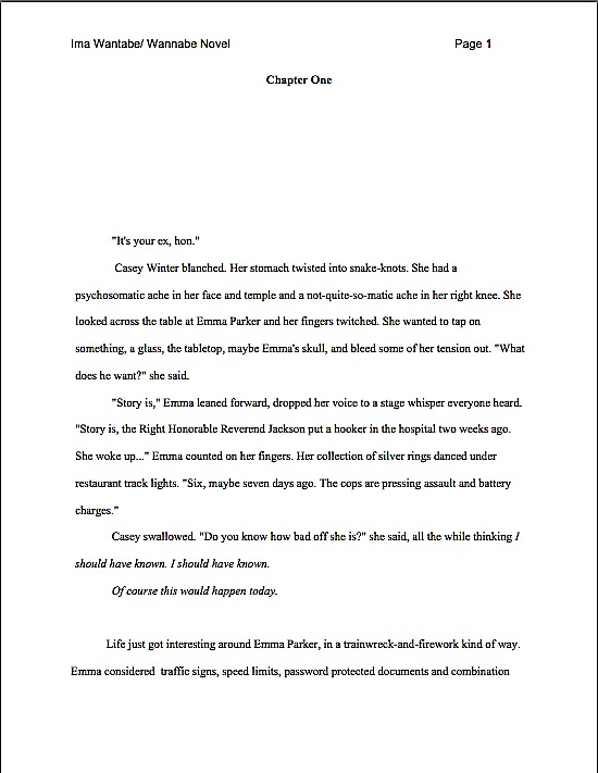
Last time, I mentioned in passing that the italicized part would raise most Millicents’ eyebrows, if not red flags over the manuscript. While indicating thought by either using italics or saying she thought is acceptable in many book categories (but not all; taking the time to learn the conventions of your chosen book type will serve you well at submission time), it’s never considered right to use both simultaneously.
In other words, while Millicent would never consider this correct:
Casey swallowed. “Do you know how bad off she is?” she said, all the while thinking I should have known. I should have known.
Of course this would happen today.
depending upon the book category, she would be perfectly happy with either:
Casey swallowed. “Do you know how bad off she is?” she said, all the while thinking: I should have known. I should have known. Of course this would happen today.
or:
Casey swallowed. “Do you know how bad off she is?” I should have known. I should have known. Of course this would happen today.
The trick is to pick one method of indicating thought and stick to it consistently throughout the manuscript — ideally, the method utilized in the current bestsellers in your chosen book category. If a conscientious flip through recent releases of your type of book does not reveal a category convention, don’t stress out about it; just use the method that appeals most to you.
Bearing in mind, of course, that there are quite a few professional readers out there — yes, including a hefty minority of Millicents — who simply don’t like italicized thought on general principle. “Humph!” they say, wrinkling their noses over type dancing across the page. “Is this honestly necessary? Shouldn’t a good writer be able to make it clear that a character is thinking something, or indicate inflection, without resorting to funny type?”
I have to admit, as a reader, I’m seldom inclined to argue with them on this point, particularly if the manuscript in question also uses italics (correctly) for emphasis (“I’m talking to you, Reginald!”), to indicate foreign words (“You left off the requisite accent grave, Marie.”), or includes a lot of song or book titles (“I know — let’s play Rubber Band Man while reading My Life as a Contortionist by I.M. Bendy!”). Used rarely, there’s nothing wrong with italics, but in a manuscript with a lot of italicized words, the skimming eye can easily become confused, even to the point of skipping lines.
There’s another reason an aspiring writer might want to be sparing in his use of italics, especially on page one. It’s very, very popular to use italics on an opening page to highlight a brief opening scene or image.
Everybody knows what I’m talking about, right? In theory, the italics are intended to alert the reader to the fact that the paragraphs in the funny type aren’t in the time, place, and/or mindset of the ACTUAL opening scene that follows immediately thereafter. On the manuscript page, it usually looks a little something like this:
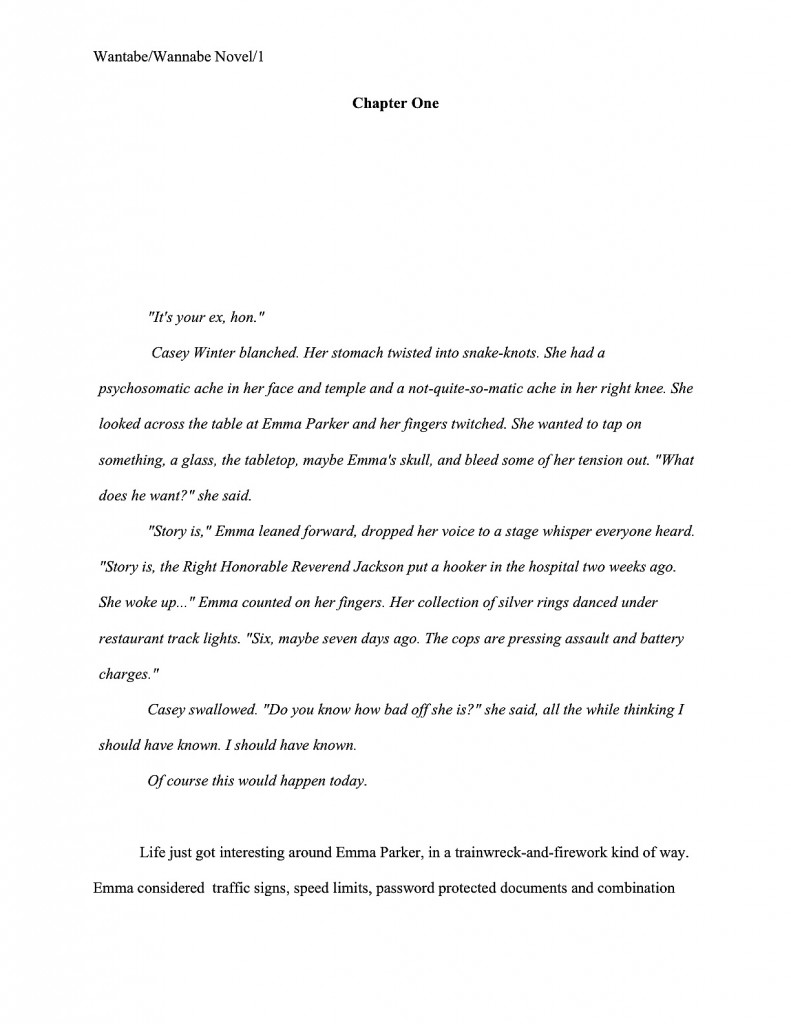
One often sees this done in published books, right? Unfortunately — feel free to chant along with me now, long-time Author! Author! readers — manuscripts are not supposed to look like published books; they differ in many significant respects. Still more unfortunately, many, if not most, aspiring writers are not aware of those differences when they submit.
The usual result? Well, we saw a bit of it yesterday, didn’t we? Instead of treating the deviation from expected formatting as an intriguing authorial choice, Millicent usually just regards it as (a) a mistake, (b) an indicator of the submitter’s lack of familiarity with the publication process, (c) carte blanche to take the submission less seriously, or (d) all of the above.
So when Millie spots an italicized opening paragraph or two, she tends not to exclaim, “Oh, here is a suggestion to the editor about what the formatting of the published book should look like,” as italics-loving submitters hope. Instead, she says, “Oh, here’s another one who doesn’t know that italicization choices are the province of a book’s editor, not the author.”
In other words, she tends to regard block italicization in much the same way as she would any other deviation from standard format — if she doesn’t happen to work for an agent who has a pet peeve against this type of opening. As many, many agents do, I’m afraid.
How would that affect how Millicent would read such an opening? 99% of the time, like so:
In response to that vast collective gasp: yes. The vast majority of Millicents will simply skip over italicized opening text, treating the first normal line after it as the opening sentence of the manuscript.
My, the group’s gasping a lot today. “Why on earth,” italics-lovers the world over croak in aghast unison, “would any literature-loving human do such a thing? Published books open all the time with italicized bits!”
A fair question — but actually, there’s a pretty fair answer. Most Millicents just assume, often not entirely without justification, that if it’s in italics, it doesn’t really have much to do with the story at hand, which, they conclude (and not always wrongly), begins with the first line of plain text. In their experience, that’s where the action usually begins.
In other words, they’re apt to skip the italicized bits to save themselves some time.
Which is, as some of you may have noticed, the justification for many, many of the instant rejection norms that plague the nightmares of submitters. Millicent’s workday moves along at quite a clip, after all.
To distract you from any well-justified artistic seething you might be tempted to do over that last observation, take another look at that italicized section. Can you spot any other problems our pal Millie might have with it?

Any luck? Actually, to Millicent’s eye, the problem is pervasive throughout the entire page. Here it is again, with the words that would jump out at her highlighted.
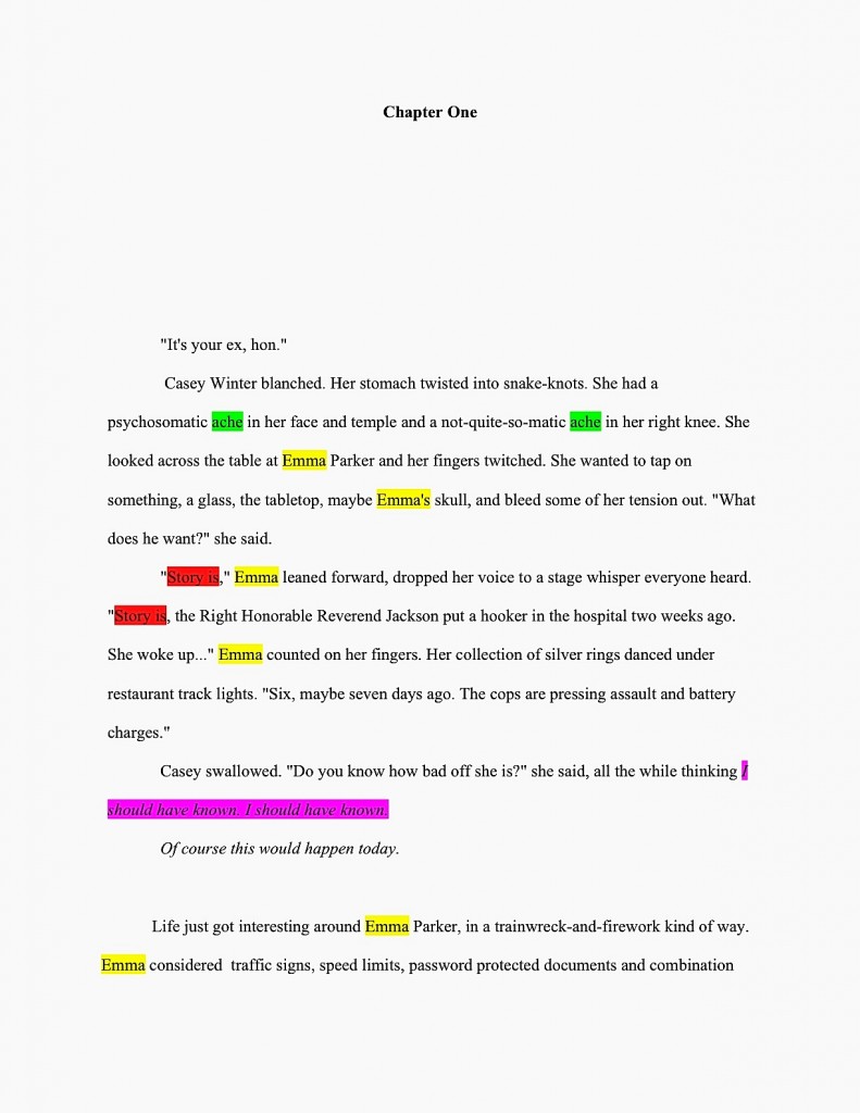
Easier to see the word and phrase repetition now, isn’t it? (Although the slug line seems to have vanished mysteriously in the transition, I notice.) Trust me, Millicent would swoop down on each and every one of ‘em like a bird of prey.
Why is she so much more likely than the average reader to notice word and phrase repetition and be bugged by it? Like most professional readers, Millicent’s eye for redundancy has been sharpened not only by years and years of reading manuscripts, but also by training: textual repetition is one of the first things fledgling editors are taught to spot.
Why might a savvy submitter want to avoid tripping her delicate redundancy sensors on page one? Because of an underlying assumption necessary to justify quick rejections: almost universally, professional readers will assume that the writing on page 1 is a representative sample of the writing throughout the entire book.
Which it usually isn’t, in practice. Most first-time writers improve as they work their way from Chapter One to The End, so it’s not all that unusual for the sentence style and word choice to be quite different in Chapter 2 than in Chapter 18. It’s also quite common for writers to revise sporadically, resulting in a highly polished Chapter 6 followed by a virtually first-draft Chapter 7. And don’t even get me started on the number of submissions in which the first ten pages are impeccable (possibly because their writers had heard someone like me point out that unless the opening pages are buffed to a high shine, Millicent is unlikely to read past them), while the rest of the text remains largely unrevised.
Be that as it may, Millicent has a LOT of submissions to get through in any given day — and it’s her job to narrow the field of applicants for the post of agency client, isn’t it? So while she may decide to keep reading past the bottom of page 1 to see if the writing becomes less repetitious, or more exciting, or more genre-appropriate, or more anything else she knows that her boss is looking for in a new client’s work, structurally, there isn’t a great deal of incentive for her to invest the extra minute or two.
In case I’m being too subtle here: it’s in your best interest to revise the opening pages so that they reflect your most polished writing style. If page 1 doesn’t wow Millicent, page 2 may not get a chance to impress her.
Fortunately, redundancy can usually be removed at little or no cost to the meaning of a paragraph, and without even much effort. Take a peek at our example after roughly 43 seconds of revision:
Do I spot a few eagerly-raised hands out there in the ether? “But Anne,” a few sharp-eyed souls point out, “that’s not the same text as before — it’s a few lines longer.”
Well spotted, sharp-eyed ones. More space on page 1 to show off your good writing is a dandy fringe benefit that often results from minimizing repetition. Don’t say I never gave you a present.
I have quite a bit more to say about this first page as a submission, believe it or not, but let’s save it for next time. Then, if we’re very brave indeed, we may take the plunge into page 2!
Clearly, we like to live dangerously here at Author! Author! Keep up the good work!
It really helps to color the words. My awesome critique partner (Take No Prisoners Sherry) highlights the problem words in red and the over-used words in blue with other colors for words indicating a slue of other things. My chapters look like they’ve been stabbed repeatedly and left for dead, but I know just how to edit and bring them back to life. Who said I needed to be a doctor? 🙂
I think I will have to invest in a large number of colored highlighters. A very, very, very large number.
(I would just use my art pens, but those aren’t usually see-through enough for this. And they bleed. A lot. The day they start making Sharpie pens in red — not markers, but the pens that don’t bleed — is the day I lose my entire paycheck in the office supply store.)
As someone who spends most of her life with five colors of highlighter ink all over her hands, I sympathize, CW. On the bright side, most writers who file a Schedule C for their writing businesses (which you don’t necessarily need to make money as a writer in a given year to do; consult a tax expert familiar with artists’ returns to learn the eligibility criteria) would be able to claim that spree at the art store as a legitimate editing expense!
This is awesome advice. Actually, I use a great program called autocrit that highlights many of those problem areas, such as redundancy, adverb-itis, cliches, etc. It has become my Millicent. 🙂
Ooh, good tip, KL. Anybody else have suggestions?
I approve of Take No Prisoners Sherry’s technique! It’s worth finding out in advance, though, if one’s critique partner had a mean elementary school teacher who graded in red ink — a LOT of adults did, and thus have a strong visceral reaction to seeing red ink in their margins.
I want to claim the expensive laser printer I bought. It doesn’t edit for me, but dang, do my pages look good!
I would STRONGLY advise having a nice conversation with a tax pro about it, Elizabeth — I’m not a tax expert, so I can’t give specific advice. Just make sure that you find someone with experience working with writers’ returns, because as I understand it, the rules are rather different for us than for other types of working artist.